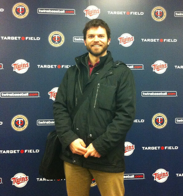
Reader Marc Aune recently took part in a tour of Target Field (that’s him above, posing in the press conference room). “I’d been to a few Twins games since the stadium opened, but there were so many interesting things I had never seen or even heard about before,” he says. “Also, I realized that I can’t help but view the world through Uni Watch glasses now.”
Here’s Marc’s commentary regarding a few highlights from the tour:
• “This laser-engraved wooden image of Kirby Puckett was created in a guy’s garage. Seriously. There’s a similar image of Rod Carew in another area of the stadium.”
• “The field never actually freezes. It’s covered for most of the winter and kept warm by underground heating coils. Nonetheless, the sod sometimes has to be replaced, which is what’s taking place here.”
• “We’ve all seen the standard MLB uniform guide posted in MLB clubhouses, although I thought it was strange that the visitors’ locker room showed a Twins diagram.”
• “Speaking of the visiting teams: When they arrive, they’re greeted by photos of what the Twins’ locker room has that theirs does not: big TVs, hot tubs, etc.”
• “There are nine different ‘keg rooms’ in the bowels of the stadium. Instead of having workers moving kegs all over the place, there are dedicated beer pipes that run directly to vendors. Do other stadiums have that feature?”
• “This model of the stadium, made before construction and lacking some features that were added later on (like a second large scoreboard), cost $750,000. Yes, $750,000. I don’t think my guide even knew how that was possible, but he assured us we were hearing him correctly.”
• Here’s the official scorer’s chair (which presumably cost less than $750,000).”
• “If I were making a slogan about ‘The Twins Tradition,’ I’d want to add something about, you know, winning.”
• “A wall in the corporate suite concourse features the names of all 10,000+ Minnesota lakes, with the suites named for the lakes in bold.”
Nice job, Marc — just the thing to get us in the mood for Opening Day.
Membership update: Eight more card designs have been added to the membership card gallery (including Patrick Fleming’s card, shown at right, which is based on the Bray Wanderers soccer kit). I hope to get the printed and laminated versions of these cards into the mail within a day or two.
As always, you can sign up for your own custom-designed membership card here. (And in case you missed it two weeks ago, here’s a step-by-step breakdown of how the membership cards are made.)
OMFG: My “One-Man Focus Group” column now has its own Twitter feed, which I’ll be using for OMFG-ish news, developments, and of course links to new columns as they’re published. Please consider following it — thanks. (And if you’re somehow unaware of the Uni Watch Twitter feed, that’s available here.)
Meanwhile, the latest OMFG installment involves a Passover Coke taste test. Enjoy.
Uni Watch News Ticker: Lots of these Ticker items would have run back on Friday, but I was too busy recovering from my birthday festivities. Sorry if some of this is old news, and even sorrier that some items got lost in the shuffle. … Here’s the Newtown memorial patch that the Yankees and Bosox will be wearing on Opening Day. Other teams are expected to get on board soon. … David Wright has been named captain of the Mets but will not wear a “C” because, as he put it, “A uniform is a uniform for a reason.” Meanwhile, former Mets captain Keith Hernandez says he liked wearing the “C,” because it was “an ego thing.” ”¦ The Cardinals Facebook-posted an awesome program cover illustration on Friday. In so doing, they also leaked their Stan Musial memorial patch, which hasn’t yet been officially unveiled but will indeed look like the one shown in the illustration. It’s a red 6 in a red circle, overlaid with Musial’s signature. … New superhero costumes for Baylor football. Curtis Schroeder thinks the pattern on the shoulders is supposed to mimic the old bear claw shoulder icon. Eh, maybe. You can see some rear and side views here. … Canada is cutting its tariffs on imported hockey equipment, in large part because almost no hockey gear is made in Canada anymore. … A village in Texas sold off the naming rights to its town name and then discovered — surprise! — that it wasn’t such a great deal after all. … If you’re looking for an old-school, blood-and-guts NFL photo, you’d be hard-pressed to do better than this 1972 shot of Charlie Krueger (from Jon Solomonson). … Here’s a story about a baseball player at Colorado Mesa University who lost everything he owned in a fire, including his uniform. “As a result, he’s changing his uni number for a short time until a new uniform with his old number arrives,” says Scott Schlaufman. … Tulane women’s hoops player Whitney Bibbins wearing a helmet after sustaining a concussion (from Christopher Mycoskie). … Bizarre new court design for FIU basketball. … Surprising sight at the Cal/UNLV tourney game, as someone at the scorer’s table wear wearing a Seattle Rainiers hoodie (from Daniel Carroll). … Sooooo much to like in this 1973 photo of the Cumberland First Methodist youth basketball team (major thanks to Tony Bruno). … Some fun thoughts on the Dolphins’ logo situation here (from Robert Silverman). … Some Valparaiso players weren’t wearing their NCAA tourney patches last Thursday (screen shot by Bryan Linton). … The cupspiracy is in full effect at the NCAA tourney (from Paul Ricciardi and Jonathon Binet, respectively). … MLB and American Needle’s latest stroke of, uh, genius: “Aztec print” brims (from Brad Iverson-Long). … New slate of alternate jerseys for the Brooklyn Cyclones (from Terence Kearns). … Rugby note from Shane Bua, who reports that the Leiceser Tigers have been looking a bit Fruit Stripe-y this season. … NFL headsets were sponsor-free last season, but that apparently won’t be the case this fall. … Nike is doing quite well these days, thank you very much. … Pretty nice cycling print on Etsy (from Jay Sullivan). … “As part of its 50th-anniversary celebration, the German Bundesliga just unearthed an old gem of a video from a 1996 match,” writes Bernd Wilms. “With Hamburg down a goal in Rostock, coach Felix Magath decides his team needs a tall player up front to create chances from headers. So he chooses goalkeeper Richard Golz, who promptly changes into a delightfully makeshift DIY outfield player shirt on the sidelines while his backup is subbed in for a defender.” … New kit for Azzurri. “I enjoyed the product description, which says, ‘Both the official shirt and replica shirt are engineered for embracing mates and hoisting trophies as needed,'” says Yusuke Toyoda. … New bottle design for Pepsi, with more branding changes to come. I’ll be doing an OMFG piece about this in a coupla days. … Chris Creamer has re-confirmed that the leaked Dolphins logo is legit. … Notre Dame QB Everett Golson thinks the football team should go Fruit Striped (from Terry Mark). … A Fort Worth Star-Telegram writer is reporting that TCU football will have a new uniform for its season-opening game on Aug. 31 (from Blain Fowler). … Leo Strawn Jr. created an mosaic based on minimalist versions of Aussie football jumpers. “I used three rules,” he says. “The elements had to be taken from current jumpers; home jumpers, if possible; and two colors. I was able to follow all three rules with all but a few. The only one that I think might be too detailed is Carlton.” … Major change for Olympic boxing, which will no longer use headgear. ”¦ Minnesota hoops player Oto Osenieks was wearing his shorts backwards on Friday (screen shot by Spencer Bowen). … “Little old Wake Forest seems to be getting a lot of football helmet prototypes,” says Duncan Wilson. … Wait, one more Wake helmet. ”¦ Non-sports-related, Part One: “Really, comes close to the satisfying ka-chunk of a stapler: It’s a sound that means work is getting done.” That quote comes from this very nice ode to the stapler. ”¦ Non-sports-related, Part Two: The new album by Waxahatchie, called Cerulean Salt, is really, really good. ”¦ Sports-related, sort of, but not uni-related: Here’s one of the most bizarre sports-related obituaries you’ll ever read (from Heather McCabe). ”¦ Harvard lacrosse is wearing a Sandy Hook memorial decal (from Tris Wykes). ”¦ Wichita State had some vertical-vs.-radial arching inconsistencies on Saturday (from Mike Harmanos). ”¦ In that same game, two of the refs had mismatched flag patch orientations. The third ref had no flag at all (from Jerry Peterson). ”¦ The Japanese Baseball Hall of Fame currently has an exhibit on women’s baseball uniforms. Additional photos here (from Shane Earnest). ”¦ No photos, but an interesting note from Gregory Koch: “This weekend, UConn baseball was supposed to host Georgetown, but the game was moved to Georgetown because snow made the UConn field unplayable. UConn retained the home team designation, batting last, but wore their road grays, while Georgetown wore white and batted first.” ”¦ No photo, but Prince Fielder of the Tigers had some sort of thigh padding under his baseball pants yesterday. Pretty sure he was wearing those briefs with the built-in padding. Never seen anything like that on a baseball player before. ”¦ Here are Tiger Woods’s shoes for the Masters. ”¦ @Uniformswag, whose tweets have proven to be very reliable and accurate in recent months, posted a disturbing Cowboys image yesterday afternoon. I got in touch with @Uniformswag, who told me, “The Cowboy picture was sent to me by a [Twitter] follower. I am not sure if it is legit — that’s why I posted it as a question, hoping someone would confirm if it is real or not. It looks real — normally it’s very easy to spot if someone has made a concept.” Agreed, but there’s no way this is real, nuh-uh. … Ooh, dig this old White Sox necktie (nice find by Bruce Menard). ”¦ “I work for the City of Salem, Virginia, which hosted the NCAA DIII Men’s Basketball tournament,” says Clark Ruhland. “This weekend I noticed one of the referees had the NCAA logo on his whistle. He said they sent him the stickers in the mail. Also, I was able to get one of the NCAA patches they put on the player uniforms, along with one that they issue to the referees. The smaller one on the paper is the player version; the slightly bigger one is for the refs. Not sure why these patches wouldn’t be the same.” … Who knew you could play croquet in the snow? Marty Hick and his intrepid wicketeers, that’s who. … Andy Henderson got this e-mail from a Groupon-esque operation. “Notice the basketball they chose for the ad,” he says. “I know the Timberwolves sometimes play like a low level college team but I thought they’d get more respect than that!” … The Santa Cruz Warriors (D-League) will be wearing tie-dye uniforms this Wednesday night (from Frederick Placido). ”¦ Hmmm, did they really leave the “A” off the end of that wordmark, or was there just a fold in the fabric? (As noted by Ryan Stanish.) ”¦ Happy Passover to all who’ll be observing tonight.
Final 2 image links are repeated — the lakes pic misses out.
Ignore me! I’m clearly going blind.
No, you’re right. The last link is actually two links. The first half of the sentence links to the wrong image (the logo), while the second half links to the correct image. Looking at the page source, the closing tag is missing for the previous link, so it bleeds down into the next bullet point.
Now fixed. Thanks, guys.
Most stadiums have a central beer distribution system now. First one I ever saw was at Camden Yards, and that was one room, now they are much more sophisticated.
That Rainiers hoodie is a contemporary Tacoma Rainiers (AAA) offering, not a PCL design.
link
After spending a couple minutes looking over that cowboys “prototype” it’s pretty easy to see that it’s a fake. The NFL logo on the collar is too small, you can see the size it should be in the white space in between the Nike-lace and the logo (it also looks a bit wonky on the bottom left, but that could be the result of my eyes deceiving me so early). The stars on the shoulders also show big inconsistencies, the one on the left has part of the star spilling over on the collar, while the one on the right appears to be oriented differently and doesn’t have the same star-on-the-collar feature.
For what it’s worth, the Nike logo is also very crowded against the collar of the uniform, something I’m sure Nike would never allow.
It appears this uniform is a somewhat poorly rendered ‘shop job, like we saw a lot of before last season.
The mere fact that the swoosh is on the front of the jersey is all the proof you need. The swooshes are always on the upper sleeve/lower shoulder area for NFL jerseys.
The jersey is a neat concept (the helmet is stupid), but it ain’t even close to real.
Just now thought of that, you’re right. I can’t wait to spend the next couple months explaining to people that this jersey isn’t real if this ends up anything like last years speculation.
If Jerrah actually did that, you’d be able to hear the screaming from Texas just by leaning out your window..wherever you are.
But they’d move a lot of merch, oh yes they would.
There was a guy on Chris Creamer’s board that worked for Nike (not anymore, since he got in trouble for posting info there).
I recall he stated earlier this year that currently Nike doesn’t have the capability for sublimation (at least on the stretch fabric they use). Those little shoulder stars would be sublimated the way they are depicted.
It looks like ass anyway.
I can’t see UniSwag’s post because for some reason Twitter is saying I’m “not authorized” to. Can someone link me to the image?
Here: link
It’s rather obviously fake when you really look closely at it.
Staplers are nice.
A sound I miss from my childhood is that of the grocery stocker’s price stamp. That steely chromed, auto-inking behemoth.
The “sha-kunk sha-kunk sha-kunk…” of a case of green beans being priced in that blue/puple ink is sound from the past that today’s young-youngsters will never know.
I appreciate the stapler story, Paul — hadn’t seen that. The four staplers on my desk are by no means dusty in my paper-based workplace. Throughout the day I rotate their usage, with the exception of the Swedish Rapid SuperFlatClinch S50 high-capacity model (for up to 50 sheets at once).
I believe Canada is cutting its “tariffs,” Paul.
The WCHA will have a new logo starting next season. Basically it’s the old logo with the skater moved to the left and colored red. link
$750,000 for a model of a stadium seems about right. Consider the hourly fees by the architects, their assistants, the CAD drawing prep, travel to other stadiums for research, revisions upon revisions upon revisions (no matter how minute) and presentations to the team, and the costs for producing the actual model.
You’re talking about full programming, masterplanning and schematic design fees there which would be in line for a stadium. But to claim the model itself cost $750k like they said is a little absurd, a model like that would typically go for +/- $20,000.
RE: NCAA patch size discrepancy.
I’m wondering if the player jersey patch is smaller than the refs’ patch due to brand restrictions. That is, Adidas and Nike wouldn’t want their logos getting creeped out by big patches. I think that wouldn’t be an issue for the refs.
I believe the refs’ patches are larger to hide any conference logo on their uniform.
Looks to me like the pictures on the easel in the visiting dressing room are there to show people on the tour what else there is in the Twins’ room, rather than to taunt the opposing team. I doubt that a flimsy easel with a piece of posterboard would last very long once another team came in.
You are correct, Seth. We did a similar thing for tours of Turner Field when I was with the Braves. There were certain times that the home clubhouse was off limits, so we had to substitute with the visitors’ one. We provided pictures to show the nicer amenities that the home team enjoyed.
Yeah, I had the same thought… that the pictures were for the benefit of the tour group, not to show off to visiting players.
Cannot believe volume of high-class information from this morning’s ticker, probably due to birthday hiatus leading to weekend. But what a Monday!
1. Marc Aune (a descendent of one of the earliest Great Lakes voyageurs, by the way; you can look it up) tees up everything in shining fashion. The giant Kirby Puckett wooden thing, made by a guy in a garage? The $750k stadium model (awesome billable hours)? The Lake-o-Rama? Sublime.
2. Patrick Fleming’s UW card.
3. David Wright’s seemliness.
4. Tony Bronco (great-nephew of the Italian-American magnate who was the first owner of the Denver AFL franchise) rings ten bells with that 1973 photo of the Cumberland First Methodist boys’ basketball team.
5. Not-as-bad-as-they-could-have-been soccer shirts of Italian men’s team (“Gli Azzurri”), with the interesting twist of having the sleeve trim in different colors.
6. Award to the word “gli” for being the best plural definite article in the entire Indo-European language family.
7. No more headgear requirement in Olympic boxing? Talk about counter-intuitive.
8. DG is right: staplers are nice, and that was a good article about them in the NYTimes.
9. Bruce Menard deserves our thanks for unearthing that ChiSox necktie, and will earn even deeper gratitude when he re-inters it. Yuck!
10. Marty Hick (who lacks the letter S at the end of his name that his musician brother —
Dan Hicks, of Dan Hicks and the Hot Licks — appended so as to avoid any inference of rural origins) is one dedicated dude for not postponing the snow-covered croquet match. Note fortifying beverage in the hand of the gentleman left foreground.
11. “Tie-dye” unis of the Santa Cruz Warriors (D-League basketball) are neither attractive nor faithful to their historical inspiration in the 1960s. [Compare and contrast with the Lithuanian national team duds donated by the Grateful Dead.] But anything about Santa Cruz is always welcome. Great town.
Yeah, the Azzuri uni isn’t great, and I’m not sure if it’s even good (not digging the undershirt look at all), but it could’ve been a lot worse.
And it’s interesting to see the Italian flag colors integrated into the uniform, since it’s usually just blue and white and nothing else.
The Cowboys is definitely a mock-up. Most obviously the swoosh in the front; but also in the visor there seems to be a watermark signature of whomever made the mock-up.
Hope so. Dallas could do ALOT better. The star patterns on the shoulder pads remind me of the russel athletic generic college football uniforms. (UL has the fleur de lis pattern on their shoulder pads)
The link to the Brooklyn Cyclones alts needs a-fixin’.
Oopsie. Now fixed. Thank you!
But now who’s going to fix all those Brooklyn Cyclones alts? ;)
I know, right? I mean, honestly, on the Hebrew jersey, the number should go on the wearer’s right, not his left. Sheesh.
I’ll ask this here rather than on OMFG because I don’t feel like signing up for an account there:
I noticed Diet Coke for Passover in the store the other day and couldn’t figure out why it needed the yellow cap. Any help?
Even products that pass Passover muster in terms of their ingredients still need a higher level of rabbinical certification in order to be approved as “Kosher for Passover.” So Coke apparently got a rabbi to hang out on the Diet Coke production line.
Or at least I *think* that’s the answer.
It is not quite just having the Rabbi hang around (although that is definitely part of it.)
For instance, it is quite possible that Diet Coke is bottled on the same line as Coke. If a run of non-Passover corn syrup sweetened Coke had just been made, nothing else made on that line after the corn syrup run would be considered Kosher for Passover, unless the entire line is cleaned in accordance with the Rabbi’s instructions. He then hangs around to make sure that, e.g., no one is eating cracker over the line (no joke).
So the Kosher for Passover cap means both that the ingredients are okay and that the production process was okay.
The thing that really pisses me off if that there’s no Coke Rewards points under the cap of the Passover bottles.
Makes sense to me that the referee NCAA patches are larger than the player ones – the typical basketball uniform is (a) more covered with graphics and (b) sleveless, unless you’re Golden State or an Adidas school that got suckered into the new unis. Less real estate, smaller patch. The refs have sleeved shirts with no graphic other than stripes, so anything goes.
As ridiculous as it may sound, I find myself wondering if Marquette could ever pull mix and matching uniforms seeing as all their side panels match. Maybe powder blue over gold or something. Again, ludicrous idea, but something which I find curious.
Major League Baseball announced on Friday that every team will pay tribute to the victims of the Newtown, CT shooting.
“According to a release Friday, all players, coaches, managers and on-field personnel will wear symbolic patches on their uniforms and clothing. There will also be a moment of silence observed before the start of each of the game – from March 31 to April 2.”
Read more: link
That’s nice and all, but I’d really like to see all this very public grieving and sympathizing converted into actual, you know, action.
That’s a problem with these remembrances. (Setting aside whether just showing grief is OK on its own, divorced from any political or social action.) They’re baseball teams. What could they actually do? Encourage people to trade in their Bushmasters for free tickets?
If you want to acknowledge public grief, great! A public moment of silence between the national anthem and the first pitch, when everyone is still standing with their hats off, should be your default approach. Anything more, and the team or league really does need to back its memorializing with material action of some kind. If you’re not willing to sponsor PSAs where players lobby for legislation or encourage better gun-storage safety or whatever, or the equivalent, then don’t commission a patch. Just schedule that moment of silence and be done with it.
“What could they actually do? Encourage people to trade in their Bushmasters for free tickets?”
~~~
That would be a nice start.
Time lapse video of the Final Four court in Atlanta being put together and painted
link
Those Baylor football unis are… not very good.
I like them. Except the white hats on the all white uni.
I’m okay with the shoulder claws, but that number font is a train wreck. And the gold chrome is ick.
The Cumberland Youth Basketball photo is one for the ages.
Indeed. The striped stirrups, the satin shorts, the simple-but-perfect jerseys, the kid with the glasses, the goofy grins, the one kid who’s looking off in the completely wrong direction, etc.
As for the Passover Coke, I remember a few years ago Pepsi came out with their throwback cans (as mentioned on this site) with sugar for Passover which were around for about a month (and was shocked at how much better it tasted). But more recently I’ve been seeing the throwback cans stocked throughout the year at a few local stores which is certainly a nice move. They’re very rarely on sale so you have to pay 4 or 5 bucks for a 12 pack but it’s worth it. I don’t drink much soda at home so have no problem splurging for them once in a while.
at least around here at my local grocery chain, when they throw Pepsi products on sale, they don’t discriminate when it comes to excluding the throwback Pepsi/Dr. Pepper/Mountain Dew, so I’ve been known to load up when they throw it on sale.
For sure that cowboys shot is fake. In addition to what Dan already pointed out, by NFL rules the manufacturer’s logo must appear on the sleeve, not at the left chest like the picture shows. This is a very well done photoshop of one of Nike’s college uniforms.
Charlie Krueger was my hero when I played Little League football. I carried around his 1972 football card.
Is he still alive? He’d have to be about 85 years old. And probably still able to put the beat-down on any punk who crossed his path.
Still alive. Now 76 yrs old. Probably not giving anyone a beat-down, since he suffered severe physical and mental/emotional issues as a result of his football injuries. The Niners were ordered to pay him a $2.3 million judgment after he sued them for downplaying his injuries and giving him anesthetics that allowed him to play (and do further damage to himself) when he should have been sidelined.
link
Thanks for this, Paul.
This is a very, very sad story.
We do have a tendency to treat people like slabs of meat, don’t we, whether it’s shooting up defensive linemen with painkillers or the Swimsuit edition or about a million other ways we just sit on the sidelines cheering while people get absolutely chopped to bits.
My parents had the opportunity to meet him in the early 70’s, I remember them telling me he was a good guy.
Peeked at Wikipedia, he is still alive, turned 76 in January.
In his “Instant Replay” Jerry Kramer said a lot of good things about Krueger, going back to when they both played in the College All-Star Game and Kramer remembered Krueger’s wife calling and drawling “Is Charles Krueger thay-uh?” So he became known to them as Charles Krueger Thay-uh.” Forward to 1967, Kramer starting to work up his hate for his opponent, and behind him he hears “Is Gerald Kramer thay-uh?” Broke up Kramer completely. Later in the game, Bart Starr took a knee and Krueger, instead of shoving in, patted Starr, shook Kramer’s hand and wished him luck in the playoffs.
The zig-zaggy number typeface on the Baylor football jerseys is reminiscent of the “Lisa Simpson giving head” logo from the London Olympics, so there’s that.
I get a Tripod image block when I click on the following “old bear claw” link.
People still use Tripod?
That’s weird – the images look like they’re stored on the uni-watch.com server.
The link for the new uniforms is on the Uni Watch domain, yes, but the link following it is on swchelmets.tripod.com.
Fortunately, the main page for that site seems to be working, so let’s try this:
link – the 1979-88 pic is what was being direct-linked.
Oh, I see. The site’s a total timewarp.
I really wish Nike would stop with the jagged fonts. It was alright when the first couple of schools did it, but now it’s almost standard in their rebranding.
I will commend Nike and Marquette for the awesome font in use on the bball jerseys though; link
Jagged fonts are cool now, yo. Don’t worry though, they’ll start going with more rounded ones in 2016.
I thought that time had link and link.
Cycles. link
That Bears jersey/Raiders logo really confused me for a second.
The “keg rooms” at Target Field are a great idea. That’s really cool.
Courtesy of Jennifer Conway @nhlhistorygirl
Edmonton Oilers nés Alberta Oilers had a sponsorship agreement in principle with Gulf Oil. The deal was never consummated, as the parties walked away shortly before the inaugural season. Without adequate time to get new uniforms with different colors, the Oilers stuck with the Gulf colors they ordered: orange and blue.
That makes me wonder what they would have went with if they had the time to buy new uniforms.
Black and gold…as in “black gold”?
As much as I root against the Cardinals, that scorecard is fantastic – great example of retro done right.
OK, here’s my old guy complaint of the day: I can’t stand the television ads for the upcoming movie “42”, not because I don’t think that the Jackie Robinson story isn’t worthy of Hollywod treament, rather the incessant J. Zee song, “Brooklyn” playing in the background. Hell the song is more about J. Zee (aren’t they all) than Jackie Robinson. It’s almost enough to make me not want to see the movie.
Everything in a movie trailer (including the featured song, if any) is misleading and out of proportion to the actual movie. Sometimes the “featured” song isn’t even played until the closing credits.
Just wait until the movie comes out, hear or read some reviews (whether from film critics and/or from friends who’ve seen the movie), and base your decision on that, not on the trailer.
Wait, you mean it’s not primarily a movie starring Harrison Ford like the trailer suggests? Shoot. It’s going to be that much harder to convince my wife that it’s an appropriate movie for Date Night.
“Get off my lawn” rants aside, how many under 20s would go see the movie if Jay-Z didn’t catch their attention first?
I have no problem using Jay-Z, and I know why they used that specific set of lyrics (he namechecks Jackie Robinson and it is clever wordplay), but those lyrics are about robbing, stealing and selling dope.
“I Jack, I Rob, I Sin… Except when I run base, I dodge the pen.”
I seriously doubt Mr. Robinson would endorse that being used to promote “him” one bit.
If it makes anyone feel better, Jay-Z *probably* exaggerates his criminal past A LOT.
I don’t know any of Jay-Z’s music.
But..he married Beyonce’, so he gets a pass from me.
Gotta plug my current city, here. Several parts of the movie were filmed here in Chattanooga, TN, at Engel Stadium. Engel was built in the 30s and was home to our Double-A team for some seventy years. They probably would have torn it down if not for this movie coming in and pouring a ton of money into the stadium to rehabilitate it. Kudos to the film for that.
I’m 30, and sorta enjoy some of Jay-Z’s music. Does it necessarily belong in a movie that takes place in the 40s? Well, no. But hey… if that song is the reason some kid perks up when the commercial comes on, then he gets interested in the movie and learns a little bit of baseball history because of it… that wouldn’t be a bad thing at all.
Kinda weird seeing all the design elements and logos in that rugby link, because I remember watching rugby back in the early 80s, when Rugby Union was still amateur. The uniforms were basically unchanged since forever – cotton, two-button collar shirts with no sponsorship or manufacturer logo.
For better or worse, it went on a fast track to modernization and passed soccer and the Big 4 sports along the way.
Non-uni related David Wright note in an amusing WSJ article about a butt-dial prone Mets executive: link
Those shorts that Fielder has are sliding shorts- they’ve been around forever. There’s a pair that Ty Cobb wore (little less sophisticated) here link
But there’s a ton of them available online now- some are more heavily padded than others link..0j0i5l3.2785.4489.2.4576.8.8.0.0.0.0.132.485.7j1.8.0…0.0…1c.1.7.psy-ab.Cd6MP74GBpE&pbx=1&num=20&bav=on.2,or.r_cp.r_qf.&bvm=bv.44158598,d.dmg&fp=763a650e9e5a1b69&biw=1280&bih=709
Nope. I have photos now:
link
Those aren’t like any sliding shorts I’ve ever seen.
The Target Field tour is pretty awesome.
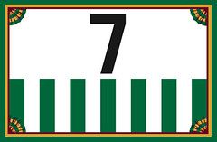
That new membership card with the stars and a red number 7 on a blue jersey is really cool. Does anyone know what team that is?
Coast Guard hockey team from the 1940s. Here’s the jersey it’s based on:
link
Awesome, thanks.
Super awesome.
That’s just a re-interpretation of my Nationals concept from a couple years ago: link
Ok, probably not. Old Harlem Globetrotters, maybe?
Ugh… this was supposed to be a reply to Wheels… and I was wrong anyway.
I need to be deleted.
I was just recently on a tour of Wrigley Field and they do the same thing in the visitors clubhouse with the uniform template. Side-note on tours never have taken any before this past summer when I toured Arrowhead Stadium (K.C. Chiefs) and now Wrigley but well worth the money ($15 for Chiefs, $25 for Cubs) lots of cool history especially if you get one of the older tour guides.
Paul, thanks for the recommendation on the Waxahatchee album. I was a pretty big fan of her previous band, PS Eliot.
De nada. Both Waxahatchee albums are really good, although I like the new one a little better. Also, the frontgal’s twin sister (who was also in P.S. Elliot) now has her own band, Swearin’. I’m still kinda getting acquainted with their self-titled debut album….
There’s a good article about the twins here:
link
Great tip.
Conn, you’re listening to indie-rock made by 20somethings? If so, that’s so cool!
Loosely related to the Powerade “cupspiracy,” I was watching the KU-UNC game yesterday afternoon and, at one point, when CBS was showing a guy in the stands who played for UNC some 50-60 years ago, a fan walked down the stairs with two soda bottles in hand–a Mountain Dew & a Pepsi (although, incidentally, both labels just happened to be facing away from the camera). I thought it odd that Coke doesn’t have some sort of agreement to exclusively sell their sodas at all tournament venues, or that the NCAA doesn’t insist that each venue make arrangements to do so.
I worked at little hockey stadium back in the early/mid 90’s. Capacity of around 5000 people. They started switching over to keg rooms way back then.
They also had a centralized liquor set up. Each liquor had 2 half gallon bottles feeding them. Tubes ran through the stadium to every bar. Each liquor had a button on a computerized gun at the bar. Press the button once, get a shot & get charged for it. It really really cut down on the bartenders being generous with the alcohol. Customers weren’t real happy either. I don’t know if they still use it. I rarely go there anymore & I don’t drink when I do.
I bought a retro pack of pepsi at the grocery store thinking the cans would be the two hole push tops from the 80’s, disappointingly they were the reg flip tops. Nervertheless, mmm.
Yeah, Pepsi Throwback is dee-licious! Glad they make it all year round now, real sugar for the win!
Cleveland Browns waiting until 2015 before deciding to change uniforms.
link
If I didn’t know better, those Baylor unis (the far left) are illegal because the numbers are too close to the color of the jersey.
Thoughts on horses in unis… errr… compression suits: link
This is the product’s website: link
Leafs wearing their alts on the road, forcing the Bruins to wear white at home.
If I didn’t like Toronto’s alts so much, I’d be miffed. First Sporting KC does the same thing to the Revs, and now this?
The Heat-Magic game is unwatchable… whoever thought white numbers on an all white uniform was a good idea needs to be removed from society.
Anybody have access to screen grabbing? Colin Greening scored for the Sens against the Devils in the waning moments of the second period, and I think he was sans front helmet numbers.
Fact: Michigan has over 11,000 Lakes. just sayin…
Happy Passover, Paul!