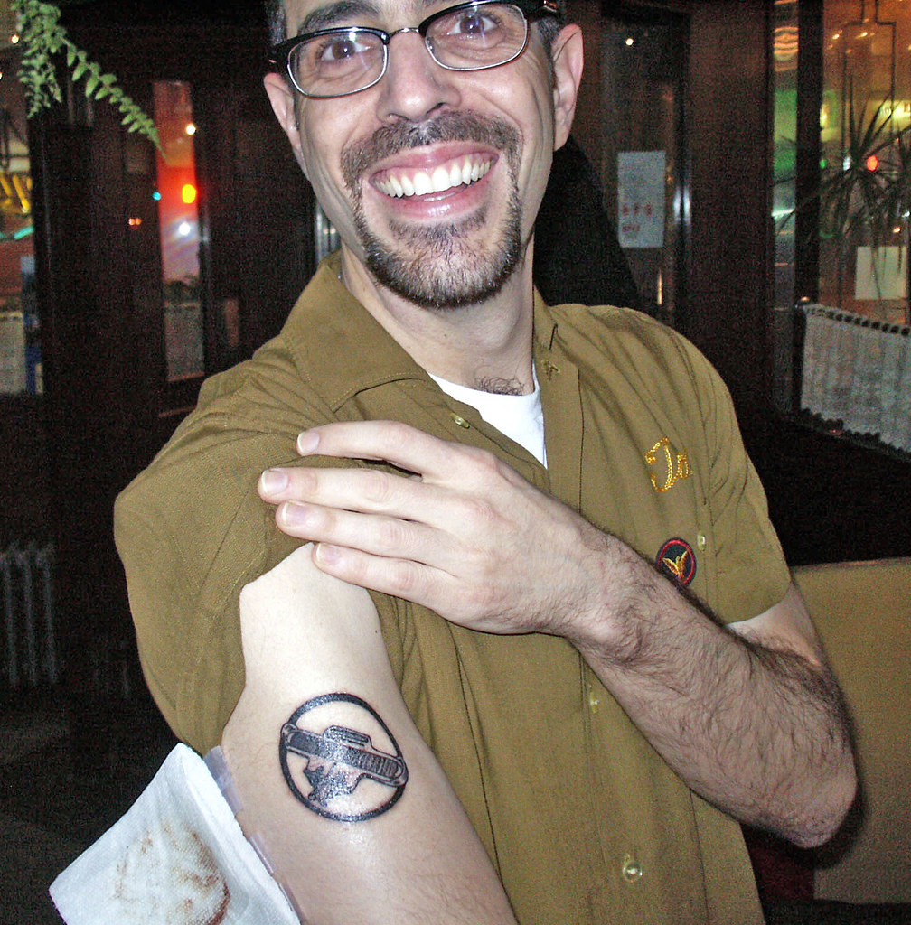
Photo by David Brown; click to enlarge
Today is my 49th birthday. A few thoughts on that topic:
• Today is also the 10th birthday of my Brannock Device tattoo, which I got on the afternoon of March 21, 2003. The photo you see above was taken at the party I convened that evening (at the very wonderful and now-defunct Long Island Bar & Restaurant, RIP), about five hours after the tat was inked. A decade on, the tat still looks very solid and pretty damn crisp, although it’s now more bluish-green than black.
• As I noted a few years back in the obituary I wrote for my father, my birthday usually involves a certain meteorological consistency. Here’s the story, cribbed from that obit:
When I turned nine years old, my outdoor birthday party was rained out and I was pretty inconsolable, but Pop said, “Oh, don’t you know? Rain on your birthday is a sign of good luck in the year to come.” It was a very sweet lie that he came up with on the spot. Rather amazingly, it rained on my birthday for the next 34 years in a row after that (really!).
As you can figure out by doing the math, it did not rain when I turned 44. But that is the only time in the past four decades that it has not rained (or occasionally snowed, or even hailed) on my birthday. As recently as two days ago, that streak appeared to be in jeopardy, as the forecast showed only a 20% chance of rain. As of this morning, however, we’re showing a 50% chance of snow showers — not bad! I’m rooting for some form of precipitation, no matter how minor.
• One of my deceased sisters-in-law had the same birthday as mine (but was much older). She died of cancer about eight years ago. This means my birthday must be a sad day for my brother, who of course is thinking of his late wife. Despite this, he always calls, takes me out or gives me a present, the whole bit. I’m always extra-appreciative of that.
I have a big day planned. The New Girl (yes, there’s a new girl) is taking me out for mid-afternoon lunch at Peter Luger. Then we’ll go to Manhattan and meet up for drinks with my friend Matt, who has the same birthday as mine — same day, same year. Then we’ll decamp to Otto’s Shrunken Head, where the mighty Susquehanna Industrial Tool + Die Co. will be playing. Should be quite the raucous caucus.
Thanks for indulging my ramblings. One further indulgence: Please, no Ticker submissions today unless it’s serious breaking news. Thanks.
(Bonus thanks to Phil. He knows why.)
ESPN reminder: In case you missed it yesterday, my latest ESPN column is ostensibly about the Fruit Stripe uniforms, although it’s really just another excuse for me to talk about my birthday.
March Madness reminder: Today’s the last day to sign up for the Uni Watch bracket contest. Winner gets a freebie from my swag bag. Details here.
And as long as we’re talking about March Madness, reader Chris Dobbertean offers the following analysis regarding the court designs from the play-in games:
I noticed three things during First Four games on Tuesday night — a couple of positives and one negative that I wasn’t expecting at all. These things even managed to distract me from the bland, standardized “Stepford Courts” that the NCAA has implemented over the past five seasons.
On the plus side, they’ve added a sideline logo for the 75th anniversary of the NCAA basketball championship, much like they did with the 50th-anniversary logo back in 1988. They’ve also added a graphic featuring the school name, logo, and conference logo in the rotation on the electronic graphics board on the scorer’s table. In the most recent past, they’d just put the two team names in those spots. At sites where they just had a banner on the scorer’s table (no electronic or rotating advertising board), they’d actually send someone out to change the team names during the break between games.
Negatively, as part of the rotating graphics package, they’ve added banners that read “[Insert Logo of Sponsor Here] Salutes NCAA Student-Athletes.” I saw them for Capital One, Enterprise Car Rental, and Nabisco, so I have to assume that all NCAA sponsors from their “Corporate Champion” and “Corporate Partner” levels must be receiving the same treatment. (Capital One is a “Champion” while the other two are mere “Partners.”)
I’ve been watching this tournament for a very long time and have never seen advertising this obvious. Seems to me that the NCAA has taken the next step up from making people place their beverages in sponsored cups. I’ll be curious to see if this is something that’s repeated at the variety of sites in use between Thursday and Sunday, or if this is a limited thing.
Seattle party update: Our upcoming Seattle Uni Watch party now has a venue. We will convene on Monday, April 8, 7:30pm, at the College Inn Pub. They have food, they have pinball, and they have a back room, which I have reserved for the evening (although we can just mingle in the regular part of the bar if the place isn’t crowded that night). Should be a good time.
And as noted yesterday, hand-drawn membership cards will be available. If you missed the scoop on that, look here. Two additional notes on that, however:
1) Several readers have pointed out that it would be cruel to do a membership promotion in Washington State and not allow U. of Washington-themed cards (which would be purple-inclusive and therefore run afoul of our usual chromatic policy). I agree. So the purple ban will be lifted on April 8, but only for people signing up at the party, and only for U. of Washington-themed cards.
2) If you’re planning to have Scott hand-draw a card for you at the party, you’d better bring really good photo reference for him. Just bring a printout of a rear-view photo of the jersey design you want, okay? Okay.
Uni Watch News Ticker: The Yankees and Red Sox will wear Newtown memorial ribbons on Opening Day, and Bud Selig has asked the other 28 MLB teams to do so as well. No visuals yet. … Congressional legislation has been introduced to strip the Redskins of their trademark protection (from Patrick O’Neill). … Jordany Valdespin of the Mets, who had said he’d start wearing a cup after being plunked in the nuts by a Justin Verlander fastball, is now backing off of that plan, at least according the last section of this article. ”¦ Old Dominion is experimenting with some football helmet prototypes (from Jonathan Leib). … Here’s the latest story on England’s soccer change-over from Umbro to Nike (from George Chilvers). … “My favorite English team, Barnet, which plays three divisions below the bright lights of the Premier League, will wear a one-off uniform to commemorate its final match at the 106-year-old Underhill,” says Yusuke Toyoda. “As far as I know, this is the first time a team will be wearing an image of the very grounds it’s playing on.” … What’s the best way to ruin a nice pair of stirrups? Guess (from Brice Wallace). … Danny Garrison’s latest set of NFL/soccer crossover concepts is for the AFC West. … No question, “smegma” for the win. … This is so cool: DIY Pantone Easter eggs (from Coleman Mullins). … Those White House petitions are way overplayed now (let’s secede, let’s make John Darnielle the poet laureate, blah-blah-blah), but here’s one that’s pretty smart: a petition to make legislators wear the logos of their corporate donors (from Maks Skuz). … More NCAA court coverage, this time a call to scrap the boring, standardized designs (from Britton Thomas). … New uniforms For the San Antonio Missions (from Bryan Spangenberg). … Recommended reading for Tiki Barber: Good story on the development of the Packers’ logo (from Don Schauf). ”¦ Two things about this shot of the 1940-41 Wisconsin hoops team: (1) Great socks! (2) If you look closely, you’ll see that most of the team has vertically arched chest lettering, but at least three players — dead center, top left, and top right — have radially arched lettering. Tsk-tsk (from David Weber).
…and many more, buddy!
Needs more purple.
Happy birthday, Paul.
Purple Rain!
Happy Birthday Paul! Very cool story about rain on your birthday, and I love the Brannock Device tat.
Happy birthday, Paul! Also Gary Oldman and Johan Sebastian Bach, the three of you together being one of the best answers I can think of to the “if you could invite anyone, living or dead, to a dinner party …” parlor game.
link
Happy Birthday PL!
happy birthday Paul! Hope you get lucky tonight!
Happy Birthday, Paul! May it be plenty wet, and feature more green than purple.
Have a great birthday, Paul!
Happy birthday good sir! No matter the forcast, well wishes will for sure be rained down on you. Cheers!
Happy first 49th. You look no different than at 39. No, you didn’t look 49 ten years ago.
Happy Birthday Paul,
link
and many more.
This is better: link
Happy Birthday Paul!
As they say on Facebook, HFBD, Paul!
“Me. Me. Me!” Is that all we get hear around here now from Paul??!
Just being snarky.
Have a great day. Don’t forget to wear your rubbers.
Happy birthday. Your blog is awesome.
the 49th birthday is the Smegma birthday!
Congrats!
Happy Birthday Paul! Many happy — and rainy/snowy — returns to you!
Happy Birthday, Paul. All the best, and here’s to many more rainy birthdays in the future! Take care, eat well, and enjoy the company of friends and a fine gal! :o)
Thank you for including my info on the NCAA changes, Paul. As for the Matt Norlander article you linked, he got into a conversation on Twitter last night with Greg Shaheen, who was formerly the NCAA VP in charge of basketball tournament (among other things). Shaheen’s argument was there was a cost factor involved because of the damage the NCAA decals were doing to the host school’s courts, especially since so many of them have started placing logos at center court.
While I can understand that cost argument, what I don’t get is why the custom-made courts still can’t have a bit of variation, especially for those of us who are attempting to track two to four games at once over the next few days. I suspect that’s why they’ve started to add team logos to the scorer’s table graphics; however, that only works when there aren’t ads on display!
“Placing logos” is supposed to be “placing giant logos.” Think of the huge logos Syracuse, Texas, Marquette, NC State and others have had on their courts in recent seasons. That requires a huge decal to cover.
I, for one, like the look of the courts. It’s a common thread through all the venues. The host school gets their logo on the corner, and the rest isn’t cluttered with a bunch of nonsense.
What I wouldn’t be opposed to is a different color scheme. Mix it up annually.
How about this for a solution, then: Don’t cover the logos. Syracuse, Texas, Marquette, NC State are NCAA institutions, and ones nice enough to host. Why can’t they get a little pub?
Happy Birthday, Paul! Looking like 30% of snow for you today.
The Guradian piece about Umbro’s association with England has a nice little accompanying slideshow showing the evolution of the national team uniform:
link
Not to get too sentimental about corporate sponsorship, but this *does* feel like an end of an era (I was equally sad to see France and adidas part ways, since it always felt like the company put the most effort into designing the French kits).
Nice gallery of images.
I can actually admit that I own a replica of the light blue shirt shown on slide 12. I still break it out from time to time, drives my wife nuts ;)
Happy Birthday!
Happy b-day whippersnapper! I’m more than a bit jealous of the trip to Peter Luger, where I celebrated my 46th a few years back.
Happy Birthday, Paul! Just curious, in regards to your Brannock Device tattoo, was it intentionally designed to mimic the universal “no” symbol?
Nope. I just like the circle — makes it feel more like an icon, or a rubber stamp, or something like that.
Happy birthday, Paul. If you find yourself with time on your hands during your birthday travels, go to Steve’s Key Lime Pie in Red Hook and get yourself a Swingle on me. Ask for Steve or Sam. Tell them The Pie Runner sent you and to put it on my tab. (You can also get a slice of Steve’s pie at Luger’s, but I’ve got no juice with those guys.) Thanks for your site.
I need to find a bar where I can acquire a nickname and a tab!
+1
Lee
Have a great B-Day Paul…
Cheers!
Happy birthday Paul, have you ever thought of having a Uni Watch gathering in the birthplace of the Brannock Device?
Happy birthday. Mine was two days ago and it was the first year down the hill. I can’t claim the same rainy streak as you, but I can say the weather has varied wildly on my birthday: from snow to sleet to rain and from below freezing to 80 degrees Fahrenheit. (It helped that I’ve lived in different parts of the US for that range to be covered.)
Enjoy everything the day has to offer. Do please tell us about the Peter Luger lunch in tomorrow’s column.
* I should have said please tell us about the experience, not to imply “dish on lunch date with The New Girl” or similar. I’ve never been to Peter Luger and, since it’s doable for me as a day trip, I’d like to know if it’s worth the effort.
Happy Birthday Paul!
Happy Birthday Paul! I hope it snows for you…
Technically, it’s the sanis, not the stirrups, that are ruined, though I’m sure you were referring to the whole look.
The sanis were already ruined. Now they are taking the rups with them.
… just realized I hadn’t said it yet, so…
Happy Birthday, Paul!
I think that is the most egregious example of nike logo creep yet.
Worse than the Seahawks shoulder treatment.
Even worse than the little girl’s lunchbox at school.
That’s just the devil’s work there on that sanitary. I give up.
And Happy 49th, Paul!
Happy birthday Paul! Enjoy!
Oh, and before I forget – re. the Barnet kits having an image of the stadium on them, I’m pretty sure Man Utd were the first team to do this, back in the 1993-94 season. The home kit had a sublimated image of Old Trafford…
Yup, image here: link
Happy birthday Paul!
Re Barnet ltd edition shirt: Rangers previously had a goalkeepers jersey that featured the famous facade of Ibrox
link
and Man Utd previously wore a home shirt made by umbro that included an image of Old Trafford
link
Soccer uniforms from the 1990s = College basketball unis from the 2010s
Shhh…. don’t tell adidas. Otherwise they might look here for inspiration for next year:
link
Happy Birthday Paul, now you are a real forty niner and not just a fan of the team. Have a great day
i’ll follow the crowd and say happy birthday!
1st round of ncaa tourney on birthday must be cool
Happy Birthday Paul!! Thank you for Uni Watch!!
I’m rather disappointed that twatwaffle and pigfucker didn’t make it into the curse word bracket/tournament thing.
/oh yeah, happy birthday Paul
Will the #8 seed out of the CCW region be the sleeper pick of many UniWatchers?
Paul likes the bracket buster. My personal favorite, Bastard (que Brick from The Middle), must have gone down in the play in game. Happy birthday Paul!
Best wishes for luck in the next year – with or without precipitation. What a great story. Happy birthday.
Just ran out to mail a batch of membership cards and found that it’s flurrying! Just barely, but definitely. Good luck in the year to come!!
I was gonna say, it was definitely snowing yesterday morning, even here in the south. Crazy!
Hope you had a great one…my best (if belated) wishes!
It appears that both the Ravens and the Orioles are playing scheduling chicken for the right to play at home the night of 9/5:
link
I like how the NFL feels it’s no big deal for MLB to play earlier in the day, but nowhere is it even suggested that the Ravens could possibly do the same thing.
Ugh, for love of Celestia… Hey NFL: stop trying to start the season on a fucking Thursday, you idiots.
For what it’s worth, this *is* opening night for NFL while it’s one of 80+ home games for the Orioles.
Then again, the O’s are coming back from a road trip the previous day/that morning, and it’s not like the NFL hasn’t opened on a Wednesday before.
But then, that Wednesday is the first day of Rosh Hashanah and…
And, of course, MLB won’t actually schedule doubleheaders anymore; they only ever happen because of a rainout.
Why should MLB schedule doubleheaders? So the sports media can complain about their working days being too long?
Why should MLB schedule doubleheaders? So the sports media can complain about their working days being too long?
Yes. Making sports media people complain is a perfectly valid reason to do something. Half of ESPN’s coverage is already manufactured drama, so I have no problem with making them suffer through a semi-pointless baseball double-header.
So Roger should simply tell Bud that his sport is more important than Bud’s sport, so would he politely move his meaningless game so the important game can go on? That should go over well.
Now, since my team has no significant parking lot next to it’s stadium anyway, I ask this – why not play both games at the same time? If the city’s not prepared for that kind of mess for one night, they should just back up the Mayflower trucks one night and …
not cool.
Well, no. The argument, whether it’s valid or convincing or not, is that this one particular game is one of the more important early season events in the league, while that other game is one of dozens and not *as* important in the whole scheme of the team’s season.
That says nothing about one leagues’ importance over another’s, just the game’s relative importance to the league/team (which, of course, puts all the leverage on the Orioles’ side).
Side note: have they ever considered running special MARC trains on football Sundays?
I know they’re just getting back from a road trip but I hope they move the O’s game to the afternoon. I would love, love, love to do a baseball/football day/night doubleheader.
Happiest of birthday wishes, Paul…
My imagination, or does the kid wearing the offensibly swooshy stirrups from Marshall look like Nicolas Cage?
(Or is it actually him…?)
That story on the Packers G logo falls under the category of “good story if true.” John Gordon is just the latest person to claim to have helped Dad Braisher design the logo. We’ve written about this from time to time at the Green Bay Press-Gazette, and Gordon’s name has never come up. Two Green Bay advertising guys, Ray Antil and Bill Moutrie, both now deceased, also said they helped Braisher design the logo.
That in and of itself sounds like it would make a good story, Jeff. Success has many fathers, after all, and it could be fun to catalog them.
One of Dad Braisher’s old friends came forward in 1998 and said none of those guys helped design the G logo. He said Braisher used to teach industrial arts and certainly would have been skilled enough to sketch the G after Vince Lombardi asked him to do so.
To follow up, I’m told by two solid sources that John Gordon’s claim of having helped design the Packers G logo is the most credible of any of them. Curious that he never said anything about it until now.
Never realized my favorite uni columnist and shared a birthday. Happy birthday!
Happy Birthday! My B-Day is today as well!
Happy birthday, Paul!
I’ll put my 50s chrome toaster tattoo against your Brannock Device anyday, although mine’s about to turn 20.
Happy Birthday!
You’ll notice that on the Wisconsin BB team photo, the jerseys you point out are not arched lettering like the others, which adds to the effect.
“I’ll put my 50s chrome toaster tattoo against your Brannock Device anyday.”
~~~
That just sounds so wrong…LOL
No big deal. I was in college. Had a little too much to drink maybe. Oh come on, don’t tell me you didn’t do it too.
Happy 49th birthday Paul!
Happy birthday Paul!
Btw, the Red Sox tweeted a picture of the Newtown memorial yesterday:
link
And a very happy birthday, oh glorious leader!
Happy Birthday, Paul. May it be filled with good meat, good friends, and green-and-gold-striped stirrups.
Happy birthday Paul! Thanks for another year of interesting reading.
Happy Birthday Paul!
Smegma is one of the greatest words of all time. Never cared for the band, though.
I always thought “Smegmatic” would be a good band name. Or “[Insert Name Here] and the Smegmatics.”
OK, that’s my last post of the day. See you folks tomorrow, when I expect to be slowly recovering from tonight’s festivities….
“Smegma is one of the greatest words of all time”
link
Happy Birthday Paul, thanks for all the hard work you do on this site! Enjoy the day, have good meat, and relax!
Happy Birthday Paul! Hope you have a great day. I’m bummed that I’m going to miss the Seattle party out here on the 8th, but that is also Opening Day for the Mariners and I already have tickets for that. I hope that you have a great time out here, where it rains on your birthday (and just about every other day…)
Happy Birthday!
President Obama didn’t like Notre Dame’s Fruit Stripes neon green unis. So of course Notre Dame sends him a customized jersey: link
… did they really put his name on the front of the jersey? Wow…
And, yes, that is one ugly-ass uniform.
That’s the back (see the “NEVER STOP FIGHTING” collar tag). They’re showing off the “OBAMA” NOB.
If you make fun of those things and they send you one remind me not to say how awful they look anymore because they are the suck. And this is coming from someone that owns an Orlando Thunder Kerwin Bell jersey.
Some of us are really going to miss Umbro making England’s kits…
I do already, but if the leaks are true then the Three Lions are in very good hands.
Chiming in very late, but man. I dunno if the game jerseys are the same, but I have the last Umbro away shirt, and it’s this ridiculously comfortable poly-cotton blend.
Happy Birthday Paul and thanks for bringing a little joy (and sometimes anger) to my mornings. Best wishes for the year.
Not that I had the guts to get a tattoo on my own 39th a few days ago, but after years of hemming and hawing about what tattoo I’d get if I ever got a tattoo, I recently decided that it’d have to be the eagle from the televised presidential debates (in use since 1992, the first election I was eligible to vote in):
link
But with the eagle in blue, on account of Tom Russell’s “Blue Wing,” which is about a guy with a tattoo of a blue bird, being my favorite song.
Anyway, I used to toy with a couple of sports logos, such as the Twins M cap logo and Washington’s curly W – before the Nats came to town – but I found that sports logos change too frequently, and I just don’t like any of them quite enough to make them permanent.
So, question UWers: If you don’t already have ink, what would be the tattoo you’d get on your next ends-in-a-9 birthday?
Dang good question that I fortunately have 2 years and a few months before 39 to ponder. Many years back I found a really awesome abstract looking picture of a phoenix online from a really unique angle. It looked amazing although I don’t know how well it would’ve transformed from the internet to ink. Being a firefighter I always thought it would be a nice change from the typical dragon that’s always used. Unfortunately many years back means the days when AOL was the thing and we were all using 14.4 and thought 28.8 was blazing fast so that picture has long been lost during computer replacements despite my occasional searches in hopes I luck out.
If it had to be sports related? I’m not sure there’s anything I’d want that I can think of.
I do have ink already, just one decent sized rib piece, but I will get more slowly. I’m not an artist, but I’ve come up with some cool concepts. For my first, (a biomechanical piece)I drew my crappy rough draft, took it to my guy, told him what I liked about my drawing and the areas where I lacked the skills to express on paper what was in my head. Then I said, keep my idea in mind, but make it your own. First one came out incredible. I’ll do the same with my second. The concept will be some combination of a wine bottle, grapes, a broken glass, and the phrase “In Vino Veritas” worked into a banner.
Hmmm, I’d get a get a purple indian with a nike swoosh.
Happy birthday, Paul, and many more! In your honor, I’ll refrain from typing the Washington team’s nickname today. (Tomorrow, though, it’s back to the casino.)
Why wouldn’t you want to type Nationals today?
Natinals*
Well, me being a Braves fan, that too.
Happy birthday! I love the device because it reminds me of my childhood buying shoes with my Oma & Opa (German Grandparents). Thank you for all you do and making me feel less Weird about criticizing athletic apparell. Much love, Sara Schieve
Happy Birthday, Paul!
Happy Birthday, Paul! Looking at all of the green,pink, and blue on the radar I’m hoping you got your wish! But please keep it there. We’ve had enough in Pa already.
Since it’s the start of March Madness I have to say every time I see that NCAA logo that’s in use at mid-court it bugs me. It just looks off with the NCAA not centered. like it fell to where it is. It’s always looked just as off to me as the new NHL logo with the lettering slanted the wrong way.
The generic court designs still in use are no better either and the stupid trend of multiple shades of staining that needs to go away isn’t helping the look of them either. Terrible!
Brewers PR guy Mike Vassallo tweeted this on Thursday afternoon: “Saw the full Brewers Design a YOUniform today in the clubhouse. As a uniform/logo nerd, must say they are sweet!!! To be worn tomorrow.”
The game can be seen on WGN tomorrow.
On this court, you could throw it into the beach from the ocean. (Sorry, Al.) link
Really enjoy Marquette’s white unis. Nice and clean but just enough good stuff to make it interesting.
Best birthday wishes, Mr. Lucas.
*Lukas?
Arrrgh! How did I do that? Autocorrect? Sorry Paul.
Speaking of tats, I saw a guy at the Y the other day with his 9-letter last name tattooed across his shoulders, just as it would be on a uniform. Talk about NOB.
Finally got around to looking at the NFL as soccer designs. Those are really great!
No way that the Bills would have Buffalo Wild Wings as a sponsor, though. That’s like sticking a NY team with Pizza Hut.
link
“Belmont player w/ Powerade bottle told he can’t sit w/ teammates near court unless he poured drink into a Powerade cup w/ NCAA logo on it.”
I figured everyone here would get a kick out of this. Absolutely ridiculous.
I just noticed that on Michigan’s regular white jerseys, the weird fade is yellow on the right leg and navy on the left leg
Happy Birthday, Paul. Hope you had a great day. Enjoy the blog and appreciate your work.
Happy Birthday! Cheers!!.. but no cheers to Packers logo. Gordon mentioned effort, to me historically there seem to be 100% more effort in projects in those days what with zero technology compared to today. “Dad” Braisher wanted a letter “G” on a football-shaped background, boringly enough his strict demands were met (or else!!!)
Next to Bears, Packers need new logo cause the Bulldogs and Reds get confused on some days. But Packer colors can stay..for birthday boy
Happy Birthday to you and your tattoo. Not sure if I understand the present tattoo craze. It seems as if everyone today, mostly sports figures and people in Brooklyn, have tattoos. As a matter of fact, they seem to be getting more pervasive than “logo creep”, especially in the NBA due to the absence of sleeves. Don’t get me wrong, I love the nostalgia of the Brannock device as well as other similar nostalgic items of our era, but I have never felt the urge to imprint such images, or any image for that matter, on my body. Such things will always be fond memories that I plan telling/boring younger generations with as they roll their eyes. Telling a story is so much better than pointing to a “tat” that will have deteriorated into a blob by the time you are in your 60s and 70s. Bad uniform choice, Paul.
Is it last call yet? Hope you had a great day, Paul!