
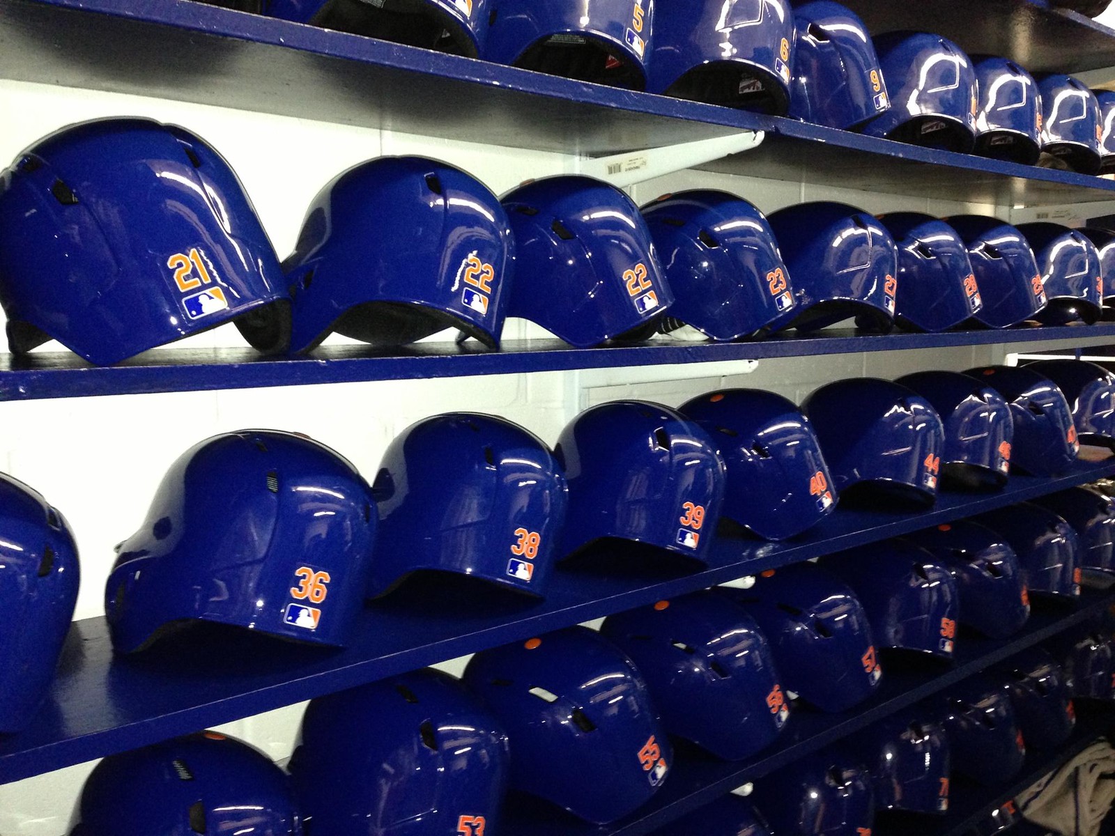
Click bottom photo to enlarge
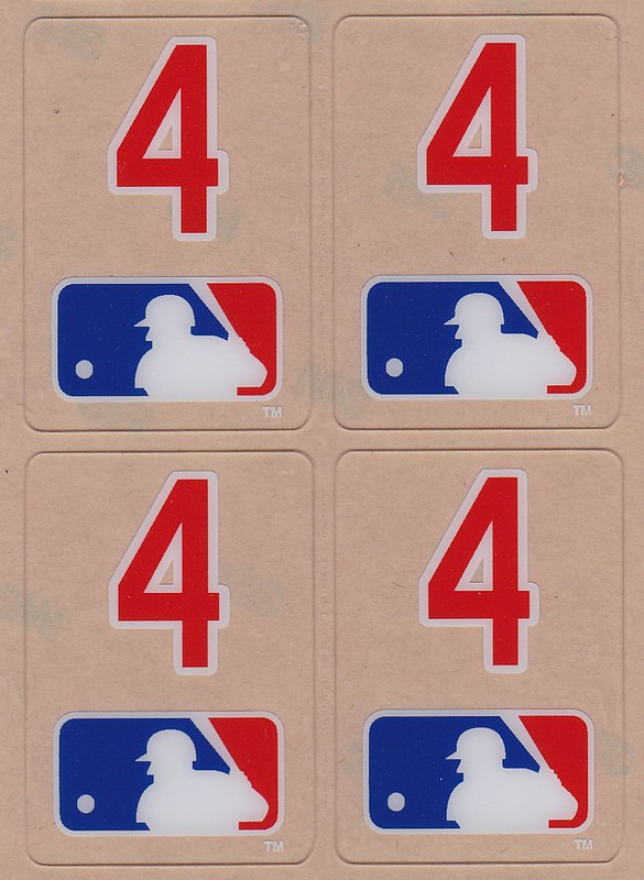
Yesterday I Ticker-linked to a screen shot indicating that the Mets had added uni numbers to the back of their batting helmets this year. As you can see in the images above, that is indeed the case. The interesting thing, as you can also see, is that each number is combined with the MLB logo on a single decal. I’m not sure I’ve ever seen that decal format on an MLB helmet before.
The numbers will replace the Dymo tape nameplates that the Mets have worn on their helmet brims for many years. Those will no longer be used. (Judging from the bottom photo, however, it appears that they’re still using the raised helmet squatchees.)
All of this comes from Pro Helmet Decals honcho David Sulecki — the same guy who makes all the bat knob decals — who says the idea of combining the numbers with the MLB logo onto one decal came from Mets equipment manager Kevin Kierst. It’ll be interesting to see if any other teams go with this format.
Meanwhile, Sulecki also has lots of news regarding bat knobs. One at a time:
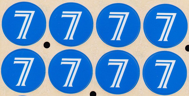
• The latest MLB team to go with the knob decals is the Blue Jays:
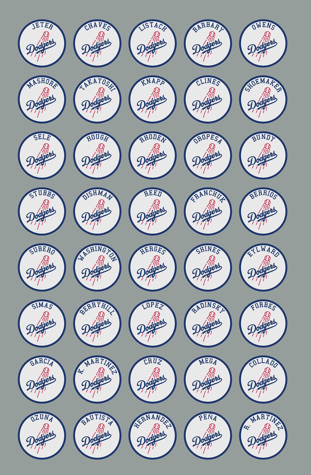
• The Dodgers requested decals for all of their minor league coaches’ fungo bats (click to enlarge):
• A bunch of college teams have also adopted the bat knob designs (if the slideshow below doesn’t work, or if you’re on a mobile device that doesn’t support Flash, click here):
The interesting thing about those college designs is that the one for Memphis is oval, not round. “That’s because they use the Baden Axe bat team-wide, so we had to cut the decals to fit on the knob,” says Sulecki.
• “I was contacted by a couple of minor leaguers — Christian Colon in the Royals organization and Nick Ramirez with the Brewers — about doing bat knob decals for them,” says Sulecki. “As minor leaguers, they can be moved around and have their numbers changed, so they preferred to use their initials or name for the most part, rather than numbers.” Colon and Ramirez then told a bunch of their fellow minor leaguers, and Sulecki ended up doing a bunch of these personalized knob decals for them (if the slideshow doesn’t work, click here):
Finally, there’s one more decal-related news item, but this one has nothing to do with Sulecki: Reader Marc Bauche sent me this photo of Blue Jays helmets with front numbers in a very unusual spot. Note that those are all double-flapped helmets, so I’m assuming they’re all for minor leaguers. Still, it looks very odd, no?
Collector’s Corner
By Brinke Guthrie
We get a varying amount of reader submissions to Collector’s Corner. A lot of the times, the auction is almost done and won’t be live when the next CC column rolls around, or it’s already expired. Which then brings us to the subject of our Most Prolific Sender-Inner.
Michael Clary gets up in the morning, goes straight to his computer, and starts pounding away on eBay. How else could he generate the massive number of auction submissions he sends in? This time around, he tipped us off to a 3-D Bengals helmet pin. And this Super Bowl II pennant. And this Kansas City Chiefs blazer. And finally, Michael discovered this eBay seller who sells football helmets with baseball logos. You can see the Mets, Giants, White Sox, and Yankees, among others. The same seller also offers NFL helmet prototypes and helmets with the original team colors.
All that is from Michael Clary. PL, this dude deserves a Uni Watch Profiles showcase.
Now on to other CC matters:
• Take a look at this really nice 1980s Astros tequila sunrise jacket. Got that Sand-Knit vibe.
• We’ve got a 1970s NBA mini-gumball kit, and it looks to be in great condition.
• Nothing new this week on those great NHL poster designs we’ve recently seen. But here’s a Stan Mikita promo poster for Northland sticks, and a Finnish Guy LeFleur Koho poster also from the same era.
• Can’t beat these mid-1970s NFL Media Books.
This auction is for a 1970s NFL logo poster, but the logos in question look more like 1960s to me.
Seen something on eBay or Etsy that you think would make good Collector’s Corner fodder? Send your submissions here.
Uni Watch News Ticker: Yesterday’s MLS unveilings were for the Philadelphia Union (additional info here) and Toronto FC. ”¦ Some sensational late-1920s women’s softball footage — including a great jersey with a script “Clerical” insignia — toward the end of this video clip (from Robin Edgerton). … Football-style batting gloves, with the composite team logo on the palms, have made it to MLB — ugh (from Jay Sullivan). … The U.S. Postal Service won’t be selling apparel after all. … Here’s an interesting diagram showing how a Lafayette football locker should be arranged (Jay Sullivan again). … Alex Hider wrote a piece about player tattoos on the Ohio University basketball team. … Tail Wags Dog Dept.: A small note in this article indicates that Nike would like Darrelle Revis to stay with the Jets. If you can figure out why that should have even the slightest relevance, you’re way ahead of me (thanks, Brinke). … Reprinted from yesterday’s comments: Here’s a good video clip showing a tour of the Majestic factory. … The Pope will continue to wear white after he retires in a few days. … This is pretty funny: Mike Woodson wearing a Mike Woodson shirt. “I’m surprised Rickey Henderson never thought of it,” says David Teigland. … The Clemson baseball team has a separate cap design that’s only worn when the team is going for a series sweep. The opposing team must love that (from Cory LeFevre). … Ottawa’s first pro basketball team will be called the Tomahawks. “If you go to the poll at the bottom of this page, you’ll see that a lot of people think it’s a pretty racist choice,” says Adam Sadinsky). … In a related item, Ottawa’s new NASL team will be called Ottawa Fury FC (from Matt Walthert). ”¦ Dartmouth lacrosse has added a “PS” helmet decal for former assistant coach Paul Schimoler, who recently died of cancer. “The letters are in red on a black background, which is a nod to Schimoler’s All-American career as a goaltender at Cornell,” says Tris Wykes. ”¦ There’s a blog devoted to superimposing the Nike swoosh onto fine art images (from Jon Grossman). ”¦ Super Rugby matches played in New Zealand will feature refs wearing pink (from Eric Bangeman). ”¦ Gumball helmet maven Bill Jones checked in with a status report on the state of the hobby: “For 2012 alone, there were over 200 new and/or revised helmets introduced. For 2013, we are already seeing new helmets as part of recruiting. I find this interesting from the standpoint of the impact on the collector and the DIYer, as it’s becoming difficult to keep up not only with the volume, but also with the technology — carbon fiber, chrome, sublimation, etc. are making it very difficult to maintain the hobby.” ”¦ Bill also shared some info on a new project he’s working on: “I have been working with three other fans/historians of the old World Football League (1974-75). With the 40th anniversary of the founding of the league upcoming in 2014, we have decided to develop a set of classic-looking football cards for this once-promising league. We have selected the players, designed the cards, hired the printer, and recently opened a temporary web site for this project. Our hope is to sell the cards in the coming year and then develop a set for the 1975 season, ready in time for 2015.” ”¦ Happy birthday to longtime reader, ace uni designer, and all-around swell guy Todd Radom, who turns 49 today. See you soon for our annual springtime get-together, buddy!
Happy Birthday, Todd!
this passage in the ohio u tattoo story made me laugh since it ties into another uw theme:
“Uninformed Buckeye fans may be disappointed to learn what garnishes Offutt’s left arm […] While the untrained eye may mistake the school’s logo with that of the University of Wisconsin, Offutt assures that it is his “high school W.””
he got the unoriginal/knockoff motion W tattooed on his arm. so much for unique ink
“This is everything basketball will get you,” he said as he pointed to the diamonds and stars on his forearm. “It’ll make you money.”
“Get a tattoo. It’ll be a constant reminder of the one you love, see? What the… Starland Vocal Band?? They suck!”
The Mets have already made those little pieces of tape with the players’ names into a tradition. Why change it? And while those stick-on numbers in the Mets’ block font look OK, I can’t see why the equipment manager had to add yet another stupid little MLB logo to the uniform, as if there weren’t more than enough of the little critters floating around already. And he even added a tiny (TM) to show that it’s trademarked!
Get rid of that annoying thing. If we ever forget what league we’re watching, we can move our eyes down about six inches and see another MLB logo on the jersey collar. And if that’s not enough, we can wait until the guy goes back out to the field and look at the back of his cap. Or the collar of his dugout jacket.
Can you tell that I hate seeing that logo all over the place?
And while those stick-on numbers in the Mets’ block font look OK, I can’t see why the equipment manager had to add yet another stupid little MLB logo to the uniform, as if there weren’t more than enough of the little critters floating around already
He didn’t “add” the MLB logo to the back of the helmet — it was already required to be there. He just consolidated the number and MLB logo onto one decal, instead of having to fuss with separate decals.
It was already required? I hadn’t noticed. In that case, I forgive him. I don’t forgive Bud Selig, but I forgive the Mets’ equipment manager.
My favorite bat knob design will forever be Billy Ripken’s!
Never happened, remember?
link
Just came across my feed. Hadn’t even heard they were starting this league.
link
The Ottawa NBL team is already reconsidering the TomaHawks name, due to yesterday’s backlash:
link
Meanwhile, the Edmonton Eskimos continue to go completely unnoticed by the Native Outrage Machine.
Let’s clear something up about the Edmonton Eskimos, shall we? The term “Eskimo” is actually an American term that is used to descibe the native people of the north in Alaska only.
The term “Eskimo” was deemed derogatory by the Inuit people of Canada, so they don’t recognize the team as representing them because they have made it clear time and again that they are not “Eskimos”.
The Inuit have also made it clear within Canada that they differ greatly from the First Nations peoples, and do not involve themselves in First Nations battles. The Constitution Act of 1982 designated them their own distinctive group of aboriginal Canadians, and they do not identify themselves with the rest of the First Nations peoples in Canada. Any gripe they have with the government is solely their own, and they stay out of any “Indian Affairs” problems that the First Nations and Metis people have.
In other words, the Tomahawks’ naming issue is not their battle to fight.
I think you mean “Eskimos’ naming issue” in the last sentence.
I don’t disagree with you, but the question is still a good one and one I think we’ll be hearing more about in the future.
Why would we hear more when the only groups that could possibly be misrepresented are American aboriginal people in Alaska? The CFL’s Eskimos use a polar bear as a mascot, and have never in their history used any sort of native imagery to represent the team. I fail to see how anyone is going to be offended in any way when the American government recognizes the aboriginal people of Alaska as “Eskimos” in their dealings. Fix the White House before going after the CFL.
As for the last sentence, it was written exactly as it reads. The Inuit want nothing to do with the First Nations peoples’ and government’s ongoing disputes over everything. “Inuit negotiations for self-government are distinguished from First Nations negotiations by the cohesiveness of Inuit culture across the North and their shared goals for regional self-government.”
In other words, leave them out of it. They’re happy looking after themselves.
Collector’s Corner is awesome except it draws attention to cool items and causes the prices to go up. I like finding the oddball items and swooping them up because no one else was looking for it. It’s weird but I actually saw that Mikita poster yesterday(there is also a Bobby Hull one). I hope it doesn’t go too high now.
Sorry. I was reading this and forgot to start a new thread.
I found it interesting that the team had a “Guess the name” poll. So, it’s not as if the fans had a say, initially, in the matter. The team had already decided what they were going to go with.
In the Ottawa case, it’s odd that we’ve often heard “it’s less about the name itself and more about the imagery,” when this particular team wasn’t even using imagery remotely related to the people who would (rightly) be offended by such imagery if it WERE being used.
That said, I can understand if most people’s first connotation upon hearing the name was the hatchet-like weapon. And with perception being reality, you can explain “No, it means tomahawk dunk” all day long and it won’t really matter.
Good rule of thumb: if you have to explain your name and/or logo, you probably haven’t thought it through. Simple is best.
I really do not understand the big deal with the team name tomahawks. It’s not like its a tribe name or derogatory Native American term, it’s simply, basically a tool/weapon. Now you could compare it to calling a team “the guns” or “bombs” or something stupid like that, but that’s a completely different argument. What is racist about calling a team something that people use? Should we change the name of the dunk also then? I support changing redskins and even possibly Indians and I’m an Indians fan, but this seems a little out of context.
Again: word association.
For MOST people (I’m going to bet) you say Tomahawk, they think “weapon I saw in a western movie,” with “missle” maybe coming in a distant second.
And if you have to explain your name, logo or joke, it’s not a good name, logo or joke.
The rationale is that it perpetuates the ages-old stereotype of Native Americans (in this case, First Nation people) as being good for nothing but war and mayhem. “Savages” was the term used quite a bit.
Now, if you’re not a member of a particular class of people who’ve been marginalized (at best) or persecuted and (in the case of those who were in what is now the United States first) victims of genocide, I can see where it would be difficult to imagine why those types of things are a big deal.
Like I always say, white males of European descent aren’t exactly the best judges of these things, even though they think they are. And they’re usually the first ones to bitch about political correctness run amok.
“…white males of European descent aren’t exactly the best judges of these things, even though they think they are. And they’re usually the first ones to bitch about political correctness run amok.”
Careful… your stereotype of white males may be construed as more offensive than a team named after a tool.
New news on chopping the Tomahawk.
link
Boy, today’s edition is a fabulous collection of items I find inconveniently absorbing. I gotta leave in five minutes for a racy symposium on internalizing the social externality costs of fossil fuels by means of a carbon tax or a permit-and-trading scheme. I mean, c’mon that’s what they pay me for. But really, I want to see that 15-minute video of 1920s women liberated by softball, I want to examine (scrupulously) every single bat knob logo [surprised at how many I like; whose is the shamrock w the number 5?], I want to check out the MSL shirts, especially Phila, I want to look into the brouhaha over the Ottawa Tomahawks, I want to dive into the guide to the tattoos sported by the Ohio Univ basketball players (an excellent idea, which I’d love to see applied to NBAers), and, finally, I want to know more about the anal-retention problems of the Lafayette football staff, who might want to direct their energies to solving the problem of being beaten like a drum every year by a certain gridiron power with which I identify.
You know, a carbon tax is really a very good idea.
whose is the shamrock w the number 5?
Notre Dame, natch.
A well designed carbon tax is a great idea. A carbon tax that extracts rent from the wrong people without reducing emissions is a terrible idea. Its a hard thing to get right.
“You know, a carbon tax is really a very good idea.”
~~~
Yes, it is. Better than cap and trade. But like Mr. Styczen says, if it’s not implemented properly and emissions aren’t reduced, it’s terrible. Make sure you get it correct, Mr. Nugent.
Roger that.
Star Whoops!
Nerd alert meets hockey alert.
link
That’s either a minor offense to the sensitivities of cellar-dwelling Jedi or a major preview of what JJ Abrams has planned for the next trilogy?
The Flyers just re-acquired Simone Gagne…I hope Harry Zolnierczyk hasn’t gotten too accustomed to wearing #12.
According to Sarah Baicker, “Z” was wearing 37 in practice today. Looks like Gagne is indeed reclaiming #12.
Thank you Paul (and BurghFan) for the very kind birthday wishes! Having lived in the northeast my entire life I can say that a late February birthday is annually linked to gray, cold, crappy weather and a general sense of longing for the coming spring. Thank goodness for Spring Training and all those bright BP jerseys, a much-needed visual boost, much better than cake.
I have to say i like the front number placement on the Jay’s helemts. I was never fond of placing the number/name towards the edge of the brim. I always thought it made the brim look front heavy. Like as if the number/name was ready to tip over the edge. With the Jay’s format, I am much more at ease about the security of that number/name staying on the brim;)
I’m happy for David Sulecki’s success, but I have to say I can’t get on board with bat knob decals. To paraphrase rpm, “fixing something that ain’t broke.”
i was thinking the same thing.
it’s absolutely cool he’s taking this idea so far, and he can really consider me a fan…
however, maybe all these great looking bat knobs just makes that random “sharpied” number on the bat that much more charming.
i’d sharpie my bat and stick one of those decals on my laptop for sure!
You know, RyCo, I always pictured your laptop link. ;o)
closer than you think…
link
lots of real estate up there for an “HBIC” sticker ;-)
I have a magnet if you like. LOL
I’ll check into my business card supplier and see if he can run me off a pile of stickers. Either way, I’ll see if we can add one to that growing pile of “sticker bling”.
Is the logo on the Chiefs blazer backwards? Doesn’t the arrowhead point the other way? Perhaps it was like that back then (I didn’t research it)
I’m liking those mini helmets. Think I might order some of the baseball ones and the Cleveland Browns ones as well.
The Chiefs used the backwards version of the logo a bit more back in the day. Just look at the infamous Hank Stram highlights from Superbowl 4.
Ahhh…I see. I never really noticed it before, but it’s the first thing that caught my eye when I saw the blazer.
I assume the Blue Jays’ Melky Cabrera will get a new bat knob decal; he was still using bats with the SF Giants bat knob decals as of Sunday.
The football logo poster must be from 1969 because the leagues are still separated and if you can enlarge the uniform illustrations, the Eagles seem to be shown with a white helmet.
I wrote to the guy selling the poster and he has changed the listing…
Re.: Majestic factory video.
The tag on Derek Jeter’s pants is “2 Jeter’s 35-40 36 OB ’13”.
What does 35-40 and the OB indicate?
35-40 means the waist size. 36 is the in-seam. As for OB, isn’t that Outer-Belt?
35 = waist size
40 = not sure what it’s a measurement of (knee circumference was mentioned in the video) but I’ve noticed that the higher this number is relative to waist size, the baggier the pants will be.
Dunno about OB either; some pants don’t have that listed while others do.
I’m not at all a soccer fan, but I really like the Philadelphia Union paying tribute to the Bethlehem Steel FC with their 3rd jersey. Very cool.
I agree. It’s a pretty terrific idea.
My only quibble is the placement of the “B” on the shirt hemline. This seems to be a new Adidas trend (the Texas flag is in the same place on the Dynamo shirts). It doesn’t look right to me.
It does take some getting used to. It appears as though they’re trying to start a “thing,” which, I guess is how all “things” like this start. Remember the first time you saw a logo on the side of a baseball cap in the World Series? Yes, all these years later it still sucks and it’s still stupid, but every uni-related thing we accept now started because someone said, “Hey, what if we put this here?”
It’s Enron Field all over again. Really great design comes when innovation meets necessity, not simply because something “could start a trend.” The Astros stadium features several borrowed elements — limestone arches, meant to evoke the facade at Yankee Stadium; a centerfield hill, a la Crosley Field; flagpoles in play, the way they used to be at Tiger Stadium; a very short porch with a green wall in left (they even had a giant Citgo sign just beyond the outfield) — to try to make their park feel old timey. It is neither old timey nor bona fide.
So I agree, KT. When you stick something where it doesn’t belong, because you can, and maybe someone will pay extra for it, you’re just being aggravating.
If I were a pitcher playing against a team that was wearing “sweep caps,” I’d go Dock Ellis on them. I’d throw at every single guy, until I got ejected.
It’s one thing to wear a “Champions” patch: you earned that. But to wear a cap that celebrates the possibility that you might accomplish something? It’s bush.
Sweep caps. We’re a nation of a-holes.
I could not agree more and thought the exact same thing when I read that. Might as well have the catcher keep a broom by the plate too…
I disagree completely. Perhaps this could have been conducted without alerting the press, and keeping the idea in-house – then, no one outside the team would have ever noticed. Hell, teams at every level could have been doing this under our noses for years. If it motivates the players towards attaining their goal, what’s wrong? From the article, I didn’t take it that Clemson is trying to show up their opponents – more that they just like wearing those caps and have associated their use with a special occasion. Lighten up.
Baloney. Some steely-eyed college baseball manager spends his off season reading The Art of War, and decides his squad needs A Competitive Edge — that’s how these things happen.
If you need a stupid white and purple cap to motivate you to be your best, then you shouldn’t be playing.
You expect this kind of chest beating idiocy in football – football is an essentially boneheaded sport, filled with essentially boneheaded rituals and traditions — but baseball is filled with superstitions and protocols and fear of bad karma. You don’t show up your opponent, or somewhere down the line, you get embarrassed yourself. More immediately, you get a fastball in the ear.
I would have LOVED to have seen Bob Gibson or Nolan Ryan take the mound against a bunch of punks wearing “sweep caps.” Batters would have been cowering in terror.
Dude, it’s a baseball game being played by 18- to 21-year-old college kids – it’s not a life or death war. They are having fun with their uniforms – how is this a bad thing? “Chest beating idiocy”??? Give me a break.
Are you saying a team will try harder because they’re wearing different caps? This is pretty much the difference between being cocky and agressive versus winning with quiet dignity.
Reminds me of the Deion Sanders quote, “if you look good, you feel good; if you feel good, you play good…”
Clemson obviously likes these hats and gets excited to wear them. If I were their coach I’d find nothing wrong with my team getting excited in this manner.
Would you now?
I thought you meant you’d take LSD before you pitched.
My life is surreal enough without it.
Also, my fastball tops out at about 62 MPH, so they would all be laughing at me, anyway.
“My life is surreal enough without it.”
~~~
Heh. ;-)
It’s just like Steve Spurrier always used to say, “It is not my job to stop my team from scoring.” If you don’t like the idea of “sweep caps” then don’t get swept.
Sorry I don’t know how to nest via phone, Paul, but te shamrock: ND was covered (I thought) by blue-and-yellow Fighting Irish design. Does ND do shamrock as well, or could it be St Mary’s or Iona or something? Otoh, ND can certainly overdo things…
My bad — the shamrock is Notre Dame softball.
Notre Dame’s colors are BLUE and GOLD, not blue-and-yellow. They are the colors of the Virgin Mary. After all, Notre Dame is French for “Our Mother”.
My French is a little rusty, but wouldn’t “our mother” be “notre mere?” On the other hand, “notre dame” is “our lady,” I think. It still refers to the Virgin Mary, of course.
You’re right Ed. I got a little ahead of myself when I saw the suggestion that the school’s colors were blue and yellow!
Didn’t Gerry Faust insist that the green jerseys Notre Dame wore on his watch include a blue sleeve stripe, to honor Mary?
Ah, Mainspark. Yeah, my dad is an ND alum, and I know the colors are officially blue and gold. I was just making reference to an old UW brouhaha in which insults were traded about what is gold, what is yellow, and what is athletic yellow. That particular bat knob — like many ND devices — looks pretty darn blue-and-yellow to me. Which I like, by the way.
And the English translation of ND’s full name would be Our Lady of the Lake.
Notre Dame is French for “Our Lady,” one of Mary’s honorifics.
Connie, it’s all good. Many of my family members are also grads of N.D.
It pays to NOT be the nation’s capital! After initial backlash, people have seemed to leave my Johnstown Tomahawks alone.
Truth be told, I think Tomahawks actually works with basketball… you could incorporate a “tomahawk dunk” into the logo with no Native American imagery and be fine.
Speaking of… where do you guys that are anti-Native American imagery (is there a shorthand version of this that’s agreed upon!) stand with terms like “tomahawk dunk” or “ticket scalping”?
Well, since the term “scalper” actually was derived from the Nordic term “skalpr”, meaning top of the head or crown, and was taught to the aboriginal people by the Viking invaders in the early settlements in North America (thanks, Leif Ericsson!), I’d say we have wrongly appropriated a term to a group of people that adopted a practice from another culture. Much like the term “Indian” was wrongly appropriated, perhaps we need to re-examine our historical etymolgy in order to fix the present.
In the UK, ticket scalpers are called ticket touts (rhymes with “outs”). I suggest re-education in terms of changing the term.
Go, Teebz!
I had an English teacher in high school who was an amateur etymologist. He would regularly teach us that etymology was far more important than usage because the vast majority of the English language was “adopted” from other languages.
Honestly, Mr. Monk was a legend. We just thought he was a nerd to the Nth degree when we went to school. LOL
I guess I’ve been served. LOL
“I had an English teacher in high school who was an amateur etymologist.”
~~~
There are professional etymologists?
In many schools, proper English and US History instruction has been replaced with foreign language and culture appreciation courses.
If a foreign language is taught properly, it gives you an appreciation and deeper knowledge of your own. Even languages such as Latin and Greek give you insights as to English etymology. A similar argument can be made for learning foreign cultures.
((Plants tongue in cheek)
When do we start renaming the states with Indian names?)
Damn right!
What becomes of “Indiana”? Do they just become “A”? (TPFIC)
There are states with Indian names… Illinois, Iowa, Minnesota, the Dakotas, etc., no?
Brendan Gallagher of the Canadiens has given #73 to recently-acquired Michael Ryder. Look for Gallagher in #11 against Toronto. Ryder has stated he’ll do something nice for Gallagher for giving up his number.
Following up on my own post, Ryder wore #72 in his first stint with the Habs. Now he’s onto #73, the same number he wore with Dallas. If he were to leave and be re-acquired again, would he ask for #74?
He wore 73 with Boston as well.
Really!? Teebz, you’re normally spot on, but I really don’t think that is correct.
link
There’s Ryder wearing #73 with the Habs while wearing Mission (!) equipment, so you know that was an eternity ago. In the alternative, it’s a blue-white-blue collar, so it’s before the EDGE jerseys. Now especially since Ryder was a Habs’ farmhand, he was probably GIVEN #73 at first, only for him to adopt the number as his own. Because why the hell would you voluntarily switch from #72 to #73?
To my knowledge, Michael Ryder was, is, and probably will always be, #73 in the scorecard, without exception in the NHL.
I was way off. Erik Cole wore #72, and I totally put Ryder into the image of Cole I was doctoring up.
You’re right, Mike. He always wore #73. I’ll be out back awaiting the pistol-whipping for messing that one up. But it is odd that #72 was swapped for #73. LOL
It’s all good, Teebz. If Nick Lidstrom can make a mistake in 1997, then so can anybody at any time.
But you and everybody else knows I’m a Habs fan, and as one, I’ll take any way to say we one-upped Dallas, no matter how frivolous! ;-)
//But seriously, we cleared cap space, got a draft pick, AND got just a little less left-handed!? OLÉ!
Wait, the Habs actually have numbers below 30 that aren’t retired?
In doing some additional research, Shane, Ryder actually wore #30 for a couple of preseason games around the 2000-01 season. :o)
In more hockey jersey number re-acquiring news, Michael Ryder is getting his #73 back from Brendan Gallagher, who will take #11 and some friendly compensation from Ryder. The unofficial new record for highest jersey number to be purchased by a teammate in the four major sports? It is certainly 15 units more than Jonathan Papelbon and Antonio Bastardo for the Phillies #58.
Here’s something from the “Too Soon?” file that might make you shake your head. Hockey Canada has decided to partner with LIVESTRONG, and link for its opening game against the US on April 1 at the 2013 IIHF Ice Hockey Women’s World Championship.
Personally, I hate this uniform with deep burning loathing. Huge mistake by Hockey Canada. But then again, Nike does outfit them. AND STOP WEARING BLACK AS YOUR PRIMARY COLOR FOR MOTHERLOVING SAKE, CANADA!
2(Go, Teebz!)
Make that “April 2”, not April Fool’s Day. Although with that uniform…
Yeesh, with a look like that, you’d think it was time for the Hamilton Tiger-Cats to get a shout-out after the Sask Roughriders got theirs.
//Stick to red and white with your black trim, eh?
The knob decals blend right in with the metal bats – but it’s ridiculous the NCAA allows those bats to be used – switch to wood.
Is there any reason other than “I don’t like the PING sound” for them to make that switch? Metal bats don’t break and fly into the crowd, so they’re safer.
They’re safer? Might as well give the pro’s a loaded shotgun at the plate.
I would think cost would be an issue. The aluminum bats are likely more durable.
They are safer. They’re now required to perform like wood bats. New regulations are requiring the ball to leave the aluminum bat at the same speed it would leave a wood bat. See my link below.
They’re not safer for pitchers, since research indicates that the ball leaves the metal bat with more velocity and puts the pitcher at greater risk.
Metal bats are also worse for players with professional aspirations, since they have to switch to wood when they start playing in the minors, and many of them have a hard time making the adjustment, slowing down their development.
And yeah, the ping is annoying.
Think of the trees.
Paul, your first two paragraphs are spot on regarding aluminum bats.
But the ping… I love the ping. Then again, that’s all I knew growing up as a player.
Does anyone remember the April Fools spoof TWIB did where they said MLB was going to switch to aluminum bats and they had these shots of like Bo Jackson taking BP with aluminum bats… could you imagine?!?!
Aluminum bats are now required to perform like wood bats. The new regulations went into effect at the beginning of the 2011 college baseball season. link
Will the New Zealand refs need a “clash” uniform when a team decides to go with a breast cancer awareness jersey?
I’m surprised nobody commented on the swoosh on lafayette’s Twitter icon. Pretty terrible.
I am surprised to see that David Sulecki makes the helmet number / MLB logo decals.
Rawlings supplies the official helmets and also offers these decal kits on their website
link
They claim that the decals are the official decals of MLB. I didn’t realize that there are different ones sold to the public than the teams actually wear.
Where’s Italian?:
link
If he doesn’t reappear, do the Brewers send Randall Simon looking?
“A small note in this article indicates that Nike would like Darrelle Revis to stay with the Jets. If you can figure out why that should have even the slightest relevance, you’re way ahead of me”
Only thing I can think of is: Nike has produced a boatload of Darrelle Revis jerseys or merchandise and don’t want to get stuck with them if the Jets move him at this (late) date? Maybe they’ve produced a Darrelle Revis ad campaign that would go up in smoke if he gets traded?
Considering some of the bigger names on the team like Bart Scott (cut) and Tim Tebow (almost certainly going to be cut or traded) and maybe even Mark Sanchez are former or soon to be former Jets, maybe they banked on the Jets not getting rid of their (by default) best player.
Just a theory.
You’re misunderstanding my point. Yes, I can imagine quite a few reasons why Nike might care where Revis plays. I just don’t see why Nike’s preferences, whatever they might be, should have any relevance to anyone other than Nike.
I wholeheartedly agree. The fact that Nike has the audacity to even make their preference known is pathetic. Wish the Jets, or the NFL, would come out and issue their own press release saying they don’t give a flying f— what Nike wants.
But of course that will never happen.
Sportsnet.ca has a poll up now for the 10 greatest uniforms. link
It’s a tie-in with the magazine special they just put out.
When does your Dolphins column go up?
Week after next.
Dolphins column? What about this? I am pretty well schooled in their logo and uniform history if you have any questions.
New primary jersey for Sporting Kansas City:
link
And new third for Montréal Impact:
link
Who wants a year supply of mustard? All you have to do is find the missing racing sausage:
link
Who wants to play “find the missing sausage”?
They say timing is everything in comedy. That being said, does it ever get old to suggest that Rick Santorum missed the innuendo again?
*Phew*… Guido has been found. I love how the culprits said, “You didn’t see anything.” and ran away.
link
So…now it’s time to play “Hide the sausage” again?
/I crack myself up.
Looks like the “Fly Wire” is still very much alive. This is a sneak preview of the new threads from “Benny”, the Oregon St. mascot.
link
Cardinals facebook feed showed a photo on Thurs 2/28…they use the same number over MLB logo format on their batting helmets, i see. Id like it if it were a lot smaller. It isnt a football helmet, but why keep things simple and understated in logos? Psh.
Hello. splendid job. I did not imagine this. This is a excellent story. Thanks! .See