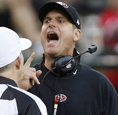
49ers coach Jim Harbaugh (aka the man most likely to suffer an aneurysm during a Super Bowl) has had more than his share of uni-notable moments this season. First he wore one of his old Stanford sweatshirts with a Niners cover-up patch. Then he wore his mock turtleneck backwards.
Interestingly, several readers have recently gotten in touch with me to ask where they can buy a Harbaugh-style sweatshirt. My answer to such queries, of course, is always “I have no idea,” because I don’t follow or care about the merchandising or retailing branches of the uni-verse, and I’m disturbed by the increasing tendency to conflate fandom with consumerism, but I still find it interesting that some people actually look at Jim Harbaugh (or any NFL coach) and think to themselves, “I’ll have what he’s having.” I mean, I realize that’s the whole idea, but it’s rare that I’m confronted with a concrete example of it. Then again, Harbaugh’s sweatshirt is better-looking than what most NFL coaches wear, so maybe that explains it.
Anyway, one of the people who wanted to purchase the Harbaugh sweatshirt was our own Brinke Guthrie, who writes the weekly “Collector’s Corner” column here on Uni Watch. He actually went so far as to ask Nike about the sweatshirt’s availability. Here’s the response he received:
I’m glad to hear that you’re interested in getting a Nike 49ers sweatshirt.
As it turns out, our 49ers sweatshirt that you see Jim Harbaugh wearing is an SMU (Special Make-Up) model, not released for retail sale, but created specially for the coach to wear [presumably so he could stop wearing the Stanford shirt with the cover-up patch ”” PL]. I’ve gone ahead and submitted feedback to our Leadership Team to let them know that we have consumers like yourself who would like to see these become available on the market, as our policies, procedures, and product lineups are heavily driven by consumer feedback. …
I was fortunately able to find a couple of alternative options for you to check out with our authorized retailers, that are similar to the sweatshirt you see Coach Harbaugh wearing.
The “similar” options from the Nike representative were this, this, and this. Not really so similar, but hey, any chance to push the product, right?
Anyway, it’s definitely interesting that Nike would miss a retailing opportunity like this. I mean if you’re making something especially for one of the NFL’s highest-profile young coaches, wouldn’t you also put it in stores? Maybe there wasn’t time to get it into the retail pipeline.
Meanwhile, as long as we’re talking about the Super Bowl (sort of), here are some additional tidbits:
• Yesterday we saw how the Super Bowl patch will look on the Niners’ jersey. Today we have the Ravens. That article also confirms that the Ravens will be wearing black pants.
• Niners running back Frank Gore has been fined $10,500 for going bare-legged in the NFC Championship Game.
• “A friend of mine works for FedEx freight in Tennessee and came across these shipping pallets of Super Bowl paint,” says Dustin Semore. “They’re from World Class Paints out of Leland, Mississippi. From looking at their web site, 90% of college and pro fields are painted with their paint. Looks like they design the special stencils, too.” Fascinating find!
• Some Intellectual Property Isn’t All That Intellectual, Part 1: The NFL has bullied a fan into abandoning his move to trademark the terms “Harbowl” and “Harbaugh Bowl.” Douchebags.
• Some Intellectual Property Isn’t All That Intellectual, Part 2: You know that idiotic move where Colin Kaepernick looks like he’s sniffing his armpit? He’s named it after himself and is looking to trademark the term.
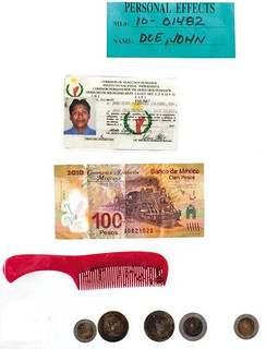
PermaRec update: Personal effects found on the bodies of migrants who died in the Sonoran Desert (some of which are shown at right) are the subject of the latest entry on the Permanent Record Blog.
Uni Watch News Ticker: The Hornets will reportedly announce their rebranding as the Pelicans, complete with a uniform unveiling, this afternoon. ”¦ Yesterday we had a look at the NFC Pro Bowl jersey, and today we have the AFC — or at least a rear view. Looks like the game will be color-on-color. … “Rugby seems to be going through a major shift,” says Caleb Borchers. ” This is how the teams looked for Six Nations tournament in 2011, and this is how they look this year. As you can see, teams are switching from white shorts to colored shorts.” ”¦ Pro cyclists are racing the Tour Down Under this week and their numbers are made of cloth. “Sweet!” says Sean Clancy. ”¦ The Charlotte Checkers (AHL) will be wearing auto racing-themed jerseys (from Adam Jackson). ”¦ Here’s a piece on the story behind UNC’s argyle design. ”¦ Lee David Wilds got his hands on a 1949 Indians scorecard and was nice enough to scan the whole thing for us. ”¦ Blackhawks goalie Corey Crawford was wearing black socks with the team’s red jersey the other night (from Tim Donovan). ”¦ Ooh, check out these old Quaker Oats booklets featuring Babe Ruth (from Gordon Blau). ”¦ York City — that’s an English soccer team — is offering new jerseys to fans who trade in their old ones (from George Chilvers). … We’ve covered this before, but it’s been a while, so it may be new to many of you: Check out the Bills’ mismatched pants striping in Super Bowl XXVII (from John Roshell).
I can relate to wanting to wear what the coaches wear. I’ve long admired that windbreaker Les Miles wears every week (link) and after looking at it so much and thinking, “That’s a nice windbreaker” I got myself one….it’s the only windbreaker I’ve ever owned.
The Ditka Sweater is still very popular amongst Bears fans. I’ll admit I’ve looked for one on numerous occasions & may even end up making it a DIY project.
you’re in luck concealed78, you can get it here
link
I too have been looking for a Ditka sweater forever and have only seen them selling for above $100. The site you posted Andy currently has 50% off all NFL merchandise so I got it for $40! THANK YOU
Thanks, Andy. But I think I’m going to go a cheaper DIY route – $15 for a blank navy sweatshirt & some white & orange tackle twill or some cloth material.
I could be wrong, but that doesn’t look like a real Cliff Engle sweater. I mean – if you care about that sort of thing. My Jints one is a pretty warm wool acrylic mix and it looks significantly thicker.
That stuff would be more appealing to me if I could get it in weird-ass teams like the Denver Gold or the Southern California Sun.
Though not the exact one, my friend went to a mall in San Jose and texted me this photo of a sweater that’s similar enough… and without the Nike logo creep on the collar
link
And I think that photo is just an image of the Pro Bowl shirt
link
Agreed. It didn’t look anything like an actual game jersey and your video link confirms this. Also, is it me or is that last name, ‘WAKE’, completely off center in the pic posted in the ticker?
york city in the EPL? how long have i been asleep?
Oops, my bad. Will fix.
U of Phoenix link goes to yahoo mail login
Dammit. Worked yesterday. Have removed from Ticker.
Since Paul didnt use this in the ticker….
On his podcast this week, comedian Greg Proops was recounting how he went to the first game at the new Giants ballpark in 2001 to see Barry Bonds.
And he referred to the stadium as
“Corporate Fuck You Fucking Eat a Giant Corporate Ass Dick Covered with Fucking Ants Ballpark”
i figured yo
That’s pretty awesome!
Not exactly uni-specific, but the Nativerse was abuzz overnight with the team’s declaration that there will be “a presidential announcement” on Saturday at FanFest. I’ve been hearing rumors since September from both team sources and the beat writers that the Nats are looking to add a new president to the fourth-inning mascot race, and a reliable source yesterday told me that it will not be the one I was hoping for. Speculation is focused on JFK, since the Nats had a racing-presidents style Kennedy join the race once a while back, and on whether the new racing prexy will be an addition or whether it will be a replacement with Teddy being retired.
Here’s a link to the JFK mascot that joined the race once in 2011:
link
Could be the biggest news in mascots since Chorizo joined the lineup in Milwaukee.
Is it a little weird that two of the presidential mascots were assassinated, and one became president as a result of assassination?
Forget JFK and the Mount Rushmore guys. I vote for Millard Fillmore, Chester A. Arthur and William Howard Taft.
Only one of the current racing presidents was assassinated: Abe Lincoln. Washington was shot at plenty of times as a soldier, but not as president, and Jefferson served uneventfully and died at a ripe age 17 years after leaving the presidency. Teddy Roosevelt was shot at by an assassin, and wounded badly, though not so badly that he couldn’t go ahead and deliver a long speech before seeking medical attention, but this happened four years after he left office.
The assassination thing is one reason I hope the addition is not JFK. Ike or Taft (built-in rivalry with Teddy!) would be much more interesting choices, from a mascot-design point of view.
You could have william henry harrison, who drops out after the first turn,
When I worked at the shop doing the Ravens jerseys in the late 90’s, the team gave all the employees a Nike fleece that was only made for the coaches. I still have it to this day and it is by far the best fleece I own!
Frank Gore looked absolutely ridiculous last weekend and deserved to be fined. While many think the fine, and the NFL’s hard line on uniform infractions are too tough, I think the NFL is doing the right thing. If MLB would enforce a similar uniform standard, we wouldn’t be subjected to the clownish-looking long pants/no socks fashion that is so prevalent today.
Question from a neophyte: How are football pants altered to the bicycle short look? Is it a matter of folding, do players just ask for shorter pants or are manufacturers in on it? I agree, the look is ridiculous. But if it’s either of the last two options, other fines need to be levied to the conspirators.
I notice that the Cowboys and Bills were not wearing Superbowl patches. Was that an option back then ?
Super Bowl patches were first introduced for the 1998 SB (Packers/Broncos)
That is incorrect. The Giants and Bills wore patches in Super Bowl XXV:
link
link
Can’t believe I forgot about that after seeing Scott Norwood for so long. I wonder why they had it for that one year and not have it the following year.
…as a way for the NFL to make more money on “exclusive” jerseys.
Super Bowl patch
link
The patch was only worn for that one year because that was the 25th Super Bowl, or 25th anniversary of the Super Bowl. Then it was added in ’98 for Broncos-Packers as a yearly thing.
Obviously it’s hard to root for the NFL over a regular person, but I find it pretty hard to have sympathy for the “Harbowl” guy’s right to trademark squat.
Rather than first demanding reimbursement from the NFL for filing costs, then trying to extort Colts tix before ultimately caving, had Fox immediately sought counsel and/or penned a carefully worded reply that basically told the NFL they’d face a counter suit (for harrasement?), the NFL may have actually paid him for the rights or to stop pursuing the trademark?
I have my doubts. The NFL maintains one of the most aggressive and competent in-house counsel offices in American business.
He instead should’ve just taken his $1000 and gone to Vegas and wagered it on Baltimore & San Francisco meeting in the Super Bowl.
“York City – that’s an English soccer team – is offering new jerseys to fans who trade in their old ones”
Bet those fans don’t have to worry about counterfeit jerseys, huh?
I can’t see sweatshops in the orient churning out York City shirts by candlelight, to be honest
The ‘orient’?
Leyton Orient.
Cue Tijuana Taxi by Herb Alpert.
“I still find it interesting that some people actually look at Jim Harbaugh (or any NFL coach) and think to themselves, “I’ll have what he’s having.”
No joke, the Pats sell the sideline hoodie for like, $65. For an extra $10, a member of the team’s equipment staff will cut the sleeves, ala Belichick, and you get a COA saying that said member of staff cut them for you.
Even as a Pats fan, I think it’s fucking dumb: link
That’s… deplorable.
I always find it strange that stuff gets marked up for being mutilated (faded/ripped jeans, cut sleeves on hoodies).
I mean, I get why. It’s just kind of counterintuitive.
Just goes to demonstrate one should never underestimate the gullibility of consumers.
Flip: word.
I believe Dave Berg addressed this topic in “The Lighter Side of Fashion”, Mad Magazine, June 1972.
Nice, I’ll have to check that out on my MAD archive! I love me some Lighter Side of…
I love that name. Dave Berg. It’s a good John Houseman name. Dave Berrrrrrg. Mr. Berrrrrrg.
link
Well there goes my chance to make a joke about being bummed out that I can’t pay Nike or a team for the chance to look like a homeless person / Sith Lord like Belichick…
Re the current Catch of the Day, I give you
link
Holy crap, what an awesome find (both the COTD and your link).
I don’t love brutalism (I don’t know if anyone really does) but I have a certain respect for the architects of the time with their audacious designs. Definitely more interesting than the bland glass curtains of the last 20 or so years.
The Ellicott Complex at SUNY-Buffalo is classic brutalism:
link
My dad was a construction worker; he spent years working on the SUNY campus. Every day, he’d come home, griping about the “hippie buildings with the roofs that are gonna leak like crazy.”
They put a brick facade on the concrete.
New gold alt jersey for Brewers.
link
Mmm, beer.
At least it’s not yet another rehash of the ball-and-glove (which is vastly overrated, IMHO).
If you mean “vastly underrated”, then I agree.
Completely original & creative, great color scheme, instantly recognizable. The world needs more great logos like that.
Interesting. Almost the color of beer…
That uniform color is referred to in Milwaukee not as gold but as “Lager”.
I’m sorry, but that’s an ugly jersey. The Brewers have a terrible color scheme & generic wordmarks.
I can’t help noticing the Brewers’ wordmarks would be improved if they got rid of the fussy drop shadows and rendered everything in the old blue and yellow color scheme. The hats ought to be the ones Hank Aaron wore. Simple, classy. And don’t forget the yellow sanitaries.
Agreed. I would take it one step further & somehow incorporate either this (I’m assuming made-up logo) of barrel-M, or the Wisconsin state patch, the latter form designated just on team jackets.
link
Here we go: game-worn jacket with the original Wisconsin state-M patch:
link
Sadly, the Brewers began their quest of mediocre & generic workmarks in 1994 with the dreadful “Motre Bame” scheme. Another fatal victim of the 1990’s merchandise grab.
Wow. I can’t agree with that at all. The 1994 uniforms were’t good, but the 1996 tweaks resulted in a fantastic set of uniforms for the club, only a couple minor tweaks from perfection.
But as far as those jacket patches go, You’re right that the barrel-M is “made up.” It was designed for the Cooperstown Collection in the late 1990s as part of this logo. I don’t know when it started appearing on its own, but it was sometime in the last five or six years.
The state-M patch was worn by the Brewers on their jackets starting in the mid-1970s. It continued until the early 1990s, when the M was replaced by the ball-in-glove. That version only lasted a couple seasons before the 1994 re-brand wiped it away.
As far as the wordmarks go, I don’t see how you can call the 1990s versions “generic”. They were a logical update of the link, putting a link that worked very well with the city’s architecture and heritage. I’ll admit that the double-outline was pointless, but I would have stripped green entirely from that set. That’s one thing the current uniforms got right.
You can’t say the same about the wordmarks, unfortunately. I cannot express how much I hate the link in a wordmark that already has an outline and another drop-shadow. The back of the jersey link since the name and number don’t have that extra shadow cluttering them up.
Again, to me it looked like the Motre Bame Germans than the Milwaukee Brewers. Maybe the uniform script was better (tho I never liked it; especially the 1994-96 version) the colors are all wrong & the cap & link was bulky, generic & boring. It’s not inspired at all – at worst it looks like clipart.
Maybe this 1997-99 wordmark is better but not much different than the 1970-89 wordmark:
link
Couldn’t agree more about that primary logo, but could have been easily fixed (preferably by the triumphant return of the link).
Love your recolored wordmark That would have been great; revised scripts in original colors.
Best thing about the 1996-1999 wormark was the clear lineage with the 1970-89 blok letters while being distinct and individual. Not so different? Feature, not a bug.
For a softball top, that’s awesome.
It mystifies me when people call the current Brewers unis and marks “generic.” Can someone name all the other teams that look just like the Brewers?
However, big mistake to add the new IPA-colored jersey without removing one of the team’s fifty-six other existing alts. The Brew Crew is worse than the Twins at this point with regard to alt proliferation.
It mystifies me that someone thinks the current Brewers look is not generic. It looks like the Milwaukee Miller Brewing Company sponsored a softball team. It’s just a bunch of over-outlined & blockshadowed scripts. Where’s the mascots? Where’s the state logos? Why the Notre Dame color scheme? How many navy blue teams do we need? They might as well play in Myrtle Beach.
Considering what they’ve had in the past, the current set is an absolute dud. Lifeless & generic.
So they’re “generic” but you can’t actually name another team they resemble or that they might be confused with by a casual spectator? As a wise man once said, “I don’t think that word means what you think it means.”
If the complaint is that the Milwaukee Brewers look like a beer brewery’s company team, that would be an example of Overwhelming Design Victory. Personally, I think the Brewers can and should look even more like a brewery company team. See for example their immediate previous unis, though the cap logos of that era never worked.
And it’s not like predominantly royal blue is the height of distinctive baseball uniform design, even within the team’s own extended metro area. Though I personally agree that the Brewers would look better with brighter colors.
I’m really just arguing that “do I think it’s pretty?” and “is it generic?” are two different questions. The Brewers may or may not be ugly, but I’ve never seen anyone even attempt a serious argument that their current uniforms are generic, in the sense that “generic” is an actual word with a particular definition having to do with lack of distinctiveness, rather than a shorthand for “I don’t think it looks pretty.”
Well, I think using Times New Roman for the numbers puts them well down the road to “generic”.
I basically agree, Chance, though again: Name the other teams that use Times or similar types for their numbers? The numbers are just about the only thing I actively dislike about the Brewers unis – BTW, it was your arguments that convinced me to give the mid-90s unis, which I didn’t like at the time, a second chance – but I think a case can be made that they’re one of the most distinctive, which is to say non-generic, elements of the uniform. Distinctively bad, to be sure, but distinctive nonetheless.
link 1. of, applicable to, or referring to all the members of a genus, class, group, or kind; general.
It looks like a generic parody of a beer company. A non-sports fan would look at that & say, “what, that’s a baseball team & not an actual beer company?” To me, that does not scream a good baseball brand. Barrel Man has much more ingenuity & instant recognizably. The current Brewers marks do not. There is such a thing as overdesigning, which the Cincinnati Bengals come to mind. You don’t need tiger stripes sporadically ALL over the uniform to repeatedly knock people on the head that “yeah, we’re [the] Bengals”, which is exactly what the current Brewers uniform does. It’s trying to be too obvious about the fact.
There’s nothing traditionally Milwaukee Brewers about it that ties it in from previous sets. Navy & gold, an unbalanced exercised in large & small cursive or freehand letters & underscores. In its current form, the Brewers script is poorly generated, & it doesn’t really work at all on “Milwaukee”, which is too long to be rendered that way.
It doesn’t look like the Milwaukee Brewers baseball club of MLB, it looks generic like Milwaukee Miller Brewing Company – like more like corporate advertising in the shape of a baseball uniform. There is nothing brilliant or remarkable about the Brewers current set, and it is completely unsatisfying. In fact it looks very Minor League-ish to me. MLB in general has a navy blue problem & the Brewers are part of that problem. Nobody else has royal & Athletic gold and it looks like the Mariners will never go back to that. It’s time for the Brewers to go retro full-time.
Concealed, you keep offering a series of very specific things that you feel the Brewers look like. Which is fine! Valid points even if I don’t agree with all of them. But the very specificity of what the uniforms say to you – “Why, that could be the logo of any company that brews beer in the city of Milwaukee!” – flatly contradicts the use of the word “generic” as I understand it or as you yourself define it.
(Also, if a team named the Milwaukee Brewers has uniforms that even a harsh critic of those uniforms admits remind him of a brewery, in Milwaukee, I maintain that this counts as evidence in favor of the quality of the design, not against. If the team’s uniforms reminded Concealed instead of a steel foundry, in Pittsburgh, that might be an indication of poor design!)
BTW, Concealed, I hope my tone hasn’t been too serious. Your arguments have made me think and rethink some of my own aesthetic assumptions. Thanks for making it a fun argument – if we we in a bar, I’d buy your next round!
Anyone else find it slightly appalling that the Brewers now will have 6 ‘regular’ jerseys, not to mention the numerous one offs that’ll be worn?
I do.
Their regular identity is bad enough, but then it’s completely muddled by all the alts, which are now no longer even limited to team colors.
Time to scrap the whole thing and start from scratch.
Ummmm, but you get a chocolate cookie in the shape of the gold jersey if you buy one. How could you not love this jersey?
link
It’s pathetic. It really is. I don’t mind the uniform, but get rid of some of the other alts. Get rid of the blue “Brewers” alt, and the blue “Milwaukee” alt. Have the Home white, away “Milwaukee” grey, gold alt, and retro alt. IMO that is still too many uniforms, but it’s a start.
Ed Mangan is the NFL field director (done it since 2000). Read a very interesting cover story in an “American Profile” insert yesterday about George Toma, a groundskeeper for all 47 Super Bowls! There’s even a photo of him at SB XXVII, and the entire grounds crew is wearing Zubaz!
Mangan has a day job too- he’s the head groundskeeper at Turner Field in Atlanta.
An interesting fact about Leland, MS – it was the bohood hometown of noneother than Jim Henson. They even have a small museum devoted to him there. Jim created Kermit there. Because of Leland, we have Kermet. Because of Kermit, we have Bonnie Erikson. Who is she? She’s the mother of the Philly Phanatic! link
any Pelican uni leaks? i heard the colors are red, blue and gold.
hope the logo and unis arnt generic like OKC. usally when the NBA unveils new logo/unis it takes me a while to get used to them.
now the real question is when will Charlotte get the hornets name back?
Soon, I hope.
I hope they don’t look anything like the LeBron James-era Cavs unis. At least 21 NBA teams have a red or some shade of blue jersey. If you include the Heat & Bucks alternates it jumps to 23.
it seems to me that navy blue is the most over used color in the NBA.
For a time, the Grizzlies-Nuggets (Navy Alts)- Hawks -and Mavs basically had the same road unis.
im still shocked nobody in the league has the appealing Navy Blue-Burnt Orange color scheme (like the bears, astros, auburn).
Maybe the Pelicans can be heavy on the Gold and use red/blue as secondary (which i doubt).
I want a black and yellow (gold) NBA team. That’s not asking much.
Pacers have been black and gold at times.
link
Pacers wear navy & gold. I don’t think they’ve ever worn black.
Did a google image search. Some of the Reggie Miller era jerseys appear black, or the darkest navy ever produced.
We need something like a 4 or five team name Swap:
Charlotte Gets the Hornets,
New Orleans Gets the Jazz,
Utah Moves to Seattle and becomes the Sonics.
I am not a big fan of the color scheme they have seemingly chosen. How many combinations of red and blue can we get in the NBA? I at least hope the colors are bright. It might be visually jarring, but this is New Orleans we’re talking about. But no, like the leak below, it’ll probably end up being navy and crimson. Boring.
I do hope Charlotte takes back THEIR Hornets, and then go back to wearing jerseys like link. I think I had that exact jersey as a kid. Sure, purple and teal scream “90s”, but so what? That’s who the Charlotte Hornets are. And with Sacramento/Seattle probably returning to green and gold, there’s room for Paul’s Favorite Color to be a part of Charlotte’s new identity.
A work of art.
Logo:
link
From nola.com, so I asssume its reliable.
NO Pelicans logo leak? link
A pointless basketball as the central element of the logo? Check. Colors that in no way connect with the city where the team plays? Check. That’s enough for me to assume that this is a real, actual NBA logo design. Sadly, it will be one of the better logos in the NBA if it is real.
Colors that in no way connect with the city where the team plays? Check.
I’m not a fan of that logo, but the red/gold/navy/white color scheme comes right from the link. Seems appropriate enough.
So… both NBA bird teams will have a logo with a ball in the middle and symmetrical spread wings. Very creative.
From the sportslogos site the leaked video, check out about 3 and half minutes in the Pelicans “Cardinals” uniforms!
link
Yep, link.
More Harbaugh-wear:
I was watching this video of Jim Harbaugh back when he was the coach for U of San Diego and he has on the coolest polo (made by adidas) with football stripes on the shoulders
take a look
link
These were standard issue Adidas polos from 2004-2006
forgot to add, this looks like the closest match to the harbaugh sweatshirt that I could find.
link
His sweatshirt does look a lot like the Crew Fleece linked above. One characteristic that makes it unique from the shirt on eBay is that Harbaugh’s is made with the softer “old school” fleece profile, whereas the new fleece styles Nike has introduced recently have a flatter look and feel to them.
Harbaugh still wears the Stanford version of his sweatshirt–seen it on him recently in local photos.
I swear in two years I have never once seem him wearing anything else, no T, no polo. Nothing. Always the black.
The mem in blazers pod often joke about buying York City and moving them, so they can be New York City.
In fairness to the NFL isn’t the guy trying to trademark Harbowl just using someone else’s name and intellectual property to make a buck?
I’d settle for, “In fairness to a consistent application of the intellectual-property argument against Native American nicknames and logos.” The Harbaugh brothers are no less deserving of control over their names and identities than Chief Black Hawk or the Sioux nation, and if it takes a kind-of-silly NFL claim that “Harbowl” is confusingly similar to “Super Bowl” to uphold the principle, then so be it. It isn’t douchebaggery if the result is upholding an important principle.
Well it really would be more similar to someone going out and trying to trademark “Chief Blackhawk” tomorrow. Part of the sticking point with IP is that the Redskins and ‘Hawks have had longstanding registrations (I found a Blackhawks mark dating back to 1969 which is still active)
link
Once a mark is registered it can’t be overruled unless suit is brought against it. This isn’t a case where a gentleman had a long-standing mark that the NFL was trying to break it. The application was still pending. He was trying to register the name, no doubt in a deliberate attempt to cash in on a potential all Harbaugh Super Bowl.
I don’t know if one or both Harbaughs object (I’m suspect they they do), but the issue was raised by the NFL and was focused on the ‘Bowl’ aspect of the trademark Fox sought, correct?
I’m no law scholar, but the Harbaugh’s would seem to have a more solid legal standing in their effort to maintain “control over their names and identities” than would ‘generic’ American Indians seeking a cessation of (or compensation for) use of wordmarks like “Redskins” or “Chiefs” or “Braves” (all of which are legitimately and properly registered?).
I would note that the NFL are tenacious in their defense of the Super Bowl name and product. So much so most people see it as extreme. For example, you can’t have a “public” showing of the game on a TV more than 55 inches. So, churches, YMCAs, university groups, etc. have been recently finding the NFL suing them if they have a party and use a projector to show the game. Similarly, even if under the 55 inches, the NFL will sue you if you describe such a gathering as a “Super Bowl Party.” Of course if they are showing the game in a Sports Bar or have a “Super Bowl” sign on Budweiser provided signage that is ok. Point is, the NFL will sue any one getting within a mile of the term Super Bowl.
How dare you bring logic into this discussion. There’s no room for that hear. Please move on.
The NFL is complete horseshit.
Brady tries to injure Ed Reed = $10,000
Gore wears low socks = $10,500
If Brady had been wearing low socks while spiking Ed Reed, would the fine have been doubled?
I think that it’s Frank Gore’s second time wearing low socks. That never gets mentioned.
so what, a uniform infraction should never be close to the fine of trying to injure a player, and Brady could have hurt himself doing that as well.
“Brady could have hurt himself doing that as well.”
~~~
Nah. We’d never get that lucky.
Irrelevant – this is like a warning for reckless driving resulting in injury vs. a ticket for over-tinted windows.
I remember in the 80s a writer suggesting the jazz and lakers should flop names.
None other than Frank Layden (ex-Jazz coach) made that suggestion.
WIll the New Orleans Pelicans owner get his new logo made into an automotive badge, and then replace his Bentley’s badge with the Pelicans badge?
I bet nobody would even notice…
That Indians scorecard download is not working – apparently Google/Flickr is having problems with its size
The Pelicans’ announcement in the middle of the season strikes me as odd. It would be even odder if they actually changed name and uniforms in the middle of the season (which I’m assuming they aren’t doing).
Has any team ever started the season with one name and ended with another?
Lots of WHA team did that, Winter.
What about any of the major sports?
If you mean sports that no one cares about like the NBA and MLS, I wouldn’t know. No one follows them.
If you’re talking about NBC’s record ratings and how every game north of the Mason-Dixon line has been sold out, then hockey is certainly a major sport, at least in the eyes of NBC.
Oakland Seals to California Golden Seals after the start of the ’70 season?
Not a drastic change, but an in-season change nonetheless.
Toronto St. Pats near the end of the 1926-27 season became the Toronto Maple Leafs.
Does anyone know why the 49ers SB patch is on the right shoulder and the Ravens SB patch is on the left? You would think they would both be on the same shoulders regardless of team.
Has it always been that way?
I think the standard is that it goes on the left. The Ravens already have the “ART” patch there. Hence it moves to the right.
And that’s left as you’re wearing it.
So to answer my own question I looked at some pictures of the past Super Bowls and I have seen:
SB 46 – Giants: SB on the wearers left, Patriots: SB on the wearers right (MHK patch on the left)
SB 45 – Packers: SB on the wearers left, Steelers:SB on the wearers right
SB 44- Both teams have the SB patch on the wearers left.
SB 43 – Arizona: SB on the wearers left , Steelers on the wearers right (regular logo on the wearers left)
SB 42 – Same side for both teams (wearers left)
Who determines where the patch is worn?
It sounds pretty straight forward to me. On left unless there’s a patch already there.
“…… ‘Rugby seems to be going through a major shift,’ says Caleb Borchers. ‘This is how the teams looked for Six Nations tournament in 2011, and this is how they look this year. As you can see, teams are switching from white shorts to colored shorts.’ … ”
Not as bad as I feared. The Italians look good with the all-color motif, and the Scots too.
Wales, England and Ireland still wear white shorts (in that photo, anyway). Welsh look awesome. The big downer for me is the abandonment of white shorts by France. I love the blue shirt/white shorts/red socks tricolor combo. I’ll miss it. Felt the same way about Mexico’s lamentable abandonment of its tricolor national soccer unis.
Spot on, Conn.
England have fortunately maintained the traditional navy socks with white tops after the nonsense of a few years of red trim. England rugby are white and navy. End of.
Scotland’s all navy is still near enough to tradition, although they usually had white shorts so this is a little bit odd. But we will forgive them.
Wales and Ireland, bless them, maintain tradiition well.
Italy don’t have a long enough rugby history, but have stuck with the azzurro look.
But France? As you say, Conn, blue-white-red : bleu-blanc-rouge. It’s iconic. Why they shun it I just don’t know. Such a shame.
Craig Robinson–he of FlipFlopFlyball.com–has a new-ish infographic, converting MLB cap insignia to Scrabble scores.
link
Awesome! And proof that the Nationals should have a DC alt cap: it’d be worth 5 Scrabble points to the curly W’s 4.
Of the two on the ‘alternates’ row that are a symbol instead of a letter, I don’t get why he gave 6 points to the Brewers ball cap, yet 0 to the Cardinal on a bat.
“I still find it interesting that some people actually look at Jim Harbaugh (or any NFL coach) and think to themselves, ‘I’ll have what he’s having.’”
Three-word response: Tom Landry hat.
I was listening to Sirius XM Off the Dribble show today, and a caller said he was a retailer from Charlotte. He said, from what he heard, that Charlotte will take the Hornets name back ASPA…but that MJ wants to keep the same Bobcats color scheme. I thought that was interesting.
link
I’m on board with taking the name and ditching the colors. Purple and teal look a bit dated nowadays.
i guess. i just love the uniqueness of the brand. i posted earlier about how it seems every team in the NBA has Navy Blue uniforms.
the teal/purple sets the hornets apart. like the green/yellow of the sonics.
it just seems silly that the franchise will take back a name and not embrace the identity of the hornets.
Interesting pic of Corey Crawford wearing black socks with Blackhawks’ red jerseys. In the 1960s, Toronto’s Johnny Bower almost always wore his home blue socks while on the road. Here are some examples:
link
link
link
link
link
…and this isn’t uni-related but quirkish, nonetheless.
If you look at the Johnny Bower pics from the games in Detroit (the first two links), you’ll note the odd placement of the players benches at Olympia Stadium — almost completely INSIDE the defensive zone. Made for some challenging line changes in the middle period. The place also had the roundest corners of any NHL arena in that era, a direct opposite to the pre-1968 layout of the Forum in Montreal.
But I’m straying off uni-topic…sorry Paul!
Ooooo, that’s interesting. If we could find a bigger picture it could be cool to colorize it.
Ray Emery started wearing solid black socks last year as well. I “think” there is a belief that the black socks may increase the chance of hiding the puck in a scramble in hopes of getting a quick whistle from the referee.
link
After reading this article from Science Daily, I’m surprised that I/we haven’t heard about this regarding sports uniforms.
3-D Scanning Shapes the Future of Childrenswear
link
Paul, not sure if you or anyone else mentioned it yesterday, but this is the first year that the Super Bowl patch on the jerseys has been the full version of the logo, featuring the stadium in the background. The previous 2 seasons of the new (same every year) Super Bowl logo, the patch just included the trophy and roman numerals.
Also, what is that sucker made of? It looks a lot more involved than just a flat vinyl patch, as the previous 2 were. There looks to be some 3D striation in the metallic elements.
Hornets video leaked:
link
That pelican logo looks pissed.
its like a hawks rehash.
hate it !
That “red” definitely looks more like a hot pink.
Maybe I just don’t get the point of all this. “I don’t follow or care about the merchandising or retailing end of the uni-verse.” So the stirrups, the cool items from the past, the auction listings, the spottings of anomalies found in stores; all that exists in a world without merchandising or retail? A big percentage of what this site presents to the world is about civilians in uniform. That stuff comes from somewhere. DIY is about creativity, craft, imagination AND retail unavailability. I think a vague answer to “where can I get…” is perfectly valid. But not ’cause it’s stupid to want to wear a sweatshirt with a team logo on it but because your site has authority and a retail endorsement should be compensated.
I’m old enough to remember when one couldn’t walk into a store and buy replicas or even fan-wear. Team-ware was mostly stolen. (Hence the Property Of… thing) The kid around the corner had a jersey that his bro had lifted. That kid was a deity in the neighborhood. And now I cherish my gray White Sox #15 Tadahito Iguchi jersey. But I won’t mention where I got it because merchandising and retailing doesn’t actually happen.
I’m old enough to remember when one couldn’t walk into a store and buy replicas or even fan-wear.
So am I. The uni-verse was better for it, too. We didn’t have endless alternate uniforms, BFBS, and all the other crap we have to deal with now when we watch a game, all of which is driven by retailing. The merch tail now wags the on-field dog, and that’s my biggest objection to the current merch situation.
You want a cool jersey? Make your own! New DIY article:
link
Nice, but I was hoping for a good source to buy small amounts of tackle twill. Instead it tells you to use Crayola markers on a white t-shirt?
Although the egg salad advice is money.
Uni Watchers, please tell me I’m not totally crazy for thinking that the new Pelicans logo looks like the old tri-corner hat logo the Boston Patriots used. Not that I think anything is fishy, nor do I think they’re the same exact logo. Just similar.
Pelicans: link
Patriots: link
I think so now.
I thought the same thing!
Thank you Ben and Paul. I’ve been getting ripped on Deadspin over it, I was starting to feel like I was taking crazy pills!
Most recent Nike excess: Giving two lamborghinis a custom paint job to match their newest soccer cleats for a boot launch. link
Yea for the Ravens wearing the black britches.
Since Tom Benson owns the Saints and Hornets, why not name the basketball team the Saints and have that black road unis with old gold trim and gold home unis with black trim.
Would love to say the N.O. Basketball Saints…..
White Sox 1983 Sunday alts seem to be proper pullovers: link
Yup, that’s what’s shown in the MLB Style Guide. But the guide calls for traditional belted pants, which isn’t historically accurate:
link
The belted pants will have the number on the thigh, however.
In correct red, or instead incorrectly navy like on the mascots?
It was there in 2003 & again in 2008:
link
Pelicans colors make sense. Didn’t Benson want to change the Saints to Navy and Gold because Navy was his favorite color? I think the intense fan backlash is what prevented it.
NO Pelicans logo. Looks like the Adirondack Phantoms of the AHL. More interested in the uniforms anyway.
I would have liked a more cartoon-ish, smiling Pelican but those days seem to be forever gone. The HUGE mistake to me is the fleur-de-bird or whatever the heck they are calling it. With the Hornets that logo worked alright because the fleur-de-lis sort of looked like hornet wings. The new secondary logo just looks like a really sadistic decapitation of a bird.
One of the leaked pictures I saw, maybe poor quality, had the red as a dark magenta (would have been very unique – and looked sharp), and the navy blue as black. I actually thought it was a heck of lot more interesting color combination than what they’ve chosen, which has a bit of re-tread feel to it
1. Florida Panthers
2. Cleveland Cavs (prior to the gold and wine returning)
3. More or less the London Monarchs?
4. And for the canuckle heads – I think one of the Ottawa Roughriders/Renegades uni’s.
The New Orleans Pelicans identity missed the mark on so many fronts. Dull color scheme. Emphasis on New Orleans. Heavy handed design looks like an AHL logo. And the rendering of the Pelican is very sophomoric. Such a disappointment.
I used to work for a certain sunglass retail store just outside of Nashville and I used to get people that came in all the time asking what kind of sunglasses Fisher had worn the week before.
I have a question regarding championship games that dates back in the early years of a sport. For example, did the first NFL championship have a patch on the uniform? or the early years of the NHL Stanley Cup Finals have a patch slapped on the jersey?
Oaklahoma Sooners havehave an interesting logo on this hockey uniform
link
I like the New Orleans Pelicans logo.
Anything is better then their existing expansion team name and logo. The New York Islanders will keep their name when they move to Brooklyn to play in the same house as the Nets.
Utah basketball is wearing Breast Cancer unis tonight vs Cal. White w/ pink accents and a NOB that says “CURE”
The Pelicans initially wanted to be black according to this article:
“The club initially wanted black, red and gold but the NBA balked, saying they already had too many teams back in black.
So, New Orleans adjusted. Again, Plan B might ultimately prove best. The unique blue, red and gold combination is featured on the New Orleans city flag and the coat of arms for the archdiocese of New Orleans.”
link
Would this be a case of NFNS?