Click to enlarge
Reader Leo Strawn recently came across a very odd eBay listing, which you can see here. The auction is for 48 color slides of a football game that, according to the seller, was played in Japan in March of 1974. The circumstances surrounding the game are unknown, but there are enough uniform anomalies here to warrant a closer look.
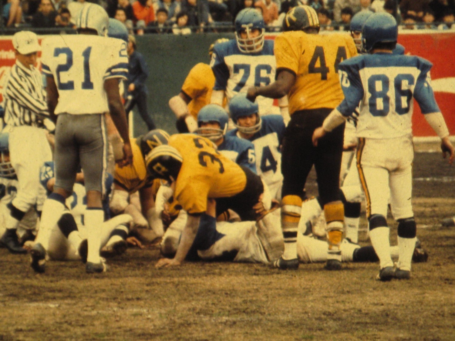
Let’s start with the photo shown above. As you can see, there are at least three jersey styles in the frame, and at least four helmet styles (if you count the “Z” and “R” versions of the dark helmet as separate styles). Also, note that No. 21 is wearing what appears to be a Dallas Cowboys uniform — right down to the little blue Dymo label at the base of the helmet stripe! Of course, the Cowboys were using NOBs by 1974. So if that’s really a Cowboys jersey, it’s an old one.
Here’s yet another uniform from that game — a Tennessee Volunteers uni (for all of these, you can click to enlarge):
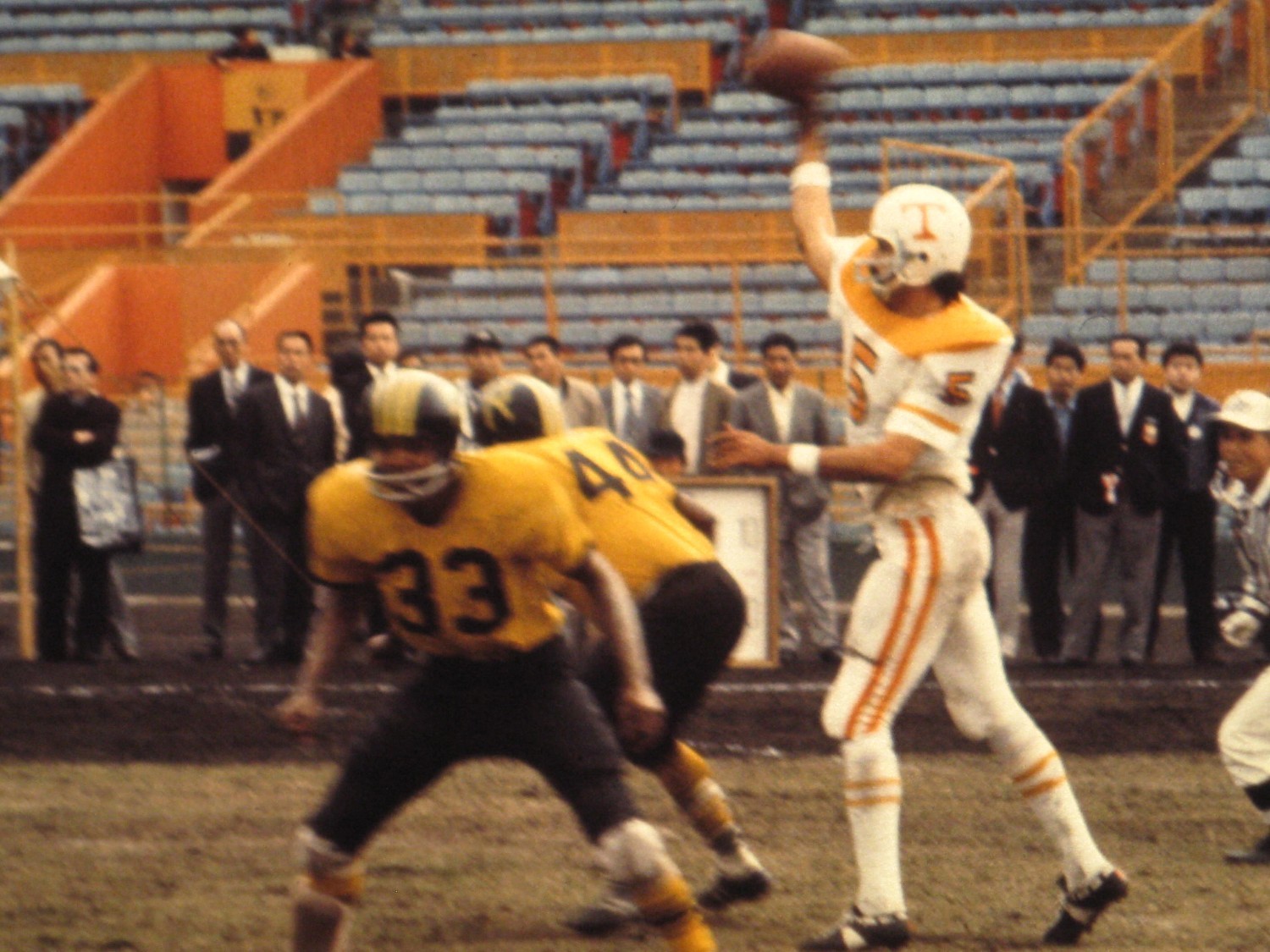
According to the eBay seller, that’s Gary Valbuena. He did indeed attend Tennessee, but he was playing for the Southern California Sun of the WFL in 1974. (Do we know that the game was actually played in March of 1974, as the eBay seller claims? Yes, we do: The date March 31, 1974, can be seen on this plaque, which was apparently awarded after the game. I asked reader Mark Rosa — aka “Mark in Shiga” — if he could translate the rest of the plaque, and he said it reads, “Japan-US American Football, Winning Team, March 31, 1974,
Glory Prize.”)
Getting back to Valbuena, he was apparently given flowers prior to the game:
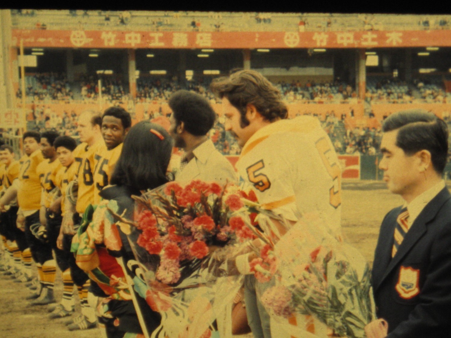
It’s not clear if he was the only one to get the flowers, or if they just hadn’t yet made their way down the rest of the line. Either way, look at the socks on Valbuena’s teammates: double northwestern stripes!
Here’s a player wearing shin pads:

Interesting! Anyone know more about the story behind this game?
Update: This post had been up for only 15 minutes when reader Justin Shibilski posted the following comment:
Here’s an article from Stars and Stripes with some more information on that March 1974 all-star game. Bob Hayes was the feature attraction in this one, making his triumphant return to the same stadium in which he starred in the ’64 Olympics. He, of course, wore No. 22 for the Cowboys, so I don’t know who the player is in that picture. No Cowboy wore 21 in ’73, but Doug Dennison, UFA out of Kutztown, wore 21 in 1974-78. Maybe that was his first task for the Cowboys after being signed as a UFA and they had not yet put his name on the jersey? Maybe because he hasn’t officially made the team yet? Anyway, great stuff.
DC party update: As I mentioned last week, I’ll be convening a Uni Watch party in Washington on Feb. 6, 7:30pm. But due to a variety of factors, we have a new venue: Hamilton’s. That’s final, so please don’t ask me to change it, don’t bother telling me why you don’t like the place, blah-blah-blah. It’s impossible to please everyone, but I’d like to think a group of Uni Watch readers will be capable of having a good time no matter where we meet up. Looking forward to seeing all of you in two weeks.
Uni Watch News Ticker: I called the Angels yesterday to check up on that hearsay about the team possibly ditching its road grays and wearing red jerseys on the road full-time. The response: Absolutely zero truth to that. … The Sharks had previously announced that they’d be upgrading their George Gund III memorial from a helmet decal to a jersey patch. Now they’ve released the patch design (thanks, Brinke). ”¦ The Cardinals have confirmed that they’ll be wearing a Stan Musial memorial patch this season (duh), but the patch design isn’t yet finalized. … Here’s how the Super Bowl patch looks on the Niners’ jerseys. You can see a video of the patch being applied here. ”¦ The NFL and Nike have both been oddly reticent about revealing this year’s Pro Bowl uniforms (I’ve been bugging both of them). Fortunately, Gerald McCoy of the Bucs posted a photo of his jersey yesterday. It’s surprisingly reserved. ”¦ Remember Gonzaga’s bulldog-head uniforms from a few days ago? Here are the designs for all the other schools participating in that uni program. ”¦ I was recently interviewed for the Stealing Home podcast. To stream it or download it, scroll down to the bottom of this page. … This is pretty great: a video clip about the Penguins’ 1992 uni redesign (from Rob Ullman). … The Cubs have asked the city of Chicago for permission to make some serious changes to Wrigley Field (from Ben Fortney). … What’s even better than football in the snow? Rugby in the snow! (From Caleb Borchers.) … The Peddie School in Hightstown, New Jersey, has blue turf for its indoor sports arena (from Connor Wilson). … Very nice Chicago Bears jacket (from Brandon Peacy). … It turns out that the Rays will have two BP caps this season, not just the one I had previously reported. The colors in those photos are really bad — the parts that look black should be navy (from Cork Gaines). … This is interesting: In the locker room for the East/West Shrine Game, they hung two helmets in a Navy player’s locker, giving him a choice of which one to wear. “The Virginia Tech player appeared to only have one option, despite VT wearing a variety of helmets during the season,” notes Ryan Robey. … Reprinted from yesterday’s comments: There’s no better way to honor one of history’s greatest human beings than by wearing really ugly corporate sneakers. … I remember watching the Yanks/Bosox one-game playoff in 1978 (i.e., the Bucky Dent game), but I didn’t recall that Yaz was missing his helmet logo just prior to popping out to end the game (from Christopher Falvey). ”¦ “As an American yid, I purposefully try to avoid Israeli politics,” says Bernie Langer. “But a friend told me to check out news about Tuesday night’s election. Because of the country’s multi-party system, their election diagrams have a decidedly more colorful flair than American red/blue maps.” Nice! Looks like a bunch of Pantone swatches. ”¦ Here’s still more on the killing of the Cal logo (Brinke again). ”¦ Here’s another new (to me) case of a team whose uniforms were stolen, forcing a makeshift solution: According to the 1966 entry on this “This Day in Hockey History” listing, the Red Wings had their unis pinched prior to a game against Montreal, forcing them to wear their junior team’s uniforms. “I tried to find a picture of the game, but all I could find was this brief mention in the Montreal Gazette, down under the ‘Habs Errors Costly’ subheading,” says Daren Landers. ”¦ I think I might have already linked to this recently, but just in case: A Michigan sports blog is putting together a comprehensive timeline of Wolverines football uniforms (from Jay Winkler). ”¦ Yesterday I mentioned that a bunch of sailboats had been turned into a de facto art exhibit. That reminded Dan Cichalski of a Maine operation that turns sails into tote bags, throw pillows, and more. ”¦ “I attended one of the many inaugural parties in Washington on Monday night,” says Cary O’Reilly. “The party was held at the Society of the Cincinnati headquarters, which featured a cool-looking old uniform. It turns out that diplomats used to be required to be in uniform when they presented themselves to foreign heads of state.” ”¦ What was Aubie, the Auburn mascot, wearing on the back of his head in this old photo? “They’re Weagles, which were the helmet merit stickers that former football coach Doug Barfield awarded players until the 1980 season,” explains Brian Powers. ”¦ If you watch this highlight video from Kenny Rogers’s 1994 perfect game, you’ll see that the Rangers weren’t wearing the MLB 125th-anniversary patch, which I thought all teams wore in ’94. Hmmmm (good spot by Paul Quinn). ”¦ The College of New Jersey baseball team appears to be taking its road jersey and cap designs from the Yankees (from Alan Borock). ”¦ Caron Butler of the Clippers was wearing shiny silver sneakers against the Thunder last night (from Jonee Eisen). ”¦ Buried in the middle of this article is the news that the Penguins wore white at home on Jan. 6, 1968: “The Penguins wore their white road uniforms for a change. ‘I just wanted to give the fans a look at them,’ [GM Jack] Riley explained” (great find by Jerry Wolper). ”¦ For those of you who’ve occasionally expressed concern that my love of meat might be having a deleterious effect on my cholesterol levels, my doctor did some routine blood work on me last week, and the numbers came back as follows: LDL (the “bad” cholesterol) = 63; HDL (the “good” cholesterol) = 48; total cholesterol = 121. The obvious lesson: Eat more meat!
Here’s an article from Stars and Stripes with some more information on that March 1974 all-star game. Bob Hayes was the feature attraction in this one, making his triumphant return to the same stadium in which he starred in the ’64 Olympics. He, of course, wore 22 for the Cowboys, so I don’t know who the player is in that picture. No Cowboy wore 21 in ’73, but Doug Dennison, UFA out of Kutztown, wore 21 in 1974-78. Maybe that was his first task for the Cowboys after being signed as a UFA and they had not yet put his name on the jersey? Maybe because he hasn’t officially made the team yet? Anyway, great stuff.
I don’t think that’s the same stadium they used for the Olympics – linkwas a typical bowl with no posts, and it looks pretty close to the field in the football game photos. Probably was held in a baseball park.
You’re right. They actually held two games, according to the articel. The game in those pics was the March 31 game at Nishinomiya Stadium, Nishinomiya City, near Osaka against the Kansai All-Stars. It was, indeed, a baseball stadium that was demolished in 2005. Nice!
great find justin…
i thought it might have been a pre-wfl game made of mix-and-match unis (since it’s possible no wfl teams would have had unis ready in march of ’74), as a means of testing the waters in japan since davidson wanted to put a wfl franchise in tokyo…
And here’s the actual link to the article. Sorry…a little groggy this morning:
link
Great info, Justin. I’ve added it to the main entry.
Sorry about that. Here’s my last name.
Damn, I wish I could affor that Bears jacket, it is sweet!
Navy player may have had 2 helmets, but the Army QB Steelman had 3.
curious to see how many helmets Oregon RB Kenjon Barner has at the Senior Bowl. so far a different one each day, including the plain green practice helmet.
I think they’ve got however many helmets the team’s equipment manager sent.
I wonder if the letters on the helmets correspond to military bases that supplied the players. Z could be Zama (a base near Yokohama)…?
Are we sure they’re not just Dodger farm teams?
:)
It’s kind of hard to tell for certain, but on the dark helmets that I can read, all the Z’s appear to be on the right side of the helmet, and the R’s, on the left. But that could just be coincidence, since I can only definitely make out the letters on 5 (all 3 in the first pic, #44 in the 2nd, and #33 in the 4th). So is it possible that everyone on the team has a different letter on each side?
That was my assessment
the “Z” and “R” are explained in the link justin supplied…
“Making up the U.S. All-Stars cast will be the Zama Ramblers, who finished with a 5-5 record in the Kanto Plain Interservice Football League, this past sea.son, plus a few extras.” (sic)
link
“Z” = Zama, “R” = Ramblers…
perhaps their team had different helmets (examples of which were recently featured on uni watch) where a team uses more than one helmet…
As a vegetarian my total cholesterol is 81. Given our N of 2 I am somewhere in the single digits confident that vegetarians have a significantly lower cholesterol than meat eaters.
Damn the cholesterol – our food tastes better.
My favorite butcher shop has a sign on the counter that reads: “We love vegans, more meat for us!”
I watched the 78 Sox/Yanks playoff game, and never noticed the missing “B”on Yaz’ helmet. That was the last game that the Red Sox played wearing the garish red hats, pull-over tops, and sansabelt pants. One of the Boston papers had a photo of Jim Rice wearing the “new” traditional style uni at spring training the following year. I believe they wore the garish unis during that ST, and he was wearing the new style for photo day. I was beyond thrilled to see the change.
I’ll never forget that game, and not just because of its historical import. It was played on Rosh Hashanah, and my whole family was over at my grandmother’s place for the holiday dinner. I spent the whole afternoon glued to my grandmother’s (crappy) TV. Serious tension ensued when my grandmother put the meal on the table during the top of the 9th. I refused to budge from the TV. I got away with it, because my father understood how important the game was (and I think he was kinda watching out of the corner of his eye), but some stern words were exchanged.
Maybe that explains why I missed Yaz’s missing helmet decal!
“whatever company you are, you like to keep moving forward with your look…”
-howie baldwin
fucker!
As a relatively new Pens fan at the time of the change (and being 17 when it happened), I didn’t have a lot of emotional investment in the skating penguin logo, but after a few years I was definitely ready for the old logo to come back.
My dad had a replica jersey of the Pittsburgh Penguins decades ago. It had the penguin with the scarf logo (used on Penguins merchandise but not used on actual jerseys until the winter classic). It was a white double knit polyester hockey jersey in the colour and striping style of the jersey the Penguins used from 1968-73. The crest was a thick rubbery quite possibly screened on crest; the years cracked the logo somewhat but it held up remarkably well.
Can’t find a good picture of the jersey (if I have one it’s probably on a backup CD). All I can locate is this team photo with the pinnies partially covering the jerseys. He’s next to the ref.
link
I remember looking around Pittsburgh for a black and gold jersey when the Pens introduced them in 1980, and nothing official was available. One hockey supply store had crestless polyester jerseys, and separate logo patches that looked like what’s on the current alt. So if your father liked the Penguins, that odd jersey may have been what was available at the time.
I absolutely hated it at the time, but I have to admit I now have a soft spot in my heart for link uni.
Of course, Mario could probably make a poop-stained bedsheet look good…
That Pens 3rd/road ended up being the first Pens jersey I owned (and I still have it). My second was a reproduction throwback of the black gold-sleeved skating penguin jersey.
Clearly the result of some outside-the-box thinking.
i own that 3rd “untouchable” jersey (authentic lemieux). was one of my favorites back then.
there’s just SO MUCH to hate about what baldwin said in that clip though! “company?” “move forward with the look?” fuck that. go tell that to the yankees & red wings. and company?!?! how bout you keep running it as a team first, the cash will follow. fuck…
Ah, Stegie. Still broadcasting the Penguins with Paul Alexander and Mike Lange. I like Paul’s brother John Steigerwald better, even though most people in Pittsburgh can’t stand him. Ans yes, the Skating Penguin logo is 1000% better.
Back on July 9, Paul wrote: “As several readers informed me, the Rangers only wore that patch on their road jerseys in ’94, not at home. So the throwbacks were correct in that regard, but why would the Rangers not use the patch at home? Very odd. … That strikes me as very odd – anyone know more?”
So did anyone ever get to the bottom of this mystery? Why would the Rangers not wear the patch? Sort of reminiscent, I think, of how the Marlins didn’t wear the Jackie Robinson patch on their vests in 1997.
My guess is that Bullet Bob is wearing 21 in the picture, having brought his practice jersey with him. I remember from my childhood a picture of Bob Lilly in workouts wearing number 68 instead of the familiar 74. Hayes might have been another wearing an old jersey for practice.
Aubie? Oh yeah, I see him now.
(sorry, I was mez-mo-rized by sequins and teeth!)
Grambling State and Morgan State were the first collegiate teams to play a game in Japan in 1976.
link
Then Grambling and Temple in 1977:
link
Ahh, yes…The old Mirage Bowl!
Named after this automotive beauty:
link
My brother went to the games in ’77 and ’78 as a member of the Temple University Diamond Marching Band.
I’ll see if he has some uni-centric pics.
Wow a SWAC and MEAC game over in Japan.
This is an interesting line from the Michigan football timeline.
‘ HELMET: As a punishment, quarterback Tate Forcier (and a few other players) have their wings temporary removed from their helmets :) ‘
It’s from August 2010. Interesting, I didn’t know RichRod knew what discipline was.
If you’re really bad, they make you play the game without your helmet. Ouch!
…or wear an OSU helmet.
I’m curious to know how that’s even possible, considering the Michigan wings are not decals: they paint the maize base coat, mask the wings with tape and then paint the blue coat.
They repaint them every week, maybe they were covered in blue for practice, before being uncovered for the game.
The pictures are from Nishinomiya stadium.
link
The Sharks have memorials for George Gund, but the Cavaliers have apparently done nothing to recognize their former co-owner, whose brother still owns a minority share of the team.
Last night was the Cavs’ first home game since George passed away, and there hasn’t been a mention of so much as a moment of silence. They’re certainly not wearing any black strips on their shoulders, and I haven’t been able to find a single mention of his passing on the Cavs’ website.
Something about that just doesn’t seem right to me.
I don’t see a “N” helmet. Just Z on the right and R on the left side of the helmets and some blank.
You’re right. I got mixed up about the orientation of a player’s helmet. Will fix!
Apologies for commenting on a topic from yesterday’s ticker (just catching up), but I could not let go without comment that the UND goalie is honoring the man (Engelstad)whose gift of the arena to UND was contingent on the use of the Sioux logo all over the building.
I think the time is nigh for me to throw together some University of North Dakota Thunderbirds uniforms.
I got bloodwork done recently for the first time in maybe 5 years and was a little nervous. I’m about 25-30 heavier than I should be, but since moving back to the Northeast I’ve been walking a ton. I’m at 144 total, 86 LDL, 42 HDL, and 82 Triglycerides. And apparently my Total chol to HDL ratio is 3.4, which is ideal. The doc (who I just started seeing) asked if I’d ever been on any meds, because I have pretty ideal cholesterol and blood pressure. I’d like to think it’s a testament to trying to be as active as I can, even with a desk job. So even if you’re fat like me, get out and walk a couple of miles (or more) when you can! That said, I hope to not be fat in a few months now that I’m doing more serious exercising again
Nike’s “Hyper Elite” unis remind me of their team-logo unis from 1999-2000.
Here’s link, and link (back when they were a Nike school).
The Tar Heels’ new unis are far, far uglier than what they wore in 1999-2000.
Recycling ideas… lame considering the source.
According to this site in Japanese
link
Southern California played against Meiji University in 1935, winning 71-7.
Say, Paul, I bet the bicycling you do helps a lot with the cholesterol levels as well. Very impressive!
Plus I eat Cheerios for breakfast every day. So if you believe all that chatter about oats and cholesterol (I have no idea how true it is), that probably helps too.
Digging the Rays bp caps. Wish the mark was more prominent on their snoozer of a jersey. More Baby blue, more yellow, more burst!
The sweaters the Red Wings wore for that one game in Montreal were probably nearly identical to their regular unis. They may very well have been actual Detroit Red Wings uniforms from a previous season, being reused by the Hamilton Red Wings, since that was a common practice at the time.
Anyone have any idea what that one Penguins mock logo at 1:02 in the video that looks like a donut is representing? Looks similar to the Carolina Hurricanes logo.
I never liked the hummingbird logo. The classic Skating Penguin has tons of charm & looked even better with the scarf. Still don’t know why they stuck with Vegas gold.
Just for shits ‘n’ giggles, who’s had more different uniforms? The Pittsburgh Penguins or the Cleveland Cavaliers? Yes, I know they’re different sports.
“…more agressive, forward thinking and dynamic…” Yeah, yeah, I’ve heard it all before.
Bring back the scarf!
We should go back to an era where Diplomats wear uniforms. Heck make all government employees have a uniform. If the military has to dress like cub scouts so should everyone.
For what it’s worth, American diplomats more than anyone else are responsible for the decline of the diplomatic uniform.
Nice! Hamilton’s is an old haunt of mine. I’ll be there, for sure!
That’s interesting to see the version of the Super Bowl patch including the stadium on the jersey version this year, plus it looks like they have decided to meet halfway between standard patch and that “sticker” that they used the last two seasons. I like the chrome finish and the texture look of this version. Maybe the NFL wasn’t so crazy about seeing the patch get all link or link by the end of the game. I’ll be interested in seeing how they look and hold up during the game though.
That patch looks much more golden than chrome to me. If that is the case, why? I thought the idea of the new system was to standardize the logo.
Correcting myself … watched the video … it’s chrome … but, my eyes tell me that pictures makes it look VERY golden.
I can see that in the 49ers picture, but the link I posted below for the Ravens shows the chrome.
cholesterol is a werid thing. did you know shrimp is high in cholesterol? safe to say the best bet is going vegan, egg whites or lipator
link new Hornets/Pelicans logo unveiled tomorrow.
I’m not too optimistic about the design.
here’s a good logo for the NOLA NBA franchise:
a pig with lipstick
Don’t know if there is any truth to this, but my off-season boss (I work at a sports collectibles store in the off-season) said he just got back from a sports show in Vegas, and said that the New Era rep told him they are making a ton of different Acme Packer hats for next season because the Packers are bringing back the throwbacks.
Even as an owner of a sports store, my boss doesn’t know a whole lot about athletics aesthetics, so you can imagine my curiosity about any truth to his statement. Has anyone ever heard of a team having throwbacks, taking a year off, and then sporting them again? I guess it is plausible because of the change from Reebok to Nike, but other teams didn’t have trouble making the transition i.e. Bills and Pats.
Anyone hear about the comeback of the Acme Packer unis for the Pack? I know that the merchandise sells a ton, and even this season, the Packer Pro Shop still had a bunch of Acme Packer stuff. Just seems weird they would take a year off, and then come back with the same throwback. In any event, if they do make a comeback, they should for sure go with the fake leather helmet look like the Redskins did this past year.
Well the Bears wore the 1940s throwback in 2010 and again in 2012, but in 2011 they wore the orange alt for their third jersey.
I apologize if this has been mentioned, but I can’t seem to find the answer on the interwebs… The new BP hats for MLB, are they going to be the New Era 5950 style? Or the same as it has been in years past?
It is supposed to be the 5950 style hat, just with the same type of material as the BP hats of the last few seasons.
Regarding basketball logo unis… black longhorn unis of ANY kind are the stupidest thing ever! gag
watching the Kenny Rogers video reminded me: oh yea, baseball players used to wear tight pants. (sigh)
And here’s the link for what the patches look like for Baltimore…
link
That article also confirms what color pants the Ravens will wear:
“The difference this year is that the Ravens will go with black plants, while they wore the white pants the last time.”
Oh, well there goes any contest the GUD might have had in picking the combo. :( Now the only drama left is the game and how many times Jim Nantz uses the phrase “the Harbaugh brothers.”
Ha ha, Nike can’t put stars on unis, it would mess with the magical functionality! #ProBowlUnis
Looking forward to your DC party, boss. Of course I don’t know Hamilton’s from Jefferson’s, but I’ll there wearing… wearing…
In Hamilton’s, they’re much more disposed towards a strong central government and a robust banking system, while over at Jefferson’s, they believe the virtues of democratic freedom are best nurtured in an agrarian, or agricultural, society, and that with increasing urbanization, commercialization, and centralization of power comes a decline in political society and eventual tyranny.
Proposed changes to Wrigley are interesting, I was surprised to see that the $300M cost will be funded privately.
The Ricketts family might be my favorite ownership group.
Expect that ‘funded privately’ to change because at first they asked the city for all $300 million and everyone said, “GTFO.”
It’ll probably be split between the Cubs and the City.
Not will be, but WOULD be … IF the city eases up on the historical landmark status of Wrigley and allows more advertising.
It reminds me of back in 1987, when racetrack owner Richard Duchossois rebuilt a burned-down Arlington Park (in my hometown of Arlington Heights, IL) at a cost of $100 million, without using a PENNY of tax dollars. The main earned a great deal of respect locally with the move.
link
The city said “no”, as they should have.
link
The Cubs can pay for it & deal with their already massive profits as is.
The only part of these new Hyper Elite uniforms I’m worried about is the shorts, unfortunately that’s normally the last thing they reveal.
link
More Hornets
Besides classic.niketeam.com, does anyone have suggestions of where I can create custom jerseys for fun online?
Paul when do the BP caps get officially released?
If you mean when they’ll be available for sale, I have no idea and honestly couldn’t care less.
If you mean when they’ll be officially unveiled as part of the teams’ uniform sets, I have no idea about that either, but pitchers and catchers are due in about three weeks, so I’d say it’ll happen by then.
FYI: The College of New Jersey has been pinching the Yankees’ uniforms since about the time the school changed names. Rick Dell has good taste.
Good taste? Yankees’ roads? Really? That’s a generic, awful, boring template to copy.
“According to the eBay seller, that’s Gary Valbuena. He did indeed attend Tennessee, but he was playing for the Southern California Sun of the WFL in 1974.”
Right, but in March of 1974, he’d have still been at Tennessee. He then played in the WFL in July of 1974.
Sounds like the Braves are close to acquiring Justin Upton. Would the jerseys then say J. Upton and B.J. Upton?
That “Cal” logo wasn’t a Cal logo. It was a logo for the University of California (UC) system, which includes Berkeley (Cal), Los Angeles (UCLA), etc.
Seems like someone has to post this correction every time that logo has been brought up here.
It’s just never been corrected so far. Cal will never change their logo to that….especially that shade of blue.