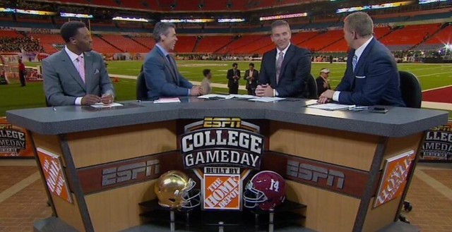
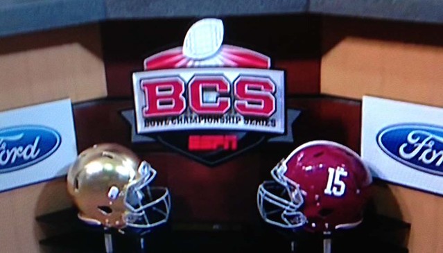
As far as I can tell, there was only one uni-notable aspect to last night’s BCS title game: ESPN maintained is recent protocol of using the TV numbers on the Alabama helmet as a way of tracking the Tide’s national championships. During the pregame show, the ’Bama helmet on the set was No. 14; for the postgame show, it had been changed to 15. As we briefly discussed last week, ESPN also did this last year. Kinda makes you wonder what they would’ve done if LSU or Notre Dame had won those games.
My congrats to all the ’Bama fans out there, and my sympathies to Dan Cichalski, Warren Junium, and all the other Irish fans.
Green scene: Here’s something that might make the Notre Dame fans feel better (or at least take their minds off last night’s events), courtesy of reader Jeff Flynn, Jr.:
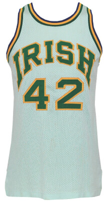
I recently acquired a Notre Dame “white” basketball jersey from Grey Flannel Auctions. It’s familiar style from the Kelly Tripucka era, but it’s not truly white — it is a light-limey green color, almost as if the green tackle twill bled into the jersey. Same deal with the shorts.
But green isn’t known to bleed in the wash, I don’t think. And the white screen-printing on the shorts (on the leprechaun logo) makes me think that perhaps Digger Phelps was up to his lime-green tricks more than a decade earlier than I originally thought.
Sure enough, I found this photo of the uniform in action against Magic Johnson and wouldn’t you know, it’s not really white. Compare the jersey and shorts to the socks. And if you zoom in you can see the white screen-printing of the leprechaun on the shorts clearly highlighted against the light green background.
I don’t think anyone ever noticed that Notre Dame was really wearing green home jerseys in the late ’70s rather than white!
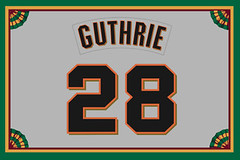
Collector’s Corner
By Brinke Guthrie
Even though I have an NHL team in my backyard (Sharks), I don’t follow the sport like I used to back in the day. But now the NHL season is back on, for a little bit anyway. So let’s start off this week’s installment of Collector’s Corner with this dandy 1960s-1970s hockey jersey, er, sweater from a long-gone Bay Area team, the California Golden Seals.
In non-NHL finds:
• Dolphins fans, do you remember Dolfan Denny? It seems he was quite a fixture at home games. Here’s his WIOD Pony jacket, right here.
• Staying in South Florida, here we have a 1970s Miami Dolphins boys’ jacket, with an “NFL Activewear” label. Ever heard of that line? Don’t see any official team markings.
• I like the look of this retro Chicago White Sox tee.
• Jason Bernard sent in the listing for this handmade Minnesota Twins sweater. [Nice, but the uniforms being worn by the players on the sweater don’t look anything like Twins unis! ”” PL]
• Jess Heltsley spotted this 1972-1973 NFL Players Association Member Handbook on Etsy.
• Here’s a selection of NFL gumball helmets from reader Michael Clary: Broncos in orange, Saints in black, 1975 Giants, and one of those terrific 1967 “Go with the Pros” AFL helmet kits.
• Here’s another 1970s NFL kit — the ball and goalpost version. It’s complete, which is a bonus considering its age.
• And to wrap up, here’s a 1970s Houston Oilers sideline jacket, or so the listing says. Not disputing whether the item is real or not, but take a look at the NFL shield. Clearly a 1960s logo, and the Oilers weren’t in the NFL yet. So there you go.
Seen something on eBay or Etsy that you think would make good Collector’s Corner fodder? Send your submissions here.

Super Bowl Logo Contest Reminder: Don’t forget, Phil is running a contest to design a new logo for Super Bowl XLVIII. Full details here.
Remember, the deadline is this Friday, 6pm Eastern.
Uni Watch News Ticker: Reprinted from yesterday’s comments: Kent State had new helmets for the Really Shitty Internet Hosting Service Bowl (from BJ Lanier). … Also: It’s nothing new for a college football team to have multiple players with the same uni number, but Kent State had two players wearing No. 1 in non-matching fonts (good catch by Rob Ullman). ”¦ Cincinnati hoops wore blackout uniforms last night. ”¦ “While reading about Penn State’s football team, I accidentally clicked on a link to the school’s fencing team page,” writes Gerry Dincher. “The first thing I noticed was the socks. It seems like socks are really the only part of the uniforms that vary from person to person, and in some cases it’s the only way to tell the two teams apart.” … When Secretary of State Clinton returned to work yesterday after her concussion and blood clot, her staff gave her a football helmet as a welcome back gift, to help her avoid further concussions. They also threw in a jersey. The uni number represents the number of countries she’s visited as Secretary of State. … Wisconsin will have special uniforms for the Hockey City Classic, which will be played outdoors at Soldier Field on Feb. 17. The lettering looks a lot like the current Nets’ chest lettering, no? (From Nicole Haase.) … New cycling kits for Garmin-Sharp and Movistar (from Sean Clancy). … I’ve always found Denis Leary’s persona annoying, but I have to give him props for playing pond hockey in a Seals jersey (from Mark Kaplowitz). ”¦ Blake Pass’s design is one of the two finalists in the running for the Wichita Thunder’s alumni game jersey. Good luck, Blake! … I’m spending the day with my Mom, so everyone play nice while I’m away, yes? Yes. Not visiting my Mom after all, so I’ll be around today.
as far as i know Go Daddy isn’t an ISP but a website domain name provider/site host.. semantics i know, but if you gonna call them out for something at least get it right
Not semantics — you’re absolutely right, and I was wrong. I’ll fix it now.
I remember Dolfan Denny back from the late 80’searly 90’s. He also attended the Miami Hurricanes Football games as well. Dressed up in Orange and Green and carrying UM related signs.
He calls himself a fan?? He hasn’t even painted his face!!
B^)
Thanks for the ‘good luck’ wishes, Paul. The contest is actually for the jersey to be worn in their alumni game. I used an existing team logo…the other guy did not.
Oh — will fix.
As the “other guy”, no I didn’t… Best of luck btw!
Best of luck to you, too! I didn’t realize you were a “uni-reader” as well.
I still think the Gatorade bath should be given to the losing coach.
Then watch him stagger around with the jug over his head and shoulders.
link has 15 on their helmet for their splash page graphic as well. (Yeah, it’s largely an ad for buying crap from that Oregon company…)
Re.:Hillary Clinton’s helmet
It appears that the helmet that was given to Hillary Clinton is a youth size model. The inside
pad colors on Riddell youth helmets are usually grey and not the white that is used for adult sized
helmets.
Nice Collector’s Corner as always!
That homemade Twins sweater is awesome! WIth the way that the figures are stitched, it almost gives them a “pixelized” look……………..when I first saw it, the first thing I thought of was a Nintendo or Sega Genesis Baseball Game Player.
That Houston Oilers Jacket looks fishy to me. It looks like the Houston Oilers wordmark could have been sewn on at a later time, plus the letters look orange to me…of course not an offical Oilers color (but then again, neither is Navy).
There is something about those shades of Aqua and Orange on the DolFan Denny jacket that is just so cool. To me those will always be the “Real” Dolphins colors!
the way that the figures are stitched, it almost gives them a “pixelized” look
This is known as a cowichan sweater. If you search on that term on eBay, you’ll find lots of sweaters with similarly “pixelized” stitching styles.
Thanks Paul. I learn something new every day!
Does anyone else have the sudden urge to dig out their old Nintendo and play R.B.I. Baseball now?
Back to that Dolfan Denny Jacket:
Does anyone else remember the NFL Team Pencils from the 80’s? When I was in Jr. High (in the mid-80’s), my school had two pencil machines. For a quarter, you would get a pencil out of the machine, and one of the machines (at certain times) had NFLPA pencils with players pictures on them, or NFL Team pencils, with just a generic team wordmark in team colors, with two small generic helmets on either side of the wordmark. I remember wearing those machines out (not to mention bugging my parents for quraters) trying to get the whole set, and lunchtime pencil trading with my friends was the high water mark of the day!
Anyways, this all ties back in to the Dolfan Denny jacket and those colors………..by far my favorite pencil was the Miami Dolphins. It was in that light aqua with orange lettering. I loved that pencil, even though I was not a Dolphins fan at all.
It’s funny the seemingly insignigant stuff you remember, especially when the colors on that Dolfan Denny jacket reminded me of that pencil as soon as I saw it.
A google image search turned up these exact pencils. And the Flickr user is “Permanent Record”. I hear the guy who runs that is a real nice fellow!
Here are those exact pencils, with my beloved Dolphins displayed proudly on top!
link
Does anyone else have the sudden urge to dig out their old Nintendo and play R.B.I. Baseball now?
No, but for exactly the same reason I have the sudden urge to dig out my old Apple IIc and play MicroLeague Baseball:
link
Man, I miss that game. Pure management strategy, no pesky button mashing, and pixelated graphics every bit as good as stadium scoreboards of the era. (A few years later, Earl Weaver Baseball was a bigger hit, but it was essentially MicroLeague with an added pitch-by-pitch button mashing mode.)
Oooh, +1 for Earl Weaver baseball. Correct me if I’m wrong, but couldn’t you play “historical” teams? I’m pretty sure I used to run the ’86 Mets against everybody.
Yeah, MicroLeague and Earl Weaver had some historical teams and even maybe a few whole league-seasons. I used to play the ’65 Twins against everybody.
I’m pretty sure that MicroLeague was the first videogame to license MLB team and player names.
I still play RBI a few times a week, man. What are you talking about?
That Oilers jacket is definitely fake. Dark blue and orange? Growing up, my mother was a big Oilers fan, Ive never seen them use those colors.
I’m not so sure. I recall seing that goofy wor style at some point in the 1970s. I’m not sure if I saw it in a store or catologue or on the sideline (though I doubt it was on a sideline) but I do recall seing that weird “Houston Oilers” style on a jacket somewhere.
Also,1973-74 I recall the Oilers wearing more of an “Ice Blue” – they would play the Saints in preseason every year and I saw the color with my own eyes.
Just not sure where I saw the jacket style, but I have seen it before. As for Orange – 40 years can do incredible changes to colors of fabric. I would nt doubt that at one time it was a more correct shade of red ….
The Seals jersey Brinke posted is rather unusual… the style suggests the Charlie O. era (green and yellow), but the crest is the seal logo, with the C in blue and the seal in all-green.
That’s because it is a fake, or at least some kind of home-made jersey. It’s using a variation of the fall of 1967 “California Seals” crest on a 1973/74 style fan jersey. Don’t forget the Seals renamed themselves the “Oakland Seals” in December 1967 and turned the “C” part of the skating seal crest to an “O”.
At any rate it’s a cool piece of home-made nostalgia.
IIRC, they played their first season in the Cow Palace, so they called themselves California. Once they moved across the bay, they became Oakland, and changed the “C” to “O”. Those original blue/green Seals sweaters are among my favorites.
Looks like they took a generic green and yellow jersey (not a Seals jersey – striping too thin) and put a homemade patch on the front (the shoulders are way too round). Not even close to being worth $37
Allow me to step in here cuz that’s MY team (see my membership card). The colors/striping are of the 1970-74 era. The crest is from the earlier green/blue/white pre-Finley jersey design. It is a crappy, worn-out crest crudely attached to what looks like a NEW blank replica. There are some hideous Seals replicas out there with the lettering all wrong, logo wrong angle, etc., even replicas of players who weren’t on the team during a particular era (3 distinct color combos during the Seals’ nine-year existence)…but this one is pretty awful.
-Jet
Wisconsin jersey is nice and fits nicely with some of the other recent Winter Classic/college outdoor game jerseys. Excellent touch with the shoulder and Captain’s C patch, as well as the Badger Bob quote in the collar. Though the reebok wordmark front and center, kinda lowers it a grade.
Nice little story on the Notre Dame basketball jerseys today. They wore those for two seasons, 1978-79 and 1979-80, before switching back to white at home and eliminating the green trim in favor of only blue and gold.
I grew up a fan of ND and still am today. I used to see them play basketball every other year when they came to my hometown. It was well known at the time that the home uniforms were a very light shade of green, and I think there was a reference to that here last year or the year before.
ND’s official colors are blue and gold, but for a couple of years, including the 1977 national championship football year, the football and basketball teams wore green and gold. Note that the unis above still had some blue trim on them.
ND household here, too. Against my better whatever — I usually much prefer the blue and gold to green intrusions — those 78-80 basketball unis are indeed pretty cool.
As to the football defeat last night, I seen it comin’, and won a few bets from fellow sufferers. And uni-wise, the Tide almost always wins. What a fabulous-looking outfit.
As to the football defeat last night, I seen it comin’, and won a few bets from fellow sufferers.
You bet against your own team? That’s cold, Connie!
I do indeed bet against teams I root for, particularly when hormonal factors induce millions of my fellow fans to overestimate our team’s quality, and move the Vegas line. Notre Dame frequently notorious in this regard. I don’t bet that much or that frequently, but I do like to come out ahead.
These kinds of chilly-calculation bets don’t interfere with my rooting, because I never root very hard anyway (watching TV, at least) and because I’ve come to like the sensation of head vs heart tensions, as if I were both sitting in my chair and hovering above, watching myself sitting in the chair.
BUT the idea of betting against one of my boy’s soccer teams is truly abhorrent, so it’s not that I’m immune to depth of attachment. It just doesn’t run to teams you see on television. My 12-year-old has just been (favorably) scouted by Inter and Juventus — anybody here with Milan vs Turin advice? — so all bets are off (as it were) when Danny appears on the big set above the cash register at the Italian restaurant.
When those Irish basketball jerseys and shorts were made ND was a 100% Champion Products school. They were manufactured in Champion’s Perry, NY plant which is now home to American Classic Outfitters (ACO).
These uniforms were made from 100% Stretch Nylon Warp-Knit Pro-Mesh. Champion did not manufacture this cloth, rather they just purchased it from a supplier. In addition to Champion the cloth was used by SandKnit, Rawlings, Wilson and Powers to name a few.
We used a ton of this cloth for football, basketball, hockey and baseball/softball uniforms. The only complaint I ever had about this fabric was that the White version wouldn’t stay White.
Around 1979 we sold a set of basketball uniforms in a White body with Purple (sorry, Paul) knit trim and two-color Purple-on-Gold tackle twill numbers and letters. The school laundry washed them and when they came out they were the loveliest shade of Light Lavender you’d ever want to see.
And on almost every set of White Pro-Mesh uniforms we sold with just screen-printed graphics and numbers (primarily for football & softball) turned an ugly shade of “tattletale grey.” Other trims that bled into the fabric included Red, Maroon and some shades of Blue and yes, Green. The bottom line was that the suppliers of the White Pro-Mesh fabric switched the cloth to a more color-fast Polyester yarn.
Therefore I don’t really feel the Irish uniforms started out in that Light Green shade deliberately. IMO because of Pro-Mesh’s past track record of absorbing other colors as well as “greying” I think the ND uniform’s just fell victim to the same problem every other user faced.
And since Champion Products purchased the cloth as finished goods I don’t think they even thought about it turning Green. Or if they did the amount of cloth that the manufacturer would have to knit would have been so large that the Irish could have used the color for years and years and years. And if Champion wanted the cloth to have a Green tint to it don’t you think they, the university (Digger) and the manufacturer would have come up with a better-looking hue that what is shown in these pictures?
No, I just feel this whole subject was the fault of the cloth itself.
Terry,
That is very interesting. But the year before, 1977-78, when they went to the Final Four, ND wore almost identical unis, only with blue and gold trim, and they were clearly white.
I was just a kid at an ND game when one of the school or basketball people told me the home uniforms had a light green tint to them, but he did not say why. Then I read here in the last year or so that it was because someone told Digger that the color showed up better on TV.
It would be interesting to find out the real reason why the uniforms were faintly green. Both stories seem credible.
Another interesting thing about those unis was that, in addition to the blue-gold-green trim, they were matched with wristbands and Adidas shoes with the same color trim. We used to color our plain colored shoes in with those colors using a marker. I’d pay a pretty penny to have either the shoes or wristbands now.
Maybe Paul could settle this by reaching out to Digger through the ESPN universe?
Geeman-Sorry for the late reply but I had a doctor’s appointment this afternoon and just got back. Assuming they were of the same material and those ’77-’78 uniforms were new and only worn at the Final Four that could explain why they stayed White. The other possibility is that they were made from Champion’s 74 Nylon Tricot Mesh which was color-fast. Champion’s Nylon Pro-Mesh was cloth 51 is the one the Irish uniforms in question was made from.
Notre Dame basketball had used SandKnit prior to Champion (the shamrock uniforms they wore in the ’74 upset of UCLA were SandKnit). And the 74 Nylon Tricot was Champion’s most-used mesh fabric for a lot of years.
So I think it would be great if Paul could contact Digger to find out his take on this question. Like they say…..Go to the horse’s mouth.
Threw this out yesterday in the comments with no luck, try again today: any DIYers know where I might be able to find some elastic fabric for cuffs/hem on a track jacket?
Trying to restore a beat up sweatshirt of mine, cuffs are shredded, hem line lost its stretchiness years ago. Lil help?
Try your local craft store, JoAnn’s Fabrics, etc…
cuffs are shredded, hem line lost its stretchiness years ago
Sounds just about perfect to me. Leave it alone!
Yeah, you might want to leave that alone. If it’s a Champion Reverse Weave, from say the 60’s, you’re looking at pure gold.
Or find another Champion Reverse Weave item (try Goodwill,etc.) and do a trim transplant.
It is definitely not a Champion reverse weave. More of a cheapo, $10 from a street stall, sweat-shirt.
Click on Catch of the Day.
Then imagine the possibilities. Those nicknames and those logos on helmets, caps, sweaters, etc.
This is it. This is how it’s done. Beautiful and fun.
Oooh, very nice. May spend a little time on here today.
Too right. It’s a crying shame, and a loss for all humanity, that there exists in none of our professional sports leagues a team named the Hawai’i Na Humuhumunukunukuapua’a.
Rece Davis on ESPN’s “Mike and Mike in the Morning” earlier this morning:
“…we were talking about how cool it was during pregame warmups just to look out there and, look, I’m not just one of those old guys that dislikes all the new uniforms but to look out there and to see the crimson helmet, and the gold helmet, and know exactly who was playing, and, and to see that place full an hour before kickoff it was, uh, it, it was terrific. It really was.”
Rece knows what he’s talking about. Plus, he’s a good guy. And I’m not saying that just because we happen to share a hometown and the same favorite college team. Nope, no way. That’s not swaying my opinion of him at all.
From people I know that were in Miami, it was a really great atmosphere. Well, before the game, anyway.
So, on The Biggest Loser last night it was their NFL week episode. Allison Sweeney was clad in a Chargers jersey–as was special guest Antonio Gates. The contestants (who are divided into a red, a white, and a blue team) wore Cardinals, Cowboys and Bills jerseys. A couple of pix are here on the Chargers site.
link
Hey, check out this WFL game program on Ebay. On the wall in the background are UNIFORM LAYOUT GUIDES!!!!
link
-jET
Ooooh, very nice!
Pretty cool. the WFL had a universal striping template for all of their teams, and I believe Sand Knit did almost all of the jerseys – though one or two teams opted out – I know that the Birmingham Americans/Vulcans opted out and had their uniforms done by another company in Alabama – I think Russell Athletic. They wore entirely different styled jerseys, striping and wore fishnet jerseys with durene shoulders and sleeves.
What I find interesting about the Sand Knit WFL game jerseys – I own 3-4 – are that they DID NOT have double material for the shoulders, at a time when pros, NCAA, even playgrounds and high schools did ! I wonder if the budget problems dictated that?
The “Helmet Hut” website has a section of interviews with NFL Equip,ent Managers – one worked the WFL and tells great details about what went on. At one point the league bought an entire stock of “new” shoulder pads and pants from a supplier for a good price. It turned out to be “new”, unused 1940s pads that were unusable as they weighed three times the weight of modern pads. Lots of good stuff there.
That game program cover is awesome – it was used I believe for every WFL team for their first home game program. I actually bought it on EBAY for The Hawaiians, and maybe one other team.
This is interesting: For generations, meteorological temperature maps have used pretty much the same color schemes, with deep red for the hottest range. But with global climate change rewriting the book on what constitutes “hot,” Australian forecasters have been forced to add new colors to their temperature maps. And look what they’re using for the hottest, most beastly temperature range of all (at least until things get even hotter):
link
Interesting. I would think if it gets in excess of 125ºF, which is what that’s showing, purple is probably a pretty good color. At least for those of us for whom the wretched color of death is a problem.
Unfortunately, I could see the USA (in the desert southwest) experiencing these higher temps in the not too distant future.
I don’t understand why the Aussies are bothering. The new colors show ranges of 122-125 F (purple) and 126-130 F (pink). For one thing, those ranges are just too small to be of particular use to human beings. But mainly, can anyone actually feel the difference between 122 and 126? Does it matter? Wouldn’t a single color for “above 122” suffice?
(Actually an honest question. I’ve never been much above 110. But on the cold side, I’ve been down to -80, and in that direction there are vast ranges where the difference between, say, -40 and -60 is imperceptible. You don’t need 12 color bands to tell you that it’s -48 instead of -42. For the most part, all you need to know is that it’s -20 or colder and how fast the wind is blowing.)
As if on cue:
link
From the NYT article:
Also interesting. But then, this isn’t really news to anyone who has been paying attention to the increase in, and strengthening of, hurricanes over the past 20 years or so. Certainly this is due in part to natural, cyclical temperature fluctuations, but it’s nice to see that scientists and climatologists are finally beginning to accept that at least part of this is caused by man.
…yeah but it’s a dry heat
Deep purple represents the temperature at which smoke rests on top of water
Comment o’ the Day right there!
Somewhere in America a kid just learned how to play guitar.
“Kinda makes you wonder what they would’ve done if LSU or Notre Dame had won those games?”
I’m guessing they would have done nothing at all.
I confess to not knowing who Dennis Leary is, but the fact that he’s wearing a Seals #3 Mike Christie jersey for pond hockey makes him super-cool in my book. Mike Christie, NHL player from BIG SPRINGS, TEXAS!!
-Jet
“It’s nothing new for a college football team to have multiple players with the same uni number …”
No kidding: Is this a typo or did the Irish actually link: Everett Golson (Slide #9) and Te’O (Slide #5)? Seems especially weird in a championship game when the latter was a Heisman runner-up …
Notre Dame has had two guys wearing number 5 all year. Maybe more, but I know for a fact that those two starters, Manti Teo and Everett Golson, have both been #5 all year.
Sure, college teams have duplicate numbers, but the fact that the starting quarterback & star defensive player had the same number seems a first. You’d think that when they both became starters, they would’ve had one of them change. Sure since they were on opposite sides of the ball, they didn’t need to, but you’d think they would have anyway.
Of course until the bowl game, they didn’t have NOBs, so a fan could buy a #5 jersey and get two for one in the rooting department.
“Is that a Golson or a Te’O jersey?”
“Yes.”
Yeah. The duplicate number thing is really getting out of control as it pertains to important team members sharing the same numbers. It seems that Notre Dame had three or four regular players sharing numbers last night, #5, #7, and a few others. Too many. I find it unsettling.
Colleges have been dressing over 100 players for decades, and duplicate numbers are common and necessary – but for the most part you have a starter and a freshman and/or walk-on sharing the number. Now, you regularly seem to find active, important players sharing the number. That is the “out of control” part. I just do not believe that it is a good thing. Can’t put my finger on it, but not a good thing.
The first duplicate number that I ever remembered to be shared by starters was Univ. of Washinhton in the late 1980s – OT Lincoln Kennedy and DL Steve Entmann both wore #74 for the Huskies, and both were starters, stars and then 1st Round picks in their years’ NFL Draft ….
There must have only been one 15 helmet last night. When they switched from the main desk (Fowler) to the secondary desk (Davis, Holtz, May) after the game, the 14 helmet was present. I didn’t grab a screen shot as I fail in having DVR.
If you go back to last night’s comments, there was a screen grab of the “second set” with the 14, and the “main desk set” with the 15.
Everybody playing in the ND/Bama game had a small “26” decal on their helmets last night that I don’t think I’ve seen before. Does anybody know what it was for? ND’s was green and on the rear left while Bama’s was white and on the rear right.
I don’t know how to make a link but you can see it in this photo and photos number 27 and 32 on the same page.
link
I guess I mean photos 10 and 32 for ND and photo 27 for Bama.
Just my guess, but I’m thinking it’s for the 26 victims in the Newtown shooting.
OOPS, didn’t see your next comment…..
I’m just now realizing it’s probably a Sandy Hook thing. Was this decal used in the other BCS games?
With the return of the NHL, here is a video of the Winnipeg Jets logo being put back on the ice at MTS Centre.
link|WPG|home
The new Winnipeg jets logo always reminds me of a Lawn Dart.
link
Paul ditched his Mom.
Why does Paul hate his Mom?
For the same reason Daniel Snyder and Robert Griffin III hate innocent, murdered six-year olds.
Always loved those Giants 1975 helmet logos. Very crisp, clean, and unique.
Ugh. To each his own of course, but I think that’s one of the G-men logos that you either LOVE or HATE. I fall into the latter camp. All I see when I see that hat is a washed up Craig Morton and awful blue pants.
But that’s just me.
Of course, it doesn’t help that I’m only 18 and don’t remember any of the era. I’ve just seen pictures and from a pure logo standpoint, I like it.
link
this list is a travesty of judgement!
sidenote can anybody explain the difference in rules between NFL and NCAA on socks?
college players seem to always not wear high socks and if they do, they wear different socks throughout the team, while all NFL players have to wear high socks?
First — pay no attention to that article. At first I thought it was a Bleacher Report piece, but it turns out it’s actually worse. I sounds like it was written by a young person attracted to shiny objects.
Second — Players are required to wear two socks on each foot; a combination of white and their team color for each leg. Wearing only one of the socks is a violation of NFL rules and *will* result in a fine. Socks must be pulled up over the calf and meet with the uniform pants at the knee.
Of course, these rules are flouted all the time, especially when the pink stuff comes out in October. I’ve more than once advocated for a reversal of the low white rule; players don’t wear stirrups anymore (now, those “high” colored socks are just tubes anyway) and they can look really awful, from a style standpoint. I don’t mind the rule that no calf should be showing (which is permitted in college), but I see no need for the anachronistic low whites anymore.
Players are required to wear two socks on each foot…
That is incorrect. The regulation actually specifies a “one-piece sock” that’s white from the ankle to mid-calf and team color or pattern from mid-calf to the kneecap.
But what’s actually worn is a hodgepodge of leggings, tights, leg-warmers, tape, and socks.
The NFL sock situation is for the most part HORRIBLE. Some teams look like teams wearing sensible, uniform sockings, but most NFL teams lokk like Jackass Raggmuffins attempting to channel the spirit of “The U” Miami Thuggerrama ….
The NFL TEAMS should have identical socks for each player on each team from the ankle to the knee. The socks should match. They should not be one long black legging from the foot to the knee, they should look like an NFL uniform with sensibility and class, not the absolute CRAP worn by the many of the Saints and Ravens on any given gameday.
Interesting how around 1990 when one of “The U” asshats wore all-Black shoes and socks – I bel;ieve in a bowl game – there was comment and condemnation and a pledge from the Athletic director to not have it happen again. Today it is Standard Operating Procedure for the $150.00 poer ticket NFL. That is a particularly crappy societal uniform development.
T Mobile just became a sponsor of MLB, and there will be officially be no more dugout phones to call the bullpen.* Instead, there will be a unit with docking stations that have cell phones in them.
link
(H/T Darren Rovell on Twitter)
*Each MLB team can choose to use the dugout phone or the new ones, so they will not be completely gone.
And the accompanying ESPN article per Rovell:
link
Who knew that NFL ref Gene Stertatore also refs college basketball?
link
NY Times did a write-up about that back in March: link
Best. Stewart. Ever.
Could the tweak of the number font on the Kent State uni number 1 be a simple way for a coach to identify which number 1 he was looking at from a distance, that is, if he wasn’t standing right in front of the player or behind him?