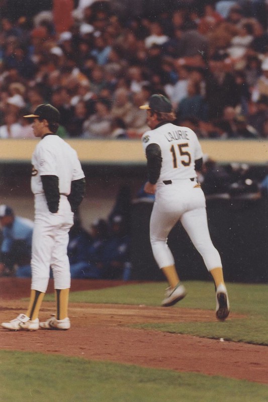
Did the A’s ever have a coach whose last name was Laurie? Nope — that’s Rene Lachemann, who coached for Oakland in the 1980s. He was known as a practical joker, so one day in 1988 the other coaches got together and had equipment manager Steve Vucinich change his NOB to “Laurie” — the name of Lachemann’s wife. Lachemann never noticed and just put on his uniform. (Big thanks to Tom Shieber for bringing this story to my attention, photographer Doug McWilliams for providing the image, and of course Vuc for confirming the details. Good stuff.)
New ESPN column today — the annual college basketball season preview. Link Here.
Got a note the other day from reader Darren Damewood, who has an interesting work history:
I’m the head equipment manager at Moravian College (a small DIII school), so I deal with uniforms and equipment on a daily basis. I also have an equipment blog where I collect articles and stories from all over the web to share in one spot. But before coming here, I was the equipment manager and football technical advisor assistant for the Friday Night Lights TV show.
Originally we based Dillon High School and its opponents on the schools surrounding Austin, Texas, so we could use actual footage from real high school games. As the series continued and Dillon played new teams, and then when East Dillon was added, we would continue to use color schemes and logos of real high schools in the area, but I was also able to create many of the logos. What I’d do was search the web for the mascot we wanted to use and see what others were using (some of the sites I frequented were MG’s Helmets, Uni Watch, and SportsLogos.net). When we would use a real logo that was in use, I always made sure to alter it slightly and would usually change the colors as well, so there weren’t any copyright issues.
We did however, come up with a few totally original logos, including these. Often we would use the same helmets for multiple teams and just change the decal. As we continued, we switched from real football decals to thinner car decals, since we only needed them for a one-time shoot.
Faaaascinating. Thanks for the great info, Darren.
Uni Watch News Ticker: Love this bowling pin lamp (thanks, RyCo). … America, fuck yeah, New Mexico style. One thing I mentioned in the comments a few days ago bears repeating here: I one reason think football is able to go so far over the top with the jingoistic uni elements is that almost all football players are American. By contrast, consider the situation in baseball, where any given MLB team is likely to have Dominicans, Venezuelans, Mexicans, maybe a Japanese player or two, etc. Imagine asking those players to wear something like that New Mexico helmet. Kinda puts this nonsense in useful perspective, no? … Wait, there’s more: America, fuck yeah, WMU edition (from Casey Hart). … Sooo much going on in this photo — a captain’s C, a Philly tag, a pink ribbon in an unusual spot, a helmet number in an even more unusual spot, what appears to be football-shaped merit decals, and what’s with the green dot? The school is Peoria Notre Dame, from Illinois. The other school is Macomb (big thank to Tony Schiffman). … “Possible new uniforms” that are “top secret” in the works for the Dallas Stars. Classic lockout story there — a non-item about non-news. … Looks like the soon-to-be-renamed Reading Phillies will be called the Fightin’ Phillies. Not exactly an earthshaking rebranding. … Ohio University is trying to raise money for new marching band uniforms (from Jason Hillyer). … Toledo and Ball State went color-on-color on Tuesday night (from Matt Wilson). … Lukas and Lucas have something in common. … A Florida voter wearing a Massachusetts Institute of Technology T-shirt was temporarily prohibited from voting because “MIT” is close to “Mitt” (from Bernie Langer). ”¦ Check it out: NFL crockpots (from Yancy Yeater). ”¦ Jerry Wolper knows what I like. Damn, that must’ve been quite a game to see in person, in color! ”¦ The Chargers were accused of having a stickum-filled towel on the sidelines. Turns out there was no stickum, but they’re being fined anyway, for not immediately turning over the towel.
Many, many of you have sent very nice notes about my broken arm, my impending wrist surgery (which will already be taking place by the time most of you read this), and so on. Thanks so much. Not sure how much typing I’ll be able to do over the next few days, but some good content is already in place for tomorrow, and Phil will be back in the saddle this weekend. I’ll see you next week, okay? Okay.
You may not read this, Paul, but my best wishes to you as you go under the knife.
Hopefully you get some quality pain meds. All I ever seem to get is ibuprofen. And I never have the balls to ask for something better.
James, I’ve met the missus. She’s a doll. If she’s holding the “better” from you, it’s probably for your own good. ;o)
No, no, no… I’m talking about what doctors prescribe. I know people who go in to have a cavity filled and they’re popping vicodins for a week. Me? I have major dental surgery and I get a bottle of motrin.
Recovery is 90% mental, I suppose. Placebos are becoming the new medical fad with suprising results (or so I’ve read in the Enquirer). LOL
I have the same problem James. I broke a rib during my wedding reception (rather, it was broken for me), and all they gave me was high test Ibuprofen. I could’ve called and said it wasn’t enough, but… no stones.
yeah… part of it is that I don’t want to seem like a junkie. But maybe the bigger reason is that I don’t want to look like some kind of wuss who can’t deal with some pain.
Agree 100% on both counts.
Weird that the Ravens & Titans crockpots don’t have the helmet stripes represented the way the rest of the teams do. Thickness aside, all of the other teams have their proper stripes – the Jets have a double green, the Packers are green-white-green, etc. But the Titans have no stripe at all and the Ravens is a single purple instead of double.
Also, good job Toledo & Ball State!
Steelers crockpot should only have one logo.
The Ravens crockpot also has no logo. Does someone at Rival wish they were still the Browns??
I’m about 98% sure that the Ravens one is just a picture from the back side – note the US flag & NFL logo – it matches the back of a helmet. Why they did that, I don’t know.
Yup, if you click to view the actual product it shows the front and the back.
Good luck today Paul, I hope everything goes smoothly.
Cheers!
~B
Medical Marijuana? Hit me up I know a delivery service in brownstone brooklyn.
Or move.
“Rocky Mountain high…”
That would make sense, since green is Paul’s favorite color ;)
I like the comment to the Western Michigan jersey:
What WMU jersey? What comment?
in the Ticker
Oh, yeah… The comment from Jennifer Hayden was under the picture at Twitter
I didn’t want to be mean to the guys – they are typically college students running those boards (when they’re not PR firms)
Jen Hayden (aka, JenInChicago)
good luck paul…hope all goes well…
Minus points for the Steelers crockpot. They have the logo on both sides. Would have been so much cooler if they only had it on the right. Also, I know the Bengals unis suck, but I always been fond of their helmets and I think it translates well to pottery of the crock kind.
Wow, that Broncos hockey jersey really goes full-on G.I. Joe – camo AND colorful at the same time, just like 90% of the actual “Real American Hero” toy line!
And that’s NOT a good thing.
Darren and Friday Night Lights nicked Purdue’s old helmet “P” used from the 70s thru early 90s. It was for their main team, too. For him to say it’s “original” is stretching it.
See for yourself: link
(Though a google search will turn up even better photos)
I’ve been in the uniform business since 1967 and that Purdue “P” has been a stock offering in football decal catalogs for years. Kind of a “What came first…..” scenario.
Purdue was huge in the mid to late 60s … Griese, Phipps, Keyes, all Heisman candidates. I understand what you’re saying, Terry, as I’ve even seen the old “Boilermaker Pete” as a stock icon for printing (aka an “oiler”).
Chicken or egg, my guess is Purdue led the way in this instance, since they were so good at the time (beating ND, Michigan, etc., consistently).
Scotty, I totally understand what you’re saying about Purdue and those great players/teams of the late ’60s-’70s era. But also keep in mind that decals for high school and college teams were just starting to become really popular then as well. Back in those days most coaches took the stock offering right from a catalog instead of having an artist draw something up.
So what was more-than-likely a standard offering from a catalog took on a life of its own and here you have a basic rounded-off “P” being closely identified as “the” brand of one of the most legendary college football teams in history. Thus my “chicken or egg” analogy.
I’m sure he didn’t mean that logo was original. It’s a variation of the Odessa-Permian Panthers, the real team chronicled in the book that the show was based on. link
The book begat the film which begat the series.
What I always found interesting was the continuation of Buddy Garrity and my all-time favorite television wife, Tami Taylor from the film to the series.
link
link
.
The Dillon Panthers uniforms were simply those of the real-life Pflugerville High School in the Austin area, which happened to have a near-identical P to those worn by Odessa Permian, albeit in different colors.
Totally original is quite a stretch, especially for the “P” and “R” helmets. There are several high schools in Texas that have used very similar logos long before the show was around.
Im now at the hospital, where I’m encountering an indignity I hadnt anticipated: my gown, pants, and slipper/sock thingies — all purple.
This calls for general anesthesia, and FAST.
Just pretend you’re the King of… something. Purple is a royal color, after all.
Just pretend you’re the King of…
link?
well, Kings is the county he calls home, so it works for me.
NOOOOOOOOOOOOOOOOOO!!!!!!!!!!
Wow. You should have refused to go in looking like that!
What says the surgeon’s listening to link Too soon?
It’s part of a secret plot against you. Maybe they’ll play “Purple Haze” as background music. LOL
I had to go in for a series of epidural steroid injections a few years back, and when I was wheeled into the operating room some Saigon Kick was blaring on the radio. I made some comment about the Saigon Kick, and the doctor began quizzing me on 80’s music. Needless to say, I was a lot more relaxed after our conversation.
This makes me smile.
GO U NORTHWESTERN!
You should have asked for CAMO!
Pics or it didn’t happen, etc. All hail purple!
Nice display of UT helmets in the equipment room.
link
Jingoistic elements? It’s not like the jerseys say “Invade Iran.” I don’t think the notion that anything resembling the American flag and/or camouflage is inherently jingoistic is fair at all.
^^ Not me ^^
I’ll only accept a few reasons for a team’s iconography taking cues from the US flag, and one of them is calling Washington DC their hometown. Another is if their mascot is a Minuteman or Founding Father. But falling back on the flag as a rallying point is a cheap and gratuitous gesture.
I completely agree. My issue is with the implication that it’s somehow bigoted simply to display the American flag.
Last night the snow in New Jersey allowed the several hundred tuned into NBC Sports Net to see a truly unusually colored game. Houston in Orange, KC in powder blue, w keepers in pink and yellow and refs in black. Not a typical USA sports color in the bunch. The consensus in the room was YUCK.
Powder blue and orange isn’t exactly that rare – I’m sure that matchup has occurred multiple times in NCAA and NBA basketball… but… seriously, why the hell do soccer goalies wear such blatantly different uniforms than the rest of the team? I mean, I can sorta see a reason for them to wear something a little different – but why not just reverse the team’s uniform rather than going with the off the wall colors? If a team’s wearing orange uniforms with white numbers, the goalie should wear white with orange – not pink or green or wtf-ever.
I think there is a rule saying the goalies cannot be wearing the same color as any other person on the field. Easier for the ref to tell who the goalie is, I guess.
That is correct, the goalkeepers must wear uniforms that contrast from everyone else on the field.
In MLS, adidas only supplies the approved goalkeeper jerseys in a limited number of colors, plus the referees only have four colors (black, yellow, gray, and sky blue this year) to work with.
This year, I’ve seen MLS keepers in black, medium green, a slightly tealish blue, yellow, plum (what you saw as pink last night), and a screamingly bright orange. I think there were a few true pink GK jerseys in October.
… A Florida voter wearing a Massachusetts Institute of Technology T-shirt was temporarily prohibited from voting because “MIT” is close to “Mitt” …
Probably a good bet the election worker wasn’t a graduate of the Institvte… BTW, read the comments below the article; quite hilarious.
Paul’s new column is up.
link here.
Whoever came up with the wordmark for Por7land should be fired. That “T” is just horrible.
Horrible, indeed.
Yet it looks infinitely better than that P|L01S wordmark on the home jersey.
link on a Georgetown jersey? Even if it’s just a template, even if it is the Jumpman brand, it’s still stupid to put Michael Jordan’s name on the back of a jersey for a school he didn’t go to.
Especially since there’s an actual player on the roster (Aaron Bowen) who’s wearing 23 this year.
Looks like some teams were rushing the 1970s crazy design looks. Those basketball uniforms in the 1967 Pittsburgh Post-Gazette article were made by Wilson (No. 50) and Sand-Knit (No. 41). Wilson had been doing the striped jersey bit starting in the late 1950s. Those Globetrotter-striped shorts by Sand-Knit were used by the NBA Rochester Royals in 1955.
I sent that photo to Paul because I knew he’d like it. I never expected to learn anything about it. Thanks, Terry.
Here’s hoping for a speedy recovery.
Also, this is gonna happen:
link
Ay carumba.
Link isn’t working.
link
Corona branded maracas and Dora the Explorer. Wow. I think if I were Hispanic I’d be offended by that.
link.
Ugh, an AHL team is going horridly Noche Latina on our asses:
link
You’re the second person to post about that with a bad link. Either you both suck at linking, or Yahoo! really doesn’t want people to actually be able to read their content. For some reason I think it’s the latter.
Curious, but as the first bad linker, you may consider me for the former. Looks like Rob got it right above…
the problem is that the URL has two consecutive hyphens (-). They get converted to a dash (‒) when you post here unless you put the URL in an anchor tag like Rob S did below.
It happens a lot with photos, too. if there’s an x in the URL “…photo-name-640×480…”, the x gets converted to a multiplication sign (×).
Heh. It happened here, too. It’s hard to tell, but the x between the 640 and the 480 got changed.
I see said the blind man, who picked up his hammer and saw.
Let’s try link for the PuckDaddy article…
I think the only good part of that uniform is the apparent lack of the Pepsi logo shown on the image for their normal white jersey.
I suppose it wouldn’t be horrible for a team that actually had some kind of Mexican/Hispanic imagery associated with it… but for a team called the IceHogs… err… umm… Yeah. Sure.
I’ve fallen behind on reading Uni Watch in the past week, so forgive me if this is duplicated information.
NFL Fan Huddle just sent out a survey seeking fan input on Nike’s jerseys. The initial questions centered around whether fans like the new jerseys and if the redesigns made us more or less likely to buy one soon. There was a specific question on if we liked the flywire/horned collars. I wonder if a raft of negative opinions (like mine) might actually do some good?
Went to look that up, got to their sign-in page, but when I clicked the link to register, I got this:
The study you are responding to is now closed. Thank you for your time and interest.
What caught my eye about that photo wasn’t Rene Lachemann’s jersey, but the other person’s, with no name or number at all. Who is that? I thought it might be a batboy, but even they have some sort of number or ‘BB’ on the back of their jerseys. Who on the A’s bench would have a jersey with no identifying name or number on the back?
From the context it looks like it could be a bat boy/ball boy bringing balls out to the home plate umpire as Lachemann is making his way out to the coaches box.
“…consider the situation in baseball, where any given MLB team is likely to have Dominicans, Venezuelans, Mexicans, maybe a Japanese player or two, etc. Imagine asking those players to wear something like that New Mexico helmet.”
You mean something like link?
Paul’s ESPN article shows Maryland’s outfit for the Barclay’s Center Classic. The arena is what, three months old, and they’re calling it a ‘Classic’?
Come on, that’s just what you call these type of college basketball events…
Apostrophe catastrophe’d.
Funny about MIT… wondering if that happened to any one wearing a Barry University (Miami) shirt?
This struck me as very catch of the day.
link
Story in the KC Star this morning about the A. Brown Jr. NOB for the K-State linebacker: link
Behind the scenes @ 49ers equipment room, etc.
link
and GOOD GRIEF lookit the Niners new stadium. This is all just since APRIL! Are we SURE it won’t be done til Spring 2014?
link
Paul,
Good Luck!
I LOVED the insight from our equipemt manager today.
I am one of the world’s BIGGEST fans of the FNL series, to the point that I can often be seen wearing an East Dillon lions tee areound during the summer.
Isn’t is true that the Dillon Panthers were actually a facsimile of the Pflugerville HS team?
Plugerville in a Nike template now:
link
New piece on Alyssa Rosenberg’s blog at Think Progress cites Paul & UW on the Redskins GI Joe schtick
link
The MIT comments are hysterical. I dare someone here to mention the Orioles apostrophe catastrophe over there?
Hadn’t seen this on here so I figured I would pass it along. Iowa will be wearing silver pants and helmets to honor Veterans this weekend.
link
Looks good (as far as these things go) but what’s the significance of silver?
University of dayton Baseball Jerseys.
link
Detroit Lions crockpot…
Starts out slow…
And you’ll be lucky if it’s done in three hours!
The header immediately reminded me of when Russell Martin used the name J. Martin in the 2009 season. J stood for Jeanson, one of Martin’s middle names, which was his mothers maiden name. MIOB (Middle Initial on Back) or MMNOB (Mom’s Maiden Name on Back) anyone?
Pat williams was on toronto radio tonight discussing nba ads.
Not surprisingly, he is in favor, or at least accepting.
I really like this column but I am sick of the non stop complaining every time a team does anything to honor the country or the military. They do a lot for us, never for much money and often under significant personal risk. Saying thanks in a public way on a regular basis is a good thing.
Fortunately for John. I’m back to typing with one hand, so i can’t give his comment the detailed response it deserves. But i’ll say this, john: Go check the comments from monday’s post — especially the ones from past and present military personnel.
Surgery went well. Arm is numb, but that will end shortly, so i’ll be shifting into painkiller mode. Thanks to all who sent kind words today.
Why am I only remembering this now? In 2004, Mia Hamm closed out her soccer career with a spouse’s NOB as well!
link
doesn’t count — since that is his LAST name (did she ever take it legally?)
for it to count, she would have needed NOMAH on the back
Probably because you’re the only one here who watches womens soccer.
Jags in a mono black tonight.
What an original, unique, leading edge move.
Jacksonville Jaguars in all black: just the thing to make The Hulk’s bald spots on the helmets look more bad-ass.
The Jags are like a former famous child actor, glorious beginning, now lost and sad. For still a relatively young franchise, I’m already nostalgic for the Mark Brunnel era uniforms. I’m OK with their helmets though
yeah…but more in the corey haim/dana plato/river phoenix mold than shirley temple, drew barrymore and neil patrick harris mold
New secondary logos for Nebraska:
link
Get well Paul.
On a side note…anyone ever notice the guy wearing the sweet Rams helmet headphones in Devo’s “Freedom of choice” video? (it was an election day thing…you had to be there).
This message was typed with one hand.
Best wishes on a quick recovery Paul.