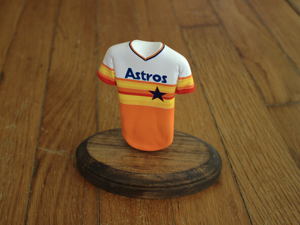
Uni Watch reader Stephen Rawlings makes these nifty little mini-jerseys. I wanted to show the step-by-step process of how he does it, so I asked him if he wanted to guest-write an entry here on the site. Instead, he posted the whole process on his site (which is better, because he deserves all the web traffic). Get the full DIY scoop here.
Stephen also sells blank versions of the jerseys, to which you can then add your own decals. For details on this, look here.
New ESPN column today — the annual NBA season preview. Meanwhile, in case you missed it yesterday, here’s my World Series preview column.
I’ve been opposed to the arena from the start, but I have to admit it’s a bit of a mind-fuck to learn that I’ll soon be living just a few blocks from an NBA team and an NHL team (assuming I haven’t been priced out of the neighborhood by 2015, when the NHL team is due to arrive). And on some level I like that the Nets and Islanders, who played in the same arena back in the 1970s, will now be back under the same roof again.
Although I’m from Long Island, I’ve never been into the Islanders. My father and brothers had always been big Rangers fans, so that was the culture of our family. I was already drifting off to sleep while listening to Marv Albert call Rangers games on the radio in 1971, a year before the Islanders even existed. I went to a lot of Isles games in the ’70s, though. We’d go see them whenever they were playing the Rangers, Bruins, or Canadiens (you know, the good teams), because it was a much easier ticket than getting tix to see the Rangers at the Garden. Sure, the Isles sucked in those days, but we didn’t care. We were there to see the other team.
As the Islanders got good and their relationship with the Rangers changed from little brother to bitter rival, I learned to hate the Islanders, to loathe them. And like all good loathings, there was something delicious about it, something addictive. By the time I finished college in 1986, hating the Islanders was as big and as satisfying a part of my identity as hating the Yankees.
Since then, of course, the Isles have been a joke. I no longer hate them; I barely even remember they exist. But will I suddenly start rooting for them in 2015 just because they’ll be headquartered four-tenths of a mile from my house? No — not if they’re still calling themselves the New York Islanders (which is the plan). I just can’t start supporting a team to which I’ve been indifferent at best, diametrically opposed at worst. But if they ever decide to rename the franchise the Brooklyn [Whatever]s, then we can talk.
Will I go to their games? Yeah, why not. It’d be fun to take a 10-minute stroll and end up at an NHL game. Assuming they’ve settled the lockout by then.
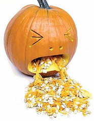
Fun with pumpkins, continued: From now through Halloween, I’ll happily post photos of any uni-related pumpkin carvings you folks come up with. Here’s today’s haul:
• “Here is my Boston College logo pumpkin,” says Stephen Garvey. “Looks a bit like RC, but I gave it my best shot!”
• Scott Duebber sent in this shot of his MLB logo pumpkin.
• Brad Reissig’s friend Ali tried her hand at this Patriots pumpkin.
• And UGA fan Matthew Lawrence says, “We may get our tails handed to us in Jacksonville on Saturday but we’ve got a damn fine jack-o-lantern!”
Membership update: The membership program goes through some odd boom/bust cycles. Sometimes we’ll go through a period where we get tons of orders and can barely keep up, and then we’ll have a period where orders slow to a trickle. We’re currently in one of the latter periods. So if you’ve been meaning to sign up, this is a good time to do it, because we don’t have lots of other orders in the pipeline and should be able to process your order pronto (or at least pronto-ish).
As always, you can sign up here and see all the cards we’ve designed so far (over 1350 of them!) here.
Research request redux: A friend of mine is involved in a project in which he’s examining inconspicuous visual symbols of achievement and/or status ”” sort of like college football merit decals, but he’s looking for examples that are less well-known than that (and not necessarily sports-related). Stealthy signifiers, if you will. If you have any suggestions, please send them this-a-way. Thanks.
Uni Watch News Ticker: Just one more October weekend to go, but the NFL has saved one last extra-annoying gimmick for this Sunday: pink penalty flags for the Jets/Dolphins game. Oh boy! Can’t wait. ”¦ Stunning sight at last night’s World Series opener, as Willie Mays appeared in a game cap instead of his usual BP cap. ”¦ Big Kool-Aid spill on the Missouri State ice surface (from Stuart Ciske). … Did you know that the Lightning used a lightning bolt red line in the mid-2000s? That’s from the great Frozen Faceoff site, which has recently been updated with a bunch of new content. … This is interesting: The Ravens used an intern to fill in for the injured Lardarius Webb in their team portrait. “Nice to see that they’re actually admitting to Photoshopping,” says Joe Hilseberg. … The Steelers are gearing up for this Sunday’s throwback game. ”¦ Good story on what happened to Hunter Pence’s broken bat from Monday night (thanks, Brinke). … Speaking of Pence, I’ve mentioned many times that he wears only one batting glove, and that single-glovers used to be much more common back in the ’70s. That has prompted a great story from Neil Cablk: “During my Little League days (mid-1970s), I batted right-handed and wore a batting glove on my left hand. Once I had a blister on my right hand that was bothering me and asked to buy a batting glove for my right hand. The guy at the local sporting goods store refused to sell me one! He asked me if I batted right-handed, I said yes, and he said something to the effect of ‘You’re right-handed, you need a glove for your left hand. What do you need two gloves for?’ For some reason the topic was important enough for him to lose a sale.” ”¦ Meanwhile, you know who else wears one glove? Giants pitcher Madison Bumgarner. Surprising that there are two single-glovers on one team (big thanks to Dan White). ”¦ Check out the cap Jim Leyland wore while skippering the Clinton Pilots in 1975. Looks more like a gimme cap from the local feed store (from Brady Phelps). ”¦ The Sporting News published some very weak uni-related humor in 1965 (from Tom Shieber). … Oklahoma is asking fans to create a candy cane stripe for Saturday’s game against Notre Dame (from Leon Frager). … In a related item, skip ahead to the 1:30 mark of this video clip to learn how Oklahoma designs its field differently for conference and non-conference games (interesting stuff from Scott Kingsolver). ”¦ The band Wilco has teamed up with Ebbets Field Flannels to produce a Wilco grounds crew jacket (from James Huening). … Postgame jersey trading is common in soccer — but in the NFL? That’s a new one on me (from Maks Skuz). ”¦ What’s worse than one team playing G.I. Joe? Eight teams playing G.I. Joe. “U-S-A! U-S-A!” says Jeff Mayer (sarcastically, I’m fairly sure). ”¦ Speaking of G.I. Joe, look what Barry Zito wore to last night’s postgame press conference (from Mario Fontana). ”¦ Some guy in Louisiana has a collection of over 300 football helmets (from Ben C. Melancon). … Bears will wear their Monsters throwbacks this Sunday. In the past, they’ve worn them with plan navy helmets. This year it looks like they’re keeping their regular helmets but using gray facemasks. … Nice piece, including a great cartoon, about how soldiers on both sides of the Civil War passed time by playing baseball. … Here’s an absolutely beautiful slideshow from a 1969 Packers/Falcons game. Great uniforms, gorgeous saturated colors, plus both teams were wearing the NFL 50th-anniversay patch (from Jeff Ash). … Country music star Jason Aldean has changed the lyrics to one of his popular songs to reflect his newly inked sponsorship deal with a major brewery. But don’t worry, corporations don’t have too big an influence on American life (from Kyle Mackie). … Henry Sibley High, a high school in the Minneapolis area, has a weird mix of elements for its football uniform: a Michigan State logo on a Giants-style helmet with Giants pants and a red jersey (from Andy Henderson). … Arizona State is letting a current player wear Pat Tillman’s No. 42 (from Paul Hirsch). ”¦ What the hell is Cowboys cornerback Mike Jenkins wearing under his jersey — a corset? Never seen that before (from James Comfort). ”¦ Check out these helmet storage bags used by the Notre Dame equipment staff (from Warren Junium). ”¦ Marty Corcoran was watching the Vietnam documentary Hearts and Minds and spotted a color-on-color high school football game. ”¦ Now I’ve Seen Everything Dept.: gumball sideline caps (from Tim Reyes). ”¦ “So my wife is watching Murder, She Wrote in bed on her iPad (don’t ask),” says Jon Solomonson. “I glance over and what to I see — a helmet buggy! ”˜Screen grab!’ I yell. She freaks out. Apparently the team was called the Leopards. That’s all I know. That’s Angela Lansbury and some kid inside (or maybe their stunt doubles!).” ”¦ Check out the photo that accompanies this article about the NHL lockout. Do NHL nets really have logo creep like that? If so, when did it start? (From John Lee.)
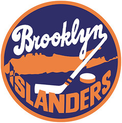
Islanders new logo link (found on imgur, i take no credit for this)
and this:
link
for the ad campaign
“…I was already drifting off to sleep while listening to Marv Albert call Rangers games on the radio in 1971…”
I did the same exact thing. Thanks for bringing back those memories!
Paul, the Isles are the one New York team that I liked. The reason was that I was a huge fan of Coach Al Arbour. I watched Alger “Radar” Arbour play during his five year career with the Rochester Americans from 1962-67.
Al learned from one of the best minor league hockey coaches of all time, Joe “The Crow” Crozier. Joe’s teams won three of four Calder Cups with Rochester with Al as assistant coach. Al was a great player for the Amerks and someone I have the utmost respect for. Thankfully he made the Hall of Fame, mostly on the great job he did with the Isles.
I think Mike Jenkins is wearing a shoulder stabilizer, but I don’t think I’ve ever seen one that laces up like that. The newer ones usually velcro.
It’s definitely a shoulder stabilizer, or at least something highly similar. I wore one when playing high school football that laced up exactly like that.
Paul, you really pissed me off. The NFL is doing the pink penalty flags because a young boy sent a letter to the League asking for it.
So… an idea is somehow less stupid if it was thought up by a kid? Maybe someone can get a 10yr old to write in about how they want to see a game where it’s legal to hit the QB in the head. Good idea?
The NFL should have just thanked the kid for his suggestion and sent him an autographed picture or something.
The NFL is doing the pink penalty flags because a young boy sent a letter to the League asking for it.
Yes, I know. And your point is..?
My point is don’t make it sound like the D-Bag NFL Marketing team who came up with the idea. I personaly rather see a pink flag than see pink wirstbands, hats, towels, socks, hand warmes, etc.
Actually, they are doing pink penalty flags because the league’s high-priced PR firm told Goodell that the best way to shift attention from the beating his reputation has taken with this alleged bounty mess is to come up with cute little distractions like pink penalty flags or talk of eliminating the Pro Bowl. Next week it will be something else, like a new end-of-season award or a change in whistles for the refs…
Why do I think it’s a pink lobbyist who really wrote that letter?
“Won’t somebody think of the children?”
On the other hand, while claiming that the idea came from a child actually makes it worse, not better, on a practical level, pink penalty flags might not be such a bad idea. Outside of October, no team wears pink. Several teams do wear bright yellow. (Sorry, “gold,” because of course it’s unmanly to call vivid yellow “yellow” when manly men wear it to play a children’s game for money.) And the dazzling magenta that the NFL passes off as “pink” is highly visible and contrasts nicely with every (non-October) NFL uniform and field. So A) Maybe the NFL should adopt pink penalty flags full time and B) Maybe by doing so, it could obviate the need for the league to make anything else pink, ever.
Of course, during October, every team wears pink, so as long as that’s going on, pink penalty flags are a terrible idea. Function before form, people!
Pink penalty flags is preachy bullshit pandering to a lobbyist with deep pockets & way too much muscle. They are a bully.
This pink NFL thing has gone WAY too far. It’s pandering on the worst level.
Athletic Gold.
What I’m saying is that, independent of the pinkwashing BS, as a practical matter pink penalty flags might actually make sense. High visibility & contrast and no chance of confusing the flash of pink with any part of any player’s uniform. As a one-off in October, I agree with you completely. But I think it might actually be a good idea as a permanent switch.
Athletic Gold : Yellow :: Square : Rectangle. [Assume a smiley-face emoticon here, since I generally refuse to use emoticons, but I’m totally kidding around.]
Playing devil’s advocate seems to be a popular role in the comments here.
Pink penalty flags, have basically been tainted now. I don’t think anybody has ever lost a penalty flag in a uniform. If it ain’t broke, don’t fix it.
I sorta agree with concealed here… I mean, if *anything* should actually be required to be a universal non-team color – it should be the football, not penalty flags.
Of course, if football visibility against a jersey was really an issue, the Browns would probably have a much better record, so… yeah.
A fluorescent yellow might be a possibility.
“ink penalty flags, have basically been tainted now. I don’t think anybody has ever lost a penalty flag in a uniform.”
~~~
didn’t orlando brown lose an eye in a penalty flag?
I don’t think they had to remove the eye, but his vision was severely, and I think permanently, impaired when the flag’s metal weight got him right in the eye.
What exactly does raising awareness accomplish anyway, other than to make the emotion-driven feel that they’ve ‘done something’?
And I wonder if someone will be watching the game and will turn to their fellow viewers and ask, “What is the pink flag about? Breast Cancer? Gee, never heard of it! Tell me more!”
It’s the art of advertising & luring people and their wallets to their cause. To me it’s no different than McDonald’s.
ChrisH nailed it on the head. The pink shit is for breast cancer awareness. OK? Who hasn’t heard of breast cancer?
This article was posted on here not too long ago, but it’s fantastic. Everyone should read it.
link
“What exactly does raising awareness accomplish anyway, other than to make the emotion-driven feel that they’ve ‘done something’?”
THANK YOU! I feel the same way about all the “Wear red for bullying” or “Wear teal for spousal abuse” crap that people are always “inviting” me to on Facebook.
I thought maybe the kid had a relative or something with the disease which led him to write in. Then I guess there’s a little bit of a story.
Pink flags piss me off because yellow is the color of caution Or warning. Pink is the color of boobies.
We all knew the pink flags would come sooner or later. I wonder if the “Flag” graphic for the game will be changed from yellow to pink to match?
What’s next? Pink footballs? Let’s paint the entire turf pink for October. Hey Boise has blue, why not pink? Pink helmets? How about making official on-field versions of those pink fashion jerseys and let each home team wear them for all their home games in October. UGH!!!
As I said the pink is right there with the cammo, the flag stuff, and all the rest of the gimmicks and has long ago jumped the shark along with the rest of them.
And that’s when I take up bird watching on Sunday. Holy smokes, what could they do to make it worse? Don’t answer that please.
There are 2 NHL shields on the back of the net.
link
I knew about the bigger one on the skirt. Didn’t remember the little one on the netting. Thanks!
I LOVE the mini-jerseys! I think I might push the envelope a bit and do hockey ones (if I can find the time).
I’ll still ask the question, Paul, but the Isles-to-Brooklyn was one of the questions we had lined up for you next week. I know how you feel already, but we still want that emotional reaction when we ask. ;o)
Don’t worry, Teebz. When I do interviews, I try to treat every question like it’s new!
ask him how he feels about purple teebz!
Mesut Özil played with Real Madrid yesterday versus Borussia Dormunt in the group stage of the Champions League.
BUT, he played each half with a different pair of cleats. Not only model, but the brand. He swept from Nike to Adidas at the half because of the negotiations he is having to sign with the Germany based brand.
link
Mike Jenkins is wearing a shoulder stabilizer, called a Duke Wyre. They are made of a canvas material and are awful to wear. Usually you have to have a fairly unstable shoulder to be put in one of those. The significantly reduce the range of motion that is allowed.
Another reader just sent me this link:
link
I agree with how horrible it is to wear these shoulder stabilizers – I was issued one by my college’s training staff back when I played (we used leather helmets). I kept it and wore it when I played rugby. I do have to say, while uncomfortable – it worked great!
That isn’t Henry Sibley but rather Simley that has the uniforms shown.
While I could be wrong, I believe you are mistaken.
Pretty sure it’s Simley. They’re the Spartans:
link
Sibley is the Warriors, and its colors were red and gold back when I was a Twin Cities high schooler.
I stand corrected (and will fix the text momentarily). Thank you!
The Minnesota High School Helmet Project tends to confirm that Sibley is wearing the gold helmets, but doesn’t show a helmet like the one pictured for Simley:
link
The real question is how two schools in the same general area ended up with such confusingly similar names!
What? Warriors and Spartans hardly qualifies as “confusingly similar” when roughly half* of all high school teams are the Eagles!
*I’m making up the half thing, but it turns out someone has documented high school nicknames by state, and Eagles is by a large margin the most common nationwide. Fascinating link here:
link
I meant Sibley and Simley.
Well, the B and M are fairly close on a keyboard… obviously one of them was originally a typo and it just stuck.
Both named after people. Henry Sibley was a territorial bigwig and after statehood the first governor of Minnesota. Simley High is named for a superintendent of schools.
Pretty big coincidence that they’re so close to each other and even play in the same district. Must drive the Pioneer Press copy desk batty.
According to Google, the schools are 9 minutes apart. They play in the same conference and are MUCH closer to Saint Paul than Minneapolis. In Arlington, Minnesota, there is also a Sibley East High School, but they would probably never play Sibley or Simley.
I thought that Georgia Bulldog Pumpkin looked familiar, and I realized that it looks a lot like the logo Cornell used to use. There is an example on this page:
link
That’s interesting about the Cornell logo. That Georgia logo was used in the fifties and sixties. I have some very cool cocktail glasses from the sixties with that logo. I like it better because it actually shows an old junkyard bulldog rather than that prissy, woefully inbred family of UGAs.
Just ran across this about possible new gimmick helmets for the University of Kentucky I REALLY hope this is some kind of joke. How nasty will these be with the checkered UK sleeves?
link
Still getting the entire column shifted to the right. Using latest version of Chrome on a PC. Goes away when I go to comments.
I get the same problem in the newest version of Firefox, and it fixes when I load the comments. Also, still getting a pop-under on first load of the day.
I had that issue this morning and remembered the comment from yesterday…..I simply refreshed my Chrome browser and it’s been fine ever since.
Brett Hull is a horrible human being, but I will say that, even as a hardcore Sabres fan, I found this hysterical.
link
link doesnt work.
It’s probably just the silly pumpkin carving that was also posted in yesterday’s comments: link
The Steelers are gearing up for this Sunday’s throwback game. …
Philadelphia Eagles are wearing their black third/alternate jersey against the Atlanta Falcons this Sunday.
Gah!!… what is it with teams wearing black alternates against teams that use black as a main color?
I actually sorta like the Eagles black jerseys, but they should be wearing them against a team that *doesn’t* wear black, like the Cowboys or Giants.
If the Eagles are not going to return to kelly green and silver, the next best thing they could do is to ship those black alts to Jacksonville along with with a bunch of these:
link
Ugh… no, the Jags don’t need any more encouragement to wear more black. They really ought to embrace their teal heritage. With Seattle having switched to navy, and the Dolphins mostly wearing white, the Jaguars could make a serious attempt to “own” teal/aqua/turquoise/etc – instead, they’ve elected to make black their primary color. They should be shamed for that, not given free jerseys.
“the Jags don’t need any more encouragement to wear more black”
~~~
while i agree with THE on principle, i disagree with him on point
there is only one team he wants wearing black, gray (also known as silver) or white, in ANY sport, and the rest he wants to wear all colors all the time
btw, Dick Butkus and Bruce Jenner (pre nose job) were guest-stars on that episode of Murder She Wrote.
Screencaps of the New Jersey Blazers from the second-season Magnum, PI episode “One More Summer” from the same era:
link
link
It’s set at an NFL training camp, so QBs have a red practice jersey. I don’t recall there being a helmet cart in the episode, alas! But it did have Butkus and Pat Morita in guest roles.
Arr,
I love Magnum Mania, it’s a great resource for Magnum fans, of which I am a big one! I have the theme song for my text ringtone.
Magnum is usually known for a lot of baseball. T.C. coaching that kids team with Alfonso Ribeiro, and Magnum with his awesome Tigers cap.
Magnum theme is my ringtone for all work-related contacts! Thomas may be a Tigers fan, thanks to Al Kaline, but he was starting QB for Navy his senior year.
This reminds me a Uni Watch type detail from a Magnum PI episode. He always wore a Tigers cap, but do you all remember the one where he went back in time and had a period-correct old style Tigers cap instead? Or something like that.
“Flashback” – season 3. After Magnum wakes up from what seemed like a dream set in the past, that old-style Tigers cap is wedged in his car seat in the present-day:
link
Never to be seen again on the show, alas.
In that same gallery as the Ravens intern wearing Ladarius Webb’s jersey for the photoshoot, the PR Coordinator is wearing Ray Lewis’ jersey, but more interestingly he is missing an “Art” patch. Also, Terrell Suggs Haloti Ngata messed around and are wearing each other’s jerseys.
They say Suggs is such a ham that they need to photoshop him in every team portrait.
Here’s the link: link
Question I have about the pink penalty flags. Players are only permitted to wear white towels with the exception of October when they can wear pink. One reason is this prevents towel/flag mixup if someone loses a towel. So now what happens if a player loses a towel during a play and the game clock is stopped by an official who didn’t throw his flag because he thought someone else did? And what happens if it’s a 2 point game with about 50 seconds left and the trailing team has the ball on their own 40 yard line and is out of timeouts?
Pink towel use seriously declined (disappeared?) last Sunday.
Sure, but the official in me wants to know what happens if something like this does happen? Is the league officially preventing the use of pink TOWELS in that game? In my experience, in those situations your radar is up for reasons to stop the clock. If you see your crew-mate’s flag on the ground you’ll stop the clock just in case the clock operator happens to be looking in your area instead of the area of the flag. On a long pass play away from me, if I look back and see a flag on the field 40 yards away from me, I’ll stop the clock. What if it’s a towel and not a flag?
“There was no flag on the previous play, please reset the game clock to 47 seconds.” Then they blow the whistle and make a gesture and the clock starts up again.
It’d be no different than any other time that they’ve screwed up on a play. Sure, it sucks a bit if you’re on the team that ends up losing, but it’s hardly a new problem.
@ The Jeff – yeah, that’s how you handle it, but now the official is being publicly roasted for a problem that was caused by the league. Officials don’t need another reason to be publicly roasted.
Fair enough. For the moment I’m going to assume that the NFL isn’t *that* brainless, and they’ll either ban pink towels for that game, or at least use a much lighter shade for the flags. Now, if they don’t ban the towels and the flags are the same color, then we can all agree to relentlessly attack the NFL for their stupidity.
For now it’s only stupid because it’s additional unnecessary pink, but not because of any gameplay disrupting issues.
Love the mini-jerseys (Teebz, you MUST!), love the Steelers’ throwbacks…not a fan of the Islanders’ plans to keep their name and logo. I get why they’re doing it, but I think they’d be much more interesting as Brooklyn’s team, not one of six other New York teams.
And the logo…it’s really always been pretty terrible, hasn’t it? It’s almost a curse that the Isles became so good as quickly as they did, because now they’re saddled with that dated, thrown-together relic of an identity for the rest of forever because of the ties to their glory years. Though I suppose the fact that they’ve hopelessly bungled every attempt at updating their look doesn’t help…
My computer was down for the first half of the month, so forgive me if this was covered at some point, but when did the Catch of the Day get 86’ed?
On temporary hiatus because I’ve been too busy to update it regularly. Will return soon.
My Islanders dream is now offically shattered.
In my imaginative young mind, they were the hapless expansion franchise toiling in some exoctic outpost (what did I know of New York geography?), never seen on TV, never mentioned in magaines. The only visual evidence I had of their existence was the O Pee Chee hockey cards I bought at the mom and pop store. The first year cards were all guys with their previous jersey logos painted out and sporting bushy mustaches. I thought the logo was a little busy and odd but loved the geographic reference of this faraway, mysterious dreamland. The colors looked sharp, too. The Star Tribune sports section back page listed nightly scores and the Islanders lost with a regularity I had never witnessed before. Though I was a North Stars fan, I always carried a fascination with the Islanders (what a great nickname!) over the years. When the North Stars left, the Isles became my favorites.
Now? It just won’t be the same.
By the time I paid attention to hockey, the Islanders were dominating on their way to the first of the 4 Cups. What fascinated ten year old me about them was geography – I wasn’t sure why they and the Rangers could both be called “New York” when the Isles didn’t actually play in New York City. But I absolutely LOVED their uniforms and the geographic logo (still do!). I’m sure Nassau Coleseum is outdated, but it will be strange to have the Isles playing in NYC proper.
NHL should totally rename the Islanders.
Bring back the Whalers !
or how about the Brooklyn Brawlers (a tip of the cap to WWF aficionados)
perhaps the Brooklyn Nordiques
i’m serious about the Whalers though, bring back the Whale !
For a team playing their home games in Brooklyn? Don’t be stupid.
I thought New Yorkers like the Knicks, Islanders, and Mets for the color scheme…
or maybe the Jets, Mets, and Nets for the word play. who knows
It’s handy to imagine that there’s a system for which teams we support, but it isn’t that easy.
I wish I could say it’s because we New Yorkers are complex, complicated people. But it’s really because sports rooting loyalties are rarely built on any rational basis. That’s part of why they’re so much fun.
I wish I could say it’s because we New Yorkers are complex, complicated people.
Hell, I’ll say it – we’re complex people.
(Raised on Long Island in the 80s – fan of the Mets, Giants, Knicks and I suppose Islanders although wasn’t really into hockey.)
That’s not complex, that’s just rooting for teams that wear blue. ;)
Let’s try again
Well, yeah, that too…
But according to the NY Times, “Blue Stands Out”
btw: for that is a really interesting article about the uniqueness of the color blue. highly recommend.
Blue may stand out in nature and in color terminology, but in professional sports it’s ludicrously overused. (The article is rather interesting, however.) I was mostly just messing with you, but the only NY teams that *don’t* use blue are the Jets (who used blue as the Titans) and Nets (who have worn blue every year until now).
If there is any sort of trend in New York Sports Team fan support, it’s probably just “established team” vs “newer team”. Yankees, Giants, Knicks & Rangers vs Mets, Jets, Nets & Islanders. There will be exceptions of course, as some people might be die-hard Jets fans but despise the Mets or whatever.
I got ya, didn’t take it any way but playful. I do agree that if there is any pattern it’s established/new.
When I explain to people outside the NY area about my allegiances, I usually point out that I started following in the mid-80s and although my family is mostly Yankee fans Strawberry, Gooden, Hernandez, Carter were such characters there was no way for a 6 year old not to follow them. Although, Mattingly was my favorite player.
As for the Giants, inherited that from my father – but LT was such a dominating figure hard not to root for him (at the time…)
thats pretty interesting. a large market with two teams in every sport.
the established team vs the newer team theory makes a lot of sense.
someone should do a poll to see where the majority lies.
Maybe the Islanders can change their name to something that rhymes with Mets, Nets and Jets…. The Brooklyn Bets? (as in short for Bettmans) Er… no. Pets? No. I guess Mets, Nets and Jets are the only nouns ending in “ets” that work. Oh well.
I think it’s worth mentioning, as Deadspin pointed out, that the current Islanders logo does not include Brooklyn or Queens:
link
We had a lengthy discussion about that yesterday in the comment section. On that fact alone it’s time for an update, not a total re-do but something to make it look less “thrown together”, “busy and odd” as others have said above.
It’s an easy fix to modify the logo so that the whole island’s on there:
link
Now, that was a quick, 2-minute job, but it works. Even kept the idea of the “I” pointing towards the arena…
Well, yeah, that too…
But according to the link, “Blue Stands Out”
btw: for that is a really interesting article about the uniqueness of the color blue. highly recommend.
Well, that’s in the wrong spot…
seems like every NBA franchise has a color of blue in their scheme
And we are talking about an average hockey team, that is moving to Brooklyn in 2015 or 2016. My suggestion would be, let’s play hockey this year, then we can suggest new logos and colors.
I’m thinking of it as the Capitals are engaged in a year-long throwback to mark the 40th anniversary of the historic 1972-73 NHL season, when they didn’t exist.
I’ve seen the crests on the back of the NHL nets in Buffalo during the 2005 lockout, so I’m guessing they went official in 2006.
The Nets played a preseason game vs. the Knicks last night at Nassau, and broke out the old ABA stars & stripes unis for the occasion, which was both unexpected and appreciated.
Sadly, the unis themselves looked like knockoffs of the originals, definately seemed like a rush job.
Photo:
link
I thought they looked better than any previous incarnation of the throwback.
I like the idea of the Nets wearing a throwback jersey in their old home but it seems like an odd choice for a team that is trying to re-brand itself and just debuted their new uniforms only a short time ago.
that and wearing throwbacks during pre-season?? really?
“Will I go to their games? Yeah, why not. It’d be fun to take a 10-minute stroll and end up at an NHL game.”
How I wish I had this option. I’m an hour away from the nearest AHL team.
Related, I was watching the SKA-Lokomotiv KHL game yesterday, and the Gazprom ad patch on the back of Kovalchuk’s jersey was flapping in the breeze the entire time.
Today’s ESPN column is up:
link
Paul, you might have omitted this from the article because it’s not uni-related, but the Lakers new mid-court logo has incorrect apostrophes for abbreviating the years. The stars have the open quote for ’09, ’10, etc rather than the close quote.
link
Yeah, I’ve noted that several times here on the blog. I decided not to mention it in the ESPN column because it would necessitate a lengthy discussion/explanation of apostrophe protocol, the way digital typography programs tend to have that mistake built into their software, etc., etc. I’ve covered all of that here on the blog, but I decided that it’s too involved for the ESPN audience, esp. in the middle of a season-preview column.
plus the people who comment on the ESPN pieces would rip you a new one because, well…they’re idiots
I am not a hoops fan, but great piece Paul. I always enjoy reading all the sport’s uni previews. I must say however, I am a fan of their throwback games unis. I think enough time has gone by to make those jerseys seem fun for a couple nights. I also have to say that Suns uni is one of my all-time favorites. When I see it, I can’t help but think of Charles Barkley. Call it a guilty uni-pleasure.
Word thru the grapevine: NBA board of govs meeting today. Could decide the fate of the uni advertising program.
So Jon S, does your wife think you are completely nuts now?
She should have been expecting it. She knows my love of helmets and unis. i don’t think I gave her a chance to ask me about it. I just yelled. LOL!
This is why Americans should not be allowed hockey. NO SENSE OF TRADITION at all. Remarket the Islanders with a new name? Are you kidding me? I went to school in Noo Yawk, just be glad they didn’t have to learn French. Fire Bettman, ban all teams in places that don’t know snow and give Canada 4 more teams (where they actually make money).
Read the WS post on ESPN, funny note to the Coke piece is that PacBell/SBC/AT&T Park has a giant Coca Cola bottle in left field, probably pisses off the Pepsi contingent even more.
Arian Foster and Ray Lewis also exchanged jerseys last season.
link
Maybe they had watched the Euro 2012 tournament and thought it was cool.
“Since then, of course, the Isles have been a joke. I no longer hate them; I barely even remember they exist.”
This is how Yankee fans view the Mets!
Paul is cited, quoted and called the “Karl Lagerfeld of uniform analysis” in a mediocre piece about the Giants and Tigers uniforms by Jason Gay in today’s Wall Street Journal.
As I mentioned yesterday, when that WSJ was posted, I know Jason. He was my editor for several GQ pieces back in the mid- and late 2000s.
I was disappointed by the Karl Lagerfeld line, though. Poor comparison — Lagerfeld’s a designer, not a critic. Surprised that one got thru Jason’s editor.
O/U on Uni-Ads being implemented before Stern retires in ’14?
Just saw the Stern news. That is a VERY bad sign regarding uni ads, esp. since the new commish will be Adam Silver.
Stern deserves credit for keeping makers’ marks off of NBA uniforms in a branding-crazy era. He’ll be missed.
I give it one year MAX once Silver takes the reigns. Probably less.
Sadly I give it 1 hour max.
Just got around to reading the ESPN Uniwatch NBA Preview (which basically sums up what you said here but hey, gotta give you some clicks Paul). Great read for someone who doesn’t come everyday to read your stuff right here.
Love your “that’s called an ambigram kids” talking about the Suns center court logo since you had admitedly learnt about this word a week before (if that).
Ah, you clever SOB.
I forgot to mention earlier that I absolutely love Stephen’s DIY jerseys. The thing I like the best is how small they are, so even a rather large collection won’t take up too much space. Bravo Zulu, Stephen!
NO UNI ADS!
link
At least for now.
Big victory, but the war wages on.
Don’t soft-pedal it. It’s a HUGE victory. Doesn’t mean we can suddenly get complacent, but this buys us at least another year — and hopefully more.
Go ahead and celebrate — we’ve all earned it.
Go celebrate on Twitter, too — use the #NoUniAds hashtag. Spread the news!
The article says nothing of an influence from the social media/email campaign championed on UW in the NBA’s decision.
Why is that?
Because there was no influence perhaps?
Put the bubbly back on ice.
Just out of curiosity, Paul, but why the desire to change the Isles’ “city” name from “New York” to “Brooklyn?” As someone who’s never been to the NYC area, I confess I know little about the territoriality, as it were. Is it because the “New York” in the Islanders’ name is more of a general “New York metropolitan area” or “New York state?”
On a related note, what about the New York, and not Queens, Mets? So far as I can think of off the top of my head, the Brooklyn Nets are the only team named after a division within a larger city. In many cases, teams bear the name of the metropolitan area in which they play; I suppose what I’m saying here is I fail to see, as an outsider, how keeping the “New York” name for a 20-mile move would be a problem.
Brooklyn was an independent city until 1898, when New York City annexed it. It has a very distinct identity.
Last I checked Brooklyn was one of the five boroughs, it’s not like they’re moving far away to somewhere like East Rutherford, NJ.
Paul and others what do you think the internal reaction of the Nets has been since this announcement was made? I have to think while the revenue of a second tenant and cost sharing has to be good for business it undercuts their entire marketing campaign and identity. Since the move to Brooklyn was announced they have sent the message that they will be Brooklyn’s team, the first since the Dodgers left 50 years ago. While they will remain the only team with Brooklyn across their chests if the Isles stay true to their word that claim is all but gone. Which is a shame because I really liked the idea of the Nets establishing their spot in the enclave of Brooklyn and appealing to the people in the area and as much as a multi-million dollar enterprise can be, becoming a part of the community.
Deron Williams standing in front of the Brooklyn Bridge with Brooklyn spelled out in graffiti behind him doesn’t have the same effect if John Tavares is standing next to him.
Brooklyn Whalers
get the old whalers logo link
and rotate it so it spells a “B”
even though the islanders have zero history w/ the whalers, that would be awesome.
Why go through all that trouble?
Just rip off the Binghampton Whalers logo:
link
And I think the Caroilna Hurricanes might have something to say about the NYI doing that(?)
Binghamton — not Binghampton.
I went to school there, and trust me, Binghamton is NOT part of the Hamptons.
A keystroke error on my part. Sorry!
A good friend of mine is a Union-Endicott alum…just a bit down the road; he’s told me of experiences and locales that would never have made it on that show Robin Leach used to host BITD.
The color on color high school game was from Ohio during the early 70’s. My guess is 72 or 73. The team in black are the famous Massillon Washington Tigers, and the team in red is Niles McKinley.
My take on the latest NBA news:
link
Good stuff being auctioned off in Dallas.
link
As someone who grew up in an American League city (Go Tigers?), it blows my mind that people who grew up in places like NYC, Chicago and to a lesser extent LA tend to pick one team or the other to root for. I mean, you have two teams, no waiting! If the White Sox are doing terrible, then cheer on the Cubs. I think this especially holds true for the pre-interleague days since Yanks/Mets never played each other until then. It’s not like the Cubs and White Sox are in the same division. Couldn’t you be happy if both teams were doing well? Maybe I’m just jealous that Detroit never had an NL team.
Very good point. I suspect the intercity rivalries are overblown by the media to create more interest. I know many fans who root for any team attached to their city. The hard part is when the teams play each other.
oh, yes
i’m sure that when the mets are doing poorly, paul immediately jumps on the yankee bandwagon
Yeah, I guess I worded that/didn’t think it thru poorly. I was just wondering why a resident couldn’t be a fan of both teams, since they both represent the same city. Tough call would be when they do face each other. I suppose there has to be some sort of dividing line.
i think most yankee fans tolerate mets fans
most mets fans probably detest yankee fans, especially the *newer* (younger) ones
as far as teams…we root for the laundry, and i don’t have the deep seated, venomous hatred for the yankees as does paul…in fact, i detest the sawks far more than the yanks
but there are, in fact, probably very few TRUE fans who are fans of both teams — casual fans or non-fans may root for the city, but real fans pick a side and stay on it (at least for the most part — there are probably are *true* fans who root for both, but those are few and far between)
~~~
on another (sorta-related) note…a lot of younger yankee fans are not giants(jets) knicks(nets), or isles(rangers) fans, but are fans of the cowboys and bulls and couldn’t care less aboot hockey
that’s because they were bandwagon frontrunners from birth
I was thinking younger fans are Cowboys & Bulls fans not just because of the front-runner aspect but because nowadays with internet and ubiquitous media profliferation et cetera et cetera you can easily root for a non-geographically local team, and in fact more-and-more people don’t root for their local team. I could school kids now and as we go into the future being branded “uncool” for rooting for just the local teams. I wonder if a generation or two from now the whole idea of “fandom” will have changed — people aren’t going to have the deep attachments to their local teams the way we still do now because we grew up rooting for a particular team because that’s how it was from 1950-2000, the local team was what we saw and heard on radio and tv. Now and into the future you can and will be able to follow whatever team you choose.
Speaking of the 300 Football Helmets displayed at Nicholls State University ….
There is a restaurant/lunch time deli in Downtown New Orleans, Mike Serio’s Deli, that serves pretty good New Orleans Po Boy sandwiches and Italian fare. The owner Mike Serio often caters visiting NCAA teams, Bowl games, etc., and has collected at least 200 helmets from NFL, NCAA and local high schools that are on display in his restaurant.
Go to the 100 Block of St. Charles Avenue when you are in New Orleans, and check his great place out for lunch. Great helmets and memorabilia displayed ….
awful. awful. uniforms
link
Fun World Series fact: Each team has a player wearing a uniform number that represents their position on the field. Giants: Gregor Blanco (7/LF) Tigers: Omar Infante (4/2B) I wonder if this has ever happened before?
Tim McCarver talking about helmets for pitchers. That would be weird.
Probably would require a chinstrap. Odd. And McCarver apparently advocating for their introduction next season.
BTW, I had to switch over to the Clemson-Wake blowout just to get away from the absurdly, awkwardly, downright uncomfortably long in-game live interview with Sergio Romo.
The New York Islanders’ move to Brooklyn isn’t that traumatic as the Dodgers’ move to LA. The Long Island Rail Road and seven subway lines converge underneath the Barclays Center. Thus, fans can go to the game from work, then get on the subway or “the train” as those of us from the Island call the LIRR, and go home.
But, the “New York” needs to go…like it should have been gone when the team was born.
So, possibles for re-naming: “The Coney Islanders,” “The Brooklyn Eagles” (after the borough’s great daily newspaper, The Brooklyn Eagle, which, in typical ironic Brooklyn fashion, folded early in 1955, missing Brooklyn’s story of that year: the Dodgers winning their only World Series.)
They could go retro and reclaim “Brooklyn Americans,” which used to be the New York Americans but changed their name yet remained in Madison Square Garden.
Or the team could go totatlly over the top and, in a bow to playing in an arena located not in a parking lot but in an old-school neighborhood, they could call themselves “The Brooklyn Motherpuckers.”
That thing that Mike Jenkins is wearing, I think, is some sort of shoulder brace. A buddy of mine used to wear one like that in high school. It’s weird looking, but apparently it helps.
In a note no one may care about but XM radio is still playing the “Shiner Bock” version of the Jason Aldean song.
what is this “XM” radio of which you speak?
KILL IT WITH FIRE. link
That is SO not gonna make it on a Uni Watch membership card.