Click to enlarge
First and foremost, mega-thanks to Phil for covering for me yesterday (I had spent the weekend working on a story in the northern Adirondacks and didn’t get home until late on Sunday night). I owe you bigtime, buddy.
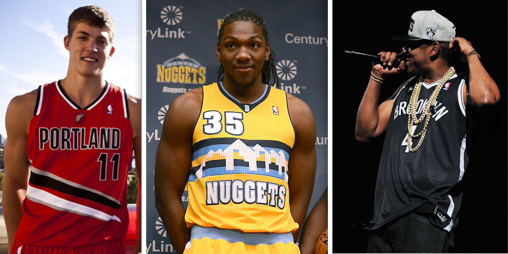
Now then: Lots of NBA news while I was away. Let’s start in Portland, where the Blazers unveiled a new alternate uniform yesterday. They’ll wear it for about 10 games, including their home opener on Oct. 31. In the grand scheme of things, it’s fine, but I’m particularly interested in two aspects of the design:
1) The team’s signature diagonal striping has been tweaked. I’ve always been a fan of the diagonal stripes, but I don’t mind the update, which feels suitably modern (although the official description that the striping has “been updated to represent speed and aggression” is seriously cringe-inducing). Will the home and road uni striping eventually get the same treatment? My hunch is yes.
2) Interesting decision to put the pinwheel logo above the chest wordmark. Feels like too much. Between the pinwheel, the “Portland” lettering, the uni number, and the striping, it ends up being overkill.
So is it good or is it stupid? It’s not perfect, and I hate that partial piping on the armholes, but on balance I’d say it’s good.
The Nuggets unveiled a new alternate uni yesterday as well (additional photos here). It can basically be summed up by this handy mathematical equation, which ran yesterday on the Basketball Jones blog (click to enlarge):
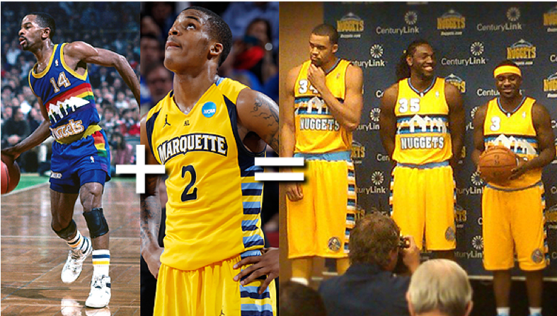
Seriously, is that a weird mix-and-match job or what? It’s cool to see the return of the rainbow skyline design, but why poach Marquette’s shorts? They’ll be wearing this design for 18 home games, starting with the home opener on Nov. 6, and I’ve like to see it on the court before rending a judgment, but I suspect it will go down as stupid.
Meanwhile, everyone’s been asking me what I think of the Nets’ new design, which was “unveiled” onstage by Jay-Z on Friday night. When prototypes of this design were first shown to me at the NBA offices last winter, I was stunned by how minimalist they were. I’d expected something much flashier. But once I recalibrated my expectations, I liked the designs just fine. I don’t love them (the black/white color scheme feels like a cop-out), but I’m fine with them. Kudos to all involved for having the discipline to show so much restraint. Good.
About face: For everyone who doesn’t like the direction the swooshes are facing on the right sleeves of NFL jerseys this year, you should all start a fan club for Cowboys punter Brian Moorman, whose right-sleeve swoosh was facing to the left last night.
And in an even weirder (and unprecedented!) development, Bears linebacker Geno Hayes had a rightward-facing swoosh on his left sleeve. Tsk-tsk — it’s like the swoosh version of dyslexia. All you Nike people reading this, what’s going on over there? Better crack the whip on the quality-control proles before your vaunted branding schemes come undone.
Meanwhile, October used to be my favorite month, but not anymore. Sigh.
(My thanks to Reed Spiller and Chris Hortness for their screen shots, and to Tim E. O’Brien for doing the mirror-image version of Phil Hecken’s original Nike/NFL logo.)
Opinións Wanted: We’ve often discussed the two approaches to Spanish-language translations on uniforms. There’s the direct-translation method (Cerveceros, Gigantes, Nueva York, etc.) and the definite article approach (El Heat, Los Mets, etc.). Since we’re currently in the midst of Hispanic Heritage Month, I’d like to hear from Hispanic readers on this. Which method do you prefer? Do you even like the Spanish-language jerseys in the first place, or do you find them patronizing? What about your friends and family members — have you ever discussed this with them? If so, what do they think?
Send your thoughts here. Again, this is Hispanic readers only. Thanks.

Collector’s Corner
By Brinke Guthrie
Just take a look at this 1960s NFL Western Conference helmet kit, and hurry. Ends tonight. Notice in the bottom graphic, the Browns helmet has the “CB” logo, the box helpfully tells you the color of each team’s helmet so you match the sticker with the helmet, and “The Steelers helmet has only one emblem, right side.” Very nice.
In other CC finds:
• Here’s another helmet kit that needs some TLC, but it looks like there’s enough there to put a good set together.
• I usually don’t include homemade items in Collector’s Corner because the quality tends to be inconsistent. But as I zoomed thru eBay this week, this cool shelf with home plate below it caught my eye. This one’s for the Phillies, but the listing says the seller will make them for other teams. He has other styles, too. On top of the shelf, that’s where you put your team mug collection, like this one!
• Looks like the seller’s husband painted the shoes of this 1960s Joe Namath bobble.
• Got a game-worn Chicago White Sox jersey from the clam-digger era right here.
• If you’re a Bengals fan and think the current look is a bit, uh, gaudy, here’s the real deal: a game-worn Isaac Curtis jersey that comes complete with a high price tag!
• This 1960s-70s suede SF Giants briefcase was given away to VIPs or team officials.
• Vintage NFL twin bedsheet over at Etsy. I bet that’s Ray Guy in the third photo.
• These Packers folding seats look to be in great shape given their age (late ’60s or early ’70s).
• Reader Manzell Blakeley submitted this awesome late-1970s North Dakota “nodak” basketball jersey — in Uni Watch colors!
• Finally, here’s one for Paul. Not even gonna bother with a description — just click. [I don’t like mesh jerseys, but that design is definitely killer! ”” PL]
Seen something on eBay or Etsy that you think would make good Collector’s Corner fodder? Send your submissions here, and you can follow Brinke on Twitter and Facebook.
Uni Watch News Ticker: Zack Greinke was victimized by a misspelled NOB for the first four innings of his start on Sunday. That prompted Sports Illustrated to trot out a big slideshow of classic uniform typos. We’ve seen most of them before (in fact, many of them were first reported here on Uni Watch, and SI even poached some of my screen shots ), but it’s still fun to see them all in one place. ”¦ The Astros will unveil their new uniforms one month from today. … I just got a review copy of The Hockey Hall of Fame Book of Jerseys. Full assessment to follow shortly. … Awesome find by Jeff Ash, who was looking at photos from a 1971 Packers/Giants game and spotted these amazing Giants ponchos! … Jeff Wilk picked up a 1969 Padres program at a garage sale and scanned the whole thing. Pages 20 and 33-35 include descriptions of the National League’s uniforms for that season. … Neil Strawmyer was playing Madden 13 on Sunday night. “At midnight, when the calendar turned to Oct. 1, all the in-game player accessories turned to pink,” he says. … Springboks wore a “46664” sleeve patch during last weekend’s rugby match against Australia. “46664 was Nelson Mandela’s prisoner number, and is now the name of a large non-profit in South Africa,” explains Daniel McLaughlin. … Arizona State’s colors are gold and maroon, but their club hockey team’s new uniforms are gold and BFBS (from Kenn Tomasch). … I’ve been championing Gawker writer Hamilton Nolan’s writing for a while now. If you like his work as much as I do, you’ll want to check out this e-mail interview with him. … Donald Bulters has an outdated Chargers wordmark on his neck bumper (good catch by Chris Maples). … Weird scene in last weekend’s New Mexico football game, as defensive back Vershad Jackson had his facemask pop off during a play (big thanks to Frank Mercogliano). … Remember the Play-O-Graph, which allowed crowds to follow the progress of World Series games back in the day? Mark Schubin has written an excellent history of them. … Omar Jalife notes that assorted Ravens coaches were wearing a yellow cap, a red cap, and a green cap on Sunday. Anyone know what the color designations stand for? … The White Sox included deceased batting practice pitcher Kevin Hickey’s jersey in the team portrait that they gave away at Sunday’s game (from Tom Nichol). … Here’s a short video clip of a young Chipper Jones as a high school pitcher (nice find by Jack Purdy). … Jets QB Mark Sanchez is, to my knowledge, not yet married. But he’s wearing something — either tape or a taped-over ring — on his left ring finger (good spot by Derek Linn). … The Wild’s contest to find the best hockey jersey in Minnesota has been narrowed down to 32 designs. “My money is on the Cloquet Lumberjacks,” says Tony Tengwall. ”¦ Also from Tony: Adrian Peterson was wearing shin pads on Sunday. … “For the last two games, Thierry Henry of the New York Red Bulls has been wearing a black and red armband,” says Bill Reese. “I sit with the Empire Supporters Club behind the south goal, and we were all puzzled by his choice of armband. Normally he wears a MLS standard captain’s armband with the RBNY team logo. It eventually became clear to us that Henry’s choice of armband was a reference to the old MetroStars colors, red and black.” … The worst-kept secret in college football — namely that BYU would be wearing a pathetically lame-o BFBS uniform at some point this season — is now official. … Here’s an excellent visual timeline of 3M logos (from Mike Chamernik). ”¦ Here’s a rare sight: a cricket player wearing No. 100. That’s Raza Hasan of Pakistan (from Peter Della Penna). ”¦ This is too good: The “guess which cap the thing is under” game at Shea may be rigged, or at least botched. A perfect proxy for everything that’s wrong with the Mets. ”¦ We all know about eye black, but what about nose black? That’s DJ Moore of the Bears, from last night’s game (screenshot by Garrett Schabb). ”¦ Also from Monday Night Football: Tony Romo appears to have a cover-up decal on his nose bumper (good spot by Caldwell Bailey). ”¦ As the A’s celebrated making the playoffs last night, Rudy Gutierrez noticed that they have bathrobes with numbers and NOBs. … RIP, Barry. Hope we can eventually learn the lessons you were trying to teach us.
Paul,
The first link to Portland’s new jerseys isn’t working. FYI
link
The Ravens hats…the red means stop, green means go, and yellow means watch out its gonna be red soon.
“Interesting decision to put the pinwheel logo above the chest wordmark. Feels like too much. Between the pinwheel, the “Portland” lettering, the uni number, and the striping, it ends up being overkill.”
At least they didn’t link
Here you go:
link
Hmmm… which one doesn’t belong?
Only one is not a basketball player.
Only one is a white guy.
Only one has a team name, not city name.
Only one is an Eastern Conference team.
Only one is wearing a hat.
Only one is wearing an even number.
Only one has a single digit number.
Only one has curved letters.
Only one is standing outside.
Six of those nine is #3, so I’ll say Brooklyn doesn’t belong.
One comment, one question.
What the Blazers did to their striping actually DOES convey the notion of “motion.” So, while the quote “has ‘been updated to represent speed and aggression'” may sound a bit exaggerated, it’s true. Perhaps they should’ve just used the term “motion”? i.e., that’s better for a Trailblazer. Lol
With everything the Nets have rolled out to-date, how could one possibly think their uniforms would be anything but minimalistic? From the color, to the logo, to now the uniforms, this is exactly what was expected!
With everything the Nets have rolled out to-date, how could one possibly think their uniforms would be anything but minimalistic? From the color, to the logo, to now the uniforms, this is exactly what was expected!
Duh. But I was referring to my initial reaction when I saw the prototypes last December. At that point, they hadn’t rolled out anything.
Best line of the day from the Mets cap conspiracy: “Give him the damn potato chips!”
The “guess which cap the thing is under” game at Shea may be rigged.
You’re in New York and you honestly expect a game of three card monty to be run honestly?
Where’s the edit button so I can fix my poor word choice?
The backwards Nike swoosh isn’t too atrocious, it’s just the various NFL uni’s by Nike that leaves a lot to be desired, especially the different-colored collars that makes the players look like they’re wearing they’re jerseys over a collared shirt, like it’s the Friday before homecoming in high school.
Two words…….Quality Control.
I couldn’t watch the MNF game last night and was going to watch it this morning. Stupid Romo pic has ruined it for me. I’ll never learn to hide under a rock until viewing
Were you to actually hide under a rock this morning, you might actually find Tony Romo. If you do, ask him about the cover-up decal on his nose bumper.
It’s been cvered numerous times here already, Romo wears the new Rawlings helmet and has to cover up the makers mark
I’m going to disagree with the opinion on one of the three NBA jerseys: I think the Nuggets alternate is awesome. I loved the “Tetris City” logo in the 80’s, and I am very excited to see it return.
Absolutely agree. I’m guessing this is a preview of what their future home and away uniforms will look like. Love it!!
Yup, those 80’s Nuggets unis are amongst my favourites ever.
I’m thinking that both Portland and Denver are testing the water with these 3rds – that if the reception’s good enough, they’ll use them as the basis for the regular unis, like the Knicks did in the mid-90s…
I always liked that logo growing up. It was very distinctive at the time and just popped off of the white or blue background. To me this modern version lacks that effect. It needs more color. It doesn’t grab the attention nearly enough. It’s a great design to throw back to. I just don’t think this was executed as well as it could have been.
Not Tetris – Atari 2600 Canyon Bomber!
The Nuggets were one of my all-time favorite teams in the 80s, from link link link and now they’re one of my favorites again (OK, it’s not just the unis – I like George Karl and the guys he’s assembled, too).
I always thought you couldn’t top the unis shown above, but I think Denver just did it. Love the bright gold (the rainbow was good with the blue, but I think it would overkill here). Good or stupid? Neither…it’s GREAT!
No, they’re not great, because they went half-assed. If you’re going to bring the rainbow back, bring it back for real. As in a six-color design.
I can’t tell you what the different color hats on the Ravens sidelines stand for, but I’m willing to bet they are a way to make those guys, who are probably relaying some sort of information, more visible to the players on the field. The players know to look for the guy in the red, blue, etc hat, which stands out on a sideline of purple and gold.
We do the same thing with our signalers where I coach, except we just use bright orange hunting hats, which are cheap and do a great job.
The three Ravens coaches in question are the three defensive position coaches (d-line, linebackers, db’s). Players on the field can look over and quickly spot their position coach in between plays to get signals of how they’re going to play the next snap.
Yup, the red hat is link, the D-Line coach. It’s pretty hard to make out the other two from the screen grabs.
sorry, botched the link: link
““My money is on the Cloquet Lumberjacks,” says Tony Tengwall”
my vote goes to the gophers jersey with the gopher on the sleeve! man is that cool
That hockey jersey vote for me was tough…father is a Cloquet alum and wife is a Grand Rapids alum…if those two teams meet, do I get written out of the will or does the eel never become active again?
Regarding the Minnesota hockey uniforms – I’m definitely curious what the U-W consensus is in the Warroad Black vs. International Falls match-up. One with Native American iconography, one with the cursed color…
According to the Third String Goalie blog, Warroad’s crest was not only approved, but designed by a local Native American tribe:
link
RE: NFL Pink-out……
It would/might be more interesting (and less horrible) if the teams REPLACED one of their colors with pink instead of ADDING it.
In the case of the Bears that would at least look a little bit better.
But the bigger point is that the pink thing is now taking up a quarter of the schedule. At some point this has to be considered a regular alternate uniform. It just looks so bad. And it doesn’t make me more aware of breast cancer awareness than if they ruined their uniforms only once a year.
The pink thing needs to die, and it can take the stars-n-stripes military worship crap with it.
I too am tired of it. Nice gesture of course but enough already.
I’ve been saying the same thing for years. I was telling my 7 year old just last night! :)
I was bummed that the Bears got a “bonus week” of pink. It would have made more sense to have everyone start on the same week with the pink unis, or better yet, just do the pink uni replacement like you’ve described, and do it only for one week. I’ve grown to resent the whole exercise, which is a bit counterproductive.
If pink is kept, it should be worn by each team no more than once and that one time may only be a home game in October as undersleeves, wristbands and towels. Not on shoes or other equipment, not on jerseys, pants or helmets. Sideline staff can wear pink to their hearts’ content. That being said, I’d really prefer this particular promotion to be retired outright.
SI’s Peter King feels our pain.. he was catching heat for saying the same thing on twitter last night (1 week is fine with the Pink garb but, the whole month NFL?)
That Gumball helmet collection is a mess! Backward logos. Facemasks on upside down.
eeesh!
yeah, that Rams helmet looks ridiculous with the backward horn logo.
i like the nuggets new alternates.
the navy ones w/ the script “nuggets” reminded me too much of the grizzlies.
In the Minnesota hockey sweater tournament, for me, it comes down to link vs. the link. I’m not a fan of those Grand Rapids sleeve stripes (c’mon, guys), but how can you not love that wacky link? Grand Rapids wins.
Norman and Ethel Thayer have stated their preference:
link
Romo is wearing a Rawlings helmet this year. Since Riddell still has the “exclusive” deal with the NFL for at least the rest of the season any non-Riddell brand has to have the manufacturers logo covered up. The Cowboys cover up the front bumpers of non-Riddells with a blank sticker and put their logo sticker on the back bumpers (as long as the back bumpers are large enough – the one on Romo’s Rawlings model is not so it is also left blank).
The cover up sticker is much more visible on the Rawlings helmets due to the size and kind of 3-D effect of the logo on the bumper – it has kind of a circle cut-out and a raised Rawlings “R” logo. Schutt front bumpers used to be completely flat or can be replaced with completely flat versions so they are easier to cover.
I know all of this — the Cowboys have been using blank nose bumpers for their non-Riddell helmets for years. But this is the first time I’ve seen such an obvious and sloppy cover up.
Paul – I haven’t seen a Rawlings in person, but from the photos you can see that their bumper is pretty thick and they basically cut out an oval around the “R” logo, leaving the raised “R” inside the oval. Also because the Rawlings bumpers are narrower than the standard Riddell, Schutt and Xenix bumpers some of the equipment managers are probably having to scramble a bit to get the proper covering.
Here’s a link to a shot of a Rawlings helmet on their site:
link
Andy Dalton of the Bengals is also wearing Rawlings this year – but since the Bengals use a raised version of their “B” logo on the non-Riddells it covers the Rawlings “R” pretty well – they might even have to sand the “R” off to fit the “B” over it.
link
Sorry, the Dalton shot is part of a slideshow and it the link does not work.
I work for a Rawlings dealer, and the reason why they have to cover up rather than get a new nose bumper is because Rawlings sews their bumpers into the helmet padding.
Jordan – thanks; I didn’t know that they were permenantly attached like that. Interesting design; I frankly haven’t seen a Rawlings helmet in person since those mid-1980s ones like Marino and several other Dolphins wore back then.
There is so much junk on that Nuggets jersey–an assault on the eyes– that if they stick an ad patch in there one may not notice.
Same with Portland for that matter.
Awful.
Yaz with an earhole helmet.
link
I’m sure it’s old to y’all, but I’d never seen it before. Were those standard at some point?
Yaz modified his earflaps late in his career, widening the hole. Lots of photos of this floating around out there.
He started by making the hole slightly larger:
link
Then he kept making it bigger, to the point where the earflap was almost skeletal:
link
Not sure why he didn’t just go with the earflapless helmet at that point. He obviously was in the majors prior to the earflaps becoming mandatory in 1983. Seems pointless.
Saw the “RIP Barry” and wondered who it was referring to, then took a wild guess that it might have been Commoner, who I hadn’t thought of in years. Checked via google and bingo. I voted for him for president in 1980, but he, um, didn’t win.
One of his ‘laws’ of ecology states that “Everything Must Go Somewhere: There is no “waste” in nature and there is no “away” to which things can be thrown.”
What you did with your vote in ’80 OTOH…
Lesson learned?
Nope — I also voted for Nader in 2000. But in both cases, I made damn sure my state wasn’t in play before I voted.
A genuinely great man. Also a Brooklynite. He’ll be missed.
There are a lot of ugly hockey jerseys in Minnesota. Woof!
The rumor was that Ohio State was supposed to wear pro combats again this year. Supposedly for this weeks game vs Nebraska.
It sure is a well kept secret if that is the case.I have not heard anything about it if so.
Not long after I posted that a buddy emailed me the following.
I am suspicious if it is true or not. Seems like I have seen that proposed helmet
So take this with a grain of salt.
link
One poster said this about that rumor or leak
Relax guys, this is NOT the right jersey and the reporter for the lantern got it wrong. The jerseys in this picture are from the 2009 season when we wore the white pro combats. These surfuced on the net in 2009 as like a “home” version of those 2009 away jerseys. I had a feeling nike wouldnt leak anything just yet but yea relax these are not the jerseys
Wow, that ticker entry re: Madden 13 going pink @ midnight on 10/1 reeked of Cinderella’s pumpkin carriage.
New here, so I don’t know if anyone has mentioned this before…
I don’t think the ‘backward’ swoosh is that wrong. I thought it was weird at first, but then I thought about Nike shoes, the swoosh is ‘backwards’ on the shoes too. Or maybe it’s just the way Nike has always done their swoosh (quality control aside).
S
RE: Henry’s armband
It could also be a reference to his ongoing campaign to rid soccer of racism: link
The armband also has a “96” on it, which refers to the MetroStars’ first season in 1996.
96 is for the Hillsborough Disaster…Justice for the 96
link
Many players and teams are recognizing this disaster this year.
Nets’ uniforms good? They are shit, Lukas.
Ahem; they are the shit.
In a vacuum, there’s nothing aesthetically unpleasant about the new nets unis. Strong color scheme; simple, clean lines and a consistent brand image.
Now, given the history of the Nets, I don’t like the new direction. An update of the Dr. J era would’ve been preferable, and sticking with red, white and blue would’ve been nice, but I understand why they went away from all of that.
Why is my last comment (and perhaps this one…) in all italics?
Because walter didn’t close the tag properly?
WAAAALTER!!!!!! (shakes fist in air, but it appears sarcastic due to open italics tag)
Gee, it looked okay on my desktop. Sorry, guys:)
S’all good now, Walt.
I was at ESPN Wide World of Sports Complex this past weekend for a running event. There was also a men’s softball tournament going on. No pics, but there were many “borrowed” logos on these meatheads’ uniforms/tops.
The Oregon “O”
The old Mariners trident “M”
just to name a couple.
Nice job by Mark Schubin on the Play O Graphs. Those fascinate me.
After having lived in Brooklyn for five years in the early ’90’s, the borough is a very colorful, dynamic and lively place. The Nets black and white drab solution was a cope out and an ode to rapper icon not a civic icon in BROOKLYN. They will change that identity in three years. (See Bobcats),..
I’m actually going to say that it was more in response to the MASSIVE marketing/branding popularity of the Yankees and the Raiders. Simple, crisp, refined.
I fully agree. Have you noticed teams with that color scheme don’t change often?
Liked the picture of the Giants in their ponchos. Is that Fred Dryer, #89 (“Hunter”) on the far left?
link
Works for me!
Colorize that!
What I’m wondering about that pic is:
Is that the game where a Giants player broke Packers head coach Dan Devine’s leg?
LI Matt: Yes.
bill: Yes, No. 89 is Fred Dryer.
There are sooooo many better hockey jerseys in Minnesota than listed in that competition. Whoever is in charge of this needs to be relieved of his/her duties.
the springboks have been wearing the 46664 patch for a while now – since 2005 or 2006 if i remember right.
here’s a shot from 2008:
link
Jeff Wilk, you got a ’69 Padres program at a YARD SALE?!?!?
Damn….
-Jet
Not only that one, but a Astros/Braves and a ’57 Pirates/Giants (as in NY) at the same sale. All the scans are at these links:
link
link
Cost for all 3? 21 bucks.
Amazing! Where do you live that people are putting items this cool out in yard sales? Around here it’s just broken toys, tattered books, shabby clothing and VHS tapes…
-Jet
you live in akron, pete?
A’s Bathrobes:
Jonny Gomes had a yellow one he wore through the year and he had one made for, I think, AJ Griffin (I remember see a video on CSN Bay Area). I assume he had them made for the rest of the team.
Gomes had one in Cincinnati 2 years ago too that he wore when they won the division. I can’t find a picture of the back, but I’m quite sure it was personalized as well.
link
With regard to backwards swooshes, I used to work for an IP law firm that had a client that had a similarly recognizable logo. When a country would not let them trademark that logo, they would send the mirror image version of the logo and it would be trademarked.
It may just be me, but the new Nets jerseys remind me a whole lot of the Spurs, just without the silver. When they are playing each other it just might look like a scrimmage at one of the teams’ practices.
I cannot express the depth of my loathing for the BYU BFBS uniforms.
BYU is royal blue and white. Not tan and navy. Not navy and white. Not black and royal.
There’s not much to like about any form of BFBS. All in the name of being more menacing and aggressive. And just so they can sell a new hat or shirt in the gift shop. Now that the sports uniform world is quite comfortable doing it with the laundry on the field, they want all the attendees wearing the same shit too. Almost 40 years later, fuckin’ Rollerball is still haunting the *real* sports world.
I might, just might, be on board with white NOB’s on BFBS nameplates on otherwise normal jerseys. Thing is, that would only happen if Trey Parker and/or Matt Stone were to become AD at BYU.
//Fat chance.
I hadn’t been to a live NFL game in 16 years…until last night. And my excitement about watching two of the best uni’s in football gets immediately deflated when the Bears come out of the tunnel and I realize it’s October 1st. But at least now I’m aware that breast cancer exists.
Love that today’s entry led with discussion of new uniforms.
My thoughts: Portland uni looks good, but it’s sad to lose the classic striping. I like the logo above the wordmark.
I like the Nuggets jersey, but the stolen shorts ruin the look. I can’t see the uni without thinking Marquette.
I think the Nets logo is awful, so I was expecting the worst from the jerseys, but they turned out 100 times better than I’d expected. The minimalist look works great in black and white after OKC’s color version produced link.
New logo for AIG:
link
Looks like a infant’s toy store logo. Bad decision to move away from the serif font.
hey, good for AIG though!
who needs artists/designers, and adobe illustrator, when you can just create your company’s new identity in excel?
I don’t know; the old AIG logo used a particularly lackluster serif type. The new logo is an improvement except for the I, where the lack of a serif makes it look like a rule. As in the company’s name is AG, with a line between the two. Overall, I’d take the new logo over the old, because the flaws, while deeper, are less general to the design as a whole.
I always do a double take when I see AIG. Looks like someone blocked out the first two letters of my name…
The Adirondack Phantoms are playing an exhibition game in NJ this afternoon.
They are wearing these jerseys (scroll down for pics):
link
Confirmed on Chicago radio….
DJ Moore has been known to color his nose so that he looks like a bear. I’m not kidding. He’s paying tribute to the Bears. His teammates get a kick out of it.
Thanks Jen. My wife and I saw him on the sidelines during the TV broadcast and thought he looked like a teddy bear. Pretty funny he’s doing that I guess.
Bears PR guy just told me he does NOT do it to look like a bear. It’s because he has “a nose for the ball,” and he likened it more to a rabbit. Which makes no sense visually, but whatever. (Looking like an animal that hibernates thru the crucial part of football season might not be a great approach…)
Maybe that’s it: bears hibernate during winter, but, contrary to popular assumption, rabbits do not. Ergo the bunny-rabbit nose.
Now if only he can convince the team to change its name to the Chicago Bunnies …
Wasn’t there a Chicago connection with a magazine which had a certain fluffy tailed moniker? Never saw it myself, but I’ve read some articles about it;)
If you can get an interview with Moore, the dude is a QUOTE MACHINE! link
Someone’s listening to Boers and Bernstein…
I also heard it on 780 with Joniak…..2 guys – one the beat writer, one the announcer. 2 confirmed relayings of the same explanation…..
Personally, I assumed it helped to cut down with glare on his nose as it’s a reasonable assumption…..
Don’t shoot the messenger, folks. At least I waited for the second “confirmation”!
Hang on – I need to confirm that the guy on 780 said that he was talking to Joniak and that’s what he said Joniak told him.
1.5 instead of 2 confirmations?
Whoa whoa whoa. I must be the last guy in the uni-verse to realize that Jacksonville made black their primary color this year. I knew they added a black uniform, but not that it is their main jersey. Crazy!
What happened to this team?! The entire reason for the Jaguars’ uniform redesign a few years ago was because the team had “too many looks” and wanted to simplify things. But then the past two years they started mixing and matching their pants, and now they switch to black uniform with mixing pants combos as well? What a joke. Even though some people hate teal think it’s a relic of the 90s, I’ve always like it on the Jags and think it is part of their core identity (and after all, they were born in the 90s).
They just re-designated the black as their primary last week. First time I can recall a team doing this in the middle of a season.
New catch of the day photo? link
Patriots may be evil but you can’t deny greatness…
Bad link there Tim.
link
I have aquired a volunteer radio show MT 10-12pm. It’s on KMSA 91.3 in Grand Junction Colorado. It is a volunteer gig for now. I plan to travel here at some point soon. I just might have to go on tour w/ my rockies!!
j
For the record, that’s just one of Arizona State’s hockey uniforms. They do have ones with maroon as the base, they just had a two-game set against Arizona on the weekend and wore the white the second night.
The bigger question is why there is any hockey team in Arizona.
Wall Street Journal has a story about a few offensive linemen who now feel “fat” because of the form-fitting Nike NFL jerseys, and the Gridiron Uniform Database is mentioned!
link
According to the article, the jerseys have a tendency to rise up and get bunched on the midsections of the bigger players.
Also, in some odd news, I noticed last night that Derek Jeter’s on-field Yankees hat has a white sweatband as opposed to the black sweatband on all the other official New Eras.
I had seen it before but had forgotten it until the giant video board at Yankee Stadium had shown Jeter with his hat removed. Not sure why his hat has a white sweatband as it doesnt really hide sweat stains as well…
I haven’t found too many pictures other than these, where it is barely visible: link
link
Throughout searching, it seems Jeter has worn a hat with a white sweatband since early August. Perhaps Jeter actually asked New Era to make him an on-field hat with a white sweatband while everyone else gets the standard black sweatbands?
So… a late comment – but I forgot to mention it yesterday. A possibl reasononing for the nike logo swap is that maybe some of the jerseys got shipped directly from the sub-contractor producing them. And the teams were required to add the nike logos. Not paying attention (or maybe even opn purpose)… someone flipped them.