Last week I Ticker-linked to an interesting article about color-out shirts at Virginia Tech. That article was sent my way by reader Chris Sykes (who’s also quoted in the article). He has some personal experience in this area. Here’s a very interesting story he related to me:
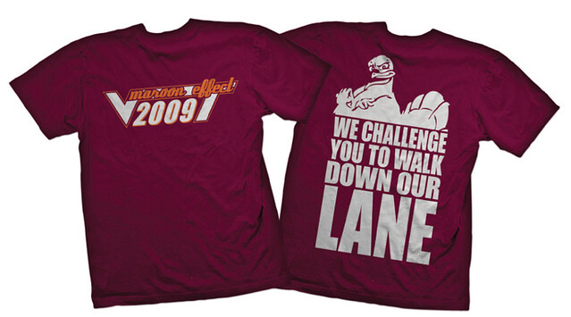
In November of 2008, when I was a sophomore at Virginia Tech, I took over the program to create a Maroon Effect and Orange Effect T-shirt for the 2009 football season. The program is run by the Student Government Association, in conjunction with the bookstore (we decided that they would be our exclusive dealers of the shirts), but we like to keep everyone around campus in the loop. To do this, we meet with our school’s athletic department when we first start the program and once we have the designs finalized. We sell around 80,000 shirts a year — $10 for the orange long-sleeved shirt and $6 for the maroon short-sleeved, $12 for both. [The prices have since gone up just a smidge but are still very reasonable. ”” PL.] Proceeds benefit Student Government projects.
I met with the athletic department’s marketing director in November when I started. The meeting was just a quick introduction to each other. We quickly talked about the status of the Maroon and Orange Effect. The marketing director brought up the school’s new Hokie Respect logo, which was a new initiative they had started. They were attempting to have it gain some traction at the school, so having the logo on our shirts would be a big deal for the Hokie Respect program. They wanted it placed on the sleeve of our shirts, but they weren’t willing to pay for it. [Adding a graphic to the sleeve adds to the shirt’s cost.] I told them I would think about it and and price it out. At the time, the color-out shirts had never had a logo on them.
We talked to different companies about printing our shirts and found that the logo on the sleeve would increase the price by $1 per shirt. Obviously, it wasn’t worth it, since the shirts are a fundraiser, plus I liked the idea that there was never any sponsorship on the shirts.
I met with the marketing director again in March. This time I brought the President of the Student Government Association with me, since I figured they wouldn’t take it well.
We sat down in the office I showed the shirt design to the marketing director. He seemed to like the designs but quickly asked where the Hokie Respect logo was. I told him that It would increase the price of the shirts and wasn’t something we were interested in doing. (We didn’t feel like the athletic dept. was really helping us with the shirts, so there was no reason for us to put their logo on them.) He quickly got angry, described all the things that the athletic department does for us (they put the Maroon Effect and Orange Effect on the schedule on their web site and that’s pretty much it), and asked us what we thought.
Again I told him that it wasn’t something we were interested in and that I sorry that we couldn’t help. He then proceeded to tell us that it is bullshit that we are unwilling to work with them and that we were so unprofessional. He then told us that the meeting was over and we needed to leave right then, and that he did not want to speak or work with us in the future.
He called me from a blocked number an hour later, apologized, and said he did in fact want to work with us. But there was a lot of tension over the next couple of months. An example of this is that they normally allow us to announce the shirts at halftime of the spring game, we were not allowed to do so that year.
Interesting stuff. While I still think color-outs are a bit silly (the idea that anyone would find a stadium full of orange to be “intimidating” seems laughable on its face), I like that Chris and his crew were able to produce very inexpensive shirts, with the proceeds going back to student projects. I also like that he resisted the “We’re the athletic department so you should carry our logo” pressure. Nice job, Chris.
Uni Watch News Ticker: Made a snap decision to go out to Shea yesterday, so I could see Cy Dickey go after his 20th win. While there, I bumped into longtime Uni Watch reader/contributor Dan Cichalski and his lovely wife, Casey Barber — nice. … Also: When I arrived at the ballpark, I took a quick peek at the Mets Hall of Fame, since I hadn’t stopped there in a while. They had a supposedly game-used 1997 John Olerud jersey on display, but I immediately thought, “That’s a phony” because of the white outlining on the letters and numbers, which shrieks “replica jersey” to me. But when I got home, I checked Bill Henderson’s jersey guide and found that his entry for the 1997 white jersey — illustrated by an Olerud jersey, no less — shows the same white outlining. The Mets actually used el cheapo lettering like that? Can’t believe I never noticed it at the time. … Very disappointing move by the Jags, who are adopting black as their primary jersey color. So the systematic destruction of a once-excellent uniform program is now complete. Meanwhile, when’s the last time a team changed its primary jersey designation in the middle of a season? … New alternate jersey in the works for the Thunder. I think it’s a safe bet to assume that it’ll have “OKC” on the chest (from Arthur Rahill). … The Guardian does not like this year’s Premier League kits (from George Chilvers). … This is pretty cool: Tennessee placekicker Derrick Brodus, who’s the first black starting kicker in the SEC, has changed his uni number from 26 to 42, as a tribute to Jackie Robinson (from Chris Howell). … Boaz High School in Alabama has new football uniforms, going from this to this. The design change also marks a change from Russell to Under Armour, which is particularly noteworthy given Russell’s long history as an Alabama company (from Jonathan Lancaster). … Odd find by Bryan Prouse, who saw a Coors ad with a proper Jets helmet but a white Giants helmet. … Some Fighting Sioux signage will be allowed to stay in UND’s hockey arena. … Sam Lam spotted an A’s batboy wearing the old helmet logo on Wednesday night. … Chester Barker did a good article on Fordham’s equipment manager. … Deion Sanders took batting practice in an Orioles uniform the other day (from Robert Onolfi). … Lots of great shots from the Expos’ first-ever home game here. “It’s mostly shots of local dignitaries, but there are some good uni pics at the beginning and the end, especially of the Cardinals’ warm-up jackets,” says Tim Ring. … Nebraska has added a Twitter hashtag to its field. “Just sad,” says Chris Bisbee. … Good story about the Nike designer who worked on Minnesota’s new look (from Matt Dever). … As you know, the Notre Dame/Miami game will be played in Chicago. What you might not know is that the Notre Dame jerseys — or at least the captains’ jerseys — will have four stars on the inner collar, evoking the Chicago flag (from Joe Reimers). … New goalie masks for Penn State women’s hockey. … A Greek football club is being sponsored by a brothel. “All we need now is for the NBA to finally put a team in Vegas and we could see the same thing here in the States!” says Lucas Ravenscraft. … Paul Lee notes that the Miami Spice of the new Bikini Basketball League have poached their logo from the Seattle Sonics. … Max Weintraub reports that Nats color man F.P. Santangelo had this to say about the team’s battery last night: “Gio Gonzalez and Kurt Suzuki have worked together a long time. First in the white cleats at Oakland and now in the black cleats for the Nationals.” … I can’t tell if Stanford LB Shayne Skov really has a backwards “K” in his NOB or if it’s just the way the fabric is buckled (from Tim Burke). … In that same game, Washington DE Pio Vatuvei somehow got his jersey tucked under his back padding, creating the illusion of a numberless jersey (from Chris Peterson). … Looks like Browns QB Brandon Weeden didn’t have a green radio dot on his helmet last night (from Rick Rutherford). … Someone tried to goose the traffic stats for a fairly lame-o set of Pitt football concepts by putting “uniwatch” in the URL. Fuckers (from Kyle McPherson). … “A friend who has connections with the Bills gave me some throwback nameplates from previous NFL drafts of potential picks they were considering. I got Brady Quinn, Brian Cushing, and Michael Oher.” ”¦ This is pretty amazing: An Ivan Nova pitch tore through the webbing of Russell Martin’s glove last night (from Dan Cichalski).
By the time most of you read this, I’ll be on my way out of town to work on a story. I’ll be completely off the grid for most of today and all of the weekend, and I won’t be home until late Sunday night. This means (a) I won’t be around for the unveiling of the Nets’ new uniforms, which is expected to take place today or tomorrow, and (b) I won’t be able to compile all the material for Monday Morning Uni Watch. Just to complicate matters, Phil is facing an extra-busy weekend of his own.
So here’s the plan:
• The Uni Watch e-mail address is currently being forwarded to Phil. Please use it judiciously for the next three days. If you’re not sure whether something is worth sharing or reporting, err on the side of not sending it. Of course, you should definitely send along legitimate news, important screen shots, etc. But try to go easy on the throttle, for the sake of Phil’s sanity.
• If circumstances allow, Phil will compile Monday Morning Uni Watch for next Monday. If he can’t swing it, we’ll run some non-football content on Monday instead. Sorry about that, but them’s the breaks.
• Remember, if you’re wearing stirrups today and want to be included in Phil’s round-up of photos tomorrow, send your pics to him here.
Thanks, people. See you next week.
Way to be lame, Jacksonville.
“How much more ugly could it be. The answer is None. None more ugly.” ~Nigel Tufnel
The Jags should be chased out of town (and into Los Angeles’ waiting arms) for high crimes against good taste.
Yeah, no.
LA doesn’t give a shit about having an NFL team there. They still can’t agree on where the fucking stadium will be, so KNOCK IT THE FUCK OFF with all of this bullshit NFL BACK IN LA!!!!!!!!!!!!!!!!!!!!!!!!!!!!!!!!!!!!!!! lies, because that’s all they are, bullshit lies.
Agreed. Please don’t send a football team, especially not a team that discards a perfectly good uniform for a shitty BFBS jersey, to LA. Don’t need them, don’t want them.
Stop agreeing with the troll.
Reading through the comments on that site, their fan base must be mainly kids who like shiny objects and black. Some of them are even begging for the Jags to go with the leotard look. Very sad.
Oh, and if this is what they’re going to wear, I’ll say “no thanks” to them coming to LA.
That teal shimmer on the helmet is going to look extra stupid against the flat black jersey. SMH
YES!! Correct!
it didn’t start with the black jerseys
link
Video’s been taken down…
Jersey designations must be flipped on 12 months’ notice; assuming the Jaguars notified the NFL about the change, the black would become their primary at the start of the 2013 preseason. Because they have not yet worn the black this season, they have one use of the black left after October 7.
We know the black is not this season’s primary because of both the article you linked to AND the fact they wore the teal 3 times in the preseason. Had the teal been the alternate, it could have only been worn once during the preseason.
Since the Jaguars have five home games remaining after Oct. 7, and only one remaining use of the black, this means they’re going white at home this season like they did in Week 2. My best guess at the other black-jersey game is the Thursday nighter against the Colts.
By the way, this means that the Jaguars will become the fourth team in NFL history to wear an alternate colored top more often than their regular colored top, after the ’94 Niners, the ’02 Redskins, and the ’11 Cowboys. This season’s Panthers could theoretically join the list if they go with white at home four more times this year.
I know this post is getting into tl;dr territory, but what is the penalty for wearing an alternate for a third time? It could easily be loss of the coin toss option for both halves and a 15-yard penalty, from my interpretation of the rulebook.
Someone posted last week that the Panthers are wearing their black jerseys for the final four home games. They’ll otherwise be wearing white at home until then.
As for the Jags schedule, they do have away games in Houston, Tennessee, and Miami. The first two they MIGHT have to wear their team colored jerseys since both teams do wear white at home at times. (The Texans do wear their Battle Red jerseys against Jacksonville at times, so I consider that one unlikely.) The Miami game is at 1 PM so they WILL be wearing a colored jersey in that one.
And if you read at the bottom of the article, it says there will be a Nike-inspired redesign next year, even though they should have to wait until 2014 before being allowed another redesign.
Loving the black on black. Its so awesome!!!!!!!!!!!!!!!
Happy Stirrup Friday! link
Note to Comrade Marshall. Check out the photo of Cardinals’ manager Red Schoendienst in the pre-game introductions. Now THAT’S what a Cardinals-style stirrup should look like! Nuf ced!
Considering the variations in the stirrups worn by the other Cardinals, why pick out Red’s as how the Cardinal stirrup should look?
Also, what Robert has on his offerings list is the style beign worn today.
Because that’s the proper Cardinal striping. Red, like me, is an old school guy. OK?
Is that white Giants helmet a complete photoshop job, looking at the position of the stripe?
Also, has the Jags’ number font changed? the corners of the numbers look like straight lines on the black jersey whereas they appear rounded on the teal?
I dig the white Giants helmet! Hard to tell if it maybe has 2 blue stripes (one being covered by the girl’s arm?) or not. I base that on the fact the the visible one starts just to the side of the nose bumper. I’ll assume there’d be one on the other side too.
Jags blow.
Love the white New York football Giants helmet.
^this
I think it looks pretty sharp.
Interesting details about the white outlining on the Mets jerseys. Never noticed that before. Don’t the Dodgers use a white base color on their home jerseys? At least they used to.
As did the Reds.
Dodgers had the white outline from 1980-2006.
I think it looked much more authentic. What screams replica to me is always one color letters.
I always liked the white base on the road grays, too. I agree on how cheap the one-color letters and numbers look on the Dodgers jerseys.
If the numbers and letters were thicker, it’d be better.
When I think replica, I think cheap. Two or three color sewn lettering isn’t cheap.
That would depend: On a detailed uniform, it just adds visual clutter. On a stark uniform (the Dodgers would qualify) it adds a natural shadow in lieu of a graphic shadow.
The Phillies have as well.
Love those ’69 Expos pics!
“Odd find by Bryan Prouse, who saw a Coors ad whwith a proper Jets helmet but a white Giants helmet.”
typo “whwit”
I really wish the Bills would have taken Quinn. Maybe it would have saved the Browns from making that mistake.
I had the pinstripe version of the white outline Mets jersey but it never looked right ,any ideas when Broolkyn unveil there unis ??
Brooklyn that is lol????
VT sudent here. I am not a fan of the Orange and Maroon shirts we sell each year. I gout the orange effect one from two years ago and mainly just to have a new Tech shirt and now figure since I own orange and maroon shirts now, I am covered for the games (if I even remember that it’s a color shirt game, which I never do).
I could be mistaken, but don’t he ones now have the Hokie Respect logo somewhere (I think on the sleeve even)?
VT alum. I thought this was a strange story. First, the Hokies Respect program dates back quite a bit longer than this- it started in 2003. So this program had been in effect quite a long time before the student even enrolled. Furthermore, the logo is not new. It’s been the same since it’s inception. The athletic department was not re branding in any way.
The other part that is confusing, is that I wouldn’t really consider it branding at all. It’s just a sportsmanship initiative. The logo is in no way related to revenue. Despite what the author says about the “athletic department doing nothing for us,” the football program is what enables and promotes this fundraiser (for free) in the first place.
I can completely understand why the athletic department thought it would be a good idea to have a reminder about sportsmanship on a shirt that will be worn by 75% of the fans at a game.
Finally, it seems like the author made little or no effort to meet them halfway. Sure, the sleeve would have been expensive, but it could have easily been placed on the breast or the back shoulder or something with no difference in cost. The SGA has complete creative control over these shirts- they could put it wherever they wanted. I know this, because I was close to 2 of the former student directors of the program.
Put simple, I’d like to hear the other side of this story. I’ll bet that this was anticipated to go a long way towards meeting ACC sportsmanship requirements or something. I’d imagine it would go something like this “We asked if they would incorporate this sportsmanship logo into their design, they said yes. We moved forward with that assumption. Shortly before the release of the shirts, they reneged on our agreement.”
I was roommates with a former director of the program and am also curious to know more of the story. Also, does the athletic department license its logos to SGA? That would be the only way the square root of one and the hokiebird could be on the shirt, right?
Finally, Paul found a picture of the most terrible “Hokie Effect” shirt ever produced. “We Challenge You To Walk Down Our Lane” is just brutal. These slogans typically run through a cycle of about 4 or 5 years (naturally, I guess). There was an Orange Effect shirt with a reference to Lane Stadium in either 2003 or 2004 too.
The link from 2005 and the
marroon shirt from 2007 are probably two of the better ones.
I found it interesting that the member of the athletic department called the student “unprofessional” and threw in a profanity to boot. Pot calling the kettle black.
About a year and a half ago I bought from eBay a game program from the first interleague series at Shea, against the Red Sox in ’97, hoping it would contain some good pics of the Mets unis from that time, particularly the road grays. Unfortunately there were no road gray pics, and a good number of pics of the white alternates and white “ice cream” caps. But on both the whites and the pinstripes, the white outline on the lettering was very noticeable.
One thing I noticed last fall when the new black-less unis were unveiled was that the “Mets” script on the home jerseys looks thicker than it was in ’95-97. I think the white outline accounts for this, viz., the new script covers the same space.
Compare:
link
link
link
link
Interesting. I think a white outline would look good on the pins, keep the wordmark distinct.
But I’ve never understood why the Dodgers use a link with their single-colored numbers, either.
I find it slightly odd that Dion’s in town for some Raven’s thing and is wearing 21 for BP, even though he wore 37 whilst with the Ravens.
Not if 21 was generally his number in both sports, and the only reason he didn’t wear it for the Ravens was because he couldn’t because it was either retired or someone else had it or it was his age at the time. (I don’t know why he wore 37 for the Ravens, but other than that he was always 21, I think). And it’s Deion, not Dion.
Exactly… 21 is Deion’s number in the same way that 16 is Joe Montana or 80 is Jerry Rice – a season or 2 wearing something else doesn’t matter.
Deion didn’t wear 21 in Baltimore because it was worn by Chris McAlister. As for 37, it was his age when he signed with the Ravens, so that’s probably the reason.
As for the Jags, I completely agree with this assessment:
Totally forgot how nice those white unis look. Maybe they’ll make a comeback in LA.
Fine looking football suits, there. Makes me appreciate an embroidered patch on each sleeve; a pretty good stand-in for a stripe.
Hey, New Era and the Orioles: This is how you do stitching on contrasting cap panels:
link
Those caps are beautiful! Not a fan of the jersey, but the caps I like!
Yeah, those first jerseys were much too conservative in form for a team the rest of whose identity was pretty innovative. The switch to the racing stripes some years later was a big step forward. The bold lines nicely complemented the pinwheel cap and the modernist chest insignia.
Makes me wish the Nats would either switch from the headspoon to Expos style racing stripes (but with navy instead of royal) or add navy pinwheel-style side panels to their caps.
My buddy wears a pinwheel Expos cap around DC and constantly has people complimenting him on it. A pinwheel style Nats hat would be popular.
I always really loved the original Expos jerseys – very clean, with the chest logo popping perfectly. I thought the racing stripes were, frankly, kind of gaudy. The originals were traditional, but also completely unique and modern at the same time. It’s a shame for this uniform that the 70’s immediately happened.
The racing stripes were a … contemporary look. My high school used them for my senior year (two red flanking athletic gold). Should the Expos ever return (let it be so), the Cool Base underarm mesh would make racing stripes impractical.
DJ, I see that as an advantage. Racing stripes belong on the shoulders and legs. Not the side-torso.
Arr, I tend to agree. I’ve fiddled with Expos concepts with pen and paper over the years; I’ve settled on the thin red/white/blue piping around the cuffs and down the pant legs (the original uniform).
Feel free to contradict my “facts”, but the Expos were the first baseball team with a custom numeral font. For Montreal, the style made sense, but I can’t say it worked for any other team. Thoughts?
Don’t know if that’s true or not – do the Expos really predate the Pirates custom numbers? – but the Expos number font would look better with the Nats curly W than their actual Dallas-style block numbers.
Chicago Cubs?
Mike, you’re probably right. Chicago’s font is more functional than Montreal’s fancy type, but it still doesn’t have an off-the-shelf look to it.
has it been mentioned that Ray Lewis continues with R. Lewis NOB while there aren’t any other lewis’ on the team..
My school’s student activity body, also known as the CUAB, does the same type of thing that Virginia Tech’s student organization has done. Granted, we don’t sell our shirts online, but we do sell them fairly cheap and at all of our home American football games.
For the ticker, I agree with the Guardian that I do not like many of the kits for this year’s BPL campaign. My least favorite is Liverpool’s, mainly because I hate collared shirts and wish that they could have gone back to this: link
Jacksonville’s new uniforms are absolutely disgusting. But then again, do they really have a reason to be mentioned in the NFL, other than being one of those Florida NFL teams?
Paul,
Going to the Mets game yesterday afternoon, you got to witness them give one of the last mercy killings to the Buccos epic 2012 season collapse. This season has truly been the best of times and the worse of times.
Anyway, how about that catch by Snyder taking away that homer! It seemed the home crowd was impressed enough to applaud him.
That Miami Spice logo sucked as the Sonics logo anyway. Let them have it along with whatever law suit comes their way.
There’s going to be a bikini basketball league?
The sad thing is that it’ll probably outdraw the WNBA.
“The
sadbest thing is that it’ll probably outdraw the WNBA.”(fixed)
i was watching some NFL highlights last night and noticed something pretty cool.
the dolphins FG kicker has the same number as Ray Finkle from Ace Ventura.
Gah… I love/hate that movie. On one hand, it’s just hilarious… on the other, the complete disregard for history with the Dolphins’ Super Bowl loss story makes me want to stab someone.
Man, some hilarious captions on those Expos photos. One says announcer Claude Mouton “avec un dignitaire,” — the
“dignitaire” just happens to be Stan Musial. Another photo of Musial says “Qui est-ce?” (Who is this?) And the one under the picture of Bill White and Joe Torre, in which White not only looks like Bill White but is clearly wearing #7, calls him Bob Gibson.
Some nice photos though.
A little piece of irony in the Nebraska #Huskers hashtag:
All Husker football players are currently banned from using Twitter. #ICantMakeThisStuffUp
It’s not like the Sonics are using that logo right now, anyway.
What a shame for Boaz HS to ditch this
link
Folks, that is a beautiful uniform right there!
If you will recall, wasn’t the whole idea behind the change in 2009 to “establish a more permanent identity so that when you see us on TV, you know this is who we are”? In the three-plus seasons since then, Jacksonville has tweaked the jersey fabric, the placement and shape of the jersey trim, the pants trim, worn black pants on the road, white pants on the road… Now they’ve finally switched completely to all black, effectively ditching teal which kinda makes the combo-color helmet (the only interesting part of the new set) completely irrelevant. What’s the point of having a helmet to work with both a black-centric set and a teal-centric set if there is no teal set?
link
To be fair, the team was under different ownership back then.
I’m sure the Greek soccer club got some inspiration from link.
And the Jaguars are completely redesigning their uniforms next season? Ummm…it hasn’t been five years yet since the last redesign. Move them to LA, link has more fans in Jacksonville than the Jaguars anyways.
I’m curious about the NFL’s supposed 5 year rule. Does it still exist or did it expire when the NFL switched from Reebok to Nike? Also, how much does a team have to change to count as a change? In 2007, the Jaguars had white pants with teal-black-teal stripes (with thin gold stripes separating them). In 2008 they swapped the black & teal. Then in 2009 they came out with the current uniform. Did swapping the pant stripes not count as a uniform change?
…and another thing: if the Jaguars can switch from teal to black in mid-season, why couldn’t the Broncos do that with the blue to orange last year?
The Jags haven’t worn their teal jerseys yet this year (they wore white at home in week 2), so I wonder if this was already planned in advance and Jacksonville wanted to keep it as a surprise. If so, then why didn’t they announce it back in April?
…this was already planned in advance and Jacksonville wanted to keep it as a surprise. If so, then why didn’t they announce it back in April?
You just answered your own question…
Also I think its worth mentioning that the last team to change their uniforms without waiting five years (besides Atlanta switching from black to red jerseys in 2004 one year after completely redesigning their uniforms–again I wonder if this was intentional) was the Patriots back in the mid-90’s. Somehow from 1993 to 2000, the Pats redesigned their uniform THREE times. link I could understand, as Robert Kraft just bought the team and wanted a fresh identity after the futility and scandal of the team in the early 1990’s. link Needless to say, the NFL made Kraft wait another five years before the Pats adopted their current, VERY UNDERRATED unis. Maybe he was why the NFL instituted the five-year rule.
Actually… I think that honor goes to the St Louis Rams, who changed their uniforms to the navy & gold for the 2000 season, then eliminated the gold side panels on their jerseys in 2002 (unless, of course, that doesn’t count as a big enough modification to be a “uniform change” under NFL rules)
Going back to the original PennDOT post, on 95 North as you enter PA, the first sponsored stretch is courtesy of an, ahem, adult video store. Ah, my beloved Delaware County!
This is a couple weeks old, but in following my fave soccer team FC Porto I noticed the jersey they used recently in the Champions League link
is different from what has been shown as their kits for this season link
I’ll have to see if they’ve worn this shirt for any domestic matches to see if this was special for the champions league
Phil, my guess is that the UCL kit was a third strip.
Most clubs in the UCL and Europa Leagues have three strips; in fact, it may be required to prevent clashing.
Haven’t seen this mentioned, from the Times a couple days ago: link
Worst bit, and apropos of the conversation yesterday, is this quote from Brett Yormark, chief executive of the Nets and Barclays Center:
“The goal is to become a lifestyle brand. We want to transcend sports. We want people to consume us as often as possible.”
Makes me want to return those Nets caps I bought for my kids.
I agree that thinking a stadium full of people in the same colour shirt is “intimidating” to the opponent is silly. However, I do think it builds camaraderie among the fans…and maybe that does get us to yell a bit louder.
And if it gets your stadium to look like this…well, I’m all for that.
link
It’s not a bad thing, per se… but it needs to be done correctly. For an example of “wrong”, check the NBA playoffs last season: link Note the color of the crowd and that the home team is wearing white. It’s almost like they were going for confusion rather than intimidation.
RE: Lame-O set of Pitt football concepts
If you had managed to read the article you would have realized they were intentionally “lame-o” as a mockery of Nike and it’s design process.
Should have taken the train a couple hours south to see Cy Gonzalez.
No mention of the unfortunate location of blood on Cleveland Browns center Alex Mack’s pants from last night?
link
I thought the guy was suffering from a serious medical condition but turns out Weeden had a cut on the top of his hand.
Aww wook, it’s a cute ittle bigoted homophobe.
Take your loathing for gays and lesbians somewhere else scum.
Wow, you got THAT from Cory’s post???
That escalated quickly.
Wow, yeah not sure where that came from. Didn’t think that was a medical condition. Think you need to settle down.
Only SME would have a audacity to criticize brand identities they created themselves… The new NETS logo retains the New Jersey shield, but drops the three-dimensional styling popularized in the 1990s. “That moment was all about in-your-face disruptive, bordering on cartoony,” said Edward O’Hara, senior partner at SME, and designer of the now-obsolete logo. “We tried to tell stories we didn’t need to tell – oh, look at me, I’m special and spinning, and I have teeth and nails.” Only a firm who is all about the buck and could care less about heritage or WINNING THE HEART, would be pompous enough suggest such a critique of their own brand miss.Â
link
“A Greek football club is being sponsored by a brothel. “All we need now is for the NBA to finally put a team in Vegas and we could see the same thing here in the States!” says Lucas Ravenscraft.”
You’re a fucking moronic retard tard. Prostitution isn’t legal in Vegas and neither are brothels so quit farting and barfing out these bullshit lies.
Actually: link
Quit being a jackass.
There are parts of Nevada where prostitution is legal. And look t my post above, its already happened here. I think the Greek soccer club got inspiration from the most inept governmental bureaucracy in the world–on the one thing they did right.
Nice hypocrisy on display.
Assume somebody made a homophobic comment and then call someone a term that disparages developmentally challenged people.
Has Joe Torre changed at all since 1969?
Apparently, a very young Norm Peterson was at the Expos lid-lifter. link
Nebraska will be wearing these shoes Saturday night. They start off looking black, but under the lights, they reflect to look silver.
link
Hey! Adidas! How about you guys stop worrying about making reflective shoes and try to figure out how to create a jersey with proper UCLA stripes?
What this guy said:) Honestly, how would it be if Majestic told the Yankees, “No, we don’t do pinstripes; pick something else.”
I agree that UCLA (and any team with a design with stripes over the shoulder) would look 100% better if they connected the stripes. UCLA, with the small numbers and the “Union officer sized shoulder insignia” just link link
If link then so could link or link Even link would be close enough.
Reflective shoes? Meh. I wish they had gone with one of my original suggestions: link
“Meanwhile, when’s the last time a team changed its primary jersey designation in the middle of a season?”
Maybe not the last or the first, but the ’94 ‘9ers did just that?:
link
Regarding the Coors “Cans” Jets and Giants helmets.
There are helmets in that ad?
(Also, a college ball, with white stripes. Not an NFL ball with no stripes.)
A few things about the Jags.
1. During their last unveiling (2009?), the owner stressed how he wanted to get back to basics of 1 home design and 1 away, to help build their brand. Do they still have the same owner? If so, it makes today’s announcement even more lame.
2. The article says they are getting a new design in 2013. Is this a brand new overhaul? Or just a tweak to the black jersey?
3. The Jags are in trouble. Playing in Europe, switching to black. This franchise is doing anything to survive. I think they are the leading candidate for LA.
Giants and Jets helmets? What helmets? I didn’t see any helmets.
Inevitable and routine “retailer accidentally displays championship merchandise prematurely” story:
link
But exciting for me, since it’s pretty much the first time this has happened for a team I cheer for.
Have you broken open the double dipped bottle of Makers yet, or are you waiting for them to officially win the East and not the bogus double wild card spot.
The bottle says “pennant.” In my book, that means either division title or, for a Wild Card team, an LCS victory. Trying to figure out how to make a bit of an event of it for some folks in the DC area, so let me know if you’re in the region!
That sounds great, I’m in Fairfax. Keep us posted!
I love the Expo’s photo’s also.
“Maury Wills et un jeune préposé au baton, 14 avril 1969.”
Maury Wills and a young attendant for the bats…
Magnificent website you have. Good Information. Thanks for writing.
Hawai’i’s jerseys look awesome with the Polynesian designs in the yokes. Their pant stripes look awful. If it connected to the waistband and to the bottom of the legs I don’t think it would look too bad. UA needs to fix this!
If only we could gain the successful notoriety of breaking the news on what the Oakland A’s batboy was wearing.
/swoon