On Wednesday night I received a note from a reader who prefers to remain anonymous. It went like this:
Supposedly there is a major bitch session going on between NFL equipment managers and the league about the quality of the new Nike NFL jerseys. I learned this during a conversation with a seamstress for an NFL team. She had a jersey ready to alter for a particular star player for this week’s game. This player has already gone through four jerseys since the start of the preseason. When the jersey is washed a couple of times, the Flywire collar has a tendency to fade drastically and the shiny design gets white and flakes off. As you might imagine, this would not look good on TV. The equipment managers were complaining so much that the NFL supposedly sent out a memo in the last week telling them to discontinue their bitching, as there is a 12-year contract with Nike and that’s the end of it.
Other points she highlighted were:
1. Nike found out they didn’t have the means to produce enough jerseys to supply all 32 teams and had to contract with an outside vendor. Ripon, which made Reebok jerseys, is now making about 28 teams’ jerseys with Nike sending the tagging.
2. Many players are having the “Flywire” collar cut down height-wise, as it is so thick and rigid that it was cutting and irritating their neck.
3. Teams are no longer creating custom “game cuts,” as the fabric would rip at the seams if altered. When equipment managers complained, Nike said that they were using subpar thread and sewing machines (way to pass the buck).
4. Nike is only offering three cuts — linebacker, skill, and QB/kicker. Reebok offered several more cut/style options.
The person who sent this to me would not identify the team that the seamstress works for. He explained to me how he knows her but will not allow me to share that information.
I wanted to know more, so yesterday I contacted several NFL equipment managers and asked them about this. Two of them wrote back. The first said, “We have not had nearly the number of issues with our jerseys that some teams have had, so I have not seen anything along those lines.” The second said, “I have had no issues with the Nike jereys. I haven’t heard anything about that e-mail [from the league], either.”
For now, this looks like a non-story — an anonymous source spreading gossip via another anonymous source, with zero real-world confirmation. My initial inclination was not to write about it at all.
The reason I eventually decided to go ahead with it was that the first equipment manager implied that some teams have had numerous “issues” with their jerseys. So maybe there’s a bigger story lurking under the surface here — maybe.
I know lots of people around the league read Uni Watch. If any of you have info to share (off the record is fine), there’s no time like the present.
Spur of the Moment: The Spurs unveiled a new alternate uniform yesterday. Advance word was that it’d be “a bit of a departure,” and that certainly turned out to be true:
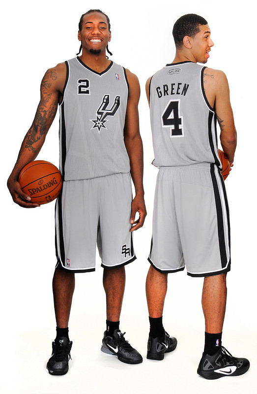
Most of the reaction I’ve seen so far has been negative. Personally, I don’t care for the gray (they’ll call it silver, but come on, it’s gray), but I’m intrigued by the simplicity of the spur logo on the chest. No team name, no city name — interesting. For a sport that seems to have run out of creative options lately (how many different ways can you put some lettering across the chest and a number underneath it?), this uni suggests a new range of possibilities. I’m curious to see if other teams try something similar.
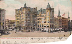
PermaRec update: A rephotography project based on some 100-year-old postcards, like the one shown at right, is the focus of the latest entry on the Permanent Record Blog.
Uni Watch News Ticker: 49ers QB Alex Smith was issued a $15,000 fine for wearing an SF Giants cap to Sunday’s postgame press conference, although the fine was later rescinded (thanks, Brinke). … Also from Brinke: The Marlins have created their own bobblehead museum. ”¦ New sweatbacks for Minnesota (from Jeremy Formo). ”¦ New kits for the English national rugby team (from Josh Jacobs). … Andrew McCutcheon of the Pirates tore one of his batting gloves while taking a swing in last night’s game against the Brewers. Never seen that before (from Geoff Poole). ”¦ Here’s the logo for next year’s Kentucky Derby. “Horrible is an understatement,” says Matt Dowell. … Andy Chalifour notes that yesterday’s Ticker-linked screen shot of Ruppert Jones’s nickNOB also showed Chisox catcher Wayne Nordhagen wearing a brimless helmet. … Another example of advertising’s encroachment onto public space: An illuminated street billboard in Boston projects its message onto the sidewalk. Shame on whichever municipal agency approved this (from Ben Marciniak). … All the caps for next year’s World Baseball Classic have now been unveiled. I especially like Australia’s and Israel’s. Also, Canada’s cap logo looks a lot like Chris Creamer’s logo. … New marching band uniforms for James Madison (from Andrew Rader). … Reprinted from yesterday’s comments: Graduating seniors on Clemson’s football team get a mortarboard decal. … Here’s a possible first: a high school football throwback game. … Here’s another high school football team with near-illegible uni numbers. That’s Tigard High in Oregon (from Travis McGuire). … Here’s a time-lapse video of the Missouri Mavericks’ (CHL) ice being prepared for this season. “Tons of on-ice advertisements, but that’s typical for = minor league teams, and it makes for a more interesting video,” says Brad Barker. … Remember our recent discussion of schools selling shirts for blackouts and orange-outs and so on? Southern Miss is now selling blackout shirts. “I have a problem with that,” says Michael Martin. … Speaking of color-coordination, last night I was at an art event and bumped into my friend Nina Katchadourian, who told me about a project she’d done while attending art school back in the ’90s: She and some collaborators arranged to have all the cars entering the school on a particular day park according to their color, resulting in a full parking lot of red cars, another lot of yellow cars, etc. Very cool. ”¦ The world’s largest collection of baseball caps — over 109,000 of them — is in need of a new home (from Joe Nocella). … If you can watch this video clip showing Utah’s new BFBS helmet without rolling your eyes or just laughing, you’re way ahead of me (from Frank Mercogliano). ”¦ New third jersey for the AHL’s Springfield Falcons (from Josh Tremblay). ”¦ Pink accessories on tap for Ohio football (from Johnny Bruno). ”¦ Gregory Koch’s high school — Spackenkill High in Poughkeepsie, New York — went BFBS last week. “I’m very disappointed in them,” he says. ”¦ Whoa, look at the placeholder Dodgers uniforms shown in this photo, presumably taken just after the team’s move to L.A. (nice find by Dennis Hasty). ”¦ Also from Dennis: Check out the team-branded crew socks in this 1957 photo of former 49ers R.C. Owens.
The uniform the Dodgers are wearing the 1957 road uniforms of the PCL’s Los Angeles Angels, the team that folded when the Dodgers made their move from Brooklyn.
The Angels didn’t actually fold, they just moved to Spokane.
I left out “appears to be”
This photo’s been discussed here before.
These…
link
…were the last PCL Angels uniforms.
link
Probably a safe bet the Dodgers PR department wanted something in the photo that clearly said “Los Angeles”…rather than just “Dodgers” (which is what their unis–both home and road–said). With just “Dodgers”, even if there’d been an “LA” on the hat, the photo’s “visual story” would have been zilch. Nothing else in the photo clearly suggests LA.
At least that’s in 1957-58 thinking.
Funny that the caption reads Coliseum when clearly it is LA’s Wrigley Field.
They may be a mistake by the cutline writer at the wire service.
Regarding Nike and the issues they where having catering for all 32 teams ,major company’s outsource manufacturing all the time ,but was very serpeised to see them allowing non Nike jerseys being sold on NFL online store ,and I’m not talking about old reebok stock but those unbranded Pro Line jerseys that started to appear just before the Superbowl!
That was before Nike’s contract started (which was April 1).
Yeah but if you check on NFL.com shop you will see they still do unbranded replicas for most teams and they went on quite recently!!
When the jersey is washed a couple of times, the Flywire collar has a tendency to fade drastically and the shiny design gets white and flakes off. As you might imagine, this would not look good on TV.
…and suddenly the ridiculous amount of alternate jerseys at the NCAA level makes perfect sense.
Indeed. A classic “Quantity over Quality” issue.
Turn it into a selling point.
“Hey, if we make ’em so crappy we have to keep replacing them, you might as well wear something new and different.”
Philadelphia Eagles don’t have any issues. Still using the “reebok” template–complete with dazzle yoke. No Nikelace, no “wear zones” no “water repellent material” on their jerseys. Same as when Rippon made them for Rbk brandmark.
“If you can watch this video clip showing Utah’s new BFBS helmet without rolling your eyes or just laughing, you’re way ahead of me” – Almost pulled it off, but then an incredulous chuckle slipped out.
the video stopped playing on mine but the audio kept going, I didn’t even get to past the intro graphics. Hearing the chants from the prison in the Dark Knight Rises got me laughing at the absurdity immediately.
Not to stir up a hornet’s nest but… Doesn’t the simplicity of the new Spurs alts leave more room for…um…advertising?
Just had to get that off my chest.
Ha! Thought the same thing.
“There sure is room for a nice big ad on those unis.”
This was EXACTLY the react my brother and I had when we saw this uni. Sweet look, but that space is prime for ads.
I’m frankly surprised that I haven’t heard more of that, especially with this email/letter writing campaign, hashtags, etc.
Ditto on my initial reaction, which was more like a shiver. I see the spur getting smaller and appearing opposite the number with a large logo where the current spur rests.
Methinks there is a method to the Spurs’ madness. Could all of the blank space on the jersey be there to accommodate the future uniform ads?
I hadn’t read your post before putting my theory down, so we may be on to something!
Great minds think alike! LOL
Practice. Training camp (which is when PR photos were taken). Not game socks.
link
Maybe Terry knows for sure, but it seems to me that maybe number of pro teams did that because they trained at colleges, and was a way to identify their stuff from anything else in the school’s laundry facilities.
Good theory, Ricko. Most colleges wouldn’t have been opened when the pros trained there for pre-season. But the NFL teams have been putting their name or logo on practice gear forever. Sometimes for identification and sometimmes for publicity. Like, “Hey, that’s Otto Graham of the World Champion Cleveland Browns!”
Also, I guess put me down for a “meh” at the Spurs new alternates. It’s not horrible, but it seems like the spur logo should be larger, and something about the striping just seems off to me.
What they really should do is just take their normal white jersey, swap the white & gray, and wear gray at home, black on the road, and not bother with an alternate or white uniform.
They remind me of the turn ahead the clock promotions…
Back in their ABA days the Spurs wore Grey uniforms at home. The shorts were Bulls-style.
They wore ’em their first year in the NBA, too, before going to a white version that had bizarre “saddle” piping on the arse…
I remember that “saddle stripe.” We made a set for a high school with those stripes. Didn’t look half bad.
FWIW, I like the Spurs alt. Different w/o going over the top. I’m not a fan of the gray, but in this instance it works.
I don’t hate white jerseys, but I agree on this one. If the Nets are switching to a predominantly black/white template, it would be a great team for the Spurs to just ditch their white set completely. If the Lakers can (mostly) wear yellow unis at home, there’s no reason why the Spurs can’t wear gray.
And while I’m sure this gray set is at least partially influenced by the explosion of gray at the college level, at least it’s an actual team color in this case.
Consider this a vote for the Spurs’ alts. The color is part of the team’s scheme, and the jersey looks as good or better than many in the NBA. The logo-instead-of-wordmark thing has been done before, by Nike on turn-of-the-millennium jerseys for North Carolina and Michigan (perhaps another team or two; I don’t remember). The look was maligned, but I think that’s because they messed with two classic looks and did it on the primary jerseys. It might have stuck around if Nike had aimed a little lower by doing it with lower-profile schools.
I agree, those Spurs jerseys are pretty cool. Love the shorts especially.
Not wild about the gray but otherwise I find the Spurs jersey kinda interesting. Not that I would want 2/3rds of the league to follow suit but it would be cool on two or three teams.
Oh, and thanks to “boxcarvibe” for answering my question yesterday about the RedSox caps, i.e. red “B” on a blue cap…
-Jet
The ad angle is interesting. I doubt the new jersey was made for the sake of leaving ad space, but maybe it was designed with ad space in mind.
All you need to do is move the number down a bit…
link
I was thinking moving the logo higher and making it smaller. Then you would have a EPL uniform with an ad along the middle of the chest.
You would think the NFL has so much money they could afford a new set of unis per player per game for the entire season. Then again they are unwilling to pay the refs fairly…
Or the players could buy their own “extra” jerseys (I think they can afford it). Cuz you know they want to look good!! Then again, a ratty jersey (like a ratty ballcap/helmet) is a sign of toughness/coolness for some.
Equipment managers can’t be fans of preparing new uniforms each game, not only the initial 53 but any potential replacements if the first ones get damaged.
Not to mention the fact that they are limited in how many cuts they can have, and apparently the jerseys don’t allow for much alteration.
Its not about money or being able to afford the jerseys (you could easily auction them off after every game at a price much higher than their cost, if money was an issue), its about getting them ready for the players to the player preference, and not being able to rely on the same jersey for more than a few games is an issue.
Yes the Spurs jersey is plain but I like the idea that it could be worn at home or on the road without really needing the other team having to change their jersey. Color on color home games maybe.
Color vs color is (almost) always good, of course… but I’m not so sure I’d want to see that gray vs white. It really shouldn’t be a road uniform anywhere other than Los Angeles.
Why the Springfield Falcons (the Columbus Blue Jackets AHL affiliate) 3rd uses the Carolina Hurricanes template confuses me. The Falcons only had an affiliation with Hartford, not Carolina, and never had a deal with the ‘Canes past outside of any player loan agreement (if that even happened).
Unless that particular template is common-use, that’s a particularly curious move.
The templates used have nothing to do with the team associations, John. It’s just a template that a team can choose to use if they so desire.
Also, just got caught up on yesterday’s info. Thanks for the shout-out, Paul! I hope some of you find the more obscure sites with weird hockey jerseys to be a bit of an adventure. :o)
That’s what I figured.
Still, to see Pro Team A’s farm club look eerily like unrelated Pro Team “R”, that’s strange to me.
“Here’s a possible first: a high school football throwback game.”
Nope, Phillipsburg-Easton did it before and Uni-Watch reported it: link
I was just about to post the same thing… It was done 6 years ago by Pburg and Easton…
link
I’m glad I’m not the only one that remembered my high School Easton wearing the throwbacks with P-Burg for the thanksgiving day game.
also i’m pretty sure the Nike/NFL contract is only for 5 years not 12…
Linebacker, skill and QB/kicker…so I’m supposing the linemen are all wearing the “linebacker” cut? That’s annoying.
Sorry, just left over resentment from being a lineman. The idea that it takes no skill to play those positions is ludicrous. I’m still holding a grudge that Orlando Pace didn’t win the Heisman.
I think there should simply be one jersey cut. Everyone wears the same damn thing, isn’t that what “uniform” is supposed to mean?
Bullshit. No tailoring allowed? Make every “split the difference” between large and small and force everybody into medium?
“I think there should simply be one jersey cut. Everyone wears the same damn thing, isn’t that what “uniform” is supposed to mean?”
LOL! Did you ever play the game?
Eh, I get it. It could be the pads they wear and the cuts it takes to get jerseys to fit over them.
My petty little point. At any given point in the game, there are always more linemen on the field than linebackers. So shouldn’t it be the “lineman” cut or just the “line” cut?
Linemen, the Rodney Dangerfield of positions.
Like I said, it was petty.
It’s possible that the person who contacted Paul used the word “linebacker” but “lineman” is the correct designation.
The new Spurs alternate uniform reminds me of North Carolina’s failed NC logo uniform from years ago which was a flop.
I don’t like them. I have less of a problem with the Silver/Grey than I do with the naked logo and the “practice uniform” look of the entire mess. why no sidewall stries? Why no “belt” or elastic area trim?
Looks pretty crappy, I say …. A missed opportunity ….
That Utah video was one of the most lame things I’ve ever seen. It owuld have been bad with any soundtrack, but using the Dark Knight Rises chant was really bad. I bet it was put together by some 50 something who thought, “Oh, the college kids are going to go nuts when they hear this!”
Two letters instead of one, but the Puerto Rico WBC caps remind me of Potomac Nationals caps.
And the Chinca “C” is a total rip off of the Corona beer link
There are a lot of obviously derivative designs among the expanded WBC roster. At least half appear to be more or less direct letter/color substitutions from MiLB. For PR, check out another Nats affiliate cap that may be even closer:
link
Also, both the Canada and Australia caps that Paul calls out are essentially unchanged from 2010.
Especially considering that the Baseball Canada logo has been around for nearly 20 years and has not changed with the exception of the 2008 Beijing Olympics when the length of the C was cut short in order to skirt the banning of National Sport Federation logos on Olympic uniforms
I wish the US would scrap that lame “Saturday morning cartoons” logo and go with something a little more classic.
Yeah. There are a lot of nice-looking caps in that bunch. Unfortunately, we’re at or near the bottom. Yuck.
I see twenty-six caps there, with Japan and Korea notably missing. Is the full field thirty-two?
Whoa… it’s twenty-eight. And two of the four qualifying clusters are already underway!? Crazy. Israel over S.Africa 7 to 3. The retired Shawn Green was the Israel DH.
And should I be more surprised that the WBC was second from top on Wikipedia when I typed in “2013 W” ?
Korea will be sponsored by Nike, but last week MLB Shop had all 28 teams (including Korea/Japan). But it seems as though MLB Shop has recently taken them down.
link
New Era and Majestic for the past 2 WBC’s have come out with some Korea gear during WBC since the authentic Nike uniforms and hats were difficult to get in the USA.
I have the baby blue Korea hat that New Era sold last WBC, it’s similar to the one they just took down, except there’s no New Era logo and the flag is now on the left instead of right.
That is NOT the Coliseum in Los Angeles where that photo took place — as a single level seating bowl, there is NO upper deck at the Coliseum to be supported by support beams. It’s old Wrigley Field home of the Los Angeles Angels (and home of the old television series “Home Run Derby”) and the uni’s are road uni’s for the Angels.
And LA Wrigley was home to Gene Autry’s expansion Angels in 1961. Those Halos moved to Dodger Stadium from ’62-’65 but called it “Chavez Ravine Stadium.”
Also, we just discussed those illegible Tigard HS uniforms in here last week in the ticker.
Do you think the Spur’s simplistic logo is designed to leave more room for adds? Might be the future of NBA uni design.
HIGH SCHOOL FOOTBALL THROWBACK GAMES
ESPN around 2007 broadcast a traditional Thanksgiving Day (morning, actually) High School rivalry game that had both teams wearing Throwback unis to celebrate the 100th Game played in the series. I believe that the teams were in Ohio or Pennsylvania.
One team wore faux Friction Strip jerseys from the 1920s-1930s, the other team wore white jerseys with the stripes similar to those worn by the HS team featured on UW last week that were to be outlawed in the near future – similar to the “School Ties” team that Brendan Fraser played on in that movie ….
The HS team wearing the Friction Strip jerseys actually had a link on it’s website to the manufacturer (a small company I hadn’t heard of before or since), offering the same on-field throwback jerseys in custom numerals and sizes for purchase by parents and fans of that school for about $90.00. I had bookmarked the site, but that was three computers ago, so I lost it …
I don’t think this is the game you’re talking about, but these two NJ schools played a 1950’s throwback game on Thanksgiving 2007:
link
pretty sure your thinking of Easton vs P-Burg, which was covered here on uni-watch. PA vs NJ
I sent in about Warren Harding Ohio and throwbacks last week. Paul had it in ticker.
They did claim it will be the first time a HS wears throwbacks.
Beauties: France, Panama, South Africa WBC caps.
Funny development on those Tigard HS uniforms: they had to send them back to Nike to get alterations, so they’ll wear the jerseys from last season (link) for this Friday’s game. Here’s the story: link
Key quote from that article comes from the head coach in the last graf: “Remember, my number one rule in all of this is to try to figure out how we’re going make a first down and how we’re going to keep the other team from making a first down. I don’t spend an inordinate amount of time on the uniforms.” It’s a Nike Pro Combat uniform, so I’m guessing he just handed their creative team all of the power with that one.
I’m surprised that Tigard’s new uniforms comply with NFHS and OSAA regulations. It’s just an awful, gimmicky design.
But, as a high school official maybe I’d embrace the illegible numbers. When a coach inevitably complains about a foul call and asks “what’s the number?” to ID perpetrator, I can simply say “Your guess is as good as mine”.
You aren’t alone there, J.B. When I first saw a picture, I thought that there was no way they were legal. If they seriously are, then there are some serious issues with the rules. It must be hell on the refs, and just imagine how coaches who want to review film on them have it. I figured it wouldn’t be a problem these first few weeks, when the sun stays out fairly late. But when it starts getting dark and gloomy, those numbers would have been impossible to see.
Are you a ref in Oregon?
No, Texas.
I haven’t seen any uniforms that crazy yet, thank God. I like to think UIL and TAPPS rules wouldn’t allow them on the field.
Wow, all the high school athletic programs with uni-news! I thought school systems were struggling for money?
Just reinforces my belief that they shouldn’t be able to nick pro and college teams’ logo/icon designs without paying for them.
money could have been raised by a fundraiser, or donations from the families
I like the San Antonio uniform. The one glaring mistake is the inclusion of “SA” at the tip of the shorts … looks like they were just itching to add something to fill in some space. When, in fact, the beauty of the design is its simplicity.
You’re right, ScottM.
Additionaly, I would like to see the white take up all the space between the black in the side stripes, eliminating the thin gray in there.
The new Spurs uniforms remind of the Turn Ahead the Clock uniforms. And some ads.
I was going to say that, too! I’m glad that I’m not the only one.
NIKE FOOTBALL JERSEYS
I’m no fan of the Swoosh, I hate the Flywire Collars (cheap looking, nonsensical) and I hate the “Count Floyd from SCTV” back portions of the collars (which I still maintain ae somehow supposed to be the pointed ends of the two Swooshes meeting at the back of the colar – in some subliminal Nike sales doochebagery ….)
That said, Grambling wore Nike jerseys at the end of Eddie Robinson’s long run, and wore some pretty far out (for the time) outfits, which I thought looked pretty cool.
Nonetheless, and for whatever it’s worth, at that time I became aquainted with Grambling’s long time Equipment Manager, Chuck Dawson, and he informed me at that time that the Nike jerseys were the best quality football jerseys he had in this 30+ years at Grambling ….
The very next year, new coach Doug Williams signed a deal with Adidas, and I was able to obtain some of those Grambling jerseys ….
A particular quote in the comments on the England Rugby kit article caught my eye:
“Pink is traditionally masculine but it’s also a very creative and inspiring colour (as is purple).”
!
America and the United Kingdom: two nations divided by a common language aesthetic.
Oh, come now. “s” is basic HTML! What’s the problem?
Anyway, “language” was supposed to be strikethrough up there. And yes, if you have to explain the joke…
I have a British colleague who sometimes appears on American TV, and we’ve been trying to persuade him for years that “yellow” is American for “pink” as far as men’s shirts and ties are concerned.
I like the Spurs’ uni. Using a logo instead of a wordmark or plain ol’ lettering can definitely work for some teams. Helps that the Spurs have a very clean “crest-worthy” (think hockey jerseys) logo. As for the color scheme, at least it is a reasonable approximation of the Spurs’ silver.
The crest template wouldn’t work for every team, but a few teams with this concept would certainly make the game more visually interesting. Bonus if it gets some teams to update their logos to look better in this format.
Remember what happened when North Carolina and Michigan put their NC and M logo on their uniforms?
Those were just too far ahead of their time. They’d be fine now. There wasn’t any huge outcry when Michigan’s football team put an M on the front of their jerseys last year.
Yeah, but that was a one-off throwback.
I think I had less problem with those unis than most. UNC bugged me b/c they have such an iconic look, but Michigan basketball? They have room to play around with different looks, as long as it’s maize and blue and generally clean looking. I wouldn’t want to see the Lakers or Celtics do this, but other teams (Warriors or T-Wolves, perhaps) could come up with a good variation on their logo that would work. Any college that changes unis every year could throw this type into the mix and see if it sticks.
One small edit… the company that makes official NFL game day uniforms is “Ripon Athletics.” I know it is a quote, but just for everyone’s future references.
as opposed to … “rip-off”?
-Jet
Actually, it’s “Ripon Athletic” (singular, not plural).
Sorry for the confusion. I was correcting the use of two “p’s” in “Ripon” and messed up the singular and plural on “Athletic”. Thanks for the correction.
It’s Ripon Athletic, no “s”.
“Ladies and Gentlemen, Virginia’s Finest! The James Madison University Marching Royal Dukes!!”
(JMU/MRD drumline ’82-’86)
(PS: Bummer about the WVU game!)
How many corporate logos can fit on that new SPURS jersey?
The Spurs alt seems to be a setup for eventual ad sponsor in place of that logo! Move the number up, eventually make the team logo smaller and moved opposite of the number and BAM plenty of space for an ad.
I say that half-jokingly of course, just wanted to put out a conspiracy theory
Hadn’t read the other thoughts before posting mine, I think we’re onto something here!
As I said, just move the number down a bit and there’d be room for a nice big ad…
link
Yea, thats the first thing I thought when I read Paul’s description.
“Open up new possibilities”. yea like the trio of McDonalds, Target, and Apple logos surrounding the player’s number…..
Is Japan not playing in the WBC?
Japan is in it:
link
If I recall, both Japan and South Korea supplied their own unis last time around. I may be remembering incorrectly, but I think that Japan gear eventually showed up in US retail outlets, but Korea might not have.
Mizuno supplies the Japanese team’s uniforms, while Nike has South Korea – which has been the case for years.
Adidas has been making the uniforms for Cuba for years, but has always taken advantage of any free stuff that they can get whenever they can
Japan’s uniforms and caps are done by Mizuno. You might seem them for sale closer to the actual tournament, but these are all New Era for now. South Korea’s not on there either..I think Nike sponsors them?
Damn, oilfan and I are in hivemind today, apparently.
I’ve often wondered why Australia always uses green and gold for its national team. Or, more accurately, why the Australian flag doesn’t include either of those colors.
Australia is an unusual case, because their national colors are different than the colors shown on their flag.
link
Netherlands uses orange for its sporting color, a lovely color noticeably link.
Funny you mention that: The red band on Netherlands’ flag used to be orange, but it evolved (devolved?) to red over time.
Yet stuck around on the link and link flags.
Go figure.
Japan has always dressed their national soccer players in blue (and called them “Samurai Blue”) despite blue not being on the flag.
Italy, as well.
Well, Blue is the color of the House of Savoy, which ruled Italy for a long time.
And the Netherlands’ color comes from the House of Orange.
Personally, I rather like the use of sporting colors that aren’t the same as the flag. Like British racing green.
Considering the overall lack of variety in flag colors around the world, it’s probably a good thing that a few countries have decided to use colors that aren’t on their flag.
Australia and New Zealand are still flying flags that hark back to their days as British colonies, as you can see from the top corner of their flags, many other small Pacific nations also have flags like this with the union flag in the top left and the same dark blue over the rest of the flag with some sort of crest or design in the middle.
If these countries decide to move on and separate themselves from this past then I’m pretty sure the Aussies would have a green and gold flag while the Kiwis would have a black and white design, probably including a fearn. A site promoting this: link Aussies have already had competitions to design alternate flags: link
Netherlands – the house of Orange, is where the orange comes from, William of Orange helped get them independent from Spain – today the reigning monarch of the Netherlands is still from the Orange-Nassau house. The French invaded though and changed the flag to a (effectively) sideways French tricolor. Then both flags were used, and then they settled for the red version only in 1937.
Japan used to wear red and white but had early success wearing blue (as a change) so decided to stick with it.
A note on the Missouri Mavericks ice being laid – are they going with an orange line instead of the traditional red line at centre? It looks the same colour as in the centre-ice logo, which is definitely orange.
RE: McCutchen’s batting gloves
I wore Nike gloves when I was in Babe Ruth (dang, that was already over 10 years ago), and they would usually be completely shredded by the end of the summer.
This thing was designed and approved….
link
Unbelievable.
I’d tend to agree, but that logo is the responsibility of link, the amateur governing body. They’ve been using it for years.
At least it has 50 ‘stars’ on the flag.
Agreed, ours is the worst looking hat on here.
What? USA baseball’s cap is a thing of beauty. The whole USA baseball uniform is terrific. We’re just lucky that the powers-that-be at MLB haven’t forced Team USA into a crappy cookie-cutter uniform like it has every other country in the WBC.
Commented above. Hate it, looks like a t-ball or “get out and play” kids logo.
I’m not sure what’s so horrible about the new Derby logo. I like it. It’s clean, simple, readable, well thought out, and marketable. The designer explains the design very well in the article. Just because a logo is new and maybe breaks from tradition doesn’t make it bad. Anybody else like the new logo?
Personally, I don’t like the over-emphasis on the initials “KD”. Looks more like a secondary mark overlaid with too much text than a primary logo.
Love the colors, though.
Maybe I’m stupid but why does the Netherlands hat have NL on it? link
Sorta-kinda the same reason the United States of America has US on its cap. It’s a common local (and general European) abbreviation. Also, there’s a history of the Dutch baseball team using NL on its caps that predates the founding of the World Baseball Classic. (Though the Dutch national baseball program has also used the single-letter N as well over the years.)
Probably using their country code/initials, like US for United States, UK for United Kingdom. JP for Japan, etc.
*link*
That Niners jersey is a thing of beauty, no?
Indeed.
Sleeves, ny friend, sleeves.
MY, not ‘ny’ (though it may be appropriate, I don’t know).
Abilene High School in Abilene, TX has been wearing these jerseys going back to 05 or 06 to commemorate their school’s 3 straight state titles back in the 1950’s.
link
Would it be strange if I bought that Israel hat even though I’m Boston Irish? Because it might just be the best looking modern hat I’ve ever seen.
Hi uni folks: what team/player hockey jersey is that on the wall behind adult film star Britney Maclin in this new photo of her and Gronk? Capitals, maybe?
link
Uh… I think that’s actually a college football jersey, not a hockey jersey.
Weren’t you supposed to say “Jersey? I don’t see any jersey in that picture.” or something.
But, yeah. I don’t think it’s a hockey jersey.
Indeed. It took me a few moments… but it’s an Arizona Wildcats jersey. I don’t know wore 38 (the jersey in the posted picture), but here’s the jersey in action: link
*ahem* “…I don’t know WHO wore 38…”
/we needs an edit button, we really does
I studied that picture for a half hour I didn’t see any jersey.
Originality, thy name is Tom V.
How to get blocked from commenting on this site forever:
1) Post first thing in the morning with “First!”
2) Respond to a photo of a sexy gurl with “Jersey? I don’t see any jersey!”
As I’ve explained many times, such comments are not offensive to women. They’re offensive to MEN, because they perpetuate the tired stereotype that we’re all dick-for-brains idiots (when in fact only a few of us are — like Tom V., apparently).
What jersey? All I saw was…was…a bottle of Pert shampoo in the shower.
How in the heck do you recognize that? There’s like 3 or 4 bottles there and none of them are clear enough for me to make any guess at all at brand name.
I’m still trying to decipher the bad grammar in the caption:
“I pic of gronk of I that no one has never seen lol –naughty! ”
(One)? pic of Gronk of mine(?) …. (Not to mention the double negative)
I know she’s an adult film star, but yeesh!
OK, advertising space availability aside, off the top of my head, here are some teams who could make this Spurs-style uni work with their sans-wordmark logos. I’m sure there are some others.
Bulls
Bucks
Celtics (shamrock)
Nuggets (mountain/pickaxes)
Trail Blazers
Heat
Jazz (music note)
I think the old Bucks logo would look GREAT on a jersey this style. The old standing buck, that is…
link? Couldn’t agree more.
Yup.
It would definitely work for the Raptors if they went back to the Barney logo
“the NFL supposedly sent out a memo in the last week telling them to discontinue their bitching, as there is a 12-year contract with Nike and that’s the end of it.”
When people are pontificating about something, and they are getting facts wrong (I believe it’s a five year contract, not 12), I take their ponderings with a few extra grains of salt…
A couple of things about the new Nike jerseys. First, and my wife is a Bengals fan, so I made particular note here, what Nike’s system of limiting alterations has done has helped bring a bit of cohesion to each team, as far as jersey cuts go. Look at last year’s Reebok cuts, especially with regards to Bengal nameplates. Nearly everyone on the team had a different size nameplate, and what should have been a straight line across the back below the nameplate became chopped and un-uniform team-wide. Sleeve striping and side panels also varied from player to player. This has largely been fixed with the new Nike template, and everyone has the same size nameplate, lineman still have the correct number of stripes, etc. Many people thing the Bengals unis are garish, at best, but I think they’ve recently suffered from a lack of cohesion, which Nike has fixed.
Secondly, am I wrong, or does it seem that Nike has begun to do the same with its college program, but country-wide? It seems to me that each school now has the same basic Nike patterns (as far as jersey cuts go). Look at the sleeve-stripes. I am noticing much more cohesion in sleeve-stripe design throughout Nike’s college program.
Count me as a fan of that Spurs alt.
I’m suspicious about the new Spurs uniform. Especially if other teams try it. It looks like there would be lots of room on the front for a crappy-assed advertisement
My first reaction to the Spurs new gray alternates was that they looked like pajamas and I really don’t like them. However the conspiracy theorist in me looked at them and saw that these may be a precursor to putting sponsor logos (as is done in soccer)across the upper stomach/lower chest simply by moving the spur up more toward the left shoulder and potentially reducing its size just a bit more. This may be a ‘test’ by the NBA to see if such jerseys will still merchandise well.
Are the stripes on the Clemson helmet painted on? The purple one looks like it is.
Is there any way to get confirmation? Is that normal?
The Utah helmet video had me graving a buttery fish by the end of it…
link
funny article on ‘a day in the life of a punter.’
Latest crazy fan trend: team logo glass eyes.
link
I don’t think that really counts as a trend. It’s not like people are going out and intentionally removing an eye or anything.
/if I ever lose an eye, I’ll have a glass eye that glows in the dark
It’s not like people are going out and intentionally removing an eye or anything.
Not yet. But just wait.
Most famous eye-plucker: Odin. If sports had existed in his day, he totally would’ve gotten a team logo glass eye.
If eye-plucking becomes a “thing” I’m blaming you.
You think link has a favorite team?
Moody? The Blues.
NFL contact lenses (a little less commitment than a glass eye) have been around for a while.
link
The, I think you might just have your million-dollar idea right there. A replacement eye that projects light in the dark to help you see with your remaining, functional eye. It’s either brilliant, or you’d just wind up blinding yourself from the glare of your eye-light. But the latter is probably just an engineering problem.
This reminds me of the bad guy from Last Action Hero
link
Spurs jersey – Swap the placement of the logo and the number on the front and you’ve got a winner. Maybe someone with photoshop skills can make that happen…
that utah video is hilarious. i wanted to roll my eyes 5 seconds in but resisted to about the 30 second mark but it was very difficult.
That Boston projected sidewalk ad made me think of a certain projected message that ran in Gotham City: link
Those 49ers crew socks are team branded or number 49 is looking for his socks.
link
Saying again. Is just a training camp laundry mark. Not for games. Not for merchandizing. Back then, seen often on NFL training camp and NCAA football practice crews.
Those Spurs alts remind me of the design the Toronto Argonauts (link) and the Memphis Mad Dogs (link) once had. (Number up top and to one side with logo on bottom opposite side)
Forgive me, but I cant count on one hand the number of minutes of NBA I’ve watched over the last ten years…Do NBA Jerseys the manufacturer’s name or logo on them? The Spurs jersey has no makers’ mark.
I just looked up images of Derrek Rose on court. Nope- no makers mark.
The stuff you buy retail has a makers mark on the top left and the NBA logo on the top right. Official ones have only the NBA logo*
*And sometimes a memorial patch on the top left, as the Bulls have had.
NBA has never had a maker’s mark. Ever.
* except on all-star unis.
Its a wonder Adidas arnt pissed at the NBA for planning to do Uni-Ads and they wont even allow Adidas to put there logo on the unis.
Notre Dame decal info…
link
How big/small are those, and where will they go?
They’re pretty small. Think of the memorial shamrocks they’ve worn the last couple of years when two student staff members passed away (videographer Declan Sullivan in the vertical lift accident, student-manager Xavier Murphy due to cancer), and you’ll be able to imagine where they’ll go ( small stickers on the back of the helmet).
“I **can** count on one hand…”
Hi Paul,
Your Permanent Record feature on report cards is neat, but I REALLY like vintage postcards, especially of old buildings. I have a bunch of them. It’s great to see what cities looked like in those days, before the 50s and 60s, and to see some of the same buildings still living a good life. Howsabout making that a sideline for the Permanent Record?
Sure!
rumor posted on a South Carolina Gamecocks forum on alleged wardrobe for this Saturday:
“all grey with black numbers trimmed in garnet….black and garnet stripe down leg…grey cleats and grey under shirt things…did not see any new helmets…may look good but a lot of grey”
SC equipment manager says the Gamecocks will be in all garnet this Saturday. the greys will be used at a later date.
Southern Miss has been doing a blackout game since 2005. It’s not something that just all of a sudden they introduced. At any rate its not some bogus BFBS crap, black is a school color, and the team often wears black jerseys and pants. Another point, USM runs a shoestring budget and needs to make money any way it can.
Liverpool’s Europa League jerseys included a second ad under the players’ numbers — for the Peoples’ Postcode Trust, a charity funded by lottery proceeds:
link
Bruce Bochy wore a 49er cap pregame in support of Alex Smith. link
I would be interested to know if there was a similar kind of issue experienced by some of the teams at the start of the Reebok jersey era.
Did any teams experience similar ‘growing pains’ as they switched from their prior company to Reebok or was it a smooth transition.
Its pretty bad if the flywire collars wind up falling apart given the fact that they are the most visible technology and have affected the design of team uniforms the most (certainly one of the reasons why Green Bay stuck with their old cut).
link
Sabol trib this WE
Not that the annoying ad should even be there on the wall behind the plate but during the Pirates-Brewers game this afternoon the “A” in “Park” took a foul ball and got pretty messed up. In a perfect world they’d just remove the ad but I’m sure they’ll just have a new “A” installed next week while they’re on the road.
One question and a couple of quick comments:
1. Have the Carolina Panthers officially changed their primary uniform from black to the blue/carolina blue/teal shade they’re wearing tonight, it seems like we see this uni more than the black one (which is overall a good thing)
2. Driving home tonight (I live in the Toronto area), a sport talk show listed the top 10 disappointments of the Blue Jays season, for those who don’t follow baseball closely – this has been an absolutely disasterous season for the Jays (horrendous injuries, the collapse of Ricky Romero, Bautista not being Bautista, but the number 1 disappointment – they listed – the Escobar incident). As it was, everyone was feeling completely let down by the season, now it has turned nasty.
3. The Spurs Uniform is interesting, it had seemed as if the NBA had gone into full retreat on hockey-like logo uniforms (long gone were the Raptors, Jazz and the Bucks forays in this regard) Now this, if you lowered the numbers a bit, put a zipper down the middle, you would have your first baseball/basketball uni. I almost think it needs a horizental stripe as opposed to the vertical ones on the top.
There is no Andrew McCutcheon on the Pirates roster, and there has never been a McCutcheon to play in the Major Leagues. There IS, however, an Andrew McCutchen (without the “o”); the only two McCutchens, Andrew and Daniel, have played for the Pirates at some point this season. Though it is a very common mistake to make, as a Pirates fan, it’s still disheartening to see writers everywhere making that mistake, especially considering the MVP-caliber season that McCutchen has put together. Granted, it’s not as disheartening as the team falling under .500 despite being sixteen (SIXTEEN!) games over at one point, but it’s still disheartening.
I’m really hoping a 6-8 game winning streak can get started while on the road trip but looks like another losing season is on it’s way. At least there’s finally a hope for the future.
I think those black jerseys in the high school photo listed above are illegal. NFHS rules require “clearly visible and legible” numbers, and that doesn’t look like either to me.