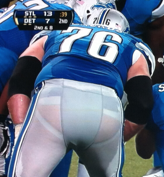
The first Sunday of the NFL season featured a predictably unappealing mix of Nikelaces, neck rolls, and sweatboxes. We were all expecting that. What we weren’t expecting — but what we nonetheless got, as you can see in the photo of Lions tackle Jeff Backus shown above — is a pair of pants that left nothing to the imagination. Let’s all chip in and buy a present for the underpaid garment worker who sewed that center panel onto the back of the pants, shall we?
The interesting thing about this is that the Lions are the one team whose pants looked significantly less metallic during the preseason. I realize some other teams’ pants look a bit less shiny this year, but the Lions are the team whose pants have really jumped out at me. I’m assuming that has something to do with the see-through effect.
Here are some other uni-notable observations from Week 1:
• Just as I’d rather not see Backus’s sweaty thighs, I’d also rather not see Saints linebacker David Hawthorne’s underwear waistband.
• How can a senior be young? When he’s Titus Young Sr., who’s wearing SrOB. Yes, it’s bogus (he’s not Young Sr., he’s Titus Sr.), but still, that’s best possible SrOB, no?
• In a move that was announced on Saturday afternoon, the Broncos have added a ribbon decal for the victims of the Aurora shootings and the Colorado wildfires. They’ll wear it for the entire season. I love the visual reference to the Colorado state flag, but I’d give anything for a “worthy cause” decal that wasn’t ribbon-based.
• My bad for not having mentioned this during the preseason or in my NFL season-preview column last week, but the Northwestern striping on the Steelers’ sleeves has been badly compromised. For most players, the lower stripe no longer exists. The primary exception, of course, is the quarterback.
• I was wondering if Buffalo’s new blue road pants, which weren’t worn in the preseason, would make their debut in the Meadowlands. But the Jets ruined any chance of that by wearing white at home.
• Speaking of the Jets, this was a bit easier to see on TV, but their shoulder stripes were clearly a different shade of green from their sleeves and numbers. Here’s another view. (Doesn’t look like that in the style guide, natch.)
• What’s worse than a sweatbox? Not much, but I’d say four sweatboxes in a row would qualify.
• Robert Griffin III had a lot of logo creep cover-ups going on yesterday. First, during pregame warm-ups, he covered up his undershirt’s swoosh with a rather strained attempt at anatomical inspiration. Then, during the game, he head black spatting tape over his Adidas stripes.
• Speaking of cover-ups, 49ers coach Jim Harbaugh was once again wearing his cover-up patch. As you may recall, I’ve speculated that it might be one of his old Stanford shirts — maybe his “lucky” shirt or something like that. But an inside source now tells me (a) it is indeed an old Stanford shirt, but (b) it’s not rooted in superstition — it’s just the Niners’ solution to Nike not producing that style of shirt, which Harbaugh happens to like.
• Aaron Rodgers had a pair of extra rivets or inflation valves or something, one on each side of his nose bumper. Anyone know more about that?
• Even by current NFL hosiery standards (or lack thereof), D’Qwell Jackson was really pushing it with his socks.
• I noticed Andre Johnson wearing a Breathe Right strip. Is it just me, or have those largely disappeared from the game over the past year or two?
• Have the ball boys always had their first names on their vests?
• Most (all?) fields were emblazoned with this logo. Strikes me as exceedingly lame-o, but then I don’t like the “Opening Day” logos on MLB fields either. Like, is it really necessary to tell people it’s the start of the season? Was anyone watching unaware of that fact?
• Now then, about those shoes: Colorful, eh? Here’s a few dozen examples (if the slideshow doesn’t work for you or you’re reading this on an iPad/iPhone, you click here):
Some of them are wretched (I’m sure you can guess which ones I slot under that heading), but I think some of them look fine, or even better than fine — at least when viewed in a vacuum. The problem is that now each team has a total crazy quilt of footwear colors. You’ve got one guy wearing black, the next guy wearing red, and the next guy wearing gold — it’s a mess. In some cases you even have one guy in black and the next guy in white.
Turning to Saturday’s college action, you should start by checking out Phil’s post from yesterday. But here’s some additional coverage:
• We all know Penn State is new to the whole NOB thing, but didn’t anyone tell them that heat-pressing the letters without sewing them down is a recipe for disaster? Embarrassing.
• Illinois switched to a blue facemask (first time they’ve worn that color on their mask since the late 1970s) and is now issuing merit decals (for the first time ever, I think, but I know for sure they didn’t have them last year).
• Speaking of Illinois, they’re no longer using Chief Illiniwek, but ESPN is.
• BYU has reduced the size of its merit decals, which had previously made the helmet look too cluttered.
• Two Florida players wore striped socks.
• Vanderbilt has a McNOB inconsistency.
• Missouri’s Sheldon Richardson has a tattoo that appears to include a football and a swoosh.
• Take a look at this shot from the Rutgers/Howard game. Notice anything odd? There’s no Dial-a-Down marker on the far sideline! A few plays before that photo was taken, a runner fell out of bounds and apparently damaged the Dial-a-Down. So they took the first down indicator stick and used it as the line of scrimmage marker, leaving the first down marker strip all by itself on the ground.
(My thanks to all contributors, including Dan Badalamente, Paul Deaver, Andrew Greenwood, Dan Hannon, Matt Harris, Jason Kerzer, Kyle Kruszynski, Ryan Mandel, John Marshall, Jason Mattina, Matthew Meo, Shawn Mulvey, Erik Nystul, Marcus Ramsey, Andy Rawlings, Drew VanNess, Steven Wojtowicz, Patricia Wren, and Dan Wunderlich.)
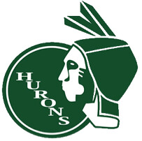
Unscientific poll: Eastern Michigan’s old Hurons logo — which was dropped 20 years ago amid concerns about Native American stereotypes — is being revived for the school’s marching band. According to this story, the move has the blessing of the Wyandotte Nation, which was formerly known as the Hurons, so it’s apparently a win-win.
We’ve discussed Native American iconography a lot here on the site. The topic always generates a lot of comments, including a few from people who identify themselves as being Native American, but I’ve never specifically asked Native American readers to weigh in. I’m going to do that now, though: If you’re of Native American ancestry (I realize that’s a somewhat controversial topic itself in certain circles, but I’m going to let you folks define yourselves as Native American or not for the purposes of this exercise), what do you think about the use of Native names and iconography in sports? What do your family members think, including those who aren’t sports fans? Is there a difference between, say, the Braves’ use of a tomahawk, which seems like an outdated stereotype, and the Seahawks’ use of Salish imagery, which is more part of the local culture in Seattle? Please let me know your thoughts on these and any other issues relating to this topic via this e-mail link (not in the comments, please). Again, Natives only, please. Thanks.
I met up with a big crew from Cooperstown at Saturday’s Mets/Braves game, including Hall of Fame curator Tom Shieber, Hall of Fame researcher Bill Francis, and Cooperstown Mayor Jeff Katz (an old college buddy of mine). Uniform designer Todd Radom also joined us, along with a few other folks. We had a great time at the ballpark and then headed to Manhattan, where we chowed down on some serious meat at Hill Country Barbecue. Given the day’s twin themes of baseball and carnivorism, I took the liberty of outfitting everyone with an appropriate uniform (click to enlarge):
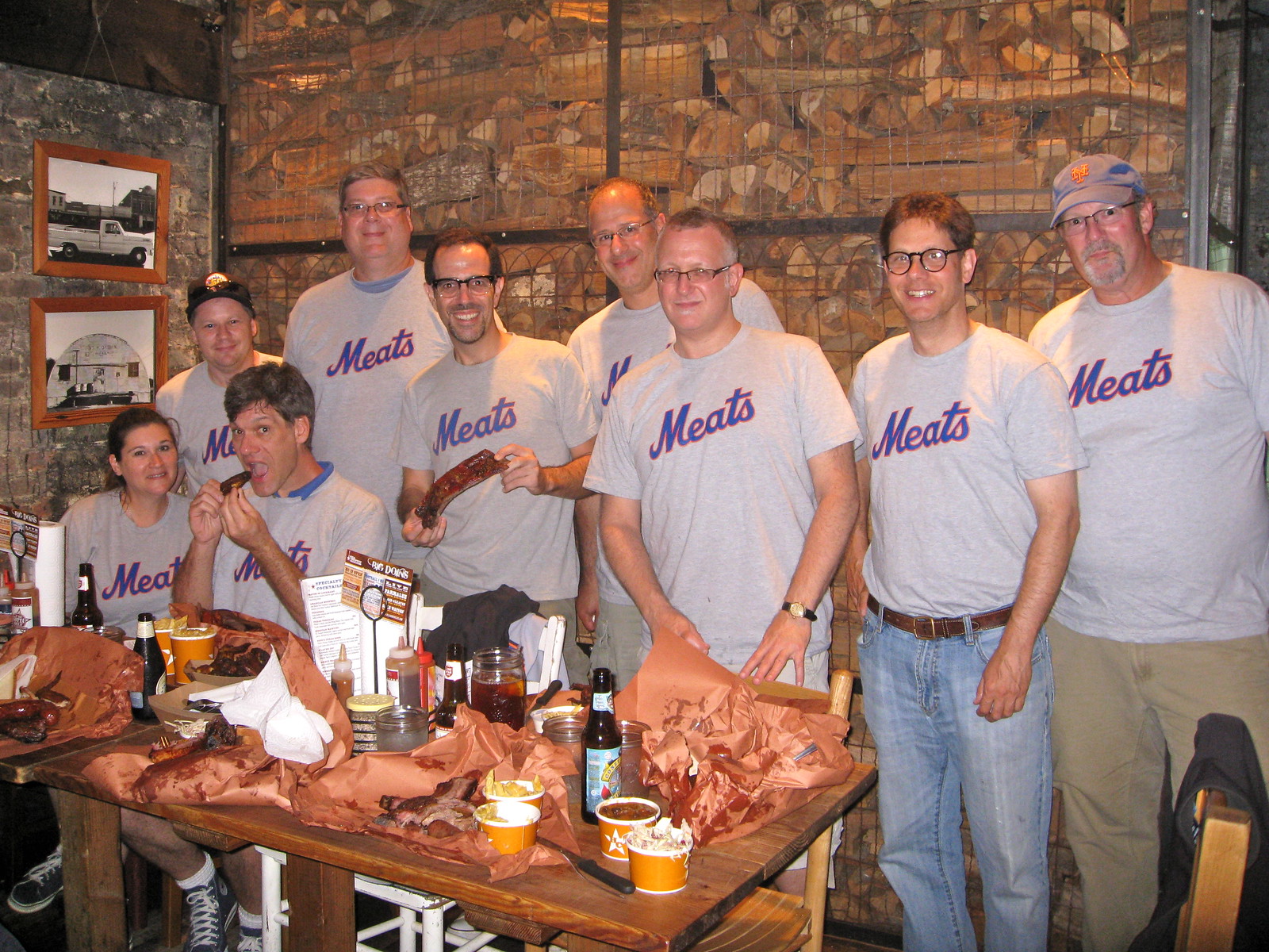
Note that there were nine of us — a true murderer’s row lineup!
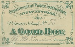
PermaRec update: Some old school documents, including an award card for being “A Good Boy” (shown at right), are the focus of the latest entry on the Permanent Record Blog.
Uni Watch News Ticker: The Texans usually list their uni combos for the season on their web site, but they didn’t do that this year — until just now. Interesting to see that the red jerseys are no longer listed as being sponsored by corporate war profiteers this year (big thanks to David Westfall). … Cornell may sever its licensing arrangement with Adidas due to the latter’s abusive labor practices. ”¦ Interesting article about a semi-pro football player who’s 6’11” and 500 pounds. ”¦ USA Today will unveil a redesign, including a new logo, later this week. ”¦ Oregon is instituting random drug testing for its athletes, which raises the intriguing question of whether a swoosh can show up in a urine test. ”¦ Here’s one of those “If the team logos really represented their teams” features (from Lou Sherwood). … SB Nation just released a new visual identity for their web network, and each site now has its own custom logo. “Many of these would be improvements for the teams that they cover,” says Adam Knor. … Here’s more about Buffalo’s new merit decals. … Meanwhile, Buffalo is also now rewarding the week’s best scout team player with a safari-style hat. “Each weekly recipient signs the hat and at the end of the year it’s given to the scout player of the year,” explains Dennis Abrams. … A Chinese mother with quadruplets had trouble telling the kids apart, so she shaved numbers into their heads. … Bobby Abreu has worn four numbers this season: 53 with the Angels, and 12, 23, and 33 with the Dodgers. “I assume this has to be a record, but I can’t find anything to support or disprove it,” says Kevin Wells. Hmmm — anyone know more? Also, why has Abreu worn three different numbers during his short stint with the Dodgers? … Georgia Tech played its first nighttime football game in 1936. According to this article, the Atlanta Journal had this to say at the time: “For the first time [coach William Alexander] has relented and permitted his team to wear yellow silk panties of a dazzling lustre. The jerseys are equally as radiant to the eye. Feminine hearts will certainly beat faster this year when the boys at the Flats trot out on the field.” Now that’s some primo early uni journalism! (Big thanks to Michael Rich.) … In a development I’m understandably giddy about, Phil Knight is being inducted into the Basketball Hall of Fame. … The current issue of NCAA Insider has a story on the history of college football unforms (from Scott Musa). … New mask for Ilya Bryzgalov (from Scott Lederer). … New court design for the Grizzlies. … Kyle Clifford found a photo of former Lions WR Brett Perriman with some Reebok logo creep in an unusual spot. Based on Perriman’s tenure with the Lions and the team’s affiliation with Reebok, that photo has to be from either 1995 or ’96, so I looked at some other photos from those seasons. And sure enough, that logo positioning was very common in those years. I hadn’t remembered that at all. … The White Sox wore their green “halfway to St. Paddy’s Day” uniforms on Friday. The green caps included the MLB logo on the back — except for Gordon Beckham’s (good spot by Jimmy Couto). … Washington soccer went BFBS on Friday night against UConn (from Gregory Koch). … Rick Rutherford notes that Luis Jimenez seems to have an unusually large knob on his bat. … As I reported last week, the Mets are planning to mark the anniversary of the Sept. 11 attacks by wearing first responder caps during batting practice tomorrow, but not during the game. Several Mets bloggers are urging them to wear the caps during the game anyway, any potential fines be damned. There’s an additional example here. ”¦ No photo, but Austin Pendergist says Clemson’s mascot, “The Tiger,” has switched uni numbers from 0 (worn since the ’96 season) to 1. ”¦ Nick Markakis was wearing the Orioles’ old angry bird logo, or raging bird, or whatever the fuck he’s called, on his undershirt/pullover thingie the other night (good spot by Ben Gorbaty). ”¦ Members of the UGA marching band have had an allergic reaction to their gloves (from C. Trent Rosecrans). ”¦ During Saturday’s Mets/Braves rain delay, Zach Pearce spotted a Braves fan wearing stirrups. ”¦ The Colorado Rapids’ new home jerseys will have season ticket holders’ names woven into the fabric (from Pete Clark).
Who do we need to talk to at the Texans to stop them wearing blue over blue and get them to try red over blue?
Can we stop them from wearing red over red, too?
They look best in white over white, and aren’t doing that again all year! sort of sad.
I’d be happy if they’d just stop wearing the same color socks as their pants. If they want to wear navy pants then use the red socks. Why are so many teams completely oblivious to how stupid they look with the same color socks & pants? Chargers, Texans, Ravens, Saints… c’mon guys, look in a mirror.
But all the girls at jazzercise dress like that.
They screwed up the Jets’ uni anyway, by making the shoulder stripes a three-stripe UCLA pattern like the Colts, when it should be a two-stripe pattern. That just makes the two-tone green effect that much worse.
I noticed the different greens yesterday also but the weird part is Sanchez’ sideline ball cap matched the shoulder cap green and not the stripe green. Going to try and find a pic.
I’ve been saying for years that the shoulder inserts should be reversed; green-white-green on the green jersey, white-green-white on the white jersey. It would have the effect of moving the sleeve stripe down just a bit.
The link had a pretty good sleeve treatment, the link were OK, but once Reebok took over it just got ridiculous. The shoulder stripes were link and there was way too much white (or link) on the sleeve, making the jersey look too much like a vest.
Nike’s sleeve treatment is much better, as the stripes appear angled rather than vertical, but on the whites the forest-green stripe only emphasizes the contrast with the Army-green sleeve. I’m not happy about the Jets wearing Army green instead of forest green; I hope Nike fixes this next year, if not this year.
(Insert comment about Kelly Green here)
If the NFL has decided players on teams wearing different colored shoes is okay (whoa, ’70s flashback), doesn’t it now seem a little pissy to worry about white tape on shoes or white socks worn too high or too low?
A couple of the Jaguars (RB Jennings and a DB) had their shoes spatted up with white tape yesterday. Wonder if they got fined.
I mean, is color choice acceptable but white tape or high socks is being “just too, too individual”?
Lots of white tape on Arain Foster’s cleats in the slideshow photo, too.
“…doesn’t it now seem a little pissy to worry about white tape on shoes or white socks worn too high or too low?”
I meant for the NFL to get all pissy about it.
My great grandmother was a full blooded Cherokee Indian. I have no problem with the use of native American logos. None, whatsoever.
Please send me an email to that effect — not a comment post. Thanks.
Love the Redskins’ gold pants! that is all.
Those unis must drive the OCD-afflicted among us nuts.
Northwestern stripes on helmet.
Two stripes on jersey.
Pro stripes on pants.
“Packer-style” Northwestern stripes on socks.
Too bad the price for it is one of the great dark over white over dark uniforms (assuming its with the white socks) the NFL has ever seen.
Absolutely agree on the inconsistent stripes. My preference would be to go back to the 1978 Packer-style sleeve stripes. (also the last year of the gold pants) These are the Redskins of my youth.
Why isn’t this like THE most fundamental law of football uni design? Stripe pattern must match between helmet, jersey, pants. Colors can shift, but the pattern absolutely must be consistent. Automatic F for any uni that breaks this rule.
Count me in as LOVING both the Redskins and Bills uniforms.
That blue that the Bills are using really pops!
As for the cleats and gloves, let them have some fun…but only within the color palette of the team.
As for the socks, Jackson of the Browns should be ashamed of himself for ruining a beautiful pair!
Nowadays, you just won’t find the words “lustre” and “radiant” in any college football reporting.
. . . and mentions of panties in connection with football are most likely in a crime blotter.
The Braves fan in stirrups at the Mets game HAS to be a Uni-Watcher. Just HAS to be. Who else would have the stones to do that in enemy territory and be proud? I love it!
Go Braves!
If you’re going to sign a deal with a company like adidas, shouldn’t you at least be willing to wear their gear? Robert Griffin III (I’m tired of hearing RG3 all the time here in DC) just looks silly covering everything up.
Don’t think it’s about “willing”.
Think it’s about NFL restrictions.
Didn’t Reggie Bush run into that sort of thing, too?
And wasn’t there also something similar involving Darren McFadden? The sanctioned supplier (compared to the brand he preferred to wear) had a helluva time coming up with shoes that didn’t give him problems. Or something like that.
Oh, good point. I didn’t think of that for some reason.
Doesn’t this make the NFL the only league that doesn’t allow a player to have a separate shoe contract then?
Shoe contracts are huge money for basketball and soccer players, and I realize that football cleats aren’t as big a deal as “kicks” and “boots,” but the NFL is screwing players out of a decent chunk of change here, if their choices are “wear Nike or cover up your brand’s logo”
Is Under Armour an sanctioned brand, could have sworn I saw UA shoes.
I’d assume that he covered the stripes because of Nike’s NFL deal.
I’m thinking we need to go back to the way things were in the late 80s/early 90s when there was no exclusive license. The Cowboys are Nike, the Raiders are Starter, the Vikings are Champion… and no one really cares. Allowing one company to be “exclusive” and then putting in a bunch of exceptions for individual players or specific pieces of equipment seems to be rather tedious compared to simply letting the players wear whatever freakin brand of shoe or wristband they want as long as they’re within team colors.
Regardless of the brand, it would covered if Griffin chooses to tape/spat his shoes like that. It’s a functional thing first.
Reggie Bush was a good example of that.
Michael Crabtree and all Jordan brand athletes have to wear cleats and gloves with the Jumpman logo ghosted or invisible due to the fact that JB is not a certified brand by the NFL.
The most famous example of this was MJ in his rookie year with the Bulls of course!
The most famous example of this was MJ in his rookie year with the Bulls of course!
Wait, what? Jordan actually had his own brand established before he’d proven himself in the NBA? Really? That seems a bit…wrong. I mean, how many rookies have come out with loads of hype only to fail completely at the professional level? Being a person who doesn’t really care about shoes, I’ve always assumed that “Jordan” as a brand didn’t exist until at least a couple seasons in his career.
Sorry, The Jeff.
MJ wore the Air Jordan 1 which did not conform to the NBA unifrom guidelines and was thusly fined.
Nike went and paid his fines for him due to the publicity and free advertising which they received.
Jordan didn’t become it’s own brand until 1997. They were Nike Air Jordans before that.
I only got to watch a couple games closely but I was distracted by the blue gel padding under Alex Smith’s helmet. It just looked weird. Did other players have that showing?
Aaron Rodgers usually has his visible. Didn’t get to watch the game yesterday though so I’m not sure if it was visible.
Aaron Rodgers was wearing the new version of the Shutt XP Elite with screws holding the PU padding inside instead of the old hook and loop/ velcro that Alex Smith is still obviously using. And the Aaron Rodgers helmet pic above, those are the screws that are showing by the nose guards.
He always wore a Riddell VSR-4 until his big concussion. Then he went to the Schutt XP Elite, as did Brady and Vick!
I know I’ll be bashed for this, but to use “Native American” to refer only to the aboriginal inhabitants of the North American continent is not correct. “Native,” in its adjectival form, means “associated with the place or circumstances of a person’s birth.”
I was born in Brooklyn. I am a Native American.
If you want to parse things like that, then when speaking of Americans, you must include citizens of every country in the western hemisphere. Citizens of Argentina are South Americans, Canadians North Americans, etc.
That’s why I’ve always preferred the Canadian designation: First Nations.
A former co-worker of mine (a Choctaw)told me he much preferred people refer to him as an American Indian than a Native American if they did not know his tribe-specific heritage.
From the late, great George Carlin:
link
I’m a Canadian and I agree completely with both you and Ricko. “First Nations” is good, aboriginal is also good.
It reminds me of a very white friend of mine who immigrated to Canada from South Africa in the 1970s because they opposed apartheid. As a protest against misleading terms, whenever a form required her to fill in her background she always filled in “African Canadian” because it was, you know, true. It usually forced a very uncomfortable university administrator to tell her that “African Canadian” didn’t really mean what it sounded like.
Majority of Nike NFL uniforms are made by Powers Athletic. These uniforms are poorly crafted and use inferior materials compared to Ripon Athletic, who still makes uniforms for teams that rejected Nike’s template and flywire gimmick. I am not at all surprised with the results we are seeing: see-thru pants, sweat patches, peeling name and numbers, colors not matching, etc.
What, in your opinion, makes Powers inferior to Ripon?
Or are you just saying that the Powers was given specs that are inferior to the specs Ripon is working from?
Excellent points, Paul. I dealt with Powers for years at Ruby’s. Their quality of fabrics and workmanship were always the best in the industry, and I’ve seen them all. Don’t blame Powers because Nike’s super fabrics are not what they’re supposed to be. The swooshies should look in the mirror.
There is a display inside Camden Yards illustrating the Orioles’ various bird logos throughout the years. The angry bird is actually known in team history as the “Psycho” Bird.
Whatever his name is, he looks bitchin’ in those stirrups.
//Talk about Getting It(tm)!
“Psycho” is the first thing that comes to my mind, looking at that bird!
Here’s a history of the birds: link
It looks like the Psycho bird has been updated since his cap wears what looks like the new cartoon bird with O’s cap.
I’m amused that there’s a mention in the lede of the Steelers’ Northwestern stripes getting hacked by the ever-shortening sleeves, only for there to be a link to pics of the Lions mid-90s, when (while still having some semblance of sleeves, and numbers on them) their Northwestern stripes were getting truncated!
Indeed… of course the Lions were able to fix that by shifting the numbers up to the shoulders. The Steelers have done that and still lose a stripe. Someone’s either being really stupid or really stubborn. The Giants have northwestern stripes on their white jerseys that aren’t cut off, why can’t the Steelers have their stripes be closer to that size instead of having the ridiculously thick middle stripe which forces the bottom one to get chopped off?
I’m not sure BYU did reduce the size of their decals. I just think Ziggy is 3x the size of a normal man.
Paul,
Can you take down the headline pic now? It may be considered cruel and unusual punishment at this point ;)
The Philadelphia Eagles wore green jerseys in their opening game against the Browns yesterday.
This is the first time in Eagles recent history that the green jerseys were worn before November.
Paul, your thoughts?
What qualifies as “recent history”?
In any case, I’m all in favor of as much green as possible, so my thoughts are happy ones.
Last year they wore Green in Week 3 and 4
B4B,
Hate to say this, but the Eagles just last year wore green jerseys in Week 3 (9/25) vs the Giants, Week 4 (10/2) vs the Niners and Week 8 (10/30) vs the Cowboys.
*ah, monday morning uni watch.*
open web page
giant picture of bent over detroit lions lineman.
*chokes on coffee*
“he’s not Young Sr., he’s Titus Sr.” – shouldn’t the same be said for Robert Griffin? Isn’t he Robert the 3rd? Not Griffin the 3rd? His jersey should read “Griffin” in my mind. Or is it all a marketing ploy (my assumption).
Yes, it’s bogus for him as well. And I said as much a few months back:
link
Young Sr is doubly bogus. Until the boy you named after yourself is at least 16, there’s no need to go around calling yourself “Sr.” to be sure people can distinguish you from the toddler who happens to live in your house.
As big a douche as Pete Rose was, he never put Rose Jr. on his back.
Question: Ignoring games where both teams have worn throwback uniforms, has any NFL team other than the Panthers worn an alternate jersey on the road?
Didn’t Buffalo wear theirs at Tampa in either the first or second year of their alternates?
link
Sure, the New York Jets wore their Titans uniforms in Miami once, with the home team Dolphins wearing white.
i am pretty sure the jets also wore the titans throwbacks in Oakland a couple of years ago. It was the game where Sanchez ate a hot dog on the sidelines.
Regarding Aaron Rodgers’ extra screws, we have some new Schutt DNAs that use the extra screws to hold the padding in place instead of using velcro as was done on the older DNAs.
+1, but I’ve seen it on the new XP Elite. I haven’t seen it on the newer IONS and Vengeance tho.
Check this pic of the vengeance out…it has the added screws…and a cow-catcher mask!
link
Anybody else notice that the Bears’ Brandon Marshall appeared to be wearing a teal undershirt? link I would assume it’s a carry-over from his tenure in Miami, but it was annoying me throughout the game. Navy + orange + teal = headache.
I think those might be his shoulder pads.
probably. Kinda like link.
And I”m shocked to see that no Fins fan has jumped in to say that it’s aqua, not teal.
The Broncos’ season-long ribbon decal looks OK, but Regan Smith’s one-timer was sharper and much easier to spot:
link
Yeah, but if you’re looking to unite everyone, speak to everyone, etc., a Christian symbol (or any denominational symbol) is a bad idea. Too limiting, doesn’t embrace everyone, etc.
Indeed… especially when you consider that one of the people who was shot and survived is openly atheist.
if the creamsicle bucks, bills, and jets do not have “nfl” stripes because the are not dark around white, then the steelers sleeves are not northwestern stripes, and neither are the old milwaukee braves stirrups. both of those are clearly different patterns from northwestern stripes. can’t get persnickety about one kind of stripe and not the other my friend. is link negative space northwestern a northwestern too? and link is also northwestern too as well? where does this northwestern tag stop? this has bothered me for a while now. but the steelers sleeves and the old school brave stirrup are not northwestern.
Well, whatever they are, the Steelers need to fix their design so that the short sleeves aren’t destroying them.
(Insert comment about ‘Batman’ jerseys here)
link
i just figured there would be arguments today, and while i didn’t want to get into those, i didn’t want to be left out;)
by the way, the illini wore link on their helmets in the link era.
Does anybody happen to have a copy of the SI NFL preview issue from a couple weeks ago (the one with Peter King’s NFL picks)? I’m fairly certain that Peyton Manning’s pants in the huge two-page spread that leads into the NFL preview showed even more than the Backus photo above. Even the center panel was entirely see-through. I might have it still at home somewhere, but the wife may have very well thrown it out by now.
Paul, the Penn State NOB letters look like some sort of lightweight film. Film is usually applied at 335 degrees for 10 seconds. Film cannot be sewn on. My guess is that the operator either didn’t have his press at the correct temperature or he didn’t wait the full 1o seconds. Plus you should always cover the letters with a transfer paper before you press and then rub the jersey with a felt eraser while still hot and covered to seal down any corners. Probably some third assistant student equipment manager who probably hurried to get the job done.
Good info. Thanks, Terry!
Paul,
This video clearly shows the letters are twill and are to be sewn to the nameplate:
link
Based on the picture of the peeling letters… if those were actually stitched on, then someone did a REALLY BAD job.
Sometimes, nameplates have to be made last minute by the guys in the ER, because players change numbers or weren’t on the original roster that was sent to the uniform manufacturer. I agree with Terry’s thoughts.
Those are NOT tackle twill letters. They are Stahls Thermo-Film letters. If they were to be sewn why didn’t they show the process.
We bought the first heat-transfer machine in Rochester in 1969. The salesman showed us the sample machine he was carrying with him and we bought it right on the spot. It lasted for over 15 years.
If that’s the way the PSU staff applies names I see why the letters peeled. I’ve put film or vinyl names on countless football, basketball, hockey and baseball/softball shirts. We had very few letters come off.
Illinois had helmet merit decals in the 80s during the Mike White era, I don’t know how long. They were Chief Illiniwek decals. Here is a picture of WR David Williams and the decals.
link
“it’s just the Niners’ solution to Nike not producing that style of shirt, which Harbaugh happens to like.”
That seems strange since the Stanford shirt Harbaugh is wearing actually is a Nike shirt. Do they just not make it anymore? Also, since Nike just started doing NFL gear does that mean Harbaugh has been wearing a Stanford shirt with a patch this whole time?
They apparently aren’t including that style of shirt in their NFL coaches’ apparel line.
Last year, Harbaugh wore Reebok.
What really surprises me is that he held on to a shirt from his former employer (Stanford) for OVER A YEAR and then wanted to wear it again when the equipment contract changed. As you mentioned, he wore Reebok last year. That means he specifically kept that Stanford shirt in his closet in hopes of being able to wear it again when Nike took over.
And we thought the players were superstitious and/or picky about their uniforms!
I don’t think it’s *that* surprising. I mean… it was free, it still fits… why would you throw it away?
So are they gonna let Harbaugh wear that all year?
Is it just me, or do the Panthers’ helmets have a different finish this season than in previous years? They don’t seem to be as glittery as I remember.
They do indeed have a new sparkle finish for the helmets this year.
I posted this late yesterday in the comment but it must have been to late. The Rapids jersey’s with the season ticket holder names were actually unveiled yesterday at a season ticket holder party. Another new aspect of the jersey is white sleeves like our “partner” club Arsenal. I’m going to get one of the jerseys so I can fill in my name with some silver ink and then frame it. It is the only way my name is going to get on a jersey at this point. Pictures are available here:
link
Ever since the Rapids switched their colors to red and blue, I’d always hoped they’d go with blue contrasting sleeves, like West Ham or Aston Villa. I guess with the ownership though, wearing a shirt similar to another London club (West Ham) is out of the picture.
Really do like the red with white sleeves, though.
Yeah, when it was first announced they would go to burgundy and light blue i thought for sure we were going to get the West Ham/Villa treatment. I’m fine with not using it now though. I do think it would be great to bring back some light blue into the kit and a great way to do it would be to make the socks light blue with burgundy accents.
Hey Paul,
In late July, Phil posted a link showing what the Browns would wear yesterday vs the Eagles. It was the usual away uni with different socks – brown socks with two orange stripes. Have you heard anything about why they wore their normal socks?
Here’s a link referencing my question, I hope.
link
I’m familiar with what you’re referring to, but I never saw legit confirmation on them wearing that.
Not that it means much, but those socks are an option in Madden. (Of course, Madden also has the Bears “not being worn this year” orange pants as the default road uniform – so… yeah.
FYI – that smashing gent in the beautiful Braves stirrups is yours truly. I’m a committed Uni Watcher and loyal comrade in Robert Marshall’s Stirrup Revolution. A sharp eye will find me at most northeastern Braves games and all my softball games sporting some beautiful hose.
Oh, and my wife is a saint for hanging in there (and playing along) with my constant silliness.
At Sunday’s game, I wore the Amercks (to match my bright red Dale Murphy BP jersey) and we kept score with our ever-present scorebook from the Eephus League…
link
Thanks for the pic, Zach! Feel free to say hi next time!
AWESOME!!
Well done, Marty. Too bad I didn’t see you at the game on Saturday — I definitely would have approached you to see if you were “one of us.”
Harbaugh looks to be wearing one of the fleece crews that haven’t been pushed for awhile. The material Nike uses now has a more satin like finish and is smoother. Interesting patch job on the sleeve too.
Batter batting sans gloves alert:
Prince Fielder yesterday against the Los Angeles California Angles of Anaheim or whatever they’re called this year…
ESPN has a picture in their gallery but the guys at Fox Sports Detroit were commenting on it during the game. They also mentioned that Lou Whitaker also went sans gloves in the box…
Looks like a “meat-out” at the Hill Country Barbecue. And only a few days after your negative stance on dress codes. Hypocrisy!
(in case you can’t tell, I am kidding)
Following his release by the Angels, Bobby Abreu signed with the Dodgers who have retired his longtime number 53 (Don Drysdale.) He was given 33 right away, but switched to 23 within a week. He was then designated for assignment off the 40 man roster, which I guess, gave the Dodgers comfort in giving 23 to Adrian Gonzalez when he arrived from Boston. However, Abreu accepted the demotion to Albuquerque, and found his way back after rosters expanded. So number 12 became his.
Did he give up his 33 to Scott Van Slyke, by chance?
I don’t know if he gave up to him on purpose, but SVS took it when he got called up a few weeks after.
Even better is the story about how the Dodgers handled #12. Justin Sellers began the season wearing #12, which he had worn since last year. In May he went on the 60-day disabled list. I guess that was out of sight, out of mind.
When Shane Victorino was traded to LA, Don Mattingly gave him the #8 he had been wearing, and took #12. He wore it for 2 days, before Donnie Baseball said he just then realized it was Sellers’ number, and switched to 88.
I guess it didn’t matter that much, because a few weeks later Abreu started wearing it.
The colorful NFL shoes remind me of Tecmo Super Bowl, thus rendering them more palatable.
If only the NFL would eliminate the low white sock rule…
I, for one, would love to see a few teams replicate the look they were stuck with in that game. Pittsburgh in black/yellow/black, Denver in blue/orange/blue, etc.
Ah, yes, the Hannah Montana Football League.
What the hell does Hanna Montana have to do with a video game that came out in 1991?
I’m saying the two-colored socks you describe would be loved by Tweens. I’m sorry if you couldn’t follow that.
As to Techmo Bowl, I’ll plead ignorance. Always figured going out and, y’know, actually throwing a football around, maybe even running a bit, was preferable.
So you’re saying instead of this:
link
..you’d rather have this?
link
I’m so glad Mike Wallace sees the light and goes with this:
link
One of the best dressed receivers in the league.
Well, to be Tecmo accurate, there’d need to be yellow shoes… but yes. Honestly, I don’t really mind the low white socks that much, but I think it should be team choice, not league mandate. The Lions have solid blue socks on their Thanksgiving throwback uniform, what would be so horrible about a team doing that with their regular uniform?
The KC on Alex Gordon’s helmet has either been cleaned of, or placed on top of the pine tar. I have never seen this before – anyone else?
link
So you’re saying instead of this:
link
..you’d rather have this?
link
I’m so glad Mike Wallace sees the light and goes with this:
link
One of the best dressed receivers in the league.
link
The Grizzlies’ court design is actually unchanged, it’s just a new floor.
Isn’t the yellow stripe on the side new?
No it’s been there.
It’s just underneath the courtside seats and on the near side TV-wise, so you never really see it.
I know the Utah – Utah State game was Friday, but does anyone else think that Utah State’s new logo is off-balance? The S in state does not connect to the first T, but the first T looks to connect to the second T, behind the A, and the second T connects to the E.
Thoughts?
Here is a link to their logo.
link
Phil referred to the Nike elite socks as sweet!
link
What’s the consensus here on the board?
Theres of course the great letterman moment with jordan and the whiteness of his shoes.
I presume thats on youtube by now.
I found a mockup of the new USA Today design:
link
If that really is it… is it just me, or is the logo font a complete rip-off of ESPN’s logo?
It’s from Back to the Future Part 2.
Probably more likely going to be this:
link
Football striping question here for anyone who may know. The term “northwestern” is used to describe the Packers/Steelers style of jersey stripes.
But there was another type of striping pattern used in the 70s and 80s which I don’t recall ever having a term used to designate it. This was the style used by the Giants when they had blue pants, the Cards when Jim Hart played, and Pitt after Tony Dorsett. Other colleges and high schools used this pattern but I’ve never seen any term to describe it. Unfortunately, I think this style is extinct, but it was sharp while it lasted.
Anyone have a clue?
you talking about the striping on the jerseys or socks…but not the pants, right?
if i never look at those wretched blue pants again, it will be too soon
on stirrups, i believe that’s called the feather edge pattern — or at least that’s what it looks like to me
That feather edge pattern is close to what I recall on the jerseys, but the
white lines in your example were much smaller.
Craig Morton wore this type of pattern with the mid 70s Giants.
Speaking of Ga. Tech and Presbyterian, Tech broke out blue jerseys Saturday:
link
link
What’s funny is that I refereed yesterday morning with Brian Cushing’s brother, Mike. Maybe he has some pull!
Did anyone else notice the Rams had a different colored stripe in their pants? It definitely did not match their gold. It almost had a flesh-tone look to it.
Whose flesh?
If this wasn’t a uni-obsessed website, I’d have almost guessed that the first screenshot was to show the rarest of phenomena in the NFL: the Rams with a lead against a superior foe.
I could be wrong, but it looks like team swoosh fixed the different sized white side panels of the bengals. All the names are also on the same level in the orange. In years past, the white side paneling either stopped below the armpit or went up to the top of the shoulder. Looks like they were at least standardized.
Still not a good look, but a better bad look.
So, i’m watching the end of the phillies game and i just noticed that antonio bastardo is wearing socks with a liberty bell on his right leg, but nothing on his left. Anyone know if this is something he’s always done?
link
link
Isn’t it a bit ironic, that this truly hideous neck striping evident on so many NFL teams this year, actually works on one uni, which just happens to be the ugliest uniform in the league – the Cincinnati Bengals. Go figure.
The picture that leads today’s column, I can’t help but think if Dick Enberg was commentating, and he saw that , he would go “Oh my”
a little too ironic, i really do think
And yet even THAT horrible mess can’t make that neck roll look good. It looks better on their white than their black jersey too.
Always interesting to see the dirt infield at the (I still call it) Oakland Coliseum. Don’t get to see that very often anymore.
chris berman also just called it the oakland alameda colliseum. said “O.co Colliseum” at first, then “I just can’t, its still the oakland alameda…” or whatever.
Bonus points for Boomer. I’m sure the ESPN lawyers sent him a memo to never do it again.
Well, well, well…
Look what link on teh Yahoos.
(no mention of this site nor the writer of today’s post)
Coincidence?
teh interwebs are serious business
Not sure if already mentioned but this past weekend the White Sox wore green/black/red pinstripes against the Royals in consecutive games. St Paddys Alts Friday/Regulars Saturday/Sunday throwback.