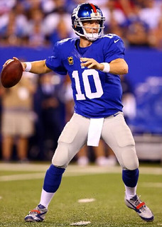
Back in April, as part of my coverage of the NFL/Nike unveiling, I wrote the following:
Giants equipment manager Joe Skiba tells me that all players can now wear team-colored shoes, although they have the option of sticking with white or black. So the longstanding rule mandating predominantly black or white footwear has apparently been scrapped (I’m trying to get league confirmation on this).
I was never able to get a straight answer from the league back in the spring, so I let it go and figured we’d find out once the preseason started. And as it turned out, everyone in the preseason just wore black shoes or white shoes, so I figured the idea of wearing team-colored shoes was dead. I double-checked with the league on this a week ago, just to be sure, and again couldn’t get an answer out of them. (The NFL’s responsiveness to uni-related queries has really gone down the crapper.) Probably should’ve double-checked with Skeebs as well, but he was getting ready for the start of the season and I didn’t want to bother him.
Well, we now have our answer, because the most of the Giants were wearing predominantly gray footwear, with blue and red accents, last night. A few players wore black, but they were in the distinct minority. Let’s say this makes me very nervous about what the Vikings and Ravens will be wearing on their feet this Sunday.
As for the Cowboys, on TV it looked like they were all wearing white shoes. But upon looking at some game photos, I saw that Jason Witten’s shoes were silver (maybe a gift from his spleen doctor or something).
A few other game notes:
• Tony Romo is wearing one of those new Rawlings helmets. It’s easy to identify because its neck bumper is narrower and extends higher than what we’re used to seeing.
• I see the trend of defensive backs looking like they’re wearing tzittzit is alive and well.
• Has anyone else noticed that some of the scab zebras are a bit, shall we say, portlier than the regular officials?
Meanwhile, unrelated to last night’s game, reader Alex Putelo has pointed out two other NFL issues, both involving sleeve patches, that I hadn’t spotted:
• The Dolphins’ sleeve patch is significantly smaller than before.
• It looks like the blue tone on the Pats’ Flying Elvis sleeve patch now matches the blue of the jersey. I’d never noticed that the two blues didn’t match before — and of course it could just the way the light hits the threads on the patch as opposed to the way it hits the jersey fabric — but I spent a bit of time looking at photos, and it definitely seems that the blue on the patch was consistently lighter than the blue on the jersey in recent seasons. For the record, the Pats have had only one official shade of blue for the past 12 years — Pantone 289 — so the patch and the jersey should match. And now it appears that they do.
Looking for more NFL news? In case you missed it yesterday, my annual NFL season-preview column is available here.
One more FBS uniform change on tap for today: Buffalo is awarding merit decals this season. (My thanks to Dennis Abrams for this one.)

PermaRec update: Some illustrations based on discarded vintage photos, along with some beautiful old report cards from Oregon (one of which is shown at right), are the basis of the latest entry on the Permanent Record Blog.
Uni Watch News Ticker: The Knicks will officially unveil their new uniforms today at 11am Eastern. I was going to attend, but the team went out of its way to leak the new design yesterday, so I’m not going to bother. If they don’t take their own unveiling seriously, why should I? … I will, however, be attending a ’47 Brand promotional event this evening, mainly because of the free eats and drinks. … Want to make the MLB postseason even though you’ve been outscored by your opponents? It can be done — as long as you change your uniform (from Bryan Duklewski). ”¦ What the hell was Brian Urlacher doing in a Navy jersey? (From Michael Korczynski.) ”¦ Interesting infographic on the psychology of logo colors. ”¦ What do Steelers coach Mike Tomlin and I have in common? We both hate a certain loathsome color (from Yancy Yeater). ”¦ Each NFL team now has a fan-designed flag (from Tom Mulgrew). … I know I say this a lot, but Hamilton Nolan is really, really good. … My ESPN colleague Patrick Dorsey wrote a piece about an interesting baseball artist. … It’s hard to see, but Longhorns safety Kenny Vaccaro has RNOB (from Matt Mitchell). … Here’s a really great item about typography on a glass roof. Recommended (big thanks to Dave Wilson). ”¦ This is surprising: a Nike sneaker with no swooshes on the sides (from Terry Duroncelet). ”¦ Terry also recently spotted a Bud Light banner shaped like a Saints jersey, complete with the Nikelace. That’s an impressive (if disappointing) level of detail. ”¦ A Colorado school district has told students that they can’t wear Peyton Manning jerseys to school because No. 18 is a gang-related number. ”¦ ESPN’s David Pollack tweeted a photo of a matte red Cincy Bearcats photo, although I have no idea of if it’s actually going to be worn (from Leo Thornton). ”¦ New logos and uniforms for the Coast Guard Academy (from Miles Eakins). … Here’s a little slideshow of Raiders equipment manager Bobby Romanski applying the team’s captaincy patches (from Rudy Gutierrez). … Love this 1954 Shibe Park snack bar menu, especially the very uni-relevant “Please Note” bit at the bottom (big thanks to Tom Mulgrew). … New mask for Jonas Hiller (from John Muir). … Deadspin had a funny piece yesterday about why you should go ahead and buy a $200 polyester shirt. I don’t really agree with any of it, but it’s entertaining. ”¦ Nike has announced a new partnership with the Spanish Basketball Federation (Leo Thornton again). ”¦ Yankees pitcher David Robertson, who normally goes high-cuffed, joined the pajamists last night. Disappointing (from Mikhail Herrera). ”¦ Always fun to see examples of logos with good use of negative space (from Lou Sherwood).
Hall Monitor Dept.: At the conclusion of last night’s Giants/Cowboys game, someone posted a snarky comment directed at Giants fans. As soon as I saw it, I took it down. I don’t want fan-baiting comments on the site — they have nothing to do with uniforms, they have nothing to do with advocating one idea over another, and they just serve to be inflammatory. If you want to say, “The Giants suck,” well, that comment might get taken down too, but at least it’s better than “Hey, Giants fans, your team sucks!” With football season getting underway, let’s please avoid any and all fan-baiting comments. Thanks.
I thought Mark Whiten was an outfielder in St. Louis!
//That’s JASON Witten in the silver shoes and the ruptured spleen, #82 for Dallas.
Right. Now fixed.
I’m trying to piece together that NBA #NoUniAds daily report you guys had. It just suddenly vanished a few weeks back. Any reason?
Been too busy with football. Will return tomorrow or Monday.
Thanks Paul! I was sort of hopeful the NBA came to its senses.
I think the Giants/Nike need to invert their shoe colors. Make them blue with gray trim. But either way, much better looking than black.
Didn’t get a pic, but I saw one NYFG defender wearing predominantly red shoes. IIRC his number was in the 90s.
One of the wideouts (Victor Cruz?) had a great deal of red on his cleats, too.
Here we go…
link
Some don’t like Art Modell much.
But we should note his passing.
I didn’t hear anything about it. Also, I thought he still owned the team. Here’s a link.
Was he a good passer or something? I didn’t even realize he played.
Any word on if the Ravens are planning a memorial patch?
Or if the Browns are planning a celebratory patch?
The Steelers released an link on the passing of Art Modell.
I don’t wish ill will on anyone, but surprisingly enough my bosses at work who are Browns fans are rather indifferent. I thought Cleveland fans would be happy.
So when is the parade in Cleveland?
The downside is, the parade will start in Cleveland and head east and south, never to return.
But someday (unless the Mayans are right) another parade will replace it. And the person leading that parade will be from Kentucky and have a big bust. Or be a big bust. I forget which.
I just assume Miami’s sleeve patch is smaller because more players have something closer to shoulder caps than actual sleeves, thus no real space for the Dolphin logo. Kind of like how the 49ers cut their sleeve stripes when they went neo-retro a few years ago.
Most players have had shoulder caps for years now. That’s not new, but the smaller patch is.
Love the logos using negative space. clever, all of them.
Disproportionate number seem to relate to the wine industry. Is being a snooty lush associated with being more creative and clever? Really hoping so, for selfish reasons …
As someone who can’t draw a stick figure well, I am just amazed at the creativity!
Indeed, this was excellent stuff. Thanks to whoever shared it.
Brilliant stuff. I’m always a fan of those.
was it just the lighting in Cowboys Stadium or did the blue of the giants helmet seem darker/more metallic
pretty sure the game wasn’t in Dallas.
opps my bad, you’re right..what was i thinking..
I think since they showed Jerry Jones so often it made me forget they were in NJ
Did we see Jones’ son-in-law cleaning his glasses for him?
Wonder if Jerry has a piss boy, too (ref: Old SNL skit).
Or was it HISTORY OF THE WORLD, PART 1 ?
The latter…
link
ricko
@AdamSchefter: The glasses-wiper in Jerry Jones’ luxury box has been identified as Shy Anderson, Jones’ son-in-law.
might be a little different. for the super bowl last year the giants had their helmets finished by HGI, the company responsible for Oregon’s helmets, among others lately.
link
link
link
Good on the hall monitor. Last thing we need is a bunch of jerks dissing on the Jets. Which by the way I personally believe they have the second best jerseys in the NFL.
Who is your #1? I’d pick the Raiders. Clean. Simple. And when teams add a 3rd set, 60% chance it is going to be black.
I know shoulder caps have been the norm for a while, just thinking that changing uniform suppliers was a good a time as any to tweak logo sizing without going full Seahawks. Also, is it just me, or did the Bucs ship sleeve logo get smaller too?
RE: Romo’s helmet…..
That style of helmet (and some others) in a light color, with all it’s extra odd-shaped holes, and crazy peaks and valleys is starting to ruin the look of the helmet for me. Add the multiple chin strap snaps and the helmet logo can get quite obscured at times.
Obviously it’s not as obvious with dark helmets, obviously.
That’s the main reason why I dislike the Riddell Revo Speed. I can’t stand that huge vent on the side of it, or the beveled edge on the back. I hated the Revolution when it first came out, but now I would prefer it to the Speed.
I’d also love it if part of the huge overlap of the facemask could be rendered in the helmet color too. Too much color wrapping almost to the earholes on ssome tems’ helmets.
Paul’s worried about the Vikings’ and Ravens’ footwear?
Well, Bernard Berrian wore these a few times, and Adrian Peterson has worn something similar…
link
Berrian also was Goldfooted…
link
This might be the single best piece of evidence ever in the fight against mono-colored uniforms.
I don’t think we have much to wonder about regarding the cleats the Vikings may wear. I saw the Ticker a few days ago, and someone had a Twitter photo showing boxes arriving from Nike at Vikings camp. Another photo in the link showed purple and gold shoes. Ugggh!
typo on the word infographic
If Nike fixed the shades of blue for the Pats, perhaps they’ll come up with a single shade of blue for the Cowboys to wear next? The wife commented last night, about midway through the 3rd quarter, that their pants looked “sea foam green.”
The difference is that the Pats only have one official shade of blue, while the Cowboys still have two official shades of blue and three official shades of silver, all of which are listed in the style guide.
Ah. Well, I’m sure their fans would freak out if anything changed, but am I in the minority here for thinking it’s a bit ridiculous? Are there many other American teams that have such similar hues in their official color palette?
Yeah. UCLA uses a number of different blues. Not necessarily at the same time, of course. Depending on the team, they’ll wear navy, powder, royal or varsity (Air Force) blue, often in the same school year. For a couple decades or more the football team wore powder jerseys at home, but the white roads had navy numbers with royal-old gold-royal shoulder stripes.
I recall one span of three years when the Bruins baseball team wore the same uni design, but one year was with powder, one navy and one royal.
So easier to regard the Cowboys’ approach as one of those quirky things that only works as long as so very few teams do it.
Actually, for a time UCLA’s shoulder stripe on the white football jerseys was Athletic Gold, even though the helmet and pants were old gold. Come to think of it, in the Gary Beban era, the pants were kinda taupe, in some light looked almost gray…
link
Might as will provide photos…
Mel Farr at home…
link
Mel Farr on the road…
link
Wait, those are two different Farrs.
(back to google)
Better go with Beban in the roads (couldn’t find color, but clearly that isn’t powder blue)…
link
The Saints used to have link specified in their style guide. This year, they link (one metallic, one flat).
The Cowboys still list link, five if you discount the facemask.
No, you’re not alone in thinking that it’s silly. Originally, the various shades were created so that the silver on all the different materials would look the same on television. But technology has changed, and television now highlights all the various shades. It’s long past time for them to standardize.
I contend that the shade of blue on the Cowboys pants is ridiculous. Can they just wear silver pants to match the helmets?
I didn’t get a great look at it, but I could’ve sworn that last night during one of NBC’s “quick cuts of a player posing in their uniform” bumpers before showing a highlight, Jason Witten’s jersey had a collar tie patch. Like I said, it wasn’t a great look, so I couldn’t tell who made the jersey–maybe they just filmed it last season or something. To this point though, Nike’s seemed to have been pretty thorough with replacing any trace of Reebok in the NFL.
Did anyone else get a better look at it?
The tie-down wasn’t a Reebok thing; it was an aftermarket modification made by the Cowboys’ equipment staff.
Right, but I hadn’t seen it on any of the Cowboys’ Nike jerseys so far. It just struck me as odd that it would appear in a studio session like that, but not on the field.
I dunno, maybe it’s there but doesn’t show as clearly through Nike’s fabric under field lighting.
A lot of those studio session bumpers were from last year (or even before that); the “NFL Equipment” patch is visible in a few of them for certain players.
Doesn’t the nikelace obviate the need for a tie-down?
you know, given the Cowboys appeal, I sure can see Nike doing a Seahawks # on them for 2013.
It’s time for a makeover, Jerr.
Well, there was that talk about standardizing the silvers, that ended up going nowhere.
If Jones won’t even tweak the uniforms to eliminate the old rabbit-ear television colors, then there’s no reason to believe he’d allow an actual overhaul.
As a related question, do the Cowboys new Nike jerseys have the same or similar tie downs inside like the have in many years past? I couldn’t notice one way or the other last night and was hoping someone with better UW-trained eyes could proffer an answer or better yet pictoral evidence. Anyone?
most likely posted yesterday, but just in case
this might be the helmet sticker that Purdue will wear in honor of Neil Armstrong
link
If that’s true, the person that approved it knows nothing about astronauts.
Horrible!
Don’t like that design- looks like Mike Wazowski.
Love the Shibe Park concession piece. Was “Hamberger” the accepted spelling at the time? 4 different cigarettes, 2 different cigars.
And I always wondered how the popcorn stayed in those megaphone things. Always asked my dad to buy me one, but then I’d be afraid it would all fall out of the bottom!
As I recall, at those early Twins games in the ’60s anyway, the narrow end had a kind of milk bottle twist off cap. The remaining plastic rim also kept that end from collapsing.
Without it, if you used the megaphone the “mouthpiece” could very quickly resemble the soggy end of a cigar.
At Fenway, it was just open. And I had forgotton about the soggy issue! That was a problem when I was yelling at Mike Andrews to hit the ball a bit further.
Or maybe was a tab cap (also like a milk bottle). Anyway, that end was reinforced a bit.
Maybe Minnesotans were too staid to lip cardboard.
I remember those megaphone popcorn holders having a metal ringy thingy on the mouthpiece. A little sharp around the edges, but that made it all the more adventurous. And ours had a cardboard poker chip thingy to keep everything from spilling out. Thanks to the person who shared the menu.
Funny. Had the same initial thoughts about the Shibe Park menu. Love that there are almost as many smoking options as there are food. Different times.
The “hamberger” also struck me. A very quick google search didn’t turn up anything about alternate spellings, and of course the actual city from which we get the name is spelled Hamburg. I’m thinking typo, but well before my time, so my logic may be faulty.
Those popcorn megaphones had a metal mouthpiece at the narrow end that was plugged by a top like you used to have on ice cream cups. You’d eat your popcorn, remove the top and yell yourself hoarse.
BTW-Love those prices. I remember in the early 1960s at Red Wing Stadium in Rochester you could buy a box seat ticket for $2.50, a scorecard cost 15 cents, hot dogs (red or white-it’s a Rochester thing) cost 35 cents and a Coke was 15 cents. Popcorn was a quarter and Sno-Cones were 15 cents (my favorite was cherry). Add in a 35 cent bus ride (with two transfers) each way to my Aunt’s apartment and you could go to a game with just $5 in your pocket.
Thanks, Terry. Knew it was something like the ice cream tab cup.
$5 in 1965 is about $34 in 2010.
A link? You learn something new every day. Gotta try one of those.
White hots are fantastic.
These are the link.
See the little perforated area at the top? those were folded inward to keep the popcorn from falling out the bottom.
Hey, was there any reason the Giants were wearing their road grey pants last night?
Scroll down to the Giants entry in the chart from yesterday’s ESPN column:
link
I saw the Steelers “flag” on the news.
That guy is an idiot. link is the REAL flag of the Steelers.
anyone know how to find the other designs from this contest..
does the terrible towel really need to tell you that it is in fact the terrible towel.. just seems too on the nose and redundant
That is the official Terrible Towel design, in use since 1998. Interestingly enough, the Steelers even sell a link Terrible Towel, the 1975-1997 original. I myself have a Terrible Towel license plate on my car.
That’s actually a second-generation licensed towel. The first just has “the terrible towel”.
Was thinking the same thing abut wanting to see the other flags, seems this one was done right (nods to the area and team championships) so others would be great.
All of the team flags are at: link
Some of them look so corporate that I think team employees submitted them.
A few really good ones for Bears, Bengals, Bills, Broncos (a pattern there, eh?). Very weird one for Rams. Interesting that the Redskins’ flag doesn’t include any of that team’s better-known logos. Interesting that the Falcons’ flag includes gold. Are they bringing that back after all these years?
How fucking hilarious is link?
That bucanneers one, can anyone figure out what the line dividng the white and orange represents? Doesn’t look like any geographic figure or anything but seems too not-random to be just a random shape.
Most are very lame.
It looks like the white part is supposed to be water and the orange part is supposed to be the land. If that is the case then it doesn’t seem terribly accurate (it should have be refined before becoming a part of the official team flag).
link
That’s what I was guessing Doug but it is just so inaccurate/refined it loses the association.
Some of them are actually pretty good. Cardinals & Bears, especially. Bengals works in its own way as a flag. Cowboys just looks like Easter Island to me, which isn’t exactly a good thing. The Titans have a very interesting adaptation of football symbols into vexillological forms.
Pretty sure that whatever “fan” submitted the Seahawks flag has a day job as lead designer on the Seahawks account at Nike.
Not to mention the Seattle flag is listed between Cleveland and Dallas maybe Nike is also re-branding them as C-eattle C-Hawks?
Paul, pass along to the ’47 Brand that they make hands down the best hats. I love the fit, the low profile, everything about them.
I can’t say I’ve completely sworn off the 5950, but it just seems that the price is too high for a hat that really only looks good on me if I wear it backwards!!!
both ’47 Brand and 5950 hats are great. for me it just depends on my mood that day on which i’d rather wear.
helpful tip on getting the 5950 to look better on you. take a handful of water and wet the inside of the crown of the hat. wear it, pat it down and shape it to your head. i use to this with ever NEW ERA hat i bought when i was working for LIDS and i would get compliments every day on how well i shaped my hats
That water trick works with the polyester ones?
5950s are OK. My main problem with them is that the sizing is wildly inconsistent. I won’t order one online because I’m never sure if I should get a 7-3/8, 7-1/2 or a 7-5/8.
(American Needle is where it’s at.)
That’s sure the truth. New Era is all over the place regarding sizes. Whereas I’ve never bought American Needle and had any issue whatsoever.
never liked the fit of the American Needle hats, especially if you try to bend the bill.
that trick works pretty well with the poly hats, you might need to do it a few times though.
only way i would order a hat online would be if i can take them back to a local store if the size is off(ie to a lids)
I’ve tried the hot water trick with the one polyester (oops, CoolBase) 5950 I have (the ’36-37 Nats throwback worn in San Diego last season and discussed in detail here) and I haven’t found it to work as well as it did on wool 5950s. The reinforced part of the crown is especially resistant to reshaping; makes me wish all 5850s were low-crowned.
My biggest beef with American Needle caps is the inconsistency in their embroidered logos. I guess that’s just the human touch.
Hey, if you’re taking requests, howsabout a real Lombardi-style link? Not the illegible double-outlined monstrosities link, but more like link.
I love ’47 Brand caps. The quality is uniformly excellent – they’re about the only cap I’m comfortable buying online, knowing that it’ll be put together right and fit perfectly.
well, ryco can attest, I bought the Pirates alt cap the first season it came out (what’s this, the third season of that hat?) and I have gutted it, tried the water, all the tricks, and it just doesn’t break in like the old ones used to.
wear it………backwards?
But backwards is so cool!
link
With football season getting underway, let’s please avoid any and all fan-baiting comments.
Can we apply the same rule to politics? Not that I’ve seen much, or any of it, but I don’t want to see it here.
Poor analogy. Politics is about ideas, and ideas can always be discussed here, esp. as they relate to the issues that this site has always concerned itself with.
“Hey, Giants fans, your team sucks!” is just about being a prick.
Is “Hey, Giants fans, your team’s white jerseys suck!” an acceptable comment or no?
/I’m kidding, don’t ban me
I read Matt as saying not that he doesn’t want to hear anything about “political” issues from Paul, but that he would like to have comments on the lines of “Hey, Republicans/Democrats, your candidate sucks!” get beaten across the wrists with the same hall-monitor ruler as NFL taunters. Read that way, I agree. This is not the place for that.
However, per The, I’d be fine with anyone pointing out that Paul Ryan needs to stop wearing pajamas and buy himself a big-boy suit that actually fits now that he’s running for almost-president, or commenting on Joe Biden’s pocket square, or whatever. (Uni-wise, hard to fault Romney or Obama, who are maybe our best-dressed pair of candidates since Dewey/Truman.)
“And as it turned out, everyone in the preseason just wore black shoes or white shoes, so I figured the idea of wearing team-colored shoes was dead.”
link…
(But it wasn’t exactly widespread.)
I missed that!
You can’t imagine how happy I was to find a photo that showed both of those players.
Hamilton Nolan snuck into my brain and took my thoughts. He then arranged and presented them way better than I ever could have. In doing so he gave me something not only coherent but also clever to share. Thanks buddy.
“Has anyone else noticed that some of the scab zebras are a bit, shall we say, portlier than the regular officials?”
I thought this to myself last night. The thing is that they aren’t fat really, they just have big guts. There was a overview shot last night showing about half the field and from that distance you could still see their guts. Just thought it was comical looking. I also thought it could be dangerous as these guys may not be used to regular season speed NFL football and may not be able to move out of danger’s way quick enough.
*over head, not overview. doh
What would happen if someone got up in the Democratic National Convention, in Charlotte, and called for a boycott of the NFL because it was employing union busting replacement referees? It seems tailor-made for speechifying.
I’m not much of an NFL fan to begin with, and I grew up in union household, so I’ve been ignoring the NFL. But I can’t think of many things a political party could say that would more disaster at the polls than, “QUIT WATCHING FOOTBALL!”
(We did watch the Hamilton Ti-Cats play the Toronto Argos this weekend, probably the last time those two teams will square off at historic Ivor Wynne Stadium. CFL is fun to watch, and it was an aesthetically beautiful game, to boot. Love the Argos uniforms…)
But I can’t think of many things a political party could say that would more disaster at the polls than, “QUIT WATCHING FOOTBALL!”
I can’t imagine the average union laborer has much sympathy for the NFL officials, considering that officiating football games is a side gig for them.
I mean, the Hochuli family probably isn’t thinking about taking out a second mortgage to pay the bills because Ed isn’t working on Sundays this fall.
Not saying they SHOULDN’T sympathize. Just saying I doubt they do.
is this Ravens jacket brown? or is it black and the lighting makes it look brown
link
Brown. PT’s jacket is brown in the light, brown in the shade, and nearly matches the draft jacket. Wouldn’t be surprised if the jackets were menat to be for the mythical “Baltimore Browns” but were stuck with blank merch after the name was rejected.
The “Milwaukee Pilots” nod affirmatively.
link
Except that the Pilots were renamed almost five years before Bud Selig bought the team out of bankruptcy.
I remember a conversation between characters on Homicide about the new Baltimore Browns on the way. Net Beatty’s character was still pining for the old days – “The Browns belong in Cleveland. The Colts belong in Baltimore.”
Paul,
What was the reason for your ESPN article about the Knicks new uniforms? The change (while positive, in most eyes) is minor. Is this news just because it’s New York? Or is it more of a story/call-out about their botched unveiling?
Sorry, if this comes across the wrong way. I really am just curious.
Any time a Big Four team changes its uniform, it’s at least somewhat newsworthy.
And when a team undercuts its own unveiling, I think that’s pretty funny.
New Catch of the Day. Just sayin’.
Now that the football and baseball seasons are overlapping, will you be rotating the photo? Or will it be Nyjer Morgan until the end of October?
Ooh, that looks good! Look forward to digging in.
Was anyone else curious why the U.S. Coast Guard Academy is nicknamed the “Bears”?
link
So the refs are portlier..but what the hell is on either side of the bill of his cap?
Microphones, to pick up game sound.
As for Hakeem Nicks’ grey cleats, they were a new special release as he just signed with Nike’s Jordan brand.
link
link
For what it’s worth, those non-swoosh-on-the-sides Nike shoes aren’t a first:
Nike Air Current (link)
Nike Huarache Free Run
(link)
Urlacher was probably being nice to the officers stationed up at Great Lakes Naval Training Center, a few miles north of the Bears’ Lake Forest team HQ. Interestling Olin Kreutz and some other Bears got nto a scrape at a nearby firing range on a Tuesday off a few years ago.
How does Tony Romo get away with wearing a Starter logo on his cap during the NBC player intros? I would have thought the NFL uniform police would be all over that.
I was wondering whatever happened to Stater, which was very big in the 80’s. I guess they were bought out a couple of times (once by Nike) and are now “partnered” with Walmart. They have a deal with Romo as their “ambassador.” link
For what its worth, the Starter workout shirts are less than $7 each ay my Walmart, which is why I sport them at the gym and sneer at everyone wearing Underarmor for 4 times the price.
Yeah I saw that—he wears that cap EVERYWHERE. shot of him and his wife with their new kid in the hospital–there it was. Too much.
He wears Starter cleats, too–but they have to be logoless.
Does he wear Starter gear while playing in televised Celebrity Golf Tournaments? I’ve never noticed, but he usually fairs quite well so you’d think they would want him showcasing their brand their. Anybody know?
People are emailing me to ask if the Ravens will add some sort of memorial for Art Modell, and I’m sure they will (a helmet decal, I’m assuming).
The more interesting question, it seems to me, is whether the Browns will add something. I’m assuming no, but I think it’s at least worth raising the issue. Thoughts?
Absolutely zero chance of the Browns doing ANYTHING.
Here’s their press release. All of it.
“The Cleveland Browns would like to extend their deepest condolences to the entire Modell family.”
I agree with brinke. Cleveland has been keeping Art out of the HOF for years because of their hate despite him deserving to be. Why would they honor him now?
short, sweet and passive aggressive
My parents-in-law are old Browns fans and new Browns fans and do not like Art Modell for moving the team. Am guessing from the vibe I get from them that many Browns fans feel the same way. So if their sentiments are true about the majority of Browns fans, I could see a momentary memorial like a moment of silence or something, but I don’t think the fans are going to love a season long uniform memorial.
Knowing those fans, they’ll probably boo the moment of silence.
Looks like helmet decal with initials: link
And therein lies the problem with the NFL created Brown’s mythology. Are we suppose to believe Modell owned the Cleveland Browns then abandoned the team in Cleveland (where the lied in wait from 95-99) to purchase a new team in Baltimore that began play in 96?
Or did Modell never own the current “Browns” which began play in 99, having no attachment to the current franchise but instead owned the original Browns franchise which he moved to Baltimore and re-branded as the Ravens?
I wonder how Cleveland Browns fans who stayed Browns fans but moved away from Cleveland before 1995 felt when the team moved to Baltimore? And do they still feel the same? I’m a Bucs fan who moved away to Carolina Panthers’ country yet I still root for the Bucs… I mean I know with the internet & Sunday Ticket & all that stuff it’s easier to be a long distance fan nowadays than someone who moved to, say Kansas City from Cleveland back in the eighties who would be more likely to gradually become a Chiefs fan, but I’m sure there were some displaced Browns fans who continued to follow the Ravens in 1996 and celebrated when they won the Super Bowl in 2001.
I’m going to stay a Bucs fan, and if they picked up and moved to Los Angeles and became the “Los Angeles Wolves” or something, I think I’d remain a fan of the team I grew up for rooting, even if the people in Tampa (Bay) felt like their team abandoned them, and even if the league stole their name and colors and gave them back to the city they left. But if four years from now, if Tampa Bay got a replacement Buccaneers I don’t know which team I’d root for. Probably if the Wolves were wearing the red and pewter but the new Bucs went back to creamsicle orange, I’d have to root for the orange team, otherwise I’d probably stick with the team that I had continued to root for that had moved to L.A.
Paul,
Your work on the team colored cleats is just another example of why I love this site. I was just thinking to myself the other day, “what happened to all those colored cleats Nike developed”, was it just a flex of muscle for what they can do, kind of like undershirt designs that no one seems to wear. Personally, I’m all for the colored cleats. Thanks for the leg work.
I thought I remembered discussion concerning new equipment guidelines for this year requiring knee pads? Did I dream that or something? It sure didn’t seem any different last night as the bike shorts were still very prevalent.
That’s for NEXT year:
link
New Knicks uniforms:
link
I’m assuming the stupid-ass line on the inner collar is some sort of wishful thinking regarding Jeremy Lin….
Reduced arching on chest = disappointing.
Solid waistband = yikes.
“Reduced arching on chest = disappointing.
Solid waistband = yikes.”
~~~
nba = who cares
I care.
And no league-baiting comments, either.
And assuming that’s a new logo on the back of the jersey, I’d wear that. Never liked the NYK logo
link
it’s way too forced and it also looks like the letters are doing kickboxing or gymnastics.
I loved the “NYK” logo, although I’m usually opposed to nickname initials on logos.
But I remember the old subway tokens, so for the first time maybe ever I was the Knicks’ target audience on that one.
“nba = who cares”
Phil +1 for that.
Not terrible, though I don’t get why they didn’t continue the stripes under the armpits.
Better, but not by much. Disappointing indeed.
Have their home unis always said “New York”? (White is home, right?)
What does the blue one have on it?
Lee
Yes, with the exception of 1979-83:link
One of the best Knicks unis ever!
Sugar Ray Richardson link
Those were pretty cool.
But nothing beats this:
link
How difficult would it have been to fully restore that classic look? Apparently, very.
Yes, they’ve based the new look on that classic, but somehow found ridiculous ways to make it heinous. That belt thing is awful. More arch, please. Unreadable litter on the back. Come on, people. Why do you have to do this when there is such a simple classic answer???
Watching the Dallas/NY game last night, I had a thought that I couldn’t shake. Is, or could there be, any benefit to specialized helmets for a given position? I know there are different facemasks that tend to vary by position, but do various positions tend to encounter certain hits that would make a particular helmet design better/safer/etc for the position? And if so, would there be a benefit to designing the helmet for the position that would outweigh the costs (extra design, certification, etc)?
I have to say, the Cincinnati matte red helmets look great. But as I looked at them, they reminded me of something. I finally figured it out: it looks just like the cherry sugar coating that Dairy Queen uses.
link
link
YES! ^^^THIS!
The IU equipment truck is using an image of mine (on Frasier Davidson’s Nike template) on their equipment truck.
My image: link
Their Truck: link link
why is your image wearing miama cleats?
Part of the template I was using at the time…
The compression sleeve is missing from their version.
Lee
Yeah, they colored over the sleeve numbers.
Compensated for your work I hope?
Or at least gave them permission…
Oh Anthony Thompson, a name from my past.
Not just his time in briefly making IU a mid-level Big Ten team, but his failed sporting goods store in downtown Bloomington that I think was open maybe a year, probably when he was holding out from the Cardinals.
those were the days
Neither. Part of the conflict I’m feeling this morning. I wasn’t asked, informed or compensated (though I’m not sure if they have to pay me under fair use…).
And should I even be compensated? I would have to do some scrounging to see if they even violated Fair Use, but I’m not sure I’d need or want to be monetarily compensated if I had the right…
But being acknowledged somehow might be nice.
Perhaps it’s Anthony Thompson who deserves the compensation.
He is why I picked the number…
D’you see him on the sidelines during the ISU game? Way more cogent than Antwaan Randle El.
Antwaan was bad. Maybe the BTN was hoping that working on the same broadcast as Wayne Larrivee would somehow magically make him a better sideline reporter.
Yeah, he sounded like someone who’s been hit in the head a lot…
Hopefully he gets better.
Their truck = AccessDenied AccessDenied
But I wanna seeeeeeee! :(
Something is wrong with their links, so I’m adding mine:
link
link
Damn dude, I’d be pissed.
I say let them use the image; in exchange, they wear those pants.
That’s a hellavan idea.
Great stuff today. Loved the article on wearing/owning $200 shirts. And our hall monitor nailed it. The my Dad can beat up your Dad, and your team stinks stuff, can be located over at ESPN on the message boards. Have your fun over there. But immunity to all who wish to express displeasure in a teams chosen laundry. Those replacement zebras must be using all their meal money.
All of Oregon’s helmets and uniforms are now available via download on NCAA 13. You can view all helmets if you download the Uniform Patch.
Only on Xbox. PS3 has to wait two more weeks [grumble].
Pics on FB: link
Details on what was seen in Oregon’s new unis: link
Great ticker today Paul. Loved the negative space logos and the Nolan piece was just spot on. He pinpointed my disgust. “Political Pageantry”…brilliant.
Not much revelation there, though. For some time now, the conventions of both parties have have been nothing more than extended TV commercials leading up to an anointing.
That’s why the networks don’t cover them the way they once did. And likely they never will again…unless there actually is some doubt about who will emerge as the nominee. Otherwise, their historical significance has all but disappeared. Their drama, too.
What I would do, if I were a presidential candidate who’s running behind in the polls in summer: Instead of naming a VP pick, I would announce that I was calling on my party at its convention to choose a worthy partner. I’d say this was a solemn choice that should be left to the delegates without tawdry campaigning by candidates, and I’d make crystal clear to relevant national and state party leaders who my shortlist of preferred candidates is. If you can avoid the rancor of active campaigning by candidates, it would produce real drama that networks would have to cover, and it would show a kind of executive confidence that people who aren’t already president rarely get a chance to display on the national stage.
You want drama on a par with the 1976 GOP or 1980 Dem conventions, but you don’t want any actual dispute over who the presidential nominee will be. So opening the veep nomination up to a real, if carefully limited, choice could be a compelling move. Of course, to do this, you’d have to trust the wisdom and intelligence of the people who vote for you, so it’ll probably never happen …
“Instead of naming a VP pick, I would announce that I was calling on my party at its convention to choose a worthy partner.”
Not exactly a show of execuive leadership or decisiveness.
Would a voice vote be sufficient? Those don’t always turn out the way they’re ‘supposed’ to:
link
Which is good because if you win & in a couple of years the Veep gets indicted for tax evasion or check kiting or caught sending inappropriate photos of himself to underage interns you can always say, “well, I didn’t pick the guy”
” let’s please avoid any and all fan-baiting comments.”
Does that include phil’s gratuitous soccer bashing? :)
Actually, yes.
But not his gratuitous NBA bashing… ;)
hey…
there’s nothing gratuitous about my nba bashing or my soccer bashing
the nhl bashing…now, that’s gratuitous
The best part of Phil’s NHL bashing, though, is how quickly he can be quieted with a “Well, at least I’m not an Islanders fan” quip. LOL ;o)
It looks like Syracuse will have new uniforms for Saturday’s game against USC: link
Today, Miami’s head coach Joe Philbin (formor OC for Green Bay) said that he will likely name captains on a week to week basis and then name permanent captains if they make it to the playoffs. He said that’s what he’s used to because that’s how it was done in Green Bay. I’m assuming this means that like Green bay, Miami will not be wearing the captaincy patches during the season this year.
This was reported by several Miami Dolphins reporters, but specifically, you can check out @OmarKelly for the info.
*(former OC for Green Bay)
fun fact:
did you know that the nickname for the little helmet wearing dolphin in miami’s logo is “greatness”
is Skiba not the head equipment manager for NYG? Only ask because I saw this commercial last night during the game
link
link
The Skeebs is the Equipment Director.
I noticed a Tide commercial during the game last night featuring the NY Giants equipment manager. He loves Tide. It make the Giants’ football unis very clean.
I’m a Fab guy. ;^)
(“Oh Fab, we’re glad, there’s lemon-freshened borax in you!”)
I’m old.
Steelers to wear their throwbacks for the home game vs Redskins, and home game vs. Ravens. (October 28, and November 18)
All refs can’t be as buff as Ed Hochulee, right?
Eddie Guns!
Ed Hochulee? Is that the scab version of Ed Hochuli?
I’m so glad I stopped being a Knick fan this summer. Those uniforms are a joke. They look like a Chinese knockoff of the great Knick unis of the late 60s, early 70’s. The timeless wordmark they have used for years is changed and for what reason? What would make this one more modern or relevant? The truncated shoulder stripes make no sense…the white around the numbers make the orange part look too thin…the waistband…well Paul said it…YIKES.
You stopped this summer? Wow. It only took you 15 years to figure out that the Knicks have shitty uniforms.
(And the new waistband is a huge improvement.)
Am I the only one who noticed that the Giants wore their away pants last night? it looked very weird until I worked it out in the 3rd quarter
They don’t have road pants.link
I sure as hell hope they wear pants on the road.
thanks Tim for that, I didn’t know that so I wasn’t sure it was wrong for not
Have the decals on the back of pitt’s helmets ever been discussed? There are 5 in an arch surrounding the number at the base of the helmet, the decals look like all of the past Pitt helmets. Not sure and don’t have DVR on this tv so can’t pause…anyone know?
Just a curiosity that perhaps you’ve covered and I’ve missed…but is there a rationale behind why the replacement officials don’t have the letter signifying their position above their numbers?
they’re not sure what it is either
Probably because they are all so confused it will allow for changing of positions without anyone really noticing. “You want to be Back Judge in the 2nd half? Have at it…”