By John Ekdahl
Since this consumed so much of Paul’s time over the past month, please check out the top 25 uniform rankings that was published over at ESPN yesterday.
The rest of the rankings are here:
Nos. 101-122 | Nos. 76-100 | Nos. 51-75 | Nos. 26-50
Yesterday’s chat roundup is available here.
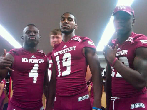
New Mexico State unveiled new football uniforms yesterday. Outside of the large and distracting Adidas logo, it’s a big improvement from last year’s clunky design.
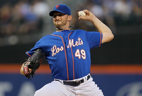
The New York Mets broke out their “Los Mets” jerseys for Merengue Night, and promptly lost to the worst team in baseball. It was the second time they wore the jerseys this season, having previously worn them on July 6th.

The Commissioner, Cousin Bubba, evidently wields incredible power…

Click to enlarge
That Adidas logo overwhelms the school’s name. Might as well be the Adidas Aggies, which is what Adidas wants.
No, it really doesn’t. When I look at the picture above, I see NEW MEXICO STATE with a triangle above it. Yeah, it looks silly and it really shouldn’t be there, but if you didn’t already know that it says adidas, you probably couldn’t tell from any real distance. It’s nowhere near as identifiable at that size as a Nike swoosh or the UnderArmor UA thing.
I hate to pile on, but I’d have to agree with The Jeff here. While Adidas should’ve at least pushed the logo to the left or right side of the jersey (obviously they’d never just leave it off), it’s not as visible or legible as the New Mexico St. wordmark.
Moreover, I agree with John. It may have a huge logo, but it’s still quite a bit better than last year’s design. That was a horrible template.
I agree with Jeff, I see New Mexico State, then the Adidas logo. I guess it’s just a matter of perspective.
I think I’m really glad that I stayed out of that live chat thing.
I am fairly sure that Mr. Lucas mentioned this earlier this year…. I thought I would remind those in the DC area or those planning a visit to the nations capitol to check this bit of Uni-Awesomeness…
link
Interesting situation in Worcester, Mass. last night, where the home team had its uniforms confiscated because of unpaid bills and had to dress in “Grays” jerseys instead of their usual “Tornadoes” jerseys.
There was a decent looking game between the Philadelphia Union and Real Salt Lake last night: link
I still see ads on the jerseys, though…
I wasn’t going to go there since he agreed with me on something else – but yeah, exactly. I see two teams with uniform ads that are larger than the team’s own logo. This is not a good look for anyone, not MLS, not NBA, not Premier League, no one. When the identity of the team is less prominent than the “sponsor” logo, there’s a problem. I don’t care how happy the Europeans are to accept those ads as normal – they’re wrong.
I’ll agree that I wouldn’t like to see ads on the NBA, NFL, MLB, etc. but I do love my Premier League and Serie A kits that I have at the house.
West Bromwich Albion are wearing their alts. They’re red with blue #OB, which is invisible in the wide shots.
Yikes.
link
Silly Baggies…don’t they know this is the only alt they ever need to wear?
link
Los Mets, El Heat. Gigantes, Piratas…. I may not be PC, but I’ve always thought that was a dumb idea.
Note to self: Next year on May 5th, I need to post as Los Jeff.
Try “El Jefe,” instead.
Or link.
Re: the situation in Worcester:
link
Hilarious.
No mention of the Steelers or Packers alts? Because theyre top 10 we’re just gonna sweep those under the rug?
I’m thinking he figured Alts and Throwbacks aren’t the same thing.
Cuz technically, they aren’t.
Oops, brain fart. I was typing “alts” but thinking “throwbacks”. Ricko hit it on the head above.
I think Kub has a point. A one-time throwback is certainly different than an alt, but a throwback worn repeatedly should probably count. So… for this year’s list, a few teams are probably safe, but if the Steelers make a habit out of wearing that hideous striped thing twice a year, they really should drop a bit in the rankings. (Or, given Paul’s love of stripes and “old school”, go up a bit)
But a throwback isn’t part of the current uni design, and that’s what he was ranking. It comes from an entirely different design platform.
For our terms here, neither the Packers nor Steelers HAVE an alt…which is a variant on the current design.
That’s definitely a valid point Ricko – but here’s the question: was Paul really ranking the teams’ “current design” or was he ranking the teams’ “current look”? Teams in less restrictive leagues with third jerseys that happen to be throwback uniforms still counted. A perfect example would be the White Sox, whose throwback uniforms were mentioned and pictured because they’re worn consistently.
The NFL has its silly rules which limit alternate/throwback uniforms to 1/8th of the season, but what should the cut-off be? 1/6th? 1/4th?
Well, okay, the “look”.
The point is a throwback can come, relatively speaking, out of nowhere, even using long-gone team colors (something like the Eagles powder and cheddar or the Broncos cheddar and brown would be possible examples). As such, they really shouldn’t be lumped in with the current “look”. And rather than fart around with the ol’ Big Book of Exceptions, probably better to just discount them as group for purposes of the rankings.
As to Alts. There are exceptions, of course, but typical Alts usually involve little more than some flip-flopping of colors and possibly a different wordmark or some such (depends on which sport we’re talking about, of course).
Geez, sounded like I was disagreeing, didn’t it.
Was saying if it were up to me maybe shouldn’t have been considered at all because they’re walking anachronisms in the design scheme…even if they DO sorta match the current design (White Sox, as you mentioned).
“if the Steelers make a habit out of wearing that hideous striped thing”
~~~
you’re fuckin nuts el jefe
this is a ting of beauty (although the helmet is a whole other story)
they should have used the washington treatment (only in gold or black)
I am nuts, but that’s beside the point, Le Phil.
If someone like Maryland brought out those uniforms without the historic precedent that the Steelers have, they’d get ripped to shreds here and you know it.
“without the historic precedent”
~~~
that exactly the point LE jeffrois
i actually liked the broncos throwbacks (especially the socks — though not the lookatme barberpole treatment), and i can’t wait to see the stillers as well
now…is that a look i want to see others adopt today, or for a few teams to go for? no…but it was great to see it and as long as its kept to two times a season, AND it’s historical…bring it
maryland isn’t oregon, and they fail at trying, so bad example…in fact no one is oregon (shit, even oregon isn’t oregon anymore), but they are the one team for whom i will allow the multiple crazy looks
I believe Paul mentioned that NFL alts didn’t really have an impact on the rankings as they are only allowed to wear them a couple times.
Late thought on those rankings…
I’m always amused by Paul’s love of the Chiefs’ red pants. If you’re a Chiefs fan of my age (47) or younger, too young to really remember Super Bowl IV, those pants represent the 15 years of total and complete failure between Hank Stram and Marty Schottenheimer. So I’d rather not see them ever again.
It’s all about personal context, in the end.
the red pants ruin an otherwise fine looking uni
this (sans the hightop sneakers) is a great look
this is gorgeous, and reminds me of this or this
this is nowhere near as good a look, imho
the red pants perfect an otherwise boring looking uni
/fixed
If you’re 47, you should remember Super Bowl 4. And despite their performance in later years, that doesn’t take away from the fact that the red pants make the best-looking team in the league look even better.
If you’re 47, you’re a man link
4 days
I’m aroused for you. Yell that at everyone, especially passersby on the street.
Last night I watched the Youngstown, Ohio sports. High school football began. There is a huge trend in the helmets going to plain with no logo or stripes.. Or numbers. Or numbers on one side. Matte or flat is also the way most helmets are now.
I turned on ESPN a while ago. Tow teams from Florida. One with plain black helmet.
What is the deal with this boring trend?
it’s beautiful…
not every helmet has to look like it came out of easy rider
minimalism is a good thing
haha Come on there Phil. Of course you are one of those oddballs that like Penn State uniforms.
Actually the Penn State helmet is fancy compared to most of the high school teams helmets I saw last night.
If Penn State introduced those unis today, I’d probably think, “Well, that’s a little dull and pseudo-modern minimalist” (much as I thought of Virgina’s unis).
Could almost say that about the Raiders, too.
But, as longstanding carryovers from another era, they’re cool as hell.
a lot of school systems are considering cutting a lot of sports programs due to budget constraints. its a lot cheaper for schools to keep things overly simple than having repaint and resticker helmets every time they get messed up.
then again…
Pat Shurmur kind of looks like Col. Flagg.
Anyone happen to catch THE LONG GRAY LINE on Turner Classic Movies this a.m.?
It’s director John Ford’s valentine to West Point, and it includes a sequence about the time they played “that little school from out west”. Was the game when Gus Dorias and Knute Rockne introduced college football to effective use of the Forward Pass. The Notre Dame “band” is a nun and a bunch of little kids from a local parochial school. Fun.
RIP Neil Armstrong
What an icon. The greatest scientific achievement in history. After the birth of my child, the most memorable moment of my life. RIP
Wow, the passing of a true American hero…
link
So happy to see Lukas get blasted over this whole ranking gimmick. Well deserved, haha.
link
Let’s keep in mind, shall we, that it wasn’t Paul’s idea. It was an assignment from espn.
espn’s idea of sports journalism lately is more and more becoming lip-flapping subjective comparison where, because there is no real answer, the discussion has no end.
Could the current Olympic team beat the Dream Team?
Is Lebron better than Michael Jordan?
And on and on and on.
And on.
Who cares.
I guess they have lots of airtime to fill, and “bar talk” is how they choose to fill it.
tim…rick
please fellas
HMMMMMmm…..
Just a Rockies Update: They seem to be winning all of a sudden in nothing but the PURPLE. But it always looks like blue is the thing. We best fix our identity and fast.
~~~
I have been horsing around with some purple jersey material. That is all.
~~~~~
Also, The RRRRUPS are finally in my hands! ALL 23 of them, the 24th is somewhere in the pioneer league.
link…
Stay Classy,
Jake
link
El Jefe….that is so good!!! Please start posting as that immediately. I was going to suggest El Jeff-o, but you can’t best El Jefe. “The Boss” good stuff
Don’t know if it was ever mentioned or not but while watching the Top Gear marathon on BBC America today I noticed this logo was being used for a rather popular show on the channel. I don’t watch it so I don’t know if it came 1st but it looks like a certain conference logo here in the states, no?
link
That logo was introduced when Matt Smith took over as the Doctor a few years ago. They tweaked the theme song at the same time. So it’s at least a few years old.
link
Jersey number news for most of the old Red Sox who just joined the Dodgers. Crawford not accounted for yet?
Saints in black tops for the first time in 2012.
The bad: the old gold numbers are kaput =(
The good: the golds match a lot better than before.
saints look good except for the stupid nikelace
texans look worse, and they really need to wear white, striped, or red socks with those blue trou
hey terry…
howcum the saints have their swooshes on the top of the shoulder?
fleur-de-lis too big, or would it diminish the MOTB?
Texans need to wear the full combos at their disposal, such as red jerseys/blue pants, which I don’t know that they’ve ever done.
you mean like this?
how great would that look?
answer: very
they’d also look great in blue over red, another combo they’ve never worn
I’ve never understood how they’ve done both monochrome blue and monochrome red, but never done a combo.
perhaps the guy who designed their patch is also in charge of the combos
Anyone have a detailed image of the Texans’ tenth anniversary patch they’re wearing tonight?
this?
Thanks. Didn’t over think that one much, did they?
theres a high school football game on espn2 right now. the team from arizona in red has a red helmet with one white stripe down the middle and what i assume is the school crest on one side of the helmet only.
the arizona team (brophy prep) also has strikingly similar uniforms to Mater Dei, which is a team that is in the same league as brophy’s opponent tonight, santa margarita.
brophy is wearing mono red tonight, but heres an image i got of their whites, just the inverse of what they have on tonight: link
for comparison, here’s Mater Dei: link
hey guys, two questions. are the NFL Captaincy patches around any more? haven’t noticed any this year, but admittedly haven’t watched much pre-season football so don’t have much to go off of.
also, the replacement official’s dont have position initials (R, U, HL, etc.) is this because they’re replacements and are possibly moving around positions, or some other reason?
from what I learnt from the live chat session…
“WHHAAAHHHH MY TEAM DIDN’T COME TOP?! your opinion really is poopy. I don’t like what you said about MY TEAM, you’re BIAS!!!!”
they really showed their knowledge on the matter
Great to see some respect for the Cubs’ walking bear in the rankings!
If there’s one thing I like about the Cubs’ otherwise-dull gray road uniforms, and the fact that they have NOBs on them, it’s that the contrast of blue and red looks so good. On the front: blue “CHICAGO”, red number. On the back: blue NOB, red number.
If the numbers were blue, like they were in the early ’90s when they first went back to gray, from the back there would be no way to tell that you’re not looking at a Dodger or Royal if not for the distinctive Cubs number font. So if your number is 4, 7, 44, or 47 (digits that look the same in the Cubs font as in plain block), your back looks pretty boring. Using contrasting colors for the name and number looks pretty good.
Of course, as a child of the ’80s and the iconic blue jerseys, I’d just as soon see them ditch the gray and wear the blue all the time on the road.
And there is one thing the Cubs could do to improve their look: dump the NOBs at home. They were one of the last teams to add home NOBs, and they dropped them in the mid-2000s, but then the Ricketts family put them back on. I’ll compromise and keep them on the road, where oppposing fans might not know who your players are, but not at home. Keep the red trim around the digits, but link. Now that’s some timeless elegance right there.