By John Ekdahl
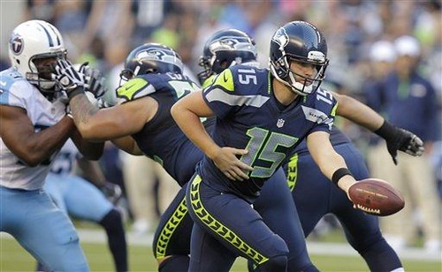
The new Seahawks unis saw their first live action last night and the results were predictable. I know some of you like them, but it just doesn’t look like an NFL team to me. For a palate-cleanser, check out the new Sea Gals uniforms. There, much better.
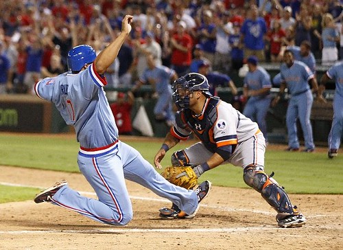
The Rangers and Tigers wore throwbacks last night, with the Rangers honoring their 40th Anniversary All-Time team. More pictures are available here.
On-field ceremonies to honor the Rangers’ 40th anniversary all-time team and induct broadcaster Eric Nadel into the team’s Hall of Fame will begin at 6:40 p.m. Saturday.
First pitch for Saturday’s Rangers-Tigers game, in which players will wear 1976 turn-back-the-clock uniforms, has been pushed back to 7:30 p.m. Members of the anniversary all-time team will be available for autographs from 5 to 5:45 p.m. on a first-come, first-served basis.
Yahoo Sports takes note of the oddest uniforms of the Olympics. There was some criticism of the women’s beach volleyball uniforms, which hasn’t been unique. The issue here is not whether they are wearing bikinis, or whether they leave little to the imagination; they don’t. But you can’t hold an entire sport responsible for the existence of small, tight bikinis. For if you do, then shouldn’t we blame the whole Olympics system? And if the whole Olympics system is guilty, then isn’t this an indictment of our participation in it? I put it to you, readers! Isn’t this an indictment of our entire American society? Well, you can say what you want about me, but I’m not going to sit here and listen to you bad-mouth the United States of America!
And if you missed it, the Daily News took a look at the coolest Olympics stadiums last week.

He’ll probably tweet about the lack of birdies, too…

Click to enlarge
Seriously benchies is never funny
So scroll past it. It’s one freakin image, who cares? I’m not really a fan of it either, but you don’t see me complaining about it every day – and I complain about a lot of things.
Today’s Benchies IS funny. So quit complaining. This site gives all of us a venue to try out our ideas – for most of us, it’s our submissions in “Tweaks.” And if our submission is goofy and half baked, Phil still gladly posts it for all to see and comment on.
In regard to Benchies, a comic strip is a long term project. Almost every ‘long term’ artistic idea I know of GREW into being great by getting a chance to do it every day. Do you want Rick to be more surreal, more topical, use non-sequitur’s, add more characters – make a positive suggestion. None of us gets great at anything without getting a shot a working at it everyday. There’s no overnight successes. I for one, think it’s great that the site gives him the opportunity to develop his art.
In my opinion, it is funny. So as long as John’s not speaking for the rest of us, we’re OK here.
Do I laugh out loud at every single installment? No, but I’ve never done that for any comic strip. This one makes me smile a lot, and sometimes I do laugh out loud, so I consider it a success. Definitely better than most of the stuff in the newspapers.
I thought today’s installment was one of the funniest yet. Great punchline! I’m that guy haha
Same here. I never LOL at comic strips. even funny TV shows. But I will smile or be amused.
Have to agree with John. Ricko’s contributions to this site are immeasurable, and no, I can’t do any better when it comes to drawing or cartoons, but… Benchies is never funny.
…Michael asked for positive suggestions and I wouldn’t want Ricko to change his vision to suit those of us who aren’t enamored with the strip. I find nearly every comic strip in the daily newspapers to be not funny. Calvin and Hobbes is the benchmark by which I measure comic strips and none come even close.
Here’s what IS funny about Benchies – the lead-in comment that appears above the strip. I always find that to be sarcastic and dry.
The intro comments are mine.
And they sort of address the point of the strip, that in on-so-many ways the people who inhabit it are a bunch of Peter Pan goofballs with their own way of looking at the world. Not unlikable, but goofballs nevertheless.
All the things to talk about on Uni Watch and you bemoan Benchies. Why don’t you buy a USA Today and bitch about the Sunday Funnies?
You know what,
Nancy rarely made me laugh, but someone laughed all the way to the bank.
Go get ’em Ricko! You never know when syndication comes round the corner!
I LOVE Benchies – better than a certain Tank…
And Nancy is pretty good these days. Check the archives to see what the latest artist does with Aunt Fritzi Ritz – Yowza!
If you want to seriously hate on a comic, do it for Funky Winkerbean….the folks at Comic Curmedgeon sure do!
link
link
I find it funny that so many people fed the troll today, but I’ll help out.
Today’s installment was VERY funny. Made me wanna punch the kid. Heh heh.
…and could it be that “John” is actually Ricko playing a sicko joke?
Nah.
Nobody enjoy negative comments, but anyone who puts something out there for the public and dreams of 100 percent acceptance of it is nuts.
So I have no problem with anyone not liking it. That some find it not worth reading is to be expected, and they can pass it by.
Not sure I understand the public crusade to rid the world of it, though.
I do believe that every nation should have their say in what their teams may wear in the field of competition. I don’t see anything wrong with certain nations choosing to not wear bikinis because of religious and cultural reasons. It’s their right as a participating nation to do what they choose. I do think it is pathetic on how sexed up volleyball has become that people complain about not being able to almost see a woman completely naked and play in the sand. Those are my thoughts.
On the one hand, I agree that the uniforms should be up to the countries and there’s absolutely no reason that anyone shouldn’t be allowed to play a sport in whatever style uniforms they want (with the provision of mandatory safety equipment and whatnot).
On the other hand, they did compete completely naked in the original Olympics.
Haha that’s true. I just think it’s annoying how adamant so many men act about not getting to see women play in bikinis.
Do you know what annoys me? No? Well – I’ll tell you.
That boxing (and a few other sports) has red v blue. No national identity (other than letters).
Remember the old days when boxers had vests in national colours? Cassius Clay in white with a red, white and blue diagonal, the Russians in red, the East Germans in blue with white edges, GB in white with a red, white and blue band.
It’s been turned very dull.
Agreed completely George. Obviously, the Olympics is about representing your nation. To me, a simple flag on a helmet or a standard red/blue color scheme doesn’t scream all of the nations of the world coming together in athletic competition.
It’s deemed a necessity for judging purposes in several sports (boxing, wrestling, taekwondo, etc), and a necessity for spectators in others (both judo players in white?)
Prior to the all red and blue suits, boxers were identified by a colored belt. Then the helmet and gloves were changed to match the belt, finally the entirety of the suit. It makes it easier for the judges to score, and considering the incompetency and/or corruption in amateur boxing, it’s probably a good idea to take away as many reasons for a judge to screw up as possible.
I don’t see why it should just be religious or cultural reasons. No reason to artificially restrict things like that.
Also: isn’t the red/blue in some combat sports because of the psychological effect colour can have on judging? They draw the colours randomly AFAIK
I was at Citi last night. The less said about the game, the better. Two things I did want to mention:
There were a LOT of T7L shirts. Those guys are on to something.
I can’t be positive, but I think I saw one of those shirts that Paul doesn’t sell.
I’m a Seahawks season ticket holder. My seats are in the upper deck but not very high (row K), but it was VERY difficult to make out the numbers on the ‘Hawks jerseys last night. Big time NikeFail.
Those Seahawk uniforms look like something an attendant at some quick-oil change shop would wear. Pretty brutal.
Pft, no they don’t.
They do kinda have a bit of a 90’s Arena Football League feel to them, but let’s not go comparing them to freakin Jiffy Lube.
Seahawks look like they picked up some rejected arena football jerseys… Those have to be the stupidest looking jerseys I’ve seen this summer!
They would not look so bad if they did not go with the monochrome look.
I find it hard to believe that the numbers weren’t hard to read before. It’s a, what, 12 inch number from how far away? I haven’t managed to see any NFL games live, but I have been to multiple NBA and MLB games in my younger days, and it’s hard to read numbers from the upper deck then too – and upper deck NBA is a lot closer than upper deck NFL.
I was at a Seahawks/Steelers game five years ago, and I sat in the upper deck. I could see every number just fine. And if you go to the right NBA games,
link
you can see those just fine from orbit. As God intended.
And if you go to the right NBA games, you can see those just fine from orbit
…which you demonstrate with a picture taken at court level. Not the best example there Jimbo. ;)
I think the last NBA game I went to was sometime in the mid 90’s, shortly after the Pistons started their teal phase. You can read the colored number on the white jersey easily enough, but teams like the Bulls or Knicks were a bit hard to read and you ended up double checking the video screen on the scoreboard.
I really don’t think I’d even expect to be able to read the numbers from the cheap seats at an NFL game. That’s what the PA announcer is there for. You don’t go to an NFL game to see the details, you go there for the environment – the experience – the atmosphere – whatever you want to call it. I have no doubt that a 70 yard TD pass is still really fucking exciting even if you don’t know for sure if it was 86 or 88 that caught it until the announcer says something. If you’re concerned with reading jersey numbers and tracking stats, you stay home and watch the game on your 42″ HDTV (or I suppose you can bring your iPhone/Android/whatever).
Dammit, I hate when my comments get stuck in moderation…
Welcome to my world ;)
Jeff,
YOU may go to games for the atmosphere. That’s your privilege. I go to watch the game. It’s nice that most NFL numbers are readable from the upper deck so I can tell who threw that block, or who that block was thrown at, since the PA announcer won’t (and shouldn’t) tell me. The primary purpose for numbers on uniforms is to identify players, and patrons in the last row of the venue should be able to do so.
…which you demonstrate with a picture taken at court level. Not the best example there Jimbo. ;)
Well, it’s hard to find a shot from that far back…
I used the Jazz and Sixers as an example, ’cause I taped that game and the numbers stand out clearly on my tiny TV. I taped a Wizards game, too, but I couldn’t make out any of their numbers.
You may have difficulty reading the numbers, but as a season ticket holder in the 300 level, row X and I had no problems reading the numbers. You may just need new glasses.
You need R v B so judges can clearly distinguish between fighters. Doesn’t help much.
No, you need two contrasting colors. If you *really* want contrast, it should be black vs white. Red vs blue is totally arbitrary and can’t possibly be any more effective than most other pairs of colors – red vs yellow, blue vs green, orange vs purple, etc.
OK. In a HBO PPV situation where the judges know who Pacquiao and Mayweather is, I see that. However, in the Olympic world, who knows where these judges are from and what they know. You also have the issue of color blindness and fighter’s not finding their corner. I’m all for a Street Fighter dressed Olympics.
Red v. blue to contrast boxing (and judo) opponents is for the judges and fans to distinguish the fighters. Though I agree black (or red or blue) vs white would provide the best contrast, red vs blue is far from an arbitrary choice. Large portions of the population are partially colorblind – and many with the condition may not even know it. (red/green being perhaps the most common). But the reason black or white are not used as assigned contrasting colors is mostly political – and yes, I do believe there is something both sad and pathetic about that.
You can’t use white in boxing; that’s for the neutral corners.
I don’t know if I miss the national colors on boxers, but if red v. blue headgear is the price to pay to not have Cold War-era boxing (skating, gymnastics, basketball) officiating, I’ll pay it.
I would REALLY like that Titans set if they just got rid of that stupid clunky computer font & went to a standard number block. They need to ditch the navy jersey & pants as well because they add nothing & make it look more generic. They need to channel their inner Oilers & put some more red trim on there.
Those Seahawks unis just suck so hard. Looks totally bush league. That stupid pants trim still reminds me of the old link logo.
I totally agree on the Seahawks. These uniforms are twelve steps backward from last year. What is the deal with Pro teams wanting to dress monochrome as if they were a Junior High School? The Seahawks uniforms look as if they aspire to copy East Panhandle State Consilidated Jackass Junior College ….
Are the Seahawks the first team that had every single uniform change worse than the last. The original Seahawks uniforms were great – but for te oversize front jersey numerals. Then they step backward by eliminating the sleeve stripes to add a redundant sleeve logo. Then comes the Blue Monochrome Jackass Junior College look (though, the White away jerseys and pants wre an improvement). Now, these horrible abominations. Looks pretty bad.
I guess we can agree (?) that each successive Seahawks HOME uniform has been worse than that which preceded it.
Titans’ numeral font could be improved, however, I like fonts that stray from the cookie-cutter styles. Titans truly need to ditch the Navy – the pants and jersey bring nothing to the uniform, and the “Oilers” Blue looks so much better.
All good points about nosebleed seats, but I’m just pointing out here that compared to last season, or compared to the Titans numbers last night, these Seahawks jersey numbers were much harder to decipher from my vantage point.
I like the Seahawks new unis for the simple fact that it is more modern( never been a fan of old school designs), but it doesn’t matter what we think here. The Seahawks fans, the NFL, and the players are the ones that truly have a say and from what we have heard and seen is that other players around the league are envious, the league is making money off of all the talk about it and, the 12th man are eating it up and throwing truck loads of money at the team for new gear. If they win with them then people will talk less about how the feel that they are ugly.
A few good reasons not to like sports.
Indians wore some 70s throwbacks against the Red Sox last night, as well.
At least that’s what the radio guys said.
Not last night.
link
The Astros wore 90s throwbacks, though:
link
The Brewers were too busy to play along, and wore their current yucky-looking blue tops.
You’ve lied to me, Joe Castiglione.
Then again, the other day when they lost to the Rangers, he called the Rangers the Twins at least 4 times before catching himself.
LOVE the Astros caps from that era.
The Titans baby blue pants are awesome. It reminds me of the older Oiler uniforms. I love light blue minus the sheen from the synthetic fabrics.
If Nike can do this to the Titans, then the Chargers need to go back to powder blue and yellow, pronto.
^^^This. Fucking THIS.^^^
Nothing about the Astros wearing their mid/late 90s throwbacks for a second straight night because the players wanted to keep wearing them? There is chatter they will wear them again today. No word on creating the road version, though…
I’m officially referring to the Seahawks unis as “Laser Tags”
link
There are so many disparate elements inthat Seahawks uniform that I find them difficult to
look at. There is something very cynical and backwards at work here.
I see: Some blurred, spotty stickers defacing the helmet–as if the iconic bird head wasn’t enough….Some god-awful, large cartoonish number font in the grim color of grey….Strips of tape randomly applied along the front of the shoulders…Some odd, indiscernable design along the side of the pants which represent nothing. The nike mark is the most distinguishing feature on the jersey–right there on the shoulder, highlighted, the first thing you see.
The new shade of blue is more pleasing than the scuba outfits wastewater blue, I’ll give them that.
and as a Titans fan i wish so badly they’d switch back to navy. They aren’t the oilers and they look like an arena team (especially with baby blue over navy with white helmet)
The Seahawks pants remind me of a pair of Kappa track pants.
link
I’d love to send back the 2012 USA Bball team to play the “Gold Medal” 1972 USSR squad.
Personal rant time: God, can we all just shut up about ’72? Seriously, it could have been a lot worse. The American team could’ve been kidnapped and murdered by terrorists. OH WAIT…
Besides, I think it’s pretty obvious who won the war.
yeah, look at all the big US sports leagues running on largely communist lines ^_^
The US would lose again, of course.
Regarding the Seahawks uniforms? They stand out ( like the Browns logoless helmet) because its different.
More modern and updated.
I like classic stuff too dont get me wrong but there has never been nothing wrong with an update.
Things change. Times change.
We outgrow things we liked at first ( for me Air Force Ones. Classic sneakers just don’t find them appealing to me anymore) and grow into ones we didn’t like.
I’m not saying your opinion is wrong just saying MAYBE one day it will grow on you.
I agree with what you are saying, but bad design is bad design. And I realize that mine is only an opinion. Of all the teams, Seahawks do seem fit to have a more modern design, but I think this look is ridiculous. Switch out the face mask with a visor, lengthen the pants, and slap on a pair of Vans and you get what they really look like… BMX uniforms.
“…More modern and updated.”
Which means soon, they’ll be old and outdated, in need of being more “modern and updated.” And it will continue ad nauseum.
Man City’s change kit today made them look like they were playing for USC or Minnesota.
Why? Because the colours are similar? City have had variations of claret/maroon as a change strip for a very long time – in the 1933 FA Cup Final they wore maroon shirts, in 1956 maroon with narrow white stripes.
It did not occur for me for a moment to think they looked anything other than City. And I’ll bet a lot more people in the world know who Man City are compared to USC or Minnesota.
They looked a bit Roma-esque to me. Fortunately if I’m not sure, I check to make sure :)
At least for me, the links in today’s entry are opening in the same tab, rather than a new one. This is extremely annoying.
Seattle(/NIKE) did make 1 change since the April promo shots. The navy pants originally were to have simply had those ‘funny-looking shapes’ down the leg in electric green. They changed to an electric green stripe with navy ‘funny-looking shapes.’ Wonder if the white or grey pants will change too.
Also, why does Tennessee have 2 different patterns for there jerseys? Hasslebeck and their punter had sleeves that ended with a 2-color cuffs. However everybody else that I could see clearly had 1-color, white cuffs at the ends of their sleeves. Maybe it has to do with Hasslebeck’s loose hanging sleeves instead of the tight gathered kind. Still doesn’t seem like they should make 2 patterns, though.
Seattle(/NIKE) did make 1 change since the April promo shots. The navy pants originally were to have simply had those ‘funny-looking shapes’ down the leg in electric green. They changed to an electric green stripe with navy ‘funny-looking shapes.’
Um… no?
link
The Seahawks uniforms of yesterday look pretty much the same as what was unveiled originally.
Yeah, and they’re not “funny-looking shapes”, their Haida art wings and are probably the best/most inspired part of the whole Seattle uni.
Or, rather, feathers.
RE: Tigers throwbacks: I wish the Detroit Tigers would go back to the 70s-80s style block-lettered “DETROIT” road jerseys. It’s a classic look and I’m sure they can make a modern interpretation of it (smaller lettering on the back and maybe the stripes on the sleeves a bit thinner, for example). I have never liked the current road jersey with the stupid script “Detroit” on the front.
About the Tigers’ current road jerseys: I wish the “Detroit” wordmark was in Old English myself. And I also wish they’d get rid of the white outlining–the orange outlining is enough.
You look at the throwbacks they wore yesterday, and you quickly notice the neck trim wasn’t right, the lettering wasn’t right, and no one wore them with the
period stirrups.
Is it time for Paul to come back yet? This month of UW has been BRUTAL…
In depth coverage of the Olympic uniforms is brutal?
You’re an idiot.
/gotta stop feeding trolls… dammit…
It’s KP! link
I would like Seattle’s look much better if they kept the blue pants with the white jersey and went with the gray pants with the blue jersey. That being said no matter what combo they wear looks terrible. If they didn’t have the shoulder/sleeve mess and the Nikelace it might not be as bad.
So, instead, if they had a generic plain navy jersey it would be better?
Yes.
This month of UW has been great, or at least it’s had enough great moments that Phil and Ek can b proud. And Benchis is terrific, including today, which is very much an early Doonesbury kind of strip. Best thing about August for me has been daily Benchies.
Seahawks unis. I appreciate the attempt. I really do. It’s OK for a few NFL teams to be out there on the cutting edge, design-wise. But. This isn’t actually the cutting edge. The elements at play are actually kind of par for the course in college ball. That, to me, is why the Seahawks fail. (That, and they’re clearly trying, but there is no try.) Seahawks look like the Orioles to me. In both cases, the specific design elements are so typical of college/minor-league that instead of looking interesting, the uni just looks low-class.
Is it National Troll Day over there today?
I JUST thought that! I wondered “did all the trolls find out Paul took the month off?”
I think the uniforms fit Seattle. Look at the Sounders jersey’s. They are garish and unique, but they are becoming iconic. Seattle’s embracing of the bright green is making it something that is truly “Seattle”.
Plus, the simple fact they don’t have the fangs that so many other teams now have automatically makes them look better than all of those teams, that is how much I dislike the fangs.
I also typically hate the monochrome look especially on the lower legs (Can’t stand the Saints black pants/black socks look) but with Seattle it works because you can tell it was designed with it in mind. I think it would look better if they wore white or gray pants with the blue jersey’s but monochrome has sort of become a Seahawks thing. At least there is the electric green to break up the monotony and therefore makes the blue pants/blue socks work better.
Ryan, I agree with you on all points. Plus I appreciate the effort to come up with design elements that better fit the way today’s uniforms are worn.
True, although the Blue/Gray combo they have been wearing at training camp looks pretty slick.
link
How link especially link even link look? (and yes I do like the Creamsicles too). And when done link (which the current Seahawks completely lack) look link (and I’m fine with a single thick green stripe as well). Because the NFL really doesn’t need another navy blue team when that royal jersey can be paired with link.
How odd to see a Colts/(modern) Rams game in the sunlight.
The Seahawks are so close to having great modern unis:link
Too much blue, not enough gray.
Nice mock-up, Tim E. I think the gray pants help a lot. Still no saving that uni though, IMO.
Is it just me or does that tailbone pad make it look like that dude’s ass has teeth?…
That should say “gray HELMETS AND gray pants”…
They have been wearing that combo in training camp.
link
They have gray helmets too? Or was your comment just posted before my second one made it through moderation?
It was done before you fixed it. They have been using the standard helmet with the dark navy practice jerseys and the wolf gray game pants.
Ahh, ok.
Lifelong Seattle fan, some thoughts on the unis:
I agree philosophically with the consensus that the overall effect is bad. The uni is very busy and smacks of a unserious Arena League or “modern” college uniforms. The best thing that can be said about them is that the redesign is a huge improvement over the 2002-2011 look. The helmet looks great and the dark blue is a major upgrade from reebok Seahawks Blue.
The green wingding strips, clavicle stripes and green shoulder thing with prominent swoosh: ugh. All bad. There is a non-zero chance that the regular season set will be blue jerseys over grey pants. Blue over grey has been worn a few times in training camp so hopefully the players fall in love with those.
The numbers are fucking terrible. Ridiculous on every level. I like the grey/silver shoulder numbers and NOB though. Those numbers should be on the jersey. We’ll presumably see the road whites next week at Denver and the blue numbers should stand out better.
I definitely would have liked something less garish and more classic, but players like modern designs and they seem to sincerely love these uniforms. The grey alternates will be a much better look than the blue monochrome. Hopefully they become the road standard and the white the alt.
Gentlemen! [Walks out humming The Star Spangled Banner]
Well, apparently sportslogos.net is an attack site:
Firefox – link
Chrome – link
good thing i never visit that site, then
I REALLY like that White Sox hat in red.
link
I am firmly in the camp that believes that the Sox need to move on from the black and gray…….
Holy shit! Hundreds & hundreds of pics of the last time the Seahawks looked like a real NFL team!
linklinklinklinklinklinklinklinklink
Lots of great shots, deep saturated colors.
Hmmm, there was breaks in there. All the links are still good.
RE: Rangers blue throwbacks. Turns out, it is possible to overdo stirrups after all, Mr. Kinsler…
link
jesus fuck
christ, ballplayers are so god damn dumb these days…
Oh dear… Just, wow.
*facepalm*
No one, anyone, couldn’t take him aside and whisper in his ear.
Man.
The hilarity that is Ian Kinsler’s hosiery “stylings” combined with the comments in this thread… Sweet Celestia, the lulz are hearty tonight. Very hearty.
Yeah, Kinsler looked goofy — but Holland was absolute PERFECTION in his stirrups and in the way his trousers fit.
link
Murphy (who always wears his uni well) was also glorious in his stirrups! Robbie Ross wore great stirrups, too — now he just needs to learn to blouse his trousers at mid-calf rather than the knee.
link
Wash typically wears his trousers bloused at the ankle.
link
On the Tigers side, Cabrera went high-socked, as did Leyland. Try as I might, I couldn’t find anyone wearing stirrups in the Tigers bullpen or dugout.
Chad Johnson released by the Dolphins…
You can pick your friends and you can pick your nose but you can’t headbutt your wife.
who?
He’s an NFL WR who forgot that in order to be on a roster you can *either* be bad at football OR beat your wife but never both.
See: Brandon Marshall et al.
Love the Animal House reference today, calssic!
i’m in awe with how UGLY the seahawks look on the feild.
how could this happen to a professional team?
My sentiments exactly.