Longtime reader/contributor/genius Marty Hick recently told me about an interesting project he’s been working on: He finds old paintings in thrift stores and then paints old NBA and ABA logos onto them.
“I got the idea from a local artist,” says Marty. “My band was playing at the annual Rock ’n’ Roll Craft Show here in St. Looie. One of the featured artists took thrifted paintings and added monsters to them (they actually looked more like the ghosts from Pac-Man). I decided to steal his idea, and I thought that old basketball logos would be perfect. The difficult part has been finding suitable paintings to match up with particular logos.”
So far Marty has done four of these. The first one was a landscape painting that he supplemented with the old Milwaukee Bucks logo (for all of these, you can click to enlarge):
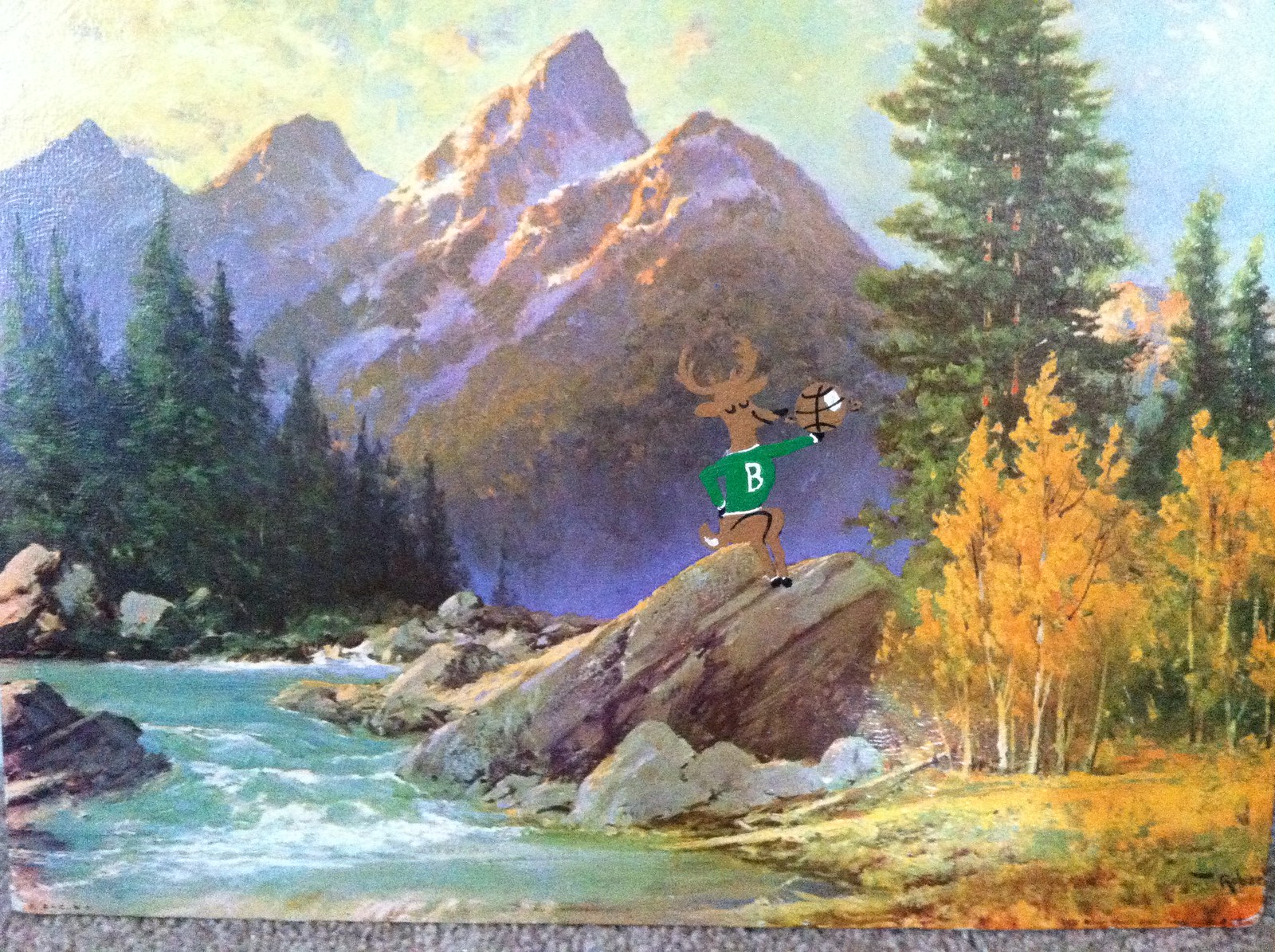
“This is by far my favorite of the four I’ve done so far,” says Marty. “What can you say about the greatest logo ever? He looks like a free-roaming creature without the confines of a logo outline. He truly looks like he belongs there, and he seems quite content. This was the first one I did, and I almost stopped there.”
Fortunately, Marty didn’t stop. Here’s his Kentucky Colonels treatment:

“Crazy logo,” says Marty. “As soon I found this portrait of a shack, I knew I had my match. I always wondered why the man with the horseshoe had such a foo foo dog behind him. As it turns out, that dog (a real life Brussels Griffon) was part owner of the team. Judging by the Colonel’s black slouch hat, I would say he was a Northerner. Kentucky was a boarder state, so that’s okay.”
Next up is Marty’s Oakland Oaks rendition:
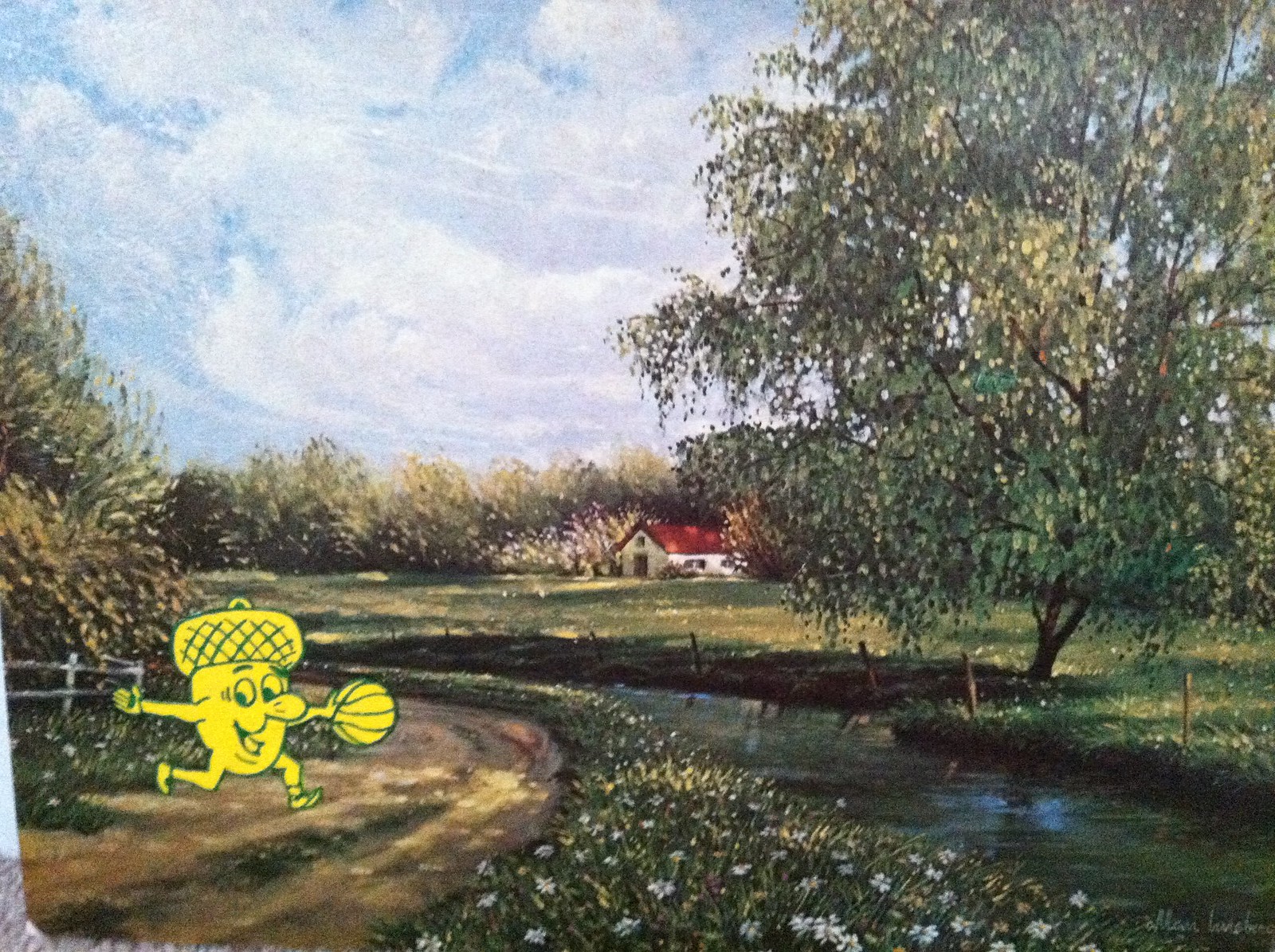
“How do you not love an acorn dribbling a basketball?” asks Marty (rhetorically, of course). “The look on his face says it all.
As far as the pairing with the backdrop, though, this is my least favorite.” Personally, I disagree — I love this one.
Finally, we have the Denver Rockets:
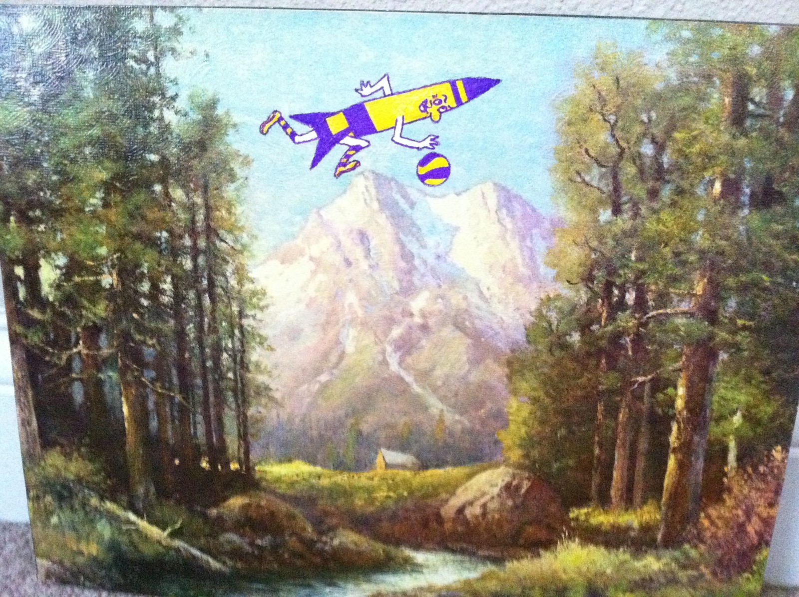
“It took me awhile to find a decent mountain image that could carry this logo,” says Marty. “The mountains in the painting replace the mountains in the actual logo. And admit it, Paul — you would wear those socks.”
A few notes from Marty regarding process, methods, etc.: “I used tempera paint and marker for each piece. After completing each logo, I hit it with a light coat of shellac, which provides a consistent sheen across each painting. I really want to find a desert scene to do the Dallas Chaparrals logo. If and when that happens, I’d like to display the four ABA paintings together and let the Bucks painting stand on its own.”
Pretty cool, right? Definitely one of my favorite DIY projects of recent months.
Membership reminder: The Uni Watch Membership Program will soon have a price increase, but there’s still time for you to get in at the current price. Details here.
Raffle reminder: I’m currently raffling off five copies of the newest edition of Bill Henderson’s doubleknit-era baseball jersey guide. To enter, sendi an e-mail with your name and shipping address to the giveaway address by 8pm Eastern tonight. One entry per reader. I’ll announce the five winners tomorrow.
Vacation reminder: My annual one-month summer break from the site begins this weekend. Phil will be handling the weekdays, Johnny Ek the weekends. I’ll still be doing ESPN work, which Phil will inform you about as it becomes available.
Uni Watch News Ticker: Here’s piece looking at the history of the NHL’s current logos (from John Muir). … R. Scott Rogers has a bottle of Maker’s Mark double-dipped in Nats-colored wax — and signed by Frank Howard to boot! … Holy moly, I like almost everything about this amazing photo of the 1909 St. Paul Gophers (thanks, Ricko). … The newest member of the Federal Hockey League is the Dayton Devils. “After looking at their logo, I am not sure if I want to congratulate the artist who designed it, or knock him out,” says Mark Viquez. … Speaking of Dayton, new identity package for the Dayton Sharks (from Leo Strawn). ”¦ Rob Ullman notes that the new Tony Romo McFarlane figurine features a Nike jersey and a Reebok cap. … Dodgers pitcher Stephen Fife, who wears glasses, made his MLB debut two nights ago (from Frank Mercogliano). … Yankee Stadium is still using the old Blue Jays logo on exterior signage but the new logo inside the ballpark (from Adam Zmudzinski). … I was recently contacted by the people who’ve created a gadget for displaying jerseys. They sent me a sample, and it’s interesting. On the one hand, it’s basically just a glorified hanger. But it has a modular design that’s pretty good for jerseys — especially large/oversized ones. Check out the embedded video on the ShirtWhiz site and see for yourself. … Speaking of new inventions, here’s a way to get an electronic autograph. Further details here (from Randy Williams). … The Colorado Rapids are adding a black armband to honor front office staffer Marisa Colaiano, who recently passed away (from Kenn Tomasch). ”¦ “While waiting in line at a recent Giants/Cubs game, I noticed the hat of kid in front of me was made entirely of duct tape, complete with the MLB logo on the back,” says Tony Crespo. Someone find that kid and get him to do a guest-written Uni Watch DIY entry! ”¦ Yesterday was the beginning of the branding blackout at the Olympix — the period when athletes cannot appear in any advertising from companies that aren’t official Olympix sponsors. Key quote, from sports marketing expert Bob Dorfman: “In a sense, the Olympics are kind of favoring the sponsors over the athletes. But that’s where the money comes from” (from Britt Jackson). ”¦ David Ortiz has just been put on the DL but was in the dugout — and wearing a pandering cap — for last night’s Bosox game (from Ben Harris). ”¦ Happy birthday to reader Kurt Van Selus, who turns, uh, he didn’t say how old he’s turning today, but happy birthday anyway! ”¦ “I came across this 1987 training camp photo of former Packers QB Don Majkowski,” says David Trett. “What I found interesting is the number 5 he is wearing was the number of HOFer Paul Hornung. The Packers haven’t officially retired his jersey number, but no player has wore it since then. Majkowski went on to wear 7 with the Packers.” ”¦ A welcome trend is emerging in the Cape Cod league: stirrups! Additional examples here, here, and here (all this from Alexander Tsipis). ”¦ Nike and Facebook have teamed up to create a platform that will allow sneakerheads to showcase their collections and, if they like, trade (thanks, Brinke). ”¦ You know how the Giants normally have NOBs on their batting helmets? Eli Whiteside had a white strip of tape in that spot last night. “He just got called up and was flown in for the game, so I assume they quickly made a label/sticker of some sort and stuck it on a helmet,” says Andrew Greenblatt. “Can’t read what it says, but it’s presumably ‘Whiteside.’ Sorry for the black/white pic, my camera is acting weird.” ”¦ And we conclude today with a treat: a new (to me) video clip of the White Sox wearing shorts on Aug. 22, 1976. Not to be confused with that other Sox in Shorts video, which has been around for years, this new clip was just posted to YouTube a few weeks ago. Enjoy (and give a hearty slap on the back to Greg Trandel):
Man… those logos look horribly out of place among all of the happy little trees.
I think the Bucks one works very well, the second and third look like a mascot has been slapped on a painting, and the fourth one, the rocket is way too intense in color in contrast to the distant mountains, it took me a bit to realize something in the foreground was bouncing a basketball off something in the background. But all in all a good start, just needs to find the right marriage between mascot and painting.
Well, I was mostly being a smart-ass with the “happy little trees” thing… but, yeah… I think the Bucks is the only one that really works. They need to be a bit more subtle… muted colors or less detail… or… something… otherwise they really do just look like someone slapped a sticker on top of the painting.
I thought the Kentucky Colonels one worked too. Now let’s put the Penguins “skating penguin” logo on an ice pond without the Golden Triangle, and that would look sweet!
Of course, it also needs some link
I liked the Bucks painting the best with Oaks a close second.
jeff jeff jeff. i don’t think the point is to be subtle, the point is to have the logo exist within the painting in it’s natural logo state, not to paint it recessing into the background as if trying to hide it. anything added to a painting is going to look added anyway. is he supposed to copy the style of each artist? as if it was even possible, combine colours in the same way? use the same materials be they oil, acrylic, water, gouache and ink, etc? and i don’t think that was even remotely the point of the work anyway. so why not just embrace that it is going to stand out, use the materials he is familiar with as a grade school teacher, embrace the skill set he has regarding painting, and tempera logos on the canvas. besides, it asks the question, what if the oakland oak was dribbling in a painting and not in a flat yellow circle? where would that cat dribble? on a roadside beneath an oak of course, that is where he would play. for sure the first 3 ask that question and use the logo subject without alteration within the scene with tremendous success. not that everyone has to like it, or the idea behind it, but that is beside the fact. and i realize not everyone here knows how to crit art, and let’s call this art for the sake of this conversation, but a comment here or in any setting that begins and ends with “Man… those logos look horribly out of place among all of the happy little trees.” is not exactly useful as a critique to someones work, and clearly shows a lack of even trying to understand what he is trying to render, and just comes off like you are trying to be a grad A prick. you don’t have to like it, and if you want to post something negative it is your prerogative. i welcome you, neigh, beg you to do so on my projects any day, and you can be as subtle as an a-bomb like you were here, but with other people maybe you should treat them with an ounce of dignity and respect in the future.
good effort marty, i know the artist’s work you are talking about, and i like these infinitely more to say the least. the first 3 are a gas, and the logo’s are totally acting naturally despite them being un-natural comic toxic super hero versions of entities that could almost be within the landscape. they really are a hoot man, and a lot of fun. the fourth one has one glaring issue, the original painting. he/she centered everything, so of course your logo is too centered on it’s mountain dribble, my eye shoots to that blue and gold in the top middle and can’t move around the painting like it does in the others. i also think you were hindered by trying to be to literal in representing the original design, it doesn’t seem as natural, but i may just think that because of the whole centered thing. these are issues that do not exist in the other 3, but that being said, for me, it is still a fun successful piece.
*sigh*
Why is it so hard to make a playful joke on the internet?
bob ross was a playful joke, the rest of it wasnot, don’t try to make yourself the victim jeff.
I got the Bob Ross reference.
I would rather see them affixed to portraits of Presidents, or scenes of abject Appalachian poverty. The less sense made, the better. But that’s me.
The Bucks painting is just terrific, absolutely terrific. That’s kitsch art if ever there was … I wouldn’t be surprised if that’s praised heavily in an exhibit and goes for $$$ if he ever chooses to do so.
The rocket dribbling a basketball through the saddle of twin-peaked Mount Spectacular? One of the great images of our time. Go, Marty.
Love, love, love those paintings. New life given to old stuff. Definitely cool!
Also, hey Paul, check out this cool infographic on Batman villians! link
Wow what a cool website, great graphic design.
They have some awesome posters, I am especially partial to the Taxonomy of Rap Names, Varieties of Beer, Map of Breweries, Bronx Baseball Breakdown, and Compendium of Haircuts….wow I want them all.
I believe Paul would be most interested in The Bike Lanes of New York….sweet!
link
and maybe the Array of Culinary Tools
link
Oh Man! Those are beautiful. Its hard to get a good look at them on a phone, but yeah, great stuff. I think you’re right, Paul should definitely take a look at the two you linked above.
Those two prints are both in the window of an art framing shop around the corner from my apartment.
Just proves that all art isn’t meant to be taken 100% seriously all the time. The Bucks painting is great.
neither of those ar art.
Didn’t Vince Ferragamo wear #5 during his cup of coffee with the Packers?
Yep. Willie Gillis and Curtis Burrow as well.
Yinz should seriously see how many Steelers have worn numbers like 31, 47, 82, and 88 after Donnie Shell, Mel Blount, John Stallworth, and Lynn Swann retired. I can understand 82 and 88 when receivers could only wear 80s numbers (though the Steelers have removed 86 for Hines Ward), but not 47? Blount played so well, the NFL changed the rules! And 31 WAS out of circulation until the Steelers signed McKeesport native Mike Logan, who wanted to wear 31 in honor of Shell. (Shell has been with the Panthers as a scout since the team’s inception, so I can see why the Steelers allowed it.) 31 has been back in circulation since.
It really bugs me when teams do that. I’m not really a big fan of retired numbers anyway, but either retire it or don’t. The whole idea that “number 12 isn’t retired, but we don’t let anyone wear it” is just… dumb.
No doubt, my Steelers have been inconsistent when it comes to these numbers. Even Jack Ham’s #59 was used in 1984 by the forgettable Todd Seabaugh.
While it wasn’t true with the Steelers, some teams will refuse to retire/reserve a number if that player had bad relations with management. That’s exactly what happened in the case of Dick Butkus, who sued the Bears for medical care reasons. His # 51 was worn by other players, including Carolina Panthers Head Caoch Ron Rivera, until Butkus and the team mended fences.
Unless it was during the 1984 preseason, Chico never wore #51 for the Bears. link.
You’re probably thinking of link.
Shell is on good terms with the Steelers, and the Steelers annually close out their preseason against Carolina, so those two teams have friendly relations. My guess that 31 went back into full-time circulation after Logan retired is that, besides playing 14 years with one team after being undrafted, Shell’s playing career paled in comparison to his teammates.
Great DIY project!
Seems like Dayton is in the early running as the most logo-challenged city in America. Their Devils’ insignia looks like a butt.
I was thinking more like Dolby Digital.
It can’t be as bad as the Expos last years in Montreal, where Olympic Stadium failed to update any logos after about 1997.
Thought so link an image from Wikipedia of the Expos last game in Montreal of the team putting up the “Best Team in Baseball” banner, which has the Pirates current logo that dates to 1997 but has the non-bolded pre-1999 Reds logo, the “Notre Dame” Brewers logo, and link for the Marlins. I don’t recall the Marlins ever using that as their primary insignia.
But those aren’t electronic logos. A lot of stadiums have probably left up old banners of that sort.
They would’ve had to’ve added Arizona and Tampa Bay when those teams joined MLB in 1998, but after that? I can understand why under MLB ownership they didn’t update the logos, but under Loria’s ownership?
I’m pretty sure Qualcomm Stadium in San Diego still has a banner with the original Atlanta Falcons logo on it.
Is the glasses-wearing Dodger pitcher named Stephen Fifer, or Stephen Fife (no R)?
Fife. Now fixed in the text. Thanks.
After the horns, you can check out the Phifer
+1 from a fellow Quester.
Is he by any chance Barney and Thelma Lou’s grandson?
I was watching the Nats & Mets on MASN last night and in the bottom of the 6th, Bryce Harper beat out an infield single and I swear it looked like a whistle came out from under his jersey. Did anyone else see this? Can anyone go back on MLB.tv and get a screen grab? It really looks like a referee whistle. There are several times you can see it, including when he tucks it back in.
Just watched the video. Sure enough, looks like he has a necklace with a whistle pendant. Tried to make screen shots, but they all came out blurry. Here’s the best I could do:
link
that’s a clown whistle, bro
LOL!
That’s the first thing I thought, too.
The Blue Jays logo of last year was also being displayed on the Yankee Stadium ribbonboard before the game started.
Belated to PL: Sorry not to have done so earlier, but I just read your ESPN sidebar on the use of the color brown in sports unis. I share your pro-brown enthusiasms, but it was incorrect to say that Brown doesn’t wear brown. They do. Even the picture you linked to (Brown footballers) shows a brown jersey. Now I would also say that Brown shows too much silver and red for my taste, but in football, basketball, and hockey, at least, Brown dons brown.
I also lament the way that Brown has evolved into a fashionable “creative” asylum for overpraised youth, but I suppose that’s another matter.
Isn’t that black?
According to Wikipedia, the school’s colors are seal brown, cardinal red, and white.
Wow. I totally missed that bit about Brown not wearing brown.
As far as I can see, only the shoes and socks in that pic link.
As for the link, link definitely wears link.
Wow guys, you were right about something and I stand corrected.
–Paul
#nevergonnahappen
Happens every day, actually.
Thanks for setting me straight, guys — much obliged.
During the 1960s and 1970s, Brown utilized yellow/gold in their uniforms. Former head football coach John Anderson began using silver helmets when he took over the program in 1973. He had previously coached at Middlebury, which had silver helmets. The Bears have used brown and white shells at different periods, but have primarily been silver since the time of Anderson’s arrival.
Excellent work, Marty. What a cool project. I’m still not sure which is my favorite, but the link piece is currently the leader in the clubhouse.
+ 1 on that!
Love the Kentucky Colonels treatment. Reminds me of those old 70’s cartoons. I think that one works the best.
right! i couldn’t put my finger on it! very scooby-doo-ish!!!
What were those people doing in old Comisky park, stacking Hamm boxes?? Why? This reminds back in the 1970’s when those old A.L. parks were broken down and decrepit looking.
I look back at these old films from the 1970’s and everybody looks so shady. It’s interesting that back then people still mostly wore pants/jeans all the time, even in the summer.
Why? Bill Veeck, that’s why!
The past truly is another country. That’s what the world looked like when I was a child, but seeing that movie it might as well be Civil War photos, or the highlands of New Guinea. Just seems to impossibly distant from right here and now.
It’s like when you meet someone old enough to have one of those accents that nobody has anymore, like movie stars all spoke in the 1930s, or radio announcers from the 1950s. You feel like you’re meeting an ambassador from a far-off country. Except in this case, the foreign nation in the Sox movie is where I grew up.
I haven’t been to a Sox game since 1978 but the sight of those elevated train tracks bordering the parking lot game me severe deja vu.
At one point – I know in the early 70s – there were placards rimming the outfield roof, commemorating every roof-shot HR in park history. They were red with white letters and featured the player’s name and the year he hit one out, and presumably placed at the spot the ball left the yard.
I remember that, by 1978, they had taken them down, but while trying to find my car in the parking lot, I saw that those signs had been moved to the wall abutting the elevated train tracks, completely outside of the stadium. Very strange, and cool. I love it when things don’t make sense.
No, it’s apple cider.
Oh, John Q, what looks broken down and decrepit to you looks inviting and glorious to me.
I know you can’t hold on to something forever–things fall apart and times change–but I loved Old Comiskey, Tiger Stadium, Cleveland Municipal, Shea, Metropolitan Stadium, County Stadium, etc. They were like old barns, full of musty smells and jerry rigged fixtures and dark corners begging to be explored by the curious and brave. Uncomfortable and unacceptable by today’s standards, no doubt.
It’s all perspective, I know. A Seattle kid today will look at Safeco Field in thirty years as his old barn.
I was transfixed watching that video. Ghosts from the past. Imagination and memory supply the audio.
One of the things I always loved about the old parks/barns like Comiskey – they felt like civic structures more than corporate ones (and I know there were ads, sponsorships, etc.). City Stadium/Municipal Auditorium and the lot are pretty much a lost relic of another time. And as much as I appreciate some of the modern amenities of your average American Airlines Center and AT&T Park, there is a sanitized detachment in those places that always leaves an unsatisfying feeling.
The FHL Dayton Devils new logo (from today’s ticker) looks like a butt. And I’m not just bitter because they Dayton Devils used to be my beloved Brooklyn Aviators, who’s logo was derived from that of the Aviator Sports and Events Arena at Floyd Bennett field. They played a season as the New York Aviators too.
The shorts are almost the least interesting thing in that wonderful 1976 Comiskey clip!
I froze the frame on the scoreboard ‘Sox-O-Gram’ and it said, BEEP BEEP BEEP BEEP…..musta been what they flashed when Ralph Garr came to bat!
At 1:35…..Ken Brett sporting a ‘straight-across’ NOB.
Were the White Sox actually in that clip? I didn’t see ’em. This is what I saw, admittedly as an O’s fan:
-Palmer. Classic.
-A rare Reggie sighting!
It sure looks like Reggie hit one out, doesn’t it? I looked on baseball-reference and he did hit a double to right field off Francisco Barrios in the game. That must be what we see there.
You checked the box score for the right day but the wrong game. Reggie did indeed hit grand slam in link.
The double came in link.
The stacking of the Hamms beer cartons is pure Bill Veeck-love it.
Marty,
The old NBA and ABA logos paintings are brilliant! Don’t forget the Memphis Tams for a Scottish landscape, the Carolina Cougars for perhaps another mountain view, the San Diego Conquistadors for a south of the border scene, and the Virginia Squires for an early Americana vista.
sweet job martay
sweet job
Yup, fun and offbeat.
First other logo I thought of was the Chaps, so hope Marty finds that desert scene he’s looking for.
in looking thru the packers 1987 training camp photo gallery from the link that David Trett sent, the thing i found interesting was that there was no consistency in the uniforms being worn. there was a mulitude of different stripe patterns going on with both the jerseys and pants. some had the green/white striping close together on the pants, others had the yellow stripe in between, some had the number on the hip, others didnt. on the jerseys, some had a big G in the middle of the stripes while others had classic packers striping, and still others had a simple green/white/green striping scenario. i believe that in today’s NFL, the players are all pretty uniform during practice sessions.
I thought that 1909 St. Paul Gophers would strike a chord.
Not just the unis, but the multi-dollar scoreboard with what might be the scoreboard ads of all scoreboard ads.
“made by Bob”?
link
Yeah, forgot to mention how sweet that photo is, particularly for the cigar billboard. Great find, Ricko!
I like to two different style sweaters, too.
The ones with shawl collars must have been for REALLY cold days.
I wondered why the different sweaters. Didn’t think about just personal choice.
Wonderful find, Ricko.
I had no idea the Don Almo cigar was made by Bob
That Gophers shot is so good it calls for a colorization. Hello, George?
Interesting other stuff I noticed.
Was that taken at Gophers ROAD game?
Or did they just trump up a scoreboard showing them winning the game something like 17-2 for the sake of the team photo?
That is a great photo. The scoreboard helps make it so
Truly one of the great pictures we’ve ever seen here.
I love how the weathered Runs Scored cards hang there, and what about the custom made bags for the bats?
Priceless image.
Twins wore those 1909 St. Paul Gophers unis..
link
I post that for anyone who might ponder colorizing the photo.
“After looking at their logo, I am not sure if I want to congratulate the artist who designed it, or knock him out,”
I’m just happy to see one that isn’t an angry cartoon character clutching a stick/bat over the full team name.
Just wondering if Whiteside’s tape wasn’t just blank. As in “White Side” of the tape. Maybe the Giants having a little bit of fun?
Pro athletes in Little League.
link
Hey, that’s my home movie! Er, well, it’s actually my aunt’s. I’d been meaning to submit it since I posted it, but have been busy. Thanks, Greg. I’ve got a score of film of Sox games from that era that I am slowly digitizing; if you check my channel, there’s another up now (with fireworks show) and one of the other home movies has a Blackhawks game. (Hope this isn’t too pandering.)
Awesome, Charles — great stuff!
I was a little disappointed to read the YouTube description that says “Ends up with footage outside and around the old ballpark and some random kids playing.” Because I was hoping that one of those kids was you. Perhaps some relatives of yours?
Charles: pleased to meet you.
I figured that since the video hadn’t shown up here yet it had probably been posted by somebody who didn’t know about Uni Watch. My apologies — that should be your name up there in bold-face type.
I think I only made it to Comiskey once in that era (I grew up on the Nort’west Side). I do have one question for you. According to wiki, the Comiskey fake-turf infield “was removed in 1976”. I guess that means before the 1976 season, right? Because the infield in your video looks like grass.
By the way, a couple days ago I bought a book from the University of Chicago Press entitled _Soldier Field: A Stadium And Its City_. I don’t have it in hand yet, but it looks like it might be really good.
Yes, the Comiskey AstroTurf was removed in March of 1976, as soon as the weather permitted Bill Veeck to do so. Natural grass was in place for Opening Day.
No worries, Greg, I’m just glad people get to see them. As I said, I am getting films digitized slowly (I am doing it at work, so basically just when they have time.), but hope to have some more soon, all from 1976-1978. Of possible UW interest is one of the Chicago Blackhawks playing a softball game. JTH, the kids aren’t any relatives I know of, but I think the woman making a kissy-face is my aunt.
Given some of the discussion this week, I found it interesting that Chick-Fil-A just posted this on their Facebook page. Let the derision begin:
“The Chick-fil-A culture and service tradition in our restaurants is to treat every person with honor, dignity and respect — regardless of their belief, race, creed, sexual orientation or gender. We will continue this tradition in the over 1,600 Restaurants run by independent Owner/Operators. Going forward, our intent is to leave the policy debate over same-sex marriage to the government and polit…ical arena.
Chick-fil-A is a family-owned and family-led company serving the communities in which it operates. From the day Truett Cathy started the company, he began applying biblically-based principles to managing his business. For example, we believe that closing on Sundays, operating debt-free and devoting a percentage of our profits back to our communities are what make us a stronger company and Chick-fil-A family.
Our mission is simple: to serve great food, provide genuine hospitality and have a positive influence on all who come in contact with Chick-fil-A.”
Sounds like an “oh shit, people are getting mad at us, we’d better dial down the religious overtones” statement to me.
/YMMV
That’s a great statement to make one day after you said gay marriage would “invite God’s judgment on our country”:
link
Not trying to reignite a debate (in fact, I’d really prefer that this thread end right here). Just putting the Facebook statement in larger context.
Great article!
This is one of those examples where you just want to lock them in a room, show them physical pieces of paper that contradicts their facebook post so we can agree on what reality is…..
One needn’t agree with or like Cathy’s views, but given his (not at all uncommon) basic assumptions, there’s no real contradiction in anything the release said.
It may not be a “contradiction,” but it’s bullshit (and also chickenshit, no pun intended) to give an interview in which you give inflammatory quotes about calling down god’s fiery wrath and then say, “We’re done talking about this now cuz we’re gonna concentrate on the food.”
If you’re gonna talk like a bigoted crackpot, at least have the balls to defend what you said, and engage with the reaction to same, instead of shifting into “Moving on…” mode.
Asshole + coward = a potent combination. Fuck Chick-fil-A.
Paul Lukas | July 19, 2012 at 1:58 pm |
It may not be a “contradiction,” but it’s bullshit (and also chickenshit, no pun intended) to give an interview in which you give inflammatory quotes about calling down god’s fiery wrath and then say, “We’re done talking about this now cuz we’re gonna concentrate on the food.”
If you’re gonna talk like a bigoted crackpot, at least have the balls to defend what you said, and engage with the reaction to same, instead of shifting into “Moving on…” mode.
Asshole + coward = a potent combination. Fuck Chick-fil-A.
—————
big-ot
   [big-uht]
noun
a person who is utterly intolerant of any differing creed, belief, or opinion.
—————
I sense a wee bit of hypocrisy at work here. It’s amazing how many folks brand Christians as being bigots because they try to uphold and promote a certain set of beliefs and for some reason these particular beliefs are not allowed to be promoted publicly because some disagree with them.
It also seems Chick-fil-A is in a lose-lose situation because they would get hammered for continuing to declare a position you disagree with or they take abuse for ending the argument publicly as their position is already well documented.
“we believe that closing on Sundays, operating debt-free and devoting a percentage of our profits back to our communities are what make us a stronger company and Chick-fil-A family.”
plus, we hate homos, who we believe are going to hell
~~~
now let’s talk about the food, baby!
Maybe they should steal Val Kilmer’s line from TOMBSTONE…
“My hypocrisy knows no bounds.”
Well, crap, that was supposed to under Paul’s entry…and just put a button on the subject.
Fantastic job, Marty. I LOVED the Bucks painting. Coincidentally, I saw link on My Little Brony today.
“I saw this on My Little Brony today.”
~~~
i realize i have no idea what you’re talking about, but somehow i’m very afraid of clicking on that link
Don’t worry, Phil, this one is safe.
May have already been posted/discussed, but NYC’s MTA is selling ads to be printed on MetroCards:
link
And Rockies fans at Coors Field are not permitted to wear paper bags over their heads(security considerations):
link
“As a security measure, post-9/11, any clothing which conceals a guest’s face is prohibited, including but not limited to, costumes and masks,” explained Jay Alves, the Rockies’ vice president of communications and public relations. “That would include bags over a guest’s head.”
Wow. Give me a break. So, make the fan take the damn bag off when they come in the gate and let them put it on once they’re in their proper seat? How hard would that be?
Welcome to the world of, “Man, things sure aren’t the way they used to be.”
Hell, I remember when you could get the airport 15 minutes before your flight…and could change tickets without paying a dime.
Security, with all its downsides, seems to rule the day these days.
This makes me a very sad panda. :(
I would love to see them be hypocrites and have a wrestling mask giveaway day.
Can’t read the linked page… all garbled up!
Upton, Keppinger and Rodriguez are high-cuffed with ultra-high 70’s stirrups for today’s game. Would send a pic but I’m in the upper deck..
That’s okay, we’ll just think of 1970s Little Leaguers.
I didn’t even notice it since the stirrups meshes in with the pants so well.
link
Ah, that works.
Thought you were talking about baggy pants way up at the top of the calf with ultra-high stirrups.
And those, of course, are two-in-ones.
All better now… here is a link on link. Although, I know Uni Watchers can do much better.
It looked like the kid also had a duct tape tie.
I remember when duct tape was only available in silver. Now they even have freakin Spongebob patterns on it. link
Ugh.
My cousin once made me a duct tape wallet. Even though all the surfaces were the non-sticky side, eventually the wallet’s proximity to my ass made all the adhesive melt a little bit and made a bunch of my cards/money sticky.
That wallet lasted about a month.
“eventually the wallet’s proximity to my ass made all the adhesive melt a little bit and made a bunch of my cards/money sticky”
~~~
im guessing the phrase “too fuckin much information” doesn’t apply to you
I’m sorry Phil was knowing I keep my wallet in my back pocket too graphic a detail for you? haha
I feel like I’ve seen a logo with a similar/identical “DD” to the Dayton Devils’, but can’t quite place it…
Well, it is sort of an inverted/backwards version of the Dolby logo that we’ve all seen a few hundred times if we’ve watched any movies within the last 30 years: link
Plus it looks like the D’s are either Arial or Helvetica font… so… yeah, it’s probably going to look a bit familiar, regardless.
James Cameron’s FX company, perhaps?:
link
the Deadpool logo maybe??
link
Nobody from Akron, Toledo, etc. has complained today about the obvious Dayton bias on the site?
With any new arena or stadium that opens up with a corporate sponsor, fans tend to give it a nickname (The Phonebooth, The Linc, The BOB, etc.) and why not since the fans aren’t getting paid to call it by its corporate name. Has there been any talk about a nickname for the Barclays Center? If not, I would like to suggest the LIBOR Center.
Very good! I may start using that….
How about the ‘Clay Court?
That’s clever, but LIBOR Center is better because it pokes fun at Barclays’ nefarious business practices.
Don Majkowski wore #5 for his rookie season with the Packers (scroll down to individual stats)…
link
Photo from Chance’s website…
link
Story from same…
link
Arr Scott, I don’t know what I am more jealous of the double dipped Makers bottle or the Mark Penxa paintings hanging above the bottle.
he made sure to get those in the shot, didn’t he!
wow, love the Bucks painting. Being a Bucks fan, it was a no brainer to set it as my new wallpaper on my computer, thanks!
Paul, I know you dont collect jerseys, so, I’ll take that ShirtWhiz sample off your hands!
Marty, I know it’s probably too late for you to be checking the comments, but I just wanted to let you know I saved one of your paintings and am now using it as my phone’s wallpaper…
link
Perfection!!!
Also, if you’d prefer I not steal your shit and use it for my own personal use, please let me know. Ill be repectful and remove it. Promise.
22:59?
the fuck time is that?
It’s one minute before 11.
Hahaha. Military time buddy. I got out in 2009 but that kind of thing just stays with ya I guess.
what moderation?
Haha, is it me or is this in the wrong area?
Also, this is what I see pretty much every time nowadays, usually for a good while before it gets posted…
link
Maybe it’s just my BlackBerry lagging or some other tech-wizardry?
is it EVERY comment you make?
tomorrow…shoot me or paul (better to send to paul) a email and we’ll look into it
don’t do it tonight…i have a feeling i know what tomorrow’s lede will be and he’s probably working on it as we speak
Not every comment, I think its only replies to comments. If I start my own it goes through immediately sometimes. But if it’s a reply to a comment, even my own, its always awaiting moderation. I don’t mind, its just weird, and lots of times my comments end up lloking dumb because they’re like an hour behind. Haha.
I’ll email Paul tomorrow.
Thanks for the concern on what’s really a trivial matter. No sarcasm, I appreciate it.
I’m also now reeeeeally excited for tomorrow’s lede!
Any hints? ;)
Tis an honor.
I will display it with pride, and tell all who witness it the story of it’s grandeur!
Also, I think I must have pissed the UW staff off at some point. Seems like every one of my posts “await moderation” these days…
My brother got me a retro Bucks t-shirt with the smiling buck mascot on the back. I don’t suppose you could paint the rest of that landscape around him, could you?
Great idea, Marty! Loved seeing what you did with those paintings.
That Colonels one gives me kind of a Schoolhouse Rock vibe…or some cartoon from that era.
Not sure if this was ever mentioned, but the Pittsburgh Riverhounds have new uniforms:
link
The NBA approved small advertising patches on uniforms staring in 2013-14.
link
The end is near.
Fuck.
I don’t want to live on this planet any more…
the nba is dead to me
…wait
You’ve got to be fucking kidding me
because the patch that would be on the players’ uniforms would also appear on the jerseys at retail
DIY from here on out, baby.
How long before we have the Denver McNuggets?
Sure it’s a small patch now, but how long until they go Euro and stick ads all over the uniforms AND the court? Yet another reason not to take the NBA seriously.
i hope somebody paints the Golden Arches onto David Stern and Adam Silver’s cars. So trashy and soulless. i want my team to have an identity that is not up to the highest bidder.
Are any of these purchasable? I’d pay for a print of the Oakland oaks