[Editor’s Note: If the first section of this entry sounds familiar, it’s because a good chunk of it was copied and pasted from an entry I posted three years ago, which was the last time Bill Henderson updated his MLB doubleknit-era jersey guide. The latest update is now upon us. If you don’t realize why that’s cause for celebration, read on. ”” Paul]
In the beginning, there was Okkonen, and it was Good. Because up until then there had been no record of base ball raiment. And so began the Period of Great Enlight’nment, and there was much rejoicing throughout the land.
And then, after a number of epochs, Okkonen joined forces with the mighty Shieber of Cooperstowne, and thus the two of them begat Dress’t to the Nynes. And this too was Good, for now the Master’s Wisdomme was available to all, even those who did not have a printed copy of the Illuminated Manuscript.
But as Time went by, certain scholars dared to voice doubts about the Master’s Wisdomme. The Wisdomme, they said, was flaw’d. In some places it was Mistak’n; in many others it was Inkomplete. And the Master’s colourful engrayvings, which had long been celebrayt’d as powerful tools to convey the Wisdomme to future generations, began to be seen as Too Limit’d, for they showed no Posterior View, nor did they show Fyne Detail, among several other Problemmes. Worst of all, the Master had been so fatigued by the initial compiling of the Wisdomme that he could not continue with the task in subsequent seasonnes. And so there was Diskontente across the land. And this was Not Good.
And then there came Henderson.
Henderson did not claim to proffer the Master’s Wisdomme. Indeed, he did not provide Informations regarding the millinery, or the trousers, or the all-important stockings, or for any raiment prior to the much-despis’d Age of Synthetux. But he did provide significant Knowledge on the subject of blouses — their colours, their regalia, their strypes. And instead of engrayvings that simulat’d the raiment, he employed a Great Magick that stopp’d time and show’d how the raiment actually look’d, in all its great Scope and Varyetee. And this was Very Good.
Even better, Henderson added new Informations to his Knowledge every 24 to 36 moons. These became known as the Great Updaytings, and the period between them became known as the Time of Much Eag’rness, so excited were the people to learne about the blouses.
I have journey’d here to informe you, O my children, that the latest Time of Much Eag’rness has now ended, and the Great Updayting is now upon us. And this is Very, Very Good indeed.
I should acknowledge that this latest Updayting, like the previous one, includes a preamble that I myself penned at Henderson’s gracious request. And it was a request I felt privileg’d to grant, so high is my esteem for all things Hendersonian.
And with that, O my children, I leave you to commence the Rejoicing. Remember not to spill mead on your keyboards.
———
The simpler version: The sixth edition of Bill Henderson’s Game Worn MLB Jersey Guide — absolutely the definitive uniform reference for the period beginning in 1970 — is now available. Like all previous editions, it includes encyclopedic team-by-team coverage of game jerseys, BP jerseys, and patches, along with more esoteric things like tagging, fabrics, and typefaces. It’s the bee’s pajamas!
The last edition came out in the summer of 2009, so the most obvious benefit of the new edition is that includes coverage of the 2010, ’11, and ’12 seasons. But there’s also a wealth of additional detail and information, above and beyond the level that’s been included in previous editions. Here are some highlights, as singled out by Bill himself:
• Lots of new details in the Orioles chapter (that’s just a tiny smidgen of them).
• Some interesting collector’s minutiae in the Astros chapter.
• Bill believes he may have spotted a fraudulent Brewers jersey on display at the Smithsonian.
• There’s a new chapter on All-Star BP jerseys, which Bill hadn’t been documenting until now.
And so on. The thing is over 2500 electronic pages long, so the material I’ve shown here is just the snowflake on the snowdrift on the tip of the iceberg. You can order yours here.

But wait: Bill has generously provided five copies of the new edition to give away to Uni Watch readers. You can try to win one by sending an e-mail with your name and shipping address to the giveaway address by 8pm Eastern this Thursday, July 19. One entry per reader. I’ll announce the five winners on Friday.

Perfect for watching a video replay of that iD-backs game: About two months ago, for very specific reasons not worth explaining here, I bought an iPad. Turns out I never used it and now, also for reasons not worth explaining, I’ve decided it’s not for me, so I’m going to sell it. I could put it up on eBay or Craigslist, but I’d rather give Uni Watch readers first crack at it, so here we are
This is what I’m selling:
• The current model of iPad (which Apple simply calls “the New iPad”), in black. This is the 16GB WiFi version, which means it connects to the internet via WiFi but does not connect to cellular data networks (more info here). I’ve used it literally three or four times, for a total of maybe three hours, so it’s like new. Still qualifies for free telephone tech support through Aug. 12 and has a limited warranty though May 14, 2013. Comes with its own power cord, natch. And if there’s an Apple Store near you, they offer free iPad classes (I took one — not bad). This model normally sells for $499.
• An iPad Smart Cover, which doubles as a stand, in dark gray. This normally sells for $39.
I’ll sell you both of these for $429 (basically 20% off of retail), plus whatever the shipping to your area turns out to be. If you’re interested, give me a shout. Thanks. Well, that didn’t take long — the iPad is now spoken for. Thanks.
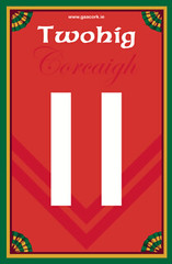
Membership news: Another new batch of card designs has been added to the membership card gallery (including Dan Twohig’s card, shown at right, which is based on the County Cork Athletic Association’s jersey). I expect to have the printed/laminated versions of these cards in the mail within a few days.
Also, in case you missed this news last week, the Membership Program will soon have a price increase, but you can still get in at the current price for another week. Details here.
Show-and-Tell update: My Show-and-Tell project, in which I invite people to bring an object of personal significance and talk about it for up to three minutes, has a new (and, I hope, permanent) home: the back room at Freddy’s Bar in the South Slope. Show-and-Tell will make its Freddy’s debut on Aug. 22 at 8pm; after that, we’ll be showing and telling on the second Wednesday of each month. I’m psyched about this — the back room is the perfect size for what I’m doing, and Freddy’s has an eclectic crowd of regulars who should bring some excellent new energy to the project, so come check it out. And if you want to join the Show-and-Tell mailing list, just say the word.
Uni Watch News Ticker: More Olympics fun: Remember that parody logo that spells out “Shit,” which I used for Friday’s post? A Denver TV station “mistakenly” ran that logo on the air the other day. Hmmmm. ”¦ Meanwhile, the parade of organizational miscues in London continues to provide one fiasco after another. It’s like the whole thing is a series of outtakes from In the Loop. ”¦ But don’t worry — the USA’s uniforms will be made in America after all — for 2014, that is. ”¦ In non-farcical Olympics news — yes, such a category still exists, if just barely — here’s a good piece on how the Olympic rings were devised. ”¦ We’ve heard this before, but the Dolphins are considering a logo update for 2013. ”¦ New throwback caps for the NFL. Basic sideline caps, too. ”¦ New kit for Kaizer Chiefs FC (from Leo Thornton). … Here’s something I’ve never seen before: a blue Red Wings jersey. Just fashion merch, obviously, but still (from Gregory Mitchell). … Here’s a look back at the Predators’ yellow jerseys after one year (from Dirk Hoag). … Ladies and gentlemen, your New York football Rangers! “That was found on the street in Cambodia,” says Alan Kreit. … New kits for Rayados del Monterrey (from Carlos Garza). … What’s even better than baseball bat groundbreaking shovels? Hockey stick groundbreakings shovels (from John Muir). … New uniforms for the Pensacola Ice Flyers. “A big improvement,” says Ryan Bohannon. … I’ll say this much for the USA’s Olympic cycling uniforms: Nobody will be confused about which country they’re representing. … No change for Liverpool’s badge (from Anthony Nuccio). … The Columbus Clippers will mark the city of Columbus’s bicentennial by wearing jerseys with the Columbus skyline on the front and the number 200 on the back (from Jeff Emhuff). … We’ve talked about how Reds players sometimes wore red shoes in the mid-1970s All-Star Games. But check out these shots of Don Gullett and Dave Concepcion. Those are both from 1970 or ’71, and they’re not from All-Star Games (I’ll spare you the details, but a variety of factors rule out the ASG factor). The color shot is from an ad, and Ricko thinks it was staged, although it’s still odd that Concepcion would’ve had red shoes on hand. The black-and-white shot of Gullet is definitely a game shot, and I suppose his cleats could be black, although I think they look red. Either way, the Reds didn’t wear shoe stipes in those days, so it’s all very odd (thanks to Brice Wallace for his help on this one) ”¦ College hoops! Remember that? Here’s a reminder: New uniforms for Portland (from Travis McGuire). … The Nats usually wear blue batting helmets on the road, but they wore their red home helmets over the weekend, even though they were wearing the blue road caps in the field. Apparently it was one of those “What the hell, let’s see how this looks” kinda things (screen shot by Doug Robb, tweet link from William Yurasko). … Very nice slideshow of the 1950s Vancouver Mounties (from Marc Viquez). … Clint Barmes was using rookie Jordy Mercer’s bat in the 8th inning of Friday night’s game. “Interesting that the veteran is using the rookie’s bat and not the other way around,” says Brian Skokowski. “Anyway, it didn’t help. Barmes struck out.” … Bobcats rookie Michael Kidd-Gilchrist will apparently be going with a double-decker hyphenated NOB! Yowza (from Robert Silverman). … The St. Kilda Saints are raffling off a corporate jersey sponsorship (from Leo Strawn). … New cleats for Notre Dame football (from Warren Junium). … Most improbable logo rip-off of recent times: A Canadian junior lacrosse tournament has poached its design from the Golden State Warriors (from John Muir). … Guess what some group of lunatic Christian wackos and I have in common? We both hate Nike (from Zach Brady). ”¦ “There’s a new Brewers-themed Miller lite ad in rotation on Wisconsin TV,” says Geoff Poole. “Apparently they didn’t have permission to use the MLB logo.” ”¦ Can anyone explain why A’s pitcher Travis Blackley needed to wear — or, rather, not wear — two pairs of sunglasses on Saturday? (As noted by Domenico Delgado.) ”¦ Very odd NOB for Astros pitcher Enerio Del Rosario (from David Taub). ”¦ You know those old NFL Chiquita Banana stickers that Brinke has often featured in Collector’s Corner? Got a note over the weekend from G.D. Tarver, who fondly recalled those stickers and added, “It seemed like I ate 500 bananas that year until I collected every NFL helmet sticker.” ”¦ Heavyweight fighter Dereck Chisora, who was knocked out by David Haye on Saturday night, entered the ring wearing a seriously weird outfit. The pattern on the robe was repeated on his trunks. ”¦ UMass football is apparently going BFBS. Sigh. … Marty Hick has a doozy of a DIY project up his sleeve, which I’ll be telling you about later this week. For now, though, there’s this: Marty’s nephew Brendan just turned five years old, so Marty made him a pair of Yankees jersey cakes. The label is a particularly nice touch, no? ”¦ Everyone’s going bonkers over this liquid chrome Auburn helmet, but I’m fairly certain it’ll never make it onto the field. ”¦ Good infographic on pro football in Ohio (from Tony Crespo). ”¦ “I was watching an old episode from one of my favorite shows, Psych, and Inoticed that one of the main characters had a Nike logo blocked out while the other one did not,” notes James Connolly. ”¦ Warner Bailey had the opportunity to spend Sunday’s NASCAR race in the pits and noticed that driver Kasey Kahne has a little four-leaf clover sticker inside his car.
Guess what some group of lunatic Christian wackos and I have in common? We both hate Nike (from Zach Brady)
That link is only one or two steps away from being on par with the Time Cube site.
Also, there’s no link for the Predators’ yellow jerseys and the New York Football Rangers link gives me a 404.
Also, there’s no link for the Predators’ yellow jerseys and the New York Football Rangers link gives me a 404.
Now fixed.
“When I checked the Nike stock, I noticed that Nike Stock went down dramatically at the time I sent out emails… and it kept going down… and down!
I thanked God and then called up Adidas to tell them the great news!”
~~~
hallelujah
I’m thinking the creator of this website needs to have a bran muffin or something and just relax. Wow…I’m also thinking this is a commercial plea since he claims to be working with adidas to produce his own line of shoes.
I think he knows exactly what he’s doing. That whole site is too….something to be serious. It’s a very calculated bit of insane rambling.
Like I said above, he’s just a step or two away from link
As a Christian it’s way easier to love people who are absolutely opposed to my faith then nut jobs who proclaim stupid crap like that! Get a life anti-Nike Christian crusader! And stop giving the rest of us Christians a bad name.
If I die, and Jesus greets me wearing a pair of Air Jordans, I’ll be sort of surprised.
But if he looks like that insane dude, waving a hammer and grinning maniacally, well, I’ll be really disappointed.
But he didn’t tell me how I should feel about Converse Chuck Taylors.
I’m pretty sure Nike bought out Converse for the sole purpose of selling Chucks.
I could be wrong.
The Anti-Nike and Timecube sites are what happens when the guy living in the dumpster discovers he’s in a Wi-Fi hotspot.
UMass basketball did the BFBS during the Calipari era, but I think the team abandoned those jerseys after losing while wearing them.
Not exactly BFBS for UMass. They’ve used black as an accent color since the 90s. I think they jumped on the alternate jersey bandwagon and black came up. So not QUITE BFBS but close.
Good chance that the Nats will be wearing the red helmets today, too. “Let’s see how it looks?” It looks fantastic. Hopefully this is a step toward dropping the navy road cap entirely. That, and a switch to headspoon piping and the Nats would pretty much perfect their road unis.
If the Nationals settle upon a look that apes the St. Louis Cardinals, circa 1985, then I guess that’s a unique look. I wish more teams wouldn’t put white outlines around the colorful graphics of their road uniform (Detroit, Washington, Texas, Angels)
Wouldn’t it be better for the 2012 Nats to resemble the 1985 Cards instead of the 2012 Cards with their navy-hats-on-the-road thing? Besides, it’s not like the Cardinals invented the concept of wearing red caps on the road!
But too right about the white outlines on gray. It’s necessary or useful precisely zero percent of the time. Seems like that’s become sort of default treatment for new road-gray insignia, alas.
I think the usage of the white outlines on gray uniforms is meant to convey the idea that gray is neutral and not to be considered an actual team color. For example, the Yankees consider themselves to be Navy & White, so they wear Navy & White on their gray uniform. The same general idea applies to BFBS jerseys and is why most black jerseys that we see are based on the team’s gray/road jersey rather than the home uniform.
Historically, the addition of a bit of white was to brighten the unis a bit on black and white TV, when that and how a uni looked from the stands were the primary concerns.
That said, I don’t think it’s the reason anymore. I think now added white and lots of other bits of filigree are about how the unis look up close…on TV, in photos and mostly how they look hanging on a retail rack. The more there is on the uni—the more ornate and elaborate it is—the more it appears to be “worth the money.”
The more I look at every new Marlins’ jersey but the white one, the more they look like shirts with glittery 1970s iron-ons. When some people say “ornate”, I think “stuck-on”.
Dude! That’s what the Marlins need… Glitter! Yes! Make it so, Miami.
The “M” on their hats should have lights.
Exactly. The white outline on gray makes it look like a bad iron-on transfer to me. Note also how for most teams that do this to their road grays, the “replica” jerseys have a much thicker white outline than the “authentic” jerseys. Which nicely reinforces the message that white outline = shoddy.
If a team has “traditional” (read: dull) graphics, like the Yankees and Royals, then they could stand a little pepping up with white outlines against the grey. Teams with splashy colors don’t need that kind of goosing.
Nah, the Dodgers’ roads look much better now without the white outline.
Re: white outlines on grays
I remember when the Dodgers’ grays had a white border for the word mark. Didn’t balance with the plain red front number at all. In that case, addition by subtraction. Royals’ white works great on their grays. Yankees: it would work, but I just really dislike the sleeve stripes. Those need to go. Tigers: navy and orange is enough. The white is unnecessary.
I think the usage of the white outlines on gray uniforms is meant to convey the idea that gray is neutral and not to be considered an actual team color. For example, the Yankees consider themselves to be Navy & White, so they wear Navy & White on their gray uniform. The same general idea applies to BFBS jerseys and is why most black jerseys that we see are based on the team’s gray/road jersey rather than the home uniform.
I think you’re wrong on that, and would love to get any confirmation from the team that such considerations went into either the Yankees’ 1970s road uniforms or any of the BFBS teams.
Dodgers’ roadies look fine; the white outline isn’t required, it’s just an option in the team’s palette. IIRC, the Yankees made a prototype of their 1971 grey uniforms with the 1972 polyester fabric and found it underwhelming, thus the white trim and sleeve braids.
Don’t think that’s a sticker. It looks like a real clover taped to the dash.
there’s no link for the monterrey ticker item.
Thanks — now fixed. Here’s the link:
link
link
I dun care none for the cycle, but those USA unis look migh-tee purdy.
Whoop, that there was ‘posed to be a separate comment. Sorry there, Mr. Simply Moono. Your post, however, provided many chuckles for a brief, but pleasurable, amount of time.
Paul, the NASCAR race was the Lenox Industrial Tools 301.
I noticed something odd on the Smithsonian Brewers jersey. If you look at the uni numbers on the jersey and the Aaron photo you will notice that they are in different fonts. In looking at baseball cards from 75-76 the fonts did not change.
The lettering is different too.
That’s how we knew it was a McAuliffe jersey. The “4” isn’t terribly distinctive, but that’s their proprietary font (think Red Sox).
Full disclosure: I helped Henderson with the Brewers section, including that particular item. The Smithsonian bills it as having been donated by Aaron himself, which makes it doubly interesting.
I was literally going to post this week that we were due for a new Henderson. Loving the new features and updates. I’m hoping someone takes a cue and publishes something similar for the other major sports soon. Maybe hockey since the ’67 expansion, NBA since The ABA debut and NFL since 1960. The Grid Iron Database is certainly a step in the right direction
Good to see that while Brandon was given two Yankee-themed jersey birthday cakes, he was wearing a STL Cardinals t-shirt.
Yeah, kind of a kick in the nuts to dad’s efforts. But then again, I had about 10 different teams when I was his age
He’s my nephew.
Neither one of us likes the Yankees.
I’ts all about the age and the number. Joey D just happens to be the greatest #5 of all time.
“Neither one of us likes the Yankees”
~~~
joey d?
/fuckin’ spammer ;)
Tis true
Broke my own rule
Del Rosario clearly plays for the Astros, not the D-Backs
Right. Brain cramp on my part. Now fixed.
On the subject of that jersey, the closest to a rational explanation I can come up with is that the person who stitched the nameplate had it in their head that his name was De La Rosario, for a moment, got as far as “DeL,” checked and noticed that they had it wrong, and just went with the right spelling from there, without thinking “Hey, maybe I should go back and change that “L.”
In response to James Connolly’s post about the blacked out swoosh on Psych: as I recall, the swoosh was blacked out in that scene, but it wasn’t blacked out when he was wearing the jersey in another scene. Weird.
“…lunatic Christian wackos…”? They hate Nike, so they sound perfectly reasonable to me. That is sound logic.
– “Nike began with Satan and is demonic.”
– “Will Tim Tebow lie to you?”
– “Kevin Durant gets paid to insult God”
These are all reasonable to me, just give them a chance. They said Galileo was a nut too.
“THE PAGAN GODDESS OF VICTORY… the demonic goddess Nike that Almighty God hates!”
God + hating Nike = sign me up!
You’re kidding right?
Hate nike all you want, but they don’t even pronounce the word ‘nike’ right.
AND ‘nike’was just the greek word for victory before they gave it a personification as a goddess.
AND that website claims that 2 Timothy is the born again Timothy and that 1 Timothy isn’t born again. The problem there is that they’re the same person writing two different letters and both would view themselves as Catholics.
AND if we’re going to make wild assumptions about things based on their Greek names, Timothy comes from the ancient Greek “Time” and “Theos” meaning “Honor” “God” and if he name is Greek and he lived in ancient times, his name must refer to a pagan god, therefore you can’t use 2 Timothy as evidence against the Satanist Nike.
AND if you’re going to claim that honoring nike with a rebuilt temple in Greece led to their economic downfall, how do you explain all the good Christians who live in Italy or Ireland who also have sever economic depression. How do you explain economic depression in the American south? Lots of devoted born again Christians down there – and certainly no temples to Greek gods – so why would god punish them too?
AND you don’t have a problem with adidas even though they were – for a time – members of the Nazi party in Germany, but nike names their company after a 3,000 year old word for victory and their the ones you go after? Really?
AND Nike has a shoe named Darwin, which could only be named after the evolution guy since no one else ever was named Darwin link
AND just because you’re too stupid to understand evolution doesn’t mean God is too.
AND if god hates Nike so much and he’s all powerful, why do they make billions of dollars a year and still exist? Shouldn’t he get on that?
AND this bottom shirt – link – is not a clear enough spoof on Nike’s logo, you’re going to get the wrong reaction from people – in fact, the complete opposite reaction you want – if you wear that in public.
AND innocent children are suffering and dying all the time, EVERYWHERE! Don’t you have better shit to do that worry about this nonsense?
Calm down, Timmy.
Tim, the titular Timothy was the son of a Jewish mother, so the “God” that his name refers to is almost certainly the god of Abraham. The Hellenization of Jewish culture was both widespread and controversial in those days, so we can’t assume that just because a reference to God is in Greek that it must therefore refer to the Olympian pantheon. (“Jesus” is itself a bad Latin transliteration of the Greek spelling of the common Hebrew name that we normally render as “Joshua” these days. So before the guy takes his anti-Pagan crusade to Nike’s door, perhaps he ought to campaign against all the Bible publishers who refuse to call Jesus by his true name, Yeshua Ben Yosef, or Josh Josephson in modern English, and use the Pagan mis-spelling “Jesus” instead.)
But yeah, dude. That much out-of-context verse quoting takes proof-texting, which is bad enough in small doses, and raises it to the level of its own form of idolatry.
I think Josh Josephson was also an offensive lineman for Nebraska in the late 70’s.
Have you ever noticed how seriously weird most artistic depictions of Jesus are? Depending on what community is the intended audience, He is either a viking, the Brawny paper towel guy, the lead guitar player from Supertramp, or Omar Epps.
I like to think He looks a little like Dustin Hoffman, circa Marathon Man.
I think Barry Moser probably came pretty close:
link
I always imagine a young Yasir Arafat, minus the sunglasses.
link
Just having some fun. Yikes! Paul has to get around to fixing that sarcasm button.
Sorry…
But I did preface my diatribe with, “You’re kidding right?”
And to be extra clear, I’m not upset with you or the god-fearing, I’m upset with idiots who use god to further such trite, obtuse arguments that do not help improve the world.
““…lunatic Christian wackos…”? They hate Nike, so they sound perfectly reasonable to me. That is sound logic.”
~~~
there are probably two too many redundant words in quotes there
I never thought the day would come when someone would accuse Tebow of not being Christian enough. That being said, for all the dirt this nutjob has slung at Tebow and inversely some of the praise heaped on Sanchez, he seems to forget that Mark Sanchez also wears Nikes. Oh well.
The pattern on Dereck Chisora’s outfit looks like flags from around the world. Pretty cool.
It should be Don Gullett with 2 ts. Sigh… What a shame about his career.
Wasn’t it 1971 when Adidas started supplying teams with colorful 3-stripe spikes? Those pics have gotta be ads, right?
Concepcion photo is pre-71; Reds had plain sleeves til the DKs came into existance.
Could have been ’71, Reds didn’t wear the DK’s until ’72
Okonnen: link
1971 Team pic:
link
1972 Team pic: link
Better link for 1971: link
ah that’s what I meant. doubleknits started in 72 (when I moved there) and looked snazzy in the Series.
Reds didn’t go to sansablets and sleeve stripes right away. Stayed with belts and buttons for 1971.
link
And, yes, ’71 was first year of adidas team-outfitting.
Also first year of players wearing adidas if WEREN’T team issue. Richie Allen with the Dodgers, for one (his only season with them)…
link
And there were, I believe, a few players who wore adidas very, very late in the ’70 season. Individuals, not teams.
We need to get something straight.
DK does NOT mean sansabelt and/or pullovers only. It may be convenient to use it that way, but it isn’t accurate.
There were a number of teams that wore doubleknit belted pants and button up jerseys in 1971 and thereafter. I’m pretty sure most MLB teams went to doubleknit in 1971 (please note, I did not say they ALL did).
according to henderson, the reds didn’t go to DK until 1972 (in fact, he states ’72 is the year most teams made the switch)
not trying to be contrary or a dick…that’s what he says
Technically, “most” only has to be one more than half.
But I’ll absolutely bow to his expertise. He has WAY more technical knowledge than I. I go by how they looked, and how they fit the players back then. Could tell by the way tight pants fit around the knees (they were tighter and didn’t bag) and the way looser pants bloused (doubleknit didn’t blouse nearly as nicely as its precursors).
It’s just that people seem to think DK and sansabelts were synonymous. Not so. It may well be that the early DK’s were sansabelt only. Although on the face of it, that makes no sense. It’s a fabric, not a uni design/style. Absolutely no reason a pair of doubleknit baseball pants couldn’t be made with belt. And plenty eventually were.
“…couldn’t be made with belt.”
with belt LOOPS.
im sure there were others, but the mets were one team that went to doubleknits (and eventually pullovers) but always wore a belt…
so there were definitely some teams (yankees, dodgers?) who never went to the sansabelt DKs
Tigers at home.
Expos.
Here’s the skinny on that mirrored Auburn helmet from Warblogle.com.
link
please… NO!
link
THE jeff approves of these concepts
I really need to refresh the page before I post…
Man, that is one pissed-off looking dolphin, which is odd since I don’t think dolphins actually have the facial features to allow for an expression of anger in that way.
I don’t have any objection to the Dolphins making another modification though. I mean, not everyone can be the Yankees and wear the same logo for 500 years. Change is not a bad thing.
Well, the same set of inconsistent logos, anyway …
I think the dolphin is extra angry because it has CTE because it’s playing football without a helmet.
The dolphin had to take off the helmet, it couldn’t breathe with it on, it was blocking it’s blowhole.
I’d rather hold my breath than get CTE…
Like those a lot. Specially the non-white one.
Sorry to sound like a douchebag but can I please get credit for spotting Blackley’s sunglasses?
No credit for you! link
Mea culpa — will add now.
Regarding the Red shoes, I read a book called “Harry The K” about Harry Kalas. In one part, it mentioned the Phillies donning red shoes full time in 1971 after the Reds experimented with them during the playoffs in 1970, or something like that
You may have nailed it! Reds/Pirates 1970 NLCS.
Maybe the shortest-lived white whale in UW history.
this is from october 4, 1970
and this is from october 3, 1970
getty doesn’t show the reds on october 5, 1970 for certain (they show the pirates in the only DATED photo) — here is the search…
so it’s possible they wore them at home, for the third game, but none of the photos that could be from 1970 show red shoes…
reds won that series 3 games to 0, so maybe in the world series?
reds vs. orioles world series also only shows the reds in black shoes
My guess (and it’s just a guess) always has been that the Reds may have wore red shoes on Opening Day of ’71. I kept the Gullett photo from a 1972 preseason annual largely because I noticed the shoes. 1971 remains the most uni-centered MLB season that I can recall (see story beginning on thumbnail page 36)…
link
Anyway, that Opener vs. the Braves in Cincy was a day game, of course, the Gullett photo obviously is a day game…and he pitched in relief (I checked baseball-reference.com).
The Concepcion photo is from an full-page ad for the company that provided the lighting for Riverfront. It’s in my files with “1971” written on it. If the photo was shot sometime during (or just prior to) the ’71 season, the “Opening Day” theory would explain why Concepcion had the red shoes among his gear.
One HUGE thing that gets overlooked with the 1970 Reds is the fact that for the World Series, the Reds dropped the white outline on CINCINNATI on the road grays for the three games in Baltimore.
Well, so much for the Opening Day theory.
Reds, Opening Day, 1971 (assuming the photo is correctly dated)…
link
The infographic on Ohio football has a couple of issues, at first glance. The Steelers logo is based on US Steel, not Republic Steel. US Steel is headquartered in Pittsburgh.
The Canton Bulldogs and Cleveland Bulldogs are the same franchise. The team was going bankrupt and moved to Cleveland. (I live in Canton and used to work at Republic Steel, so these both caught my eye.)
another buckeye here…”the nfl’s official encyclopedic history of professional football” lists these other ohio-based football clubs (p. 15, 16, 18-23, 86-87)…
akron indians (ohio champs, 1909, still in existence at least as late as 1912, may have been two teams named indians, akron listed 1920-22 as pros, listed as indians 1923-26)
columbus tigers (although that may be a later name for the panhandles…panhandles listed 1921-22 standings, tigers listed 1923-26)
canton professionals (around 1912 or 13, named professionals “to make fans forget about the tainted past of the bulldogs”…returned to “bulldogs” nickname by at least 1916…this was after canton “quit pro football…apparently did not return for five years, until 1911”)
canton and cleveland BOTH had franchises named “bulldogs” playing in 1925…two separate teams…canton moved to cleveland in 1924, then another canton bulldogs franchise started in ’25, making 3 separate canton bulldogs teams…
according to this article it says that it was Republic Steel’s logo link
straight off the the Steelers site(as a Browns fan it pained me to go to this site)
In the 1950s, when helmet logos became popular, the Steelers added players’ numbers to either side of their gold helmets. Later that decade, the numbers were removed and in 1962, Cleveland’s Republic Steel suggested to the Steelers that they use the Steelmark as a helmet logo.
link
In case it hasn’t already been covered, the Big Sky Conference unveiled a new logo today:
link
Bill believes he may have spotted a fraudulent Brewers jersey on display at the Smithsonian.
Also, the #44 number font is incorrect. There is no serif or diagonal cut on the cross-member.
I think that’s how he spotted the fraud, at least that’s what I gathered…
That is how I read it as well, TimEO.
FYI- Chance Michaels was the one who brought this to my attention. He knows more about the Brewers than any person alive, I think.
Today the St. Paul Pioneer Press website posted a youtube video of a 1972 broadcast of a game between the Vikings and Steelers…
link
If I come across sometimes as crumugdeonly and cynical and unimpressed by contemporary football design, consider that in 1972 I was 12 and at the absolute pinnale of my sports, uniform and NFL loving obssesion. (You know what I’m talking about.) It’s what I was raised on, what I loved. Watch a few minutes of this game and notice the absence of sounds and graphics and overall visual clutter. Not the bombast and glitter and information overload of today. See jerseys with sleeves–and how good they look– and players performing at the highest level wearing them, undeterred by an opponent’s occasional yank.
Alright, you kids get back to your ballgame. I’m done gripin’. Grandpa’s gonna go take a nap and dream of huge afros rock hard Astroturf.
I’m of a similar age, and found that the glitzier and more cluttered the TV coverage got, the less interested I was.
Always loved when the CBS play by play guy cued up the commercial break by saying something like, “with the score Pittsburgh 7, Minnesota 3, let’s pause for a moment.”
Big Sky Conf has a new logo. Video attached here.
Paul Stave
Cheney WA
link
If I had the money to waste, I would start a corporation just to enter the St. Kilda contest. And if I won, I would have them leave the space on the jersey blank (no patch) or put something unrelated to my corporation (team name or something). The suits may end up hating me for it, but you know the fans would love it.
So the EWU Facebook page asked for comments on the new Big Sky logo. Here was my input:
Really who cares about a logo? What did the old one look like? Im not going to send my kid to a certain school because of a logo. But will bet some marketing hack spent hours coming up with a description of the logo: “The new Big Sky logo conveys a sense of strength, trust, boldness, sensitivity, compassion, sense of adventure, individuality, that is unique to living in BigSky Country”. Lets just play football. And quit pasting the logo everywhere. I don’t care.
Got my link on Saturday. Looks good! :)
i’m shocked…SHOCKED…that you’d have a pittsburgh-based card
;)
Well, when I had looked at the cards months ago, I noticed that all three Pittsburgh sports teams were already covered under their current design. I personally don’t like the new Steelers throwbacks, but I wanted to be different.
In case anyone is wondering, the number 20 comes from my jersey number I had when I played basketball, the only organized team sport I played in. I guess Baron Batch switched to number 20 for the Steelers this coming season after they cut Bryant McFadden. Of course, to Steeler Nation and Vietnam War veterans everywhere, number 20 will ALWAYS belong to link
i used that colour shot of concepcion on the old 1970 strat-o-matic set back n the day. i sude it for jerry may who is sliding into second as it was hard to find shots of some players pre-net. anyway, i swear i got that shot from a sports illustrated story from the 1970 nl pennant series. i could be mistaken, but i am pretty sure. the pixture i have is pretty faded and magled, but concepcion’s cleats sure do look black to me. was that perhaps colourized?
The white laces are a fairly good tipoff.
Red, blue and white adidas came from the factory with white laces.
The black ones had black laces.
The Phillies, I believe, did replace the laces with red for ’71. But the fact remains that they came out of the box with white.
Noticed this while looking through my buddy’s pictures from Saturday’s Mets game in Atlanta. First base coach Tom Goodwin doesn’t wear cleats to coach in–he wears Nike Frees. Is this a trend, or is this just something Goodwin does? I’ve never really noticed before, but I feel like most/all base coaches wear cleats?
Picture: link
In my opinion anyone involved with the game from throwing out the first ceremonial pitch to base coaches and everyone in between should be wearing cleats.
Remember when Obama did the mom jeans thing? One thing would have corrected the entire situation, if he was wearing cleats. Flat bottomed sneakers have no place on a baseball field, especially with ill fitting jeans.
Meh. Uniforms are for those involved in the game, and spikes are just for extra traction. But in the perfect world, those who eschew spikes would at least wear “baseball trainers,” i.e.: baseball cleats without spikes. You know, just to keep the image.
I’m not surprised that Goodwin wears non-spiked shoes, e.g.: sneakers in a Mets colorway, because cleated traction and comfort tend to be relatively, but not mutually, exclusive. I actually think that THAT is the general rule. Jim Leyland is an exception because he wears spikes, even though he probably doesn’t “need” them.
A lot of base coaches and managers wear trainers.
Christians hating Nike? So how come we see that Cross logo eveywhere??? Not trying to be blasphemous…just trying to make a little fun. How come they gave up on Ozzy? Is it because you cant play CDs and your iPod backwards?
RIP Kitty Wells, The Queen of Country.
Whenever I hear the words “fresh new look”, I wince! Good luck Dolphin fans.
I think they should steal the old USFL Breakers helmet and add a dolphin.
Or stick with what they’ve got.
They fixed something that wasn’t broke. I hope they clean up the 1972 design and use that as the new look; somewhat like the way Bill Parcells unretired the Jets’ Super Bowl uniforms. There’s a bit of crud in the original helmet logo, perhaps caused by using a xerox of a xerox, but that can be whited out. There was nothing wrong with it.
“I hope they clean up the 1972 design and use that as the new look”
this
Yes.
There is something very charming about the original Dolphins logo.
link
I realize charm doesn’t go very far these days, but it’s a wonderful logo. Maybe get rid of the white on the mammal…I dunno.
Well…you know what it looks like….
link
New NESN score bug:
link
I’m trying to order the CD version of the MLB Game Worn Guides, but the coupon code keeps disappearing. I tried 3 times, get a new password, but no coupon code. How can I order it with the $0 discount?
Ahem, $10 discount…
Other interesting points from that Cosell “Halftime Hghlights” segment ….
The Redskins wearing White-At-Home before they regularly began doing so in the Burgundy Pants-era ….
The Bears paying a HOME GAME at Northwestern University in the regular season Why? Were they still laying at Wrigley and bumped out by baseball? Did they regularly play at NU that year?
What! Not Saints in the Halftime Highlights? Actually, they rarely made it back then, and I would be proud and excited fir them when they actually did make it on ….
John- send me a note, link. Our website is acting up in a most unprofessional way. I will fix things. Sorry. Anyone else having this problem, please let us know. Aaargh!
I don’t know if this has been mentioned previously, but YouTube is sporting a full broadcast (in 2 parts) of the second-ever Monday Night Football game, from Sept. 28, 1970, with the Chiefs visiting the Colts.
Aside from the 2 teams involved, at the start of part 2 we get the famous MNF halftime highlights, with NFL Films footage from the previous day narrated by Howard Cosell.
link
About 3 minutes in there is footage of a Jets-Patriots game from the previous day that looks almost like they are using throwback jerseys! The unis seem almost like practice jerseys, with no striping I can see. Anyone know what might be going on there?
Plus, let it go a bit longer, and you get a Marlboro cigarette commercial that seems to be at least 90 seconds long. Unreal.
Jets had a “trim-less” white jersey they wore in preseason..and in a few regular season games.
It’s been covered and discussed here, if anyone wants to try to find it (has some details), and I know the Gridiron Uniform Database includes it.
Patriots wore jerseys with only TV numbers and a bit of trim at the sleeve ends for several seasons.
Color photo of that jersey vs. the Oilers…
link
…and the Patriots…
link
Other interesting points from that Cosell “Halftime Hghlights” segment ….
The Redskins wearing White-At-Home before they regularly began doing so in the Burgundy Pants-era ….
The Bears paying a HOME GAME at Northwestern University in the regular season! Why? Were they still playing at Wrigley and bumped out by baseball? Did they regularly play at NU that year?
What! No Saints in the Halftime Highlights? Actually, they rarely made it back then, and I would be proud and excited for them when they actually did make it on ….
in 1970, the pats had very plain jerseys
white
red
The MLB Extra Innings package doesn’t come in HD?
Nevermind, I found out the answer for my cable provider.
From Sunday: Orioles Miguel Gonzalez has misspelled jersey
link
Double ended hockey stick/shovels? Really. Did they think a hockey stick was unrecognizable without the blade? I like the idea, but they would have been just fine wrapped in tape.