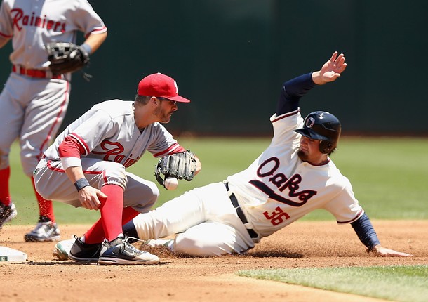
Yet another impressive MLB throwback game yesterday, as the A’s and Mariners dressed up as the Pacific Coast League’s Oakland Oaks and Seattle Rainiers, respectively. Some notes from the game:
• From what I could see, everyone on the field went high-cuffed. No stirrups, though — just socks. As several readers have immediately pointed out in the comments, the A’s were indeed wearing stirrups, but the white portion of the ’rups blended in with the white sannies. And a few Seattle players wore stirrups as well.
• Both teams went NNOB. I particularly like Seattle’s block-shadowed numbers.
• Both teams used throwback batting helmets.
• No throwback gear for the catchers. Seattle backstop Miguel Olivo wore his usual Mariners catching helmet, and all the rest of his usual gear. Ditto for Oakland catcher Derek Norris.
• The A’s wore their usual white shoes with green trim. I understand why they don’t want to get special shoes for one game, but it does detract from the throwback effect.
• At least one player made a footwear adjustment, however: Ichiro had red shoelaces!
Finally, there’s this: Ebbets Field Flannels posted a note on Facebook last night. Here’s what it said: “OK, I just looked at the hats Oakland wore today for their TBC game. Unfortunately, the Oaks never wore such a hat. ”¦ The ‘O’ should have been a simple circle. They added a goofy loop that was never there. Odd, as plenty of research exists. No doubt some genius thought they needed to tart it up a bit.”
I’m not sure who wrote this (Jerry? Scott?), but you can see what they’re talking about here. But the A’s broadcast of the game included a little bit of old Oaks footage during the pregrame segment, and one snippet of video appeared to show a cap with the loop (it was a bit clearer in the streaming video than in those screen shots I made, but you can still kinda see it). We all have our gripes with MLB and New Era, but I don’t believe they would’ve invented a cap design out of thin air just for the sake of doing so.
Uni Watch News Ticker: In yesterday’s Ticker I wondered aloud why the Rangers’ 1994 throwbacks — worn on Saturday — hadn’t included the MLB 125th-anniversary patch, which all teams wore in ’94. As several readers informed me, the Rangers only wore that patch on their road jerseys in ’94, not at home. So the throwbacks were correct in that regard, but why would the Rangers not use the patch at home? Very odd. ”¦ That strikes me as very odd — anyone know more? ”¦ More zero-centric news: Randy Miller reports that according to the book Uniform Numbers of the NFL (which for some reason I don’t have a copy of — need to rectify that), the Giants had lots of players wearing 0 back in the day, including Phil White (1925, 1927), Walt Koppisch (1926), Ox Eckhardt (1928), Danny McMullen (1929), Ted Bucklin (1931), Lee Mulleneaux (1932), Reb Russell (1933), Wee Willie Smith (1934), and Lou Eaton (1945). The book also lists Steve Bagarus wearing 00 with the Rams in 1947. Also, according to this Steelers Q&A article, Johnny Clement wore 00 (1946-48) and Jack Collins wore 0 (1952) for the Steelers. No photos for any of this, natch, and early NFL info is notoriously unreliable, so I’m still from Missouri on all of this. … This is interesting: The Red Sox normally don’t sell the seats in the centerfield “triangle” area for day games, because it would interfere with the batter’s eye. They do sell those seats for night games, however. So what happens if a night game is rained out and rescheduled for a day game? “Used to be they’d move those folks to other seats, but they can’t do that anymore because they sell out every game, so instead they give them dark T-shirts to wear,” explains Peter Greenberg. “Must be fun when it’s 92 and sunny.” … Fascinating article about the army’s use of digital camouflage. Be sure to check the last correction at the bottom of the page (thanks, Kirsten). … The Mets’ Pepsi Max Team — i.e., the bunch of 20-year-old interns who shoot T-shirts into the crowd and will then list that on their résumés to get really annoying jobs as publicists for even more annoying corporate clients — will just be the Pepsi Team next year. New uniforms, too. “I got that from an inside source at Pepsi,” says Anthony Verna. ”¦ Roger Federer was wearing a black undershirt beneath his polo shirt for part of yesterday’s Wimbledon final. “First time I’ve seen that,” says Brinke. ”¦ Really great story about a guy who’s trying to get autographed cards for every card in the 1983 Fleer baseball set. Additional info here (from Gordon Blau). ”¦ Whoa, check out the crazy-ass football field design being used by Lindenwood University (from Justin Merriman). ”¦ Latest soccer team to let fans pay to have their names on the club’s jersey: an Italian Seria A club, Parma (from Joseph Nguyen). ”¦ Two great things in this photo: First, that’s the best view I’ve ever seen of the White Sox’s 1968 stirrups. Plus it provides a decent, if not ideal, view of the Illinois 150th-anniversary patch that the Chisox and Cubs both wore that year (thanks, Ricko). ”¦ Tyler Kepner is covering the All-Star Game in KC, where he saw this display showing various Royals prototype logos that were proposed prior to the team’s launch. ”¦ Pretty lame-o batting helmet design they came up with for the Futures Game. Also, note that Royals prospect Wil Myers bats bare-handed (from Blake Parker). ”¦ Shout-out to reader Tarun Sharm, who said hello to me and Phil at yesterday’s Mets/Cubs game. If today’s Ticker seems shorter than usual for a Monday, that’s because I ran Tickers on Saturday and Sunday. If you didn’t read the site over the weekend, go back to those entries to see all the Tickerage that you missed.
The lead photo shows a Seattle player wearing stirrups. Or it appears to be. Look at his left heel.
I believe that is the white trim on the heel and tongue of his shoe, not an undersock.Oh, his LEFT heel (I was looking at the right heel) — hey, I think you’re right!
Actually Paul, look closely at the first picture you linked too, particularly the leg on our right. The A’s are wearing stirrups, the white portion just blends in with the sannies.
Yea youre right too. The pitcher semms to have white bottomed rups with white sanis.
Good catch. I’ve updated the text.
Two great things in this photo: First, that’s the best view I’ve ever seen of the White Sox’s 1968 stirrups. Plus it provides a decent, if not ideal, view of the Illinois 150th-anniversary patch that the Chisox and Cubs both wore that year (thanks, Ricko)
There’s no picture link there, yo.
Thanks — now fixed. Here’s the photo:
link
. … Two great things in this photo: First, that’s the best view I’ve ever seen of the White Sox’s 1968 stirrups. Plus it provides a decent, if not ideal, view of the Illinois 150th-anniversary patch that the Chisox and Cubs both wore that year (thanks, Ricko)
^^^^^^^^^^^^^^^^^^^^^^^^^^^^^^^^^^^^^^^^^^^^^^^^^^^^^^^^
no link/photo is showing
See previous comment.
My all-time favorite Chisox hose were the ones they wore in 1969 and 1970 that resembled the Toronto Maple Leafs’ hockey hose. Go Leafs Go!
In addition to the great throwbacks, that was one of the rare times when both teams used superior nicknames than what they actually call themselves. A shame the PCL couldn’t be integrated into the big leagues – it had consistently the best team nicknames it the game prior to 1957.
Eh… I’ll give you Oaks being better than A’s or Athletics, but I’m not so sure about Rainiers. It’s a single mountain, not a mountain range like the Rocky Mountains/Rockies. Calling them the Rainiers is almost like calling a band the Lone Rangers.
Well, there’s three of you. You’re not exactly lone. Shouldn’t you be the Three Rangers?
I like Rainiers, but that friggin’ mountain only appears twice a month to the citizenry of Seattle. Otherwise, it’s hidden by clouds.
Could be they were the Rainiers. Now THAT would make sense.
The Hollywood Stars’ use of the uni number inside a star on the back of jerseys was unique. I loved that look.
Question. Were the Rainiers owned by the brewery, perhaps?
link
Ah-ha!
The Seattle Rainiers, originally named the Seattle Indians and also known as the Seattle Angels, were a minor league baseball team in Seattle, Washington, that played in the Pacific Coast League from 1903 to 1906 and 1919 to 1968. They were initially named for the indigenous Native American population of the Pacific Northwest, and changed their name after being acquired by the Rainier Brewing Company, which was in turn named for nearby Mount Rainier.
Reminds me of the old story of the Cardinals naming of Busch Stadium…MLB wouldn’t allow beer sponsors to name ballparks as Gussie Busch wanted to rename Sportsmans’ Park in St Louis “Budweiser Stadium”. So he named the ballpark Busch Stadium after his last name.
A few months after the rename the brewery introduced Busch Beer.
“In addition to the great throwbacks, that was one of the rare times when both teams used superior nicknames than what they actually call themselves. A shame the PCL couldn’t be integrated into the big leagues — it had consistently the best team nicknames it the game prior to 1957.”
Absolutely. I often wonder (looking backward) how much money MLB could have made (in the long run) had the offered, say, eight PCL teams the opportunity to become the third major league by coughing up some money in 1956 or ’57. Y’know, expand with a whole new group of teams the way the NHL did a decade later. The advent of TV sure should have made them think about it.
O’Malley and Stoneham made money by moving to the West Coast. But maybe they ALL could have cleaned up.
People today don’t get how big the PCL was. Given the time difference and limited communication of the day, the West Coast almost was a sports nation unto itself, especially when it came to baseball. And in some cases, PCL teams paid players comparably to players in the Majors. If you dig into the history of some of those teams, their followings were huge (research the Hollywood Stars sometime; in the 40s and 50s their games were among the places to see and be seen in L.A. with celebrities all over the place).
So I’m with Scott. I’d love it if the San Francisco Seals, for example, were an MLB team. The Giants, of course, likely would have moved to Minneapolis as originally planned so it certainly would have changed a lot of what’s happened the past 55 years.
Ricko-
The other two AAA minor leagues, my beloved International League and the American Association had some equally enduring nicknames as well and some of them are being used in the Major Leagues today.
The IL had the Baltimore Orioles which was carried on in 1954 when the Browns moved to Crabtown (Oh my, just think-both the AL Browns and the NFL Browns moved to Balto. Imagine if both wanted to keep the Browns sobiquet. Mind-boggling) Then there’s the Miami Marlins, which the NL team became this year. Some other IL classics were the Toronto Maple Leafs (which the ball club had been using for almost 40 years before the hockey team). The Montreal Royals were named after Mount Royal which in French is Mont Real. Buffalo was and is the Bisons. Havana was the Sugar Kings, just to name a few.
The AA had the Milwaukee Brewers which the MLB team uses. The Minneapolis Millers, the St. Paul Saints, the Toledo Mud Hens and the Louisville Colonels all used names with local color involved.
So lets show the other two league’s nicknames some respect too.
Wasn’t slighting the International League or the American Association at all.
Just sometimes wonder how a “West Coast gang expansion” in the mid-50s might have changed the landscape of MLB.
Then again, I also sometimes wonder had Castro not come to power in Cuba and the country stayed a free enterprise economy (relatively speaking, of course), whether Havana might not have had an MLB team for many years now. Cuz ya gotta love “Havana Sugar Kings”. One of the great team names in baseball, majors OR minors. And we know how much Cuba loves baseball. Maybe they’d have come in with the Expos, two international franchises added at same time?
Just fun to think about.
Next to the Toledo Mud Hens…. Havana Sugar Kings is probably the coolest and most unique name in all of sports. Can you even imagine Havana being a stop for MLB teams during the late 50s early 60s without Castro!! Talk about the crazy late nights!!!!!!!!!
ricko,
i can basically guarantee you that stoneham or o’malley or both would have had farm teams in cuba in the early 60’s had not castro come to power
and we’d almost certainly have had a havana team by 69
There were a number of PCL players who were MLB caliber, but turned down the offer. For them, the PCL offered equal or higher pay, less travel, and better climate.
Yup. ‘Tis true.
Ricko, if I were commish, two things I’d do on my first day:
1. Pickoff attempts by the pitcher would count as balls 1-3, though never ball 4; and
2. Baseball would be realigned into 3 leagues with 2 5-team divisions each. Original AL and NL teams would mostly stay in the AL and NL; the new United League or whatever would consist mainly of post-1960 expansion clubs. No wild cards; the playoffs would consist of the winners of each league’s divisions playing for their league pennant. The champion of the league that currently holds the World Series title goes straight to the World Series, and the other two league champions play a Challenger Series for the right to play in the World Series. All postseason series are 7 games. Timing of the various League and Challenger series would be offset so that the team representing the current World Series title-holding league doesn’t have a significant rest advantage.
Bonus: A 3-league structure would make it impossible for the All-Star Game to determine World Series home-field advantage. Since I seem to be the only person in the world whose name doesn’t rhyme with “crud Zelig” who likes the ASG determining WS home-field, this should be a big selling point.
Aside from instantly gaining a nationwide presence that it took the bigs two decades to achieve incrementally, PCL integration would have offered MLB a chance to break the two-league structure that it has spent the last 30 years chafing against.
The champion of the league that currently holds the World Series title goes straight to the World Series, and the other two league champions play a Challenger Series for the right to play in the World Series.
How in the blue hell is that fair? So, the Yankees win the WS, then totally BOMB the next year and the Red Sox get to advance automatically while the Giants and Marlins have to play each other to advance? Bullshit.
I’m not sure exactly how a 3 league system should work, but that sure as heck isn’t it.
Jeff, it’s no more fair than the team with the winning record being given home-field advantage. You win 96 games in order to get to the playoffs; giving that team an actual material advantage over its 92-game-winning opponents in the playoffs is gratuitous and unfair. It’s putting your thumb on the scale in order to help one team win, and in this case the team that least needs the help.
The point isn’t that it’s perfectly fair – it’s not! – the point is that as a matter of arithmetic and logistics, someone has to have home-field advantage. Or, in this case, with three leagues, you either go to an un-American round-robin format, or you give one league champion a bye somewhere in the process.
Further, I think there’s a case to be made that the system I propose would give fans stronger rooting investment in the playoffs even when their own team has been eliminated. Say the Phillies and Nats both wind up in the NL under my fanciful system, and the Phillies advance to the World Series. Against the Yankees. Now, normally I hate both the Phillies and the Yankees with the burning heat of ten thousand suns, and I wouldn’t even watch a Yanks-Phils World Series. But as long as the Nats have a chance to make the playoffs next year, I’d have to suspend my Philliephobia and root for the Fightins’, since their victory could redound to the Nats’ advantage next year.
Not to mention, why the hell should excellence and achievement be rewarded, and people be forced to accept and deal with the fact that their team didn’t finish first?
I mean, it’s downright un-American not to build in some kind of “do-over.”
Well, at least you admit it’s not fair…
I’m still trying to work out details in my head, but I’m thinking you’d need some sort of wild card/playoff system to give you an even number of teams competing at the end, but I’m not sure how to do that in a way that doesn’t leave the possibility of 2 teams from the same league surviving.
Maybe a relegation system where you have 2 “major” leagues that play for the championship and the 3rd league as a step down? The best team from league 3 moves up into the big 2 and the worst team from the AL/NL moves down each year? I dunno… I suppose there’s probably a good reason that a 3 league alignment never happened.
How ’bout the three champions and the second place team with the best record in a four-team playoff?
That second-place plays the champion with best record. I’m tempted to say “unless they’re in the same division.” But, damn, a first-round playoff between division rivals could be something.
Ricko, is that supposed to be a defense of giving the team with the better record home-field advantage? If so, two things.
1. Excellence and achievement are rewarded by being in the playoffs. Favoring one team over the other with home-field advantage is above and beyond.
2. Any principled defense of favoring the “better” team with home-field advantage would also of necessity require the NFL to do away with the randomized coin-toss and instead just let the team with the better record choose whether to kick or receive at the start of each game.
Further, if “fairness” requires us to reward the more successful team with the material advantage of home-field advantage, then how is it not a moral obscenity that we perversely reward failure by giving the worst teams the best draft picks? If “fairness” means helping the best teams to win, then the winningest teams absolutely must be given first pick in the draft.
Personally, I prefer randomized assignment of material advantages. (Coin toss = good!) Failing that, I’m happy with arbitrary assignment of material advantages. (AL homefield in odd years, NL in even years = good!) I can live with assigning material advantages based on record as a practical solution, because ultimately any such assignment has a high level of arbitrariness to it. (For example, why base the assignment on regular-season record, when the less-winning team might have swept its prior playoff series commandingly while the more-winning team went the distance and just barely eked out a win? Which is to say, even the definition of “better record” is necessarily arbitrary.) What I object to is insisting that there’s a principle of “fairness” at stake when what we’re really talking about is putting our thumbs on the scale and making one team more likely to win than the other. That’s the opposite of actual real-world fairness, so any attempt to construct a principle around it will necessarily produce perverse results such as declaring coin tosses and loser-picks-first draft structures “unfair.”
Nope, was talking about having to find ways to get more teams in the playoffs…for the sake of getting them into the playoffs. Y’know, tiers, etc.
Wasn’t getting into the particulars at all.
As to adding a second place team (in a later comment), that’s just addresses the mathematical simplicity of having an even number of teams.
My preferred realignment would be to create:
* An eight-team Pacific League out of the current Pacific & Mountain Time Zone teams
* A six-team Southern League (Atlanta, Houston, Miami, Tampa Bay, Texas, Washington)
The National and American Leagues would then consist of the remaining sixteen NE and Midwestern teams (one AL team would have to switch leagues–probably the Jays).
With four leagues, it’d be relatively easy to set up a logical playoff system.
Six teams is not a worthwhile league. If you really want to try to divide it up that way (though I’m not sure why 4 leagues is better than 2 2-division leagues) then you need to add 2 teams and make it a total of 32 teams. At least then you hypothetically have four 8-team leagues so everyone is equal.
Arr Scott-
Your three leagues would go something like this:
American League East American League West
Yankees White Sox
Red Sox Athletics
Orioles Twins
Indians Angels
Tigers Rangers
National League East National League West
Phillies Dodgers
Pirates Giants
Mets Astros
Braves Cardinals
Cubs Reds
“United League” East “United League” West
Blue Jays Padres
Nationals Diamondbacks
Marlins Rockies
Rays Mariners
Brewers Royals
Terry, I think you’ve got the Cubs and Reds transposed.
Let’s get rid of Tampa Bay and Arizona and go back to two 14-team leagues, each with two 7-team divisions. The division winners play off in a best-of-7 and the winners meet in the World Series. A 154-game sked for the regular season, which starts no earlier than April 15 and ends no later than October 20.
At least two games in every postseason series must start in the daytime or twilight.
The DH is abolished.
Teams can have no more than two home and two road uniforms and wear throwbacks just once a year. Stirrups or socks showing would be mandatory.
Cats and dogs living together.
if I were commish, two things I’d do on my first day
1. I don’t think so. How about giving something back to the pitcher like increasing the strike zone, raising the mound & the seams on the ball? Everything is way too titled towards the hitters as it is.
2. I don’t think so. Divisions are a fallacy & there is no guarantee that the best teams would make the playoffs. There is no such thing as geographical balance. If the best teams are all on the East Coast, so be it. The smaller the divisions, the worse it is.
I don’t like the idea of automatic slots. It makes no sense.
Bonus: I don’t think so. Don’t make an exhibition game that’s extremely flawed in the first place decide home field advantage. You give the advancing playoff team with the best regular season record home field advantage.
If they ever built a statue at a ballpark I’d bring my hacksaw.
I like the cut of your jib, Geeman.
Let’s not get rid of Tampa Bay or the D’backs.
Lets get rid of Cleveland and Pittsburgh instead.
Or how about Oakland and Miami? So what that they have a new stadium?
WE MUST GET THE LEAGUES DOWN TO 14 TEAMS!!!!!!
Sheesh………..
“If the best teams are all on the East Coast, so be it.”
~~~
wait, what?
the flyover cities would never stand for such preposterousness
why, the next thing you know, they’ll be complaining about an east coast (or worse, new york bias) on sportSCenter (where you need to have every team look different in case you happen to catch a 2 second highlight while you’re on the treadmill at the gym)
next thing you know, the yankees and red sox will be on SNB every week
I wouldn’t mind contracting the Marlins, DW. There’s nothing good about them. The trick is a 2nd team and it should be a 1990s expansion team. Hell-o… Diamondbacks.
If a neater schedule isn’t the only benefit, it’s getting some of this AAAA-talent/crud out of MLB parks. Less is more, fewer players, better baseball, better value. Creed was the only thing behind pointless expansion, not the betterment of the game.
wait, what?
Hmmm, maybe a better choice of words should been “if they all come from the same time zone / region, so be it”.
It’s not like it’s constant every single year & it’s not like it’s some NCAA tourney where you break it up by west, east, north, south. 2/3rds of MLB teams are east of the Mississippi River. Unlike Selig who only wants the biggest of big markets in the World Series for advertising dollars, I want parity for the good of the sport. Selig would rather saw off his own right arm than have a Tampa/Pittsburgh World Series. He’s all about New York / Boston / Philly / NL Chicago / LA&Anaheim / SF where the biggest markets with the biggest payrolls, wallets & advertising power. MONEY!
“Creed was the only thing behind pointless expansion”
~~~
huh?
this or this?
this or this?
Absolutely neither. Especially that douche band with the drunk lead singer.
link Creed!
Man they should had ended that show when Carell left. Oh well. Keeping it going was a last-place idea by a last-place network.
How about giving something back to the pitcher like increasing the strike zone, raising the mound & the seams on the ball? Everything is way too titled towards the hitters as it is.
Wait…what?
Have you lost track of how many no-hitters and near no-hitters have been thrown lately? Now if you mean “increasing” the strike zone back to the proper letters-to-knees zone, I’m all for that. Otherwise, things are a bit more balanced in this “post-steroid” era.
You want to give something back…teach more of them to throw a knuckler so they won’t wear out their arms.
1993-03 has left a bitter taste in my mouth, Jim. It just obliterated the record book to the point that records are a mockery. Bonds ruined what was the most hallowed sports record there was. And he did it all because of his ego & what MLB did to his father, and he know it & has zero regrets. He knows exactly what he did.
Food for thought, Jim: many of those pitching records were done in bigger ballparks, bigger strike zones, seams on the ball, a much higher mound until ’69 & a 4-man rotation & pre-setup & closer era. We will probably never see a 300-game winner ever again. Today hitters are smashing a cue ball with maple bats in bandbox stadiums, shoebox sized strike zones, glorified long ball culture, and pitchers are getting knocked down literally with rockets. There’s still way too much tilted towards the hitters. Until R.A. Dickey came along & Tim Wakefield, I thought (and still think) the knuckleball is an endangered species going the way of the dodo bird & will not survive with today’s gym rat hitters.
Could you imagine how many more no-hitters & perfect games are being denied because of the current era? It’s not like there’s such a thing of too many of them.
Concealed:
Why does it have to be one of the 1990s teams?
Why not Oakland? They have been at the bottom or near the bottom in attendance for years.
I can’t remember the last time I saw the A’s on TV.
Why does it have to be one of the 1990s teams?
Because I’ll take history over 1990s expansion teams any day. Miami is not a good baseball town. Personally I’d move the A’s to Phoenix to take the Diamondbacks spot. Not really a fan of Denver & its thin air but they support the team & I’d keep Tampa just to spite Selig.
A closer look at the Rainier script across the front of the jersey gives me the impression the Mariners rejiggered their lettering in 1977 to closer resemble the old team. If you’ve seen various preseason images of the 1977 Mariners, a few of their jerseys had the “Mariners” in a radial arch, but when the team hit the astroturf, the lettering had been condensed and rendered in a vertical arch.
I’m not sure if this has been mentioned on the site.
Yesterday, during the Mets/Cubs game, home plate ump Doug Eddings was wearing his uni number, 88, on his throat guard.
I’m still looking for a picture.
wil Myers also wore Stirrups during the futures game do not know if this is a trend for all bios games but lets hope so
In the picture of the helmets, is Jemile Weeks losing the swoosh on his left foot? What’s going on there?
I’ve heard of “running out of your shoes,” but “running out of the logo on the shoes,” haven’t heard of that.
Same link, look at the shadow the raised stitch “R” is casting on Kevin Millwood’s cap. Wonder what the stitch count is on those caps?
How many “z’s” in bazillion?
Here is the best view i have found of that patch link
I think the folks at Ebbets Field Flannels meant the Oaks never wore the O with the flourish with that particular uniform.
Oaks did wear a script O (and Ebbets obviously knows they did), but it was later, when their unis were royal and white. Hard to tell from the b&w footage, but that be from the royal and white era?
link
Note the white squatchee (which was on the royal and white cap)…
link
Besides, it’s been my experience that if I had to bet on Ebbets Field Flannels or MLB getting something right regarding minor leagues unis, my money would be Ebbets.
sure, but expect rude and defensive facebooking from ebbets almost everytime. i hear they are good guys but man their tone on facebook is downright obnoxious.
Isn’t that just Facebook?
I’ve found the guys at Ebbets Field to be pretty responsive to the research of others. Hey, think we can get them to make a 1957 Bluefield Dodgers cap? ;)
Tigers prospect Nick Castellanos bats bare-handed, and he cranked a 3-run blast in yesterdays Future’s Game, winning MVP honors.
link
This scourge on our great nation – i.e., multi-colored football fields – really needs to find a way to die a fiery death. And I’m not even a Boise hater. The blue field, while cheesy, I can accept. But this garbage of fields having alternating color patterns? For the love of all that’s holy, make it stop…
Second. This candy cane of a field is just stupid squared.
….find a way to die a fiery death.
It’s the “find a way” part I love in this phrase.
Would have been been better if it was just plain red. The red and gray alternating is too much.
Also, “EnviroTurf?”
That’s just Orwellian double-speak, unless they figured out a way not to make that stuff from plastic and rubber. Are they claiming it’s made from recycled water bottles now?
I think they’ll get rid of it the first time their quarterback throws 4 interceptions in a game because he can’t find his red and grey clad receivers running around on that thing.
“multi-colored football fields”
~~~
dude, it’s baseball season
who cares about football now? that’s for after october
“who cares about football now? that’s for after october”
Yeah, tell that to someone in Western PA. Even with the Pirates in first place, it’s ALWAYS football season.
Brazil 1981 – try mowing that one
link
I’m pretty sure Clement wore a single Zero for the Steelers as well. As he was a starting QB, should be some stuff out there. In the team history DVD I’m certain there is footage of him wearing a 0.
Hey Paul I liked the “1994 throwbacks” on the Twins that you covered yesterday.
With that said, not uni-related but does fall under the douchebag label when it comes to highway sponsorship–link I can guarantee you that when the litter crew is out on the Parkway West, it would be backed up for MILES! lol
“According to PennDOT, Blush’s money is as good any anyone else’s, serving the joint purpose of saving the taxpayer and keeping our highways clean.”
Good ol’ PennDOT.
One of the few times I would actually agree with something related to PennDOT.
I pass their sign every day on the Parkway East. Going past their clean up crew especially during rush hour would certainly brighten up my commute!
The KKK adopted a stretch of interstate not too far from where I work in St. Louis over a decade ago. MODOT initially rejected their bid, but the US District Court overruled, citing the first amendment. The MO Legislature voted, then, to rename the stretch of asphalt the Rosa Parks Highway. Incidentally, they were booted from the Adopt-a-Highway program pretty swiftly for never actually cleaning anything.
“Hey, remember when football fields were green? Good times.”
Meh… fake grass is fake grass. If they aren’t going to play on real grass and mud, who cares if their fake turf is green, or blue or rainbow colored? The greenish-teal Astroturf looked just as bad, if not worse than any of the modern colored fields.
Whoa, a guy who apparently judges everything by how it looks on TV doesn’t understand that different colors “go home” differently?
I’m with The on this one in principle: Green is no more natural a color for artificial turf than pink and chartreuse candy stripes. And indeed there are some terrible green fake fields out there that are uglier than some of the team-colored fields we’ve seen lately.
But. The most important part of field design is not whether it looks like natural grass, or whether it looks pretty, but whether it functions well. First and foremost, no field should ever be colored in such a way as to make either players or the ball difficult to see. Secondly, turf color should be easy on the eye. For both of these purposes, a dark and not too highly saturated green is just about ideal. Light gray or light tan would work well too. Bright team colors, or too-vivid green, sacrifice too much functionality. They’re either hard on the spectators’ eyes, or they tend to camouflage home-team players by too closely matching uni colors. Instead of bright crimson, say a desaturated dusty rose would be just fine.
The NCAA needs to set a rule that requires field/uni/ball contrast and visibility.
“First and foremost, no field should ever be colored in such a way as to make either players or the ball difficult to see. Secondly, turf color should be easy on the eye.”
Exactly what I meant. Doesn’t have to be green, but the door shouldn’t be flung wide open. Needs to be a color that, visually speaking, drops back. Not one that leaps forward. We need to see the players first, not what they’re standing on.
Same reason some of those ridiculous basketball court designs need to be scuttled.
No, the NCAA needs to not overly regulate anything. Focusing too much on “ball visibility” or “uniform & field contrast* leads to bad things. A whole range of greens would be illegal because they’re too close to grass/turf color. Brown would be illegal because it’s the color of the ball. Teams can’t wear white or light gray in snowy conditions, etc. Not cool.
The only uniform color rule the NCAA needs for football is that 2 teams can’t wear the same color. No mandatory whites, no home team must wear dark, no “you can’t wear blue on a blue field, but it’s ok to wear green on a green field”, nothing. The home team announces the uniform they intend to wear and the road team brings what they want to counter it. That’s it. Why we insist on making things so overly complicated is beyond me.
Or maybe just stick with green?
Exceptions for the sake of exception only create a subjective situation full of debate and dickering that would use up time and money, stimulate arguments and be, in the final analysis, counter-productive.
We should go through all that bullshit just because someone thinks a powder blue field would be interesting?
C’mon, let’s try a reality check here.
“Focusing too much on “ball visibility” or “uniform & field contrast* leads to bad things.”
Seriously?
You absolutely NEVER take into account the actual playing of the game, do you.
Oh give me a break Ricko. The players can see things that those of us in the stands or on TV can’t.
Do the Cleveland Browns or Bowling Green Falcons have an advantage in wearing brown jerseys with a brown football? Probably not, but if you start making rules about it, then both of those uniforms become illegal.
Obviously, you never played football at an age where the opposition was old enough, or big enough, to hit you so hard your hair hurt.
So let’s just leave it at that.
You’re right Ricko. So, from now on, let’s make all footballs Neon Pink so they don’t clash with any uniform colors or anything.
Honestly.
It’s fake grass. It’s supposed to mimic grass. Grass is green.
The End.
We got at cross purposes, I think, THE.
We weren’t even having the same discussion by the end. I started talking about TV and in-stadium watch-ability, and you brought in contrasting jerseys and “ball hiding” or some damn thing.
An important element of green (besides its natural tonal qualities) is that as a species we have 15,000 years or so of looking at things in the Northern Hemisphere against green grass and trees, etc., so we’re kinda adjusted to pushing it to the background. Had to. Often for survival. And sometimes just to see where the damn livestock wandered off to.
And, yes, I know you can think of all kinds of exceptions to that statement. But they won’t make it any less true.
Everything is a video game to Jeff, Ricko. No concept of functionality or contrast whatsoever. It’s all about “why can’t I do this? Why can’t I do that?”
…because you don’t need “functionality or contrast” in video games, right? It’s not like I need to see what’s happening to react to it properly or anything.
Boise State has been playing on blue grass and wearing blue uniforms for 20 years and winning. Apparently the players’ view on the field must not be so bad, eh?
You just want to be different and defiant for the sake of being different & defiant, Jeff. Which is why I’m not a fan of any of your ideas which come off as pretentious & annoying. Your parade of futility asking “why?” to everything comes off as childish.
there are those who look at things the way they are, and ask “why?”…THE dreams of things that never were, and asks “why not?”
I assume you’ve seen photos of the two field hockey pitches at the upcoming London Olympics. Artificial turf, as required by rule. The field of play is blue, the out-of-bounds areas pink, specifically to make the (yellow) ball readily visible for spectators at the stadium and on TV.
Damn, another great throwback game! I’m really loving the look of those black/white socks on the Oaks.
And that is one FUNKY-looking “k” in Oaks!!! But nothing says “classic old minor-league uniform” like a funky script letter that obviously didn’t come from a standard font/typography book…
-Jet
Unfortunately I was away yesterday and didn’t see the Mariners-A’s game. I agree with one of the posters – wouldn’t it be great if the West Coast teams used the former PCL nicknames all the time. The only thing I can add concerning yesterday’s uniforms is that I wish the “Oaks” would have used the green and red color scheme. Of course, that’s a personal preference, much like my preference for purple.
I believe the A’s have used the kelly (it WAS kelly in actuality, btw, not forest or hunter or whatever) and red unis in the past.
Does the University of Oregon (and there for Nike) “own” the baseball cap copyright for the plain circular “O”? Could this be the reason that perhaps the Oaks had to add the squiggle? …just a thought.
No.
Copyrights and trademarks are a bit more specific than that. You can’t just own “the letter O on a cap”. Nike/Oregon owns that particular O and those exact colors, but they can’t stop anyone else from using a different O with another color scheme.
I totally agree (…and understand).
But font for the “O” used by Oregon and the font for the “O” used by the Oaks (In one of the pictures posted with the entry) look exactly the same.
I don’t think it’s exactly the same… Oregon’s font is wider on the sides and thinner at the top and bottom, the Oaks’ O is a bit more even all around. They’re definitely close, but not quite the same… sorta like Helvetica vs Arial.
You think this link and this link look exactly the same?
Cleary you don’t spend a lot of time looking at fonts.
If you’re looking for a team logo that the Oaks might infringe upon, I would go with this guy – link
And at least that logo existed well before the Oaks’ did. If Oregon tried to sue the As for the Oaks logo, that’d be like Family Guy suing the Simpsons for stealing their idea for a show.
link
I believe he’s referring to the logo on the right.
The O on the Oaks/A’s caps reminded me of this (sorry but it’s the best shot I could find):
link
Here a rendering of the helmet:
link
I doubt this has anything to do with limiting legal liability but everything to do with not wanting to advertise a Nike brand. The plain letter O is very much identified as Oregon, to the point where I can see fans seeing pictures of uniforms they’ve never seen before and wondering, “why are the Ducks playing baseball today”?
Once again, I think a certain hockey club would beg to differ link
That’s so much older (like 80 years older), and actually looks like the Oaks’ logo, what with the stroke around the letter and the hight to width ratio.
I don’t know if you people just watch a lot of Oregon football or if you just listen to Nike’s self-aggrandizing hype too much but I think of a lot of things when I think of an ‘O’ on a uniform before I think of a logo created 13 years ago…
… I also deal a lot with logos and fonts, so the Oregon ‘O’ and the Oaks ‘O’ look about as similar, to me, as an apple and a chihuahua.
And, THE, to suggest Arial and Helvetica are close… I mean, I get it Arial is a rip off of Helvetica, but that’s like saying this knockoff looks like a real Bears jersey link
“a certain hockey club”
~~~
????
who or what is that?
no one cares about hockey
I got a bit of a laugh when I read “sell out every game”. I don’t think dumping seats on Ace Tickets and then link inning counts as a sell out.
But in uniform news, these throwbacks this season have been amazing and that game yesterday is no different. It’s been a lot of fun to watch.
The Red Sox might have a sellout streak when the Yankees are in town. But as the Globe story shows, most games aren’t really sellouts, despite what the team claims.
“… Fascinating article about the army’s use of digital camouflage. Be sure to check the last correction at the bottom of the page (thanks, Kirsten). …”
‘Pixilated” means drunk? In my half-century of elbow-bending, I never… Well, learn something every day.
I can’t stand beveling. I cringe at excessive trim and borders. I abhor gradients. I find almost any number font other than standard block unsightly. So what is it about the block-shawdowed number….
link
link
link
…that I find so appealing, so agreeable? Is it nostalgia? No. Why does that number treatment look so good?
This has been bugging me since I read the main blog (and I’m probably going to have an “oh, yeah I knew that” reaction) but what the heck is the difference between “block shadow” and “drop shadow” when talking about jersey numbers?
A block shadow is connected to the main numeral, forming a three-dimensional unit (or, rather, the illusion of same); a drop shadow is not connected to the main numeral (the numeral “floats” above the shadow).
Block shadow:
link
Drop shadow:
link
Wait. So the Mets used to have link?
I’ve been calling them drop shadows all this time.
@ JTH
I think I would still call those drop shadows. See how the edges of the numeral aren’t actually connected to the shadow? That would be the “floating” effect Paul is talking about. Compare the base of the 1 in Paul’s block shadow example above to the number in the Mets jersey and you should be able to see it.
Yeah, I think I was taking that explanation a little too literally. The Brewers example is just a little more clear-cut of an example than the Mets.
Yeah, that’s a drop shadow on those Mets roads.
A drop shadow looks as if the type were lifted above the surface and is casting a shadow.
A block shadow (in a broadest sense of it) is like the lettering on the Superman logo. The illusion of depth. As if the letters were solid building blocks and we’re seeing their other surfaces. Hence, the name.
Which is what Paul said, I know.
JTH:
Its hard to tell because the NEW YORK font is curved on the edges. But its a drop shadow for sure.
Also, look at the 7 on that photo you posted… obvious drop shadow.
it’s thoughts like these:
“I can’t stand beveling. I cringe at excessive trim and borders. I abhor gradients”
…that will get you free rounds of drinks in the presence of certain company!
(though as much as i LOVE standard block, there are a few more that i really like too)
“it’s thoughts like these:
“I can’t stand beveling. I cringe at excessive trim and borders. I abhor gradients”
…that will get you free rounds of drinks in the presence of certain company!”
~~~
so will thoughts like “i like cheese” or “i drink, therefore i am”
link
Well, crap.
Hung out with this guy a LOT when I was in college.
“B.J.”, they called him, for “Big John.”
link
Younger than me, too. Grumble, grumble…
I was watching that Red Sox game and when they showed a shot of the fans in the batter’s eye, it appeared as though they were given 2004 AL Champion t-shirts. This leads to the question of whether they had a large overstock of them on hand, or this was deliberate since they were playing the Yankees?
those were the shirts they had to recall from ghana at short notice
You probably need to differentiate Lindenwood-Belleville on the ticker entry regarding the new field. I thought the main Lindenwood campus in St. Louis when I clicked your link (hell I didn’t even know there was a Belleville campus until I saw this)!
Matt’s right. Lindenwood-Belleville is totally different than the LU in St. Charles. We have a normal football field. I was shocked when you said we had a crazy design. I thought they changed it over summer, but then I saw it was red and white. The main campus is black and gold. My dorm room has a great view of the field, and I don’t know what I would do if I had to look at that every day.
I had a similar reaction: “Lindenwood isn’t red & white… wait, there’s a LU-Belleville?” My wife teaches like 2 minutes away from the St. Charles campus, and it’s amazing how much they’ve built there at First Capitol & West Clay since she started 5 years ago.
I absolutely LOVE the first (upper left) prototype Royals logo shown in that pic. Perfect example of how you can have a character/mascot that doesnt need to be aggressive looking. Different time for sure. That being said I like the design they settled on better due to its sheer simplicity.
I like the kings head aspect to be more specific. I think that would look great in the coat of arms logo or as an alternate cap. I think the scroll and cross hatched bats make it too busy but that king, is,err, KINGLY!
I love the round Royals logo on the bottom right, looks like a gas logo from the good ol’ days!
I can’t remember if you covered it, but they already played a Rainiers vs. Oaks game a couple months ago, in Seattle. Basically the same, but white Rainiers jerseys and road grays for the Oaks.
Holy hell those home run derby tops are ugly.
shoes are worse
Best logo I have seen in a very long time for an All-Star Game. It’s really too bad they are on such a brutal template.
I don’t know if this is normal for him, but Beltran was wearing a “thumb-rubber” lol. Whatever its called that keeps ya from getting stung from a hit. I’ve had a few jack and cokes this evening. Excuse my ignorance ;)
didn’t see his hands (was too distracted by the stupid gold kicks) but is this what you’re referring to?
it’s called a “ProHitter Bat Sting Thumb Guard Batting Cushion Protector”
Yeah! But “I’m still calling it a thumb-rubber”! That’s t-shirt material.
I prefer “Thumb rubber”
Atta boy!
RA Dickey being interviewed at Home Run Derby had a gold “n” on his all star cap, but others have a white “n.” I don’t have a picture, but any idea what this is about?
I think it’s a captaincy designation.
Sorry to see Dickey and David Wright with Mets sleeve patches that bring back the black … Ugh.
West Virginia representing in the HR Derby! (Albeit from the announcers)
So its not specifically uni related, but that link to the new Lindenwood football team/field was interesting because the same school just joined D1 women’s ice hockey last year, which is a huge step.
Makes me wonder if they got some sort of huge grant/bequeathal of money or something.
“if you’re state farm, do you want guys to do it?” (meaning hit the gold balls for homers) — George Brett
seriously? do these guys not realize that OF COURSE the sponsor wants it — they take insurance out to cover the long ball and LOVE it when that insurance has to pay…it’s when they don’t go yard that the sponsor gets screwed
congrats to the HRD champ
so all you haters out there who say he’s fat now — he’s ALWAYS been fat…
is he still a vegetarian?
He disproved his vegetarian myth awhile ago. Years ago, actually.
He must do a lot of grazing.
I don’t know how old the Cubs-themed State Farm TV ad is, so apologies if this has been mentioned before, but I love the ’80s-era stirrups on Andre Dawson along with the circa-1987 uni & hairdo. Nice attention to detail.