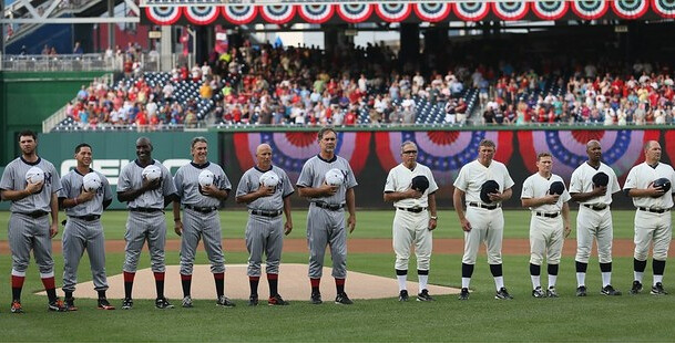
The Nats and Giants played a throwback game last night. But as you can see above, it wasn’t just any throwback game — they were re-creating the match-up from the 1924 World Series between the Senators and the Giants, so they treated the game with like a special occasion, complete with both teams lining up in front of the mound for the playing of the national anthem. As you can also see, everyone went high-cuffed (although some did so a bit more successfully than others).
Some notes from the game:
• It’s interesting to see white caps paired with a gray uni. Feels a little incongruous at first, but it’s not a bad look. Interestingly, Okkonen’s entry for the 1924 Giants doesn’t show a white cap, although the caps do look white in this photo.
• Both teams went NNOB. Of course, back in 1924, they didn’t even wear uni numbers. Kinda wish they’d gone numberless last night, too — after all, the Yanks and Bosox have already shown that it can still be done. (Meanwhile, note that the New York cap in that last photo appears to be gray. Hmmmm.)
• Both teams wore their regular batting helmets. Booooo!
• Kudos to Matt Cain, who showed off some top-notch blousing. That’s Strasburgian right there.
• I really like the little red inlays on the Giants’ chest insignia.
• Nice touch to have the grounds crew dressed in period-appropriate attire (except for the footwear — woof).
• Nats broadcasters Bob Carpenter and F.P. Santangelo got in on the fun as well.
Phil has already mentioned this a few times, but it bears repeating: Throwback games seem markedly improved this year. Lots more instances of the visiting team being dressed up for the occasion, and much better attention to detail. Now if we could just once get the umps to join in — that would be the cherry on top.
(Big thanks to Avi Miller, Peter Gaston, and Brinke for their screen shots.)
ESPN reminder: In case you missed it yesterday, my latest ESPN column is available here.
Incidentally, even if you did read yesterday’s column, here’s an additional detail: I linked to a photo showing this year’s All-Star BP jerseys. As you can see, there’s some sort of bullshit pattern on the uni numbers. What I didn’t realize, until reader Ryan Mandel pointed it out to me, is that the pattern includes the Royals logo, the words “All-Star” and “2012,” and the MLB logo. “Really makes these jerseys look like absolute garbage (not that they didn’t already, with the hideous shoulder yoke),” says Ryan.
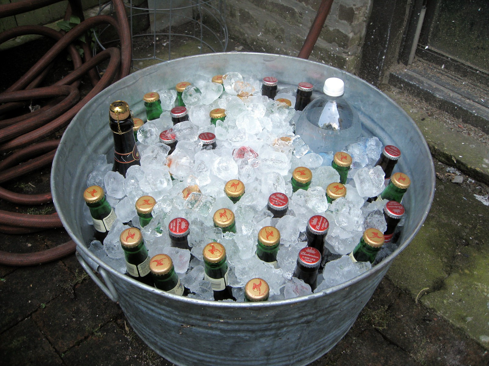
Independence Day recap: Nothing says “Party!” like a galvanized tub full of beer on ice and a rack full of meat, am I right? You bet I am (click photos to enlarge):

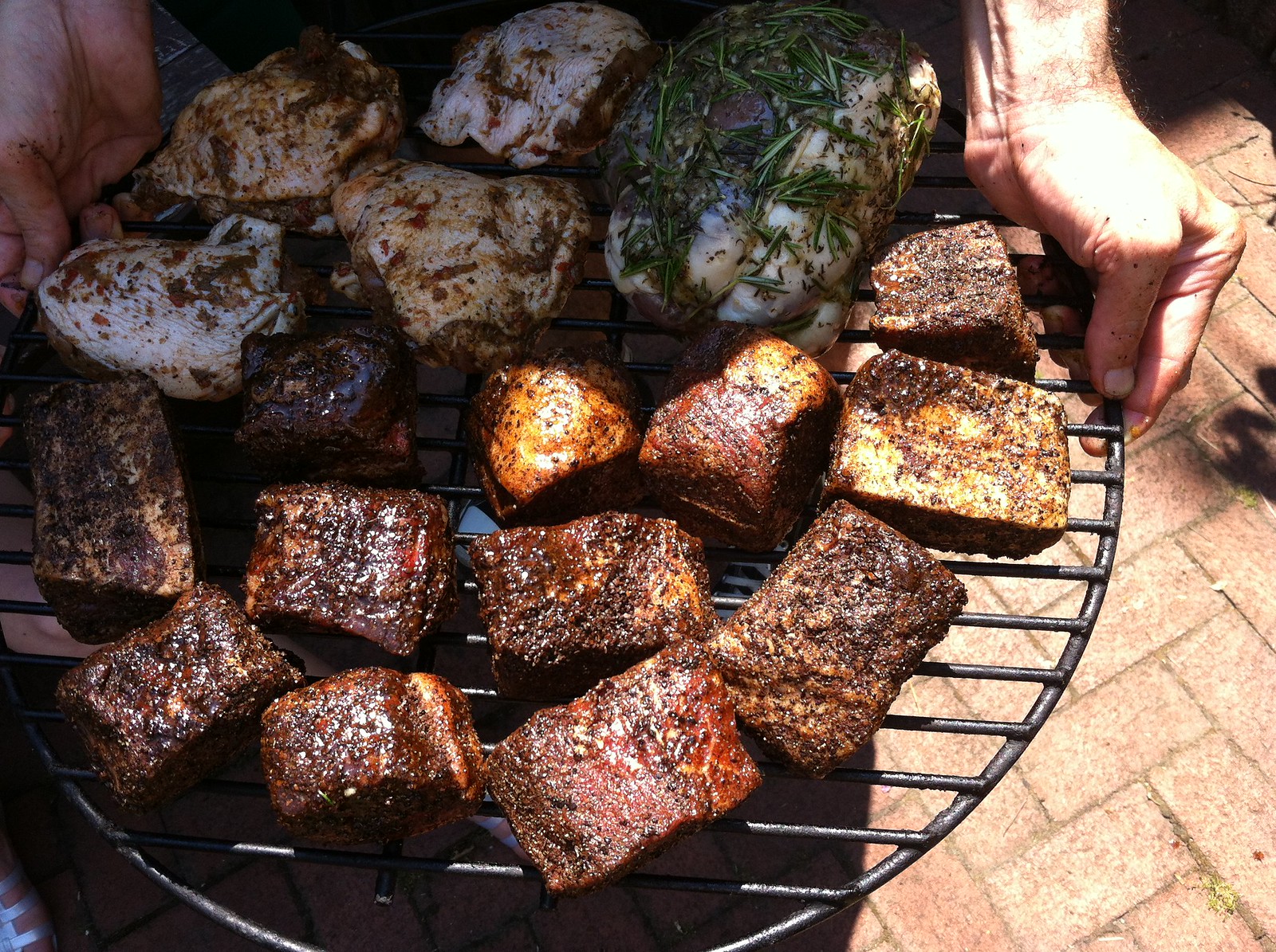
Sorry about that last photo — didn’t realize I was standing partly in light, partly in shadow (why didn’t the photographer tell me?!). Anyway, that’s the meat that I put in the smoker on Wednesday: beef short ribs with this dry rub; chicken thighs with this jerk preparation; and a butterflied leg of lamb rolled and tied into a little roast and coated with a paste I made from olive oil, garlic, salt, pepper, and rosemary.
There was a lot more food than that, including one of those steaks I showed photos of on Monday, but I ended up being so busy that I didn’t have time to take any additional photos. So that’s all I got — sorry!
Of course, if you’re gonna cook all that meat, wouldn’t it be cool — just hypothetically — if you could wear something like this while doing so? Sure it would.
Uni Watch News Ticker: Texas A&M will unveil new football uniforms next Thursday. “Looks like a state of Texas there on the pants,” notes Dave Wilson. … The Mets will do the “Los” thing tonight. ”¦ News flash: Selling your stadium’s naming rights to a corporate sponsor is a mixed blessing at best. ”¦ The soda case design trend has spread to the Olympics (from Art Savokinas). ”¦ F1 news from Dane Drutis, who writes: “The Lotus F1 team has added the logo of Batman: The Dark Knight Rises to their cars, racesuits and helmets this weekend for the British Grand Prix.” … Here’s more about the Rockford RiverHawks’ corporate-sponsored baseball uniforms (from Brian Anderson). … “My alma mater, Elon University, just released some terrific glass plate negatives that show some of the school’s athletic history,” says Scott Leighty. “Some of the baseball team shots are great, with the sweaters, non-matching uniforms, and some nice socks. I particularly liked the dirt tennis court.” … New kits for Atlético Madrid and Inter Milan (from Lucas Ehrbar). … Here’s an absolutely brilliant NHL-based animation that shows, well, just watch it for yourself and see (from John Muir). … Wimbledon officials made Victoria Azarenka change from a yellow T-shirt to a white top — while warming up on a practice court! (Thanks, Brinke.) … New third kit for Liverpool (from Allan Lewis). … Interesting story about Phillies big leaguers adjusting to minor league uniforms during rehab assignments (from Eric Nitschke). ”¦ New logo for the Las Vegas Wranglers (from Matthew Moschella). ”¦ Here are some more photos of the U.S. Olympic weightlifting uniforms (from Kevin Mueller). … We’ve all seen MLB jerseys repurposed as minor league jerseys, but rarely has it been done as clumsily as this (from JD Denison). ”¦ Clever Indians jersey at last night’s game (from Nick Ruggeri). ”¦ Two notes regarding the Potomac Nationals: They have a 35th-anniversary logo that should really say “35th season,” and they have their logo painted on their field with the colors reversed from their official logo (both of these from R. Scott Rogers).
Phil’s taking a well-earned break this weekend, so I’ll be filling in for him tomorrow and Sunday. The bad news: no colorizations or tweaks. The good news: I’ll run a Ticker on either Saturday or Sunday, or maybe both.
Both the Atletico and Inter links show the Atletico kit.
Love that Cleveland jersey!
Oopsie — now fixed.
Here’s an absolutely brilliant NHL-based animation that shows, well, just watch it for yourself and see (from John Muir)
I think this is the coolest hockey related thing I’ve ever watched.
“Absolutely brilliant” is right. Amazing.
and a bit surreal… genius!
-Jet
Not crazy about the new Las Vegas Wranglers logo, but I do like the 10th Anniversary wordmark with the dice. Nice touch.
I don’t like it either. I’ve been to a few Wranglers games, and they’ve had some nice logos that look like actual cowboys. This one looks like a serial killer or Rorschach from “Watchmen”. Agreed on the 10th Anniversary workmark. It’s clever.
the las vegas wranglers logo bears a tiny resemblance to their first ever logo when franchise was introduced
The Wraglers new logo looks more like Freddy Kruger with a Jason mask or Jason with a Freddy hat. However you want to say it.
Rorschach?
ed
I should have read the comments first. I thought the same thing.
speaking of batman themed crap… i totally forgot to mention something i loved seeing yesterday in the ticker.
not sure what the overall feedback was for the fresno grizzlies jersey (i can assume though, right?)… but i LOVE the stacked Z’s! SO cool!!!
link
HAPPY 75th BIRTHDAY TO…
SPAM!
Wonder if they kept the first can that came off the line. Probably still edible, eh?
Well, the Grand Prairie AirHogs of the American Association have also been wearing jersey patches with their sponsor – QuikTrip. And if the team was wearing them last season, then all this “acclaim” Rockford is getting is unwarranted. Can anyone verify if Grand Prairie had the “QT” patch on their jerseys prior to this season?
As an Elon University Alum, I love those old glass plate negatives. There were some great pictures in there
Yes. How about those acrobats?!
Hey Paul, you put the “new Liverpool 3rd kit” in the ticker two days in a row, which is a double sin because it’s purple! (well, they call it “Nightshade”) Just sayin’…
“Two notes regarding the Potomac Nationals: They have a 25th-annivsary logo that should really say “25th season,”…”
I think you mean 35th =P
Yup. Now fixed.
Potomac Nationals ticker listing should say 35th not 25th, and “anniversary” has a typo.
Fixed.
You misspelled “Strasburgian” if that’s even a word.
Of course it’s a word. English is all about new coinages.
Excellent lede, Paul. And big thanks to the screen-grabbers. I tell you what, it has been a real pleasure to move to DC and follow the Nats. It doesn’t hurt that they lead their division, of course, but the whole franchise, from GM down, seems to be a (relatively) classy operation. Has any other team been so thorough in its throwback particulars, e.g., the grounds crew, the black-and-white replays on the scoreboard, the detailed authenticity of the unis? Fine ballpark, too, and you don’t need a car to get there.
Nats beat Yankees in seven, with Bryce Harper scoring the Series-winning run on a steal of home.
You should have been in DC a few years ago when they went out of their way to sell tickets in Philadelphia before single seats went on sale in DC for the season opening series against the Phillies. “Class” is about the last word to come to my mind when I think of the Nats.
That was Stan Kasten. Things have turned around quickly for the Nats, not just on-field but all around the front office, since he left. Coincidence?
Yuengling! Yes!
No Brooklyn Lager in that tub though?
-Jet
Needs more Sixpoint.
What was the corked, 750mL bottle? Gotta ask; I’m a beer geek.
It has a Brooklyn cap. Local 1? Local 2?
Like Local 1. Still gotta try Local 2.
The American flag on the soda case display is being displayed improperly. The blue should always be on the left.
What if it’s meant to be viewed from the other side?
Junior took his Batman paint scheme, fire suit, etc…to Victory Lane at MMS(in Brooklyn no less!) a few weeks back for his first win in 4 seasons:
link
The 88 even ‘drafted’ with the Batmobile (I still call it that) for a couple of laps.
Paul, I’m a little worried you’re not getting enough fiber in your diet.
Yeah, maybe I should send him my recipe for grilled falafel patties or something. They’re also good crumbled up for tacos, if you don’t want to eat a fauxburger.
At least he’s getting some grain in a bottle…
Let me join the chorus of those saying “Yuengling!” today. Good stuff. Just got some last night, and I hope to open them up this weekend.
Been about a year that they expanded the market into Ohio. So far I’m still experiencing the “Whoo hoo, I can get it right at the corner store!” effect. Hopefully it won’t turn into the sometimes inevitable “Meh – I can get *that* at the corner store…” effect.
I’ll defend MLB’s use of the regular batting helmets in throwback games. It would just cost so much more to get a separate set of helmets (or to paint them) for just one game.
Also, they need to put the numbers on the jerseys… so they can sell more jerseys… which is what they are doing in the Nats team store.
(Go Nationals!)
The versions in the Nats store also have NOBs, but they left those off of the game jerseys. They could have left the numbers off as well.
I was at the game last night, and in the team store there are not only NOB and #OB replicas but also replicas without name or number on back. Hence the fan can go full 1924 and get a jersey with an unadorned back. Unfortunately there’s still a Majestic logo below one of the sleeve “W”s and in the end, as our host is wont to say, it’s still a $100 polyester shirt.
There were New Era 5950s (in limited sizes, couldn’t find a 7 3/8) and adjustables for sale as well. I wore my old Cooperstown Cap Co. ’39 Nats cap, which looks pretty much identical to the ’24 lids, and got a lot of questions about it from spectators and Nats staff alike.
I agree, but I feel like it would be easy for the team to then auction off the game used throwback batting helmets and turn a profit.
Rawlings has these helmets available in a myriad of colors, including black, navy, scarlet, whatever. A simple logo/decal is all that’s needed. Cost to the team would be about $20.00 each. They should have bought ’em and auctioned them off.
They didn’t wear helmets in 1924 and since everyone is so intent on having these games as accurate as possible they should have played without them.
That thought occurred to me, too.
They wore wool uniforms back then, too…
The players would love those right about now with our 100 degree days
The Nats broke out their road blue batting helmets for the occasion, could they have made a solid blue with matching white W sure but at least they were conscience enough not to wear their home reds.
Three things…
So that makes FOUR SEC teams with new uniforms? Obviously two of them will be the new entries (A&M/Mizzou), but also Vandy and Arky. Am I leaving anyone out? That has to be a record for a league so steeped in tradition. I’m guessing the Aggies won’t be introducing anything earth-shattering.
Am I the only person that likes seeing reverse-color logos? I guess that’s a weird thing to enjoy, but I do. Not that I’ve ever even really heard of the Potomac Nationals before today, but it’s neat to see the logo reversal.
Paul – good choice with the Yuengling. I love that stuff. That is my absolute go-to when it comes to cheap, mass-produced beer. Forget Bud/Miller/Coors.
Mississippi State’s getting new duds this year as well (let’s hope that they don’t turn out to be duds, although we are dealing with Adidas here).
Ah. Forgot about MSU, but then, here lately it seems they are wearing something new every year…
I thought the Times likes to write about quirky lil Portland? That stadium piece woulda been an excellent time to point out one of the last great names of arena in the country – Rose Garden.
For the very first picture showing the white cap with the grey uniform, I don’t know which player it is, but the guy on the far right of the picture…is his cap hovering above his head or is that just a bad photoshop job? There is no way that looks natural to me.
Good catch Kyle, it does look weird.
-Jet
Couldn’t find a pic of the Nats’ scoreboard from last night, but I did notice on tv that they went bare-bones white on green. Black and white replays sound interesting, too. Anybody know if they went without at-bat music? I wasn’t paying that close of attention.
Yes, the display was designed to look like an old hand-operated scoreboard. They listed the batting orders, but instead of the full color logo or word mark header, they had the team monogram (either the interlocking “NY” or the “W” in white on the green background. I think the green also matched the color of the outfield wall, which was another nice touch.
awesome!
-Jet
At-bat music was played on an organ.
And Screech was even dressed up in a throw-back uniform, too
link
“And Screech was even dressed up in a throw-back uniform, too”…”(except for the footwear – woof).”
Those ASG jerseys are just another reason to take a pass on the All Star game. Ouch.
Why? They aren’t worn in the actual game.
Now that many teams are stepping it up a notch with the throwback games, which is a good thing, I wonder if going high cuffed with the socks will be mandatory, or else the offending player gets slapped with a kangaroo court fine!
Until tonight, when we have the Astros in their late 80’s rainbow sleeves throwbacks, and the Brewers are wearing the grey road unis. (At least they didn’t wear the softall tops)
It’s a good thing the Giants all went with the high-sock look. The layer of white that you get to see matches well with the white cap, which might look a little weird if there were no other white in the uniform. They probably could have made the belts white,or maybe the undershirts, and it would have been perfect. Did the 1924 Giants all have the same color for those accessories?
I don’t know for sure. I need to dig into my ’24 WS photo collection to see. I could’ve sworn the Giants road caps were gray before last night. Might be a weekend project for me.
From ESPN Article:
The other Davis on the Giants in 1986 was Mark, not Glenn…Met fans will remember Glenn on the Astros that year.
I was out at an antique shop yesterday and found a couple great old baseball magazines. I want to email pics of them to Paul but I can’t remember to which email address I should send them. A little help guys?
link
Thank you sir!
Paul’s email, taken from his latest ESPN blog, is link
Yep, got it from that link above, thanks. The one Mothervilker provided has all the links for any Uni-Watcher’s needs.
“…they were re-creating the match-up from the 1924 World Series…, so they treated the game with like a special occasion, complete with both teams lining up in front of the mound for the playing of the national anthem.”
Did they play “The Star-Spangled Banner” or something else (“My Country ’tis of Thee”)? The US had no ‘national anthem’ in 1924…”The Star-Spangled Banner” wasn’t adopted as the national anthem until 1931 and the tradition of performing it before every baseball game began after the US entered WW II, didn’t it?
“Star Spangled Banner” wasn’t ubiquitous before ballgames, but it was common enough that the playing of it before ballgames is often credited with the song becoming the national anthem. Prior to the 20th century, “Hail Columbia” was most commonly treated as the national anthem. As for “Star Spangled Baner,” I believe it was commonly played at World Series games starting in 1918, though I’m not sure whether it was at the start or during the 7th inning stretch.
Nowadays, “Hail Columbia” is mainly used as the introductory fanfare for the vice president.
We were at the Nats-Giants game last night. As well, the Nats gave out 1924 WS replica scorecards, the scoreboard read ‘New York’ and the video replay board showed highlights in grainy black-and-white. Walter Johnson’s grandson threw out the first pitch, using a ball used in the ’24 series. The only thing missing were pebbles in the infield…
But the game ended with a nice simulated pebble hop, so it worked out.
Glad to know I’m not the only one who thought that!
The post title should add “The rock in front of Freddie Lindstrom is gonna have a helluva game 7”
Nice touch, thanks for that info. I’m glad baseball is going all-out with these throwback games this year.
-Jet
Only organ music at the Nats game last night. The way it should be. Will send some pix later…
FOR REAL?!?!??!
If that would become permanent, I might consider attending baseball games again.
Because I CANNOT STAND the obnoxious sound bursts of pop/rock music that are played at every lull in the action.
-Jet
Pix of organ music?
I hope they fix the numbers on the All-Star jerseys. They’re using 2 different fonts. The 2 and 4 look like MLB Varsity, but the 3 looks like MLB Block (note the beveled inner corners of the 3, instead of the right angles of the inner corners of the 2).
Pure laziness.
Those pictures are likely approximate mockups from the mlb.com shop website. I see that disclaimer all the time. You select your jersey in the right size, punch in the customization information if you want it, and then it spits out the image for you to double-check that it’s to your liking. The disclaimers tend to say, in sum and substance, “This is not an official and accurate representation of what your jersey will look like. This is for illustrative purposes only. Your jersey will feature all-accurate fonts and specifications.”
In other words, don’t take too much stock in those pictures. They’ll probably get it right for the ASG. Where it “counts.” HA.
Great spot Jim…I bet they were trying to go with Block with Serif (which the Royals use)…and screwed up by using Varsity on the 2 and 4.
Paul,
I am genuinely disappointed that I can’t see a pic of that beautifully marbled steak. How dare you enjoy the festivities to the detriment of food documentation. I will forgive you this time, but I know you have more, so DON’T FORGET THE NEXT TIME!
I was a little disappointed too. I’ll forgive this time. That grass fed rib-eye beefyness looked amazing. Wondered if it tasted as good as it looked. It definitely inspired my rib-eye dinner that day.
Don’t know if this was posted already: Just saw that the Peoria Rivermen (St. Louis Blues AHL affiliate)is having a jersey design contest through August 1st.
Here’s a link: link
All the information you need is listed at that site. I knew this would be a site that needed to have this notice since there’s so many talented people here.
In additional Formula 1 news… I was watching practice this morning, and Lewis Hamilton was adding decals (himself) to his race helmet. It was an orange star, which apparently is somewhat of a signature of Maria de Villota, an F1 test driver who suffered major head and facial injuries, and lost her right eye in a freak testing accident this week.
You can see the orange stars on her helmet here:
link
Let’s try this link:
link
Here’s a shot of Fernando Alonso, who’s also doing the orange star tribute.
link
I wish New Era would at least attempt to reproduce period cap construction, instead of applying historic designs to those link.
Or at least have them go with low-crown caps.
There are a few players who use them (Johan Santana is one) and they look infinitely better than the big trucker-style 5950 crown.
Yeah, maybe I just wish the big ass 5950s would go away altogether.
That was my thought. New Era sells low crown versions of the 5950, no idea why they don’t at least make that available for the players.
Also, re Paul’s question about ump getting in on the fun – my guess is there’s something in their contract about what they can/can’t wear.
Thought that too Ben. Don’t know if MLB won’t put up the funding for these things, or the other way around, and the Ump union, can’t or won’t do it. Shameless. It needs to be done.
According to DTTN, the “W” is on the left sleeve. The Nats wore it on the right sleeve. On the Nats left sleeve is what looks like an “N”. Don’t know if that’s accurate (DTTN only shows one sleeve) or if it’s supposed to stand for Nationals or something.
DTTN only shows the left sleeve. The Nats in those years wore a W on each sleeve and no logo on the jersey front. Exactly as the Nats wore it last night. It was a very distinctive Washington thing back in the day.
I have to wonder whether, had the 1920s-30s Nats been more successful relative to the Yankees and A’s, jerseys with logoed sleeves and unadorned chests would have become the norm rather than the exception… nah, what am I thinking? All that empty advertising space?
Since you mention them, I have to wonder since the Yankees don’t often throwback, seem very happy with their storied history in New York and don’t advertise/celebrate their pre-NY history much, I suppose it would be “good”(and they would be ‘good’)if the former St. Louis Browns threw back to the Baltimore Orioles team of 1901(Have they already done so?)…Shoot, they finished 3 games above .500 that year and ahead of the ‘original’ Washington Senators (now the Twins), Cleveland ‘Blues’ (the present day Indians) and Milwaukee Brewers(currently the Baltimore Orioles)!
ChrisH: a TBTC game between the Yanks as Orioles and Orioles as Brewers could really blow some minds. Bud Selig might not care for it as it harkens to a Milwaukee AL team, not an NL one.
Logos on baseball uniform sleeves was a trend for several teams from 1910-30, teams wore them had both less and more success than Washington during that time span.
Inevitably, the conclusion must have been reached that the chest area needed to be the priority for either the city/team name, or logo. Visually, it just made more sense, especially for the fans.
A) Oh, Yuengling. Can’t get it anywhere in Massachusetts, and we’re practically on the NY border here.
B) Thank you for posting this picture, Paul, it’s probably the best thing I’ve seen this week:
link
Yuengling on tap is all over DC these days. It’s my default draft.
Yuengling on tap is all over Ohio these days. It’s my default draft.
On tap in FL too and in bottles, etc
think thats a new thing. The Yuengling Twitter posted about it a month or so ago
Not much more than 10 years ago, Yuengling was hard to find in DC. Had a couple of friends who went to college in PA and turned me on to it in the late 1990s by bringing cases back across the Mason-Dixon from time to time. Now it’s everywhere – a victory for us all. Fat Tire is hitting DC big-time, too. Now if only we could get the non-fruity Leinenkugels and Summit this far east.
Not in Massachusetts? Strange. Obviously I’m not tuned into the beer distribution patterns of New England, but I know a big to-do was made several years ago when it was introduced here in the southeast. Now I know it’s all over Tennessee and back in my hometown in north Alabama.
Of course, if I’m not mistaken, Yuengling operates a second brewery out of Tampa. I’m pretty sure that’s where the southeast’s supply comes from, not Pennsylvania.
having moved from PA to IN about 8 years ago I still miss good ole Yuengling out here, come on get it together and make it available out here!! I miss the “Lager Fog” on a Sunday after drinking way too may!
From what I’ve read, Yuengling is now the largest American-owned brewery (Since the big boys sold out to foreigners) despite having distribution in just 14 states. They just edged out Boston Beer Company (Samuel Adams).
also one of the oldest American breweries
THE oldest.
Court approved. Suck it A-B.
As long as my Straub beer stays under the radar, I’ll be very happy hoarding it all for myself.
Yuengling is great beer. Straub is better.
Straub is available in Ohio. Apparently it loses something as it crosses the state line, though…
At the next UW gathering, everyone should bring their favorites and have a beer swap.
Here’s a 2011 ESPN article that shows a Grand Prairie player wearing an advertisement on his uniform:
link
So all those writing about Rockford being the first professional team to sport ads are incorrect.
American Hockey League teams have been wearing ad patches on their jerseys for years.
The Houston Aeros had a beer logo on their shoulder way back in the 1990s.
And I guess if you want to, you could claim the Buffalo Bisons “Pepsi bottlecap” jersey was advertising. And the Federal League’s Brooklyn Tip-Tops, named after the owner’s line of baked goods, wore the “Tip-Top” logo on a shoulder patch way back in 1914.
Do the Nats need the Twins permission to wear Washington Senators uniforms?
Do they also have to get permission from the Rangers at the same time?
I guess it depends on who owns all of that stuff. Twins, Rangers, MLB, nobody.
But they ARE using the Curly W that was part of some of the uniforms back in the day, right?
I could be mistaken, but when the Twins threw back to their franchise roots, the tops had “Washington” on them.
The Nats, when dressing as a prior DC MLB team, have always(and much too often)used a variety of W’s on their uni’s, but never the word “Senators”.
Only the Rangers have used that word on their throwbacks.
Nope. The Nats wore Senators road throwbacks against the Texas Rangers couple of years back. Organized by the Rangers, though, so the Nats didn’t choose the Senators jerseys.
Sure, but so does Walgreens. Which makes me suspect that the curly “W” never got trademarked, and is so widely used that no one now could successfully do so.
No, Walgreen’s does not use the same curly W as the old Senators or the current Nats. Similar, but they’re two distinct variations on the theme of cursive-W:
link
That reminds me, I need to get milk & nail clippers.
You’re right that they’re not exactly the same. However, it suggests that the Nationals could legally get away with a curly-W design that’s at least *functionally* indistinguishable from the old Senators logo. So even if the Rangers DID hold that trademark, there’d be little point in making hay out of it.
I believe that legally the functional issue actually works the other way. Because no customer will ever confuse the logo of a baseball team with the logo of a drug store to the point where either will lose business, the similarities of the trademark symbols are not a problem. It’s not like people who want to fill a prescription are going to go to Nationals Park by mistake, and it’s not like people who want to see a baseball game are going to be fooled into showing up at their local drug store instead of the ballpark.
But two baseball teams using the same, or substantially similar, logos? Definitely a huge potential for confusion and loss of business.
On the other hand, MLB’s antitrust exemption allows for an Office of Commissioner with essentially unlimited power over the operation of the league’s member clubs. So really, if the commish issues a diktat saying that the new team in Washington gets to use trademarks that belong to the Texas Rangers, then I don’t think there’s much the Rangers could to to oppose it. Even if they were inclined to cling to a monopoly over the Senators identity, which obviously they weren’t.
They built a new WGs nearby, boy did we need another one, it has a REALLY big “W” just by itself on the wall. I think of Uni-Watch every time, heh.
Yes, it’s the same curly W. Or rather, it’s a very slightly modified version of the old expansion Senators curly W, but New Era and Majestic have yet to replace the old curly W with the new one on caps and uniforms, so the curly W the Nats actually wear is essentially identical to the Senators/Rangers W.
As a formal matter, the Nats may or may not need the Twins’ permission to do a 1924 throwback. I’m not sure whether individual teams or the league controls the particular bits of intellectual property involved. But the better question is: Would the Twins or MLB ever deny such a request for a new franchise to honor baseball history in its city? Of course not! It’s good for the team, it’s good for the game, it’s good for the fans, and it comes at no conceivable cost or detriment to the relocated original franchise.
“Permission”?
Maybe DC MLB History Part I is sort of like that sofa in your new apartment that was there when you moved in, or like salvaging for treasures at the city dump: Since whatever you find there has been left or discarded, the former tennant or ‘rightful’ (is that the right word choice?)owner must not want it anymore, so it’s yours for the taking? It’s OK…the prior owner still has the memories; you, on the other hand, have the goods which you can use, retain and/or pawn.
Property (e.g. the sofa) ownership is very, very different from intellectual property (e.g. copyrights, trademarks) ownership. Abandoned property can indeed become the property of the new tenant. The same is not true for trademarks.
That being said, the mark “Washington Senators” became a federally registered trademark owned by the Washington Nationals Baseball Club LLC in 2009, after the registration was filed in 2006 by Baseball Expos L.P.
I haven’t found the logo trademarks’ owners yet.
Sports unis meet blood donation drive:
link
Beats the pants off American pink or baby blue cause-unis.
Now that is a cool idea. Kudos to whoever came up with that. Very clever!
I’m pretty sure I got a trojan from that stadium’s naming rights article: had just turned on the comp & all else I had open was this, Twitter & that article. *.exe file in a temp folder.
I got hit with something from that article as well.
As a Kansas Citian, I am just glad the All-Star BP jerseys aren’t as bad as the one’s last year.
Still don’t like all that crap inside the numbers
Am I seeing things or does the guy, third from the left, in the second photo (main article) look like Bill Belichek?
Here are some black & white shots from last night’s Nats game, thanks to the Facebook page of a Post photog
link
Didn’t notice the Giants-Nats throwbacks too much since I was more concerned that THE GIANTS GOT SWEPT.
I would swear G’s had a good pitching staff before they left on this trip.
That’s why out here we call them the EAST COAST ROAD TRIPS OF DOOM. At least that’s what I call them.
Year or two ago, there was a trip to NYC, Mia, and DC. Massive storms on the coast..and huge rain delays each and every game. The anncrs were going bananas.
Addidas building up a possible new look for Texas A&M football:
link
Looks like the double stripped shoulder look could be making a return to Aggieland.
link
It’s already in the ticker. But good find on those extra shots =)
I commend you on having plenty of ice cold Yeunglings for Independence Day. Excellent beer!
If it’s so good, sell it in Illinois already! (It IS good, I just wish they’d sell it here. I have to go visit my college roommate in his hometown of Pitt, PA so I can have a few Yeunglings.)
What do you suppose The Higgs Bosons’ uniforms would look like?
The fabric would be made out of space-time.
Any other Blackhawk fans think this might look ok next season? link
It’s not that I would dislike the player; I would really dislike the salary cap hit he’d entail.
$5 mil isn’t that bad and he is signed through 2054…
Sad to see former Dubois County Bomber, Steve Cishek is wearing his stirrups backwards for the Marlins tonight. Worse yet, pretty sure Logan Morrison is wearing one right, one wrong.