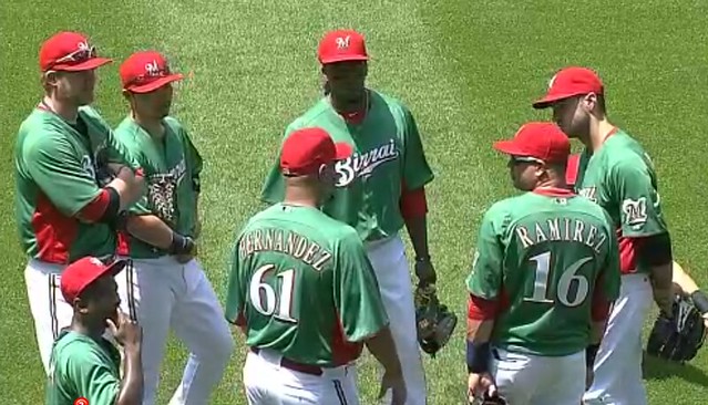
The Brewers and Diamondbacks decided to play a spring training game in July yesterday. Or at least that’s how it looked at Miller Park, where it was Italian Heritage Day. For weeks now we’ve been saying that this was shaping up as the most unsightly game of the year, and it did not disappoint.
I actually watched first hour or so of this one. It was one of those odd experiences where you’re sort of transfixed by the ugliness — it’s painful to look at, yet you can’t look away. Here are some of the more pertinent details:
• The Brewers wore green “Birrai” jerseys and red caps. It’s hard to overstate how awful the red side panels looked in action.
• The D-backs became the iD-backs, which is wrong on some many levels. The jersey looks a lot worse once the mismatched side panels are revealed — yikes.
• Both teams wore their normal batting helmets. This worked out a lot better for Arizona than it did for Milwaukee.
• The Brewers did, however, go to the trouble of getting red catching gear for Martin Maldanado.
• They also got red belts, as well as red socks for players who chose to go high-cuffed.
• The Brewers always tailor their mound logo to match their uniform, so naturally they made yesterday’s logo red and green. Am I the only one who thinks it looks like a variation on the Chili’s logo?
What a mess. Couldn’t they honor the Italians by giving out free pizza coupons or something? Additional photos here.
Meanwhile, the Blue Jays celebrated Canada Day in their usual uni-centric fashion. Here’s the rundown on that game:
• As I mentioned a week ago, I think the red jersey clashes way too much with the blue elements. The colors end up vibrating.
• The vibrating effect is even worse when you throw in blue socks or blue catching gear.
• CNOB is always nice.
• It’s a little hard to see, but the Jays pulled the tiresome pandering move of wearing camouflage-logo caps.
• A “Canada Day” script was printed behind the plate.
Not a good-looking uniform, but I accept the fact that Canadians like to wear red on Canada Day. I just wish the Jays would wear red accessories to match the jersey. Additional photos here.
Finally, one more uni-notable note from the weekend’s MLB action: The Giants held a 2002 World Series reunion ceremony prior to yesterday’s game against the Reds. The Reds, of course, are currently skippered by Dusty Baker — who was the Giants’ manager in 2002. So Baker put a 2002 Giants jersey over his Cincy road grays. I wonder how his players, employers, and fans felt about that. (Thanks to Brinke for the screen shots.)

In case you missed it yesterday, Phil recruited Jim Vilk and Rick(o) Pearson to help cover the weekend throwback games in Minnesota and Tampa. Check it out here.
As it happens, several Uni Watch readers attended the game in Minnesota:
• Jeff Barak showed up at the ballpark in full Minneapolis Millers attire. “The cap was custom-made at my local Lids store, the jersey is from Ebbets Field Flannels, the pants were part of a St. Paul Saints 1909 throwback game-worn uni, and the stirrups are from our own Robert Marshall,” says Jeff. “The full uniform was a hit with the fans, and wouldn’t have been possible without the stirrups from Comrade Marshall to complete the look.”
• Jeremy Formo captured a great detail: Even the grounds crew wore Millers gear. You can see the rest of his photos here.
• Jared Wieseler got some nice shots as well. You can see them here.
• Daniel Determan was pleased to see the Royals all going high-cuffed and stirrups-clad as they made their way to the bullpen. But he was highly disappointed to see so many of the Twins wearing pajamas for a throwback game. “Shouldn’t that be a crime?” he asks. Indeed.
Meanwhile, Kevin Kleinhans has a gripe about the Rays’ fauxbacks:
Like many others in the Tampa area, I rushed out and got my hand on the new Rays fauxback gear as soon as it was released. The first thing I bought was a New Era authentic cap. Watching the game on Saturday, I noticed that the “authentic” hats they sold us were different from what the players actually wore! The difference is the shape and size of the light blue panel in the front:
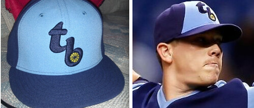
As you can see, Kevin is absolutely right — his retail cap is the standard six-panel design, with the front two panels rendered in light blue. But the caps used in the game were eight panels, because they split the front two panels so they could narrow the light blue area. You can see what I mean more clearly in this shot of David Price. Speaking of whom, what the hell did he have on his cap — pins? Anyone know more?
There was some uni-related banter in the Indians’ radio booth during Saturday’s Tribe/O’s game. Here’s a transcription, courtesy of reader Ed Hahn:
Tom Hamilton: Boy, the Orioles going with a hideous jersey today. It’s an orange top, black and white trim with white pants, and it’s, sorry, but it’s an ugly orange. … Looks good maybe on October 31 if you’re a jack-o-lantern, but it doesn’t do anything for anybody on this Orioles club. Isn’t it awful?
Jim Rosenhaus: It looks like a Creamsicle.
Hamilton [after a pause]: Okay.
Rosenhaus: [Laughs.]
Hamilton: It wouldn’t be around long today [i.e., because it’s so hot].
Rosenhaus: Not feeling it?
Hamilton: Nah.
Rosenhaus: No?
Hamilton: I just … I like their home whites, you know? Orange and black to me isn’t the greatest color combo anyway, but when they wear their whites, it doesn’t look bad. Even the black jerseys last night weren’t bad. … Although to be honest. the Indians’ jersey isn’t all that much better when they wear these blue road jerseys, that were made for the home uniform. The blue jerseys with the Indians’ home white pants looks terrific. The Indians’ blue jerseys with these gray pants. not nearly as sharp.

Culinary Corner: For most of the beef sold in this country, the quality of the meat — and the grade it receives from the U.S. Dept. of Agriculture — is determined by its degree of marbling, or intra-muscular fat. More marbling leads to a higher grade, and usually results in better flavor as well. (The reason Kobe beef is so highly prized is that it has an insane amount of marbling. Instead of beef streaked with fat, it’s almost the other way around.)
But using marbling as a determinant of quality only applies to grain-fed beef. Grass-fed cattle tends not to develop much marbling. This makes a certain kind of intuitive sense: If you ate mostly salad instead of bread, you wouldn’t develop as much fat either. This doesn’t mean grass-fed beef isn’t as flavorful, mind you — it just means that the flavor comes from other sources than the marbling. For example, grass-fed cattle roam around in the pasture instead of standing still at a feedlot, so they use their muscles more, which tends to give grass-fed beef an earthier flavor. (There are also lots of other advantages to grass-fed beef — better for the planet, better for the cattle themselves, blah-blah-blah — but I won’t get into that here.)
Sometimes, however, you get the best of both worlds: grass-fed beef with a lot of marbling. It doesn’t happen often, but occasionally there’s a particular steer that just happens to have a lot of intramuscular fat despite having been raised on a grass diet. The carcass from one of those steers apparently found its way to my local butcher, Fleisher’s, the other day. All of Fleisher’s beef is grass-fed, so I’m used to not seeing much marbling in their meat case. But when I walked into the shop on Saturday intending to purchase a bone-in ribeye, I couldn’t believe what I saw: ribeyes with enough marbling to make any serious carnivore drool.
I was so blown away that I bought three steaks instead of one. Check it out (click to enlarge):

Now, the big vein of fat running through each steak isn’t marbling — that’s just a standard part of any ribeye (the fat vein separates the eye of the ribeye from the outer cap, a muscle known as the spinalis dorsi, which is considered by many meat fans — myself included — to be the best part of the entire carcass). But all those other little nodules of fat you see in there? That’s pure gold. And it’s almost never seen in grass-fed beef.
I haven’t cooked any of these yet. One or two of them are ticketed for July 4th, and the rest will stay in my freezer (but probably not for long). Gonna be some good eatin’!
Permanent Record update: The latest full-length PermaRec installment is now up and running on Slate. There’s also a new entry on the PermaRec blog, plus I have some additional blog entries in the hopper for later this week. As always, if you want to sign up for the Permanent Record mailing list, just ask.
Just theoretically, if T-shirts like these were available, you’d know what to do, wouldn’t you? Of course you would.
And as long as we’re talking about T-shirts, don’t forget about the groovy shirts based on old sportswear labels that I’m selling. You can find those in the Uni Watch merch shop.
Uni Watch News Ticker: A little birdie checks in with the following: “I have a friend who works for the Astros, and he caught a glimpse of the logo and wordmark the club sent up to MLB for approval. His description was that it’s the same star they are using now, except a little ‘sharper,’ and in blue and orange. The wordmark uses a font that is similar to what they were using in the ’60s and ’70s. No word on the uniform, though.” … Reprinted from Friday’s comments: Lots of photos from this year’s Congressional baseball game, featuring lawmarkers in uniform, here. Meanwhile, Ron Paul was inducted into the Congressional Baseball Hall of Fame and wore a tequila sunrise jersey for the occasion. … Don Larsen is auctioning off the uniform from his perfect game (thanks, Phil). … The whole “I’m gonna celebrate by untucking my jersey” thing is causing waves again, only this time it’s because Rafael Soriano’s doing it. … Here’s a knitting pattern book, circa 1960s, for Australian football sweaters (from Rocky Lum). … If you’re an ABA fan, you’ll definitely want to check out this mother lode of 60 old ABA media guides (from Bruce Menard). … Here’s the best photo yet of Arizona football’s new copper helmet. The flag on the nose bumper is a nice touch (from Leo Thornton. … Lots of uni-notable glitches in this 1987 Packers training camp photo. Note the inconsistent pants piping, the missing white stripe on one helmet, and the upside-down logo on another helmet (big thanks to Jeff Ash). … New kits for Southampton (from Mike Miller). … “I know you like to talk about camo/military-themed jerseys as ‘G.I. Joe’ unis,” says Christopher Peterson. But the Dayton Cubs of the Florida State League have a jersey literally based on the G.I. Joe action figures from the ’80s. The wordmark is deliberately done in the style of the old G.I. Joe logo.” … “UConn held a press conference on Friday to officially announce their move to Hockey East in 2014,” says Gregory Koch. “As part of the celebration, they unveiled a commemorative jersey with the number 14 and a ‘Hockey East’ NOB.” … Nike is an inescapable presence at the U.S. Track and Field Trials (from Tony DiRubbo) … Phil Pries notes that some of the NBA rookie photos have a slightly different ball design. I’m trying to find out more from the NBA. … You know how each MLB clubhouse has a diagram on the wall showing how the uniform is supposed to be worn? Turns out there’s a similar diagram for the umpires (good find by Jason Werth). … Here’s something fairly rare: color photos of the Babe (from George Chilvers). … In what may qualify as the weirdest promo in recent memory, the Diamondbacks are giving away team-branded Mexican wrestling masks to fans attending this Saturday’s game. No word on whether (a) team broadcaster Daron Sutton will be required to wear one with his suit, or (b) Los Straitjackets will be playing, or (c) the state legislature will try to deport all the masks. Either way, crowd shots from that game should be pretty entertaining. … Last year I ran several entries about certain Dodgers minor league players wearing letters instead of numbers during spring training. Lorraine Colette, whose husband was in the Dodgers’ minor league system, has now provided a key to which minor league teams used which letters. A=Montreal, B=Spokane, C=Saint Paul, E=Atlanta, H=Macon, N=Green Bay, S=Great Falls, T=Reno, and W=Kokomo, Panama City, Orlando, and Odessa. … Here’s a really funny repurposing of the MLB logo. Andy VanPelt saw that at a diner in Portland. … Two NHL goalie notes from John Muir: New Blue Jackets netminder Sergei Bobrovsky will wear No. 72, and Islanders goalie Kevin Poulin is working on a new mask and is asking the people of Long Island what it is about L.I. that they’re most proud of (I’m assuming “the Islanders” will not be a frequent answer). … John Follett was watching Major League: Back to the Minors and noticed a uniform inconsistency: In consecutive scenes that take place a few seconds apart, ‘Downtown’ Billy Anderson’s uni number changes. “We also noticed a ton of scoreboard inconsistencies throughout the film, but that happens often in sports movies,” he says. … Former Padres pitcher Jake Peavy, now with the White Sox, is another player who’s been wearing a makeshift “Ak” memorial for former Padres bullpen coach Darrel Akerfelds, who recently passed away (screen shot by John Koziol). … The European debt crisis has resulted in at least one uni-based cartoon (from Terence Kearns). ”¦ Kudos to the single-A Wilmington Blue Rocks, who sell stiruups in their online team store (from Steve Vibert). ”¦ Two notes from the CFL’s opening weekend: Arland Bruce III of the BC Lions is wearing RNOB, and the Saskatchewan Roughriders debuted a new white helmet and wore an all-white uni for the first time in their history. “Normally they wear gray or green pants on the road, and always a green helmet,” says Marc Bauche. ”¦ According to this story, your average Nebraska football player is wearing $1000 worth of gear. Interestingly, the article states that the jerseys are made in Israel, which means Adidas/Reebok is still getting erseys from that one Israeli mill that produces the super-stretchy fabric (from David Westfall). ”¦ AC Milan has released a new away kit and a new third kit. “The away is about what we expected, although it doesn’t have a collar like the other two uniforms,” says Jeremy Schneider. “The third kit is a bit of a disappointment. Milan CEO Adriano Galliani had said that they would go with a yellow third kit (something they had worn in the past) because the team is superstitious about their black third uniforms ”” at one point they were 0-3 while wearing. One interesting feature, however, is the breast pocket with Italian flag above it.” … Here’s a uni-centric interview with Mississippi State athletic director Scott Stricklin (from Joey Harvey). … In 1931, the Notre Dame football team made a series of short football instructional films. But instead of wearing uni numbers, the players wore the names of their positions, so they’d be easier to follow (great find by Larry Bodnovich). … A Ukrainian artist has designed some Game of Thrones-themed sports logos (from Ed Hahn). … Here are Notre Dame’s cleats for the game in Ireland. “Awful,” says Warren Junium. ”¦ Mets pitcher R.A. Dickey has ordered a longer bat for bunting (from Marc Bauche). ”¦ “EHC Munich has now become Red Bull EHC Munich, and to celebrate they’re having a third sweater contest,” says Alec Pappas. “Submissions are in, but you can vote at this URL until Wednesday.” ”¦ Here’s a great shot of cyclist Dave Zabriskie in his Captain America costume from Saturday’s Tour de France prologue stage (from Robert Wheeler). ”¦ “I was watching the Olympic trials Sunday night when they announced the U.S. men’s gymnastics team,” says Josh Holman. “Take a look at their warm-up pants — all of them have the three stripes up near the hip with a white piping, except for the third guy from the left. His stripes are lower, and there’s and no piping. Interesting.” ”¦ “I’ve always wondered what legendary NFL coaches would look like without their trademark suits,” says Brice Wallace. “So I did a bit of Photoshopping, and here’s what George Halas and Paul Brown would look like in today’s NFL.” ”¦ Jerry Wolper found a 1977 Oakland Tribune item about a Vida Blue wearing an illegal cap. I can’t link to the story because it’s hosted by a subscription-only site, but here are the pertinent bits: “[Vida Blue] held a death rite for the outlawed cap he had vowed to wear, burning it during a brief pregame ceremony last night. ”¦ Blue had threatened not to play unless he was allowed to wear the cap, banned by umpire Russ Goetz because the faded colors did not match the rest of the club’s uniform.” ”¦ Red Sox pitcher Felix Dubront wore two undershirts yesterday (Marc Bauche again). … The corporate sponsor of the new arena in my neighborhood continues to be a shining example of civic pride.
Has their been any talk yet about Tony LaRussa’s uniform for the All Star Game? I mean, he’s not even an employee of MLB anymore, right? My guess would be he’ll be in Cardinals gear, but it would be fun to see him in a Gaylord Perry-esque outfit!
How about a suit?
Speaking of which, I wonder if PL received his yet.
So something I didnt see in the ticker, was that yesterday was Old Timers Day at Yankee Stadium. No biggie, but the Old Timers were ALL wearing the grey cap from the 100th anniversary of Fenway from back in April… WHY was that? Did the Yankees have a plethora of over stocked hats and needed to use them for something? Old Timers Day is such a classic, so why have the old timers dress in CORRECT uniforms, with numbers, only to have them wear some leftover cap?
They did at least put a pretty sharp Old-Timers’ logo on the cap: link
“The D-backs became the iD-backs”
Heh. This line reminds me of that awful movie “Mickey Blue Eyes” with the restaurant called “The La Trattoria.”
The Diamondbacks lucha libre promotion is not as weird as you think, since the Angels did something similar in the past couple years. I believe they were trying to set a Guinness record for most number of people masked in one place (or some such).
That’s right, it was the Angels. I remember someone doing that, yes for record purposes. My White Sox were playing against them that day, and yes the crowd shots were pretty entertaining.
The Padres did it a few years back, too, though I can’t recall which team did it first.
It’s not that the NU players are wearing what we should consider “$1000-worth of gear”; it’s that Adidas has priced the stuff that high. I have the Indiana version of a lot of that gear and, while the light and breathable fabric and different tailoring are neat, I wouldn’t pay $60 for one of those polo shirts if you pointed a knife at me.
2 of the highest priced items are the helmet and shoulder pads that are $700 together and not produced by adidas.
The jersey price was an estimate and that’s cheaper than any on field jersey I’ve heard of if its true and the cleats are right in line with the rest of the industry.
From yesterday’s comments that I just finished going over:
Phil Hecken | July 1, 2012 at 10:36 pm
i hope THE was watching SNB just now
I was at work, what did I miss?
a dodger player hit a little nubber up the line, which stayed in fair territory for about 65 feet, only to hit the cut of the infield grass and slowly roll foul…david wright immediately picked the ball up when it crossed into foul territory
Oh… more about *that* and my lack of precise baseball rule knowledge. I thought it might have been something cool like a conversation about how nice it is to see colored jerseys and how boring all the old white vs gray was. ;)
I know you enjoy ripping on me, so fair enough… but you do realize there’s a bit of a difference between a slow rolling grounder that goes foul before the base and a ball that’s already foul actually curving back in, right? One happens with a fair amount of regularity while the other is incredibly rare.
New PermaRec article on Slate:
link
The Brewers continue to prove to be major league baseball’s most minor league team.
Forgive me, but what the h_ll is “Italian Heritage Day?”
That’s ludicrous … what’s next?
according to the promotional sked, $1 hot dogs on the 4th
“What’s people most proud of in Long Island” Clearly not the elementary school education. (From a proud Long Islander – Sayville)
Ah, you Sayville-ites… (I attended high school at Bayport.)
this is old, but there are some add-ons…
here
The show Portlandia already covered the topic of an MLB team:
link
I seem to recall that the umbrella-ed Jerry Dior logo is a remnant of Portland’s ill-fated campaign in the late 1990s. Looks very familiar.
The Brewers Italian Heritage uniforms look more like Mexican heritage uniforms to me. The way they put the red and green together reminds me more of the Mexican national soccer team kits.
Sure, I’ll agree that the bold blue and red used by the Blue Jays clash a bit. But at the least, red and blue go together and are used together regularly. The Blue Jays’ red and blue aren’t nearly as bad as the bad idea that happened in Milwaukee.
Mind you, Milwaukee is the site of the team most closely wed to the green & red color scheme (the Bucks) so it’s not a strange sight to most Milwaukeeans (Milcunians? Mookies?)
One big thing missed from the Brewers’ Italian Heritage Day was the walk up music for the Brewer batters. They took music clips from Godfather and used those rather than the normal music. How is that honoring anyone of Italian heritage? Not to mention how much of a downer that was to listen to that slow and drawn out music for every batter.
It’s Milwaukee. They probably had 3 choices for “Italian” music – The Godfather, the background music at the Olive Garden, or the Super Mario Bros theme.
No “My Way”?!?!?
And a number of Dean Martin tunes.
“When the moon hits your eye,
like a bigga pizza pie…”
I wish someone would use the Super Mario Bros theme.
The Brewers do use the “cleared level” music from SMB occasionally after the a 1-2-3 inning by the visiting team.
And as a Brewers fan, I really don’t have a problem with an annual “heritage” day, but to hear that they were using the Godfather music for walk-ups really cheapens the whole thing. More so than the ugly unis, in my stupid opinion.
I dislike all “walk-up” music (ex: If you are at all paying attention you’d know when Chase Utley’s coming to bat, and if you don’t that’s what Dan Baker job is. I don’t need Led Zep on the PA…does Utley?) but given the news about yesterday’ ‘celebratory’ musical selections, I wonder…
Is that much/any different than the Cleveland Indians’ use of Chief Wahoo?
Agreed. I think every ballpark needs to tone down the music & video rhetoric.
“Agreed. I think every ballpark needs to
tone downeliminate the music & video rhetoric.”~~~
(fixed)
your lawn sir…shall i remove myself from it?
I am not worthy! I am not worthy!
Absolutely we should get rid of all music & video. Crankiness just isn’t up to par yet in the morning.
Imagine a baseball game without canned musical accompaniment or giant video screens ‘entertaining’ us….
…Ambient crowd noise, spontaneous cheering or booing, planes flying overhead, seagull cries, vendors yelling “Beer here!,” players complaining about a call….
Yes, please.
A little organ never hurt anyone.
Assuming one has never fallen or crashed onto someone, Jim. Maybe some Carpal tunnel syndrome as well.
Too-shay, mon ami.
Apparently, link:
“The at-home experience has gotten better and cheaper, while the in-stadium experience feels like it hasn’t,” said Eric Grubman, the NFL’s executive vice president of ventures and business operations. “That’s a trend that we’ve got to do something about.”
In hopes that professional football can mimic the wild stadium atmosphere typical of college football games, the NFL says it has “liberalized” its restraints on crowd noise. Stadiums will now be free to rile up crowds with video displays, and public-address announcers will no longer be restrained from inciting racket when the opposing offense faces a crucial third down.
They ever hear of a marching band?
I was at the game, and the only player’s walk up music that was changed was Cody Ransom’s, which was, in fact, from The Godfather. All the other Brewers had their normal music.
This phrase scared the hell out of me:
“I’ve always wondered what legendary NFL coaches would look like without their trademark suits”
Thank goodness it was followed by:
““So I did a bit of Photoshopping, and here’s what George Halas and Paul Brown would look like in today’s NFL”
Coaches Halas and Brown always did it THIER way. They would have told Roger Goodell point blank, “Hoodies, hoodies, we ain’t wearing no stinkin’ hoodies!”
It’s important to note that many early football coaches, including Halas, didn’t just coach — they also owned the team. They viewed themselves as businessmen, and dressed accordingly.
Dan Reeves wore suits. Pat Bowlen (the owner) wore furs.
The head is where it’s at when it comes to beef.
Ah, that takes me back: The hat manufacturers not being able to reproduce San Diego’s “bell”. When I sold baseball souvenirs in New England in the 1980’s (Pennant Fever, Hampton Beach Casino, how ya doin’), I was confounded by the inability of hatmakers to copy the Padres’ trademark bell shape on the front of their brown hats. We always got brown hats with two yellow (gold) panels to ape the trucker style. Now Tampa Bay seems to be addressing the same problem, having used San Diego’s template.
True enough. They borrowed the Padres’ uniform wholesale, it’s rather ironic that they’ve also assumed the Padres’ reproduction problems.
I don’t think the Padres had “reproduction problems”; they were just following their vows of chastity…
Meanwhile, down under, Essendon’s new clash jersey is NOT going over well.
link
Talk about get off my lawn. How DARE the AFL make the clubs have a jumper that is a different color than their primary one. Just making the red sash 3x wider doesn’t help when you’re playing a team that also wears a red/white/black jumper.
I watched a match between Richmond (black with yellow sash) and Adelaide (navy blue with gold and red hoops) and was amazed the players had any idea who was who. Granted, I realize the home team always wears dark shorts and away team white, but at speed, they just blended together.
Culinary Corner – those are beauts! Another one of my favorite UW installments. Looking forward to the July 4th entry.
re: Dusty Baker in Giants jersey. Like what, 95% of all players change organizations at least once in their careers; probably didn’t think much of it.
Agreed. Remember, we had this discussion about Derek Lowe last week. Its a tempest in a teapot.
link
Notes: I couldn’t get photos, but the Browns hat just says ‘Browns’. Also, some teams have an alternate color (Jets have black cap, Dolphins also have orange, etc.)
Also, the Bears have a hat with the curly B on it, and the Chargers offer a powder blue or navy blue hat.
Is it too much to ask for a plain, solid color fitted cap with no logo creep & a flat embroidered normal-sized primary or helmet logo?
Apparently it is. Sigh.
Did they *ever* have fitted caps with NFL logos?
Meh, if you don’t care about the “fitted” part, a fairly basic NFL cap isn’t that hard to find. Usually a lot cheaper too.
link. There’s a few on there. That retro B cap has been around for at least 6 years.
In fact, in 1991 I did have a fitted NFL cap (I can’t remember which brand but the logo creep on the back was in a shape of a square; maybe it was The Pro or Sports Specialties brand) and the cap was made of cotton.
puffy steelers logo is just HORRIBLE!
is the titans logo unbalanced?
white raiders hat… interesting (in a good way)!
chargers logo on a hat just looks stupid
couldn’t they give the packers a yellow alt?!?!
cowboys 2-tone panels… interesting (in a bad way)
I don’t know if I represent the “average” Raiders fan or not, but I would never wear a freakin white Raiders cap. Black or Silver/Gray, period.
/really though, white caps for any team are sort of a bad idea if you plan on wearing it enough to possibly sweat in it.
but think how well it would go with this
Ugh….they’re horrible……
I guess David Stern finally got approval to introduce the men NBA ball design already used in the D-league, the WNBA and the NBA all- star game.
Looking at that Culinary Corner, I’m reminded of why I love going out for steak with a group of Japanese people — they love all that fat and marbling (it’s called shimofuri, “frost”, here), and I like only lean meat. I get the fat-free cuts and they take the fatty parts!
New NBA design, not men NBA design. Sorry for the typo.
I will now be eating steak tonight. Those are some great looking cuts of beef. If I was ever POTUS, I would insist upon being sworn in on a beautiful cut of marbled beef instead of Washington’s bible. God bless America there is nothing like a good cut of animal flesh.
IfWhen Iwas everbecome POTUS, Iwouldwill insist upon being sworn in on a beautiful cut of marbled beef instead of Washington’s bible.Fixed.
Frankly, I’ve never wanted to be President before. But now I do, just so I can do the swearing-in as described above.
Will you also ride atop a Golden Calf as you parade down Pennsylvania Ave?
mmmmmmmmmhhh….veal.
Blood for Baal!
i cant find the Tampa Bay retro hats anywhere online. i tried to pick one up but they’re either all sold out or not in stores. id really like a franchise cap of the tb fauexbacks
Why not consider buying a cap that has some REAL history to it…one that would look great on the Nationals Park grass?:
link
not bad, i’d pick up the solid blue one. btw, i love all baseball team’s take on the “M” logo.
Marlins, Brewers, Expos, old school Twins, and MILB teams like the Memphis Redbirds…ect. Pretty interesting to see all the varieties of letter logos.
and the Nationals could flip the M upside down if they wanted to create a feauxback.
the expos logo “americanized”
Careful – turning symbols upside down is being against something.
link.
Sometimes an upside down M is just a W.
And if the Expos ever used an “M”, instead of an indiscernible blob, the Nats could invert it.
The hats finally became available mid day on the 25th. The lids website was down to just size 7 and 71/4 in the New Era 59/50s only a day later, now they aren’t shown at all, my guess is that they are just sold out. I have seen a lot of t-shirts with the throwback logo, but the hats have unfortunately been very sparse, frustrating because I wanted to order one too.
Peavy, also in honor of Akerfelds, link in the majors on Saturday, after having organized a raffle that raised $52,000, all for pancreatic cancer research.
Thew NBA ball isn’t exactly new. It has been used in the D-League and the WNBA. I doubt it’ll be used in the NBA (with how poorly received the last “new” ball was) but it’s interesting it made it into rookie photos. Maybe they’re planning to use it for the summer league.
The NBA really doesn’t need a new ball… just think of the logos. It took *how many* years for the Clippers to make the ball in their logo accurate? We don’t need to go through that again, do we?
+1
As I recall, the first objection to the ball was that it was made of a synthetic material; players were complaining of getting tiny cuts on their hands from handling the ball. The second issue, IIRC, was either the depth or thickness of the seams, not so much the pattern. If this new ball is made of leather, and the seams are similar to the old ball, this new one might stick around.
Haven’t they been using that new ball in the All-Star Game the last couple years?
Maldonado came into the league with (i think) the Angels.. think he just had the red gear laying around? Hard to believe the Brewers would go buy all new gear for one game but not repaint the helmets…. Just a thought!
He did play a couple of years in the low minors in the Angels organization… but I’m thinking that the red gear was probably his Nashville Sound (Brewers AAA) gear. I think their main color is red.
as an italian-american, it’s fun to see an italian heritage day. what’s not fun is that major league baseball and the diamondbacks couldn’t come up with anything better than “iDbacks”? …what the F is an iDback and what does it have to do with italian heritage? they couldn’t have at least used “serpente”? …or “vipera”?
It’s not “iD-backs.” It’s “i D-Backs” — two words separated by a space.
It’s the same idea as the NBA’s Noche Latina jerseys (Los Bulls/Mavs/Spurs, etc.). They just slapped the Italian definite article on there instead of translating the word.
We know. “iD-Backs” is funnier with the Arizona immigration debacle though.
…still seems really lazy to me.
Dunno if it made the site already, but link Friday night. this time, Denard Robinson returned the favor.
I’ll say it right now: The Minnesota Twins have NEVER looked better than this….
link
That’s second baseman Alexi Casilla. (Thanks for the picture, Jared Wieseler.)
except when they looked like this:
link
I stand corrected.
Wow….are you joking, or have I just met the only person — besides me — who loves those?
those are another of those “so bad they’re good” unis
awful, but like a trainwreck, you can’t stop staring at them
plus, they were the second best roadies the twinks ever wore, after these beauts
Well, I’M joking. Those pullovers were fine–and definitely representative– of the era (though the red helmet was an odd stretch), but most definitely a period piece. Phil’s example is the best roadie–though I wished it had read ‘Minnesota’ across the chest.
Fact is, that Millers uniform is killer, timeless. (Without the striped stirrups, however, it is a very good uniform. With them, pure class.)
I love the powder blues with the red helmets!
But yeah, those Millers unis are very nice.
Got to agree about the O’s orange look. Orange can work on uniforms if done right, like the old Tampa Bay Buck’s or Texas. It has to be less reflective.
I couldn’t disagree more. Orange is the original Orioles alternate. If they’re going to do an alt at all it should be orange.
I hate the O’s, but I agree with duker on his opinion about their orange jerseys
No doubt the Brewer’s outfit was ugly, but give them credit – they’re constantly looking for more ways to create revenue opportunities (merchandise) and get fans to the ballpark. There’s no doubt that they are not a good team this year, but at least they’re making an effort to find unique ways of getting people to the ballpark.
putting a winning product ON the field would no doubt put more fannies in the seats
(easier said than done, yes, but stupid gimmicks are just that…but as long as the stupid gimmicks don’t seep into the uniforms, i’m cool with it — once they start screwing with the unis, then a line must be drawn)
Stupid gimmicky jerseys are fine, but with two conditions:
1) They must be used very sparingly.
2) They must look as good as (or in Tampa Bay’s case, better than) the everyday jerseys.
Milwaukee and Arizona failed miserably with #2. They already have the two worst unis in the bigs, in my opinion, and they came out with something far worse.
“Stupid gimmicky jerseys are
fine, but with two conditions:never acceptable”~~~
(fixed)
1) they must never be used
2) they will never look as good as the everyday jerseys
How ’bout to celebrate Native American Day, they stick a feather in their caps?
No, wait…they’d call it “macaroni” and then we’d be back to Italian Day.
Phil, I’ve said this before and I’ll say it again, its easy to say stuff like that when your team is located in New York.
I’d argue that if you’re running a team in a small market, life is just different. Hard work and promotions, nonstop. Its not enough to just open the gates and wait for the stands to fill up at whatever price you name.
For further reading: Veeck as in Wreck.
i just finished “moneyball” (the book, not the movie)
i beg to differ
does money help? of course, but you don’t need to whore out your uniforms, and NO ONE is worth $15 million (although i think $5M is more than fair for anyone) or more per season
i don’t blame the yankees for that, although they don’t help matters
What is often difficult to reconcile in our minds is the value of a commodity when that commodity is a person or performer.
Way back when, Ted Danson got $11 million to come back for one more season of “Cheers”.
And we all know the huge money bankable movie stars get for a film.
Sports is entertainment and there are parallels with other aspects of that industry, uncomfortable and seemingly absurd as they may sometimes seem.
oh…and another thing
and i bet you know the answer to this:
what team was the first MLB team to crack the 4,000,000 attendance (single season) figure?
i’ll give you a couple hints — it happened in 1991; this team did it two more consecutive years (1992 & 1993 as well)…not coincidentally, that team won the world series in 1992 & 1993
obviously, that team was NOT located in new york — so we must throw that out of the equation — or at least, we can’t use the “new york excuse” …
now…that city is not small by any means (more than 2.8 million residents), but if you put it up against US markets, it would fall 14th — and every one of those cities has at least one MLB team (except puerto rico), but NY/CHI/LA have two, so in terms of population base, it’s not a huge market by any means
why did this city draw more than 4,000,000 fans three years in a row?
it wasn’t gimmicks
The SkyDome was the gimmick.
* Retractable roof.
* Hotel.
* Hard Rock Cafe.
Sure, shit like that is commonplace now, but in the early 90s, it was all cutting edge.
I was there at a playoff game with my mom back in 1993 and the novelty was not lost on the dipshit Jays fans sitting around us. Not only did my poor mother have to watch her beloved Sox falter, she had to put up with them spouting off about “the world’s coolest stadium” every half inning.
unlike jeff, skydome doesn’t have a definite article preceding it
Sorry.
i SkyDome.
It wasn’t gimmicks, but it wasn’t far off.
For years, the Jays had cultivated a huge fan base all over southern Ontario with promotions, gimmicks, mascots, giveaways, you name it.
When they moved to Skydome, the combination of a lot of years of hard work, a new stadium, and a winning team resulted in huge attendance for a few years. The stories in those days were that the team had a waiting list years long for seasons tickets.
IMO, they took it all for granted, stopped working hard, and pissed it all away. They forgot that you had to work hard to keep fans engaged and coming back. They threw around terms like “small market” when it wasn’t true, it was their own fault. You’re absolutely right about that part.
You’re right that winning helps a lot. But even a well run team is going to have ups and downs on the field. You say gimmicks like its a bad thing – but a lot of teams are asking the same question – how are we going to compete? If its not realistic for the Jays or Brewers to contend year after year, isn’t “just win” a simplistic answer? In other words, what’s your plan B to keep butts in the seats?
Good score on those steaks. Really miss the Fleisher’s blog but I understand time wise that well there just isn’t enough time. OUt here in suburban Philly area I’m having a hard time find a good butcher.
“… Jeff Barak showed up at the ballpark in full Minneapolis Millers attire…”
Awesome.
“A=Montreal, B=Spokane, C=Saint Paul, E=Atlanta, H=Macon, N=Green Bay, S=Great Falls, T=Reno, and W=Kokomo, Panama City, Orlando, and Odessa.”
Does this mean that Panama City, Orlando and Odessa are unknown or was the W for all four of those teams?
Because X is still unaccounted for.
The reason for the difference in the retail and on field Tampa Rays fauxbacks is that the seamstresses at New Era have to hand cut the material for the curved panels and do not like doing it. (odd for a hat that is marketed as ‘hand made’)
The compromise was that they would do it for the hats to be worn by the players but the ones for mass retail would be the full panel. The other option would be to source the production out to one of their many Chinese plants but with the hats meant to honour American (and Canadian) veterans already being produced there (something just off about that) and their being a stipulation in the MLB/New Era contract limiting the amount of non-domestic manufactured hats that can be supplied to teams it seems the compromise was the only way to go.
These hats will be available at online retailers like Hat Club, MLB Shop and the like, New Era is just not timely when it comes to getting their product to market.
So we have to choose between Chinese sweat shops or inaccurate reproductions? Seems like an easy choice.
Found a couple custom shirseys that gave me a laugh…
link
link
Nationals version.
Much better! Brunette for me, please.
I love the look of those steaks and George Halas in a Lovie Smith look. Papa Bear made that look good.
Hi Paul & Phil,
I’m looking for the photo from a few weeks ago about the Mt. Rushmore team so I can send the link to a friend. What was the date? Thanks. By the way, doesn’t the face of Jefferson, without the eyes, make him look like John Lennon?
this one?
by the way, here’s how i found that
link
The vibrating effect is even
worsebetter when you throw in blue socks or blue catching gear.Fixed.
The Rangers should do this with their unis.
Watching the game on Saturday, I noticed that the “authentic” hats they sold us were different from what the players actually wore!
Kevin (or anyone else dissatisfied with their Rays fauxback caps), I’d be happy to take your hat. Let’s make a deal.
As ugly as the “Italian-heritage” unis were, the Italian flag is far, FAR from being the unsightliest combo of colors and design elements out there. I think we should take this whole unpleasant episode as a learning experience and a challenge: what nation’s “heritage day” uniforms would be the very worst-looking of all? Let the Photoshoppings commence!
The Chicago White Sox are having a Polish heritage day tomorrow. Too bad they couldn’t coordinate it with the red/white throwback they’re wearing this year (also the colors of the Polish flag.)
Well, you know…every St. Patrick’s Day doubles as Libyan Heritage Uniform Day…
Can’t hold their liquor, them Libyans.
Buddhist Heritage Day promises to be link. Unis based on that flag would probably not be reincarnated.
jim vilk would wear them, though
There was some uni-related banter in the Indians’ radio booth during Saturday’s Tribe/O’s game.
I’ve never missed Herb Score more…
That orange alt is fabulous. It’s the black alt that doesn’t work for me.
Did Nev Chandler and Joe Tait just do TV games, or did they help out on the radio as well? I miss them, too. Mike Hegan’s good, but I can’t listen to a Tribe game for very long these days. Why can’t KDKA get the Pirates games back so I can listen to them at night?
You’re not the first to ask this, apparently:
link
ed
Wow, ’73 to ’84 was the golden age of Tribe radio, then.
Forgot about Reggie Rucker doing TV games. WTF? Reminds me of when Sonny Jurgensen did Washington Bullets games.
Hamilton made a great statement last year, he said: (paraphrasing),” The Indians gray road uniforms are one of the best in the league, yet they continue to keep wearing the blue tops this season.” The same goes for this season, the Tribe are wearing their blue tops much too often.
Hammy is like pouring a rainbow into you ears.
Rosenhaus is not.
Seeing Dusty Baker wearing a Giants jersey for the 10 yr Anniversary of the Giants NL Championship wasn’t the first time I saw players wearing other gear while employed by another team. I attended an A’s/Brewers game in the early-mid 80’s, and they held an old-timers game (’72-’74 A’s vs their World Series opponents). Odd thing though, Rollie Fingers and Don Sutton were active players (Fingers for the Brewers & Sutton for the A’s), but they sported their WS teams unis for the old-timers game…might have been the only case of this happening.
Speaking of Old-timers’ Day at Yankee Stadium…most of them wore pajama pants, even if they played in the 60s and 70s…see here:
link
Even thought they were new last year, Skins are using the old red Bills helmet in their 2012 schedule:
link
Does anyone remember the website that was profiled on here years ago that made custom jerseys? Or does anyone have any recommendations? I can’t DIY for the life of me so that’s not an option.
Search for “Frosty” on this site.
You’re right – Canadians sure like to wear red on Canada day.
I went to our city’s Canada Day celebration – I’d say the crowd was 60% red and white for Canada, 20% Spain, and 20% Italy.
Which brings me to my second point – what are the odds that on the day the Brewers pick to honour Italian heritage by wearing red, green and white, every single Italian supporter will be avoiding baseball entirely and wearing blue for the Azzuri?
Granted that the Brewers’ side panels were fugly, and granted that those colors are all kinds of wrong for the Brewers’ particular identity and logos. Still, the game photos mainly leave me thinking that it’s a great proof-of-concept that some team somewhere in MLB ought to wear red and green as primary colors.
Dana Holgorsen, football coach at West Virginia, discussing that they looked at a black alternate but instead went with the gray.
link
That Arizona football helmet sure reminds me of the Rattlers’ helmets.
Or the USFL Wranglers.
When asked why MSU is changing its look again, Stricklin said, “It’s been three years. You still wear the same shirts from three years ago? … It just seemed like a good time to do it.”
Actually, I do Mr. Stricklin. I guess I’m not as frivolous with my money as you.
I still wear the same underwear from three years ago…
Shirts? If they last, I wear them for decades.
By the wall, Paul, I noticed that the Barclay’s article also noted that Citi was being investigated. Two for two on your teams’ venue sponsors.
To quote Good Sir Vilk about those Blue Rocks Stirrups: “I’d wear that”
Am I seeing wrong or were the Brewers wearing their regular pants with blue/gold trim?
Pretty standard I believe:
link
Good call on the Wranglers Ricko- Hadn’t thought of that.
Benfica released their 2012/2013 jerseys:
link
2 things:
1. Your average amateur hockey player wears $1000-worth of gear easily.
2. I like the O’s Saturday orange tops. Goes with the throwback logo on the cap. Screw the Indians (and their broadcasters)