[Editor’s Note: Today we have more guest-written soccer content, this time from Tim Newcomb, who’s bringing us up to date on MLS kits. Enjoy. ”” PL]
By Tim Newcomb
For a league that was born in 1996 and looked every bit the part, the MLS’s recent expansion into soccer-embracing cities has infused the league with a strong set of kits featuring a mix of freshness, European influence, and club-specific detailing.
As with any young league trying to get noticed, early MLS kits largely represent a history worth forgetting, and a more recent pushback into a white-heavy blandness certainly doesn’t give MLS fans much reason to get excited. But the latest years of MLS jerseys showcase how a club can play to an energized fan base and create nuances within a kit to accentuate the identity of a club, a city, and a league.
In general, soccer kits around the world have more variety than most North American fans realize. Team logos are generally reduced to a crest on the breast, leaving room for a sponsor across the front. But beyond the sponsors, uniform designs range from horizontal or vertical bars to solid colors, sashes, or even checkered patterns. That global diversification allows MLS teams to explore the bridge between European and North American styles. Kit creator Adidas ”” teamed with MLS since 2005 ”” uses both local and global “creation groups” to “incorporate trends happening elsewhere while also still be locally relevant,” says Antonio Zea, director of soccer for Adidas America.
That European-style detailing has certainly crossed the ocean to North America. A few of those nuances include the thorns on the red away kit for Portland, the Rose City; a fleur de lis cross embedded inside the authentic Montreal kit; mountain peak-like logo silhouettes as a subtle backdrop in Vancouver’s dark blue away kit; and the “5280” on Colorado’s kit, referring to the altitude of Denver.
“These little details tell about the stories of a city or the club,” says Stuart Crystal, consumer products guru for MLS. “The clubs are more unique and have gotten stronger identities that represent them. … They build their brand and they know what their brand represents, but we are making sure every club has a distinct identity.”
MLS kits really started to take on new life in 2007, when the league caught up with global soccer trends and added sponsorships to the majority of its jersey fronts. MLS also started adding soccer-loving cities such as Seattle, Portland, and Vancouver to its roster of teams — cities where fans demand and expect those intricate kit details that might otherwise be lost in, say, New England.
Adidas also brings the same cuts to MLS as it does for top European clubs, giving MLS teams performance benefits and ensuring that fans have a consistent look, whether following a team in England, Spain, or the U.S.
Several MLS clubs have combined this global approach with North American-friendly nods toward jersey design. Houston, which opened a new soccer-specific stadium this season, has embraced a North American-specific orange, but with a textured pattern, so the kit doesn’t appear flat. The Los Angeles Galaxy has paid homage to an earlier day with a navy blue . Sporting KC, also with a new soccer-specific venue, has stylized its look with a complete rebrand and given new life to differing shades of blue.
Then there are the Seattle Sounders FC, the top-selling kit in MLS. Not only did they embrace “rave green” as a dominant color ”” certainly bold, but not outlandish and in line with colors already introduced in the Pacific Northwest ”” but the Sounders stayed on the cutting edge of European fashion by introducing fluorescent shades of green and blue in a third strip often worn during international competitions. Now other MLS clubs have introduced bold colors on third kits, and the L.A. Galaxy has even taken the lead on monochromatic logos.
Other MLS kit notables:
• Columbus offers a bright yellow kit and also a kit with black and yellow checkering across the shoulders of a white jersey.
• DC United has one of the most classic MLS looks, with a black and white base and a giant white Volkswagen logo. The red is saved for an accent.
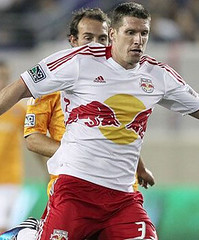
• The New York Red Bulls have incorporated their sponsor into their logo, a distinct look that actually works in the soccer world.
• The Philadelphia Union may have the worst jersey in MLS. There’s a lot going on there, that’s for sure.
• Portland has a deep green that fits with the Timbers motif.
• Seattle, while popular, has odd strap-like bands of gray that mar an otherwise cool look.
• Vancouver’s white jersey is certainly the niftiest in MLS, with thin blue horizontal stripes giving accent and class. The sponsor’s blue lettering even matches ”” surprisingly uncommon ”” and the aforementioned details in the blue kit makes Vancouver the sharpest combo in the league.
Tim Newcomb is a contributor for Time, Sports Illustrated, Dwell, Popular Mechanics and other publications. You can follow him on Twitter at @tdnewcomb.
ESPN reminder: Paul here. In case you missed it yesterday, my latest ESPN column takes a comprehensive look at players who’ve worn zero or double-zero. Enjoy.
Uni Watch News Ticker: New 1924 throwbacks for the Nationals. They’ll also have retro outfits for the grounds crew, retro scorecards, old-timey concession prices, etc. … The Padres have added a “48” memorial patch for bullpen coach Darrel Akerfelds, who died over the weekend. … The Rays, who’ll be wearing their 1979 fauxbacks on Saturday, may add yellow sannies to the ensemble (from Cork Gaines). ”¦ Southern Miss will wear 1970 throwbacks on Oct. 20 against Marshall. … Good DIY project from Jake Sorg, who made himself a pair of Iowa Hawkeyes cornhole boards. … “On Wednesday, the White Sox hosted the Double Duty Classic, showcasing inner-city baseball talent from across the country,” says Anthony Zogas. “The game pays tribute to the Negro Leagues and the uniforms are inspired by that era.” … New sponsor and kit for the Garmin-Barracuda cycling team (from Bernie Langer). … Check out this groovy Quebec Nordiques leather jacket (from Paul Caccamo). … Is Serena Williams’s purple headband against Wimbledon’s rules? (Thanks, Brinke.) … WVU is adding the Big 12 logo to their football field (from Joe Sewash). … The NHL’s collective bargaining season is about to start, and several equipment-related issues are on the table. For details, scroll down to the “Equipment” section on this page (big thanks to John Muir). … “My seven-year-old son plays PeeWee Baseball for a team whose colors are purple and silver,” says Josh Nolan. “He didn’t dig the standard-issue solid purple socks, so, at his request, we found him some ‘cool’ socks. The rest he did all on his own. Sharpest-looking legs on the team, if not the league.” … Buncha new jerseys for Michigan State hockey (from Ryan Mandel). ”¦ You’ve Got to Be Fucking Kidding Me Dept.: You know how NFL coaches aren’t allowed to wear suits, because they’re required to wear NFL-branded apparel? A similar situation is brewing in Arizona, where Diamondbacks play-by-play man Daron Sutton has been suspended for wearing a suit instead of a D-backs polo shirt. Douchebags (Brinke again). ”¦ Looks like this Washington helmet was painted with the facemask still attached. “Bush league,” says Matt Lucas. ”¦ Hunter Pence was apparently wearing a pair of Phillies-branded compression shorts under his uniform pants yesterday. How do I know that? Because you can see the Phils logo right through his uni pants (good spot by Brian Skokowski). ”¦ Good story about soccer players wearing Kinesio tape (from Todd Davis). ”¦ The Giants have had the same cap design ever since moving to San Francisco, right? Not quite — here’s a really interesting discussion thread about some slight variations in their cap from the late ’70s and early ’80s (big thanks to Davian Almonte). … Here’s a fun little piece on the basketball uniform’s evolution (from Robin Edgerton). … I’ll be on the road for most of today. See you next week.
As a diehard MLS fan, you could have done a lot better on that Tim. Hardly up to date, Crew clash doesn’t have the sponsor, you used Philly’s jersey from the previous two seasons instead of the current one, and the Red Bulls one, you forget to mention that Red Bull owns the team.
Feels like a general post that one might find on something like Bleacher Report. Maybe I’m a bit snobbish but still.
I agree…the post left a little to be desired…
It would have been interesting to compare some of the evolution of the jerseys through pics instead of just one generalized photo (the first one)…you could have also presented a little more information on if re-branding towards a more Euro-centric uniform is working…also, just a point of interest on my part…why is it so bad to look “dated”, many 90’s uniforms reflected the times and style of its era, not everything is going to be “classic” or “timeless”…
this article felt like exactly what it is…just filler…
I agree, and am also left puzzled about what’s North American-specific about the Dynamo’s orange.
Tim has no idea what he’s talking about, especially with the Philadelphia Union kit. It’s bold, uncluttered, and unique. And, most importantly, proudly reflects the flag of the City of Philadelphia.
If you’ve seen the current Union jersey you would understand that they’ve forgone representation of Philadelphia to accomidate their sponsor, not to mention the fact that it’s a hideous jersey in the first place. No need for addition of stripes, and as with the last jersey, the crest in the middle of the chest is a bad look.
It’s that houston looks like an orange Mexico kit… and no mention of FC Dallas and a few others. Especially with the big UniWatch news in MLS being FCD getting a kit sponsor for the first time in their team history this past week. Thoroughly disappointed.
The cross shaped silhouette on the Montreal Impact jersey represents the cross the stands atop
Mount Royal.
I’m right with you guys, this post was quickly thrown together and bunk. I have always liked Philly’s kit. And seriously, I may be biased, but no mention of Portland’s 3rd kit. A direct throwback to thier NASL kit of the 70’s that even used throwback font on the shirt sponsor? I would have much rather seen that get a mention than our red kit which, nice and all, is probably gone after this year.
Not to mention the 3rd is made of 100% recycled material and produced completely in Portland. How’s that for being “locally relevant”? While pointing out the thorns on the rose city red jersey was nice, he completely ignored the rose city patch unique to only that kit. The green kit also has the chevrons paying homage to the NASL version of the team as well as the sunshine flag patch at the hem on the jersey which is probably the finest example of a team giving a nod to the passion between the team and the fans in the community in all of MLS.
I agree. I also could not easily see some of the nuances, e.g., “thorns” and “peak like silhouettes,” in the pictures.
Do you think that the Netherlands national team would agree that orange is “North American-specific”? link
Do any other North American teams have Orange as their predominant colour? I think is the point he was making.
I don’t know if he was making that point (which is on him as the writer), but it would be the only way the sentence could be accurate. Several non-N.A. club teams wear orange or tangerine (Blackpool, Dundee Utd, Shakhtar Donetsk). A better way for him to describe it would have been simply to call it “distinctive.”
A little more in depth from me now that I’ve awoken a bit more. Completely agree that it feels put together way too fast. Making a big deal about the Rapids ‘5280’ on the back of their neck when a good percentage of the team also has something in that area, not so unique at all.
A throwaway about my team, Sporting KC, simply just about the two blue colors? Nothing about the line that runs down the heart, through the crest and on down, symbolizing the state line between KS and MO that plays a big part into the metro area? We also, along with other teams, have that fancy pattern stuff like Houston and Vancouver.
I feel grumpy for no reason about this but it just feels so distant from something that many of our fans always talk about. No passion behind this article.
Nineteen teams in MLS and no mention of 7 of them?
As I said earlier, this isn’t really up to the usual uniwatch standards IMO. I did really enjoy opening the site up to see soccer featured though.
It just doesn’t seem like this specific article was put together for this site. Seems recycled from some general sports related site. Too much superficialness to be suited to this website.
I won’t be quite as harsh as most seem to have been here, but I do agree this could have been a bit better. It’s great to see some MLS coverage, but a more in depth, or at least comprehensive piece is preferrable. Many more important uni-noteworthy things were missed than were highlighted here.
I appreciate the effort though, that’s for sure.
He also neglected to mention how Adidas has, as is the standard in European leagues, standardized the uni name/number font across all teams.
Um, MLS has had a standard number and letter font well before Adidas became the exclusive outfitter.
As you can see, Tim, the bar is set very high.
“MLS kits really started to take on new life in 2007, when the league caught up with global soccer trends and added sponsorships to the majority of its jersey fronts.”
Nothing has ever taken on new life by having a sponsor added to it. Give me a break Tim
Well said! I love how clean Colorado’s and Kansas City’s kits are without a huge sponsor across the chest. I find it sad that a beautiful kit like DC United’s had strips across the chest removed in order to slap a big VW decal on it.
“[Incorporating a sponsor into a logo is] a distinct look that actually works in the soccer world.”
Ugh, speak for yourself Tim. It definitely doesn’t work for me.
While I’d rather not see any sponsors at all, I suppose a logo that incorporates the ownership’s name, and doesn’t actually contain any words, is as good a compromise as we purists are giong to get.
Still, I hate seeing people talk about jersey advertisements as if they’re some kind of definition of “modernity”. They’re not; they’re a money-grab by team ownership. I’d probably wear soccer shirts a lot more if they didn’t have this garbage on them.
Truth on that, Mark. I’d like to wear a few soccer jerseys, but pretty much all of them (worldwide) make you look like you’re wearing your company-issued polo on casual day at the office. I’d have no problem with a sponsor sleeve patch or something, but c’mon–we don’t have to follow the rest of the world down this path.
More Soccer is welcome, but IMO not up to usual UW standards.
I find sponsor-less Soccer jerseys to look unfinished. My Thursday night indoor league teams can pick up standard adidas template kits for not much at all, without a sponsor, MLS teams looked like amateur hour.
I hope the Rays do indeed decide on the yellow socks under the stirrups for their fauxback game.
The link does not work at all.
Too bad they can’t really do anything about the belted pants at this point.
Though the colors may be subtly different, the Brewers’ road uniform pants circa 1975 would be the ideal design for the Rays’ ensemble.
The Rays already helped themselves to at least one team’s uni history…what’s one more?
Too bad they can’t really do anything about the belted pants at this point.
Ahhh, link
“Ahhh, if only…”
…the Mariners had held a rummage sale a few weeks prior?
The Diamondbacks have every right to mandate the rules that Sutton must follow if he wants to be the team’s announcer. I think it’s much better for a team to dictate that than a league.
Duh, of course they have the right to establish a dress code. But it’s ridiculous that someone could wear a nice suit and be told be told that it’s inappropriate (and doubly so when the reason is “You have to wear this polo shirt with our logo on it”).
I know the Red Sox don’t have those rules in place. Jerry Remy rips on Don Orsillo’s choice in jackets and ties on a fairly regular basis.
And if they do ditch the suits on a hot day, it’s usually a polo with the network logo, not the team logo. Then again, The Red Sox do own NESN..
The Angels don’t appear to be so strict on their dress code either. Victor Rojas and Mark Gubicza switch up between suits and Angels polos. The only requirement there would appear to be is that they both be similarly attired (both wearing suits, or both wearing polos). When they wear suits, they generally include an Angels lapel pin. It’s a nice look.
They could have just gave him a D-Bags….errrrrr….D-Backs tie to wear with the suit if he has to be branded. Or how about a D-Backs lapel pin. So many better routes they could have taken instead of this. However, reading the article, it seems they haven’t got along for a while now and this was just the excuse to get him out the door.
Exactly. This isn’t something you do when you’re getting along just fine with a valued employee. Nor, for that matter, is this something you do if you are generally satisfied with your job and your employer. It takes two to douche-tango in a situation like this. “Wear a branded polo shirt” is not an unreasonable dress code in this instance, whatever one may think about what the decline of men’s formal attire says about the course of our civilization.
Though I’d totally side with Paul on this if Sutton had been wearing a brick red suit with a black-and-tan tie and pocket square.
It’s ridiculous that someone would wear a cumbersome suit in this summer heat when he doesnt have to (and doubly when he does so in Arizona summer heat).
“It’s ridiculous that someone would wear a cumbersome suit in this summer heat…”
~~~
not ridiculous at all
especially if it’s a nice suit, a nice linen is neither cumbersome nor uncomfortable
the only one’s “uncomfortable” in suits are those who don’t wear them for a living
And doubly not ridiculous at all — the Diaomondbacks don’t play in Arizona summer heat. They play in an air-conditioned dome.
I wear suit and tie/slacks & sport coat and tie for a living every day and I cant wait until casual fridays in the summer when I can pull out the golf shirt. Not because I’m uncomfortable in a suit (I love wearing coat and tie), but because it’s freaking hot.
Todd,
I’m guessing Daron Sutton would rather look “ridiculous” in your opinion than be caught dead in a good portion of what’s in your regular rotation.
Not trying to pick on you — he probably wouldn’t wear what I’m wearing right now to change the oil in his car.
I don’t wear a suit to work, but I do wear one while birthday bowling.
I didnt say wearing a suit and tie looked ridiculous. I’d never say that. I wear suit and tie for work every day, so I’m not looking ridiculous.
I said its ridiculous to wear a suit in the Arizona summer heat when you have the option to wear a breathable golf shirt.
Sigh: link
Again, he’s NOT wearing it in the Arizona summer heat. He’s wearing it in a very comfortable indoor facility.
From the time he puts the suit on until the time he takes it off, I doubt he sets foot outdoors at all on a typical work day.
“From the time he puts the suit on until the time he takes it off, I doubt he sets foot outdoors at all on a typical work day.”
Do you think we all have teleporters here in Arizona?
No, just deporters
I kid ;-)
“Do you think we all have teleporters here in Arizona?”
Is it really that hard to picture him walking out of his house and directly into his attached garage, hopping into his car, driving to the ballpark, pulling into the underground parking garage, getting out of his car and into an elevator that takes him straight to his lofty perch?
“Do you think we all have teleporters here in Arizona?”
~~~
oh for fucks sake…maybe he gets dressed in his suit AT THE BALLPARK?
no one is asking him to wear a worsted wool suit and overcoat and hat in the searing heat, but he could be wearing a lightweight blazer (or suitcoat) INSIDE THE PARK, which is climate controlled
jesus fucking christ
the point isn’t about HIS COMFORT OUTSIDE THE BOOTH
the point is that he’s being told by tools not to dress nicely, but to wear the corporate logo
that’s the frigging point
I agree.
But, then I’m also a person, who, when faced with a “No Jeans” dress code, chose to wear Zubaz pants. So, yeah.
Take it from a Charlestonian: seersucker rules.
amen crackerre!
Seersucker jacket and pants, white shirt with a bow tie. Makes proper Southern women drool.
With a pair of bucks? (I only wish seersucker were easier to find in Ontario.)
Tell that to Juror #4 (see if you can spot him in this shot from “12 Angry Men”):
link
Now, see, had they not changed colors he could wear a nice purple blazer.
And, y’know, for fun, a Joker mask.
Hey Sutton, ARE YOU WATCHING, UNEMPLOYMENT LINE?!
As a Revs supporter I have to note that despite lacking a SSS we do have a distinct supporter culture, one ownership embraced in this year’s kit by putting the Revolutionary War era flag of New England on the back of the shirts
I agree Janssen, I think the flag was a nice touch, befitting of the name of the team and the area it represents. It is the “New England Flag”, and great to be incorporated. Maybe the Patriots could include it at some point? (same ownership)
Did they not even try to remove the Big East logo from the field? You can still see the “E” from East sticking out the side of the Big 12 logo…
I think they’re painting over it. Look at how dark the green is inside the new logo. They’re probably just not finished yet.
Ahh, ok. I see it now.
Ray Guy in the 1970 Southern Miss uni…?
Yup.
Ray Guy’s jersey (looks like a Russell Athletic) from 1970 is absolutely gorgeous. It has a full UCLA insert with the sleeve insert for TV numbers AND the sleeves (you all remember sleeves on football jerseys, don’t you?) still look form-fitting enough so as not to offer opponents a lot to grab onto. And that was 42 years ago! Goddamn Swooshies, Reetread and Oddydas! They’ve ruined all sports uniforms!
Amen.
Yup.
uh huh.
I noticed from looking at the photo of Ray Guy that the gold of the 1970 Southern Miss jersey’s UCLA insert stripes leans more towards old gold, while the gold of the pants looks like a duller version of standard athletic gold. (The 1970 pants athletic gold color isn’t nearly as bright as the modern-day version of athletic gold seen in the 2012 throwback recreation.)
I’m looking at link, and noticed something that I’d been wondering about for a long time.
Back before numbers were printed on jerseys, scorecard makers used to mix them up a lot so that fans wouldn’t be able to re-use their old scorecards and still know who was who on the scoreboard, right?
And on that day they’ve got the predicted starting lineup “wearing” 1 to 8, then the backup catchers, then the pitchers, then the other reserves, who have 31, 51, 61, and 71. But then there are three pitchers with 112, 122, and 223. Huh? As much fun as it is to see a player actually wearing a number that immense, why would the scorecard makers do this?
I thought that maybe the scoreboard operators had lots of “1”, “2”, and “3” panels (because you often see that many runs scored in an inning), but the most common panel is surely “0” and none of the scorecard numbers contain a zero.
Any collectors of old scorecards who have any insight about this?
Also, while I like those simple Senators throwbacks and love seeing the McAuliffe font, I’m starting to wonder why it’s so popular with throwbacks. These days only the Red Sox (and the Angels, about 30 years ago, and the A’s before that) use it, but there’s nothing particularly archaic about it. I’d hate to see it “typecast” as an old-style font and not see any teams choose it for their regular uniforms anymore.
The first Washington AL franchise used the McAuliffe font for its numbers from the time it adopted numbers until the end of WWII. If you ever get the chance to watch George Case’s home movies of the late 1930s Nats (his son sells the DVDs, our host plugged him once IIRC) you can see the McAuliffe numbers on the Nats, Tigers and (gasp!) Yankees as well as on the Red Sox.
(Aside: I think it’s a shame the Okkonen “Dressed to the Nines” database doesn’t show the backs of the jerseys.)
I just hope the current Nats get link right next week.
Teenchy, thanks for that update; if the Senators were using McAuliffe after numbers were introduced, I guess it’s pretty natural to use that when imagining what the ’24 jerseys would have looked like had there been numbers.
I too wish that Okkonen’s book had the backs visible. I’ve been wondering for years what my Cubs had on the backs in the early years. I know that around 1940 they switched to the number font that they still use today, and that initially the “1” didn’t have that straight hook at the top or base at the bottom (it was a plain vertical line, like the Bears have). But before that I wonder what they used. Plain block?
Quite welcome. I haven’t had the time to search for very many pics online to confirm. The Boston Public Library has a wonderful Flickr stream that has plenty of 1930s Nats pics @ Fenway but non I’ve looked at yet shows a clear shot from the rear. link partially shows a “3,” and link shows the McAuliffe “7” on the back of Joe Kuhel. link is particualrly interesting in that it looks as though the Nats are wearing the McAuliffe font but the Red Sox are not (compare the “7”s).
Philly has the worst kits? I take offense to that, since it was 10x better link, although, the link isn’t that bad.
The baby blue kit is nice. I wouldn’t mind getting that jersey, even with the sponsor.
Yeah, they made the baby blues and link for better meshing with the sponsor’s logos.
The problem with the shirt is very simple. The sponsor logo is too wide and overlaps the edges of the center stripe. It looks considerably better on a shirt that doesn’t have a center stripe, like on their white third shirt from last season. The two blue shirts that the Union have look great on their own, but right now that Bimbo on the front isn’t doing them or their sponsor any favors.
If you want an example of a sponsor done well, have a glance over at the new shirt sponsors for FC Dallas, Advocare. Their logo is blue and trimmed in white, and fits snugly between the horizontal bars of the Dallas shirt. What’s more, their shade of blue is also a part of Dallas’s color scheme, so the look comes across as considerably more organic. As far as sponsors go, that’s a textbook example of how you do it.
So what I would suggest to Philly is to either work on the placement and size of the Bimbo logo, or to change up the design of the shirt and move that center line elsewhere.
hoping Southern Miss can find 1970 style striped crew socks for their 2012 throwbacks.
Amen Ronnie!!!
Not impossible. I’ve seen them (or something very close) in a store at MOA.
Of course, I was there with my daughter, so they’d probably think they have to send in someone in disguise to buy them.
A favorite pastime of mine is seeing how quickly teams put up images of new drafted players’ jerseys, whether photoshopped in an actual photo, or on the team store site.
A few of note:
Blank number jerseys seem to be a trend – link
link
link
It appears Austin Rivers will not sport #0 for the Hornets as he did at Duke – link
I love Uni-Watch, but this is horrible writing and even worse journalism. “Portland’s new red jersey” that they’ve worn for two years. Praise for the Bath-Twoel Crew jerseys. NYRB has “incorporated their sponsor into their logo” (with no mention that Red Bull owns the team!) The Union, one of the 4 MLS teams with an actual ‘style’ “may have the worst jersey in MLS”. And this from a Time, SI, and Popular Mechanics contributor? Paul has let me down today
It’s not Paul, it’s his guest “writer”…I almost wish he just shut down the site today…one of the worst articles in a long time…
Paul, you wonder why soccer isn’t popular on this site? This article doesn’t help…
Soccer gets adequate(almost daily)coverage on UW from Paul and posters.
There may be quality issues, but the general popularity is tough to contest.
I may not like it or understand it, but that’s my affair.
I’ve always geeked over San Francisco’s hats. When they rebranded in 1982, they sanded the punked (elongated) corners off the monogram, removed the blocky serif from the crossbar of the “F” and added it to the left of the top stroke. When the exaggerated corners returned a few seasons later, the new serif arrangement was retained. Just the kind of details the true believers notice!
Yeah, anyone who thinks the Giants’ hat “SF” has gone unchanged since 1958 just ain’t payin’ attention.
But then, the links on that article don’t work for me, so these might be changes even I don’t know about.
Creamer’s link is wonky today.
That’s Creamer for you.
The Credit for the article on the Giants cap logos should go to Paul Carr he is the one who wrote that article and goes by insomniac186 on the NewEra Cap board.
Washington evidently repainted their helmets with the facemasks attached for years – I remember noticing it once Washington came into my awareness back with the Warren Moon-led team made the Rose Bowl after the ’77 season. They also painted over the front bumpers of their helmets.
I’m sure all they did was give someone a can of gold spray paint and tell them to “go paint the helmets and get it done quickly”.
Goes back even farther than Warren Moon…
link
my dad played in the pac-10 in the late 70s and early 80s and he’s mentioned before how UW’s helmets looked like crap up close. said it seemed like they were basically just dipped in paint, facemask and all, and there were often globs and streaks where excess paint dripped and dried, instead of a smooth surface
Don’t forget about Vancouver’s 3rd Kit, maybe the best use of brown in sports.
link
Brown and light blue is a very rare color combination, but it looks absolutely gorgeous on the Whitecaps.
I got a chance to talk with Dexter Fowler about stirrups yesterday! The Movement rolls on!
link
Right now I am trying to fundraise some money so I can finally pay for the 24 pairs of custom rups that TCK has been holding for me forever. I’m going to be auctioning off memorabilia items soon. While it won’t be immediate, you can expect a pair of purple stirrups in return for your support! Some of the items will be large, like my sign, but others may be as insignificant as a ticket stub. The goal is to get a little bit of liquid spending money so that I can do more stirrup related shenanigans.
Donations will also be accepted. Thanks for your support Uni Watchers, Keep fighting the good fight!
– Jake
“My phone was dead so unfortunately I don’t have any photos.”
Maybe I’m just old fashioned, but reading that line stunned me for a second.
These are indeed amazing times!
Keep going, Jake!
I really should just get a camera. Thanks Chris!
Alright guys the auction is up and running.
link
link
link
Thanks!
– Jake
~~~~~
Also, if you would like to donate a pair of stirrups to the cause, feel more than free! The more the better. I love the idea of starting a stirrup sharing community throughout Uni Watch. This could be the start of it, and I could be the unofficial headquarters
Happy Stirrup Friday!
Also…
link
Wow! $5? “Comrade’s” are 3x as much…
Robert opts for the highest-quality — the 700s — when he orders from TCK. I’m guessing Jake is going with the economy option — the 300s.
And shipping/packing materials ain’t free.
And all the “comrade” shit aside, do you seriously expect him to do this all without getting a buck or two in return?
i might also add that if anybody wants to order a dozen, you can have them at a better price, as cheap or cheaper then you can get them anywhere, that goes for the crappy 300’s, or the mlb quality 700’s. as for singles, if anybody can point me to anyone who sells single striped stirrups i will eat my hat. why does nobody offer this? it is a pain. but let’s break down the price for the single…
$8-same price by the dozen you would get anywhere for a SINGLE.
$1-tck’s shipping to me
$2.12-the shipping per pair that i pay to get it to you.
$1-paypal takes because hardly anybody is verified even though i ask you to be.
$.75 for envelope and tape.
—–
by my accounts that is 15 bucks, more then i charge if you get in at the new price. so i am making less for a single pair then these other clowns are making by selling by the dozen. but let’s add in this. answering emails for 1 pair rather then 12, stuffing individual envelopes rahter then direct shipping from tck, standing in line at the post office instead of direct shipping, dealing with tck(you try it), packaging shit, filling everything out, did i mention answering questions. the money i have sitting in the cabinets as individual stirrups so people can have items to choose from. gad-zooks, puuuh-lease.
so it is implied that i am gauging, nertz to that and up your nose with a rubber hose. if anything my prices are too damn low for that major hassle i go through for this. anybody, and i mean ANYBODY who thinks i am gauging you, do me the favour of not coming to me for stirrups, try another source for individual striped stirrups. oh right, there is none because there is no money in it and it is a major hassle.
this kind of comment really grinds me considering the lengths i go to do people favours at cost, making sure everything is right, trying to accomodate requests as much as possible. mother of corn, my brain-pan is exploding.
Steve, seriously… you’re an idiot.
spanky beat you to it skipper:
great typo me. i always seem to manage to do this when i get angry and type without thinking clearly. i am obviously not being accused of checking dials, but dipping into pockets.
Mr. Marshall, were I not unemployed and broke, I would have already ordered at least half a dozen pairs from you. Be that as it may, I have ordered zero pairs, and I STILL appreciate and understand the trouble you go through to deliver a quality product at a more than fair (read ridiculously good) price.
Bravo Zulu to you, good sir. Carry on.
thanks coleman, but i wasn’t looking for kudos, just pointing out there is a reason the prices are what they are, and why they could or should be even higher. send me an email sir rpmarshallart at gmail, i am running a special unemployed special for you.
and while i am at it, um jake, do you know where stirrup friday comes from? or why it started? when it started? or that “good fight” revolutionary movement language you use comes from? on behalf of the hundreds of comrades who have been in the movement who have implied stirrup before their nom de plume, we welcome you to the revolution.
“Wow! $5? “Comrade’s” are 3x as much…”
~~~
they’re also 3x the quality, slappy
and if you want to buy $5 rups…believe me, you’ll get what you pay for
Comrade, email sent. Don’t you go spamming me now ;)
I’m actually not sure if mine are 300’s of 700’s we never talked about it. But TCK is selling them to me for 4.95 a pair in bulk. The 5 dollar stirrups do not include shipping and handling btw.
rpm, I actually don’t know that much about the very words that I choose to use, but I love them and would love to learn more about them! Thank you for what you do, I hope that I’m not infringing upon your territory. Trust me the 5 doller rups won’t last for long! I just need some frekin’ money already so I can actually get them once and for all.
– Jake
jake~
putting stuff out in the comments i don’t do, so you are not stepping on my toes there. i never link my site, i never mention any sales unless someone asks where they can find individuals, then i or someone else will suggest contacting me. i go to the head-man directly to ask permission to do that. i do that out of respect for paul and the site because i know he does not want solicitation here. as for the rest of it, it’s a free country.
as for where all that comes from, i would be happy to explain, but i have reached out to you 2 or 3 times to try to help, and you have not gotten in touch with me. i would be happy to explain the roots to all of it, and what i have done as a service to paul and the readership over the last 4/5 years if you finally write that email, again, rpmarshallart at gmail.
This
“Bernard | June 29, 2012 at 2:38 pm |
Steve, seriously… you’re an idiot.”
Part of the old Big East logo is still showing underneath the new Big 12 logo West Virginia added. Looks like they sewed in a whole new big piece of turf, so maybe they’ll just paint over that little bit that shouldn’t be there?
Looks like it, since the green inside the logo is a lot darker than the turf.
FYI, the Seattle ” odd strap-like bands of gray” is actually the Adidas TechFit version of the kit, as far as I’m aware players get to chose if they want the more tight fitting version or not.
For the record Arjen Robben wears one for Bayern Munich (link) and Fernando Llorente usually does for Spain (link)
I had just assumed the bands crossing the back were for xbox since Washington is Microsoft land, though they could be using it as a dual purpose with the TechFit bands. Imagine combining corporate branding from one company with corporate “technology” from another…
Happy Stirrup Friday! Two stirrups shown today. The first was from a lot I won from eBay a while back. Billed as all adukt sized stirrups, I can say that not all were. These beauts are made for smaller feet/legs than mine:
link
The ones I am wearing were posted in here back in the Spring. Since then, I got the pink out of the white stripe:
link
Is Camilo Pascual pitching today?
And, damn, ain’t this Killerbrew kid something!
The Little Potato looked good in the stirrups: link
And, and the truly arcane connection in all this is that the film version of DAMN YANKEES includes footage of Pascual pitching at Griffith Stadium.
With a big ol’ Natty Boh sign on the outfield fence.
In color, even.
Oh, and Happy Birthday to Ol’ Harmon!
Or maybe a Broadway reference?
“I’d sell my soul for one long ball hitter.”
link
San Jose needs to jump on the identity improvement bandwagon. I guess their fans like their “high school” look but as someone who doesn’t have a fav MLS team and watches as a fan of the entire league, it’s always an eye sore to watch a good team like SJSC on tv while they Rick the optimist club uniform/logo.
Yesterday was the 51st Annual Congressional Baseball game. Ron Paul was inducted into the Congressional Baseball Hall of Fame and was wearing an Astros Tequila Sunrise jersey.
link
You can see more pics of Paul and the other members of Congress playing here
link
Hard to see, but in the one pic showing Rep. Linda Sanchez of California, she wore the Roman Numeral IX, in recognition of the 40th anniversary of Title IX.
Oops, copied the same link twice. Here are the rest of the pictures.
link
I like this link jersey an awful lot.
Also, Philly has one of the nicest kits….specifically this one: link
Without the sponsor logo, that would be really nice.
In general, I like the MLS uniforms. Even though I don’t like the sponsor’s name on the jerseys, I understand why the MLS teams do it because it brings in revenue. I wish that DC United would put back the three stripes on their home and road uniforms. I believe that it is possible to have three stripes above the VW logo. If DC United does bring back the three stripes it would nice if it were red for the white jerseys (road jersey) along with wearing red shorts. That uniform would represent the color of the DC Flag which is red and white. Other than that, I would keep DC United’s black uniform to wear at home because of the team’s history and winning four MLS championships. I would not make red their primary jersey because other teams already wear red: Chicago, Chivas, Dallas, and Real Salt Lake.
I had no idea that the UWatch faithful had so many scrupulously attentive MLS fans. Tim N must feel a little bushwacked, but I’m impressed by our peers.
Love love those 1920s Wash Senators unis.
Wish the basketball gear timeline had started earlier, back when kneepads were de rigeur. You know, when basketball players were called “cagers” because they literally played inside giant cagess.
Hey, how about them Italians? I just love the way they dominate the Germans.
Italy: Dragging Germany Down Since 1915(tm).
Love the Nats throwbacks too, and somehow McAuliffe font just seems right for the numbers. In general, I like how the Nats have more or less re-adopted the traditional Senators look of a W on the chest – ought to do so on the road, too – but whenever they do a 1930s (or now 1920s) throwback, it gets me wishing that they’d consider adapting the logo-on-sleeves concept. Slap the curly W on each sleeve, leave the chest unadorned except for maybe the headspoon, and bam, completely distinctive uni in all of baseball. Even if only as a way to distinguish an alternate jersey from their regular home top; while I think the Nats have one of the better softball tops in the bigs, at least the red version, I’m not a fan of alternate tops that are just the regular uni with a different fabric color.
“Love the Nats throwbacks too, and somehow McAuliffe font just seems right for the numbers.
I love that font, and would love to know how many other teams have used it over the years besides the Sawx.
I know Detroit did in the 40’s, California Angels used it too.
somewhere i have a list, but not at the ready
the yankees (yes) wore it for a time as well — pretty sure if you google “babe ruth” (when the yanks had #OBs) you’ll see it
Sorry I didn’t scroll down to see this. The Tigers, Yankees and first AL Nats all used the McAuliffe font at one time.
Here’s Babe Ruth as a Boston Brave, and I believe he’s got McAuliffe font on his back.
link
Angels when Nolan Ryan was with them. Oakland in the ’70s when they had the straight-line NOBs. Brooklyn Dodgers in the ’40s, as seen on their awesome powder-blue throwbacks (on the satin uniforms, at least).
Love the McAuliffe font. More teams should use it.
“Hey, how about them Italians? I just love the way they dominate the Germans.”
~~~
didn’t you (in)famously say “don’t bet against the germans” (QOTD) last week?
“Love love those 1920s Wash Senators unis.”
Just like they wore when that franchise was in Montreal?
(Oh, good, Ricko, get THAT discussion started again).
a) you’re stealing my line
b) let’s wait till Sunday to get that discussion started
;)
I am a big fan of soccer uniforms and was disappointed with the lack of every MLS team. If you are going to go into as little detail as possible (as you did), how hard could it be to at least show what each team is wearing?
Wasn’t there a huge rebranding effort by Michigan State a few years ago, with the purpose of all teams having similar uniform styles/fonts? On the page if you scroll down you can see the specific font…and it’s nowhere on the new hockey sweaters.
It’s in the numbers.
The rebrand also made the spartan helmet the primary logo, and standardized the colors throughout all of MSU’s teams. Both of which are evidenced in the new hockey jerseys.
Can’t disagree more about how sponsorship adds to the kits of the MLS. Philadelphia has a great shirt design and colors that it’s “Bimbo” sponsorship totally ruins. DC’s sponsorship fits better, but after watching the Euro Cup, how can you debate that sponsorship adds to the uni. The national kits are the best reflections of what soccer jerseys can look like.
The only semi-good looking sponsor I’ve seen on any soccer jersey ever is the Red Bull jersey, basically because “Red Bulls” sounds like a legitimate team name, so it sorta works.
If you’re DC United with a giant fracking WV logo? Yeah… you guys look like you’re playing for the car company.
On the VW thing, it’s always seemed uncomfortably like something out of one of those alternate-history novels where the Nazis win the war and occupy America to have Volkswagon on the shirt of Washington, DC’s soccer team. In fact, isn’t a video clip of a United game how Kirk realizes that the past had been changed in “City on the Edge of Forever”?
Yeah, that too.
you mean cluttered by numbers as a way of showing that they can’t have sponsors?
I suppose you’re entitled to believe the uni numbers make the jersey look cluttered (although I disagree) but I don’t see how you could find numbers – which can be designed to fit the style and look of the jersey (which you can’t with sponsor patch), which are generally smaller than the average jersey sponsor patch and which actually serve a funcion on the pitch – to be anywhere near as objectionable as jersey sponsor patches.
As much as the authors on this site want teams to cling to tradition, I’m surprised that you’d say Washington painting its helmets with the facemasks attached is “bush league.” More accurately, I’m surprised the people running this site didn’t follow with proper information. The comment makes it sound like that particular helmet was painted that way.
This practice had a long history with the Huskies.
Here’s Sonny Sixkiller from 1971:
link
The Huskies did the same with their occasinal purple helmet in that era:
link
It continued into later eras. Here’s Warren Moon:
link
You can go back further. You can see in this picture from 1960 that the old white plastic double-bar masks had gold where they connected to the helmet:
link
Here’s one from 1967 or 1968. The head coach would award a purple helmet to a defensive player who was performing “above and beyond.” But whether it was a purple helmet or a gold one, it was painted at the point where the facemask connected:
link
Like I say, I can understand when someone sends in something not knowing tradition, but it would seem whoever is running the site would have knowledge or curiosity about tradition before letting such a comment go.
I think Notre Dame did that for a while.
Notre Dame painted the helmets for a very long time, but either removed the face masks prior to painting, or in later years taped a nylon covering around the face masks to prevent paint from getting on them.
I thought they painted the portion of the mask by the ear hole.
Slipshod MLS article. Any one of 20 regular commentators could have improved on it.
Or, you could go here:
link
DC United seemed to add that crap to their sleeves just for the hell of it. It looks cheap and doesn’t flow well with the rest of the jersey.
And in Jerry Seinfeld tone: What’s the deal with jersey collars these days?
Does a bear shit in the woods?
Jersey sponsorship will never go away. MLS can’t make enough money without them and there’s too much money involved not to have sponsors everywhere else in the world where soccer is the main sport. Uniform-wise, the MLS was definitely the WNBA to the rest of the world until they added sponsors.
I also think a good sponsor defines a jersey. Manchester United had a pretty good looking jersey with AIG but AON looks like crap. However, Philadelphia’s bland design is a carbon copy of Germany’s 2008 alternate.
I don’t want the sponsor to define the jersey though. I want elements which directly relate to the TEAM to define the jersey: the colours, the patterns, the cuts.
One of the least Uni Watchy pieces in a long time. None of that attention to detail that we’re used to or that critical edge. Instead it’s just meaningless generalisations and buzzwords (“European-style”?) presented as a series of platitudes borrowed from the official the party line; in any other post would a giant Volkswagen logo be considered a “classic look” for a uni element?
If there is anybody who is under the brainwashing of the current culture in thinking that jersey sponsorship “actually works in the soccer world” may I direct your attention to Euro 2012 going on right now because from the moment you start watching it becomes strikingly obvious how much better soccer looks without it.
I’d rather have sponsors on jerseys and no commercials instead of the North American way of doing things.
Why do the logos have to be on the shirts to forgo commercials? They’re really not even clearly visible except during close-up shots.
Hell, they can just paint a big patch of the grass with that chroma key green color and superimpose the various logos right on the field during the TV broadcast.
Yeah, that’s a pretty uninformed comment by Bob here.
Just like Euro 2012, I can’t remember the last time I saw an MLS game that had commercials at anytime other than halftime (when people are getting new beers and peeing anyway).
You don’t need jersey sponsors to do that. You just need those gigantic, omnipresent electronic ad boards that change ads every minute or two link and you need fans in the stadium and a decent TV audience. International soccer doesn’t need uni ads, club soccer should treat uni ads the same way: As an affront to their club, fans and the game itself.
As if that would ever happen here. NASCAR is literally nothing but a bunch of high speed rolling billboards and it still has commercials.
why do you hate america so?
I can’t believe Paul allows del the funky homosapien references (This is directed @ Mr. Dobalina)
Phil, sorry, but I can’t seem to nest my remarks when using the iPhone… That you see inconsistency between “Don’t bet against the Germans” and a whoop of satisfaction over the reliability of Italy Beats Germany is a sad confession of epistemological rigidity. Or something.
oh sure, conn…the old i can’t nest with my iPhone excuse ;)
the italians are pretty good a soccer, tho, right?
the italians are
prettyvery gooda soccer, tho, right?at flopping.Go Spain.
The Spanish are good at ball control, but Mario Balotelli can find the back of the net.
Go Azzurri!
I’ve heard good things about him. Just hope it’s a good match.
AZZURRI!
Here’s a photograph from last night’s Democrats vs. Republicans Congressional Baseball Game – It’s Ron Paul in a Houston Astro’s tequila sunrise uniform:
link
I wonder what number he had on the back. They never seem to report this when talking about people who throw out the first ball, and some of them are really interesting. When Japanese prime minister Yoshiro Mori threw out the first ball for the Mets, they gave him #2000 (for the year, I imagine; it was a black jersey). Don’t worry; his body was wide enough to hold four digits.
Interesting pictures in that article discussing soccer players’ use of Kinesio tape. The three pieces of the light blue tape running up Mario Balotelli’s back read stronger than any manufacturer’s logo. It is just screaming Adidas, but Mario is a poster-child for Nike soccer, and Italy wears Puma. I guess I am just a little surprised that nobody spotted that given that he is Italy’s leading goal-scorer and will tend to take his shirt off after goals.
Great stuff in the ticker. A few tidbits caught my eye. The Spartan unis look nice. NHL looking to have players buy their own sticks, was funny, as in funny strange. Treating them like true contractors now. BYOT (bring your own tools). The photo of the little league (striped socks) batter took me back. I’m surprised to see there are some fields still out there that harken back to fields I grew up on. In those days our fields were 100% dirt. Not a blade of grass anywhere on most of our fields. We’d pour out about a pound of flour-like dirt from our cleats every game. Head first slides (ala Pete Rose) were a whole different story in that stuff. Have a great weekend!
Maybe if they went back to $20 solid wood sticks and not these $300 hollow composite shit sticks the budget wouldn’t be so high.
Looks as if there could be a new life for the Rubber Bowl…and another team with a singular nickname. Say hello, possibly, to the USFL’s Akron Fire:
link
“…Cuadra and Biletnikoff will continue visiting other locations, which include Portland, Ore.; Raleigh, N.C.; San Antonio and possibly Memphis, among others”.
Will they resurrect the names Breakers, Gunslingers (political correctness be damned!) and Showboats?
For the last few years, there was a group that was going to bring as many of the names back as they could. But with the guys in charge now, I don’t think that’s going to happen.
the rubber bowl bounces back?
A little disappointed in today’s article. As other’s have mentioned he used last season’s Philadelphia Union uniform. You want ugly check out the new one that replaced the old kit. Just terrible.
More Curling please.
aaaaah back in chicago, and with internet access, no more phone reliance. and everyone should have their stirrups by now, the last ones were sent out monday.
re:washington huskies paint job
not exactly a revelation, the link did that throughout the 70’s and 80’s. and you can call it “bush”, or you can call it “unique”, i prefer to think of it as the later. if it was bush, would it not reflect the stylings of lazy, or homogenous bush league football teams? whereas they actually tape everything off, making this style more difficult to execute, surely intentional, and far from bush. so you can not like it, that’s fine, but it ain’t bush.
And, over stock footage of the L, let’s all sing…
“Welcome back, welcome back, welcome ba-aack.”
oh how i missed the roar of the elevated and the *ding-dong* “doors closing”, all the city’s lights as i ride my bike down the lakefront after a work shift, the pulse of the city, etc. kc is a great town, it really is, but good golly have i missed the city of broad shoulders, it is so nice to be home.
I apologize if what I say may offend somebody ahead of time, but fuck the NFL for not allowing coaches to wear suits and fuck the Diamondbacks for suspending Daron Sutton for wearing a suit. All those “team branded polos” look like shit, and it’s even worse now that they suspend a play-by-play man for dressing up when they do shit about players not dressing to protocol in the respective leagues (note: fines, in my opinion, mean shit when it comes to discipline).
Sometimes, I wish I didn’t live in this world.
Your pre-apology offends me.
Tony LaRussa live on ESPN comparing his 2 World Series rings, mentioned how “traditional” his first one is compared to the “gaudy” one he just received for the Cards win. Boy is he right…
The traditional one is his first one with the Cardinals (2006) or his first one *ever* (Oakland, 1989)?
My mistake. I believe it was his first ever, with Oakland.
I read that the 2006 bling-ring had Burmese rubies for the “STL” (I don’t know about the 2011 one)…I winced at that a bit. The Cards are one of my favorite teams, and I’d hate to think they were doing business with the Burmese regime…
Paul,I know you love a well dressed coach (or booth personality), but if you want to see that on the sidelines European international soccer is where it’s at (it’s soccer, I get that, but these guys almost make it worth while, haha). Ok, so first of all these guys have swag out their asses. link, link all dress like they just came off a Milan runway and even the stuffier coaches – like link and link – are still wearing some damn fine duds. I mean, look at that embroidered English crest on that suit jacket! That’s top shelf shit right there. The best part? These are uniforms. All the coaches were the link (although trainers wear short shorts and stretch at inappropriate times ruining perfectly good photos *grumble* *grumble* *grumble*…). It’s primo coach wear that we just don’t get here in the Americas. Example:link. link. Again,link. link. So sad.
So the monster that lives in the series of tubes stole my paragraph spacing but I promise, if you read that daunting block of text, you’ll probably enjoy it.
Sorry…
Wonderful points, Tim E. All but that first little jab at soccer, that is ;)
Hey, I’m watching, so they got me hooked, I just can’t bring myself to watch the MLS – too poor of a product still.
I love international soccer, though…
Ill take it! One fan at a time!
And I’ll partially agree to your point about the MLS still being too poor of a product. A long road still lies ahead, but they’ll get there.
I can’t believe the Sun Times article on the Double Duty Classic never mentioned the player it was named for (Ted “Double Duty” Radcliffe). That’s unfathomable.
If you had clicked the “related stories” link, you’d see that link.
Weird. The [url=http://www.suntimes.com/photos/galleries/13440815-417/baseball-simeons-marshawn-taylor-mount-carmels-jerry-houston-excel-in-double-duty-classic.html]story[url] that linked directly from the gallery Paul posted didn’t mention him at all.
Right. There were two separate stories about the game.
On that article’s page, look to the left, you’ll see the “Sox making inner-city pitch…” link under Related Stories.
University of Arizona’s copper football helmet:
link
interesting
And copper is now an Arizona team color? Copper?
I’m not condoning it, but its a tip of the cap, or helmet if you will, to the huge impact that copper has on the state of Arizona. Not a school color, but sure as fuck better than BFBS or GFGS
Also, fuck RichRod. (Sorry guys, my inner Mountaineer is showing)
New Southampton (English Premier League)kits are out. Reasonably big change, going away from red/white stripe home kit and a yellow, navy, sky blue or black (depending on year)change kit to a red home kit and white change kit.
link,,10280~11003025,00.jpg
Try that Southampton link again
link,,10280~2827440,00.html
use this link
OK, one last time.
link
That is terrible.
Doesn’t look a thing like the Soton I know and loathe…
I kinda dig the all whites with red pinstripes, but the all reds with white pinstripes looks like a blood clot. Should at least have kept the black shorts with that kit.
The NBA Draft caps looked stupid on everyone who didn’t have a fat or round head
link
Anyone else have a problem with the Nationals 1924 throwback? I believe that 1924 Championship and uniforms belong to the Minnesota Twins. This is not the Nationals history to celebrate, nor their flag to fly (which they do by the way). Do the Phillies fly the three championship flags won by the Philadelphia Athletics? Do the Ravens claim the Super Bowl V victory by the Colts as Baltimore’s? How about the Mets celebrating the championships by the NY Giants and Brooklyn Dodgers as theirs? They’re just trying to (pathetically in my estimation) latch on to the success of a long gone franchise. The Expos had some good teams and great players, but they never mention that nor wear their uniforms. This is a good young team with some history to write of its own, so maybe this ridiculousness will disappear with the success that seems to be headed their way.
My views on the subject (tho not set in stone) is they’re celebrating a past era of Washington baseball, and honestly I would find it strange for the Nationals to don Expos jerseys which has no connection whatsoever in any way to D.C.
I agree it would make no sense for the Mets to celebrate the Dodgers or Giants largely because those teams still exist while the Expos in name do not.
BAAAAAAAA!
wrong answer mark
we’ll have more on this on sunday…and then again later this summer
I don’t often concur(or converse)with Phil, but on the matter of the Nationals rejecting their history, thereby preventing the on-field reappearance of the Expos Year 1 uniform, we are in agreement.
The fact of the matter is they were the Montreal Expos, not any other DC franchise. Honor THAT legacy (and Gary Carter before the seasons out!) and stop denying it!
“I don’t
oftenever concur(or converse)with Phil”~~~
(fixed)
on a serious note — i don’t really have a problem (unless the rightful owners, the twins do) with the nats celebrating warshington baseball
what i DO have a problem with is their outright rejection of their roots (and damn that 1969 ‘spos uni is gorgeous) … to the point of outright preposterousness
it’s not really OK that they appropriate another team’s lineage (even if that team kind of had to leave the name [nats/senators] behind when clark griffith bolted to greener pastures), but i can live with them celebrating washington baseball via the throwback
but what is NOT OK is for them to totally disavow any connection to the franchise from whence they were born
it’s a bullshit argument that “well, most fans have probably never heard of the expos” — so what — we should just let that part of history die? i’d wager that 99% of the baseball fans, and probably upwards of 80% of UWers have no real clue that for more than half a century, ALL of baseball (NL & AL) was played in a mere 10 cities…none south of DC or west of St. Looie
and probably 50% or less realize that the a’s and braves have moved not once but twice
but why should we celebrate any of the past when it can serve to educate
better to propagate the myth that the current denizens of the swamps of the potomac have been there since 1905…with a 33ish year break to regroup
I don’t have a big problem with the uniforms. Kinda like the Mariners wearing the Pilots unis. Not that franchise, but still cool to see on the field. My issue is with the celebrating of the championship. I think their inclusion of Washington baseball history into their ballpark/promo material is a great idea actually, but they shouldn’t claim that 1924 championship as the Nationals’.
I was flipping through the channels and stopped on the Olympic trials. Noticed Bianca Knight put her bib on upside down. Asked afterward she admitted it was just simply a mistake. Kinda funny.
‪RE; SF Giants numbers:
New P Brad Penny will wear #31 and Hensley Meulens will change to #37
For those north of the 49th, on opening night of the CFL season, the Saskatchewan Roughriders, breakout eggshell helmets (white , no stripes) and overall for a modern uni, look pretty sharpe, while the home team, the Hamilton Tiger Cats, disappoint by going monochrome black, on what could be a great looking uni. Ironic, the team I expected nothing from (Sask) surpasses at least for tonight , a uni I was really looking forward to seeing.
Yikes.
link
I thought they opened on Canada Day these days.
This isn’t the final season for Tim Horton’s, too, is it?
link
The CFL is trying to start the season around the Canada Day holiday. This is a long weekend, so while not officially starting on Canada Day, it’s close enough. This is a relatively new goal, they use to start the season slightly earlier. With the overall warming that has taken place over the last 20 years, I actually think they could push the season back several more weeks, and push the Grey Cup into December, if they wanted to
I’m a little embarassed not being certain on this. But it is the last season of Ivor Wynde stadium in its current format. Next season they will be temporarily homeless, and there is no absolute plans yet – could be a embarassing. I believe the new stadium will be the same site as old, but with a new grandstand on one side, and refurbishment to the other.
In general, the CFL is finally – reluctantly – going through a modest wave of new stadiums (some are really decrepid).
Apparently Winnipeg is next?
link
Does anyone know if the Yankees have finally made the switch to cool base jersey? They could use it in this weather.
Bueller?
This is why, if I were playing in the majors, I’d wear a double-flap helmet even though I only bat lefty:
link
Surprised this doesn’t happen more often.
nah…
if you played professional ball, you could get away with just wearing these on the basepaths
Wiffleball, yeah.
CFL uniforms Friday night: Saskatchewan’s were horrible. The piping on the back of the uniforms was random. Some followed the side green stripe up to the shoulder while others took a sharp turn at the shoulder blade and became disconnected from the green stripe.
Hamilton’s weren’t as good as I thought they would be. Momochrome black didn’t work for them.
Winnipeg’s gold roads look bad. B.C. actually made an improvement by removing the black piping around the shoulders. And that was the only change the Lions made!
Winnipeg/BC photo:
link
And a guy on Winnipeg wearing #0.
link
Thank God the 5&1 is on hiatus. I’m sure link would crack it.
I was just watching some Olympic Qualifying swimming, and 4-time Olympian Amanda Beard is wearing her wedding and engagement ring while swimming. This is shocking to me, seeing how anal swimmers are about drag and resistance. Seems like it could even be a disadvantage.
It’s an advantage.
Wearing a ring or two makes your hand(s) bigger so you can displace more water.
MLS fashion faux-pas: Chicago Fire secondary kits (link). Compare with New England Revolution primaries (link). From the last row of a stadium, can you tell the difference?
The best kits are the globally unique ones. The Seattle Sounders primaries are a fine example. No one else in the international soccer world wears rave green.