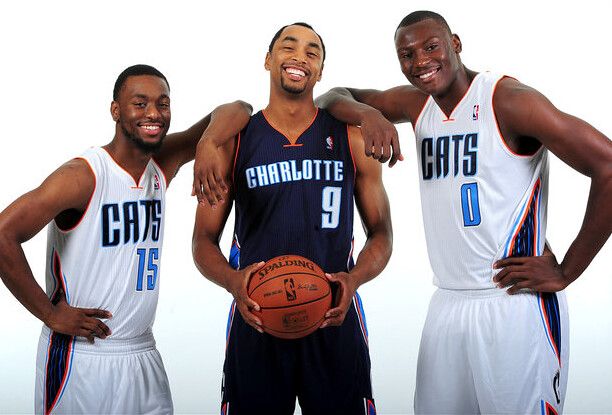
In a surprise move that nobody saw coming, least of all me, the Bobcats unveiled new uniforms last night. Very odd timing on this — why not wait until the NBA Finals are over? Anyway, you can see a good slideshow here.
A few random thoughts:
• Very happy that the Bobcats will no longer be wearing pinstripes (an element that I almost never like on basketball uniforms).
• I love orange as a trim color. Always looks good.
• I hate navy blue and sky blue used together — almost never looks good.
• That Nike-style wishbone collar looks sooooo dated. When’s the last time a team switched to that look?
• For the Bobcats’ inaugural uniforms, the off-center uni number made sense, because they were using a baseball-style chest insignia. They moved the number to the center when they adopted the pinstriped design, but now the number is off-center again. Why? Doesn’t make sense with the new chest wordmark.
• The off-center number looks even worse on the road jersey, because the road lettering is much smaller (because “Charlotte” has more letters than “Cats”), so the number looks proportionally larger, which makes its off-centeredness feel badly unbalanced.
• Speaking of the off-center numbers, someone on the Chris Creamer board pointed out a strong similarity between the new Bobcats design and the Mavs design.
• “Cats”: No. Use that for an alt jersey if you want, but as your primary insignia? No.
• Here’s the rear view of the road jersey. That’s the new logo, which we’d previously seen on a cap, above the NOB.
Overall: Not a horrible uniform, but not a particularly well-conceived one either. Feels like change for the sake of change. I loved this team’s original look. Wish they’d stuck with it.

Collector’s Corner
By Brinke Guthrie
Did you collect action figures growing up? My favorite was Captain Action. This guy was terrific, and in fact he was the first one to be called “action figure,” so boys wouldn’t be stuck with a “doll.” Captain Action could be dressed up to portray a lot of different superheroes, and he had his own cool ride, too. I still play with him today (although Princess is not impressed). I also had a few GI Joes (this Mercury Space Capsule was a favorite), but I don’t recall sports action figures from back in the day. With that said, take a look at these Johnny U and Joe Willie figures — though Johnny looks more like Peyton Manning to me!
Here’s the rest of this week’s haul:
• Take a look at this 1976-1977 NFL calendar from Pizza Hut. Looks like Mean Joe Green was trying to unscrew Roger Staubach’s head.
• Hmmm, this glass may have “Kansas City Royals” on it, but that player sure looks like Reggie Jackson, doesn’t it?
• Ack! Willya look at this set of ABA pillows! [That is pure gold right there. ”” PL]
• Speaking of the ABA, you’ll love this serving tray. Looks to be in perfect condition.
• I always wanted one of those NFL Springbok puzzles. This one features the Kansas City Chiefs.
• A mod look to this 1970s RC Cola in-store football poster.
• The ad says this is a 1970s NFL Thermos, but I believe this is more early 1980s, judging from the helmet artwork. Either way, looks great!
Seen something on eBay or Etsy that you think would make good Collector’s Corner fodder? Send your submissions here, and you can follow Brinke on Twitter and Facebook.

Question Time: As you may know, the Brits have a political ritual called Question Time, when the Prime Minister answers questions from the members of Parliament. I’d like to start our own Question Time ritual here at Uni Watch, like so: Every so often I’ll invite all of you to send me questions, and I’ll try to answer as many of them as possible in a future blog entry. The questions can be about uniforms, sports in general, me, or anything else.
Nothing is out of bounds. If you want to ask what I think of Ronny Cedeño’s orange shoelaces, that’s fine. Ditto for “What’s the best way to cook a pork chop?” or even “Why are you such a big asshole?” (although my answer to that question may not be as definitive). Personal questions are fine, although I may opt to ignore any that I decide are too personal. I can’t guarantee that I’ll be able to get to every single question, especially since I don’t yet have a sense of how many of them will be submitted, but I can guarantee that I’ll do my best to address as many of them as I can handle.
Hard rule: Only one question per person per Question Time segment. (I’m hoping Question Time will be a semi-regular feature, so you’ll have other opportunities to ask about other things down the road.) Soft rule: I would prefer that all questions be signed with your real name, although that’s not a requirement.
So here we go: Send your question (again, only one) here. Please do not post questions in the comments. Thanks.
I don’t mind saying that yesterday’s entry, about the 1976 Braves’ nickNOBs, was a doozy. If you missed it, check it out here.
Uni Watch News Ticker: Check out the award patches on this Ravens practice jersey. The top patches are the “Arm and Hammer” award, which is for strength and conditioning — they’ve been giving that out for years. I don’t recognize the lower patch design, though. Anyone..? (From Brent Coulson.) … Here’s a good discussion of Native American mascot debate as it pertains to some Connecticut high schools. … In a related item, I’ll be discussing Native American mascots and logos tomorrow morning, between 9am and 10am eastern, on Connecticut Public Radio’s Where We Live program (you can use the “Listen Live” link in the left sidebar to hear the streaming audio). They initially asked for Phil, because of his recent Redskins and Indians renaming contests, but he’s not available tomorrow morning, so I’ll pinch-hit. … It looks like Arkansas baseball coach Dave Jorn is wearing a Nike windbreaker, but an anonymous reader knows better. “That’s a Majestic Cool Base Convertible jacket,” says our source. “Nike doesn’t make a jacket with contrasting sleeves. The low logo on the right sleeve is to covers the Majestic logo.” … Look at Phil Rizzuto with his sleeves rolled up. He’s wearing the uniform of the Norfolk Naval Training Station baseball team, circa 1943 (from Mike Hersh). … Former NFLer R.C. Owens passed away yesterday. This obit includes a uni-notable detail I hadn’t been aware of: “Owens was also a pioneer in the use of gloves for pass catching during cold weather games. This was a practice that he developed during his years while playing for the College of Idaho. 49ers’ coach Howard ”˜Red’ Hickey discouraged Owens from the practice of utilizing gloves, saying, ‘This is the NFL, son'” (from Andrew Berthelsen). ”¦ Eli Manning did a promotional appearance at a Dunkin Donuts outlet yesterday and wore a Reebok jersey with no NFL logo for the occasion, which should piss off several different sets of people (from Jason Mattina). ”¦ Quite a bit going on in this shot of Alexei Ramirez, what with the pregame cigar, the knee pads exposed by the inside-out pants, and what’s the logo on that T-shirt? (From Ryan Connelly.) ”¦ Remember those ugly jerseys that the Brewers will be wearing for Italian Heritage Day? Here’s the cap. That’s gonna be one horrendous-looking game (from Sam Lam). ”¦ Bobby Kutzendorf, who pitches for Aurora Christian High School in Illinois, has a sharp look (from Lincoln King). ”¦ We’ve previously noted that Rangers backstop Mike Napoli has been wearing black catching gear, because he likes the look. But I didn’t realize he’d gone so far as to wear a BFBS helmet. That’s kinda fucked up (screen shot by Josh Best). ”¦ Aaron Rich notes that English soccer player Alex Oxlade-Chamberlain only has “Chamberlain” on his jersey. Should we call that TNOB, for truncated name on back? … I had previously shown the American League’s All-Star BP cap, but I don’t think I showed the N.L. version. They’re both displayed here. … If you’ve ever been to the Mt. Rushmore visitors’ center, you may have seen the photo of the baseball team comprised of workers who created the mountain monument. I recall seeing it on my visits to Rushmore in 1997 and 2000, but I never took a photo of it. Fortunately, Jonathan Mayer did. ”¦ Here’s what the Mavs’ draft cap will look like. Other teams to follow soon, presumably (from Stu Taylor). ”¦ Speaking of caps, look at the MLB logo on this Mariners cap. That extra border of stitching isn’t normally there, is it? (From Andrew Edwards.) ”¦ Reprinted from yesterday’s comments: I love the early use of the wishbone-“C” logo by this Cherokee basketball team. ”¦ Mets radio broadcaster Howie Rose gave a nice shout-out to Uni Watch last night. I wasn’t listening at the time, but Robert Silverman was, and he provided the following transcription: “By the way, if you’re interested in uniforms and uniform history, there’s a great web site called Uni Watch. They dig up the most amazing things… It’s a great web site. He’s got some pictures on there… the stuff Paul Lukas, who runs the site, finds are just amazing. Great site.” Nice. ”¦ Pretty hilarious item about how the Yankees lodged a uni-based protest against the White Sox in 1976. Entertaining reading (from Mike Kingery). ”¦ After Lucas Duda homered in yesterday’s Mets/O’s game, teammate Justin Turner unbuttoned his jersey to reveal, uh, something. Looks like “Buches,” right? And that’s exactly what it is — explanation here (screen shot by the long-lost Mike from Queens, T-shirt decoding by Phil). ”¦ Rays reliever Joel Peralta was ejected from last night’s game against the Nats after umps found pine tar in his glove. ”¦ A high school football team in Florida is using the Atlanta Hawks logo (from Mike McLaughlin). ”¦ New kit for Plymouth Argyle (from Bob Williams).
Those Charlotte uniforms aren’t just similar to the Dallas Mavs, its the exact same font with a reflected A. Pretty lame. I hope the Mavs have a uni change coming up.
Not the exact same font, but pretty close.
I’m not even close to being an NBA fan—-but I recognized the Mav’s font as soon as I saw the story. I am sure Cuban has already called the league, eh?
The unis harken back to the ill-fated Cavs uniforms of the Danny Ferry era. Dark Blue/Lite Blue/Orange.
The more things change, the more they stay the same.
You mean the one with the splash of light blue across them? I always thought that was a black uniform…
You’re correct. It was black.
They were black, with a powder blue “lightning bolt” thing across the chest. The numbers, while blocky, had the split numerals, ala the Grizzlies or Villanova. That Maverick jersey is pretty dead on, though.
The split numerals were the only cool thing.
Let’s not talk about those Cavs unis, or else I’m going to get their image stuck in my head.
Happy thoughts, Jim…link link link
I understand why Michael Jordan chose this design of the new Charlotte jerseys; he is a student of history:
1) Since this particular Nike-style wishbone jersey was introduced back in the 1999-2000 season, at least one team wearing it has, with the exception of ’03 and ’07, appeared in every NBA Finals: that’s 11 out of the last 13 seasons (if the Celtics and Spurs had also switched designs, it would’ve been a 13-year sweep)
2) Every US-based team who has worn them has won at least one NBA title, and if the Miami Heat wins one more game against OKC this season, that would make it 9 out of the last 13 championship teams (again, if Boston and San Antonio had also swapped their kit, then it would have been 13 out of 13)
As pointed out by others over at Creamer’s, I totally saw the resemblance to the Dallas Mavericks immediately, but I came up with three other quick observations:
1) Who doesn’t like cats? (especially on YouTube)
2) It looks like Mavericks in the front, but like OKC in the back: does that make it a mullet?
3) “Cats”? Really? More like “copy-cats”!
Disclosure: I hated this design when it made its debut, grew to tolerate it, like it, love it, being indifferent to it, and now beginning to dislike it a little.
There have always been issues in Charlotte with the fact that Bob Johnson named the team Bobcats… like he was naming them after himself.
While I agree “Cats”, like “D-Backs” is dopey on a uniform, this is probably the reasoning behind it.
haha your kidding. the guy who named the team- his name is Bob? incredible
I think those jerseys are incredibly generic, uninspired & one last cash grab by the Bobcats, whom are probably anticipating getting the Hornets moniker back.
It’s basically an exact copy of the Dallas Mavericks: basically same shitty font & off-center numbers, majority color scheme, even the animal logo with basketball on the right side. I know some basketball people love Mark Cuban but come on. Have some originality.
@Concealed78: exactly, which is why Michael Jordan is getting rid of “Bob” and renaming his team the Charlotte Copycats.
If I remember right from a book I read as a kid, RC Owens was the player who they positioned under the goal post to try and block field goals that would just skim over the bar. I think it was soon outlawed after he tried it in a game.
Good to see Uni Watch get a shout out on the Mets broadcast. Imagine if it had come by the guy whose broadcasting Paul doesn’t like. If only they had plugged a certain t-shirt…
Ricko posted a link to link yesterday.
Cool. didn’t see that yesterday
Couldn’t he just as easily have tapped one over that might have fallen short of the crossbar otherwise? Seems kinda stoopid.
If the kicking team can get a guy downfield to the crossbar in time, I’d like to see that…
The new pinstripes-free jersey for the Bobcats also means they finally adopt the new NBA jersey fabric introduced a couple years ago I suppose (and believe I can recognize on the pics).
I don’t really care for the fabric the current NBA jerseys are made from. The ribbed effect (especially on the White shirts) reminds me of the tank-top undershirts my Dad wore in the 1950s. Just looks cheap and unbecoming.
Here is an article from 2010 on the second Ravens patch:
link
From the article:
The Ravens have a new patch on their practice jerseys that is an homage to the Biblical story of Nehemiah.
Featuring the ubiquitous Ravens shield in the middle, a shovel and sword are crossed behind it in an “X” fashion.
The shovel and sword call to mind the building of a foundation, a story Ravens head coach John Harbaugh told earlier this year.
Yup. Phil asked the same question about the patches last year: link
My mistake, John Ekdahl did the ticker that day.
If you’re such a big fan of the original Bobcats look, they didn’t get rid of it…
link
(you should be more thorough in research…lol)
Niiiiiiiiice.
I believe the Bobcats and the Panthers team names are meant to be in the same family. Kind of Hokey if its true but a fun theory.
Charlotte does like cat names. Public transport is called Cats, light rail is called Lynx.
Paul,
You said you ALMOST never like pinstripes on a hoops uni. So which uni did you like them on? I know I always thought the Pacers yellow pinstriped jersey was very nice and still one of my favorites.
Yup. I like that one too.
I loved the Bulls black unis with the red pinstripes
link
Michael Jordan couldn’t stand wearing those if I’m not mistaken.
You are correct, Wheels. He and most, if not all, of the players didn’t like them because they felt that they looked too much like Orlando’s unis.
I remember reading this in a newspaper article reporting that they’d be wearing the unis again in the upcoming season. I believe the headline was “Despite Popular Demand.”
The “upcoming season” I’m referring to would have been the upcoming season at the time I read the article: 1996-97.
That makes sense, because I think the next season they removed the pinstripes and just had plain black alts.
I’m referring to 1997-98: link
A couple of thank yous to commenters from yesterday:
Randy Rollyson for explaining why Darrel Chaney would be “Nort”, and Mark H. for Adrian “Bing” Devine. Here’s hoping we can confirm both.
regarding the embroidery around the batterman logo on the mariners hat. i believe the hat is part of the cooperstown collection and not an on-field version. new-era uses the normal rounded version of the logo with the on-field hats and an embroidered square logo on cooperstown and “fashion” collection hats.
we sure this isn’t a knock off? look at the batter it’s self .. it looks like a blob instead of the actual person
i use work at a Lids and have plenty of NEW ERA caps and i have never noticed a difference between the boarding of the MLB logo for fashion and on-field hats
The Braves 1974 Cooperstown caps also have the extra border. When they wore the same caps for the Civil Rights game last season, there was no border on-field or on the ones sold in the team shop and online.
i am referring to the embroidered square outline not the extra boarder. look at the image again you will notice that it’s white MLB boarder is squared off not rounded. i might have to do with the switch from a flat logo to a raised logo though
It’s a shame that this camera was apparently dropped in a vat of petroleum jelly before the picture was taken. Can we please leave instagram off pictures taken for pointing out small details? Or better yet, can we please leave instagram off pictures completely?
Maybe Michael Jordan had a hand in the new uni design and the off-center numbers are a nod to the link he wore during his link.
Or it’s just the next step in his quest to achieve the title of worst GM in the history of the NBA.
Don’t recall the number being so low, but I loved those.
They should go back to that radially-arched BULLS. It’s retro-cool in the extreme.
The new ‘CATS’ uniforms look like the result of a three-way between the Villanova Wildcats, Dallas Mavericks, and OKC Thunder.
With a little Orlando Magic side panels thrown in
Paul, regarding the pinstripes, I’m surprised you didn’t mention that there in fact do appear to be pinstripes on the uniform, but relegated to that weird side panel? Any thoughts on that? Seems very strange to me.
gotta say…i was kind of expecting a different design for the plymouth argyle…
You too? You would expect a team with the word Argyle in its name to have argyle socks or something argyle in its uni.
Yep, although I think in the UK that pattern is seen as more of a Scottish thing than Devon. Wonder where they got their name.
If Wikipedia is to be believed:
“Much speculation surrounds the origin of the name Argyle. One explanation is that they were named after the Argyll and Sutherland Highlanders, an army regiment with a strong football side of its own. Another theory is given the respective geographical placements—suggests the name comes either from the nearby public house, The Argyle Tavern, where the founder members may have met, or the local street named Argyle Terrace.”
Cool question column thingy. But I’d like to ask a general question to the commenters.
Readers, why do you like to post comments before finishing the blog entry in its entirety? Is it a “I want to be the first to mention this” kind of thing?
Two comments:
* That ABA serving tray is listed at $300. Yikes!
* A diehard Chisox fan needs to do a uniform tracker on the different combinations that team wore with the blue navy retro uniform set, like what was done with the BucsTracker. I think there was at least three different sets for the White Sox, possibly four during that era.
Not sure what this comment has to do with commenters jumping the gun, but there was blue over blue, white over white, blue over white, white over blue — all of those paired with blue caps. They also wore white caps a handful of times in 1976 (I think I’ve only seen pics of them worn with the blue over blue unis).
Then of course there were the white jerseys over blue SHORTS.
The striping pattern on the socks changed from year to year during that era as well.
A diehard Chisox fan needs to do a uniform tracker on the different combinations that team wore
Can I ask: why? Other than the shorts, do we really need to know what they wore every single day from 1976-81? Seems like more trouble than it’s worth.
As far as we know, the Sox wore white caps on the road from basically April 13 1976 – April 21 1976 & was banned thereafter. 1981 they basically wore white over white at home & white pants on the road.
Exactly. The Buctracker makes sense due to the number of different combos available, but the Sox today have more different uni combos available to them than they did during the majority of that period (all white, all gray, black over white, black over gray, 1972 throwback).
The white road caps weren’t banned; they just stopped wearing them.
Well DJ, I’m just going by what I’ve read over the years from various sources, including this one from a great site:
link
“During the month of June, baseball Commissioner Bowe Kuhn banned one of Veeck’s uniform additions. Apparently the alternate white caps, only worn a few times, were making life miserable for hitters. Batters complained that the view of the ball was lost in the white hat when thrown by the pitcher.”
Thought I read it here too, and/or that white caps were banned in the A.L. (at least back then) until the Red Sox wore them in like ’97 but not in the N.L.
They stopped wearing it well before June. May, I think. Well before Kuhn’s purported ban.
I think the listing for the Kansas City Royals glass was really for a Kansas City A’s glass, which would explain why Reggie Jackson was on it.
Well the glass does clearly say “Kansas City Royals” on it. I suspect this must have been pretty early for the franchise (maybe 1969-1971 era) so whomever made the glasses just recycled an image that was based on Reggie Jackson from the Kansas City A’s days.
This design smells a lot like “didn’t want to pay anyone for a license” to me.
The image is obviously based on a picture of Reggie, but that looks like a 70s doubleknit Oakland uniform, and not anything he would have worn with the KC A’s in ’67.
The whole thing has been made generic enough to keep MLB and the MLBPA off their backs. I wouldn’t be at all surprised if it came from any year in the 70s.
You’re right. The pullover jersey/striping/skinny stirrups mean the glass is probably from 1973-up, when Reggie had acheived superstar status. No way does he appear on glasses as a K.C. rookie, in any case.
Nice that the seller allowed it could be a 1950s Kansas City Royals glass, though.
Brinke may not “recall sports action figures from back in the day”, but I do.
Mego (better known for their lines of StarTrek and Super Hero action figures) made a Joe Namath (complete with an off-field wardrobe), a Muhammad Ali, and (allegedly) a Franz Beckenbauer action figure.
link
Never knew about that. I want one, if only to dress in Cosmo whites.
In the Mt. Rushmore team picture, it appears that Washington and Jefferson are sporting some eye black.
A great many of the New Era 59FIFTY fashion caps have a square MLB logo and may or may not have “[t]hat extra border of stitching.” For example, hats such as the Yankees black-on-black 59FIFTY do not have any extra stitching and have a standard-shape MLB logo. link
Hats such as the Cooperstown fashion hats do have the square logo. Here is a Rays (they do not say Devil Rays) hat:
link
“Navy blue and sky blue almost never look good together”
Thats a joke right? Navy/sky are a classic color combination that ALWAYS looks good together. See: UNC
No joke, it’s just A Paul Thing®, like hating purple.
Navy and sky blue look fine together.
Sloppy work on my part: I don’t like it when sky blue is used to outline navy, instead of the other way around.
Disappointed to hear you’re not a fan of the look here at Villanova. To each his own.
One of my favorite unis of all time:
link
And that look was fantastic up in Toronto:
link
And I wouldn’t be surprised if there is a sky blue alternate coming at some point. I’m assuming the franchise has a vested interest in not pissing off Duke/NC State/other college fans in the Charlotte area, but a sky blue basketball uni in North Carolina? I’m shocked it’s taken this long to do it.
Navy blue and *black*, however, are just ducky.
Ick! My bad! Powder blue and black, I mean.
“I hate navy blue and sky blue used together – almost never looks good.”
Almost, not always.
Paul made lemonade out of that lemon of a color combo in Camden a while back:
link
To Mark Hamilton:
Cherry and White always looks good…Go Owls!
From yesterday about the Orioles new bat knob designs
link
Why would they use a different font for DAVIS and BETEMIT?
Bobcats look like a mix between the Thunder and the Magic.
Not a fan.
Strong similarity between these new Bobcat unis and the Mavs unis? Try direct rip-off.
The Hornets never should have left.
True that, but if I have to pick a favorite Bobcats look, the expansion year suits were fine. I liked the solid orange; the number font was a bit hard to read, though.
noticed the logo is on the wrong side of the Steelers helmet with Mean Joe Green on that calendar cover.
I’m about 90% sure that the baseball hats that I own from New Era do have the MLB logo outlined like the Mariners do in that picture.
Even with that second color?
That outlined MLB logo is what New Era uses on their “Cooperstown Collection” of hats; these are hats that use old logos of current or former teams. You can see it in the center of this image: link
I have to assume the Mariners logo used on the cap is somehow an older version of the logo which qualifies it to be a “Cooperstown Collection” (very odd, I know)and it has that outlined MLB logo. Whoever submitted the design to New Era tried to hide the outline by making the extra border of stitching tonal with the rest of the hat.
The cap qualifies for the Cooperstown Collection by virtue of the fact that they haven’t worn it as part of their regular uniform set since A-Rod’s rookie season.
Not only the stitching, but that MLB logo looks terrible. Looks like a bad drawing
Maybe I’m crazy, but I wouldn’t be surprised if just using “Cats” is a test run for dropping the Bobcats name altogether. The rumors have been out there for a while. After a few years of slowly phasing out the full team name, they’ll transition to something else. Hopefully, by that time the Hornets name will be available and will return to Charlotte.
Hell, if they get the Hornets name back, I’d even suggest returning to purple and teal. Love it or hate it, at least they wouldn’t look like the Dallas Bobcats.
Two things:
Paul, I can’t believe some picky Carolina fan hasn’t told you yet that it’s Carolina blue, not sky-blue. (I’m not a Carolina fan).
That Mean Joe Greene/Roger Staubach calendar image is a doctored image from an actual picture of Baltimore Colts linebacker Mike Curtis tackling Los Angeles Rams quarterback Roman Gabrial in a 1960s football game. I’m image-linked challenged, but if you google image Mike Curtis, the phote comes up.
Wow – great call on the link photo!
It’s neither; it’s Columbia blue. ;)
Even Carolina fans get confused: surely you’ve seen the bumper sticker (or T-Shirt):
“If God isn’t a Tar Heel, then why is the sky Carolina blue?”
Keep in mind, though, that the Bobcats aren’t using an exact Carolina Blue (although Michael Jordan would probably like to convince himself otherwise). Same deal with the Panthers, who use a brighter shade of blue that they call “electric blue.”
That sign at Armwood High School is about to look a little different.
link
This is interesting given that their big rivals, Plant High, have maybe 10 students in the district with the rest claiming relatives’ addresses and random cardboard boxes as their place of residence to get in.
All of these new NBA jerseys (OKC, Brooklyn, Charlotte,Atlanta) look very generic to me. In general I like simplicity as long as its a “classic” look (think Celtics). There is nothing exciting here. At least the hated Gold Washington Uni uni was (link) and this innaugural Toronto set (link) were creative. Who is going to remember these unis in 10 years?
Basketball uniform design is tricky, because there’s so little real estate to work with. No sleeves, no long pants, no socks, and you’re required to include a uni number on the front. That makes it hard to come up with memorable designs.
That’s why I think the link basketball uniforms have link designs to link.
Portland
link
link
link
but I also like some link link link
And yes, I realized I just linked to all old-school unis.
I do love Memphis’ current unis, along with Cleveland’s. The Sixers and Jazz have some great classic looks, and I also like Dallas’ and Sacramento’s newer unis (not as much as the 80s, but I have adapted). The Spurs have always looked good.
“along with Cleveland’s”
~~~
don’t the cav’s have like eight different designs?
Nope. Home white, road wine and blue alt. I could do without the last one, but it’s still pretty good.
If you’re talking about the whole history of the team, yeah, there’s about that many.
That makes sense, not a lot of canvas to work with. I actually liked those BobCat “Racing” alternate unis with the checkered flags on the side. I was hoping their new uniforms were going to build off of those. It was unique and I think they could have been a huge hit if they did them right. Just look at how much kids love the “Cars” movie. A name change would be in order of course. I like the idea of “The Runners” which be a dual nod to the old ABA team and Racing (Many of the original NASCAR drivers had roots in moonshine running”.
I wana see the BKLYN unis !
“Charlotte Bobcats” always sounds little off to me. They should of did a complete re brand of the team with the roll-out of the new unis
Carolina Bobcats
Carolina Cats
something that makes it sound better
who knows, maybe next year they’ll be the Charlotte Hornets and the city will have their pin stripes back again
Carolina Cougars.
All they have to do is keep the throwbacks they wore this season.
I dunno, the aesthetic of that NFL Thermos screams early 1970s to me. It’d have to be 1973 or later because of the Rams’ helmet, but I would think the fonts used for the conference names would have been replaced by 1980 with something along the lines of solid capital block letters, or something in the Helvetica family.
It would be helpful, of course, if we could see more than one view of that Thermos. Too bad the seller didn’t think of that…
I had a lunchbox – and wallpaper – with those same helmet renderings when I was in grammar school in the mid-late 70s.
Little bit of a complaint with the advertising pop-up on the mobile version of your site Paul. What happened to being able to close it out? No little x in the corner now and a quarter of my screen is blocked by an itunes ad :(
Anything I’m doing wrong or is this just the new format?
Wasn’t aware of that. Will investigate!
Stand up guy, you are!
It’s back to normal! Did you take care of it that quickly or was it a fluke?
Fluke, apparently.
Brinke, you walked straight into my toy collecting sweet spot!
Captain Action has been reissued twice in the modern era – 2000-ish, with the cheaper-to-get licensed characters (Lone Ranger, Green Hornet), and this year, when a new maker sprung for a Marvel license. Look for Cap and the Spiderman and Captain America outfits at a Toys R Us or comic book shop near you.
The Namath and Unitas figures were a Kenner Starting Lineup release, also 2000-ish. Johnny U looks more like Johnny U without the helmet.
As for sports figures in the 70s, do not forget Big Jim, Mattel’s spin on a sports/outdoors action figure. 9 inches tall, push-button karate-chop action, and more accessories and playsets than you could shake a stick at.
Nice of the Mets broadcasters to acknowledge Uni Watch. I wonder why they didn’t do it before, when that other broadcaster was working. You know, that Wayne guy…
Howie has actually acknowledged Uni Watch on the air in the past. He’s a fan (and the feeling is mutual, natch).
Re: Joel Peralta. A rule is a rule. If you break it and get caught, you pay the price. No matter what the circumstances are. If you don’t like the rule, get it changed. I’m usually a Maddon fan, but you look more bush league for complaining about this than just owning up to it and taking the penalty.
I’m usually a Maddon fan, but you look more bush league for complaining about this than just owning up to it and taking the penalty.
Agreed. I love Maddon and am disappointed by how he responded here.
What’s worse is this article:
link
So this is considered better than using steroids? BS – cheating is cheating is cheating. If you’re gonna keep Bonds and McGwire out of the HOF, then you shouldn’t have put in Gaylord Perry or Whitey Ford or any of the other so-called “artists.”
…exactly cheating is cheating is cheating and as soon as they remove Bonds and McGwires’s HRs from the record books then they shouldn’t be in the HOF… but as long as numbers like 762 HRs & 583 HRs (and 4256 hits, for that matter) stand in the record books then they should be in the Hall of Fame, because those numbers are Hall of Fame numbers. Otherwise you get people debating about whether someone like Jim Thome (608 HRs and counting) who has not been tainted by “steroid talk” deserves HOF consideration because HR numbers in general have been “inflated” If anything Thome deserves Hall of Fame consideration even moreso considering he’s hit 600+ HRs without apparently cheating.
Saw a shirt yesterday for sale in, of all places, the grocery store, of a “Angry Oriole”, basically the Smilin’ Bird crossed with an Angry Bird design.
If you think that’s bad, see what the Philadelphia Eagles have done:
link
After seeing how badly they rendered the Eagles jersey, I can’t wait to see what how the Angry Eagle looks.
Have you ever seen Andy Reid so animated at a presser?
So, the Angry Birds haven’t just jumped the shark, they’ve got a jump rope made of sharks.
i really dont understand how the Angry Bird franchise still thrives..there’s not substance there, one would think it’s 15 minute would have been up a long while ago
COTD FTW, The Jeff!
Terps new pride basketball unis – link
Well, those are disappointing. Nowhere near enough of the flag patterns, and just like the football uniform, failing to switch sides between top and bottom to actually mimic the flag.
I’m one of those Maryland wierdos who loves the flag and the uniforms. But why they don’t switch the sides to mimic the flag is beyond me. It would be so simple and make it look so much better.
I think the flag usage is just right – incorporated into a pretty standard basketball template. I love how they’re used as side striping on the shorts – only wish there was no butt chap thingy from back to hip to thigh (wow, that sentence looks weird).
Still don’t like the current MARYLAND wordmark and numbering – always looks muddled on black and gold designs. Red uniform looks outstanding though with cleaner white lettering/numbering.
I -knew- I recognized that “Joe Greene/Roger Staubach” photo. But…it wasn’t Joe or Roger.
Try Mike Curtis trying to murder Roman Gabriel!
link
That explains the earlier comment about the logo on the wrong side…
Looks like presidents Washington and Jefferson are sporting eyeblack in that Mt Rushmore baseball team photo. I assume the dark bars are supports for the workers carving the monument. But it’s fitting for the baseball photo.
For that Mariners cap and that extra stitching, I have the exact same cap. This was a reproduction cap. The original ones had a white sweatband but these have a black one. The extra stitching is normally found on fashion caps so I don’t know why this reproduction of a non-fashion cap has it
I think the truncated hyphenated name has been done before. When Lew Alcindor changed his name to Kareem Abdul-Jabbar in 1972, the Milwaukee Bucks put “Jabbar” on his jersey. By 1974, the Bucks changed it to “Abdul-Jabbar”. There’s a few Bucks videos on YouTube that show this.
Similar to the UK, Canada has Question Period where the PM and other cabinet members avoid answering questions from the Opposition. It’s called Question Period not Answer Period for a reason (especially in recent times).
Check out the jerseys the “Legends” are wearing about 10 seconds in:
link
Very tequila sunrise-y.
(yes, that’s the HR Derby for the South Atlantic League AS Game taking place on an aircraft carrier)
Eli knew exactly what he was doing by wearing that jersey. Him and his brother do anything they can to wear Reebok. Peyton was on that Live With Kelly talk show and he wore a Reebok sweatshirt. Nothing beats Tony Romo and how much he wears (and makes his new kid wear) that dumb brand Starter….
lol Starter; that is so 1990.
Not the same company.
The original Starter, which was licensed to make authentic uniforms and dugout jackets, etc, went out of business sometime in the late 90’s.
Nike bought the rights to the name & logo out of bankruptcy, and started the brand which you see today in low end places like Wal Mart and K Mart. Nike then sold the brand to some other company who kept it going as a discount sports apparel brand.
The More You Know
================*
Ah, so they’re just a generic Under Armor-type company now of a subsidiary of Nike that I need to boycott as well. Seems like every company is owned by another company these days. I thought they completely disappeared until I saw some white Starter socks at Walmart a while ago. I remember when Starter was all the rage back in the day.
Did you collect action figures growing up?
No I did not. I still think they’re dolls. Never understood the appeal of them nor did I ever want them.
FTR I played with Legos, crayons, various toy guns, some sports equipment & my bike.
at the same time?
…while bicycling & drawing a Smith and Wesson logo in crayon on a gun made of Legos which I used to… dribble a basketball.
Good times, good times…
catch of the day made me realize just how far and tough the kessel run must have been for han… what an accomplishment!
That COTD is awesome!
“Space is big.
You just won’t believe how vastly, hugely, mind- bogglingly big it is.
I mean, you may think it’s a long way down the road to the chemist’s, but that’s just peanuts to space.” – Douglas Adams
Seriously mesmerising.
Forgive me if this has already been posted (a quick check indicated otherwise), but I was at the Frederick Keys game on Saturday night (Lupus Awareness Night, as I came to find out) and they wore special jerseys for the occassion:
link
I believe the jerseys were auctioned off, with proceeds benefitting the Lupus Foundation.
When Alex Oxlade-Chamberlain made his debut for Southampton a couple years ago he wore his whole NOB but it looked a little silly…
link
Also his dad is Mark Chamberlain a former professional footballer who made a few appearances for England, although I don’t think they used NOBs for international sides when he played.
link
Should just go with “Ox-Chambo” his Jack Wilshere bequeathed nickname.
In the Charlotte “Cats” photo, Kemba Walker is wearing his old number 15 from Connecticut instead of number 1, and Gerald Henderson, who wore number 15 for the “Cats” last year is wearing number 9. I’m assuming these will be there new numbers for next year, but the current Charlotte Bobcats website still has their old numbers listed.
Before I get nicked, yes, I spelled their as there. So there.
don’t know if it will work. Here is Joe Maddon in the FauxBack Uni the Rays will wear June 30th.
link
Some good news: The Tigers are playing along too.
link
It’s just a rip-off of my favorite Padres’ uniforms, not very original.
And the belt doesn’t work either, should have been a sansa-belt, or whatever it’s called.
In vintage Mariners colors.
Needs the high-cut stirrups instead of solid socks.
What’s the point if you’re not going to go all the way with the pants? The belt ruins the look. You gotta go with the sansabelt pants with an elastic, striped waistband.
link
the appropriately ghastly Ray’s fauxback
So awesome.
“I hate navy blue and sky blue used together – almost never looks good.”
What Paul said.
It almost always looks good, in my opinion.
And I’d SO wear that Rays uni!
So Bad it’s Good
I kinda like it — (except for the fact they should be Devil Rays) … very San Diego Padres-ish and the Comic Sans like rounded number is bigger than I expected. Unusual (well, it’s all unusual) to see the number on the left instead of the right. I wonder if they were going to put it on the right until they realized the tail of the “y” would be in the way. I wonder what the back looks like.
Is this the first time a team has done an admittedly entirely made up throwback instead of just failing miserably at getting the details correct?
Yeah, I don’t think anyone has thrown back to a time before a franchise actually existed. They’ve thrown back to different names in the same franchise timeline and thrown back to teams in other leagues in the same city, but I don’t believe anyone’s thrown back to a time when the franchise in question didn’t actually exist and yet acted like it did.
Gotta say, that’s probably what it would have looked like. And unlike some, I’m not going to shout at the rain about it.
Texas Rangers, June 1996. Do a Google Image search on Darren Oliver. He was pictured in it for two relatively common baseball cards.
Linking this again:
link
So they wore it twice – 1993 & 1996?
I have to say again: that is one awesome uniform & if the Rangers ditch blue again they should go right to that. Ice Cream Man cap; NNOB; cream, simple Olde English T; everything.
Was that Mets “big N-Y” uniform entirely made up too, or was it based on something the New York Giants wore?
Also on that picture of Maddon modeling it you can just barely see the edge of a patch on the left sleeve, and in the text of one of the articles it says the jersey has on the sleeve a patch with the City of St. Petersburg Seal from 1979. The city logo from 1979 is this, so I wonder if the patch will look like this.
link
Its existence is incomprehensible and its appearance is ghastly. Probably the stupidest MLB uniform I’ve seen since the Mercury Mets. I can’t say a single good thing about it, except that I’m glad it’s only a one-off. (I should start praying that it remains a one-off.)
And oh by the way, the San Diego Padres called. They’d really like to have their template back.
Angry much?
Baseball is supposed to be fun. Have fun. Don’t blow a gasket about a team you don’t support wearing a uniform you don’t like for a game you won’t watch and won’t buy a ticket to.
It’ll be all right. Really, it will.
Fun game, stupid uniform. Two completely independent opinions! And not angry at all. Just calling them as I see them!
“Don’t blow a gasket about a team you don’t support wearing a uniform you don’t like for a game you won’t watch and won’t buy a ticket to.”
~~~
um…this is Uni Watch…it’s what we do
Angry much? Baseball is supposed to be fun. Have fun. Don’t blow a gasket about a team you don’t support wearing a uniform you don’t like for a game you won’t watch and won’t buy a ticket to.
Don’t tell people they can’t dislike something. That’s not how life or the Internet works. It’s like those lameass people who whine about “haters” and tell them to “go away” on a message board because they don’t worship the particular subject matter.
No wonder the Rays chose 1979 as the year to to fauxback to:
Right after this:
link
And just before this:
link
Reactionarily innovative for ’79?
Certainly not for date significance since it was 33 years ago. Not for irony since Tampa’s record snowfall came in 1977.
I laughed when I saw it. Which is not necessarily a bad thing for a fanciful one-off.
Tres funky, I like it.
Its perfect. Its exactly what the Rays would have worn if they’d existed in 1979.
It captures everything that made the 1970s in baseball so funky.
Thumbs up.
That sun looks like either a lemon; “Ray’s Lemonade” or I guess, an anus.
A Padres rip-off. Just like I imagined. Even ripped off the front panel design.
Hideous.
angry much?
Never.
Oh yeah, screw that god damned no-nuts know-nothing asshole Barry Petchesky for his “Joe Maddon, you’re a damn good sport. (Except when you’re calling out the Nationals for a “pussy move” when they bring attention to Joel Peralta’s sticky, dripping glove.)” remark. Maddon is one of the best managers in the game. I’d kick him right square in the dick if he didn’t have a big pussy-vagina already :)
Maddon was wrong in this case.
And that fauxback is glorious.
that was a pussy move to wear that *thing* without proper ruppage
You’re not psyched to see some blue pants again? Reminds me of the early 80’s Cardinals, Phillies, etc.
I’m not into powder blue or funky 70s designs. I like the old traditional wool flannel white & gray look. Off-kilter looks can work if they’re done tastefully & with some restraint.
That Lemonade Rays look is just too much & is not very original at all. It looks like the 1978 Padres met the 1977 Mariners roads.
Man, I realllly wish Ebbets Field Flannels made a batch of those Mt. Rushmore jerseys.
I came across an interesting case between Alabama and a guy who paints pictures of Bama sporting events. In short, Bama says the artist needs to pay licensing because he depicts Bama uniforms, colors, and trademarks in his work.
link
The newest unis in the NBA:
Home: link
Road: link
Brought to you by the BUDâ„¢.
Good work, Tim!
Wish I could say the same regarding the actual unis, though.
The Charlotte CopyCats!!! Well, OKC would probably sue if Charlotte changed their name to ThunderCats. Make that OKC AND Rankin/Bass… (link)
Not sure why you’d think the NFL Thermos was from the 80s. Two of the four helmets shown had colored facemasks by 1980 (Steelers and Browns). The fact that all the helmets you see on the Thermos are gray would indicate it’s from the 70s.
I haven’t been in the comments section for a number of days, so forgive me if my opinion sounds redundant. On the issue of Native American imagery and names being used by sports teams, I agree with Paul (and Phil) on some of the finer points, and disagree on other points. That having been said, I like how Paul has posted some of the links recently on this issue. I haven’t been a big fan of Paul adding comments like “slowly but surely..”, etc.. Yes, it is Paul’s site and he can do as he pleases. I’m not about to suggest otherwise. Most of us regular readers already know how Paul (and Phil) feel about the issue. I welcome the articles that are linked and read the vast majority of them. I prefer the more straightforward intro to the articles that have appeared in the last few days. I know it’s not my place to dictate content; just putting in my two cents. Now if only the subject can be brought up without a parade of douchey replies…
fair points, james, and i can see how some commentary might bother some people
i am curious as to where you differ with paul and me, since you brought it up, and i also wondered if you might proffer an opinion as to why some comments made after articles (“that’s gonna be a horrendous looking game” or “that’s gonna piss off some people” etc.) or even “jesus fuck” get no commentary but even the slightest slant “slowly but surely” on something engenders such negative feelings on the part of some…
just curious, and since it’s late, it probably won’t set off a shitstorm in the comments section
Overall, I would say that I’m kind of in between on the issue (if that’s allowed). I’m not opposed to using Native American imagery or names, per se, but I admit that the name “Redskins” and the image of Chief Wahoo are too much. I like that some schools (FSU and one of the Connecticut schools mentioned today) have gone to local tribes for their input and/or consent. I would like to see more of that. Certainly no group has been screwed over more in this country than the ones who were here first, so I’m all for some sensitivity (or understanding) on this issue.
I actually liked the idea of the redesign contest, but I felt some people went off the deep end (especially when mentioning “PC” derisively). Lighten up and have some fun with tweaks/concepts/redesigns. Someone would post an angry comment, and I would usually just roll my eyes and scroll past the ensuing long string. The issue can be discussed intelligently, I think, from both sides. That I would have no problem with and would welcome.
As far as other comments attached to articles, I’m not big on the profanity or the Lord’s name in vain, but I’m not going to get my panties in a bunch about it. Just because I may not use a particular word or phrase doesn’t mean no one else can use it. For instance, I didn’t always agree with George Carlin, but he was damn funny and I enjoyed watching and listening to him. Also, I think an opinion stated about the look of a game (particularly on this site and its followers) is less likely to ruffle feathers than bringing up a true social or political issue.
I hope I’ve answere most of your questions. Oh, and I didn’t mind the ’86 Texas matchup as much as you (although I thought the Rangers road jersey from that season looked better) and disagree with Paul on the navy blue/ligh blue issue. I saw his correction in the comments and still disagree. Just to end on a lighter note.
thanks james
hope you’re planning on wearing the tequila rups this friday…since they’ll be wearing the rainbows that night
As much as I loved this Washington throwback (link)
I wish Michael Jordan would have also worn this one (link) during his stint with the Wizards. After all, Bulls is just Bullets without E.T. and because this jersey would’ve probably sold like crazy. Since Washington is reluctant to change their nickname back to the Bullets, maybe Jordan could buy it and name his team the Charlotte Bullets to stick it to the Chicago Bulls? Nah. I would much rather prefer if Charlotte acquired the Hornets moniker back from NOLA. If only they had ‘Zo and Grandmama back… :D
The uni number doesn’t just appear to be further off-center in the road uniform, it IS further over. The number is right aligned with the wordmark, and the road wordmark is wider than the home. Compare it to the NBA logo on the left chest: the home CATS is even with (or perhaps a hair beyond) the NBA logo, but the road CHARLOTTE is a full letter (an inch or so) outside the logo.
Of course, it also doesn’t help that the road uni has a single digit number. Number 15 on the home jersey doesn’t look as off.
Found this commercial of the late Warner Fuselle selling the All-Star program from 1984:
link
I like the truncation to “Cats” on the jersey and in naming. (Trail)blazers, (Super)Sonics, (7)6ers, (Timber)wolves, Knick(erbocker)s.
But i would be glad to see them get “Hornets” back from NO.
“- “Cats”: No. Use that for an alt jersey if you want, but as your primary insignia? No.”
Yeah, Paul. It would be absolutely criminal if a team used a shortened name for it’s primary insignia, wouldn’t it…
link