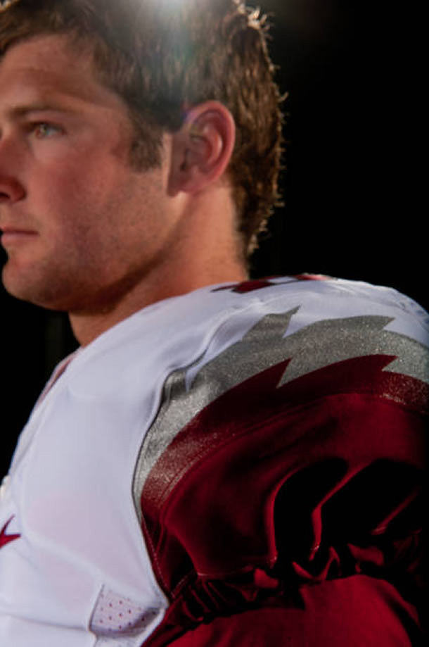
Okay, so I realize it’s supposed to be all razor-y and everything. But still, you’d think the very notion of a lightning bolt (or anything resembling same) on a shoulder would be considered a proprietary San Diego thing by now, no? But the folks at Arkansas and Nike were apparently untroubled by that consideration, at least judging by the new uniforms they rolled out yesterday. The lightning bolt notwithstanding, it’s a pretty miserable design, but we’ve learned to expect that by now.
New ESPN column today — the results of the Astros redesign contest. Enjoy.
Uni Watch News Ticker: Here’s the American League BP cap for the All-Star Game. While the cap is lame-o, I like the logo quite a bit (big thanks to Jason Gomez). … On the other hand, some other All-Star Game merch has absolutely nothing to recommend it. … Here’s a weird one: St. John’s baseball caps have the New Era logo on the side and the Rawlings logo on the back. What’s up with that? (Good spot by Terry Duroncelet.) … Reprinted from yesterday’s comments: Check out this shot of Tex Rickard wearing this amazing “Dodgers Announcer” sweater! … Oh baby, dig this awesome “Pla-Master” Yankees uniform display (from Mike Hersh). … Those of you who get off on torn-uni porn can once again reach for the Vaseline. That’s Brett Lawrie of the Blue Jays from a few nights ago. … Reprinted from yesterday’s comments: zippered NBA shorts! … This is interesting: Michigan football is honoring Gerald Ford, along with some other former players, by unretiring their numbers (from Philip Caldwell). … In what seems like a smart move, Pop Warner football is limiting full-contact drills. … Bryce Harper wore Roger Bernadina’s helmet yesterday (from Aaron Maisel). … Think you’re a big Steelers fan? Probably not as big as this guy was (from Brendan Slattery). … Interesting article about Ann Romney’s evolving fashion sense. ”¦ B.J. Upton’s stirrups prompted this comment last night from Mets radio announcer Howie Rose: “B.J. Upton’s the best dressed player on the field — striped hose, sannies showing. If a young kid like Upton can do that, why can’t everyone else dress like that?” (Transcript by Robert Silverman.) ”¦ The Pats have been wearing Reebok tank tops, which led to the following Q&A exchange at Bill Belichick’s press conference yesterday: “Q: Is there a specific reason you guys are not wearing jerseys? A: No. Q: Do you actually have practice jerseys? Is it because of the switch to Nike? A: I don’t know. You’d have to talk to somebody in the marketing department about that. That’s not really my thing” (from Joe Giza). ”¦ Clemson got a big shipment from Nike yesterday (thanks, Brinke). ”¦ Also from Brinke: Brandon Belt is now wearing orange shoelaces. ”¦ John Wall and Matt Kemp traded jerseys before last night’s Dodgers game (from Phillip Garza). ”¦ Former Dolphins player Vern Den Herder had a very odd NOB back in 1982 (nice find by Bill Kellick). ”¦ Ditch the Wilpon script already! ”¦ Here’s another look at the G.I. Joe helmet that Virginia Tech will be wearing on Sept. 22 (from Walter Ford). ”¦ Bruce Menard has come up with four sensational old baseball photos: (1) This shot shows the Giants at the Polo Grounds on Opening Day, 1917 (America had entered World War I just two weeks earlier, hence all the flags). (2) Here’s a great shot of fathers and sons in uniform. (3) ” It seems that in January of 1938, there was a test of the ‘deadness’ of NL baseballs held in Baltimore,” says Bruce. “From left to right, that’s Bill Cissell, Chuck Klein, Jimmie Foxx, and Charlie Keller. What’s really cool is that they’re all wearing from-the-era Baltimore Orioles caps/jackets for the test!” (4) And here’s Eddie Stanky with an adorably attired young admirer. “What’s odd is the girl’s jacket, which has old-school Giants lettering on the front and the Yankees’ “NY” on the sleeve,” notes Bruce.
Meh, take away the lightning bolt and they’re just sorta… whatever. I think some NFL-style socks (you know – white at the bottom, color on top, no bare leg) would really help the look.
Eh…Razorbacks/Razor wire. It’s not the worst thing ever.
Do my eyes deceive me or, in the photos above, does the lightning bolt point forward on the white jersey and backward on the red jersey? If so, it’s sloppy workmanship.
I was about to point out the exact same thing…yes, on the white jersey the razor back correctly points backwards, as if the animal is moving forward. But on the red jersy the forward facing edges make the design simply look like a lightning bolt. Not much attention to detail by Nike, IMO…
So it’s razorbackwards?
Why is the slate gray the new black? Pretty pretty miserable.
My first thought is that it’s more like a buzz saw and less a lightning bolt.
It definitely is sporting teeth and has a less rounded sensibility than this: link, but I think there could have been a more elegant design of the edges featured on the back of this: link
Lightning bolts, Arkansas? Well, I get the reference to razor back hogs, but really? I suppose this model of uni will prevail until next year or so when the fans, students, etc., clamor for a new one. Such is the life with Nike.
this
is awesome on so many levels
That is a fantastic photo! Little Rodney Mancuso looks like he’s already the toughest kid around.
Anyone notice the train that appears to be running along the top of the grandstand? God, I love the Polo Grounds.
More likely, it is an el train stored at the yard that was right next to the P.G. at the time –
link
link
A bathtub-shaped stadium surrounded on one side by a railyard. I swear I was born in the wrong half-century. Thanks for that.
I ain’t running on that kid.
BTW,
The socks can be dated like this:
Players (’36 NYG issue)and kids(L-R)1932 issue and 1932 road issue. See here: link
I just noticed my typo now, ‘doh!
I meant to write kids (l-r) 1935 issue & 1932 rd issue.
On behalf of my son, Robert James, I am officially weirded out by the Steelers fan’s tombstone.
I don’t want to weird you out further, but this fan may have been bigger:
link
Also, the suspect responsible for sending Mr. James to an early grave was just found last month (assuming this is the same young man):
link
Razorshoulders???
If they’d’ve only used the TOP edge of the bolt it might have been OK.
St. Johns has the two logos because the hats are made by New Era but the team is sponsored by Rawlings, who provides bats and gloves.
Yeah, I get that, but isn’t it unusual for both logos to appear on one cap? Do other college baseball teams do this?
I have seen TPX logos on the back of hats that were made by other manufacturers before. But I don’t know if the cap company actually put their logo on them as well.
Pro Line Cap Company made many of them that you can see here
link
TPX, of course, is a Louisville Slugger brand.
O.K., my top-to-bottom assessment on the new
ChargersRazorbacks unis:-The new matte crimson?/cardinal? helmet is okay, but the white helmet needs a dark red facemask and a dark red razorback with white detail, instead of the other way around.
-I actually like the blade thingies on the shoulders, but I too came to the conclusion that they look like lightning bolts when I saw them yesterday.
-I like the team name on the home top, and the school name on the road top, but the road top’s lettering needs to be red.
-While I’m not crazy about the gradient, it could be a lot worse, so I’ll take it… I guess. Also, the overall font is at least readable, if not spectacular.
-The pant striping on the white and anthracite pants is all kinds of suck, but then again, any striping that wraps around the back of the knees sucks (it’s what squandered Ohio State’s otherwise awesome Pro Combats in link and link). At least Kentucky incorporated a cool design in their pants last year (can’t find a good picture right now).
-KILL THE ANTHRACITE UNIFORM WITH FIRE BEFORE IT LAYS EGGS
I agree about the hog needing to be red on the white helmet. Can’t help but notice that the size of the logo seems to have increased as well. Logo Swell strikes again.
Wouldn’t it be more fitting for Arkansas’ new unis to have barbed wire instead of lightning bolts?
You know, a nod to keeping the pigs in the pen. Oh, never mind.
I’m not going to lie but I kind of like the white Razorback helmet. I do wonder why they didn’t do the Razorback on the helmet in red.
Love that Pla-Master display, even more awesome is the little kid dressed up as an indian on the packaging, awesome!
why is that awesome? that’s how kids dressed up in the 1950’s…is it awesome that they’re all white too?
Paul thinks it’s awesome and so do I. You don’t think it’s awesome Phil?
“even more awesome is the little kid dressed up as an indian on the packaging”
~~~
i think it’s an artifact of the day, and that, by itself, is very cool
my point is why would you specifically need to point out that the “kid dressed up as an indian” is awesome?
it’s what kids did in the 50’s…they also dressed up as doctors (boys) and nurses (girls) but not the other way around…gender roles were strictly defined and perpetuated then — and that’s fine, because that is how things were 60+ years ago, just like kids playing “cowboys and indians” were
i was just curious if there was anything else awesome about the display…or did you just want to point out only the children dressed as native peoples?
Yikes. Lighten up.
wait, does this mean kids shouldn’t play cowboys and Indians anymore? That’s bull.
Don’t worry Todd, they can just play Marines & Na’vi(the blue cat-indians from Avatar) instead.
And they can even link.
whew, color me relieved.
wait, don’t color me anything, I don’t want to offend.
[Insert Rodney King quote here]
“… … Bruce Menard has come up with four sensational old baseball photos: (1) This shot shows the Giants at the Polo Grounds on Opening Day, 1917 (America had entered World War I just two weeks earlier, hence all the flags)…”
Calling All Colorizers!!
Hopefully!!
Here’s the 1917 NYG chart:
link
What a great picture of Opening Day 1917. A touching item in the picture is the 4 of the players are saluting. 3 of them to the left of the picture and one on the right. Very touching gesture. I wonder if they were veterans. Great find
We sure agree. What a photo! Sorry if it’s too personal, but I gotta say that “John G. Livewell” is one of the greatest names I’ve ever come across.
I like the sheer fact of the photo accompanying this article.
link
Yeah, that’s a pretty great picture.
Those Arkansas uniforms are brutal. Enough said.
On that Pla-Master kids baseball uniform. The uniform came blank but included a sheet of heat-transfer letters that your mother applied with an iron. You could pick any team name you wanted. The letter sheet was in the color of the uni’s trim. That’s why I don’t think this was a real Yankees’ “replica,” just a sample showing what could be done.
The Suns’ fly-front shorts look like cut-off knit baseball pants (snap-front waistband) of the era. They were made by Spanjian Sportswear and the “zipper” might actually have been a button-fly (note the gap at the top). Even I can’t understand why the Suns needed a fly-front waistband in the stretch-nylon era.
Yup, Spanjian outfitted the Suns’ unis until ’86, when Sand-Knit took over the whole league.
Those shorts had a 2-button snap fastening on the waistband as well as the zipper. They were used from the Suns’ inception (as well as the 1975 All-Star Game), but Sand-Knit went with a more conventional drawstring waistband when they started making them.
Don’t forget the Air Force lightning bolt
College football unis are getting worse and worse. At the pro level, as Paul has stated many times, teams are more protective of their visual identity and heritage. It seems more and more of the big time college programs are letting things get weird. And here I thought tradition was a big part of the college experience. Say what you want about unis like Penn State’s, to me they are a breath of fresh air.
What’s sad is, while Arkansas isn’t exactly an historical Top Ten program, they have been consistently Good over the years. We aren’t talking about East Popcorn State. They have some tradition. From what I can tell, gray has never been a part of that tradition. The uniform changes, by themselves, wouldn’t exactly be THAT horrible (compared to what they’ve been wearing)… but why throw gray in there? We know the obvious answer, but still.
We know it all comes down to some Nike rep telling the athletic department that they might make a few extra bucks off selling a third jersey. Well, that, and a kid or two might actually choose to go to Arkansas because they think the gray jersey is cool. Eighteen year olds are that dumb.
They are going for a saw blade look (razor’s edge).
Its the one time where adding Grey actually makes sense, though it should have only been used for the razor’s edge (not for the name on the away jersey).
Today’s ESPN column is up:
link
Very nice article. I especially liked Wooley’s logos, given it seems to be referencing the San Jacinto Monument.
link
Correction, Melling’s.
Alex Rocklein’s designs are so damn good. I wouldn’t change a thing, and that alt in particular is perfect. The Astros would do well to give the designer a call.
I think this is one of the strongest collection of design submittals for a team redesign contest that Uni Watch has sponsered. A feast for the eyes!
Well done, everyone!
Not sure if this has been mentioned or not, but Illinois football has a new helmet.
link
Bierbaum’s Brewers uni was the unexpexcted highlight.
Loved the winner’s home and alt concepts.
Also kudos (in no particular order) to Bryan Molloy, Bruce Genther, Jeff Provo,Joe Bozek, Pecos McCool, Richard Koehler, Sidd Finch and Tim E. O’Brien.
Bierbaum’s Brewers uni was the unexpexcted highlight.
I’ll say! And he’s right…I’d wear those, as well as his Astros designs. Great job, Tom.
Great job to all the others, too.
Every time I design a uniform in colored pencil where you can see the name on the back I try to think of a short name that won’t take long to draw in and it occurred to me during the Cleveland Indians re-design, a minute too late to use it then, that Vilk is a great short name especially appropriate on Uni-Watch, so I saved it up for this re-design.
And this Brewers re-design is based on a yellow uniform I made up for a fictitious team of mine when I was probably about 10 years old (1966) and have kept in mind since then. A friend of mine played on a Little League Senators team that used yellow in this way and I always liked the way that team looked.
I’m guessing it’s just because they’re not wearing full pads and the jerseys are a bit loose, but the way the elastic “cuff” of the jersey sleeve meets the white undershirt in the 2nd pic made me think they were going to be wearing Seinfeld puffy shirts. (Although that might be an improvement.) The white helmet is different, not terrible if also not necessary. The unis are, IMO, a big downgrade. Ick.
Small detail, but something I noticed in that VT helmet pic, is that a carbon fiber helmet design in the left corner? Very small glimpse, but it caught my eye.
I don’t remember any mention of one on here recently.
I really like Wooley’s concept.
Brittain’s ‘A’ that doubles as an ‘H’ is pretty clever.
Malinoski’s concept isn’t really anything original, but I certainly wouldn’t mind seeing that trotted out next year.
Also liked seeing the current wordmark in more Astros-y colors like blue and orange.
That shot of Belt’s laces from last night–just now coming down from the perfect game rush.
watched every single pitch—-amazing.
already waiting for the PERFECT GAME 06 13 14 bobblehead.
How ’bout that.
In softball vernacular, Tiger’s playing with a couple hookers.
Arkansas unis are nothing special to look at. I to wonder why the razorback on the white helmet is white?
So we have another multiple helmet team and uniform team. Sheesh
Huge fan of this site and do not consider myself “racist” by any means but this native american “agenda” is getting a little too overbearing. I agree that a lot of teams (specifically the Redskins and Indians) are using outdated sterotypes that are really out of place in the modern world. It it right, no? Should they be changed? Probably.
With that said I feel like those issues (while important) have gotten too much press on this site. I find old uniforms fascinating for the very reason they are offensive to some. You cant erase history and these uniforms and names are from a different era. Its the same reason why the Nazi Uniform guide is fascinating (though on a different level some would argue). I understand the desire to change the name but please dont beat us over the head with it everyday. Your point has been made.
This is just my opinion (I feel others may feel the same way) and will not stop me from coming to a great site. I just feel like there are different venues that are more appropriate for a discussion and it may alienate fans of those teams (and uniforms). If I wear a Boston Braves jersey (which I own) does that make me racist? I dont think it does any more so than buying Aunt Jemimah (sp?) syrup, Quaker Oats (all Quakers eat oatmeal, wear wigs and have cool hats right?) or watching “The Song of the South”.
Everyone is entitled to their own opinion and to free speech (espescially on their own site). One could classify this as “White Mans Burden” syndrome but I dont think that is a fair argument either since that equates “compassion” to “guilt”.
I know your heart is in the right place but lets all try to be a little more open minded, respect EVERYONES opinion (though hate should not be tolerated) and have fun. Because in the end that is why we come to this site, to get away from our “real life” for just a little while to discuss ssomething we all feel very passionate about: uniforms.
Just my two cents. Keep up the great work!
Had it been mentioned today?
Phil commented on a reader saying that the kid on the Pla-Master dressed as an Indian was awesome. Came across as a little pretentious. So maybe not on the ticker but it was mentioned in the comment section which I feel is just as large a part of the site.
Whereas I thought the original comment was looking to pick a fight, and Phil’s reply was just being annoyed (but I don’t speak for Phil, obviously), not pretentious. Pretensions in the eye of the beholder, I guess.
I say if you don’t want it talked about, don’t talk about it. Kind of like Fight Club.
I am a daily reader, and to be honest, I was very interested in it at first and it got me to think. Now it is just noise. I just scroll right over any comments that are addressing that topic. Still love the site, but that topic seems to be becoming one dead horse that is getting the shit kicked out of it.
Thanks for the thoughtful feedback, Kyle. A few things:
1) The comments are read by a very small percentage of the site’s readership, and are participated in by an even smaller percentage. So let’s try to maintain a sense of perspective.
2) Do you think it’s “overbearing” when I say, “Purple sucks!” or “Stirrups are great!” or “I love meat!,” all of which show up here much more frequently than the Native American issue? If not, perhaps you should ask yourself why the Native American thing bothers you so much while the other issues do not.
This site advocates for things I believe in (and that Phil believes in, when he’s running the show on the weekends). If you don’t like all of those things, I can’t really do anything about that, but I’m still going to say what’s on my mind.
3) I’m sorry to have to keep saying this, esp. since I realize it’s not something that people like to hear, but saying “I come here for [x]” or “I don’t come here to read [x]” just isn’t relevant. The site isn’t written for you; it’s written for me. What you choose to do with it is completely up to you. Yes, I know that sounds selfish and arrogant and all the rest — I’m sorry. But it’s just the way it works.
4) In any case, as another commenter has already pointed out, I didn’t say anything today about the Native American issue. And what I had to say about it in yesterday’s post consisted of *two sentences* in the Ticker. And there was nothing gratuitous about those two sentences — I was reporting the results of the vote in North Dakota and stating my approval of said results. If you honestly find this “overbearing,” I think you’re defining the term differently than I do.
Thanks again for the feedback, and for the kind words about the site — much appreciated.
“Whereas I thought the original comment was looking to pick a fight, and Phil’s reply was just being annoyed (but I don’t speak for Phil, obviously), not pretentious.”
~~~
you don’t speak for me, but in this instance, you could have — that’s EXACTLY my thought process
no one mentioned ‘indians’ and yet tom v., who was clearly in the camp upset at the south dakota vote yesterday and who had a SHIT TON of comments on that, decided he’d take a backdoor into reintroducing the topic (“looking for a fight” if you will) today
it’s funny — i try to check all of paul’s links every morning when he posts the article, and in my e-mail to him, i said something to the effect that “i hope there won’t be any native people controversy today” since nothing was said in the lede or the ticker on the matter
most of us, after a days worth of comments, move on and forget what happened the day before…new day…new comments
obviously, tom v. hadn’t quite had his fill — i can see no other reason for making the “awesome indian” comment
so, yes, i was annoyed…annoyed that some people are looking to stir shit when there is no call for it
At the risk of putting words in Tom’s mouth, his point may have been, “Lukas, you hypocrite – you’re supposedly against all this Native American appropriation, but then you post a link to this thing and say it’s ‘awesome.'”
Honestly: I didn’t even notice that the display included an illo of a kid dressed up as an Indian. Now that I see it, does it bother me? No. Does that make me a hypocrite? I’ll let others debate that.
Was Tom looking to stir this up today when nobody else brought it up? Yup.
I’d like it very much if we could now all move on.
Paul:
1) I think a lot more people read the comments that actually participate in the commenting. A lot of great follow up items appear in this section. In many cases they end up on the ticker the very next day…
2) I dont think saying “purple sucks”, “I love meat!” or any of those things can even be compared to the Native American thing. I guess if I were a member of PETA or the Vikings I would take exception perhaps but that’s a bit of a stretch. Asking why this topic “bothers me so” much seems a little defensive to me when I wasnt making an attack but merely an observation. If told people everyday on facebook “that I hate teal” and “I love eating Lobster” i dont think it would get the same reaction if I started telling people “Lucky Charms offend me, how dare you make light of the Irish. Notre Dame should be ashamed of themselves. Etc.” Totally different.
3)I dont understand why there is so much oversensitivity when someone questions these things. I think I make it clear that I am not asking that you dont say what is on your mind or to “do something about it.” I exaggerated a bit when I said “overbearing” to make a point. I think a lot of LONG TIME readers like myself understand your point and AGREE with what you are saying. I just feel like like the “vibe” has changed. Maybe it is because the site is an extension of yourself as a person and the contents reflect your growth and opinions. I totally understand and respect that. It just seems like when someone disagrees about the content or have a different opninion there is “if you dont like it, leave” mentallity. I dont beleive that is your intent.
I truly do love the site. I am not the type of person to disperage anyones beliefs or tell them how they should represent themselves our intelllectual property. I did not intend to offend you or Phil with my opninion and was not “trolling” (not that you impied this) for a response. I think what you guys do is great and would actually be upset if you DIDNT speak your mind. Im just worn out with society being overly PC because I think that allowing yourself to be offended by things lends it credability and gives it power.
Thanks again for letting me “vent” Keep up the awesome work!
No offense, Kyle, but I think I probably know more about our site analytics (who reads what, length of stay, etc.) than you do. Just sayin’.
Now, again, let’s please move on. Thanks.
NORTH Dakota, Phil. South Dakota wants no part of the Sioux. ;o)
shit, teebz…i did the same thing yesterday in an email too
clearly i am blaming the south for the war of northern siouxation
That’s ok, Phil. While I’m sure the divide was important historically back in 1889 due to population, it’s more just a formality now. ;o)
Although link doesn’t have a hockey program. That’s a shame.
I was reading a WVU board about the gray helmet and uniform. One poster said that WVU did wear gray from about 1922-1930 vs Pitt. According to the WVU Vault book.
I love concepts that look professional, but would never, ever see the light of day.
link
That is my favorite uni redesign ever. Seriously.
This is something that might only be interesting to me, but the NASA ‘vector’ (the red wing-shaped element of the insignia) actually represents the Aeronautics portion of NASA’s missions, not the space portion. So it’s the least ‘astro’ thing in the entire logo!
“Former Dolphins player Vern Den Herder had a very odd NOB back in 1982 (nice find by Bill Kellick).”
I wonder if Uwe von Schamann had a similar NOB treatment for ’82.
God, wouldn’t those Baltimore uniforms in the pic where they are testing the “deadness” of baseballs make gorgeous throwbacks?
They would make awesome throwbacks. Too bad the current Orioles make no acknowledgement of the NL Orioles. I always thought they should have some banners or something for the 3 consecutive championships that they won.
The NL Orioles lasted only a few seasons and ceased operations before the 20th century even started. The next team to have that name was the New York Yankees who became the spiritual successor to the original Orioles and then moved.
They have no affiliation whatsoever with the NL Orioles, and a besides they were already a team during that time (they were the Brewers). It wouldn’t make much sense to claim to histories that overlap one another.
Also I’m fairly certain those are the uniforms for hte Minor League version of the Baltimore Orioles (and they are wearing jackets over their unis).
The O’s have plenty of history to draw on, there’s no need to add other team’s stuff too.
Teams often seem to throwback to just “another team that played in this city once.” And, of course, we will soon have the Rays throwing back to absolutely nothing. I don’t think there needs to be any more connection than what’s already here (another team from the same city/region) to justify it. They wouldn’t need to necessarily “claim” that history to throw back to it, as far as I’m concerned.
I’m not convinced the Pirates “claim” the Grays or the Rays “claim” the Saints, Smokers, Pelicans, etc.
These days it seems like you don’t need more than “hey, weren’t these uniforms cool? Let’s dress up like that” to have a throwback. And I have no problem with that.
RE: Arkansas’s new unis….Judging from last year’s monstrosities with those horrendous/stupid/pointless/ugly under-arm/side panels, this is a million times better.
In case you haven’t noticed, Croatia finally got to wear their awesome Checkerboard kits in the Euros today link
It’s possible that the white shorts are traditionally paired with the checkerboard jersey, but royal shorts instead would look better. Then again, it’s possible that the white shorts and socks are only there in deference to that all-blue team. (Is that Italy?)
Yes, Italy is wearing the all-blue strip, abandoning the white shorts of their traditional strip even though they’re the “home” team. Since Croatia’s change strip is all blue, and there are no “3rd kits” in international soccer that I know of, Italy are wearing the blue shorts as not to clash. Italy also went all blue for the 2006 WC final (in this infamous pic) link
Agreed.
They remind me of this:
link
yeah, its a rare outing for the home kits in a major tournament for the ol’ dalmatians. I blame the number of red and white teams :p
Yes in Euro 2008 they played Turkey, Poland and Austria, all Red teams as well as Germany. Today is the first time they’ve worn the Checkerboard in the Euros since the 2004 Group Stage, and in a major tournament since the 2006 WC.
Watching Mets/Rays at the Trop. Man, the charm of weekday-afternoon baseball is really diminished when it’s played in a dome….
weekend-afternoon baseball, too…
Given the street closures and train restrictions in NYC today, staying indoors to watch the Mets on the tube seems to be a smart move.
What’s your take on baseball played in silence:
link
I’ve heard of ballparks having sections that are peanut-free and alcohol-free; is this proposal the first of its’ kind? The 600 Club @ Fenway was rendered ‘noise-free’ once it was finished, but that was unintentional and was quickly remedied.
how about just baseball in general being ruined by the Trop
speaking of the Mets.. kinda takes huge stones to try to get a this turned into a no-hitter after getting a no-hitter by benefiting from a controversial play only a few weeks ago
link
Been to a few games there, absolute worst place to see a ball game. Even if it’s sunny and 85 out, it still feels like a rainy day in that place.
It’s depressing watching a game in that park. Truly. It reminds me of when we used to have to have practices inside during high school….but my high school gym didn’t look like a big, gray warehouse…..
Rocklein’s link is fantastic. It very thoughtfully taps into the team’s colorful history while still feeling modern (but not trendy). Well done.
The Georgia Force have been using Bolts on their uniforms their entire history. When the AFL returned the Force went simpler with their design, putting it right on the shoulder. If the Chargers didn’t take issue with that there’s no way they will if anyone else does.
Besides the Air Force Academy has had a bolt on their uniforms for decades, there’s no way the Chargers could make a claim to the bolt now, too many other companies, teams, etc. have already established it as part of their brand.
I forgot to post the Link to the Uniforms
link
I’ll spare readers the sight of the old ones, look them up at your own risk.
If the Chargers didn’t take issue with that there’s no way they will if anyone else does.
I didn’t mean to suggest that the bolts are literally the Chargers’ intellectual property, or that they’d lodge a complaint or anything like that. I just meant that when a particular design element has been so closely associated with one team for about half a century, it seems like a dubious design decision to use that element for another team.
Your point about Air Force is well-taken, though.
Indeed.
Air Force had shoulder bolts and helmet bolts before the Chargers; the Winnipeg Blue Bombers had helmet bolts a few seasons before Air Force.
And Captain Marvel and the Flash had lightning bolts on their chests before either of them.
Sometimes a lightning bolt is just a lightning bolt.
Or a razorback back, I guess.
Ooops, my bad. Air Force did NOT have shoulder bolts before the Chargers. AF’s original uni pretty much matched the Colts, except helmet had two stripes and the lightning bolt.
The Chargers DID intro the bolt on the shoulder and down the pantleg.
I doubt the Chargers complained about this (as inconsequential as that venture turned out to be):
link
Didn’t Kent State use helmet bolts (and maybe shoulder bolts) for a while, too?
Late ’80s, maybe?
Yes.
They were very Chargeresque at times.
When they had the little guy at QB.
Pat Young was his name, maybe?
Something like that.
This was either late 80s or early 90s:
link
Rocklein’s link is fantastic. It very thoughtfully draws from the team’s colorful history while simultaneously feeling modern (but not trendy). Well done.
What he said.
Kinda like to see it with navy instead of black, though (or IS that navy and my monitor isn’t reading it right?)
I’ll ask again. How come so many of these concepts don’t show the undersleeves?
Even though more players are wearing their pants shorter lately, we’re still gonna undersleeves a lot more often than we’re gonna see stirrups.
If the undersleeves aren’t shown, just assume that they’re the same color as the socks. After all, you’re not allowed to put stripes or numbers or anything on them, so they’re always going to be a solid color.
I get that.
What I was saying was that comparatively speaking we’d rarely see the stirrups, so why not include the undersleeves for a better look at what would be common?
“And, of course, here are the stirrups that pretty much no one will wear” isn’t much of a real-world selling point.
Not complaining, just making an observation.
I see it as navy.
And I’ll be absolutely shocked if the Astros come up with something better than that concept. It’s nearly perfect.
I see navy (with slightly lighter navy on the alternate cap). If I’m wrong, that changes things a bit for me.
The lighter color for the cap next to the alt jersey is an optical illusion. That cap is the same color as the one with the road uni.
So my eyes are playing tricks on me? Those dicks…
Navy all the way. Any hint of black on this team next year would be a shame.
Darn straight. But “near perfect,” since this uni absolutely cries out for an H in the motion-serif style of the prototype caps we saw yesterday. I like the star logo as a logo, but it’s got some balance issues with the internal negative space, and I’m not a fan of how off-center it appears on the cap. A symmetrical object like a five-pointed star needs to be centered on the front panels. So I’d rather see a good H logo, with the star perhaps an alternate or hitting rehearsal version.
I would bet money that the 2013 Astros will not look as good as this concept.
I really like your concept, Arr Scott. That hat would sell like hotcakes.
How about that TNOB on the Pla-Master Yankees uni?
-Jet
Paul, that NL All-Star Nike T-shirt is really stupid, but can you at least admit that if the exact same shirt were produced in 1955, with the words chain-stitched, that you’d love it? ;)
Also, a note about the ‘Wilpon’ script: after reading the article you wrote about it 2 years ago, it appears that the script is supposed to show the ‘M’ resting flat on the ground, with the ‘ets’ sort of taking of from there into the air. It appears that the Mets get its orientation wrong constantly, like on that latest email, where they just orient the whole thing straight across and thus create the crooked-looking ‘M’. It also appears that every example you used of the ‘classic’ script was really the skyline logo script (the more compact one), so I think the actual classic uniform script has gone away.
Hmmmm… to your first point, and obviously not speaking for Paul. I would. Not sure if that makes me a hypocrite, because I hate the current ones.
I dunno. I guess that’s, just like, my opinion, man.
Will there be a rebranding contest for the NoDak Sighting Fioux?
WRT to the ASG BP caps. I still greatly dislike that they exist. But if they *must* exist, this batch is definitely the best ever. Nice to see that New Era and the design team finally got their shit together: Wordmarks don’t belong on caps.
BFD on the Clemson Nike shipment. Am I supposed to be excited for a bunch of boxes of hats?
College Football Live had segment about Arkansas uniforms and uniforms at the end of show. They then showed a wild mockup of Penn State unis for Matt Millen.
So will NoMas be making a shirt for the Fighting Sioux?
Also, is Paul still off the Diet Coke?
No. And yes.
New basketball uniforms for Oklahoma State University. They’ve incorporated similar elements to Texas, Duke, Mich State, etc with the back graphics. Those graphics are Pistol Pete, the Student Union, and 1890. I’ve posted all of the photos on my twitter feed (www.twitter.com/osuuniforms).
Pics from the Tulsa World (link).
Heat in black, Thunder in white and…here’s a twist: the crowd is in alternating sections of blue shirts and white shirts.
Game Two is underway. Later, folks.
Now where have I seen link?
that actually makes sense in assembly hall, though
I was going to mention that.
Plus, when they do it, it’s a BYO affair. No t-shirt draped over your seat as you arrive.
Well, I kinda like the Ark unis. Aside from the sticker litter adorning the front, anyway. That stuff got way out of hand a while ago.
As far as the Astros go, those are ALL awesome. And look at that! Mothervilker getting some national exposure. He deserves it. Just for being the one and only.
I especially like Koehler’s wordmark and hat, Sosa’s jacket, logos, and hat, and WOW, Rocklein’s alternate (and socks of course). Whatever I would have come up with didn’t stand a chance. I hope the real thing can match you guys!
Oh, and I am forever offended. Purple is the best. (coming from a Kansas State grad and son of a Northwestern alum)
I owe you guys an explanation of my concept (#3 in the ESPN.com column), here it is:
Cap logo: I’ve liked the star with the two sides missing since it debuted in 1995, but the first two renditions (1995-99, 2000-present) missed the mark. The first one looked way too much like the logo Lockheed Martin was using. The second, well, it didn’t look too distinctive at all. And both were missing the all-important “H” for Houston that the 1965-1994 Astros had on their caps–such an omission would be fine if it was a team that was looking to move elsewhere, but the Astros, obviously, aren’t. I wanted to bring that “H” back. I also wanted a star that was flying upwards like a rocket to match the “onward and upward” future-minded spirit of the space program. I hope that the upwards-shooting star doesn’t remind anyone too strongly of a certain series of NBC public service announcements. Heck, the far left side of that upwards-shooting star may even remind some of the left end of the airfoil you see in the classic (and current) NASA logo.
Wordmarks/numerals: The font is derived from a font you have already seen from Close Encounters of the Third Kind (1977), Pepsi (late 1980s) and Star Trek: Deep Space Nine (1993-99). (That font definitely enhances the future-minded look I wanted to capture). I added some blocky serifs to it to give it a “Texas accent,” and it may even remind you of the “HOUSTON” wordmark that the Astros once used on their road jerseys (1965-74). The wordmarks on the home and road jerseys swoop upwards–kind of like the Planet Hollywood logo or the logo the Seattle Sonics used in the 1990s–to match the upwards-shooting star and enhance that “onward and upward” spirit.
The proof is in the piping: You knew that the “tip of the cap” to the “tequila sunrise” jerseys had to come in somewhere. I never considered using the 1975 “tequila sunrise” design as a base for my design; still, those orange-and-yellow stripes are a part of Astros’ history and I wanted to incorporate them some way. So after much deliberation, I decided to give that tribute in the form of piping–namely, three-striped piping (similar to the blue-red-blue piping you see on the Atlanta Braves’ jerseys) made from the Astros’ new colors: Navy blue, bronze and gold.
But wait, Mark, did you say “bronze and gold”? I didn’t want to use orange and yellow; not when their metallic equivalents are available here in the 21st century. Bronze and gold go so well with navy blue and they shine like the stars (OK, maybe that last part sounded corny). Besides, metals are tough and yellow is a color you often find on bruises. The upwards-shooting star is also bronze and gold to add to that aforementioned “tequila sunrise” tribute.