Click to enlarge
Back on Tuesday I posted a guest-written entry about the Dubois County Bombers, a summer collegiate wood bat team that got a retro makeover from reader Kyle Kendall. Today Kyle has provided some follow-up materials about the Bombers:
• The program: Kyle asked me not to reproduce the entire program, but here’s the cover and a good article from the interior pages.
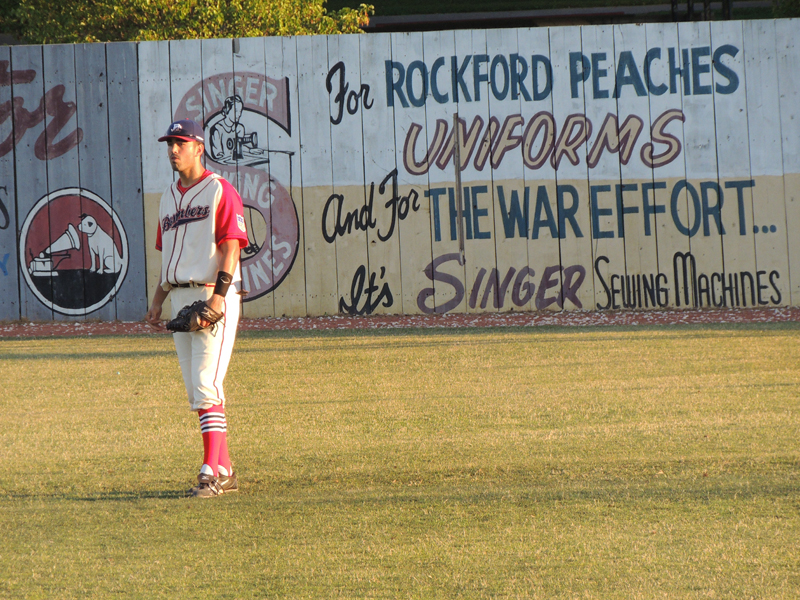
• “Meet the Bombers”: “This is our roster insert,” says Kyle (look here and here). “I had each player strike a few classic baseball card-type poses and used these baseball cards as a way to introduce them to our fans. With most of these guys coming in from all over the country, we have to give our fans something to help them instantly connect with the new players. It’s the second year we’ve done these, but the new uniforms really make this year’s set stand out. A few guys haven’t reported yet due to their college postseason games — hence the hat photos.”
• Bus driver’s and beer maids’ uniforms: “Our GM, Gary Freymiller, is quite a character,” says Kyle. “He picked up a vintage bus driver’s uniform and has been wearing it while driving on our road trips. We also got the Rockford Peaches ”˜costumes’ for our beer maids. I found a place where we can get authentic ones made, but they didn’t make the budget cut. But most fans won’t notice the difference for now.”
• Player photos: Kyle sent a variety of posed and action photos, many of which show just how beautiful the Bombers’ ballpark is. You can see them below (or for those of you who are on an iPad and can’t view flash animations, you can click here):
Those uniforms look great, no? “Ebbets Field Flannels really nailed it for us,” says Kyle. “As a designer, I’ve had my share of times where I’ve handed something off to a vendor and been less than thrilled with the final results. But obviously these guys shared myvision and even exceeded my level of detail. When I finally saw the finished product, I was floored. They’re exactly as I pictured them. Not one minor complaint.”
All very cool. Even better, the Bombers got off to a 7-0 start this season. “Between our hot start and some coverage that the bus has gotten on the road, there’s quite a bit more buzz around this team than there’s been in quite some time,” says Kyle. “We’re enjoying it.”

Chili-licious: Great job by reader Jake Kessler, who was watching some highlights from the 1986 MLB All-Star Game and spotted Chili Davis — then with the Giants — wearing “Chili” on his jersey.
The National League All-Star squad had two other Davises (Davii?) that year — Glenn and Jody — so it’s not clear if Chili’s NOB was a one-game thing or something more serious. Anyone know more?
Meanwhile, is this a nickNOB or a FiNOB? Does anyone even know what Chili Davis’s real first name is? (I had to look it up: Charles.) If a guy’s real name is so obscure that nobody knows it, and if his nickname has essentially become his first name, does that make this more of a FiNOB than a nickNOB? Discuss.
Curling in June? Sure, why not: Dean Gemmell — the man who taught me to curl and a really swell guy besides — was on the team that won the U.S. National Championship this year, but he and his teammates are looking ahead:
We’re trying to figure out what we’ll wear on the ice next year. As defending champs, we want to look sharp. Not sure if the full-on vintage look works all the time. But I would love to figure out a new look.
If your readers have any ideas, we’re open to suggestions. Just remember that elite curlers need pants with stretch, something that can be changed during a game according to temperature in the arena, etc.
Here’s Nike had us wear at the Worlds [that’s Dean on the right ”” PL]. I literally think they give curlers whatever Dick’s and Sports Authority returns. We also had jackets that were pretty much soccer warm-ups.
Naturally, I think Dean and his crew should dress like this, but I figure that isn’t gonna happen (grrrr). Got any better ideas? Send them to Dean here.
Stirrups Club last call: Today’s the last day to place orders with Comrade Robert Marshall for his latest set of stirrups offerings. Check them out here.
ESPN reminder: In case you missed it yesterday, my latest ESPN column, about MLB’s biggest uni-related quirks and oddities, can be found here.
Contest reminder: I’m currently running an ESPN contest to redesign the Astros. Full details in the sidebar of this column.
Uni Watch News Ticker: The Marlins wore their orange caps and sleeves for just the second time this season last night. Still no orange helmets, though. … Looks like Ohio State football is wearing a jersey patch for the Columbus bicentennial. You can get a better look at the logo here (from Brad Eenhuis). … Eric Marin notes that David Price’s cap didn’t have a squatchee last night. Some quick photo research reveals that he’s usually squatchified, so this must have just been a fluke thing. … Cool submission from Robin Griffiths, who writes: “Non-league football clubs in the UK (i.e., those below the professional ranks) often produce match day posters that can be put up in the windows of shops and bars around the town advertising forthcoming fixtures.” There’s a great selection of them here. … Alex Gelman teaches third grade in Park Slope, Brooklyn (the same neighborhood I live in), and his students got him a very cool present for the last day of school: a Mets jersey with TNOB — that’s teacher name on back. The kids also signed the jersey. “I’m just happy the Mets ditched the black in time!” says Alex. … More blowback regarding that Cardiff City rebrand (from Tim Xumsai). … Lucas Ravenscraft noticed something while looking at photos of the recent Arsenal kit-launch event: “The store where the launch took place displayed both home kits with the Premier League font NOB and numbers with the Premier League logo at the bottom (this is unchanged), but there were also versions of the kit with a different font for the NOB and the number, and the numbers had a small eastward-facing cannon detail at the bottom where the Premier League logo would normally go on the Premier League kits. Now, these kits aren’t shown with any shoulder patches, so I can’t be sure, but I think it’s pretty safe to assume that these are the new kits for the UEFA Champions League. The past couple of years the Arsenal Champions League number and NOB font looked like this, so that’s a noteworthy change.” … New football helmet for Culver-Stockton College. … New away kit for Everton. “It’s a beauty,” says Casey Hart. “It appears Nike is sticking with the simple approach that Le Coq Sportif took the last couple years.” ”¦ New away kit for Chelsea. There’s a video of the launch here. ”¦ Mississippi State plans to reveal new football uniforms later this summer. … Check out the awesome hockey sweaters worn decades ago by the Brooklyn Crescents. Further details here (from Pete Woychick). … The Giants are visiting the White House today and will give this jersey to the President (from Chris Flinn). … James Ashby found an old Spalding brochure, circa mid-1970s, that came with his first glove. … Ryan Clark normally wears No. 25, and is still listed as such on the Steelers’ roster. So why was he wearing No. 21 in practice the other day? (As spotted by Joseph Lombardo.) … HGI — that’s the company that makes the metallic-finish helmets — had some Virginia Tech designs on display at a trade show (from Terry Duroncelet). ”¦ Lots to like in this pre-Pro Bowl wire photo of Tom Landry, Fran Tarkenton, and Don Meredith. I especially love Landry’s jacket. This game was Meredith’s last as a pro (nice find by Brendan Slattery). ”¦ Jason Greening scored a bunch of 1980s NFL mini-pennants for a quarter apiece at a yard sale. ”¦ Omar Aujani was watching some footage from the 1974 World Cup and noticed that Dutch striker Johan Cruyff was consistently wearing only two stripes, while his teammates wore three (for Adidas, natch). “After doing some snooping, I came upon this article, which explains that Cruyff had a personal deal with Puma and wasn’t willing to represent a rival brand,” says Omar.
The Landry-Tarkenton-Meredith link isn’t working…
Thanks. Now fixed.
The last three links appear to be busted
Sorry – guess it was just me; now they work
most anything would be better than the horrific pink change kits that Everton had a few years ago.
/american toffee
/go sweden
The whole Bombers effort is first class. Great work on the cards, programs, everything. A doff of my cap to Kyle and his crew. Good luck this season! May your seats be full and your rainouts be few!
Indeed! And be still, my heart… are those unis actually NOT polyester?!?!?!?!
-Jet
At ease — they are indeed polyester.
Marlins orange caps link broken.
I see now that I’d made a coding error that left eight links inoperable. They should all be fixed now.
Wow. Tarkenton is not as big as I thought I remembered.
Love the new Chelsea jersey.
Tarkenton was indeed a little — well, for football — guy: link, but I remember in his playing days he was often referred to as much smaller. That’s allegedly why he was such a good scrambler (“Scramblin’ Fran”), having to get away from all those giants rushing him.
I don’t understand anything about this Cardiff City rebrand thing. What is the point of doing it when they know there is such vociferous opposition? I just don’t see how they can justify going from blue to red as being a simple act of “developing a brand” or “being progressive”, why are these things impossible with blue?
While team nicknames in European soccer aren’t as widely publicized/used as in America (You don’t often hear Manchester United Red Devils or Manchester City Citizens, etc.), Cardiff City’s nickname is the Bluebirds, and well, a team known as the Bluebirds wearing red as a primary color is as stupid as the Blue Jays wearing black.
Re-read your comment again, and realized I whiffed on the content (hey, it’s early). I guess it’s not much of a re-brand if the uniforms look pretty much the same as they did, and soccer teams make subtle changes to their kit ALL THE TIME. So completely changing color is about the only way to get attention. I do like the dragon as a nod to Wales (see Welsh flag), but yeah see above about the blue/red thing.
So in other words it’s a publicity stunt? Man that’s sad. I understand what you’re saying though about that being the only way a soccer team can get uni-related attention.
No, it’s about trying to open up merchandising in Asia, where red has special cultural significance and where a red shirt is presumed to sell much better than a blue one.
As to the “why”, it’s because their new Malaysian investors are putting in a tremendous amount of cash to retire debts, build new facilities and earmark towards new players.
Cardiff City’s owners are Asian, and red is seen as a lucky colour over there – by changing the strip they’re hoping to vastly increase merchandise sales over there, which (in theory) will provide the cash they need to be able to compete with some of the larger clubs.
I’ve got a lot of friends in Cardiff, many of whom support City, and they’re NOT happy about this – essentially, they’re taking a hundred years of tradition and shitting all over it in order to make a quick buck. The feeling is that if the owners are willing to do that to the kit, what else are they willing to do?
great job (again) kyle!
the only complaint i have is with the footwear…i realize those might not be “gameday” shoes, but they’re really visually very jarring
everything else though? FUCKIN A AWESOME!
Do I hear an “Amen”? Amen.
Inspiring and absolutely delightful, Kyle!
(And, yes, Phil’s right…get those shoe companies to play ball and outfit these fellas with black cleats.)
I could be wrong, but at that level of ball, the players buy their own shoes.
They likely are the cleats they use at their school. Summer college ball is rarely as organized as DC seems to be.
It’s my fault. I took these photos just minutes after seeing the uniforms on the players for the first time. I was so busy critiquing the uniform elements I had a hand in, I really didn’t pay attention to the shoes. Most of the guys still had their running shoes on. It wasn’t until I got home and downloaded the photos that those bright shoes jumped out at me. Luckily for most of the player cards I was able to crop them out. And I’ll probably photoshop them to black if I use these photos for any posters.
do you guys have a mandatory cleat deal or color? like, can they wear any maker but they have to be black?
The GI Joe look never makes me happy, but at (I still call it) VPI, I think it’s particularly troublesome. This is the school that was the site of the deadliest mass shooting in modern U.S. history (April 16, 2007) and whose alum includes the shooter suspected of killing 13 and wounding 31 at the U.S. Army base at Fort Hood, Texas.
Virginia Tech has a full Corps of Cadets and is one of six senior military colleges in the U.S. besides the service academies. (Norwich, Texas A&M, The Citadel, VMI, and North Georgia being the others).
link
They certainly have more of a right to play in G.I. Joe uniforms, then say, Maryland.
And when those cadets receive their commissions, they’ll wear plenty of camo in the course of their duties.
Until then, it’s still drag.
Dude… if you’re trying to say they shouldn’t wear GI Joe uniforms based on the fact they look shitty and aren’t any kind of meaningful tribute, that’s fine.
But equating the Tech shooter and the psycho at Fort Hood with regular service members… that ain’t cool. I know that’s probably not what you meant, but that’s how your comment can possibly be read. There’s nothing wrong with honoring all the great people that serve. It’s just, ugly uniforms shouldn’t be an option.
Maybe the Marlins’ equipment guys store the orange helmets in the same room with the gray road jerseys?
link
How often have these been worn?
Now THIS…
link
…looks like a team based in Miami.
Presumably, by this time next year that will look like a team based in Houston.
Indeed. The orange sorta works for Miami, but I’d rather see them in aqua/teal. Let Houston own the orange.
/I’ve added an Astros uniform to my DA page, click on my name
The Lewes FC posters are awesome, Minor League Baseball teams could take a lesson.
Ryan Clark wears #21 in practice in memory of his friend Sean Taylor. (IIRC, Clark wanted to change his number a few years back, but was told he couldn’t.)
Yeah, this isn’t news. This has been common knowledge for quite some time now. In fact the Steelers link on their official Facebook page the other day about it.
maybe he had eggs in the morning.
Hidden in the deep recesses of my brain, and not jarred loose until I saw the photo in today’s post, was the knowledge that Chili Davis did indeed wear his FiNOB (or NickNOB – I’m too tired to get into that argument!) on more than just this All-Star Game occasion. I’m not a Giants fan or follower, but I do seem to remember him doing this, maybe for one season or at least part of one season …
I’m not entirely certain Chili Davis wore “CHILI” on his jersey more than once, but I do remember seeing Vida Blue wearing “VIDA” on his Giants jersey in a game @ Atlanta around that time. Unfortunately I didn’t take and can’t find pictures, but will try searching for them.
Vida Blue Giants road jersey with “link“
That should say alternate….this is the link
link
Another link.
Kyle, those Bombers uniforms are gorgeous. That is EXACTLY how I picture a baseball team looking in my head. Would love to see some of those guys make it to higher leagues and bring the high cuffed stirrup look with them. And maybe I missed it but I don’t see a flat billed hat in the bunch. Awesome.
If I could find out who to send my money to I’d buy one of those hats.
Call the team office at 812-683-3700. I’m sure you can work something out.
On those HGI photos you linked:
I’m guessing theyre just mock ups but two things I saw that I hope arent real…
Matte Cowboys Helmet on the table in the background:
link
High Gloss Ohio State on the shelf in the background:
link
Should’ve read the comments first. A couple observers noticed the same thing I did. The Cowboys is for a youth league and the Ohio State is a diamond plate design with a similar stripe
Thanks everyone. We’re thrilled with the feedback we’ve gotten from the Uni Watch community. You’re all welcome at the stadium any time! If you’re there, look me up.
We also got some nice coverage from a local news station which gives you some nice video of the bus & uniforms…
link
Sorry, wrong link…
link
“If a guy’s real name is so obscure that nobody knows it, and if his nickname has essentially become his first name, does that make this more of a FiNOB than a nickNOB?”
Perhaps someone could ask Octavio Rojas?
link
Why would the Arsenal store have 2012-13 jerseys with Robin Van Persie’s name and
number when there a good chance that he will be playing elsewhere this upcoming
season?
Could be a sign that they’re confident he’ll re-sign with the club. One thing for sure, NOT featuring your best player is a pretty good indication you have no expectation of him re-upping, so they could hardly do that.
True enough.
And if he leaves, they’ll probably offer some name/number swap in the club shop at Ashburton Grove.
The DC Bombers are playing in town tonight… and I have to work!
Paul, I think Chili Davis would fall into that rare middle-ground somewhere between NickNOB and FiNOB. Not sure what day it was, but I saw you mention Chipper Jones as an example. When a nickname is used so ubiquitously that a lot of average fans couldn’t tell you whether it’s a nickname or not… then that’s different than calling someone Robert “Bobby” Smith (maybe a bad example, is that even a true nickname?). Could it be CommonNOB? AcceptedFiNOB? I don’t know.
I almost lost it when I saw that pic of the Bombers’ beer maids.
Almost lost what?
Heeeeyooo!
The Cruyff shirt with two stripes is pretty well known among serious footy fans. The interesting thing to me is that Adidas and Puma were founded by two brothers (the Dasslers).
Euros start today. I am SO ready for football…
A simple, silhoutted crescent moon.
No wordmark, no trim, no piping, not even a stripe.
The Brooklyn Crescents: Just perfect.
I think I have an answer for the Arsenal kit font question.
This may be something everyone is already aware of, but the Premier League requires all clubs to use the same font for kit numbers and NOB’s. However, this restriction only applies during league matches. During cup games (FA Cup, League Cup, Champions League, Europa League, etc.) and friendlies, clubs will wear numbers supplied by the uniform manufacturers. Nike makes custom numbers for its big clubs (Man U, Arsenal) as does adidas (Chelsea, Liverpool). These are often different colors (if only slightly) than the standard Prem numbers.
Exactly. Not just Champions League, but all non-Prem matches.
Once upon a time, Arsenal wore the same numbers for all matches, just with the EPL crest removed when playing outside the league. But Nike has kitted them out with custom numbers, changing every year, at least since the link (compare with link), if not before.
As an aside, that’s one of the things I love about soccer in England; you earn the numbers.
For a club like West Ham, which has bounced between link and the link and link in recent seasons, you can track them based on the number font. And now they’ll look like link again. Brilliant.
yes, it’s quite fitting that the “championship” and other lower-tier clubs are forced to wear nascar-esque numbering.
I know that Liverpool had their own adidas font, but for the life of me I can’t imagine a single game where it was used (including FA Cup and Carling Cup finals and Europa League matches).
Edit: It looks like the font is owned by LFC, not adidas, since it’s used on Liverpool’s new Warrior kits
Anybody find it sexist and demeaning that the Beer Maids are dressed in Women’s Baseball Uniforms? I get that their cute, but those uniforms are important to women’s equality in sports not for “beer maids.” I love the old school movement but lets not take the wrong steps backward.
I think the bigger question, from a gender-equality standpoint, is why they only hired female beer vendors/dispensers.
Sexist? No way. There’s nothing particularly revealing or low-class about them, and they’re part of the ambience and part of the fun. Why have a generic beer-vendor uniform when you can pay homage to history like Kyle’s team doing? I love it. If anything, Rockford Peaches uniforms should generate interest in the movie and the league (fewer and fewer of whose players are still alive these days): what more could you ask for?
“Anybody find it sexist and demeaning that the Beer Maids are dressed in Women’s Baseball Uniforms?”
If the young ladies in question don’t, I think they get to make the call.
Come on, Kenn, you’re smarter than that. First of all, they might object to the outfits but feel they need the job. Second, there may have been other potential employees who turned down the job because they didn’t like the outfit. Third, workers are often tolerate being exploited in all sorts of ways, but that doesn’t make it right.
I’m not saying the outfits are sexist; I’m saying that the topic deserves a better argument than the one you made.
what about the chicks who work at hooters?
fuck, nevermind…i see hooters was brought up further down
you’re right, they should be wearing tight volleyball “shorts” and a sports bra (preferably swoosh emblazoned).
it’s fun… the peaches unis are fun… let them have fun…
No, let me make sure we’re all talking about he right thing here. I’m not saying women shouldn’t serve beer in tight clothes or whatever. That’s different. I’m making a strictly uniform-related argument here. Those specific uniforms are great, right on-authentic looking. However, those uniforms symbolized women playing baseball and however sexy looking they were, the women playing in them were looking for respect in the sports world. Don’t you think the WNBA players would be angry if the Lakers had “beer maids” wearing Sparks uniforms?
I agree with Ry Co. I think their intent was more about the fun of it all, than trying to sex it up. It’s a college summer league. The GM is driving the bus. I just don’t think sexiness factors into it. It’s more about the baseball nostalgia.
@Corey:
I hope you don’t expect a male server at Hooter’s. Or go to any golf course expecting the beer cart to be operated by anyone other than a pretty little gal.
I would be surprised if the ONLY vendors at the stadium are female-only. If so, well, good for them in trying to give women the opportunity to work.
I hope you don’t expect a male server at Hooter’s.
So you’re saying that these beer maids are the equivalent of Hooters waitresses? Hooters makes it pretty clear that they’re selling sex(iness). I don’t think that’s what we want minor league baseball vendors selling.
Here’s my take: When Kyle first wrote to me, “We’re having our beermaids wear Peaches uniforms,” I immediately thought, Whoa — do they *only* have beerMAIDS? If so, why?
If a guy wants that job, can he get it?
If a gal who’s overweight or not conventionally attractive or who doesn’t fit into a Peaches uniform wants that job, can she get it?
In other words, are they using sexy young chicks to sell beer?
If so, that’s not too cool. Aside from being unfair to workers who don’t fit the profile, it also sends a terrible message to young women (and reinforces a terrible culture of privilege and entitlement among men).
To me, this is a much bigger issue than the uniforms themselves.
Do the male concession employees wear this?:
link
While I doubt very much that the Bombers are violating labor law through their hiring practices, nor are they ‘selling’ anything other than what you’d expect from a summer collegiate wood bat team, I wonder if they secured the proper authorizations to borrow those Peaches styles, logos, etc…(assuming they are not public domain).
I am curious whether or not they have any male vendors… but I’m not going to accuse them of discriminating against the overweight – the job itself does that. Walking around the stands for 2-3 hours every game, carrying a cooler full of beer in the summer heat… you do the math.
Plus you don’t need sexy women to sell beer at a baseball game – it’s beer at a baseball game, it pretty much sells itself.
The point is, if you’re using young female employees as sexual totems — for beer or for anything else — that’s not right.
I do like the idea of using the Peaches’ uniforms as part of the team’s basic approach, though. Good historical connection.
“In other words, are they using sexy young chicks to sell beer? If so, that’s not too cool.”
Just saying…when haven’t sexy young girls been used to sell beer, or most anything else for that matter? Not saying it’s okay, and I know you go on to make the point that it just adds to the pile of sexual exploitation and setting bad examples for younger generations, but it happens.
Next time you to to Citi Field, look at any girls looking to get you to sign up for credit cards, or may be going around with the mascots, or doing any other type of PR / marketing related work for the team or its partners. Chances are they are easy on the eyes. No saying its okay, but it seems to be the nature of the beast.
The difference is that this was a marketing/branding campaign that was started from scratch, and was specifically designed to be, you know, a good thing.
I just don’t think that is their intent. I think it is more a nostalgia angle than a sexiness angle. Once again, I think they do need to ditch the term ‘beer maid’, maybe that’s where this part of the idea/branding gets derailed.
“If a guy wants that job, can he get it?
If a gal who’s overweight or not conventionally attractive or who doesn’t fit into a Peaches uniform wants that job, can she get it?”
Paul, I’d be interested to know how you feel about transgender natural born males entering beauty pageants that had always only been open to thin, “conventionally attractive”, natural born women in the past.
The 2012 Miss USA pageant took place several days ago and the winner, Miss Rhode Island, was asked in the final question whether it would be fair if a transgender natural born male was named Miss USA. She said she thought it would be fair because everyone has a right to a happy life and this is a free country, but Miss Pennsylvania recently announced she is quitting the pageant scene because allowing transgender contestants goes against “every moral fiber of (her) being”.
Since this is a hot topic right now I am curious what your thoughts are on it Paul.
My thoughts are that beauty pageants are really fucking stupid.
“…are they using sexy young chicks to sell beer? If so, that’s not too cool. Aside from being unfair to workers who don’t fit the profile, it also sends a terrible message to young women”
“The point is, if you’re using young female employees as sexual totems – for beer or for anything else – that’s not right.”
So do you think it’s ok to have sexy young models in a women’s clothing catalog that is trying to sell clothes to other women? Sexy women aren’t used just to sell things to men. Both men AND women in the business world would agree that attractive people increase sales and make their products seem more desirable. Granted, different demographics may have different ideas of what “attractive” is but there are certain proportional/symmetry ranges that almost everybody subconsciously finds more visually appealing than others. It’s not just sexual attraction; it happens between straight men too. If two job applicants have the exact same credentials, the more attractive one will ALWAYS get the job. It would probably be more fair to flip a coin, but choosing a person based on looks is just the way humans operate, even if they don’t realize it when it happens. To put it in a sports perspective, every day on playgrounds kids pick their kickball/touch football/basketball/whatever teammates based on looks. Yes, we shouldn’t judge a book by its cover, but that’s just the way it is. To continue with the sports idea, I’m sure most men would agree that Erin Andrews is incredibly beautiful. Because of her above-average beauty, is ESPN not using her as a “sexual totem” to increase ratings? Do you think Erin Andrews feels guilty because she is more attractive than most women? Of course not! But wait a second… I just realized that attractive women *also have brains*. Erin Andrews is obviously very bright otherwise she wouldn’t have her job. So therefore, is it ok for smart women to also be physically attractive? Should ESPN have hired a less attractive woman who was just as intelligent as Erin Andrews so they wouldn’t have been accused of getting ratings because of her looks? I think that would only happen if Erin Andrews was a complete airhead and was bad at her job. I mean, who WOULDN’T want to be really good looking AND really smart? I guess the ideal attributes of a sportscaster is someone who is smart, knowledgeable, and a good speaker, but if they *just so happen to be smoking hot*, we shouldn’t hold it against them right? Good looks is not something to be ashamed of.
NFL Films did a story recently how an expert in economics scientifically analyzed the facial symmetry of all the starting quarterbacks in the league to see if a higher percentage went hand-in-hand with a higher salary:
link
link
link
And the final hyperlink is to a pdf of the study’s findings. They concluded that the more symmetrical a QB’s face is the more money he makes. (Brace yourself, there is a lot of math and statistical type stuff in this report):
link
Anyway, if the Bombers team was really “using sexy young chicks to sell beer” I think they would’ve made their outfits closer in appearance to something you’d see at Hooters. It is my opinion that the use of the Peaches uniforms is strictly as a reference to the movie and fits in with the whole era the team is trying to emulate. If the beer maids also happen to think the uniforms are cute and enjoy wearing them, what’s the problem?
Honestly, a woman’s attractiveness has been used to get people’s attention since the dawn of man. Is it ok for a sexy woman to make money/get what she wants strictly because of the way she looks? If she knows she has above average beauty, should she be ashamed of it and hide it because it wouldn’t be fair to people with average and below average looks? Please! This is America!
Beauty pageant contestants enter the pageants willingly. Men don’t force them to. In fact, a lot of the contestants are groomed from birth to enter these pageants as children by, brace yourself, THEIR MOTHERS!!!!!!!!
Yes, you have the right to feel beauty pageants are “really fucking stupid”, but it seems like it is the inherent, hard-wired nature of women to competitively compare their physical appearances to other women.
Nature vs nurture? You be the judge.
In my opinion, it has nothing to do with purposeful exploitation of the girls. It’s really exploitation of the movie to get fans in the seats. The movie was filmed in that park and they are tying a lot of their branding off of that era/movie. It’s just another tie-in. Yes, the girls look cute and sexy in them. However, look at the pics of the girls and you will notice not all, or any, of them have the typical Hooters girl figure. They are covered up to the neck and have skirts that are standard length, if not longer, than today’s standards. At major sporting events on the major league level, there are cheerleaders, ice girls, etc. I would not categorize these ladies with them. If anything needs to be changed it is the term ‘Beer Maids’. Has automatic negative tones. Just call them ‘Peachettes’ or something.
In short, I think it is more of an attempt by them to get people to say, “Hey, let’s go to a Bombers game. We can sit in the same stands as the movie and they even have girls that go around and wear the same uniform as in the movie. Bring Pop too, so we can ask him if this is what it was like when he went to baseball games back then”
@Mike V. I hear what your saying and I didn’t know that they filmed the movie in that stadium. I agree with some of you that feel bringing back those uniforms is fun and exciting. I started this topic though because I thought the connection between “beer maidens” + serving beer jobs + Rockford Peach official baseball uniforms was demeaning to the real women’s baseball league. Their baseball uniforms, not classic serving uniforms. Look at the bus driver, he’s wearing a classic bus driver uniform. I guess I just took it as girls played baseball so any girls connected to the game should wear that outfit, even if their serving beer…bad form.
I noticed in yesterday’s ESPN Column (Great one, Paul!) that the photo montage of the other “white cleated” teams showed the Astros wearing their white “Home” tequila sunrise uniforms with the orange “home” helmets while obviously playing at Dodger Stadium. I wonder why? I can’t remember, but I don’t think the Astros ever wore the orange helmets on the road. Even if they did, they are certainly wearing the white home uniform in that shot. You can tell it is at LA because of the electronic scoreboard that LA had at one time, right down on the field near where the tarps are stored at other parks.
The Astros used only one uniform set (or had a road set that was almost identical) until the 1980’s?
link
Yes, I see that now too. How come I never knew that? According to Dressed To The Nines, It looks like they had the samme exact Home and Road uni, from 1975-1979. I guess because there was so much color on that white? By contrast, even the Astros Road Grays from 1980-1993 almost looked white. It was a very light shade of gray.
It wasn’t gray; it was an off-white cream that looks like what the Giants have at home now.
The caddy Tony D’Annunzio from Caddyshack looks like he just might be the sartorial inspiration for Tiger Woods.
link
Those Lewes FC match day posters are KICK ass. I wish I could get my hands on those.
Agreed, I love those posters but I love the fact that Lewes stadium is called The Dripping Pan even more.
Here is how The Guardian described The Dripping Pan a few months ago:
At this quaint little ground, you’ll be allowed to stand up, smoke your gills out, watch entertaining Brazil-circa-1970 style football, eat delicious modestly priced organic burgers and lorry back refreshing pints of the local brew Harveys all at the same time
You can. If you look at the right hand corner of the page you can buy copies.
I learned in History class bunches of times that during the Depression, people would wear their pockets inside out to show that they didn’t have any money. They were called Hoover Flags, so that is what I call it when ball players wear their pockets inside-out, a Hoover Flag.
Never heard that before — excellent!
yes, because today, clearly MLB players are broke
The Johan Cruyff 2-stripes is something of soccer lore. In fact, because of that World Cup alone, Puma designs generally include 2 stripes
With regards to the Marlins orange caps, there should be a requirement for teams that if you label a cap your ‘road’ cap it should have to be worn in a majority of road games. it is atrocious that they sell these things to fans and imply that they will be regularly worn, and then they are not. If you plan on never wearing it, call it an alternate. Even then, there should be a minimal use requirement.
Agreed, mostly because the orange hat looks so much better than the black hat. If only the Braves had had their old red-billed caps last night, I would have considered it a VERY good game.
Part of me wants to agree, but then part of me says it shouldn’t need a label in the first place. If we’re going to allow teams to have multiple caps, then they ought to be able to decide when and where they wear them, without any arbitrary labels or restrictions (which they pretty much do anyway). The Marlins may officially have a “home” and “road” cap, but in practice, they simply have a black cap and an orange cap – and that’s the way it should be. (Well, yeah, they should probably be wearing the orange one more often, but that’s not the point of this particular rant.)
My point is that you should not market something to fans in a way that implies the team will actual be wearing it to a reasonable extent and then pretty much never wear it. Call it a fashion cap in that case. There is enough abuse of fans with alternate jerseys and changing caps and jerseys every few seasons without misleading them as well.
or…they could just refuse to buy all that crap
Love love love those Lewes FC posters. Especially since I’ve actually been to Lewes, an incredibly lovely little town near the south coast. Sigh. Maybe someday I can go back during football season.
I used to live down the road from Lewes and it is a terrific town – excellent pubs and the Harvey’s brewery. The football club has great kits, great nickname (The Rooks) and a great ground name (The Dripping Pan).
link
Yeah, I didn’t have a chance to sample the Harvey’s on tap but I bought some bottled to take on the train back to London, where I was staying (in-laws live there). Excellent stuff.
DC Bombers = Complete awesomeness!
Complete awesomeness = about The best compliment we can ask for. Thanks
Those Lewes posters are outstanding.
And Kyle, awesome job you guys are doing. Much better than the summer league team our town has. Though..they have never worn a white jersey at home in over ten years.
Very cool to look at the lineup and see a kid from my alma mater! You’re doing it right, DC Bombers.
Looking good, Kyle!
My opinion on the nickNOB vs. fiNOB… if the name is a common substitute for the full name (Charles = Charlie, Chuck) its a first name. If its not common (Charles = Chilli) its a nick name.
Your example got me thinking of a former Phillies pitcher who insisted on being referred to by his baptismal name once he made it to the bigs:
link
No matter what he wanted to be called, he couldn’t “chuck” all that well.
I’m watching the Euro 2012 opening match, Greece vs. Poland. The Greek goalkeeper is wearing a near-solid skin-colored jersey, shorts, and socks. Every time he appears in the picture on my low-resolution espn3 feed, especially when he is sprinting to get to a cross or loose Polish striker, it looks like there’s a streaker on the field.
Totally thought the exact same thing, and I was watching it on ESPN 1 on the HDs
Is that Adidas’s sandstorm color? It is rather … strange to look at with so little dark trim.
Thought it was just me! Thank goodness for that ;)
Absolutely beautiful work, Kyle! The designs were gorgeous but seeing them as actual uniforms in photographs is amazing. You did a commendable job with the opportunity that you had.
the stirrup club has officially broken even on all the “new orders”, except for the uber striped tck oops, but i payed for that 2 months ago so it doesn’t feel like a loss. but all this is load off my mind as i did not want to drop below the mendoza before the move next week, so thanks. since that worked out, i may do this whole pre-order thing again so there isn’t as much of a wait for people, which would be nice for all of us. it’s a link miracle.
and as far as the mel hall keeping four or so batting gloves in his back pockets to waive good bye to home runs that i referened yesterday, i tried like heck to find a pixture of him in cleveland doing it because that is when he really went over the top before the league cracked down as i recall, but i did find an example of him as a link, and again as a link.
I hope to throwdown on some ‘rups in the near future! Just going through a rough patch budget-wise.
It makes me cringe now to think back to the early 80s when Hall was one of my favorite players during his stint with the Cubs.
I hope he used those batting gloves to link.
I think it’s cool that the Marlins seldom wear the orange hats. In 30 years someone — on a website such as this — could share their discovery of an orange-capped Marlin in an actual game photo, and it would be quite the discovery; a fun Topic Of The Day.
Gotta think of these things!
It’d be even cooler if they seldom wore the black hats…
But what if those black hats had orange brims?
Nah, that’s so Baltimore and ‘Frisco.
Orange hat with black brim? Now you’re talkin’.
Can someone please give me Paul’s email. I would appreciate it.
it’s under that tricky “contact” button at the top of the page, try…
link
You’re not authorized to give out information of that nature.
You’ve jeopardized the mission.
thanks
Yankees vs. Mets are gonna look awesome tonight.
yup
If you mean “…except for the part of National League teams playing American League during the regular season & not in the World Series,” then yes.
Just talking about the threads.
I know, Wheels. When Interleague Play rolls around, it gets under my skin. This ain’t October / the best time of the year on baseball’s biggest stage. Just doesn’t feel right.
i don’t know what it’s like in chi-town, but i don’t even care that this is the quote-unquote “subway series”
no…that was 2000
all this interplague is shit
No, I agree, the World Series doesn’t seem as special as it used to. Interleague is stale.
Things are very grim in Chitown, Phil. Apathy was at an all-time low, which it finally took the media 15 years after the fact to finally say it. The games at Wrigley were not a sellout, either. It’s just nobody cares anymore, and what’s worse is somebody made up a stupid trophy & it’s sponsored by British Petroleum (which debuted right after the oil spill). This crap may had been a cheap drawing card & thrill in 1997, but once they got their rock offs…
All this crap for <1% of Chicago baseball fans who actually like both teams.
Just wanna say again that the Mets road grays are a fuckin miracle. Every Mets away game is a pleasure to watch.
Every Mets
awaygame (except johnny franco night) is a pleasure to watch.(fixed)
but yeah, especially the roads
The homes are nice too, but I just wish the pins were white instead of cream. Then make those the full time home set and get rid of the snow whites.
I just watched Alfonso Soriano launch one deep into the 2nd upper deck off Glen Perkins at.. (new Met?) Metropolitan Stadium II to give N.L. Chicago a 7-6 lead & I’m shaking my head despite the conflict of interest. I do NOT like what Interleague Plague does to me.
It is a… plague on us all. Enemies rooting for friends; friends rooting for enemies; enemies rooting for enemies…
And I much prefer the TC cap to the M cap.
“I much prefer the TC cap to the M cap”
~~~
thank you
And I much prefer the TC cap to the M cap.
link
JA!
or should i say, HELLS JA!
Forgot about those killer Twins throwbacks. That should be their uniforms right there.
“The games at Wrigley were not a sellout, either.”
The highlight of that series for me (well, highlights, actually) were all the shots on TV of the sparsely-populated bleachers.
They’re charging 80 fucking dollars to sit there? Good luck with that.
The Ricketts are very greedy. You keep pushing all these outrageous ticket prices on people, you’ll see people’s breaking point.
In 1989 that same bleacher seat cost $4.25!
“Forgot about those killer Twins throwbacks. That should be their uniforms right there.”
Sorry, gonna have to put the brakes on you there, Wheels. The Twins are another team who got it right link
…let’s not get carried away with the Twins red-TC caps here. The ‘throwbacks’ are aesthetically pleasing but historically reminiscent of terrible baseball years.
Easy there, concealed78….I’m one of the so-called 1% (I’d like to see your research) that likes both teams and I think interleague play is a horseshit money grab by MLB/Owners/etc. Don’t pin this on me!
Bah, humbug!
The anti-Interleague crowd needs to get over it.
As a child of the 90’s, I can say with authority that my baseball memories are only “less special” because the traditionalists want them to be. Depriving fans in LA, Miami, or Houston (my hometown) the opportunity to see all-time greats like Derek Jeter in person to make the World Series “special” is flat-out backwards.
It’s a 162-game season. You have 30 teams. There’s no excuse that every kid in a MLB city shouldn’t have a chance to see every team at some point. You have no right to tell a fan with the time, interest, and money that he doesn’t get to see Lincecum or Weaver because it makes postseason play more interesting.
Go play a fucking video game if you want to see that Interleague Play shit.
Some of us were baseball fans before 1997. It’s better when the leagues only met in the All Star Game & the World Series. To play 29 other teams in the season would be seriously boring. That’s not how you build rivalries, either. That would be full of 5 or 6-game series all throughout the season.
If you want to see Jeter, Lincecum or Weaver, go turn on the TV or buy the MLB.com package.
Telling someone to “go play a fucking video game” or “turn on the TV” misses the point. Just saying the old system was “better” is not a valid argument. From a competitive or fan standpoint, not having Interleague play makes no sense.
There are plenty of rivalries in the NBA and NHL, which have featured inter-conference play for decades. 3-game series against select few clubs are a relic of a time well before teams flew on chartered (or club owned) jets or TV diminished the novelty of the ASG.
I can see highlights and full games anywhere. Big Papi crushing a monster home run off of Roy Oswalt in the ASG means nothing, even as an Astros fan and a Red Sox hater. You are drastically underestimating the impact of seeing these things in person, and during meaningful games moreso. I am not advocating the Astros play the Red Sox every year, but being able to see them at Drayton’s Template Corporate Ballpark once in a blue moon is not hurting the MLB. With Interleague play, you are minimizing the match-ups of all-time greats who may never make a World Series, at least not against each other. How many great NL hitters did Catfish Hunter never end up facing, even with 5 World Series appearances? Interleague put Barry Bonds against a number of pitchers he never would have seen. Forget steroids, if you spend your whole career in one league without interleague play, can you really be the home run king?
I grant that the quality of the MLB product may have declined, but by no means is that a result of Interleague play. Overexpansion, rising salaries, gentrified ballparks, and the wrong kind of parity have hurt the MLB more than Interleague play ever could.
MLB is NOT like the other 3 sports, so don’t tell me they basically *need* regular season Interleague Play because they don’t.
I know it’s hard for you to imagine but it’s not always about *you*. Yes, the old way *was* better and you have to remember of the fans that came before you liked the way things were, and these changes that Selig thinks enhances the game does not. Building bandbox stadiums, lowering the seams on the baseball, shrinking the strike zone were all cheap tactics to promote the home run after the Strike, which in turn made a complete mockery of the record book, an unfair advantage tilt that went all in favor of the hitters against the pitchers (which btw, some of us do not dig the long ball & prefer pitching, tight defense & sound fundamentals).
MLB is not about every single great player facing every other single great player, it’s a TEAM sport. There is no injustice of Bonds not facing some American League all-star pitcher. There was no injustice of George Brett not facing National League pitching during the regular season – the separation of the leagues is what made it special & better – especially in the World Series where it matters most. Believe it or not, less is more.
The fact is, Interleague Play was a cheap drawing card for chronic complainers like you who bitched about not seeing Jeter, A-Rod or Griffey Jr in their NL parks, and was before MLB.com, internet streaming & Extra Innings package existed. The options to a watch a MLB game today are leaps and bounds on what it used to be.
We traditionalists will not simply “get over it” and young people like you will only continue to piss us off & will continue to keep reminding the masses of the way things used to be. You wanting to see everything in person is just another chronic whining of modern symptom of your quest of absolute comfort and convenience based on your needy & relentless expectations. Interleague Play is just another example of Bud Selig tinkering with the game to make as much money as possible pandering to the lowest common denominator; changes which do nothing to enhance the game itself but merely make the sport more money. Bud Selig is the absolute worst enemy to a purist & traditionalist. He doesn’t care about those people, he only cares about making money & wringing it out of young people like you who will pay $80 a bleacher seat, $37 for an ugly Stars&Stripes cap & $200 for an ugly alternate jersey.
By your logic, all four sports have had their quality declined with Interleague Play, expansion, rising salaries & the illusion of league parity. Just because the NFL, NBA & NHL does something, it doesn’t mean MLB has to.
i was going to mention that lewes fc got some play on the guardians football pod this year, but someone alluded to it.
they slent 3 or 4 episodes discusiing the name of the park.
I also totally saw the Chili Davis highlight but forgot to snap a pic. I love watching those old games on MLB Network – they’re a treasure trove of uni-related gems!
Also, I live in Chicago and agree Wrigley bleacher seats are outrageous nowadays; they now employ a bit of a dynamic pricing system, but when I bought tix at the box office in March for Opening Day & the Red Sox series after tax they came out to be $87.36/ea! These days I’m thankful for the secondary market which is typically much, much cheaper.
The Everton kit is a “beauty”? It’s a black polo with yellow print, for Christ’s sake. Can I refer you to Nike’s work on Barca, Man United, etc etc etc? Please don’t confuse “lack of ideas” with “great design.”
Ryan Clark is going to be wearing number 21 if Melwede Moore doesn’t return to the steelers.