The Brooklyn Nets are a complicated proposition for me. For starters, I grew up rooting for the Nets and attended several of their games at the Nassau Coliseum back in the Dr. J era. I became more of a Knicks fan when the Nets moved to New Jersey, but I always retained a soft spot for the Nets. When Jason Kidd led them to the NBA finals twice in a row, I was actually excited for them, even though I’d largely stopped caring about the NBA by that point.
Secondly, I’m about to mark my 25th anniversary of moving to Brooklyn (plus both my parents grew up in Brooklyn), so I care deeply about the borough and am generally in favor of having a major-level team here. Like I’ve always said, sports teams are civic enterprises as much as they’re business enterprises, so I dig the civic aspect of a team with “Brooklyn” on its chest.
But I’ve been very, very opposed to the new arena (about nine blocks from where I live) and its associated development project. It’s in a terrible location that will bring loads of traffic and congestion to a spot that’s already overburdened, it’s a financial boondoggle, it has forced people out of their homes, it’s not providing as many jobs as had been promised (happy May Day!), and on and on. It’s a fucking disaster, and I get sick to my stomach just thinking about it.
All of which means that I view the Nets’ new visual program with a mix of emotions. I’m trying my best to put all of that aside as I assess their new branding. I’m also ignoring that storyline that says Jay-Z had a big role in creating the logo. Maybe that’s true and maybe it isn’t, but it’s ultimately irrelevant.
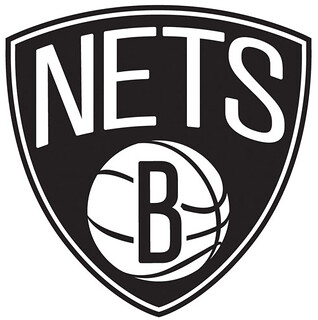
Brooklyn is very easy to caricature (sometimes positively, sometimes negatively), and my biggest fear was that the Nets’ new logo would come off as some sort of T.G.I.Brooklyn cartoon. I think we can safely say they haven’t done that. Unfortunately, I’m not sure they’ve accomplished much of anything else.
Here’s what I like about the logo: It isn’t overdesigned; it doesn’t try to look macho or fierce or intimidating; it doesn’t make use of gratuitous digital tricks like beveling; it doesn’t feel “extreme.” In other words, it avoids many of the pitfalls of modern sports logo design.
But avoiding weaknesses is not the same thing as having strengths, and I don’t see much in the way of strengths here. The typography feels so wan, so generic — come on, make that “B” a bit thicker, a bit bolder! And I think a bit of gray or silver trim would help a lot. The whole thing feels more like an Old Navy knock-off than an NBA logo. I’ll say this much: I’m impressed that such a minimalist design was able to make it through the pipeline without being gussied up along the way. But this is one of those rare cases when less feels like less.
Now, I’ve seen the uniforms (not sure when those are being unveiled), and I like them better than I like the logo. For now, though, this team feels really, really plain.
Collector’s Corner
By Brinke Guthrie
Someone astutely pointed out last week that Collector’s Corner seems to skew towards 1970s NFL stuff. Quite right. Why? It seems to me that that era hits the sweet spot of a lot of the readership here. Plus, it’s been my experience that the NFL from about 1967-1977 has the best stuff. Sears, IHOP, Chiquita, Gatorade — all those tie-in premium items we had to have. Believe me, when you search MLB/NHL/NBA in the 1960s-1970s era, the quality stuff just isn’t as prevalent.
With that in mind, let’s lead off with a nice IHOP NFL standings board, a set of Chiquita stickers, this NFL Central Division glass from Mobil, a 1973 American Express promo NFL Playbook signed by Merlin Olsen and Isiah Robertson [my own copy of this, while not signed by any players, has been among my favorite possessions for nearly 40 years ”” PL], a Great NFL Fun Book from 1978, and an NFL lunchbox from the same year. Whew!
But here are some other items, just to show that CC can venture outside of that sweet spot:
• This one’s specifically for Paul: a 1940s milkshake cup with artwork of a woman skating playing hockey. [Ah, Brinkster, you know what I like. ”” PL]
• Ernie Banks is a Hall of Famer. And while he didn’t have a “signature” baseball shoe, he sure has an expensive pair right here.
• We’re going way back to the early 1960s for this Cowboys bobble — and just $450, too! If you really want to fork over the cash, this Dallas Texans bobble dude costs about three times as much.
• Do you want an official 1970s Boston Bruins coloring book? Sure you do.
• Sorry, but Charlie Hustle is always gonna look out of place wearing an Expos uniform, like on this 1984 glass.
• Nice 1967 New Orleans Saints book cover!
• Great graphics on this 1970s Bengals light switchplate. Pair it with this helmet buggy, eh?
• And we close things out this week with this awesome 1970s MLB kids’ belt, featuring all the then-current team logos.
Seen something on eBay or Etsy (or anywhere else) that you think would make good Collector’s Corner fodder? Send your submissions here.
Uni Watch News Ticker: Attention all you SoCal readers: Although nothing’s firmed up yet, there’s a decent chance that I’ll be making a work-related trip to L.A. at some point over the next two months. If so, I’ll definitely arrange to have a Uni Watch party during my visit. More details soon. … The Mets were apparently considering a powder blue road uni in the 1980s. That prototype was shown at a Mets history conference that took place at Hofstra over the weekend (big thanks to Mets Police blogger Shannon Shark). ”¦ “One of my father’s closest friends was a former Pirates minor leaguer from the 1950s,” writes Mark Mannino. “In the late ’70s his friend found some old Pirates documents and they mocked up a tryout invitation for me on Pirates letterhead. I was eight years old at the time. I forgot about it for years and just this week was digging through old albums and found it. My favorite part is where ‘The Pirates’ is in quotes.” … E. Lindsey Hall III picked up an NFL-related T-shirt in Iran that’s weird in all sorts of ways. … Natty Boh has produced a cool can design to mark the 20th anniversary of Camden Yards (from Tim Haller). … Has anyone ever said this about a Bosox/Chisox game before? … New rugby kit for Warrington, and it’s a, uh, doozy (from James Welham). … If you miss the Brewers’ old ball-in-glove logo, maybe you should root for Brick Memorial High School in New Jersey (from Dan Cichalski). … Army football wore new uniforms, based on the ones from last year’s Army/Navy game, for their spring game (from Terry Duroncelet). ”¦ More Army football news: Army has been letting fans vote on the photos that will be used on this year’s season tickets (from Noah Goodman). … Ice cream has been served in mini-batting helmets for decades. But now a few stadiums are selling nachos in full-size helmets (from Brice Wallace). … Falcons RB Jacquizz Rodgers has agreed to give up number 22 to recently acquired CB Asante Samuel. “Apparently a lot of people call Samuel ‘Deuce-Deuce,'” explains Britton Thomas. “Rodgers will wear 32 next season.” … Ever wonder what the Rangers and Canadiens would look like in black helmets? Check out this hockey board game that Tim Reyes’s brother found at a local Salvation Army store. … Reprinted from yesterday’s comments: The Mets dressed up Western-style, yee-haw, for Sunday’s flight to Houston. “Word is they’ll be breaking out hockey sweaters for a road trip to Toronto later this year,” says Ben Fortney. … Now that Texas A&M is in the SEC, they’ve added all the SEC team logos to their equipment room wall display (from Glenn Stern). … Yesterday I mentioned how the Titans’ colored yoke no longer goes all the way to the edge of the sleeve cuff. But now Buddy Walker has provided a photo showing indicating otherwise. Might depend on the jersey cut. Looks like we’ll have to wait until we start seeing these on the field. ”¦ Here’s a page devoted to Marlins uniform history (from Thomas Griffith). ”¦ New mascot for FSU (from Leo Strawn). ”¦ 49ers draftee LaMichael James, who went to college at Oregon, had this to say in a radio interview yesterday: “I would not go to two or three colleges, just because they were Adidas. Weirdest thing ever. I wouldn’t go to Arkansas and I wouldn’t go to Mississippi State because they were Adidas schools. No three stripes for me. All Nike.” ”¦ Good article about a Seattle uniform company called Intrepid Sportswear, which is devoted to taking smaller profit margins and therefore offering lower prices than the big corporate outfitters. Recommended reading (from Mike McLaughlin).
Sorry, but the Ernie Banks link isn’t working
Thanks
Now fixed.
You know what Ernie always said about shoes: “Let’s wear two!”
BOOOOOOOOOOOOOOOOOOOOO!
To be fair the Warrington shirt is a one-off for charity. Not easy on the eye, but for a good cause and one which is clearly close to home for them.
I had a good laugh over the Iranian NFL t-shirt in the ticker. Hilarious.
Yes, that shirt is priceless! I’m sure it would get some pretty funny comments if you wore it to a sports bar.
Am I the only one disturbed by the fact that Texas A&M’s equipment room has the adidas logo on equal footing and equal size as the A&M logo?
link
Maybe they put that up to keep LaMichael James away…
I noticed that too. It is indeed disturbing.
Extremely disturbing.
A couple of things I noticed about the wall:
1. The Alabama circle logo is way too small compared to the other logos.
2. The Georgia logo should have a black G on a white background instead of a white G on a black background.
3. And the Mississippi State logo in incorrect.
link
Looks like the MSU logo is the one last used in 2008.
link
Hey Paul,
Couldn’t agree more. Doesn’t say much. I loved Freddy’s! I kinda’ love the logo though.
im guessing lamichael james is no longer jason bernard’s favorite player
Good guess!
I would try and say that at least the Barclays Center is only nine blocks away and you could walk to see Nets games, but reading your list of legitimate grievances, I’m gonna keep my mouth shut.
I also really hope those Nets uniforms are much, much better than that logo. Yeah, silver would help the logo out a lot, but if the uniforms are legitimately black and white, it would throw off the uniforms if the logo had some silver in it. Besides looking like a San Antonio Spurs knockoff.
I would also like to say that I think the link also use a black and white combo, but I think a link are used for detailing.
I like how the Nighthawks are named after the stealth fighter.
The Kansas City Command of the Arena Football League have a stealth bomber in their logo:
link
Out of curiosity I did a google search for “stealth football” and there are several other teams with stealth aircraft names and logos:
The Utah Stealth (the following link shows many photos of their new 2012 uniforms):
link
The Pittsburgh Stealth (gotta love the stealth bomber as the “A” in “STEALTH”):
link
and the Wichita Stealth, which is a defunct AF2 team that had a very interesting helmet design:
link
link
link
Entirely un-uni related, but I saw the bomber fly over and bank on it’s way to the airshow at Jones Beach once. Legitimately one of the most amazing sites I’ve ever witnessed.
Saw one make a couple passes over an air show a few years ago. Definitely an impressive sight.
It’s like black bird of prey. Imposing as hell. Far ahead of the sound it’s generating, it approaches almost silently until it’s right over you.
Remember thinking, “Man, I’d hate to be on the receiving end of all the firepower that thing has.”
link
“Saw one make a couple passes over an air show a few years ago. Definitely an impressive sight”
same here. thought it was great… but… that same airshow i saw a navy trainer & a japanese zero duking it out, complete with blank rounds
the stealth was the second coolest thing in the air that day (for me, anyways)
I found another team with a stealth aircraft in their logo.
The Huntsville Flight of the NBA Development League:
link
I’m pretty sure that’s an F-22 Raptor jet fighter in the logo:
link
I live even closer to the Baclay’s Center than Paul – one half a block – and am WAY less concerned about traffic/parking impacts than others. In fact, I work for the city in parking management (although I am completely uninvolved in Barclays/Rattner parking projections) and I can say they even if the arena builds no additional parking, there is sufficient unused capacity in the area [at any given time, roughly 1,000 on-street spots within 1/4 mile from the arena not including any structured parking, commercial parking lots, or accessory off-street parking]. The provision of more parking will only encourage driving to an arena that is most likely the world’s single most transit-accessible venue, with 11 MTA subway lines (8 of them express) as well as a 6-track LIRR terminal
Hey Paul, the NetworkedBlogs Facebook feed of the post today (and I think yesterday’s too) is coming out weird. It shows the post title and the Nets logo, and the link works, but the text shown is computerese:
Well, You Certainly Can’t Say They Overdesigned It
(function(d, s, id) { var js, fjs = d.getElementsByTagName(s)[0]; if (d.getElementById(id)) return; js = d.createElement(s); js.id = id; js.src = “//connect.facebook.net/en_US/all.js#xfbml=1”; fjs.parentNode.insertBefore(js, fjs); }(document, ‘script’, ‘facebook-jssdk’)); !functi
source: Uni Watch
link: Full Article…
Thanks for letting me know. I’ll ask Ek to look into it.
Really don’t understand why the Nets didn’t completely re-brand and become the Brooklyn Empire.
I think there’s nicknames to come. I noticed during the Avery Johnson TV interview there was a t-shirt hanging on the rack in the background that read “Brownstone Ballers”. Looks like they’ve been testing nicknames.
jay-z has like 10 made up nicknames just for himself… expect anything!
(GF is a big fan of his… means i HAVE to listen about 85% of the time more than i’d like…)
Hova’s Hoopsters.
The Brownstone Ballers tee is one that I did. Wrote the verbiage and drew the script.
The Mets in powder blue wouldn’t have looked too bad.
For a sample/concept it’s OK. Maybe I’d like it more if the chest logo was orange with a navy border and slimmer (it seems to be a bit too wide).
Great find, but the design is way too plain. Glad that never happened.
And in other news, the Florida State University Seminoles have signed an endorsement deal with My Little Pony.
This mascot is a joke, right? I mean, Nickelodeon? Cartoon Network? That’s not tough. Keep that silly mascot off of campus and leave it with the kids’ events.
The first thing to catch my eye was a pullover jersey without trim on the collar. I have trouble imagining how well that can be pulled off.
Looks rather Expoish, no?
Looks VERY Expos-ish. Those racing stripes are still hideous.
I wonder if those Titans jerseys were just altered instead. Here’s their official jersey from the 2012 Draft:
link
The 1970’s kids belt link from collector’s corner isn’t working
Thanks — now fixed.
i hate to be “that guy” today, but i will:
COTD just keeps on getting better and better! damn!
Seconded! Wow. Just, you know, wow.
Plus, I was totally in need of a couple of pocket notebooks myself, so CotD fills a utilitarian purpose for me today as well.
same here. the scribbles and scratch paper on my work desk are out of control lately. after watching the “films” section, how could i not pick up a 3 pack…
While I don’t think the new Nets logo is awful – I do like some things about the minimalism approach – it seems like it could use some minor adjustments. Both the ‘NETS’ and ‘B’ fonts do seem light. Spacing seems off, especially the placing of the ‘N’; the lower-left appears to be closer to the edge of the shield than does the top, and that same corner also appears to be down further than the bottom right of the ‘S’ (could be a function of the rounded ‘S’, but it still looks strange). The ball seems to be a shade closer to the bottom sides of the shield than it is to the wordmark. Just little things here and there.
Love the NFL helmets inset pic – I have that binder down in my basement.
The font is meant to be similar to the lettering used on the old roller type subway signs, but I would have much preferred they designed an authentic reproduction instead of using a similar font.
Something like this would look a little better, I think: link Smaller serifs on the ‘S’, more symmetry on the ‘B’.
Actually, I think the off-white would look great over the white, too.
I’m with you. I love the idea of black & white. I think there is a ton of potential here, and I’m actually pleased they didn’t include a third color (yet). I’m really hoping they use b & w stripes somewhere. Maybe socks, on the collar, the arm trim? Loads of potential, and the simplicity is refreshing. But I realllllly dislike the font used for the “B”. It looks totally off to me.
Also about the Titans jersey… If you notice, all of the jerseys being worn have no powder blue stripe at the edge of the sleeves…the blue panel extends to the edge…regardless of the yoke color. All of the jerseys at the Nike debut & on the NFL website have the powder blue stripe at the edge…
I’m not terribly surprised to see that hilarious t-shirt in Iran, honestly. English language has a sort of cachet even though most people don’t have any idea what it means (and most Iranians wouldn’t recognize an American football helmet). It’s not altogether different from Americans tattooing themselves with Chinese characters; it has basically nothing to do with the literal meaning of the words. My brother lived over in Guangzhou for some years, and I saw some very odd t-shirts, greeting cards, etc. in China (obviously China is totally different from Iran). I remember seeing “21st Century Doritos”, and tons that made no grammatical sense whatsoever.
Many years ago I went to the Belgian Formula 1 Grand Prix in Belgium at a time when Michael Schumacher from Germany was battling for the title with Brit Damon Hill.
A group of Germans in front of us all had T-shirts proclaiming “Schumacher is over the Hill”. I think they thought it meant in a superior position, but I wasn’t going to tell them what the normal meaning of “over the hill” is. I, along with all the other Brits around, just sat and chuckled.
It’s sort of like the “Ich bin ein Berliner” thing (though there are still various opinions as to whether that was truly an error). One of my favorites in China was a girls shirt that said “I can feel delight, frankly.” I just turn the mirror and remind myself that, surely, American ignorance rivals theirs.
Choosing a college based on a sporting goods sponsor. We know this cat’s priorities.
He is staying through the semester to finish his degree, so at least his priorities aren’t all out of whack.
Sadly, though, while he calls it the “weirdest thing ever” to pick a school based on swoosh or stripes (or even UA), that’s really not so weird anymore. And that’s terrible.
I don’t understand how anyone can criticize this location for the Nets stadium. It’s exactly where the Dodgers tried to move 60 years ago, and it would have been a great location for them. You can’t say you would support a professional team moving to Brooklyn and then criticize the choice of this location: on a transit hub, on mostly undeveloped land. As for the financing and the jobs, of course those have been affected by our screwed up political system. But all the “ruins the neighborhood talk” is so much NIMBYism, to me.
I see. And do you live in the area? Do you know anything about the project? Do you know anyone who was forced from his or her home due to the project? Do you know any business that was condemned and evicted due to the project?
Oh, and it is NOT where the Dodgers wanted to move. The Dodgers wanted to move to the site of teh current Atlantic Center (owned by the same developer who’s doing the arena), which is a block away. THAT site would be much better, because it’s not at the intersection of Brooklyn’s two busiest traffic arteries.
Community groups suggested — BEGGED — the developer to simply put the arena on the Atlantic Center site, but he wouldn’t do it.
That does help my understanding, but I still see it as a block’s difference in a borough of 2.5 million people. The workings of eminent domain law and high-powered business will have an effect on people sitting on such valuable real estate, no? Daniel Goldstein cashed in, after all: link
We’re gonna have to agree to disagree.
What might’ve worked 60 years ago in Brooklyn doesn’t work now. I’ve got a few good very good friends who live not far from Coney Island. We’ve “explored” Brooklyn a fair bit. I don’t know the borough nearly as well as many on here – – – and I’m a HUGE fan of Brooklyn in general. But I can tell you….. this will be a total clusterfuck. Such a clusterfuck, that I almost wondered if they picked a clusterfuck location on purpose. Maybe they figure “people won’t move far, so they’ll be stuck here and have to spend money”. I don’t know. I really like the idea of a major sports team in Brooklyn. Basketball is a great fit and people will be excited. But go drive around the area around 5:30pm and tell me it’s not going to be a TOTAL logistical CF. (Sorry about the language folks, “clusterfuck” just fits this too well.) This isn’t NIMBYism, this is common sense, Nick.
There are already issues with the project sidewalks being narrower than specified in the plan, so neighborhood groups are up in arms that lots of drunk people will be flooding on to Atlantic and Flatbush Avenues after events. This is potentially really dangerous for both patrons, pedestrians and drivers.
And there are a series of bars ranging from small to enormous that are seeking liquor licenses in the area adjacent to the arena, which is also adjacent to low-scale residential areas.
So the problems that many of the opponents cited that were pooh-poohed by supporters are already starting to manifest. Woo!
I used to teach in that neighborhood, from 2003-2009. I can’t speak to many of the local issues that Paul raises here with respect to the development of the arena. Those aside, it always seemed to me that it was a good location given the huge — and recently refurbished — transit hub that lies underneath (9 subway lines + LIRR), although having gone back to the area recently I saw that the arena itself is a bit further away from the station entrances than I envisioned it would be.
Time will tell if this becomes the boon to the neighborhood that a lot of people are hoping for. If nothing else, maybe it’ll get the LIRR to expand service into and out of Atlantic Terminal, on more different LIRR branches.
So if LaMichael James was drafted last year, would he have not signed with his team because the NFL was outfitted by Reebok?
What an awful way to choose a school.
But he wasn’t choosing a school. He was choosing a sports team to play for.
To be fair, he’s graduating this year.
I think Jay-Z ripped off this logo.
link
West Point did its spring game right. And the unis were first-class as well. On point, all the way around.
I like the way black and white is used in the new Nets identity. I like the B mark a lot, and the B-with-basketball element is now my favorite basketball-including NBA logo. By “favorite” I mean, “basically the only one I like.”
But the Nets script brings on the blahs. The guitar pick does nothing for me. (I don’t care that the team calls it a “shield.” That’s not a shield, that’s a guitar pick.) The strongly horizontal edges of the Nets script just don’t work inside the evenly curvy guitar pick. And then throwing all those curves on top of a flat horizontal “Brooklyn” looks like an abandoned second draft of an art-school design project.
So we have a few really strong elements, and a few really weak elements, all jumbled together. Nothing is integrated; this is mere juxtaposition. There’s some nice art going on in the new identity, but the design work is decidedly mediocre.
On the upside, if the use of color in the logo is the driver behind the design of the uniforms, as seems likely, I could see the Nets having really terrific unis.
nothing is integrated – totally agree. Looks like a mishmash of ideas to try and cover all marketing angles.
I had that NFL Fun Book, and a later edition, when I was little. I don’t know where they are so I may bid on this one. The later edition had caricatures of the team mascots reading a Fun Book on the cover (images of that can be found quite easily). There was also at least one MLB Fun Book. What I liked about them was the section showing each team’s helmet and home uniforms; the baseball one had a concept drawing of the White Sox’s new uniforms as they were changing them in 1981 or 1982.
I think those books were how I first learned to appreciate the intricacies of football & baseball uniforms, even though I was only 8 or 10 at the time.
Worked on the construction side of the arena project for the last 5 years. Interesting to get the opinion of a long time Brooklynite. I know the community fought tooth and nail on a lot of this and I always wondered why? Realistically that piece of land was doing absolutely nothing before the arena, and while people being forced to leave is never a good thing, I always felt it was a net positive in the long run for the BK.
As for traffic, I’d assume they anticipate the majority of locals to simply ride the train rather than driving to the Arena so I can’t see how it could be any worse than it already is. But then I don’t live in the area so you’d know better than me.
On topic: I applaud the minimalism. Just don’t know how well it’ll translate to a jersey. Can’t wait for them to leak.
I think that “Net” positive (see what I did there?) is always in the eye of the beholder. The arena *may* make a return on its civic/state investment, or it may not.
In the short run, the construction jobs are a boon, no doubt. But “economic spinoff” is always a crapshoot, and the people who write economic assessments don’t get paid hundreds of thousands of dollars to say that the substitution effect will just move money around in the local economy. It’s most likely that the developers and team owners will make out like bandits but that the arena will be a net drag on the local economy for a variety of reasons. Remember, the reason that this plan originally got high marks was because of the concurrent development (office and residential towers) which are now not going to happen, at least for some time.
With respect to traffic, if even a few hundred people drive to events at the arena and try to park on the street, parking in an already congested area will become will become that much more difficult for local residents. At that point, the visitor is being favored over the resident and when is that in anyone’s best interest?
It may not seem like a nuisance, but if the arena is successful and is hosting events 300 days a year, it can completely change the nature of the surrounding area.
So why support a sports team coming to Brooklyn? That will inevitably change the nature of the surrounding area? I completely agree with you that commercial activity will dramatically change, but that seems like the price you pay for bringing this kind of enterprise back into the borough.
RE: Mets in Western togs…….
Looks like they’re all audutioning for the Village People.
Concerning the Nets new home, this film is illuminating…
link
Meanwhile, I do find the new branding…fascinating. Maybe it’s all just marketing strategy and I’m a sucker and have taken the bait, but I just can’t believe that an NBA team has gone this route. I can’t take my eyes off that new logo BECAUSE it is so plain, so unadorned, so simple. What does that say about contemporary sports design? About me? Put all the NBA logos in a room together and my eye goes right to that new Nets logo. Genius…or ridiculous?
Nacho Helmet…..
I guess the helmet is just for CHOW and SHOW, as it doesn’t appear to have the adjustable band inside to wear it after you are done.
Oakland serves popcorn in a full-size helmet.
I’m not a big fan of nachos, but I would totally buy them just so I could keep the helmet as a souvenir.
Looks like the marketing geniuses have gotten to me.
Astros serve popcorn in one too. It’s a tad smaller (presumably to fit a kid – although, it fit my head). And it is pretty cheap knock-off – the ice cream ones are made better IMO. Of course the printing on it is horrible (especially a black helmet). Still a fun souveneir, though.
Just wear a hat underneath the helmet…after you’ve eaten the nachos, of course.
White Sox serve the nachos in the helmet, too. They have an over the PA commercial (which pisses me off) that touts 2 lbs. of nachos served in a helmet outside of sections x, etc.
I was at an Akron Aeros game last summer and they have an ice cream sundae in the full-size helmet. It boggled my mind to see someone eating such a monstrosity.
I like the less is better approach to the Nets logo. Don’t like the colors. Would have been neat if they took the Dodgers blue or something a little more interesting. Black is not a fun color. To dull and depressing for a sports logo IMHO.
Hey Lukass, stop whining about more traffic because of the arena. It’s not all about you, douchebag.
If he lives in the neighborhood, it’s certainly about him because he has to deal with all that it brings.
If I wanted to plop a nuclear reactor on to your front lawn so that I could generate power for decades and create hundreds of new jobs, would you complain about a little radiation, pollution, or traffic?
Know when to keep your mouth shut, X.
I don’t hate the Nets logo, but wouldn’t it be nice if – just once – the Nets logo included…I don’t know, a net?
That’d be too literal. You might as well ask the Clippers to put a boat in their logo.
It would make perfect sense. If I had the design talent, I was going to make a logo where the cords of a net spelled
BROOK
LYN
With a ball going through the net, of course.
And I miss the SD Clippers logo with the sails:
link
Shoot, I miss the SD Clippers altogether. Pre-Donald Sterling, great unis, great looking court:
link
What is it with San Diego and basketball?
Same here – one of my all-time favourite unis, along with the “Irish Rainbow” Bucks sets. I especially loved the nautical flags spelling out “Clippers” on the shorts.
Great link, too – Magic’s first pro game!
I agree. There’s a ball, but no net. As for the Clippers, they do have these triangle designs incorporated into the stripes on their jerseys and shorts that are inspired by the sails on a clipper ship, so that’s something.
Put me in the “don’t hate it” camp with the Nets logo…but wow, I am soooo underwhelmed. I get the feeling that they’ll endlessly tinker with variations in the future (if for no other reason than to create more merch).
RE: Nets
Not an NBA fan really, but as far as the design goes, I don’t..hate it. How about the old style Dodgers B font tho?
The Brooklyn Dodgers “B” was my first thought as well. I’m sure that’d be trademark infringement, though.
I tweeted Brooklyn Decker about the new logo.
Amazingly, no response.
Regarding the NFL item that leads off the Collectors’ Corner segment (notebook? folder? poster?)…
I find no rhyme or reason to the order they have chosen to depict the teams. ???
The only thing I can think of is that it was just an attempt to not have any two helmets of the same color next to each other. So it’s basically a pattern of organized chaos.
In all these years I’d never thought about that. It’s odd in that there are parts that make sense. Top left corner down, you have the AFC West (at the time). Bottom right up, four of the five NFC East. Then three AFC Central. Trade MIA with CIN and you’d have all four, and MIA would be more at home between BUF/NE. A similar swap with ATL and BAL would also work, putting all four NFC West around the shield. But you’d still have NYJ, WAS, CHI and DET out of place.
I think the way to make it work would have been to have one 5-team division across the top, followed by the two 4-team divisions. Another division along the bottom, then the two remaining down the sides.
There – 30+ years worth of thought all caught up on.
sadly, i think about it all…the….time.
If you do not live in the area, have worked in the area or have friends/relatives who were affected by the decision to build Barclays Center on that SPECIFIC corner…you would never understand. I can understand why “they” chose to build where they did. Close to Manhattan, plenty of rail and bus service, close to retail, Downtown Brooklyn…even close to loyal NJ Nets fans to make the trip….
But on the flipside…. you could not have picked a WORSE PLACE IN ALL OF BROOKLYN TO BUILD A MAJOR ARENA!!!!
Would you prefer it be like the United Center in Chicago and be in one of the worst/most dangerous neighborhoods in the city and have no L line nearby and nothing else to do or see anywhere within walking distance?
I don’t know the Brooklyn situation well, but it sounds like it could be a whole lot worse.
A) The green line has a stop at Ashland. That’s like a 4-block walk/bus ride.
B) Worst/most dangerous? When’s the last time you were at the UC?
A) I actually forgot that stop was there, I’ve seen it, but never used it. My bad.
B) link The UC basically borders East Garfield Park and while the violence in the area is down in the Near West Side as of recent (due to increased police presence and the east side of the Near West Side being super gentrified…), the UC used to be in middle of one of the worst gang neighborhoods and close to one of the worst projects (the Henry Horner Homes) in the country.
It doesn’t matter the last time I was at the Madhouse. Do you want to move into that neighborhood? Would you feel safe? Probably not. You’d probably stick to Wriglyville or Lincoln park or Logan Square. If you did want to move to the Near West Side, it wouldn’t be anywhere near the UC and you know it.
Key words: *used to be*. But when did I say that it’s the happiest place on earth?
And whether or not I’d like to live in a particular neighborhood is not the litmus test for its livability.
I’m pretty sure I don’t want to live next door to you. Does that mean your neighborhood is dangerous?
you can’t even get good pizza there
hell…you can’t get good pizza in all of chicago, but that’s another story altogether
Phil, you and I both know damn well that you don’t know shit about good food, but you’re right about one thing. You CAN’T get good pizza at the UC. They started serving DiGiorno there this year.
i may not know shit about good food, but i know what goes on a hot dog, and it ain’t red or yellow
tacos are encased in crispy tortilla shells
and meat pie aint pizza
“you can’t even get good pizza there hell…you can’t get good pizza in all of chicago, but that’s another story altogether”
That’s b.s.!! (as the insufferable assclown Hawk Harrelson would say)
“and meat pie aint pizza”
(More) b.s.!!!
Our cheese, meat & sauce casserole …er stuffed deep dish pizza is fucking delicious. If I had any kids I’d trade them for the pizza. Without hesitation.
“you can’t even get good pizza there. hell…you can’t get good pizza in all of chicago, but that’s another story altogether”
That’s b.s.!! (as the insufferable assclown Hawk Harrelson would say)
“and meat pie aint pizza”
(More) b.s.!!!
Our cheese, meat & sauce casserole …er stuffed deep dish pizza is fucking delicious. If I had any kids I’d trade them for the pizza. Without hesitation.
Timmy, I’m gonna be there in a couple of weeks. Don’t stereotype my experience for me. LOL
I love the UC. It’s the bomb. But it’s not Wrigleyville, you wont want to move there.
Great stadium. Bad neighborhood.
Actually that section of Brooklyn isn’t dangerous at all. Probably as safe a place to be in in the borough as there is….
Again from the developers point view and from the fans that will be coming in from out of that neighborhood to arena events, the location is absolutely perfect.
For long time residents and business owners, or any one else that makes a living in the immediate area ( delivery truck drivers, cab drivers, bus drivers etc ) this will be a nightmare. It is already probably the worse intersection in the borough and it will get exponentially worse on event days.
New Yorkers are used to public transportation and will know better than to attempt driving to Barclays. But you can be sure that there will be a big percentage of fans that will think driving is a good idea……
That’s not even discussing imminent domain, which by it’s very nature will be for the greater good but always screws the ones being IMMINENTLY DOMAINED!!!!
He wasn’t talking about Brooklyn…
My bad, I thought he was referring to BK….never been to the UC…..but I did go to a game White Sox game a few years ago…and a couple of blocks away it looked like the neighborhood they used to show in the intro to GOOD TIMES!!
…..but I did go to a game White Sox game a few years ago…and a couple of blocks away it looked like the neighborhood they used to show in the intro to GOOD TIMES!!
1. The projects you saw near US Cellular Field are gone.
2. Good Times was set in the Cabrini-Green projets, which were on the Near North Side. Not too far from the Gold Coast, actually. Demolition of Cabrini-Green will conclude by 2015.
Someone say “Good Times” and “demolition”?
link
“Damn! Damn! Damn!”
No way, that neighborhood is not as bad as you’re making it out to be…on game days. (crime stats be damned)
I wouldn’t tell anyone to stay away from the UC on event days, ever. Truthfully, I’ve been in that neighborhood when there aren’t events going on and it’s much better than it used to be.
The neighborhood is terrible. Doesn’t stop me from going to games. You’re safe while entering the UC, but hang out there for more than just a few fleeting minutes and shit could go down (not that shit doesn’t go down everywhere and anywhere…).
It’s a bad neighborhood, just because you like the sports teams there doesn’t make that not the case. It’s gotten 1000x better since the 90s, but it’s still pretty bad.
Listen, I’m a White Sox fan (and a Bulls and Hawks fan…), I don’t hear to many people saying nice things about the neighborhood the Cell is in, but it’s gotten a lot better since the 90s too, but it’s still a bad neighborhood where you’re more likely to have trouble find you than in other neighborhoods in the city.
My argument was that people don’t like the Nets new location (among other reasons) because of it’s location in the thriving heart of their city, all I’m saying is that I’d rather have a Wrigleyville-walk-to-the-stadium type atmosphere than the Theres-nothing-else-here-except-places-to-find-trouble type of atmosphere you get around the UC.
Doesn’t mean I don’t love the Bulls, Hawks or the UC. It’s one of the best NBA and NHL arenas around, IMO, but I’d like it even more if it were located on State Street.
Again, Tim, just because it’s not Lakeview does not mean you have to dodge bullets and wade through discarded needles to get in the door.
And I’m sure this is something that you’d never even consider doing, but when I go to events at the UC, I park on the street (unless the parking happens to be free for the event in question).
You’re missing the whole point. I’m not calling it the thunderdome, I’m calling it what it is: A bad part of the city of Chicago.
What I’m saying is statistical fact. You can act like a hardass all you want and talk about street parking (What does parking on the street have to do with anything?…) but the crime rate and average household income statistics – and the fact that no person in their right mind wants to live or hang out there (outside the UC) make my case for me.
It’s still a poor neighborhood.
It’s still a heavy crime neighborhood.
People with means don’t choose to live there.
Beside the stadium, there are no sites to see/things to do.
None of those arguments would be made for the Barclays Center’s neighborhood. None of those arguments would be made for Wrigleyville.
And that is my argument. The UC is not in the vibrant heart of the city, it’s in a shitty neighborhood no one would go to if the stadium weren’t there (unless you’re enrolled in Malcolm X College…).
If you can somehow try to justify why it isn’t a bad location in your own mind, good for you. But the next time I go to the UC, afterwords I’ll still end up driving somewhere far away to go celebrate the victory or agonize the loss.
Hardass? Really?
What street parking has to do with it goes to your saying that if you “hang out there for more than just a few fleeting minutes and shit could go down.” Also, that I’m fairly confident that my vehicle will be right where I left it when I return to that spot.
Honestly, how far away do you feel you need to go to celebrate/agonize safely?
“Honestly, how far away do you feel you need to go to celebrate/agonize safely?”
If you can party in any city in the world, would you pick Detroit? How about Gary, IN?
You would probably feel safe at your party in either of those cities, but wouldn’t you rather go to LA or NY or London?
It’s not fear that makes me leave, it’s the fact that the area outside the UC’s walls sucks. Hard.
If you’re so confident there’s worse neighborhoods in Chicago than around the Cell and UC, then name them. Because crime and poverty statistics are on my side.
You’re not even arguing your original point anymore and your definitely ignoring the crux of mine so I’m done with this argument.
Honestly, I didn’t realize this was an argument. Debate? Maybe. But I wasn’t arguing.
AAaaaannnnyway…
What do Gary and Detroit have do with the conversation?
My original point is that I feel perfectly safe in that area. I’ve been saying that all along.
And if you want me to name less safe neighborhoods, I can use that link.
Let’s see…
Per that map, the UC is in Near West Side (and its location is pretty far from East Garfield Park), which is colored yellow. So anything from light orange to red would be worse.
So Loop, Near South (where Soldier Field and the museums are — guess I’d better stay away from there), East and West Garfield Park…
The Cell is in Armour Square. And that’s light green. So apparently it’s even safer there.
But I’ll level with everyone. I’m clearly a hardass who’s just trying to lure you all to your deaths so please ignore everything I’ve said so far. If you value your life, stay FAR AWAY from the United Center. I hear link, link
and link are nice.
There is a Malcom X College in Chicago?
Nope. THE link is in Chicago. It ain’t a chain, Marty.
Assalamu Alaikum
Aleikum-salam
The Canadian Football League will be getting link.
Well, it’s about time, eh?!
Tigercats are out and they are fantastic. Blue Bombers and Alouettes soon and Argos tonight!
Here’s a good article about the Hamilton Tiger-Cats new uniforms:
link
Hmmm… that link doesn’t seem to be working. Let’s try that again:
link
That link doesn’t want to work, so if you want to read the article and see pics of the new uniforms, do a google search for “Everything that’s old – and Black and Gold – is new again” (that’s the title of the article) and then click on the first result, which should be from the Hamilton Spectator.
And while we’re on the subject of the CFL, the Winnipeg Blue Bombers updated their look, more or less going back to what they had up until the mid-90s.
They are going look great. Big improvement over the lightning bolt era. Huge.
Oops, link.
Tiger Cats:
link
The new Stampeders jerseys come out tomorrow – the current ones are so awful I think it would be impossible NOT to improve them. The public event is in my ‘hood so I might swing by.
I get so mad when I see that the linemen and “skill players” are wearing two different jerseys because of the striping on the sleeves that the linemen don’t have.
I also HATE the red “halo” that they have on the away jerseys, it’s terrible! And the black labour day jersey is an insult to anyone who has vision!
When they introduce the new ones tomorrow Ted Hellard should apologize for putting everyone through this recent uni era!
Those new Ticats jerseys are fantastic. They could market those under the slogan “Believe in the Sleeve”.
Paul, being that you’re from the Borough, and you know more about the team than casual observers like myself, any insight on how the team will be marketed? Knowing the roc-a-fella who is involved as a part owner, I can imagine that there will be a lot more Brooklyn branded merchandise that anything with a basketball logo. The images I’ve seen so far just don’t say “Basketball” to me, or even sports franchise.
“Secondly, I’m about to mark my 25th anniversary of moving to Brooklyn”
Will you be wearing an anniversary patch?
I see a design contest in the making.
Seriously, this. The Washington Professional Football Team redesign contest can wait. Phil, please make this happen!
it will have to involve the kitties.
BEST COMMENT OF THE DAY!!!
Lmao.
Joy. Another missed opportunity for an NBA team to eliminate the basketball from its logo. There are entirely too many NBA teams with a basketball incorporated in its logo. There’re still 20 franchises in the NBA that have a basketball depicted on their logo. That’s a 2/3 rate
Baseball? 11/30 teams have a ball or bat.
Hockey? 5/30 have hockey sticks depicted.
Football? 4/32, if you count the Browns and the football helmet worn by the Dolphin.
I think that should be 5 for the NFL. The Bucs & Jets have a football depicted in their logos, the Raiders & Dolphins have their mascot wearing a helmet… and then the Browns being the Browns.
Nonetheless, there are definitely way too many basketballs in NBA logos.
There are entirely too many NBA teams without a basketball incorporated in its logo.
(fixed)
There are way more than 11 MLB teams that use a bat and/or ball in their logos.
At least 11 use a ball: Red Sox, Yankees, Mets, Dodgers, Giants, Rockies, Twins, Mariners, Blue Jays, Rangers, Brewers.
Pirates, Cardinals, A’s and maybe the Orioles (not sure if they still use link) come to mind as teams that feature bats.
Then there’s other baseball imagery, like the diamond used by the Rays & White Sox.
At any rate, at least there’s some diversity there. It’s not just the ball being used.
The Yankess have a ball AND a bat in their logo.
Indeed they do.
Ssssh. (sotto voce) Someone has been channeling … link. They say 13 for MLB, 6 for NHL, 5 for NFL.
Carry on.
Interesting to see that Wall Street Journal piece to show up after my most showed up on here. The hack even used my numbers, which had been hastily gleaned from the Cris Creamer site.
My error. I guess this article was posted earlier than I had thought. Seems like the author is on the same page as me. I never read the newspaper, and I sure as hell don’t read the Wall Street Journal or any other NYC-based newspaper.
Chill — that’s why I said “channeling”. I’d say it’s a coincidence — and I just happened across that WSJ piece this AM.
On the larger point, I chalk up the frequency of basketball images on logos to the relative newness — really — of the league. Sure, the NBA started in 1946 but it spent decades in the shadow of football and especially baseball. Frank Deford has a superb piece in a recent SI about the NBA is the early ’60s; it was truly a different world.
That’s an odd thing to fixate on. It seems an even number of good and bad insignias do without the basketball, just as including the ball has no bearing on making a logo sink or swim. I like the Bulls’ and Jazz’ insignias: one has one, one doesn’t.
Wow – newly redesigned Ti-Cats unis (Canadian Football League) – huge improvement from Reebok’s first go around. Paul will be very impressed I’m sure:
link
So, wait… Reebok is able to put 4 stripes and a logo on those sleeves, but they couldn’t properly do the 49ers 3 stripes?
Maybe they figure Canada is really cold so the players still need sleeves.
Duh. These jerseys are re-engineered. So we’re talking about brand-new technology. Up until this year, it was impossible.
Comment of the day right here.
I think the team asked for that weird stripe solution, hence why it wasn’t fixed when Nike took over.
A. The team was stupid for doing that.
B. Fine, substitute the Bears in their place: link
Ok, that link isn’t working
link
Huge Improvement – wow , some teams go into uniform wastelands (i.e. Toronto Blue Jays for the past 20 years or so – until this year), whereas in the CFL, it’s been the whole league, hopefully this is a postive sign they’re getting out of the wilderness.
So when the San Antonio Spurs vs. New Jersey Net meet, this will be maybe a first, at least in terms of uniforms, it really makes no difference if the game would be broadcast in Black and White.
Well, thankfully there will only be 41 games played there.
Plus playoffs.
And preseason.
And NCAA games.
And concerts.
link…
And possible NHL games if the Islanders move there. Add another 41 home games and a handful of preseason games. No playoffs, though. They are the Islanders, after all. ;o)
Wait… you mean they only get 6000 per game? Never mind. I did link, though. I’d be interested in hearing what Paul and Phil and everyone else thought if the Isles were to move to Brooklyn into the Barclays Center.
Duh. Forgot about that preseason NHL game.
And of course, if you have a rink, you can have ice shows.
Hockey seating chart for Barclay’s. A pretty screwed up plan. Now I can see why all the bickering about “it’s set up for hockey/it’s not set up for hockey” has existed. This isn’t any long term solution for playing hockey in that arena.
link
The WHA Houston Aeros existed for a long time in Houston with that very setup. There have been many examples from the WHA, the AHL, and the ECHL where teams have existed with poor seating. The key is that what they lose in seats has to fill the remaining seats on the other side.
From what I’ve read, it would automatically become the smallest seating capacity for the NHL. No way Bettman wants that for a team in such a big media market. Certainly not for the long-term.
They already play in the smallest building in the NHL, James. Why not add more amenities, better seating, and the chance at picking up a ton of new fans to fill the seats rather than staying in the Mausoleum where they haven’t turned a profit since the 1980s?
I thought Winnipeg had the smallest capacity (Like, around 15,000). I’ve gotten the impression that Bettman and his cronies have looked for facilities that had no less than 18,000 seating capacity for new arenas, but that it was hard to ignore the support of Winnipeggers vs. the indifference of Atlantans.
Right, but the WHA, ECHL and the AHL isn’t the NHL. (Although the Islanders do resemble teams from those leagues (It’s ok I’m an Islander fan.))
I used to go to Solar Bears games at the Orena and the rink was centered and you just lost the first 15 rows of the basketball end zones and the first rows in the corners were about 10 feet up in the air. All remaining seats were useable. The Barclays set up looks ok for pre-season in an area/arena without a hockey team, but as a permanant set up that isn’t going to cut it.
Oh and the blogger where I found that seating chart made a very interesting point. It’s a seating chart for a neutral site game between the Devils and the Islanders, however only the Islanders are represented on the seating chart page. As well, most of the news about the game is marketed as Islanders friendly.
I mean granted LIer’s know the problems with Nassau/Wang/Lighthouse etc, and it is far more geographic friendly for Long Islanders to attend than New Jerseyites.
Too bad it isn’t big enough for a Monster Truck Rally.
Or is it?
And some wrestling and UFC, too.
No UFC. The New York State Athletic Commission doesn’t sanction mixed martial arts fights. However, there are a few boxing events scheduled.
I like the simplicity of the new Nets logo, but I agree it might be just a tad too minimalist, particularly the typeface, without a third (trim) color. Grey or silver would be the obvious choice but the Spurs already do that. Black and white without a trim color would be unique; the only other place I recall seeing that is the fictional Miami Sharks in “Any Given Sunday.” And there aren’t many teams in any sport that have only two (white + 1) colors (Jets, Colts, Red Wings…)
Maple Leafs.
Celtics until the past few years when they “lemminged” into line with their BFBS and alts with gold.
The new Lightning set?
Not the Lightning. On the white sweater, the blue numbers are trimmed in white and black.
I thought of the Celtics but remembered they had black alts; not sure if they still wear them as I don’t watch the NBA but didn’t want to err.
obviously the front number is red, but the dodgers is pretty much dodger (royal?) blue plus white
oh, and duh…the gaddam yankees are just midnight blue and white
Red front number is the reason I excluded them; red is also present in their primary logo, as is the case with the Yankees, and both wear gray road unis. I also thought of the Royals but they have a bit of gold in their primary logo, gray roadies, and powder blue alts. I realize the gray road uni is more utilitarian than design-related, but it’s still a third (or fourth) color that appears on the uniform. Then again, the Colts have grey facemasks, so that could DQ them as well.
Having only two colors appear anywhere on the uniform is still very rare, even if you discount the utilitarian elements.
Being the creator of the previous Nets logo, I would of course have some bias to the 3-D version that has stood the test pretty well, and would have welcomed the opportunity to see a refresh, which is basically what they did, I have the original NETS logo sketches and have a logo that looks amazingly close to the new Jay-Z mark.
The Brooklyn word mark reminds me of the Nike Brooklyn word mark
link
Way to go, Jay-ZZZZZZZZZZZZZZZZZZZZZZZZZZZZZZZZZZZZZZZZZZ
LOL!!!!!!!
Drake would have done a better job
I find the bitchin’ about the arena about 9 years too late…far worse things have happened to neighborhoods for far too long and far more deserving areas (Seattle/KC) would love to have a NBA team back…yeah it sucks a small percentage got displaced…but life could be so much worse…I don’t hear you bitchin’ about all the celebs & millionaires buying up the brownstones and making Brooklyn uber expensive and chic exclusive…no, that’s fine…I don’t hear you championing for housing projects, no wait..that would bring problems…the rail yards project was the best thing for Brooklyn and just shows how far it has come…
I find the bitchin’ about the arena about 9 years too late…
Some of us have been, uh, “bitchin'” about it for that entire time.
I totally get where Paul is coming from, and what I’ve read about the arena from sources who haven’t been “bitching” about it like Paul leads me to generally trust Paul’s account. But. NIMBYism is basically universal. Someone could propose turning a vacant lot into the Magical Permanent Rainbow’s End with free pots of gold every day for each local resident plus unicorn rides for kids, and at least two-thirds of the neighbors would be against it. I’ve been that guy sometimes. I try to keep an open mind, but I’m temperamentally conservative and I tend to be nreasonably suspicious of change. (True story: there’s a chili joint I’ve been frequenting since 1993, and I have never once deviated from the same order I put in the first time and loved. Terlingua Red, three-way.)
Anyway, while I also understand that my little suburb isn’t Brooklyn, I’m seeing similar NIMBYism cropping up among my neighbors at the prospect of the local minor-league baseball team building a new ballpark across the street from us. I’m all like, Walk to baseball games, yay! And, Future homebuyers will see it as an amenity and pay more and by the way nobody looks at houses at 10pm when post-game traffic might be bad, yay! And, More visitors and foot traffic over there means better retail can survive and the “town center” won’t become a total hood like every other retail development in this part of the county, yay! But most of my neighbors are already bitching about the “extra traffic” and the lights and the noise and the “crime”. (I kid you not. Crime. Either my neighbors are from Philadelphia, or they’ve never actually been to a baseball game.) Even though every last one of our houses is less than 5 years old, and we live on what was for years a nice quiet driving range and hilly forest. I’m unreasonably pissed off about this, and it’s made me see my own stuck-in-the-mud NIMBYism in a more critical light. Things change. The built environment is not a natural system; it’s supposed to change, and change pretty radically, over time. On the other hand, while it’s true that healthy urban neighborhoods rarely get eminent-domaines out of existence, it’s also true that many urban sports arenas have made things worse for their surrounding environs.
On a tangentially uni-related note, the team I’m talking about is the Potomac Nationals, and when I was exchanging emails with the owner, Art Silber, over the winter about the possible relo to my neighborhood, he seemed to suggest quite strongly that there intends to rename the team when it moves into the new ballpark. I told him my wife still misses the old “Cannons” nickname. Since the county will be footing a fair bit of the bill, I’ll be curious to see if the team reverts back from “Potomac” to “Prince William” in the name.
You’ve staked out the broad strokes of how these things play out, and that’s fine. But every story has its particulars, and the particulars of this story are repellant, because there have been SO many bait-and-switch maneuvers by the developer in the course of this project. First the arena was gonna be designed by Frank Gehry, which was a big selling point to get city approval — then Gehry dropped out of the project. First there was gonna be a lot of low- and medium-income housing included as part of the development — but then most of that was scrapped. First the project was going to provide X number of jobs — then it was 75% of X, and then 50%, and then it turned out they’d mostly be part-time without benefits. And on and on. It’s been a charlatan’s act from Day 1.
Then again, it’s a little bit easier to stomach a 6,oooish Class A ballpark than a 14,000+ arena (Too bad the neighbors in VA don’t see that). I still call them the “Cannons” on occasion as well. I would imagine that Silber is looking at the rebrand in large part because they haven’t made any tweeks in years. Could he also be thinking about if he changes affiliations? Although, the advertising he gets on W-Nats game has got to be great for him.
Seriously, Gehry was attached? Then I have to question your perspective on this. Sure, there’s a big ugly arena ruining your nice little neighborhood. But it’s not built by Frank Gehry. As bad as the Barclay’s thing might be, at least you avoided the aluminum vomit that Gehry’s studio has been inflicting on America since he got rich and lazy. It’s not just that Gehry’s recent work is ugly – that’s subjective – but he’s been doing consistently bad architecture, from an objective standpoint. As in, designing concave walls of reflective metal on sun-facing facades. As in leaky roofs. As in designing giant metal sails for notoriously windy locations.
But mostly, it’s about the ugly thing. Brooklyn lucked the heck out not having a Gehry-designed sports arena.
From a few years ago:
link
What is being built is a lot different than what was sold to the public to get approval from the city and state. The bait and switch started before the shovels were in the ground.
At this point, I have to wonder if the entire project will be finished before the Nets start agitating for a new arena.
The latest target for Brooklynites: Hooters.
link
As a lifelong Manhattan resident & Nets fan. I knew they’d go minimalist vs. the Knicks, which I knew meant no bright colors – but this is ridiculous. Instead of using silver & biting off the Spurs they look more like a D-League team. I haven’t seen the jerseys, but I’m sure they look closer to the LIU-Brooklyn Blackbirds than anything else. Paul has seen them and I bet if you press him he’d agree. My biggest qualms: Not having a single-accent color and not having a more compelling font for the B. The Dodgers B was so much better and was designed nearly a century ago. But hey, it’s the NBA, if it doesn’t work, Prokorohov can toss out another $75M for some other garbage. I thought OKC looked plain, especially with their font, but the Nets lead in something now: Blandest Identity. Plus, this is the 5th iteration of the Nets logo in franchise history…none of them have ever featured a net. Even on a secondary logo. Closest thing is the side-paneling on the last jersey. Thank you for reading my diatribe!
The more I read about this Brooklyn situation, the more I am reminded of the genius of Ed Snider, a truly great entrepreneur, visionary and yes, humanitarian. Let’s go Flyers (who BTW have one of the best logos ever conceived)!
Slade takes on Brighton in this 1978 release filmed at Goldstone Ground in Hove: link
The problem with the Brooklyn Nets is that “Brooklyn” is nothing more than a marketing tool: this is not about pride of place or establishing a connection to a community; it’s about moving merchandise, Paul’s “market based society” argument writ large.
No one who’s followed the exploits of Forest City Ratner has anything but ill will for the Atlantic Yards/Barclay Center project. Every stadium built in North America over the last 20 or 30 years is constructed on exaggerated economic impact forecasts, shady land deals, graft, corruption and lies, but this Brooklyn deal is especially dirty.
As for the design, there was an awful film about 30 years ago, Repo Man. Everything in the movie had gone generic: the grocery store was lined with white boxes and cans, that said “Food” in block letters. If there had been a basketball scene, one of the teams would have been wearing the Nets new logo.
“Every stadium” might be a bit of an exaggeration. I know my city’s recently-built arena turns a major profit, and the economic spin-off is felt in the immediate neighborhood and across the city.
link
I think that unless someone has some type of connection to to that specific area of Brooklyn or has been following the shennigans since day one, they would not understand.
All they see is a shiny new building…that wasn’t there before….
Soccernomics is sort of an overrated book — lots of the authors’ arguments are simplistic, and recent events have proven them wrong — but they make a great point about the stadium construction in North America (it starts on page 236, if you’re interested; they reference “Field of Schemes”, by the way).
Here’s their argument: Paid economic consultants create a “projection of economic benefits” which is essentially a number pulled out of the air, say “the stadium will bring $2 billion in benefit over the next 10 years.” It’s impossible to disprove the number, because it’s impossible to determine what the economic benefit would have been had the stadium not been built. Stadiums don’t create revenue; they redistribute it from other places in the community (honestly, how many people come in from out of town to watch the Golden State Warriors, or the Houston Astros?)
Stadiums bring a perception of economic success, but there’s little proof that any of it is real. There’s a lot of evidence that a grocery store has a bigger economic impact on a community than a stadium does.
Speaking of stadiums, Harris County has ramped up the “Wither the Astrodome” rhetoric: “We love the Dome, but it’s falling apart, and we can’t afford it anymore.” I will be shocked if the building is still standing at this time next year.
Rutgers: link
I was just about to bring this up….
Texas a&m is using the old Mississippi state logo on their wall.
Interesting take on the Nets aesthetic. link
The new Nets logos definitely look like something you’d see on a t-shirt at Old Navy, and hipsters don’t wear t-shirts from Old Navy.
New Winnipeg Blue Bombers uniforms (to go along with the redesigned logo that debuted last week)
link
The biggest change – no white jersey. Blue at home, gold on the road.
The biggest change — no white jersey. Blue at home, gold on the road.
FUCKING AWESOME.
You see that, NFL? You don’t need to make every team have a white jersey.
try explaining that to ricko
Rutgers new CHROME helmet
link
I thought of chrome football helmets a looooong time ago, but I dismissed the idea thinking it would be distracting to players when the sun reflected off the helmet.
Wide receivers already have to deal with the sun in their eyes when looking for the ball, I doubt many players would be happy getting blinded from the helmets now too.
Another problem is the helmet gives defensive backs a nice rear view mirror when a receiver burns them. All they gotta do is look at the helmet to see if the ball is coming and how close it is.
Isn’t Nike basically doing the same thing over and over for non-upper-echelon teams?
Monochrome jersey and pants.
“Unique” shoulder treatment with “cut paper” shapes going from nowhere to nowhere like an ugly 1950s “modern” shower curtain.
And a “stunt” helmet.
Broken down to that trio of basic and predictable elements, they’ve become something of a one trick pony.
wow! I can just imagine the sun glare bouncing off of these lids on tv broadcasts!
I was at the White Sox game last Thursday and while in the gift shop, I noticed 2 t-shirts. Why would MLB and the Sox allow their logos to be manipulated like this? (notice that the Swoosh is left in tact)
link
link
I don’t think having parts of a logo cut off due to a v-neck is that big of a deal.
I’ve seen a hell of a lot worse, like in the early 90’s they were selling t-shirts with college team logos on them, and the logos were backwards and upside down!
Those are just t-shirts. They are sold to fans as a way for the team to make money. If the logo is missing parts, so what? It makes the t-shirt look that much more unique and different. T-shirts have to be trendy or they won’t sell. It’s not like the t-shirts are worn on the field by the players.
There’s more to it than that, and you know it. Compromising your brand integrity becomes a drip-drip-drip of compromises, until your brand doesn’t stand for anything anymore. It also lowers the bar for what constitutes acceptable design in the public mind, which is bad for everyone.
I don’t cover the merch side very much, because it’s never been part of what I want Uni Watch to be about. But even though I don’t cover it, it *does* matter.
I’ve seen v-neck t-shirts where the top portion of the graphic was printed on the *inside* of the shirt within the collar, where it would normally be cut off. This doesn’t compromise your brand integrity when the shirt is on the rack, but I guess it could compromise it when the shirt is being worn.
However, if v-neck women’s t-shirts with 75% of the logo showing on the front only make up less than 1% of the team-licensed merchandise offered for sale, and even less of a percentage of what *sold*, what’s the problem?
Also, even if only 75% of the logo is shown it is still recognizable.
I’ve seen Yankees hats in every color imaginable, I saw a grayscale Denver Broncos hat once, and a while back in the comments someone posted a link to a custom MLB hat site that let you pick any team’s logo in any color and put it on any color hat. You could even pick different colors for the brim, the underbrim, each panel, the stitches, and the eyelets.
It seems like merchandise sales are more important to teams than possibly compromising their brand integrity.
Thanks, Paul….unfortunately, the folks I was with just rolled their eyes at me…”It’s about selling t-shirts, who cares about the logo? It’s all about the green.” Makes me sick. You’ll never see a swoosh compromised like that.
I think the Nets always tried to hard with the uni design. I hated the Drazen / D.Coleman unis….. although the grey Jason Kidd alternates were amazing!!
I think we automatically dislike any Nike “combat” uniform, but I think Rutgers’ is an improvement. As an alumni I always hated the our the unis…AND they would look even worse then they went BFBS….
But this is not bad…
West Coast says c’mon out. Plenty of places for suds, stirrupin’ & socializin’.
FYI: I have two empty slots on a batch of membership cards that’s about to go to the printer. So if you sign up now, your wait/turnaround time will be very short!
Just sayin’.
“Bi-soxual” That’s funny. And really weird. I wonder how many seasons the announcer held back on that one, thinking: “I have a career/family/significant other” to think about. Then comes the White Sox, dressed in red, hosting the Red Sox, dressed mostly in navy, link – and he couldn’t hold it in any longer.
i really dislike the white stockings in red, and this is a very good example as to why.
is it may day already stirrup comrades? me thinks solid red for tonight’s shift at the ol cracker factory.
paul, phil, and i guess anyone interested for no good reason~
in an unrelated may day note from 1976 that came to me as i was listening to a small faces album and working on the images for the next stirrups…i was one link don’tcha think? that is east berlin 1976 on the porch of our link. we lived in that 3rd section from the left in the foreground of the fernsehturm(television tower), top floor, roughly in the middle. the pixture of my brother and i was taken from the tv tower side, but my bedroom was on this backside where that train would keep me up at night as i laid beneath my link bed sheets(sorry no nfl for me). anyway, the stassi followed us closely that may day(they always did) as we watched the parade and my old man moved us around to try to ditch them. eventually some guy in a black leather trench and a guy in a beige trench told my old man in no uncertain terms to take his kinders and get his subversive butt lost, so we went home and my pops took the pixture. i am sure this is a pretty typical memory for any american 6 year old, and i don’t even know why it came to me today, but it did and i thought i would share. hm, maybe it is uni related, my brother and i did have on matching outfits…buh.
i was one nappy lookin’ 6 year old don’tcha think?
And a half! Priceless….
the more i think about it, it may have been 77, the bicentennial meant nothing to me as a kid in germany, but i remember the event vividly. i remember the first 4th of july after we moved back, it was the first 4th that i remember, and i thought the people in this country were freaking crazy, it was soooo red white and blue, and everything was blowing up. imagine never having seen it, and then seeing it for the first time and how on mars it would all look.
can’t find the solid red, have to go blackhawks…off to work now, happy may day everybody, remember to “drop the wrench”.
“eventually some guy in a black leather trench and a guy in a beige trench…”
~~~
*phew* … i so thought this story was going in a totally different direction once i read that
enjoy your night shift in the factory, komrade
haaaaaaaar. i wish my nightmares of those days were as easy, and singular in event to be honest. when i really start talking about this stuff i develop all sorts of tics, and start scratching the brain-pan, etc. seriously, ask the pineapple man when i stop repressing some crap i get really weird.
My God, it’s like James isn’t even trying to hide the fact that Nike owns Oregon. Pathetic.
Sometimes people prefer wearing a particular brand while playing sports, due to feel, peformance, and/or look. Not really that big of a deal anymore.
If you want collectors’ stuff from a different decade go find some NFL Huddles material from the 1980s.
LaMichael apparently didnt get a good education at Oregon…Arkansas is a Nike school…
They are now, but when they were recruiting him, they were wearing adidas.
Eh. Just another example of a student-athlete not knowing what he’s talking abou… Wait, what’s that? He was correct. My apologies. haha.
Sometimes, I fell we’re (as a whole) too quick to employ our Anti-Swoosh rhetoric.
re: Pirates letterhead
Damn, that old Pirates logo looks more like a battered corpse than a pirate.
los angeles vikings?
hmmmm
As an Arizonan that doesn’t care for the name of the
ChicagoSt LouisArizona Cardinals, I hope they change the team name to something else besides Vikings. Doesn’t make sense for LA. Teams should be named for something in the area that is rooting for them. Otherwise the whole civic responsibility that teams have is hogwash.Just drop the “Vi” and you have the LA Kings.
If Sacramento’s arena deal doesn’t get done, move to Anaheim and you have the LA Kings of Anaheim.
Then you’d just need to convince the Angels or Dodgers to change their name and you’d have an LA Kings in every major sport…and hockey, too.
Uh LA Lakers much?
Well there’s no new stadium in L.A. and doesn’t seem like it’s going to get built either.
It’s just a matter of how much Minnesota politicians hate the taxpayers & saddle them with a new inevitable stadium.
L.A. Express.
Overall I lean towards a favorable view of the Nets logo. It’s a design that definitely provokes thought and I have to admit, I’m trying to surpress Paul’s comment on it resembling an Old Navy knock-off . In terms of adding another color, I’m glad it’s not silver. I think it would be too cliched. Maybe traces of a light pale green – to be distinctive.
My first real exposure to international soccer was the 1974 World Cup. The most striking uniform to me back then was West Germany’s white top, black shorts. It can look striking done right.
In terms of the two colour looks – the normal teams normally get brought up Toronto Maple Leafs, Detroit Red Wings etc (I do consider the Lightning as a virtual two colour uni – despite the little bit of black) – the one often overlooked is the Phoenix Coyotes (not counting their logo).
“Maybe traces of a light pale green — to be distinctive.”
~~~
so, kinda like this?
Stop using public funds period!
Let the f’n team move…NFL is running out of cities to bully people with…I find quite funny (I live in East Meadow)that Charles Wang was open & honest and he got shot down (I do not want to start a fight on that…),
link
Stirrup alert! Ubaldo Jimenez on the mound against the White Sox going very high cuffed w/ ‘rups.
link
Pinstripes again for the Sox tonight? Ozzie must be rolling over in his grave.
I haven’t really been keeping track, but if I’m not mistaken, they’ve worn their Sunday throwbacks more than the black jerseys this year. Is that even possible?
It is and it’s fucking great! I hate that black gift shop rag.
The Cubs, on the other hand, seem like they’re trying for some kind of record for most wearings of that blue piece of crap in one season. I think they’ve only worn their gray jerseys twice in their ten road games.
Probably just a matter of time until they start wearing them at home again.
“I think they’ve only worn their gray jerseys twice in their ten road games.” You are correct sir: link
That D.U.D. site is fantastic.
I remember when the Cubs wore their blue alts at home for the first time (don’t recall the date) it offended even me. It just didn’t look right. Still doesn’t. I think the shade of blue has always been too light as well. Doesn’t look like a deep royal.
Black jerseys have been worn once. link
But they remain awesome. link
They don’t even bother removing the excess inner gray trim, those lazy cocks.
Whoa whoa whoa, I had to have that specially made, on account of the apostrophe, I love that jersey and appreciate all the hard work those people and my family went through to get that done.
“those people”
~~~
who are “those people”?
I don’t know specifically, the jersey was a gift since you can’t get apostrophes through the MLB, I think it was something like these guys – link
Speaking of Ozzie…
Orange Hats Held Hostage: Game 23
link
You’re playing *another* orange and black team with black hats…is there a better time than now to free the lids?
Ozzie who?
That’s right.
Give it up Vilk, they aren’t going to wear them this year. They’ll be just like Cleveland Browns brown pants which existed in style guides and video games for 2 seasons before they ever saw the field.
I somewhat agree, The. Although, if I was a betting man, my money would be on 1-to-5 times this year.
All the more reason to keep up my vigil, to showcase what a waste it was to make the hats if they aren’t going to wear them. Thought they’d be different, but in the end they’re not an orange/black team…they’re just another black/orange team. All I know is, if this keeps up, the Astros better go back to orange next year.
I love the Army Spring training uniforms and the helmets! Those Cross rifles and Helicopters (? not sure on the gold helmets) look neat. I do like the stenciled look on the uniforms as well.
Anyone else think the Nets’ new logo is entirely too similar to another NBA team’s current logo? To me, it’s basically a palette swap.
Nets: link
Thunder: link