.
I told you it’d be a doozy.
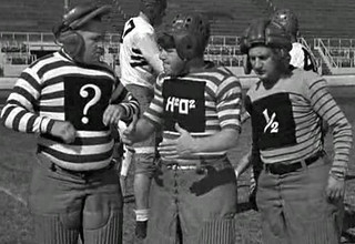
It’s not exactly a secret that I love stripes, so it’s probably no surprise to most of you that I totally dig the throwbacks that the Steelers unveiled yesterday. Loud? You bet. Borderline ugly? Arguably, but they stay on the proper side of that border. I wouldn’t want them to wear this every game, but I love it — love it — as a one- or two-game alternate. It’s a dynamite history lesson, and all those stripes on the field are gonna look fucking amazing. Kudos to the team for having the guts to do something this bold.
The Steelers have produced a good slideshow here, and I’ve made my own slideshow of screen shots from the unveiling:
A few thoughts:
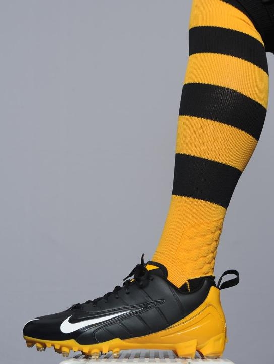
• No TV numbers — I like.
• I’m a little surprised and disappointed that they’re sticking with their regular helmet for this uni. The Packers have shown us that plain brown isn’t a good way to simulate a leather helmet, but how about plain black? No striping, no logo, no numbers — just plain black. Would’ve been a better option.
• The anniversary patch doesn’t work on this jersey. Gets swallowed up by the stripes and just makes things look too cluttered. Duh, we already know it’s your 80th anniversary — that’s why you’re wearing the throwback jersey to begin with! The patch will look great on their regular home and road jerseys, but they should’ve done without it here.
• I reaaaalllly wish the jersey didn’t include those black side panels.
• Surprising that they’re going with mesh, no?
• An odd detail: Most of the stripes on the jersey are printed, but each shoulder has a sewn-in stripe that extends a little way down the sleeve. Sure enough, that was part of the original 1930s design.
• I said, “1930s,” rather than listing a specific season, because there seems to be some dispute over this design’s year of origin. At the unveiling, they described it as being from 1934. But the Gridiron Uniform Database lists it as a 1933 design (and yes, the team was called the Pirates back then). The GUD guys have already whipped up an article addressing this discrepancy.
• I’m hearing a lot of chatter about how this is “a Nike design” (some people mean it as a compliment, some as an insult). But Nike had nothing to do with this design. The Steelers decided what they wanted and told Nike to make it for them, the end. It would’ve looked exactly the same if Reebok was still making the NFL’s uniforms.
• When the Broncos wore their 1961 throwbacks with the vertically striped socks, they wore the stripes from knee to shoe, which was inaccurate, because the players used to wear white crew socks on their lower shins back in the day (Reebok could’ve easily simulated this by making the socks partially white, like most other NFL socks). Now, these Steelers throwback socks are also being worn with no white area on the lower shin, but that appears to be historically accurate.
• Here’s something that may not be accurate, however: Several sources indicate that the uni number panels originally had a yellow background, but the throwback numbers have a white background. Frankly, I think it’s an improvement, and throwback jerseys already have lots of other inaccuracies built into them (NOBs, short sleeves, etc.), so this doesn’t bother me.
• You may have seen this shot of Isaac Redman modeling the new uni in a bathroom prior to the unveiling. He later Tweeted that the lavatory locale “was because we had to hide from the media assholes!” Hey, man, I wasn’t even there.
The small images that I’ve scattered around this entry all reflect various negative reactions that various people expressed to me last night. I understand these reactions, and I think they’re funny besides, but I still think this uniform is a hoot.
+ + + + +
The Steelers weren’t the only team to unveil a throwback yesterday. If you’ve been wondering what the Yankees will be wearing for Friday’s 1912 throwback game at Fenway, wonder no longer:
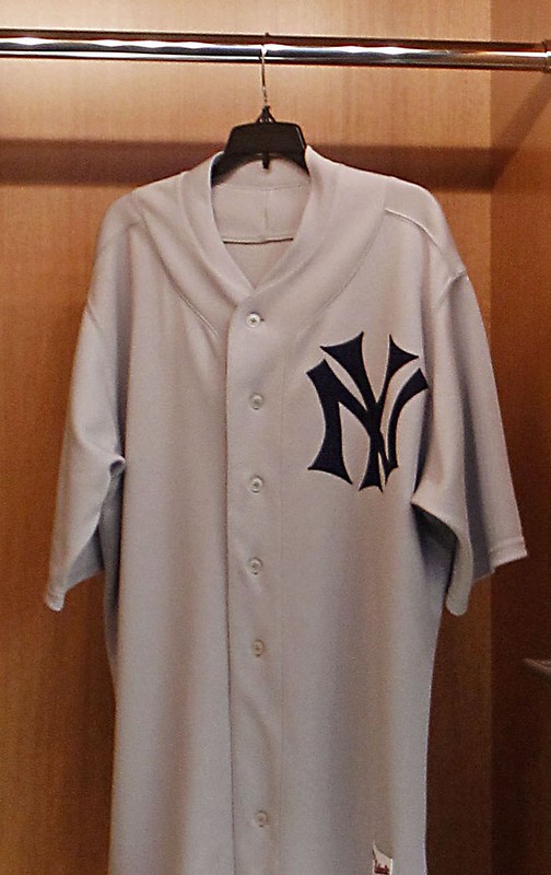

That’s right, kids, maroon-striped stirrups, just like back in the day. Disappointing that they’re going with high-crown caps (that white one is what the Bosox will wear), but whaddaya gonna do.
Take another look at that jersey. Seems like it’s missing a button (or at least a buttonhole), no?
(My thanks to Matt Harris and Matt Shevin for their contributions.)
Your ad here, continued: Richard Sandomir of the Times has provided an excellent inside look at the uni advertising presentation from last week’s NBA Board of Governors meeting. Apparently they had three kinds of mannequins on display: one with an advertiser’s logo in place of the team insignia; one with an ad patch beneath the uni number; and one with an ad patch “on the jersey strap.”
I confess that that’s a more serious (and disturbing) level of consideration than I had anticipated. Still sounds like nothing is imminent, though, and much of the article consists of the standard lame-o attempts at self-fulfilling prophesizing (“We recognize it’s only a matter of time”), apples/oranges comparisons (how can you talk about jersey advertising in the English Premier League without mentioning that soccer games on TV have no commercials?), and selective reporting (two words that don’t appear in the article: David Stern). Still, there’s some decent info in here — recommended reading.
Remember Edmund Burke. #NoUniAds
Uni Watch News Ticker: Packers news from Jeff Ash, who writes: “On the bottom of the first page of a “Dope Sheet” that accompanied their schedule release, the Packers quietly announced, ‘In 2012, the Packers will forego using their historic third jersey.'” Too bad — I dig that bulls-eye design. ”¦ Turns out Reebok isn’t the only company whose familiar logo will be absent from NFL games next season. Motorola will no longer be the official headset sponsor. No new sponsor has been announced yet, but I’m hoping the coaches just use a tin can with a string going up to the guys upstairs. … Had to go see a podiatrist yesterday (nothing serious). It was my first time in the guy’s office, and at one point he asked what I do for a living. I explained Uni Watch to him and asked who he roots for. “The Yankees,” he said. “Oh,” I said, “not much going on with their uniforms — they never change!” To which he replied, “Yeah, but they’ll be wearing those throwback in Boston this Friday.” Pretty sharp, right? If it’s absolutely necessary for someone to be poking around at my feet, it’s good to know that he’s uni-aware. … Disgraced former Mets equipment manager Charlie Samuels got off easy the other day. … Several readers noted that Missouri’s new football jerseys have a circular SEC logo patch, instead of the pennant patch. A little birdie now tells me that all SEC teams will be wearing the circular patch this fall. … Bruce Menard found a listing for this old Angels suitcase with the team’s original logo. … Dan Ballance was watching this video clip about the Seahawks’ new uniforms and spotted possible evidence of green pants being in the mix. Yikes. … “My brother won a basket of stuff at some golf tournament or something, and he gave me one of the items — a Joe Namath action figure that from the early 1990s,” writes Jeff Jacobs. “The back of the package has photos of the other action figures in the product line. But they got Lawrence Taylor’s team wrong.” … Anyone with half a brain knows that the best part of a chicken is the dark meat, and white meat’s for suckers. Luckily for me, most people don’t have half a brain, so dark meat always costs less, because there isn’t as much demand for it. Or at least that’s how it’s always been, but now people seem to be developing half a brain after all. I’m glad to see folks wising up to the pleasures of dark meat, even if it means I may end up paying a bit more (big thanks to Tom Mulgrew for the tip). … New football uniforms in the works for Rutgers (from Mike Edenzon).
I don’t know what’s worse. Having L.T. on the 49ers, or whatever the hell Dan Marino is wearing!!
Yeah, that jumped out at me too. Those things were never 100% uniform accurate, but to have Marino wearing shorts is odd.
His hair color is out of whack too.
I think it’s supposed to be his training camp garb, though still odd that all the other players are in on-field uniforms and his figurine is not.
I know what’s worse than either of those things – the manufacturer thinking Rick Mirer is a “superstar.”
IMO the Steelers should’ve gone with the vertically-striped socks the guy in the front row (#46) of that Steelers team pic was sporting. Reduces the bumblebee effect somewhat.
link
They didn’t focus on Superstars as much as the modern McFarelane figures – for example, Chuck Long and Jeff Chadwick were among the available Lions players in the first set.
Thought the exact same thing regarding Mirer. And at least LT had the Giants garb on!
I wonder if that “missing button hole” is around where the jersey meets the belt buckle when tucked in so it doesn’t poke the players body oddly or get caught on their pants if the jersey come slightly untucked.
If you look at the ‘Dressed to the Nines’ image, that jersey has a placket which ends just above the belt. So the ‘missing’ button could be an attempt to sort-of replicate the look.
My two joke comparisons last night were the 1980s wwf wrestlers the Killer Bees (brian Blair and jim brunzell) and the SNL killer bees.
As soon as I saw the jersey, I immediately thought of these guys:
link
No Stryper references? Disappointing.
If somebody were to say to me “Killer B’s”, I’d first think of the ’82 Dolphins.
That’s B. Brian Blair & “Jumpin” Jim Brunzell if you don’t mind. That’s like saying Michael Fox!
link
and i sure hope those stiller socks are available (sans the nike padding and shit) for retail sale…
would be cool if they made both a padded option (nike would probably charge $50 per pair though. lol), and just a reqular sock.
had been thinking how comfy those padded socks would feel in my skates. not that my skates hurt me (knock on wood…), or that it’s remotely a problem… but would just feel that much… nicer
I absolutely LOVE the Steelers’ throwbacks. But I’m with Paul, I’d like to see something different done with the helmet. Maybe all matte black, or even try a matte brown (that’s how I think the Packers should’ve gone, the glossy brown just wasn’t working).
I’d almost say screw black and go with a plain yellow helmet. The Steelers didn’t use a black helmet regularly until 1963. From a historical/retro standpoint, if they don’t want to use brown (because it’s freakin ugly, as Green Bay demonstrated), yellow makes more sense.
I agree, a plain yellow helmet would seem to make sense
I’m not sure about those white shoes, though…
“I’m not sure about those white shoes, though…”
You sure about that? (link)
Remember, the NFL (supposedly) scrapped theie “Everyone-is-strictly-a-black-shoe-or-white-shoe-team” rule, so the Steelers can wear the (mostly) black shoe pictured above. Of course, the Steelers (and Raiders) shouldn’t be wearing white shoes in the first place…
I agree. The only reason Green Bay’s helmet looked stupid is because it was glossy. A matte brown helmet would look much more like and actual leather helmet and look pretty cool just on its own. Steelers should have given it a try.
Except that link were glossy. A matte brown finish would look more like an actual leather… catcher’s mitt or something.
The last set of Steeler throwbacks had a 75th season patch when they were launched in 2007. If they’re planning on using these for more than one year, the 80th season patch makes some sense, although I agree that it gets lost. (I’ll withhold overall judgment until I see them on the field.)
I’m glad the Yanks and Bosox are maintaining high crown caps for throwback day. The low crown creep has gone far enough with the batting practice caps. With the baggy pants all they need is to follow the public and adopt the “Leave it to Beaver” low crowns to complete an image of total stupidity.
That, my friend, is your opinion. I think that the high crown carries a look of stupidity. Why would anyone want to wear a square box on their head?
Depends on the situation. Old-school teams with monochrome hats (Yanks, Reds, Tigers) look overdone with a high-crowned hat. Teams of a more recent vintage with throwback graphics (three-toned Expos, Padres with the bell outline) need the boxy profile to make the insignia more sign-like.
Everything I post is my opinion.
Some of us have big grapes on our shoulders and can use a high crowned hat. Low crown/slouch/relaxed hats just make us look like we are wearing a yarmulke with a bill.
Regardless of the cap construction, it’s too bad the Yankees are using the modern “print” version of the NY logo. As has been pointed out numerous times here, there are three NY monograms – jersey, cap, and one for all other uses (print, screen, etc.). The throwback jersey has an era-appropriate version, but that cap… It’s not even the usual cap version, so they went out of their way to change it for this occasion, and didn’t select something appropriate. Makes the cap look like a Cap Day giveaway at the stadium.
I don’t usually do this, but…. the new Catch of the Day is really, really good.
HOLY GORILLA SNOT!!!
I’m enjoying it, but I find myself thinking about how many of those got recycled into Alfa Romeos.
You outdid yourself on this one!
The site clearly botched a few of the countries of origin, but there’s some terrific stuff there. Gotta love Buick, Colon and Dorko (and that’s just the Deutscher section).
I guess the guys at the Steelers Sideline Store in Grove City, PA were right. I hope they just wear these for two games this year, then next season go back to just two uniform sets.
As for the Packers not wearing the throwbacks? I think they should have a blur third jersey of the current design.That would look nice on them.
Not “borderline ugly”; that’s actual ugly.
But that’s OK! Good design doesn’t always look pretty. These are awesome fauxbacks, and the ugliness is part of what makes them work. Wouldn’t have taken all that much to pretty these up a bit (a lot), but that would have destroyed the charm.
As for the Yanks, that right there is a million percent upgrade on their actual, current road uni. The cap I can take or leave versus their current chapeau, but the rest of the uni should have been their road duds all along.
Gridiron Uniform Database has added newspaper photographs from BucTracker Jerry Wolper to our blog…
More certain than ever that uniforms weren’t worn in ’34, plus a new discovery about the 1933 Giants.
link
Always glad to help. And happy to assist Tim’s awesome job of research.
link Those bathroom tiles are pretty sweet too.
haha yep
How about link.
At my graphic design job, I salute you.
I prefer kittens.
I agree with virtually everything Paul said about the asthetics of the Steelers throwbacks.
I don’t however agree with the idea that the Steelers are being bold nor would I applaud them for this. This is about marketing, team branding and money. All that is fine but don’t applaud the Steelers for doing something that all businesses do every day. Try to generate more revenue.
I am a lifelong Yankees fan and I am a bit torn about my team wearing throwbacks Friday. On one side we have the very rich tradition of the unblemished Yankees uniform versus The 100th anniversary of Fenway Park. Tough call. The Yankees for all their marketing and team branding don’t do the throwback gimmick thing(I know, they wore a Negro League throwback in 1996 I thought that was fitting and proper).
In the end I guess I’ll be ok with it as Fenway is a special part of baseball history. I just hope this is a one time deal and quietly goes away after Fridays game.
Virtually everything a team does “is about marketing, team branding and money.” But there are different ways to approach that. You can play it safe, or you can push the envelope a bit. I think this uniform pushes the envelope. I love it, but some fans will hate it, and I’m sure the Steelers know that. But they did it anyway. Good for them.
Just to clarify, I don’t think being bold just for the sake of being bold is necessarily praiseworthy (see: Oregon). But in the context of what the Steelers could have done vs. what they actually did, I’m happy to give them a pat on the back.
Would like to see the Yankees honor their tradition with the occasional throwback, the 1903-05 uniform comes to mind. If anything, the tasteful, rare throwback is a positive experience for fans, and players alike. Just don’t see the outrage if this were to happen in the future, since the standard uniform will continue to be worn 99% of the time.
But the Yankees road uniform *isn’t* that unblemished. The pinstripes have survived a long time, but Mickey Mantle did not have the white borders or the navy-white-navy sleeve stripes that Reggie Jackson (and later stars) had. The road uniform is, IMO, definitely fair game to get relieved by a throwback and/or tweaked in the future.
(And I’m a Yankees fan too.)
this throwback design would look SOOOOOOOOoooooooooooooo much better with Under Armour faux flannel fabric.
Until Majestic can start producing something like that, leave the regular road uni as-is.
The beauty of the throwback is that it eliminates the large gap in the “New York” wordmark between the “w” and the “Y” in the road uni. I find the double space to be a major design flaw. This flaw is not unique to the Yankees. The Red Sox home uniforms come to mind.
Um, there’s supposed to be a space between the “w” and “Y” in “New York.”
My point was that the space is too large — it’s the equivalent of two spaces.
A day late and a dollar short, but I liked those gaudy Syracuse Chiefs uniforms mentioned in Tuesday’s ticker.
Looks like Syracuse began wearing those last year as part of its Jackie Robinson Day celebrations:
link
those were great, and I actually think they make a great template for a varsity sweater.
I love the Steelers uni – great job, Pittsburgh. I also don’t care if there are minor details wrong with throwbacks. Aesthetic improvements are fine, as long as they are fairly minor. Make sure to point out on TV that something has been changed, and perhaps people will go research the originals and learn something.
I really hate the look of that SEC patch on the Missouri jersey. I sure hope that they will at least allow the schools to use their own colors – I don’t want to see blue and yellow conference logo on a crimson jersey. It’s always been that way, so here’s hoping. For the life of me I don’t understand why they’re necessary. Well, I guess the answer is “they aren’t”, but that’s modern sports for you.
Make sure to point out on TV that something has been changed, and perhaps people will go research the originals and learn something.
Yeah, that’ll happen. The announcers will refer to them as 1934 throwbacks, comment on how wacky they look, and maybe flash the black & white team photo on the screen for a few seconds, and that’ll be it.
Yeah… I guess I’m too much of an optimist sometimes.
Maybe we can count on the radio crew? That way, the 7 people that still listen to games on the radio can learn something?
Oh hell, what am I saying. The only people that really care about this stuff are us dorks on here, anyway :)
Maybe we can get Paul to do a writeup for that ESPN Fandom thing that focuses on all of the various mistakes and inaccuracies on throwback uniforms over the past few years.
I only listen to games on the radio. Not because I don’t have a TV, but I’d rather listen to the home team announcers, instead of national announcer.
It’s cool Jerry, and just to be clear, I wasn’t taking a shot at anyone. I enjoy listening on the radio too. It’s usually the more hardcore fans that DO listen to the radio broadcast, and would be more likely to care about the intracacies of an 80-year old uniform design.
I started listening to races on the radio with the race on tv until I realized quickly the radio feed is 7 to 10 seconds behind the TV feed. Doesn’t work.
I love the throwbacks for the Steelers, but I think they just appeal to me as a rugby fan. They basically are the same as the jerseys worn by Taranaki and sometimes London Wasps:
link
link
Love the hoops, Taranaki and Auckland always look good, but it irks me that the stripes never go all the way around any more, what is it with sport Uniform fashion that dictates hoops are broken under the arms when back in the day they went all the way around?
I can’t decide if the best part of link is the three guys who don’t have jersey numbers of the one fella in vertically-striped socks.
Pretty sure it’s the socks.
I don’t think those are vertically striped. Just ribbed.
Damn.
Either way, I’m super curious about why that one guy had different socks.
As a Steelers fan, I’m very disappointed in the throwbacks, and the negative reaction/poor sales should ensure this is a one year experiment. Strange to see the superior design earlier in the 1933 was abandoned, that look with black pants and the city crest on a black helmet would have been a winner.
The 1940 all gold and 1967 uniform would have been better alternatives. Even a conceptual uniform based on the 1960 Steelworker logo would have been a wiser choice.
I must be in the minority but I think that the new alt for the Steelers in really bad. The only good thing I see are the sock but thats it. I know that all the traditionalist love them but I am a more modern design guy myself. For me there is too much yellow in this design for it to work for me( I prefer cool tones always over warm tones) so I say bad to borderline stupid using the uni-watch grade scale.
these are tight. it is a bit absurd by today’s uniform standards, but much of the new / current / modern uniform designs are all about trend and result in decisions like the Seahawks. If we want the NFL to look like the CFL or the World League at its inception then by all means lets keep carving up the uniforms into more and more fragmented parts. the Steeler throwback pays some respect to the history of football and its rugby-ish beginnings.
The Numbers within individual shapes is a phenomenal idea from the past, and its legit today. the socks of course are amazing. i want 12 pair please. i agree the helmet should be simply stated, a blank black helmet with the numbers, as they exist on the front of the jersey, on both sides of the helmet would be amazing. little black helmet, with white box with black numbers. would look fantastic. i want a Hines Ward collectible in this uniform. he needs to unretire for 1 week so it can happen.
I wondered how awkward single-digit numbers would look on the new Steelers throwback, then I noticed that no player pictured in the original team photo wore a single-digit number.
So, would a #7 jersey be historically inaccurate?
I thought about this yesterday. I would like to see Big Ben in a #07 jersey, but we know that a’int gonna happen.
Here’s a silly question… how do they handle single digit numbers on the throwback jersey? Is it one centered number box, or 2 boxes with one of them being empty?
…dammit Mike N.
One centered box, I would assume.
the Steelers throwbacks are so over the top, they’re cool. i love them.
what will they do for single digits? i assume just center the number. or will they go super bold and use, say, 0-7 for big ben?
love the fact that they’re using the regular helmet too. i’m sure that will look great in game action!
ironically, approx $250 was stolen from me on monday (a sign?)… otherwise, you could expect to see a 40 NNOB tailgating at any given home game.
also, i’m thinking about DIYing one. i’ve wanted this black & gold striped KooGa jersey for some time now, just didn’t know what to DIY it into. here’s the jersey:
link
i didn’t want to just buy the KooGa jersey and leave it around while i thought of a plan for it, because of the $55 price tag. but who knows now?
also if you look close at a pic of the rear numbers, it’s not -number, stitched to white box, stitched to larger black box- meaning, it’s not 3 total layers of material (would be quite heavy, no?). it’s actually -number, stitched to white box, with thin black strip of twill stitched around the boarder of the white box- just saw that technique about a month ago used on hockey jersey numbers. thought it was interesting (and probably pretty difficult to pull off).
also if you look close at a pic of the rear numbers, it’s not -number, stitched to white box, stitched to larger black box- meaning, it’s not 3 total layers of material (would be quite heavy, no?). it’s actually -number, stitched to white box, with thin black strip of twill stitched around the boarder of the white box- just saw that technique about a month ago used on hockey jersey numbers. thought it was interesting (and probably pretty difficult to pull off).
I believe that’s called a kiss cut, because the border just “kisses” the layer that it’s bordering. I think I learned that from Joe Hilseberg (who’s probably reading this right now — hi, Joe!).
ahhh… good info, paul!
hi joe!
Correct info. Kiss-cut has seen increasing popularity of late due to today’s outine-rich designs. Many NFL teams jerseys have featured this technique for a few years.
So link what it’s called! Pretty cool =)
Are the Steelers definitely going to wear the regular helmets with these throwbacks?
Or is it possible that for this unveiling, it was a kind of “oh, shit” moment where they just forgot about the special helmet so they sent this guy out there with a regular one that they grabbed at the last minute?
is it possible that for this unveiling, it was a kind of “oh, shit” moment where they just forgot about the special helmet so they sent this guy out there with a regular one that they grabbed at the last minute?
Nike’s style guide shows this uni being paired with the regular helmet.
And no, I can’t share the style guide. Sorry.
Y’know, if they removed the 80 Seasons logo from the jersey and put it on a plain helmet, it might look pretty nice.
“if they removed the 80 Seasons logo from the jersey”
~~~
then how the hell would we know it’s a special jersey?
Good point, Phil. Without that patch, it’s just any old run-of-the-mill jersey.
Can’t help but find myself amused at the t-shirt screw-up at A&M – Can’t even put themselves on there correctly.
link
I like the Steelers throwbacks, though I agree with Paul that a solid black helmet would’ve worked better.
Anyone know where to find some of those Cleveland Browns socks, the ones they wore prior to yesterday?
It wasn’t a screwup at A&M – they didn’t put “themselves” anywhere, correctly or incorrectly. The design is nothing created by or individually approved by the University – it is the work of “Aggieland Outfitters,” a third party t-shirt vendor at the local mall. Much ado about nothing.
I said it was AT A&M. Not BY A&M. Jeez.
And by AT, I mean College Station. I was under no illusion it was produced by the school. I simply thought it funny.
I like the Steelers throwback for what it is, a pre-TV uni that has wacky design elements. My favorite part of the uni is the pants, I guess they’re supposed to be gold but the pictures make them look sand or khaki colored, makes them look like a business casual chain gang.
They’re not supposed to be gold.
More like canvas.
oh ok canvas is interesting…, thanks for giving a frame of reference and not just telling me my guess was wrong.
Astros will be wearing green caps agian for their annual Play Green game. Oddly enough, this years cap is a throwback to the Star-H logo. link
It would look great with the green Astros throwback jersey: link
Wait — they’re wearing those caps? Or just giving them away?
Every year they have had the Play Green promo, the caps that are given out are the same the players wore during the game. I am waiting for a reply confirming if this will be the on-field cap or just a promo
Are they wearing turn-back-the-clock uniforms that night, too? Would make sense since the Astros are doing that throughout the season.
Scott, the Astros will be wearing their Colt .45 throwback uniform on Friday, April 20th. The Play Green promo is on Saturday, April 21st.
I agree with Paul’s assessment of these Steelers throwbacks. They’re whacked. It’s fun.
What bothers me–and maybe it’s just my problem–is that the shoes are modern and it looks goofy. My eye goes right to the modern shoe design. It clashes even more with the old look than the modern helemt, i think.
Couldn’t nike sacrafice their beloved “innovative design” for one game and just make everyone’s shoes black (or brown or whatever football shoes looked like back in the ’30’s)?
They always make an all black version of their shoes (with white swooshes, but whatever), so the option is there, but the onus is on the players.
It looks like the Yankees throwbacks are not cool base, just like the throwbacks the Tigers wore against the Dodgers last year. It seems odd that Majestic does this with throwbacks, when most guys normally wear cool base.
They could be trying to more closely resemble the style or construction of the older jerseys. Cool base jerseys have that gusset under the arm that older cuts lack.
The Yanks don’t wear any CoolBase fabric (aside from BP) – they still use the standard polyester double-knit.
So I guess they have to make up for that by wearing two different sets of BP jerseys.
such douchebags
I want my uni-watch membership card redone in the new Steelers throwback uni!
You can certainly order a new card in that motif!
Nice Yanks throwbacks. However, this link snippet is wrong:
“According to the team, it will be the first time the Yankees have worn a different road uniform…”
The Bombers wore Black Yankees road throwbacks playing Detroit in 1996… Crack research there at News Corp.
Crack research there at
News Corp.the Yankees.Fixed.
I believe Jayson Blair assisted George King on his research for the article.
Point taken. They did rely on ex-cathedra information there. Still, there’s always room for link, no?
Either way, I’m excited to see the Yanks in something else…
The Astros are giving these jerseys out to kids on Friday. Colts?
link
Huh. Without the pistol. Disappointing.
Statement from the Astros via Twitter: “We are giving away the complete jersey in September…this one had to be ordered before we got permission to use the revolver”
Agree or disagree with zero-tolerance rules in schools, it will probably save those kids from being sent home or suspended if they went full-on revolver.
@Chris… Then, cancel my previous statement. :)
Why is the “C” in Colts shaped that funny way? It looks like a whisp of smoke from a warm gun, but I see no gun.
/sarcasm off/
They should give these t’s to the kiddies instead:
link
And the grownups can get this classic (Shoot, it’s even orange!):
link
The Braves are wearing their Saturday-Sunday fauxback uniforms for their business man special today.
Here’s a link w/ some Bo Jackson goodness…
link
The plate ump in that Mets/Braves game is wearing a hockey-style mask with a matte finish. Don’t think I’ve seen the matte style on an ump before.
I remember seeing it last year but I don’t have pictures to prove it.
Seconded
I wonder if that has anything to do with the fact that they wore the normal homes on Sunday (as opposed to the throwbacks they are supposed to wear for Sat/Sun home games).
I have never seen the 3 stooges in this football picture.
link
I wonder if that was a certain teams unis and or where is this taken?
They showed that photo on the most recent CBS Sunday Morning in a story about the longtime popularity of the Three Stooges (and as a tie-in to the new movie). Hi-larious to see it on UW.
Rob, I watched that segment and must have turned my head when they showed it.
The Yankees “missing button” is for the blousing of the jersey. The blousing will look better without a button in that area.
The last paragraph in link article alludes that the Orioles 2011 first round draft pick Dylan Bundy is wearing number 7 in the minors.
Odd of course for a pitcher to be wearing a single digit number, but also the Orioles have unofficially retired number 7 for link
Although single-digit numbers are rare for pitchers in the majors, are they that rare in the minors? I feel like I’ve seen a fair number of them over the years, but maybe they’re more prominent in my memory just because they’re unusual…
Fair enough. I typically don’t read much about guys in the minors. This was an exception. I thought the number assigned was odd as it was unofficially retired at the major league level, but a quick check of the minor league rosters shows plenty of players are assigned numbers that are officially retired too.
This may have been answered in the past, but how would one go about buying a pair or 10 of those Broncos and Steeler socks? Any clue? Contact the team?
Thank you!
The Broncos were selling them at their team store during the AFL anniversary season (not sure if they’re still available). Don’t know if the Steelers will be doing the same, but contacting the team isn’t a bad idea, esp. in the age of Twitter, when you can often get a quick response to a simple query.
I have a pair of those Broncos vert-stripe socks, which a friend bought for me at I’m Still Calling It Mile High during that season.
By the way, they are indeed plain white “sanis” up to about quarter-sock height, and you can see the white part if you pull ’em up tight, though it doesn’t reach mid-calf like the period-appropriate ones.
Your question brings up a question I’ve had for years … what DOES happen to most old game-used equipment? I know some of it goes to auction/charity/giveaways, but what percent? I mean, how many perfectly usable (to a fan, anyway) jerseys, socks, helmets get unceremoniously thrown away each year? If teams can sell urinals from old stadiums, surely there’s a market out there for even back-up catchers’ gear, right? Or does selling this stuff in mass lower demand too much on the replica products already available?
I’ve seen the Panthers sell their old practice jerseys at their “horse trailer” shop at training camp as well as used coaches shorts and shirts. I have two.
An old aquaintance of mine in Boone obtains some uniform items and sells them on link . Some of it he used to sell retail out of his sporting goods store but I’m not real sure if still has the store open. I think he has an “in” with various equipment people.
a good question might be—where is all the TON of team Reebok stuff going? you know there’ll be an edict handed down about not wearing any Reebok stuff on the field, practice, game, or otherwise.
Given that the new NFL sock design incorporates Nike’s own technology and is a much more ‘branded’ product than the Reebok socks ever were (they were basically plain tubes), maybe we’ll see them for sale.
The Steeler throwbacks are slowly growing on me. I major worry is what they will look like on the linemen.
The Steelers throwback kind of reminds of an Aussie Rules Football uniform (with the addition of pads and sleeves of course). The team being Hawthorn.
This is the first thing I thought of when I saw the Steelers throwback sox with the gaudy shoes.
link
I have always said the best football uniforms were from the 1920’s up until the mid to late 1930’s. All the strips or stripes on jerseys, socks, and sometimes pants. I do not think the Steelers are a good looking 30’s style. but I like them. Even if they are a year off. I read some comments on the Steelers facebook and most hate them on that. But it seems like fan in general hate most any throwback. And wait until the sports guys covering the Steeler game and on highlights talk about the unis.
It’s strange how the Steelers went from the well-conceived throwback mix of 2007-2011 to these clunkers. My only complaint with the previous throwbacks was the helmet, which should have read “Steel”, and had a gray face mask.
Another possibility for a Steelers throwback in the future would be the 1971 all white uniform, which was used on the road that season, but would be suitable at home(especially early in the season).
TCM is having baseball movies today. Started this morning. “Take Me out to the Ball Game” is next.
“The Jackie Robinson Story”
“Angels in the Outfield” about the Pirates
Are the ones left
“O’Brien to Ryan to Goldberg…”
The Mets new/old road greys … somebody has to say it, and it might as well be me: I don’t like them. I mean, I actually DO like them – in theory. My high school colors were blue and orange – I love the combination! I always wanted to see someone graduate from BG, go to U of I, then get drafted by the Bears, so they could wear the same colors from beginning to end!
In any case … It has always bothered me to watch old highlights from the last time the uniform was worn this way, because it seems like (strange as it sounds) the orange doesn’t contrast enough against the grey. I thought newer video and better camera equipment would fix that, but it STILL looks like 1980s footage when I see highlights from yesterday’s game!
Unfortunately, I don’t know of a good answer to this problem. I’d hate to add another layer (the NEW YORK/RED SOX font is busy enough as it is) … it almost makes me wonder what it would look like with orange numbers with a blue outline?
I’ve never had a problem with the outline not having major contrast with the background. It’s just trim, in my eyes, and as long as the color of the letters themselves is dark and bold, the trim serves to simply splash a little color into the ensemble, which it does fine. I’d bet orange lettering with blue trim would be harder to read on a grey background.
I’m as big a chicken thigh fan as one could be. Since we already have the wonderfully named Toledo Mudhens, why not extend the love?
Let’s go Thighs!
Bring back dark meat in the McNuggets!
“Bring back
darkmeat in the McNuggets!”~~~
(fixed)
The judges also would have accepted using quotation marks around meat.
I’m with you on the dark meat 100%. Same with Turkey or any bird for that matter. Huge fan of duck legs. I bake them resting on slices of bread so they don’t sit in the fat. Delicious!
Add me to the list of Steelers fans who give this design a big A+. Bold and beautiful. Why the hell not?
Not loving the Steeler alternate. And since I dislike the team, it brings me pleasure to see them looking so Stooge like. If only for a game or two.
How do you know when you are a uni-nerd? When you get this text: (918) Dude, those Steeler’s Uni’s are ridiculous…They make Maryland look like Penn State.”
20102 Olympics motto to be “Inspire a Generation”
link
Not 20102 of course – that would just be a tad too futuristic
yeah…maybe 3004 would have been better
I would love to see this in a t-shirt format that you can buy. Love this jersey so much!
Don’t know if it’s been mentioned yet, but major props to Jamie Moyer for his accomplishments and stirrup-wearing. Also, not a single pitch he threw last night topped 88mph.
Correction: didn’t throw a pitch over 80mph!
Now a company called Sports Decals is doing a full HDHD Wrap Around Helmet Decal. Not sure what the extra “HD” is for. But here is the link. You can see examples on page 10 of the online catalog.
link
AH! It’s “High Definition Helmet Decal” Hence “HDHD”
link
too bad that didn’t exist when the duckies had their diamondplate phase…could have had that pattern on the lids too, for maximum swooshbaggery
I would like to have my membership card redone in the Steelers’ new motif as well (btw my address has changed since I became a member in 2007)….how could I go about doing that?
here, let me help you out with that
I think you wanted link.
Dick Clark dead at 82.
rip dick
“rip dick”
Sounds so nasty…
Me: “The final ball has dropped.”
My wife: “The day the music died.”
but yeah, rip dick sounds………..painful.
““The day the music died.”
~~~
she’s a keeper
link
Is it me or do the new Panthers helmets have thicker stripes? I can’t tell if the logo is bigger and that makes the stripes look different or if it’s a combo of both
On the Yankee throwbacks: I wasn’t expecting dead-on accuracy but based on the research I’ve done for my future Yankee uniform database they got a couple things wrong. First, the cap logo being used was the cap logo from 1966-1976 and is still mistakenly depicted as the “current” cap logo anywhere you look on the internet. Second, the 1912 uniform had partial placket piping and navy cuffs on the sleeve. Additionally, every picture I’ve seen from 1912 shows players with only one red stripe on the socks. Dressed to the nines is a tremendous resource but many details do get missed from time to time and I’m sure MLB simply used their depiction when making the uniforms.
Overall though,I can live with it,the chest logo looks good, and I’m still looking forward to this game and wish the Yankees would wear throwbacks more often; it’s not like getting new uniforms…if it’s something the team has worn in the past then it is as much a part of the Yankee tradition as the current uniforms.
at least Pitt is gona wear their normal helmets. they could of worn brown helmets to represent leather headgear
and those unis look weird with a nike swoosh
Yeah, THAT’S what looks weird about them. ;)
How do I buy those 1912 Yankee stirrups?
I’m sold!!!!
sounds like a job for….
the wreck of ship
80th season, not 80th anniversary, for the Pittsburgh franchise. (“Duh, we already know it’s your 80th anniversary”)
The 80th anniversary of the awarding of the franchise will be May 2013, the 80th anniversary of the franchise’s legal formation will be July 2013, and the 80th anniversary of the franchise’s first game will be September 2013.
Also, with one season played as a merged team with the Eagles, and another played merged with the Cardinals, one could make the case that the 80th season will actually be the 2014 season.
They always treat 1943 and 44 as part of their history.
Yeah, I always wondered about that. Is it that Rooney essentially “owned” or at least bankrolled the merged teams? Or did both the Steelers and Eagles franchises continue to exist as entities, but play together as a merged “team”?
Looks like the Cubs catcher could use some of those finger stickers mentioned here recently. The pitcher was missing signs so he improvised and stuck the back of his hand in the chalkline of the batter’s box. Announcers even talked about it.