.
Today the world as we know it will come to a screeching halt. Or, things will be pretty much the same as they’ve always been. Or, most likely, something in between those two extremes.
I’m referring, of course, to today’s Nike/NFL uniform unveiling. I’ll be arriving at the event around 10:15am Eastern, with the festivities scheduled to begin at 11am. My plan is to do lots of Twittering, including photos. So for the next several hours, the best way to keep up with the proceedings is to follow my Twitter feed, which you can do by keeping an eye on the handy widget shown below.
Once the event is over, I’ll scoot home and summarize my thoughts in an ESPN piece, which will be posted at some point in the afternoon. The link to that piece will be posted here as well, of course. which is now up. Should be an interesting day. Ready? Let’s go. ”” Paul
Uni Watch News Ticker: New 80th-season logo for the Steelers. Not sure yet if it’ll be worn as a patch. If it is, maybe it’ll replace the team logo patch for this season..? Just thinking out loud there. … “Futuristic” alternate uni in the works for Nebraska football. Or maybe it’s just a late April Fool’s joke. Hmmmm. … In a related item — which could also be an April Fool’s joke — Texas may wear those new practice jerseys on Sept. 1 against Wyoming (from Ryan Lindemann). ”¦ Remember Joe Petruccio’s illustrated Mets journal/log thingie? An illustrator named Katie Sekelsky is planning to do the same thing this season for the Pirates. “Katie’s such a Pirates fan, plus she’s ridiculously talented,” says Rob Ullman. Looking forward to seeing how this project unfolds. … “Three years ago the Lake Erie College baseball team switched to a matte-finish helmet with uniform numbers on the front of the helmet instead of a logo.” Says Jason Tirotta. “The first season we had black helmets, but last year switched to green — a major improvement. I think the look is very unique.” … Make your Opening Day even more delicious with this hot dog wrapper (from Comrade Robert Marshall). … Hmmm, why would an NHL shirt have an NFL tag? Eric Arnold spotted that at a store. ”¦ Oops (thanks, Brinke). ”¦ Dave Marucheau notes that Troy Tulowitski was wearing a “2LO” logo on his undersleeve when he got plunked by Ubaldo Jimenez the other day. ”¦ My apologies to the many of you who submitted Ticker contributions that didn’t make today’s cut. I was busy for much of yesterday and didn’t get home until late. Today’s gonna be a crazy day too, so I’d appreciate it if you could dial down the Ticker submissions — I’m gonna be too busy to look at most of them. Thanks for understanding.
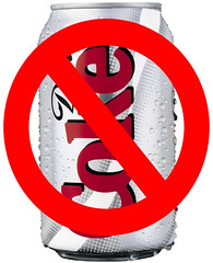
Kicking the Habit, Day 1: As I mentioned yesterday, I’m trying to go this entire week without Diet Coke — in part because I know I drink too much of the stuff (about two liters per day for the past decade) and in part because I was so pissed off over Coke’s illegal graffiti marketing campaign in New Orleans last week. I’m happy to report that I made it through the first day relatively easily. Drank a lot of water instead of the usual sodee pop. So far, so good.
Tom Osborne’s idea of “futuristic” is likely that the “N” on Nebraska’s helmets will be slanted instead of straight…
Or it’ll just be a BFBS version of what they already wear.
Nah…too wild for Tom Osborne. Maybe a thin black outline around the numbers…wooooooooooo!
Kansas-origin riddle:
What does the N on the Nebraska helmet stand for?
Nowledge
Check’s in the mail.
I’d wonder if they would do that. The defense are called the blackshirts, so I dunno if they’d appreciate the whole team going BFBS, seems like going black is a matter of pride for the D (I’m not intimately familiar with them, just know enough since my wife is from Lincoln)
If I had to guess, the red will be brighter or there will be a slight patter in the red, much like louisville bball, cincy bball, Wisconsin during rose bowl, etc…being that they’re an adidas school…
If this is the uniform I think it is, then A. I think Tom Osborne is delusional, and B. I think you guys are severely overestimating his conservatism.
I wrote to Paul last night to tell him his Coke rants were quoted in USA Today (via their iPad app). Today I notice that Uni Watch is “Part of the USA Today Sports Media Group” as noted in the copyright blurb at the bottom of every page.
I told you I was dumb!
where in bk is the event id like too go
HAHAHAHAHAHA
Anthony, it should say on your invite.
The Lions’ pants will now sport a dull finish instead of a metallic shine? I wonder if that applies to other teams whose pants are metallic in finish…Saints, Raiders, Rams, Cowboys, Carolina. Maybe the Saints can use this opportunity to coordinate all their different shades of gold…
Expect them to go from silver to gray. NFL teams will eb using the same uniforms Nike has had on their college programs. So look at the shift at Purdue from the previous Nike uniforms:
link
To when they switched to the new uniform template/materials:
link
There will be no metallic sheen at all. All matte colors on pants. That’d be my guess anyway.
I hope the Saints get straight on one shade of gold…and eliminate the gold collar entirely on the black jersy.
I love the matte finish Nike has…it’s always looked cleaner.
As a former Pitt student, the switch from adidas to Nike was welcomed as the fabric just looks cleaner with the matte finish pants/jerseys.
I’m most excited for this for teams like Miami, the Bills, Cowboys blue jerseys (and silver pants!).
Its just an overall better look.
I wonder if any teams will adopt a matte finish helmet.
And speaking of matte finishes, why hasn’t any MLB teams adopted this on their batting helmets? Teams are putting the little squatchee on the top to make it look more like their caps, but wouldn’t you think a dull, matte, finish would compliment the jersey better and more replicate a cap?
I’m a Yankee fan, and all about tradition, but I think a matte batting helmet would look amazing as opposed to the shine of current helmets…
Stirpey…you must be reading my mind. Looking at MLB pictures from the early sixties I have been thinking about how much better matte finish batting helmets would look…especially on the Yankees. A very traditional look, indeed…
Pierre, I couldn’t agree more. I never understood the shine…Yankees, Sawx, any team with a dark/navy blue would look excellent…Black as well.
Red? remains to be seen…
Stirpey, a couple of Japanese teams have matte finishes on their helmets. Here’s link, from a licensed vintage-NPB-gear store, and here’s link.
My amateur team has shiny ones; supposedly the mattes cost more. I really like the matte look a lot more.
I’m not really sure what to make of that, actually. Are we talking Ohio State gray or Washington State gray? I really hope that the Lions non-metallic color is a choice rather than a Nike limitation. I find it really hard to believe that Nike is unable to produce metallic colored pants.
I think they just choose not to produce shiny pants, instead always opting for a matte approximation (usually a bad one) of the helmet color.
I bet it is a Nike limitation. They probably haven’t figured out how to make the metallic pants 30% lighter or whatever. (I’m being serious)
It can’t be a Nike limitation, they have too many college uniforms with shiny pants (Colorado’s new pants last year come to mind).
As a side note, and I know it’s been discussed here ad infinitum, why won’t the Cowboys match up their pants and helmet? Seems like this would have been a perfect opportunity.
Hoping against hope that that means the Cowboys green tint is gone from their home pants.
I wouldn’t count on that…I think Jerry Jones likes that signature Cowboys look. What I wish they would do is make their helmet trim royal blue instead of navy.
Well, they were considering standardizing the silvers (at least within each of the uniform sets) a couple years ago.
Ironic that the various shades were introduced in an attempt to make the pants and helmet match on television.
haven’t been in the comments section much lately… so have we noticed how many hypocycloids are in bottom ring of the Steelers “80 seasons” patch?
really, about the ONLY thing i like about soccer is the championship stars…
love the patch
link
It’s a good thing they lost those Super Bowls against the Cowboys & Packers, or that patch would be way too cluttered.
No, they could have put one on either side of the dates and it would still look fairly clean.
New 80th-season logo for the Steelers. Not sure yet if it’ll be worn as a patch. If it is, maybe it’ll replace the team logo patch for this season..? Just thinking out loud there.
Nah, the 75th didn’t replace the team logo.
link
When did 80 become an anniversary worth celebrating with a patch? This is getting a bit silly. I’m ok with 10, 25, 50, 75 and 100, but anything else is really pushing it.
New rule: everybody gets to wear a patch to celebrate every 5 years. If that ends up not seemingly like enough, we’ll go with every even numbered year. Better yet, every team should be REQUIRED to wear a jersey patch denoting how many years they’ve been in existence.
Excellent proposal. I would extend your logic, Adam, to individual humans. No reason why we shouldn’t all wear celebratory patches (in our favorite colors) denoting our ages. Kinda like Paul’s UW membership cards, but more frequently updated.
YES! Every player gets a jersey patch denoting how long they have been in the nFL, along with a patch for how long the team has been in existence. Should former AFL teams also have soem sort of patch so that we recognize that they’ve been around for a long time, but only with the NFL since 1970?
And these patches should have corporate sponsors, naturally.
I think every player should be allowed to wear a custom patch with a personalized message on it. A shout-out to Jesus or Mom, perhaps…or just a little pat on the back to oneself. ;>)
And can we make everyone’s nameplates double deckers? Surname on top, twitter handle below.
And patches that light up…!
probably what a nike/redidas board meeting sounds like… really…
Jeff, as a very senior citizen and lifelong Steelers fan, ANY year as a Steeler is worth celebrating!!! Hope you feel as passionate about whichever team you support…Aloha, Lois
Just poking around online, found a picture of T.O. during his rookie preseason… wearing #15?
link
Owens wore #15 in pre-season that year before switching to #81 and Iheanyi Uwaezuoke was #10 in pre-season before switching to #89. Anytime you can type Iheanyi Uwaezuoke you have to do it.
“… Today the world as we know it will come to a screeching halt. Or, things will be pretty much the same as they’ve always been. Or, most likely, something in between those two extremes…”
Bold prediction, Paul! I lean toward the meh-ish probability of no-big-surprises.
Just a couple of hours more… C’mon c’mon…
some seattle seahawks gear:
link
i guess Bo isn’t the only one that “knows” these days…
link
ComeUpWithSomethingNewForFuksSake!!!
and it should be noted the seahawks and panthers do not have a “Graphic Tee” section when you click their team logo, which means no helmet shirt…hmm.
There’s an image of the hand-sketch looking helmet shirt for the Seahawks floating around the internet somewhere, showing the logo with gray instead of Seahawk Blue, on a navy blue helmet, with a really wide, strange looking, feathery helmet stripe.
oh yeah…i did see that yesterday…someone also posted a picture from a blog yesterday in the comments…it had like a thick, georgia pro combat stripe in the middle, but it was like carbon fiber/racing checker pattern?
link
There she is!
You can see the link from the Seahawks website(brightened with photoshop). You can also see a bit of what’s going on with the jersey as well.
scratch that…found this in the “womens” section for the seahawks…just still a color change..
link
the panthers also have this but its the same, just with the new logo.
Paul, please use this sometime today:
“NIKE UNI APOCALYPSE”
(“apocalypse”, in Greek originally meant “revelation, unveiling”) apt for today.
And ‘nike’ (nee ‘kay) means victory and marathon is a place, not a run…
Armageddon is a place. Marathon is an event named after a place.
Nike was the Greek goddess of victory (Romans called her Victoria).
Jupiter and Zeus have the same root.
Zeus was often referred to as ‘Zeus, Pater’ meaning, Zeus, the father.
Over time it got slurred into ‘Zeuspater’ and the Italian accent turned it into ‘Jupater’.
Sorry, I thought this was a greek and roman history pissing contest, haha.
And the dude who ran the first marathon – ran to marathon from 26.6 miles away to tell news – said ‘Nike!’ (victory) and died on the spot.
Yet another reason to never run a marathon, it kills.
I thought he ran from Marathon to Athens?
Not quite.
This myth has Pheidippides running from Marathon to Athens after the battle, to announce the Greek victory with the word “NenikÄ“kamen!” (Attic: Îενικήκαμεν (We were victorious!)), whereupon he promptly died of exhaustion, probably of a heart attack. Most accounts incorrectly attribute this story to Herodotus; actually, the story first appears in Plutarch’s On the Glory of Athens in the 1st century AD, who quotes from Heracleides of Pontus’s lost work, giving the runner’s name as either Thersipus of Erchius or Eucles
link
Brain fart.
Yeah, I wrote that backwards. Ran 26.whatever miles FROM Marathon.
My bad.
“Paul Lukas” is Greek isn’t he? lol
Didn’t Zeus fight Hulk Hogan in a wrestling match?
This is link. The shirts are legit, just not yet. It’s only a matter of time before Kentucky’s title is vacated.
When (oops, IF) it gets vacated, Kansas doesn’t become champions. There just wasn’t a champion that year.
IU and Kansas should play for the backup national championship.
Gee, Adam, thanks for the clarification on that one.
Wow Paul that’s like 5 Diet Coke cans a day! Whew!
And how! 5 x 45mg of caffeine and all that fake sugar stuff!
I hope you’ve drunk plenty of tea or coffee this morning, or you may have a caffeine width-drawl headache today.
To your good health!
I was thinking about all the wear & tear on Paul’s teeth.
not sure the answer to stopping taking a particular drug is to take that particular drug. I’ve suggest a weaning method, myself, not that my advice is requested
link
If this is the new Panthers helmet… damn.
Nope, but there’s a Fluttershy’s-legs-as-a-filly-sized chance that it could be real. But as it stands right now, it’s a fake.
Have fun at the event, Paul. Looking forward to the reportage.
2 liters of Diet Coke per day. For 10 years? Hokey Smokes!
“Holy cripes!” was my reaction. That’s 5 ½ cans a day! It’s like those smokers who do one or two packs a day: where do you find the time?
And Paul is going to be at a Nike event with no Diet Coke in his system?! He might be a tad cranky. Cue the 01/17/87 Bloom County strip of Steve Dallas quitting smoking: link
Man they don’t make strips like this anymore.
“It’s like those smokers who do one or two packs a day: where do you find the time?”
~~~
we find that shortening our lifespans by 7 minutes per has its advantages
To loosely reference the non-watched Ted Danson “Becker” sitcom on cigarettes shortening ones life span: “ah those are the crummy ‘in a wheelchair sitting at a lake’ years”.
Thing is, thanks to our overbearing Mother Hen/Nanny state government, there’s just no place left outside or in to smoke anymore. Can’t even smoke at the ballpark anymore which just tears it.
You say that like it’s a bad thing.
“This is nothing. Back in high school, I used to drink 100 cans of cola a week, right up until my third heart attack.” – Phillip J. Fry
I used to drink 4-5 Cokes a day from when I was a teenager until I was 30 and a trip to the hospital where reflux masqueraded as a heart episode.
Only 1 soda since then.
link
Anybody else notice that Nike made a mistake on the Saints?
link
Darren Sproles is #43. For the time they had to prep the rollout, you’d think this stuff would be right.
they got a bunch of the player t-shirts wrong. It’s embarrassing but proof that all they care about is making $, they don’t even care if they get the simplest things wrong.
I’d be the last person (well, after Paul) to defend the swooshies, but I’ve found attention to detail tends to go with making money — ask, say, Apple.
Getting “the simplest things wrong” shows sloppiness, which is rarely profitable. We can only hope.
Not many companies are run like apple. See: Microsoft.
But you would hope Nike starts getting the details.
link
From watching the Chiefs feed and seeing the Wall o’ Gloves, this is gonna be a rather douchey event. I should have stayed in bed…
I consider this exciting just because it’s a new manufacturer and to see the apparel they come out with along with how the jerseys look along with the material of it. Some sort of a makeover but it’s nice to see a little bit of change in the game and attire.
Should today be considered “Uni-Watch Thanksgiving”?
No. It’s unlikely most people will be thankful for this bounty of poorly exicuted, wholly uncreative NFL paraphernalia. There might be like 3 good things to come from this (‘Sburgh thirds, shehawks unis, maybe a panthers update).
“Uni-Watch Apocalypse”
;P
Is there something special about the Browns gloves design that I’m missing?
it’s not the design, they’re askew in the wall presentation because the Browns are so bad they can’t even get that right.
OK, so Paul’s comment was regarding the tilt of the gloves rather than something with the design. I totally overlooked that.
99.999% sure
I thought that the image of a helmet on a pair of gloves was the notable part…
No, That’s their primary logo. Has been for years.
Right. That’s why I thought I was missing something. I think Tim is right with his assumption.
Perhaps it’s interesting they chose to use the helmet rather than their little cartoon guy, or that B logo with the football (that come to think of it i haven’t seen in a while). Not sure if that makes it the coolest of the lamest of the logo gloves.
I know it’s their primary logo. But it’s a helmet, on a pair of gloves. That’s a bit odd.
Definitely the coolest of the logo gloves. Since the logo gloves are inherently lame, the absurdity of the helmet-on-the-gloves thing only highlights the lameness, so in that way the Browns gloves transcend the suck.
Have golfers started wearing gloves like this yet?
Mmmmm, hot dogs (with no ketchup & Chicago-style, of course). Too bad they cause butt cancer, according to some nuts:
link
The Bills wordmark is the one they’ve had ever since wordmarks were introduced in the NFL (early 70s). The Browns wordmark is relatively new. I think it was adopted three or four years ago.
The Bills wordmark is actually the new one they introduced last year. The Browns have used that block lettering since at least 2003.
I would just like to say that the Cardinals in gray with red caps, ‘rups showing, and red shoes, vs the Marlins in white with black caps would be a pretty pleasing sight for opening day.
Why would the Cardinals not use their navy caps, which they always wear with their road uniforms? If they wear red caps, then they’ve screwed up.
Because the red cap looks better. And if we want to get into an argument about “tradition” or whatever, then the fact that the team was originally named after the color red, not the bird, would trump the “but they’ve been wearing the navy cap since 1992” argument. The blue road cap has only been worn in the years 1940-1964 and 1992-present, which isn’t all that much tradition. The Cardinals have a much deeper heritage of wearing red caps on the road.
Put black shoes on the Cards and I’m on board
Black shoes? NEVER!!!
Always. Black shoes look better.
Amazing that of all the places they chose to do this…it was Brooklyn.
Behold the power of Uni-Watch.
The NFL is based out of Manhattan + Bklyn is considered to be the cool/hip place to be in NY these days (see: MGMT, LCD Soundsystem, Vampire Weekend, Matt and Kim, Yeasayer, the Nets, etc.).
Hello Paul and fans:
Sorry but my english its not good.
I have one question:
Im writing about Vancovuver Grizzlies uniform and i see pictures of the first road uniform. I knew the uniform was teal (naismith blue?? more green) but i see other pictures which pacific blue colour (more blue). Is posible? If changed when changed the colour in the uniform first five seasons?
Thank for all and i hope that you have the answer.
The Vancouver Grizzlies always had turquoise as a team color, but changed their away uniforms from turquoise to black after a couple of seasons.
Variations in the shade can depend on how the picture was taken, and how the picture was reproduced.
I once saw an article in the local paper (I forget if it was the Free Press or the News) that had a picture of Grant Hill in the “New Breed” road Pistons uniform, that came out rather blue (the unis were really teal, or “Pistons green” as the team called it).
I’d guess that some of the silver helmets (Dallas, Oakland, Carolina, Lions) are going to get that chrome treatment that Ohio State had for its Combat uniforms last year.
I’d also guess some of the older teams — Bears, Packers, Browns — are getting matte-finish helmets. I’m seeing more and more of them on the lacrosse field. Not a bad look.
I wouldn’t be surprised if either the Eagles or the Seahawks get a green chrome helmet like an old Sprite bottle.
I think you’re expecting too much (dramatic) change. Most teams will look just like they did last year to the untrained eye.
I REALLY hope the Chargers aren’t trending towards BFBS. REALLY.
they wont, you can only have three jerseys and the chargers already have the very popular powder blues as their third jersey.
Again, you’re not telling me anything I didn’t know, which is why I said “trending” instead of “instituting a black jersey.” Take a deep breath Tim…
why do people keep telling me to take a breath? Stop, haha.
You posited a hypothesis and I argued why it was probably false. No need to calm me down, I’m quite relaxed.
Paul, coming from someone who drinks unhealthy amounts of iced tea everyday (and not the watered-down crap you get in a bottle: I draw a gallon of water and put in 9 unleveled 1/4 cup scoops in, which is roughly a little over 11 leveled 1/4 cup scoops. Yes, I drink this on a daily basis), I have to say that 2 liters a DAY is CRAZY bad! Haven’t been (much) of a soda drinker since I was 14-15 years-old (I’m 21 now), and I applaud you on cutting that liquid shit out of your diet. Trust me, you’ll feel a lot better mentally as well as physically.
Scoops and Tea shouldn’t be in the same sentence.
Hey, Paul, are they serving free Diet Coke at the event…?
haven’t seen anyone post the list of players modeling the jerseys so here it is:
AFC EAST
Patriots: Wes Welker – wide receiver
Jets: Antonio Cromartie – defensive back
Dolphins: Karlos Dansby – linebacker
Bills: George Wilson – defensive back
AFC NORTH
Ravens: Ray Rice – running back
Steelers: Ben Roethlisberger – quarterback
Bengals: Andy Dalton – quarterback
Browns: Josh Cribbs – wide receiver
AFC WEST
Chargers: Ryan Matthews – running back
Raiders: Darren McFadden – running back
Broncos: Champ Bailey – defensive back
Chiefs: Dwayne Bowe – wide receiver
AFC SOUTH
Texans: Andre Johnson – wide receiver
Titans: Nate Washington – wide receiver
Jaguars: Rashean Mathis – defensive back
Colts: Robert Mathis – defensive end
NFC EAST
Giants: Victor Cruz – wide receiver
Eagles: Michael Vick – quarterback
Cowboys: Jason Witten – tight end
Redskins: Brian Orakpo – linebacker
NFC NORTH
Packers: Clay Matthews – linebacker
Lions: Ndamukong Suh – defensive tackle
Bears: Brian Urlacher – linebacker
Vikings: Percy Harvin – wide receiver
NFC SOUTH
Saints: Marques Colston – wide receiver
Falcons: Justin Blalock – offensive tackle
Panthers: DeAngelo Williams – running back
Buccaneers: LeGarrette Blount – running back
NFC WEST
49ers: Alex Smith – quarterback
Cardinals: Larry Fitzgerald – wide receiver
Seahawks: Kam Chancellor – defensive back
Rams: Cortland Finnegan – defensive back
Andre Johnson and Cortland Finnegan in the same room? Hatchet buried I assume.
Joe Haden was the Browns “model”
A day dedicated to the NEW ERA of NIKE logo creek and I pull this rabbit out of my hat.
Usurped.
link
WOWOWOWOWOWOWOWOW
The gloves are presented more in a “No, don’t hit me!!” position, than a “I’ve got my hands up to catch a pass” position.
Odd to me.
link
Congrats on the not drinking soda Paul. I have not had one drop of soda pop in about 4.5 years. I was drinking 5-10 cans of pop per day. My kidneys thank me every day. I’m drinking about half a gallon of water a day.
Pretty cool that Paul has gained over 10 K new followers so far today on Twitter. That is, if you think Twitter is cool. (I do!)
link
“Aaand now, the starting lineup for your… CHICAGO BULLS!”
”They just showed a little video with a glimpse of the new Seahawks uni… It is SERIOUSLY ugly…”
mwah ha ha ha ha
man do I wish I was there in Brooklyn just to see PLs reaction and hear the sarcastic mumbling under his breath..
here are the Jacksonville uniforms, seems like the NFL shield logo is heat pressed on the pants and also maybe the jersey.
link
link
this feed has been very fast, and up-to-minute for those of you who like instant feedback…also, no need to hit refresh for more news…
we have flywire collars! link
NFL shield only. Encouraging.
yeah, apparently that was a Reebok thing, they’re gone according to colorwerx
link Shehawks wordmark looks the same.
Pejorative nicknames are funny… once. Not when you use them every singe time you refer to the team. That’s what elementary school bullies do.
get over it.
Getting all defensive, again. Grow up, Timmy.
Go to hell.
You first. (If you really feel the need to post that way, there are plenty of sports sites where it’ll fit right into the conversation.)
@ BurghFan – and the thing is, me and Tim are actually fans of the same teams, but that doesn’t excuse his behavior or immaturity. As I’ve said before, people don’t visit Uni Watch to hear how their sports teams suck. We’re all sports fans here.
Respect is a two-way street.
Take a deep breath, Tim.
You mother vilker…
haha
See: Bellow, way bellow.
Yeah, I saw that right after I posted. Had to get one more in on you, though. ;)
Pretty cool that Paul has gained over 15,000 new followers so far today, on Twitter. That is, if you think Twitter is cool. (I Do!)
Looks like the NFL Equipment patch is dead. I won’t miss it too much.
I always consider it a Reebok brand anyway.
It was formed around the same time, but it was a league initiative, not necessarily a Reebok one.
I didn’t think the league would kill it, but I’m glad they did.
the basic NFL shield is a bit classier looking IMO
No doubt
Redskins, Eagles and Steelers are all doing something for their 80 year aniv. From what I saw in the news feeeds here in DC, the skins are talking about some kind of throwbacl.
Would make sense, the Stillers are doing a throwback…
There might be substantial UniWatcher outrage if the Redskins went with this throwback from 1933(though not having chest #’s would never be permitted)?
link
I think this set(from ’37)would look great on the new jersey cuts:
link
Perhaps this one (’48)will be more pleasing/less offensive?:
link
seahawks new unis: link
those are worse than I imagined they would be. wow
These are leftover April Fools Day uni’s right? Holy shit those are ugly.
My usual Chiefs blog is saying they hope the Chiefs have something outrageous like that. I hate football fans.
Kill it with fire
Colors aren’t so bad but jeez there’s a lot happening on the shoulders.
I know exactly what that Seahawks sidetrim reminds me of:
Mayflower old moving van:
link
And Baltimore fans everywhere run and hide
Perhaps a bit closer to this….. link
link
2nd latest picture here…SEAHAWKS jersey, bottom row…middle, inbetween steelers white shirt, and black hoody.
you can see the neon, and the silver side stripe on the shoulder.
The guy doesnt even realize he saw it either haha. two posts later “still no uni”
If I was Paul I
BINGO!
new seahawks unis
Notice that there is a HUGE swoosh inside the triangular element on the sleeve. This is worse corporate douchebaggery than the infamous Ree-Box in the NHL.
I think they’re just happy being in the media for something. They’re unique, not hideous, I like how they’re trying to establish a theme…Can’t say I’m mad at it, but can say, I’m glad I’m a Bills fan, haha!
Jeebus fleebing cripes….
Ouch on the way the helmet logos meet in the back…
mimics the pattern throughout the jersey though. the way it connects…
I’ll be interested to see if they really hit the field that way.
It probably makes me a terrible person to say this, but I actually kind of like the Seahawks unis. Not every detail, and not the giant neon mark of the beast, but the general look is just fine, and even a marginal upgrade for this team.
Sure is a lot of rococo fiddle-faddle in the details, though. I’m OK with one or two teams getting this sort of treatment, but we better not see sublimated patterns on the numbers and whatnot for teams like the Bears or Colts.
holy fuck are those awful
link
That “4” is fugly. I really hope they change that before the season starts.
I kinda like the seahawks unis… Wish they went with a gray lid but overall, I kinda dig the Haida wing elements.
I like those as well – in a way I wish they would have met in the front on the collar. Another is I wish the shoulders were a lot more uniform in the patters. One set has a wider space between the “stripes” and the “patch”. The stripe from the shoulder to the collar is still sinking in as to whether or not I like it.
Oh my good God. The seahawks have become an AFL team.
I assume you meant Arena Football. And you’re absolutely right.
Congratulations, Seattle: You are now officially the University of Oregon.
If I was Paul I would need a freakin’ Diet Coke to sit through this bullshit…
Yep, Arena, not a great throwback from the American. Sold out to Nike, just like their little brother Oregon.
So when did the Seahawks join the UFL?
Not digging the strip down the side of the britches, but overall, not bad.
In non-NFL news, link did a really good color analysis of the Marlins new uni… you might be surprised to see what they found.
link are actually pretty great unis, IMO. They need to kill the weird experiments and come home to white uniforms and teal, leaving the black and orange as an accent. It just looks better.
I do like how they did the “action green” triangle on the sleeve for the blue jerseys…i really like to combination of colors over all for the seahawks…guilty pleasure…sorry I’m not sorry…
This – link without “seahawks” on the shoulder and with a gray helmet is actually a decent uniform.
It’s throwing up an HTML error, but I agree that if they took the Seahawks wordmark off the shoulder it would look better.
The home and road should both be paired with the gray alt pants.
and can anyone agree with what we said earlier?
The fact Nike does not have shine to their uniforms is the one think they are consistent with and it makes a bad jersey at least look somewhat decent. Shine/sheen/whatever the hell you call it is too 80s/early 90s…
Interestingly enough the Eagles jersey still has that shine
The white jersey/gray pants Seahawks road outfit isn’t too bad.
I don’t expect many changes but those that are made will be drastic.
I can’t wait to see if they offer any Referee stuff within their new package!
So whats up with the bumps on the helmet?
not bumps, haida wing pattern
Nike on new Seahawks…
“How can it possibly look bad when we’re the ones who thought of it?”
And that gray alternate wasn’t going to be ugly? *cackle*
Seems all that “action green” has stopped Paul’s live blogging dead in its tracks.
…and we’re back.
I don’t mind the Blue over grey, white over grey, and white over blue Seahawk uniforms. The grey jerseys, just like the Pats silver alts, just look like the white uniforms that got dirty or washed with stuff that was black and bled a bit. Grey jerseys in football = BAD idea.
I like the helmets. Definite improvement there for me.
Dump all the different combos and stick with dark and white jerseys over grey pants and I would like it.
Waaiit a second: did Nike really put backwards swooshes on the right sleeves to mimic the American flag on soldiers? GTFO, Nike.
It’s also backwards on the right side of most every pair of shoes they’ve ever made, or hadn’t u noticed?
One more time. The swoosh was designed to be a shoemark, and the corporate logo is a version from that. Not the other way around. We can criticize Nike for a lot of things, but let’s not say they’re doing something cheap by flipping the swoosh. That’s its original usage.
link
Or like they have on every single one of the 29 bazillion pairs of sneakers they’ve ever produced?
they’ve been doing that for years
but they didn’t do it the last time they did NFL unis. link
I think flipping the logo is a bad idea.
So? They obviously have, as many companies do, different applications in their branding package, and decided to apply the original shoe usage parameters to the jerseys this time around.
I can believe they just looked at the former jerseys and said, “Looks better when headed forward.” And, you know what, from a design standpoint they’re right. And they do have the option of facing it forward. Have for decades. Just look down at the shoes.
Doesn’t make them heinous. Doesn’t mean they think the swoosh is a frickin’ flag. They simply opted to apply their logo in a fashion they have done since the company’s beginnings.
Serious nit picking.
I dunno, Ricko. I just find it hard to give the benefit of the doubt to the same company that pulled this: link
Football, at any level, is not war.
“Serious nit picking.”
Says an all time nit picker, haha. ;)
I just think it’s a bad idea from a branding standpoint, but I could care less which way it faces on the uni, I just wish it weren’t there.
I pick nits generally about accuracy, that I’ll admit.
But this whole “reverse swoosh” backlash is just a colossal over-reaction, even if there weren’t an entire company history of Nike flip-flopping it constantly.
Reverse for forward-facing is nothing new. For example, the USFL’s LA Express came to use a complete re-working of their logo for the left side of the helmet, to keep it forward-facing. The “LA” was anti-italicized, so to speak (the first season it may have been backward-facing; not sure, I’d have to check).
As to Nike…Again, have we not noticed the right side of their shoes all these years? The swoosh is a shoemaker mark and is used alone as a secondary advertising/promotional logo. The corporate logo is (or was) the swoosh heading left with an all-caps italic Nike. We have figured out the difference between the two, and how they’re used, right?
actually they have and pictures of that have been shown on this site before
I love how in the group shot all the players are wearing thigh pads, their pants cover their knees and their socks look perfect. Yea, right…LOL!
wouldn’t the broncos pants look better with a predominantly orange ‘stripe?’ isn’t that what they had back in the day with their orange jersey? the blue ‘stripe’ looks out of place
They have both, and I’ve always preferred the orange stripe, yet for some reason, they continue to wear the orange jersey over the blue stripped pants. They also wore the blue jersey over the orange stripped (white) pants fairly often.
No. In the past when the orange was the 3rd, they would wear their road pants with it so it would be one continuous blue stripe. It would look silly to have it suddenly switch colors from blue to orange.
It looks like from this image:
link
That Nike has killed the Bears and Chiefs sleeve numbers. Farewell side-sleeve numbers it was a great run!
I called that one months ago. I wonder about the Raiders, though.
link has a video of the equipment director going over the changes
did anyone else notice the RED GIANTS uniform at the start of this video?! but Skiba said “only two jerseys this year are blue and white”
*confused face.
Giants have used a solid red uni as an alt before. I’m 100% against it, but it’s not new.
link
Nike probably did a mock-up, and the Giants probably (wisely) nixed it, because the red jerseys were bad luck
News from this:
1) Giants only using the three stripe pants next season
2) There is something big coming in 2013 that the one pair of pants is “prepping for” (don’t like the sound of that)
3) I didn’t realize that all shoes are now team color. Don’t think I’m a fan of this.
the only way i’ll be happy with the change the giants are “prepping for” is if they go back to the 1980s-90s style jerseys (hopefully with the block GIANTS back on the helmet)
anything else and i’ll be pissed, because IMO the Giants have some of the best uni’s in the league
G-Men using only the three striped pants all season = Me very happy…
link
link
I noticed that too. Which set of striped will they be using? Still confused.
Patriots look unchanged. Thank goodness.
I can’t tell if it’s the lighting in the room, but the panels on the shoulder look less silver and more grey. Blech.
The pants too, apparently. The silver is officially gray.
And the Pats are the only team without the new style collar on the jerseys:
link
Here are the Bengals for comparison:
link
The Eagles and the Packers also elected to keep their collars
Looks like the Steelers are unleashing their inner link and going with gold shoes. Otherwise, as I expected, no changes with them.
As for the Seawhawks? Hate to say this, but their new uniforms are an IMPROVEMENT. That’s saying A LOT.
There is a lot of love for “traditional” looking football uniforms on Uni Watch, and many Uni Watch readers love to bash anything that’s new, modern, and different.
Let me just say that I really like the new Seahawks uniforms and am actually disappointed that Nike didn’t give every team a major overhaul.
Yikes. What is it with the bird-themed NFL teams ditching good unis to look like complete assclowns? These are marginally worse than the Cards, way worse than the funereal Eagles current set and probably about 15% as bad as the Falcons.
link New bear’s shoulder stripes are even more truncated than before. Bad news bears.
AND SHOULDER NUMBER?!?!
Sad day for Bears unis.
They should have moved the numbers to the shoulders years ago to avoid link.
Looks like the link got the same treatment. Nike probably wants the stripes to be more pronounced. Strangely enough, they didn’t do it to the Redskins.
But hey, we’ve been used to it in Steeler Nation since the 1990’s anyways.
Someone tell Nike that Brian Urlacher is a white guy.
Those are mannequins. I’m pretty sure Aaron Rodgers, Drew Brees, Matt Ryan, Wes Welker, Troy Polamalu, Blaine Gabbert, Alex Smith, and Jason Witten aren’t black, either.
Alex Smith is black. link
Trib’s got detailed photos and story.
Pic 5 – Flywire collar
Pic 8 – TV numbers and stripes
link
And from Paul’s pic, the Cowboys still look to have that God-awful greenish silver pants color *sigh*
AWESOME!! link
Actually (not uni related) but this is an interesting photo. I was wondering what I was seeing last night as seats next to the court were sloping up, which would be impossible to use existing seating in a football stadium. They built stands over the existing seats at a shallower slope.
link
also, what is a ‘fly wire’ collar, and how does it differ from a regular collar?
They reinforce the relatively thin jersey material they use with heavier gauge plastic threads they call flywires. A few years ago they realized they could make designs out of them.
That Giants clip I posted has a tease for changes coming in the 2013 season. Guess I won’t be getting a new jersey this year even though someone owes me one from a SB bet
Any idea of “GSH” is still on the Bears sleeve? The TV numbers are atrocious.
It’s there. link
no way would they allow Nike to remove that, not as long as Virginia McCaskey is still alive. No photos to confirm this, however.
Thanks! I was looking for a picture since everything else I saw was head on with the new shoulder numbers. I figured it would remain.
Nike has already shown that it’s able to do UCLA stripes that go 3/4 of the way around the shoulders. Why are the Colts’ stripes still stuck at half?
Amazing, isn’t it, that companies so brilliant at uni design and construction are so flummoxed by UCLA stripes.
Maybe it’s a non-issue for them because the majority of companies, designers, athletes, and fans actually think truncated UCLA stripes look more modern and sleeker, and therefore better, than the old style UCLA stripes?
Old style UCLA stripes look really dated to me now. I prefer the truncated look. The current existence of truncated UCLA stripes may not be strictly due to construction limitations; that’s how they came about in the first place, but I think they still exist because of aesthetic appeal.
It’s just a more current look.
The majority actually think this? Was there an official study conducted?
They are significantly longer than the ones on the Reebok techfit (whatever they called their version of it) jerseys. Heck before you pointed out that they were shorter I thought they were full length (they only are slightly shorter than the traditional stripes used by the Colts)
Douglas: If you want to see how close Nike can get to traditional UCLA stripes with its current construction template, check out this year’s LSU PC jersey:
link
That’s what I meant by 3/4 of the way around.
I know, I was convinced you were deluding yourself into thinking they were shorter so I googled those. They are clearly longer in that case (more akin to the traditional UCLA stripe), but the stripes are hardly too short in this case (as I said I was convinced they were full length).
That LSU pic isn’t the same cut of the jersey, though. That’s the skill position/sleeved cut, as opposed to the lineman/sleeveless armhole cut.
All in all, Nike’s Colts looks the same as Reebok’s Colts (ultrastretch jersey notwithstanding, but that was only worn by a few players).
Come to think of it, Nike didn’t improve any ‘problems’ that were present in the Reebok era, and even regressed some of them, like the Steelers, Bears and 49ers sleeve stripes. Didn’t fix the Saints gold. Matte finish grey does not work great with the silver helmets. There’s still a lot of problems. I can’t say I’m surprised, knowing how difficult the NFL can be, but I’m disappointed.
Looks like a bunch of contrasting collar colors, at least semi, and new sleeve stripe patterns for a few teams.
The Browns, as expected, look pretty much the same. I’d like to see if they’re going orange-brown-orange or brown-orange-brown on the pants and whether they still have the AL this year or are taking it off next year.
I have no citation for this, but I believe the AL is coming off this year or next year.
It’s already been covered here. Randy Lerner said that it’ll be ten years this season since his dad died, so this is the right year to end it.
check my post below.
Nike Football’s facebook page is loaded with pictures
The swoosh on the right sleeves are backwards, like the American flags would be. A little presumptuous, no?
It’s already been addressed. The Swoosh was originally designed as a makers mark for shoes so it’s intended to be mirrored like that. Not presumptuous.
Seahawks can mix and match…I hope they get some silver gray pants with home, and maybe use the blue away.
In looking at the picture of the Pats uni, it appears the bumper on the back of the helmets has (1) grown larger horizontally, and (2) been switched to grey/silver for some teams (in this case, the Eagles and Giants). The color could be due to the lighting, I suppose.
The size and shape of the bumpers has to do with the type of helmet, not the helmet manufacturer. The 4D and Revo Speed both use wider bumpers than the standard Riddell and Schutt bumpers we’re used to.
That’s what I thought later but was having a hard time pinpointing that down in my limited Googling of the subject. Thanks for clearing it up.
Not to pile on to the new Seahawks uni (it’s just so easy to do), but I’m guessing it’s going to look even WORSE when they start putting on jersey patches (captain patches, anniversary patches, etc) that will undoubtedly cover those odd shoulder stripes. Can’t imagine that’s going to look good.
Is there something special about the Chargers, Texans, and Raiders? Paul hasn’t put them up with the rest of the AFC.
Not sure that I dig the new cookie-cutter “faux neck roll” that I am seeing on some of these jerseys (Saints, Broncos, Vikings, Bengals among the many)
Looks like a dress shirt collar.
Rovell is covering the Nike uni’s better than Lukas. Lukas is clueless about “Twittering”
Is Rovell actually writing an article about the unveiling the way Paul is? Just because someone is regurgitating photos faster does not mean that he’s covering them better.
I would argue that in an event where the fans only get to see what is reported to them that “regurgitating pictures faster” would be better coverage. PL’s pics were blurry, the best view I got of the entire line-up came from live blog on the Seattle Seahawks’ site, and the best pictures I saw came from Rovell (who I didn’t find until they were retweeted by Kevin Seifert (the NFC North Blogger for ESPN.com)). I didn’t need or want commentary on them during the release I wanted to see them, I’ll read about them later. When it comes to Twitter the point is to be brief. I haven’t read Lukas’ page 2 article yet, and I’m sure Rovell didn’t write one but he got the fans what they wanted at a faster pace, even if his job ended there he did a better job in that area.
Does Lukas suck donkey balls like Rovell? Nope.
The eagles are sticking with a less “state of the art” jersey (shiny material, no flywire collar).
I can’t tell but do the Packers have the Flywire collar with their typical collar design placed on top of it or is that a flywire-less jersey.
The Flywire collar causes some problems, in some situations its appropriate (like with the Broncos as the rest of the design fits with the half collar, or like with the Bucs who name fits with the design), others it’s out of touch with the rest of the uniform (i.e. Saints, everything else about their uniform screams traditional but then you have this non-traditional collar that messes with the whole motif), and finally you have the awkward looking ones for teams that elect to keep the collar all one color (i.e. the Texans).
The Steelers Jersey on the manican has messed up stripes but the one modeled on stage has the normal ones… Does this mean there will be a difference in design based upon the cut that is worn?
link
It looks like the Bengals have new pants (with a design somewhere between the one worn withe Reebok and the pant design used by Baylor/Cal), wish we could get a side view of those.
link
Interestingly enough no team went with new number fonts or sizes aside from the Seahawks. I figured a few teams would switch to the skinnier numbers prevalent in NCAA, is this lack of change due to size requirements by the NFL? Its weird because in the NCAA all the numbers rest above the sweat box but with these they will overlap it.
The Steelers have had different cuts on their jersey “sleeves” for some time. Other than the L.C. Greenwood-esque gold shoes, no changes for them. And we wouldn’t have it any other way. :)
Yes they had different cuts, but the design did not change with said cuts.
Here’s Polamalu in game:
link
Here’s his jersey on display at the unveiling
link
Obviously two different designs. There is (or was) a Lineman with a similar cut to the one shown on display but if you look carefully you can see that the design is continued around the cuff (on either side of the cuff you can see the white stripe with black outlines). Basically all of these types of cuts had varying amounts of the design being shown, the Entire sleeve design exists but it essentially had a hole cut in it.
link
The Nike jersey doesn’t even show a portion of the rest of the design.
Also, not all NCA numerals sit above the sweatbox. It depends ont he size of the jersey. On smaller guys (LaMichael James) you see numerals overlapping the sweatbox like on the NFL jerseys. And yes, the NFL numerals are generally 10 and 12 inches, though the exact sizes vary from team to team.
I think on the Stillers manikin , the sleeve has an elastic band on the bottom so the stretched sleeve probably just tucks under the pads. The whole stripe is there, you just can’t see it (probably).
Big Ben was wearing his sleeves without the elastic, as he is wont to do. link
Kinda ironic that the Eagles “Fly Eagles, Fly!” decline to implement the FlyWire collar on their jerseys.
Jeff Laurie still has his head up his ass. All went downhill when midnight green replaced kelly. (now known as “Nike Green”) Come on, man.
I think it’s good the Eagle’s aren’t getting the Flywire collar. The link would stand out and just look bad.
Also, I like the midnight green (since when was it called Nike green?)
close up of the Bengals pants
link
is it just my eyes playing tricks on me, or are some of the chest/back numbers much larger than normal? the giants and the cowboys just look like gigantic compared to the others.
At this point why do NFL jerseys even have to have TV numbers anymore? They’re so tiny and so high on the shoulders I doubt they’re useful to officials. And with more HD cameras pointed at the field they sure don’t need em for TV.
As the name implies, they’re for the TV announcers and spotters, not the officials. The press boxes are usually the highest seats in the stadium, so it doesn’t matter how high up the shoulder the numbers are. The NFL also has regulations on minimum size, so you won’t see the tiny numbers everyone in college seems to have.
Here’ a thought. Why do we even need television announcers live at the game in a broadcast booth? The announcer can simply watch a video feed of the on-field action and make the play-by-play calls accordingly. What’s the point of sitting in a 6′ x 10′ box in freezing temperatures to call a game? Never understood this. Get with the 21st century, man.
because things happen off camera sometimes… If you want to properly read a defense and then analyze said defense, you need to see the safeties, something almost never visible in the standard broadcast football one shot.
They’re certainly not required. How many teams have worn throwbacks in recent years that don’t have them? I’m still waiting for the day the Bengals start wearing their original uniforms as throwbacks, complete with “BENGALS” on the helmet. Those unis lacked TV numbers, and the Bengals last wore them on a regular basis in 1980.
they’re required for non throwbacks.
and only if said throwbacks did not have TV numbers
Spotters. link
It doesn’t matter how HD the camera is if a guy is under a pileup and all you can see is the sleeve.
No pretense any more about whether the Chargers lightning bolt stripe is a shoulder stripe or sleeve stripe. It used to be on the edge of the shoulder…now it’s an actual sleeve stripe.
Is there something different about the Bengals pants stripes…they appear to end under the thight pads. Werte they like this before…?
How the hell is it that the Chargers get a full sleeve stripe but not the Browns, Bears, and Chiefs?!
The broncos got the new pointy stripe like the bengals as well.
Probably in the minority here, but I really don’t mind the new Seahawks unis. Kinda remind me of the new Preds sweaters, designwise.
They are an improvement over what the Seahawks previously wore. I don’t mind them…
The more I look, the more I like the Seahawks’ design. The only thing that really pokes at my brain is the wordmark on the shoulder. It unbalances the whole design.
they’re not bad, not great but okay
The Nike logo is flipped on the right sleeves
Can you even read?
those seahawks uni’s are horrible, but i digress.
just thankful the Giant’s are unchanged
closer look at the Browns new pants/stripes
link
also is it this year or next year that the Browns were suppose to drop the “AL” patch?
link
Panthers, Raiders, Bucs, Cowboys & Eagles all still have shiny pants. Interesting because their pants use a completely different template than all the other teams; shoestring ties, different belt loops, etc. Weird they have to use a completely different template for different materials.
Two different pants for Cowboys…
link
link
Is it just me or do all the socks look look one piece multicolored stockings?
*look like
They’ve been like that since the 70s. Recently, players have been using leg warmer type stockings or non team issue stockings to alter the look. What interests me is the hex padding visible around the ankle. That’s a great feature. Don’t know if it’s built into the sock or a separate piece, though.
Here’s a question I’ve been wanting to ask. Does the Seahawks use of Haida-reminiscent deisign (i.e. the primary logo and new “feather” patterns) count as using Native American imagery?
since it’s using the art of the people rather than a caricature of the people themselves, probably not, but that’s just my opinion.
Perhaps the best way to answer that is to apply for a UniWatch membership card and submit that design? If you’re told no, you’ll know!
+100XP
Well, the Seattle Thunderbirds junior hockey team use Haida art as their primary logo and name and have yet to be blacklisted, so safe to assume the Seahawks unis are fine.
New third in the works for the G men? link
link
just fucking kill me now
Don’t lose hope, your boy Joe Skiba seemed to imply that that jersey wouldn’t be on the field this season.
I know you were holding out hope Phil. I didn’t want to say anything but this is pretty much what I expected. Talk about screwing the pooch!
it’s also not new at all. they’ve had a red jersey since about 2003, but they haven’t worn it since 07.
and Skiba didn’t imply; he explicitly stated the Giants will have TWO jerseys this year: blue and white
Decent amount of collar shenanigans with teams. Lot’s of contrast where it wasn’t before (i.e. Broncos). Titans’ collar use to be same color as yoke, now it blends in with the jersey.
Nike really does know how to make an ugly collar, slap it on every jersey, and downgrade every team’s look. Not a big fan of the shiny flywire look on the football uniforms or the unsettling college basketball V necks.
I don’t understand why Nike can do metallic pants for the Bucs and Cowboys but not the Lions and Pats.
The Bucs and ‘Boys are sticking with old-style pants, while the Lions and Pats are going with the new-tech.
Is anyone else bothered by the fact that the Chargers sleeve bolt looks upside-down??
It bugs me that they didn’t fix that.
Obviously none of these guys or mannequins are sweating, but is there a “sweat box” on these new Nike uniforms? I REALLY hope not.
pretty sure there’s a sweatbox since just like the college uniforms there’re different materials in certain places on the uniform elements, but I guess we’ll see on game day.
There is one, however the numbers overlap onto it which makes it difficult to see it on the mannequins (as, like you said, they don’t sweat)
Is it me or are the Steelers numbers WAY off center?
link
Almost like they put a 4 on and were like “Oh. He wears 43.” and just tacked on the 3…
I can’t imagine Nike would present it like that, but it doesn’t look at all like it’s just an angle playing tricks since the center of the collar clearly is just above the top of the 4…
it’s probably just because they’re italicized and the angle of the photo.
link I think there’s just less kerning in the new Nike uniform, maybe it’s just the model…
link
yeah it looks a bit off to me too
Okay…now let’s see what these unforms really look like without pads and hiked up like biker shorts…and with layers of leg sleeves to mimic socks.
The one truly good thing I can say about the Seahawks’ new look is that they got rid of that horrible suicide blue – err – “steel blue”.
Everything else about the new look? I’m just glad not to be a Seahawks fan.
Shame they couldn’t do away with the truncated sleeve stripes for most teams. Opportunity lost
Agreed. It’s just time for them to go.
Do you mean that teams should no longer have sleeve stripes or that they should have figured out a way to get full stripes?
Silver/gray middle ‘sleeve’ stripe for the Cowboys?
link
Sorry if that was previously mentioned.
That might just be a shadow…
It’s a shadow. The official photos have better lighting:
link
Seahawks uni’s would look better with silver helmets
I don’t think silver helmets (or royal blue) could fix that mess. With the ridiculous trim, panels, too many uni combos & translucent feathered helmet sticker, they’re now officially NikeUofNFL.
anyone else pissed that they botched a bunch of the collars (rams, vikings, broncos)???
I think the collars for the broncos and the Vikings match the rest of their uniform designs. However they do mess with a lot of looks, the Saints for example have a traditional style uniform, but now they have that modern style collar that conflicts with the rest of the design.
I think the Vikings actually better this way.
The collars make it look like some of the teams are wearing old school neck rolls. Look terrible. Why not continue the color all the way around.
Look at the Texans’ collar for that answer… the front part is significantly thicker than the back part, which creates a weird looking collar when colored the same all the way around.
If you want to see what the unis look like on actual players: link
What in the world is that infinitely repeated pointy thing all over the Seahawks uni? It’s on the helmet… bumper… thingy. On the numbers, down the pants, on the sleeves, collar… but what is it? Could it REALLY be the two helmet logos converging in the back, or was the helmet designed to mirror that… pointy thingy. Chevron? No, it’s not exactly a chevron, is it? What IS it?
It’s a Haida art motif used in bird wings. link
Has that been confirmed? It does look a lot like that picture, but also it doesn’t. Also I can’t decide whether that’s horrifying or not.
It’s haida art.
Well, good luck to Seahawks fans. We just wandered out of the desert of Bills uniform hell around here.
concealed78,
Lets bury the hatchet.
I’m sorry for saying “go to hell”, that was wrong, but I don’t appreciate being called defensive when I’m defending my reputation from provably false attacks and then you seemingly call me that again today for no reason.
It’s the grumpy argument. If you ask someone why they’re grumpy enough, you eventually make them grumpy. It’s a self fulfilling prophecy. Let’s stop going down that road.
We *are* fans of the same teams and we both love unis, let us (and I’ll start) just be amicable again and move on.
I’m sorry.
And please stop calling me Timmy, I look at that as a pejorative. My name is Tim.
settle down, timmy
[grumble grumble grumble]
Nike Inc. has released a full description of updates with detailed pics of each team. Here’s the Bears – link
According to the link one, they didn’t adopt the Flywire. Wonder why, the Flywire wouldn’t of affected the design of their uniform.
And the Eagles elected to “stay with their traditional design aesthetic as well as their former uniform fabrication this year.” Personally, I think a materials change would have benefited the midnight green set.
link
Have yet to see a road uni beside the Seahawks…
I am glad that the Giants actually got an upgrade from the tissue-paper crap jerseys. No more bare armpits.
I actually think the Seahawks are one of the better looking uniform sets in this new uniform system – the stripes actually make sense and flow with the cut of the jersey. As long as they go blue or white over gray pants I think they look good.
The collars and sleeve stripes for most teams look worse than before. Even the Texans jersey that who matches the flywire part to the rest of the collar looks clunky.
Can someone verify if the socks are now a one piece multicolored stocking?
The uniform also features the Nike Vapor Game Sock — a highly innovative sock designed specifically for football. The knee-high design combines compression, Nike Pro inspired cushioning, mesh venting and structure precisely where needed
Socks have been one-piece since the 70s. See my above comment.
Is it me, or are the side-stripes on all the new NFL/Nike pants moved closer toward the arse?
maybe a tiny bit – link – but I think any difference is negligible.
Nike NFL uniforms: much ado about nothing.
Is the Nike swoosh logo on the sleeves screen-printed, direct-embroidered (Rbk retail authentics) or a patch applique (Rbk game-issued authentics made in Berlin WI by Ripon)?
Paul Lukas: Can you confirm please?
It looks like patch applique chain stitching. It’s definitely not screen printed, it’s raised.
Those are Nike patches sewn-on to the sleeves. You can get a good look at it from this link.
The Colts brought back the link. This is link right now.
You and your ponies…
Nice catch!
Those look sharp.
Biggest upgrade of the switchover.
you mean the Swootchover?
I hope so. The link at the unswooshing didn’t have stripies.
Darn, they had a chance to fix up those awkward 49ers sleeve stripes… no dice.
“Awkward” doesn’t even begin to describe what’s happened to those stripes.
Yeah, upon closer inspection, they made them even worse. Nice going Nike.
I wonder if Paul wishes he could put the word “fuck” in his ESPN article when talking about the new Seahawks unis?
dont mind the new Nike unis, but really Nike really?!?!? the 49ers sleeve stripes are jacked. hell they are not even sleeve stipes, smh. thats all that needed to be tweaked and then they go totally overlooked.
what happened to paul’s twitter feed?
I was wondering that too. Is it possible that the increased traffic overloaded the server his feed is on or something? Besides not updating, it’s also giving me intermittent 503 errors.
he just posted that his phone camera broke and then he was working on the ESPN piece.
Can check out all teams unis here:
link
I find it very interesting that Nike designed that new Seahawks center stripe around the linkBack in the day, one of the main reasons to split the decals at the back, was for the center ridge found on the Riddell helmets. Now, Seahawks players, fitted with Schutt or other brand helmets, will be forced to wear a decal derived from the Riddell Speed helmet.
wish the Nike swoosh on the Niners’ pants was in red and not white as well…
When I heard that the Broncos were changing their Orange Jerseys from alternates to the regulars I figured they would have to change their blue (go with a lighter blue, like a darker version of what the Giants used) in order for it to work. Turns out all they had to do was get rid of the shiny material used by Reebok. The orange looks brighter and better and the Navy doesn’t clash as much as it used to.
Can we get nominations for best war faces from the players on Nike’s Facebook page? My nominations go to link, link, and link, because they seem to be the only ones that realize just how ridiculous it is. I especially like Cribbs’ duckface.
NIKE UPDATE:
Nike is offering three versions of the new NFL jerseys:
“Game Jersey” $100 (available April 15th)– screen printed numbers
“Limited Jersey $135 (available June 28th) twill numbers
“Elite Jersey” $250 (available April 27th) on field version?
They’re all overpriced, but I’ll say it’s nice to be able to get tackle twill numbers for less than the authentic price now. Are the graphics/NOB still printed or are they fabric as well?
The $100 “Game Jersey” is advertising silicon print numbers.
link
And are the tackle twill numbers on that already-expensive mid-range jersey going to be the real, multi-layered ones, or will it be that hideous “single layer with other layers screenptinted onto it, including fake connecting threads” that you first saw with NBA jerseys and now see all over the place?
That style only avoids looking like garbage with the one-color-number teams like the Giants, Packers, and Niners.
It’s hard to tell from the preview thumbnails they’re giving us, but it looks like it will at least have real stitching holding it in place.
Not many people realized, but Reebok actually had three tiers of jerseys for sale as well. Replica, Premiere, and Authentic. Replica had the screen printed numbers and name, the Premiere (in my opinion the best of the bunch) had different material and actual tackle twill numbers. Authentic were close to double the price of the premiere jerseys for not a lot more. The thing was, not a lot of people sold that Premiere jersey. It retailed for $110, and the only store I ever saw them in were Dick’s, and the locally owned sporting goods store I work for in the winter. Packersproshop.com didn’t sell them, and neither did NFLshop.com.
My strong guess is the Limited jersey will be the version of Reebok’s Premiere collection. Tackle twill, better material, and the best bang for your buck (if you like spending money for polyester shirts)In my opinion, it looks like the “Game Jersey” is just a glorified t-shirt.
The premiere jersey was awesome for teams with one color numbers. Basically the same as authentic except for the fabrication.
I liked the premier best, but unless you got one of the premier throwbacks, wasn’t the tackle twill just heat pressed on like the screened numbers were? These look like they’re actually sewn down.
The twill was definitely stitched (the outermost layer). The other colors were printed on top of that layer.
Seahawks new pants give me the urge to play PAC MAN
Seahawks center helmet stripe looks like a big wah-wah pedal.
I’m provisionally down with the sublimated center stripe, but the way the logos swoop down and connect to a point in the back is my least favorite aspect of the new uni.
Didn’t the birds always come together on the back of the helmet?
Sort of…IIRC, there was a small gap between the Seahawk heads in the back like where the helmet stripe would be on a normal helmet.
The logos “met” at back with a gap between them: link
I can see what they were going for–the end of the patterned stripe continuing through the logo stripe–but the pointed dip downwards just looks weird and incongruous to me.
The back of the Seahawks helmet is an absolute disaster. It was always strange that there was that gap on the old helmet, but I actually think it would have looked weirder if the 2 hawk heads connected. The Nike solution, however, is ridiculous. It almost looks like the decal started to melt, or something.
Nike uses same shoulder striping for Colts two stripes link
as they do to replicate Jets single contrasting stripe & full contrasting sleeve link
Those Photoshops on the Nike Facebook page are pretty unrealistic.
Anyone else notice the slogan on the inside of the Panthers jersey?
link
Lame.
It might be lame to have phrases on the inside of the collar, but the “Keep Pounding” phrase is attributable to Sam Mills in a speech to the Panthers team. Mills was battling cancer and later succumbed to it.
Oh man, I definitely plead ignorance on that.
Seahawks have something similar… just a 12 patch:
link
Those are the only 2 teams though, fortunately.
Hate to be the idiot in the room, but where are you seeing these team logos?
Never mind. I see that you have to click on the “elite jersey” to see it.
“Keep Pounding”? That couldn’t even have sounded cool in the marketing director’s head.
Are the Bucs gonna have one that says “Chopping Wood”?
That was Jacksonville that did that.
Chopping Wood was Schiano’s slogan at Rutgers.
I don’t think anyone has posted this today, but if you want to work up some anger Grantland has a new dumbass column that presents NBA jersey ads as inevitable and desirable.
link
Paul works for ESPN too, can’t he get some space from them to write a rebuttal?
Is it just me or do the new Nike NFL jerseys look like they would be very easy to counterfeit? Reebok implemented some unique features to prevent China knock-off manufacture of their product. Nike seems to have overlooked this (except for maybe the FlyWire neck inserts).
Looks like the Pirates updated their profile pic on their link to their link. Seems like since they quietly introduced it in 2010 (that year was highlighted by a 105-loss season and the link) the logo has seen increased use. It was used in more team apparel and an Iron City Beer billboard last year, and this year it’s being used as the profile pic on the team’s official Facebook page. The link is still the team’s primary logo and is still used on the team’s uniform sleeves. But I wonder if the team is phasing out the last vestige of McClatchy aside from link for what is clearly a better logo. I never liked the red Pirates logo when it first came out in 1997. Hard to believe that, aside from the Pirates “P” that dates to 1948, it’s already the second-longest used logo in the team’s 125-year history to link timeless classic.
I was always fond of this guy
link
Also, I would be happy to see the current logo go. I always thought it was more cartoonish/tame than it should be. I prefer the older logos like you illustrated
Yeah I like the alternate logo better, with it incorporating the Pirates “P” cap logo in it which, since its introduction in 1948, has seen the team use SIX primary logos. Between that and the introduction of the black alternate jersey in 2009 (which the team seems to wear about as often as the Cubs in their blue alts both at home AND on the road), the Buccos are placing more emphasis on the “P”. Wonder what Paul’s thoughts are, since it’s a circular logo. And we all know how much of a sucker he is for circular logos.
As for the logo you highlighted, I remember when the Pirates switched away from that logo to the current logo. I was in the sixth grade at the time, and I was thinking “WTF?”. Probably not as bad as the Penguins dropping the “skating penguin” logo for the “flying penguin” (which, mercifully, Mario Lemieux later fixed), but it does incorporate a color that just doesn’t belong in the color scheme of Pittsburgh’s sports teams: red. And as much as I like the Penguins reintroducing blue into its third uniforms, I like the fact that it’s NOT an official team color like red was for the Bucs from 1997-2008. At least we won’t have to see link again.
I bet the Chinese are shitting themselves over these changes. Gonna be a bitch to make decent, passable knock-offs with all these changes–especially the flywire collars and ventilation areas.
My main overall issue is with the “Flywire” collar.
You would think that, for a piece of technology that’s only functional on the inside of the jersey, they’d have a way to cover that up to give the appearance of a normal collar design. But, Nike being Nike, it sure appears that they don’t want to cover it up, and instead show it off to everybody, no matter that it makes the collars look like ass.
Teams adopting the “upgrade” minus the “Flywire”:
Patriots
Steelers
Chiefs
Texans
Teams not upgrading at all:
Packers
Falcons
Eagles
Panthers
Raiders
Clicking on every team’s page here:
link
The only teams that don’t adopt the “Flywire” on the Elite jerseys are the; Texans, Patriots, Raiders, Steelers, Falcons, Panthers, Cowboys, Packers, and Eagles.
A good look at the Seahawks unis, from The Seattle Times.
link
Too bad the team from Washington didn’t go to the yellow pants they wore occasionally. Those were some nice pants.
Only one version of home uniforms were shown for all teams (Seahawks notwithstanding), so don’t think that the gold pants are gone forever. We’ll just have to wait for more pictures away from the ones at the unveiling today.
Ditto on the gold pants. The current uni design for the Skins dates to 1979…and is looking dated. It’s not like we’re talking about the Bears, Packers or Cowgirls, whose unis have essentially not changed for years. The Redskins changed it up a lot from about ’59 to ’79 and haven’t done anything since. The gold pants were a nice switch from the same ol, same ol of the last 33 years. It would be nice to see an updated Redskins uni that incorporates the burgundy and gold used in the 70th anniversary throwbacks.
Or at least the gold pants. The white pants suck.
Looks like the Bills moved the stripes down to the sleeves from that strange in-between location they had last season.
“The Seahawks were the one team that agreed to put their uniform into the Nike design centrifuge. Your assessment of the results probably depends on (a) whether you view football as a video game played by comic-book superheroes in costumes, or as a sport played by human beings in uniforms, and (b) your tolerance for neon green.”
from here
Today’s ESPN column is up:
link
Too bad they didn’t show off alternates. That’s all I really cared for.
Thought you would like to know that this article written by you is popping up as the number 4 story on google news at the moment
Looks like the first link in the column is a bit wonky.
Unless you wanted it link.
Florio @ PFT.com says PL is ‘obsessive.’
Like that’s a bad thing.
It is in the subheading of the blog. Besides, if he’s obsessive, what does it say about the people who put up the other 420 comments here?
If you read what he actually wrote, he didn’t make it sound like a bad thing at all — just a descriptive thing:
link
God only knows why I did this, but I read all the comments on that page. Here’s the best of the bunch.
It’s not 1960 anymore you old farts. This is the year 2000. They look fantastic, and I hope all the uniforms get an overhaul, especially the Browns, Packers and Steelers. So plain and boring.
On Nike’s website for jerseys, when you hover over the team symbols, they had the Colts with striped socks, however, Paul’s pics show a Colts team without striped socks.
Just wanted to point out the discrepancy.
That’s not good.
To me, the Bears and Chiefs sleeves seem like drastic changes. Also the new Bears Shoulder/TV numbers and placement of the GSH letters.
LOVE the Raiders shiny pants!
link
I presume the Nike changes will not affect the base color of the shoes. All of the mannequins were wearing shoes that wear completely colored (red, blue, green, etc). However, NFL law states that cleats must have a base color of either white or black.
I was wondering about that too. Any answers?
Yes. Look at around the end of this vid of Joe Skiba talking about the ins and outs of the Nike unis. He talks about the cleats.
(link)
why the fuck did they make the bird connect?
granted…the old one wasn’t great…
but now it’s a hydraseabird
Why didn’t they make the bird connect without it looking like a hydraseabird?
/fixed
It mimics the Haida art feather motif.
Not saying it looks good, just saying that appears to be the effort.
That’s gonna annoy the shit out of all of us. Looks like the paint started running before it dried or something.
“Because they could” seems to be the operative excuse for these things. Should have just been a continuous stripe if it had to connect.
Why do men climb Mt. Everest? Because it’s there. Why does Nike needlessly fuck around with designs? Because they can.
And because it’s their idea, so it must be a good idea.
Awfully thick collar that Andre Johnson is sporting here:
link
Yes. That might be worse than the tuxedo collars being sported by the Saints and Bills, among others.
I realize everyone’s picking out little changes that have been made (TV numbers moving, etc.). I’ll have a full breakdown on all of these tomorrow. Today was just about getting a quick reaction to the big-picture stuff.
Take a look at these two shots. Compare the stripes on the model to those on Urlacher. Clearly, Urlacher’s jersey has more stripe coverage than the model version. It’s a subtle difference but fairly significant in my opinion.
link
link
Wow, did they change(RUIN!!!) the Bears jersey! It makes the uniform look like a Hutch kids uniform.
I like that they moved the stripes and the numbers up to give them both more room, but this cut of the Nike jersey gives you about as much stripe as a TechFit jersey.
Let’s not go overboard here. Why don’t we wait until we actually see them on the field?
In your eyes, what are the specific problems?
The only thing I’m not crazy about are the truncated shoulder stripes, but is that worse than a complete lack of stripes, as would often be the case on some players when their sleeves would be tucked under their shoulder pads?
Besides, I’d like to see how the blue pants look.
Agreed. I’m generally one that doesn’t care quite as much about stripe truncation. I’m a ‘you gotta do what you gotta do’ type person. There’s a solution in here somewhere, though, that would allow a better representation of the stripes on the sleeveless cut. Someone just has to find it.
Also, the solution is not ‘put the stripes on compression undersleeves.’
of course not andrew…that would make too much sense
Oooops wrong thread:
Take a look at these two shots. Compare the stripes on the model to those on Urlacher. Clearly, Urlacher’s jersey has more stripe coverage than the model version. It’s a subtle difference but fairly significant in my opinion.
link
link
Urlacher looks good. He’s probably wearing the sleeved cut of the jersey, which doesn’t obviously relegate the stripes to a small panel on the outside of the shoulder.
Anybody else catch Paul making a cameo with his Ohio Northern jacket in the background of an interview on NFL Network?
I did.
Go to your local sports paraphernalia store today (or soon).
I just bought two Reebok Bears jerseys, priced normally at +$200, for $40 TOTAL.
Tim = Very pleased.
450 comments at 3:45 pm Eastern time.
Think by the end of the day we’ll break the comment record that was set the day after the Maryland flag uniforms premiered?
Who cares.
Comment quantity means nothing.
Comment quality means everything.
sweet…we are up to 535 now!
The Seahawks have become the new Buffalo Bills. Those jerseys are an atrocity.
Is there going to be a rule change for next year with regard to the cleats? I noticed the unveiling featured mannequins with multicolored cleats and I thought a few years ago the NFL put in place rule that the cleats had to be white or black could include only one accent color.
cleats have to be like 50 or 51% black (or white depending on team).
Did Nike only unveil the home jerseys at the show? I see some road pictures on team websites, but the unveiling seems to be just home unis.
Photos not showing up for me but I can picture what the photos are. Some guy commenting on Pauls ESPN article posted this link, to some “brand new” hand trickery that nike created with the gloves!
How long has that been around?
link
Good sir. It was a sarcastic article on how lame the gloves are, not actual amazement. Please read more critically next time.
Small request: We need a nickname for “Flywire,” because there’s no fucking way I’m gonna keep saying or typing that term.
Just as we came up with sweatbox, sweatback, etc., I’d like to come up with a suitable nickname for this newfangled collar. Doesn’t have to be negative — just snappy and intuitively descriptive.
I’m coming up blank. Anyone..?
I guess “placebowire” just fits the intuitive part.
Nike Necklace?
or Nikelace
I like Nikelace
Seconded
“Spidey-neck”? IDK. I do have a nickname for those half collars that some of the teams are sporting: “Neck-Fauxll” (“neck roll” + “faux”).
Tacked on triangle?
CD collar?
For “corporate douchebaggery”, of course… because, as I noted in my earlier comment, for a piece of technology that works on the inside of the jersey, they could (and should) be able to obscure that in a way that resembles a traditional collar, but they instead choose to call attention to the feature, making the whole neckline look bad (unless the collar is the same color as the body of the uniform, in which it only looks slightly less bad).
Pentacollar
nikenoose?
FWIW, “flywire” is the name Nike has given to all their technology where little filaments connect pieces of material. Their latest running shoes make extensive use of the technology.
(my sole point being that its not new and its not just a collar technology, its across a lot of different pieces of equipment)
or…since it’s apparently made of some shit called vectran fibres…
how about “nectran”
Good find Phil – I never thought to check the wikipedia. I’ve owned the Lunaracer shoes since 2008.
“Tooth Fairy necklace?”
No,that’s already taken.
Crap.
“Them fancy head-holes?”
“Nollar”: Nike Collar.
(I also put in a vote for Nikelace)
fishing line
Just back from a bike ride, during which I came up with the right name. I’ll reveal it tomorrow.
My suggestion: Chokers.
Paul, is there a reason that some teams like the Eagles and Packers chose not to use the new uniform materials and jersey cuts?
John Glennon of The (Nashville) Tennessean wrote a short write up on the Titans’ new uniforms here:
link
It includes the following paragraph:
“One reason the Titans don’t have a totally different look: they were the first team to take full innovation in the Nike Elite 51 football uniform, upon completion of the Nike/NFL contract a couple of years ago.”
Does anyone have any idea what he is talking about? Nike and the NFL haven’t had a contract since when? 2003? Before Reebok the Titans were outfitted by Puma and all of this Nike “technology” is extremely recent. I have no idea what anything in this paragraph means. Am I missing something? Help?
Probably, the Nike/NFL contract was signed years ago, but wasn’t in effect until April Fools Day (how apt), and the Titans probably just said, at that time, “we don’t want new uni’s, just make us our current uniforms”.
@Andy and JTH, forget, Nike and the NFL (((RUINED))) one of the longest classic looks there was(at least 50 years). And this look translates into their 2 lower model jerseys for fans to buy. There is a huge amount of blank Bears blue on the arms now . And for what? Of course, a lone Nike logo. link
The Broncos and Bears have similar colors, as well as the rounded numbers. So why make these 2 jerseys even more like one another?
Not to mention these things were put together like we are all going to appear on Star Trek. Im also sure the all three jersey models will have their dry-supermaxi slim fit features. Thats just what Bears and Packers fans want, a $140 compression jersey to go along with our beer-brat-pizza-cheese nacho guts, lol. : )
What is the true state of the Broncos orange. In Paul’s pic it looks pretty bright like it has in the past
link
In the pics on the broncos website though it looks much more muted.
link
Just look at the contrast between the viewer and the background pic for their website. Is it just the lighting in those photos?
the picture of the jersey is the orange, the picture from the Broncos’ site is a photo-shopped one, where an effect was applied.
Can we stop talking about re-branded polyester shirts already? Geez.
Sure. Feel free to not talk about the re-branded polyester shirts as often as you want.
Enormous, overblown fail. Seahawks look like crap and everybody else looks the same. What a bunch of hype for nothing.
PS, Washington Redskins – 1979 called. They want their uniform back.
Photoshopped pics of Marshawn Lynch appear to show a darker grey alt than the actual modeled version:
Lynch home: link
Lynch road: link
Lynch grey alt: link
Modeled grey alt: link
Links apparently not linkable. Apologies.
Thank you Seahawks. As a Falcons fan I now have yet another team along with Arizona and Cincinnati to laugh and point at. After seeing that I’m glad my Falcons weren’t “fixed” yet. I just wish they would break out the black pants on the road to get rid of that awful all white look and burn the red jerseys to go back to the proper black at home like they should have (and never see a red helmet ever again too) and that would be fine with me if Seattle is an indication of what we could get in the future. Wow…
I do like the NFL logo back on the collar in place of the NFL Equipment shield but I can’t stand that stitching at the collars. Looks like crap in college and looks like crap for all the NFL teams that have shown pics of it in the uniform.
I spotted the Seahawks having a ’12’ inside the collar and the Panthers having ‘Keep Pounding’ similar to the Pro Combat jerseys that had messages for each team. Anyone notice any others?
Eh. After digesting the C-Hawks new unis for a few hours, link. It’s a slim improvement over what they had before, but improvement is improvement.
The team’s a tee shirt cannon away from a friken perfect day at the office I guess. Rolls eyes back in his head
I’m not even going to try to read all the comments to see if someone posted these. Here are two videos regarding the uni changes. One from Clark Hunt, owner of the Chiefs. The other a rather informative video from Joe Skiba, equipment manager of the Giants. Recommend you watch the Skiba one all the way through for a surprise. Contrary to a previous statement they are not just polyester shirts anymore. You can say all you want about Nike’s corporate practices but when it comes to their actual product they do know what they’re doing. Lot’s of innovation. I don’t know if it will actually improve performance but the players will at least be more comfortable. Also several articles on team pages made comments about the new shoes being team colors and Joe Skiba mentions it in the video which probably means no more black or white rule.
Chiefs: link
Giants: link
They’re getting rid of the wrong pants. Ugh!!!
Agree, they aee keeping the wrong pants. The other stripe pattern looks much better.
Also, how does having only one pair of pants THIS year have any impact on anything they might do in 2013? Makes no sense. I also remember Paul reporting last year that there was going ro be a special alt uniform in 2012. Guess they just liking to keep us in perpetual suspense.
Uh, did you not see the red alt uni in the pictures on the counter in their equipment room.
It has already been reported higher up in the comments that the Giants will NOT be wearing that red alt. Even if they were, why does the red alt require the 5 stripe pants as opposed to the 3 stripe pants?!
Well, the Steelers, like other company Facebook pages, recently made the conversion to Timeline. Included is the team pictures of every team in franchise history, including 1958. Note that Hall of Fame inductee-to-be Jack Butler is link while the rest of the team is wearing black. Wonder why?
Here’s one from 1994–in the link. Intriguingly enough, 2007 was missing from the group.
It looks like the best jersey to purchase will be the “Limited Jersey”, if you want to play football in pads with your jersey then you’ll have to shell out the extra $115 for the Elite.
If we are to believe the claims made by Nike’s site they will have the same set-up as the Elite jerseys but without the water-repelling and stretchiness (they will have the same ventilation points, though it does sound like you won’t be experiencing the sweatbox phenomenon (or at least not on the same level as we typically see) as none of the material is water-proof).
Unfortunately we likely won’t get to see what they actually look like until late June, not that I would have enough money lying around to buy either of the other 2 options. But if the Limited is what they say it is I’ll be picking up a Nike jersey to replace my Reebok ones (besides I need to get a Rodgers jersey, I’ve got Favre and Woodson, one is gone and the other is getting up there in age).
Of course, there’s another option: Just don’t buy any of this shit.
yeah…right
But I want a Frank Ryan jersey and I don’t have the time or skill to DIY one.
Is the Seattle helmet logo now completely wraparound? (As I always thought it should be.) Can’t quit tell due to reflection.
aha found it.
Phil Hecken | April 3, 2012 at 3:16 pm | Reply
looks great to me.
Personally I’ve never understood why people want to buy “Authentic” NFL jerseys when they look nothing like what the players wear. In the other sports I imagine that what you buy as Authentic Jerseys are either very similar if not the same as what the players wear. If you want to wear what the players are wearing then why don’t they match.
These
link
link
link
Are different from these
link
link
The colors match, but the tailoring is different. Let alone the sleeves…
Baylor just won a national championship wearing only 1 of their school colors.
^oops that wasn’t meant as a reply here.
Ok, the Seahawks isn’t that bad, it could be better, but without fixing the font, I think these would make pretty good unis.
Home: link
Road: link
They’re not classic but they are actually a bit kitsch. I like the shoulder thingies, maybe not the part framing the swoosh, but these need gray helmets.
They look good. I feel like they need the neon green somewhere on the pants to tie it all together though.
Seahawks look good to me, mostly. The sublimated pattern on the helmet and numbers is sorta silly, but also pretty much invisible from a distance. The white pants need to go away though.
Agree with everything.
Get a gray lid, use only gray pants (maybe blue on the road only) and get rid of these dumbass things – link
Yep, pretty much agree. I thought I would hate the wraparound logo, and probably would, although I like the way they designed it where it mimics the cohesive feather to a point design. I wish the gray pants were darker though, or at least I could hardly tell the alternate pants were gray. Have to get used to that number font.
well, looked thru everything I could find:
*Wish the Cowboys had finally gone to a unified color scheme.
*Stripes for Colts and Jets still look WRONG.
*those two tone collars like the Saints; WRONG.
*Sure woulda like to have seen the black Carolina helmet.
*Like the Seattle wraparound logo- not the # font.
*Wish they’d fixed those crappy 49ers truncated stripes on the sleeves.
Looks like this is the closest concept from our contest a few months back – link
That contest entry is sooo much better.
Seahawks new unis SUCK! Neon snot swooshes. Wow.
Yup, I hate ’em.
What a joke.
And nothing done to fix the Bengals.
And the Seahawks? A mess. With the nike logo featured, FEATURED, in a colorful triangle on the shoulder. You gotta be kidding.
What a waste.
The bengals cant change yet, they changed in 2008 and therefore – by NFL rules – can’t change again until next season.
Scratch that, they edited uniforms in 2008, the overhaul was in 2004. So maybe they coulda changed, but a lot of teams probably wanted to see what nike could do with their old stuff and with Seattle before they gave them the keys to the car.
Why would they give the Bills of all uniforms the Flywire treatment? It’s totally against the spirit of those new uniforms. Totally idiotic.
Just to be clear, the Flywire collar with the two-tone collar. The full bullshit treatment.
Ask the Bills. Obviously they wanted it that way, or it wouldn’t have been done.
They Bills must have decided that having looked good for one season, it was time to go back to looking crappy!
Yeah, the Bills decision- with some nudging from Nike.
“C’mon these are the hot new collars, you know you want them. All the other teams are gonna have them… Just try them, trust us.”
Give the Seahawks ALL the credit in the world, they took an awful uniform (current) and made it into an absolutely atrocious mess. That is no small feat my friends.
NFL Uniform Reporting. Yawn.
Looking at the Nike store site, I like that ‘Game’ jerseys, what was Replicas under Reebok, are far nearer to looking like ‘Elite’ jerseys, nee Authentics, than before.
The Rams for example, had skinny and straight sleeve stripes on the Replicas that bore no resemblance to the fat, tapered bands that on were the Authentics or on player jerseys.
The overall look of ‘Game’ and ‘Elite’ jerseys is the same, even if the materials and construction varies in quality dependent on price point. Reebok’s Rams jerseys for fans looked nothing like the players jerseys, Nike appear to have done a better job in that area.
i NEVER thought i’d be saying this…
especially with my incredible hatred for reedidas…
nike actually made the NFL worse by a factor of 100
there is NO WAY that seahawk uni is going to grow on me either…unlike the marlins, which i’m beginning to like more each time i see it (and especially when i see the orange top and lid)…
the seahawks went from the 4th or 5th worst uniform in the league to the absolute worst
every single contest submission we had …i mean EVERY SINGLE ONE including the shit by HHH…
was better than what nike trotted out there today
kill me now, please
Funny because all of the players really like it. Those Marlins unis on the other hand belong in a trash heap. At least they won’t be able to wear bike shorts anymore.
I think I like them even more now. ;)
Get off my lawn!
oh…except for the one by THE
that’s still worse than what nike trotted out
(Insert TimE inspired rant about lies and slander here.)
Sadface.
I kinda like em – with a few fairly significant edits – but I think they could be a lot worse.
The pants are great. Classic stripe combined with well thought out, unique, local flair.
Has anyone even brought up the new belt tunnels yet? Why the hell did they have to redesign that?
Paul covered it on ESPN
“Every single contest submission we had …i mean EVERY SINGLE ONE including the shit by HHH was better than what nike trotted out there today.”
LOL! I’ll take that as a compliment!
This — link… without “seahawks” on the shoulder and with a gray helmet is actually a decent uniform.
No Tim, it’s not a decent uniform. It’s throw up in your mouth revolting.
Opinions are like assholes…
I must say though, I’m not happy that the Rams have ditched the gold pants and will be going with white or blue, as both look rank I think.
Are we sure they ditched the gold pants? Did anywhere say that they absolutely showed every combo today? I was happy to see the Bucs’ red-over-white, but I’m sure they’ll still have the pewter pants.
Jim Thomas of the STL Post-Dispatch tweeted “Only 2 jersey colors for Rams new uniforms (blue and white) and only 2 pants colors (blue and white). The gold pants are gone. History.”
i’m not buying it
any team that already has three colors of pants will likely still have them
and there is NO WAY the rams ditch their metallic gold
/am still hoping they return to royal and athletic gold next season
Again, they only showed one home combination for 31 of the teams (the Seahawks being the one exception). I’m sure that they’ll have gold pants, they just weren’t at the unveiling.
What Nike has done is put design in front of demand. They’ve created a uni set that says:
“Hey. we’re Nike and we’re hot shot designers and we can take a garment and add so many different graphic design enhancements because we’re ‘designers’… and you’re not…”
What they misses was connected with their core fans (which the NFL rarely screws up) and in one fell swoop, the F’ed up a decent sized markets retail appeal. It’s shocking.
(nice s/n btw…”less is more”?)
“the F’ed up a decent sized markets retail appeal”
~~~
i know there is a large segment of the UW readership that actually gives a shit about the retail market (god knows nike does)…but how about how the unis look ON THE PLAYERS
i don’t give a FUCK what the $300 polyester fanboy jersey looks like — i want the damn unis to look good on the players
and from what i saw today…they don’t
During a local New Orleans news station interview with Pierre Thomas, we got a good look at how the Saints’ “Neck-fauxll” looks on a player that isn’t in a Nikefied photo shoot (phooey on me for not making a screengrab or snapping a pic). The jersey top actually forms pretty well over him. I think the floor models look like shit, but the actual uniforms that the players have been fitted for will probably look 10 times better once we see more pictures.
The redesigned belt tunnels are retarded. But hey, they’re padded!
“Retarded”? Fucking really? -_- Yeah, they could’ve shortened the length of the belt tunnels so that they don’t interrupt the pant striping, but there’s no need to throw words like that around as commodities.
You’re right. I should have used better judgement.
If you wanted The Bengals or the Eagles or the Steelers to be “fixed”, don’t blame Nike, blame your team. As far as I know, the team must put a request in with the League office at least a season in advance (like Denver did for the primary color switch).
I’m curious to know the details of the Seahawks switch or if the NFL made an exception because Nike is in the PNW or some other horrible excuse.
Nike is guilty of douchebaggery in its highest form, but don’t blame them for not fixing a team that can’t realize it needs fixing.
link I was able to design an EFLI Warhawks from the NIKE TEAM BUILDER site and it looks a lot better in my humble opinion.
As an aside, is anyone watching the NCAA Women’s final? Notre Dame is wearing greenm and Baylor grey. I thought the NCAA required some contrast between the uniforms, and if I am not mistaken they did not let the Baylor’s men’s team wear their dayglo uni’s in a game because of that.
Finally, a non-NFL comment!
I don’t get ESPN, but I was looking at photos of the game. Yeah, they could have had some more contrast.
link
More importantly, Baylor needed more contrast between the jerseys and the numbers.
ND’s unis look very nice, but the real star of that game is the court:
link
That looks much better than the court they used for the men’s Final Four.
You gotta hand it to Nike. They are the top story on all the major sports outlets, and they got many players/media acting giddy. All over nothing.
Love or hate em, they are great at marketing.
Finally got to see these after a day of tornados. NOTHING was improved. The Seahawks uni is now an abortion the likes of which would make the Bengals and Atlanta proud. The collar thing is not necessary.
I guess I’m in the Jeff camp on this one (Seahawks new uni)
It represent an upgrade from the previous uni, which was horrible.
Why
1. The colours are cleaner, more striking. I’m in the camp that there’s nothing wrong with neon green, it’s no different than orange or powder blue. Used in small doses, on a dark background, it can work as a color.
2. The strip on the pants, is an upgrade, unique and interesting.
3. I agree there are certain excesses, but as been said previously, they won’t really show on tv.
Is this one of the better looking unis in the NFL, no, but in my opinion it moves it up a few pegs. The old one – was a very dreary shade of blue/grey – kind of matched Seattle’s winter weather.
I actually loved the color of the jersey’s and helmets that the Seahawks had. Of course, I like matte over shiny, and to me, these are the color equivalent of “shiny”
Excuse my comma faux pas, please.
Jeebus. Apostrophe, not comma. I’m going to bed now.
Speaking of Nike, their founder, Phil Knight, was elected to the Basketball Hall of Fame today…great day for him I guess. Pretty sad for the rest of us.
link
Still upset Guy V. Lewis isn’t in.
link
1/2 hour farting around with the NIKE TEAM BUILDER site and viola! Improved Seahawks identity. That’s just how I roll.
very happy that my team, the Packers, didn’t indulge in any gimmicks.
I was VERY scared when I saw all the flywire collars today. I was extremely surprised, and relieved, the Packers declined that option. If it aint broke…
Still can’t wait for the throwbacks to be unveiled. Wondering if the Pack will still have their Acme throwbacks still.
if the Packers do decide to wear the Acme threads this year, I am sure it will contain the same materials as the current uniform. How weird would a flywire collar look on the Acme jersey? haha
The more I look at the Seahawks new threads, the more I like them. The only thing I don’t like is the sleeve design highlighting the swoosh.
On a same, but different note, I still can’t stand the Marlin’s uniforms. Hate the colors, and still REALLY hate the logo. It is going to take a lot of time for me to get used to/like them.
*sigh*
this article kinda sums up the way the players feel…
If you look good, you play good. If you play good, you get paid good.
There you have it.
actually it was the next sentence that skerred me more
Got ya. And there’s nothing wrong with playing better because you think your uniform looks cool, it’s just funny how he said it.
Holy shit Jermichael! Shut up! You just went from one of my favorites, and one of your biggest defenders, to me pretty much hating you.
as a Cleveland Browns fan, Finelys words make me nauseous. The wolves are at the door with fans and players wanting to “modernize” the Browns unis. I sure hope it does not happen!
Yeah I saw this.
Hopefully Green Bay decides to switch it up
Don’t hold your breath there, my friend.
link
Young players also like rap music. Doesn’t make it either good. It’s a matter of taste (both good) in classic unit vs crass (Seahawks) and it’s just a matter of your point of view.
I’m NOT going to read everything above. So too bad if this has already been covered. I’ve seen two different pictures of Rams gear, one had a new number font and the other the same rounded numberals.
Overall impression. Dumb. Very dumb. All of it. From the ridiculous unveiling, to the Seahawks, to the Bengals white side panels that still haven’t gone away, to the Colts truncation, belt loops, collars, dry ice, helmets on Browns gloves…. God awful. And there was Trent Dilfer praising everything but prefacing it all by saying he’s “been with” Nike for 17 years. Of course he’s going to praise it if they are paying him!
This junk is sad and pathetic. Glad football season is months away.
I can’t believe it took me this long to update my template.
link
link
link
Have you fixed mine yet?
by *fix* you mean blow it up and start over, right?
Yeah, I still don’t know what you meant? give me a point of reference to work from and I’ll do my best.
I have a feeling I’m in the minority on this, but I think the stripes moving up the Bears’ sleeves is an improvement. Would have looked better on the Reebok jersey though.
Shouldn’t the numbers be on top of the jersey construction seams rather than under them?
I put them under most of the time because of:
A. simplicity
and B. you can see the seems under the numbers on jerseys
When is Majestic’s MLB pro combat warrior badass faster lighter meaner jammy unveiling?
We broke 600 comments. Does that mean we all get free tacos?
Fish Tacos! link
Interesting BoSox “Beats by Dre” headphones link
It’s good to be here. I hope all went well above. I’m not about to look for myself.
Uniforms have been a huge part of my life since 1977, and I can’t believe how little a shit I cared about today.
I think I’m growing.
Coincidentally, the 77 Seahawks helmet is what tripped my little 5 year old mind at the time.
If I was 5 now, I probably wouldn’t be getting into uniforms.
Come on, these look good.
link
link
What’s that down the side of the pants? Seahawk feet?
Deep breaths, Tim…
Talk about ho-hum. Weve been waiting for this great unveiling for months now and ONE uniform changes? The new Spring sweaters at Macy’s is a bigger story.
All nine Seahawks uni combinations link
Both Baylor and Notre Dame only wore one of their school colors in the championship game (ND – Navy, BU – Gold). No matter what the champion was going to be wearing a uniforms completely different from their school’s identity (yes ND does tend to wear Green but it is typically paired with Gold not Navy).
Has this ever happened before? I mean no matter what the winner only had 1 color, the Oregon National Championship unis are the only instance I can think of where a team didn’t wear their actual colors in a title game but in that case Auburn was wearing theirs. And see at least with Oregon there was an understanding that the crazy uniforms is a part of their style, yes it was messed up that they elected not to wear any school colors but what they wore still screamed Oregon.
Correct me if I’m wrong but the game against Georgia Tech is the only one where Baylor wore their regular uniforms (which was odd as Tech wore their Navy unis for that game, I would get ditching the “tournament unis” if Tech had been wearing gold but they didn’t, and typically don’t). Why would a team elect to go an entire tournament only wearing 1 school color?
Beats me. You’d think on your sport’s biggest stage you’d want to wear the colors that define your team, not the flavor of the month color that your uni supplier tells you looks cool.