Except for a four-year hiccup from 1927-30, the Yankees’ road jersey has been largely unchanged since 1917. Now, as then, it features a gently arched “New York” in plain lettering. Yes, the fabric has changed, and white outlining was added to the lettering in 1973, along with striped trim on the sleeve cuffs. But the basic design format of the plain, arched “New York” has remained the same for nearly a century, right?
Wrong (click images to enlarge):
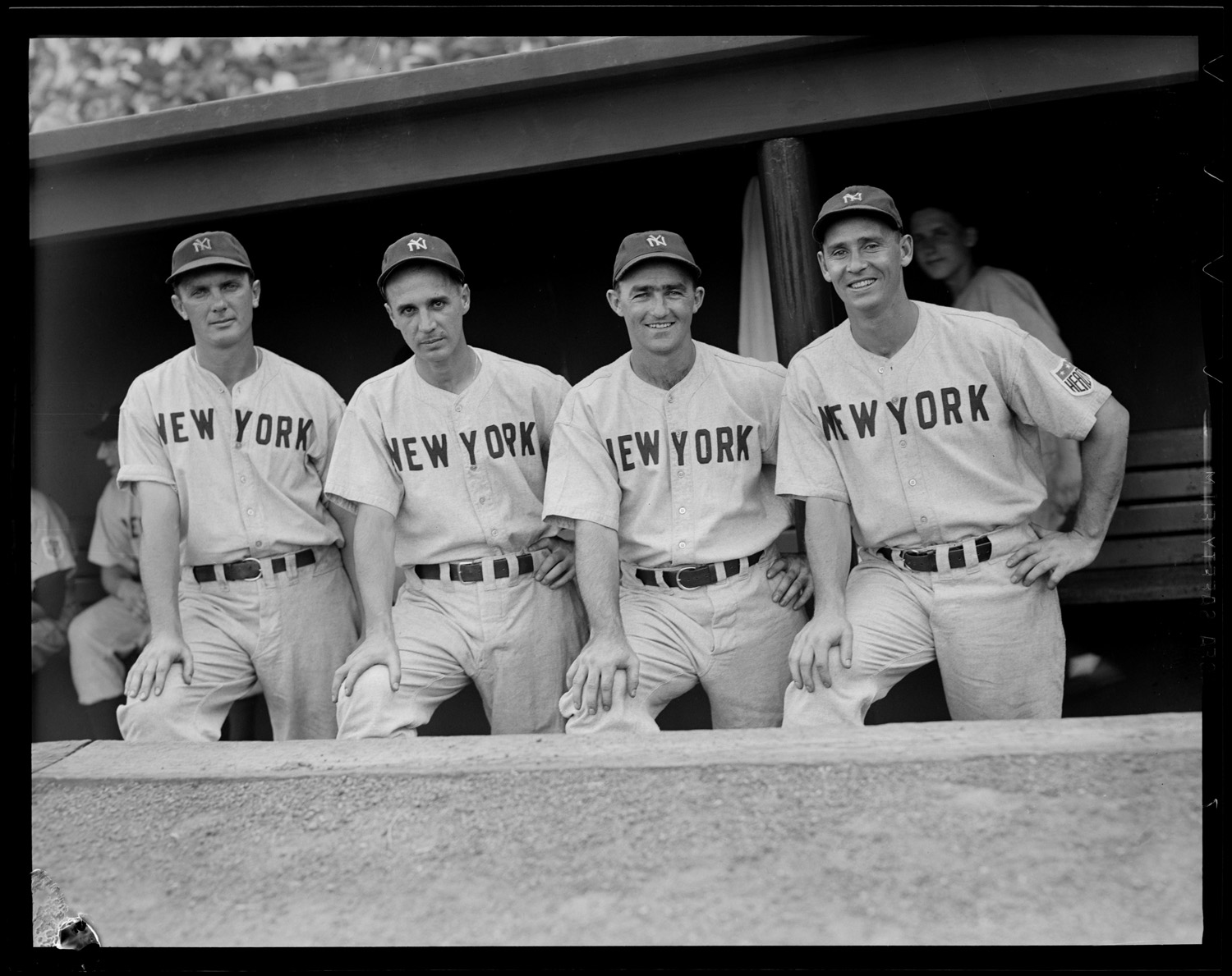
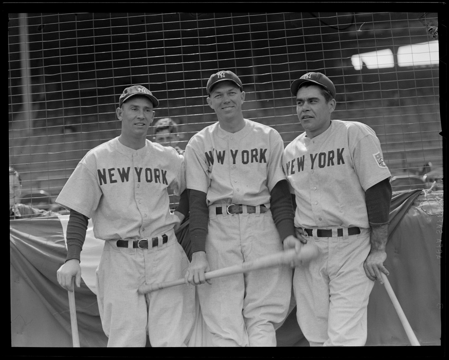
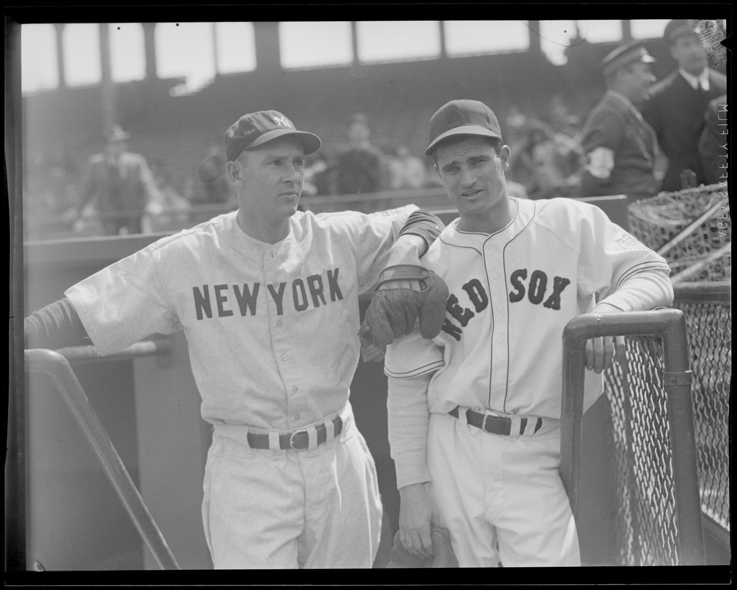

Baseball Hall of Fame curator Tom Shieber recently found those photos, all of which come from the Boston Public Library digital archives. I’ll let him describe his thoughts about them:
I was blown away by this. I researched it and have come to the conclusion that these photos were almost assuredly taken during the first Yankees vs. Red Sox series at Fenway in late April of 1943 (April 27-29). I found a photo very similar to this one in the Boston Globe of April 30, so it’s likely the Boston Public Library photos were taken before that date. Apparently the Yankees reverted back to the more traditional arched “New York” later in the season, though I haven’t been able to pin down exactly when.
Also, note that the Yankees are wearing the 1942 “Health” sleeve patch, but these shots are definitely from 1943 because…
1) Snuffy Stirnweiss, who’s shown in this photo, didn’t make his big league debut until 1943.
2) Nick Etten, who’s in that same photo, wasn’t traded from the Phillies to the Yankees until January of 1943.
3) Joe Gordon, who’s in several of the other photos, was in the military in 1944 and 1945.
Why were the Yankees wearing such strange road uniforms? I thought perhaps these were “error” jerseys from AG Spalding and the Yankees were forced to wear them until corrected jerseys came in, or until the club could return them once they got back home from their road trip. But then why is the “Health” patch on the sleeve, instead of the correct “Stars and Bars” patch (as seen on Bobby Doerr’s sleeve)?
I also thought that perhaps this is what the Yankees wore at the end of 1942. Perhaps their new road uniform shipments were late and they were forced to wear the previous season’s road uniforms. That would explain the “HEALTH” patch. But I found images of the Yankees wearing their road uniforms in St. Louis for the 1942 World Series and they are clearly the traditional arched “NEW YORK” versions.
I’m baffled. Meanwhile, I’ve added these “alternate” 1943 road versions to the “Dressed to the Nines” database.
Amazing, no? One thing I love about Uni Watch is that the rabbit holes are almost always deeper than we think. I mean, seriously, who would have thought there could be something we didn’t already know about the Yankees’ uniforms — something that would even stump the Hall of Fame’s top uniform expert! The more we know, the more we realize we don’t know. Ya know?
Also, this needs to be said: Baseball names don’t come any better than Snuffy Stirnweiss.
———

And speaking of heretofore unseen uni variations, the other day Jerry Wolper was doing his favorite thing — looking through old Pirates photos — when he came across two shots of Rick Rhoden and Jim Morrison, both of whom were sporting a very odd-looking cap detail. Take a look (click to enlarge):
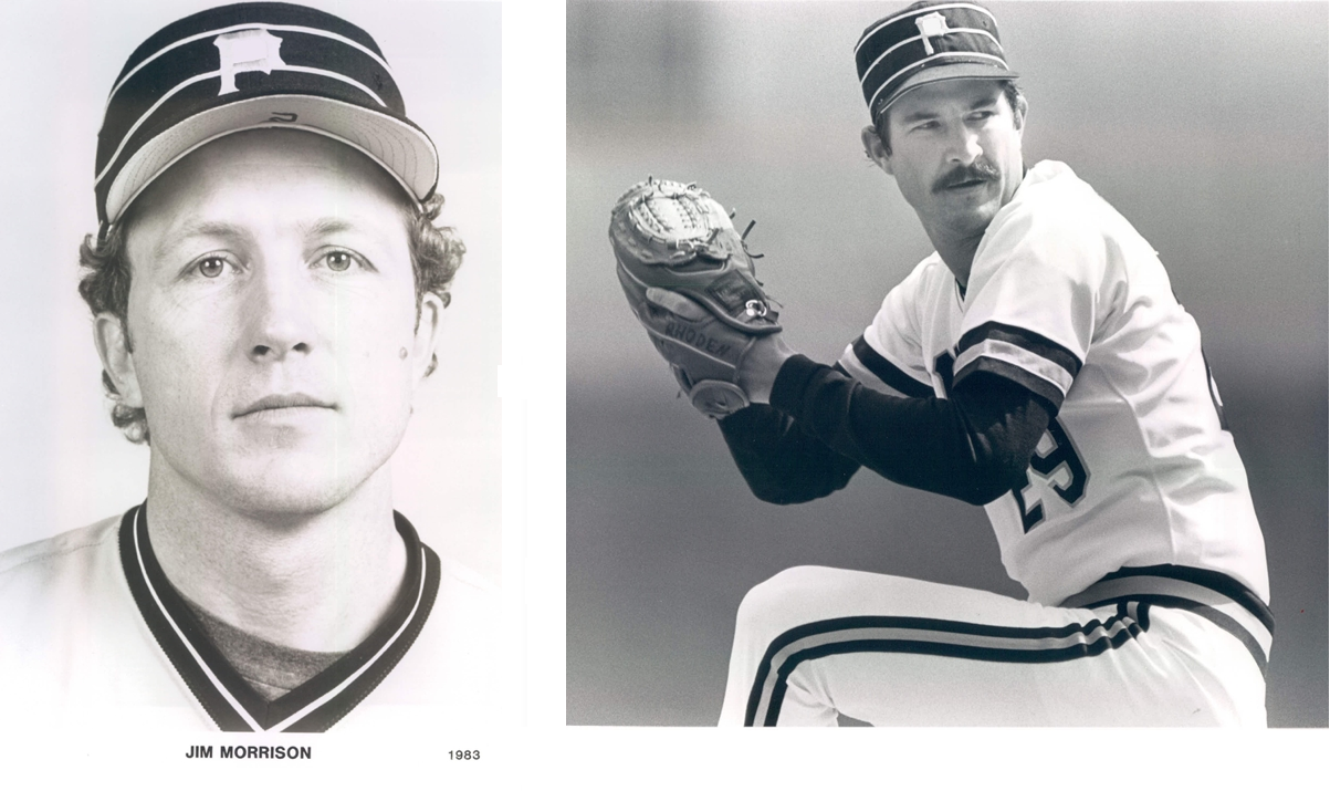
Jerry, who’s a pretty serious Pirates scholar, has never seen anything like this, and neither have I. Both photos are from 1983, so I looked through every 1983 Buccos shot I could find (from Getty, AP, Corbis, etc.), hoping to find another example — no dice. If anyone knows more, I’m all ears.
Meanwhile, look at that Pirates logo up there at the start of this section. I don’t think I’ve ever mentioned this before, but it has always — always — bugged me that the upper-left corner of the P doesn’t have a pointy serif like the ones around the bowl of the letterform. Makes the whole logo feel off-balance and unfinished. Anyone agree?
Jumping from the past to the present, reader Patrick Karraker has spotted something absolutely bizarre, at least by MLB standards. It involves the Giants, whose 40-man roster currently includes Freddy Sanchez and Hector Sanchez. Freddy is injured at the moment, but check out Hector’s NOB (click to enlarge):

There are several oddities here, the most obvious of which is the “Surname, Initial” format. We’ve seen this before in the NFL — the Chargers did it for several years — but I don’t recall having seen it in MLB before. Second, note that there’s no period after the first initial. And lastly, look closely at the nameplate on Sanchez’s helmet — same format! Faaaascinating.
Can you solve this uni mystery? The Mets and White Sox will be playing their first spring training games today (not against each other), and both teams will be debuting a small but interesting uni element that, to my knowledge, has never appeared on a baseball diamond before. The vast, vast majority of fans will never notice it, but it’s prime Uni Watch fodder.
I was going to tell you about it today, but then I thought it would be more fun to see if any of you can spot it on your own. Either way, I’ll provide full details tomorrow.
There’s a new entry on the Permanent Record blog, featuring a photo of the first (and so far only) living link to the project. Look here.
Uni Watch News Ticker: The England rugby team is switching from Nike to Canterbury (from Scott Sidor). … If you’re familiar with Portlandia’s famous “Put a Bird on It” sketch, you’ll love this: LaMarcus Aldridge has given Portlandia co-creator Carrie Brownstein a Blazers jersey with a bird on it (from Jeremy Brahm). … Also from Jeremy: New orange alt jersey for the Yomiuri Giants. … I hadn’t realized that D-League players weren’t allowed to show any non-Adidas logo creep until Brad Keppler sent me this shot of Sundiata Gaines with tape over his mark of the beast. Some quick photo research indicates that these tape jobs are fairly common. … “Just got my Patriots season ticket packet in the mail,” says Anthony DeFilippo. “They list the 2012 home opponents with the teams’ helmets, but they’re using the outdated Bills and 49ers designs.” … There is sooooo much to love in this old NYC stickball photo, I don’t even know where to start (big thanks to Tom Mulgrew). … David Long notes that Jim Leyland is wearing a game cap while everyone else in Tigers camp is wearing BP caps. … Interesting NOB for Mets prospect Matt Den Dekker. “It’s the first instance I’ve seen of a non-‘van’ Dutch name on an American player’s uni,” says Caldwell Bailey. … The Penguins practiced at Denver University on March 1, and half the team wore DU practice jerseys (from Dane Drutis). … A 20-year-old WHL player has designed a few jerseys for his own team. “The management liked the designs so much they had them made,” explains Luke Rosnick. … New alternate kit for the Australian Socceroos (from Larry Adams). … Is MLB switching to Cool Base pants? The reason I ask is this photo of the Rangers’ throwbacks that Chris Mycoskie sent me — you can totally see the jock tags through the white pants! Woof. … “The Fukuoka Softbank Hawks have released their uniforms for the Hawks Festival,” reports Jeremy Brahm. … Here’s another gas station uniform catalog — and this one has fabric swatches. ”¦ Female amateur boxers now have the option of wearing either shorts or skirts in the ring. No word on skorts, however (Jeremy Brahm again). … Here’s some old video of Wilt Chamberlain playing for Kansas in 1957 (from Casey Common). … Interesting article about the city of Chattanooga designing its own typeface (from Ray Chen). … Good article about the guy who invented the clear plastic basketball facemask (from Rocky Lum). … Very nice stirrups being worn by Florida Gulf Coast University (from William McGillis). ”¦ Oregon hoops wore “Fighting Ducks” uniforms on Saturday, complete with the little Donald Duck cartoon on the shorts (from Jackson Nock). ”¦ Cool feature on the evolution of the Universal Pictures logo (from Steve Winner, who didn’t give his last name). ”¦ Peyton Siva of Louisville doubled up on those triple-striped Adidas socks on Saturday (screen shot by Scott Novosel). ”¦ Here’s Mets infielder Justin Turner talking about his various gloves. ”¦ Sam Lam has custom-painted a pair of Manny Ramirez A’s bobbleheads. ”¦ A budget-minded Canucks fan decided to update an old jersey instead of buying a new one. “Very apropos, since the two teams involved in this NHL trade were playing each other at this game,” notes Luke Rosnick. ”¦ Hope for the future: Bryce Harper has been wearing stirrups (from William Yurasko). … Tyson Chandler of the Knicks wore a padded glove thingie yesterday (from Zachary Plesent). … Good color-vs.-color game on Saturday, as Duquesne and St. Louis went red-vs.-blue (from Nolan Petote). … New striped socks for Wisconsin. Wish they were higher, natch, but I still dig the stripeage (from Stuart Ciske). … Titanium necklaces, Powerband bracelets, and all the rest of the Tooth Fairy products should all be marketed like this (good one from Chad Todd). … You probably know that the Minneapolis Lakers wore sky blue uniforms. But did they also wear green, or was that just bad lighting? (From Danny Determan.) … In a related item, here’s Mpls. Lakers star George Mikan taking a swing in the batter’s box (from James Ryan). … The facemask style worn by Justin Tuck and Chris Canty is apparently coming to Notre Dame this fall (from Warren Junium). ”¦ “The New Zealand teams got new Super Rugby jerseys this weekend, all based on the same new template,” writes Caleb Borchers. “Very odd, as this was Week 2 of a new season, and everyone was wearing last year’s jerseys in Week 1. (Someone must have missed a deadline.) Another quirk of the late rollout is that the Hurricanes started the season on tour in South Africa, so they are still wearing the old unis, presumably until they return to Wellington.”
link
Los Lakers vs. El Heat last night in LA
Even NBATV was putting Los Lakers def El Heat 93-83 in their graphics after the game.
I think the whole thing is really silly, but if they’re going to do it, I think they should go all the way and Spanish-ize the players’ NOBs, kinda like we had to do in junior high Spanish class.
-Bernardo
For the Mets and White Sox mystery, I’ll try the “they’ll wear grey pants at home” long shot.
Don’t try to guess what it is (trust me, you won’t be able to dream it up). Instead, watch the games and/or look at photos afterward and see if you can spot it.
I would have loved it but will be unable to considering I’m currently a French guy in Paris who hasn’t purchased the MLB.TV yet this year. Guessing was my only kind of chance. Poor me.
Squatchee on the seat of each player’s pants?
Debut of “A” chest logos for assistant captains?
NFL-style sleeveless stretch jerseys for “freedom of motion”?
Both teams wearing link to honor the anniversary of the Boston Massacre?
Launch of Nike MLB unis as Majestic surveys the market and gives up because we all know where this is going?
Well, today’s White Sox game will be online at 2pm Central time, so I’ll see what’s up.
Noticed that the Sox haven’t been wearing BP caps, and Cubs manager Sveum has been but the rest of that team hasn’t.
Players in sleeved team blankets on the bench.
For the Mets and White Sox mystery, I’ll try the “they’ll wear grey pants at home” long shot.
Brewers wore gray pants at home in 1991.
But now I’m looking forward to the Mets game. I love a mystery.
Why did the Brewers wear gray pants at home in 1991?
Also, in 2008, the Astros link “at home” in Milwaukee.
“… There is sooooo much to love in this old NYC stickball photo, I don’t even know where to start (big thanks to Tom Mulgrew). … ”
Tons to love. What a wonderful image.
PS: I dare anyone to tell me that “Stuffy Stirnweiss” isn’t one of the great monikers in human history. Double-dare.
I dare to tell you it’s “Snuffy”, not “Stuffy”…
;)
-Jet
Of course it’s Snuffy. I wrote Snuffy, not Stuffy. Clear as day.
Long Shot Question: Does anyone recognize the buildings in the stickball photo? It would be really neat to see a google streetview of the location today.
The composition of the pic will tell you a lot about the neighborhood it may be in…although figuring out the exact address would be tough. There are black and white players, and a jewish poultry shop and with hebrew lettering at that. If the dates are 1940s-1950s, then this is PROBABLY Bed-Stuy or East New York…but probably not Crown Heights. There are not may Jews left in Bed-Stuy or ENY nowadays, but they were both Jewish neighborhoods until the 1950s. In the 40s Puerto Ricans began moving in to ENY and African Americans into Bed-Stuy. Jews pretty much stayed in Williamsburg and Crown Heights.
I would say it was probably a Sunday. The batter is wearing his “church shoes”, which he probably would no be allowed to wear the rest of the week. You know its not Saturday or Friday after school, because the jewish shop is open…. really intrigued now.
So I will not get any work done the rest of the day researching this pic!!!!!
I love the boys holding hands.
Great deductive reasoning, Ricardo.
And great question, Mark W.
Any luck, anyone, identifying that location?
Continuing a thought from last week, here’s a screenshot that shows 29 of the 30 logos MLB is using to represent teams in its At Bat app:
link
The missing one is San Fransisco, which is represented by its SF logo in orange – in other words, exactly the team’s normal cap logo.
The ones that vary from primary cap logo make for some interesting effects. The Cardinals go with the bird-on-bat alt cap logo instead of the STL, so each songbird team is represented by a bird logo. The Mets have an orange drop shadow, but no black. It looks better in the screenshot, but viewed on an actual pad screen, Milwaukee’s M-on-Wisconsin logo just looks like a dark smudge. And the use of the block C for Cleveland instead of Chief Wahoo means that three teams are represented by tiny red C’s, which at that scale is kind of confusing.
Also, San Diego seems to be using its road cap emblem, which emphasizes the tan that the team is otherwise wearing a lot less. Is this to play up the camo uniform/military thing, since the tan SD is also used there? Or just another case of a team with no clear sense of its identity failing to execute what otherwise seems a clear campaign to recast itself as a blue-and-white team?
That is quite the shade of green on the Softbank Hawks jerseys. Hope everyone in the stands get free sunglasses.
Oh come on, that’s a great shade of green. It’s actually, you know, GREEN. It’s not neon, it’s not ultra dark… it’s just freakin green. We need more of that color.
+1
Green and black are a great, underused combo in sports, especially if the green is kelly. Too dark and there’s not enough differentiation. It’s one of the distinguishing features of the U. of North Dakota’s identity (even more so once they’re no longer the Fighting Sioux).
Paul, thanks for coming out of the closet on the Pirates cap logo. I really like almost everything about the Pirates look, even if the team manages to do less with more, execution-wise, then most teams. The P in Pirates looks fine to me on the jersey as one letter in a word. But alone on the cap, it’s always looked unbalanced to me. A case like the Rangers, where the cap logo really does need to be differently executed than the same letter in the team name.
As to the odd cap logos, my totally uninformed guess would be an embroidery error that used that white backing/stabilizer stuff on the front of the cap instead of or in addition to on the inside of the cap, and only the bits on the outside of the P got removed. It can be kind of a pain to remove “islands” of stabilizer like that.
my totally uninformed guess would be an embroidery error that used that white backing/stabilizer stuff on the front of the cap instead of or in addition to on the inside of the cap, and only the bits on the outside of the P got removed.
A fair assessment. Surprising that these caps actually made it onto the field, however.
I am a Buccos fan for better or worse, and I have to say I like the ‘P’ logo the way it is. I imagined what it would look like with the extra serif and think it may look too busy/cluttered up there. I imagined it looking like a puffer fish. If someone wants to take the time and photoshop what it may actually look like, then I might change my mind. Still though, it may seem off balanced now, but if it was included to the top left, it may make the logo feel top heavy.
BTW, Rick Rhoden = Kurt Russell doppelganger
link
For that Sanchez picture, does anybody else see the period actually before the initial? To me it looks like “Sanchez. H”.
Maybe it’s a comma , but I was thinking it was a period when I looked at it too.
Looks like a period to me, same with one of the chargers jerseys. Why you go dyslexic on the period, Gigantes? His name no, “rotceH,” why you do that?
Only thing that beats Snuffy Stirnweiss is having Spud Chandler in the same photo. Now that’s a twin bill. Too bad we no longer have such unique nicknames in baseball.
or Ducky Medwick
I really like Chattanooga’s font. Are there any other cities that have their own font?
Paul, I think there is a typo- you didn’t write *who* gave Carrie Brownstein the birded Blazers jersey. Was it the Trailblazers organization or LaMarcus Aldridge himself?
Thanks. It was Aldridge. Now fixed.
The audio Ford ads are back…
Thanks. Will complain to our ad people.
Firefox + NoScript & Flashblock is your friend. Audio ads? Pfft.
Whatever any of that means.
Or you know, you could just mute the volume.
Muting the volume shouldn’t be required while internetting. What if you’re listening to mp3s or watching youtube videos in a different tab?
Advertisements with sound on webpages are pure evil and should be destroyed/outlawed.
I completely agree. I thought our ad service had nipped this in the bud, but apparently not. Keep letting me know if/when this happens — I’m doing my best to expunge it.
I didn’t notice it in the photo of Rangers new unis last week, but it looks like there’s an extra layer of fabric sewn into the knees of the pajama-length pants, I guess to add extra strength for sliding.
Is this a common uni detail? I’ve never noticed it before.
Commonly referred to as the Clemson cut. I hate it.
Common to darn near every pair of decent baseball pants that can be found retail, too.
It looks like Ian Kinsler is/has switched from Mizuno cleats to Under Armour. I wonder what that means for the rest of his gear, in particular his glove?
Not that it’s sports-related, but I liked the Universal bit.
Here’s a breakdown of the past logos in the montage:
1927-1936 – “Airplane Passing Globe II”*
1936-1946 – “The Art-Deco Globe”*
1946-1964 – Universal International globe
1964-1990 – “Zooming Globe” or “MCA Globe”*
1990-1997 – 75th Anniversary Globe
1997-2012 – “Glittering Globe”
The starred entries appeared in the montage for the initial rollout of the 75th Anniversary logo (which, oddly enough, marked the anniversary of Universal City, rather than the company itself).
Also, since they added the Universal International period to the montage, I just have to add this:
“Doesn’t the fact that it’s ‘Universal’ make it international?” – Mike Nelson, Mystery Science Theater 3000: The Movie
“Doesn’t the fact that it’s ‘Universal’ make it international?”
Damn! You beat me to it!
The Pirates’ Rick Rhoden looks like Kurt Russell.
Nice start to the Uni week with a Yankees mystery! Pirates too, but I’m inclined to agree with what Arr Scott said a few posts above, most likely an embroidery error.
-Jet
Words can not describe how much I loathe the idea of street signs in all-lowercase. Capitals are essential to identifying words quickly and accurately from great distances. You’d think type designers specifically would be more apt to adhere to the ‘form follows function’ adage than most graphic designers.
They really should be ashamed of that.
I’m with you on all LC for aesthetic purposes. But studies have shown for decades that LC letterforms are read more accurately, quickly, and at greater distances, than UC letterforms. If the choice is between all-caps and all-lower, function would dictate all-LC every time. Personally, I’d go with mixed case if possible, because initial caps help break a string of letters into words, but the science is decisively clear that all-LC is more functional design for signs than all-caps.
I’d agree with you but for the case of distinguishing a proper noun from a garden-variety noun, which aids identification. Surely, you can see the importance of distinguishing *a* main street from *the* Main Street. And yes, I know this is ironic coming from a man who signs his name with a small “w” :)
I don’t like them messing around with standard road signage. Use your custom font on the street nameplates if you want, but it really should be mixed-case (especially if you’re using a standard green background instead of a custom design). And the other traffic control signs are just flat-out wrong.
It’s the Manual on Uniform Traffic Control Devices for a reason.
In a couple thousand years, when archeologists are looking at the ruins of our civilization, they’re gonna have a hell of a time translating our language. You think hieroglyphics are confusing, how about “A” and “a” being the same thing? And that doesn’t even start to get into all the various fonts we’ve created.
Archae-who?
Time machines, Jeff. They are our future… and our past!
I may need to take up writing tag lines for undiscovered industries. LOL
Time travel is too impractical to bother with. Even if you *can* travel back in time, you also need to travel a rather large distance in space for it to do any good. Remember, our planet and the entire solar system is moving around the universe at a rather high velocity. You may travel back in time, but then you die rather quickly in the vacuum of space because the planet is a few billion miles away.
Hmm.
We’d need a vessel capable of traveling through both time and relative dimension in space…
A blue rectangular box might do the trick…
I meant initial caps, of course, but didn’t clarify. They should be mixed case, as that’s the easiest to read. Though, if given the choice between all LC and all UC, I’d take UC because it looks more professional and traditional.
1. Majestic has been selling something that they call COOLBASE pants for a year or so, but I haven’t seen them in person, so I have no idea if they are thinner or not.
2. Didn’t Hector “Macho” Camacho used to wear skorts to the ring on a couple of occasions?
Camacho wore loincloths late in his career:
link
link
link
That footage of Wilt would make Bill Self’s head explode. There’s way too many guys jacking up bad shots before The Dipper even gets a touch.
Those Minneapolis Lakers unis are a victim of either bad lighting or innacurate colourization – they never wore green, always powder blue. Of course, the exact shade of blue differed slightly depending on the uniform material.
Love that article on b-ball facemasks, too. Could have used one of those when I broke my nose my last year of high school ball – instead, I had to fashion a horrible-looking padded thing that I fastened to my goggles…
I know I’ve seen those before, and I could have sworn we discussed them on here before. I thought they were an alternate uni or something.
Another shot of the “green:”
link
That’s pretty dark if it was powder blue & a bad colorization.
I don’t think bad colorization is out of the picture. I recall a post here not too long ago (a year or so ago) dealing with black & white photography and colorizations where a San Diego Chargers picture in black & white showed the yellow-gold outline being darker than the not-quite-royal-blue numbers due to color filters.
If you take the “green” on those Lakers jerseys in an imaging program and increase the lightness/luminosity, you eventually end up with a color that isn’t too far off from what most people would call “powder blue”.
Another from Sports Illustrated:
link
A few more from Getty Images:
link
We’ve never noticed that if we put too much red in the “tint” on our TVs that skin tones look like Double Bubble and blue turns green?
We’ve never noticed that many, many, many of the photos in the SI Vault have the same problem?
The Minneapolis Lakers did not not wear green.
The Lakers wore, I’m pretty sure, powder and cheddar (Mikan era).
Then powder and white with a bit of navy (Dick Garmaker, Slater Martin days; saw that one in person).
Then royal and white(Elgin Baylor; saw that one).
Then royal and white with a bit of powder (Baylor again, also saw that one).
Then they moved to Los Angeles.
I cannot make out any shade of blue anywhere in those pics. The numerals on the Knicks look black.
Could this be some form of two-color film being used?
It’s raw film of photos that never ran in the magazine.
Hence, they have not been color-corrected.
I can’t do this here at work, but all someone has to do is save one of them as a jpeg in Windows Viewer, click “Fix”, then “adjust color”, then adjust the “tint”. The skins tones will look less like baby bird meat, and the unis become powder blue.
Also can accomplish it to some extent, sorta, by adjusting “color temperature”.
Harmonizing with The Jeff.
Numerous ways to see what the problem is…and fix it.
Yes. Old color film tended to look warm, and what is ‘warm blue’ but green?
FYI… Louisville basketball player with the socks is Peyton Siva, not Payton Silva
Thanks. Will fix.
My only guess on the 1983 Pirates caps thing is instead of putting it in their back pocket like Tim Raines, they put their “purchases” from the Pirate Parrot in their caps.
I hope the W.Sox/Mets item is a blindfold over the camera lens, who would want to watch that match-up, especially when Hockey is in full swing?
who would want to watch that match-up, especially when Hockey is in full swing?
Anyone who isn’t Canadian?
Of course, if this new uniform thing is something most people aren’t going to notice, it’s probably not really a big deal anyway. It’s probably something silly like team logos on the gloves or player numbers on the back of the hats or… whatever.
C’mon, Mr. Too Cool — don’t dismiss it before you’ve even learned what it is. Paying attention to details that don’t matter to other people is what we do around here (ahem, most fans don’t care about gray facemasks), so stop trying to sound like you’re above the fray.
C’mon, it’s a Cactus League team vs. a Grapefruit League team! How amazing is that?
Oh, wait.
“The Mets and White Sox will be playing their first spring training games today (not against each other), and both teams will be debuting a small but interesting uni element…”
(Sox vs. Dodgers and Mets vs. Nats.)
Fine: who would want to see EITHER of those match-ups?
Sadly, thanks to Paul’s treasure hunt challenge, I do.
Will the White Sox mystery just be a spring training thing or a full season thing?
Should be a full-season thing (for the Mets as well).
Velcro flies?
When you’re having fun.
RE: Wisco Socks
Those are the same socks many (if not all) Adidas teams have been wearing all season, like my Hoosiers – link
The striping isn’t that good because it doesn’t go all the way around the sock.
The only reason these are ‘new’ is that /// changed the middle stripe on all these teams socks to a contrast color (see: the gray stripe on the photo above).
IU at the beginning of the season: link – all stripes red
I bet the NCAA made them do that. Something about only one corporate logo being allowed on a garment.
And why would one stripe of a different color be kosher, but three same-colored stripes not?
Three stripes of the same color are deemed by the NCAA to be an Adidas logo, in addition to the triangular-shaped logo. That’s why you see two colors used in the striping on Adidas’s college team apparel.
That rule does not apply to a player’s “personal equipment” (shoes, gloves, etc.)
You know what the Pirates pictures look like to me?
It looks like someone on the editorial staff took some whiteout and blotted something out. I am thinking maybe crosses.
Thats my guess.
Were those players big Christian guys?
Lee
Why would you put a cross inside the hole of the P? And if that was the case, wouldn’t it be just as easy to take black marker and cover it, leaving a normal looking P rather than using whiteout and leaving a “what-the-hell-is-that” filled P?
Billy Martin used to wear a cross on his Yankees hat while he managed them (A’s too, I think). You;d have to ask him “why?”.
As to the second part of your question, again, I don’t know, your idea does make more sense.
I was merely speculating, with only looking at the pics Paul posted. Just a guess, they look doctored to me.
Lee
Billy Martin with a cross on his Yankees cap:
link
Lee
In answer to The, yes, it would be just as easy – easier, in my limited personal experience with photo reproduction and layout tools of the era – to have blacked out the inside of the P as to have whited it out.
Lee, what I don’t understand about your theory is the cross thing. I mean, look at that press photo of Billy Martin you link to: the cross is visible, and not incongruously whited out. Are you aware of examples of crosses being obscured in press photos of ballplayes 30 years ago? On the one hand, editors back then tended to feel freer to alter photographs. On the other hand, I just can’t imagine it occurring to any of the old-timers I knew that there was any reason to remove a cross from view. That particular explanation doesn’t pass the sniff test for me, but if you have evidence of it happening in other instances, I’d reconsider.
I do find the editorial white-out hypothesis about as convincing as my own embroidery hypothesis, though. It’s just that I’d expect it to result from, say, an obscenity rather than a symbol of the religion shared by 80% of the population.
No evidence, 100% guess, to both the doctoring, and (if it was doctoring) the reason for the doctoring.
The spot on the caps look doctored to me, thats all, so I wondered why they may have, and crosses would make (at least a little) sense. If you have a better idea, no problem.
A big huge (relative) chunk of ‘mistaken’ embroidery doesn’t do it for me.
Lee
The link, and is by a photographer who shot a lot at Three Rivers. So anyone who doctored the print would know that black made more sense than white.
I can understand Jim Morrison picking up a cheap cap to wear for his publicity photo shoot. It’s harder to imagine such a crappy cap in a regular season game.
The photographer’s name is on the back of the photo – George Gojkovich.
And apparently he still works in the biz. Google his name and in the pictures section you see lots of photos attributed to him. There’s a lead for you, Paul.
I just wrote a short ESPN piece about the NBA’s Noche Latina promotion. Covers ground that we’ve pretty much covered before here on the blog, but here’s the link, just in case you’re curious:
link
“So maybe the NBA should consider going with Los Toros and El Calor after all. These terms may not be part of the fan base’s vernacular, but they probably do the job better in terms of Hispanic outreach, plus they’re just a lot more fun.”
Ugh. No.
Toros and Calor? OK, but the jerseys don’t say THE BULLS and THE HEAT now, so if they ever do make the switch, I hope they do so sans definite article. (Or should I say sin definite article? tee hee)
That “Birraioli” thing is hilarious.
Paul, tremendous COD link today. If I hget any work done this afternoon, it will be a minor miracle.
Thanks, David — glad you like.
Wonderful. I was particularly fixated on the “Pretzel Logic” locale for that 1974 Steely Dan album. Never noticed that the cart guy spelled it “pretzle.” Stupendous album.
Yeah, that’s a cool site.
And, yes, Connie, Pretzel Logic is a great one. Particularly the title track and, of course, Rikki.
Any Major Dude is a good chill one.
bad sneakers…and a pina colada my amigo
Paul, thanks for bringing the top story to light.
Tom Shieber deserves much credit for his discovery of the ’43 Yanks away lettering. Tom deserves even more credit for keeping the DTTN database up to date as possible. I’ve always said that the most important part of a visual uniform database is the accuracy of the graphics. Timeliness is part of that equation.
Speaking of accuracy, one of my partners in the Gridiron Uniform Database, Bill S., has been making MAJOR discoveries on the 1960 AFL uniforms and the aegis of each team’s NOB’s during that inaugural season.
We’ll keep you posted.
Sometimes, it’s good to be stuck in bed with the flu.
Thanks, Tim — glad you like.
David Robertson is wearing stirrups for the Yankees! Has he done this before?
I just made a screen shot of that:
link
He’s always gone high-cuffed, but I don’t think he’s ever worn stirrups before.
Wow. So is Robertson the first Yankee to wear actual stirrups in the 21st century?
No. See Brosius, Scott.
David Cone link.
So no.
Still doesn’t count – the 21st Century started January 1, 2001.
Is he wearing stirrups over 2-in-1 socks?
Am I daft, or is Cone wearing stirrups over faux-stirrup socks?
Both of you are right: he is wearing stirrups over faux-stirrups.
As for “21st century” bull, do you assume time started when this “Hey-Zeus” guy was born? If you do, December 25 is one week before Year Two started. Therefore, your 21st century for baseball didn’t actually start until 2002.
Unless of course, he was born on December 25, 0. And then 2001 would be right. You can’t just assume the first 51 weeks of the year exist of the guy was born during the last week of the year. If it was January 1 anytime before that guy’s birth, is is BC? Because, by your definition, it would be January 1, 1 despite Him not being born until December 25.
That’s the epitome of stupid. Why don’t we start counting birthdays as the moment of conception then? At least that would be closer to the start of your proverbial Year One.
Y2K was not the end of the 1990s. It was the start of a new millenium. And a new century.
What the hell are you talking about, Teebz? Who is saying that Y2K was the end of the 1990s? That makes no sense.
When Jesus was actually born is completely irrelevant to the discussion. The first century was AD 1-100 (or 1-100 CE, if you prefer), not AD 0-99. There is no “year zero”
There was 1 BC (BCE) and then there was AD 1 (CE). But, of course, nobody knew that at the time. The calendars were constructed centuries later.
Anyway, nobody’s really sure when Jesus was born. Biblical scholars have provided evidence for everything from about 18 BC to about AD 7.
Just because we’re accustomed to thinking about decades in nice, round numbers that start with a zero doesn’t mean that the 21st century started with a zero. The 2000s were a wraparound decade. Their first year was the final year of the 20th century and the other nine were in the 21st century. So the 2010s are the first “full decade” of the 21st century.
St. Eds hockey honoring the Ohio High School shooting victims
link
I dont know what STP stands for on the St. Eds skates.
While investigating the 1983 Pirates cap conundrum, I came across something I never knew before: Willie Stargell wrote his number 8 in Roman numerals on his cap and bat.
link
link
Erstwhile Dolphin Vern Den Herder had the “Dutch” prefix when I was a lad.
link
Chiefs just posted a little Nike teaser. Looks like the shirt says Chiefs Just Do It.
Is that a Raiders jacket with a Chiefs logo slapped on it?
Re: White Sox
Gordon Beckham has a white sticker on his helmet, is that it? It looks like one of those NFL radio helmet notification stickers, only white. link
Plus it seems to be near where a squatchee would be but the White Sox don’t have a white squatchee on their hats… link
Can’t confirm it on any other player’s helmet as I just started watching and after Gordon cam De Aza and he ended the inning but I couldn’t see if he had a sticker, though I thought I saw one quickly.
Are they concussion sensors (or accelerometers or whatever…)?
After writing that, I feel that sounds stupid…
I meant does it signify some sort of sensor?
The White Sox have a white sticker there all the time anyway. It wouldn’t surprise me if there was a sensor in there somewhere with all the focus on concussions lately.
Dude, I thought you were a Sox fan.
The white link on the helmet is link.
(But if it is a sensor, then that is new.)
I have been thinking the Easter egg was cool-base pants although I was quietly hoping it was cool-base (BP fabric), game caps.
I’ve never noticed that… (while my baseball team is the White Sox, I don’t much care for baseball on TV = paint drying)
That’s what I get for trying to find anything new.
“I don’t much care for baseball on TV”
~~~
first you wear stirrups sans sanis…and now this?
what the hell is wrong with you?
TV broadcasts of baseball are outdated, slow and a bore. Live, baseball is actually quite fun to watch, but the interplay between the dugouts, the interaction between the batter at the plate and the opposing infielders and outfielders and the atmosphere…
All of that is lost when all broadcast show you is a 1 shot of a pitcher with the batter over his shoulder interspersed with a 2 shot of the patter knocking off dirt from his cleats and adjusting his junk.
It’s boring, simplified and a SDTV way of shooting a beautiful and complex game. Take advantage of HDTV broadcasts and show more of the game.
Until that happens, paint drying.
or…perhaps you’re just easily bored
White sticker atop a batting helmet isn’t new pretty much anywhere. Been around a long time.
I’ll just say this: You’re close.
Oh well shit, I just gave up and turned the game off, now I have to go back, haha.
If that is a concussion sensor it is the most discrete one I’ve ever seen or not seen.
Is it maybe some sensor for the development of a baseball video game?
New batting helmets?
SO nice not to hear Hawk Harrelson or Darrin Jackson calling a Sox game, even if Bill Melton sounds like Hank Hill. Feels like 23 years ago.
Mets have their logo on the back of their caps???
Also,
Tampa Bay rays players are wearing USF shirts that say “madness” today at spring training.
link
Hope this isn’t a re-tread
Uh oh….
link
God help us all.
The NBA would thus be the first of the 4 major North American sports leagues (MLB, NFL, NBA, NHL) to include sponsorships on game jerseys. That just sounds awful. And the way they say it just seems so corporate and sleazy.
The NBA would thus be the first of the 4 major North American sports leagues (MLB, NFL, NBA, NHL) to include sponsorships on game jerseys.
Except for MLB’s several season-opening series in Japan, all of which have featured advertising sleeve patches and helmet decals.
True, though this would be on a permanent basis. Even printed on replica jerseys.
Speaking of advertising patches, whatever happened to that idea of funding a Uni Watch patch on the women’s tennis circuit?
Made some inquiries with the company but never heard back.
and there’s only three major NA sports leagues
Old farts like you still like baseball, don’t knock it, it only has a few more years left in the tank.
Yes, because soccer is going to take its place.
(eyeroll)
Been hearing that for thirty years.
Or hockey?
Median average attendance last season in MLB was approx. 30,000…
link
Hockey was 18,000…
link
First: As long as the MLS is what the US has to offer as ‘soccer’ that ain’t happenin’
Second: I think Phil was making fun of the NHL, a league I am quite fond of, so I made fun of the MLB, a league he is quite fond of.
Third: I don’t believe what I wrote.
The point is, they’re ALL still popular.
“Or hockey?
Median average attendance last season in MLB was approx. 30,000…
Hockey was 18,000…”
Really Ricko? REALLY? Baseball stadiums are bigger and outdoors. The biggest nba/nhl stadium is smaller than the smallest mlb stadium by like 12-13 thousand seats and this is exacerbated by point #2…
BASEBALL IS PLAYED OUTDOORS. Next year an NHL game will attract 100,000+ for the only outdoor game, you know why? (Other than spectacle) Because the stadium can be bigger.
A rink is 200ft by long, home plate to center field in almost all stadiums is twice that there fore a bigger stadium still has decent sight lines, playing hockey in that sized building (outside or inside) would be ludicrous from a fan’s perspective.
plus…hockey really sucks now
plus…Islanders hockey really sucks now
Fixed. :P
that is so not true
.
.
.
.
.
.
.
.
.
.
.
islander hockey has sucked for a looooooonnnngggg time
“Really Ricko? REALLY? Baseball stadiums are bigger and outdoors. The biggest nba/nhl stadium is smaller than the smallest mlb stadium by like 12-13 thousand seats and this is exacerbated by point #2…”
They also have a median of 30,000 twice as many times.
And baseball’s TV ratings blow hockey’s away.
Again, wasn’t starting a “one is better” debate. Was just saying they’re ALL important. But the fact is, hockey is far more a “pockets of interest” sport. Has been for decades. And nobody, not even hockey people, deny that.
OK, I’m watching on Slingbox, so I can’t really see much detail. I notice the Mets are wearing their regular game caps (blue!!!!) instead of the BP caps but it looks like the Nats are too. Will have to wait until I get home to watch in HD.
Not thrilled about seeing the BFBS “NY” logo (blue/white/orange over black) in the SNY chyron, but one thing at a time…
I have to admit, the detail in question is v-e-r-y hard to see — harder than I expected. If I didn’t know about it in advance, there’s no way I would have spotted it (well, at least not after one inning).
All will be revealed tomorrow.
Team logos on the back of their caps??
Meanwhile, the new BP jerseys look really good. If they wear these jerseys for a regular season game this year (as they’ve pretty much telegraphed that they will), I won’t complain too much. And when they use this design as the basis of an alt jersey next season, I’ll barely complain at all.
yes…but they’re still BP jerseys
unless they’re willing to replace these for the black (now) roadie…i hope they never see the light of day (or lights of night)
do they look nice? yes, but so does a really sharp black suit…i wouldn’t want to see that on the diamond either
do they look about 5000x better than the shit the warshington team is wearing? absolutely?
is royal a beautiful color? fuck yes
but do i want to see this, instead of the pins or snow white on a diamond? only if they wear royal blue pants…and i really don’t think i want to see that either
“only if they wear royal blue pants”
Oh, ick. With today’s trousers that’d look like “DeLuxe Dry Cleaners” softball circa 1952.
dammit…the sarcasm tag is broken again
Amen. I like that the jersey itself is monochromatic; no inserts. And of course the orange/white script looks great on it.
It might look good just like this as an alt, or just add orange or white placket piping.
as much as i hate to say it…it’s just TOO royal…if they added the headspoon like last year…it would look better
Another slight distinction from that Los Mets jersey: The Los Mets design had orange piping about an inch above the sleeve cuff, but the BP jersey has orange piping right on the edge of the cuff itself. I like it!
I believe MLB designs the basic BP jersey and all teams use the design…many add contrasting side panels…a few are even adding shoulder panels…but no team uses headspoons…many have that same little cuff trim as the Mets. You can see all the different BPs using this link. So I don’t think headspoons are an option on the BP…the alt jersey is another matter. They can likely do what they want on that.
link
Yea, I like that. Do you think a white headspoon would look as good/better than the orange?
I just checked every team’s BP…only 3 don’t have contrasting side panels…Mets, Padres Home and Angels. I assume MLB at least lets each team decide on side panels.
Ahh, this Nats/Mets game is refreshing.. no BP caps!
Kinda gets ruined when the Nats wear those jerseys still.
It looks like the squatchee on the Mets’ helmet is raised a little bit? Like it’s glued on?
btw…what the hell happened to bryce harper wearing rups?
he’s got clown pants on tonight
Looks like the Mets helmets (besides the raised squatchee) is also a solid blue all around instead of the 2 tone fade from one blue to another blue they used last year. Below is a pic where you can see the difference in blues on Daniel Murphy’s helmet. (Mets last year)http://photos.nj.com/star-ledger/2011/04/astros_at_mets_4-20-11_4.html
I can’t tell from Tom O’ B’s pics if the White Sox helmets were solid black or 2 tone black. But I do believe they were 2 tone last year.
More than likely its the squatchee.
Here’s a shot of Mark Kotsay’s helmet from last year with the 2 tone black look. Of course this only effects players that wear the cool flow helmets. But you can see what I mean from this pic and the Murphy pic above.
link
Yea, good riddance to the stupid metallic paint flake on the front of the helmets; it looked terrible on the 2-tones and the 1-tones. But we knew that already.
I heard the Mets 2-tone referred to somewhere as “The Blue Heat”, ha.
I see the Orioles are wearing helmets without the front white panel. Anyone know if that’s just a spring training thing, or if that will carry over into the season?
Found my own answer:
link
For White Sox/Mets:
I can’t really tell on any photos I’ve seen of the White Sox today, but I have the Mets game on right now, and I see some white writing on the Met’s batting helmets on the tip of the brim. I can’t read what it says, but the Nats don’t have it and I couldn’t see it on any other photos of other teams I looked through.
Could this be it?
Nope. Sorry Kyle. Thats just the players name.
NFL Network showed 1975 NFC divisional playoffs Cowboys vs Vikings (The hail mary) today (outdoors in Minnesota), cold messy dirty uniform football,. Vikings looked good IMO
OK. Watched a couple of innings in HD. I saw the MLB logo on the back of the Mets batting helmets just above the neck, and it looked like there was something in white underneath it but I couldn’t make out what it was.
I give up.
nope jay…not it…
tune in tomorrow — im sure paul will have all the gory details
It kind of looks like the Mets have screen printed their logos and numbers on the jersey.
probably too late for anyone to see this but this is a very nice photo of the d-bags new bat knob decals
link
i always tear the “squatchees” or whatever they’re called off my hats- force of habit