Got a package a few weeks ago from reader Steve Russell, who wrote:
Back in May of 1991, my father took me to Raleigh, North Carolina, to see the Raleigh-Durham Skyhawks of the World League get smoked by the New York/New Jersey Knights. (The Skyhawks were winless in their only season.) Enclosed is the program from that game, which I found while cleaning out a closet at my parents’ house. I’m not sure why I saved it all these years, but you seem like a more fitting custodian. Hope you enjoy looking through it.
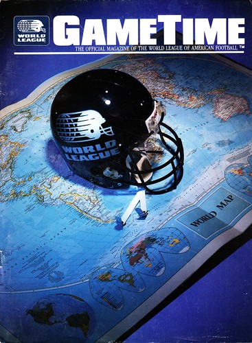
I never paid any attention to the WLAF while it was operating, and I can’t say I’ve studied it very closely since it shut down except to say, “Yup, that Orlando Thunder uni sure was something.” So flipping through this program is probably as much extended exposure to the World League as I’ve ever had. And it’s pretty interesting — did you know, for example, that all of the WLAF logos and uniforms were designed by David Boss (the same guy who did a classic series of NFL poster illustrations)? The WLAF program has an article that explains the league’s design process, which you can see here and here.
The program also features a series of really nice uni illustrations for each of the league’s 10 teams. Boss didn’t do these — they’re by a guy named Peter Winter, who I haven’t heard of before. Whatever the merits of the individual uni designs (some are clearly better than others), these images are how football’s supposed to look, no? Reasonable sleeves, proper-length pants, good white height on the socks — all very tasty.
A few other details from the program:
• There’s a decent article about radio-equipped helmets, which you can read here and here.
• The very first photograph in the program is this one. Couldn’t they have gotten a real football shoe for the photo shoot?
• Here’s an ad for licensed WLAF caps, T-shirts, and so on — but no jerseys. The whole “big bucks for polyester shirts” market hadn’t been invented yet.
• If your team is called the Skyhawks and based in Raleigh, North Carolina, what should your cheerleaders be called? Take a look. Pretty clever.
Big thanks to Steve for this excellent addition to the Uni Watch library.
Be my guest: As I mentioned a few days ago, I’ll be appearing next Wednesday, March 7, 6pm, on WFMU’s excellent Seven Second Delay show, which is broadcast live from the Upright Citizens Brigade Theatre in Chelsea. They’re giving me a nice-sized guest list, and I have a few slots open. So if you’d like to attend, gratis, shoot me a note and I’ll hook you up. (Details: You’ll need to arrive at the theater before 6pm. Show should be over by 7pm. I’m told that one of the other guests will be New Yorker writer Susan Orlean. Okay? Okay.)
Uni Watch News Ticker: In keeping with the protocol established by the Red Sox in 2005, the Cardinals will wear special championship uniforms for their first home series of the season (April 13-15, against the Cubs). The “StL” cap logo will be gold instead of white, and the jersey will also have gold trim (from Caleb Yorks). ”¦ Remember how the New York Times magazine was soliciting ideas for Jeremy Lin T-shirt designs? Here are their 11 finalists. Were any of them submitted by Uni Watch readers? ”¦ “I was in Snowshoe, West Virginia, and really liked the bear on this security guard’s patch,” says Sam Belk. I’m not sure which I like better — the patch or that there’s a place called Snowshoe, West Virginia. … Josh Exline notes that Kevin Durant was wearing different-colored shoes during the three point shootout. … Check out the very interesting concept that won a hockey medal design competition (thanks, Kirsten). … Not the least bit uni- or design-related, but it’s worth mentioning that Hamilton Nolan of Gawker is turning out some of the most incisive, most devastating, and absolutely the most hilarious cultural commentary that’s currently available. Every time I read something of his, I think, “Damn, I always sort of understood that on an intuitive level, but I’d never spelled it out like he just did,” or “Damn, I really need to raise my game as a writer,” or both. If you’re not familiar with him, this short piece is a good place to start, but it’s nothing compared to this masterpiece. Highly recommended reading. … Nine grand is a lot to pay for a uniform, but it might be worth it in this case. … Love the red devil logo patch on this old jacket. … Also love the lettering on the back of this jersey. … “Texas A&M just renovated its baseball stadium thanks to a sizeable donation from Aggie-owned Blue Bell Ice Cream,” writes Ryan Levy. “The new park is gorgeous and the renovation was welcome, but our beloved Olsen Field is now Olsen Field at Blue Bell Park,’ and the Olsen part of the name has almost vanished from signage on the stadium. I’m calling it Olsen.” … How pathetic has Fred Wilpon become? So pathetic that he recently distributed Underdog T-shirts to Mets players, at least one of whom isn’t too happy about it. … I feel like we’ve seen this before, but once more can’t hurt: Here’s an infograph showing the progression of every NFL team’s logo (from Tom Farley). ”¦ Congrats to Giants equipment director Joe Skiba, who’s been nominated for Equipment Manager of the Year. ”¦ Brian Cox notes that the Pirates’ 40-man roster has seven players whose names start with “Mc.” ”¦ More shoe shenanigans from Tim Lincecum, who’s been wearing New Balance on one foot and Nike on the other (from Matt Paver). ”¦ Unusual scene at Orioles camp, as Buck Showalter signed autographs for some Amish men who were visiting Florida from Indiana (from David Shank). ”¦ New throwbacks for Mississippi State baseball. ”¦ New alternate cap for the Durham Bulls. ”¦ Looks like Daniel Winnik, playing in his first game for the Sharks after being traded from Colorado, was still wearing his Avs gloves and breezers (from Sean Robbins). ”¦ Very amusing note from Peter Christian, who writes: “On Tuesday’s Connecticut state bar exam, the contracts essay was based on a St. Louis car dealer who ordered 40 red sports cars but received blue ones instead. She had ordered the red cars, to be delivered before Opening Day, as part of a baseball promotion ‘because the St. Louis Cardinals’ uniforms are red.’ I noted in my response that the uniforms are either white or road gray (I didn’t get into BP jerseys).” Peter is clearly going to make a great attorney. ”¦ It’s an embarrassment of riches for soccer fans, as new kits have been revealed for Peru, New Zealand, Turkey, Spain, Italy, and Russia. ”¦ Bat knob update: At least four Cardinals — Rafael Furcal, Carlos Beltran, Jon Jay, and Daniel Descalso — will be using these designs, plus there are new designs for UNC baseball and UCLA softball. ”¦ The Clippers and Timberwolves wore throwbacks last night.
Emancipation Day: With Leap Day once again making its quadrennial appearance, I’m reminded that sixteen years ago today — Leap Day, 1996 — I walked out of my office at Billboard Books for the final time. It was the last time I had a regular job (or health benefits, or paid vacation, or any of the other perks that come with being an employee, but of course I knew what I was getting into in that regard). The next day I started life as a full-time freelancer, and my only regret is that I didn’t do it sooner. Can’t believe it’s been 16 years — time really does fly when you’re having fun, and I’ve had a lot of fun. Thanks for coming along for part of the ride.
I was actually at the first World Bowl in London. Probably still have the Monarchs flag I bought outside somewhere, along with some of the trading cards which I think they were giving away.
Fun league while it lasted.
I taped the first World Bowl, but I no longer have it. I was a Monarchs fan because I was a bit of an Anglophile in the late 80s/early 90s. Still am, but I *really* was then.
I liked San Antonio’s unis the best, followed by Sacramento, Raleigh-Durham and Orlando. They were all good, though.
By the way, I have the inaugural set of Pro Set WLAF trading cards, if anyone wants to do some trading.
I have an original full-color copy of the league’s first-year uniform poster and a first-year media guide. Great artwork!
I have the 2nd year media guide and covered the first media-day thing they had.
And I have jerseys for Orlando, London, Frankfurt and Birmingham.
Proud to say I have the complete set of World League pennants from the inaugural season. Pretty neat collection, though it doesn’t do anyone much good in a box in my parents’ basement.
I was studying German in high school when the WLAF still had teams in North America, and got into it a little; the Frankfurt Galaxy became my team.
They did eventually make polyester jerseys, but they weren’t for any specific player. All the ones I saw had #95 on them (for the year, I think); I still have mine. You don’t want to see it, Paul; the color would make your eyes bleed.
I remember going to see a Montreal Machine game in ’91 and seeing they had jerseys for sale. IIRC, they all had #50 and even the yearbook and schedules had artwork of a player wearing #50. Maybe in reference to their major sponsor, Labatt 50?
link
I’d never heard of the #50 jerseys, but I did spot a few more 95s:
link
link; plenty of game-used stuff here too. That NNOB #75 blue jersey looks awesome, as do the #28 and #50 white ones. Bring those back!
if only one *good* thing came out of the WLAF, it was the clip art helmet and uni scheme of the thunder…
ok, the logo design was awful, but i wish someone would try a muted neon green for muted neon green’s sake instead of more bfbs…in ANY league
Can a neon color really be muted?
But yes, let us hope that Nike puts the Seahawks in neon green next year instead of the dark blue (or worse, a damn 80’s fauxback).
“let us hope that Nike puts the Seahawks in
neon green next year instead of the dark blue (or worse,a damn 80′s fauxback).”~~~
fixed
Well then who would be your candidate to try a neon green scheme? Seattle seems like the most obvious choice to me since they already have it as a trim color. That’s better than some team with no history of green doing a full neon makeover, isn’t it?
didn’t say that…i’d just like to see the seahawks go back to their 80’s unis
however, i wasn’t so opposed to the neon green jersey, as i was to the horrible outfit the hawks trotted out that day (epaulettes, dark blue pants)…put them in a *plain* neon jersey, and white pants, and i think it could work
from way back when i used MS paint…on the left would be my suggestion for the seahawks
here
anything else involving that color is horrid, but make the jersey that color and give em white trou (similar to the thunder), and i might be OK with it
So this link wouldn’t work just because of the sleeves? Or is the dark number too much too?
What about this? link
I gotta go with The’s choice over Phil’s here. The contrast-colored sleeves look really good on the bright jerseys.
I strangely agree. And hell, I like that Thunder uniform. I don’t know exactly why. Maybe it’s just the uniqueness of it. You sure won’t find that color anywhere else in football, except when the Seahawks use the brighter version.
There’s a difference between lime green and neon green.
We know this, right?
What I never understood is why ‘lime green’ is so often considered to be a light, bright green, when limes are actually quite dark, not unlike the background color of the blog here. I suppose the inside of the lime is lighter, but it’s still not as yellow-tinged as what we think of when we hear the color ‘lime green.’
Paul- big reader of the blog, love it. Just wanted to drop a line saying that the T-Wolves and Clippers wore throwbacks last night, not sure if you were aware. Thanks for the great blog!
link
Shit, I meant to mention that. Will add to the Ticker now.
I really like the hockey medal design, very unique idea.
Very cool.
Agreed. I think it’s brilliant work. Kudos, Tapio Kettunen.
Agreed, can’t wait to see an imitation of it, like a soccer or basketball medal in that style.
I really like the picture of Showalter and the Amish men. It’s not as surprising as you might think. The Amish really seem to enjoy baseball. The evidence is found in the sandlots often found in a corner of a field or pasture throughout the farms and fields of Amish country.
4:30…time for milking
You beat ne to it, Ger.
Really? That’s awesome. I know the whole thing with the Amish not being particularly enthusiastic about being photographed, but Amish-country baseball would make a great photo project.
The composition and depth of field on that Showalter photo is just outstanding. Could be a time-travel artifact: “Buck Showalter, Time Ranger, speaks with local farmers during a mission to Hoboken, New Jersey, to witness the first Knickerbockers baseball game in 1846.”
That’s a lot of travel. Were they Amish or Mennonite?
Mennonite, more than likely. Same school of thought, more progressive. Most Mennonites own cars and electric tools for work, but adhere to the same style of dress and simple way of life.
Agreed. More likely Mennonite than Amish – “Old Order Mennonite” to be even more precise. There’s a sizeable group of Mennonites in Florida. As a young Mennonite in Pennsylvania, I waited with great anticipation for the arrival of the Sarasota choir.
Baseball and other stick games have long been a point of contention for the Mennonites and Amish. I recall learning that a friend’s family transitioned from Amish to Mennonite as a result of the grandfather’s shunning for accepting minor league baseball wages. Receiving payment for playing a game was little too “of the world” at the time.
UniWatchers might enjoy this Amish crafted glove rack:
link
Yes, probably Mennonite not Amish.
The best music recording studio in Harrisonburg, VA in the 80’s was at Eastern Mennonite College. State of the art at the time.
I live in Sarasota where the Orioles spring train. There is actually a small Amish/Mennonite community in the middle of Sarasota called Pinecraft. It is filled with Amish restaurants and furniture stores. It is pretty interesting because the Mennonites will go out to the beach in their full traditional clothing (long dresses, pants, dress shirts, etc.). Definitely a strange cultural interaction.
Wouldn’t that be 4 years ago today?
No, it’s sixteen years ago, but today is the fourth anniversary. Leap Day is when we get to experience the temporal paradoxes of faster-than-light travel in real life!
I’m sure there’s a time dilation/eye doctor appointment joke in there somewhere.
The root of anniversary (and annual, etc.) is the Latin anno, meaning year. It’s still the sixteenth anniversary because sixteen years have passed.
I have a poster that has the same image as that magazine cover.
I find it funny that the shoe kicking the football is flipped…(note the position of the continents)
Nobody said it was THIS world.
Also, how did they get Mark Mosely to do that photo??!!
“… Remember how the New York Times magazine was soliciting ideas for Jeremy Lin T-shirt designs? Here are their 11 finalists …”
Great idea, excellent entries. Definitely worth a look. And vote! [Eric Caposella won my ballot.]
Mine too. I liked several of the others a lot, but the gap between best and runners-up is huge.
There was more good art than good design on display among the finalists. But credit to the NYTimes for attracting that level of quality to a contest like this.
Umbro… link
Turkey’s look is cool, although I still hate those printed badges that Nike’s doing this year. I understand that they want to make soccer kits as light as possible, but printed numbers and badges look stupid to me. I say go with true patches and tackle-twill numbers. The rest of the kit is light enough as is.
I don’t like the Spain kit. The collar is ugly and ruins the potential flow of the uni. I do like the light blue, though. The socks (without the Adidas logo) are awesome.
The Russia kit’s badge and number look weird stacked on top of each other, and I’m not sure how I feel about the positioning of both along with the Reedidas logo near the collar. But overall, not bad.
“… It’s an embarrassment of riches for soccer fans, as new kits have been revealed for Peru, New Zealand, Turkey, Spain, Italy, and Russia. …”
Riches sometimes, embarrassment sometimes.
Agree with SMoono about Turkey. Very good look. A-
Like Peru’s simplicity and its homage to one of the finer national flags. A-
Italy not bad, really, though I still hanker for their old all-white Away uni. B
Agree with SMoono about Russia’s Away kit. Not so bad at all. The diagonal stripes work better on a white background (away) than on red (home). Aamof, I wish the US would jettison ITS diagonal and let Russia own the sash look. B-
SMoono is right about the excruciating Spain design but wrong, I would respectfully say, about the light blue. It’s terrible. As I have fulminated before, countries shouldn’t be able to wear national unis in whatever color they like (cf tirades regarding use of green by Germany). Light blue may be pretty, or whatever, but it has nothing to do with Spain or Spanish tradition. D
New Zealand. Quintessentially awful. F
One of the new USA kits (away, maybe?) is supposed to be released today, if I read that tweet from Eurosport correctly.
Have to disagree, Connie. I think link is pretty outstanding. Love the fern motif and the way it looks in different lighting.
My seconds will be in touch with your seconds. Usual motif: Weehauken NJ; pistols; swooning loved ones.
I love the New Zealand jersey as well. Needs a bit of trim, though. Minimal trim.
Completely agree. Great looking uni. Maybe the best out of that bunch.
Aamof, I wish the US would jettison ITS diagonal and let Russia own the sash look.
If anyone owns the sash look in international soccer, it’s Peru. They’re famous for their home whites with the red sash.
First off Umbro is just doing all retro designs, which doesn’t make them do everything right. In some cases it works in others it just looks dated. In Peru’s case dated.
Umbro’s design for England isn’t retro at all. The button collar, the trim, the rainbow reds, the monochromatic badge; all define the new shirt, and England has never used any of those design elements before.
Nice WLAF read. Went to a couple Knights games in the first season.
Those uniform illustrations are beautiful. My only criticism is that the Riders facemask color is incorrect. It shows them having a brown facemask. They wore an athletic gold facemask.
Makes you wonder if they were forced to switch to athletic gold at the last second. Brown not being a widely used color. Not sure if Western Michigan or Wyoming used browns masks in 91. That athletic gold mask always seemed out of place to me being the rest of the uniform used old gold.
Wyoming did have a brown mask at that time, actually.
WLAF site
link
“Still. Kevin Nealon is a whore for scented candles. Disappointing.”
Those Gawker articles were great! Funny stuff…and true.
NFL logo infograph (in alpha order of their current city, btw)seemed a bit of a mix between helmet logo and corporate logo.
A couple of them seemed backwards too. ????
All he did was go to sportslogos.net and put each team’s listed “primary logos” in order, at icon size.
Reminds me – I need to get all the old Packers logos up there. Right now it’s like the team didn’t have any printed matter at all until the 1950s.
“Remove your sunglasses, rich assholes. They make you look like rich assholes.”
One of the best lines I read in years. Paul, thanks for introduction to Nolan, I am an instant fan.
Best line you’ve read in years? Come on.
What’s the point of this piece? Yeah, rich people who work in the entertainment industry get free stuff, rich people like expensive stuff, rich women in Beverly Hills shop for expensive stuff and rich men are often d-bags.
Paul I don’t get why you think this is a masterpiece. I agree with its premise and it’s well written – but all it’s doing is pointing out the obvious. I guess the stuff about the charity angle. I don’t see an argument being made or even a discernible point. Seems more like self important whining than a master piece.
If the point is that these people should have to do something more productive to get their money and free stuff – agreed. Just don’t think it’s very effective at converying the message. I’m not trying to start a flame war Paul – just didn’t think it was that good and I’m a long time pretty big fan of Gawker.
Of course he’s pointing out the obvious. In a world where we have eleventeen tv channels fawning over celebrities, faux-celebrities, reality stars, etc., someone pointing out the obvious is a welcome change.
I guess. But that’s a low standard for high praise like masterpiece, best line I’ve read in years, ect. The emptiness of modern celebrity culture is pretty universally recognized. I’d love to hear someone suggest ways to start an effective, mass backlash against it. Ripping on rich people in Beverly Hills is boring.
Only good thing? Really? I though some of the uniforms were gorgeous, Monarchs, Dragons, Galaxy (despite the purple) and especially Birmingham Fire, lovely stuff.
I truly adored the Monarchs, even modified my signature to incorporate the M as crown logo. Ahem.
I remember being excited about the Fire as a kid. Growing up in Alabama, college football was obviously more important, but I wanted to like the NFL too. I tried to follow the Falcons at times, but couldn’t put my heart into it (plus, they well… sucked). But HERE, was a pro team I could get behind. I guess 8 year old me didn’t realize that any pro leage not called the “NFL” was pretty much doomed to fail.
While most (if not all) of those uniforms were great, they all seemed to follow the same basic design template. It feels weird saying this, since I’m a staunch traditionalist… but I think you need some variety (a la the Broncos unis) to break up the monotony of similar stripes and jersey/pant designs. It makes you appreciate the traditional uniforms more.
When you consider that the whole league was designed by one guy, I think they had a decent amount of variety. Even if he’d had a few more radical ideas, it probably wouldn’t have been the best idea to use them if you wanted people to take the league seriously.
At the time you had the general idea that a football uniform should look like “this” or “this” and that was it. Look at the NFL pre-’90. Take the Bucs jersey, darken the orange, swap the red for blue – now it’s the Broncos. Take a Lions jersey, blue to black, silver to yellow – Steelers, black to purple, swap the stripe order – Vikings. Jets jersey, green to blue – Cowboys. Giants, blue to red, red to yellow – Chiefs.
If the WLAF had done anything too far outside the box, they’d have been laughed out of existence even quicker.
I agree. I don’t mean to take anything away from the uniforms themselves – very nice, both for the time period and considering one guy designed them all. It’s just funny that twenty years ago there was no problem with this lineup of uniforms. Today, if a new league were created… we’d be lucky to get more than one or two of these “traditional” designs. And I’m not saying that’s good or bad. Just interesting how designs change.
Ironically, if a new league did THESE new uniforms today… they might be laughed out of existence.
Whats funny is that all of the UFL’s(United Football League)teams have the exact same uniform designs but with different colors.
I’ve got a Frankfurt Galaxy sweatshirt that my dad picked up for me from a PX in Germany. If you ever do a DC UniWatch party, I’ll bring it.
There is a Snow Shoe, Pa. as well.
I grew up in the boonies of Pennsylvania. Snow Shoe is so far out in the sticks, that “you can’t get there from here.” It’s just one of those little places with a funny name that people always remember it, but don’t really know where it is.
It is off I-80 northwest of State College. It is the gateway to the sticks in a sense. They might have a truck stop.
At least the WV one has a ski resort.
Not to be all nit-picky (oh, being nit-picky, but that’s what we do here, after all) the player traded from the Avalanche to the Sharks is Daniel WINNIK, not “Wenick”.
Never apologize for pointing out an error — I appreciate the help. Will fix now.
I hate being “that guy” but this morning I’m gonna be that very guy… the dreaded flaw-pointer-outer.
The player the Avs traded to the Sharks is Daniel Winnik, not Wennick.
See above.
out of all the defunct football leagues that Birmingham had a team in, the Fire was my favorite..especially the helmets. when the league became NFLEuro and the fire was in Rhein (??) there unis were still cool even with the changes. Im sure i have some WLAF, CFL, XFL, USFL, and WFL programs in boxes somewhere in the basement hiding from my wife.
That’s it, the Rhein Fire. I think they were based out of Dusseldorf, Germany, but don’t hold me to that.
Yup.
Never watched a WLAF game but always loved that Galaxy logo. The Dragons is cool, too. Even the Skyhawks design is sharp. The others? Eh……
Happy Emancipation Day!
Noticing it for the first time, but how about the San Antonio Riders: brown, gold & orange! Yow! The Texas flag totally throws off the helmet, but totally dig that color scheme & stripe pattern.
The London Monarchs logo reminds me of butter for some reason.
^^^ old Imperial brand margarine logo, that’s it.
I’m not sure you’d classify this as an error in the NFL logo infograph, but the Jags originally had a different helmet logo that had to be scrapped since it was too close to the Jaguar car hood ornament.
I didn’t check the date on it, but they also missed the new Panthers redesign.
link, courtesy of Shorpy.
How’d you like to get your hands on a pair of those shorts, Paul?
Wow — that’s one of the greatest Shorpy shots ever!
And yeah, those shorts have my name (or at least my initials) all over them….
Any idea of the actual colours anyone? I’d guess gold (/amber/yellow) and burgundy, but maybe someone knows?
My google-fu is failing to find a definitive answer, but the team was owned by George Preston Marshall (Redskins old owner) so the burgundy & gold/yellow would make sense.
jim vilk has a pair of shorts just like those…in fact, he may even have a pair of those shorts
Shorpy is always so full of win.
Look at how wrinkly the second sweater from the left is. If that was me, I would’ve been mortified (even in 1924).
I’m still calling it Olsen.
Congrats on the anniversary of the move to freelancing. That was a gutsy move.
My wife has been self-employed since before I met her. Her business has changed a couple of times and her income has ebbed and flowed a bit along the way. Never a dull moment. We wouldn’t have it any other way! Adds a little spice to life.
(I’m a puss with a 9-5 desk job).
I don’t think there’s anything uni-notable about the Daniel Winnik photo. Looks like he’s wearing standard-issue Sharks pants and gloves. San Jose has orange branding on its equipment, while Colorado has white. Also, Colorado has no orange in their colour scheme.
i do not like these nob stickers in the least, and i know exactly where the fall on the good-stupid continuum. you mark your bat, you know your mark, you can see it from across the dugout because everyone has a different mark/patina to their , ahem, nobs, and that is that. most of these nobckers would cause me much grief as i riffled through the bat rack looking for the microscopic number on a busy uniform patterned background leaving me in an angry place before my 3 unassisted. i woud much rather be in a happy place and have a 6-3 in the books. uniform, yeah i get it, but my nob? i always thought my nob was mine. i can’t believe this trend has not been called stupid yet.
I’m sure if it really bothers any of the players, they’re free to tell the EQ guy to not use a sticker on their bats.
Everyone knows that pro athletes are ridiculously superstitious, so you know a team won’t use the stickers if they’re gonna throw off a star’s Ki/Mojo.
just sayin’ how i feel about them jeff, and i am sure the players don’t have to use them, but the fact remains the same, they are kind of stupid. do we really need uniform nobs? that is really my point jeff.
or in other words, it solves a problem that was never really a problem to begin with because we can all pick out own nobs out of a lineup without them being tagged.
Right. I just think they’re mostly harmless. They aren’t necessary, but they aren’t worth ranting about either. The practical difference between a sharpie’d “fuck face” and a stickered “`7” is trivial.
Calm down.
it solves a problem that was never really a problem to begin with…
I basically agree, and good for Moose for calling me out on it. I confess that I’m not coming down hard on these decals in part because I like the guy who makes them. But it’s also fun and interesting to see a small, geeky element begin to take hold — it’s like being at the forefront of sea change.
Of course, you could also say it’s like being at the forefront of a epidemic that needs to be nipped in the bud, and I wouldn’t completely disagree. Again, I plead a conflict of interest — I like the supplier guy.
i didn’t know you knew the guy.
if they were just giant numbers maybe i could get on board with ignoring it. but placing a small number in the middle of the state of north carolina, sticking a tar heel in the upper left, an interlocking NC in the lower right, etc, and getting all busy is silly. by customizing them so much it defeats the purpose to me. not to mention i see peeling issues, especially for guys like me who hold a finger or two over the end of the nob.
i don’t know, maybe it strikes me like those old sweatbands that ball players wore with their grill on them. yeah, i know you’re chili davis man, i can see your mug on the teevee, i don’t need your sweatband to identify you. not to mention i find it distracting to see the numbers on the nob. bats should look like your wood, a natural extension of self, not another place for a bumpersticker, i call already see the swooshes.
just my opinion which does not mater for squat.
i don’t know that i would call that a rant jeff, i would call that more of an amusing anecdote from my perspective that calls something silly in a more general way. if i was ranting there would be a much stronger tone and language. and if it isn’t worth me commenting on, then it certainly is not worth your usual 2 cent one line jab comment you stamp on every strain of thought in the uw comments every day as if we all ask ourselves “how does jeff feel about my opinion?” every time we post.
love as always,
grey facemasks
thats what you get with him
But isn’t there a category difference between clever little player-number stickers that are merely replacing handwritten NOKs and the broader world of logo creep? For one thing, this is in most cases info that’s already being applied to the bottom of the bat. For another, this is team/player branding, as opposed to manufacturer branding or advertising. The NOK sticker is essentially identical to a goalie wearing a custom-designed mask with team-related imagery. (And granted, Moose’s critique of the NOK sticker does apply equally to the custom-painted goalie mask. It’s not like we didn’t know what team the goalie played for when they wore plain masks, and it’s not like goalies used to have a hard time grabbing the right mask when they took the ice.) That’s an entirely different category of thing than the link showing up on the bottom of a bat.
I’m still curious about a question I raised yesterday: Why did bat makers not put their brand logos on bat knobs years ago? Did MLB have some supplier/equipment rule in place to prevent it, or are bat makers just not very good at logo creep?
Arr, I always thought the large Louisville Slugger stamp was enough of a logo creep. Plus what would be gained from logo creep on a knob? Not exactly visible during an at-bat.
The NOK sticker, strictly as a capitalist venture by someone who’s probably a nice guy, is mostly harmless.
The problems are:
1. They attempt to standardize something that has always been entirely personalized.
2. They aren’t (manufacturer’s) logo creep, but they ARE logo CLUTTER. I said it more delicately yesterday, but seriously, link is a fucking mess.
As Moose points out, aren’t uniforms/caps enough? Does every piece of on-filed equipment need to be team-branded?
“especially for guys like me who hold a finger or two over the end of the nob”
~~~
unintentional QOTD
i tend to see them, which isn’t worst thing ever, but true, it depends on a batters stance, a good point 78’s.
scott, i don’t think it is too much of a stretch to at the very least bring up the point that if these are effectively visible they might be replaced by a manufacture’s label, or a player’s endorsement label. i am not saying it will happen, or that it is my biggest fear, i was just making it a sub-point to my main point, which is the label itself isn’t the worst thing to happen to baseball or anything, i just think it’s silly and not needed. i’m calling stupid, that simple.
phil, while maybe it stands alone better, that was the most benign of all my tool references, non of which are worthy of being QuOTeD.
sorry roberto…
just on a quick break from jurious duticus, and didn’t really read any of your other knob references
but on another note, why u no like the stickers?
my OCD is really enjoying the concept, although i totally agree that there are too many bumper stickers on the knob stickers
stick to the KNOB# (what?) and don’t embellish it with shit
and if someone wants to pen FUCK FACE on the end of their knob, im sure no one is going to stop them
how do you distinguish your knob from others’?
I used to write “MINE” on the knob.
Same for upper portion of shaft on hockey sticks.
Only thing I can see that’s different in the Winnik photo is that SJ usually has a logo on their pants right below where his right glove is. Dont see one on Winnik.
It’s been a few days since I’ve had a chance to come back, but when did Paul switch COTD photos? Was there a reason or did he just feel like changing it?
Because it’s baseball season.
It’s basketball season.
“It’s bas
ketball season.”~~~
(fixed)
It’s wabbit season!!
Duck season!
Elmer Season!
Fire!
i just got back “on the grid” after a looong weekend… i’m guessing 2 + 2 = baseball season…
I absolutely LOVE today’s Catch of the Day! I’m probably going to spend all day looking at New York City in the past.
I tried five different places that should have a lot of history and only one of them had any photos at all. A little disappointing once you get outside the northeast corridor.
If you want to join click the link and the password is 1234
link
and invite your friends
I didn’t have to put in a password. Is that because I’ve been in Uni Watch leagues before?
David Boss obituary:
link
Anyone else really want to see the skyline art deco schemes referenced in the NY Knights explanation?
Oh, yes.
Those Mississippi State baseball throwbacks would be SO much better if they didn’t have the adidas logo creep.
David Wright doesn’t have to worry about the Underdog thing. By August 1, he won’t be playing for the Wilpons.
The defunct WLAF was also known for the innovative helmet camera, one of which ended up at the Pro Football Hall of Fame. Each week, the league would equip a different position player for their prime time matchup on either ABC or USA network. The looks from those shots, audio and video, still haven’t been equaled 20 years later. Surprised the networks today haven’t brought back the helmet cam with today’s technology.
The only drawback was the pounding these WLAF helmets took, and technical problems usually surfaced by the third quarter. On the USA Network, they would leave the audio up longer, giving the viewers some colorful language after plays.
Here’s a quick look at helmet cam:
link
I thought it was interesting that the WLAF uniform illustrations (and the helmet on the cover) appear to have tradition metal facemasks. Didn’t all the WLAF helmets have those clunky plastic masks?
Oh man, I have a bunch of WLAF cards sitting around somewhere (probably in storage).
If there’s ever another Albany party (or one in the Berkshires), I’ll dig them out.
I think I’ve known this ever since seventh grade when I was thinking up cool-sounding names and designing cool-looking helmets for imaginary football teams, but reading the WLAF design process article today made it hit me like a ton of bricks: working for NFL Properties would be my dream job.
link.
Interesting that the stools still have the black logo. I know it’s being used on the black alt but, at this point would have thought they would be removed completely from everything else.
Agreed. Disturbing.
link
New US away shirts are official. Not horrible, but I’ll likely pass.
The whole uniform looks nice. The numbers look silver, which adds to how the plain white sleeves stand out. A decent change kit.
And Italy is wearing their new all white kit. Both teams look very nice.
I hope the slash is more obvious on the white kits this time around, the subtleness works on the navy (I really liked our previous kits, and though I’d prefer the slash be more prominent on these I’m not sure the white slash would work with the new sleeves (too much white)), but the white kits just lacked color.
Any idea as to when we will learn about the other kits for Qualifying? or will the blues ones be the only ones changing.
You haven’t heard the speculation about red and white hoops?
If the leaked reports are true, the US will have a sublimated slash on the primary kits — which will be red and white hoops with royal blue shorts.
On a related note, England in their new all-white strip which, for the first time, has no blue trim. Instead, it’s red and crimson. A nice two-tone sort of look on the numbers.
Yeah if those are real I hope they are the 3rd/change kit. That look would be interesting to see a few times but not as something we would see roughly half the games the MNT plays.
You mean like these…
link
That would be a great jersey 1. if it had blue sleeves, and 2. if the US crest didn’t suck total ass.
Agreed.
I think the USA should use the block font like on some of their hockey jerseys (link) for all sports to create a good uniform look.
I think the US should use this as their crest
link
I agree, but please note that this is a PhotoShopped gag crest that got spread around a couple years ago; some wag replaced the rattlesnake’s link with a swoosh.
Love the crest, but thanks to Google the swoosh-ified one is everywhere.
It looks really good as far as I’m concerned.
From the press release at ussoccer.com, the jersey is supposed to evoke a varsity letter jacket.
Yeah, I can link the link.
RIP, Davy Jones.
“Cheer up, sleepy Jean…”
link
Each time an alternative pro football turns up, Birmingham is right there with a charter franchise. Would Birmingham make a viable N.F.L. town?
…alternative pro football *league*, my bad.
no, college football rules this state. plus the stadium all these minor league pro teams played in is a dump now. plus there are two NFL stadiums within two hours and another 5 hours. as long as the Crimson Tide plays football here nothing else really matters. oh and that other school as well i guess
War Damn Eagle
Actually, I have no dog in that fight, I just wanted to be contrarian.
Not really sure, while College Football is king most Alabamians cheer for the Atlanta Falcons in Pro Football.
Interesting (to me) Twitter exchange:
From @NFLprguy: Full legal name permitted RT @seattlevandal: @NFLprguy will NFL let RG3 wear “Griffin III” on jersey, or are roman numerals against rules?
How many guys have had a III (or IV) in their NOB?
I figure Loudon Wainwright III would have, but how many others have there been?
During the Combine, he had “Griffin” on the back of his compression shirt.
Walter Thurmond III wore his Romans at link (sorry, bad pic, but it gets the point across), however, in Seattle he was link.
Maybe its equipment manager suggestion (less to put on the NOB), or maybe its personal preference. I think RG3 will go no Roman; it looks a little more professional without it, IMO.
When did the CotD pic change? Is that for the baseball season?
Also, love the look into WLAF. I always loved the alternate leagues…kinda see what could happen with the NFL.
how in the hell did you miss that thread?
Probably around the same time my teacher started making sure we don’t deviate from our work during class…
The Knicks logo at center court of Madison Square Garden has been repainted without any trace of black. Here’s a photo from a couple weeks ago with the black: link
It now looks like this (the official updated Knicks logo): link
Keeping up with the latest university trend, of course. ;-)
Ha. I do however consider this a small yet significant victory in the battle against BFBS.
Chi B-Hawks at home in white allowing the Maple Leafs to wear their heritage Third unis (Blue).
Classic Original Six meeting.
All that’s missing is the home blackout and blue-on-blue NOB’s! Then, it would be EXACTLY like the old days.
Shit. I totally missed the “home blackout” part the first read.
Why, I oughtta…! *shakes fist*
What’s the opposite of rolling in one’s grave? Because that’s what Bill and Arthur Wirtz are doing right now.
Blackhawks are wearing white at home and Toronto’s wearing blue. The last thing we need is for the Hawks to think they’re on the road. What gives?
Not to be a dick, Jen, but I think this has been said. hahaha.
I kid but it’s a pretty good look. IMO, this is the best jerseys each team wears (even though I’m still a color at home proponent). Throwin’ backto the old days (but not the super old days).
RE: the two comment threads above.
Five words: The Way God Intended It.
Although I do admit that when I turned the game on I was confused for a minute or so. Everything told me home game, but when I looked at the jerseys (and socks and helmets), it said road game.
And that’s actually kinda weird, because to this day, I usually turn on the game and see the Hawks in red and immediately think road game.
Uh, I thought I was gonna make that it’s own post. Looks kinda stupid to reference two threads above, when I’m posting in one of those threads. So make it “this thread and the thread above.”
Or something.
*its* own post.
Fuck.
And yet god intended it only from 1965-2005. Weird, You would think he woulda gotten his way in the nearly 60 other years the NHL has played.
no timmah…
god got her way until the almight dinero god stepped in an slapped her upside the head
Fuckin’ kids…
1965? Try 1971 or 1972 for when the NHL switched to light colors at home.
link
sometime between 65 and 73. I just guessed it was 65…
link
1970-71
– Teams switch home and road jerseys. Teams now wear white (or yellow) jerseys at home and dark colored jerseys on the road.
I was born midway thru that season. Coincidence? No way.
And… I screwed up the tags on that one.
This is clearly not my thread.
“The Way God Intended It“
~~~
from your lips to the cornmother’s ears
Congratulations Paul! That’s excellent! All power to ya!
this from last nite..”Brad Northstar | February 29, 2012 at 12:47 am | Reply (to me) “love the new/old BLUE Jay colors, to me it looks normal.”
Looks like somebody didn’t pick up the theme of today’s entry!
Sorry if I offended the god topic person of northstar and I’m also sorry for relating a topic in the opening to uniforms, but isn’t this UNI watch?? (this is the reason I originally left this site before, jus sayin, but I will not let a 1 comment a day person delete me from adding my comments and reading Paul’s interesting work) still..jus sayin..
I think you need to upgrade your browser. It seems to be having a problem with the sarcasm tags.
Yeah. Just a play on your ‘looks normal’ comment vs the ‘weirdness is cool’ theme. That’s all.
They shoulda given Gabe Carimi a goalie jersey.
The Maple Leafs look wicked in blue and the Blackhawks in white tonite. I joined hockey bowl a ton of years ago and picked Blackhawks in white-love it. I still wish the Maple Leafs would have their 1935’s..notice the NHL shield in the cornerboards tonite..
Da fuck?
The “NHL shield” is, in fact, the new logo for the NHL Network. It would seem that they’re broadcasting the game tonight. I’d know for sure, but damn AT&T dropped the channel from its lineup.
That doesn’t help explain the rest of the nonsense he wrote. Sentence structure and explanations of random shit you write are important.
Also, the UC always has those in the corner. I have no idea what channel the game is on outside chicago, but here it’s on Comcast Sports Net Chicago Plus (DirecTV ch. 666).
The corner logo often changes, depending on who’s broadcasting the game. You’ll see an “NHL on NBC”, an “NHL Network…”
This is true, but in the case of the UC, unless it’s on a special channel like NBC, that’s the standard corner board.
666? what the hell’s wrong with you? Watch it on 666-1.
Fuckin’ kids…
JTH, the number of the beast isn’t 666-1, it’s 666 and while the game was technically on both 666 and 666-1, I watched it on 666-1 because if you’re watching it on 666, why bother? #DirecTVInsideJokes
As for the “1935s”, I assume you’re referring to the uniforms featuring the 33-point leaf. I like that, too. But they DID win their last Cup with the Canadian flag leaf.
how many of us were alive the last time they won the cup
(raises hand)
but im old, dammit
The good:
Marquette and Cincinnati go blue vs. red:
link
The bad and the ugly:
Maryland and North Carolina go black vs. gray:
link
Would’ve preferred Marquette to wear light blue here, but THAT is a real color vs. color game. And I have no problem with Maryland in black, as it’s an actual school color for them, and I like the script (I wish they would use it for all of their basketball unis), but the Hyper Elite Platinum crap that UNC’s wearing sucks.
isn’t pretty much every color in maryland’s colourscheme?
yeah, yeah…i know those are the colours of their flag, but school colours should be limited to three at most
except oregon
supposed to be a rundown of Leaf jersey history there’s 1935’s somewhere link in here
link
here (’35 sweater)
Ooh! Vintage white!
turns out after looking at those links it’s the 1928-1934 series. It’s centerpiece was what is the now original and famous 47-point maple leaf crest. Let’s hope I’m done with writing nonsense ;)
In regards to Winnik, he (and Galiardi who was also traded from Colorado) were both wearing gloves with orange embroidering, which is different from the teal that all the other Sharks were wearing. However, in looking at the Avalanche gloves they have black gloves with white embroidery.
Kobe with the plastic mask.
The Phantom of the Kobe: link
So, the USA-Italy game had two teams in their official away jerseys, then.
In the Germany-France friendly game, both teams wore away kits. Germany’s green away shirt is uber-sexy.
Why was Orange absent in all of the TATC uniforms? The Padres (in their orange and blue days) were orange-less, same goes for the Orioles, Mets (though that might have something to do with their move to Mercury) and Giants. Seriously, was there some kind of common belief that we would have no use for orange in the future?
damn, I scrolled down to far… this comment was meant for the 3/1 post…