A month ago I posted Ryan Connelly’s account of how he painted a Penguins logo on a friend’s wall. Like all of RyCo’s DIY projects, he began by mapping out the logo in AutoCAD, a graphics program that works very well for this type of thing.
Now, a fancy-shmancy graphics program like AutoCAD is fine if you’re in the 1% like RyCo. But what if you can’t afford gold-plated software, or don’t have the key to the Exclusive AutoCAD Room at your work, or whatever? Reader Chris Hernandez — a proud member of the 99% — decided to make a Rangers wall logo simply by rubbing two sticks together, more or less. Here’s how he did it.
My DIY Rangers Wall Logo
By Chris Hernandez
First, I took the Rangers logo off of Google and copied it to Miscrosoft Paint (free!). Then I blew up the logo in the “Sketch/Skew” option to 500×500, which makes the logo about 3.5 feet by 3.5 feet. Then I printed out the various sections to create my template (for all of these photos, you can click on the image to see a larger version):
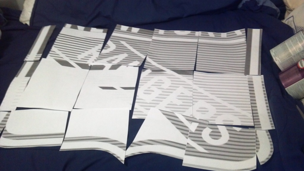
Once the template was cut out, I taped the top section together and adjusted it to make sure it was even. Then I took carbon paper (very inexpensive) and slid it behind each section, tracing the outline with pencil.
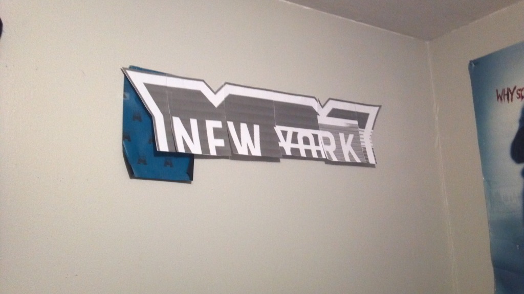
Rinse, lather, repeat:
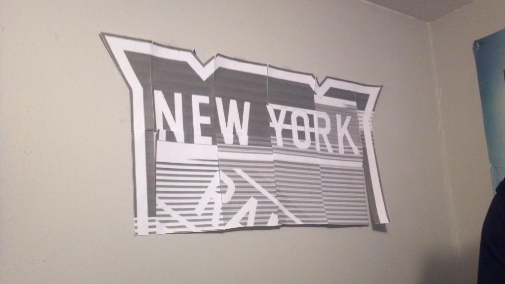
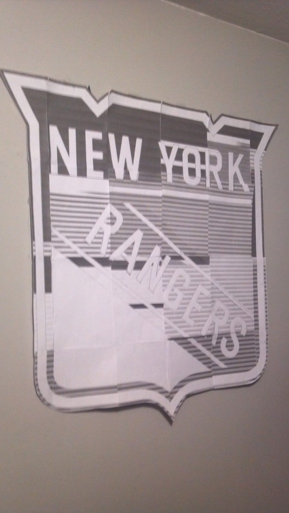
As you go, you adjust each sheet to make sure it’s even, and so on. Once you’re finished tracing, you may have to tie up some loose ends with a ruler or a curve, if necessary.
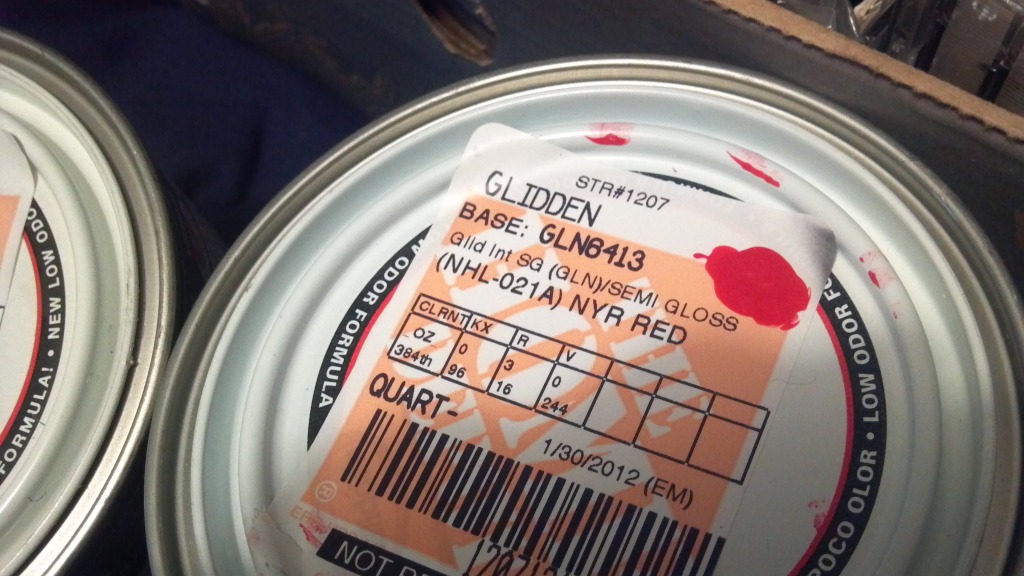
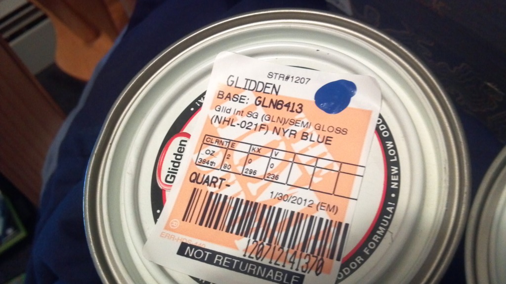
After that, it was time to start painting. Home Depot has a book of officially licensed paint colors for each team in any professional sport (so if you want to take on that Chicago
Blackhawks headdress, godspeed). I bought one quart apiece of “NYR Red” and “NYR Blue” for $10 per can:
I started by painting the blue areas of the logo, using the carbon paper outline as a guide:
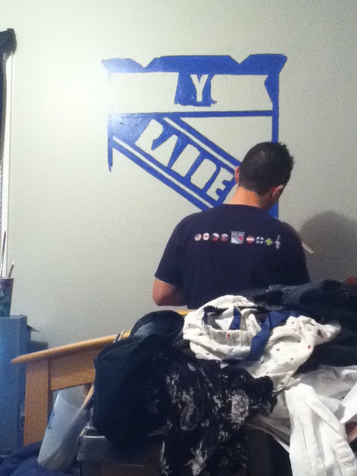
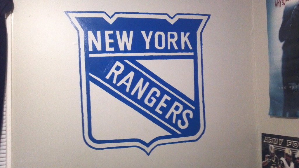
Next up: a section of red.
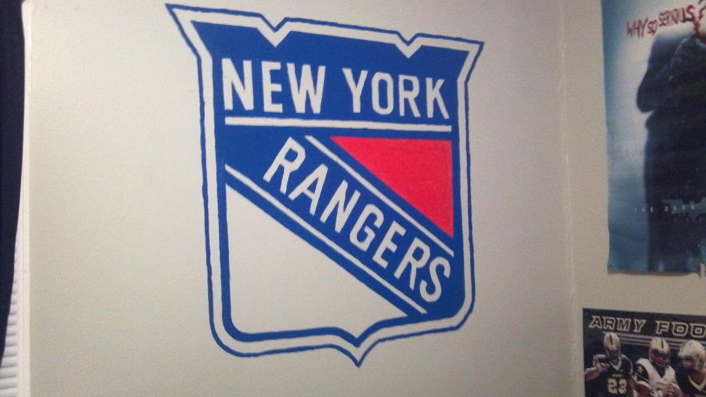
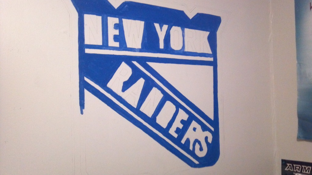
And then, finally, the white:
———
Thanks, Chris. And keep those DIY projects coming, people.
I love a woman in uniform: As part of an ESPN project, I’m trying to compile a list of notable moments or designs in women’s sports uniform history. I have lots of obvious examples — the Rockford Peaches, the All American Red Heads, Anne White at Wimbledon, the Aussie Olympic basketball unitards, Brandi Chastain’s sports bra, Serena Williams’s catsuit denim skirt with boots Cameroon soccer-inspired outfit whole fucking wardrobe, Zola Budd’s bare feet, the entire sport of beach volleyball — but I have a feeling there are some major points on the timeline I’m overlooking. And in addition to female athletes, who was the first uniformed ballgirl? The first uniformed female mascot? And so on.
If you have any suggestions on this front, I’m all ears. Thanks.
Uni Watch News Ticker: New uniforms for USA Basketball. Can’t say I think much of that chest insignia, which feels sorta like an old-world European heraldic crest — not very USA-ish. … Disgraced former Mets equipment manager Charlie Samuels has pleaded guilty to theft and agreed to a hefty fine and lots of other sanctions (including being banned from Mets games, Brooklyn Cyclones games, and spring training). Good riddance. … Meanwhile, Samuels’s replacement, Kevin Kierst, has redecorated the team’s spring training clubhouse and eliminated most of the black. … We’ve seen the uni guideline posters that are posted in MLB and NFL locker rooms, but I’ve never seen the NBA version until now (from Scott Cummings). … Tom Konecny’s nephew’s seventh grade hoops team wears some very cool hoop socks. … Michael Jordan’s 1996 All-Star jersey at the Basketball Hall of Fame apparently has an upside-down numeral. … Sleigh Bells do nothing for me musically, but I do like how singer Alexis Krauss has been wearing a cleverly modified Michael Jordan jersey. … David Letterman, of all people, wore Jeremy Lin’s name and number on the back of his suit the other night (from Mikhail Herrera). .. Lonnie Chisenhall of the Indians is wearing No. 8 this year as a tribute to Cal Ripken Jr. (thanks, Vince). … Check this out: a hockey jersey with Velcro “seams” on the sleeves, for ease of fighting (good find by Kevin Dugal). … Second graf of this story says Bryce Harper showed up in Nats camp and promptly “stretched out his pants legs to his specification … [and] removed the elastic in the cuffs.” Not a good sign for the game’s biggest prospect. … Here’s a better look at Charlie Smith’s shark cage helmet, which he wore to protect a broken jaw in 1980 (from HHH). … New logo for Windows 8 (from Tom Mulgrew). … Interesting story about how Auburn football wore two black helmet stripes in 1981 as a memorial gesture for two players who died in car crash (from Jeremy Henderson). … San Diego State baseball equipment manager Sonny Sanfilippo is justifiably proud of his team’s new striped stirrups. … Some uni number shuffling for the Yankees (from Matt Harris). … Fun piece on the intersection between hockey masks and other masks from pop culture (from Terry Eckberg). … Here’s what the 2012 MLB All-Star Game baseball will look like (from Chris Flinn). … Oooh, if you’ve been looking for some football-themed fabric, this might be the coolest design you’ll ever find.
Lame apostrophe catastrophe in new ‘track and field’ line from Nike: link
From here: link
That’s probably how they would have done it in 1981.
No it’s not. They would have done it correctly, because they wouldn’t have been setting the embroidery type on a computer, so the apostrophe wouldn’t have been mistakenly auto-corrected to an open-subquote.
I see you didn’t get my sarcasm. I can’t count how many times someone has said to me, “That’s how they would have done it back then” when building faux-retro graphics. It’s a crutch sometimes, but in this case, there’s no reason to think that someone in 1981 couldn’t have made a mistake and used an open-quote instead of a close-quote. Not every designer was/is great with grammar. I can easily see someone not knowing the rule making this mistake even when hand-setting the type.
nice job, chris
Ha.. from that NBA Uni Regulation poster — “Shorts to lay no lower than 1″ ABOVE knee.”
Yeah, right.. when do they plan to enforce that one??
Probably around the same time that the NFL enforces their sock rules or makes “exposed armpits” illegal.
/in other words, never
NBA is pretty good about the shorts. NCAA is the egregious offender.
Who knew they still made carbon paper???
Who knew anyone still uses MS Paint?
Who knew people didn’t just go out and buy logo Fatheads for this kind of stuff?
Well, you can’t customize the size of a Fathead.
plus there’s absolutely 0 reward for paying $90+ for a sticker…
The bigger the decal, the harder it is to prevent bubbling or other misapplications. A painted decal might be more work, but it’s easier to guarantee a better result with just a little more work.
Agreed – baffling. Fathead looks a million times better, takes 5 minutes to install, and doesn’t ruin the wall. I feel like these DIY stories should meet some minimum quality threshold…
I like the hand-painted stuff, myself, just to clarify. I was being a bit sarcastic.
Another free program he could have used to ‘blow up’ the logo would be Posteriza – somewhat limited but it’s free. Have used this program to blow up logos for making crests for hockey jerseys.
Like the hand-painted logo. There is a certain satisfaction in making something yourself even if it doesn’t turn out to everyone’s exacting standards (plus not having to shell $90 plus for a sticker).
Has anyone heard of NHL teams having a uni guideline poster? I haven’t seen one.
there’s no real wiggle room with an NHL uni. the only “hey look at me” things you can do are
1: shin pad over, or behind the skate tounge
2: jersey tucked or untucked
3: sleeves pulled up to the elbow pad, or worn regular length
other than that, i can’t think of anything else… teebz?
Colored laces.
Crazy tape job on the stick.
Multi-colored mouth guard?
Mouth guards aren’t mandatory parts of a uniform in any sport. It’s a player’s choice whether to employ one or not.
But on the other end of the extreme, hockey is the only sport (or one of very few) that allows a player (the goalie) to have a piece of equipment that is totally customized/personalized.
Are there regulations on Catcher’s masks?
Players can mess with shinpad tape, although few do. The only one who comes to mind is Donald Brashear (notice how he blacked out the white on his socks).
link
When Charlie Smith played at Grambling, he caught passes from a white quarterback. This I remember, from a TV movie based on this unusual situation. Bruce Jenner played the lead in this movie.
“Logo must be right side up” on headbands..did the Assoc ever crack down on Rajon Rondo for that?
Not really, because Rondo realized how ridiculous it is to micromanage that little detail. Rondo doesn’t wear the headband anymore, because he wouldn’t be allowed to wear it upside down.
Take that!?
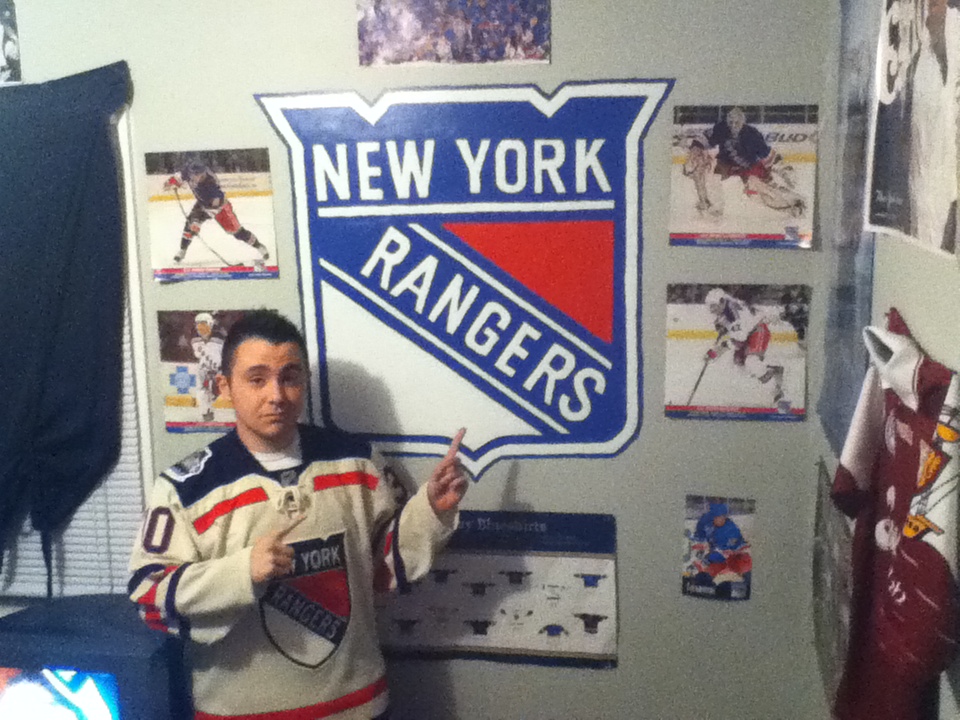
Rangers DIY
Dude, the R’s look terrible. Did a 3 year-old paint that hideous logo?
I await your DIY wall logo so that I may critique your abilities.
The right way to do it:
link
That Rangers fan’s end result looks like what my Uncle would call a “home made job” at best.
Wait, it actually is a home-made job, and your devastating critique is that it looks home-made? That’s like, profound, man.
Captain Obvious to the rescue, Arr. His skills of deduction would make him a valuable resource for the FBI or CIA.
The R at the top is a little bit imperfect. Big whooop. It’s great work, and inspiring too. The other two Rs are actually near perfect, and they’re the hard ones. Plus, back in the day, all signs were hand-painted, and slight imperfections like that were par for the course even on stadium signs and the like. You see slight imperfections in logos and whatnot in old sports photos.
The other two Rs are far from perfect. Maybe you should take a trip to Lens Crafters. For a perfect R, look at the R in the Flyers locker room photo.
link
Oh, you mean the PROFESSIONAL job? Y’know, where the Flyers actually pay a professional painter to come in and do the work for money because that’s his trade? That’s not DIY (the Y stands for YOURSELF).
Let it go, Arrrrrr – this is obviously just a Philly fan acting like a Philly fan.
As a Pens fan, I very much like the above statement. Philly, the only place where they make statues of fake sports figures. Yo Adrian!!!!!!!!!!!!!!!!!!!!!!!!!! You don’t see New York putting up a statue of Roy Hobbs or Cleveland unveiling a Ricky ‘Wild Thing’ Vaughn bust.
You don’t see… Cleveland unveiling a Ricky ‘Wild Thing’ Vaughn bust.
But you know, they should, just to see what wacky hijinx Charlie Sheen could get himself into if he managed to show up at the ceremony.
Damn lack of an edit feature…
Not a fictional sports figure but still fictional: Detroit is putting up a statue of Robocop.
Inspiring, no, but let’s not forget that the Rangers’ own logo wasn’t exactly drawn by a pro typographer, and you can tell if you look closely.
If anyone is wanting to do this at home and not interested or can’t find carbon paper, a quick and easy thing to do is scribble on the back of your paper with a regular ol’ pencil. It’ll take a lot but you can just follow the lines so you don’t scribble over the whole thing.
Once you trace the logo it’ll transfer some of the “lead” to the wall. It’ll be more faint than carbon paper but its free!
I’ve done this when making Cornhole boards (also known as Bags, Bag Toss, or others) and its quick and easy.
You can also use charcoal but that’ll get all over the place.
yeah, but wouldn’t you need a really smooth surface to pull that off? the penguins logo i did was in a game room on a painted cinder block wall. also, isn’t there less room for error when you’re lining up the pages? i’m not saying, i’m really asking.
Same thing as carbon paper. Still dealing with a rough surface so really its no difference. By doing the scribbling on the back you’re just eliminating the carbon paper. However you are sacrificing the boldness of the line.
Just offering it up as an alternative since he mentioned carbon paper was expensive. The best way to do this is if you can get your hands on a projector and project it on the wall, then trace it that way. I’ve done that before and works wonders, just need to make sure the projector is lined up properly so you don’t have a skewed logo…
Can’t say I think much of that chest insignia, which feels sorta like an old-world European heraldic crest
Well, the Olympics ARE in London; perhaps they’re using that as an inspiration. But, I agree that an American team should look…American,
I think it’s supposed to be a stealth bomber.
Not bad:
link
Stealth bomber is the first thing I thought of when I looked at it.
Good spot. I like the logo. It’s something a little different and yet it’s still a basketball logo instead of a repurposed football wordmark, like Nike does at the college level.
The U and the A seem very European in form, though. Reminds me of the Dutch national soccer team’s black electrical tape numbers:
link
There’s just no connection with anything that I think of as “American”, either as a matter of aesthetics or team history, in the USA script.
Yeah, it does look a bit like one…
When you put the number together with the USA, it sort of reminds me of an arrow that points up to the player’s face, saying “Look at me!, not the name on the jersey.”
I’m surprised Nike didn’t put out a press release explaining how the new logo makes the jersey more aerodynamic, thus giving the player 52% more acceleration power.
Like the little streamers that kids’ bikes have coming out the end of the handlebars. My Dad used to call them “Go-Fasters”!
Streamers coming out of the handle bars on kids bikes is probably the best analogy for why wide receivers in the NFL in the 70’s used to cut their jersey sleeves so they’d be flapping from the air as they ran. The theory for doing it was it made it look like you were running faster. Maybe Uni Watchers will now refer to sleeves cut this way as “Go-Fasters”? :)
At least the numbers look decent (admirable restraint for the Shwoozies). Though why no shots from the back (unless I missed it)?
our man Vince popped up on a yahoo basketball blog:
link
#1 reason to hate lebron though: well done steak?!?!
This is a good joke waiting on Paul Lukas’ silver platter.
A grave insult to the memory of a noble beast.
I think LeBron is a fascinating character, a great player, and I will defend him to the end…
But well-done? Seriously?
Steak well-done? What a moron.
*and* cut up for him??
Don’t forget the Appletini. Didn’t know link.
It’s almost as if the animal dies in vain when meat is overcooked.
I hardly ever eat steak so bear with me if the following is shocking to you, but what’s wrong with liking your steak well done? I mean, isn’t that the only way to ensure it’s cooked thoroughly? I think knowing you’re not going to get sick from eating it would make you enjoy it more.
Almost all contamination is on the outside of the meat. You have to cook ground beef more thoroughly, because it gets mixed together, but with whole cuts only the outside needs to be cooked to a safe temperature to properly sterilize it.
If it is good meat then you should be able to eat it raw and not get sick from it. In my opinion, cooking meat well done ‘cooks’ away the flavor signature of the cut, as well as makes the cut dryer and tougher. I like mine rare to medium rare. If you think over cooking a certain piece of meat will make it safer for to eat, you probably shouldn’t be eating it in the first place.
Heat up the cheese on your pizza after the cat licks it.
Occupy AutoCAD!
great idea on the carbon paper, chris!
did you have that moment when you started to sharpen up the paint job… took a step back… and thought something like “damn! i can’t believe i did that!!!”
really cool!
Hmmm… The Letterman video is “currently unavailable”.
Isn’t the “N” on the back of Letterman’s suit upside down? Sloppy work, Dave — you should employ one of uni-watch’s do-it-yourselfers.
Sleigh Bells are awesome! The dude who writes/makes all the music and plays guitar used to be in the hardcore/metal band Poison the Well. While in PTW he always wore an old 1970s Univ of Miami (where hes from) sweatshirt. I wish I could find a picture
I’m so-so on most of their stuff, but Comeback Kid is an absolutely killer song.
Oh dang. For a second I thought you were talking about the hardcore punk band Comeback Kid.
Uni-mention, they use to sell t-shirts with their name styled like the old Winnipeg Jets logo.
Is looks like it’s not level (lower on the left side)but the colors are good.
For your women in uniforms piece, what about Roller Derby? It isn’t crazy popular, but I know their uniforms can be pretty cool. Also, they call their matches bouts.
My favorite team? The Norfolk Brawds. LOVE their logo!!
link
Chattanooga Roller Girls 4 Life!
link
Sorry guys…gotta go with the DC Roller Girls (4 teams in one)
click on name to see the website
O.k., it might not be entirely in keeping with the article, but how about Shania Twain’s hockey jersey dresses at the JUNOs in 2003? link
I’ll jump on the hockey bandwagon.
Prior to 1990, had any women’s teams worn pink as a one-off gesture? Team Canada wore pink at the first Women’s World Hockey Championship in Ottawa that year when Team Canada was always red and white. It seems like the Canadian women were first despite their wearing pink not having anything to do with breast cancer or cancer awareness.
Rumor has it that a certain insulation-manufacturing company demanded they wear pink as a marketing strategy in exchange for that company paying entirely for the uniforms. Instead, it slightly backfired as the enrollment of girls in hockey increased by nearly 50% the following year.
Do it right; do it pink, I guess.
Backfires, that is, as in the company didn’t see a massive influx of insulation purposes. I should have made that more clear. :o)
Purchases*, not purposes. This is what I get when trying to do work and make comments at the same time.
“I’ll jump on the hockey bandwagon.”
~~~
really, teebz? really…
I’ve heard of players doing their own thing with their socks.
Sopel used to wear his so the stripes were really low.
Brasher used to put colored tape on his Philly socks; white, black, and orange.
That’s just to name a few. Also thought of the sleeves pulled up and jersey tucked that was mentioned, but just wanted to see if there were any offical guidelines when it comes to things like that.
There are guidelines, Jim, but not so much as in HOW to wear your uniform as opposed to what needs to be done to wear it on the ice.
For example, all players are supposed to have the tie-down securely fastened. Not fastening it makes one available for a game misconduct as per the rules. But the Gretzky tucking of the jersey, for example, isn’t frowned up whatsoever.
Because players have their own equipment deals, anything outside of the socks and jerseys are pretty much up to the equipment manufacturers following the NHL’s guidelines on equipment. As long as they fall into these guidelines, there might be different helmet or breezer colours seen based upon those manufacturers’ hues, but as long as everyone is similarily uniform, all is good from the NHL’s standpoint.
Ray Whitney used to cut out that ridiculous little “NHL” triangle in the neck of his jersey when he was with the Canes and I think that was covered here at the time. I don’t know if he still does that in Phoenix. That’s certainly a uni modification that the league appeared to permit.
An interesting link about NHL uniform rules.
link
I wasn’t aware that home/road jerseys must have contrasting helmets and socks as well as sweaters. You see one helmet used for home/road in junior/IIHF play, but never in the NHL. Guess that’s why.
Does anybody but me think the “S” on the new US basketball unis could be an allusion to Superman? That’d be plenty American.
I think it’s just you.
The Superman ‘S’ is rounded, serifed, and narrower at the bottom than the top. This is pointed, sans-serif, and uniform width top to bottom.
Maybe if the USA mark and the numbers created a cushion-cut pentagon, I could see it as an overall theme, but since the mark is pointed at the top it isn’t there.
Suzuki “S” is what it reminds me of
Thanks Teebz, I knew all of that, but was just wondering If the league is as relaxed on the uni modifications as I thought. Guess it is. Just figured if MLB, NFL, NBA had official sheets in locker room maybe the NHL did that i wasn’t aware of. Never saw one the couple times ive been in one.
Thanks for the info though.
At work so need to do this quickly, and if it’s already been noted, I apologize. All the Ebbets Field Flannels Negro League jerseys are on sale…
link
Missouri Tigers teasing their new football jerseys again. A guy nicknamed Kampy did a pretty good job of screen capturing and posted his findings/assumptions:
link
Interesting analysis. He seems mostly on point. I’m not sure the last picture is of a pair of cleats though. Is Nike still using flywire in their football shoes?
The Oregon of the SEC, perhaps? Just about every team currently in the conference sticks to (mostly) traditional unis. If Mizzou unveils several alternate jerseys, multiple helmets, “tiger stripes”… that will easily give them the most radical uni set compared to their new brethren.
Considering they have the historically weaker football program than Texas A&M, maybe they think this is their way of standing out in the conference.
What’s better than a powder-blue KC Royals gamer? A powder-blue KC Royals gamer worn by Chuck Barris on the frickin’ Gong Show:
link
(#25 on your scorecard is OF Tom Poquette.)
Is that an LA Kings jersey underneath?
Sure looks like it…but the Kings all-time roster doesn’t have a listing for any player named “Back With More Stuff”.
Not link is a fan of the USA wordmark on the Olympic jerseys.
They think they can shave a quarter of a second off 100 meter times? That’s a pretty ballsy claim.
It certainly is — or it would be, if that’s what Nike was actually claiming. But the correct figure for what they’re claiming is 0.023 seconds (not 0.23):
link
Yahoo got it wrong in their story.
Oh, okay. So what’s the point of claiming an improvement to such a ratiocinated degree that the sport itself doesn’t recognize it as a difference in performance; like improving times by thousandths of seconds when the measuring equipment is only capable of measuring hundredths? Oh wait . . .
I heard an even better claim on the news this morning, they claimed that the fabric was lighter than skin. The implication that somehow by wearing this suit it makes you weigh less?
Anyway, I’ve heard skin is the largest organ on your body so wouldn’t nearly any clothing be lighter than skin?
Yup. And the ball speeds up when it’s rolling on Astroturf…
A male basketball player is probably carrying a little over 10 pounds of skin on his frame; maybe up to 12 pounds. A normal basketball uni weighs not much more than 2 pounds.
So Nike’s claim is almost certainly true: The new b-ball uni weighs less than skin. Just like every basketball uniform made or worn in the history of everything ever.
At Nike, this conversation happens every day:
link
UK Hoops goes pink : link
Ah!!!! That UK :)
I thought “.. but we don’t have a hoops team”
Damn that Jordan ASG jersey is just brutal. The mid-90s were not a good time for basketball jerseys.
The mid-90s is up there with the early-70s and late-80s as aesthetic disasters in general, not just sports.
OK, what’s up with the radial arching on link and why are the 2 and 3 so far apart?
I give it a C+. That’s a B+ for the idea and a D+ for the execution.
Plus the collar and sleeve striping doesn’t include the traditional black. link
what radial arching?
Are you new here?
link
Interesting uni-related question regarding tonight’s prexydential debate: Will Gingrich and Santorum, both of whom are Catholic, wear ashes?
link
Also on Santorum, about the only time he ditches the sweater vest for a suitcoat is to appear in one of the six thousand GOP debates. Seems that it effectively makes the sweater vest his home uni, and the suitcoat his road gray or change kit.
Last candidate who adopted a uniform like this, that I can think of anyway, is Lamar Alexander and his buffalo-check flannel coat in 1996:
link
Considering the large amount of makeup applied to anyone on camera, they’d most likely have to have it applied after makeup.
And they’d have to have a priest do it, or that would be a sacreligious act according to their religion.
Ah, excellent point re: the makeup.
Which is a great excuse for them to not do it.
While those two would no doubt be glad for an opportunity to show off their faith, black smudges would look terrible in still photos of the debate days, weeks and months from now. Consider it a corollary to the link.
Just got a look at the Catch of the Day. I own most of that stuff!
That old-time-football quilt is so nearly amazing, but what’s with the wacky coloring!? Were they referencing black-and-white photos and just guessed?
Interestingly, Marion Motley almost looks like he’s supposed to be represented in his Steelers year, but his helmet would have had a face mask.
I would absolutely buy this if the colors were even remotely close to accurate, but the thing would just bug me beyond any enjoyment it’d afford.
There’s a reason the colors are wonky; those are images of old NFL uniforms originally created for the NFL. They have been recolored, presumably so they could be sold without kicking any nickels back to the league.
Compare link to these scans of the link (Curly!), link, link and link. Anything look familiar?
I’ve read that they come from a long-out of print book called The Illustrated History of the American Football Uniform, but can’t confirm that. I can confirm that at least some of them were reprinted in the 1972 book NFL: The First 50 Years.
Ah, I’ve seen those scans before, but I could only find Nevers’ today. Thanks for linking to them! I can’t place the Detroit Lion — who is he?
And does the league really retain any rights to long-defunct teams like Duluth?
I think the Lion is link, although I’m not sure if he wore #24 in Detroit or just in college.
As for defunct teams, if it is possible to trademark defunct entities for the purposes of merchandising, then the NFL has certainly done it. And we do know that the league was in the bed linen game….
goddam that browns uni
wasis perfectIsn’t it! Probably my all-time favorite. It also looked great when they switched to orange (plastic) helmets.
Oops, meant to link: link
Not sure if anyone posted this, but I just stumbled upon another brand that Nike is ruining with TCU. link. Why can’t they leave a good thing alone?
Stupid. It looks like some weird two-legged creature that has left a steaming pile of turds in its wake. Seriously, it’s not good at all. TCU has such an awesome, unique logo at the moment. I really hope they don’t change to that… THING.
Hey brain surgeons, you want to make a positive change? How about going back to PURPLE uniforms? You know… your school color.
It would be nice to see TCU have the balls to actually say no to Nike at some point.
I have no idea if I’m right, but they probably feel (felt?) that as a small school, doing Nike’s outlandish bidding was a sure way to catch attention. And for the most part, it’s probably worked. Now they plan on stepping up to a big-boy conference, and I bet they think their awesome logo is too “amateurish” or some garbage.
I hope their fans raise a big fuss. I generally like TCU, and don’t want to see this turd of a logo foisted upon them.
From John Thorn’s MLB Blog: The good people of 1888 didn’t have Paul Lukas rhapsodizing upon the minutiae of baseball uniforms. However…
link
Re: the Rangers “license plate” logo painted on the wall.
I never noticed all that negative space to the left (or northwest) of the first “R” in Rangers. At first looking at the painted version I thought perhaps it was off a bit, but then I looked up a real Rangers license plate logo on-line and sure enough, a huge amount of negative space. Now that I notice it, it really makes the logo feel unbalanced.
The more I look at that logo the more unbalanced it feels. Two other things. Look at the size of the red triangle versus the size of the white triangle, much bigger white triangle. Secondly, if you bi-sect the logo (creating a centerline from the teet on the bottom) you’ll notice “GERS” and half of the “N” is to the right of center, where as only “RA” and half of the “N” is left of center. Thats 2.5 letters to the left and 4.5 to the right. (I’m looking at an actual graphic, not the one painted by Chris Hernandez) Also it looks like theres a number of different fonts going on there. The G sort of has a serif on the bottom, yet no other letter has that, and the width of the E’s in comparison to other letters feels off, and I have NO IDEA what is up with that K. Yowzers.
Nice work on the Rangers logo.
PS—
They are allllmost here.
link
Here’s a random Uni-thought; the Spurs uniforms need an update. I’m really tired of their boring design, and with some subtle changes, they could have some of the best unis in the NBA. A great start would be restoring the diamond-shape on the shorts that they used to have, the same design that the Bulls have on their shorts, and Georgetown had in the early 80’s.
As much as I like “plain” logos or traditional/regular looking letters/numbers on team jerseys ie: Giants vs Panthers->2011’s written team name aka gross, the new microsoft 8 logo in the ticker I felt like..ok where is it?? boring. Don’t know what I was expecting when I opened the window but..
Speaking of microsoft, I recently heard Seattle was looking into getting an NHL & NBA team?? Wasn’t their old team the Supersonics?? cool name..some of the expansion teams of today have boring names like I think hurricanes is spent as well as the panthers. Names like Red Wings or Lakers Celtics Giants are unbeatable, even Blue Jackets work for me. For example, Winnipeg Jets?? I know they WERE in the NHL before, but the “Jets” are NY’s team.
I was in Toronto right before the Raptors were born. Picked up a newspaper, there was a pole on team names for the new NBA franchise. One name I still remember were the Toronto Great Lakers (based on the geographic location of the city). Obviously they became the Raptors..what a dinosaur has to do with that or any city puzzles me till this day. Shouldn’t team name resemble its city
I can’t imagine the NBA would’ve allowed ‘Great Lakers’, given LA’s claim to its second component.