In last Tuesday’s “Collector’s Corner” column, Brinke Guthrie mentioned that he’d created this Bengals illustration back when he was a kid. As soon as I saw that, I asked him if he had any additional artwork from back in the day. He initially said, “I don’t think so,” but then he poked around and found something. And then something else. And something else. Soon he’d flooded my in-box with a ton of material from his childhood.
Let me stop for a moment here to say that Brinke has been doing “Collector’s Corner” for well over a year now and had been a steady Ticker contributor for a long time before that, so I have a decent sense of what he’s about. On the other hand, however, I’ve never met him in person and am pretty sure we’ve never spoken on the phone either, so the truth is that I probably have no sense of what he’s about. That’s how it is when you know someone exclusively via e-mail — you end up with a very limited, almost cartoon-like version of that person. In Brinke’s case, I kind of like it that way, because the cartoon of him that I’ve assembled in my mind is a very entertaining one — a cartoon that draws Bengals illustrations and obsesses over Sears catalogs and such. In other words, a cartoon that has been obsessed with athletics aesthetics since boyhood. I almost prefer not to know the real details that would flesh out the cartoon into a real person.
So when Brinke sent me all that childhood artwork the other day, I was intrigued, because it enhanced the cartoon and gave me a better sense of him as a real person. Let’s take a look at that material, beginning with this excellent Reds illo (you can click on all of these images to see larger versions):

How great is that?! I love how one of the hitters is wearing batting gloves while the others are bare-handed. Details, baby, details! Also love that Brinke signed his work with a little monogram, but he mistakenly made his middle initial (J) bigger, instead of his last initial (G) — a very endearing little goof.
Here’s another Bengals piece, apparently from Brinke’s psychedelic period:

Yes, I realize this was probably just cribbed from a poster (ditto for the Reds illo), but it’s still pretty great. I especially like the way he handled the letters and numerals on the scoreboard.
Next up is this soccer program cover that Brinke designed during his time at Mariemont High in Cincinnati:
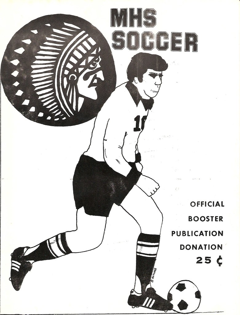
The blacked-out eyes are a little weird, but look at those stirrups! Even as a lad, Brinke understood that the lower opening faces front, with the larger opening in the back. Clearly, the boy was destined for greatness.
Ah, but Brinke didn’t just do sports-related artwork, as you can see from this mixed grill of Brinke-ness:

“That’s my Senior Art Show display from high school,” says Brinke. “I was one of two ‘Best Art Student’ winners by senior year. In the middle is the logo I did for the Village of Terrace Park’s bicentennial.”
That’s when Brinke stopped sending artwork and started sending sport-y photos of himself as a kid. As you may recall, I’ve run other childhood photos of Brinke in the past, like this one from when he attended the 1972 NFC championship game. Turns out he’d been holding out on us, because here’s another shot of him from that same day:
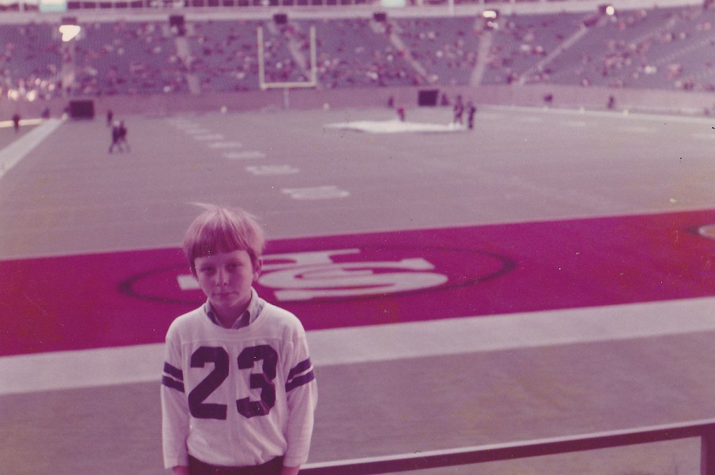
Nice, right? Note that although the game took place in Dallas, the Cowboys gave the 49ers their own end zone. Of course, this was a quarter-century before Terrell Owens shat all over the midfield star, so the folks in Dallas were a bit more favorably disposed toward the Niners back then.
Speaking of the Cowboys, it turns out that Brinke didn’t believe in the blue jersey curse:
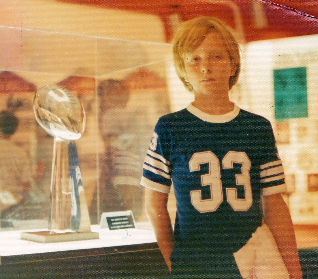
Of course, that isn’t really a Cowboys jersey, but Brinke says he chose it “due to a vague Cowboys look.” The photo was taken in Canton, at the Hall of Fame, circa 1975.
But enough of these “Just stand there” photos — what about action shots? Ask and ye shall receive:
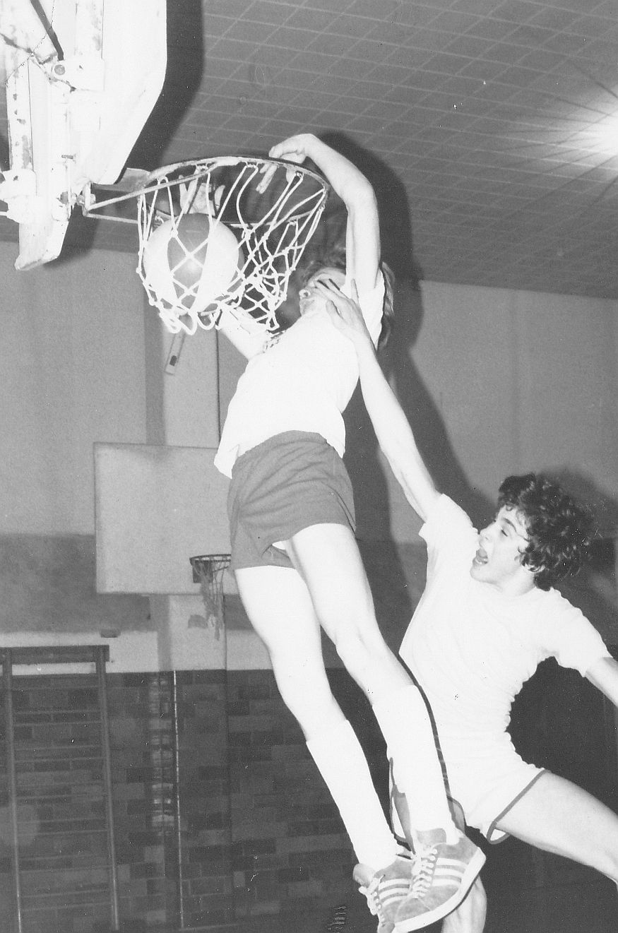

But wait a minute — how was a kid able to dunk? “We took the balance beam, about a foot high, and laid it across the foul line, then put a spring-board mini-tramp thing on it,” says Brinke. “Get a running start and you become Dr. J. I got the idea to go get my dad and his camera. I wasn’t a very good player, but in these photos, I did indeed have game.”
Brinke apparently liked the tennis court as much as the basketball court:

“All Adidas, all the time,” says Brinke. “Made the brutal mistake of having a milkshake and then going out onto the court. Unwise.”
That’s enough of Brinke for today. Hope you’ve enjoyed getting to know him a little better, as I have. Thanks for all the cool photos and scans, buddy.
The Habs and the Hab Nots: As most of you know, Phil and I spent most of Friday and Saturday at the USA Curling Nationals in Aston, Pennsylvania, and I’m happy to report that there was a great uni-related moment during our time there.
Here’s the deal: On Friday afternoon I was catching up with Craig Brown, a world-class curler who was my skip when I curled at the House of Hearts tournament two years ago. He introduced me to his wife, Lynn, who I hadn’t met before, along with a few other people. Somehow we all ended up talking about NHL logos (wasn’t my idea, honest), and somebody said, “What does the ‘H’ in the Canadiens’ logo stand for?” Lynn immediately said, “Habs!” Craig beamed at her, all proud-like, and Lynn said, “Ooh, I’m gonna get laid tonight, aren’t I?”
Naturally, I had to ruin everything by informing everyone that the “H” actually stands for hockey, not Habs (which may explain why I haven’t been getting laid much lately). Later on, it occurred to me that it makes sense that curlers would be into the Canadiens, given the design similarities between the house and Ken Dryden’s old mask.
Big thanks, incidentally, to all the readers who said hi during the curling tourney and also to those who showed up at Saturday night’s Uni Watch party. I’ll have more to say about that later this week.
You’ve gone all sad, so I feel sad too: Amelie Mancini, the Brooklyn artist who’s previously produced postcard sets devoted to baseball injuries and ballplayers with food-based names, has now produced a limited-edition Gary Carter poster. “His passing touches close to home for me, because my boyfriend’s aunt also had brain tumors and passed away a few months ago,” she says. “I am selling the Gary Carter tribute prints for $20 each and will donate all the profits to the National Brain Tumor Association on his and her behalf.”
Amelie is giving Uni Watch readers first crack at the Carter poster, which is available at the bottom of this page.
Meanwhile, speaking of Carter and the Canadiens, those two themes came together yesterday in Montreal, as the Habs honored Carter on their Zambonis and pregame warm-up jerseys.
One final Carter note: His former teammate Wally Backman, who’s skippering the Mets’ triple-A team in Buffalo this year, has announced that he’ll wear No. 8 this season.
Too good for the Ticker: I can’t even begin to express how much I love this old Russian hockey poster that Robert Marshall recently turned up. So, so awesome. That is all.
Uni Watch News Ticker: New Fenway Park centennial patch for the Red Sox. ”¦ Just what the world’s been waiting for: his and hers Yankees fragrances. “Oh barf,” says Kirsten. ”¦ “According to Rutgers football Coach Kyle Flood, the team is due to receive a new uni set for the 2012 season,” says Stephen Dahl. ”¦ Some truly outstanding pics of the Boston Braves wearing white satin unis here (big thanks to Mark Sullivan). ”¦ Speaking of satin unis, you almost never see vintage satins for sale, but check this out — what a beauty! ”¦ Matt Konrad notes that Bemidji State goaltender Dan Bakala has Bob and Doug McKenzie on his backplate. ”¦ Here’s a weird one: Former NFL defensive lineman John Randle had Harley-Davidson mudflaps on his shoulder pads (from HHH). ”¦ Odd college hoops game on Friday night, as Loyola Marymount and Valparaiso went light gold vs. white (from Terry Mark). ”¦ Meanwhile, yet another school has gone gray: San Francisco. “USF was originally nicknamed the Gray Fog instead of the Dons, so that might explain it in this case,” says Mark Lum. ”¦ I dig the socks that Rajai Davis was wearing at Blue Jays camp the other day (from Marc Bauche). ”¦ New logo for USA Basketball (from Leo Thornton). ”¦ Speaking of USA Basketball, here’s a rare sight: Michael Jordan wearing Adidas (from Jordan Evans). ”¦ A few months ago I linked to some photos showing that the Indians’ coaches had worn white piping on their caps in 1973. Kenny Crookston has now DIY’d his own version of that cap. “I bought a blank all-blue fitted cap and hand-stitched the piping onto it, along with an original crooked-c patch,” he says. “I couldn’t be happier!” ”¦ How come nobody ever sent me a photo of Chris Hamnurger and Coy Bacon standing next to each other before? (Thankfully, Matt Barnett has now done so.) ”¦ Mark Prusinski was watching the movie Invincible and noticed a player wearing an upside-down Eagles headband. ”¦ In a vaguely related item, Joe Hollomon was watching Rudy and noticed this NOB. “As you may know ,Jon Favreau appears in the movie as the cast member ‘D-Bob.’ Maybe this is no big thing. But as I looked deeper, I’m now finding Notre Dame player NOBs that correspond to the film’s producer, the camera operator, somebody called a “swing gang,” and perhaps the costume designer. ”¦ Nike is apparently shutting small shops out of the replica jersey biz (from Tom Tell). ”¦ I think we’ve mentioned this before, but just in case: Tim Hardaway, Jr. has a comma in his NOB (from Caleb Borchers). ”¦ This is definitely the best Jeremy Lin jersey I’ve seen so far (from Phillip Garza). ”¦ Here’s a site specializing in those baseball cap-style backpacks that I’d first mentioned a few weeks ago (from Clayton McGrady). ”¦ Bizarre numeral design on Ohio’s black basketball uniforms. “Is that supposed to be computer circuitry?” asks Tim Burke. ”¦ Got a spare $1500 lying around? Then you can score this nifty Denver Rockets practice jersey (from Robert Silverman). ”¦ The Seahawks are preparing for the Nike changeover by selling a bunch of old game pants and related gear. “As a former gridder, I was surprised to see the variety of pants worn by players, even in this small sample,” says Jake, who didn’t give his last name. “There were some traditional pants with belts and pockets for thigh and knee pads, some that must have been for kickers or punters were basically just winter cycling knickers with a drawstring waist, and some pants even had socks stitched in to the top of the pants themselves. It seems like there are any manner of inseams, lengths, internals, etc. There were assorted numbers inside the pants, but they didn’t seem to correspond to any particular player(s) or positions. They appeared to be using more of a type/size matrix. Also: I was quite impressed with how the white pants looked in person.” ”¦ Terry Duroncelet was watching a college baseball game and saw a Prairie View A&M player step up to the plate high-cuffed, but then one of his pant legs fell down toward his shoetops as he ran toward first base. ”¦ Johnny Flanagan is a big Tottenham Hotspurs fan. In a crazy coincidence, his parents were recently on a Caribbean cruise and befriended a couple that happened to be the parents of Hotspurs player Kyle Walker. They all got on so well that Flanagan ended up receiving a game-worn autographed jersey from Walker. ”¦ Someone has paired up each MLB team with a character-appropriate beer (from Laren Richardson). … The Florida baseball team is wearing striped stirrups with orange sanitaries (from Josh Coney). ”¦ Been a while since I showed one of those magnificently hideous early-’70s Yankee Stadium food vendor shirts (from Joe D.). ”¦ Yet another pink-vs.-red women’s hoops game, this time featuring Florida and UGA (from Kevin Wright). ”¦ When Miller Park was being planned, it was originally supposed to have a classroom area and a Hall of Fame. Both of those got scrapped for budgetary reasons, but an employee has been quirreling away important bits of Brewers history — including the bullpen buggy from County Stadium — in the hopes that they can one day be displayed (big thanks to Nicole Haase). ”¦ MLB has a logo, but the sport of baseball does not have a flag. A century ago, however, someone tried to create one. It’s an interesting story, which Tom Shieber tells here. ”¦ Pepperdine baseball wore tequila sunrise jerseys yesterday. Nice, but that Under Armour logo creep is a major turd in the punchbowl (from Jake Moorhead). ”¦ Coupla new uni number assignments for the Yankees (from Matt Harris). ”¦ We’ve talked many times about how the Lakers’ old purple shorts didn’t match their jerseys. But check out this shot: Byron Scott’s uni matches, but James Worthy’s doesn’t (from Paul Watson). ”¦ Speaking of color inconsistencies, check out this shot of the Blue Jackets’ helmets (from Tim E. O’Brien). ”¦ Here’s a really interesting interview with the president of New Era. If you can get past all the corporate-speak (“Directionally, we’re looking to add 100 jobs”) and the endless repetition of the word “story” (as in, “At our retail shops, we try to tell a New Era story”), there’s some solid info in there (from Matthew Robins). ”¦ Good spot by Mark Bauche, who notes that the Reds and Orioles are wearing gray pants for spring workouts — except for the O’s coaches, who are wearing white (a classic Showalter move).
It’s probably obvious after a couple minutes viewing: the Russian in the Bear/Hockey poster is “Russian Circus of Moscow”.
ed
I think I’m having flashbacks.
Good stuff, Guthrie.
PS—-you’ll notice on the Reds drawing—-Bench is wearing WHITE adidas. Patterned off the fact the Reds players wore red or white shoes in the summer ASG. I also featured #9 Plummer and #16 Gagliano (I think) on their as they were scrubs and never got any playing time, and I felt badly for them. On the mid-70s Big Red Machine, you had a few HOFers in the lineup, and the scrubs stayed on the bench next to Sparky.
Brinke: As always, great stuff. Did you originate the “Even More For ’74” line in the Reds drawing or was that their motto?
I’d like to say I made it up, but that was their slogan.
That Russian hockey poster is amazing. We must get more info on what that translates to in English. Also what logo is that in the lower left corner. Is that a silloette of a woman laying down? What’s with the box she’s half in? What does the wording say? Very intriguing, great poster.
The logo is for the Soviet Circus, the Cyrillic banner is Russian Circus Moscow(St. Cyril has a lot to answer for, IMO.)
The Apollohal is a small arena(cap +-4000) in Amsterdam.
Seeing as it’s a circus poster, I imagine that the woman at lower left is meant to be a trapeze artist/acrobat (the text under her is “Soviet Circus”). The tradition of performing bears in Russia is actually kind of sad; they aren’t treated well at all.
I don’t think those are zambonis in the Gary Carter article. They just look like old carts.
Guys riding around in them firing t-shirt cannons?
definitely not Zambonis. old carts for dudes to fire t-shirts from a cannon
It was a pleasure meeting you guys. By the way, did you see the argyles that Martin Sather, the second for team McCormick, was featuring? Very stylish. Everyone else had boring old black socks.
What’s the deal with Greg Kinnear’s GIANT head???
Someone didn’t close their italics.
**leans over to the right**
oh good, it’s fixed
Referring to “Tottenham Hotspurs” or to them as “the Spurs” is not correct. The team is Tottenham Hotspur (no “s”). Diminutively, they can be referred to as “Spurs” (no article).
What exactly is a Hotspur, anyway?
Their emblem, per their Wikipedia article, is “a cockerel standing upon a football”. I seem to recall that the rear talon is referred to as a spur, so it would seem to be a cockfighting reference.
All explained here.
link
Han and I never got a publisher for this book :(
If only Le Coq Sportif made the Spurs kits.
Le Coq made their kit in the early 80’s IIRC.
Hotspur allegedly comes from link, whose family owned land in the neighborhood and as a salute to their style of play(aggressive.)
Who the heck is the other team in that mis-matched Lakers photo???
link
-Jet
Denver Nuggets, I think.
Yeppers. That’s Denver, all right.
The classic “rainbow” unis… If I’m not mistaken, that was the ’85 West Finals.
And I never get tired of seeing the Lakers’ mismatched unis.
Alex English was a smooth and prolific scorer.
The Ohio basketball uniform numbers look like they are sort of going for the same look as VT did in football two seasons ago against Boise State.
link
Brinke with the left handed dunk!!
(I notice you’re a righty with the racquet)
I thank PL greatly for the (highly undeserved) star treatment today. It’s a pleasure to contribute to the site, and I hope there’ll be an SF UW gathering.
For tennis, I played right handed. Threw a baseball/dribbled a basketball/threw a football left handed..street hockey was right handed..eat, write and mouse right handed, but reach for everything left handed..i know i’ve never answered phone in my life with my right hand. who knows?
“Speaking of USA Basketball, here’s a rare sight: Michaerl Jordan wearing Adisas”
Small typos in “Michael/Michaerl” and “Adidas/Adisas”.
Also, I was wigged out at LMU wearing gold, too. After the commercial break, one of the broadcasters said that the golds were for LMU’s 100 year anniversary. Nowhere near as cool as neighboring UCLA’s golifying of the “C” in “UCLA” to mark their 100th national title some years back, but it wasn’t too horrible. At least gold is a warm color, unlike
platinum/steel/silver/sad whitegrey.It’s not unusal that a team would wear that shade of gold on the road, since college teams have been doing it for years, just unusual that Loyola Marymount did it. I don’t think gold is a school color.
It’s not a school color, but they did it for their 100 year anniversary. Second time this season.
The weirdest part wasn’t that LMU wore gold at home (common practice for Vanderbilt, Florida State, BC, etc.), but that Valparaiso elected to wear white on the road. Why would Valpo do that when they have a dark uniform that would provide much greater contrast?
Because screw contrast? *shrugs* I’m not sure.
I thought Valpo wore gold on the road.
Or am I mistaken?
In the Florida and UGA pink-jersey photo, the referee has a pink whistle!
“All Adidas, all the time,” says Brinke.
I like this guy. Also, I like the MHS Soccer program cover. It’s funny how many high schools use MHS and an Indianhead.
Also, it’s Tottenham Hotspurs, not Hostpurs.
No, as mentioned above, it’s Tottenham Hotspur — no “s” at the end.
“All Adidas, all the time,” says Brinke.
I knew there was a reason I love you, Brinke.
(I wore link for my drive home to Pittsburgh from Philly yesterday.)
in addition, my dad went to Europe a few times while I was in HS and brought back way-cool Euro-only adidas items..stuff the local sporting goods stores would never ever see. I think the adidas shirt in the one dunk photo is one of those. mwah ha ha ha ha.
“I wore link for my drive home to Pittsburgh from Philly yesterday”
~~~
really JB?
better than what ronnelly wore home from buffalo
Yep. I know it’s obnoxious, but I couldn’t resist.
New uni numbers for some of the Phillies pitchers – link
If you look close, it appears that Showalter is wearing a dfferent (white panel) cap as well….
Not only is the Eagles headband upside down, it has the current logo.
Love that 1978 Hanburger and Bacon shot. Just to add, a rare pic. of #32 Mike Curtis as a Redskin.
The meat joke still works OK, but we all know his name is Hanburger, not ‘m’. Was that typo intentional?
No — fuck-up on my part. I’d forgotten his real surname, even though I was starting at it in that photo. Will fix the text now.
Paul,
Your fix made it worse…”Hamnurger”
I know I read this somewhere once, but can’t find a link…Bob Sheppard, while announcing for the Giants on the public address, could not help himself and announced a tackle as a Giant player being “sandwiched by Hanburger and Bacon.” In Bob Sheppard’s voice that must have been hilarious…I think he regretted it later.
Would have been just another call for the late, great Dave Zinkoff, the longtime 76ers PA man. When Garfield Heard of the Braves scored, it was “Heard of Buffalo”.
“I’m now finding Notre Dame player NOBs that correspond to the film’s producer, the camera operator, somebody called a “swing gang,” and perhaps the costume designer.”
There’s an episode of How I Met Your Mother (“Little Minnesota”) where some of the extras are wearing Vikings jerseys with cast/crew/producer NOBs, as well.
link
FWIW, according to an article last week, Gary Carter’s nickname was “Kid,” not “The Kid.”
“The men’s fragrance captures ‘a sporty and confident attitude, creating a timeless masculine’ scent, redolent with ‘fresh wood tones, an invigorating blend of sparkling bergamont, coriander and cool blue sage,’ the manufacturer says. The ladies’ scent is described as an ‘alluring and fruity’ melange that blends ‘guava, succulent plum and sun-kiss apricot nectar.'”
I would have guessed fire and brimstone…
I notice Carey Price doesn’t seem to be wearing the CARTER 8 Habs tribute jersey. No market to auction a novelty jersey in goaltender’s cut…?
clearly he just hates kid
I thought that the jerseys had the players regular uni number on the sleeve, since you can’t see the back of Price’s jersey.
But I guess that what happens when you assume.
Looks like player number on the sleeves, Carter on the back. Player in question pictured.
link
I really liked the 49ers endzone in Dallas. What a great touch that was. I really thought it was cool when the Cowboys used to put the visiting team name on the goal post pad as well. I wish they still did.
I was freezing that day, for some reason I didn’t bring a coat. So we’re only a few rows up in the end zone and a guy from NFL FILMS comes up and says, ‘hold up your game program so we can film you reading it.’ I did so, but never saw the clip. My original Cowboys jersey was #30 for Dan Reeves, but it was too small so I returned it and all they had left was #23, who was backup and little-used WR Margene Adkins. I didn’t care- after growing up in Louisville, Big D was Big Time.
Here’s a little something about my curling weekend:
link
nice!
Talking about the Carter/Canadiens tribute, some friends and I were wondering how big an athlete would need to be in a US city for another team in that town to honor them?
Would the Knicks honor Reggie Jackson?
Would the Ravens honor Brooks Robinson?
and so on.
In a way, the Canadiens/Carter thing could be seen as returning the favor for when the Expos wore a memorial patch for Rocket Richard in 2000.
And after all, former Expos mascot Youppi became a Canadiens mascot after the ’Spos left town. So it would be fair to say that the Habs and the ’Spos have a special relationship.
As a fairly big Montreal sports fan (I went to McGill, passionately root for the Habs, passively supported the Alouettes, and would have seen more than my fair share of Expos games if I hadn’t missed them by three years), it felt more…appropriate when the Expos paid tribute to Rocket, compared to the Habs paying their respect to Gary Carter.
I mean, Rocket was a cultural icon for the whole province, a beacon for the French-speaking population, the muse for the famous children’s book La Sainte Flanelle, and the unquestioned star of the dynastic Habs. On the other hand, Gary Carter infamously asked to go into the Hall as a Met, for fear that his grandchildren wouldn’t know what an Expo was. (That was in 2003, so it felt like he was kicking the Expos while they were down.)
Don’t get me wrong–no grudge on my end, and I definitely approve of the Habs’ little gesture, but I am expressing my opinion that the Habs mean more than the Expos. In other words, it can’t help but feel a little funny that the Habs would pay tribute to another team from the city, when the Habs might as well be on top of Mounts Everest and Olympus at the same time.
Speaking of Richard, here he is in a Canadiens baseball uniform:
link
According to the website link, the Canadiens barnstormed during the summers, playing baseball games in Quebec and Ontario.
link
Note the “M” cap on Richard, while the other two players, Marcel Bonin and Jean-Guy Talbot, have caps with Canadiens’ standard C/H logo.
Epic.
I know the Heat honored Dan Marino some years ago.
The fact that the Expos left town play a big role in the way the Canadiens honored the memory of Carter.
A single banner with the numbers retired by the Expos was raised along with the banner of the numbers retired by the Canadiens. Those numbers are not officially retired by the Canadiens but are now the only way to remember those great players since the Washington Nationals but the numbers back in circulation after the relocation.
Many persons in Montréal would like to remember Carter by renaming the subway station near the Stade Olympique, where the Expos played there game.
It would seemingly take an act of congress to do that. Montreal metro stations are usually named after an adjacent street. Exceptions are reserved for permanent landmarks, such as universities. So you’d pretty much have to change a street name in order to change a metro station name. And since the Big O is on Pie-IX Blvd. (that’s Pope Pius the Ninth, and keep in mind how Catholic Montreal is), I wouldn’t predict it. But if simple re-namings were possible, Lionel Groulx would HAVE to get the kibosh in favor of Oscar Peterson. It looks really bad to have a black neighborhood’s metro station named after a racist prick–especially when a black jazz super-duper-star grew up near it.
I posted this in yesterday’s comments as well, but Youppi! was back in Expos gear yesterday as part of the tribute.
link
Its hard to see this happening anywhere else. I don’t see the New York or Baltimore examples as similar because the Yankees and Orioles still exist. Its a combination of honouring the most beloved player of their history, lingering sadness over the loss of the team, and recognizing that this is the only chance they have to honour him (because his team doesn’t exist anymore).
In other words, I think its pretty unique circumstances.
The full Canadiens tribute is here.
link
And yes, they were wearing their own numbers on their sleeves
link
In the early and mid 1970’s, some 850 miles northwest of Cincinnati, lived Brinke Guthrie’s doppelganger, who spent countless hours drawing those same Bengal players (yes, there’s Virgil Carter, Dave Lewis, Chip Meyers and Tommy Casanova). He even wore a Sears catalogue ordered Dallas Cowboys jersey, designed yearbook covers and the like ’cause he drew so well, and experienced the pleasure of dunking by any means necessary.
As a student at Texas A&M University, I was happy to see our baseball stadium get a link. The new design is light years better than what we link, however while walking by it the other day, I noticed that the stadium said Bluebell Park (Stadium sponsor) in big noticable lettering 5 times on the link of the stadium. Two of them are on logos at the stadium’s left and right corners, while the other three are in big maroon letters scattered around the building. Having a stadium’s name FIVE times just around a corner is SO not needed, the stadium would be much better with the name on it once, at most.
Not uni-related, but this can’t be real… can it?
(link)
Maybe he’ll practice.
Practice?
not a game…not a game
Iverson is bankrupt, after all.
Bleacher Report just had a blackened Jimmy Clausen as Cam Newton instead of Cam Newton. It was up but I am having trouble finding it now as it appears they have fixed it.
Very simple rule: Bleacher Report doesn’t matter even one little bit and is not worth linking to, commenting on, or anything else, the end. Let’s move on, thanks.
That Jordan picture is clearly from pre-1986 for two reasons:
1) No three point line at Assembly Hall in Bloomington
2) My Hoosiers only have 4 banners hanging at the south end of AH, by 1987, it was 5.
Remember the little weekend game, “Guess the Game from the Scoreboard?” This would be a fun one.
If it’s pre-1986, it begs the question: When did Michael start his Nike contract? Then again, maybe it wasn’t strong enough back then to supersede the Adidas rule, as appears to have been the case in that photo.
My guess is that the picture is from around 1984.
Jordan was on the ’84 Olympic team and it was coached by Bobby Knight (I think?). If Knight did coach that team, it would make sense for them to practice in Bloomington, would it not?
And I believe Adidas sponsored the US Olympic teams back then too.
Actually, on second look, one of the banners isn’t a championship banner at all and another is a 1973 “finalist” banner (ftw).
This picture, therefore, COULD be pre-1976-77 season since it could be the summer before the Hoosiers raised the 1976 March Madness Championship banner.
BUT that would put Jordan in HS, and this website – link – insinuates that it’s from 1984.
AND…
link
This photo credit from Bloomington, IN on 4/17/1984 seems to corroborate our hypotheses.
Also, he’s wearing /// in that picture, too link
link, and link, from a USA basketball gallery and obviously players were allowed to wear link.
Also, link, a leisure suit?
He went with Nike in 85.
He was a pro in 86, therefore no Olympics.
Is that Steve Alford guarding him?
That has to be Steve Alford.
It is.
Bob and Doug on a hockey helmet. Beauty. That’s, like, almost as good as getten a full beer truck for Christmas, eh?
During the NFL championship games in the 60s, and some conference championship games in the 70s, didn’t both teams have their names painted in the end zone? For instance, the 49ers had an end zone painted in Texas Stadium, and Dallas had the other. I seem to remember this being the case in the Ice Bowl as well, with Dallas having an end zone painted at Lambeau Field (ahh…the heresy). Anyone (Ricko perhaps) want to expound on this practice and how long it lasted?
It wasn’t a constant thing, but it lasted at least into the 80s.
link
link
link
Two things:
1. Could the Reds (2012 version, not 1974) look any worse in those pajama pants and jerseys with the unnecessary black side panels and lame wordmark? I’m pretty sure that shot represents a new low in the pajama-pant epidemic.
2. Funny how many fewer comments are on here on a non-workday weekday.
Numbers freaks like me will note Bill Voiselle, the pride of Ninety-Six, South Carolina, in the corner of the Braves’ dugout shot.
I showed that photo to Phil the other day (he loves satin uni pics) and pointed out the No. 96 jersey. Didn’t realize the story behind it!
A true color-vs.-color game between #16 Louisville (red) and visiting #4 Notre Dame (navy) in Women’s College Basketball on ESPN right now.
Looking at these videos of Ryan Howard doing some light jogging and fielding at Phillies camp, it looks like the Phillies players and coaches both wear the road pants. link
Actually, must better pictures on the main page link
This was a search query that sent someone to my site:
link
Apostrophe catastrophe
Speaking of mis-matched purple uniforms, John Stockton’s jersey didn’t match his shorts.
link
That Red Sox/Fenway patch is not new. They were selling merchandise at Fenway last sesason with that same patch/logo.