The other day I got a note from the pseudonymous Hungry Hungry Hipster (probably not pictured at right, but hey, you never know), with the following subject line: “Lots of great hockey stuff for Ticker.” After looking through his finds, I decided they were too good for the Ticker and deserved to showcased on their own. Okay, one at a time:
• Did you know MLB.com sells tape that you can use to customize your hockey stick blade with an NHL team logo? Not only that, but they have it for teams that no longer exist, like the North Stars and Nordiques. What the hell is this hockey product doing on MLB.com? If you’ve ever believed that the four major sports leagues are all secretly in cahoots (not really the sexiest conspiracy theory, I know, but it’s all I got today), this would be Exhibit A. Okay, Exhibit G. But seriously, anyone know what’s up with this?
• And as long as we’re playing “Did you know?” and talking about hockey sticks, here’s something else that was news to me: Did you know that the global warming debate includes something called the “hockey stick controversy”? It’s true! No word yet on whether economic policy hinges on the waffle blocker theorum.
• There are lots of sites out there devoted to vintage goalie mask reproductions, but I hadn’t encountered this one before. Lots of great stuff, plus HHH says he hadn’t been aware of Mike Liut’s old bumblebee mask from his days with the Cincinnati Stingers. “I have a vintage Liut Whalers jersey, and it just got a lot more special to me now that I know he wore such an amazing mask,” says HHH.
Meanwhile, reader Luke Rosnick has been keeping a close eye on the Rangers and says, “I’ve seen enough to summarize some questionable practices in equipment management of my favorite professional sports team.” Here’s his analysis:
Last year was the debut season for the Rangers’ navy blue “heritage” sweater, and they wore navy/red/white gloves with it. (these were distinct from the royal/red/white gloves that they wore with their regular home and away uniforms). They also had “New York” wordmark decals on their navy helmets, which matched up with the heritage sweaters (and, again, were distinct from the royal helmets they wore with their home jerseys).
This season, we’ve had the introduction of the Winter Classic uniform, which appears to have screwed some things up. My first Ticker submission this year was that the Rangers had been wearing navy/red/white gloves for every game, no matter which uniform they were wearing — home, away, or heritage. This may have been to simplify things, or to leave things open for another pair of gloves for the Winter Classic uniform. Nobody but me seemed to be notice or care, since royal and navy are pretty close.
Sure enough, we did see new gloves for the Winter Classic uniform, and new helmet stickers for the navy helmets. I know that Bauer took the game very seriously, and even supplied city-theme sticks for the outdoor game. You can see the Boyle (who likes Bauer) was wearing nicely cream-color-matched gloves for the game.
Goaltender Henrik Lundqvist also got cream-colored trimmings for the Winter Classic. The thing is, all of that cream-colored stuff would look much better with the navy heritage sweater, instead of the white pads he’s been wearing. Same goes for the navy/red/cream gloves from the Winter Classic, instead of the gloves with the white trim. According to the Rangers’ web site, they’re scheduled to wear the navy jersey four more times this season. If they don’t go with the cream-accented gear, it’s a huge wasted opportunity to make the cream-accented heritage uniform look that much better.
I’m actually attending the Rangers Casino Night fundraiser on Feb. 28, and I’m going to ask some players about this to see what their thoughts are.
Good luck with that, Luke — I have a feeling you’re not going to get much satisfaction from the players on this one. But hey, I’ve been wrong before, so do let us know what they tell you.
Research Query: Simple question: Do any of you out there actually like to wear MLB batting practice caps? If you’re one of those people who obsessively collect every single cap your favorite team has ever worn, that’s not what I’m interested in. I’m looking for people who actually enjoy BP caps, for aesthetic and/or performance-related reasons, and go out of their way to purchase them. If that’s you, I’d like to hear from you. Why do you like BP caps? Do you like them better than regular game caps? Go into as much detail as you like. Thanks.
Party reminder: Uni Watch gathering this Saturday, 6:30pm, at the Devil’s Den in Philly. See you there.
Uni Watch News Ticker: According to a Chris Creamer thread, Nike’s new NFL jerseys will all have a team slogan on the inner collar. Lame, but mostly harmless. ”¦ Ozzie Guillen thinks the Marlins’ new uniforms “look bad” (from Ben Gordon). … The Philadelphia Wings — that’s a lacrosse team — went THOB on Sunday. That’s Twitter handle on back. … I’m told that the upcoming HBO movie Game Change, about the 2008 presidential election, shows Sarah Palin — or, rather, an actress playing her — wearing several NHL jerseys: Rangers, Avs, and Red Wings. … Best Maple Leafs outfit ever. “I really hope that was Photoshopped,” says HHH. … New baseball uniforms for Tennessee (from Chase Scott). … Cross-dressing alert: 1970s NHLer Rod Seiling wearing a football-style neck roll (from J.R. Gain). … Major find by Bart Miller, who found another photo of those clear plastic faceguards, only this one was Rawlings-branded. “Safe-T-Vue” — love it! … The National Federation of State High School Associations has issued its new football rules for this fall. Key passage: “The Football Rules Committee also cleared the way for state associations and their member schools to place corporate advertising and/or commercial markings on the field of play. These types of markings previously were only allowed in the end zones and outside the field.” Why note just sell ad space on every kid’s ass and get it over with? “Sad, just sad,” says Nick Hanson (who happens to be a high school football coach). … Here’s a video clip of Sabres goalie Jhonas Enroth showing off his new mask. ”¦ The Wild wore white at home on Tuesday, because the Ducks wanted to wear their alts at home on national TV (from Casey Common). ”¦ For reasons we can only laugh at imagine, someone out there has gotten himself tattooed with all of the MLB mascots (from im Walaitis). … Jamie Costello sent along a “mediocre column” (his term, not mine) about NBA teams wearing color at home. … Snazzy new lacrosse helmets for for Oregon State and Stevenson (from Dan Kaempff and Jeff Brunelle, respectively)… The Mets were briefly selling a T-shirt that said, “Est. 1862” (from Chris Flynn). … “Stevie Taylor, a freshman on the Ohio men’s basketball team, has already amassed quite a collection of school apparel,” writes Tom Valentino. “The highlight is his stash of game-day socks he’s bought from the campus bookstores, including a pair with green & white stripes and another with an old-school OU paw-print logo pattern.” … Remember all those Super Bowl soda displays? Here’s a Mardi Gras version, spotted in Louisiana by Terry Duroncelet. … Cooperalls and a Zamboni — two great tastes that taste great together (big thanks to Mike Raymer). … New jersey sponsor for the Columbus Crew (from Brandon Ponchak). … There was another pink-vs.-red women’s hoops game on Monday: SIUE vs. Southeast Missouri (from Scott D. Slarks). … Emirates vs. Emirates! That’s Arsenal in yellow, taking on A.C. Milan yesterday (from Andrew Peterson). … Several versions of the new USA away kit have leaked over the past few days. Christopher Peterson says this one is legit. … A reader who doesn’t want you to know that he was watching the latest episode of Smash notes that the show included some sequined Yankees uniforms. ”¦ The title track on Chuck Prophet’s excellent new album, Temple Beautiful, includes the rhyme, “She got so excited / Manchester United” (and also has a song called “Willie Mays Is Up at Bat,” although that one is actually one of the weaker tracks).
My thanks to everyone who sent nice notes yesterday about Uni Watch boy-mascot Tucker. He wasn’t the happiest camper yesterday, but he got through everything OK and is physically fine (if somewhat emotionally frazzled). He’s also, as you can see at left, several teeth lighter. We’ll be putting those under his pillow for the Tooth Fairy, who I’m sure will happily accept them in exchange for some catnip.
Nike has been leaving slogans inside Soccer jerseys for a few years now, my favorite is Arsenal’s “Victoria Concordia Crescit”. No surprise that the concept is coming to the NFL.
I noticed that. This year’s Man United jersey has “Relentless” printed behind the crest, as well.
Nothing to do with Nike – Arsenal have had “Victoria Concordia Crescit” as a motto since 1949
link
I don’t think anyone was blaming the motto on Nike or Adidas, just pointing out that they’ve been printing it on the uniforms.
It’s just anti-counterfeiting crap that doesn’t really matter anyway. The guy who buys a $50 fake instead of a $200 authentic probably doesn’t give a rat’s ass about any text on the inside of the jersey. Seriously, no one with a brain is buying counterfeit jerseys under the assumption that they’re authentic. They buy them because they’re “close enough” for a far better price.
Sorry, didn’t mean to imply that Nike came up with the slogan, I just started to see that slogan inside an Arsenal jersey a few years ago and thought it was neat, that’s all.
I am a huge fan of the old style goalie masks. Makes the goalie look much more intimidating. Plus there is more mask area for design work, which is why I feel masks in this era have some of the best designs.
I am a fan of the old style mask, too.
However, I think that they became less…well, intimidating, when painted. Just the white mask, individually customized, looked really cool–ghostly, almost. You knew who the goaltender was based solely on the curvature of the mask or the size and shape of air holes. (Yet, you didn’t KNOW the goalies because they remained…invisible…like ghosts). ;)
Cheevers gets a pass because the stitches were less about him and more about the plight of the brotherhood of goaltenders…I think.
No discussion about old hockey masks is complete without mentioning Jason Voorhees from the “Friday the 13th” movies. I think you touched upon some of the reasons why a hockey mask was chosen for the character. Many people familiar with Jason don’t know that he didn’t start wearing the hockey mask until the third movie.
I am a huge fan of the old style goalie masks too, especially the way they were painted with bold, simple, abstract graphics with lots of contrast. The designs were easy to make out from a distance. I can’t stand the modern trend of air-brushed / painterly designs on the new style masks. From far away they all just look like a blur, and a lot decoration is squeezed into a tiny area making it visually congested. Why bother putting all that detail into the design if the fans can’t see it from the stands or even on TV, unless there’s an extreme close up?
ewww, i HATE old sports equipment (classic masks included). it all looks SO creepy to me.
but you hit the nail on the head with this:
“especially the way they were painted with bold, simple, abstract graphics with lots of contrast.”
couldn’t agree more. i always say those old simple masks are by far the best paint jobs (IMO of course).
“Why bother putting all that detail into the design if the fans can’t see it from the stands or even on TV”
because it’s pretty much for the goalie, not the team. i’m actually a tad bit surprised we’ve gone this far without some sort of “goalie mask-paint job-logo/percentage of team represented” regulation of some sort.
“Why bother putting all that detail into the design if the fans can’t see it from the stands or even on TV, unless there’s an extreme close up?”
I think they would argue that it’s not for the fans, it’s for themselves, one of the last remaining examples of vibrant personal expression in modern sports.
Now, I would tend to agree with you that simpler masks are better looking, but that’s why when I become the Blackhawks starting goalie, I will have old school caramel brown pads with an awesome yet simple goalie mask.
Man. It’s always nice to hear Looty’s name come up.
Looty and Slobo (RIP). My two favorite goal stoppers as a kid.
I do wear a Giants BP cap, Paul, but it’s not really for aesthetics.
They were way cheaper than the normal 5950s, and already come with a pre-curved brim. Aesthetically, the only downside for me is that it doesn’t have the orange squatchee that the normal Sunday caps do.
squatchee…A GREAT WORD.
“Nike’s new NFL jerseys will all have a team slogan on the inner collar.”
For the Seahawks, how about; “Our 12th man, will mess with your head!”
link
Check out these T shirts, from a Seattle based company: link
Oh and yea, that old skool Seahawks logo, as a hat on the Patriots Flying Elvis: link
For the Seahawks, how about; “Our 12th man, will mess with your head!”
I beg you, let’s please NOT turn this into a thread where everyone posts some lame-ass slogan that each team should use (not that the above-quoted slogan is necessarily lame-ass, but that’s always what this type of thread devolves into). Thanks.
I hear ya Paul. However, my slogan above was lame-ass. Really just an attempt to connect it to that T shirt.
But this would have been my first chance since college to use that Old Norse lexicon from that class on the sagas to translate a slogan for the Vikings. I’ve been carrying that book around for like 20 years now just for this sort of contingency!
Admittedly, none of the slogans I was thinking of were actually very funny, so I guess grudging point to Lukas, even if it means I’m denied the chance to post the letter “þ”.
Nar goet die norskeferner, eh?
Georgia Tech wore navy blue last night. That’s been a rare sight these days.
link
Disagree with me all you like, but I think link is as close to perfection as you’ll get in the modern (corporate logo’d) era. Simply gorgeous.
It is good, but I like that Arsenal one even better.
The design is top-notch… except for all the damn Adidas stripes all over the place. Minor logo creep generally doesn’t bother me (like the Adidas logo on the chest), but having stripes on the jersey, shorts, and socks as well as an Adidas logo on all of those items is a bit much.
I got a tweet last night from the Crew Supporters Union that we all have a new song to learn. That old Spike Jones Shaving Cream song, “Shaving Cream keep yourself clean, shave every day and you’ll keep yourself clean!” or something like that.
Shaving Cream
Be nice and clean
Shave every day
And you’ll always look keen
That sounds like one of those Burma-Shave billboard rhymes.
I’m all for one-color sponsor logos that can be colored up in team colors.
Bonus points for Barbasol not hopping on the offensively stylized typography bandwagon that many brands launched long ago.
Trouble scoring
Off the pitch?
Unmowed grass
Is hard to kiss
Burma Shave
‘Twas Benny Bell, not Spike Jones. I remember hearing them both on Dr. Demento’s show as a lad ca. ’73. I thought “Shaving Cream” was unalloyed genius, but then what self-respecting 11-year-old boy wouldn’t?
Our baby fell out of the window.
You’d think that her head would be split.
But good luck was with her that morning.
She fell in a barrel of …
I think it’s funny that the team with Barbasol as it’s jersey sponsor has maybe the most beards of any of the mls teams. Just an observation.
link
link
sorry about the link malfunction.
link
Coincidentally, they also have the smoothest chests of all the MLS teams.
“What the hell is this hockey product doing on MLB.com? If you’ve ever believed that the four major sports leagues are all secretly in cahoots (not really the sexiest conspiracy theory, I know, but it’s all I got today), this would be Exhibit A. Okay, Exhibit G. But seriously, anyone know what’s up with this?”
The MLB, NFL, and NHL (among other high profile sports properties) web stores are all run by GSI Commerce in King of Prussia, PA. They share the same warehouse and inventory system. They share the same product codes, too.
The biggest clues are that the URL structure and product numbering scheme are identical for all four of the big sports’ official web stores, and page layouts for those sites NFL, NBA, MLB, and NHL are all variations of the same basic design.
For example:
link
link
link
link
… and random NBA and NFL links (they don’t list the NHL product for some reason):
link
link
I can’t speak to why NHL items show up on the MLB store, but NHL items do not show up on the NFL or NBA stores, but I’ll hazard a guess that it’s specified in the contracts.
Source: Two of my friends used to work for GSI Commerce, one of whom had “leaked” (yes, I’m intentionally using that term for dramatic effect) information to Paul about the sales successes and failures of the various versions of Stars and Stripes MLB hats which were discussed on a uni-watch.com article, though I can’t find that specific article at the moment. Interestingly, he was the one who updated the MLB Shop website moments after the Phillies won the World Series in 2008 to enable purchasing “World Series Champions” gear (King of Prussia is in the Philadelphia area, so it was neat memory as a Phillies fan).
“(yes, I’m intentionally using that term for dramatic effect)”
(link)
Could everything that you just said explain why there has been the occasional NFL tag showing up on an NHL jersey? Also, there’s a town in PA called “King of Prussia”? Awesome.
It’s probably the best place name this side of Weston Super Mare, in England.
The guy with the MLB Mascot tattoo has Bernie Brewer on the AL side. Unless he got that tattoo in 1997 or before (Brewers moved to NL in 1998) Bernie Brewer on the AL side makes no sense. The guy is 28 right now, so if it was a Brewer pre-NL tattoo, he would have been 15 at the time. I guess another question is, what side is the Astros’ mascot on?
He was on the left side… National. For dating, it was the rabbit, so post Astrodome.
He also has what appears to be the Nats mascot Skreech donning an Expo uniform. Certainly is not Youppi:
link
google him, he explains everything. actually seems like one of us!
and yes, he explains the brewers and astros
on a side not, amongst other cool little quirks of those tattoos: he made the pirate parrot’s eyes red, and starts around his head in honor of ellis’ LSD no hitter. LOL.
google him, it’s a treat
Plus it looks like the Red Sox mascot has the ball going through his legs, a la Bill Buckner.
They couldn’t find some cases of 50/50 or something to be gold for that Mardi Gras display?
*Ancient Aliens guy*
“Walmart.”
I don’t think Wal-mart has anything to do with it. It’s a Coke diplay – it’s built by vendors, not store employees.
…and shouldn’t you be using the ponified Derpy version instead of the actual aliens guy?
(link)
Better?
link
I threw up a little in my mouth when I saw those new USA soccer jerseys. That can’t be legit. White sleeves on a blue jersey AND tri-color neckline? Really?
Adidas has also been putting slogans on the inside of the jersey waistlines for the MLS.
The only thing I really didn’t like was the navy sash on a deep blue torso. Too low-contrast, just like Nike seems to do with everything else.
Everyone hates on tonal design elements! :-)
I’ll elaborate by saying that I think the tonal sash would look great if it were the only major design element on the jersey, but it definitely does not look good when paired with the retro white sleeves and striped collar. This is one of Nike soccer’s least desirable efforts in recent memory. It almost looks too dated to be a Nike product. It’s retro, but not in the best way, if that makes sense. Looks kind of 80s.
Tonal detail elements usually look good. The problem is when the tonal design is on a major element, like NOB, number, wordmark, or a major design element like the sash. If Nike loves tonal designs so much, why is the swoosh bright white?
It works with subtle effects like color gradients or hidden patterns (not that I condone sweatbacks), but something as prominent as a sash should stand out.
As for the last round of pageantry, they got it right with the white sash on the blue jersey, however, the white jerseys should have a blue sash and the red jerseys a white.
It’s also there new away kit so won’t be worn as much as this which is the leaked home kit.
link
Nice easter egg in the URL for today’s page, Paul!
HA just noticed. Excellent.
link
Amazing story. So unfair to call him a “bandit” — he doesn’t steal anything! Just call him the Mad Piggybacker or something…
He’s like a creepy, felonious version of the Kissing Bandit though.
He’s not felonious. Or at least the article doesn’t indicate that he’s ever been charged with a felony. Just misdemeanors.
Wouldn’t you say he steals piggyback rides though? I mean, a big part of the problem is that he sometimes jumps on unsuspecting player’s backs.
That’s just… That’s just fucking weird. And not a good kind of weird, either.
He was spotted at a couple of HS events last week in ND. I do know that his picture was posted around the gym that our district boys’ hoops tourney was being played in.
Great find, jdreyfuss. I can’t get through a few paragraphs of the article without constantly checking to see if its from April 1, or The Onion.
It would be one thing if he did this at minor league or college games…but high school kids? That doesn’t pass the smell test.
Wait, it’s okay to beg piggyback rides from strangers as long as they’re getting paid to entertain me in some other capacity? Hot damn!
This dude doesn’t just beg for piggyback rides, he sometimes steals them, from our children. This is straight up gangsta activity.
Yes, I am well aware that those blade laminates exist. It’s one of those things that you see in every hockey equipment catalog, but you never actually see in person. Chris Mason used one while with the St. Louis Blues:
link
though I also remember a more custom version of his, with the #50 in the Blues’ font. No luck finding that so far.
Wow, I did not know that Windsor Arena was shutting down. That one managed to escape my radar. As the home of the Detroit Cougars during the 1926-27 NHL season, it was the second-oldest former NHL arena still in operation as a hockey rink (the oldest is Matthews Arena in Boston, which opened in 1910).
I own 2 BP caps, and in my case, it’s all about the logos
* Houston Astros (with the state map superimposed)
* pre-makeover Diamondbacks (link)
In both cases, they were the only “official” hat that used their respective logos. So that’s why I got them.
As for other teams that use the same logo for both regular and BP caps, I agree that the BP cap serves little to no purpose.
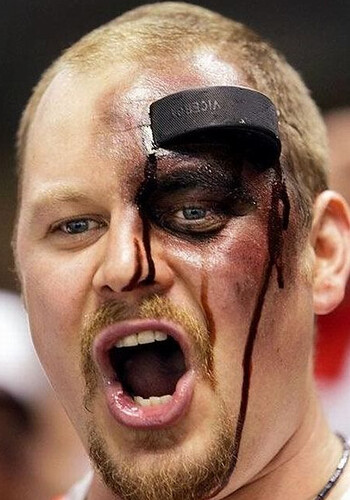
That’s one great photograph at the top of the column. Hockey people!
I bought a Red Sox BP cap because of the flex fit. Much more comfortable.
Opposite case for me: I’m between sizes on the flex fit – the smaller size is uncomfortably tight and cuts off circulation, while the next size up sits loosely on my head like Charlie Brown’s ballcap – so the last few generations of Hitting Rehearsal caps have been off-limits to me, even if I’d have wanted to wear one.
I must be in between sizes too because I have one and the few times I’ve worn it it has given me an incredible headache. I don’t think my head is the right shape for those.
Wonder if the actress playing Sarah Palin is Lisa Ann…
There’s some buzz today around the Nationals blogiverse that the Nats may be jumping back on the green bandwagon for St. Patrick’s Day next month.
The Catch of the Day is pure awesome. It’s seriously got me doing Fluttershy’s link. My favorite is link, probably because link starts playing in my head.
In the video, the coolest thing is the way she uses a wet eraser as part of the medium, the process is as cool as the finished result.
Flakin and perpetratin?
Like smoking the “sens” on the Chronic, but not on this particular album.
If you can’t keep it real… how can you keep it?
OK, somebody help me out, please. What exactly is a kit?
All this time, I thought it was the full uniform (jersey, shorts, socks) but I keep seeing these references to “leaked kits” lately and all they show is the jersey.
Case in point: link.
~~~~~~~~~~~~~~~
link is actually palatable.
I’m sure a “kit” is a full uniform, but people are dumb. Just look at how often we’ll see a story about a team wearing “a throwback jersey” when they’re obviously wearing a complete throwback uniform.
I like where this thread is going.
Anyone else noticing the upside-down 8 on the left side of the Mardi Gras/Beer display tcker news?
Are Uni Watchers the only people in the world who can tell a regular 8 from an upside-down one or a M from an upside-down W?
I’m sure typographers have this skill as well.
Have these kits circulated yet? Beauties. Baltimore Bohemians of USL Premier Developmental League…
link
Saw those. Interesting. Any Baltimoreans want to clue us in as to the iconic Mr. Boh?
Mr. Boh is the mascot for Natural Bohemian a local Baltimore beer. Hence Baltimore Bohemians I suppose.
re: Batting Practice Caps
I used to wear one all the time back around 2006. Actually it was this site that gave me the idea. I always hated the wool 5950’s. They looked goofy on me, were a pain to break in, and expensive. Also, I hate fitted caps. I tend to wear my hair at various lengths throughout the year. Fitted caps tend to be too tight or too loose.
The 2006 BP caps looked like the regular game caps except they were the 3930 flex-fit caps and they had a contrasting color stripe at the edge of the brim.
link
I noticed that Detroit Tiger Kenny Rogers had a cap that looked different than other caps on the field.
link
Turns out Uni Watch found out why. Rogers simply took a BP cap and colored in the color around the brim with a sharpie. I immediately went out a bought a BP cap and made the alteration using a mix of blue and black sharpies. Turned out great. Couldn’t even tell it was a BP cap.
I know this probably wasn’t what you were looking for, as I bought a BP cap with the intent of making it look like it wasn’t a BP cap. I wish New Era mad 3930 models of the regular game caps. No way I would buy one of the current BP caps with the piping and panels. Barf.
Interesting! I agree, I really don’t like the “official” caps, and also don’t like fitted caps in general. My favorite Braves cap is actually made by the Evil Empire (Nike), and the material feels like something you would find on a pair of khaki pants – and yes, same color too. But it’s extremely comfortable, and looks good to boot (or so I think).
Try the Twins Franchise fitted hats. Unstructured cotton twill (probably the same stuff used for your nike hat), everything the 5950s aren’t, but still sans adjsuter, which I really like. Letter sizes rather than numbered ones, but close enough.
I also despise strecth fit. I don’t like the stretch terry and I don’t like the compromises in fit at the ends of the sizing range.
It appears that Arsenal was in violation of UEFA rule 18.08, which says:
“If two clubs meeting in the competition have the same shirt sponsor, the
home team may wear their regular sponsor advertising whereas the visiting
team may only wear advertising for a product of the said sponsor. No
identical advertising elements may appear on the shirts of the two teams in
question.”
What a stupid rule. I mean, if you’re gonna allow the advertising (barf), what difference does it make if both teams have the same sponsor?
“the visiting
team may only wear advertising for a product of the said sponsor”
That rule seems like something that helps the sponsors out, not something that avoids confusion. Rather than having redundant advertisements all over the place, they get to advertise themselves, plus a specific product. For them it’s a win/win, have your cake and eat it too situation, whatever you want to call it.
What if they’d played at Arsenal’s Emirates Stadium? Armageddon, surely!
Not so much. Because Emirates is not a UEFA sponsor, the stadium cannot be referred to as “Emirates Stadium” for a Champions League match. Instead, it’s called “Arsenal Stadium.”
Similarly:
Etihad Stadium reverts back to its old name “City of Manchester Stadium.”
Allianz Arena, the home of Bayern Munich, and venue for the Final, becomes “Fußball Arena München.”
Chivas USA got new uniforms yesterday. Funny how a couple of simple shifts can make one uni so much better than the other with essentially the same design template to work with of red and white stripes.
This year: link
Last Year: link
Go Corona! Whooo!!!
/Seriously why the hell is this utter garbage considered normal for soccer uniforms? You’ve got a completely unreadable team crest and a big glaring sponsor logo. How is that a team identity?
Soccer team identities are more rooted in those patterns and colors than they are the crests.
Different sport, different paradigm.
As I understand it, in soccer if you’re on a team that can attract a sponsor you’re kinda in the big time.
In a developing (when compared to La Liga, Serie A, the Bundesliga, or the Premier League) league such as MLS, absolutely. It’s only a matter of time before all 19 MLS teams have jersey sponsors.
Once commercialization began, in some cases, it became more prestigious to not have a sponsor. Barcelona was perhaps the last big club to jump in, and for a number of years paid UNICEF for the privilege of having its logo on their shirts. They still do, although now its underneath the player’s number; Barça’s long years of holding out allowed them to get an enormous amount of money from the Qatar Foundation.
I am happy to see the rifle-pad action going away.
And it’s the first time I saw it.
I have a 2006 Brewers BP cap for a few reasons.
1. The use of the Brewer logo incorporating Wisconsin in the background. The Crew use this as a sleeve patch, but always thought it should be the main cap logo.
2. I have a rather small head, so the flex fit for me is a lot more comfortable than a 5950.
3. The cost.
I just noticed that the MLB.com shop also sells NBA, NFL, NCAA, NASCAR, MLS, and even WNBA merchandise in addition to MLB and NHL merch.
There is a row of links for each league near the top of the site, and a column of links on the left hand side of the site. However, these links only appear on the Candaiens hockey stick tape MLB.com page:
link
The links are mysteriously absent from the defunct teams hockey stick tape MLB.com pages:
link
link
So the guy with the MLB mascot tattoos apparently has some sort of bird wearing a powder blue Expos uniform…this doesn’t make sense, seeing the Expos’ mascot was Youppi!, who is an orange fluffy thing. Might this be some sort of mashup of the Nationals mascot with an Expos uniform on?
Yes, that appears to be Washington’s mascot Screech, wearing an Expos jersey.
i used to own an Indians BP cap. bought it for the flex fit & chief wahoo logo… probably wore it twice… then gave the uncomfortable piece of garbage to goodwill
on a much more positive note… CATCH OF THE DAY!!! i am amazed, to say the least! that is SUCH beautiful work
The only flex fit hat I have is a Rice BP cap. It was really uncomfortable until I took the plastic threads out of the crown. It fits much better with the soft crown now.
Wow, awesome COTD.
I love that the Oprah Magazine cover has egomaniacal Oprah herself posing with the chalk, and not the actual artist.
I like that she crosses her Ws. It’s a little flourish that gives it a distinctive look. I’m also really impressed with the smooth gradients on the first “Express Yourself” mural.
Some great hockey stuff today! I’ll spend hours on that mask site – be sure to check out the forum; you’d never know there was one unless you clicked the button that says “Click” next to the phrase “Classicmask.com” at the top of the page! No indication that it takes you to a forum!
Anyway, lots more info there and one link took me to this 73-74 video of the WHA Los Angeles Sharks where you get some good views of the referee in his RED striped shirt, starting around 1:00 and in a few more places after that.
link
I think I recall you being fascinated with the red-striped ref jerseys Paul, so there you go
-Jet
Rest in Peace, Gary Carter. Always The Kid.
I hope whatever patch the Mets says “KID” instead of just his initials or number. That would be pretty neat, and entirely appropriate.
RIP, kid
:(
One thing that was easy to like about Gary Carter, was that he always seemed to be having SO much fun being a major league ballplayer.
Used to think the same of guys like Hrbek, Puckett and young Griffey, Jr.
Precious little of that these days, I’m afraid. By comparison, anyway.
Simply put, joy seems to be vanishing.
From just about everything.
I thought that of Carter, Puckett, Hrbek, and some others back in the day precisely because it stood out in contrast to so many of their apparently joyless, it’s-just-a-job peers. And I can name just as many players today who seem to exhibit joyful passion for the game. I suspect this is one of those things where the reality is constant, but we individuals see it differently as we age.
Maybe it’s all the “warrior” talk that drowns it out.
R.I.P. link
RIP Kid
Fast start in the ‘Hawks/Rangers game, but the Rangers are wearing the Heritage jerseys with their gloves that white rather than vintage white (cream).
Biron is in net for NY and is wearing his winter classic caramel brown pads (sexxy, IMO) but has let in two goals in the first 3 minutes, so we might see Lundqvist before the night is out…
Make that 3 goals in 4 minutes.
And as you can see here – link – Biron usually wears white pads with modern red and blue patterns.
Good for Biron, getting into the spirit, but maybe he shoulda worn his normal pads…
2 things
RIP kid
popped my presser cherry today and if i do say so myself, i fuckin’ took it outta the park
now…time to get into curling mode…
Hot.
link
I wear BP caps because my head is really big (7-7/8 to 8) and “rocket shaped” (think link only less exaggerated).
I could get a snapback, but they seem too little league, so 39Thirty it is.
Interesting that the guy who got all the tattoos chose to get the A’s sleeve patch design rather than the costumed mascot, Stomper.
Hmm, came across this, Syracuse Orange, original colours were light blue and pink – yikes
link
from the article…
“Syracuse accepted the challenge of Hamilton College to a track meet…”
and apparently they kicked our ass
so let it be henceforth known that had not the continentals lost to the
pink & bluesorangemen…well, they wouldn’t be the orange todayI actually wear a circa 2005 Anaheim Angels BP hat because it really fits well and had a nice style/fabric to it that’s classic and not faddish at all. The last two generations just seem too flavor of the month to me.
The actress playing Sarah Palin is actually Julianne Moore. The trailer link, with shots of the Rangers and Wings jerseys in a quick-cut sequence right around the 1:05 mark.