Click to enlarge
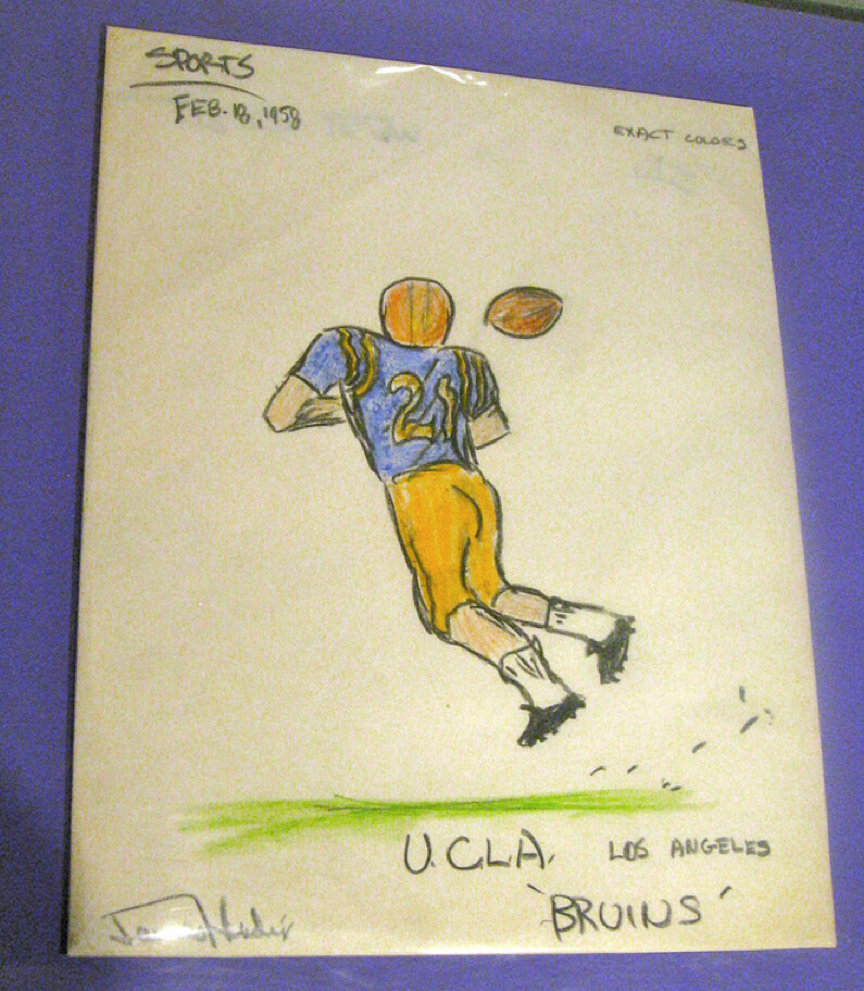
Is this one of Ricko’s “kid card” illustrations? Nope — the artist in question was one James Marshall Hendrix, age 15, who’d later become better known as Jimi.
There are four college football drawings by Hendrix currently on exhibit at the Rock and Roll Hall of Fame. I saw them, and a bunch of other sports-related items in the Hall’s collection, during my visit to Cleveland last month. Those items will be the focus of an ESPN column and video segment that will be posted today — link coming soon. have been postponed. Might run tomorrow, might run next week. Will advise when I know more.
Here, I’ll give you one more sneak peek before the column runs:
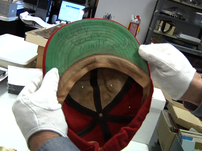
That’s Brian Wilson’s Little League cap from 1954. In case you can’t read what’s written on the underbrim, it says “Mickey Mickey Mantle Special.” And yes, that’s presumably genuine Brian Wilson sweat encrusted there as well.
Meanwhile, see the white gloves that the curator is wearing while holding the cap? True story: He initially put on a pair of purple gloves, but I asked if he could please change to white. Fortunately, he was willing to do so. Narrow escape.
Some Philly stuff: Remember, Uni Watch party next Saturday, Feb. 18, 6:30pm, at the Devil’s Den. Phil and I will both be there (and we’ll be in a good mood, because we’ll have spent the whole day watching curling).
Meanwhile, there’s another Philly event coming up that you should know about: The folks at Pro League Authentics are sponsoring a new series of exhibitions called “The Jersey as Art,” the first installment of which kicks off on Feb. 22. I won’t be able to attend that one, but all you Philly-area people should definitely check it out.
Uni Watch News Ticker: BenJarvus Green-Ellis wore a concussion-sensing chinstrap in the Super Bowl. Surprising that there was no mention of this during the game — seems like the kind of thing they’d want to publicize. Some additional photos here. … Yesterday I linked to these totally boss New Mexico basketball throwbacks; today I have them in the flesh. … North Dakota is bringing back the “Fighting Sioux” nickname, at least for now, with a statewide referendum on the issue likely to follow later this year. ”¦ Serious soccer footwear coverage on this site. “They have some of the best photographs I’ve seen, do separate article entries for new colorways, and even have a Premiership goal tracker for what boots score the most goals,” says Michael Korczynski. … Wowie-zowie, check out this amazing 100-year-old boxing school letterhead that Mike Hersh turned up. And look how it’s signed — “Scientifically yours”! Love it. … There’s a new blog about candy packaging, candy history, etc., and their first post is a super-thorough retrospective on Big League Chew (thanks, RyCo). … Some new uni number assignments for the Cubs and the Rays (from Ben Gordon and Kyle Speicher, respectively). … Wanna see how not to write a uniform article? Count all the things wrong in this USA Today piece. … New Castle High in Pennsylvania is colloquially known as Ne-Ca-Hi, and at one point they actually wore that nickname on their basketball jerseys (fun find by Steve Santillo). … Remember the Wizards fan with the misspelled Blatche jersey? Here’s a very entertaining follow-up (from William Yurasko). … Here’s a good page breaking down the Montreal Alouettes’ uniform history (from Noah Sidel). … I usually leave readers’ concept designs to Phil, but lots of folks are making a fuss over Charles Sollars’s helmet concepts, so go ahead and take a look. … In a related item, what if you want to whip up some concept designs but don’t have access to Photoshop? Just paint over an old photo. The Hungry Hungry Hipster found that while poking around some other people’s Cardinals concepts. Here’s the road version. … Check out this cool map that shows the United States of College Rooting (big thanks to Scott Leighty). … Reprinted from yesterday’s comments: Interesting story about the shirt worn by Michael Strahan at the Giants’ victory parade (from Ben Fortney). … Here’s a midseason report on UNC’s basketball shoes (from Benn Wineka). … NC State baseball will be wearing green for St. Paddy’s Day (from Mark Collins). … Several people in yesterday’s comments mentioned that the Braves have a bit of chutzpah to put “1876” on their alternate jersey’s sleeve patch, since the franchise has only been in Atlanta for 20 minutes or whatever. But I think the most interesting thing about the patch is that the negative space is cut out instead of just being an off-white background. Pretty sure I’ve never seen a pro sports patch like that before. … By contrast, look at the Angels’ new sleeve patch. … Army’s hockey team is letting fans vote on which sweater the team should wear this Saturday. … Mike Hersh came across a bunch of sensational old hockey sweaters in the new Classic Auctions listings — one of which features a striped turtleneck collar! Additional old-time hockey goodness here, here, here, here, and here. … In addition, Mike found some excellent Bauer retail displays — look here and here. … Check out this shot of Nolan Ryan wearing a mesh-backed cap on the mound. The cap plus the scoreboard suggest that it must have been a spring training game (from Todd Hotz). … The 2013 NBA All-Star Game will be in Houston. … John Okray has spotted a few noteworthy details in the Brewers’ 2012 promotional schedule. Key passage: “In addition to the two annual tribute events — Cerveceros Day (June 2 vs. Pittsburgh) and the Negro Leagues Tribute Night (July 28 vs. Washington) — the Brewers will host Italian Heritage Day on Sunday, July 1 against the Arizona Diamondbacks. For these three games, the Brewers will wear special uniform tops, including a ‘Birraioli’ jersey (the Italian translation of ‘Brewers’) on Italian Heritage Day.” Also, John notes that Retro Fridays, which have been the first home Friday of every month, are being changed to the last home Friday of every month. … I love the little rose sleeve patch on this florist-sponsored baseball uni. ”¦ Georgetown’s Mikhael Hopkins has his uni number printed on every corner of his towel. “Overkill on the personalization if you ask me,” says Ben Harris. ”¦ NBC’s Rock Center with Brian Williams show has moved to a new time slot, and NBC produced a promo spot that shows cool baseball jerseys — including vertically arched NOBs! — for all of the show’s reporters (from Steve Dodell). ”¦ Not sports-related, but you colorizers out there will dig these before/after colorization shots (from Nathan Haas). ”¦ What’s better than one lame-ass uni trend? Two lame-ass uni trends in one game. That’s what happened last night, as Rutgers and Seton Hall went black-vs.-gray (from Timothy O’Brien). ”¦ New logo for the 2013 AHL All-Star Game (from Matthew Jean). ”¦ Cory Sarich of the Flames, who wears No. 6, got his jersey torn in a fight last night and had to go with an NNOB No. 65. “The Sharks’ commentators actually made a mention of it,” says Sean Robbins. ”¦ Here’s the job opportunity of the lifetime: The Nats are looking to hire a new racing President (thanks, Kirsten). ”¦ Check it out: Willie Mays’s first time in a Mets uni.
LOVE that Brian Wilson cap!
I’ve always heard that he was a big Mantle fan, that confirms it even more.
Maybe it’s cause I just woke up–but I don’t get it. Brian Wilson’s cap from 1954? You mean, Beach Boys Brian Wilson?
I thought the USA article was great…far better than anything I have seen Paul write, here or for ESPN.
There’s also a John Holmes who painted Ballantine Paperback horror novel covers in the 1970s: worth looking up.
Judging from the “Dodgers” on the scoreboard and the grass berm below it, the Nolan Ryan shot looks like it was taken at a Dodgers Spring Training Home game at Holman Stadium in “Dodgertown”, Vero Beach, FL.
Betcha that’s from Ryan’s first year with the Astros.
The headline on that Green-Ellis article is terrible.
“Green-Ellis wears impact gear”
~~~
what’s so terrible about it?
It’s vague? Got nuthin’.
Maybe he was hoping for a pun?
Love those old time hockey jerseys. My favorites are the St Paul striped one, look how high that number on the back is. The other is the Quebec aces, you don’t see that color of green in hockey jerseys that often.
Ebbets Field Flannels used to offer a repro of that Aces jersey. Alas, they don’t seem to have it anymore, although they do have this Aces jacket:
link
Here’s my favorite bit from the Classic Auctions listings… lot #483, a Canadian world championship jersey from 1979. In the description:
“A 2″ x 3″ piece has been cut out of the lower front hem where a manufacturer’s logo was nixed by the IIHF.”
link
Photos from the Caribbean Series: I can’t decide whether to be angry at the link, or at link.
Mexico has ads link (one guy has link), and even the link has one! How about some dignity for the officials, at least?
I like the “7” in the Dominicans’ number font, though, and the link are ripe for a renewal in the major leagues. And the Tigres have a classic pinstripe look that anyone would love. Just get those distracting ads out of there!
Don’t the Blackhawks’ sleeve logos use negative space cutout?
Justman’s did:
link
They do, indeed.
RE: The Willie Mays Mets photo
The first thought that went through my head when I saw it…”Damn, that’s how a ball player should look.”
No kidding!
When are the Brewers going to have a Polish appreciation day?
Trying to think of a joke involving the words “smooth,” “grind,” or “shine,” but it’s just not coming to me. Hmm . . .
They have celebrated “Ceverceros” day for at least four years I believe. Last year they celebrated German heritage. This year Italian heritage. My guess is that next year they will have a Polish day. All of thee work out in my favor because I am Polish, German, and Italian. So it’s a win-win-win for me.
I think it’s a great idea, but why are the Brewers doing this on July 1? If they did it near the end of the month, they could have a tie-in with link.
One of the best things about Milwaukee in the summertime (aside from the Brewers) is the lively parade of ethnic festivals. Why not strike a deal with the organizers to capitalize on that? Have the heritage days right around the corresponding festival (yes, including Polish Fest), get somebody associated with that festival to throw out the first pitch, etc.
Seton Hall-Rutgers in gray and black: Seton Hall has been wearing gray or silver for decades, if I recall. I’m not sure when Rutgers started to wear black. Anyone know? Is black even a school color of Rutgers?
Black has been RU’s second color (definitely second, after red) for quite a while, though it feels like they use it just so that they can have a second color to work with rather than BFBS.
I really think there should be a rule that if you have a color in your name, you can’t wear a different color jersey. I mean… come on, man. You’re the Scarlet Knights. Wear red and wear it proud.
They should indeed be wearing scarlet jerseys but I don’t have a problem with black for borders and trim and that kind of thing. Princeton does the same thing; orange is their real color, and black is secondary.
A little variety on occasion is good — but I wish they’d save the black for the road and not wear it at home. And I like the modern-ish side stripes mixed with the traditional number font and NNOB.
But Princeton’s colors are clearly black and orange. I agree that a black uni should not be worn at home in basketball, for tradition’s sake. I’m not even sure orange should be worn as the lighter color jersey at home, though teams have done it for years in college ball.
Geeman’s right. Unlike Harvard’s crimson and Yale’s blue, Princeton was always orange-and-black.
I’d mentioned SHU last week when they were mentioned as GFGS – gray’s basically been their 3rd color since the re-branding in 1998.
(Speaking of the Hall, I’ve got a great photo of the baseball team wearing Tequila Sunrise throwback jerseys sitting a t home, gotta rmember to scan that)
Just a spelling nitpick, Paul — the Flames player with the torn jersey is Cory Sarich
Got it. Thanks.
What exactly would you call Sarich’s #65 jersey? “Blood jersey” doesn’t seem right, since I’ve definitely seen hockey players skating with blood-stained jerseys before.
I guess it sort of surprises me that the Flames wouldn’t carry two sets. I remember seeing Scott Hartnell from Philly get his jersey ripped almost in half during a fight a few weeks back, and having a brand new one the next period.
Carrying two sets of jerseys on the road is a nightmare for equipment managers. This is the main reason that alternate uniforms appear at home rather than on the road unless it’s a one-off game.
Maybe a scrub jersey? Or an emergency call-up jersey?
In case they have to call someone up who doesn’t have an assigned number yet, maybe?
Is negative space that rare? The Cubs use it in their link, not just in the full-size logo, but also on the sleeves of their home jerseys. I can’t find a photo online, but I have a game-used one and the pinstripes definitely poke through. None of the previous bear-face logos had this.
I think the practice jerseys had link at first, though that could just be with the replica jerseys.
The walking bear really is one of my favorite logos in sports. I hope the Cubs keep it around for many years to come.
Huh. Didn’t realize that. Maybe not as rare as I thought!
I guess the difference for me is that the Cubs’ and Blackhawks’ logos involve open-ended letters, and the Braves’ is a full circle.
I can’t think of another circle logo that had its negative space cut out. But maybe that could be attributed to the fact that few MLB circle patches have that kind of negative space.
The thick black trim on the Blackhawk shoulder patch closes the circle, so to speak.
The Cubs logo isn’t open-ended, either. The letter C? Yes, that’s open-ended, but the bear pretty much closes it off to where it’s essentially a round logo, a la the Braves.
Love that Big League Chew article. Did you notice the one gum, “Buckaroo Chew”, with the unfortunate blurb: “Man Size Wads”…?
-Jet
The original BLC package they showed said that too. It looks like they replaced it on later packages.
I had no idea Big League Chew gum was made in my hometown! Granted it was on the opposite side of town, in the industrial park (tho it looks like it has moved around). Been down those roads hundreds of times tho & never noticed the smell.
you know what I haven’t had in awhile?
Love that Hendrix drawing. He was one of us! Notice the note in the upper right hand corner.
Yes, that’s my favorite detail — “Exact Colors.” What a geek!
There are actually four separate drawings (all of which will be shown in the ESPN column), and they all have that “Exact Colors” note. One of us, indeed!
Hendrix and I would have shared the retroactive frustration with black and white. I thought the College All Star Game jerseys were red, not royal…and he missed that the loops and numbers on those UCLA powder blue jerseys were white, pretty much through the 50s and 60s.
We’d have had a helluva conversation about such things, I imagine.
Really fun to see. And now if someone says I was a weird kid I can cay, “Oh, yeah? Well, Jimi Hendrix…”
Wait, and that would make you seem less of a weird kid to them?
LOL Ricko
The “Oh, yeah? Well, Jimi Hendrix…”
That is pretty cool that Jimi Hendrix was a uni watcher.
I am not far from New Castle, Pa and I know the area well. I dated a girl from that area. New Castle Red Hurricanes are one of the winningest programs in Pa football. Had some good basketball teams over the years too.
Years ago they were in Section 3 with poweful little Farrell,Sharon,Butler, Beaver Falls and some others. Farrell was one of the smaller schools in Pa but always played up and they won something like 7 titles.
Even though I am in Ohio, I followed both states sports for a long time. High schools that is.
Always neat to see something local mentioned or pictures of the area.
I have seen Jimi’s “work” before today, but it’s always a cool reminder of his creativeness. I suspect Jimi would have made a name for himself in whatever medium he chose to express himself.
1. Cool headline, Paul. And Jimi did a darn good job on that UCLA guy.
2. “… Wowie-zowie, check out this amazing 100-year-old boxing school letterhead that Mike Hersh turned up. And look how it’s signed – “Scientifically yours”! Love it. …” Extremely zowie.
3. Enjoyed the US map delineated by dominant enthusiasms for college sports teams. Wonderful looking graphic. But was the determining factor the fanbase for college football or for all college sports? In the Northeast, at least, rooting for a school’s football team (Boston College, for example) doesn’t imply rooting for the basketball team. The latter is usually more fragmentes and — admittedly — harder to illustrate.
Forgot to mention this typo, Paul. Presume you didn’t intend that second “there.”
“… Not sports-related, but you colorizers out there will dig there before/after colorization shots (from Nathan Haas). …”
Got it. Thanks, Conn.
There have been some copyright issues, and some pictures are a bit graphic (although well known).
A bit more here (Warning: some graphic content) link
Jeez, George, what an excellent feature. Suggest you give it a bigger drum-roll!
3. Very nice graphic indeed. It looks like they might have started with the football programs and filled in the gaps with basketball programs, or used some combination of both with a heavier weight on football. Does all of NYS actually root for Syracuse football? Although I’m not a big basketball fan (although I am from LI) it seems St. Johns U is missing from the island.
Secondly, North Dakota State University takes up the entire Dakotas without an mention of the (aforementioned in the ticker) hockey heavy UND?
As a Penn Stater myself and knowing that a lot of alumni find themselves in New York after graduating, I’m a little surprised that the map extends the territory all the way out to Long Island.
I think you could make NYC and LI a mix of blue and orange, as Syracuse is HUGE in NYC also – the game that Cuse played in the Garden the other night against St John’s was very notable for, despite it being a ‘home game’ for St John’s, at LEAST 3/4 of the crowd was there wearing orange – if not more – a real embarrassment for the St John’s administration.
Which brings up the point of a couple of other posters, which is, that you could probably make a more accurate map for different sports. I mean, the PSU football team surely has a bigger fan base in the state, than does its basketball program, and the opposite can be said for Syracuse. (and speaking of Syracuse, one could put a small orange blotch in the center of Connecticut….say around Bristol – sometimes it seems like half of ESPN is Syracuse grads :P)
Also, Notre Dame and the service academies have more of a national fan base, so that gets a kind of short shrift also. I mean, I live 25 miles from West Point in Orange County, NY, and I have been to exactly ONE Army football game, and one Army hockey game. Despite the local media focus, its just not that big a deal around here.
3. The Oregon map is backward, the Ducks are big in the western valley, but rural Eastern Oregon is Beaver Country.
I love the GMEN logo Strahan is wearing, but why is it on a black T-Shirt? Same with the other Super Bowl Champion gear. It is either black or gray. Last I checked, the Giants were blue, red and white. What gives?
I wondered that myself when I came across it. The online shop selling them has a white t-shirt with what looks like a dark blue GMEN logo. Not sure why they passed on the royal blue.
Does the fact that “GMEN” does not have a dash between the G and M bother anyone else? I think the logo would read better if it looked like this: “G-MEN”.
Bothers me. What’s a “Gman”?
Getting enough stock in a team color (-Dark Royal for the Giants) is going to be difficult, and to forecast ahead of time for all teams makes it very difficult, that’s why you’ll see white, athletic grey and sometimes black for most championship gear. Certain teams become more of a problem over others, especially a team like the Giants who share their Dk. Royal with no other NFL teams and will never allow navy to be used.
Wonder how much of it has to do with the creator steering clear of infringing on licensing issues. No blue, no red, no mention of Giants. It’d be really hard for anyone to say for sure that shirt had anything to do with the Giants or the Superbowl (of course, we all know better).
Bingo.
I didn’t go to New Castle (I went to nearby Rochester, and we have our own unique nickname: Rochy Rams.), but I currently live in the city of New Castle. Good positive press on the Fireworks Capital of America Paul. I think the last time New Castle made national news was the time Jay Leno mentioned on the Tonight Show (his first stint, so this was a while ago) about a woman in New Castle in her late teens/early 20’s who was caught giving a blow job to a 80-something-year-old man for only $10.
Love the Hendrix. There is a great double disc, “Live at the Fillmore East,” that was recorded on New Year’s Eve 1969 and New Year’s Day 1970 on which Jimi congratulates USC on their Rose Bowl victory, adding that he hates Michigan. Good shit.
I know exactly what you’re talking about.
Those shortened colloquial names are popular in this part of PA… Se-Wy-Co Fire Co. link for SEidersville, WYdnor, and COlesville, HanLeCo Fire Co. link for HAnover LEhigh COunty, NoLeHi and SoLeHi for Northern Lehigh High and Southern Lehigh High link
Definitely popular in Eastern PA.
Interesting. But how many of them have shown up as jersey insignia?
Just an FYI Paul, New Castle is in WESTERN Pa, about 50 miles northwest of Pittsburgh. It’s actually about 20 minutes from Youngstown, Ohio. I guess they are the exception to the rule.
There’s actually a New Castle Township in Schuykill County PA, but I’m guessing he’s referring to the one out West…
Yeah, it’s that one. I live in New Castle, now.
I know Nolehi and Solehi have done it on jerseys, and I know SeWyCo did it on a firemen’s league softball jersey… Just can’t find the photographic proof anywhere. Still looking though.
There is (was?) also BECAHI (beck-a-high) for Bethlehem Catholic High in the Lehigh Valley. And SOLANCO which is now the official name for what was Southern Lancaster County. Coudersport in the Northern Tier of PA, used to (still do?) wear COUDY on their basketball jerseys.
I *thought* I was liberal, yet it disgusts me that North Dakotan taxes are spent feuding over a team mascot. Just put a frigging tomahawk on the front of the uniform, or a thunderbolt, and call ’em the “Thunderbirds”. And when the Sioux nation cries that the war club and thunderbird are sacred symbols, tell them to go pound sand up their ass. Sheesh!
Hey, it could be worse. Some of these teams using Native American nicknames could be using link in their uniform assortment. The Navajo’s had it first.
My thing is, and this extends with the recent throwbacks that just came out with the Atlanta Braves NOT including link on the left sleeve like the originals did, if these teams REALLY wanted to be politically correct, it takes more than the nickname. My stepdad is half Blackfoot Indian, and I’m not offended by the Indians Chief Wahoo or the Braves Chief Noc-A-Homa. What is more offensive–and somewhat contradictory on the Braves part–is that the Braves won’t include Chief Noc-A-Homa on an otherwise accurate throwback but yet will continue to do link.
But does the “Tomahawk Chop” really offend people? And I don’t know, I’m just asking. It seems like there are some things that can become so ubiquitous that people just start associating them with something OTHER than their origin. Do fans REALLY think of Native American warriors while doing the Chop? It seems like it’s just something to get the fans involved in the game, and Lord knows we (the Braves) need more of that.
Again… I guess I’m just asking because I don’t know. If people with Native American ancestry (and I think I’m something like 1/8th Cherokee, but I don’t think that really counts) find it offensive, it probably needs to go. But I just don’t even think of the racial overtones and hardly ever have. I think of the players and the team. Maybe that’s wrong of me, though.
The whole thing is, over the decades several surveys have been done with Native American tribes on the whole nickname debate. The results have been pretty consistent: over 90% of those surveyed were not offended by it, but consider it more of an honor. It’s a SMALL group of people that consider it offensive.
As for the teams themselves, most of them aren’t racist as a whole. (I consider the Washington Redskins, or as Gregg Easterbrook like to call them the Potomac Drainage Basin Indigenous Persons, the exception to the rule.) The Indians, in fact were the first American League team to sign an African American player (Larry Doby) and probably do more to honor the Negro Leagues than any other team in MLB except for the Pirates, which is more than what I can say about the Dodgers who, aside from signing Jackie Robinson, what have THEY done to honor the Negro Leagues?
Man, I’m in class. Don’t post stuff like that on a sports uniform website without some warning.
I second that, I’m at work, that was waaaaaay too much!!!
**sigh** I take it neither one of yinz are regulars on here. Paul drops f-bombs all the time. Plus, the whole Native American mascot controversy has a lot of academic value to it. Yinz really shouldn’t be on here if at work or in school anyways.
The flag picture jackass. Give a NSFW warning on the link.
I took a Holocaust class in high school. The swastika was used by several Native American tribes for centuries long before Hitler was even alive. What I’m saying is, if it wasn’t for the Nazi’s I’m sure there are some teams with Native American nicknames that would’ve incorporated the swastika into their logo in some capacity, especially in the Southwest. Now if they had done that BEFORE Hitler came to power and somehow kept it after WWII ended, I’m sure there would be a firestorm even worse than using Native American mascot nicknames.
The swastika was used as a symbol of good fortune by most cultures around the world before the Nazis co-opted it. It doesn’t change the fact that that flag should carry a NSFW warning, but it does mean that it has nothing to do with Native American culture in particular.
I am very fortunate to be able to look at this site at work. I worked for one place that was so restrictive of the internet that the President of the U.S. Operation reamed out the I.T. department when he couldn’t see Masters golf scores online. As long as you get your work done, who cares? Also it’s not up to you to determine who’s a “regular” here. thank you very much.
Back to the point, a Nazi flag taking up an entire screen is the equivalent of literally 10,000 of Paul’s “FUCK”‘s. I’d like to see how long I’d be working here if I had left that on my screen for more than the 0.75 of a second it was there. I’d like to think you wouldn’t do that with a picture of a Porn Star in action, but I wouldn’t be sure.
Because of Hitler, I can’t put a swastika on my hockey sweater. You think I’m not mad about that?
Yes, and millions of innocent people were murdered, but you get my drift..
Does anyone remember the old 3 Musketeers slogan? “The more you whip it, the bigger it gets?”
re: Georgetown towel
Definitely not overkill, probably not even a personalization thing either. The number is on every corner to allow the towel to be folded quickly and placed in the player’s locker. No matter how the towel is folded, the number will show. One of those little things that we (EM’s) do all the time.
Good info — thanks!
You made him change out of purple gloves? That’s a little much, Paul. You might need some help. ;)
Actually, I thought you people would never let me hear the end of it if those purple gloves ended up appearing on camera in the ESPN video segment…
And really, doesn’t white look better, more dignified, more curatorial? Zero purple tolerance, baby!
Purple haze all in yer brain
I have to ask: were the purple gloves nitrile gloves? A lot of nitrile gloves seem to come in purple, to distinguish them from latex gloves which are often light blue or white.
oh, and by the way:
“’Scuse Me While I Sketch This Guy”
… is fuckin’ brilliant!
LOL all day at that!
Ditto that…one of the best Uni titles ever!
Thanks for the that Big League Chew write up Ry Co.
oh no, buddy… i just found a link and forwarded it to paul. didn’t write a thing
“All Along the Uni Watch Tower” was a no?
Buried in the Rays uni-number changes in the ticker: Matt Garza was stolen a pair of personalized Nike shoes he wore for his wedding.
Who the hell wears Nikes for his/her wedding?!?
More people than you’d imagine… Men’s Warehouse even offers black Converse as one of their tux options.
My brother wore tux Chucks to his wedding. I ended up having to wear a pair too, since MW sent me shoes that were two sizes too small and fitted narrow instead of wide.
I got married on the beach, no shoes at all.
I’m getting married in September and wearing white adidas sambas.
Just fits my fiance and I’s personality and our wedding atmosphere better than dress shoes.
Well that and Sambas are just pure awesome.
Not to rehash old arguments, but… why are people riled up over the Braves “1876” claim, it is the same franchise, no?
This isn’t the Nats claiming to be the Senators or the new Browns claiming to be the old Browns.
Would help if “1876” weren’t juxtaposed with the word “Atlanta,” methinks.
But putting Braves along with 1876 would also be an inaccuracy. They didn’t become the Braves until the 1900s, and even then they still flirted with other names before finally settling on the Braves.
I mean Georgia Tech still claims the establishment date of 1885 despite being the Georgia School of Technology at the time. Auburn still states they were established in 1856 despite being named the “East Alabama Male College” at the time. This is similar for many colleges across the country, because they have gone through several names over their history.
The Braves organization has existed since 1876, yet they were not the Braves or in their current location at the time. This does not negate the fact that they were established in 1876. There is no way they could tie their current identity to a patch stating the year in which they were established without being inaccurate. Essentially the patch would be misleading (to the uninformed) no matter what name they put on it, but it makes more sense to tack on the current identity knowing that they have moved around.
It just seems like the club is trying to fool the public. In reality, nobody (that’s really into baseball) is going to think “Hmmm, the ATLANTA Braves started in 1876!”
Why not just go with the year, and leave Atlanta off altogether, or just go with “Braves”.
I don’t get the opposition to using the – drumroll please – actual franchise name in this instance. Hey, you know that team that joined the National League in 1876, played in Boston? Is it still around? It is? What’s it called today? The Atlanta Braves? Huh.
Whereas stripping the, it bears repeating, actual franchise name off the patch and emphasizing the “Braves” identiy with the 1876 tag would be factually incorrect. The team has been continuously named the Braves since 1941.
The thing is, if it’s wrong for the Braves to claim ownership of their actual franchise history like this, then what the Nats tried to do with their early “Est 1905” crap was not only right but more or less mandatory. If the history follows the franchise, then it follows the franchise, and “Atlanta Braves 1876” is as morally proper as it is factually correct. Which is to say, 100%. Or were the Minnesota Twins and Oakland A’s wrong to celebrate their franchise centennieries along with the other founding AL clubs in 1901?
The only legitimate beef here is with 1876, which is the year the team joined the National League, not the year of the team’s founding. It should say “Atlanta Braves 1871”.
There is no new or old Browns. The franchise officially suspended operations for three years and then resumed playing football in 1999.
The NFL can officially claim whatever they want to. We all know the truth.
Yes, that it’s the same franchise. ;)
If Boston and Milwaukee feel that possessive about the Braves’ pre-’66 history, maybe they should have hung onto the franchise.
Milwaukee tried like hell to do just that. One of the minority owners, an obscure local car dealer, even took his partners to court in an attempt to prevent it. So did the State of Wisconsin.
But the Braves’ new Chicago-based owners were in search of larger television dollars, and weren’t going to let anything stand in their way. The hope of a larger television market, not any deficiencies of the fanbase, was responsible for the move.
I’d almost forgotten that; thanks for the reminder! In fact, my father remembers it being a toss-up for a while whether Atlanta would get the Braves or the Athletics.
(I won’t necessarily weep on Milwaukee’s behalf or count them martyrs, though; a few years later they’d do unto Seattle precisely what Atlanta did unto them.)
Its seems like ND should have a larger share of Indiana in that college rooting map, heck they should have a larger part of the country not just the area around Indiana. I mean there is a reason we are forced to hear about them regardless of how bad they they might be doing.
I was impressed he traced the exact borders of West University Place for Rice
I don’t think the artist tried to accurately reflect the actual borders, more of a generalized map. I’m guessing that the eastern half of the state of Tennessee is more UT fans than ASU fans. Still pretty interesting.
The Alouettes uniform history is a lite odd – there’s a few things off about it.
They don’t mention that it covers three different franchises – the original Als, the 82-85 Concordes, and the ex-Baltimore Stallions. In fact, they don’t mention the Baltimore team at all.
They also don’t show that the team still wears blue alternates (they have that ending in 2006).
About the Braves’ patch (I didn’t see yesterday’s comments): Not only is it not chutzpah for the patch to say “1876”, but it is a welcome display of historical accuracy. The important thing is the franchise, not the current name. The Atlanta Braves were not founded in 1966; they only moved to Atlanta on that date.
So, for me, the Braves get higher marks than the Yankees, who consistently use the date of 1903 as their “founding”, when the franchise was actually founded in 1901 under the name “Baltimore Orioles” (in homage to the legendary NL team of that same name which had been contracted out of the NL in 1899), and then moved to New York in 1903.
The silly thing along these lines was the Washington Nationals’ use of “Founded 1905”, when the franchise was founded in 1969. Doubly silly is the fact that 1905 doesn’t even refer to any specific event, as the Washington Senators entered the NL in 1892, having been founded in the American Assoc. in 1891, and the Washington Senators of the AL were founded in 1901. While 1969 is the only correct founding date of that franchise, at least one of those other dates would have had some sort of meaning.
At one time, franchise identities were clear, in all sports. (The franchise lines in baseball are beautifully maintained by the site Baseball Reference link .) Then came the ridiculous decision on the part of the NFL with respect to the Cleveland Browns, creating the fiction that the “franchise” somehow stayed in Cleveland, even as the team moved to Baltimore. The tragic thing is that are now many kiddies who don’t even know that the Ravens are the original Browns, and that the current Browns are really an expansion team. And we now have similarly muddled histories both in the NBA (Seattle – Oklahoma City) and in the NHL (Winnipeg).
So, I applaud all measures that uphold franchise continuity, such as the Orioles’ wearing of St. Louis Browns throwbacks, and a few such events in the NBA. When the kiddies learn that the L.A. Clippers were once the Buffalo Braves, this is a good thing.
I generally agree with all of the above. Just wish the patch didn’t have “Atlanta” along with “1876” — seems like a bit much.
I suppose having “Braves” on the patch would make it accurate, but the jersey already says Braves so I’m guessing they went with “Atlanta” to reduce redundancy.
Could have just had “Braves Baseball” or “Braves Baseball Club”. Something similar to that would have worked, even if I guess it’s redundant to mention “baseball” on a baseball uniform.
The word “club” or the name of the sport you’re playing have no place on a professional sports uniform.
Why does the word “Braves” need to appear on the sleeve at all? It’s already on the front of the shirt.
It probably doesn’t.
So we remove “Atlanta” and “Braves” from the potential patch, and what do we have left? Not much.
I think this is a case of designing a patch because they felt they needed one, not creating a good secondary logo in its own right.
Tom, I agree 100%, however, the NBA has a little problem with putting a basketball in everything. Just in case you forget which Raptors team you’re cheering for I guess.
The original Senators (the present-day Minnesota Twins) changed their name to the Washington Nationals in 1905, and would remain their official nickname until 1956 when they switched back to Senators. Both names were used interchangeably over the decades. The second Senators team (the present-day Texas Rangers) solely used Senators.
Ah, interesting. I didn’t know that. Well, that explains (though does not justify) the use of 1905. Thanks.
Not a problem, it’s always been confusing among baseball historians. While the second Senators and the current Nationals have a consistent history with their nicknames n’at, the first Senators (pre-1961) has always been a quagmire because the entire time their official name was Washington Nationals (1905-1955), both the Senators and Nationals nicknames were used by both fans and the press, and neither name was ever displayed on the logo or uniforms. Again, this was not the case with the link as well as the link, although the current Nats link despite the nickname being prevalent in the current logo.
Since this discussion started with an observation about a sleeve patch, I’ll point out that all of the Nats’ game jerseys do, in fact, have the nickname on them.
My bad, you’re right. I did overlook that. Thanks!
Since I can’t reply directly to Joseph Gerard at 12:29 pm, I’ll reply here that the 1901-60 Nationals did display the team nickname on the uniforms, link
For historical symmetry’s sake, maybe we should all start calling the current club the Senators.
Leaving the 19th-century franchises out of the mix, I refer to the 1901-60 AL franchise as Nats v1.0, the 1961-71 AL franchise as Nats v2.0 and the 2005-present NL franchise as Nats v3.0.
The NFL didn’t care either way what happened to the Browns franchise. The City of Cleveland sued Art Modell to retain the rights and that’s why he had to change it. Legally, the franchise never actually moved.
When it comes to teams relocating or name changing maybe the moves should be reflected in the names.
For example Braves could be known as the Atlanta-Milwaukee-Boston Braves or maybe in football we can have the Chicago/St. Louis/Arizona Cardinals and hockey can be loaded with Dallas (Minnesotia North) Stars or Toronto Areana St. Patrick Maple Leafs.
If we really care about historical accuracy, the undeniable fact remains the Atlanta Braves started play in Atlanta in 1966. That’s the most important aspect to this entire discussion. The history, events, and moments are forever linked to where these teams play. Where is the mark in Milwaukee honoring Hank Aaron’s 755th HR? Sorry, that history belongs to Atlanta. Milwaukee can have a statue, and Brewers fans can talk to their parents and grandparents about Aaron.
The term “franchise continuity” is only a mildly interesting topic. It sounds like a business term, which of course, it is. And that’s the crux of the matter. It’s merely a technical term, which is only a weak case for pumping up a current team when they do something like a patch. 1966 is the real date for the Atlanta Braves, going back to 1876 is one of the most asinine things I’ve ever heard.
True, hometown fans, not bandwagon fans, always follow their favorite teams with the name of the city included. It’s not a business or technical matter, it’s being a fan, and emotions play a part in this. We do this because the team plays in a specific area, and we’ve seen them play in person.When the Braves moved to Atlanta in 1966, only the few people in Atlanta with Milwaukee ties really cared. It’s the nature of franchise relocation. On the uniform side, why do we see so many teams with their city name on a road jersey? Location, location, location.
So when we talk about franchise continuity, by definition it’s not that relevant to the vast majority of fans. Teams should pay respect to the past, and the occasional throwback uniform to a different city is fine. But there’s a huge disconnect when we attempt to draw a connection with different cities, 50 plus years ago. Very, very, few fans even care. These events happened so long ago, most people aren’t around who saw these teams play in those different cities. And that’s the problem.
Where are all those Warren Spahn throwback jerseys in Atlanta or even Andre Dawson throwbacks in Washington? If franchise contiguity was important to the masses, we’d see many jerseys of this type.
Ferdinand, with all due respect, your last line about the kiddies caring about the prior cities of the Clippers is just incorrect. Most all young people don’t care, just as their parents and grandparents could have cared less about another relocated franchise. And when we start talking about 75-125 years ago, it’s truly ancient history. Looks good on a web page or book, but that’s about it. It’s not tragic at all, but a normal reaction with a transplanted team. It’s just the nature of things. The reality is, most fans are far more informed about the history of their own team when it’s in the same city.
For any Atlanta Thrashers fans out there, do you follow the Winnipeg Jets with the same level of interest, even if the Thrashers name had been retained? No, I didn’t think so either. Location, location, location, people.
Thats true. I am wondering why my grandfather and uncle, who have lived their whole lives in the NYC area are Los Angeles Dodger fans.
Actually, I (and most other Braves fans) DO tend to care. I’m well aware that Spahn never pitched for Atlanta, but feel a proprietary pride in his accomplishments, and consider that he, and earlier Boston/Milwaukee players, accomplished them as members of my team. One can question the precise logic of that sentiment, but it’s there. It would feel all kinds of wrong if there WEREN’T a Spahn statue at Turner Field, or if the Atlanta club unretired his number 21.
And if–IF–one were less disgruntled about the Thrashers’ departure and felt much like following any NHL team at the moment, it would probably be the Jets or Flames.
Let’s be honest here. How many of these Atlanta Braves fans who claim to care about Warren Spahn ever saw him play or know anything about his career? How many non HOF Boston/Milwaukee Braves players are known by Atlanta Braves fans? How about average or below average?
With all due respect, the harsh reality is that players like Warren Spahn, were never on “your” team. Yes, it’s fair and reasonable to take an added pride and the same nickname and logo assists in that process. Spahn was a great pitcher, and that should always be remembered. However, the disconnect will always be there, that was several decades ago.
“Proprietary pride” really is a far cry from the passion you see with the stars who either crossed over to the new city or played their entire career in the new city. The other issue with proprietary pride is then going back even farther, and trying to get nostalgic about team accomplishments. The lone world championship in Milwaukee baseball history occurred back in 1957. Honestly, aside from the few Milwaukee transplants, the only real memories have to originate from the old Milwaukee Braves fans.
No doubt in my mind, if you gave all Atlanta fans a comprehensive Braves test from 1876 to the Milwaukee era, the overwhelming majority would fail. Not because they’re not good, loyal fans, but the disconnect of not having those memories in the same city in which they occurred. Fans of teams in cities without transplanted teams(or within a century of the same city) would score much higher if given a test going back many decades. Of all sports, baseball is the one passed down from generations, and that’s yet another disadvantage for those transplanted teams.
I was born a year after the Braves began play in Atlanta, so you have me at a disadvantage–I couldn’t have seen the man if he HAD pitched there. Nonetheless, Atlanta tended to be Braves country even before then, thanks to extensive minor-league affiliations. As to whether the pre-1965 team was “ours,” I can simply repeat that the local answer tended to be “yes.” The validity of that sentiment is more an issue for an ontologist than a baseball historian.
Finally, if you gave Bostonians and Milwaukeeites [?] a “comprehensive Braves test from 1876 to the Milwaukee era,” most of them would probably fail as well. That’s mostly because since the modern era began, the franchise has generated far less than its share (on balance) of happy memories.
I never saw Hank Aaron play, doesn’t mean I can’t have a sense of pride in what he did (one of the most complete players to play the game, having more than 3500 hits, having the steroid-free HR record, 25-time all-star).
The fact that a player only played for the Braves during their time in another city doesn’t negate them being a part of Braves history. Milwaukee is more than welcome to remember Spahn’s time there, and even consider him one of their own, but they can’t pretend like he was a Brewer. Boston seems like a non-issue as that’s Red Sox territory (how many are going to have fond memories of the Braves time there?).
Hell, Aaron finished his career with the Brewers, but he is known as a Brave, doesn’t matter where he played as a Brave what matters is he was a Brave. And as was stated by myself and others above, it would be factually incorrect to just put the Braves with the 1876 date, so what’s wrong with putting Atlanta Braves. How many fans in Milwaukee associate with the Braves now? as the years go by those numbers will dwindle until a point during which the people of Wisconsin/Milwaukee will only associate with the Brewers. The Braves history will always be attached to the Braves, whether they be in Atlanta or move somewhere else, you can’t just erase their history or re-appropriate it to a new franchise. Milwaukee can claim parts of Braves history, the Brewers cannot.
1905 was the first year “Nationals” nickname was used. They had been the Senators from 1901-1904. While we know the current team started as the Expos in 1969, Nats marketing, with an OK by MLB (link) have tried to play on the history of baseball in Washington, even though it’s not same club. Being a season ticket holder I understand trying to use Washington Baseball history (there’s also a lot of homage to the Homestead Grays around the park), would like to see more recognition of the great Expos players (the do have Dawson and Carter in their ring of honor, which recognizes HOFers who have played for Nationals, Senators, Grays or Expos).
1905 was the first year the Nationals nickname was used officially by that club. Because of the prominence of various Nationals teams dating to 1859, every major club in Washington, including the 1901-1904 Senators, was popularly known as the Nationals or Nats by fans and the press and even spoken of by players and other baseball people. There is, furthermore, some doubt about the extent to which the Senators name was ever fully official with regards to the team in any of the individual years 1901-1904. It’s a unique and uniquely confusing situation, in which basically every pro team in DC history prior to 2005 was known as, and often referred to itself as, both the Statesmen or Senators and the Nationals. (The second AL Senators team was always officially the Senators, and yet team materials also used the Nats nickname, which despite attempted retconning, descends from the Nationals nickname, not the second syllable in Senators.)
Also, people are giving the current Nats way too much credit in thinking through the “Est 1905” thing. Yes, it’s because of the official recognition of the name. But the Nats pretty obviously settled on that because it made 2005 into an apparent centennial. If the Expos has moved to DC in 2004 or 2006, you can be sure that “Est 1905” would never have appeared on a team logo.
Looking forward to the party in Philly, looooong time reader and I;m bringing a couple of jerseys that most folks probably haven’t seen.
Speaking of the USA Today, I just noticed this at the bottom of the page. Is that something new or just something I’ve been overlooking for a while now?
Copyright © 2012 Uni Watch – All Rights Reserved. Part of the USA Today Sports Media Group.
Website by Jetty Web Solutions, Inc.
About half of our ads are served by the Big Lead web network, which was recently purchased by Gannett, which owns USA Today. The terms of our agreement with them required us to add that fine print (although I’m thinking I may remove it in a month or so — I’m pretty sure they won’t notice).
Interesting.
maybe this thread should be deleted…
I’m sure that a lot of people around here are hip to this site, however, ran across this NHL expansion jersey contest at: link
Really enjoyed some of these concepts, and that winning Las Vegas Kings jersey is super! Other notable jerseys, Quebec City Garcons, KC Comanches, and the KC Thunder Wasps. The latter displayed some impressive sleeve stripes.
that kings jersey is aces!
Just saying – too bad there’s already a team with that moniker. Also that wordmark on the secondary logo really shouldn’t be a dye cut / extend beyond the border. The Scouts one by far is my favorite. That Nordiques one looks like it’s still just missing something & the 3rd jersey has bad tendencies.
I tried to enter a Puckdrawn contest once, but I was rejected by the site host because my work was in MSPaint. I left a bad taste in my mouth as imagination shouldn’t be limited by technical skill, as the weekend tweaks featured here are evidence.
That sucks. Not everybody has had the practice or the skill level to pull of these obviously computer program assisted concepts. I stay away from all that high-gloss design & fancy template background shit. I like to keep it as simple, clean & 2-D as possible.
Here’s a link of the Cubs’ walking bear sleeve patch on both the home and road jerseys.
Concerning the alternate jersey worn by Cory Sarich of the Flames- it featured the vector logo.
I thinks it’s funny that you linked to soccer bible. It’s a part of my morning internet routine. It usually goes like this espn, uni watch, mlssoccer.com, soccer bible, footballshirtculture.com, footballfashion.org, and about once a week bigsoccer.com to check the forums for new unreleased colorways for soccer boots. All of those sights are great for getting new info about soccer unis and cleats. You have to be careful with footballfashion because they have a propensity for showing half naked women on their page, but they have almost all of the new kits released when they come out. Footballshirtculture is great for leaks as well, but their a bit slow sometimes when it comes to some newer releases (like a few days behind footballfashion). Soccerbible is great for both kits and boots, they somehow manage to get pictures of players in training with prototype boots a lot which is pretty cool. The Big Soccer forums under the soccer boots thread and then either the adidas, nike, puma or new release thread are great for finding pictures of boots that haven’t been released yet a few months before they come out, but you have to sift through a bunch of drivel to find them that’s why I only go once a week and either look for links or pictures embedded in the posts. Just figured I post a few of the useful uni/shoe soccer sites in case people were interested.
soccerbible.com
footballshirtculture.com
footballfashion.org
bigsoccer.com
Just sent off three jerseys to Pro League Authentics. John & Ray have been super responsive, helpful, and cheerful. Thanks for the reference, Paul! Looking forward to getting ’em back – I’ll report back with photos when they’re done.
Today’s ESPN column has been postponed. More details when I have them.
I just saw the video …
link
… looking forward to the article.
Oh man, those Hendrix PAC 10 drawings so cool! Especially, his take on the Ducks uniform. Though, I wonder about the red belt amidst the green and yellow?
Not terribly uni-realted, but still very awesome article on the new jousting reality show here:
link
I hate reality TV but I will check this out.
Love love LOVE the New Mexico throwbacks. I would love to get my hands on one of those originals from back in the day!
Ok, yesterday there was Tim P. O’Brien, now there’s a Timothy O’Brien? This is the lack of creativity of my Irish brethren.
Hell, Timothy isn’t even Irish, It’s Greek (Time = Honor Theos = God). Paul, I demand you start renaming us Tim O’Briens for clarity’s sake, though you may not understand the troubles of having such a common name.
You could call yourself Connie O’Brien. Be my guest.
Timothy, like Patrick, is a non-Gaelic name long popular with Gaels. But both have Irish-language versions. Many names we think of as Irish (Sean, Seamus, Liam) are just Gaelicized versions of standard Christian names (John, James, William, respectively).
Yeh feckin eejit.
In my dorm there was another Joe. He was Joe the Greater and I the Lesser, due to seniority. We could try that here. Would you like to be Timothy the Elder or Timothy the First?
Being a Roman history buff, something like Pliny the Elder – Tim E. the Elder – might be enticing, haha.
We could call you Template Tim or Photoshop Tim?
Or Hoosier Tim…
Chad Johnson is returning to football
link
Luckily for the soon-to-be-again Mr. Johnson, nobody wanted his jersey anyway. I wouldn’t think there’s too much unsold stock for which he’ll have to reimburse the NFL.
It’s the changeover year, no player has to reimburse stock for a name or number change.
That’s what I thought as well, but Adrian Peterson got billed in advance for his tentative change.
link
That seems like a load of crap… unless Nike’s already been cranking out jerseys in preparation for the official takeover, since the Reebok stock has been reportedly diminished down to almost nothing (unless Peterson’s jersey hasn’t been selling as well as he’d like to believe).
I don’t know if this has been linked here before, but here’s a picture of Paul Pierce playing with an autographed jersey in the 95 McDonald’s All-American game.
link
Detroit and Toronto is gonna play in the next Winter Classic. link
I’m not a hockey person, but I thought it went Winter Classic for US teams, the not-really-annual Heritage Classic for Canadian teams.
Yeah, but Toronto and Montreal were the only Original Six teams not to have played in the Classic.
And really, what red blooded American wants to sit around watching a buncha frog eaters playing a pure American game like hockey?
Besides, Montreal’s played in both Heritage Classics, so Toronto was the only O6 not to have played in either.
So New York is gonna release a commerative licence plate for the link. I saw the Saints link, but I don’t see one for the Pack (although generic link and link seem to be out)
The one thing I read on the Yahoo article was about politicians and some NY residents were unhappy that there wasn’t a commemorative 9/11 plate. Now, they don’t have one because NY pulled the plug on adding to the link, but is it 100% necessary to have one? It’s a licence plate; that thing you put on your car and only notice it’s there when you have to fill out insurance paperwork or some d-bag cut you off and you decide to call the cops on him. A commemorative licence plate for 9/11, ten years after the fact seems like a waste of time to me. New York City has a pretty slick memorial where the towers once stood, and that right there probably makes more of an impact than 100,000 9/11 plates ever could.
I’m sure if you felt really compelled to, you could find a nice 9/11 memorial front plate to stick on your car. It’s people making an mountain out of an anthill, but I guess to be fair, the Giants don’t really need a plate either.
Can’t do a front plate, NY requires license plates fore and aft.
Your automotive 9/11 memorials is link. Or even automotive! Hell, my township has a pretty sweet 9/11 Memorial (the link doesn’t give a good pic on the memorial. It’s a fountain in the shape of the Pentagon with two pillars symbolizing the twin towers).
I guess you could kind of attribute this to a birthday card. You can get a really nice one from Hallmark, and it’s all professional and…cardish. But the best birthday cards are a piece of printer paper cut out and colored by hand.
Johan Santana in Port St. Lucie:
link
I love the high blue socks, blue Mets shorts with orange stripe, and big NY warm up jacket on the coach beside him.
Two things—-non uni.
1) McCartney streaming a live performance tonight on iTunes. He’s releasing some (ack) standards album- the first single is awful, but maybe this will be good anyway.
link
2) New Van Halen- been playing it non stop for three days.
Amazing.
The Lakers are going to retire Shaquille O’Neal’s #34 next season. I can’t think of another athlete who has worn as many different numbers in a career. Shaq:
#32 Magic, Heat, Suns
#33 LSU, Cavaliers
#34 Lakers
#36 Celtics
In any sport? Jon Lieber matches, with four different numbers. (One for each team.)
Yes, in any sport. I’m sure there are some guys with more, but I can’t think of any. It might be kinda fun for somebody to find out…
Gomez below, but James Wisniewski also has at least four numbers in his lifetime: #34 for Anaheim, #43 for Chicago, #20 for NY Islanders and Montreal, and now #21 for Columbus.
BUT SCRATCH ALL THAT
Brendan Shanahan is my unofficial clubhouse leader. #11 as a Devils rookie, #19 with the Blues, #14 for most of his career, namely with the Red Wings and the Rangers, #94 captaining the Whalers, and #18 riding out the twilight with New Jersey again.
And of course, Scott “Goal-less” Gomez, with four numbers among three teams–no “second stints.”
The Lakers are wearing their home golds in Boston. This has to be a first.
That just ain’t right.
link
Also, Ole Miss and Mississippi State went red vs. black tonight.
link
TCM has Pigskin Parade on Friday at 6 PM. Judy Garland and football movie from about 1935
link
Pigskin Parade is on at 12:30 AM tonight. on TCM
from the ticker.”Check it out: Willie Mays’s first time in a Mets uni” The black and white photos do no justice for the uniform. It’s almost hard to imagine color, even in old time movies.
funny you should mention, couldn’t sleep the other nite found myself watching a b & w movie and thought the exact same thing. this movie was obviously filmed in a southern climate what with palm trees in behind: the movie was lacking,,well; color.
well, I am in the field of color and when I see the giants or yankees in black & white (or mets, dodgers etc) I almost wish I had a time machine just to check out these early time uni’s, anywhere from stitching or if the numbers were ironed on, just stuff like that.
I’m guessing back then is why there were only primary colors used because of no color in television or photos. Nowadays pro teams are rocking yellows at home games (ie.Predators-NHL) or red sox puke red alts.
One thing I would check out back in time re:unis would be: when a player got traded to a team, who would be responsible for sewing the numbers and name to the jersey. Do they just rip off the previous numbers and name and sew the new players’ name? cause I doubt each player got a new uniform for every game (do players get new unis each game today? anybody know??)
..one thing is for sure, this summer will mark 5 years wearing my jersey in my ball league, but I don’t make $15mil/yr either..My guess they would just rip off the number and name and call the local tailor joint for a fixin
I remember as a child asking my gramps about this exact topic. Was there really color back then?? he would just laugh and say “oh yeah sure there was”
Re: NeCaHi ….
There are a few other schools in Pennsylvania that answer to contractions … “Becahi” is Bethlehem Catholic High School, “Solehi” is Southern Lehigh, and “Steel-High” is Steelton-Highspire.
Bit of mixed signals on that BenJarvus Green-Ellis chinstrap. Sure, it’s a concussion sensing chinstrap, but he seems to be wearing the Riddell VSR-4 helmet, which isn’t one of the newer, supposedly concussion reducing, designs.