Wanna see something odd? Go to Majestic’s home page and check out the second item in the carousel. Majestic is selling NFL gear! What’s that about? In addition, the shirts they’re selling apparently don’t carry the Majestic logo.
Brinke spotted that yesterday afternoon. It’s even more interesting in light of something reader Chaz Noerenberg had pointed out to me earlier in the day: NFLshop.com is selling a series of jerseys called the Pro Line. If you look at the listing for one of them, the fine print reads as follows:
The Pro Line NFL jersey is manufactured on behalf of NFL Shop and is not manufactured by Reebok. The Pro Line NFL jersey is only sold through NFL Shop. ”¦ The Reebok logo does not appear on this jersey.
Faaaascinating. Chaz was curious to learn more, so he started a thread on Chris Creamer’s site. You can read the whole thread, but the key info was posted by someone who engaged in an instant-message chat with one of NFLshop.com’s customer service reps. Here’s what he posted:
[The NFLshop.com rep said] Reebok isn’t making jerseys anymore (including for the Pro Bowl), so the NFL had to whip these up themselves. They are not branded and supposedly are not produced by Nike. However, I doubt they would be able to get potentially hundreds or thousands of jerseys made to sell this week on such short notice. I picture two scenarios:
1) These are the eventual Nike product, just without the swooshes. Swooshes will be screened onto the remaining stock to be sold after March.
2) They made a few thousand non-branded jerseys for all the playoff teams just incase and these will all end up at TJ Maxx this spring.
[The rep] said that they weren’t notified yet of the price of the new Nike replicas. Also confirmed that Reebok hasn’t made new stuff this year, and they have just been selling the inventory the whole season. He said not to expect a big sale in March.
Now, I don’t really care about spending $100 on a polyester shirt. In fact, as most of you know, I don’t care about any of this merch — chuck it all in the drink as far as I’m concerned. But I will say this: If you insist on wasting $$$ on this crap, now is the time to do it, because we have temporarily lurched into into this alternate reality in which there is NO LOGO CREEP! It won’t last long — Nike officially becomes the NFL’s outfitter on April 1 (how fitting) — so allow me to repeat that ringing endorsement: There’s never been a better time to waste your money on this crap than now.
As for something I actually do care about, the most interesting thing about all this is the revelation that Reebok won’t even be making the uniforms for the Pro Bowl. So will that game have unbranded unis? If so, it’ll be the first NFL game without a maker’s mark in a long, long time (if you count the Pro Bowl as an NFL game, which I’ll admit is a squishy assessment at best). How long? Frankly, I have no idea, but I’m thinking at least 20 years. Anyone..?
Incidentally, I asked the NFL to show me this year’s Pro Bowl uni designs a few days ago. They said, “We’ll check.” They’ve become very unresponsive to my inquiries lately (I think I’ve kinda been shit-listed, just for generally peskiness), so I have a feeling we’re all gonna see the designs when the rest of the country does. But if they’re really logo creep-free, it’ll be worth the wait.

Human billboards, continued: Totally forgot to mention in yesterday’s post about Instant Sponsor that an Olympic track runner recently auctioned off space on his left arm, in the form of a temporary tattoo. Look, here’s his actual eBay auction, which garnered a whopping 85 bids, topping out at over 11 grand.
This isn’t the first time an athlete has auctioned off advertising space on eBay. The first such instance I’m aware of — and I’m pretty sure just the first one, period — took place way back in August of 2002, when pro bowler Kim Adler auctioned off nine square inches on her skirt. The winning bidder was an outfit called Pacific Pools, at a price of $14,389.89 (and hey, that was in 2002 dollars).
Meanwhile, exactly zero people bid in Instant Sponsor’s auction for a sleeve patch on Kevin Anderson’s shirt in the Aussie Open. Maybe he’d be better off with eBay, too.
Speaking of Instant Sponsor, yesterday I floated the idea of bidding on one of their auctions (which should be cheap, since nobody else appears to be bidding). Having now looked at IS’s fine print, I see a few yellow flags. But I also see that IS has an office right here in New York (although the company is headquartered in Australia), so I’m gonna give them a call either today or Monday and try to learn more. Stay tuned.
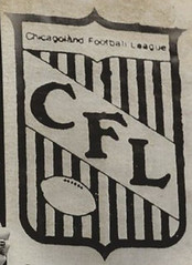
Too bad Hot Doug’s wasn’t around to sponsor anyone back then: A few months ago I linked to this wire photo about the Chicagoland Football League. Reader Brian Powers just caught up with that photo and has some interesting additional info:
The caption on the side of the photo noted the introduction of the Newton (Iowa) Nite Hawks into the CFL in 1974. I lived in Newton during that time, and my father and I helped out with the club. One detail that the photo doesn’t reveal that well is the uniform and equipment sitting on the table. When Jim Foster (future inventor of arena football) landed the team in Newton, he was resourceful enough to get the University of Iowa to donate all of their used football equipment, including helmets, jerseys, pants, pads, and even rain capes.
So many players who played collegiately at other schools were donning Iowa gold and black for the Nite Hawks. It was an odd sight to see former Iowa State Cyclone standouts like Ray King, Jim Wingender, Gerry Petsch, and Karl Schueneman in Hawkeye colors.
On a similar note, the Nite Hawk logo on the sides of the helmets was designed by Kansas City graphic artist Don Vernon. His company did all the graphics and branding for the Maytag Co., which was headquartered in Newton.
The Nite Hawks played good football and there were many Big 8 players that played in the Chicagoland Football League after college. Some players successfully made NFL rosters. The CFL became the Northern States Football League a couple years later, using the same logo but with “NSFL” on the shield.
Uni Watch News Ticker: Minnesota’s new football uniforms will be unveiled today. Meanwhile, the team’s Facebook page has the new wordmark, which features breathtakingly poor kerning. Are they really gonna leave that “A” hanging off the end like that? Amateur hour. … Did you know bowl season is still ongoing? Here are the jerseys that were worn in last night’s Artificial Grass Bowl (from Mike Donnelly). ”¦ A City College of San Francisco student had dyed his hair with a 49ers helmet stripe. But c’mon, no “SF” logo? (From Al Cummings.) … Jerome McDonnell’s father-in-law is a high school football coach, and one of his players is going to Northwestern. “He was over at the guy’s house when the Northwestern coaches were there, and at one point one of their coaches pulled out an iPad to show the player what their uniforms would look like next year,” says Jerome. “According to my father-in-law, they had four to five designs, and one was a throwback with gold trim.” … Tyler Hansbrough of the Pacers has been wearing goggles in practice after an eye injury (from Ben Traxel). … Reprinted from yesterday’s comments: Really depressing news out of Kentucky, where advertising may now be allowed on school buses. And if you don’t see anything wrong with that, I recommend checking out the discussion that took place in yesterday’s comments. … Here’s something you don’t often see: a hockey player — in this case Devin Setoguchi of the Wild — tossing a baseball (from Maks Skuz). … This is too good: There’s a movement to make sheep shearing an Olympic sport (thanks, Kirsten). … Here’s something we all missed: Eric Lightenberg says the Wild and the Flames wore this helmet decal back on Jan. 13. “It was in honor of Minnesota high school hockey player Jack Jablonski, who was paralyzed from the neck down after being hit from behind during a game,” says Eric. “The Wild also had the logo behind their bench during the game. It’s been the big story here in Minnesota the last month.” … Chris Holmes is creating a gallery of AFL programs. “I’ve gotten up through 1966 so far,” he says. “If anyone can help me fill some holes, I’d appreciate it.” … Also from Chris: Someone is posting a crazy amount of Texas-related sports photos. … Liverpool FC has inked a new kit deal with Warrior Sports. “I don’t know much about Warrior Sports, but it’s worth noting that they’re owned by Boston-based New Balance and Liverpool is owned by Fenway Sports Group, so there’s a Boston connection there,” says Ashley Wilkes. … Camo warm-up jersey in the works for the Avalanche (from Chris Grey). … Cougars may be an endangered species, at least in terms of team names. … New home kit for the L.A. Galaxy (from Isaac Rosenthal). … You know spring training is right around the corner when assistant Cubbie clubbie Gary Stark is affixing the raised “C” logos to the batting helmets (big thanks to Cubs media guy Jason Car). … Really nice throwbacks on tap for Iowa hoops (from Jack Coyier). … New umpires’ uniforms for Japanese baseball (from Jeremy Brahm). ”¦ Also from Jeremy: New uniforms for the Japanese soccer team Urawa Red Diamonds. ”¦ Someone on eBay is selling a bunch of cool college football T-shirt iron-ons. ”¦ The Heat wore their new black alts at home last night. ”¦ RIP, Johnny — you may be gone, but the hand jive will always live on.
Unless Nike or who/whatever Pro Line is are changing them, the number fonts for the Pats jerseys are wrong.
Collectors should be all over those… it’s an Authentic Counterfeit.
Skimming around a bit, there’s a few others that don’t look quite right. The Saints gold collar actually appears to match the number color (rather than being badly mismatched and stupid looking like on the real thing)
Eh, the amount of jerseys with the wrong font you see at Foxboro every Sunday is amazing, too.
It just annoys the crap out of me for some reason.
It’s like going to Bruins games and seeing sweaters with queer striping patterns. After the Stanley Cup Finals, my father bought a “Hong Kong Special” and the waist and sleeve striping were so far off. There’s a sports memorabilia store in the Holyoke Mall that sells poorly made counterfeit jerseys. It’s only a matter of time before they get their due.
“queer striping patterns”?
Incorrect widths and proportions. I was using it in its original manner, before it was misappropriated to be directed at the LGBT community.
The Packers numbers are link, but the graphics show their Pro Line jerseys with the exact same numbers on both front and back (the back numbers are as wide as the front versions but a couple inches taller, leading to a “stretched out” look).
That could just be Photoshop, though. I’m always very wary of reading too much into online shop representations.
No jersey for the Browns (I would have seriously considered tossing money at it) but they do have a nice gray on gray sweatshirt with generic font. Let me give you my credit card now!
I thought it was funny that the Browns are one of like three teams whose standard font actually matches the generic varsity block they used on that sweatshirt.
I guess I’ll have to wait ’til April to make my custom Frank Ryan #13 unless I want it fitted to my sister.
Nice shirt, but this bugs the hell out of me:
link
Weathered/faded silk screening is such a stupid waste of time. Shirts already have a limited lifetime of washings. What’s the damn point of that??
The NFLPA Collegiate Bowl is an all-star game for players leaving for the NFL much like the East-West Shrine Game.
What was the deal with the multiple logos on players’ helmets for this game? (Cf. link and link) Sorry if I missed something.
The “A” in the Minnesota Gopher football wordmark isn’t hanging off the end, it’s just trying leave early, just like the fans.
You’ll find Gopher fans doing this quite often when the Gophers are blown out by a Big Ten team or lose to a school in the Dakotas.
Exactly.
The symbolic, “Enough, time to get my A outta here.”
The A is obviously terrible, but the thing that’s pissing me right off is the two link. What’s the deal?
One of the people in charge of coming up with lettering designs thought it was cool, and his art director agreed with him, and then the school said, “Yeah. We really like that one.”
Lowercase N’s are Minnesota tradition. See: link
does this new typeface mean an end to the upside down “W” helmet logo?
The “upside down W” that you refer to is known as the “block M”, and is actually deeply rooted in the school’s tradition. The first appearance of the “block M” was when the University Marching Band (then the Cadet Band) formed the block M in its first ever field show in 1910. The University has used it ever since, and it is a classic. Also, the block M is prominently featured on the new helmets, as it should be. I am not defending the new font, but the block M is wonderful.
It still looks like an upside down W. For the most part, Ms have vertical pieces on each side, while the W has them slanted. I think Ronnie was just pointing that out.
And typically on a “W” the two center diagonals end in a point, or near point, without the serif.
The Gophers “M” is…an “M”.
link
link
link
The A appears to have the same spacing as the other letters. I think it just being since the space is determined by the top of the T and the bottom of the A it looks, well, odd. The italicized font doesn’t help either.
That’s why Paul said the kerning was breathtakingly poor. The designers don’t appear to be familiar with such a term. Regardless of familiarity with it or not, there’s no excuse for not recognising the sheer weirdness of their work and applying a little bit of kerning. The human eye cries for it to happen here.
Those jerseys are hard to look at as they have obviously just been done in a graphic design program. Questionable strategy to post them without pictures of the actual uniforms that are being sold.
… Chris Holmes is creating a gallery of AFL programs. “I’ve gotten up through 1966 so far,” he says. “If anyone can help me fill some holes, I’d appreciate it.” …
That project is fabulous, the Lord’s own work.
Hear, hear!
Dear Chris Holmes :
I am also devising a database of AFL program covers. If you contact me,I will send
you a file of the covers I already have. I can also send you a file of AFL media guide covers.
Luther – Excellent! You can reach me here: the.chris.holmes AT gmail.com.
Someone who follows the sport will know more than I, but isn’t Warrior known mostly for lacrosse gear?
Seems strange they would manufacture football kits.
Yes, Warrior is best known for lacrosse gear; Liverpool is their first soccer club.
I’m no insider, but I had read reports of this almost a year ago.
Warrior does mostly lacrosse and ice hockey – as this BBC article mentions.
link
Looks like this will probably be their first move to the football kit world
They’re not the only ones. Canterbury of NZ made the jump from rugby to football a few years back when they made Portsmouth’s kit.
And then they promptly dropped out of the football market if I’m not mistaken.
Yeah, they started out as a lacrosse stick maker, eventually moved on to all other pieces of lacrosse equipment and then hockey stick and gloves.
It doesn’t look like they are doing it anymore, but they generated a lot of buzz/controversy because they would name some of their equipment with the word “pimp” and other things of dubious choice. They also used to have a girl of the month on their website, with the girl just in a bikini and lacrosse equipment.
That’s a different Andy, by the way.
One of you needs to come up with a new name. You can’t both be “Andy”.
“The Andy”?
yea back when i played lax warrior, stx, brine were the big gear companies.
brine does soccer stuff too i think
Slightly different persepective – not so much Warrior taking over but Adidas rejecting:
link
Hmm. Sounds like a little “I didn’t want to date that supermodel anyway!” on Adidas’ part.
I thought it was hilarious that the article mentioned Warrior as the kit manufacturer for the Boston Red Sox.
I bet that’s news to Majestic…
Factual accuracy has never been the Daily Mail’s strongpoint :)
“Really depressing news out of Kentucky, where advertising may now be allowed on school buses”
REALLY? Schools systems are losing money, closing schools, laying off teachers, and using textbooks longer than they should and someone is going to complain about a new way to bring money in to help our kids because it is “OVER THE TOP”, this is not the same as a womens tennis player advertising on her uniform. You have apparaently never worked in education. I wish they would do this in Florida instead of closing down schools.
I wish they would do this in Florida instead of closing down schools.
That’s a false choice, and you know it.
Did you read the comment thread from yesterday, which I linked to?
I’m glad that I work for a private bus company that provides busing for the public schools in the area.
So any new source of revenue would be a good thing? Then why not skip the middleman of school buses competing against private billboard companies, newspapers, and TV stations for ad revenue, and just have the government take over the media and run it for a profit? Why not sell advising space on the walls of courtrooms? Why not institute school uniforms, and then sell advertising rights on each student’s body?
The logic of this particular defense of the Kentucky proposal does not just permit each of these examples; it requires enacting each of them if proposed.
“Yancey” is a very interesting choice for a handle when defending education in Florida. Closing schools is simply a function of the number of students enrolled in the district, if you don’t have any customers there’s no reason to keep the store open.
Secondly, here’s a good look at some other things being considered for advertising in schools in Florida…
link
Let’s not pick on people’s names. Stick to the merits of the argument. Thanks.
I’m a teacher who lost his position in a school this past year because our governor Tom Corbett decided to cut the budget for education and threaten the public school system by supporting online school systems, which, by the way, don’t have to meet the standards of public schools in many different areas and, from which, students struggle in other facets of learning, mainly having social interaction. Advertising on the buses isn’t the solution to the problem, but schools are running out of options.
I don’t want to see advertising on buses or in the school anymore than what a consensus would see as a minimum amount, but I’m sick of the attacks on schools and seeing our children suffer because schools aren’t getting the resources they need to be successful.
If you going to disagree with my assessment of schools, I’m going to ask how much time you’ve worked in the system and in the Commonwealth of Pennsylvania, because I’m speaking from my own experience.
I’m sick of the attacks on schools and seeing our children suffer because schools aren’t getting the resources they need to be successful.
I completely agree. Wish more politicians had the courage to do what’s right (enact progressive taxation, e.g.) instead of falling back on cowardly “solutions” like advertising on school buses.
I’ll take ads on busses over a wall full of soda and snack machines to increase revenue any day. A school I taught at in the late 80s had machines in nearly every department to raise funds–music dept., art, department, science wing, etc.
It doesn’t have to be an either/or. Those are both bad ideas.
My secretary here at work one time tried to argue that she shouldn’t have to pay school taxes, since her kids were no longer using the school system. We tried to convince her that an uneducated or poorly educated populace was a very Not Good thing and would eventually affect her in some way. Alas, she couldn’t be convinced.
I just wish politicians would be forced to better use the money they do have. I work in government and see plenty of frivolous spending. Then you have administrators making several HUNDREDS of thousands in salary, while the lowly teachers are lucky if they break $40k/year. Not that I’m begrudging someone from moving up the ladder and getting paid for it, but I think the gap in pay is certainly out of whack sometimes. I have several friends who are teachers and it’s depressing. Especially when they have to use the money they make to buy supplies for their own classrooms.
I live in NC and a few years ago we implemented a lottery, ostensibly to help pay for schools. In reality, it provides only a small amount of money to school systems. But people don’t understand this. They ask, “why do we need to raise taxes? Isn’t that what the lottery is for?” Thus making it harder and harder for office holders to request from tax-payers the funds they need.
It’ll be the same with the ads. The more we try to outsource school funding to other revenue streams, the less people will feel the need to pay the taxes that are necessary to the system.
And that doesn’t even touch on the idea that advertising sodas and whatever else is contrary to what education should be.
The problem isn’t taxation. The problem is that the government doesn’t appropriate the taxes properly and we have ridiculous amounts of debt because government programs are run so poorly. I am fully willing to pay taxes that I know are going back to the school system. It’s the other crap I don’t want to pay for. The problem with the way the government does things is that it creates a systemic societal issue for people who think that the government somehow owes them something and that they shouldn’t have to take care of themselves. Example of this, a few years back I was at an outlet mall and overheard a conversation that went something like this.
Woman A: “Are you going to take that job?”
Woman B: said rather perturbed as if the other woman should have know better “I can’t take that job! I’ll lose my social security check if I do”
Woman A: “Oh yeah, you can’t do that”
These women were in their mid to late 20’s. This is why America is in the toilet my friends. We need taxes to go to education so that people like that can get educated on why their line of thinking is what keeps them in poverty.
I was going to hop in yesterday, but teaching class got in the way. I used to work in Colorado, where advertising on buses (at least in the Springs, where I worked) is pretty common. I think that the argument Paul makes, that kids should be protected from advertising, is a valiant one, but one that doesn’t really stand up in the current political climate (and yes, I know that this sounds like the “rape is inevitable, lay back and enjoy it” defense). Schools, like many other publicly funded entities are in desperate need for funds. This helps to raise those funds.
Additionally, kids are already surrounded by ads in schools. Beverage contracts have been the standard operating procedure since the mid 1980s. Any number of corporations sponsor contests and have their logos plastered all over the school.
I think that ads on buses are actually less damaging to young people than other ads which are more common. Ads on scoreboards and outfield fences (common at schools across the country) are actually visible to students. Most students don’t read the outside of the bus they ride on. If the proposal let schools put ads inside buses, then this would be more dangerous.
As it is, I think this provides a great teaching moment to discuss with kids school funding and advertising. We’re always trying to teach kids about the credibility of sources, why not do the same with advertising? Kids (especially at the Jr/Sr High level) are absolutely capable of having that discussion.
no jets jerseys? rats!
I can’t believe the Galaxy aren’t going with the Championship star tradition like DC United and other squads
Maybe they figure they’re already a whole galaxy.
The scudetto is still there.
link
Those are the replicas. They will have the two stars again above the crest with the scudetto on the other side, followed by a third in 2013.
Does anyone have photos of Elena Yankovic (I’m not sure of the spelling) from her recent matches in Australia? She was wearing this dress that was very Miami Floridiansesque.
link
It’s Jankovic. Pronounced Yahn-Ko-Vich.
It’s also Jelena, pronounced “yell-LAY-nah”. ;o)
Indeed Teebz! I just cringe every time I hear people pronounce her surname like she was related to Weird Al YANK OH VICH.
Cool gallery of 80s sports posters at SI: link
YIKES! Those posters are horrific. Maybe if I was 8 years old I might want one. No Cubs logo on Andre Dawson’s uni?? Really??
I bet most of those guys wish these would never see the light of day again. Em-bar-as-sing!
Yea, I felt more nauseous after viewing each one. Stopped after about 6 of ’em.
The Ronnie Lott one treads the line nicely. I like the Bob Golic one too, although that’s more for its pure over-the-top-ness.
Holy crap! One of my best friends from school had link on his wall. I had blocked that from my memory.
HA! If he’s so “Majik” why has he used ALL of his timeouts while he has the ball, AND needs 14 yards for a first down?? Sounds like the Majik Man is currently losing this game!!
Maybe the Majik is about to happen on the next play?
Those were interesting.
Now I think I’m gonna go drink until I can’t remember seeing them.
I certainly could have gone the rest of my life without seeing Chuck Person in a pair of leather chaps.
Then again, at least he had trousers on…
I unapologetically loved them.
Oh god. I remember seeing a few of those in high school classrooms back in the 1990s. Beyond cheesy. Almost forgotten how Michael Jordan was advertised on a round-the-clock basis here.
I remember seeing a John Stamos poster in Spanish class & an Alanis Morissette poster in Science class. What did those two have to do with Spanish or Science? Not a god damned thing. It’s one thing to have classroom decorations & it’s another when your teacher uses their classroom like it’s a dorm. Beware of hipsters.
Your teachers weren’t hipsters. If there’s anything that disqualifies a person from membership in the International Society of Hipsters, it’s owning an Alanis Morissette poster. Thanks to her signature song redefining the word “ironic,” it’s not even possible to display a Morissette poster ironically, as a true hipster would have to.
Beautiful. Love em. So bad they’re good.
As it currently stands, the teams that have Pro Line jerseys are: Ravens, Bills, Broncos, Patriots, Raiders, Steelers, Panthers, Lions, Packers, Saints, Giants, Eagles, 49ers, and Buccaneers.
Paul, I enjoy coming here several times a week. But as a card carrying member, I must say that the negativity on here starts to wear me out. I get it: you don’t like corporations taking over the industry you cover in fantastic detail. 90% of anything new sucks, and 90% of anything old is great.
Obviously it’s your blog, and I respect your insight, but I grow tired of the bitter viewpoint. I enjoy seeing new trends with the uni world, new sponsorships…heck, I even own a sports team shirt with a Swoosh on it.
I wish I could read more often about some new things you do like in the current uni/merch world instead of reading about how awful everything is becoming or how great things used to be.
If I think something sucks, I’m gonna say it sucks; if I think something’s good, I’m gonna say it’s good. Simple.
You’d prefer that I lie or self-censor?
If I have an honest response to something, I can’t help that. If you don’t care for that response, I can’t help that either.
Your comment basically reduces to, “I don’t agree with your point of view.” There’s nothing wrong with that, but there’s also nothing that can be done about it.
Oh, and p.s.: If you really think I’m down on 90% of new stuff, you obviously didn’t read any of my MLB coverage over the past few months.
Certainly wouldn’t expect lying or self-censorship. Consider it a challenge to look at things from more angles.
Sometimes I am looking for something more than “corporate logo is here, and corporations are awful.” New things are met with cynicism; vintage is heaped with praise.
I think it’s no coincidence that your praise of MLB changes is related to how many MLB teams have reverted back to a more retro look. Your analysis of the Marlins was a major exception to this, and I remember being pleasantly surprised when reading your positive take on it.
Look, first you said, “You hate everything new.” Now, when I point out that you were wrong about that, you say, “Okay, but you only like something new when it doesn’t look new.” Some people ya just can’t please.
The Marlins thing notwithstanding, you are essentially criticizing me for having consistent taste and a consistent point of view. Consistency can be boring, I suppose, but my job isn’t to surprise you. My job is to express myself honestly.
If you don’t care for my point of view and the way it’s expressed, maybe this isn’t the web site for you. I’m not telling you to go read something else, mind you; on the contrary, stick around, be welcome, put your feet up. But I’m saying that there’s little point in asking me to be something other than myself. I yam what I yam, and that’s what this web site reflects. You can’t blame salt for being salty — it’s just not gonna taste like sugar, no matter how much you “challenge” it to do so. So if you can’t accept it as salt, maybe you should go looking for a sugar refinery.
As for the notion that I’m cranky about corporations: Yes, I am. That’s not going to change. I see it as a fundamental problem in American life. Again, if you find that pont of view particularly off-putting, maybe you’re reading the wrong web site. But the point of view is what it is.
The notion that a cultural critic — whether it’s me or anyone else — is “too negative” is silly, because most of what’s out there is crap. Most design sucks, most art sucks, most music sucks, most movies suck, most food sucks, most books suck, most TV sucks. Hell, most people suck. That’s part of why good things are so special — they’re fairly rare. Frankly, I’d rather ignore most of the sucky stuff myself, but y’all get pretty bent out of shape if I fail to cover a given design.
Think of this way: People in Seattle probably get tired of hearing the weatherman say it’s gonna rain tomorrow. But he can’t say it’s gonna be sunny just to make your day a little more interesting. It is what it is.
I thought I was pretty clear when I said that you seem to hate 90% of what is new. There is a 10% portion of the time when I am refreshed to read a positive look on something new. Not sure where I was wrong when saying the Marlins example fell in that 10%.
You compare yourself to critics of other art. If a movie critic hated 90% of every movie made after 1990, and only liked it if it mimicked Orson Welles; or a music critic hating 90% of everything they review unless it reminded them of Bob Dylan…their readers would view them as too narrow minded and, as you said, boring. Being predictably predictable isn’t really a good thing for someone who has a difficult job of staying true to their opinions while also giving their readers something to look forward to reading.
Your blog is certainly not comparable to a man reporting to the weather. I just hope you consider being more open to looking at new trends. Or at least spend some more time looking at new things you DO like.
And I say this all out of respect and appreciation for what you do. I’ve been reading your blog for years. There’s a lot more to like than not like. When reading your post today, I rolled my eyes and said to myself “oh boy, here we go…another entry about how our terrible corporations are ruining our uni world.” For some reason I felt compelled to share that reaction with you.
Being predictably predictable isn’t really a good thing for someone who has a difficult job of staying true to their opinions while also giving their readers something to look forward to reading.
I know you’re not going to like this, but giving you something to look forward to reading isn’t particularly high on my list of priorities. I’m much more interested in whether I look forward to writing it. After that, it’s up to you.
I understand you’re trying to be constructive and that you wouldn’t be bothering to engage in this dialogue if you didn’t care about Uni Watch. I get that, and I thank you for it. But your argument still reduces to, “This isn’t what I came here for.” That’s a pity, but it’s what *I* came here for, and I’m afraid the latter trumps the former. That’s life.
If I’ve become predictable to you, maybe it means your relationship with my work has run its course. I can’t help that. If I think, “Black,” I can’t suddenly say, “White” just to keep things interesting.
With the passing of Sarah Burke yesterday, I expect to see some tributes during the X-Games coming up in February. It will be interesting to see what the athletes come up with.
Also, longtime MLB umpire Marty Springstead just died. I suspect MLB umps will wear some sort of memorial tribute.
The cubs clubbie is wearing a Cincinnati Bengals Hat. Where is the Chicago Bears Pride???
Having both Cubs and Bears gear in the same room would be too depressing for anyone to survive.
I am surprised there is no mention of the Dick Whitman-Don Drap…ahem!…er… the Fausto Carmona-Roberto Hernandez Heredia situation. The Cleveland Indians and Major League
Baseball are probably very upset because,there is a warehouse full of “Carmona” jerseys
and t shirts that must be unloaded at deeply discounted prices.
There’s never been a better time to waste your money on this crap than now.
That’s right up there with E Pluribus Unum and In God We Trust.
I read the requirements for an instant sponsor patch and one thing besides some of the draconian terms stood out to me. Why do they specifically require the logo to be in a lossy, raster based format? Don’t most ad companies prefer lossless, vector formats like SVG, since you can manipulate them to fit any patch without destroying the picture?
Eh, you only need vector based art if you’re going to produce it in multiple sizes. If the patch is always the same size, then a jpg at their specified resolution (which isn’t listed) would work just fine.
Marine Aviation Unit Patch: link
Check this extra protection
link
If he took off his helmet he might be able to pull his head out of that toilet seat!
The Pro Line stuff is listed as exclusive to NFL Shop, but was sold here in Indianapolis for years. (Most replica NFL jerseys are manufactured at the Reebok plant here, which used to belong to Logo Athletic, if I remember correctly.) However, this looks like a different beast, as the Pro Line jerseys were usually identifiable by their slight drop in overall quality, ie printed shoulder stripes on a Colts jersey instead of being sewn in. I have a few friends over at the Reebok plant… I’ll ask them if this was their work.
I remember the great NFL PRO LINE designs from the 80s/90s..the real sideline team stuff, no matter what the maker, had NFL PRO LINE on it, like this:
link
I am part of a committee that is forming a local sports hall of fame. We are trying to decide what to give HOF inductees at the induction ceremony. There are some traditional routes, like a blazer/sportcoat or a ring, but those may get a little bit pricey. We have also thought about a nice lapel pin, but I was curious to see if any of you have a creative idea. Thoughts?
Championship belts like the Pistons wore after they won the NBA Championship and some of the Packers had last year. The wrestling fan in me loves those things.
Lapel pin is a nice idea, and a relatively common device for, for example, charities and political campaigns to honor supporters. If your HOF honors exclusively men’s athletics, it’s not all that expensive to have custom ties made.
Custom belt buckles are also not all that expensive to have engraved, and just as easy to mount on an award plaque as to wear, so it can make as nice a wall display for the recipient as an actual belt buckle.
Also not all that expensive, and also kind of unique for this sort of thing, would be custom-designed challenge coins or police-style badges. If you went the challenge coin route, you’d probably want to award two: one nicely mounted for display, and one boxed in case the recipient wanted to carry it on his person, which is the point of a challenge coin.
Those collegiate fake grass bowl jerseys have the same exact design as the Jacksonville jaguars. Same exact crappy design that is.
Not the same design as all the Jaguars… just check out these different cuts MJD has worn:
link
link
link
Yea but that’s been inconsistent on the jags uniforms since day one. Excluding that and the coloring they are exactly the same.
Curiouser and curiouser: NFLshop.com is selling the same shirts as Majestic — but with Reebok creep:
link
Reebok designs the locker room apparel but has some weird agreement with VF and the league that let’s VF produce the same designs without the reebok mark, with VF owning Majestic I think this is why you see it on their site. I think the league takes the stance that it’s technically their “design” since it uses their marks…strange
out of curiosity, i checked out the vintage iron-ons on ebay, and oddly enough, the ohio university bobcats item – clearly green, with only “ohio” at the bottom – is mislabeled as “ohio state buckeyes.” oops?
Down the rabbit hole of eBay links this link shows Zang Auerbach’s mascot in a different pose than i typically seen.
*is typically seen
Not that this is a valid excuse, but I’ve run into a lot of people outside Ohio that don’t realize “Ohio” and “Ohio State” are two different schools.
The Buckeyes are probably to blame for that. Their band isn’t famous for creating an “OSU”, after all.
Well maybe Ohio should sue Ohio State again. They already have precedent on their side.
I can understand that. It’s always confusing when the most well-known state school is not “The University of ______”. It’s what we are conditioned to. I live in Tennessee, and probably didn’t know about Ohio University until I started seeing them pop up in video games in my late teens. No slight to them in the least, they’re just a wee bit overshadowed.
And remember, for many years back in the day, the end zones at the Rose Bowl simply said “Ohio” instead of “Ohio State.” Always wondered about that.
In advance of the new Minnesota uniforms, the Star-Tribune did an interview with me:
link
It’s been up for four hours. I’m impressed no one’s yet accused you of insulting the team for suggesting that there was more involved in the design than just the school’s interests.
Not that that would be justified of course; it just seems like whenever you do an interview outside the context of Uni Watch fans get overly defensive.
Nice interview, Paul. Probably the best thing the Strib has printed in a while! Did the writer capture the essence of what you were saying about uniforms?
Somewhat. Let’s say my responses were edited/truncated fairly heavily. But not to the point of gross distortion or anything like that.
Love how you can just see that in the photo, the backdrop alternates rows of golden Minnesota M’s with rows of golden McDonald’s M’s. I guess the thinking of the marketing flack who approved the M-on-M display was something like, “Ah, it’s just Gophers football. Screw it, do whatever you want. No one’s watching anyway.”
I forgot to post this yesterday, but for those of us that were determining the i.e. vs e.g. and their uses, link.
link
Actually, that was the main reason why I was so excited about Charlotte’s ABA throwbacks.
Vertical sleeve stripe plus school logo on leather helmet
link
The B-O-M-B.
FLASH!
ah ahhhh
He saved everyone of us!
Have always LOVED those 39 Tech unis – would kill to see them in color!
Also thought these link and link West Texas State unis were an interesting combination with the yoke striping AND standard sleeve striping (as opposed to link taking the yoke striping all the way down).
Are these “pro line” jerseys the equivalent of the Reebok screen printed replicas? One of the bullet point features says, “Single-layer dyed or screenprinted tackle twill player name and number give the appearance of multiple layers”. Are these going to be the exact same jerseys sold after April 1st, just with the Nike logo on them?
Are these going to be the exact same jerseys sold after April 1st, just with the Nike logo on them?
Only the Shadow knows.
/but if I had to guess, I’d say probably.
Feels and looks like multiple layers, but it’s only one? Yep, sounds exactly like the Replithentics. And they’re just as cheap/expensive as always. However, this probably means that there will no longer be a “strictly replica” option, i.e.: completely screen-printed.
I note that the “no maker’s mark” jerseys have an NFL Equipment collar ornament, but a regular NFL shield on the jocktag. (And it’s worth remembering that before the NFL Equipment logo was invented, the NFL shield occupied that particular piece of space.) Paul, can you confirm whether or not the NFL Equipment logo will move to Nike? (My guess is “probably,” but maybe you’re at liberty to say so?)
I love in the University of Minnesota’s article they call Paul, and other uni-nerds, “looney for laundry”. That should go on your business card Paul.
Oh, Etta — RIP.
First Johnny Otis and now Etta James? This is a sad week for early rock ‘n roll.
Rule of threes, who’s next?
PL, ever used “I’d Rather Go Blind” as a headline?
I thought it was here in the Uni Watch comments, but I remember someone had mentioned somewhere to be careful about your grammar in reporting this obituary, or you could wind up with the unfortunate headline…
“At Last singer Etta James has died”
instead of
” ‘At Last’ singer Etta James has died”
Amen. Great dame, was Etta.
///
Those gold Iowa throwbacks don’t have a logo on it, which is great.
I happened on a new copy of SI (dated perhaps January 16th) at my doctors’.
Anyone catch the photos in the article about Michael Jordan’s HS hoops career? In one of them, a B/W action shot, an opponent in a dark uni under a basket looks to be guarding someone out of range, with Jordan shown behind and above him.
That opponent’s shorts appear to be belted, in a photo that must be from circa 1980. Did HSers really still wear belted shorts thirty years ago? Or am I seeing things?
(Disclaimer: This may not be an either/or question!)
Here is a link to the picture:
link
Sure looks like a belt to me.
I think it’s this picture link
Yep, you’re right. Somehow I saved the link to the wrong picture. Anyway, it was Hoggard High School in Wilmington, NC that Laney was playing. I couldn’t find anymore pictures from that era.
I can’t figure out who the belted kid is guarding or how he got into that position. Weird. Also, I’m thinking that belt might be a printed design on the waistband mimicking a real belt.
I think the kid thought he was going to block the shot or undercut MJ and MJ hung in the air too long. It looks like he was running full speed and then had to put his hands out for the goal frame.
I think the light color is an effect from the flash from the camera off of the leather and metal buckle on the belt. It’s too bad one of his teammates isn’t in the shot so we could see.
Chicago Fire have new kits and a sponsor as well. Quaker Oats.
link
link
A lot of people hate the new design, but I personally think it’s an upgrade of their last ones.
Paul thought you might like this, you can own the old outfield walls from CitiField now that they are moving them in.
link
link
RIP Etta James
For Chris Holmes and his AFL Gallery:
There are AFL programs in the “link” link to FanBase.
Sorry if someone else posted it – have not read through the comments yet.
crazy amount of Texas-related sports photos
You ain’t kidding…146 pages of photos. And yes, I looked at every page.
From those, I picked out my ten favorite photos (in no particular order):
Look, a link sighting! That uni’s tied with the Chiefs for Best. Ever.
Staying with the Oilers, #00 in your program but #1 in your hearts…link
Dig this link That’s gotta be the biggest I’ve ever seen.
Conn, you think your alma mater would spend a bit more on some quality link huh?
Two words: link
More link And then some.
Think A&M will throwback to link
For Paul, a link
A better link in my opinion. Sort of a pre-Rob-Ullman Rob Ullman.
And finally, insert your Eagles jokes link
OK, screwed up two links.
Let’s try “More link And then some.” again.
Same with “A better link in my opinion. Sort of a pre-Rob-Ullman Rob Ullman.”
jdreyfuss – that’s the same as confusing penn state with u penn, or boston university with boston college. even miami u (oh) with u of miami (fl). people are dumb and lazy.
Well, depends on the people.
My wife isn’t a sports fan, and I’m a UniWatch member. (Different worlds, eh?)
So on these pages, “burnt orange” means exactly one thing: Texas. But to my wife, TexasTech, North Texas, Texas A&M, and U Texas El Paso? Who can tell them apart? (Bonus: Her brother is a prof at UT!)
I joke that she should make all these innocent mistakes when we’re at home, and I’ve vowed never to let her go to a sports bar without accompaniment.
Gallery of Hockey East jerseys here:
link
Man, that Maine uniform is exceptional.
On those NFL jerseys…
This has happened before, I have NFL tagged jerseys in my collection. Just before Reebok took over, NFL put them out. Maybe it was the same situation back then as today?
One other point, when you do a zoom on the photo of some of these jerseys, you can see the numbers are screen printed on, while the description reads “and designed with single layer tackle twill front and back numbers for an authentic feel.”
The Wild will have a new decal on the back of their helmets on Saturday as a tribute to a local teenager named Jack Jablonski that was paralyzed playing high school hockey a few weeks ago… The 13 was his jersey number.
link
Anyone else see the Rams have committed to playing in London for the next 3 years? Could be the first step towards moving back to L.A. in my opinion. And if that happens, let’s hope a move back to these comes with it:
link.jpg
No dice on that pic? try this one:
link
I got an interesting tee shirt at the Texans home playoff game. Just a stylized “PLAYOFFS” logo with a Texans logo above, but there is no NFL logo, no manufacturer logo and no trademark or copyright symbols any where — not by the Texans logo, not by the playoffs logo. I’ll take a pic and post it later.
It was tossed in the stands by the roving spirit cheerleader type kids (you know the ones, with the whistles and crap).
Really disturbing story (and not just because of the color involved):
link
I can’t believe it took a parent’s group (and the intervention of the Ravens) to put an end to that BS.
Sounds like the school was in love with the idea of a perfect color attired media shoot but lost sight of reality. “Oh we can’t have any of those pesky non-Raven/Steeler fans! They’ll ruin everything!! We’ll show them who has perfect Raven Spirit!”
Maybe I’m exaggerating, maybe I’m not.
link is the only appropriate shirt to send your kid to school in when it’s Ravens Indoctrination Friday.
All you ever wanted to know about the Gatorade Shower:
link
The video that shows the new Minnesota Golden Gophers football uniforms:
link
More on Gopher uniforms
3 color jerseys (Maroon, Gold, White)
3 color pants (same)
NOB- Maroon & white
TNOB – Gold
Love the matte finish on the helmet. Not crazy about the “brick pattern” in the numbers though.
Pretty good video about the design elements on the uniform:
link
Yawn.
So basically they will just end up looking like Arizona State with every combination of jersey and pants involving Maroon, Yellow, and White. Won’t be long before black is added and different helmets are introduced.
I like the new Gophers unis! They are basically an updated version of the unis from the Glen Mason years, which I thought were a nice, clean, classic look. Then Brewster came in and they went with a stupid modern look with all the piping and the outlined numbers. I love the move back to a more classic look, with some unique modern twists (matte helmet, funky but not obnoxious number font). I’d definitely give this move an A. I was expecting/preparing myself for much worse.
Here is a Behind the design video
link
Ignore that, Johnny O beat me to it.
Not only are these reasonable, they’re damn near perfect (prop the white pants, number outlines should match the M logo outline)!
Kudos to nike! Kudos
I like them. Simple, clean, retro look. Looks like they’ve darkened the maroon a bit (or maybe that’s just the pictures). I wish they’d done the same to the gold and made it just a bit mustardy.
Not a fan of the “texture” silliness, though. Same with the TNOB on the gold tops.
link
I can live with the extra white, but for the love of Chuck Norris, PLEASE get rid of those damn black socks! Although the cleats look pretty damn cool.
link
Missed this from last night. Virginia Tech men’s basketball went grayscale against UNC.
I don’t give two shits about our basketball teams, but when I saw this, I died a little inside. I see all of these other schools in the Ticker go grayscale and it never occurred to me that my own school would go down this path.
I attribute our loss to the uniforms, but of course all of my friends won’t listen to me anymore when I talk about uniforms.
Forgot to add…click on the most recent photo album, the UNC game for pictures.
.
Timberwolves in black against the Clippers, I didn’t know that they had black alts still.