.
As you can see above, one of the chief pleasures of New Year’s Day Weekend is the rare sight of eye black during an NHL game. But the Winter Classic was just one of the many, many uni-relevant events over the past few days. Let’s take a look, one major category at a time”¦
NFL
• Isaac Redman of the Steelers had some nameplate problems on Sunday.
• Did Larry Fitzgerald wet his pants, or did it just look that way?
• During Sunday night’s Giants/Cowboys game, reader Zak McGinniss sent me the following: “I keep noticing four white threads coming from underneath Corey Webster’s jersey. Almost looks like a tzitzit worn by orthodox Jews. Ideas?” I couldn’t find a good shot of Webster from Sunday’s game, but I did find shots of him — and other members of the Giants secondary — showing the dangling threads in previous games. I sent a quick note to Joe Skiba, who replied, “Usually a player ties down his sweat towel down during a game. When it’s too long/too short or not in the right place, we gotta cut it off and the string remains. Guess they got the idea from that. Like anything else it’s a copycat locker room.”
• The Broncos’ socks are supposed to be navy on top and white on the bottom, with an orange stripe in between. But for Sunday’s game against the Chiefs, Quinton Carter went with — well, see for yourself.
• Speaking of sock shenanigans, the Bengals wore solid black, with sock stylings ranging from a whole lotta white to no-show whites to no whites to misplaced whites. The NFL should just do away with socks altogether, because the situation has gotten ridiculous.
• Outgoing Jags owners Wayne and Delores Weaver were given gold Jags helmets at a farewell ceremony on Sunday. Rumors that the gold lids were designed by The Jeff are almost completely untrue.
NHL Winter Classic
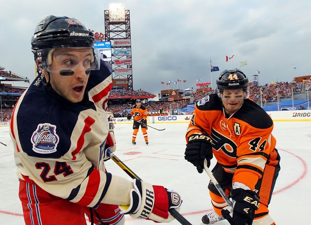
• In the alumni game, the Flyers alums wore a “10” memorial for Brad McCrimmon, who died in the Russian plane crash. The number looked rather odd on John LeClair’s jersey.
• Another great note from the alumni game: Remember former Rangers goalie Dan Blackburn, who suffered nerve damage and in left arm a few years back and briefly tried to play with two blockers, instead of a blocker and a mitt? He was going with the two-blocker format in the alum game.
• As for the Winter Classic itself: When the Rangers and Flyers unveiled their WC gear in November, they wore straight-hemmed jerseys. So it was disappointing to see both teams wearing the scoop-hem Edge template. Pfeh.
• Personally, I think the Rangers would’ve been better off with white helmets, instead of blue.
• I’m sure everyone enjoyed the Flyers’ keystone-shaped captaincy designations.
• Sergei Bobrovsky had a brown set of leg pads in his locker but didn’t wear them for the game.
• The players weren’t the only ones wearing eye black.
Rose Bowl
Eh, whatevs. Nikegon mostly looking silly + Wisconsin mostly looking like Wisconsin = dog bites man. Personally, I think it would’ve been super-cool if Nikegon had pulled the old-school move of adding a rose to their helmet. Simple, elegant, and it would’ve had way more shock value than the latest superhero costume maneuver. Everyone would’ve been all “Wow, modern but classic, who’da thunk?” But hey, they didn’t ask me, go figure.
Incidentally, several readers pointed out that this was the fifth consecutive year that the Big 10 team wore its road uni in the Rose Bowl. (Last one to wear its home design: Michigan in 2007.) Anyone know why the Pac-12 has always been the designated home team?
Corporate Snack Chips Bowl
• Oklahoma State’s captains wore star-shaped “C” designations. This is something they do for bowl games (much like Notre Dame adding NOBs), as you can see here.
• Bit of overkill by Stanford, which memorialized former coach Chester McGlockton with a jersey patch and a helmet decal. Interesting that they used “Mc” instead of just “M,” no?
(My thanks to all contributors, including Brian Alexander, Ben Gorbaty, Jake Hurley, Robert Lim, Frank Mercogliano, Rick Rutherford, and Matt Stern.)
Collector’s Corner
By Brinke Guthrie
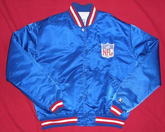
As we know, come April 1, Nike takes over the NFL. A lot of us recall when the swoosh wasn’t as dominant as it is now. Other brands had huge profiles, like Starter. That jacket doesn’t appear to be a retail item, showing just the NFL shield, and being offered by a former Eagles employee. (And contrary to the ad copy, I don’t think Starter was around the NFL in the 1970s.)
In other eBay finds for this week:
• Absolutely outstanding 1960s NFL poster here. [Wow, that’s a beauty. ”” PL]
• Nice lot of old MLB team decals.
• Here’s a 1960s mug featuring the NFL Coastal Division. Great names back then — Century Division, Capitol Division, etc.
• It’s always back-to-school time with this 1965 Cleveland Browns/NFL helmets book cover.
• Let’s go back to 1935, when Dizzy Dean’s “Super Baseball Shoe” was featured on this baseball rules guide. What, no Skittles graphics or holograms?
• We all know MLB silhouetted batter logo, but does anyone remember when they used the logo on this lapel pin? I’ve never been able to trace the exact time frame of this logo. Anyone know more?
Seen something on eBay that you think would make good Collector’s Corner fodder? Send your submissions here.
Uni Watch News Ticker: Vintage Pleasures, Part 1: I’m all house-proud and kid-with-a-new-toy because I got this groovy 1960s chair a few days ago. Totally in love with it. ”¦ Vintage Pleasures, Part 2: While you were watching college football yesterday, I stopped in at my favorite clothing shop, where I scored this totally swell Gulf jacket (which isn’t dirty, even though it kinda looks that way in that photo). The best part is the manufacturer: Unitog! ”¦ New logo in store for Utah. … Looking for galleries of old college football program covers? Go here and scroll down to “College Football Programs & Other Memorabilia” (from Justin Eller). ”¦ Kansas and North Dakota hoops went color vs. color on Saturday (screen shot by David Trett). ”¦ The mighty Fleer Sticker Project just ran a killer post about some MLB, NBA, NHL, and NFL placemats from IHOP (thanks, Brinke). ”¦ Big East basketball refs are wearing memorial patches for Dave Gavitt, who was the conference’s founding commissioner (from Eric Stoker). ”¦ Good article about Chris Canty’s unusual facemask. ”¦ Great contribution from Wayne Koehler, who sent along this sensational photo of two Tigers spring training ticket-takers, circa 1982 or ’83. ”¦ New secondary logo for the Grand Junction Rockies. ”¦ Someone on eBay is selling a ton of old military patches, many of them really beautiful. ”¦ I have a fairly large collection of vintage bowling-themed beer ads, like this one. Until now, however, I’d never seen one featuring Canadian-style pins, complete with the black rubber bands. ”¦ Latest college hoops team to go gray: New Mexico. Actually, the color is technically designated as silver, but come on — it’s gray. “Also, coach Steve Alford wore his cherry blazer the other day, which he wears for big games,” says Frank Mercogliano. ”¦ No photo, but Ryan Gast says Keyon Dooling of the Celtics was wearing a pair of Rondo’s shoes — complete with number 9 embroidery — during Sunday’s game against the Wizards. ”¦ Good story about uni numbers in the U.S. Army All-American Bowl and what they mean to recruits (from John Gworek). ”¦ Marshawn Lynch’s was fined for wearing his Skittles cleats. ”¦ Fun fact from Kevin Schell: “This season will mark the first time in the Super Bowl era that there will be no white-helmeted team in the NFL playoffs.” ”¦ In a truly gross development, you can now melt a Super Bowl logo onto your pizza (blame Jon Solomonson). ”¦ In the wake of Santonio Holmes “quitting” (or whatever) on Sunday, Rex Ryan announced yesterday that the Jets won’t have captains next season. So that’s one team that won’t have to worry about captaincy patches next season. ”¦ Alex Rocklein was watching last night’s Celtics/Wizards game and spotted someone wearing a Bruins/Celtics hybrid jersey. ”¦ One of the prexydential candidates is getting attention for his sweater vests.
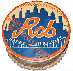
Uh, pretend that cake says “Phil” instead of “Rob”: Easily lost amidst all the holiday hubbub is the fact that our own L.I. Phil Hecken turns 29 (again!) today. It’s no exaggeration to say I couldn’t produce Uni Watch without him, plus he’s a good friend, a tireless worker, a straight-A grad student, a sharp dresser, and a lot more. Seriously, most of you have no idea what he’s gone through in the past year, but let’s just say he worries a lot more about AP style and canine insulin levels than the average fella. But that’s no surprise, because he’s no average fella.
Phil doesn’t like to be fussed over, which is just one of the many reasons he’s worth fussing over. Please join me in wishing him the happiest of birthdays today. Here’s to you, buddy.
The NFL sock shenanigans are definitely far beyond out of hand. But I will say that if the Tebows are going to keep wearing mono-blue, putting the orange at the top of the sock is an improvement.
…and if I’d designed that Jags helmet, it would have had a black facemask.
I dig the new Grand Junction “GJ” logo, but what’s up with the honkin’ “Rockies” script on the back? Are minor-league teams even allowed to have something other than the MiLB logo on the back? Anyway, the script turns that cap from “covet” to “meh” in my book.
Also, love the chair. Is it original or repro? And is that original upholstery, and if so, how is it so well preserved? Great piece, and cool to see, since I don’t think I’ve seen that particular design before.
Original chair, new upholstery.
Want your own? Here:
link
Info on the designer, Adrian Pearsall:
link
Very nice chair. Liked the Gulf jacket, too.
The look Paul is going for:
link
;)
know a couple of bassets who would love to break in the new uphostelry…
Looks like you have already lost possession of that chair….
Yeah, it’s now basically Caitlin’s chair. She may let me use it from time to time…
I know the feeling Paul…..
Just a quick note: found out from a reader last night that the sheriff C patches on the Okie St. unis has been done by them before in previous bowl games. They treat them as Notre Dame does their NOBs, in which they don’t show up in any games other than bowl games. Some past proof link, and link.
Excellent info. I’ll add that to the text.
Higher ranked in the final BCS poll is the “home” team for each BCS bowl game. 2006 Michigan (07 Rose) was the last time that the B1G was higher rated for the Rose.
Love the chair Paul…and of course, a big Happy B-Day to Phil!
Cheers Guys!
~B
Fussy Birthday Phil. Congratulations too on your upcoming graduation this spring. Is your future politics, fashion, vet medicine, or sports writing?
Happy Birthday Ro…er…Phil. :o)
Mad love for Phil on his B-day!
-Walter
“…plus he’s a good friend, a tireless worker, a straight-A grad student, a sharp dresser, and a lot more…”
It was the sharp dresser thing that most surprised me when I finally met Phil. I mean, the guy is dapper. He owns many fedoras!
Happy Birthday, Phil.
Yes, a very HBTPhil!
But what’s a fedora? Sounds like some South American animal. Is it legal to own one?
Yep, woot woot!
Three uni-related, college football observations…two thumbs up; one thumb down:
1. I am reading the local newspaper this morning here in New Orleans and looking at the Sugar Bowl rosters of Michigan and Virginia Tech. Michigan’s roster reveals the usual amount of duplicate jersey numbers one expects to see nowadays in college football. On Virginia Tech’s smaller roster (which may reflect its traveling squad), however,there is not one duplicate number. Regardless whether this is just the traveling roster they chose to print, having no numbers duplicated by offense and defense players is extremely unusual. I wonder if Virginia Tech just doesn’t do duplicate numbers. If so, congrats to them.
2. Orgeon’s mirror finish helmets were an abomination. I have actually come to like the detailing in Oregon’s uniforms, this one (jerseys and pants) included. But you could make out very little sharp detail in the mirror-like helmet finish…or only catch a glimpse. Just a blurry, shimmering mess.
3. Big thumbs up for Michigan State whose Nike unis I have very much come to admire. This is a modern college uniform, in fit and fabric, with a traditional, retro feel. Other schools with modern uniforms could take a lesson here.
Larry Fitzgerald broke a rib and was coughing up blood, according to ESPN. Perhaps that was the residue of water used to clean up bloodstains.
Could those golden jags helmets become more than a one time gift?
Oregon’s uniform, reminds me of when I was a kid, we would latch onto something funny, and beat it to death , until it got completely silly, we’re well into the completely silly phase.
I used to care about Oregon’s uniforms, then I took an arrow to the knee.
Gold helmets are nice, but nothing beats this link
From the neck down, the Ducks unis were maybe the best (least terrible?) that Nike has done since taking over Oregon’s athletic department. The shimmery numbers just needed to have more contrast with the green jerseys; the shimmer should have run from, say, bright green to yellow, or brown or blue to yellow. The dark green on dark green thing from some angles was poor. But otherwise, Nikegon’s best unis.
But that helmet. It’s almost like the brand artists at Nike – you know, the people who would be designers at a company that actually did design – saw the basically sound quality of the uniform and threw up a little inside. Because of course to the brand artists at Nike, “basically sound quality” actually means “we’ve failed to sufficiently cram down the observer’s throat that this is not about Oregon, it’s about Nike.” So they grudgingly kept the uniform, which the stupid client liked, and put on the most ridiculous, unmatching, who-cares-about-Oregon-this-is-Nike helmet they could think of.
As the paint scheme for a low-rider Impala, that would have been a thing of beauty. As a football helmet for a green and gold team in the Rose Bowl, it was ugliness itself.
The shade of green just didn’t work for me. It looked too desaturated, even on the sidelines where the players weren’t wearing their disco-ball helmets.
They would’ve looked better in gold or white pants. Given the helmet, though, white would’ve probably worked better than gold.
I did this for the Ducks by using that photoshop tool smartbrush.
I am not a uni tweek guy. Never learned how. But this green is much better than the drab green.
link
I like the individual elements. The helmet wings are great but were lost in the shine. The shoulder wings never really showed up, and would probably look better with more contrast. The numbers are cool.
I was watching games yesterday so did not post much. I think it was Paul and Ricko who kind of agreed about Oregon. Whatever they do in the future is not necessarily going to be better. They just have to think of different things to do. It would be nice to use a nicer green and yellow more often. They could do that and make some good unis. Throwbacks would be awesome but they will not do those.
As others said that green is just a drab green. So I did not think the unis were great. My favorite helmet was the chromafusuion or whatever that was supposed to look like mallard ducks head.
So when they say something new coming up it will never be anything super fantastic. Just different.
Do throwbacks Oregon/Nike throwbacks.
Helmets would have looked better if they weren’t the new fangled helmets with all the bumps holes and ridges on them. A nice smooth half sphere would have been nice.
Jags helmets that is.
Awesome job with this Larry: link
On Oregon’s helmets, I absolutely hate the chromed out shine, ambivalent about the shape of the feather on the sides, and absolutely love the Oregon O at the middle back.
They should have worn this jersey, or something similar with TV numbers: link
Thanks Mike, You make sense with your comments too. But the helmet was ok with me. The jersey you showed would be much better.
nice to see these HS football All Star kids are WAAAAY into themselves. Big props to their parents and pop warner, middle school, and HS coaches for sacrificing their souls to win games to placate these lil assholes.
I just want to “Like” this comment!
Happy Birthday, Phil!
The Rangers would have looked better with a white helmet. Unfortunately the “Off-White/Antique” color is not a stock option with helmet manufacturers.
More’s the pity; dark helmets with white jerseys gave the game a beer-league whiff.
-Walter
On my TV, the Rangers jerseys looked REALLY beige. Basically bandage beige. They look a ton lighter in the pics.
I still think the jerseys would’ve been better white, but unfortunately, the Rangers were already on the vintage-crap bus with the alts they debuted last year.
Cream is okay for some baseball teams (I wouldn’t advise all teams going cream), but the non-white (in place of true white) just doesn’t look right at all on a hockey uniform. The only two NHL jerseys that I like that use the “vintage” shade are Boston’s 2010 Winter Classic, and Buffalo’s present 3rd; both of those have that shade blending in with athletic golden-yellow. It just doesn’t look right on everybody else.
Note that this only counts for teams that are using the so-called “vintage white” in place of a true white. Teams that have tan/beige colors in their actual color schemes (Minnesota, Phoenix) or are throwing back to an era where it was a team color (Chicago 2009-2011 third) don’t count. (The key words here being “TEAM COLOR”…)
I did like the keystone-C/A on the Flyers’ unis. Reminds me of the old-school diamond-shaped patches the Red Wings wore way, way back in the early days of the link – an element that hasn’t appeared since the link. It’d be nice to see teams come up with a little variety on the C/A these days, like how the Flames have had the Atlanta “A” for their alternates since 1996-97 (the franchise’s 25th year combined, incidentally).
I dug the blue helmets. It reminded me of the 1980 U.S. hockey team.
You remember the greatest confluence of events.
Those kids whining about their numbers at the Army All-American game is one of the most obnoxious things I’ve ever seen. Nothing screams “Me, Me, Me!” like complaining about something like this. Also, if a kid is picking a school based on numerical availability, that’s a pretty good indicator, IMHO, that he is not someone you’re going to want on your team.
Well said.
always have backup numbers!
-Ry Co 8
–Ry Co 39
—Ry Co 77
16
15
5
87
7
8
3
22
54
84
00
And a few more…I’m flexible.
I believe MLB lapel pin referenced by Brinke dates to 1969, when baseball celebrated its alleged centennial.
I had a groovy chair sorta like that, Paul. It had dark wood and bright orange cushions. My parents bought it in the ’60s, then sent it off to college with me in the ’70s. It fell apart in the ’80s.
Legends night at Staples Center honored Daryl Evans, so Kings wore throwbacks. Photo here ~~~> link
The Kings should never have departed from those colors.
“The Kings should never have departed from those colors.”
Amen brother.
Just a gorgeous uniform!
Yep, but who the hell is Darryl Evans – I follow hockey quite closely – and I mean he barely registers.
I don’t know Daryl Evans, but I do know who Darrell Evans is (member of the World Series-winning 1984 Tigers).
Looking it up, Daryl scored the game-winning goal of the “Miracle on Manchester” game, leading to the Kings’ upset of the Oilers in the 1982 Smythe Division Semifinals, and is presently their radio color commentator.
Probably your last sentence explains – why the honour, either that or Ed Joyal was not available.
“In the wake of Santonio Holmes “quitting” (or whatever) on Sunday, Rex Ryan announced yesterday that the Jets won’t have captains next season.” This is precisely why the Jets are such a bad organization and Ryan is a bad coach. Lots of talk and when it comes to action, stupid action. Two better solutions to this problem: (1) Pick captains worthy of being captains and (2) Ship Holmes out of town. He’s a bad influence on a team despite his tremendous talent.
Does the league not require teams to have Captians? I thought the new (well, not-so-new anymore) Captaincy patches were a mandate from the league office, but maybe not?
Always been optional. Steelers have never worn them; Packers only wear them in the postseason; etc., etc.
Ah, thanks for clarifying. I feel like I should have known this.
Steelers have captains, just don’t wear captains’ patches.
link
The Packers select different captains every game. That is a big reason why they don’t have the captain patches. In the postseason, they only designate one set of captains. I don’t like them having the patches in the postseason, but what are you gonna do.
Funny, I was thinking the Rangers would have looked a lot better with red helmets, which is what I think they should always wear, regardless of the jersey.
And this will now be the third place I’m saying this, but I’d be remiss if I didn’t: happy birthday, Phil. Do I need to make that my first tweet as well?
Sorry for all the fuss Phil but Happy Birthday!
Happy Birthday, Phil!
Pizza prints? That’s stupid!
Agreed.
Utterly amused that they’re showing some completely made-up logo to represent the Super Bowl, despite having an NFL Properties license.
Of course, I agree that the entire premise is rather stupid. Besides, everybody knows that if you’re going to do anything decorative on a pizza, you’re going to use actual toppings to create that decoration, right? Much more creative and artistic that way.
For those that are interested, reports from the NHL at the Winter Classic yesterday by Elloitte Friedman on CBC stated that Detroit will host the 2013 Winter Classic at either the Big House or Comerica Park. Obviously the Ilitches want Comerica as they own it, but the NHL may have some sway here when it comes to ticket sales.
2014’s game reportedly will be in Washington as Ted Leonsis has asked the NHL repeatedly for a Classic game.
2015’s game will reportedly take place in Yankee Stadium in NYC. The agreement to hold bowl games in Yankee Stadium runs out in 2014, and the NHL wants into Yankee Stadium badly.
I would hope the NHL would do what the Wings want to do.
I don’t know about holding a game in DC. I just checked and the average high temp in early January is around 44 degrees. I guess if they agreed to play it at night it might work.
I’m pretty sure the difference between seating 50,000 at an outdoor game compared to sitting 100,000+ at an outdoor game is huge money.
While the Ilitches would lose on the concessions and parking, selling 50,000+ extra tickets would easily make up for it if they can split the difference with Michigan. Of course, that also means all the fun (alumni games, college games, high school games) leading up to the game would also see less parking and concession sales go directly into Ilitch’s pocket as well.
As for Washington, would you turn down Ted Leonsis’ request after he basically has been begging for one for almost six years?
Olympia Entertainment only owns a fraction of the parking in the Comerica Park/Ford Field neighborhood, so they could still take a hit on the parking side for just not being at the Joe (though they’d make up for it on concessions, to be sure).
They could try to incorporate a collegiate game, but that would be an interesting logistical challenge. Do they try to work in the Great Lakes Invitational (in which the Wings already have a partnership), or do they leave that tourney at the Joe and schedule a separate game after the Winter Classic?
When is that tourney played, Rob?
That would be an awesome final to not only win the tournament, but to do it outdoors on a grandiose scale!
All things being equal, common sense would assume that football stadiums are better than baseball stadiums, because football fields and ice rinks match in rectangular shape. (But we all know baseball stadiums are more available in January.) A Red Wings game in the Big House would be awesome!
The GLI’s usually on December 29th and 30th. It’s always Michigan, Michigan State, Michigan Tech and an invited team from another conference.
IIRC the NHL ice guy says the bigger problem is rain, rather than temperature. And the Caps were pretty much promised a WC in exchange for going to Pittsburgh.
The Great Lakes Invitational this past year was Dec 29-30 so it’s feasible they could move it to coincide with the Winter Classic at the Big House.
I noticed earlier this season- and you can see it in that eye black photo- that the NHL officials have a grey strip around the end of their collar to keep it from blending in to the black stripes.
Does anyone know if this was new for this year? It seems strange to me that it’s grey rather than white.
Paul GREAT Gulf Jacket, a dog doo would look sharp in that thing, so I have confidence you will do great things with it.
And Happy Birthday Phil, thanks for making my weekends more bearable.
yeah, first thing I thought of was Steve McQueen in LeMans (1970 movie.)
The Baseball logo on the lapel pin was MLB’s corporate logo during the 1970s and early 1980s-
the Bowie Kuhn era. It was on all their publications,including the Sporting News published rule book.
Interesting that they used that logo even though they had Jerry Dior’s silhouetted batter logo in their design portfolio.
This information about the logo on your pin comes from a book I checked out on logos years ago. It is one of those Dover Publication books (the company which also put out books on fonts, clip-art, and the like) from 1976. Luckily, I happened to copy some of the pages.
The logo on your pin was described was:
Office of the Commissioner of Baseball. Major League “Baseball Bannermark,” not intended for commercial use. Designed in 1970 by deMartin-Marona & Associates,Inc.
The earliest use of that logo was on the cover of the 1970 All Star Game program (game played at Cincinnati’s Riverfront Stadium). The latest use of the logo I could find would be in 1984, where Gary Carter was MVP of the All Star Game. That logo appeared on his MVP trophy. It is likely that that logo was abandoned when Peter Euberoff became commissioner after bowie Kuhn left.
One other note, in the same book, deMartin-Marona is credited in creating the Phillies 1970 logo. The book gives it a 1969 copyright date. Considering logos and uniforms must be submitted in advance, the 1969 copyright date is legit.
I have been watching a Gulf jacket just like that on eBay for quite some time now… awesome find!
Thanks. It apparently had a zip-out lining at one point (the zipper track is there), but the lining is no longer there. Aside from that, it’s a total beaut.
Cool little find, Disney themed college pennants
link
Did anyone else notice the lame Fiesta Bowl championship T-shirts? The Rose Bowl one was “Rose to Victory” – okay, good enough. But the Fiesta Bowl’s was “Nacho Victory”… what the hell does that even mean??? To me it means “Not Your Victory” in bad english. Can’t wait to see how bad the others are…
Suger Bowl: “How Sweet It Is”
Orange Bowl: “Knock Knock? Who’s there? Banana. Banana who? Knock knock? Who’s there? Banana. Banana Who? Knock Knock. Who’s there? Orange. Orange Who? Orange you glad you’re Orange Bowl Champions?”
Oh my bad… “Rose to Power”. Ugh… should have known it was link!
Looking at the Twitter feed for “Nacho Victory” search – two things. Some people will buy anything that Nike makes – without question of how stupid it or their claims are… so sad.
Ah, crap. *Sugar
Happy Birthday Phil!
BTW, I found a baseball themed cake that has your name all over it: link ;)
Happy Birthday, Phil! Much appreciation for all you do here!
Paul, I’m not sure if anyone has mentioned this yet. But I believe the Rose Bowl team that wears the “home” colors is the team with the higher ranking.
New Mexico has actually been wearing gray as an alternate for at least a year or two now. For once, the Lobos may have been ahead of the curve.
Not to mention that gray/silver/whatever is actually one of their school’s colors (officially cherry, silver, and black). Sure, gray is a trendy color in college basketball right now, but I don’t see anything wrong with a team using one of their official colors as a uniform color (hey Oregon, are you listening?).
If anyone likes the combination of Dr. J and smooth early 80’s music, check out this clip (note the great uniforms):
link
You get me! You really really get me!
Thanks, Wheels. That’s right in my…wheelhouse.
Glad to see most here agree with my disgust with those Nokegon helmets because on Twitter I was called gay (not at all an insult),
There were however, lots of good tweets last night. Two of my favorites:
perryj74 Perry Thomas
I obviously need to go back to college for broadcasting and take Beating a Dead Horse 101 #fiestabowl
ESPNCFB ESPN CollegeFootball
1stQ ANALYSIS: Overrated-#Oregon unis. Underrated-Ducks cheerleaders. Overrated-#Wisconsin dealing w/ heat Underrated-Badgers quickness
Hit the button too early…
Glad to see most here agree with my disgust with those Nikegon helmets because on Twitter I was called gay (not at all an insult), a hater, a nobody and that I should shut my mouth! None in correct English, I might add!
There were however, lots of good tweets last night. Two of my favorites:
perryj74 Perry Thomas
I obviously need to go back to college for broadcasting and take Beating a Dead Horse 101 #fiestabowl
ESPNCFB ESPN CollegeFootball
1stQ ANALYSIS: Overrated-#Oregon unis. Underrated-Ducks cheerleaders. Overrated-#Wisconsin dealing w/ heat Underrated-Badgers quickness
Happy birthday, Phil!
I absolutely loved the Oregon helmets. The wings on the side reminded me of the Michigan helmet design, and the chrome look with the Rose Bowl reflected in every close-up was beautiful. Oregon has had hits and misses over the years, but this helmet was a huge success and my only regret is that their season is over and I won’t get to see them again for awhile.
I didn’t really care for the Nikegon helmets…except for the logo design. The wings going into the logo in the back was really cool, IMO. I think other teams could do something like that (ie, Eagles maybe?), but put the uniform number where the logo was.
That iridescence on the uniform numbers was stupid only because it was iridescent green on a green jersey, however, at lease Nike shown some restriant and kept it at the numbers. Although, at times, the numbers looked completly fine, but others it was completly dumb.
Related note; Happy Birthday Phil! You’re only 29 once!
“December (and now January) Sox-a-poppin'” in NFL.
Been that way for a long time.
Don’t mean it’s right, just mean spotting the aberrations has been fun through the years.
January was supposed to have “?”.
Not sure we’ll see it as much in the playoffs.
RE: Larry Fitzgerald “wetting his pants”… I notice that with a lot of players lately when dark pants are worn (not counting black pants because it wouldn’t show up.)
I am curious about it. I’m sure you’re joking about literally wetting your pants… but is it sweat?
Either way, its kinda gross.
The whole red uni-red pants-red tights look is pretty gross in and of itself, moisture issues aside.
Though, at least Larry was wearing pads in his pants, and not the biker shorts, so he’s at least got that going for him.
I noticed this while watching Sav Rocca of the Redskins yesterday. It looks like he cuts off the top horizontal bar of his facemask. There are four little places where it looks cut. I think he has the exact same facemask as Armstrong in this picture but Armstong’s has not been cut. Anyway, just something I had never noticed before:
link
That is awesome! You think they could have ordered one instead of taking a grinder to it!
In regards to the baseball pin design..I’ve seen that logo used during MLB’s centennial celebration in 1969..I saw that logo on an old book I actually have somewhere. My guess was it was used as a secondary logo along with the one they use today.
Looks like if you decide to get a 49er pizza print for your playoff party, folks will be eating the old helmet design (Bills is wrong, too).
And what’s with that weird Super Bowl logo? Doesn’t seem like the NFL would be too keen on stuff like that. Maybe the real logo wouldn’t look good on a pizza pie?
happy birthday skipper.
Looking thru the Fleer Sticker post, where did they get that Jets helmet logo from? They used the correct Bears helmet. Any thoughts?
I doubt there’s any uni-related news today in Iowa, but… someone’s gotta mention it here. It’s like an Internet law.
I doubt there’s any uni-related news today in Iowa…
Last item in the Ticker.
link
I’m a native-born Iowan, and I approve this message.
Methinks he doth protest too much.
A New Yorker scoffs at someone from any other part of the United States suggesting that his location might not be entirely populated by unlettered hicks and rubes? I’m shocked! Shocked!
True story: When my dad got his first network gig at the CBS affiliate in Philly, effectively a call-up from the literal farm team in Iowa, his new colleagues greeted him with a sweatshirt that had a fake academic seal, around which was the legend, “University of Iowaohioidaho.” Perfect encapsulation of the urban Easterner’s regard for the rest of the country. Alas, I have no photograph of dad in the sweatshirt for archival logo purposes. It was awesome.
Also, while we’re on the subject of protesting too much, thanks to the whole Hawkeyes-Steelers connection, Iowa has been a hotbed of informed uni-watching since at least the late 1970s. As a child, I thought it was perfectly normal for burly men watching football to switch from debating the I formation versus the shotgun to comparing uniform design and back again without anyone making girly-man jokes. Turns out that’s not normal behavior among football fans; it’s just an Iowa thing, thanks to Hayden Fry.
As I think you know by now, my favorite part of the country is the Midwest, so don’t go painting me with that brush of NYC snobbery! Anyway, my main gripe with that video is that a claim like “the first woman lawyer in America was from Iowa” may be true, but it conveniently overlooks the fact that Iowa has never elected a women to statewide office (and you can look it up). And yeah, the Iowa Supreme Court legalized gay marriage — and then the judges who decided that case were promptly voted off the bench. And so on. In other words, let’s not overstate the progressive case here.
I have no particular ax to grind against Iowa. I just think that video clip seemed like a classic case of little brother syndrome.
I’m so sorry to have to do this, but you literally asked for it.
Iowa has elected at least 13 women to statewide office, including 5 consecutive lieutenant governors since 1986. (Iowa’s lieutenant governorship is an independently elected office, often won by a member of the party opposed to the governor.) This includes attorneys general, secretaries of state and agriculture, and the equivalent of secretary of education. It could be more; I’m not sure I counted all of them. If so, that would put Iowa ahead of New York in electing women to statewide office.
[And I know you’re not really a coastal snob. I’m teasing around here myself. In case the intended friendly, jocular tone isn’t clear!]
Hmmm, ’twould appear I did ask for it. Just last week I read something that I thought supported my position, but I was obviously mistaken. Mea culpa, and thanks for setting me straight.
And I know you were kidding about the coastal snobbery. That’s why my response ended in an exclamation point, which was intended to be, you know, mock outrage or something like that…
Lest we forget George Washington Carver’s time spent in Ames.
Fuck you Phil.
Shit, I meant Happy Birthday, I always fuck that up.
Happy Birthday Phuck.
SONNAVABITCH!
Haven’t looked into it, but has the B1G team been the lower-ranked contender in the Rose Bowls since 2007? Might explain the away unis.
Question for Stanford fans: what happened to the axes on the helmets? Does the team remove them for a bowl game?
Paul, honestly, why don’t you get it over with and just make this into a vintage stuff-appreciation blog. Your coverage of current sports developments has continued to descend into such a cynical roll of the eyes, it’s really non enjoyable to read. And it’s also obvious that you hardly even watch any of the sports you cover, with your constant allusions to stuff you were doing while ‘the rest of us were watching (said game)’ (as if that makes us somehow inferior).
Maybe you’ve been in the business too long, but it really seems like your passion has devolved into a snobby, sarcastic contempt for everything that is modern sports. The only thing that seemingly brings you enjoyment is anything produced 30 years or longer ago, and your cats. At least Phil brings enthusiasm with his weekend posts, instead of making up sarcastic nicknames for everything and finding other ways to mock current stories.
As a fan of yours and a regular blog reader, I write this not as an outright trashing, but in the hope that you will re-examine why it is you do what you do, and what you get out of it.
Ummm… about 80% of today’s post was either positive or neutral factoids.
You know what DOES suck about Uni-Watch? Having to wade through comments about how people think the content of the site should be.
You’re wasting everyone’s time. Don’t like, don’t read.
I’m guessing you have plenty of time on your hands if you’re reading hundreds of comments on here daily.
I don’t do this blog because I like sports. I do this blog because I have things I want to say, and this is the forum where I say them. If you like what I say, cool; if you don’t, that’s fine too. Either way, I don’t say them for you. I say them for me.
If two or three sentences in the Ticker somehow outweigh everything else that was written here today, then yes, this is a “vintage stuff-appreciation blog.” If you read the rest of today’s entry, you might discover that it’s about uniforms.
Am I more excited about my new chair than about the endless parade of meaningless college football bowl games? Did I have something better to do yesterday than sit on the sofa like a turnip? Do many aspects of modern sports annoy me? Do I like my cats more than I like Nike? Yes, yes, yes, and yes. If you find any of that distasteful, that’s completely up to you, but none of it is exactly news.
Hope he doesn’t read HBIC. I do lots of historical pieces, like the Eagles leaving St. Louis, the Seals leaving Califoria and Oakland, and the Barons walking away from Cleveland.
None of it has anything to do with today’s game, but it’s still interesting for those that are interested (ie. the guy who is writing it).
Your blog sounds great, I probably will check it out. I am not uninterested in historical things, and if you think that then you missed the point of my post.
No, Charles, I didn’t miss it. But I only do stories that pique my interests as well and that includes a lot of historical and op-ed pieces.
I hear you about the site content – believe me, NCAA football bores me to tears – but you really have to know Paul and Phil because their interests are what drives this site.
I can honestly say that having met Paul, he doesn’t piss on today and celebrate yesteryear all the time, but I think it comes down his values based on today’s sporting world. Paul isn’t big on the corporate world driving the sporting world in general into one giant marketplace for a corporation to sell-sell-sell, but that’s where we’re heading if we’re not already there. It’s that belief, I believe, that is mistaken by some readers into thinking Paul hates all that is new and “unique” in sports.
Essentially, if Nike, Reebok, and adidas weren’t manufacturing 90% of uniforms on the planet, we’d have smaller guys like CCM, Maska, Doug Laurie Sports, and others who made the uniforms locally with their own unique touches to them. That’s what made them special – they weren’t just a cookie-cutter design. They were truly unique.
Paul takes this one step further because he appreciates the vintage aspects of things like durene fabric that simply isn’t used any longer, and a chair that he probably sat in as a kid while listening to the Mets on the radio.
While it may not interest you entirely, that’s cool as well. Paul has a vested interest in vintage clothing and furniture because it means something to him. It’s the same for me in terms of hockey history that just isn’t written about nowadays. We all have our quirks about sports – Paul’s happens to be that he isn’t interested in the Meineke Car Care Bowl because that name means zero other than corporate dollars.
Paul just uses this space to express his love for these things because there is no ESPN editor above him telling him that his love of vintage chairs and clothing doesn’t belong on ESPN. And I’m cool with that just like I’m cool with long articles about college football. In the long run, it doesn’t detract from the site, but actually adds value in that we get a better sense of who the author is.
‘snobby, sarcastic contempt’
nah… definitely not snobby.
For the guy who was looking for the convergence of today’s events in Iowa and sports, here’s the sweet spot:
link
Why are EPL teams wearing black bands on their arms? I’m watching Liv v ManC
According to the Utes’ Twitter account, there are no plans to get rid of the drum-and-feather logo (or as they call it, circle-and-feather): link
Also, Oregon’s uniforms were terrible. They could have been worse, since at least the BFBS was restricted to the helmet, but I didn’t see the need for a new shoulder wing design (the old one was just fine) and the shiny numbers were unnecessary. Ultimately a failed effort on Nikegon’s part especially when compared to the classy uniform that Wisconsin wore.
On another subject, do you think Nike can afford the pay raises they’re going to have to give the Oregon players after that win?
PL – Just saw this – link – and immediately thought this is like your literature wet dream.
Some good deals on the vintage hats at Ebbets Field Flannels (well, on other items, too). Not shilling for them, just passing this on as public service…
link
(hope the link works)
Really like this block-shadowed letter/logo:
link
You don’t often (ever?) see a block-shadowed cap logo like that…
I have soft spot for this one. Bought it a LONG time ago. For one thing, love the city. Also the often overlooked history of just how popular the PCL was before MLB moved west.
link
I suppose the closest thing to a drop shadow in MLB might be yellow “S” Mariners of early Griffey, but it was the same color as the letter. And was more beveling, guess.
link,!g0Ew5CUKk7SBMQS2wPM8w~~_3.JPG
Aw, heck, we all know the cap I meant.
link
And once again, that looks more yellow than Athletic Gold. What a crappy 80s design. They sure did like big bold blockshadow letters back then.
Ha, I just ordered the 1952 Tokyo Giants cap last night.
I should point, for the truly maniacal hat collectors, the Colt .22s hat IS among those specially priced…
link
I’m getting insane attention wearing that .22s cap. People stop me to ask about it just about every time I go out in public with it. And I think it’s the first time anyone at the shooting range has ever been jealous of their token liberal friend about anything.
Reaction to this US cap has been odd, though:
link
Every single person who’s asked about it, including my wife the first time I wore it, assumed it said “SU,” not “US.” Two different guys have assumed I was a fellow Syracuse alum and just started talking Orangemen sports to me. Very strange.
I wonder, do you suppose people are conditioned to seeing “USA” on a hat?
Don’t know, just occurred to me that might be the case.
Also that evidently some Syracuse grads can’t tell orange from red.
The interlocked “US” on the US cap is the inspiration for the dollar sign – just snip off the bottom of the “U.”
There’s a trillion caps out there and many obscure ones. A lot of people aren’t going to know what they’re from and probably assume it’s a version of something they know. But having strangers talking about specifics because of a hunch is odd, and not something I would ever do. Too many posers out there. And that US cap is pretty damn sweet.
Man, that (doesn’t matter who) Chicago Union Giants cap is really nice & so is the price.
I guess my only concern is the cap fitting too large since it is handmade and high quality instead of the shitty New Era caps.
My experience is that if you order your typical size it will be just a bit big.
I’d be curious what Scott has found.
That’s what I’m afraid of – they don’t have the next size down for an exchange since it’s a clearance item. But are we talking *just* a bit big or like “I can stuff my index finger or thumb in there” kind of big? Because I have ways to adjust the cap without harming it or dousing it with water (unless that’s recommended to dry & fit on your head).
I stuffed a bit of rolled/folded paper towel in the headband of my Seals hat and it’s definitely wearable.
A little big certainly is easier to deal with than a little small.
Heh, you’re a paper towel / napkin stuffer too, then.
Back in the day when my New Era caps got too small, I would snip 1/4″ & break the back of the sweatband to relieve the pressure. When that wasn’t enough, I carefully removed cut square”-piece sections of sweatband from the center back and kept cutting where needed. Of course it was a well-worn sweat stained cap by then & felt weird to put on since the back was wool-thin, but it still looked like it was fully intact.
Yep. Consistently just a bit big compared to New Era. But I think that’s due mainly to the fact that it’s a lower-crown pattern, so it’s the same size but sits higher and thus a tad looser. I dropped a hat size in 2010, and while about half my 5950s in the old size are tight enough to still wear, all of my EFFs had to be retired.
Happy Birthday Phil
Always appreciate your hard work for this site
What he said.
Yeah. Ditto.
But 29? Riiiiiiiight…
Hope you had a great day, old man.
Tim E. O’B
Do you have a link for your site? The tweaks like your Big Ten ones or whatever you had done. I saw it before but would like to see it again
Mostly NCAA unis.
Click my name.
More specifically, here’s some IU link
Here’s some NU link
Here’s some B1G link
Here’s some pac12 link
And here’s my uni concepts home link
I like this 1933 Indiana throwback with the winged helmet that they wore.
link
Also, there’s this – link
and this link
(first comment with links is in moderation as of 4:30 central)
thanks Tim
the nfl(each team) should just have 1 sock to wear. such as the packers wearing a sock that’s green on the top half & white on the bottom.
No.
i dont think it’s a reach, some teams have stripes on their socks. what’s the difference?
Bears have two perfect sets of socks. Just no.
i don’t think we have the same thing in mind
arrrgggghhhh….
just getting to today’s post
THANK YOU EVERYONE for the nice birthday wishes — you ever have one of those b-days where you feel like that chick in that 16 candles movie or whatever it is? good thing i don’t really care about b-days anymore, but to all those who took the time to wish me a happy…
THANKS … and i really do mean that!
Michigan vs. Virginia Tech…best looking bowl this season so far?
The way football should look.
Natural sunlight would be the only improvement….I’ll need a time machine for that, though
michigan’s jerseys look like crap
what was wrong with wearing the awesomeness that was the michigan state game?
va tech looks like …
va tech…did someone at nike fall asleep at the switch?
I was wondering if those are just VaTech’s practice pants. How about a lame pinstripe or something to tell me they didn’t buy them at Dick’s?
Virginia Tech ok. Michigan does not look good to me. The numbers seem so odd. So skinny and with that outline. Michigan in the dark is so so much better than Michigan in white and yellow.
I admit I was hoping for the shoulder striping too. Still, I like the faux-sleeve stripes and the narrow numbers with maize trim….way better than their normal roadies
Is that ref in the Sugar Bowl wearing glasses? And if so, has anyone ever seen that before? I definitely haven’t.
He is! Can someone get us a good screen shot?
He’s from the PAC-10/12. Does not have many fans out west from what I can gather. He’s worked for quite a while, including many big bowl games, in glasses.
As a student at a Pac-12 institution, I can assure you that every single official in every single sport is blind, deaf, and mentally challenged. He’s wearing the glasses to cover for it.
Happy Birthday Phil! May 2013 be a much better year for you! And Paul’s right, you add a ton to UW (not to mention the countless weekend entertainment you provide to all of us)!
Skipping & no 2012 altogether for Phil, eh? Yeah I’ve already given up on 2012 myself.
Happy Birthday Phil,
Overall is’t a strong looking game, but Michigan probably shouldn’t mess with their regular unis. Not sure I’ve seen thinner numbers on a football uni. I find the stripes – the more offensive part – why are they needed?
Does the Big 10 suck or what.
“Does the Big 10 suck or what.”
i can see them losing to the pac…and the sec…
but the ACC???
junior thinks not
Beginning with the 1947 Rose Bowl, the Pacific Coast representative was the home team, and the Big Nine representative was with visiting team. This arrangement would alternate each year. The stadium seating started with the Big Nine representatives in the end zone, but eventually was set with the Big Ten fans and team on the West (press box) side, and Pacific-10 fans and team on the East side. The home team wears their darkest home jerseys, and the visiting team wears the visiting jerseys. There have been exceptions. UCLA wore their home jerseys in the 1962, 1966, and 1976 Rose Bowl games.
From 1947 through 2001, the Big Ten team was the home team in odd-numbered years, and the Pac-10 team was the home team in even-numbered years. In 2003, Washington State was the home team, as a non-Big Ten or Pac-10 school (Oklahoma of the Big 12) was the opponent; the same applied in 2005, when Michigan played another Big 12 school, Texas.
Beginning with the 2002 Rose Bowl, Nebraska was the home team and fans and team were on the East sideline. Since 2006, the home team has been the team with the highest BCS season ending ranking. For the 2005 Rose Bowl, the Michigan team was on the East sideline, Texas was the visiting team and was on the West sideline. For the 2006 Rose Bowl, USC was the home team and Texas was the visiting team on the West sideline. Traditionally, the Big Ten (or its BCS replacement) is on the West side (press box) and the Pac-12 team is on the East side.
The institution with the highest BCS ranking performs the national anthem, and performs first at halftime. Except in BCS championship years, the National Anthem is performed by the band. In BCS Championship years, a performer has been invited to sing the Anthem, the last being LeAnn Rimes in 2006. The Rose Bowl does not have other performers during the halftime show besides the school marching bands. As part of the television contract, a portion of each band’s halftime performance is shown on television. Each school and each conference are allocated television spots to advertise.
A Non-uni note – But how the hell does Norv Turner keep his job every year, that guy must have some pretty compromising pictures of someone high up.
Jordan Benn made his NHL debut tonight with the team his brother Jamie plays for, the Dallas Stars. I have not been able to find a picture of the back of their jerseys to see how they handled NOB.
It appears that they both wore “Benn”.
link
link
Regular white helmets wouldn’t have looked good with the Rangers’ Winter Classic jersey unless they got a new set of vintage white helmets to match the jersey. Maybe that’s why they wore blue.
As a Badger fan, I could look at the Oregon football unis… But what is up with the unis that their band wears? Those hurt my eyes. You’d think that Nikegon could do something about those…
The “baseball” logo was on the outfield wall at Three Rivers Stadium into the early 1980s. It got a lot of airtime during the 1979 World Series. You can see it well in this video starting around the 8:40 mark.
link