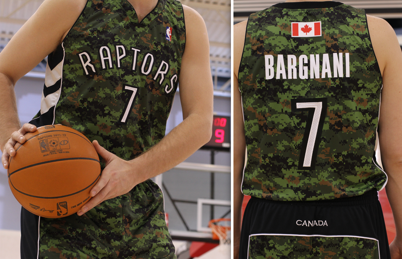
Click to enlarge
What you see above is the NBA’s first-ever camouflage uniform, which will make its on-court debut in Toronto on March 21 (my birthday, oddly enough) as part of “Canadian Forces Night.” This design had previously surfaced in video game screen shots, but I’m pretty sure these photos are the first and so far only real-world images of this uni. Personally, I don’t care for it, for three reasons: (1) Looks like shite. (2) As most of you know by now, I’m generally opposed to camouflage uniforms because they represent Band-Aid patriotism at best, rubber-stamp politics at worst. (3) Does anyone else think it’s weird for a team whose roster is almost entirely non-Canadian (the one exception is Jamal Magloire) to dress its players in a uniform that celebrates the Canadian military? All of that said, I recently interviewed team COO Tom Anselmi and was impressed by the depth and sincerity of his commitment to military and veterans’ affairs (he’s actually visited the Canadian troops in Afghanistan). So while I still think the uniform is a bad idea, it definitely isn’t a just a promotional gimmick.
The Raptors’ camo design is the probably the biggest eyebrow-raiser of the new NBA season (at least until I’m allowed to talk about all the great throwbacks that are in the pipeline). The rest of this season’s uni changes will be showcased in my annual NBA season preview, which is up now on ESPN.
Raffle reminder: This year’s Uni Watch Reader Appreciation Raffle is now underway. Full details here.
Party reminder: Uni Watch gathering in Cleveland, Jan. 10, 7pm, at Prosperity. See you there.
Uni Watch News Ticker, Winter Solstice Edition: A TV crew from CBS Sunday Morning stopped by Uni Watch HQ yesterday afternoon to interview me on the subject of college football uniforms. The segment will run on Jan. 8 — the day before the national championship game. Been ages — like, probably decades — since I’ve watched CBS Sunday Morning, but my impression has always been that their typical viewer is about 73 years old, so my basic “Ah, those stupid kids and their superhero uniforms” shtick will probably go over well, right? … Here’s another gift idea I wish I’d known about earlier: beautifully hand-painted baseball gloves. … New jerseys for the NLL (from Aaron Klett). … In a related item, an NLL team is planning to replace its NOBs with Twitter handles (from Andy Crossley and Ryan Gast). … Yesterday’s entry about the increasing irrelevance of NFL socks prompted a note from Caleb Borchers, who says he’s noticed a bit of a “rebellion against socks” in the rugby world. “The worst offenders are the Franks Brothers (Owen and Ben), who consistently wear socks bunched at their ankles,” he says. “They look like total slobs.” … If you say, “Barefoot NFL kicker” to me, I immediately think of Tony Franklin, Mike Lansford, and Rich Karlis. But I’d completely forgotten about Paul McFadden until Jim Vilk sent me an old magazine with that photo in it. … Here’s the latest chatter regarding Missouri’s new football uniforms (from Dave Singleton). … Check this out: The Knicks have been boxing as part of their practice sessions. Is that a standard thing in basketball camps? … Another Winter Classic mask, this time for Ilya Bryzgalov, and it’s the best one of the lot. Kudos. … Derek Linn notes that Adrian Peterson, of all people, didn’t wear gloves last Sunday. … One of the Stanley Cup rioters in Vancouver was apparently very easy to identify and charge with a crime, because he was wearing a jersey with his name on it (from Chris Falvey). … Excellent story about how a DC rec league basketball team got themselves some Bullets uniforms (from Jason Mott). … Eh, whatever, I still call it Joe Robbie (from Mike McLaughlin). ”¦ Steve Shanabruch has embarked on a project to design a logo for all 77 of Chicago’s community areas, and also for most of its well-known neighborhoods. “I have 15 posted so far, and I post a new one every Monday, Wednesday, and Friday morning,” he says. ”¦ This is pretty hot: color video of the 1955 Gator Bowl, featuring Vanderbilt and Auburn. Check out that giant V on the Vandy helmets! (Big thanks to Jeff McClendon.) ”¦ Several readers noted that the end zone at the TGISports Bar Bowl in Tampa had some left-over logo creep from the Rays (screen shot by Mike Edgerley). ”¦ I have a feeling this guy didn’t order his jersey directly from NFL.com. Brian Arnold took that shot at Sunday’s Broncos/Pats game. ”¦ And we conclude today with a short video clip featuring a fine winter sport from years gone by — ice tennis (with a hearty handshake to Maks Skuz):
It doesn’t make the uniforms any less horrible, but the Raptors signed Jamal Magloire this summer, bringing their Canuck count to one.
Ah, didn’t realize that. I’ll adjust the text accordingly. Thank you!
I didn’t realize Canada had military.
I was going to make several snide remarks about this, but I won’t.
Why? Because ignorance is bliss.
“Because ignorance is bliss.”
Isn’t that Canada’s Foreign Policy?
BA DA BOOM!
Alright, Timmy. I did smirk at that comment (well done), so let’s go back and forth on this, shall we?
Rejected foreign policies:
“Canada: targets for US friendly fire in war”. We know you guys like to shoot each other, so why not include the rest of the world instead of just us, Afghans, and Iraqis?
“Canada: a military presence in countries without oil”.
Or maybe “Canada: Americans welcome at Tim Hortons in Kandahar”. Where’s Starbucks in all of this?
“Canada: America’s largest trading partner and oil and electricity supplier. Keeping your world moving”.
We need one clear and concise policy, methinks. ;o)
Also, the Mexico comment below = pretty funny.
How about this for the US:
“America: Sanctuary to – and future adopted homeland of – any Canadian that’s worthwhile.”
“America: We make you food and drugs. You’re Welcome.”
“America: Do you know what 70Ëš feels like? We do.”
“America: Saving the world since 1917.”
“America: Cultural exporter to the world.”
or lastly,
“America: We have at least two teams in every major sports league.”
Ok, mine are a bit more Slogan-y but #s 1, 2 and 4 all work.
“America: Undefeated in wars (that we count).”
“America: We build nice things in your country and then you shit on us. Panama, we’re looking at you.”
or
“America: Let’s emancipate ourselves completely from every other country.”
Seriously, dude, you are entering a world of pain with that one. An American who makes light of Canada’s military heritage within the hearing of a Canadian will be lucky to escape without a crippling beat-down. Or the Canadian equivalent of a crippling beat-down, a very stern talking-to. Aside from Canadian heroics in the world wars and in Afghanistan, Canada has an undefeated 2-0 record in wars against the United States.
Calm down America’s Hat. Look at it this way: it is better to our hat than our crank (Sorry Mexico).
Unless I have the definition of crank wrong, I believe that’s still Florida.
Mexico is our pants, our stinking, shit-filled pants.
What I didn’t realize was that in Canada, the tramp stamp is considered a patriotic symbol.
It’s a worldwide phenomenon, Scott. We’re just more patriotic about it. ;o)
Who could forget Dudley Do-Right…sweeeet Nelll!!
ACTUALLY, the specific camo design on the Raps jersey is called CADPAT. It was the first digital camouflage in the world, invented by the Canadian military, and later copied by the US military. More: link
Steve Shanabruch’s project of making logos for all the neighborhoods in Chicago is so brilliant, so cool, so witty, so well rendered, that … That … I dunno, it’s just great from about 17 different angles. Wow.
they do things that they don’t do on broadway
I saw a man. He danced with his wife!
Fancy girls out workin’,
honky tonks a-blaze…
I’m motivated to do something like that for New Rochelle, but that would involve learning all the neighborhoods. Unfortunately, there’s this *extremely* important half-eaten bag of chips requiring my full attention..
Beverly and Rainbow Cone. MMMMMmmmmmmm. I don’t care if it’s 30 degrees out – I’m making a road trip!
i dunno… i really don’t want to sound like a hater on this because i appreciate sharpening your skills, and REALLY appreciate the effort of creating 77 logos! but these are mostly just text fonts. also they seem hurried or mass produced. i didn’t see one font i hated at all, and the actual logos he created are really cool. but most of them don’t capture the flavor of a neighborhood. as an outsider to chicago, i just see titles. nice titles, please let me make that clear. but not logos, and not incredibly meaningful to the neighborhood.
Jeez, those Raptor’s uniforms are gross. How about that Canadia tramp stamp? Just in case that wasn’t enough, they even have the maple leaf flag over top of the NOB.
(anyone else notice the basketball says Raptors 2011-2012?)
Why don’t they go all the way with cargo pockets, bandoliers, and dog tags?
Why does the ice tennis umpire have a hockey stick?
The better to discourage any McEnroe-esque shenanigans, natch.
I like that they call it “Iced Tennis”–like iced tea.
Tennis becomes infinitely better with body contact.
Merging the two together, “tockney” would be a popular spectator sport at the 1948 St. Moritz Winter Games in Switzerland, but the IOC decided not to incorporate the game into the Winter Olympics due to low country participation.
(I ran into problems confirming the last paragraph.)
probably didn’t want to lose or misplace your stick back then (not like there was a Canadian Tire down the street). guy probably was taking a break from a morning shinny and stepped in to “judge” for fun
Check out Vanderbilt’s helmets in that 1955 footage.
Now THAT’s a “V”.
After our discussion about socks recently, it is interesting to note those four barefoot kickers all had the upper part of the sock on their bare lower leg. They still tried to fit in!
i’m guessing (probably quite obviously), that the socks were sewn into the pant and that the kickers just cut off the rest of the sock from the botton of the stripe…
however, looks as if paul mcfadden is wearing a completely different sock on his left leg…
The stadium formally known as Joe Robbie should just install a wrap-around electronic sign with whatever name they put it on. Bet they save big bucks on having signage made.
When I hear “barefoot kicker” I think of David Warnke, the kicker that the Bucs signed late in the season in their 2-14 year of 1983 (after John McKay pronounced that “Capece was kaput”) — He kicked so god-awful in the season finale at Detroit, that offensive lineman George Yarno came in to kick an extra point.
Are the Raptors (and NBA) any different than all the US NHL teams who celebrate veterans day with barely any US born players on their roster?
Steve, they make up the second largest percentage behind Canadians. As of 2008, 19.9 percent of NHL players were American-born. That’s more than Swedes, Finns, and Czechs combined.
My point is, I don’t fault the Raptors or any sports team for promoting any form of patriotism. I know we are tired of the gimmick uniforms, hats, and the profiteering of it.
I just think we don’t get enough patriotism these days, so I am willing to accept the bad that comes along with it.
Teams should represent their country of origin.
Why? How about sports teams just play sports? We don’t need flags on uniforms, period.
Agree totally.
badges? we don’t need no stinkin’ badges
Amen.
Pro league teams should represent their city of origin. If a fan wants to cheer both for his nation and for a sports team, we have teams for that, too. They’re called things like Team USA and Team Canada, and they play in leagues other than the NBA or NHL. I have no problem with one-game promotions like the Raptors are doing, but expecting a city’s team to represent its nation as a matter of course seems to me like a fundamental category error. Canada has a national basketball team; that team is not the Raptors.
A few small “font” type errors in that “Satan” jersey.
I wish I could take that pic and show it to that numbskull at the RayJ on Saturday Night who took an old Tebow Gator jersey and put “Jesus” on it as the NOB. Idiot wouldn’t sit f——g down…
why not just get an old buffalo sabres miroslav satan jersey?
The tennis on ice video reminds me of a Duckman episode when the men and women are separated and Duckman walks into a bar with the tv on and it announced, “Coming up next: pre-season ice basketball”
link
Wait, someone actually watched Duckman?
If this was Facebook I would “like” that comment.
Canadian teams doing the camo-thang just puts Canada one step closer to becoming the 51st state (North Minnesota). Next thing you know they will be putting down their Molsons and Labatts and picking up Miller Lites and Buds. It will be bedlam I say….BEDLAM!!!!!
Um… we have both of those beers in Canada, and both are fairly popular. Admittedly, MGD gets sold a lot more than Miller Lite, but the Miller and Anheuser-Busch beers are sold in Canada with fair success.
Mike, it’s Canada. Beer is its own food group.
Um…it was a joke. No need for over-analyzation.
So was mine, although I did want to qualify it.
After all, a barley and hops sammich is a good lunch for any Canadian. :o)
I thought so, the “Um” threw me off. A barley and hops sammich is a good lunch for anyone. A good side is a charcoal mellowed chaser.
“loaf of bread in a glass”
Miller and Bud aren’t even American beers anymore! The #1 American beer brewer is now Boston Brewing Co. (Sam Adams), followed by Yuengling (that was a bit of a shocker when I first read that).
True, but the top selling beer in the US is (1) Bud Light (2) Bud (3) Miller Lite. Plus these brands are the most identifiable with US sports due to the heavy advertising. Thus the reason why I used them in the joke. These brand are also some of the top sellers in Canada as well, but Molson and Labatt are most associated with Canada, hence the reason I used these for Canadian drinkers. Humor doesn’t always coordinate with accuracy.
This is one thing I love most about uni-watch, a simple comment meant nothing more than to raise a chuckle turns into a full-fledged conversation about beer consumption/manufacturing by country.
By the way, for full disclosure, the last case of beer I bought was Molson Canadian.
Not that I didn’t already know it, but I just shake my head at that list of top three beers. Come on America, we have so many better beers!
I know a guy who is a sales rep for a fortune 500 company. Each year they take their top regional reps to vegas as a “‘at a boy” for being the top sellers. He told me one year they brought him to dinner at this place that essentially has every type of beer you could ever imagine on the menu. If a farmer in Ireland brews his own personal batch, they would have that on tap, that’s how extensive we are talking. What does he order? A Miller Lite! (Face palm). I just don’t understand it. It’s one thing to drink it because it’s cheap and it works. But if you prefer that over any other beer, I……ugh (face palm again).
And both Sam Adams and Yuengling actually produce quality beer.
Which is why they’re tiny compared to the buds of the world. Fizzy, tasteless piss that gets you drunk is what the masses, in both the US and Canada want.
Sam Adams Cherry Wheat is quality.
There’s a big conference of beer producers. At the end of the day, the presidents of all beer companies decide to have a drink in a bar.
Augie Busch IV of ‘Budweiser’ orders a Bud, Tom Long -the president of ‘Miller’ – orders a Miller Lite, Pete Coors orders a Coors, and the list goes on. Then the waitress asks Arthur Guinness what he wants to drink, and much to everybody’s amazement, Mr. Guinness orders a Coke!
“Why don’t you order a Guinness?” his colleagues ask.
“Naah. If you guys won’t drink beer, then neither will I.”
I may be wrong but I read something recently and I think the beer sales rankings in Canada are:
#1 Bud
#2 Coors Light
#3 Molson Canadian
#4 Labatt Blue
Fizzy yellow corporate water….sad so very sad.
I thought Elsinore would top that list, eh.
it’s just for hosers…
Elsinore is a strange brew that is made next to the Royal Canadian Institute for the Mentally Insane.
+1
Those custom-made Bullets jerseys look AWESOME! Well done.
Paul. Surprised that a nitpicker like you would make the mistake putting the Rays in Tampa….they play in St. Petersburg.
I think Pauls confusion(?) is justified especially when a team that plays in St. Pete is named after the body of water (named for an adjacent city) that they play next to.
Am guessing if Paul had said the game was played in Tampa Bay he would have been accurate?
They are the Tampa Bay Bucs, Rays, Lightning, etc. but they play in the Tampa Bay area… if they played in Tampa Bay, they’d need scuba gear. You can say the Rays play in St. Petersburg, or the Bucs play in Tampa, or they all play in the Tampa Bay area. And of course the Lightning played in the St. Pete Times Forum, which, of course is in Tampa. (Soon to be Tampa Bay Times). Why is it so difficult for everybody? At least they play in the right state, unlike the New Jersey Giants & Jets.
I think it is because “Green Bay” is the name of the town up there. (But then what is the body of water called? Green Bay Bay?)
It may be the first NBA team to wear camo jerseys, but some NBA D-League teams have in the past. Sioux Falls Sky Force was the first picture I could find.
link
Good shot here showing the old Laker uniforms with the different shades of purple. However, this one shows that Byron Scott’s top matches the shorts, but James Worthy’s does not.
link
Today’s ESPN column is up:
link
I enjoyed that graphic with the necklines. Which brings me to ask you, have you ever done a story on the wishbone necklines? If there is one uniform element I find the most annoying ever, its those wishbone necklines, among the most visually unappealing elements of any jersey, it just doesn’t flow. The crewneck and tapered V necks should be the only neck types allowed.
I’ve never written about them specifically. A Nike innovation (or “innovation”), I believe, right?
I remember when the wishbone-style collars appeared in hockey in the late 90s, and that originated with Nike uniforms as well (the Maple Leafs, Mighty Ducks, and Olympic teams).
I wasn’t a fan of the collar there, and I’m not a fan of it in the NBA.
The item on Joe Robbie Stadium made me think of Conseco Fieldhouse’s name change to reflect the buyout of its title sponsonr. New name: CNO Financial Fieldhouse (rolls right off the tongue, right?).
That, in turn, made me think “What will we ‘still call’ these newer facilities that we’ve always associated with a brand name when the inevitable name change comes?” In Indianapolis, people still think of the old RCA Dome as the “Hoosier Dome”, Verizon Wireless Music Center is still “Deer Creek”, Lucas Oil Raceway is still “Raceway Park” or “IRP” and so on. But what about places like Lucas Oil Stadium in Indianapolis, Target Field in Minneapolis, PETCO Park in San Diego, or whatever they’ll call Miami’s new baseball stadium? My earlier example of Conseco Fieldhouse is a bit exempt from this because it’s known locally as just “The Fieldhouse”, but will these other places be automatically associated with their original corporate sponsor the way we associate older facilities with their original names?
I went to IU too and I frequent Indy and the ‘House, but you had a place in Indy called Raceway Park?
That’s like calling a baseball stadium “Field Stadium” or a basketball stadium “Court Arena”. I wouldn’t “I’m still calling it…” to that one.
ALSO,
Nickname for Lukas Oil Stadio: The Gas House.
“Gas House”…I like it. There have also been calls for “The Oil Can” and things like that. And yes, Indianapolis Raceway Park is a small racing facility about five miles west of its more famous big brother that hosts drag racing and short track racing, and sometimes puts on a better show than the big Speedway (especially during NASCAR weekend).
I watched the trucks race on TV this year at Lucas Oil. Actually it was one of the more watchable truck races. Really has that small hometown racetrack feel. I do believe this was the last year they’ll be racing NASCAR series there though.
Tom V:
Correct. All Indy races are moving to the boring-ass Indianapolis Motor Speedway.
The Lucas Oil races were the highlight of Indy weekend (and I’m really just a fan of Sprint Cup.)
Not quite on the Raceway Park thing. A park (in that sense) would be simply the plot of land. Not every park has a raceway on it. It would be akin to calling something Baseball Field Park.
Lucas Oil Raceway from a naming standpoint is a good sponsor for a raceway if there must be one. Versus the Verizon Wireless Music Center…a phone company has zero to do with music.
Thank you for bludgeoning my joke to death with reason.
Well, the RBC Center is changing to PNC Arena soon, so as a Canes fan, I’m gonna need something to call it other than the Entertainment and Sports Arena, which was the awkward as can be original name. I didn’t mind the corporate bit of the RBC Center, because it wasn’t awkward. But PNC Arena seems artificial and forced. PNC Center would have been much better, just in terms of flow.
Also, the jokes have already begun to flow in Canes fan circles. Probably Not Contenders, Pack ‘N Canes, quite a few more.
I don’t think that I’ve ever heard anyone say “The Fieldhouse” – that’s a youth facility up in Fishers. It’s usually just “Conseco” – hence the reluctance to change the name up until now, even though the company itself has been CNO for awhile.
Deer Creek is no longer “Verizon”, either. It’s now “Klipsch”.
oh, it’s Klipsch now? I don’t go to many concerts anymore because I like my money too much. I had heard that Tweeter, an audio retailer, was looking to buy the naming.
And you’re right on the “Conseco” thing, though I hear some of both. Now that I put some thought into it, “Fieldhouse” is a little vague when it comes to Indianapolis. However, I’m guessing that the name change from Conseco to CNO Financial will probably have people calling it “The Fieldhouse”.
Agreed.
Interesting to hear from the Mizzou lineman in the link-from-Paul’s-link that he wishes the new jerseys would be looser. Aren’t the super-tight jerseys supposed to be for the linemen’s benefit? That they’re harder to grab while blocking? I don’t think Fisher is an especially rotund guy.
link
Well, if they’re tight enough to truly be harder to grab, then they’re probably tight enough to restrict movement too.
I think we all know what I’m supposed to remark about these Toronto Jersey’s but actually, while I agree with Paul on the reasons this jersey isn’t visually nice/a great idea, I approve of the flag on this jersey.
The reason I don’t actually mind every Canadian team putting the maple leaf on every darn thing all the time: That’s just about the most beautiful flag in the world right there. Always looks good. The only time Canadian national teams don’t look great is when they skimp on the maple leaf and rely on fancy “CANADA” typography instead. The last Winter Olympics Team Canada hockey jerseys still have me quaking in national envy.
Agreed on the CNHT point, That’s why I own a Toewser Canada jersey – the home white. Plus he’s one of my favorite players and he was forced to change his number (19) and he took my favorite (16).
And the US jerseys look best when they have a block USA splashed across the chest in some way.
We looked pretty good at those Olympics too. Goes to show how both the US and Canada need to ditch the logos of their governing bodies: It leads to better uniform design.
Michael Cuddyer will wear #3 with the Rockies as a tribute to Harmon Killebrew.
From starbribune.com…
Cuddyer will take a little bit of Minnesota with him.
He will not wear No. 5 for the Colorado Rockies, his new team. That number belongs to Carlos Gonzalez.
Cuddyer, however, will honor his time in Minnesota by wearing No. 3 — the number worn by his idol and friend, Hall of Famer Harmon Killebrew, who died last May.
“I think no matter where I would have gone, even if No. 5 was available, I would have switched to No. 3,” he said.
Not if you went to the Yankees!
I’d have bet a thousand bucks someone would say something like that.
and mitt romney would have laughed at you
And I’d have won.
I really like the blue 76ers alts. I didn’t care too much for the Sixers redesign, but these are sharp- they should make them the full-time roads.
And there are only five crew neck-collared jerseys left in the NBA. Sad.
Agree on both counts, Wheels. Crew collars just flow nicely. The others don’t.
Also, the Charolette Bobcats really–REALLY–need a makeover. That uniform/font/logo is just god awful.
Meanwhile…the Paul McFadden link confirms, once again, thesublime beauty of this uniform…
link
How about this makeover for the Bobcats: Dissolve them, just erase them from history. Then, move the New Orleans Hornets back to Charlotte, and once again, all’s right with the world.
I’m a v-neck guy, so I don’t lament the crew neck’s gradual demise.
I do agree about the Bobcats needing to disappear. Probably the Hornets, too.
Bobcats become Hornets. New Orleans moves to Oklahoma City as the Thunder (with new, non-generic logo and uniform). OKC moves back to Seattle as the Sonics. All is right again.
That’ll work!
Speaking O Canada (see what I did there?) did anyone catch that for Mike Knuble’s 1000th game, the Caps all wore 22 on their backs during warmups? The weird thing was that the jerseys had each player’s correct number as TV numbers. The only other time I remember them doing something like this was when they retired Mike Gartner’s number and wore the throwbacks during warmups with 11 on their backs as well as 11 TV numbers if I can recall correctly.
For the Gartner retirement, the players wore 11 but with their names and it was the “road” white. I’m trying to remember if they did anything special when the team honored Dino last year.
found it…they only wore the winter classic uniforms for Dino
I finally found a blog that had pictures of the pre-game skate and emailed it in this morning.
Paul, in case you didn’t know I think you’ll be happy to hear that Wayne Hagin won’t be returning to the WFAN booth next year.
Where did you hear that? On Friday, the Post reported that it was “doubtful” that he’d be back, but I hadn’t heard any confirmation that he was definitely out.
Ah, here we go:
link
Still not a done deal, though. There will be no rejoicing until the deed is officially done. Fire Wayne Hagin already!
To Tim E. O’Brien:
My apologies if you’ve seen this already, but something to throw giggles at:
(link)
HA!
Between these camo uniforms and the illusionary placards that make my eyes bleed, there’s a reason I don’t watch my hometown Raptors. Ugh.
That, and the team sucks.
Ah, NOW we’re talking:
link
Key quote: “Wayne Hagin, who spent four seasons working alongside Howie Rose, is not expected to return.”
That’s close enough for me. LET THE REJOICING BEGIN!
I wish the Redskins would ditch Larry Michael, Sonny Jurgensen and Sam Huff.
I wish the Orioles would ditch Joe “You Can Wave It Bye-Bye” Angel.
I miss Steve Kolbe on the Capitals radio broadcasts. I guess John Walton is ok, but I definitely miss Kolbe’s call.
Happy V-WH Day, Paul. You’re definitely on a roll with the Mets caving in to your tireless campaigning on many fronts. But let’s not celebrate too much here. After all, Hagin isn’t going away; he’s just leaving the Mets. Which means that there’s a good chance he’ll wind up ruining radio broadcasts for some other poor schmuck’s team. Sort of like how 1990s-style car alarms didn’t actually reduce car thefts; they just made cars without alarms more likely to be stolen. And yes, I am saying that Wayne Hagin is the “wheep-wheep-wheep-whomp-whomp-whomp-oowee-oowee-oowee” car alarm of sports broadcasting. Let’s save the real celebration for the day Hagin signs a contract in some other profession. Until then, I’ll be just as likely to hear him on MLB broadcasts on satellite & app if he signs with any other team as if he’d stayed with the Mets.
“there’s a good chance he’ll wind up ruining radio broadcasts for some other poor schmuck’s team”
~~~
and this is a problem because…???
You’ll have to scroll down, but there’s two of the worst along with two favorites (Tom & John):
link
Yes, even I have felt the sting of Hagin many, many years ago. He was a dumbass.
Oh my goodness. More reason why the NBA sucks. They’re too dramatic about their jersey unveilings. And a couple have leaked through video games. Dummies. Just unveil the stupid uniforms. If they do, they’ll create buzz and be able to sell more crap to people. But I guess they would rather have the buildup or the surprise.
I like how baseball unveiled theirs after the World Series.
Keep in mind that the NBA has been a crazy state of flux due to the lockout. Lots of disarray, lots of “Should we do this now, or wait until later, or will we ever do it at all?” Cut them a break on this one.
Ok. Yes. The lockout has affected a lot of things, especially scheduling. But considering the scheduling, I would figure that the marketing teams for all of the franchises would be ready to unload a torrent of announcements and promotions. I’m pretty sure they didn’t start manufacturing the jerseys after the lockout.
I agree. It’s ridiculous that we’ve waited this long just to get the labor problems
resolvedworked to a point where they could actually play a season, at which point these unis would’ve already been unveiled.Adidas is probably the main force behind withholding these new unis anyway.
I assure you, Adidas has nothing to do with it.
Well, okay, then.
I still hate that company.
And no, I’m not as forgiving in regards to the state of flux created by the lockout. To be honest, if it weren’t for Uni Watch, I wouldn’t even have noticed or cared about any design changes in the NBA, executed or proposed, because I just don’t care enough about that sport.
If you don’t care anyway, why complain about their unveiling schedule? Jeez, some people are just looking for something to gripe about…
Ehh, if you didn’t have the column up, I wouldn’t have had anything to gripe about!
My interest in the NBA, for the most part, begins and ends with my hometown team, the Pistons. Occasionally, something comes up that piques my interest, but I’m usually more concerned about hockey and football (in that order). Still, the uni aspect holds some of my interest (after all, I wouldn’t be here if I wasn’t a uni geek!).
Guess I’m just grousing because of my dissatisfaction with those two entities in general – the NBA and the Adidas conglomerate. And because my mind’s warped.
Or, to quote Joel Robinson of MST3K: “I’m weird, which results in creativity.”
It’s funny. I’m pretty much the same way. I say that I don’t care about the NBA. But I still read up on it. Especially Uni-watch. I guess I do care about it to a degree deep down. Just not as much as other sports. I definitely prefer the college game. And I view NBA players as the most spoiled athletes in North America.
You know, leagues makes uniform changes many months (in some cases years) in advance (MLB’s deadline is June 1st I think) and they have to get this info to video game manufactures months ahead. You know, to boost the new product and all. If anything, video games are our ace in the hole. Nothing new. That’s how the ’04 Jays charcoal roads got leaked.
Paul, I assume you will… but remember to inform us of the CBS interview closer to the date. Some of us have bad memories :)
I want to DVR it but I assume my schedule doesn’t yet hit 1/9/12.
I agree. Is it possible to link/embed it after it airs?
Does CBS Sunday Morning post their full shows to their own site the next day?
I know the Today show does, not sure about this one.
No idea. But I’ll be sure to post a reminder as the date approaches. If web video is available later on, I’ll post that too.
Wow. Saw the link about the Raptor’s link in the ESPN.com article, and thought that was a nifty little thing…
… but, then, I went to the LogoPaint page, and link link. The link isn’t quite so bad, and they also have the benefit of retaining legibility (if not the 3D effect) at different angles, while the on-court/ice/field ads are basically lost on, what, 70% of the crowd in attendance at a typical North American major-league venue? All just for the “benefit” of television.
Bleh.
More than 70% of the crowd. And it’s not just sports. So many public events here in Washington are produced for the TV audience with no regard for actual attendees that I long ago stopped going to things like holiday concerts and so forth. Presidential Inaugurals are about the only thing left that don’t have commercial breaks built in.
But what an opportunity!
Chief Justice: “We’ll be right back with the General Electric Presidential Inaugural, but first, a Senior Moment from Goldman Sachs, who remind you to Invest in Yourselves – and Your America!…”
That’s just hard on the brain. I don’t particularly care for it either.
It’s always fun to get a hint of the NBA’s Style Guide when Paul posts the excerpts such as the team fonts.
I have to say there’s a bit of a mis-labeling therein: the Bulls number font is erroneously grouped with the Jazz, Sixers, etc. It should be grouped with the Celtics and Spurs.
Kobe’s shoe is not inspired by the Grinch but by the Joker and has been since the Kobe V (this is the Kobe VII). This year’s version also sports cheetah accents. More details here: link
That color combo does remind me of a lot of old-school comic book villains. Seriously, what was up with so many DC and Marvel baddies going with the green and purple?
Man, that shoe just screams…
“He plays for the Lakers!”, doesn’t it.
Nah, it says, “He works for Nike.”
Which, of course, he actually does.
In terms of gross earnings, anyway.
link
I’ve seen a study showing that the combo of blue. yellow and red are reserved for super heros (Superman, X-Men) and black, purple (Magneto, Joker) because of the perceptions that readers get when seeing those colors. The movies, however, have totally thrown that notion out; it’s a different monster on screen.
Re: NBA practice logos- Why do the Miami Heat get special treatment? They’re the only one whose practice logo incorporates their official script word mark.
link
I noticed that too. Its not like there’s another team in Miami.
Sixers got special treatment, too…only one with the team logo included.
Speaking of the Sixers, I’m the opposite of Paul. I like the blue alts, but that’s what they should be – alts.
Didn’t notice that.
Cleveland too
And didn’t notice that. crazy
Portland too.
DC is working on new taxicab regulations that might wind up mandating a uniform livery for all cabs, as in NYC or London. Details on the link, but several local bloggers have been talking a out color schemes (yellow is too New York, blue just looks like a normal car, etc). Consensus so far is red, and several have called red the “city color” of DC. On the one hand, the city flag is red on white, but I had not previously heard anyone call red the “city color” before. Seems to me it’s a result of the proliferation of red-dominant sports teams, starting with the Nats but especially the Caps and Wizards switching to red-dominant unis.
link
You (of all people) know that the DC color is red because the kinda spurious heraldic coat-of-arms of George Washington had that red stars / red stripes thing. The crest became the flag, and the seal, and that’s all she wrote. I like the red taxi idea anyway.
you don’t know what you got till it’s gone
You mean switching back to red-dominant unis, right?
Never, ever cared for the desaturated blue, black, and bronze/copper/whatever the hell they called that metallic brown.
D.C. taxi livery? Gotta be yellow.
link
I’m watching the first Knicks preseason home game, and Chase, arguably the worst bank in America, has their name painted twice on the Madison Square Garden court. Chase signed a “much-anticipated, long-term marketing partership” over the off season, but this did not include naming rights for the Garden. So as far as I can tell, this is an unprecedented case of corporate logo creep onto a professional basketball court. Yuck.
Duh, that was there last year.
is this a new hat for tcu in the poinsettia bowl?
I don’t think so but I haven’t seen a good close up, what makes you think it is?
link
link
link
Can’t verify those are from this year, though.
that last one, against colorado state, looks like it’s from this year…so i guess that’s not a new topper
i hadn’t seen them much this year…didn’t remember the purple helmet with the black stripe…but it looks like they’ve worn it before
jeebus, they win the rose and go undefeated last year, and now they’re in the poinsettia bowl…talk about needing to get up for a game
ok, you toads, time to do some distance
Hi Paul,
I’m 49 years old. I read Uni Watch everyday. It’s a great blog! I also watch CBS Sunday Morning every week. It’s a good program.
Tom Marquand
I love CBS Sunday Morning, and have for years…before we had kids, it was a staple of the weekend for my wife and I. Very few network shows have the courage to be as low-key and, frankly, nerdy as it does.
Agreed. The show has a good heritage, going back to the Kuralt days. It’s sort of aggressively un-hip. I asked the film crew about Osgood, and they said he’s 79 but still loves working and just signed a new contract (two years, I think).
“To Michael!”
“To Micheal!”
Right. Play video games and believe you’ve actually accomplished something.
If someone suggested a TV spot like celebrating the world’s greatest “Clue” detective he’d get laughed out of the room.
Ricko, 75% of the time, I have no f***ing idea what you’re talking about, haha.
PS3 commercial featuring characters from some of the bigger games saying all they accomplish is due to the owner of the system, Michael (or Micheal).
Yeah, lol, that was for anyone watching the bowl games this week. Can’t miss the spot.
How’s that my problem? ;)
Add the Nuggets to the list of teams that will have throwbacks this season. Uni Watch has seen the design and can confirm that it’s a beauty.
link
Oh wait…they’re ABA throwbacks. Never mind…
Yeah, I can confirm that that’s not it.
I had no idea what the name of the Edmonton NLL team was, and when I saw their 2012 jersey I was baffled that someone would name a team the Rust.
I guess they’re the Rush, but you wouldn’t know that from the logo.
Can’t say enough good things about CBS Sunday Morning (on my addictions list with Modern Family & Justified). If you like NPR, you’ll probably like Sunday Morning in the sense they take their time reporting topical and off-the-radar stories. I liked your line about it being “aggressively un-hip.” Which, of course, makes it hip for me on that principle alone. I’d rather something be interesting than hip anyway.