You probably heard a few weeks ago that MLB and the players’ union had reached an agreement on a new labor deal. The players have ratified it, but the owners haven’t done so yet (they’re set to vote on it tomorrow and are expected to approve it). Since the deal isn’t officially ratified yet, it hasn’t been made public and nobody knows exactly what’s in it. A few details have leaked out over the past few weeks, but nobody in the media has seen the full agreement — until now.
The AP got its hands on the document and published a bunch of details late yesterday afternoon. It’s all interesting — I recommend reading the full article after you finish up here at Uni Watch — but two passages are particularly uni-relevant, beginning with this:
Any big leaguer who wants to change uniform numbers without switching teams better give eight months’ notice unless he’s willing to buy warehouses full of his overstocked jerseys. …
Players must tell the commissioner’s office by July 31 of the preceding year if they want a new jersey. That is, unless ‘the player (or someone on his behalf) purchases the existing finished goods inventory of apparel containing the player’s jersey number.’ As in, every replica jersey, jacket, T-shirt, mug and anything else with a number that’s anywhere in stock.
Hmmm. We’ve heard about this kind of thing in the NFL (remember Chad Bengal being presented with a big merch bill when he wanted to change his NOB?). And I recall the NBA being upset about Michael Jordan changing his uni number from 23 to 45 upon his return to the league way back in 1995 because it was gonna screw up all their merch sales (although I don’t think they had a rule against it at the time; I assume they do now).
But there’s never been a rule like this in MLB before. And although I’d never thought about it until now, this has definitely led to a more freewheeling approach to uni numbers. We’ve all seen MLB players changing numbers in the middle of the season, either because of roster changes or just because of personal whims (remember how David Wells wore No. 3 at the beginning of 2005 and then said, “Ah, never mind” after a few starts?). I kinda like that — it makes for a more fluid, more interesting uni-numerical culture. But now, as in so many other areas, the merchandising tail will be wagging the on-field dog. Sigh.
Of course, the players get a cut of all the merch revenue, so one might argue that it’s perfectly fair to keep them from messing up the merch machine with frivolous uni number changes. All of which leads me to wonder this: Can a player still change uni numbers with impunity if he opts out of the merch-revenue system? That would never happen, natch. But the new rule just seems depressingly corporate.
And that brings us to the second uni-notable element of the new labor deal which is this: Players will be prohibited from getting tattoos with corporate logos. Kinda sad that they had to think about including that, but I guess it’s a good thing. The real question, though, is what happens if a player gets a tattoo of his uni number and then ends up changing it (the number, not the tat). The whole system would probably self-destruct.
(Big thanks to Ashby Jones, who was the first reader to bring the AP story to my attention.)
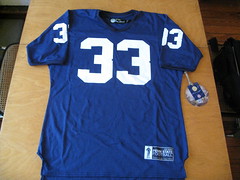
Sponsor shout-out: Two days ago I got a note from reader Kevin Dull, who wrote: “I thought you’d appreciate these new Penn State throwback jerseys that a local store is selling here in State College. A couple of years ago Nike sold some faux-back Cappelletti jerseys, but they were the same material as the current
replica jerseys. The ones I saw tonight had the old-school material.”
The jerseys that Kevin saw were made by Tiedman & Formby, who are currently advertising here on Uni Watch (top of the left sidebar). After they first got in touch with me to inquire about running an ad, they sent me a few samples, and I was seriously impressed. Old-school cotton/nylon Durene fabric, period-appropriate numeral applications (sewn on the Notre Dame jersey, screen on the Penn State), all made in the USA, etc. Can’t say I’m in love with that patch on the back of the Irish jersey, but that’s my only quibble. First-rate product, and I’m not saying that because they’re advertising here — I’m saying it because it’s what I believe.
Tiedman & Formby is a comeback project of sorts for Craig Tiedman, who pioneered football, hockey, basketball, and soccer throwbacks back in 1989 under the brand name Tiedman & Co. Sportswear. This was when Jerry Cohen (Ebbets Field Flannels) and Peter Capolino (Mitchell & Ness) were creating the market for baseball throwbacks. He eventually sold the business to Champion and did other things with his life until 2009, when he and his wife, Louise Formby, reactivated the brand. They’re currently assembling a growing collection of NCAA licenses, so we’ll likely see more of their product in the years to come, and I hope to write about them more extensively soon. If you haven’t already checked out their stuff, I suggest taking a peek.
Uni Watch News Ticker: Here’s a good story about the flag of New England, which appears on the New England Revolution’s new jersey. … “Saw these NFL pajamas at a Kohl’s over the weekend,” says Brad Jackson. “Notice the gold Bucs helmet. Apparently their definition of pewter is much closer to the gold used for the Saints.” … New Santa-themed jerseys for the Edmonton Oil Kings (from Donnie Gould). … Just what the world needs: pop-up naming rights. Why not just call it Douchebag Stadium for 11 days and be done with it? (From Ben Gordon.) … Nick Schiavo sent in a photo of his very nice Mets Xmas tree. … The new issue of NFL Magazine has a piece on throwbacks (from Steve H.). … Speaking of NFL Mag, their logo looks rather un-NFL-like, no? … Here’s what Michigan will be wearing in the Car Insurance Bowl. Backstory here. … Hard not to like this Bengals toothbrush. Are other NFL teams available? (From Ethan Crooks.) … Very interesting submission from Josh Hansen, who writes: “This shot is from a Pistons/Jazz game at the Salt Palace on St. Patrick’s Day during the 1985-86 season. It’s noteworthy for two reasons: (1) The Jazz stopped wearing the green jerseys (regularly at least) after the 1983-84 season, and (2) it’s color vs. color. Was this the first case of St. Paddy’s Day uniforms in the NBA?” Excellent question. Anyone know more? … New uniforms in the works for Minnesota (from Casey Common). … Hmmm, I had no idea the Packers had such huge rear helmet numbers in 1973. That shot is from a Packers/Chiefs gallery that Jeff Ash put together. Also notable: the uniforms on these security guards, or ushers, or whatever they were. … Yesterday’s post about names prompted Tim E. O’Brien to write a piece about the travails — uni-related and otherwise — of having an apostrophized name. It’s all interesting, but if you prefer to skip directly to the uni-relevant section, search on the word “fandom.” … Alan Tompas found a cool site devoted to soccer stamps. … Remember my semi-recent ESPN column about uniform myths? Here’s one I hadn’t heard before, from Chris Vanaskie: “I went to Penn State, and there’s a story that the football team originally wore black and pink, but the colors eventually faded to look like they were blue and white. I always thought this sounded ridiculous but still accepted it and even helped to spread the myth by telling it to friends and family. The students and alumni view it as a fact. I even remember a few years ago when the ‘S Zone’ (part of the student section that wears blue and white shirts to create a block S) went so far as to wear pink and black shirts.” Anyone care to perpetuate or poo-poo this one? … Oh man, is Kobe Bryant really gonna open the season in these shoes? (Blame Chris Flinn.) … I’ve always been opposed to domed stadia. But I may have to rethink that position now that the closed roof in Dallas led to this mildly high-larious situation last Sunday. I trust the birther folks have already booked a flyover for tomorrow night’s Jags/Falcons game in Atlanta. … Remember that Illinois high school that got hit with a technical foul due to a ticky-tack uniform violation? They won’t have to worry about that again (from Pete Lootens). ”¦ Following up on yesterday entry about my name, Jeff Barak points out that there’s an Austrian hockey player named Phillipp Lukas. Turns out he’s had a wide range of NOB variations, some of which I like better than others. ”¦ While looking for photos of Phillipp, I noticed two shots that show him wearing what I assume is a captaincy designation at the base of his collar, instead of off to the side — never seen that before. Of course, I’ve never seen that many ads on a hockey jersey either.
The NBA indeed does have a similar rule about giving notice before changing uniform numbers. I remember the big breaking story when it was announced that Kobe was going to switch from 8 to 24. And during his last year with the Cavs, LeBron filed the proper paperwork, so that even if he had stayed in Cleveland, he was still going to switch from 23 to 6.
Of course, these happened about 15 years after Jordan. So the NBA has it now.
There have also been some minor league baseball players with the last name Lukas, like this fellow from Long Island who pitched in the Northern League in the 1990s:
link
Remember how LeBron had to apply to the Association while he was still a Cavalier to change his number from 23 to 6?
I wonder how the new baseball rule will affect call-ups. They’d take whatever number was available when they got to the majors, and then switch to a lower, more “appropriate” number when they became more established. Are they now going to be stuck with 56?
Adam beat me on LeBron.
Mark Buehrle doesn’t seem to have a problem with 56.
No, they’ll simply have to notify the league prior to July 31 that they plan to change numbers for next season, just like everyone else in the league.
BurghFan, I was thinking the same thing. This is really unfair to those callups.
On the other hand, it might not be a problem, because this only applies to players whose jerseys are being made in advance and then sold. Call-ups and short-term guys don’t have jerseys made like that, do they?
And of course it doesn’t apply at all to players whose jerseys have numbers only (NNOB), though today only the Yankees have none of their jerseys tainted by names.
I’ll be an optimist and hope that this otherwise-ugly decision spurs more teams into going NNOB, and convinces players to agitate for NNOB jerseys so that they don’t have to pay out money just because their favorite number became available.
Would it really be a problem for callups? Not many would have warehouses full of merch to buy out if they were to willy-nilly change the uni number. I take rules like this to keep high profile players from changing randomly. I would think that the merch machine would like a LeBron to change numbers every year so that more “polyester shirts” could be sold.
First off, there’s no penalty if the player informs the league of his intention prior to July 31. The penalty only applies for number changes made after that date. And if a phenom callup finds himself in such a situation, it seems safe to assume that the team will eat the merch dollars on his behalf. It’s as much in the team’s interest for marquee players to have stable, identifiable (read: low) numbers as it is for the player.
What I don’t like is that this makes the number issue a matter between the player and the league. But numbers don’t (or shouldn’t) belong to the player, they belong to the team. A team should have absolute right to give any player any number it feels like, and if number changes are a problem for the league, then there should be a league policy that applies to teams. If a player wants to change his number, that’s between him and his team, and if his team wants to grant the request, then that’s a matter between the team and the league. This isn’t properly a matter for an agreement between players and the league.
Have to assume that Minnesota’s new uniform is related to the Under Armor announcement in yesterday’s ticker.
Don’t count on it. The teaser has a Nike logo incorporated right into the image.
yeah, no. Like Adam pointed out, this means they’re officially out of the UA running – which was to be expected (IMO) because they seem to have a good relationship with nike.
Gophers switching to Under Armor? Saw that rumor of a Big 10 school is switching on Chris Creamer
Don’t bet on it. If that were true, then they wouldn’t have bothered putting the Nike logo underneath the Minnesota “M”. It’s probably gonna be either Indiana, Wisconsin, Nebraska, or Northwestern.
I doubt it will be Indiana. They signed an 8-year deal with Adidas in 2008. Of course Adidas could have let IU out of the contract. However, I have not seen that in print.
link
The Hoosiers only recently (last decade or so…) got their shit together and went to one uniform supplier for the entire school and at the same time finally solidified their colors to a specific tone of red and true white (Everyone remembers Antwaan Randle El wearing black helmets, but other teams wore blue and shit even into the late 90s).
Adidas was a big part of that and the basketball program (read: The money maker) has a good relationship with the three stripe so I doubt IU would turn their back on them.
My money is still on Northwestern.
Does UA make hockey apparel? If not, I’d bet it’s not Wisconsin.
They outfit all of Boston College’s teams, including hockey.
New bowl jerseys for Michigan
link
Already in the Ticker.
Where this new number-switching rule in MLB could be more of an issue is when, let’s say, Average Player X wears Number Y. The team acquired Big Star Z, who has always worn Number Y. In the past, Big Star Z would buy something for Average Player X to get Number Y. Now, there is an additional complication. (There might not be much stuff out there on a average player, but name teams have t-shirts and stuff with the names and numbers of several players.)
This came up last year when Drew Storen of the Nats changed from 58 to 25 in the 2010-2011 offseason, and we bought Storen 25 t-shirts from the Nats team store. Soon after that, though, the Nats signed Adam LaRoche, who has always worn 25, so Storen switched to 22. We kept and wear the Storen 25 shirts to Nats games, even though he never wore the uniform anywhere but an autograph signing.
Actually, Adam has only worn 25 since he left the Braves the first time. He (and Andy) would have prefered to wear No. 17, their father’s number, and both wore that number in high school (I was the sports editor at the newspaper in Fort Scott, Kansas, when both of them in high school).
Adam’s numbers have been these:
19 the first time with the Braves (He couldn’t have 17 because Glenn Hubbard had it).
25 with the Pirates (at the suggestion of A—-* Jones).
23 in his very brief tenure with the Red Sox.
22 the second time with the Braves.
25 with the D-Backs and Nationals.
(* – Who the hell can spell his first name off the top of their head?)
@ NFL pajamas
If I had to assume, cheap products like bed sheets & pajamas routinely use a limited set of inks & paints (as opposed to the blending CMYK process) and don’t really bother with specific Pantone colors. Pewter is subtle enough to pass as metallic gold on the dime. Judging the pic, it looks like the Seahawks, Titans & Lions (and probably many others) use the same shade of lighter blue on there.
You’re probably right.
If there’s anything to complain about with those, it’s the red Bills helmet making them outdated.
Graphics Arts divisions & specifically Printing Press Operation was my college background & major. Had a lot of fun taking all those classes. Too bad the Printing industry dried up (no pun intended).
On the same note, when you think about something that’s printed, you’re limited to how many color stations the press has, and when you have every team’s helmet on there, you’re going to have to pare down all the reds to one red, all the blues to one or two, etc.
Or this fabric could be sublimated, which would just make it inexcusable why the colors are inaccurate.
Lived in New England for a very long time, never heard of the Flag of New England before
That’s because there never was one.
The Pine Tree flag was indeed the standard flown over Breeds Hill (at the Battle of Bunker Hill), and Trumbull did indeed show it in the painting “Death of General Warren.” Warren wasn’t much of a general, actually, but certainly brave and he certainly took one for the home team. I also dated his great (6x) granddaughter, and I also hijacked the Pine Tree flag as the logo of a group I ran called the Liberty Tree Alliance, both facts noted on this site already, but I’m going to keep repeating until Paul makes some explicit allusion to my sheer wonderfulness.
… Um… oh yeah, the flag. No official body ever decided that any rag was the “Flag of New England.” Not ever. Nor can one point to a popular trend (evidenced in newspapers, schoolbook, etc) that any flag was considered the “Flag of New England” by custom. iSome websites will show you a blue flag with a red-on-white Cross of St George in the upper corner and say THAT is the flag of New England. The Pine Tee flag is a beaut (it hangs on my wall), the Bennington Flag is a beaut (ditto re wall), but neither has any historical basis as the “Flag of New England.” Sorry.
WAIT! Just got around to reading late entries from yesterday. A little after 6pm, Arr Scott (pronounced Our Scott) revealed that he is a direct descendent of Robert Rogers, the eponymous leader of Rogers’ Rangers and a very significant influence on the outcome of what Americans call the French and Indian War. Without Robert Rogers, the French would have been able to keep control of what was then the Great Northwest and better provision their positions on the St Lawrence. No British army could do what Rogers and his rough men did. Yes, he did pick the wrong side in the American Revolution, but hey. The bigger question, I think, is whether Scott dated a direct descendent of General Warren.
Nope, but I did once discover a very fine fowling piece hanging in a Hapsburg hunting lodge in Bohemia attributed to a 17th century gunsmith with my wife’s very rare surname, so there’s that.
As to the New England flag, it seems that the use as a regional flag postdates the Revolutionary era. (Though to be fair, there was no “official” body that could have given its blessing at the time. New England being a region, not a polity.) But the same is true of many flags we associate with the era, including Bennington, which probably didn’t even exist until the 1800s. (Anachronism or no, I too love the Bennington flag, and fly it every July 4 – though only after flying the Grand Union on July 1-3.) The pine tree was widely used as a symbol, including on flags, by New Englanders during the Revolutionary era, and in the last century that flag has gained currency in New England as a regional symbol, so I think it counts.
NFL magazine: HATE the title font. wtf?
The “UN-NFL” font on the cover of NFL Magazine is the same font used for the NFL Redzone Channel.
link
Interesting. Still, it’s one thing to use that type treatment for the words “Red Zone”; it’s another to use it for “NFL.”
Agreed. I also found it odd that they could have pulled the top horizontal line in the F back to the right vertical line in the N on the cover of the Mag as they did with the N & E in RedzoNE, but chose not to.
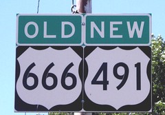
Ah, the roadgeek in me is quite amused by the picture in today’s lede.
I thought it was “highway enthusiast” now…
I wonder how much overlap between road geeks and those that partake in the obsessive study of athletic aesthetics.
Count me amongst the road geeks. I immediately recognized the significance of today’s picture of “the Devil’s Highway”.
LOVE me the road signs, too.
Remember the yellow stop signs with the “THRU” above and “TRAFFIC” below on the older yellow stop signs.
Also remember yellow SQUARE curve signs set low to the ground instead of the yellow diamond shaped curve signs…at least in PA anyway.
LOVE me the road signs, too!
Green Bay ushers? They look like service station attendants.*
*For all you young youngsters out there….there once was a time–not all that long ago–when gas stations actually had employees that did more than sell wretched hotdogs, beer, Maxim magazine and lotto tickets. They actually came out and put gas in your car, and checked your oil. They might even check your tires’ air pressure. All with bright smiles and spiffy outfits. Ding Ding!!
Sort of like these guys: link
Nice, nice, nice, nice, nice, nice.
Go to New Jersey. They don’t check your oil and wash your windows, but every gas station has station attendants that pump the gas for you. There is no self-serve in New Jersey that I’m aware of.
I have no knowledge of it, but I have a sense that the union lobby got state legislators to require that gas has to be pumped by an attendant.
“Go to New Jersey”
No thank you.
There are parts of Jersey that are incredibly nice.
Not only do they pump gas for you in New Jersey, but the price is always cheaper than New York and Pennsylvania.
Oregon is another attendant-pump state.
Same in Oregon. I got out to pump the gas and this guy came running up, I went, “uh…..what are you doing?”
Having grown up in NYC and New Jersey, for me it was the opposite. On a trip out of state as a kid — Maryland, maybe — Dad gets out of the car and picks up the gas pump and I’m thinking, “What is he doing? You can’t just take gas! What’s gonna happen if someone sees him!?”
As a Washingtonian who is near our border with Oregon I have had to on more than one occasion help an Oregonian pump their gas because they didn’t know how it worked. I think it has something to do with taxes, but Oregon almost always has lower gas prices than Washington even though they have to pay those extra attendants. They get really ticked if you try to pump your own gas too.
I’ll bet the use of attendants lowers the insurance premium the stations have to carry, too.
As far as I know, Oregon residents have attendants pumping the gas. No window washing or anything like that. This has been for some time now. My understanding is that it’s to control the careless spilling of gas, that can occur during the filling process. All the environmentalists came together and lobbied for it. What makes an attendant better at pumping my gas, then I am anyway?
I remember the issue with Michael Jordan during his comeback was NOT him switching to #45 (I think the league was actually glad, thinking they could get repeat sales), but when during the playoffs, he suddenly went back, unauthorized, to #23….
Ah, I think you’re right. Good call.
Hadn’t the Bulls also retired 23 in the interim? I seem to remember that being the reason for Jordan wearing 45 upon his return.
As do I.
Jordan had already been wearing #45 during his baseball “career”…he said he didn’t want to wear #23 anymore after his father was killed. The Bulls did not retire his number during this period (they rightfully thought he’d be back, and even if they did, it’s not so binding that they couldn’t break it out for him (or anyone else)whenever they wanted.
It would appear we are both right. His number 23 was retired on November 1, 1994, the same day his statue was unveiled at United Center.
link
When he came back, he wanted to wear 45 since 23 was the last number his father had seen him in.
Jordan also wore the uncharacteristic No. 45 – the same number he wore as a baseball player – instead of his retired No. 23.
“I didn’t want to wear No. 23 because it was the last thing my father saw me in. This is a new era so I’m going to wear this number. Although it didn’t bring me luck today,” Jordan quipped to the hundreds of media people at a news conference after his first game back with the Bulls.
link
He switched back to #23 after a couple of bad performances in the Magic series. Due to the unauthorized switch, the league fined the Bulls 25G’s per game that he wore #23…
While looking at the soccer stamps that Paul linked to, I noticed London 2012 olympic stamps. Included in the stamps is a “Goalball” stamp. I had never heard of this sport before (being generally ignorant of things not right in front of me), but Goalball is a Paralympic sport played by blind or visually impaired athletes. It’s a 3 v- 3 game using a ball that has bells inside. It looks like an exciting game: link
Looks like they don’t trust that the athletes are blind.
“remember how David Wells wore No. 3 at the beginning of 2005 and then said, “Ah, never mind” after a few starts?”
I’d purged that from my memory, Paul. =(
Regarding number tattoos, players would have to do something similar to what NASCAR fans do. Or did. Remember when Dale Earnhardt, Jr changed numbers? Fortunately for those fans, he switched from 8 to 88. I can’t imagine what they would have done if it had been something like 52.
Maybe it’s just me, but if a person is dumb enough to tattoo an athlete’s number somewhere on their body, they deserve their fate if said athlete decides to change numbers.
I know. I’m not a fan of tattoos in general. I’m glad I don’t have to worry about it.
Especially NASCAR, where even the most popular drivers will change numbers 2, 3, 4 times in their career. Jimmie Johnson and Jeff Gordon are exceptions… but Stewart, both Busch brothers, Dale Jr., Kenseth, and a host of others have changed multiple times since I started watching in 2005.
That always bothered me about NASCAR, I wish they would run the number they receive in the final standings, if you’re the champ you should run #1 the following year. I’m sure the NASCAR fans would hate this and I don’t really follow NASCAR but it would make more sense. The way it is now the number becomes more of a “Logo” in a sense.
Interesting idea, MEANS. What if they changed numbers each week, based on their spot in the standings? Wouldn’t that be different. I’m not a NASCAR fan, but I’m guessing they wouldn’t take to that change too well.
Re Penn State Colors. I have regularly perpetuated this “myth”, most recently to my 10 year old daughter as we were discussing the PSU uniforms while watching the Nebraska game. That’s what I think I read in a PSU football program or something as a freshman. Please, someone let me know I wasn’t lying.
Also Re Red Bills Helmet in PJs. At least I can accept that from some low level NFL licensee, that probably is using some of last years stock. What about a major media website (read si.com) still using the red helmet in their NFL scoreboard page?
There are several stories on official Penn St. websites that state the original school colors were pink and black. Here’s some links from Penn St. websites and some from non-Penn St. websites.
link
link
link
link (second sentence of first paragraph)
The original colors were indeed pink and black, though the pink was a very dark shade. The story I heard was that they faded to black and white, and they decided to change the black to blue.
Penn State’s original colors were pink and black. If they used pink and black now they would have a much better looking uni in football.
I heard they switched to blue and white and adopted the ‘nittany lion’ mascot to be more like Western Pennsylvania University which is now more commonly known as The University of Pittsburgh.
I’m being a little sarcastic in the taunting but I honestly, 100 percent, did hear that as we had our mascot and our colors first.
Hail to Pitt and see all you Penn Staters in 2016!
The story I’ve heard is that our colors were pink and black, and the jersey story is true, but that it was the baseball team’s jerseys that faded into blue and white. Supposedly the football team wasn’t founded until after the official colors were changed to blue and white.
Of course I’ve heard many different versions and people pretty much just accept that the original colors were pink and black and there’s come grey area as to how they eventually became blue and white.
Yet another Penn Stater here who grew up with the pink and black story, although I’d never heard that the colors faded to blue and white (more like grey and grey). The version I’ve always heard was that the student body got to vote on a new color scheme and blue and white won the day. The joke on campus is that’s the last decision the students at Penn State ever were allowed to make.
“Christmas”, not “Xmas”.
Happy Decemberween.
I love celebrating Decemberween with a nice glass of warm melonade.
I was always more partial to a Cool One.
I got a text from a kid the other day, didn’t even use the vowel.
Xms
Got his point across.
Are you opposed to “Xmas” on religious grounds or stylistic grounds?
I think we can assume the objection is stylistic, since there are no valid theological grounds for Christian objection to the usage. The use of X as an abbreviation* for “Christ” in our language dates to at least the 11th century, and in the wider church to the 1st century.
*The X is a Latinization of the Greek letter Chi, which begins the word ΧÏιστός, or Kristos, which is the origin of the actual word “Christ,” being itself the Greek equivalent of “messiah,” literally “anointed one.” People seem to forget that “Christ” is a title, and even “Jesus” is a transliteration of a transliteration; the guy’s actual name was Yeshua ben Yosef, though he often referred to himself as ben Ha’adam during his ministry.
Merry Christmahanukwanzakah!
Yule, baby, yule.
NFL/NCAA toothbrushes:
link
I’m shocked nobody has yet made the joke that you could just sell Penn State’s current jersey alongside a throwback and there would be no difference. And as for the black and pink colors… what are the university’s official colors? Seems like that would put to rest whether or not that myth is true. I don’t know of any instances where a school just starting a sports program “way back when” did NOT use the school colors.
Except of course for the shade of blue…
Also… Oregon wore blue & yellow despite the school colors being green & yellow – from 1894 to 1924.
link
Interesting. Now that I think about it, I believe Virginia Tech may have chosen colors different than the school colors (trying to achieve uniform colors that were “different” than other schools). So maybe it wasn’t as common of an occurence as I first thought.
Close, Tech’s (Virginia A&M) original colors were black and gray. However, the administration decided to change the colors officially to maroon and orange when the school was renamed Viriginia Polytechnic Institute because they thought the black and gray football uniforms looked too much like prison garb and no other school in the country was utilizing the maroon/orange combination.
link
On a side note, WVU’s official school colors are old gold and blue. link
W. Va. definitely does not wear old gold anymore. VMI’s official colors are “red, yellow, and white,” and it does not wear yellow anymore.
VMI football colors are definitely red and gold.
link
Maybe blue & yellow were big amongst 17 year olds at the time? BAYFBAYS?
I hear the lads looked quite dashing at the time in their blue and yellow fashion pantaloons.
that early Oregon color with the dark blue is gold.
The “official” colors are blue and white. The shade of blue varies a little bit from team to team, but it’s always navy or close to it. The shade has changed quite a bit over the years though. If you find some old footage from the 60s, the blue was closer to a royal blue, like the Baltimore Colts or New York Giants.
Occasionally, you’ll see a silver or gray accent. The basketball team had them on their side stripes, for example.
I believe the baseball team has used varying shades of blue in the same uniform. For a while their official hat was a cascading interlocked PSU with the S at the center and bigger than the other letters. I believe it was a sky blue and the other letters were white.
Except that many schools adopted “official” colors only after a period of evolving use by athletic teams. Same with nicknames & mascots. So the story is entirely plausible, at least on that score.
Pink and black it was –
link
It isn’t unheard of to see pink and black t-shirts around campus. Also, one tailgate uses a pink flag with a black S as its identifier.
Several schools had different colors as originals. I think Syracuse also had pink. Pink and blue maybe?
Maybe some day somebody can find a list with schools original colors?
Ohio State was orange and black. But they did not want to have same as Princeton so went with scarlet and gray.
I think one of those thick ESPN college football books from a few years ago had bits about original school colors.
We need our master uni tweaker Tim E Obrien to do a Penn State pink and black in today’s uniform style.
link
Also, damn you LarryB for using the Obrien version of my name, hahaha (if you don’t get it, see paul’s link to my site today.)
Man you are on the ball there Tim.
Glad you mentioned that. I just read about the last name. I feel for you. And the way others spell the last name.
Marty Biron’s Winter Classic Mask:
link
Is it bad that my first thought was “Florida Panthers”?
I think he’s requesting a trade through his mask.
A tribute to famed 1970s goalie Gilles Gratton!
link
link
I wonder if that’s why Andy Moog rocked the fierce-as-all-get-out bears.
That and the Bruins’ old shoulder patches.
Love those Tiedman & Formby jerseys. Especially the link.
Yes, what a great find!
I picked one of the Penn State Ham jerseys – it’s really nice. Actual durene – not the all poly fabric used by other retro jersey makers.
The new issue of NFL Magazine has a piece on throwbacks
The “Uniform Monitor”?
Where did I leave that rolling-eyes gif?
Maybe what we need is an Anti (uniform) Monitor?
/+1 to anyone who gets that joke.
Oh, I do. Sadly, my wallet and I get that joke all too well.
+1
Run, Barry, run!
Nice, to see a couple fellow geeks
+1
Would that make Phil our very own Psycho-Pirate?
That’s not even the worst bit, Chancey my good man. (sorry, just wanted to say that)
The worst bit is that he declares himself to be “America’s foremost appraiser of all that’s good and bad in the Technicolor world of sports apparel”. I know Fearless Leader would never bestow such a ridiculous title upon himself, but it’s pretty much de facto at this point.
No greenish sparkles for the Jags on those NFL PJs?
Nice username, bro.
I’m just now noticing the photo that accompanies today’s entry… did that highway get its number changed just because of the association with “666”?
I bet people kept stealing the signs.
Is it in Toronto?
Why would you think it’s in Toronto? There’s no maple leaf on it.
Not only that, but that’s clearly a US Route marker. I know it’s hard to remember, but they are their own little country up there, complete with highway signs and everything.
Wow- I didn’t think that would fly that far over everyone’s head- the Blue Jays have (allegedly) been stealing signs for the last couple years.
You see- “signs” in baseball are like signals from the catcher to the pitcher that… oh, nevermind.
link
Players will be prohibited from getting tattoos with corporate logos.
Does that include team logos? What if you get a tattoo with the logo of a sole proprietorship? LLC?
This shows what all of the state highway markers look like (scroll down a bit):
link
I like to consider this the “uniform” for each state road.
Great tip! I like especially like Kansas, California, Washington, Florida, Vermont, New Hampshire.
Arizona, Kansas, Minnesota, New Mexico, North Dakota, Pennsylvania, Guam. Hands down. Oddly, Nebraska’s signs look much better in person than as a jpeg thumbnail. That, or the seemingly endless expanse of the state just lulls me into aesthetic numbness when driving across it. Anyway, in person, you can really see that little Oregon Trail motif at the bottom along with the numbers.
Here’s the Canadian equivalent:
link
Thanks for that, Arr Scott.
Rockies to get new road grays in 2012:
link
Hope this doesn’t mean they’re ditching the road pins. Without that, the Rockies would be among the bottom three unis in MLB at the moment. Keep the home and road pins, switch to the purple cap, eliminate all alts, and the Rox would be in the upper half of baseball instead of scraping the bottom.
About the splash photo…I read a passage in Weird Pennsylvania (great reading BTW if you live in PA) about PA’s own Route 666. Many states had one apparently, although they were changed either because of religious “fear” or economics, PA hasn’t changed theirs. In fact, link. Surprisingly, only a few signs were stolen from PA Route 666 (suck it, Jersey).
Also, that highway in the splash goes from Utah through Colorado into New Mexico…which explains the federal funding.
link
There goes link dream of playing in the Majors.
2-Time American League Champion Texas Rangers Uni-News
link
PL just saw the blurb about being opposed to domed stadiums.
You won’t be opposed to it once that January/Feb SB rolls around to the Big Apple.
This coming from someone who was at Bengals/Chargers ’82–
-59 below WC.
TRULY cold.
I think it makes the game more fun. People remember the Ice Bowl because it was so ungodly cold outside, not because it was Lombardi vs. Landry (or at least at first). I always loved the weather factor in football, and never really cared for teams with a dome.
Also, Super Bowl’s in open air stadia up north? Freakin’ sweet!
PL just saw the blurb about being opposed to domed stadiums. You won’t be opposed to it once that January/Feb SB rolls around to the Big Apple.
Um, it’s not as though I’ll be attending the game in person, Brinke.
Frankly, the potential for a snowy Super Bowl is the best argument yet for not having any domes.
Very impressive to hear you were at the 1982 AFC championship game, though. I remember watching it from the warmth of my living room on the teevee (see, the lack of a dome had no effect on me in that case either). Did you get frostbite? How much did you have to bundle up? Details, please!
Boy, they don’t waste any time, do they?
This was up within an hour of the trade.
link
Why doesn’t the MLB tell suppliers to cut down on surpluses? The people in charge always make it seem like they are against the players. Nothing worse than working for an employer who not only doesn’t have your back but also stands over you with a stiff ruler. It’s baseball for crissake, it should be about fun.
What if the player says he’s just changing the base in which the number is expressed, and not the number itself? Like if Derek Jeter were to switch to number 10, could he claim he wants his uniform to be in binary now instead of decimal, and the number is still the same? Nowhere does it say it has to be in Base 10. It does say the digits must be between 0 and 9, but even that wouldn’t rule out higher bases alltogether. They couldn’t wear number 1B, for instance (that would be what we know as 27 expressed in hexidecimal), but they could still wear hex number 19 (which would be 25 in base 10).