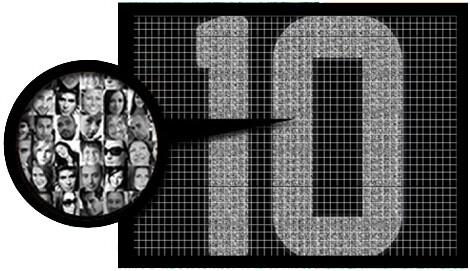
Phil briefly mentioned something on Saturday that I want to explore in greater detail today. Here’s the deal: Sevilla — that’s a Spanish soccer team — is letting fans pay to have a tiny photo of themselves printed within a player’s uni number or NOB. Photo size: two millimeters square. Price: about $33, depending on today’s exchange rate (or on whether the Euro still exists by the time you read this). A few other European soccer teams will soon be offering the same service.
Most of the reaction I’ve seen has been negative. That Yahoo Sports story refers to it as “a new way to squeeze money out of [fans]” and quotes another site calling it a “money-making scheme”; on Saturday, Phil called it “some new corporate whoring profit-making move”; in Friday’s comments, Mike Engle referred to it as “a totally gross cash cow.”
Personally, though, I find the idea more silly than offensive. And as silly ideas go, I think this one is rather clever. For starters, there’s nothing corporate about it. This isn’t like selling corporate ad space on a uniform; it’s more akin to those personalized stadium bricks (which I also think are silly, but largely harmless). In other words, it’s a way for fans to feel a more personal connection to their team. In that sense, it’s actually the opposite of corporate whoring, which drives a wedge into the fan/team relationship.
Is this also a rather transparent attempt to create a new revenue stream? Sure. But nobody’s forcing anyone to put their photo on a jersey (just like nobody’s forcing anyone to buy a $200 polyester jersey, or any of the other crap that teams sell).
Of course, it’s worth noting that I don’t really give a shit about soccer, so I don’t have much of an emotional stake in this. But what if the same thing started happening in Major League Baseball? Specifically, what if the Mets started doing it?
I can’t say I’d be thrilled. But my main concern would be that the photo-imprinted numerals look sort of faded and camo-ish (at least based on those photos in the Yahoo story). In other words, my concern would be more aesthetic than conceptual. Even then, I’d at least want to see how it looked before passing judgment. And if someone told me I could have an itsy-bitsy photo of myself lurking in Jose Reyes’s Ike Davis’s uni number, I’m not gonna lie: I think that would be kinda cool. I don’t think I’d pay to do it, but I’d have fun imagining it.
Here’s a related thought: Most MLB stadiums have really ugly corporate advertising on the outfield wall. If a team could raise just as much $$$ for a given portion of the wall by letting fans pay to have tiny photos of themselves printed on the wall, wouldn’t that be preferable?
Of course, there are no ads on MLB uniforms (yet), so there’s no need to make that trade-off. But if forced to choose between a MasterCard sleeve patch and a bunch of fan photos imprinted on the uni numbers, to me it’s a no-brainer.

Collector’s Corner
By Brinke Guthrie
In the beginning, there were Chucks and Jack Purcells. And they were good. And then the Dassler brothers started rocking in Germany and started Adidas and Puma. Puma Clydes owned my high school in the mid-1970s. And by the way, Broadway Joe scores in Pumas, baby. I don’t think he needed any mistletoe, either.
As for the rest of this week’s eBay finds:
• Here’s a great 1973 Bengals team photo. I had this, and I always thought it was cool they had Nos. 12 through 20 sitting in order.
• Had this too — a terrific early 1970s Minnesota Vikings poster.
• Check the eagle wings on this little bobble dude from the 1960s.
• Off to Canton we go, with this 1960s Football Hall of Fame coin bank with AFL logo stickers on it.
• I like this retro-style 1950s football sweater– is that Michigan on there?
• Here’s one from Paul: a nice set of Baltimore Colts glasses.
Seen something on eBay that you think would make good Collector’s Corner fodder? Send your submissions here, or tweet them here.
Holiday reminders: Uni Watch aspires to be your one-stop shopping source for all your holiday war on Xmas needs. Por ejemplo:
• If you want to buy someone a Uni Watch membership as a gift, full details on how to do that are available here.
• From now through the end of the year, if you order two sheets of stickers based on your membership card design (that costs $26), you’ll also get a free sheet of Uni Watch logo stickers (a mix of all three colors). Instrux for ordering stickers can be found here.
• Speaking of the circular Uni Watch logo stickers, my recent offer still stands: If you want three of these stickers (one of each color), send a self-addressed stamped envelope to Paul Lukas, 671 DeGraw St., Brooklyn, NY 11217. If you want to enclose a coupla bucks or a barter offering, that’d be nice, although it isn’t required.
• T-shirts, beverage coasters, coffee mugs, and the like are available at the Uni Watch shop on Zazzle.
Uni Watch News Ticker: Here are some video game shots of some of the new MLB uniforms. … Scotland County High School in Laurinburg, North Carolina, uses a helmet design based on the Phil Sims-era Giants (from Gerry Dincher). … Hmmm — is this a blank nameplate, or was the nameplate removed? (Screen shot by Jimmy Atkinson.) … New cycling kit for Omega Pharma (from Ted Hill). … Gazoo update: A week or so ago I mentioned that Rawlings would be unveiling a new version of the S100 helmet at the winter meetings, and here it is. Can’t tell much from that shot, but I’ll try to get better visuals from Rawlings today. ”¦ An additional college football note from last Saturday: Clemson wore a “91” memorial decal for Chester McGlockton (from Benji Boyter). ”¦ And here’s a college football follow-up: Yesterday I mentioned that several readers thought Lamin Barrow of LSU had some backwards letters in his NOB, but I thought it was just the way the fabric was stretching. LSU assistant equipment manager Louis Bourgeois saw yesterday’s post and responded like so: “We received a few texts/tweets during the first half on Saturday about the Barrow jersey. You basically got it right: It was a combo of the angle of the picture and the way the jersey was sitting on the Velcro. We went ahead and snapped this picture in the locker room during halftime just in case this came up.” So there you go. ”¦ Looks like the only thing bigger than the Marlins’ cap logo is their sleeve logo. ”¦ New kits for the Columbus Crew (from Jeff Frazier). ”¦ Next time the Texans wear their red jerseys “presented by Halliburton,” remember that they’re in bed with a company that’s so scummy, even other scummy companies can’t stand them (thanks, Phil). ”¦ Good-looking game at the Garden last night, as the Rangers wore white at home and the Leafs wore their throwbacks. ”¦ Detroit Mercy hoops wore their Dick Vitale throwbacks last night, and the court featured a massive Dickie V. signature (from Stuart Ratliff). ”¦ Quite a bit going on here: the Oregon-style diamondplate, the Flying Elvis rip-off, the wordmark on the thigh, and let’s not overlook the Magic Marker on the arm. And in case you were wondering, here’s what the team’s road uni looks like (from Nick Hanson). ”¦ Another high school with a dubious logo choice: Camas Valley High in Oregon uses the Hawaii helmet logo. Didn’t they know they’re supposed to use the XFL Hitmen logo instead? (From Joe Alvernaz.) ”¦ In case you haven’t seen it, the three-part series about Derek Boogaard in the Times is the kind of work that wins Pulitzers — epic, powerful, compelling. Here you go: Part 1, Part 2, and Part 3. ”¦ The Sixers are letting fans vote on the team’s new mascot (from Kurt Esposito). ”¦ R.I.P., Hubert. Killing floor, indeed.
Given the broad swath cut by Uniwatch, any thoughts on NHL Realignment and/or what they might name the conferences?
Presumably, Gretzky, Lemieux, Orr and Howe is too obvious.
Imagine what those logos or trophies would look like.
Would l’Habs be willing to play in the Bobby Orr division?
New conference names for NHL:
1. SNOWBIRD. Northeastern US, Quebec & Ontario, Florida.
2. MELTING POT. Mid-Atlantic US.
3. RUSTBELT. Central time zone.
4. REFUGEE. Pacific time zone. [Requires Colorado move to Seattle]
Would it be too much to hope for Patrick, Adams, Smythe and Norris?
I’m 100% behind the idea of bringing back the heritage of the sport.
Smythe = Pacific/Mountain timezone teams.
Norris = Central/Eastern timezone teams.
Adams = Northeast/Florida teams.
Patrick = Atlantic coast teams.
…and white at home!
There was something really cool seeing how there was a bunch of red Indianhead sweaters in the crowd at the blue-clad Scottrade Center Saturday night. Really stands out. You just can’t get that with white.
How about a French name? (Could Laurier skate?)
AS IT SHOULD BE.
Though I should point out that when those names first came into use in 1974, the divisional alignments were far more whack:
Wales Conference 1974
Adams – Boston Bruins, Buffalo Sabres, Toronto Maple Leafs, California Golden Seals
Norris – Detroit Red Wings, Montreal Canadiens, Pittsburgh Penguins, Washington Capitals, Los Angeles Kings
Campbell Conference 1974
Patrick – Atlanta Flames, New York Islanders, New York Rangers, Philadelphia Flyers
Smythe – Chicago Blackhawks, St. Louis Blues, Kansas City Scouts, Minnesota North Stars, Vancouver Canucks
Laraque = Pacific/Mountain timezone teams.
Twist = Central/Eastern timezone teams.
Probert = Northeast/Florida teams.
Domi = Atlantic coast teams.
History or no, I don’t like the idea of naming conferences after players or anyone else mainly associated with any particular team. Geography! But there’s no reason for leagues to restrict themselves to cardinal directions. Could be any combination of seas (Pacific, Atlantic, Gulf, Great Lakes), rivers (Frazier, St. Lawrence, Mississippi, etc), features (Rockies, Prairie, Piedmont, etc.) Plenty of room to get creative and do something more interesting than East, West, Central, South or whatever. If the NHL has to go with names, they ought to be maximally whimsical and/or mock-serious:
Arthur (southern/eastern US teams, named for the president who may have been born in Canada), Dickens (central/mountain teams, named for Charles Dickens’ son Frank, who served as a famously incompetent Mountie), Fraser (west coast), Diefenbaker (everyone else).
The Butcher, the Baker, the Candlestick maker…
and Charles.
That’s my vote
Given the NHL “leadership” these days, I’d say:
Nike Division
Reebok Division
Adidas Division
Pepsi Division
Walmart Division
Leaders and Legends?
Crosby, Stills, Nash, and Young
happy birthday jimbo
Thanks, Skip.
And many more, Jimbo!
The Sixers are having a choose-a-mascot shindig, but giant foam numbers 7 and 6 aren’t among them? Epic Phail.
Detail I hadn’t noticed before on the Miamarlins unis: the collar piping is so far inset that it doesn’t have to bend into an angle at the front to follow the line of the placket. This gives it a much more “loopy” arc than typical collar piping, and makes it look like a tooth fairy necklace. I give it about 15 percent odds of being less ugly than normal collar piping when worn with an actual tooth fairy necklace, since the shapes will roughly match, and about 85 percent chances of making tooth fairy necklaces even uglier, since it may just look like the player is wearing two tooth fairy necklaces.
“… The Sixers are having a choose-a-mascot shindig, but giant foam numbers 7 and 6 aren’t among them? Epic Phail…”
Brilliant idea, Scott. Those three official “candidates” are really stoopid.
The dog makes me think of McGruff. The moose is just nonsense.
Whatever, I’m not the target audience for mascots anyway, and I was never really that big into them to begin with, even as a kid.
Oh my, those are all quite pathetic… what is the Philly Moose all about???
Why not go with the obvious choice, a bald eagle?
Or, if you don’t want to associate with the football Eagles, how about Ben Franklin’s choice for the national bird: a turkey?
I know they want to stick with animals, but I think a link would make a better link than the ones that are up for a vote.
The fact that one of them is supposed to be Ben Franklin himself is the only redeeming thing about any of these mascots. Makes that one pretty much the mandatory choice, even though it bears no resemblance to actual Ben Franklin whatsoever. The dog looks way too much like link, and the moose is, um, a moose. In Philadelphia. So the long-haired Robert Duvall one that’s supposed to be Ben Franklin it is.
Always remember to recycle… TO THE EXTREME!
Honda F1 did a fan-connection livery in 2007-8. Names of people pledging to improve the environment were added onto the Earth images on the car.
link
Completely agree with everything you’ve said Paul. This IS just another money making venture. So what? Fans aren’t forced to swallow anything they don’t need to and at the same time they are free to avail of something which is pretty damn cool even if they do have to pay. Recently the Irish rugby team ran a similar thing where fans could get their names arranged on the jersey so the numbers on the back were made up entirely of fans names. (link) It was free (as long as you used a particular phone company). In fact, by virtue of its association with a particular company, it was actually corporate — unlike what Sevilla are doing. But it wasn’t overtly corporate — there was no more actual advertising on the jerseys than normal — and I can honestly say that it was cool knowing that there was a player out there with my name on his jersey.
Did you know which player it was, Paddy?
PS Still smarting from a remark by our host. “…I don’t really give a shit about soccer…”
I know it shouldn’t hurt, but It hurts, that’s all. Would it kill him to fall back on an empty euphemism or two? “Despite its evident global appeal and the overwhelming demonstrations of passion that the game provokes in the breasts of three billion of my fellow bipeds, my own personal failures of imagination — not to mention my chronic discomfort in the face of the beautiful and the sublime — prevent me from appreciating this noble construct as much as it deserves.”
Yeah. They sent you an e-mail to tell you which one you got. There was a lottery to determine who got on and on which jersey. I think I was on Paddy Wallace’s jersey for one of the games and I think Jerry Flannery’s for another.
Guess I’m in Paul’s league when it comes to soccer. I must have skipped over the previous reference.
The Sevilla scheme is BRILLIANT. It’s certainly preferable than going NASCAR. As stated, no one is holding a gun to anyone’s head to participate. It’s so small that it’s innocuous. It allows true fans to literally buy into their team.
It also reminds me of Nike’s initial SOD when it personalized basketball jerseys with names of players. But this is better. After all, it’s the fans who count – or should.
There’s something really off about putting fans pics on a team uni – either that they actually paid for it (which ruins all novelty & is just a revenue scheme), the complete lack of modesty in the individuals represented, and it comes off like they are more bigger/special fans than everyone else. $33 for 1.25/16th” is not exactly the biggest bang for the buck.
This idea works better as an advertisement. But on an official team issued uniform? Not in this country.
It’s a GREAT idea! And $33??? Most spend more than that on their morning coffee every week!
Starbucks / takeout coffee has to be the biggest consumer ripoff / frivolous item in the past 20 years. Brewing coffee at home is not rocket science (it’s gravity more than anything) and for two Starbucks coffees you can buy a month’s worth of beans at the grocery store.
Just millions wasted every single year just for convenience, corn syrups, milk and whipped cream.
The “Your Face Here” idea has been done once in Formula 1.
link
For the British Grand Prix in 2007, the Red Bull team sold spaces on their cars, with the proceeds going to charity.
Other forms of racing did the same thing, but it was either judged in a contest (for Kurt Busch’s car), or were picked in a random drawing (the Your Name Here 400 at Richmond).
Not quite, it’s been done several times in NASCAR in recent years.
Red Bull did pictures on both of their cars this year – link
While at least twice they did names on Dale Earnhardt Jr’s car – link
Crown Royal picked a fan out of a drawing to have a race sponsored after them for a few years – link & link
I’m 95% Geoff Bodine ran a race with a fan’s pic on his hood while driving with sponsor QVC in ’96/’97
Then again, these were all done with no cost to the fan… still a cool deal though
And after a bit of digging, tracked down the fan car from 1997
link
link
Dick Vitale Court … for being there only four years?
HELLOOOOOOOOOOOOOOOOOOOO!!!!!!!!!!!!!!
I heard Dick on ESPN radio this morning saying he had originally turned down the offer to have the court named for him for that exact reason–he was only there 4 years. i guess they talked him into it.
I’m constantly reminded that I have terrible taste. Case in point: I am way digging the Detroit Mercy jerseys from the Vitale game. The ’70s were a golden age of basketball uniforms.
You got that right, Walter!
It was less “Dick Vitale Court Naming Night” and more “Little Jesuit School in the Horizon League Starved for Press Night.” Kind of sad really.
“Good-looking game at the Garden last night, as the Rangers wore white at home and the Leafs wore their throwbacks”
as… gahd… intended!
quite excited for the new columbus crew jerseys, eh? ;-)
RAINBOW EFFECT:
“We received a few texts/tweets during the first half on Saturday about the Barrow jersey. You basically got it right: It was a combo of the angle of the picture and the way the jersey was sitting on the Velcro. We went ahead and snapped this picture in the locker room during halftime just in case this came up.” So there you go.
Has anyone else noticed that on television the LSU white jerseys give off a rainbow effect on the yellow and purple stripes. Same thing used to happen on the Vikings white jerseys back in the 80’s and 90’s.
Paul, your thoughts?
When I first saw the story about the whole “Your face here” on the uni-numbers, I automatically thought of the Mario Mosaic. It’s kinda the same thing, where fans submit itsy, bitsy, teeny, weeny pics of themselves and it went into a mosaic of Mario Lemieux. The only difference is that Mario’s was for charity (The Mario Lemieux Foundation [read: helping kids with cancer and their families]) and the mosaic is in the Consol Energy Center and not on a uni. Oh, and Mario’s was tax deductible (tis the season).
link
If the money for the Euro footy teams was going to charity, I don’t think the outrage would be as intense. The Mario Lemieux Foundation always made it clear that the money for the mosaic was intended to help children and families in and around the Pittsburgh area.
The footy teams? Helping themselves is not charity.
The vast majority of things sports teams sell are for themselves. These clubs are businesses (and just about some of the most unstable businesses in the world) and they raise money by selling things: tickets to games, merchandise, refreshments etc. This is one more way of raising revenue specifically for the club. Helping themselves is helping themselves and there’s nothing inherently wrong with that. I’m certain Sevilla do plenty of charity work too; just because this is not an example of it (and somebody else did something similar but for charity) does not make them bad people.
Who said anything about being bad people, Paddy?
The problem is that their horrendous economics is not my problem. I’m a fan – I don’t bankroll the team. I’ll go to games and support the team through whatever means I feel necessary, but selling miniscule spaces for my face on your shirt to fund the next player transfer?
Poor form for a sport that’s supposed to be a big business that knows how to keep its house in order.
Your tone keeps suggesting “bad people.”
Also, football here is in a bad way. It’s rare to find a team that’s not in the red. If teams can come up with imaginitive ways to stem their huge losses (as opposed to selling corporate naming rights or other such ventures) then all the more power to them.
Thirdly, like anything in life, nobody is forcing anybody to do anything here. If somebody actually wants to shell out €33 for that then why not take advantage of it. Call them gullible, call them a devoted fan, call them whatever.
Fourthly, none of this adversely effects my (the average fan’s) viewing of the game. I assume that the procedure will comply with regulations regarding the visibility of shirt numbers. If it does prove to be an eyesore then I’ll have a problem with it, but I don’t think it will.
As Oscar Wilde once said, “I can resist everything except temptation.”
The temptation to sell anything to make a buck is the problem here. It’s a uniform, and I get that it represents a civic entity – a town or city – but the fact that footy is drowning in red ink does not make it kosher to sell off a fingernail’s size of space on a jersey for a fan’s face.
If link, then so should all of these “revenue streams”.
If you are saying that all of the ways a club makes money off of its fans should be got rid of then I completely agree. I would love it if we lived in a world where we could all go to games for free. We could be fans by virtue of our devotion to a team, our knowing all the players names and stats, and loving the team for what it is, it’s tradition and, most importantly, how it plays the game. (There was a good article about Cuban baseball a few weeks ago which had something like that world)
Unfortunately western capitalism won and we have to pay to see our team play. There’s also a lot of pressure in today’s society to prove you’re a fan with merchandise and all the rest. But we know that that’s not what makes a fan. People still do it. You don’t even need to go to a game to be a fan. You can be a fan without ever paying a cent to the team you support. However, people like to shell out lots and lots of money to prove their fandom. That’s western culture. That’s capitalism. These are businesses and the people who buy their stuff are their customers.
Also I’d like to point out that the example you give is in no way analogous to this one. This is a purely in club excercise (from what I’m aware of). No party aside from the club benefits from it. On the other one there is a clear selling out to the Burger King corporation.
Western capitalism? Wow. That’s almost laughable considering the OUTRAGEOUS player transfer fees that are completed in footy that have put a vast amount of these once-proud teams on the verge of bankruptcy.
So you feel this venture is ok because of capitalism? After all, “That’s capitalism. These are businesses and the people who buy their stuff are their customers.” As true as that may be – I understand how sports business works – just because they can sell a fingernail’s worth of space for a fan’s face does not make it ok. In fact, I’d say that this is stretching your beloved capitalism to a new low.
Selling space to Burger King that is never seen on the inside of a uniform (unless the player scores and wants a yellow card) is entirely identical to selling space for a fan’s face that will never be seen unless you’re close enough to touch the player. Neither will be seen by fans any longer. So why bother at all?
The lesson here? Just because you can doesn’t always mean you should.
I agree. The best way to deal with the problem of massive debt would be better business management and regulation of markets.
I am, in fact, not saying it should be done. I’m merely saying it’s done and why should I get in a huff over it? It doesn’t affect me as a fan and if the club can make a few bucks out of it, what’s the harm?
What I’m basically saying is the system is screwed up royally and there are so many things – big things – wrong with it. Why are we getting upset over (what I believe at least) is just about the least egregious aspect of it. In fact, people will probably curse this and then turn a blind eye to a team naming their stadium after a heartless corporation. It’s backward. It’s (as you say) a fingernail size issue.
I’d already have my picture on a jersey if this was Atletico Madrid doing it instead of Sevilla.
The Times piece on Derek Boogaard was excellent.
If that piece doesn’t win a Pulitzer, something is seriously wrong with the world of literature.
I thought it was an amazing piece, too. I am shocked, somewhat, that the NHL seems to be taking exactly the same path the NFL did a few years ago when it was confronted by a doctor in Pittsburgh (read an excellent piece on that in GQ), and denying the connection to fighting, or to the sport. It’s the “it won’t happen to me” syndrome, and it stinks. I love hockey, but I don’t love the fighting. It would seem that that aspect of the game needs to go.
I just became an NFL owner. It feels pretty good.
The Stock Certificates look awesome. It is a small sample, but the details look amazing.
link
Should have dug a little deeper. Here is a better image of, and information on the certificate.
link
My Bears need to do this already.
I did too. And owning stock in the Packers is almost the exact same thing as the tiny pictures on the jerseys or the stadium bricks. It is a nice way to feel connected to the team and not to mention a good way to get my name 6,700 places closer to the top of the season ticket waiting list!
“Is this also a rather transparent attempt to create a new revenue stream? Sure.”
You mean just like the Uni Watch membership program?
Yes, exactly. Except I don’t have 37 *other* revenue streams, like a team does. And I give away my primary product — the content that you read every day — for free.
Given the disparity between broadcast viewership and available space for on-site spectators, and the availability of a broadcast of almost any game across the world, I’d say sports teams generally also give away their primary products. Actual game attendance is a heightened fan experience, not a basic one.
Actual game attendance is a heightened fan experience…
But it’s a key budgetary factor, a major revenue stream.
More to the point, no team “gives away” its televised product. They sell their broadcast rights to TV networks for bizillions of dollars.
You have at least nine revenue streams directly linked to the primary product (the ads which are part of the visual experience that is the website). You may be “giving it away” on one level, but you are selling the ads to us via the main product. I’m not complaining, it would be ridiculous for me to complain because I know that’s just how you pay the bills and I don’t have to indulge any of those revenue streams. Furthermore, it doesn’t detract from my enjoyment of the website.
Why should Sevilla be treated any different?
I never said it should be different. Did you read today’s entry? I’m generally fine with it.
As is so often the case here in the comments, you’re so interested in playing “Gotcha” that you’ve abandoned all pretense of rational analysis.
Honestly, I meant that as a general statement. Not directed at you. Meant for it to kind of transition from being a direct reply to your assessment of specifically your website’s “revenue streams” to a more general comment on the matter. Guess I should have made that a little clearer.
“More to the point, no team ‘gives away’ its televised product. They sell their broadcast rights to TV networks for bizillions of dollars.”
Just like Uni Watch doesn’t “give away” its product–it sells advertisements on the Uni Watch website.
Shut up. You don’t like ads, find me a website that provides quality content seven days a week that doesn’t have ads.
I don’t think he was disparaging Paul or the ads; he was just pointing out that providing the content for free to the consumers still requires revenue from some source, just like sports teams provide their broadcasts for free with the revenue coming from a source other than the consumers.
well, five days a week, anyway
Six when you let me post, ;)
Shut up? Enjoy that underemployment.
TROLL.
It’s a screen shot from a video game so maybe it’s unfair to judge, but that Marlins uniform is so bleak and uninspiring it looks like it could just disappear if you blink.
I think the point of the uniform is not to inspire fans, but rather, to clothe the players. Also, I don’t really agree that a uniform this colorful can be described as ‘bleak.’
All I’m seeing is black, gray and a wisp of white.
And, Andy, this website that is focused on uniform aesthetics.
er….this IS A website…..
True, but function and appropriateness still come into play when evaluating a uniform. Personally, I don’t think it’s appropriate when a uniform’s primary function is to inspire to the people who look at it. That’s for the Oregons of the world. It’s to make the players feel professional. Most ‘inspiring’ uniform sets make players look like clowns. I’ll take the status quo over the ultra-progressive any day. My ideal uniform is a good combination of the two, but that’s easier said than done, apparently.
Andy, I think we’re quibbling with semantics. Maybe I could have come up with a better word than “uninspiring,” I dunno. It means: not creative or spirited. However, I stand by that.
I look at that Marlins uniform and I see a black hat on gray pajamas and some hard to discern white lettering and timid piping. The rainbow of colors is a small, impossible to discern blur. The package just doesn’t translate well. It doesn’t excite me, please me, make me look twice. You know, inspire me. We just disagree.
I am inspired equally by bold designs and simple clean lines. The Marlins is neither.
See, I think the Padres generic blue headspoon is “bleak”. A uniform can be conservative and show character. White letters and little splashes of color on basic grey do that for me. I hope they’re not going with baby blue spikes, as shown in that graphic!
I’m impressed with the 76’ers choice of mascots. it seems like most of the time fans get to “pick” the options are all crappy except one.
i’d go with the phil e. moose
Big Ben Franklin all the way.
The RedBull Racing Team did a similar thing in the Sprint Cup series this year… Fans could upload their pictures to the website and have them on the car for a race, though RedBull didn’t charge, it was just a cool “thank you” to the fans.
link
link
Heres some satirical uni-news…
link
Club management confirmed that by the All-Star break, when the hype has died down, the team is below .500, and people stop showing up for games, the tarp that typically covers all of the unsold seats in the stadium will also have a new Marlins logo on it.
Sad, but that probably will be proven to be true.
… that was meant to be a reply to Kramer’s post above…
“is this a blank nameplate, or was the nameplate removed?”
Looks like it was removed. Maybe they needed a jersey and someone else’s name was on it.
Regarding the above comment, he forgot to add that the threat from Loria to dump payroll if attendance does not improve will soon follow. Let’s see how many fans from Palm Beach and Broward counties will go to those games.
They’ll have to get Pujols or Fielder to have any chance of a sustained respectable attendance streak beyond 2012; especially if ticket prices are a lot higher now.
“Let’s see how many fans from Palm Beach and Broward counties will go to those games.”
Not sure that’s who they’re courting. Too many transplants who bring their longstanding allegiances to northern or midwest teams with them.
My former girlfriend had DirectTV at her Boca Raton home. It didn’t include the station that carried the Marlins, and no one seemed to notice. At the Sports Authority right up the boulevard, there was tons of Dolphins merchandise and virtually NO Marlins gear (speaking of ’06, however, so things may have changed).
Didn’t they win the World Series in ’06?
shit. No, of course they didn’t. that was the Cardinals. Marlins in ’03. Duh.
By the way, Camas Valley High is in rural Oregon and plays 8-man football.
I think if you look at that Bengals’ team photo carefully, it appears that the entire team is in numerical order.
The whole photo has increasing numbers, but only the guys in the front row have the extended run of *consecutive* numbers.
Which has me thinking of adapting poker to sports photos. Especially all-star game photos. Each team is effectively a suit, so you can have runs and pairs. Only low would beat high, right? And in an ASG situation, you could conceivably have three or even four of a kind.
The holy grail would be a photo with two #1, two #8s, and Marge Schott in the background.
I read that, immediately thought, “Off with her head!” and laughed out loud. Scott, you are personally responsible for me getting kicked out of the library today.
Paul Brown…one of the original control freaks.
Have the Bengals ever thrown back to that 68-80 uniform?
Yes, in 1994 for a couple of games.
link (Only with wrong color facemasks, no striped socks…).
Thanks! Wish that could be a ‘permanent’ throwback.
Portland Timbers unveiled their new third uni. Nice retro feel to it.
link
Here’s a little better look.
link
That would look a lot better if the stripes went all the way down to the cuffs.
It’s the nature of the Adidas template. This enables MLS teams a smooth, visually clean area for the MLS logo/country flag patches on the sleeves. For the teams at Euro 2012, they use it for the tourney logo patch and the UEFA “Respect” patch.
…and if there wasn’t a sponsor logo on it.
But, you could do worse than Alaska Airlines, I suppose. Still a good-looking jersey.
Hey Paul.
Not to be a total cynic, but Sevilla’s “pay for space on the jersey” scheme could easily spiral out of control. Next up: split up home and away jerseys to make twice as much money, and then different rounds of kit sets for MORE money…
It would remind me of Montreal parking meters. They depend on centralized pay-meters, so unlike the good old days when you could use the last minutes on somebody’s quarter, you are guaranteed to have to pay upon arrival. Doesn’t matter how many people payed for 6:45 PM on December 5th before you.
I think this is why I’m so hard on Sevilla here. Would I think this cash cow is less gross as an annual “fan appreciation” thing? Why yes, yes I would.
I hear ya, Mike.
I wasn’t trying to call you out or anything like that. I just quoted you because you had provided one of the (relatively few) published opinions I’d seen.
Obviously, I’m generally skeptical of schemes like this one. But I just find this one a bit more clever and harmless than most of the others. Plenty of room for a variety of views on this one.
I ran some real quick numbers on this Sevilla thing. Lets say the number 1 is 250mm high x 50mm wide. Thats 3125 sq mm. Lets say every other number has twice as many sq mm as that and every player has on average a 1 and another number on their jersey for a total of 9375 sq mm. Divided by 4 sq mm means theres 2300 people per player at $33 per person is about $75,000 per player times 15 players is about $1.2M raised. Add away jerseys and double that number. For the record thats about 35,000 fans with their unrecognizable 4 sq mm picture on the jerseys.
But again I don’t see any way a 2mm x 2mm picture will be recognizable on fabric. On my 24 inch monitor even the magnified part of the image at the top of the page, the images are 2x the size they will be on the jerseys and they are nearly unrecognizable at 4mmx4mm. 2mm x 2mm on fabric? It’ll be a giant blur.
If I recall correctly, a NASCAR driver did something similar last year or the year before. Except you got to send your signature in for free (actually it was a web app where you “signed” your Hancock).
Suprisingly, considering NASCAR, it was free.
Sure will be nice to see link in real life. That would look good on my wiffleball field, too…
Here’s to “This Old Cub.” Congratulations to #10 Ron Santo on being selected to Baseball’s Hall of Fame. Better late than never.
Hey! Hey!
Santo’s own opinion was better never than late. He didn’t want to be inducted “post-humorously” (sic!).
This was nothing less than an act of cruelty by the Hall voters.
Nevertheless, a wrong has been corrected.
How ’bout calling them the Big Country?
link
Comes with its own theme song…
link
“Another promise fallen through, another season passes by you.”
Featured song on Return To The 80s today!
link
The Rangers and Leaf unis look grat. The NHL need to go back to home whites. It just look right.
did i hear correctly that it was spanky’s birthday?
well happy birthday jimbo, may the cornmother guide you though another year.
Yes, Happy Birthday Jth. I won’t out your age. I’ll just say it’s one of the following four options: 1, 3, 41, or 112.
I love how Virginia’s welcome sign has right next to it that radar detectors are illegal. And how New Jersey doesn’t even have a traditional sign…they have a lightboard.
Also, never knew that the Lions link. I think it looks bad just because it’s the Lions and they are a historically silver pants team.
One of those things that looks pretty good in a vaccuum, but in context….is just morally indefensible.
The blue pants were great, and were a perfectly reasonable thing for a blue & silver team to wear.
If you want to talk about morally indefensible… link
Well, they added black to everything they wear, which would seem to make it a team color.
Incidentally, how are so many here able to call up a photo like that anytime they want? Have you got a folder of every uniform worn by every team? I wish I could illustrate my thooughts that well.
Incidentally, how are so many here able to call up a photo like that anytime they want? Have you got a folder of every uniform worn by every team?
I rely mostly on the memories buried in the dark crevices of my evil twisted mind… and a Google image search.
/I do have a few folders full of logos, concepts, and miscellaneous sports images though.
It is a reasonable thing for a blue and silver team to wear…just seeing the Lions in blue pants is like seeing the Raiders in black or the Dolphins in orange, no matter how good the uniform looks by itself, you add the context in and it just looks wrong.
Not gonna lie; I think black trim helped out the Lions a lot. The way the uniforms were, everything just blended together. Just remove the black in the collar and maybe the facemask and the Lions look great.
“how are so many here able to call up a photo like that anytime they want?”
~~~
you should google that
Well I found link with Google Image.
Looks like we may be seeing Albert Pujols in the new Marlins unis.
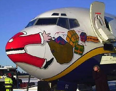
Paul: where did you find that awesome plane/santa photo? Is it real? Love to hear who put that on their plane.
I googled “fucked up santa” (really) and there it was.
Wow, along with a bunch of… interesting… stuff!
when i have 5 free minutes (so, like, around 10 pm) — should i take the “safe search” off?
Phil, you should ALWAYS take the “safe search” off — literally and metaphorically.
found 5 minutes
and i *almost* always have a safe search off, especially now that i have a mac (and i mean that both literally and metaphorically)
gotta say…that was nothing to be worried aboot
I just finished up the piece on Derek Boogaard. Massive thanks for the link, Paul.
Did you read all three parts? It’s pretty powerful stuff.
Here’s an article about the guy who wrote it:
link
Yeah, slow night at work. I just need to finish reading his notes (epic props for including those, NYT!)
Oh whoa hey two Shanes (I am not the one with the jersey)
Speaking of high schools wearing college logos, my hometown’s high school, Needham High in Needham, MA, is wearing the Northwestern logo with our own colors added. I don’t go to NHS so I can’t say for sure, but I think this is their first year using it: link
That shot is from their Massachusetts High School Super Bowl appearance against Boston College High School this past Saturday at Gillette Stadium.
Also, has there ever been a larger mid-court logo? link
Also, and this should come as no surprise, BC High appears to be wearing unis identical or very similar to their collegiate counterparts, Boston College.
Amazing reading about Derek Boogaard. When he was traded here (Prince George is my hometown) I remember the jersey he had to wear, and that it did need some tailoring. A year or two after he was traded, I noticed that the game worn jersey he wore was for sale. Since I am a big guy (6’4″), I bought it. I still have it, and the stiching is pretty good, considering that they had to extend the sleeves and the length of the jersey to accomodate him.
Wow! Shane, if you’re willing, I’d love to see photos of that jersey, showing all of the extra tailoring and such.
Count me in for that, too. HBIC is always interested in a good uniform story. :o)
Sure. Might take time. I’m not that computer savvy.
Colbert’s still calling it the Sky Dome.
In a diatribe about how awesome he is, Colbert called the Rogers Centre the Sky Dome but managed to use the brand new Blue Jays logo while calling them, “the number one baseball team in Ontario.”