Click to enlarge
The Royals have been so bad for so long that it’s easy to overlook how good their uniforms have been for most of their history. Aside from that brief BFBS hiccup a few years ago, they’ve generally gotten it right. And yesterday they made a good uniform set even better. Let’s take a look:
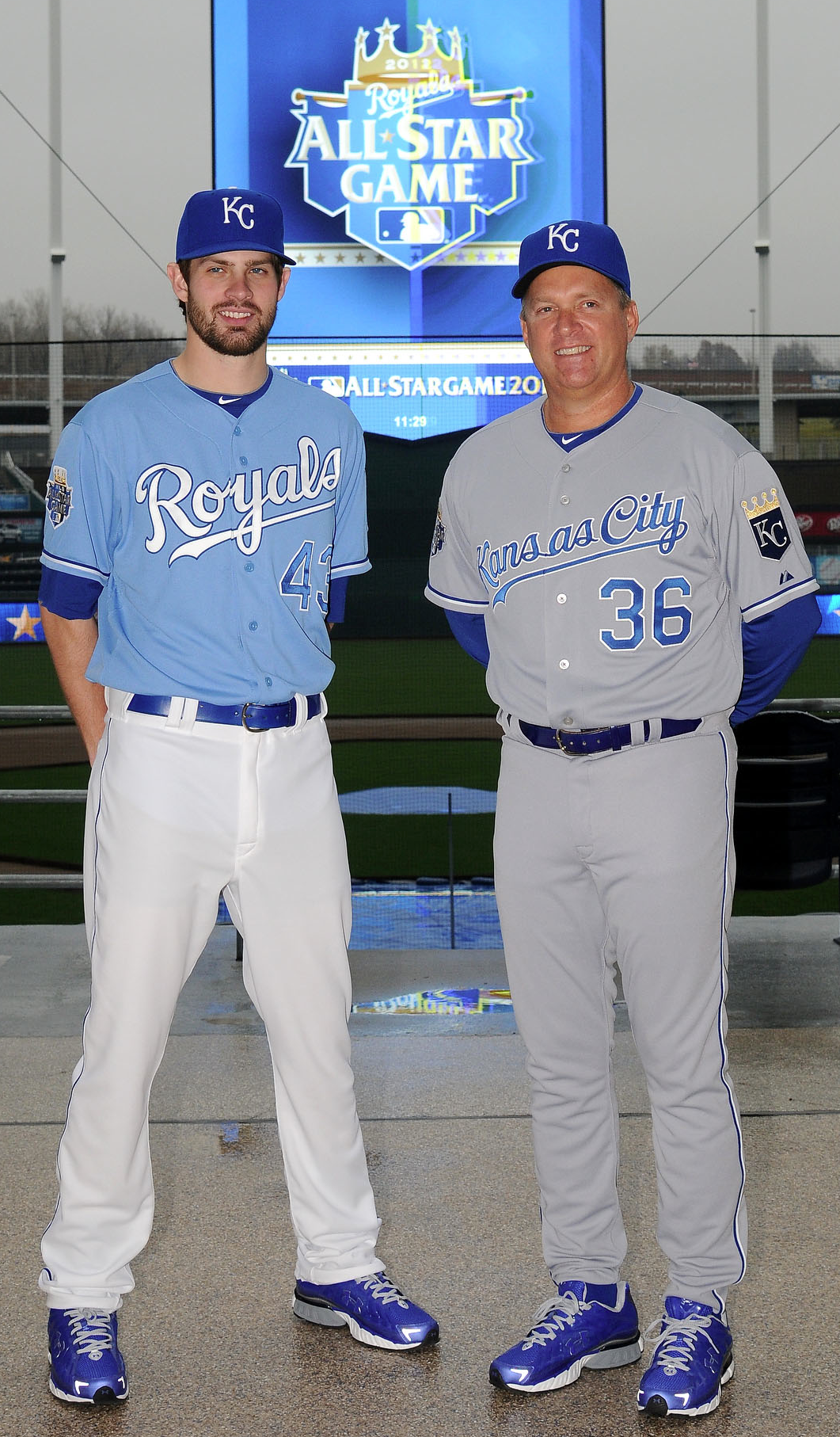
• The new powder blue alternate jersey: Several changes here: They’ve switched to a different shade of blue; instead of a blue insignia with a white uni number, it’s now the other way around (all type on the back will still be white); and they’ve scrapped the powder blue cap, so now this jersey will always be worn with the primary cap. (Contrary to what a tipster had suggested to me, they are not going with powder blue pants.) I like most of these moves, although I think the jersey would be even stronger if they’d made the front uni number white along with the insignia. Still, on the good/stupid scale, this is definitely good enough.
• The new road uniform: As you can see, they’ve made some tweaks to the insignia. They’ve also switched the shade of gray to “a deeper-looking blue/gray tonal quality that will enhance the other colors featured in the uniform,” whatever that means. And the piping on the sleeves and pants, which had been blue, is now blue and white. I’m fine with all of these moves, especially since I thought the insignia had looked a bit cramped and compressed before. Good.
• The All-Star Game patch: This isn’t really new — the design has been floating around for months — but it’s nice to see it in context. I like the crown and the heraldic-seeming banners. Good.
• The new number font: Not sure if this is actually happening. The new set, which is the same font the Giants use, is shown in the MLB Style Guide, but all the jerseys at yesterday’s unveiling used the old font. It isn’t clear yet if this means they’re sticking with the old typeface (which I prefer over the new one) or if they just couldn’t be bothered to use the new one for the unveiling event. Too soon to say.
Further details on all of this here.
New Gazoo Review: Blood testing, shmlood testing. The real news in MLB’s new collective bargaining agreement is that the Rawlings S100 batting helmet — currently mandatory in the minors but rarely used in the bigs — will become mandatory for all MLBers in 2013. Rawlings is supposedly working on a newer, less bulky version of the S100, although I don’t have have any details on that yet. Stay tuned.
Another uni-related item from the new labor deal: Players will no longer be permitted to carry smokeless tobacco products in their uniforms. That means one of baseball’s most time-honored visual details — the outline of the circular tobacco tin in a player’s back pocket — is now extinct. Let’s all spit a big, brown goober to mark its passing.
Notre Dame auction results: The auction for the Notre Dame promo box was extremely successful. The top bidder was a Notre Dame alum who prefers to remain anonymous, but suffice it to say that his winning bid — a whopping $10,020.04 — was extremely generous. He’s chosen to donate the entire amount to Doctors without Borders (who, as you can imagine, are thrilled). I’ll be proud to add my own $1000 to his donation.
My thanks to everyone who participated in the auction, and also to the many of you who couldn’t afford to bid but nonetheless took the time to send me “attaboy” notes. I appreciate everyone’s support.
Uni Watch News Ticker: Mmmm, look at all these old NBA logos — tasty (from Mike Hersh). … Joshua Pryor has started an online petition to get the Astros to change their uniforms. … Good job by Tim Donovan, who found three 1993 photos of Drew Bledsoe with three different uni number fonts. … Reprinted from yesterday’s comments: New helmet logos for the Elite Football League of India, which will begin play in 2012. … New uniforms for the Philadelphia Union (from Enrico Campitelli Jr.). … Reprinted from yesterday’s comments: What’s up with the black stripe on the Giants’ right sleeve/shoulder seam? Turns out it was a memorial band for assistant coach Bob Ledbetter. I’m a lifelong Giants fan and have absolutely no memory of this detail, but sure enough, a bit of photo research shows that it was there. Are there any other example of a football memorial being worn in that particular spot? … Hey, here’s a novel idea: an article about Oregon and Nike (from Chris LaHaye). ”¦ New cycling kit for Lotto-Belisol (from E. Berg). ”¦ Good article on NHL mustaches (from HHH). ”¦ Okay, this is really odd: President Obama’s re-election campaign is selling a basketball jersey. I’m assuming this is a first (from Michael Kramer). ”¦ Those blue Adidas sneakers at the Maui Invitational look pretty ridiculous, although of course I like the striped socks.
Holiday schedule: Uncle Frank won’t shut up about that damn BMW of his? Kids won’t stop bickering? Stuffing’s too dry? No worries — Uni Watch will be open for business tomorrow, providing a handy escape from all the holiday hoo-hah. So if you find yourself about to blow a gasket over this or that, just excuse yourself from the dinner table and hunker down at the computer for a few minutes. You’ll feel your blood pressure returning to normal in no time.
If you’re on the road or in the air today, travel safe. If you’re going to someone else’s house, bring flowers. And if you’re cooking, use more butter. See you back here tomorrow.
no powder blue trou? c’mon kc…although after seeing that *experiment* the b-j’s tried a few years back, in pajama style, perhaps that’s a good thing
overall, the redux is a push…glad they fixed the white/blue lettering problem on the powder, but the new script isn’t anything to write home about either
happy early t-giving to all…looking forward to a big plate of sucker food tomorrow
I agree, Phil; the Royals should be in powder blue pants as well. I don’t mind the addition of a blue layer to the lettering, but powder blue looks better with matching pants.
I say dump the gray uniforms entirely and wear the powder blue in every road game.
As for the number font, what made them dump the slightly different varsity block that they’d always used in favor of the same dull version that seemingly half the teams in both leagues use? They used to have link. I like that version a lot more.
If there’s one team that could pull off a monochrome pastel uni at home, it’s the Royals. Hope the powder pants are still a possibility for future seasons, and hope they wear ’em at home.
It’d be a shame if the number font change sticks. The current KC numbers/NOB lettering is about as good as varsity-style gets, and much better than the supposed new version. I bet Majestic tries to persuade all the teams with a unique font to go with the Giants-style font, purely to slightly reduce marginal production costs.
Scott, wouldn’t Majestic want every team using the same font if they were interested in lowering costs? They’d be pressuring the Giants to drop theirs rather than get other teams to also use an irregular font.
Technically, “varsity” block has bases on the 1 and 7, and a few other serifs. The Yankees and Tigers use this, but most teams use the “semi-block” style, with no serifs.
I’m a Cubs fan and don’t want them to ever lose their distinctive font, which looks modern and distinctive whether it’s 1940 or 2012. The only number font that approaches it is the McAuliffe font, which needs to make a comeback.
Maybe I’m biased (I am) but I think the Cubs font is hands-down the best in baseball (possibly in all of sports). McAulliffe is just OK.
I don’t know if I have a single favorite, but the Cubs numbers are definitely top-three. But it works for the Cubs; it would look terrible for most other teams. I think the single biggest difference any MLB team could make by changing only numbers would be for the Nats to ditch their Cowboys block numbers in favor of an updated version of the Clarendon-esque, school-bus-style numbers the Expos used to wear. Not only franchise continuity, but that particular type would be a terrific complement to the curly W, whereas their overserifed Cowboys numbers are something like the Bizarro World opposite of the curly W.
I can’t think of a single reason why it would look terrible on most other teams, but one of the things that’s great about that font is that it’s unique.
It might not look right, but it wouldn’t look terrible.
They used that font for the link. It definitely looked wrong and I can’t understand why they used it. But it didn’t look bad, per se.
link
Got a better link? All I get there is a Tripod logo.
Keep your softball bottoms, Phil. Colored jerseys are fine, but for pants it’s white or grey only!
I hope that wasn’t intended as a serious statement.
Count me as another who is glad to see no powder blue pants. And I think the switch away from powder blue caps with the alt tops is a big improvement.
And as a Royals fan, I’m just happy to get a little pub.
Over $11,000 to DWB? That’s awesome, Paul.
I’m sure that DWB can do a lot of great work with that kind of $.
Astonishing success, Paul. Irish grad and you — one grand?! — deserve big applause.
Totally agree. That’s a great thing that you did Paul, and it makes me proud to be one of those who “get it.”
Kudos to both of you.
A great gift to a tremendous organization!
Tremendous of you to do this, Paul. Thank you and to the winning bidder.
Another voice to the chorus. Terrific job.
MSF isn’t just a good cause. Eleven grand to them will save some measurable number of lives. Next year, there will be actual individual human beings, most likely children or young women, who will be alive, who would otherwise have died, because of this money. Kudos to Paul and the mystery high bidder. Even to Adidas, for making this possible, even if making the world a better place wasn’t what it set out to do!
MSF? Motorcycle Safety Foundation? Masonic Samaritan Fund?
Ah, he’s just speaking link
Sorry. Reflex. Honest to gosh I was thinking the words “Doctors without Borders” when I typed “MSF.” Completely involuntary.
Not only will lives be saved, but we got to see Paul making a glove salute! Win-win situation for EVERYONE.
Add me to the list who’d like to see the Royals in all powder blue on the road. The “Kansas City” script is an improvement as the original looked as if it’d been stretched vertically, like Silly Putty.
Obama campaign jersey isn’t that bad, really, though I thought it might have the number 12 instead of 44. Based on that, it also could form the basis for a series of Presidential concept jerseys. I can immediately envision a William Henry Harrison jersey with a number 9 on a tipped canoe a la the Warriors’ number-on-a-cable-car.
For Ford throwback Michigan football jerseys would suffice, and Reagan could have a jersey with a microphone on it. Run with it, tweakers….
Teenchy, that is an awesome idea for a concept series. Only thing I would add is that it should fit the sport to the president. So a football jersey for Ford, wrestling trunks for TR, bowling shirt for Nixon, and CC Sabathia’s jersey for Taft.
Which turns out to be exactly what you said in your last paragraph. Curse my short pre-coffee attention span!
Ernie Lombardi for Taft, not Sabathia. He was from Cincinnati, not Cleveland.
It might not be so easy to fit a sport to a president: I don’t recall any railsplitter jerseys, for example. TR could have a whole line of hunting apparel; in fact I’m surprised Orvis or L.L. bean hasn’t done that already.
Trains of thought like this make me wish sometimes UW had a forum, but I know that’s too much cost and maintenance/vigilance. Besides, that’s what Chris Creamer’s board is all about – not that I’ve visited it in over a year or so.
I’m not quite bored enough to embark on this particular quest… and I’ve got far too many other quests to finish in Skyrim anyway…
Hey, Tim E.O. go create some Presidential uniforms for us, willya?
Abercrombie & Fitch outfitted TR for all his expeditions. I doubt their current business model would benefit from such a line
@Achowat: Sad but true about A&F.
Curling sweater for Chester Arthur, who may have been born in Canada.
And of course Grover Cleveland would need two jerseys. Given the stark differences between Cleveland’s non-consecutive terms – in his first term, he was right up there with Polk among the best one-term presidents, and in his second term, he was right down there with Hoover among the worst one-term presidents – Cleveland’s jerseys need a huge contrast. Like, classic Bills white jersey vs. dark Buffaslug sweater as design basis, what with Cleveland being an upstate New Yorker and all.
Old-school Boston Patriots for John Adams. Maybe a later revision for JQA?
Thunder jersey for Andrew Jackson?
Old Hickory is a tough one. He needs the kind of jersey that fans love but uni-philes and design professionals hate. Whatever the most popularly adored, critically hated jersey in sports history is, that’s what the Jackson jersey should look like.
Alternately, a ball-in-glove style of logo, with A and J combining into the shape of a hand giving the finger.
Based on that criteria, Jackson is begging for BFBS
Ooh, definitely an Oilers jersey for Harding.
Here’s what I’ve got so far:
Washington: Virginia Squires. This one is surprisingly hard.
John Adams: 1961 Boston Patriots. Their best look and it just fits nicely.
Jefferson: Virginia Cavaliers. Duh.
Madison: I don’t know but it should tie into the War of 1812 if possible.
Monroe: William and Mary? He went there but didn’t graduate.
John Q. Adams: 1972 New England Patriots. Similar to the original, but with some changes and not as fondly remembered.
Andrew Jackson: Oklahoma City Thunder, preferably Tim E.’s bison cloud version. Trail of Tears.
Van Buren: Flutie-era Bills jersey. He was short and from New York State.
William H. Harrison: 1969 Seattle Pilots. Very quickly died in office, to be replaced by . . .
Tyler: 1970 Milwaukee Brewers. Yeah.
Polk: 1962 Houston Colt .45s. He annexed the state, so he gets its first baseball team.
Taylor: 1901 Baltimore Orioles. Lasted longer than Harrison, but not much.
Fillmore: University of Buffalo. See Jefferson.
Pierce: I don’t know.
Buchanan: Phillies Saturday Night Special. Only president from Pennsylvania; quirky and not very well thought of. Abandoned by his party rather quickly.
Lincoln: I can’t think of a team that was established and well respected but died suddenly. 1983 Baltimore Colts?
Andrew Johnson: 1997 Tennessee Oilers. Not well-liked, hastily thrust into the spotlight, and constantly under fire for hurting his constituents from further south.
Grant: Columbus Bluejackets. Union general from Ohio.
Hayes: Columbus Crew. Nondescript and from central Ohio.
Garfield: NHL Cleveland Barons. Died almost as quickly as Harrison.
Arthur: New York Yankees. From New York and criticized for buying his way into political success.
Cleveland I: Cleveland Browns brown jersey/Chicago Bears blue jersey. Not terribly exciting, but traditional and aesthetically pleasing.
Benjamin Harrison: Indiana Pacers. Bland, inoffensive, lives in the shadows of those surrounding him.
Cleveland II: Cleveland Browns/Chicago Bears orange jersey. A change to a traditional platform that angered even his strongest supporters.
McKinley: 1995 Cleveland Browns. Another long and well respected tenure that died suddenly.
Teddy Roosevelt: 1972-73 New York Knicks. Brash, physical, and successful.
Taft: 1941 Reds. Ernie Lombardi.
Wilson: 1969 Mets. Thrust into an impossible situation, somehow still managed to be successful.
Harding: 1996 Houston Oilers. If he hadn’t died, it would have ended even worse, and all due to an oil deal.
Coolidge: Early ’60s Celtics. Successful without a lot of flair.
Hoover: Colorado Rockies gray pins. A mining engineer by trade, everything he did to bolster the economy seemed to end in disaster and he was generally blamed for the problems.
Franklin D. Roosevelt: 1957 Dodgers/Giants. Very successful, around for a very long time, and then suddenly gone.
Truman: St. Louis Cardinals. Old fashioned, stubborn, and successful.
Eisenhower: 1912 West Point football. He played there.
Kennedy: 1972-’73 Dallas Chaparrals. Popular and moderately successful, but short-lived; succeeded by . . .
Lyndon Johnson: 1973-’74 San Antonio Spurs. From San Antonio and often accused of stealing his position and success.
Nixon: 2007 New England Patriots. Somewhat popular, despite or even possibly because of his unlikability; generally successful term ended very very badly, partly due to missing tapes.
Ford: 1933 Michigan Football. He won a national championship there.
Carter: 1977 Braves. Often too smart for his own good, had many innovative ideas but little success.
Reagan: 1981 San Francisco 49ers. Largely considered a joke as a politician before he found success almost instantly when he became governor of California.
George H.W. Bush: 1947 Yale Baseball. He played there.
Clinton: 2005 Minnesota Vikings. Successful term derailed by personal excesses.
George W. Bush: 1989 Texas Rangers. Started out seemingly harmless, though not too bright, but became frighteningly inept very fast.
Obama: Any Chicago Cubs. Came into office with lots of fanfare, but seemed to lose steam by the middle of it.
I missed that old-school Bills vs. Buffaslug for Cleveland suggestion. That is the best pair for him.
jdreyfuss: Those analyses/analogies are very well done. Here I’m thinking of things like battleship gray with a white varsity block “35” drop shadowed in black like USN ship numbers for JFK, or a “39” in a peanut for Carter.
You’re giving JFK a Dallas team? Really?
Way too much sport consideration and not nearly enough of the political figures themselves. Yeah, you’re matching career trajectory with team trajectory, but that’s missing the mark way more often than hitting it.
There’s just something wrong about these Royals uniforms. If powder blue is a team color, then there should be be some powder blue trim or something on their other jerseys. If the powder blue is “neutral” then they should have gone full retro with powder blue pants and no gray uniform.
As it is, it’s pure PBFPBS and seems just as wrong (though not as visually jarring) as those black jerseys the A’s used to have.
…and they’re the Royals, if they’re going to wear a blue jersey, shouldn’t it be a royal blue jersey? Like, duh.
You’re making some real sense there, TJ. Either it’s a
But I don’t necessarily think they need powder blue on all their uniform elements (Tigers don’t have any orange on their home set). However, if they don’t have the balls to go full powder on the road, they should replace all the white with powder.
Oops. something happened to my second sentence. Should be:
“Either it’s a team color or it’s not.”
The way the Royals use powder blue, or more accurately DON’T use it…strictly speaking this is like the Cardinals having a powder blue alt jersey.
Yes, the powder blue became something of a trademark for the Royals because theirs may have been the most well-designed road uni of powder blue roads era (and they won big wearing it). But it really was nothing more than the common alternative to gray. It wasn’t a color they incorporated into their color scheme. At all. In any way.
And, but for the recent affections of powder alt jerseys and hats it has never been used even as an ersatz team color. A color they once wore, yes, but powder blue is (again, strictly speaking) no more a team color of the Royals than it is of the Cardinals, Brewers or Twins. Or, during their existence, the Expos.
Even if Powder Blue is an official team color now, there’s no reason to “have” to have it on the home uniforms.
The Tigers home unis have no orange, nor should they.
Those Bledsoe photos show two with real jerseys, the pair on top, and one with a very poor airbrushing, bottom right. The Patriots only ever wore the font on the upper right jersey, however.
I don’t think that the bottom photo of Bledsoe (the Upper Deck card) is an airbrush job. I think it is just a training camp practice uniform done for them by Apex much like Reebok has been doing for the past decade – like those Bengals plain jerseys with plain numbers or the Buccaneers jerseys with the odd number fonts – so they didn’t have to practice in the old red Pat Patriot uniforms in 1993. They didn’t need these for 1994 because they had the old 1993 uniforms for camp.
The jersey in the top left photo was likely a prototype for Draft Day (or a post-draft press conference); only the top right photo was from real game action.
I don’t know… granted, photoshop isn’t quite the same as airbrushing, but it sure has the look of a white jersey that’s been ‘shopped blue, rather than an actual blue jersey, to me. It doesn’t look shiny/reflective enough, and the “feet” on the 1’s are different sizes. It just looks… off.
Looks to me like it could even be photoshopped picture from college that they threw together for his rookie card. He never wore that facemask with the Pats.
The one at the bottom is missing shoulder numbers as well.
Those Royal’s updates look nice. I actually like the royal blue hat with the powder jersey. However, those road uniforms need so much work.
Personally, this would be a good example of a team getting rid of their road grays and using powder blue/royal blue away and wear white at home.
Also, not a fan of the royal blue numbers on the front. It would look better white with blue outline on the front…it’ll match the back.
Definitely agreed on the numbers on front.
I don’t mind them de-emphasizing the front number. Even better to leave it off entirely. I have a problem with teams adding elements simply because other teams have them.
Powder blue at home is like having steak and salad for breakfast. It is fundamentally, viscerally wrong. Powder blue = road = tops AND bottoms = universe in its proper alignment. Powder replaces grey. You can have grey, or you can have powder, but you can’t have both.
And just so we’re clear: at home you wear white; top AND bottom.
Powder replaces grey. You can have grey, or you can have powder, but you can’t have both.
And just so we’re clear: at home you wear white; top AND bottom.”
~~~
exactamundo
Yeah the powder blue uni numbers definitely should had been white. And I still think a powder blue jersey with white pants for a Royals home set is a good & sensible compromise. I still don’t see powder blue roads making a comeback – unless they finally get that faux wool-flannel material to become the new standard – which I think would immensely improve all road unis by 1000%.
That faux-flannel material would be something that could get me to finally tolerate gray. Gray oplyester is just so boring and dull and insipid that it’s no coincidence that almost all the teams rushed to ditch the gray soon after polyester came on the scene in ’72.
Drew Bledsoe……and so did that turkey!
(ba-dum, crash!)
link
Also, I found link of Bledsoe. I like how the number font changed from draft day to game day.
I’m no good at the techno stuff so I can’t link/post a photo but….
If you look at 1994 Topps Patrriots football cards, you will see some players with Red numbers and some with White on their blue jerseys. (not that card companies have ever prided themselves on accuracy).
If there has to be a softball alt, at least the powder blue is a nod to the past rather than just a bland color.
Is it just me or does # look disproportionately large on away shirt?
Otherwise, Royals continue to impress as most underrated (Dodgers have same general scheme and get tons of props) uni set and stadium in the league. Now if they can match this with on field performance …
Part of the reason I underrate the Royals (as with the old scripty Rangers) is precisely because they’re so close to the Dodgers. Yes, that’s a beautiful style for a baseball uniform. But the Dodgers got there first (and execute it better), making the Royals (and Rangers back in the back-in-the) something of a retread. Especially since the Royals (and Rangers at the time) did basically the same unis with basically the same medium/royal blue.
If the Royals aren’t going to be original, then they need to execute their style even better than the original, and they don’t. These are fine unis, and KC has always looked good, but they don’t rise above derivative or anodyne. Except with the powder home alt, which is why that’s such a great jersey, and largely why I’d love to see them adopt powder blue home monochrome unis and do away with white altogether.
I think the Royals do their unis better than the Dodgers, particularly on the home set. The piping on the pants and sleeves is a nice touch. Plus, their sleeve patch looks a lot better than the clunky LA.
Agreed. I don’t like the Dodgers’ home set at all. Their road set with the piping looks so much better than their home jersey. By comparison, I LOVE the Royals home unis.
The new grey KC set doesn’t look right to me at all though. The script is TOO small, the white piping stripe is superfluous. The deeper blue is a downgrade IMO as well.
“I don’t like the Dodgers’ home set at all.” I would argue the Dodgers have one of the top home sets in the sport. Under sunny skies, there’s virtually none more beautiful.
I think KC should add gold as an accent color. It’s in their logo, but that’s about it. It would like really sharp if the script had a thin gold outline.
Are the Bulls the only NBA team whose primary logo hasn’t changed? A quick search of logos indicates that it might. Do they win the ‘prize’ for longest use of their original logo?
link
Indeed they are – they’ve not so much as tweaked the logo in 45 years. The Lakers introduced their logo the same season, but that’s had a couple of revisions (mostly the colours) over the years.
The Yankees’ Bat and Top Hat logo – it hasn’t changed since it was introduced in 1947!
Interesting to note that almost all NBA teams included basketballs in their logos even link.
That kinda makes sense. When your sport isn’t really popular, having the ball or other equipment in your logo so people know what the team plays isn’t too bad of an idea.
What baffles me is why they still do that today, with the NBA (and MLB, for that matter) having achieved global recognition. There’s a ton of old pre-70’s NFL non-helmet logos that used to include footballs on them, but only a few teams that still do anything similar today.
Count me as one who loves balls or equipment on logos, no matter what the sport is.
Me too.
so every hockey team should have a puck, stick, NHL logo, and the word HOCKEY on every uni then
~~~
this is why they’ve suspended your gym membership
Why is Michigan wearing light blue socks and shoes? Gosh, this uniform stuff is getting stupid. Nice socks, though the three stripes are pure marketing for that brand.
Paul, I thought you said you were a 49ers fan, not a Giants fan.
Niners first, Giants a close second. And living in NYC, I tend to see a lot more Giants games than Niners games.
Got it. Two of the best uniforms in the NFL, too.
If the Mets did not exist, and the Brooklyn Dodgers and New York Giants did, which would be your baseball team?
I’ve always pondered that question myself. Grandmother was a huge Dodgers fan, even had some of Dem Bums over for dinner in the 30’s.
On the other side, great Grandfather was convinced Christy Matthewson was/will always be the greatest pitcher to ever toe the slab.
I have a feeling my love for the underdog (which initially brought me to the NYM) would send me to the Dodgers camp.
What history has taught us now, is that no matter what the Dodgers had done, the Giants were outta there. They were gone to Minneapolis, except O’Malley suckered them into moving to San Francisco, and Candlestick Point. There just was not room in New York for THREE baseball teams.
“If the Mets did not exist, and the Brooklyn Dodgers and New York Giants did, which would be your baseball team?”
~~~
chris…is that actually a serious question?
All of the Adidas teams at the Maui thing last night had to do it for a promotional thing for Adidas. Don’t know what it was, but it looks stupid on anyone besides UCLA. Having said what I said about UCLA, I wish that they didn’t sign that contract extension with Assdidas. Those /// douchebags have bastardized UCLA’s once-amazing football uniforms and have made some poo changes to the basketball unis as well. What I’d give to see them as a Nike school…
Agreed. LSU has better UCLA stripes than UCLA.
But let’s not just blame just Addidas. Nike, Under Armour, and Rusell all share blame for ruining great unis across the nation. Stupid little things like eliminating the stripe from UCLA’s basketball uniforms, truncating the stripes on Auburn and UNC’s football uniforms, and of course a myrida of other screwups across the land that are too numerous to list.
Of course, part of the blame is on the players who keep wanting tighter and tighter uniforms. The evil sportswear companies are doing this crap in part because the players ask for it.
/and Nike doesn’t seem to be butchering the design elements as badly as Adidas or UA. Just sayin…
All of the Adidas teams at the Maui Invitational are wearing those shoes and socks. They look the worst on Tennessee and actually ended up matching both of their opponents’ uniforms.
link
and
link
Also, not sure you want to envy Nike schools. Adidas seems to do a better job keeping things clean and traditional even when whoring it up (see Michigan vs. Notre Dame game this year)
Yeah, they keep the football jerseys “clean” because they don’t have any room on them for actual stripes.
/that’s not a good thing
The article on Nike U of Oregon was interesting, but I have a couple of questions. The writer implied that current Oregon football players have a lot of input on the unis, including a lot of work on the actual design. Is this true? And do they get paid for this, or is it some kind of internship?
It sounds like it’s a patronage deal, where the ones that are really involved have a good chance of a job once they graduate.
That sort of but not really answers the questions I posed. If they do get paid that’s a violation of NCAA rules, right?
By patronage, I mean they get the opportunity to show the Nike people what they can do and if they’re good they get a job. It’s perfectly acceptable for any college student to get that opportunity.
I’m not suggesting they get paid during college, though I don’t know one way or the other. However, if it’s a job or internship and the athlete can show he did the work, there’s nothing in the rules that says he can’t get paid. That’s what the problem with Rhett Bomar was a few years ago; he had a no-show job, not just a job.
I don’t think so. NCAA Athletes aren’t required to be unemployed, just not being paid to be athletes. I can’t imagine the NCAA cares about a student-athlete working part time as a graphic designer. (If so, half of the Volleyball team at my D3 College would be ineligible)
@Achowat: That’s what I said, although you said it more succinctly.
Re: Oregon:
None of their players has ever resonated with me. They all look like robots. But they are fun to watch.
I don’t like the fact that they don’t use their great school colors in their uniforms either. They’re all black and gray. But that “O” helmet is great.
Smaller, finer lettering on KC’s new road jerseys. Hope that’s a trend. Now, why can’t they just make the cap lettering smaller and finer?
Agree totally.
One more thing with the KC roads: “Kansas City” is just a little bit long for the script treatment. If they’re not going to use “Royals” on the road, how about some kind of “KC” emblem instead?
Like the shield as a left-chest patch? Have they ever done something like that?
They did it link.
Actually, in the grand scheme of TATC that jersey isn’t so bad.
I’d like to see KC or the logo on the chest with the current look…not the TATC look.
Although, yeah, that one isn’t *so* bad. Still…
The script “Kansas City” on the roads is a callback to the original pre-doubleknit look of 1969-1972. I love it. This current set of uniforms reminds me of all my good times as a Royals fan, and skips the horrible no-hope BFBS years entirely.
The Royals wore a large version of the “KC” from the cap on the left chest of their (royal blue) BP jerseys back in the 80s, but I don’t recall another similar use. Even the gray vests during the BFBS years used a block “Kansas City”.
“… If you’re going to someone else’s house, bring flowers. And if you’re cooking, use more butter…”
What should I drink to wrap the whole business in a gauze-like blur?
Ah, Connie old chap, clearly you need a bacontini.
You’re never too old to get educated. Thanks to you and Wiki, Shane, a new datum has been lodged. “Bacon-infused” doesn’t strike me as a particularly promising characteristic, but hey, I’m game. Gotta remember to cancel vodka-drip IV.
It’s not actually bacon-infused, but Jim Beam Black packs a very nicely meaty, barbecue-pit punch on the nose and the palette. I don’t much care for the general flavor profile of Beam products, but I tasted Black on a panel recently and it is an outstanding, almost bacony whiskey.
They do make bacon infused vodka, which is really a leap too far in my book. The only thing I could see that ever working in is a bloody mary.
What is up with those disgusting blue sneakers Michigan is wearing!?!?!?!
Paul, what happened to your usual admonition vis a vis which part of the turkey to eat?
How’s the realignment going to play out? Move the Brew Crew back to the American League Central, and stick the Royals in the AL West? Thoughts?
The Astros are going to the AL, and will settle in the West.
Speaking of, I have a very good friend in the Houston area who has a friend working for the Astros. I’ve been told countless stories about said friend’s friend being called by fans, who are pissed because they think the team’s moving to Alabama.
/can’t make it up
Do people actually refer to Alabama as “The AL?”
Apparently they do in Houston.
Do people actually refer to Alabama as “The AL?”
Normal people? No. A few semi-literate morons? Probably. I’ve seen someone from Toronto refer to their city as “T DOT”. So… yeah.
They clearly have not watched the news for the entire last two years McClain was trying to sell the team… he was adamant that the team not leave Houston!
The only people I know in Houston that are pissed off are the ones that wanted the Astros in the Central instead of the West. I don’t know anyone that thought they were moving to Alabama.
No one actually in Houston thinks that.
Vidor?…maybe.
I’m actually interested in the marketing challenge for the Astros. Astros don’t have much of a national following, and it’s getting to the point to where they’re not even the biggest thing in Houston, as the city’s roots as a football town are kicking in and the Texans are becoming the biggest team in town, if they’re not already. Given the Rangers’ success, you’re seeing more and more Rangers caps in Houston, which you never used to.
Other than the obvious solution of winning, some changes are definitely needed to raise their marketing to a competitive level.
Vidor… that brings up memories.
We were driving down to Houston when I was about 12 and our car broke down there. A cop gave us a ride from the service station to a sandwich shop. It was the first time (and sadly, not the last) I was ever in the back of a police car.
Ha. Being from Alabama, I call the state “Big AL”. You know, like the Tide mascot. “I’m going down to Big AL for Thanksgiving weekend!”.
Ok, not really.
That story just proves what I already know: people, in general, are just plain stupid.
Pretty sure they decided to move the Astros to the AL West and leave everyone else where they are. 15 teams in each league, and interleague play all year long.
And hopefully fast-track consideration of expansion up to 32 teams to restore scheduling sanity. Sadly, it looks like the Castro regime isn’t actually going away soon, so we won’t get to have a team in Havana named the Missiles. Most of Mexico looks iffy too for the foreseeable future. But where else would make sense for expansion? Portland, Sacramento, and San Antonio are the largest US cities without MLB teams at the moment. After them, down in the 30s, would be Las Vegas, Columbus, Charlotte, and Indianapolis. Even Norfolk and Nashville are more populous than Milwaukee, which at 39th is the least populous metro area with an MLB team.
Never happen in Vegas, major sports leagues are too paranoid after Pete Rose and Art Schlichter.
I think I’d vote for Portland and Indianapolis.
…and as someone living in Columbus, I don’t think this city would actually support an MLB team. It’s pretty much all Buckeyes here. I’m kinda surprised the Blue Jackets have survived, actually.
Portland doesn’t even have a AAA team anymore, do they? Aren’t they the Tucson Padres?
Personally, I don’t think more expansion is necessary.
The ultimate solution is to just scrap the idea that the AL and NL are different leagues. Kill the DH rule (or implement it universally) and treat them the same way that the NFL treats the AFC/NFC. There’s nothing wrong with six 5-team divisions if “inter-league” play isn’t treated like it’s special.
If Portland baseball atmosphere is anything like what I’ve seen at Timbers games, I am ALL for MLB going to Oregon.
I imagine the New York area would be considered for another team. They probably have the population to support it. Otherwise, you’re looking at some pretty small markets. Would Canada come back into play? Maybe Vancouver? Heck, would a team in Hawaii be too far-fetched? The Islands might enjoy having a major-league franchise. I don’t know, I’m just throwing it out there.
Biz of Baseball has looked at expansion/relocation a number of times, his conclusion was that no other city is capable of hosting an MLB team right now. The economic climate simply won’t support it.
If I remember correctly Portland, Charlotte, Vancouver, Vegas were all examined.
Thank you for pointing that out.
No solid markets, no real major league facilities sitting around unused and, most importantly, not a lot of people with deep pockets coming forward offering to pony up to get into the game.
Just not the right time for expansion.
Not at all.
I am from Indianapolis. As I am sure some of you know The PTB tried to drum up interest for getting either an existing or an expansion team in 1985. It went so far as to design uniforms, etc. See this site: link
However there were too many problems – one being the lack of a stadium. But also there were rumors the Cubs, Reds, and White Sox would never go for it. I would imagine that would still be the case. I think there is a chance Indianapolis could support a MLB franchise.
And if MLB said it was expanding tomorrow, cities would start lining up immediately and planning their $500 million castles for their expansion franchises. There’s no reason baseball can’t succeed in a dozen or more additional cities around the US or Canada.
The ad right above the start of the comments is teasing me with today’s AC Milan-Barca game.
I’m really tempted to use a half-day and watch it at home, forgot to set my DVR. Yikes.
Nice redo of the new Orioles logo:
link
Unlike the Blue Jays blogger revision, this would actually be an improvement.
That last one is terrible. It looks like Homer Simpson in blackface.
That logo on Von’s blog (drawsigner) is a huge step up from what the Orioles just released.
I was lucky enough to have him as an instructor at a community college in Salem, OR about five years ago. His course, the only real design course I ever took, literally changed me life, as I am now a a full-time designer (who dabbles in freelance on the side as well).
There’s an absurd overemphasis on the bird’s cap in the redo. I hadn’t noticed the size of the cap bill was comically exaggerated in the original until the blogger just went nuts with it.
Otherwise he ruffled the back of the head and made the eyes beady. I actually like MLB’s better.
True, the cap bill is overly long. But look at the size of the cap in the redone versions versus the size of the cap on the newly released LMB version. The MLB’s cap is tiny compared to the birds head whereas the redone version fits nicely atop the head.
Orioles-wise I think the cartoon bird is fine choice, however the details in the logo are incredibly lacking.
One more thing regarding the bill of the MLB version versus the size of the hat.
Lets say on average a human head is about 10 inches in diameter front to back (for reference). Now the oriole hat is only about 70% as long as the head it sits on, and looking at it the bill of the hat is just about as long as the head front to back. So for a 7 inch hat it’s got almost a 10″ bill, whereas a human head (10″ diameter front to back) would have a bill about 4″. So normal is 40% bill, this MLB Oriole has a bill 150% the length of the hat.
Personally I think the MLB is in a design slump recently. One of the worst ocular offenses of late by the MLB is the Florida Marlins new logo. It’s like getting a 90 mph beanball to the eye socket.
+1
Probably not a popular post… I think the Adidas striped socks are genius! First, let me say all teams wearing the blue socks/blue shoes is a douchebag move (unless I have missed a valued reason like the color supports a charity the tourney benefits). That being said, the Adidas stripes were subtle – providing a nice design element, not an in-your-face oversized logo screaming look at me! The genius part is making a design element out of the stripes (and we all know that we need more stripes on socks)to combat the Nike tactics.
I don’t remember seeing anything about charity, but they said the color is evocative of Maui’s blue lagoons. If it’s not for charity, it’s definitely a marketing move. “Look how many teams we have in this elite tournament! We don’t need the NBA for our brand, even if we do have that contract already!”
You can wear the Obama b-ball jersey to this campaign event.
link
The Royals’ All-Star patch looks like it’s based on their mammoth outfield scoreboard.
link
The scoreboard is based on their primary logo, link. Likewise, the link is also derived from the KC shield.
Yeah, that is true.
ga those patriot jersey’s w/ the elvis patriot on the shoulder pads were horrific. they really gave the bengals a run for there money.
love the royals uni set
Some interesting tidbits are contained in Chris Creamer’s blog detailing how Paul Beeston strove to bring back both the blue & Canadian elements back into the Blue Jays’ identity soon after he came back on board before the 2009 season. A quote taken from Paul Beeston:
“So I called New York and said we’re putting the maple leaf on our sleeve, they said ‘well you can’t do that’ and I said ‘well you better come opening day ’cause it’s gonna be on there and you’re gonna have to take it off!’”
link.
Looks like no color vs color this year for UCLA-USC – rumor is that UCLA will wear all-white alternate uniforms for the city showdown.
link
Too bad if true. The USC UCLA color on color game is a great look.
That’s a travesty – like mixing firecrackers and Thanksgiving.
UCLA is teasing the alternate jersey leading up to the game via social media. Here is the first tease.
link
A couple days late on this. I have on ESPNU. Replay of NC State and Clemson. I like that Wolfpack look. The helmet with the nice stripes in the middle. Good to see that stripe instead of these newer tapered ones.
I looked back to Sunday’s column and saw Terry did mention it.
I took a few photos of Seattle’s Memorial Stadium, built in 1962 for the World’s Fair. I think they’re going to be tearing it down soon….
link
You took those photos? They’re fantastic.
Seconded.
thirded.
great job jim!
Thank you, fellas.
Love the pictures as well!
How could the piece of paper saying ‘Snacks and drinks order only’ still be on and readable?
Thank you, Jonathan.
Memorial Stadium–which was actually built in 1948 (not 1962 as I mentioned above) and dedicated to former Seattle high school students who were killed in WWII–is still in use, periodically, for high school football and soccer clubs. There is a movement to re-imagine Seattle Center and it doesn’t involve keeping the stadium, sadly.
I visited Seattle about 15 years ago, and when i was on the Space Needle, and always wondered why there was a football field there so close to the where the Kingdome was. Great photos and a great Wikipedia history lesson.
Syracuse is getting a new Otto the Orange costume, with Nike logo creep.
link
I’m usually a lover of double blue, but if the Royals aren’t going full powder, stick with royal blue and white. Someone suggested gold trim…I could dig that.
Keep the old number font. It’s one of my all-time favorites.
All in all, though, the Royals still look very good.
Anyway, Uni Watch may be open for business tomorrow, but I won’t be. Happy Thanksgiving, y’all!
Yes, the old, old font:
Bo: link
Frank: link
Dick (in KC batting practice jersey): link (note serif on sleeve number)
Hal: link
and, of course, George: (old) link (vs. newer) link
Major fail – on more than one level – by the Chicago Tribune: link
I have no quarrel w/ the No. 1 position.
Wow, forget the rankings, just look at the number helmets that are no longer even being used (or just don’t exist).
Browns (missing white stripe)
San Fransisco (old helmet)
Bills (last years helmet)
As a Chicago fan I must intervene to say the Giants’ “ny” is right up there with the wishbone C.
I guarantee the author of that trifle is 30 years old and humorless. Anyone who balks at a helmet-wearing dolphin would spit coffee at a ballcap-wearing bird, too.
The Main Event sections in the Trib are supposed to be funny, not serious
Yeah, it’s the top of page 2 of the Tribune sports section, usually paired with a Steve Rosenbloom column; whom basically is a immature man-child who writes total drivel trite. They put a lot of stupid graphics or cartoons on that space, many times inaccurate (tho they do a few uni graphics, most recently on wearing Bears jerseys, cap wearing & fan cheering and even one on stirrups, tho they didn’t get right I think).
I like the Royals in powder blue, but don’t have a problem with the road grey as others do. In fact, I think they look pretty sharp, really digging the satiny look to the blue letters and numbers.
-Jet
I know I said I wouldn’t do this, but it’s hard to resist: The new Catch of the Day is really, really good.
I want a snirkle, like now.
Me too! Isn’t that the best candy name ever? I think I’ll name my next cat Snirkles!!
I want me some Walnettos.
Or an AbbaZabba.
Chocolate babies? Uhhh…OK.
link
Also, I want some Chuckles now.
The Catch of the Day is superb.
I spent a great deal of time looking up old cereal boxes.
Interesting that the majority of those are still in existence, but they’re all being manufactured by like three different companies now.
Ah, I’ve been to that site! My favorite section is the Fast Food, a lot of interesting old designs. Totally love the old Jack in the Box taco coupons.
link
link
4 tacos for 99 cents!
The New Union unis look nice design wise, but as an American I always find it funny that they slap the Mexican bakery’s name on the front. It may be pronounced “Beembo” but here in the US it just looks funny.
BREAKING! The NY Rangers will be announcing their WC jerseys some time this afternoon, and Facebook will be the first place to see it. About damn time.
link
More like “unveiling” instead of “announcing,” but whatever. I think it’s gonna be mostly white. ;-)
Racist :)
/highly sarcastic
It doesn’t say the unveiling will be this afternoon; it says this MONDAY afternoon.
Sincerely yours, a university student who clearly needs another coffee. (I’ll cue my own “link” music.)
It’s interesting news that the Royals are changing to a darker shade of gray for the road unis. I was under the impression that Majestic’s MLB road grays for all teams were exactly the same standard shade. It looks that way on initial examination when the visiting team line up for player introductions at the All-Star Game. I guess the Royals move to a darker shade shows that there is variation.
Here’s a photo from a recent All Star game:link
Hard to tell if all the grays are uniform.
Just watched the Blue Jays video over on Page 2 and noticed that all the players were pulling the jerseys over their head. Got me to wondering if the bottom buttons were actually functional and just the top two or three were used as true buttons. Anybody know if that’s the case?
Reminded of my biggest college football pet peeve while watching a Heisman prognostication —
The Heisman needs to redefine itself. It is not an award for the “best player in the nation”.
Sometimes, the best player in the nation is an offensive lineman. You can’t tell me honestly that in 1996 Danny Wuerffel was a better player than Orlando Pace.
Sorry, tangent.
Any NFL teams wearing alternate/throwback uniforms tomorrow? I don’t believe I’ve seen Detroit’s yet this season. It would be interesting if Detroit AND Green Bay wore throwbacks, as the Packers wore their 1929 unis earlier this year. I’m pretty sure that won’t happen. I’m assuming Dallas may wear throwbacks and the Ravens may go with black. Any info, let me know.
That old Seattle Supersonics logo kicks ass.
It looks like it’s going to impale the Golden State logo. For a one color logo it’s really dynamic. Love the Bucks’ too.
Cincinatti’s logo reminds me of link.
That’s cool. And yeah that Bucks logo is incredible too.
Random observation:
My son is playing Madden in the other room and I saw as he was on the screen to select which stadium to use that Soldier Field is listed as “Chicago Stadium.”
(In case some smartass wants to point out that the 1932 Championship game was played there, the stadium in question is clearly Soldier Field, not Chicago Stadium.)
at first I thought they just use generic names or something, but the other choices were Raymond James Stadium, Invesco Field at Mile High, etc.
Never really played Madden, but I guess this issue has been going on for a while:
link
Yeah, I have yet to play it myself. That’s really odd.
I guess it doesn’t surprise me that there was a miscommunication between EA and the powers that be at Soldier Field.
Seems odd that they’d choose that particular name instead of something truly generic, though.
Thanks.
I think the Royals new alts are still a let down. The blue outline and contrasting number color is still too busy-looking.
They should have just made these the alt jerseys–much cleaner design.
link
And you thought that D-1 scholarship athletes were living like kings/queens? Check link out. I think Jim Vilk will get a kick out of J.R.’s Slippery Rock shirt.
Looking at the Islanders in action in their new black duds.
And I mean DUDS. Holy shit, they’re every bit as horrible on the ice as feared.
If they’re going to go BFBS, they could at least have the decency to throw in black helmets. But then again, nothing can save those monstrosities.
In other words… link
GAAAAAAAHHHHHHH
ARE
YOU
FUCKING
KIDDING
ME?????
My kid’s team looks better than that on the ice.
And you know that I’m not kidding. You’ve seen the pics.
shit…YOU look better on ice than that…and i’ve seen those pics too
Indians are tweaking their uniforms. More info to come on Friday…
link
For the fans who just have to buy another jersey…
I’ll stick to my blue home alternate with the silver piping. Looks good on the fans, not so much on the field. I did recently get a block C cap though. I should have gotten one with Chief Wahoo inside the wishbone C.
Following the Blue Jays, Orioles, Mets, and Royals changes, isn’t time for the Seattle Mariners to go back to the trident logo and the royal blue and gold colors? I mean those colors look so much better than navy blue and teal (It’s not Northwest green. Nothing in the Northwest has that color except the Mariners). Who’s with me for a Mariners uniform update?