.
Everyone’s gonna like these.
And why shouldn’t they? Let’s go through the details, one element at a time:
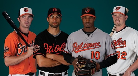
• The new cartoon bird: You know, I’ve always enjoyed the ornithologically correct bird, which is classy, stately, and proud. The thing is, classy, stately, and proud are the kind of attributes that make a good team seem better, they just make a bad team seem boring. And the O’s have been bad for a long time now (and, given the division they’re in, are not likely to get a whole lot better anytime soon). But hey, if you can’t field a winner, you can at least look like you’re having fun. The cartoon bird provides that, while simultaneously connecting to successful chapters from the team’s past.
The O’s are touting the new bird as a hybrid of two previous version. Now, the bird’s history is actually much more complicated than that (that page there deserves a Nobel freakin’ Prize), but whatever — I like the new version a lot. The angle of the eyeballs, the updated squatchee, even the way the lower part of the beak blends into the orange outline.
Just one problem: the cap that the bird is wearing. For starters, it’s a wasted opportunity for an infinite regression. More importantly, there’s this (click to enlarge):
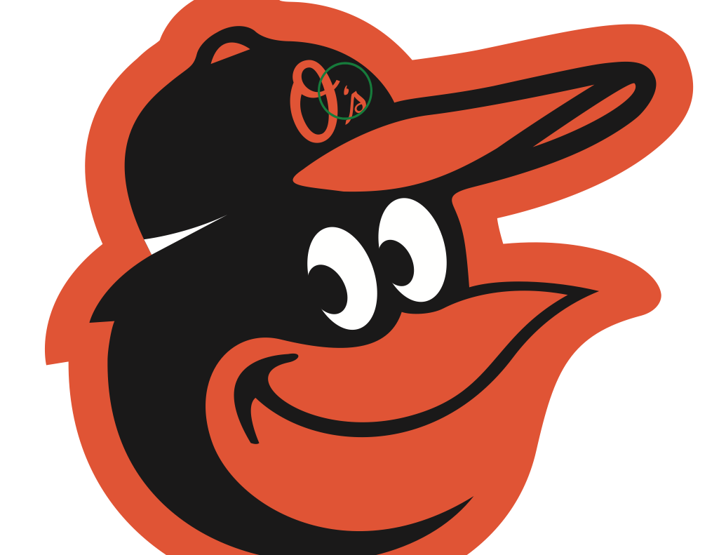
Arrrrrghhh! In the name of David Simon, why did they saddle this poor bird with that accursed upside-down apostrophe? For that matter, why is that punctuative affront still part of the team’s identity system? This design update would have been — should have been — the perfect opportunity to fix it. Rich Frank, I know you’re reading this. You know I love ya, but you’re gonna have a hard time explaining this one!
Still, overall, the new bird is a very positive development. So is it good or is it stupid? Let’s say 99.9% very, very good, 0.1% remarkably stupid.
• The new home cap: Love it. Wouldn’t want every team to go with the multi-colored panel look, but this one totally works. Very good.
• The new road cap: Magnifique. If you’re gonna have two distinct caps — like, really distinct, not just mild variations of each other — this is how to do it. Very good.
• The new road jersey script: As you can see, they’ve decreased the insignia’s angle of inclination and eliminated the vanishing-point taper. As for how it looks on the jersey, I didn’t mind the old one, but I like the new one even better. Also, note that the old version resulted in an awkwardly split “t,” a problem they’ve avoided this time around by extending the loop between the third and fourth letters. Remains to be seen if that will end up looking a bit forced. Even if it does, I still think this is an improvement. Good.
• The new orange alternate jersey: Between the Marlins’ new orange alt and now this, it’s shaping up as quite a month for orange. Can’t say I’m in love with this one, but I suppose it’s better than the black alternate, and it pairs nicely with the new cap. Good enough.
• The new sleeve patch: So. Very. Plain. I assume the patch shape is based on this dedication plaque or some similar referent, but it doesn’t work for me at all. The type, the composition — snoozers. I won’t say it’s stupid, but I will say it’s not that good.
Too bad there wasn’t a live unveiling — they could’ve had Brooksie come onstage in a shortened-brim helmet with the new bird. Overall, though, a very nice job. Further details here, and you can check out the new style guide here.
Now if they’d just fix that goddamn apostrophe already — it would be like removing a splinter from my brain.
Notre Dame auction update: My thanks to everyone who’s sent in bids for the Notre Dame promo box. The high bid as of this morning was $4000, which means today’s minimum bid is $4100. If nobody bids today, the minimum bid will increase to $4200 tomorrow.
Full details on how to bid, and everything else regarding the auction, can be found here.
Sticker update: I handed out lots of Uni Watch stickers at last weekend’s Sheep Station gathering. Want to get some for yourself? Just send a self-addressed, stamped envelope to me at 671 DeGraw St., Brooklyn, NY 11217 and I’ll send back three stickers (one each of green, gold, and burgundy). If you want to enclose a coupla bucks or a barter offering, that’d be nice, although it isn’t required. Okay? Okay.
Uni Watch News Ticker: Mets will officially ditch (most of) the black at 10am Eastern. That sound you’ll hear in the background will be yours truly shedding a few well-earned tears of joy. … Here’s USF’s Wounded Warrior uni — woof! Note that they’re going with simple block uni numbers, in gold — a lot simpler than what they initially had in mind. That’s a direct result of the snafu with South Carolina’s Wounded Warrior jerseys last month. Looks like they made up for it with the helmet, though. … Bit of a dust-up regarding an alteration to the Polish soccer jersey (from Ron Lizik). … Ohio University’s marching band wants new uniforms (from Jason Hillyer). … Kudos to Jon Solomonson, who found some primo sports-themed citrus carton labels. … Yesterday I Ticker-linked to those Radford basketball jerseys with the “RU” above the NOB. “That was a mistake by the screen printer,” says Radford multimedia services director Parick Reed. “After the uniforms arrived from Powers (who makes the Nike uniforms for us), the basketball staff sent them off to have an RU logo placed above the name on the back. It was supposed to look like this. Unfortunately, the printed matched the font of the player names, which everyone agrees looks ridiculous. The staff has been assured that these will be fixed with some sort of patch.” … Memphis hoops wore some gorgeous throwbacks yesterday to honor former coach/player Larry Finch. … Sure, why not, and while you’re at it you can get a DeSean Jackson jersey with a “Judas” NOB. … Weird coincidence: Yesterday I linked to photos of Matt Powers and his DIY Johnny LeMaster jersey. Then yesterday’s Freakonomic podcast was all about the phenomenon of booing — including an interview with Johnny LeMaster himself, talking about his famous “Boo” jersey. To hear the podcast, go here and click on “Listen,” which will let you access the free audio file in iTunes. The LeMaster segment is toward the end of the 30-minute program (big thanks to Mike Hasselbeck). … Between the flocked helmet shell and the felt logo, you’ll rarely see a batting helmet shot wit h more texture than this one (great find by George Fetkovich). … Speaking of batting helmets, for a second there I thought Jason Henke had found a photo of Martin Prado wearing a chinstrap. Then I realized it was just Prado’s necklace riding up. … We already knew that Oregon State would be wearing turquoise uniforms for the N7 game on Nov. 12. But Joe Alvernaz reports that this had matching turquoise shoes this time around. … Matt Powers notes that Tyrone Mathieu of LSU was wearing white Cutters, instead of Nike gloves, in the game against ’Bama. … The Grand Junction Rockies — the former Casper Ghosts and Rookie League affiliate of the Rockies — have a new logo. “Obviously, it’s a based on the Rockies’ logo, but with a silhouette more representative of the mesas on the western side of the state,” says Scott Schlaufman. “Personally, I think it just looks like a hat.” … Some decent analysis of NHL team logos on this site (from Donnie Kwak). ”¦ Great catch by Mike Sambuco, who noticed that the jersey used as the Phillies’ press conference for Jonathan Papelbon had an upside-down 8. ”¦ Matt Duchene of the Avalanche has “It Ain’t Killed Me Yet” written on the end of his stick (screen shot by Dane Drutis). ”¦ Very interesting contribution from Charles Fisher, who writes: “Many law enforcement agencies create souvenir patches with team logos, which they use as gifts or to trade to officers in other agencies.” ”¦ Nike and Darren Rovell: letting no event go unmerchandised (and no merch uncelebrated). … Here’s another view of that undershirt looking like a taffy pull from Saturday’s UMD/Notre Dame game (from Dan Chichalski). ”¦ Also from Dan: Notre Dame backup QBs usually wear red caps on the sideline, so they’re easy to spot as they signal in the plays. But it was a little bit nippy on Saturday, so they wore striped ski caps instead.
The “O’s” script on the bird’s hat follows the same precedent as the “M” on the helmet the dolphin wears on the Miami Dolphins’ helmet. Recursion would disrupt the space-time continuum.
Lokking into a mirror, within a mirror, within a mirror…
On the one hand, I’d rather see a recursive cartoon mascot logo. On the other hand, my single biggest beef with non-recursive mascot logos is when they’re wearing a cap that’s neither worn by the team nor available to fans. So the new Orioles logo at least avoids the problem: The bird is wearing a cap that the actual team will wear from time to time, and that fans can also wear. Unlike, say, the Toledo Mud Hen, the Baltimore Oriole is actually a member of his team.
But what about THE FARKING UPSIDE-DOWN APOSTROPHE????
Of course the apostrophe catastrophe should be fixed on the actual O’s caps, but as long as it’s wrong on the actual caps, it should be wrong on the cartoon cap too.
The hobogoblin of little minds, Scott.
Maybe (this is a theory,) just maybe the upside-down apostrophe is the result of a down-stroke.
The “O” and the “s” are in cursive script. We all know that cursive is a fluid form. With that in mind, if the “writer” of the “O” looped upwards, then the apostophe would be made with a down-stroke and stop, resulting in an upside-down appearance.
To me, baseball’s use of cursive font is meant to be light, fun and slightly informal. Maybe, just maybe, the original designer’s intention was the “O’s” logo to have that handdrawn, informal spirit.
No no, it’s a link that’s the hobgoblin of little minds. This is wise consistency, which is the archangel of great minds. Besides, I prefer generalized incompetence, as in getting the apostrophe wrong everywhere, to the lazy situational competence of correcting it in the smaller logo but leaving the error on the actual caps. I’m less frustrated when people don’t know any better than when they do know better but don’t care enough to do anything about it, which would be the case if the Orioles fixed the apostrophe only on the cartoon cap!
… kinda like the backwards “R” in Toys R Us.
Why is there even an apostrophe in the first place? Doesn’t that make the “O” possessive?
It’s a contraction of O(riole)s. The apostrophe takes the place of the omitted letters, just like don’t or didn’t.
I’ve never bought the contraction theory. If that’s valid, then the A that the Athletics used to wear stood for Athletic, singular, and the letters on Denver’s MLB team’s caps stand for Colorado Rocky. The initial stands alone, and the s pluralizes the letter; it doesn’t stand for a contraction. (Another absurd but necessary result of thinking of it as a contraction: the stat must henceforth be written R’B’I’s.) So normally, there would be no apostrophe. Except that you do use the apostrophe with a plural s when needed for clarity. So for Oakland, the apostrophe makes it clear that the cap logo is the letter A, but plural, rather than the word “as.” The Orioles have less of a case for the clarity exception, but I can see how they would want to avoid the appearance of putting the word “os” on their caps. Except that it seems obvious that no such thinking went into it at all, and Baltimore just straight-up copied the A’s but screwed it up.
It just weirds me out that you, Paul, used the same damn words as I did on the Creamer boards yesterday morning about the wasted opportunity for infinite regression… I need to get away from this blog for awhile, I’m starting to think and write like Paul before Paul even thinks it…
One way to correct the apostrophe catastrophe is to dump the stinking O’s script hat all together along with the black alt jersey. Have hated that hat since it was introduced. Looks like something from elementary handwriting class.
As someone who has hated the ornotholigically correct bird from day one I’m very happy with the new design. Never thought it looked right on the cap. When they said they were combining elements of the old cartoon birds to make a new one, I was worried, but it turned out great.
Really like the O’s new uniforms and the cartoon bird cap logo. Good that the cap logo seems to be flat instead of the standard modern raised embroidery…although their last bird logo was flat, too. Never a big fan of the raised embroidery. The older, flat style just has a more elegant look.
so you’re not a fan of say, this then?
/flock you! ;)
Flocking is for Christmas trees…
Seriously, do you think raised embroidered logos are an improvement over flat ones? Personally, I like the old style. But, then again, I’d probably go for flannel uniforms, too. ;>)
I love raised embroidery. Feels more substantial and authentic. I think it can be overdone, but most caps are done well.
I loved seeing those Pirates helmets in pictures when I was a kid. But have not seen many in color.
I did not read all the comments yet. Did anybody name the Pirate and the year?
Count me as another one who can’t stand 3-D / raised embroidery. It just doesn’t look right when viewed at an angle & distorts the logo, and it’s too thick for sharp points & fine ends; e.g. Tigers, White Sox, Mariners, 1994-99 Astros. I prefer my caps to be flat-embroidered and keep an eye for (tasteful) caps to snatch up.
When New Era started reproducing flat-embroidered Cooperstown caps about 7 years ago of 1990s caps, I snatched up a 1991 no MLB logo-on-back White Sox cap & was extremely pleased, and even had the correct primary logo on it as opposed to the current 2nd generation of 3-D embroidery of a wider, distorted & reshaped logo:
link
now, if the mets would just intro an orange alt to replace the black one…
/nice patti smith ref
Aw horses, Phil.
Orange is a fine color, but I’d rather not go down this particular road:
link
And what about the helmets? Will they match?
And is the orange-front cap an addition on the horizon?
link
Kudos to Radford for explaining their problem.
Though they could just consider, oh, I don’t know… going without a logo of any kind above the NOB?
Yeah, crazy, I know.
You can’t just remove screen printed letters from a jersey. They have to be covered up if you don’t want them to be visible. Hence the patch solution.
But your point is taken. They shouldn’t have had anything up there to begin with. This problem would not have happened if that were the case.
The sleeve patch is based off of this sign: link
“…I won’t say it’s stupid, but I will say it’s not that good…”
Here’s a vote for stupid.
That sign is what Orioles fans think of think of when you say “Camden Yards” so I’m voting for “good.”
Matt, that’s the first thing I thought of when I saw it. I’ve been to hundreds of Orioles games and have never seen the plaque that Paul linked to. (Or at least it didn’t make enough of an impression for me to remember it.)
The dedication plaque is located to the right of the “home plate” entrance of OPACY.
A fan of the road script, but not a fan of how it was stitched onto the jersey. The space between the L and the T is too awkward for me. I realize that the split T on the old road uniform is awkward as well but from afar, it looked fine. I guess I’ll have to wait and see how this new road jersey looks next season.
And I love how the word “ornithological” is in vogue here.
You know what strikes me as the most out of place with that uniform set?
The gray uniform.
I think they should just wear white at home, orange on the road and black as the occasional alternate. No point in, or need for, the non-team-colored uniform.
With black pants on the road? If so, I’ll sign your petition!
But white is not a team color.
The prominent white front panel would seem to imply otherwise.
I’d be fine with them wearing just black & orange interchangeably with no white uniform too.
of course you would
The Grand Junction Pizza Hut Rockies…. awesome. And by awesome, I mean just terrible.
Beat me to it by ten minutes. But consider the cross-promotional possibilities!
Yeah…I figured I wouldn’t be the first to notice that. But hey, sign Pizza Hut on as the official pizza of their ballpark and print a hybrid logo on the box. It’s perfect!
Yeah … I didn’t think I’d be the first one to comment. Kyle: No need for a hybrid logo – it already is one!
Not Pizza Hut, Dick Tracy! I can’t believe they ditched a team called the Casper Ghosts whose bad ass caps glow in the dark for something so lame.
Interesting that the Orioles are keeping the ornotholigically correct bird for their primary script logo. Also with they had brought in some stirrups for their style guide. Would look pretty decent with the new unis.
Orioles seemed to have nailed the road uni. As to the home jersey, why do they keep insisting on making the “Orioles” script 5 times bigger than it should be?
So it takes up the same amount of horizontal space?
This look is much more classier:
link
Glad someone else mentioned that. Huge script is a corrolary of my huge cap logo peeve.
Is the cartoonithological bird sized correctly? Wouldn’t be surprised if it’s bigger than when last seen.
I agree. They have really messed up the “O” in the script recently. I liked it better when it did not connect.
Talking about where the script starts on the “O”
I liked last year’s road script better. It was more legible because the letters were less italic, and it matched the home script beter. Oh well.
“Ohio’s marching band wants new uniforms”
read as:
“Every university in the country wants new marching band uniforms”
#FundTheArts
Nope. The marching band uniform budget has been moved over to the “make every uniform in the athletic department black” budget.
Though I guess if the band asked for black uniforms, whoever Ohio’s supplier is would be at their door within 10 minutes…
The Purdue All-American Marching Band doesn’t want new uniforms. They’ve been wearing the same uniforms since forever.
#Tradition
I think Rice’s MOB supply their own uniforms. I do believe the school provides the fedoras though.
The whole college band uniform thing — Ruritanian excess as the expression of “school spirit” — yeah, sure, if that’s what floats your boat. But, c’mon.
By “uniform,” I’m referring to a pinstriped blue sport coat and a gray fedora. They’re not exactly a traditional marching band.
Very interesting contribution from Charles Fisher, who writes: “Many law enforcement agencies create souvenir patches with team logos, which they use as gifts or to trade to officers in other agencies.”
Guess that explains link little number from Monday’s ticker.
When you click the link to the USF Wounded Warrior photos there is a memorial photo of Le Roy Selmon showing (what I assumed was) the Texas Longhorn symbol. Seemed very strange that a OK Sooner would show the enemies sign but then I realized it must be the USF Bulls symbol too. Anyone know for sure?
It’s been co-opted by USF and is widely displayed by fans at their games. It goes much deeper than that, however. In the early 60’s when USF chose a nickname for its sports teams, they chose “Golden Brahmans” in tribute to both Florida’s cattle industry and the Texas Longhorns.
link
In the 80’s USF shortened the nickname to “Bulls”, then the Football program started in 1997.
not a fan of the white panel cap. reminds me of foam-front trucker hat. …just my $0.02
Would have loved th O’s Orange Alt to have the orange crown 75-76 hat with it.
It was sweet. I posted a link to it above.
It would look good with the black jersey too, instead of that “O’s” hat.
Does the Oriole character have a name?
The Oriole Bird.
Seriously. The name of the team’s mascot is the Oriole Bird. The Angelos brain trust is just that creative.
Angelos should be blamed for a lot of things, but the Oriole Bird name dates back to the 70’s.
They’re saying that now to save face. His name was Orenthal.
Between this comment and your coining of the term “cartoonithological” earlier, you’re on fire today!
You did coin that term, right?
I remember getting his autograph as a kid, it was just signed “The Bird.”
You have it a backwards Paul. The cartoon bird represents classy and proud to Baltimore fans. The O’s ruled for a generation under those hats. The ornithologically correct bird, at least among those old enough to have experienced the heyday, represents poor management and losing. The more realistic the bird got over the years it seems the worse the losing. Plenty of folks over 40 only wear the cartoon bird as a silent form of protest. So this new uni is swell, but it is like a kid playing dress up in his Dad’s clothes. All I can hope for, and I’m not holding my breath or anything, is one day the team will be worthy of the cartoon bird.
This line of thinking makes me wonder anew just how in the hell the Cubs’ pinstripes became a hallowed, untouchable uniform. I can count the pennants they’ve won in them on no hands.
You mean the hallowed, untouchable uniform that has a registered trademark symbol right on the logo?
Does this mean Matt Weiters will now wear a helmet with the ornithologically correct bird under his catcher’s mask?
Genius query/comment.
Saw the new Mets identity! How exciting that every other UniWatch blog topic moving forward won’t be directed at ditching the black in the Mers unis. Great Caesar’s Ghost!
Don’t worry, he’s still got Wayne Hagin to rail against.
From what I’ve been haring on the506.com forums, Hagin may not come back as his contract is up on New Years’ Eve…
^^^ Best Mets news of the offseason and it’s not even December
Apparently Italy played their first game last night in their new kits. Apparently Mario Balotelli doesn’t care for for the new shirts. He played the first half in the new shirt and then switched to the old shirt at halftime. He was booked for a yellow card 5 minutes into the second half when it was noticed that his shirt did not match the rest of his team. At that point he was told to change.
link
Balotelli is pretty freaking crazy, I’m surprised this is the first time he’s had uni-related hijinx.
Not the first time. Here he is unable to put on his warm up bib.
link
Artists do art. Writers write. Certainly the Orioles artwork (and apostrophe snafu) was generated by an illustrator who probably chose the filed od illustration in part because he was not the best in grammar. Cause. Effect folks.
Nobody was questioning WHY it happened. The point is that it should be fixed.
The patch looks like the sign on the warehouse.
link
Except the patch doesn’t have Camden Corners. :(
Sorry Fred…you beat me to it.
Jimmy Wales, the founder of Wikipedia, on advertising. link
re: the Tebow “Jesus” jersey. shouldn’t it be the last name on the back? CHRIST would work much better. and if there is someone else with that name, it could be H. CHRIST.
Not a fan of any of these ideas…but at least they’re better than suggesting F for a middle initial…
An H CHRIST NOB would be brilliant, but the literal answer would be BEN YUSEF.
Obvious joke about Jesus playing for the Saints.
He was an All-American, three-sport Varsity letterman, and president of the Bible Study club during his tenure at Notre Dame before being drafted 33rd overall by New Orleans.
“…during *His* tenure…”
Yes, but in a way, He is like Soviet Russia. The Saints don’t draft Him, He drafts the Saints.
Anybody see the stupid Nike “903 Kounting” caps and signs last night after the Duke game? Can Nike leave anything alone???? Great moment, great embrace with Knight and K after the game, and then the camera cuts to….Duke players wearing backwards “903 Kounting” black caps with the swoosh on them!
Wouldn’t have made more sense for the slogan to be ‘903 & kounting?’
I really like the return of the cartoon bird and the panel cap. The apostrophe catastrophe is just ridiculous.
More than 60 comments and not a single minotaur joke about the South Florida Bulls and their labyrinthine uniforms? I’m disappointed.
definitely missed a golden opportunity to use some variation of a “Surfin’ Bird” reference in the title / lede.. always makes me think of the Family Guy episode.
Overall, nice job by the O”’s.. now let’s see if the Met’s let us down.
How in the world does this apostrophe catastrophe happen? My guess is multiple people involved with this project saw this, and either didn’t know or didn’t care. It just boggles my mind that something like this can happen. I guess people who don’t get it, don’t get they don’t get it.
By far, the best thing about the O’s unis is the lack of link on the sleeve. It was beyond pointless, showed an amazing lack of creativity, didn’t look good and was just there for the sake of having something there. Let’s hope it doesn’t creep back on after the Camden Yards anniversary season.
Excellent point. Major addition by subtraction.
so what does that say for the Marlins new unis and the fact that the M/Marlin emblem appears in such a tight space so often? Is it too much to hope for some sort of inaugeral patch on those jerseys?
Official semi-Ditching of the Black can be viewed link.
and someone deep within the recesses of UniWatch HQ, a 1969 vintage champagne will be un-corked and toasted.
Howie Rose, appropriately, is the emcee.
Looks like the little “NY” is not returning to the skyline logo.
…”the return of Banner Day.” YAY!
Strange little thing – the 50th logo graphic they’re using is slightly different from the on-field patch.
Check out the ball’s stitching where it overlays the blue skyline – is it supposed to be link or link
missing the “?” at the end of that sentence. Whoops?
A third grader could have made a better logo for the Mets’ 50th Anniversary season than recycling the current logo, slap the number 50 over the script and have an banner with “Anniversary” on it. How about an apple with a gold “50” on it instead of the skyline logo as that?
/Still Ponzi Scheme’d.
At least it isn’t a Domino’s logo with 50th in one box and ANNIVERSARY in the other!
Not everything has to be completely overthought. Putting a 50 and a banner on the logo works very well for the purpose.
And it’s a very well crafted logo. Nothing to complain about.
I do like it, except for the gold stitches.
If you look at the photo with today’s lede, and remember a similar photo with the realistic bird on the hat, one difference is the new one, on some reactionary, before-you-analyze-it level, seems to have more personality.
That was the point of those cartoon logos of the pre-TV era (the Brownie, Ol’ Red, the Celtic leprechaun and tons of others) in the first place: Give the team a little personality when it was represented visually.
Granted, times have changed. But that doesn’t mean the involuntary reaction isn’t the same. That makes the return of the cartoon bird kinda nice. Less corporate, more about fun. Not going to war, just playing baseball.
Nicely put. Agreed!
Also agreed. It’s “Play Ball!” Not “Work Ball” or “Battle Ball.”
Also agreeing with today’s very first comment: I don’t have a problem with the mascot wearing something different on its head. It’s delightfully quirky.
Paul,
Just a small correction to a ticker item. The correct spelling of the name is “Tyrann” Mathieu – not “Tyrone.”
Mets live blog going on right now from Citi Field…
link
Can’t find a live video stream from the event.
…oops…. didn’t scroll up and see that someone HAD found it. Thanks Graf!
The Colombo Lions of the EFLI. Team Nine.
link
2-tone cap has been “eliminated.”
BFBS to be worn as an occasional alternate, “mostly on the road.”
Jerseys have numerals on the front.
Pinstripes are off-white, and will be primary.
Squatchee is orange.
Didn’t see the back but I’m guessing NOB is there.
There have been few great days in Mets lore over the past 10 years. Today is one of them.
There is NOB.
Also, the 50th Anniversary patch will be on the back of the caps, a la the 2009 Yanks. Not sure how I feel about this:
link
It’s not that bad. I won’t be buying one, though; I already have a blue Mets cap (albeit a rather old one). I think I’ll wait until next year to buy a jersey, with the standard patch on the sleeve instead of the Anniversary patch.
Only a blue cap next year?! Brilliant!
(but blue cap, black jersey is going to look terrible)
I’m gonna guess that the all-black cap will remain, but (hopefully) only to be paired with the BFBS top.
Just a few thoughts on the new Met’s press conference….
Banner day is coming back this year!!!
Blue caps for road uniforms, pinstripes are back as primary home unis and no more black drop shadows.
Although they did not show the black alternate uniform we were assured that it still exists and will be worn – Boo!
I like the 50th anniversary logo better on the jersey than in print. I don’t think the NY was necessary at the base and should have been left out completing the circle instead of forcing a “home plate” onto it.
Also, the pinstripe jersey will still be cool base so let the “pit stain” live on.
The Mets finally got it right (at least uniform-wise).
Paul must be beaming right now. Guess we have to buy a ton of this new Mets gear to convince them not to back to black.
I might wait until next year, to have the standard patch on the left sleeve.
Well at least the Mets will be one of the better looking teams in baseball. The retro unis are perfect in every way. The thing that stood out the most at that press conference..their best player was nowhere in sight. The Marlins offered Reyes 90 Million over 6 years..the Mets have a brutal decision to make.
I agree except that the pinstripe uni’s are cool base which show a pit stain in the armpit… link
I’m afraid that without Reyes the unis will be the only thing to look forward to in 2012.
Was it me or did the “Mets” script look bigger across the chest? Not talking about extended space between M and e in the Wilpon script; I just somehow got the feeling that the entire thing had been scaled to like 105% compared to previous years (or something).
Maybe it looks bigger because it’s less cluttered by the black shadow. Not sure if it’s the same script cutout in 2 colors instead of 3. Oddly, they don’t go on sale for 2 weeks so we’ll wait to do a side-by-side at the Mets Shop…
“Maybe it looks bigger because it’s less cluttered by the black shadow.”
Good point. They still look good, but “wow, the ‘Mets’ script looks big” was the first thing that struck me.
FWIW it looked pretty normal here:
link
It does look a lot bigger. Also, no more glacier twill! Too bad, I kinda liked it.
I was about to mention that — no glacier twill! I never liked it, so I’m thrilled. Close-up pics show them using conventional tackle twill:
link
link
That’s great news.
NOOOOOOOOOOOOOOOOOOOOOOOOOOO!!!!!!!
Why is the Black alt still there on the Mets? As a Marlins fan I have seen more than my fair share of BFBS Mets unis (Including that disaster with the Mets BP jerseys earlier this year)and it never looked any bit good. Where is the promised blue alt? Hell even an orange Mets alt would have been better.
Next year.
So I’ll have to endure some of the worst looking games in Mets/Marlins history. Fuuuuuuunnn…
I’ve always been fine with the black alt so long as the black was removed from every other part of every other uniform, and the Mets thankfully, finally, at long last, have done that. The “promised blue alt” will appear a handful of times this year and become part of the regular uniform rotation in 2013. The BFBS will probably go away at that point, but you never know.
Road greys with blue caps….I’m genuinely looking forward to April 13 in Philly.
damn…was just coming on here to post:
oh happy fuckin day!
Hear, hear. Raise a glass and celebrate!
L’Chaim!!!
Anybody find hi-res photos of the Mets unis online yet?
The Grand Junction Rockies logo does indeed look like a hat to an outsider, but any local resident will understand it to be the Grand Mesa, which dominates the skyline when looking east from the city. Having lived in Grand Junction for two years, I showed the logo to my wife and she immediately knew what it was and thought it was cool. Good idea overall, and good local integration into the Rockies big league logo.
Sounds like we need to have a GJ Uni-Watchers gathering. For all three of us.
After seeing the Miami Marlins’ horrendous uniform fiasco, I am joining Uniwatch in their celebration of the Mets getting rid of almost all of their black.
Top uni in all of MLB –
the new Mets road. Stunning!
In one week, the baseball gods have righted the course of baseball uniform design.
Notwithstanding the Gods’ San Diego brainfart.
Don’t forget, it could have been black.
Jays released a teaser video ahead of their upcoming jersey announcement Friday:
link
Hi-res Mets jersey pics:
link
link
link
So there clearly will be NOB on all jersey’s next year.
Thanks Paul! I wonder what the NOB is in those…
Looks like it says “PLAYER”
Hope he can pitch.
He’s gotta better than that YOUR NAME guy. He’s bounced around so much it’s ridiculous,
So, Paul, which do you prefer as home uni? Pinstripe or plain?
In theory, pins. In practice, I think the pajama look is even worse with pinstriped pants. Since that’s how most of the players will wear their pants, I’d rather see plain white.
Not yet mentioned by anyone but confirmed by someone who’s at Shea: The caps will have the anniversary patch on the BACK (like the Yankees did a few yrs ago). Pfeh….
Also eliminating black from the spring training / batting practice uniform:
link
much like the mythical “blue” ’80s Mets jersey
View of rear cap patch:
link
link
Better execution than the Yanks’ version of same.
Agreed. Smaller, less obtrusive. Probably less stiff/uncomfy, too.
Don’t like the stripes on the cap, but I can guarantee there will be a lot of those in the stands at Shea next year.
oops, that was re: BP set
Man, link at those gorgeous grays.
link
One feature of the 50th Anniversary patch that I truly appreciate, is the “ball stitching” link Anyone who has watched the Mets on TV must have noticed the atrocious quality of this feature on the sleeve logo for the last few years.
Good point. The past few years, I always viewed the crappy looking ball stitching on the patch as a way to identify knock-off unis. But that was before I realized the Mets themselves were wearing crappy looking patches on their game-worn unis. Paul had an entry that included pics showing them wearing both versions in the same game:
link
Hopefully, that era has come to an end.
Something I always found maddening, the black skyline logos on the black jerseys usually seemed to have better quality control
The patch not only changed in content when they eliminated the NY from the logo but also in quality. They’ve looked sloppy since 1998.
“Nike and Darren Rovell: letting no event go unmerchandised (and no merch uncelebrated).”
You just know there’s someone at Nike with a boner over all the media attention being WASTED in State College.
Funny how time changes perceptions. When the Orioles unveiled the “ornithologically”-correct bird hats in 1989, they were replacing what had become “an oft-criticized cartoon oriole,” according to the Chicago Tribune. And in that first tear of the new caps, the Orioles had some of MLB’s best-selling merchandise.
I liked the natural bird logo, better than the cartoon bird but I’m not an Orioles fan and don’t have any real emotional connection to either one.
New stuff always sells well, even if it sucks; even the Islanders’ fisherman sold well initially. There weren’t a lot of new caps/logos in MLB back then.
Correct, retail sales mean nothing. The Buffaslug sold well in its first season, because it was new.
More importantly, retail sales SHOULD mean nothing, because only a certain kind of fan spends $200 on a polyester shirt (i.e., a fairly young fan with lots of disposable income). That one type of fan should not be driving what all the other fans have to look at.
I remember that time–the Buffaslug also sold well because it was fortunate enough to latch onto Buffalo’s best team since No Goal. Drury, Briere, Campbell, Afinogenov, Miller…
That first year (2006-07), the Slug was #2 in jersey sales. #1 was the Detroit Red Wings, who, since Gordie Howe’s time, have changed the crest exactly once, changed the white jerseys exactly once, experimented with a number font exactly once, and have had a couple of fluky special jerseys.
This is accurate. People were very excited for the ornithologically correct bird in 1989. The orioles had been bad (we didn’t realize what would come later) for five years and people saw a fresh start. Then they won with no names in 1989 and the uniforms became very popular for a few years. If you look at the history, the bird got less stylized over the years and looked lamer, slower and boringer. And the trend moved back toward more color and fun in unis (return of powder blue, throwbacks, etc.) Add that to the on field suckiness and the death knell struck for our ornithologically correct friend….
Looks like some controversy is brewing over the name for the new London, Ontario entry into the indepedent Frontier League, the link.
Kinda makes you question the inch-deep thinking of whoever came up with it, doesn’t it.
Sorta like the San Francisco Zodiacs.
Or Milwaukee Dahmers.
Just a horrible, horrible decision. Sounds like a team out of BASEketball.
Montana Kaczynskis? Maybe that’s a stretch.
And now, ladies and gentlemen, please join me in welcoming for the first time, your Oklahoma City Bombers!
(crickets)
Sorry if this has been brought up before, but…
Is it possible that the Mets dropping of black trim is for 2012 only? The press release wording implies that it’s being done strictly as part of the anniversary celebration….”The Mets this coming season will wear new home pinstripe, white and road grey uniforms reflecting the look of the original uniforms from their inaugural season.”
So how do we know black won’t be back in 2013?
I am attempting to determine the answer to that very question. Stand by.
One thing we know, however: The black alternate jersey will NOT be back in 2013. (It’ll be replaced by a blue alternate.) I’m hoping that means all the other black accessories will stay mothballed.
I was wondering that myself; unfortunately no one at the presser asked the question. My sense was, and is, that the answer is no; i.e., the black trim is gone for good*, and the black jersey will stick around for one more year (and be worn very rarely, mostly on the road) before it’s supplanted by a blue alternate softball top in 2013.
I don’t know if MLB has limitations on how often a team can change/tweak its uniforms, like the NFL does, but even if not it seems like a lot of effort (especially for retailers) to scrap one uniform set in favor of another only to switch right back the following year. I didn’t get the sense from anything said at the presser that this was a temporary switch. I also noticed that David Howard used the word “eliminated” when referring to the two-tone black/blue cap, instead of something like “will not be worn this year.”
Still, I’d like to have a definitive answer as well.
[* – Of course, “for good” means that the club’s present intention is to keep the black-less uniforms. New management/ownership could, at any time in the future, decide to bring back the black.]
Not that many people (anybody) cares. But from the new Marlins and Mets uni releases it look like the BP caps will be staying the same. Mets tweaked theirs just a bit.
So glad Mets will only wearing blue caps most of the time.
And I would agree with a previous poster that the road uni is just gorgeous.
I have a Mitchell & Ness 1969 road with #14.
HISTORIC PITT PHOTOS…
This may have been covered by one of the many yinzers on this site, but I’m a pitt student and they just came out with these historic photos…where the sports are nice I really love the Cathedral construction pictures
Hail to Pitt!
link
Sweet.
I have now confirmed that the Mets do NOT plan to bring back any of the black elements. This is not just a one-year thing.
So let your rejoicing commence.
Our long national nightmare is over.
HALLELUJAH!!!
Anybody know if there’s an old and little used MISSION ACCOMPLISHED banner around somewhere?
V-BFBS Day?
If only.
Still much more BFBS out there.
I’d suggest BVM (Black Vanquished, Mets), but anyone who went to parochial school knows “BVM” is already taken.
Amen to that!
(link)
Still…..I feel some unease. I don’t like the notion of that black alt lingering about.
Kill it, I say, and nail that coffin shut.
Well, it’s been a good day for unis thus far…
… but, the Islanders shall spoil everything come 6:00. Not looking forward to that one.
(Unless all of the leaks are completely, totally wrong… but that doesn’t seem likely.)
Any one find it odd that the Mets black skyline patch AND the 50th Anniversary patch are on the black jersery, BUT the 50th patch is the only one on the other three?
Might just be that they’re using old patch-inclusive stock for the black jersey photos. I suspect that’s the reason.
Any pics? Haven’t seen any, and haven’t been able to get any video from here.
Go to the mets.com shop link
Not really. The black skyline patch is already on the left sleeve of existing inventory. It’s the only holdover from the previous jersey set and will only be retained for one more year. Plus, this could change before Opening Day.
I came to the same conclusion yesterday. Would seem easier to simply add the 50th patch on the right sleeve of existing stock, than removing the old patch (and possibly damaging stock) and replacing it with the new patch
It is a cheap half ass job if you have a special design but for inventory reasons utilize that concept 75% of the way. Just like the Wilpons, cut corners.
Good thing nobody on Radford has “Paul” as a surname…
Wow. That would be bad.
It would be a real drag…
I see that this thread has sort of turned into a Mets thread, which is justifiable considering Paul’s affiliation with the team, the news that broke today, and the amazing movement against BFBS. However, I would like to point out something that wasn’t mentioned in the article or any of the subsequent comment, as far as I can tell.
There was one comment about the script text being gone from the right sleeve, which is certainly addition by subtraction. What was failed to mention was the change in the LEFT sleeve, where before the white jersey’s patch said “Baltimore Orioles” while the gray and black jersey’s patch said “Orioles Baseball”. They now all will say “Baltimore Orioles”, which I think most can agree was the wrong one to pick, but at least it’s down to just one now, which is also a big improvement.
Pirates to wear camouflage jerseys for Memorial Day according to seventh graph of this article – link
Aside from the names still on the back and pant length and stirrups not being inforced, the Mets unis are right where they should be! Is the blue looking darker now without the black, or have they changed the pantone?
Paul-
When you write “For that matter, why is that punctuative affront still part of the team’s identity system?”, are you referring to the apostrophe itself, or just the fact that it’s upside down? I know that using an apostrophe with RBIs or unis would be offensive to the punctuation-pure, but wouldn’t the O’s example require one? Isn’t the rule that an apostrophe should be used to avoid confusion in the case of pluralizing a single letter?
The upside-down-ness.
Technically speaking, using an apostrophe for O’s is not incorrect, because the apostrophe can be viewed as standing in for “riole.”
I know I’m late to the party here, but the Mets finally ditching the black is the best news to come out of Flushing since Minaya got canned.
High-res shots of players wearing the new duds:
link
link
WOWSA on pic #2
ugh (the pajamas) on this one
DW couldn’t go high-pantsed just this once? i mean, wasn’t it a *day* game???
/nyc bound…
Yeah, crop those pics at the knees and they’re perfect.
I honestly think the Mets have the sweetest uni’s in the bigs now. Those are just tremendous.
Nevermind, in those pics it definitely looks like the pantone hasn’t changed. Looked darker on the video.
My eye went right for the shoes. What does Ike have on? Duda’s got the Under Armor and Wright had Nike. David is also sporting Nike creep on the undershirt.
Paul did you go to this or are these just media pics?
I did not attend, but someone in the Mets PR dept. has been feeding me pics.
Mizuno
THANK YOU! It was bugging me all day! I knew the logo, but could get past the mental block.
Paul, great gesture auctioning off the Notre Dame promo kit for charity and adding in.
Nicely done.
Not sure if someone has pointed this out already, but the Orioles anniversary patch is based on this sign that is on the outside of the warehouse.
link
I think it works.
Sorry, try this link:
link
Because there hasn’t been enough Mets talk today… they updated the background on Mets.com to show the upper decks of Shea and New Shea – kinda cool.
Technically speaking though, shouldn’t they have the Polo Grounds since that was their home for year 1?
+ year 2.
Ugh. Nothing more boring than waiting for Twitter updates on the Isles’ unveiling.
Just to add… The new cartoon bird’s hat matches the Oriole Bird mascot, who has worn the “O’s” hat since they were introduced:
link
Also, the “t” being split across the placket was only a problem the first year of the new jerseys. They changed it to break the way the new script does in 2010:
link
link They’re absolutely HIDEOUS!
Seriously, the new Islanders third looks like the mutant bastard offspring of the Mets’ road black alts and the Ducks’ third!
Or the Knicks had a bad night out on Long Island and threw up all over a hockey jersey. My eyes hurt.
couldn’t agree more. total fucking joke. and a real shame to see eddie westfall in this jersey. this franchise sucks shit!!!
Those suck
The black NY alt has shifted from the Mets to the Islanders. What’s next, the Jets?
Not only do they get out chanted last night (like always), this is making me yearn for the fisherman-era (which was / is a guilty pleasure). Just another fail for this once proud franchise. Do they want people to stop coming ?
If they went diagonal with the text and had the 40th patch over the left crest, that may have saved this…
Only 3 years left….save the Islanders!!
Move them to Brooklyn….
jesus fucking christ
On the same day a Blue, Orange and White team rids black from their color scheme, another adds it and does so by adding the worst third uniform in the history of NHL third jerseys, perhaps the worst NHL uniform ever.
link
See my comments just above.
While some of the shit that came out in the 90s was just god-awful, they still managed to have some character. Wildwing breaking through the ice? The Burger King jersey? Even the Fisherman jerseys with that goddamn wave pattern, as much as they made me seasick, at least were interesting! These are boring as fuck.
As ugly as I expected… moving on.
Captain ‘C’ makes the jersey, way too crowded. They did a better job on a former captain’s jersey than on the actual one.
link
Guess the 3rds will debut february 4th.
link
Isles were also unveiling what they call their ‘winter gear’. Not all bad IMO
link
Plus check out this logo on Grabner’s hat. It says New York Islanders… Wish I got a better view, looks nice.
link
That screen was just showing one of the scheduled games. The unis make their on-ice debut next Wednesday, and again next Friday.
The replicas don’t even match the authentics
link
Way to go Islanders…
By the way, nice of Paul to link
Not a fan of the Orioles new/old look. The tri-panel hats won’t last too long.
Question: What exactly did they use from the 1983 bird to create the <a href='link hybrid bird? Looks pretty much like a modified 1970 version.
Not a fan of the Orioles new/old look. The tri-panel hats won’t last too long.
Question: What exactly did they use from the 1983 bird to create the new hybrid bird? Looks pretty much like a modified 1970 version.
The sleeve patch commemorating the Camden Yards anniversary is based off the logo on the top of the warehouse opposite the stadium.
Image here: link
Paul, do you really think the Orioles home and away caps are “really distinct, not just mild variations of each other”? From what I can tell, one has a white front panel, the other black.
It’s pretty much along the lines of what the A’s, Cardinals, and Tigers (among others) do.
Mickey mouse sweaters from a Mickey mouse organization
As a birder I am compelled to point out that the previous logo was not “ornithologically correct.” Actual Baltimore Orioles have blue/gray bills and no cream eye ring. Real birds have much more white in the wings then the logo bird.
I wrote about these things here: link
I’m a biologist and a pedant, so upon learning this, I’m torn between my instinctual liking of a more-or-less realistic bird over a cartoon thing and the revulsion over getting the more-or-less realistic thing wrong.