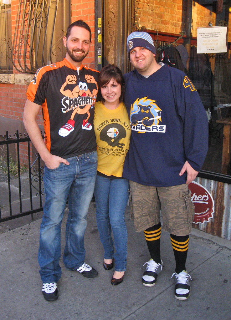
I’m always flattered and humbled when anyone shows up to a Uni Watch party. When someone — or, in this case, three someones — drive nearly 400 miles just to spend a few hours making the Uni Watch scene, well, that’s pretty special. So here’s to the Steel City troika of (from left to right) Jason Bernard, Jenny Sweet, and Ryan Connelly, who drove all the way from Pittsburgh to Brooklyn for Saturday’s gathering at Sheep Station (and you should’ve seen the look on my face when I saw them). Thanks, guys — you’re the best.
So who else was on hand? Let’s take a look-see:
• Here’s Keith Goggin and his lovely wife, Kathleen. Keith said he wore that Knicks warm-up “because there’s no NBA right now, so I thought I don’t know when I’ll get to wear it again.”
Keith also brought me three wonderful gifts. He said he scored Mets yearbook and the baseball rules mag (which is wonderful — I’ll feature it on the site soon) at a yard sale for 50 ¢ apiece. As for the “CH” patch, that’s an official varsity letterman’s patch from Holy Cross High School, where Keith teaches math and coaches golf. “I know you like those colors, and you like chenille patches, so I thought you’d get a kick out of it,” he said. And how! So now I’m an honorary Holy Cross letterman, and I couldn’t be prouder.
• This is Matthew Brotman, who took the train in from Patchogue — one town over from where I grew up! He’s wearing a mid-’90s Miami jersey, which had an interesting detail I hadn’t been aware of: The “U” logo was ghost-stitched into the shoulders. He also wore that Brooklyn Dodgers cap because, as he put it, “I always wear that every time I come to Brooklyn.”
• My favorite jersey of the day was worn by Matt Powers, who DIY’d himself this awesome Johnny LeMaster jersey (a reference, of course, to this epic moment in uni history). Matt said he had just made it just a few hours before the party, so it still had some loose ends, which just made the whole project more endearing, at least to me. Great concept, great execution. First-rate!
(As an aside: While I was taking photos of Matt, some random guy walked by and totally knew the LeMaster story. He also said lots of old Giants players, including LeMaster, showed up for the last Giants game at Candlestick — and that LeMaster was wearing a “Boo” jersey for the occasion! If true, that’s a great story. Photos, please!)
• It’s not often that someone wears baseball pants to a Uni Watch gathering, but that’s what Alex Rabens did. Nicely done.
• Alex brought along his pal Hillel Kipens, who wore an old youth XL Reggie White jersey with a very cool jock tag.
• I was very happy to see so many people wearing my favorite color combo — green and gold — including Manzell Blakeley, who looked sharp in his Gary Payton jersey.
• Jay Braiman actually designed the jersey he was wearing back when he taught at Frank Sinatra High School, which obviously owes a certain stylistic debt to a certain National League baseball team.
• Nice layering job by Marc Rivlin, who wore a Mets cotton button-up jersey shirt, a Mets sweatshirt, and — remember these? — a Uni Watch charter member T-shirt. A rare item!
• Uni Watch parties usually feature lots of soccer gear, but the only piece of soccer apparel this time around was Matthew Solly’s 2002 Portsmouth FC jersey. The Ty Beanie Baby sponsorship is a nice touch.
• Back in the summer of 2009 I wrote a piece about a guy who custom-paints designs on baseball caps. That guy is Chris Giorgio, and I was really excited when he showed up on Saturday, wearing one of his own creations. He says they take about 15 hours to execute.
• I was totally jealous of Marty Buccafusco’s Notre Dame logo socks. His DIY Braves sweatshirt — sewed by his Mom, he sheepishly admitted, not by him — included an excellent detail: a phantom 1991 championship patch.
• Marty brought along his buddy Jon Zelenak, who kept it simple with a Phillies ski cap.
• Our own L.I. Phil looked sharp in his mirror-image Mets jersey (a David Frost DIY special, don’tcha know), nicely accessorized with a Uni Watch Deep Freeze tee and your humble host’s favorite stirrups.
• Speaking of stirrups, a bunch of us gathered for the obligatory hosiery hoedown shot. The guy third from the left is Terence Kearns, who I somehow neglected to photograph on his own.
• As for me, I wore my 1941 Lane Tech varsity sweater. Perfect for a crisp November afternoon.
———
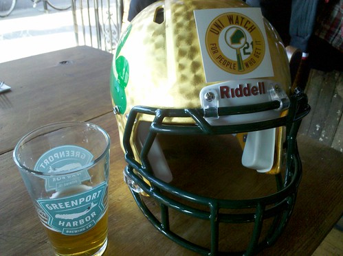
So that’s who was there. I brought along the helmet from the Notre Dame promo box, which everyone had fun looking at (and a few people tried on).
I also brought the Notre Dame jersey and noticed a small detail about it that I hadn’t initially picked up on: It was made in Israel. As you may recall, the first super-stretchies — worn by the Giants in 2009 — were Israeli-made. (I reported that myself here.) That one Israeli supplier must still be the only source of the super-stretchy fabric. Wonder if a particular mill has a proprietary exclusive on it — I’ll try to find out.
Hot stove uni action: Lots of MLB developments in the hopper over the next several days. Here’s a rundown:
• The Orioles will unveil their 2012 uniform tweaks this morning at 9:30. Here’s some advance word on what to expect. have unveiled their 2012 uni set. Further details here.
• The Mets will present their 2012 uniforms on Wednesday, but various sources are already reporting what we’ve already known for a while now: no more black drop shadow! Looks like a very nice 50th-anniversary patch too (designed by Todd Radom, incidentally). There are still some questions to be answered — will they wear blue caps and sleeves on the road, will the blue caps have a blue squatchee, etc. — but this is a very good start. Having campaigned against the black for many years, I don’t mind saying that I find this development very, very satisfying.
• The Royals will announce their own 2012 uni updates a week from today at noon Eastern. According to a little birdie, the changes will be minor: the All-Star Game patch and possibly — wait for it — powder blue pants.

Collector’s Corner
By Brinke Guthrie
NFL helmet/goalpost kits are fairly common on eBay, but you rarely see the ones with the footballs, not so much. I absolutely had one of these, even remember when and where I bought it (August 1971, Oxmoor shopping center in Louisville), but I don’t recall all 13 balls being on one base.
In other eBay finds:
• Two words for this gem: Oh. My. I’ve never seen this 1974 NFL IHOP board game before.
• Check out the embossed wings on this 1960s Eagles bobble.
• This New York Giants Fran Tarkenton shot is for Joe Skiba. Ad says 1960s but no way- look at all those Puma shoes. Definitely early 1970s.
• Look at this Boston Bruins tankard. I guess you flip back the top of the helmet..?
• The NFL should bring back helmet buggies, but you knew that already.
Seen something on eBay that you think would make good Collector’s Corner fodder? Send your submissions here, or tweet them here.
Bidding is now open for the Notre Dame promo box charity auction. The minimum bid today is $1000. If nobody bids today (an unlikely scenario, methinks, but anything’s possible), the minimum bid will increase to $1100 tomorrow.
Full details on how to bid, and everything else regarding the auction, can be found here. Have fun, guys.
Holiday Gift Guide reminder: I’m now working on the annual Uni Watch Holiday Gift Guide column, which will run on ESPN in early December. If you know of a good uni-related gift item that I can include (or if you produce such an item yourself), don’t be shy. Thanks.
Uni Watch News Ticker: Coupla leftover college football items from Saturday: Louisiana-Lafayette wore white at home, and Texas Tech wore its Wounder Warrior design with a stars/stripes helmet logo (from Jacob Kubuske and Susan Freeman, respectively). ”¦ New uniforms for the San Rafael Pacifics. ”¦ UGA basketball wore — of course — gray uniforms on Sunday. “I’m told Coach Fox only breaks them out to honor the football team, paying tribute to the ‘silver britches,'” says Parks McLeod. “The last time we wore them was after National Signing Day last year.” … Pens goalie Brent Johnson is a huge Led Zeppelin fan, but the “Stairway to Heaven” lyrics on his backplate misspells who’s (good spot by Nolan Petote). … Several readers have noted that Northwestern’s new basketball court appears to be the wrong shade of purple. … New home kit for Italy. … The Marlins’ new jerseys are already being worn in the Arizona Fall League (from Brett Crane). … Speaking of the Marlins, here’s an interesting note from Roy Bellamy, who sent me this photo of these two orange Marlins caps: “I purchased the one on the right, with black in the MLB logo, at the unveiling on Nov. 11. The one on the left, with blue in the MLB logo, was purchased by an intern in our office the very next day, Nov. 12, at the Marlins stand at Dolphin Mall.” … Here’s a first, at least for me: the NCAA authentication mark on an undershirt sleeve (good spot by Leo Thornton). … Jeremy Brahm reports that one of the two basketball leagues in Japan, the BJ League, has unveiled a really cool all-star game logo. The other one, the JBL, has released its all-star uniforms. Naturally, I like the green outlining on the West design. … Larry Bodnovich found some old Rice photos with interesting uses of owl iconography. I really like this cape and these basketball jerseys, but there’s something a bit disturbing about the mascot in this football team portrait. ”¦ Here’s a weird one: Shane Canup reports that Radford’s basketball jerseys all have “RU” above the NOBs. Okay, so “RU” stands for Radford University (duh), but those letters aren’t a logo — they’re the same typography as the NOB lettering. Anyone know more about this? ”¦ Pat Sharon scored this nice oil painting at an estate sale for $12. Anyone know who the artist was? ”¦ Batting glove pioneer Irving Franklin has died.
“Keith also brought me three wonderful gifts. He said he scored Mets yearbook and the baseball rules mag (which is wonderful – I’ll feature it on the site soon) at a yard sale for 50¢ apiece. As for the “CH” patch, that’s an official varsity letterman’s patch from Holy Cross High School, where Keith teaches math and coaches golf. “I know you like those colors, and you like chenille patches, so I thought you’d get a kick out of it,” he said. And how! So now I’m an honorary Holy Cross letterman, and I couldn’t be prouder.”
I don’t see a link.
Oops. Now fixed. Thanks!
The Northwestern court – it looks like they stained the floor to look like purple heart wood:
link
I second that, the wood is stained, not painted. The center court logo is painted fully and appears correct.
The guy’s comment about it being painted the wrong shade of purple must have prompted Paul to think to himself…”Is there a RIGHT shade of purple?”
I wish more teams would stain their courts dark or unique colors. I find it to be much more subtle and less offensive than painting large areas of the floor. Too many courts are totally vanilla, or completely tacky. There are very few that toe the line of tasteful and unique well.
Sometimes vanilla is the best flavor – link
I find it dull as hell. Sorry, but that doesn’t come close to even making my list of good courts. Utterly bland and non offensive courts? Sure. But you gotta take some risks to stand out.
Standing out’s not always a good thing.
link
The NCAA logo undershirt is the Nike team shirt. If you look closely, they all have the blue patch on the right sleeve…
link
I got my cousin a #2 Nike Michigan jersey for Christmas in 1997, and it had the same ghost-stitching (with the plain block M) on its shoulders. So I’m guessing that was a common thing among Nike replica jerseys of that era (at least those with TV numbers on the sleeves instead of the shoulders).
I had a Warrick Dunn FSU jersey that had an arrowhead on each shoulder.
I recall seeing a Penn State jersey of that time with a small “PSU” on the sleeve, with the “S” in a larger font size, kind of like monogrammed shirts, sweaters, etc.
I have a UM jersey with the ghost M on the shoulders as well. Bought it in the mid-90s.
Love that ghost stitching. All teams should employ it. Replace it with those nasty logos above the NOB and my guess is not only would it clean up the clutter, but it’d be a super merchandising hit.
Paul – The Joe Skiba article you link to about the stretchy Giants fabric from Israel mentions “a doozy of a throwback” for 2011. I haven’t heard anything about this (I tried to search your previews but couldn’t find anything). Safe to say this isn’t happening anymore this year?
Plans were scrapped.
It was nixed early in the season.
Ah okay, guess I did miss that then. Any details on what it would have been? Thanks guys.
Circa <a href="link;?1980's throwback.
I gotta get myself to Brooklyn for one of these parties. Road trip!
Y’all looked great! Congrats.
Odd pattern on the Texas Tech Wounded Warrior uniforms. It doesn’t look like camouflage so much as it resembles the Kente-cloth motif from the Georgetown basketball uniforms. UA’s website didn’t elaborate. Thoughts?
Jenny Sweet’s thought was that it looked like a crossword puzzle.
Will Shortz strikes again?
New Mets jerseys look terrific. Looks like the pinstripes will be off-white and have numerals on the front; whether they’ll have NOB remains to be seen. Looks also like the “50” patch will supplant the standard logo on the left sleeve, which I’m not thrilled about but not a deal-breaker. Look forward to the full unveil tomorrow, and hopefully answers to the remaining questions, especially whether the road uniform has blue caps and undersleeves, whether the 2-tone cap goes away, and whether this is a permanent upgrade.
I wanted to come up to NYC for both the Uni Watch Party and the UK v Kansas game tonight but I am moving away from Kentucky for a job in Ohio soon.
Maybe next year I can go to the UK v Maryland game at the new Barclay’s Center in Brooklyn.
Well welcome to Ohio, and good luck with the job. You going to be in southern, central, or northern?
I wish I could have made it to the party just for the Notre Dame stuff. (No offense Paul)
The job is Greenville, OH 30 miles northwest of Dayton.
Love the tri colored caps on the O’s. The orange alt is a beauty too. Well done Baltimore
New O’s gear:
link
Here’s a closer look:
link
I blew up a picture of the home cap and, good for the O’s, they got the apostrophe right!
So the road script is less tapered, which will please everyone who was more concerned with the letters being equal size than with the script (A) matching the style of the home script or (B) being legible to the naked eye. It now looks less like the home script, and it’s harder to read. Congratulations, Baltimore!
On the home cap, the seam stitching in the white panel uses black thread, so it looks like a cheap fan giveaway from an early-1980s cap night. These are already using a blank that matches no other team, so it can’t have saved much labor or cost versus using white thread on that side of the seam, so rather than making the caps less costly, this just makes them look cheaper. Congratulations, New Era!
Orioles new look is horrid. The cartoon bird looks ridiculous and the tri-color cap is fugly. Might as well throw some plastic mesh on the back of the hat and you’d have the perfect little league uniform. Then again, considering the Orioles level of play in recent years….
Agree with my Hungarian friend.
Thanks for noticing.
Seconded.
I love the white paneled Orioles caps from the 80’s, but I don’t like seeing them return as a primary cap. And the orange jerseys are hideous.
By the way, I’ve been looking for another all black official cap from the early 2000s if anyone knows where to find one. The only sizes I can find online are under 7.
Orange alts are very nice. Re-shaping the “Baltimore” script was a good idea – it sort of just faded into a vanishing point. Love the new Bird. Not a fan of the white-panel hats. Throwing back permanently to the sixties is cool, but the seventies and early eighties are not quite retro-hip enough yet. I don’t see the White Sox going back to the beach blanket hats full-time. Having grown up in Baltimore in the 80s, they just feel little league. Maybe that’s the strategy. Little leaguers love shiny things?
Throwing back to the 60s is SO 90s.
Perhaps, but I’m not sure throwing back to the 70s is 2010s. The Astros would look much better in Colt .45s-style unis than in tequila-sunrise style, at least every day anyway. Especially since most ballparks are retro-styled nowadays, including the stadium the O’s are celebrating next season. When they start building concrete ovals again, then bring the 70s caps back.
Or maybe I’m wrong and they’ll look fine on the field.
So true. What’s retro-hip right now is throwing back to the 90s. Throwing back to the 70s and 80s is already uncool.
The 80s always were and always will be cool.
“Throwing back permanently to the sixties is cool, but the seventies and early eighties are not quite retro-hip enough yet.”
As a child of the 80’s I strongly disagree.
I was born in 1979. So my memory of the white-paneled O’s cap is inextricably tied in with my parent’s gold couch, pea green shag carpet, and bright yellow kitchen table. Not a style I want to throw back to. I agree it definitely strikes a chord with the 80s generation, but I’m just not sure we’re nostalgic for it yet.
link…
Baby boomers selling you rumors of their history- Forcing youth away from the truth of what’s real today
Couch
The Orioles finally look like the Orioles again.
The Orioles do indeed look like the Orioles again! The long ornithologically-correct nightmare is OVER.
Tweak request: just wondering what the new Marlins’ unis would look like without any black elements?
Well done, Orioles. Great f’n uniform set.
White panel good.
Cartoon bird bad.
Nah, I like it. Fun.
I thought you hated white like Paul hates purple.
Not quite. My hatred of white is more complex than that.
Love the new look, reminds me of Palmer, Eddie, Cal, Flanny and McGregor. You know, back when the Orioles played in the major leagues.
Rumor is the new alt marks the return “Sunday Orange”. Now, if they would just drop those hideous black alts, the circle would be complete.
Congratulations, Paul. The Mets look like the Mets again.
One thing really bothers me about the Orioles’ logo (aside from the fact that they’re trying to have it both ways, with “Ornithologically Correct” bird logo and cartoon bird caps): I don’t like that he’s wearing that silly “O’s” cap. If they had put him in a 1960s throwback “B” cap, he could have repped the city a little bit.
The other thing that caught my eye right away is the way his beak link. The cap doesn’t have this problem, since the stitching link. I haven’t decided if that one bothers me, or it’s brilliant design.
The beak merging with the keyline caught my eye immediately as well.
I like how the beak blends with the keyline. I’m not a huge fan of keylines, but if you have to have one, it definitely looks like less of an afterthought when the logo interacts with it somewhat.
There’s very little thought that goes into how logos work on dark/light in general, especially in sports, and the solution too often seems to be, ‘Just throw a keyline on that bitch!’ The Blackhawks are a good example. They don’t use a keyline on black, but rather, just let the outline and hair blend into the background. I like what the orioles have done, blending the logo with the keyline. What puzzles me is the little white separation between the head and the cap. That should be orange. Draws far to much attention being white. A white B on the bird’s cap would have been perfect.
Orioles new uniforms are amazing, except for the space between the L and the T in Baltimore on the away uniform.
Finally I can get a Cartoon Bird cap that isn’t flex fit (and therefore likely to slowly ride up my head) or a fashion hat!
I’ll bet they rue the day they chose that particular rendering of the word “Baltimore”. If it looked more like the up-and-down “Atlanta” script on the Braves’ jersey, it would be easier to center.
Somehow the cartoon Oriole just doesn’t seem like he’ll be at home at Camden Yards…
The team doesn’t seem to be at home there…
Sell, Peter. Sell.
Good seeing you all on Saturday, even if it it was just for a hot second…
good to see you too ed
you’re weren’t downtown at 1:00 am this morning, were ya?
No, but I will be checking in down there today and the rest of this week… waiting on the Judge’s decision right now.
Not sold on the new Orioles caps; nicely retro, yes, but the white front panel is a little too ’70s for me, and I kind of liked the bird logo the way it was. (I drew it on the whiteboard in my classroom, which was no easy task, so many times over the years….)
Years ago I read some wag who said the cartoon bird makes the Orioles look like summer camp counselors.
Disappointing news that the O’s will continue to wear the stupid “O’s” hats – apostrophe catastrophe intact – on Fridays. They could at least have fixed the apostrophe, no? Oh wait, this is the modern-day Orioles….
Doesn’t the apostrophe represent the omitted letters in a contraction? Therefore, if you’re contracting O(riole)s, it would be O’s.
I’ll admit I’m not fresh on my rules. Maybe there’s a separate rule for this type of thing, but it seems it’s been done before by the M’s and the C’s.
Now, if you look at it as if one Oriole is an O, and there are nine of them on the field, then I guess they would be the Os, but I always saw those types of nicknames as contractions, which is why I never considered this an apostrophe catastrophe.
They should’ve ditched the O’s cap and gone with a B cap.
link
Just looks classic.
The catastrophe they are referring to is that the apostrophe is upside-down.
Thank you for clarifying for me Brian. I forgot that it’s been a while since there’s been a discussion on upside-down apostrophes on this site. But yes, in UniWatch-ese, an “apostrophe catastrophe” is an upside-down apostrophe in a wordmark or logo.
Also, I agree with Winter. Maybe an updated “B” logo?
Sure enough. Makes perfect sense now. Never really looked at the logo closely enough to see that it was upside down.
That B cap would have been perfect.
What a day for MLB uni-news:
Mets take a major step towards ditching the black
Orioles bring back the cartoon bird (and the white panel!)
Hints of a powder blue monochrome for KC?! Amazing
The Baltimore Orioles win the day.
If the Mets go with blue hats on the road, they will win tomorrow.
Breaking news from Twitter:
University of Memphis basketball will be wearing throwbacks from their 1972-73 season tonight in their regular season opener vs. Belmont. Also the #21 patch for Larry Finch will debut, which didn’t show up during their two preseason games.
Tigers need to throw back to these. Permanently…
link
It’s not Memphis State anymore though, so wouldn’t it look kind of awkward without the over/under wordmark?
No, not really.
They wore that style after they changed the name without the “STATE” under the number also.
link
Agreed.
Tonights jerseys will look like this though.
link…
link fail
Here’s your working link from below transported up here:
link
Thanks
Pic from today (game was at noon):
link
Made a rough mock-up of link
blech.
(not your mock-up, which is fantastic. I just hate the look of mono-powder)
I actually like the mono-powder. It would be cool to see something like this.
Man, it’s nice to have the Baltimore Orioles back! The white panel caps don’t work for everyone, but they sure do for Baltimore.
Agreed.
Tonights jerseys will look like this though.
link
oops that was a reply to my earlier post
I’m afraid the uniform changes and the changes to the outfield walls are all just schemes by the Mets to butter us up before not re-signing Reyes.
Maybe, but at least the uniforms and ballpark will finally be more pleasing to the eye than the games themselves.
Since you’re calling out Georgia for the GFGS (actually SFSS), here’s a short link on the first Georgia helmets to feature a “G.” This also gives precedent for the use of silver in their uniforms though the official school colors are red and black.
Note the article touches on the “oval G”/Packers copy issue but doesn’t go into detail.
I don’t agree. Red on grey a bizarre combination? In what universe. The letter was very tall and narrow? Looks great to me. At least it’s original. That’s a beautiful helmet.
There are some posts alluding to it above, but the new Welsh-Ryan Arena court looks to me like it’s got the link (at least the painted parts), especially compared to the link.
Always hated the white front Orioles hat. Too bad they are back.
Au contraire! Not only would I wear that…I’d buy that.
Welcome back, smiling bird!
They come in adjustables? Mesh-back adjustable? Either/or is good.
Always lile the black standing bird hat best, but then I’m a minimalist.
Bet you loved Brooksie’s helmet!
The Tarkenton photo is from 1970 or 1971. The Cardinals have NOB, which started for NFL teams in 1970. Giants played at St. Louis in both ’70 and ’71 so it’s hard to tell which season. Tarkenton was traded to Minnesota in ’72.
It’s 1971.
Not that many players wore white shoes in 1970 (though it seemed to be the year that white cleats were first starting to pop up in the newly merged NFL), but this game was a CBS doubleheader game (confirmed per the506.com) Ray Scott and Pat Summerall on the call. And what struck me was how many players from both sides were clad in white cleats.
Yeah I distinctly recall 71 or so, all of a sudden Riddell was OUT and adidas/puma IN.
other trends too-
late 70’s, Nike hadn’t taken over yet- but Brooks and Pony were EVERYWHERE.
Or was it the late 80s? I forget.
Big fan of the new Orioles look. I see the cartoon bird, white-paneled cap and orange jersey and immediately think of the successful O’s teams from the late ’70s and early ’80s (and even the black-paneled cartoon bird cap is reminiscent of the late ’60s/early ’70s Orioles). To me — even if I’m biased towards the look I grew up with in the 1980s — this is what the Orioles are SUPPOSED to look like. They may not be playing that well on the field, but, well, they look like champions. Whenever they’d wear the white-paneled caps over the past few years, the look seemed natural, and I felt as though the O’s should have simply kept wearing them. Now, they are. Finally.
I don’t know why, but I am always compelled to look at Uni Watch partiers’ shoes.
there is a name for that fetish…but it escapes me…powers would know
Powers was rockin Air Max 95s. Varsity Red (or chili?) colorway, I believe.
Air Max 95 Safety Orange
link
C’mon…I always coordinate…
link
I’m Calling It Chili
;)
I wish I could “like” that link.
A couple of weeks ago I pointed out how triple helmet stripes and some logos cover up the ventilation holes on the Riddell Revo Speed helmet and wondered whether that might compromise the manufacturer’s warranty inasmuch as keeping the head cool is considered not just a comfort feature but a safety feature.
Well, look at Clay Matthews helmet, here…
link
Several readers have noted that Northwestern’s new basketball court appears to be the wrong shade of purple. …
Uniwach readers more often wrong than right miss another one… NU’s court purple areas are a purple semi-translucent stain… Check the B1G
Ten logo which is clearly NU purple.
Good thing you were here to set us straight… about four hours after that exact point was already made.
OOOOOOOOOH SNAP! hahaha
Count me in among the fans of the Orioles’ new look. I don’t think the different-color panel background works for every team, but there are some who make it work. The Orioles are one of those.
My question is this — will the helmets worn at home also carry the white panel?
(I’m also curious to see if the Marlins will have an orange helmet to go with their orange caps…)
Yes.
“The 2012 cartoon bird head is a new design, utilizing elements from both the 1970 and 1983 versions. It will replace the ornithologically-correct bird on both the home and road caps. The club’s new home cap will feature the cartoon bird on a white front panel with a black back and orange bill and button. The look will be replicated on the club’s home batting helmets. The road hat will feature the cartoon bird on black with an orange bill and button. The same look will be utilized on the road batting helmets.
For the first time since the 1992 season, the Orioles will wear an orange jersey for select home games. The orange jersey features the “Orioles” script in black with a white outline and joins the existing black jersey, worn on Friday nights, as an alternate version of the uniform. The orange jerseys will be worn for Saturday home games.”
Jenny Sweet is THE most beautiful girl I’ve ever seen.
That Jason Bernard is pretty cute, too.
Thank you, Connie.
It would be really nice if just once — JUST ONCE — a photo of a woman could appear on this site without some clown feeling the need to remark on her desirability. Last time it happened (Bethany Heck), I just took down the comments. This time I’ll say something:
Whether you realize it or not, such comments, however well-intentioned (or not), are AT BEST the internet equivalent of a construction worker giving a leering whistle at a girl as she walks by. At worst, it’s the internet equivalent of a flasher in the park.
As always, my gripe with such behavior is not that it demeans women. It’s that it demeans MEN (myself included) by typecasting us as predictably dick-for-brainz morons. And I won’t allow men to be portrayed that way on my web site.
For fuck’s sake, guys, have a little dignity.
So you know what you have to do now to combat this, right, Paul?
Just start posting gratuitous cheesecake photos. Maybe they can have a “uni-related” aspect.
Lingerie Football League … Hooters girls … Tilted Kilt, um, lasses? … SI swimsuit models…
That way, any time a photo of a woman is posted for official Uni Watch business, it’ll be old hat for the horny masses.
Whatever happened to Leon?
Oh. That’s right.
Hi James.
Does anyone else find it really hot when Paul gets all worked up? OW OW! Hubba, hubba. AOOOGA!
There are methods on commenting on a woman’s looks without sounding like a creepy old man. Hyperbole is not one of those ways. It makes you sound like a perverted closet-case.
Paul Lukas: Going off on alleged perverts so I don’t have to since 2011.
All joking aside, comments like LA’s are why I’m scared to comment on nice (and not racy) pictures on Facebook. Because I know that if I say or word one tiny detail wrong, I instantly become a pervert who’s trying to hit on a 17-year-old girl. As Kyle mentioned, there are ways to compliment a girl on her looks without raising a pervert flag. You can say “You have very pretty eyes.”, but you cannot say “Your eyes are so sexy…”. I’m sure some of you have enough of a brain to figure this out without being flamed by Paul, and flamed further by a 20-year-old and an… 18-year-old? Kyle, are you 18? I can’t remember…
But my point is that we as men should set a new, healthy example, instead of enforcing the stereotype. Now if you’ll all excuse me, I have a Monster to down so I can continue watching this college hoops marathon.
It’s pretty simple: You don’t say something that you wouldn’t want someone else saying about your sister. Fuck, I know that and I don’t even HAVE a sister….
A problem with saying anything like that on the internet is there is no tone in the text or comment. Even if you don’t mean to sound like a basement-dwelling pervert, you have a very good chance of it, no mater how you phrase it. It’s like sarcasm; it’s lost in translation from voice to text.
I mean, if LA would have said something like “Jenny Sweet looks cute” or something along those lines, there would have still been a creepiness factor in the comment (it’s the internet), but I’m sure most of the male demographic would have been able to relate or agree to the comment.
You don’t really need a new example, you just need a little restraint and a little less exaggeration (and what Paul said).
This exchange needs to be stapled to the forehead of the next reader who accuses Paul of being a pushy liberal. Paul makes the most socially conservative defense of old-fashioned values I’ve read in at least a week, standing athwart our declining cultural norms and shouting “Stop!”
Random thought: Why are Baylor’s football uniforms gold and forest green when their basketball uniforms are highlighter yellow and kelly green? Basketball should move to the football colors. They clash less and would look better on that hideous court.
link
Could it have to to with Nike providing the football uniforms and Adidas providing basketball? Also Baylor is the only major college I can think of that does this.
Good color link. The whole university should adopt the same colors. Maybe they should choose b/w Nike or Adidas. based on the link and the uniforms I have seen, they should go with Adidas. Although I prefer the darker gold and green, it’s obviously not correct.
The latest Freakonomics Radio podcast is all about booing people, and they cap it off with an interview with Johnnie LeMaster about how he and his wife came up with the ‘BOO’ idea. I was just listening to it during my lunch today and the first thing that popped into my head was Matt Powers and his DIY from this entry. Well done, Matt, for tying Freakonomics and Uni Watch together for me this afternoon.
I just listened to that myself (thanks to a tip from another reader). Amazing that they’d interview LeMaster the same day we’re discussing him here on the site!
Thanks, John!
Those get togethers are always enjoyable, if for no other reason I get to meet with people who share a very niche and misunderstood interest!
Not even by best costume project of the past two weeks:
link
Just caught something while job searching: PETCO has become petco, and they no longer like animals that aren’t healthy:
link
The athletic aesthetic connection? I don’t know about the actual park, but the Padre’s website still refers to the building as PETCO Park. Especially since the name isn’t an acronym, I’ve always felt that the all-capped name was very annoying and over the top marketing.
FYI, the linked story looks to be from August, so this isn’t that new of news.
Nice to read about fellow uniwatchers when they get together. How about the Pittsburgh area guys making a special trip.
Why does the O’s bird have an ORANGE underbill on his cap?? Is it to match HIS orange underbill???
;^)
I’ll assume the players’ caps will have black, right?
Here is a link to the one off USF will be wearing this 10/19 against Miami. I really don’t care how it looks as they are going to be sold at auction for the Wounded Warrior Project.
link
Littlefoot’s grown to be quite the football player, huh?
No, I will not mock up a Toronto Tree Stars jersey.
Damn…
SUCH a great time saturday!!! can’t wait till the next one!
Loving the O’s Aways! I always prefered the Brooks era caps…cartoon bird on all black cap with orange bill.
I can live with the tri-colored hat & cartoon bird…but I think they should have gone with black letters/numbers/script & orange trim on the white jersey.
I dig it.
Now…play like the teams that won the Series in that hat, and we’re all good!
link
An early bat knob decal?
The marlin on the new Miami Marlins cap is blue on top, orange on bottom on the orange cap.
link
It is the same on the orange jersey.
The marlin on the black cap is orange on top, blue on bottom.
link
Same as road, home, black alt.
There will be mismatched marlins when the orange jersey is worn with the batting helmet
link
and if the debut was any indication, it could happen if black cap is paired with the orange jersey.
link
And the marlin looks a lot like the dolphin stadium logo used a few years back.
link
O’s changes – sweet.
That is all.
“Louisiana-Lafayette wore white at home”
Actually, they wore white and BFBS on the road.
link
While I was channel surfing, I came across the Miami/Tennessee women’s basketball game. The U has got some huge NOBs. Take a look at the third photo in this gallery, you’ll see what I mean – link
That gallery isn’t from this season, but the NOBs are the same
I haven’t visited here lately, but has it been mentioned that The University of Texas football equipment staff has a twitter account? Thought some here may be interested.
link
“Updates and behind-the-scenes insight from the University of Texas football equipment staff.”
link
Don’t know why ru has such a bad collar logo, but I always liked the logo from when my brother went to Radford which was an ‘R’ with an arrow laid into it, but I wish they’d go back to tartan plaid color scheme like they had up to a few years ago
I love the cartoon Oriole, of course.
But I have to say–and I may be the only one here–this…
link
…is one of the all-time great baseball caps. I love the detailed, dignified bird.
Agree 100%
Global Branding begins in Sri Lanka.
link
I don’t know why a lion needs to carry a sword…
But other than that it looks alright.
Paul – The Louisiana-Lafayette’s home “white out” was actually Saturday, November 5th versus Louisiana-Monroe.
Louisiana-Lafayette wore white tops and black helmet/pants this last Saturday on the road vs. Arkansas State.
O’s new stuff looks great. Love the retro bird. Nice when a team cares what it’s fans think, eh?
As a FLORIDA Marlins fan, left we no respectable team to support, I may have to go buy my first non-Fish/Fish MiLB affiliate cap. The O’s black looks sexy, have heard good things about the new Jays too. Also may pick up an Expos pinwheel as a tribute to the other team Jeffrey Loria killed.
29 Major League Baseball teams are lookin’ pretty damned good these days in my opinion. It’s a shame when they play the clown college team from Miami the collective style of the game will take a sharp nosedive.
I am a fan of the Mets black drop shadow. I’m an even bigger fan of the snow white jersey I was afraid they would lose. Good job keeping that.
The part I will miss is the triple twill lettering. The Mets have in the past employed a white base lettering under the blue and orange. I like that. To me is says that real effort was put into making that jersey.
Most Important- a good patch. From what I see, I like it.