.
We have a LOT to cover today, boys and girls, so let’s get right to it, beginning with notes from yesterday’s NFL games:
• The Falcons once again wore their beeYOOteeful throwbacks. Too bad the Saints don’t have road throwbacks — that would’ve been a gorgeous game to behold.
• The Bears wore their orange alts. I’ve never much cared for this look, and my impression is that nobody else likes it either. Anyone want to stick up for it?
• The Rams and Browns went solid-blue vs. solid-white.
• The Jets wore white at home.
• Marshawn Lynch’s “beast mode” schtick is getting really tiresome (and that purple mouthguard doesn’t exactly help).
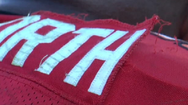
• DJ Ware of the Giants spent a good chunk of the second half with a black wrap around his leg. I don’t know if this was medical or to cover a torn pant leg or what. I’ve asked Joe Skiba about it — will advise.
• Albert Haynesworth had some nameplate problems.
• Maybe the super-stretchies are too stretchy.
• Turning to Saturday’s college action, New Mexico took the white helmet from their first game, left the stripe, and used the decal that’s normally on their silver helmets. The team’s seniors chose the design.
• Hey look, it’s the Cincinnati Reds! That’s the Cincy Bearcats, natch, who went with a solid-red look for Saturday’s game against West Virginia.
• And of course Phil and Terry had loads of additional college football news in yesterday’s post.
(My thanks to all contributors, including Ross Hazlett, Rob Holecko, Derek Lucas, Frank Mercogliano, and Ronnie Yates.)
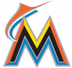
Fish story: In case you missed it over the weekend, Phil had full coverage of the Marlins’ new uniforms on Saturday. Plenty of photos there; some much larger, higher-res photos here; video of the unveiling is here; and the full set at a glance can be seen here.
As for me, here’s what I think:
• I never loved the Marlins’ old look, so I’m not exactly mourning its demise.
• I’ve liked the new logo just fine since it was first leaked back in September.
• I like the home uni, at least from the front (I think that rear view, with the drop shadow on the numbers, is gonna be really annoying).
• Ditto for the road grays, although I kinda wish they’d used orange trim for the collar and sleeves, instead of black.
• The black alternate is a major mistake. Ugly, boring, predictable. Too bad.
• As for the orange alt, it’ll look a lot better if they pair it with the orange cap shown in the style guide, instead of the black caps they used at the unveiling. (For some reason, the orange cap wasn’t used at all at the unveiling, but it does exist.) Either way, though, that rear view with the blue drop shadow is gonna be brutal.
• There’s been lots of chatter about the cap logos being too big. Yes, they are, but for some reason this isn’t bothering me too much, at least for now. I might feel differently once I see them on the field.
• Looks like the chest mark could potentially have a problem with a disappearing letter.
All in all: Not so bad, especially from the front (and let’s hope they tweak the rear number typography after a season or two). Is it great? No. But as Phil wrote on Saturday, “It’s different, but it still looks like a baseball uniform.” Exactly. I like this set a lot more than the Padres’ new set, because it feels like a good fit with its team and city.
Of course, I may revise this assessment downward if they sign Reyes.
Things have been so busy lately that I haven’t had a chance to follow up with the NCAA regarding that little blue jersey-authentication patch. It was supposed to be mandatory this season (you can get the full story from this piece I wrote last year) but seems to be appearing very haphazardly: Some teams have it, some don’t. Some clarification now comes from reader Kyle Mackie, who writes:
I was talking to one of the equipment managers for Cal and asked him about the blue NCAA patches that we heard about last year. I noticed the Cal uniforms did not have them, but they did have the Jumpman logo. He said was the NCAA wanted it to be on pretty much every piece of equipment/gear the players wear, but it was too difficult or something and they were having trouble enforcing it or implementing it and the whole thing was basically scrapped. Some of the sweats and other things that the basketball team was issued do have the blue patch but not the jerseys.
Faaaascinating. I guess some patch-inclusive jerseys were already in the pipeline, which is why we’re still seeing some teams wearing them. Wonder how long it’ll take for those jerseys to cycle out of circulation. Which school — which player — will be the last one to wear the little blue patch?
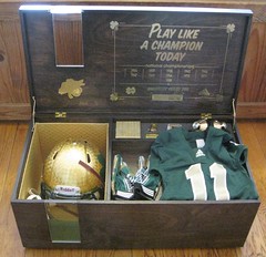
Monster in a box: I’ve been flooded with inquiries from people who want to know what I’m going to do with that Notre Dame promo box (if you don’t know what I’m talking about, look here). After thinking about it over the weekend, I’ve decided to auction it off, with the proceeds going to charity. Here’s the deal:
1) First, about the box and its contents: Everything is in like-new condition except for the Adidas-shaped piece of chocolate, which was already broken when I received it, and the gold dome dust, a teeny-tiny amount of which was removed from its container for this photograph (I was unable to get those dust flecks back into the container). I wore the jersey, helmet, and gloves for about 10 minutes on Nov. 11, I plugged the flash drive into my computer for about a minute on that same day, and maybe five or six people tried on the helmet during the Uni Watch party on Nov. 12. Aside from that, everything is unused.
2) The box will be auctioned off as a single unit, not as separate components. Please don’t ask if you can bid just on the helmet, or just on the jersey — not gonna happen.
3) Bidding will start tomorrow morning, Nov. 15, as soon as I post tomorrow’s blog entry, and will conclude next Tuesday, Nov. 22, at noon Eastern.
4) This will be a silent e-mail auction. To bid, simply send an e-mail with your best offer to an address that I will reveal tomorrow. Your e-mail should include your full name, shipping address, and phone number (I may call you to confirm a few things). Bids that do not include a working phone number will be deleted. The highest bid will win. In the case of identical bids, the one with the earlier time stamp will be the winner. (Note that this is not like eBay, where you can simply beat the next-highest bidder by a dollar. If the highest bid is, say, $1 million, and the second-highest is $2,000, the winning bidder must pay the full million.)
5) When the bidding commences tomorrow, the minimum bid will be $1000.
6) Each successive morning, up through Nov. 22, I will announce what the current high bid is up to (although I will not divulge the high bidder’s identity). The minimum bid each day will be $100 more than the current high bid that I announce that morning. In other words, if the bidding on Wednesday morning is up to $1750, the minimum bid on Wednesday will be $1850.
7) If nobody bids on a given day, the minimum bid the following day will increase by an additional $100. In other words, if the bidding on Wednesday morning is up to $1750 and nobody bids on Wednesday, then the minimum bid on Thursday will be $1950. If nobody bids on Thursday, then the minimum bid on Friday will be $2050. (This is to keep people from waiting until the last day to bid.)
8) If you’ve already bid and then want to increase your bid, just send another e-mail. There’s no limit to the number of times you can increase your bid. You may not retract or lower a bid once you have made it, however.
9) If the winning bidder fails to follow through with payment, the second-highest bidder will win the box (and, you can be sure, I’ll splatter the deadbeat bidder’s name far and wide).
10) The winning bidder will be responsible for either (a) picking up the box from my apartment in person, (b) arranging for someone else to pick it up in person, or (c) covering shipping costs + insurance via UPS (the package will weigh about 80 pounds and the origin zip code will be 11217, so you can do the math to see what the shipping charge will be). I have the original shipping materials that Adidas used when they sent the box to me, so I’ll use those and do my best to pack things as securely as possible.
11) Once I receive payment from the winning bidder, it will be donated in the bidder’s name to his or her choice of the following nine organizations (this list is final, so please don’t ask me to amend it — thanks):
ASPCA: Longtime animal welfare advocacy group. Tucker and Caitlin are rooting for the high bidder to choose this option.
Doctors without Borders: Renowned humanitarian group helping catastrophe-stricken people around the globe.
It Gets Better Project: Dan Savage’s groundbreaking initiative to support LBGT kids and combat anti-gay bullying.
National Parks Conservation Association: Working to preserve and support America’s national parks, which are currently facing massive budget cuts.
National Trust for Historic Preservation: The foremost organization dedicated to preserving America’s endangered historic places.
Population Council: International NGO dedicated to public health initiatives in developing countries.
Slow Food USA: Brilliant organization supporting local and sustainable food production and consumption. The exact opposite of corporate fast food.
Southern Poverty Law Center: Longtime watchdog organization that monitors and fights extremist hate groups (the Klan, skinheads, etc.). They’re the ones who brought the 1990 lawsuit that bankrupted and essentially destroyed the White Aryan Resistance.
WFMU: Best radio station on the planet. Completely listener-supported, perpetually broke.
If the high bidder wants to divide up the bid amount among two or three of these groups, that’s fine too.
12) I will add my own $1000 contribution to whichever organization(s) the high bidder ends up choosing.
And there we are. If you have questions about any of this (like, legitimate questions — not “So am I the high bidder?” or “Can you let me know if anyone surpasses my bid?”), feel free to be in touch at the usual Uni Watch address (not at the bidding address). Thanks.
Saturday’s Uni Watch party was sensational. My thanks to all who attended (esp. those who traveled all the way from the Steel City!), and doubleplusthanks to Keith Goggin for all the excellent gifts. Full report in a day or two.
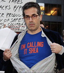
Uni Watch News Ticker: Who’s that with the excellent taste in T-shirts? None other than best-selling author and MacArthur genius grant recipient Jonathan Lethem (big thanks to Casey Barber). ”¦ Speaking of the Mets, they’ll unveil their 2012 uniforms on Wednesday. … According to Jags equipment manager Drew Hampton, the team will likely have a black uniform within the next two years. ”¦ New kits in the works for the Philadelphia Union. … New Euro 2012 kits for Spain, Germany, and Russia. … The Kitchener Rangers wore a Remembrance Day jersey on Friday (from Jerry Muir). … A Venezuelan baseball team has been wearing green ribbons as a gesture of support for kidnapped Nats player Wilson Ramos. And they’re not those bogus ribbon patches — they’re real ribbons (big thanks to Eric Stroker). The U.S. soccer team wore white jerseys with blue shorts for Friday’s international friendly against France. “First time they’ve done that, I think,” says Austin Chen. “Usually they wear white on white, or red shirts with blue shorts.” … This article about the Springfield Falcons — that’s a minor league hockey team — includes the following: “We do share in some equipment costs with Columbus. The budget for hockey sticks can be in excess of $100,000 a year. Small items like hockey tape will run us over $6,000 a year. Our uniform costs are in excess of $10,000 a year. We will spend close to $5,000 a year on hockey pucks” (from Tris Wykes). … Latest entry in the “Worst Jersey Ever” sweepstakes (from Chris Dearth). … More poppies, this time on English soccer shoes (from Chris Cruz). … Michael Kramer reports that the O’Brien Trophy has its own wordmark, at least on several of the trophies that he recently got to see. Pretty ugly, no? ”¦ The color distinctions aren’t easy to make out, but Luke Rosnick notes that most of the Rangers were wearing their navy gloves — normally used with the team’s retro alternates — with their regular home uni. “They had worn the retro sweaters in their past two games, so I’m wondering if the guys kept wearing the same gloves because they’re properly broken in at the moment (not sure what the turnover is on gloves in the NHL), or as a kind of superstitious thing because the team is on such a tear right now.” ”¦ Gordon Gromer spotted some very odd pants on the sideline of Thursday’s Virginia Tech game. ”¦ The woman who created the pink ribbon for breast cancer has died. ”¦ Here’s a little truism Scott M.X. Turner taught me years ago: Every Negro Leagues team portrait includes at least one guy whose uniform doesn’t match all the others. The Memphis Red Sox appear to have taken that concept to an extreme level (great find by Don Gale). … Looking for something cool to wear for Xmas? You could do a lot worse than this amazing green/red varsity sweater. … Anyone else think it’s a little weird that the patch for the FBI’s Pittsburgh office includes a Penguins logo? (From Alan Feller.) ”¦ Tris Wykes likes how Brown University’s football helmet logo includes some ivy — fitting for an Ivy League team. ”¦ David Sonny notes that the Cincinnati basketball court now has icons celebrating the 50th anniversary of the school’s NCAA championship. ”¦ St. John’s hoops had two NNOB players yesterday. “The roster shows #25 is Drew Bashen and #40 is Sam Sealy ”” but no other info as to why their names aren’t on their jerseys,” says Brian Cheung. ”¦ New soccer uniforms for Kawasaki Frontale in the J-League (from Jeremy Brahm). ”¦ Good article about Pennsylvania high school football helmets (thanks, Kek). ”¦ Ron Roza was at last night’s Blackhawks game and spotted someone wearing an amusing Flames jersey. … Manny Pacquiao had a ridiculous amount of bumper stickerage on his trunks for Saturday night’s bout against Juan Manuel Marquez. … Here’s an interesting situation: Former pitcher Charlie Lea, who tossed a no-hitter during his six seasons with the Expos, has died. Is this the first time a former Expo has passed away since the franchise moved to Washington? Will the Nats wear a memorial patch?
DJ Ware lost his thigh pad somehow. I saw him with it in his hand…then handed off to the sideline. I’m thinking he got a whol in his pants and the black tape was keeping his pad in place.
sp – hole
The jersey worn by the Florida Everblades that looks like a kid’s drawing of the Little Mermaid should celebrated for their look because of what it means.
As stated in the article, “the drawings on the jerseys were done by patients at the Southwest Florida Children’s Hospital.
“The Everblades work closely with the hospital throughout the year, including donating toys from the annual Teddy Bear Toss and pairing players with patients for a special program called ”Blades Buddies.’ After Saturday’s game on Nov. 19, the jerseys will be auctioned off with proceeds going to the hospital.”
I have nothing but the utmost respect for the Everblades using their uniforms to raise money to help sick kids.
Call them a contender for one of the worst LOOKING jerseys, fine (if you’re a heartless soul). “Worst Jerseys Ever”? Nope. I’d call them one of the best.
Agreed. As a one-off gesture for such a good cause, I think it’s a great thing.
It’s certainly better-looking than Ronald McDonald-themed jerseys over yellow ice, or Valentine’s Day pink-and-red overflow that even the NFL would have a hard time getting behind, or “outlaws and lawmen”, Star Wars, or whatever other bizarre themes they can come up with.
Though I’m still waiting for a Dragon Ball Z minor-league hockey cross-promotional uniform… especially with Funimation pushing their Blu-Ray release of the series ahead so quickly.
I agree, a great idea. And having sea creatures on the jerseys is no sillier than the idea of having a hockey team in Southwest Florida.
Those jerseys actually look better than most of the monstrosities trotted out for these type of (sadly, non-charity) events or themes.
Good job by the Everblades.
Gee, I wonder if that huge-ass Marlins cap logo is for the benefit of T E L E V I S I O N. I think the Marlins should use TWO cap logos…one in the front and one in the back…and make’em BIGGER!
P.S. Paul, nice gesture raffling off the Notre Dame promo kit and donating the proceeds to charity. You’re a good man…
Why not ad TV numbers to the side of the cap? Maybe we could throw in the New Era mark, too… ;-)
Well…you have to leave some space for pink ribbons and other commemorative patches throughout the season, such as for National Retailers Day.
My first thought when I heard the ND gear was being auctioned – “awe, man! I was hoping for a Christmas raffle!” (and I’m not even a college sports fan). Then I read the details. Well done.
Wait, people WATCH the Marlins on TV?
Like they do “in person?”
I knew I recognized that multi-colored Marlins’ “M” – It’s Joseph and the Technicolor Marlins Fonts !
The more I look at these new Marlins unis, the worse they look. YUK !
The US wore white shirts with navy shorts in the 2006 World Cup
link
link
And throughout qualifying for the 2010 World Cup.
link
So, first time ever THIS YEAR may be a bit more accurate.
I believe he meant it was the first time ever with this current kit.
2002 World Cup as well.
link
The US only recently went all white with their white kits. They’ve had navy shorts for a long time with their white unis. When they were originally revealed they were white top, blue shorts, white socks. The away was blue top, white shorts, blue socks. They just recently added the red third uni which utilized the blue shorts that already go with the white uni.
Here’s a pretty good site on the history of US kits showing white tops with blue shorts at least as far back as 1990. I would guess that the 1988 white kit had blue shorts as well.
link
I’ll stick up for the Bears orange alts only because I like a little variety. I will say it’s not exactly like the Yankees wearing an alt, but it’s close. And I definitely would not want to see the Yankees ever wear an alt.
Trim colors are just that. They looked like an x-ray of my football team.
I give them a pass because they have a history of wearing orange, but it still doesn’t look quite right and I still don’t really like the orange set.
I would stick up for them if they remained true to history: navy block numbers and three stripes circa 1930s:
link
I also vote support for the ORANGE alternates. Now, take it with a grain of salt, as orange is my favorite color, and I came from a Chicago-area high school with identical team colors to the Bears, and regularly wore what a coach deemed “Pain Camouflage” – a pair of running tights (only while running) that were designed to simulate florescent orange and blue paint splatters.
It is a good-looking uniforms, just not as good as the navy uniform, which is the best in the league. If you have to do something different once in a while, this is a good way to do it — use one of your colors, stick to the traditional design, weart it sparingly. The Bears’ uniform is a lot like Auburn’s, which is awesome, but somehow I don’t think I would ilke to see Auburn wear orange. Anyway, the orange jersey is better than the all-navy blue uniform they have worn a couple of times.
Speaking of orange, thumbs up on the Marlins jersey and cap.
And Paul — good move on the N.D. auction. You wouldn’t want to wear that get up out in town anyway, and I’m an Irish fan.
And if the Bears wore blue pants with orange jerseys, that would be the most hideous uniform in the league, just a ahead of Tennessee’s two-twon blue abomination.
In total agreement. The orange jersey is a nice change of pace so long as it is always paired with white pants.
I take grief from the blue pants lovers but the Bears in white-over-white is criminally underrated. Would be the best w/w in the league if they wore it.
Agree totally that the Bears should consider themselves the Yankees of the NFL. No alts. Ever.
pb: I’m with you on the white on white.
The white on white is excellent, especially if they wore the blue socks.
Meant to say Tennessee’s TWO-TONE abomination is worst in the league.
I think blue orange blue COULD work, I would have to see it on the field first.
“Agree totally that the Bears should consider themselves the Yankees of the NFL.”
-That made me throw up in my mouth. In no way should the Bears every try to be like those fucks.
and the white over white is nice, but white over blue is way better, that’s why I’m ok with the bears wearing w/w for 1-2 road games but the majority should be with blue pants.
I like an orange jersey, but not on the Bears. Maybe I would like it more if it was a throwback like on Thanksgiving 2004:
link
Not the best or worst, but the Bears should stick their navy & white jerseys. Not a fan of the blue pants, either.
Another vote for the occasional donning of orange by the monsters. A scheme I would like to see appear as a throwback scheme would be this 1936 uni: link
Bears should wear that and the helmet too.
Ex-Chicagoan and Bears fan here. Nope, not sticking up for the orange alts. They don’t look like The Chicago Bears, end of story. The orange is a trim color, nothing more.
They would be 1000x better if they were burnt orange rather than nuclear Valencia. Still, just go with a fauxback or something.
I just don’t see the “Marlins cap logo is too big” thing. I like big cap logos. For a baseball team, that’s the primary distinguishing mark for the team’s identity. Which is to say, an MLB team’s cap logo is the equivalent of an NFL team’s jersey, or an NBA team’s entire uniform, or an NHL team’s sweater. My problem has been teams making their cap logos smaller, as several have done in the last generation, such as the Indians. A number of cap logos seem to have shrunk right around the time the foam-core logos started being used circa 1994. That was a mistake, and I’m actually kind of glad to see the Marlins going back to using the space available.
Also, while the entirety of the Marlins cap logo, apostrofish and all, takes up a lot of real estate, the core of the logo, the inner white M, is actually not that big. Certainly no bigger than, say, the Yankees NY or the Twins TC, and smaller than, say, the Rays TB. On the orange cap, which hopefully one day will be the team’s primary, though I wouldn’t complain about a blue bill, or even a black bill, you can see how the logo doesn’t seem to be as big as on the black.
Extra large logos, whther on a baseball cap or a football helmet, tend to make the player look top heavy. Balance is an often-forgotten element of a timeless uniform design.
The Yankees’ cap NY also looks huge. No way is it smaller than in, say, the 1980s.
Tampa’s cap was the first I noticed the trend. Thought, damn that looks minor league.
Texas Rangers have maintained a huuuuuge cap logo pretty much since adopting their current logos. The A’s also seem to have maintained pre-1994 proportions, or at least not shrunk as much as some teams.
I think the difference is that the Yanks, Rangers, and A’s have relatively skinny logos so they look fine bigger. The Marlins logo is real wide which, in my opinion, makes it look bleh.
How ridiculous has over-marketing become when you’re branding a TROPHY?
“The Memphis Red Sox appear to have taken that concept to an extreme level”
I love playing this game.
#2 matches #7. Am I right? Did I win the Notre Dame gear?
#7 doesn’t have the collar piping. For just the jerseys, I think 3 and 4, and then 5 and 6, are the same shirts. But if you include hats, I think there are 9 different unis here.
I wonder if anyone was doing a Memphis Red Sox Tracker back in the day.
That’s really a cool picture.
With six distinct uniforms on nine players, they should have been called the Memphis Mets.
F’get the uniforms, look at the faces on those guys. Worth 1,000 words.
link is the blue and black Woodland Hills Wolverines helmet that won the poll of athletic directors for best helmet in western PA (from the article submitted by Kek).
PUKERS.
I get what Novak wanted to do, and his little story about wolverines is cute and all, but yeah, I’m not a fan of that helmet.
That being said, the purpose is served, when people see that helmet, they know it’s Woody High.
I love how over the years, that paint design somehow equals “Wolverines”. A few years ago, Richland High in suburban Johnstown when away from either the Ram horns or circle “R” and went with the Michigan design. People were like “they’re not even the Wolverines”. That paint design has nothing to do with a Wolverine.
Western PA folk, what’s your fave WPIAL helmet? I’ve always thought Mt. Lebanon was cool. link
Lebo is probably number 1. link is kinda wacky in a fun way.
Cool nickname too. Their hockey jerseys are pretty fresh.
Mt Lebanon has had that style helmet for a long time.
link
Mt Lebanon helmet in 1960
link
I wish I knew who Mt Lebanon was playing in this 1960 action. Or what the helmet logo on the front is.
The Bears wore their orange alts. I’ve never much cared for this look, and my impression is that nobody else likes it either. Anyone want to stick up for it?
*raises hand*
It’s not a bad uniform. It’s really not even *that* different from what the Broncos will be wearing next year. Granted, we don’t particularly need 2 teams looking too much alike so there is that. I’d actually like to see them use it with their navy pants.
In a more perfect world, it would serve as the Bears’ “road game vs color too close to navy” jersey instead of wearing white on the road. But of course that isn’t going to happen any time, as I have no way to force the NFL to do what I want. :(
…and now back to Skyrim. So I won’t be commenting any more today. Enjoy.
The orange would be fine if it wasn’t retina damaging. Or if it was blue with white outline as opposed to white with blue.
I don’t remember the Nats every giving a nod to the Expos. I could be wrong, but it would surprise me to see them wear a Lea patch. If I had a say, the Nats would play in Toronto on Canada Day and wear Expos throwbacks. That will never happen.
it would surprise me to see them wear a Lea patch.
And what if Gary Carter loses his fight with cancer? Think they’ll wear a Carter patch? A much more prominent player than Lea, obviously.
Just in the last two seasons, the Nats have done, well, maybe not a full 180 about-face, but at least a 120 meaningful-glance-over-the-shoulder on the Expos. I don’t think most teams would do a season-long memorial patch for an equivalent player to Lea, relocation or not, so I don’t see the Nats doing so for actual Lea. But Gary Carter? Unless the team does another radical reassessment of its approach to the Montreal years, absolutely the Nats would honor Carter. Let’s hope this remains a hypothetical question for a good long time, though!
Pitcher Woodie Fryman, a very popular Expo, and Duke Snider, a longtime Expos coach and broadcaster, both predeceased Lea this year. Since the Nationals don’t honour the Expos’ retired numbers, I think there’s zero chance they would pay tribute to any ex-Expo who doesn’t also have a connection with the Nats.
I was under the impression that the Nationals re-retired (un-un-retired?) the Expos numbers
Don’t think so. Jonny Gomes is wearing Tim Raines’ No. 30 and prospect Corey Brown is assigned the No. 10 retired for both Rusty Staub and Andre Dawson
So the Nationals, have totally dis-owned the Expos.
Last week I saw an article about who would be the last living Montreal Expos player and the bottom of the article lists Hideki Irabu, Ivan Calderon, Roy Johnson, and Rick Mahler as the most recent former Expos to have passed. Calderon died in 2003, while the Expos were still around and the other three died after they became the Nationals with of Hideki Irabu being the most recent in that group just this past summer. I’m surprised they missed Fryman and Snider, but those are a few more to add to the list of post-Expos deaths.
link
I’m sorry to hear about the Lea family’s loss. I have to admit, however, I’ve never remember hearing the name until he died. Does he warrant a patch? Not so sure. If so, I assume teams like the Cubs, Yankees, Reds/ox, and any other long-time teams would have about 25-30 memorial patches every single year!
Threw a no-hitter as an Expo. Was notable there. Dick Williams also died since the move, and nothing was done there either. No chance they’ll memorialize Lea. We’ll sooner see the Canadiens wear a patch than the Nats.
Lea also started and won the 1984 All-Star Game.
Nobody’s saying he’s Hall of Fame material, but tossing a no-no and starting/winning an ASG are pretty significant items to have on one’s résumé. In fact, I wonder how many other pitchers notched those two achievements for the same team..?
Paul:
Mark Buehrle. Not hall of fame material, but his all star game win, no-hitter, perfect game, world series wins… he’s going to have his number retired and if (god forbid) he were to pass away, there would be memorial patches and the like.
So Lea absolutely diserves it. But I also bet they don’t do squat because they’ve distanced themselves from the Expos and latched onto the “history” of former DC baseball teams.
“Nobody’s saying he’s Hall of Fame material, but tossing a no-no and starting/winning an ASG are pretty significant items to have on one’s résumé. In fact, I wonder how many other pitchers notched those two achievements for the same team..?”
~~~
i’d have to reread my transcripts, but top of my head, i think our friend jerry reuss did that…
i know he tossed his no-no for the dodgers, and i think he started and won the 1980 ASG as well…
just checked wiki — not sure if he started the 80 ASG (i think he told me lasorda had him start, but on this point i might be wrong), but he definitely did toss an inning, striking out all three batters and got the win
“Reuss was a two time All-Star – first in 1975 with the Pirates, having 18 wins and 11 losses that season and an earned run average of 2.54, and then again in 1980 with the Dodgers, striking out all three batters he faced in that year’s game, and earning the win.
In 1980 Reuss had one of the best seasons of his career with eighteen wins and only six losses, and leading the majors in shutouts with six; he also threw a no-hitter against the San Francisco Giants on June 27.”
Huh. Fair enough rebuttals. If the Natinals are willing to recognize their northern heritage, then there SHOULD be a memorial in 2012.
The Nats have placed Carter and Dawson in their Ring of Honor along with former Senator and Homestead Gray players. I’m sure you would see them honor Carter or Dawson if unfortunately one of them passed but doubtful they do anything for Lea.
Isn’t it rather unusual for a relocated team to recognize the retired numbers from the previous city, especially in baseball?
The Dodgers and Giants, just to name two teams, both do it.
Difference being (I think) that they’re still the Dodgers and Giants…
@Komet17 The question could be put another way. Name change or not, does any other relocated MLB franchise not honour a number retired in a previous city? The most obvious possibility I can think of is Walter Johnson, but did he not retire before numbers came into vogue?
The wordmark on the Marlins’ jersey seems better suited to being placed above the entrance of an airport or civic center rather than on the front of a baseball jersey.
Davis, I think you’ve really hit the nail on the head in describing the aesthetics involved in modern sports uniform designs. What may work on a huge sign or even car window decals is not necessarily the best choice to place on an actual uniform.
Yes … and no …
Just like the Blue Jays old/new uniforms, the logo matches the city, the ballpark, the team identity (as it’s being rebuilt into, anyway). I don’t think those home unis would look right in Fenway Park, but I bet they’ll fit right in at the new Marlins stadium.
Very “1970’s Metro” look…
I like the font, the colored bevels should’ve stayed on the drawing board. Thankfully they didn’t include ALL the colors on ALL the link.
The one odd thing about the FBI patch I see is that their shield is off to the side while the Stanley Cup is front-and-center. Would think it should be the opposite. Other FBI offices have ‘localized’ patches, so that is not out of the ordinary. link
VTech pants aren’t that strange. Probably just a Vineyard Vines-esque design with something related to the program.
link
link, natch.
Does anybody call VT the “Gobblers” anymore?
Just heard from Joe Skiba regarding Ware’s leg wrap:
“Real simple explanation…his gamepants tore around his thigh pad area and needed a quick answer without switching into another pair of gamepants…we didnt have enough time to switch out an entire pair.”
I’m surprised they’re not wearing stretchy upper leg sleeves over matching shorts nowadays instead of pants. That way the player could have simply pulled on another leg sleeve to replace the torn one.
Damn…I may have given them another idea on how to f*ck up football uniforms! Sorry…
Ware was tackled and then ran to the sideline carrying a pad. The replay didn’t show it being torn out, so I thought it was a knee pad (which can loosen & fall out). I wondered exactly what pad it was, & how they would fix it quickly. A wrap of black tape provided the answer. In a pinch, tape can fix anything.
I wonder if his teammates who don’t wear leg pads gave him a hard time about it?
They can give him a hard time about only until one of them gets a deep thigh bruise and has to miss a couple games while a doctor sticks an eight inch, ten-gauge needle in there to remove the blood pool.
Good for you for the donation of the ND gear, Paul. And thanks for also putting up your cash along with it. Makes me (almost) want to bid on some dreaded Irish attire.
Re.: Manny Pacquiao’s shorts
I was at a sports and memorabilia show in
Mississauga,Ontario yesterday and one dealer
had Pacquiao autograph items,including blue
boxing trunks with the red advertising squares
on the bottom. Also,another dealer had the white
cloth Olympic rings,that were removed from the
top of the hockey nets from last year’s Vancouver games,for sale to the highest bidder.
It’s always fun seeing what odd items pop up for memorabilia. I remember a few years ago, the Canes auctioned off the 2006 Stanley cup logo from inside the ice, which was apparently made up on some fabric or felt so the teams could just shave down the ice, throw it in, and cover it back up.
Just one of those things I wouldn’t have expected to see, and something that would be a really neat thing to have, if I had a few thousand dollars to spare.
Very nice idea on the ND box, great list of charities too, I’m sure they’ll appreciate the dough. Just a footnote, because of this idea, I’m sure you wouldn’t mind a facebook/twitter bump of the auction link, correct? I’m sure some of my friends that are ND fans would enjoy trying to taking a crack at it.
As far as the Bears’ orange, I like them, but would never want them to switch to them for their primary look. I think it’s good for a change of pace. Perhaps they could try them with blue pants?
If you follow me on twitter, you know how I feel about old “Beast Mode”….that crap is worse than if a guy was a pro and still putting his area code on his strips…
…yo TK, can’t wait to show you my 814/412 tattoo! LOL!
By all means, publicize it as much as possible. Thanks!
A coworker & I were discussing the value of it last week after you posted it. Between the helmet, jersey, gold, and the finely crafted box, it should command a pretty heavy penny. I think it’s great that you took this step and that you’ll be matching the opening bid. I bet if some real ND junkies get wind of this that it’ll get out of control. Definitely looking forward to the final bid.
EQUIPMENT MANAGER’S NIGHTMARE
Spotted a moth crawling on the back of a Arizona Cardinal player (unidentified) jersey during the Eagles vs. Cardinals game yesterday. I think it was during the first quarter. Does anyone have a screencap or video of this?
No, but I think I captured an orb on the back of Jay Cutler’s jersey. Some believe the light anomoly was the spirit of George Halas expressing his revulsion over the Bears orange jerseys.
Similar occurrence from several years ago:
link
It happens on the tennis court as well:
link
bonus: nice down-blouse shot
The MothMan Chronicles:
link
Monday Morning Uni-Watch Query
Now that the Marlins have brought brightly colored non-red caps back to MLB, what minor-league teams wear primarily orange, yellow, pink, salmon, lime green, or other bright, non-red caps? Top of my head, I’ve got the link with an orange alt cap and the link with a yellow alt cap.
Bonus points: Does any MiLB team wear purple caps?
Are there any MiLB D-back affiliates that haven’t switched over to the new scheme yet?
The Winston-Salem Dash. Stupid name, purple caps.
Fail for cbssports.com. On their teams page link, they have the new logos that we unveiled last week by the Padres and Miamis but, for the Nats, who unveiled a new logo last off-season, CBS is still going with the original logo from the franchises inception. How about a little respect for my Nats, huh?
OK, when you drill down to the team page, the new logo is there. Still, how about a little continuity?
I’m hearing that the O’s will unveil their new threads tomorrow. Anyone else heard this? I haven’t heard a time yet.
“Manny Pacquiao had a ridiculous amount of bumper stickerage on his trunks for Saturday night’s bout against Juan Manuel Marquez.”
What’s interesting is that I didn’t even notice it when I watched the fight. I think its a case of so much stuff on the trunks made it all disappear. It’s kinda like the jumpsuits NASCAR drivers wear.
I know I’m in the minority on this site, but I actually like the black Marlins alternate even though I’m not usually much of a black jersey guy. I think part of the reason is the regular home whites and road grays manage to be rather boring and nondescript despite all the colors in the logo and wordmark. To me, the black jersey makes those colors pop and makes for a more vibrant look than the whites and grays.
I see where you’re coming from on the contrast and making-it-pop front. Black jersey still seems a bad idea to me, but what if the Marlins had gone a little more out of the box (something they needed to do on a lot more aspects of this rebranding) with a road uni base color other than very light gray? Either a pastel or, going with the make-our-colorful-logo-pop theme, more of a dark graphite gray?
Observations after looking at the Miamis unis with fresh eyes:
1. Are the home whites vertically or radically arched? The style-guide said radically, but Ramirez’s uniform at the unveiling sure looked radically arched to me.
2. While the cap logo looks huge close up, most of the detail is lost from a distance, and all that is obvious is the white of the M. I think it NEEDS to be the size it is.
3. According to the unveiling speech, the Marlins alt is “Red-Orange”. Of course, Loria, also calls the new M “clean and simple. Clean? Sure. Simple? Uh, OK.
Memo to Jim Vilk:
Where in the world was Auburn-Georgia on your list of 5&1 from Saturday?
Auburn fell off my pedestal a bit when they went with the tramp stamp and the new pants striping. I still keep them in mind when it’s a slow week, but I had enough other good matchups this time.
Well, you’re right about those things. Still love the unis even with the blemishes. And UGa.’s are great.
Northwestern University was wanting to have an all-purple basketball court this season but cooler heads prevailed. Here are a picture and a YouTube video showing off the design:
link
link
It was a fan vote and that design won, no cooler heads situation. link
The Purple inside the 3-point circle shows the wood grain underneath and looks like crap. It’s a different shade than the sidelines and does not come through in the design that was voted on. (god knows what that all-purple court would really have looked like, on top of being Paul’s worst nightmare..)
Correction, the purple is the same except for the mid-court “N”… Paul please don’t pull up this link link
Did anybody else notice that Mark Sanchez has the sleeve cut on his throwing arm? Looks like he had the seam that goes under the arm taken out, presumably to give him better range of motion. It’s still intact on his left arm.
Also: (inhale) THE ATLANTA FALCONS SHOULD USE THAT THROWBACK AS THEIR FULL-TIME UNIFORM!
I’m not one to automatically say that a throwback, no matter how well-done, is better than a modern uniform, but I think we can all agree that the Falcons’ throwback is pretty much perfect and should be used all the time.
I must be a minority; I don’t really care for the Falcon’s throwbacks. It might be the logo, ’cause I never really liked it. Also, I like seeing the Falcons in Red, even though their current jersey needs some work.
Actually, I think it’s the gray facemask and the gold stripe down the helmet. I know the gold stripe is a reference, and it’s good to see an accurate throwback, but it throws the uni off in my opinion.
HTML didn’t work for me this time. Here’s the link to a photo of Sanchez’s throwing sleeve:
link
“The Mets have called a news conference for next Wednesday to unveil uniform changes”
Please say no black trim of any kind… Please say no black trim of any kind… Please say no black trim of any kind…
Why do the Miami Marlin’s home jerseys say “Miami” instead of Marlins?
To promote that they’re now the Miami Marlins. Franchise marketing.
Yup.
Re-branding. Re-positioning. This way every jersey they wear, and sell, repeats and reinforces the new name.
In a few years, could very well go back to “Marlins” on the homes. But for now is a solid move.
When MLB awarded the Marlins franchise, plenty of fans and influential people in the Miami area were stunned to learn the team would be called Florida instead of Miami.
Since Miami had been a long time home of minor league baseball, many assumed the city name would be used
The original owner of the Marlins wrongly assumed using the name Florida would draw fans from the rest of the state. He was also aware the Tampa Bay area was looking to acquire a team, but made the decision anyway.
1) new Mets unis? Why?
2) Marlins “M”= waaaay too big.
3)redoing my twitter account, all Uni-Tweeps pls add:
@brinkeguthrie
PS Paul, great ND auction idea.
“2) Marlins “M”= waaaay too big.”
Obvious move to appeal to those who buy the streetwear versions of MLB hats with the oversized logos.
As much I generally agree with the Marlins’ new uni decisions, that one really bugs me. Look like MLB players, not people hanging out at IHOP.
Marlins’ unis could be a lot worse. The one item that bothers me the most, though, is the white wordmark on the gray road jerseys. Does not provide enough contrast.
You read this blog and you need to ask that question?
In regards to the Johnnies with NNOBs: Usually, the walk-ons don’t get the name treatment, only numbers.
Both of these players have played only two minutes in one game this season, so my guess is they’re not on scholarship.
The problem with the Marlins logo is that the Marlin defies physics coming from in front of the M and then somehow wrapping back on itself to go behind the M. I won’t be able to get past that. Ugh! Horrible!
So what you’re saying is you have trouble with a picture of a marlin doing link? Twisting breach? The thing that is iconic to marlins?
“Twisting breach” — what a great term. That should be the Marlins’ mascot’s name!
Did he win the Preakness in ’38?
Isn’t that a position in the Kama Sutra?
Oh … I see what Kevin means. It’s about false perspective.
Look at the Marlin on its own. The tail of the Marlin appears to be in the distance when compared to its head – correct? HOWEVER – the tail is shown to be in front of the M, the head is shown to be behind it.
Thanks, Kevin. Now it bothers me, too!
Has bothered me since it first reared its leaked head too. Call it the Jack Kirby Twisting Breach. But it’s just a symptom of the larger issue with the apostrofish being too abstract. Wrap the tail around the back and pass the body of the fish in front, of the M, and it would work better. But by putting the tail in front, it highlights the fact that there is no tail, and calls attention to the abstraction of the thing. Bad design.
How ’bout if we imagine the marlin is leaping in foreground and twisting AWAY from the viewer as it ducks behind the M?
Of course, that’s not an angle often seen. Usually we’re thinking of it as if there’s a line between fish and fisherman…so our stereotypical POV is from the boat.
Would be a lousy way to design the logo, yes, but thinking in reverse might help those getting “twisted up” when viewing it. :)
I think he’s referring to the fact that it looks odd for the marlin to be breaching from in front of the M, twisting around behind it. I would look much more natural for the fish to start behind the M, and twist around to the front. This is the major flaw in the logo for me as well.
I just noticed that too. But the old logo did the same thing; the tail was in front of the F.
If anyone has the time and know-how, I’d love to see that Strasburg template with Miami’s orange top and orange hat. If you could add orange pants (maybe with some blue and yellow ‘rups??), that would be swell.
On a related note, I hope some Australian baseball team somwhere are wearing these: link
Lots of really crazy baseball pant designs there.
1st- I like the Miami Marlins new digs…..except, THE CAP LOGO IS TOO BIG (I know you mentioned it, but it was my first impression of the unis)
2nd- I read the College Basketball ESPN blog, and saw there wasnt a picture of Memphis’ Larry Finch patches. Here’s a pic from their exhibition game vs CBU friday night. Go Tigers Go.
link
am i the only one who HATES the marlins colors/design/unis? looks like something made up for a nickelodeon show! TERRIBLE. 2nd worst in all of baseball right behind the rockies pinstripe grays!
I completely agree…except for the Rockies. They’re bad, but not new Marlins bad.
I thought someone was pulling a prank when they revealed the Marlin’s logo. It’s just awkward. They try to be a “modern” (read: a load of black) team, but then force upon us orange. I’m sorry; where is the blue and yellow? Oh, sorry, the blue is in the drop shadow. Was black not good enough?
It does make the franchise more noticeable than the Florida Marlins, however, noticeable doesn’t always equal good.
No, Dwight, you’re not alone. It’s a messed up look. Too many cooks in the kitchen and no one taking over. I like that font, but the rest is uncertainties and half-baked execution.
This is cool. From Mental Floss, 11 jersey numbers that were retired for unconventional reasons:
link
And that doesn’t even include otherwise-legal numbers “given” to unnumbered coaches or other personnel, which is a personal pet peeve of mine. (I’m totally indifferent towards the five hundred-something whatever retired by the Knicks for Coach Red Holtzman, but I hate Chuck Daly’s retired #2 for the Pistons, and I really hate the Celtics’ retiring #1 AND #2 for non-players.)
those stupid pants someone on the VPISU sideline was wearing are not just limited to them, there was (and probably still are) a rack of them in the clearance section at the Georgia Tech Bookstore featuring a bunch of Buzzes all over the pants. I’ve also seen some uga ones around as well, they are something that only a grandma should wear (and even then I advise against it).
The Mets will unveil their uni changes on Wednesday, with black being severely downplayed.
The Islanders will unveil their new third on Wednesday, with black being the primary color.
Make of that what you will.
Who was it, again, who proposed Lukas’ Law of Conservation of New York-Area BFBS? Take a bow.
Orioles announcing uni adjustments tomorrow morning, 9:30am.
More:
link
Really hope that means the end of the stupid script patches on the right sleeves. Thanks!
Has nobody checked out the Catch of the Day???
Love it, though I’m a guy with some of the Bard’s wisdom permanently inked on my arm…
The URL, it seems, just does not work…
(Enough iambic pentameter for a Monday, I’m spent.)
Oh can it, you unmuzzled, toad-spotted joithead!
That is great.
The Ottawa 67s, another OHL team like the Kitchener Rangers, also wore Remembrance Day jerseys – they had about six poppies on them (three on the front, one on each sleeve, and one on the back) and apparently are going to be auctioned off in support of the Royal Canadian Legion.
Pictures:
link
link
I’d like some help please before I bid.
Is this a real gamer?
It appears to be a Wilson, which IIRC, the Bears wore during Harbaugh’s time. It reminds me of my own Singletary jersey. Same dark navy, same reddish orange, vinyl glued-on numbers, letters, and stripes.
Harbaugh may or may not have worn that specific jersey in a game, but it seems to be the type of jersey he wore in games.
If I were to win that awesome box (which I won’t), I would I be able to give all of my monies to all the charities (evenly split, o’course)?
Don’t mind me, I didn’t read number 12 with the s in the parenthesis. On that note, would it be $1000 per charity, or $1000 split up across what ever charities were chosen?
I would prefer that the winning bid be split no more than three ways, so as not to dilute it too much.
I’ll split my own contribution in the same ratio as the high bidder’s.
Tebow’s 2-of-8 passing victory brought up mention of a 1974 Bills game where they won despite going 0-for-2 passing (and the Jets lost after Namath only managed 2-for-18). Anyway, what’s up with Namath’s jersey at the :55 second mark of this clip reel from the game? link
Not sure I saw any comments on the 49ers unis yesterday. Just a very sharp uniform in my opinion.
Lobos white helmet looked ok. But the silver helmet is better. I hope they stay with the silver.
Have the ‘Skins been wearing super-strechies this whole time?
I don’t think that’s really a super-stretchy in the Grossman photo — just a “regular stretchy” (which, obviously, is plenty stretchy enough). I was just making a play on words.
On Monday Night Raw The Rocks new t-shirt has a captaincy ‘C’ patch.
link
Paul, I just sent you an email (subject line: Football oil painting) with a few photos attached. Just a heads-up so it doesn’t end up in your spam box.
I don’t think Marshawn Lynch’s “beast mode” schtick is even allowed in the NFL. Don’t we have Mr. Jim McMahon to thank for that one? I expect a fine for him.
Excellent t-shirts for the Stanford student section during the Men’s hoops game tonight against Fresno State. Cardinal red long sleeves, with a design evocative of the great SF
Warriors “The City” design (replacing “The City” with “The Farm”, the Hoover Tower replacing the Golden Gate Bridge, and “6th man”).
Mets are abandoning the black drop shadow from all their uniforms, but keeping the all black (for what will probably be it’s last year since 2013 the all blue goes into effect.) Plus, rocking the 50th anniversary patch. via link
Snow white, gray aways, black alt and cream pinstriped alt (sans shadows.)
All except the “new” creams are for sale in the store.
Is this the first we’ve seen the Mets 50th patch?
Yup.
For those who feel the logo on the Marlins’ new hats is oversized (i.e. not “traditional”), check out the urban/gangsta sized “P” on Eddie “I got shot by a stalker and inspired ‘The Natural'” Waikus’ 1950’s era cap:
link
I was just watching the Ken Burns documentry on baseball specifically the first tenth inning episode. I noticed when they talk about Barry Bonds he has these wristbands that appear to have his picture on them. Doing a quick google search produced some more pictures and a few explanations but also showed me that Brandon Phillips did this recently this year. Interesting concept I was just wondering if anyone had anymore details on these wristbands, like what started to them, what happened (besides them looking awfully goofy), and who made them?
Any help would be great.