There was a true stroke of uni-related genius at yesterday’s Rams/Cowboys game, where Josh Hamilton of the Rangers and Lance Berkman of the Cardinals participated in the coin toss — in full uniform! I can’t even begin to express how much I love this. Texas vs. St. Louis, get it? Big kudos to whoever came up with this one.
In other developments:
• The Bucs and Bears played in London, which means both teams were wearing the “International Series” patch. Man, that design is so blah. A profoundly unsatisfying patch.
• Here’s another interesting things about that Bucs/Bears game: If you look through all the game photos, you may notice something missing: pink. Not a speck of it. At first I thought maybe the whole cancer-awareness thing was just an American initiative, but it turns out it’s an international campaign. It’s hard not to conclude that the NFL decided not to present a color-compromised version of itself to the very special overseas audience they’re trying to woo. But for us slobs back in the States, hell, we’ll watch anything, no matter how much pink it has.
• Yet another thing about the Bucs/Bears game: They had a little pavilion set up with various bits of NFL history. Interestingly, the logos they used for the Lions and Cardinals were out of date.
• Is it just me, or was this the first time in a while that the Dolphins wore solid white?
• There are four uni-relevant things about these photos: The Vikings wore their throwbacks; as usual, this meant their helmets didn’t match their jerseys (just like in the old days); in addition, their throwback horn decals intersected particularly badly with their helmet vents; and Adrian Peterson was wearing shinguards (something I’m amazed more players don’t do).
• There was a rare sighting of the red cross above Troy Polamalu’s nameplate.
• This was an extremely uni-notable weekend in college football. Phil and Terry had all the details in yesterday’s post.
(My thanks to all contributors, including Jonathan Cain, Jon Kamide, Derek Linn, Marc-Louis Paprzyca, Bob Williams.)

Party reminder: The next Uni Watch party will take place on Saturday, Nov. 12, 2pm, at Sheep Station in Brooklyn. I’ll be there, Phil will be there, and it’s conceivable that we may have a few other uni-luminaries on hand. But the real luminaries are you, the readers — hope you’ll join us.
And while we’re at it, all Seattle-area readers should go check out our own Scott M.X. Turner and his band, RebelMart, tonight at the Funhouse.
Uni Watch News Ticker: This is awesome: a whole article on neck rolls! My compliments to the chef. ”¦ Kevin Poss points out that the Rangers’ red/blue confusion even extends to Ron Washington’s eyeglass frames. … Remember last Thursday’s post about the Rangers using repurposed Senators jerseys for spring training in 1972? Further evidence of that comes from this 1972 Rangers spring training jersey — with 1971 tagging! (Nice find by Todd Radom.) … Several readers have noted that Colby Lewis is wearing a gray-underbrimmed cap. … New mask for James Reimer (from Brian Lee). … The NAHL’s Port Huron Fighting Falcons are wearing a Chewbacca jersey for Star Wars Night. … New hoops uniforms for Northwestern (from Nick Brilowski). … Tramon Williams and Clay Matthews of the Packers were fined $5000 apiece for wearing “nonconforming shoes” in Green Bay’s recent throwback game against the Rams. ”¦ Now that’s a scary jack-o-lantern (from Peter from Poughkeepsie). … Latest breast cancer stunt: Next week’s NASCAR race in Martinsville will have pink curbs (from O.J. De Castro). … Oh, and while we’re at it, the Blues wore pink sock tape on Friday night. ”¦ Here’s a weird one: Peter Fredrcikson was watching footage of a 1970 Steelers/Bills game and noticed that the Steelers logo at midfield had been mostly — but not entirely — obscured by an Astroturf patch. … New court for UNCW (from Troy Fowler). … Also from Troy: “Syracuse had a March Madness event last week where they had an alumni game with former stars. It looks like they used old game shorts from a couple of different eras.” … Lots of old Minnesota football program covers on display here. “For some reason I like this goofy-looking one,” says Joe Hollomon. … I’m quoted a bit in this article about why baseball managers wear uniforms. ”¦ Rangers pitcher Matt Harrison didn’t have the World Series logo patch on his cap on Saturday night. He did, however, have his wedding band on his Tooth Fairy necklace. ”¦ Arizona hoops held their annual Red-Blue scrimmage the other day, and alum Jason Terry took the name of the event rather literally (from Kenny Abbey). ”¦ Wisconsin’s sideline pullovers appear to have an upside-down M instead of a W. “I don’t know if this is just a faulty batch or just a really crappy design/font used by Adidas,” says Graham Teitelbaum. “Either way, it looks terrible!” ”¦ Ben Beattie notes that ESPN is using a very old picture of Ray Lewis to promote tonight’s Ravens/Jags game. Note the outdated logo creep on the sleeve. … Jonathan Mayer attended a wedding at Comiskey over the weekend and saw something new: a jersey being used as a guestbook. … According to this really good article about dugout phones, the Cubs experimented wireless dugout phones in 2006. Can’t say I remember that. Does anyone else? ”¦ Here’s what happens to the Brewers’ sausage race costumes when the season’s over. ”¦ New gray alts for South Carolina hoops (from Andy Shain). ”¦ New volleyball uniforms for the Japanese men’s and women’s teams (from Jeremy Brahm). ”¦ Sure enough, now that Theo Epstein is officially with the Cubs, the team is selling Epstein jerseys and tees. Is this a first for an MLB GM? (From Matt Lindner.) ”¦ I caught three movies over the weekend: Take Shelter (interesting but ultimately unsatisfying), Margin Call (spectacularly good — see it), and a documentary about one of America’s most iconic public housing debacles (really good, but it’s only playing the festival circuit, so good luck finding it). Not a uni-related moment in any of them, alas. … Lots of phantom championship gear on display here (from Ben Hayden). ”¦ Robert Waynick has created some Michigan sports-themed wallpaper designs for the iPhone and Android. ”¦ Plenty of Rangers jerseys at last night’s World Series game — but probably only one like this (screen shot by Ben Fortney).
That wasn’t the Steelers logo being covered over by Astroturf (actually, Three Rivers used Tartan Turf, 3M’s version of the stuff). That was a preseason or early-season game. The Three Rivers infield was covered up for football, and the Steelers logo was painted on that, but the full logo wasn’t painted on the field until the baseball season was over (note to youngsters, the Pirates actually made the postseason in those days).
Ray,
It was the 10/11/70 game against the Bills.
Last game in the 1970 NLCS at Pittsburgh was Sunday, Oct. 4. They may have felt they didn’t have time to do the full painting before the Oct. 11 game. They probably did a painting as a test before the season when they were seeing if the turf over the infield dirt worked, and didn’t bother to remove the paint before they removed the turf.
The Port Huron ice hockey team is the Fighting Falcons, not the Icehawks.
Also, they play in the NAHL, not the IHL.
Oh my God…I’m stunned!
link
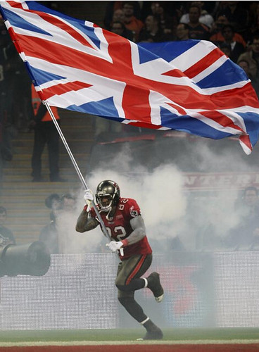
An American NFL player waving the Union Jack? The flag of a foreign country with socialized medicine! Why is this player being allowed back in the United States…?
Socialized medecine? You haven’t seen the state of the NHS :)
By the way, as this forum seems one for pedantry, it’s only a Union Jack when flown on the jackstaff of a ship. Otherwise it’s the Union Flag.
Much more importantly – it’s upside down. The top red stripe nearest the flagstaff should have the broader white band on top.
link
or if you prefer
link
:)
Heh. The file name of that image is “union-jack-dress.jpg”.
So I guess she was aboard a ship when that photo was taken?
The Buccaneers lost. Maybe Kellen Winslow was calling for aid?
Had an interesting conversation with a German businessman on the light rail on the way to the last Portland Timbers home game about a week ago. He was talking about the difference between America and Europe. He pointed out the massive taxation in Europe like pet taxes and tv tax and such. He also pointed out that the people who invented Socialized medicine were the Nazis. I’m personally opposed to socialized medicine so take that with a grain of salt. However, I just found it interesting if it is true. Anyhow, I’m not interested in political debate I just wanted to comment on the whole socialized medicine thing with a recent random anecdote that I picked up.
Pet taxes? TV taxes?
Social medicine was developed, in the UK at least, post-War in 1948 by the Labour Party – hardly Nazis. I think your German travel partner had non-standard views :)
We have pet taxes in most of the United States. It’s just that municipalities call it a “license” instead of a tax, and most people are scofflaws who don’t bother to pay them. We also have “socialized medicine,” and have had since the 1960s. Interesting to remember that Ronald Reagan got his start in electoral politics as a paid spokesman for GE delivering speeches warning that enacting Medicare would lead in just a few years to the federal government dictating where every single American could live and what job he could do just like the Soviet Union and Nazi Germany.
Clearly, since we do have pet taxes and socialized medicine, the socialists/fascists/terrorists/pickem have already won. Thank heavens we have sports unis to distract us from our mass enslavement! ;-)
PS: We have TV taxes too. But again, it’s just that we call them license fees instead of taxes, and we charge them to broadcasters instead of to individual TV watchers. But in terms of the government extracting money from the economy, a fee is a tax is a tax, and a tax on any business has the same effect as a direct tax on that business’s customers. Either way, it’s the customer who pays.
“According to this really good article about dugout phones, the Cubs experimented wireless dugout phones in 2006. Can’t say I remember that. Does anyone else?”
i do actually remember this. if my memory serves me correctly it was because a few games before this happened there was a malfunction with the phone system and rothschild was having a hard time communicating with the pitchers
Actually, it was an idea that was brought up and implemented by John McDonough, the Cubs marketing genius. The idea came from McDonough watching another game the previous season and seeing the dugout having problems communicating with the pitchers. I think that the Motorola/Chicago connection may have something to do with the product implemented, but that I can’t say with 100% certainty.
I searched, but didn’t find, any reference to link featuring kids in quarter-midget race cars. Noteworthy is the boy in the red car wearing a souvenir Giants cap from this, their first season in San Francisco.
Many years ago (late 1980s) I came across a box of children’s souvenir MLB caps in an Army-Navy store in an Atlanta suburb. They were a mix of White Sox (black “Go-Go Sox” style) and Senators (navy late Griffith-era) caps, which would’ve put them c.1959. I can’t recall if the lettering was embroidered or heat transfer, but I do recall that as a poor grad student I didn’t think they’d be a good use of funds at the time so passed them over. Hindsight and all that.
I guess my point, besides the photo, would be to wonder when exactly souvenir caps started showing up for children, if not adults. I know they were if full force by the mid-1960s as I had a couple from that time.
Please delete this post if someone has indeed posted on it, or this has been a subject of previous UW discussions, thanks.
*in full force
I’m sure people here are already tired of hearing aboput my childhood, but when I was a very small child I had a New Orleans Pelicans child’s cap. Black cotton with yellow gold felt letters sewn on…interlocking “N” and “O”. The Pelicans were New Orleans’ AAA baseball team.
Sewn on felt lettering was pretty much the standard, as I recall, and that’s what every playground team cap I ever wore had.
Every now and then in dime stores you could find cheap children’s major league caps of very limited selection but with the most beautiful embroidered lettering.
I remember the Pels vaguely as being a Crackers rival, though Ebbets field Flannels has done a nice job of reviving the memories of both teams.
Felt would of course have been a logical choice for the interlocking White Sox lettering; every post-WWII Nats cap I can recall seeing (save these souvenirs, again because my memory is unclear) has had embroidered W’s.
As a follow up to yesterday’s debate…
link
…as I suggested, it is all about the lighting. ;>)
How about a different kind of gold?
(link)
Ok, we’ll go there again. What the hell.
Think of it like this… if someone asked what color pants the Titans wore yesterday, you *could* answer “blue”, and you’d be technically correct. You’d also be completely failing to actually answer the question. You’d need to specify “navy” to provide any actual information.
Now on to gold: If you use my terminology, you can use “gold” to describe a team that doesn’t already have national recognition. The newest Arena expansion team is going to wear gold helmets – and everyone knows that means metallic gold. Or, they’re going to wear yellow helmets, and athletic gold is assumed. There’s no confusion. Everyone knows exactly what colors you’re talking about.
If you insist on the traditional usage of “gold” for both the metallic and athletic colors, you make the term completely useless. The new team is going to wear gold? What color gold? We still know nothing until you specify which shade.
Does that make sense to anyone? Let it officially be Athletic Gold on the style guide. Fine. That doesn’t mean it shouldn’t be yellow to avoid confusion in casual conversation. We don’t bother calling it Millennium Blue for the Rams, do we? No, we just say navy. We don’t say Northwest Green for the Mariners, we call it teal. Well, why say gold for Athletic Gold, when yellow paints a much clearer mental image?
THE
im going to say this once more and then im done (at least for today)
for the ten THOUSANDTH time, if you want to call the shade “yellow” you’re not wrong
but those of use who refer to it as athletic gold are also not wrong, and this is, for the most part, the “official” color
stop saying those who call what LSU wears, for example, “purple and gold” as “wrong” (just like the steelers are black & gold and the packers are green & gold)
if you want to say the steelers wear black and yellow, fine…everyone understands you and you’re not incorrect
but please do NOT try to tell those who call those colors ____ & gold they’re wrong
just because you can’t grasp the concept that “gold” (whether it’s athletic, metallic, or old) can encompass a myriad of shades doesn’t mean the rest of us can’t
Exactly. It is never wrong to call athletic gold “yellow,” because in point of fact that color is yellow. And in the context of speaking of athletic aesthetics, it is not wrong to call the hue of yellow most commonly worn “gold,” because that is a widely recognized term of art. However, it is wrong to say that said color can only be called “yellow,” and it’s even more wrong to say that said color can only be called “gold.” The color is yellow. That’s a basic fact. But it’s also widely known and recognized as gold. That’s also a fact, though slightly less basic in terms of the fundamental building blocks of the English language.
If The only ever calls it “yellow” he’s right. If Ricko only ever calls it “gold,” he’s right too. If either The or Ricko assert that only his chosen term is correct, then he is wrong. I know that I’ve pushed my own comments on the subject into that latter category of wrongness from time to time, though I think I’ve only done so unintentionally. At any rate, when I’ve questioned the correctness of calling that hue of yellow “gold,” I’ve been wrong.
I posted my thoughts on this this morning (UK time) on yesterday’s comments – so I’ll just reiterate a couple of things.
Wolverhampton Wanderers wear old gold. They have donein all of living memory. But what that means has altered over the years. Actually it’s now nearer orange than anything else, but everyone calls it old gold, and you would have a seriously rough time in Wolverhampton if you called it orange.
Leicester City a few seasons ago had change shirts in “fosse gold” – they used to be called Leicester Fosse, so this was obvioulsy a made up name. However it bore no relation to waht I call “gold” – it was beige. But no matter what I think, it was “fosse gold”.
link,,10274~522231,00.html
If a team want to call a colour something then that is what the colour is.
Many years ago I heard a radio commentary of a rugby league game where a female presenter (a rarity in rugby) said “Huddersfield are pressing forward in their purple and orange jerseys”. She was of course perfeectly correct – but her male co-presenter felt obliged just a few minutes later to say “Huddersfield, in their tradiitonal claret and gold…”
If I told you all those typos were just English spellings would you believe me?
No? Thought not :)
I can see it, George. It’s like a lighter shade of Fender’s old “Shoreline gold” color.
Give it a rest, THE. Or could you just hold your breath until we all acknowledge that you are right while everyone else is wrong?
Wolverhampton Wanderers wear old gold. They have done in all of living memory. But what that means has altered over the years. Actually it’s now nearer orange than anything else, but everyone calls it old gold, and you would have a seriously rough time in Wolverhampton if you called it orange.
I’m a West Brom fan, George so I’m calling it orange. And now I’m running away as fast as I can…
Sheesh, am I going to have to hit the reset button every day now?
link
Except that the color that falls somewhere between yellow and orange is called gold…and has always been called gold as far back as I can remember.
I think that where you grew up may play a part in this…kind of a cultural thing, perhaps. We grew up with LSU gold and could distinguish it from what we consider yellow, a lighter color.
I’ll tell you a funny (true) story. Once, years ago, LSU wore gold jerseys at home just because another coach was f***ing with them and was tryng to make LSU wear purple at home. A guy I knew told me about how when his mother (many old ladies here are long-time LSU fans) saw LSU come out of the tunnel onto the field she exclaimed “That’s not gold…that’s yellow.” And she was correct. The jerseys weren’t LSU gold…and she knew the difference, damnit!
Call it whatever you like…
BTW, that really is a true story. The guy was a lawyer from Lafayette who told stories in full cajun accent. In this telling his “momma” disdainfully pronounced the offending color “yaller”.
Well, the way I see things, if it’s not metallic, it’s not gold. Period. It may be “golden” as in “similar to gold”, but it ain’t gold. It’s a non-metallic substitute. The 49ers wear gold helmets and tan pants. The 70’s Raiders had silver helmets and gray pants. There’s nothing wrong with admitting that. I understand that metallic colors aren’t always an option, but to me that doesn’t mean that the non-metallic substitute should share the name.
Funny thing too, my high school was a purple and gold school, and it always bothered the hell out of me that we had t-shirts that were purple with shiny metallic gold lettering, but the sports teams all used the standard athletic gold that I want to call yellow. Yes, I’m aware that athletic gold is a bit darker than pure yellow, but it’s still yellow.
Hey, Jeff… ;>)
link
Q: The colors of link are Black and (what)?
Bernard, I would call that grey…the non-metallic version of silver, perhaps.
Me, I favor the Saints colors of black and metallic tan. ;>)
Part of te problem, as it pertains to the Yellow/Athletic Gold and traditional Gold both being referred to as “Gold”, is that many schools and teams have alternated or switched from one to the other, while maintaining the description of their color(s) as “Gold”.
For exampl, until 1955, LSU wore what we would describe as Old Gold. The school’s colors were traditionally referred to as “Purple and Gold” Then, from 1955 thereafter the school wore the Yellow/Athletic Gold, and the school and fans and press continue to refer to the School’s colors as “”Purple and Gold”. Two colors, same name.
The LA/St. Louis Rams have used various shades of Athletic Gold and almost) Old Gold, and have contunously referred to their colors as “Blue and Gold”. Pittsburg Stellers have used diferent shades of Athletic Gold (the earkly Franco Harris Steelers wore a more “mustard” Athletic Gold than what is worn today, or, wwas worn prior to that) yet the Steelers always refer to their colors of Black and Gold.
Many, many colors – with the same (wrongy used) name …..
“Many, many colors — with the same (wrongy used) name …..”
At what point does 55 years or more of common usage become accepted usage?
BTW, if I were so inclined I’d love to go back and find references in poetry and literature to a golden sun…that rich color which falls between yellow and orange.
Language evolves. Just because “gold” could mean “orange-ish yellow” 100 years ago doesn’t mean that it should always be that way.
…and note “golden” rather than “gold”. Something can be “similar to gold” without being “gold”.
Put it this way. The Boston Bruins have always been “black & gold”. Always. It’s mentioned in songs, by certain bands, who put it in yellow print on t-shirts.
link
Though, I’ve refrained from getting the old Winter Classic jersey because as I told a friend, “I don’t look good in yellow”. Not gold. Yellow. Who the frig knows anymore.
Good grief…it’s a f***ing football uniform. Go tell millions of fans all over the world how incorrect they are.
As for me, in protest, I will forever refer to any variety of so-called metallic gold (“old gold”, Vegas gold”, whatever…) as metallic tan, because that’s what it really is. ;>)
(apart from the 1920s and early 30s when they were brown and gold, whoops)
Go tell millions of fans all over the world how incorrect they are.
Gladly. Tell more people to read this site. :)
Bernard, I would call that grey…the non-metallic version of silver, perhaps.
See, Pierre, I would call that black & silver (or silver & black), because:
a) I know those are the Raiders’ colors, and
b) I’m not just trying to be difficult.
I was just messin’ with you, Bernard…in a friendly sort of way. ;>)
My point, though, was that if some people want to be so damn literal about everything then let’s call all colors what they really are…such as metallic tan, or metallic grey. The non-metallic color known as gold that falls between yellow and orange, such as the sun, has been known as that for probably longer than I’ve been alive. Why is it so difficult for people to accept common usage?
One last thing…chartreuse is a color that falls between yellow and green. It’s in the yellow family, but do you call it yellow? No…you call it chartreuse. That’s the name of that color. Same with the color gold that falls between yellow and orange..
All I know is that Big Bird ain’t the same color as LSU’s pants.
And neither is Tweety.
Or Lemonheads.
Or a Cheerios box.
I’m sticking with “Cheddar”. It keeps the Kraken of Kontroversy in the can.
I was just messin’ with you, Bernard…in a friendly sort of way. ;>)
Why is it so difficult for people to accept common usage?
Believe me, Pierre, I get it. And I agree with you 100%. My comment wasn’t directed at you. ;)
How ’bout we call it “Goldenrod” after the obviously ill-named flora (being as there is little or no metal in it).
Also because at InstyPrint one of our paper choices is yellow, which they generally call “Butterfup”. Another is a darker color that’s not orange but is called “Goldenrod.”
Come to think of it, anyone who calls that particular vegetation anything by “Yellowrod” is just wrong.
Wrong. Wrong. Wrong.
Is there a Flor-Watch website I can go to and begin correcting the world regarding this egregious error? ;)
“Butterfup”? Ooops.
Best make that “Buttercup”.
Depends on the lighting, Ricko… ;>)
More specific is always better. I liked the old nomenclature on Crayola crayons (blue-green, yellow-orange), but I kind of like evocative descriptions (goldenrod, saffron, sunflower). Part of the yellow-tan-gold kerfluffle is that you’re attempting to describe a finish as well as a hue.
Ricko — That neon stuff that Oregon wears is yellow, which by the way is one of its official school colors and which also is a lot lighter than LSU’s gold.
Welcome to reality. Gold actually IS the color between yellow and orange in certain lighting. Lets just give this a rest.
link
‘Goldenrod’ was a name used by Crayola that pretty well approximates this color. At least that’s the one I used to draw the Steelers and Packers when I was young.
I don’t know if it’s been mentioned (as I didn’t follow yesterday’s debate), but in the uniform industry, there is Athletic Gold, Old Gold and Vegas Gold (with Vegas Gold being the metallic Gold).
But, Phil is right. People that say LSU wears Purple and Gold, or Pittsburgh wears Black and Gold aren’t wrong, just as saying Green Bay’s colors are Green and yellow aren’t wrong. There is not a single right way to say it.
“- Yet another thing about the Bucs/Bears game: They had a little pavilion set up with various bits of NFL history. Interestingly, the logos they used for the Lions and Cardinals were out of date.”
Not only that, but the EST. date for the Cardinals link. The NFL was founded in 1920, but the Cardinals were founded in 1898.
In that link to the Syracuse shorts, you can see link wearing Adidas socks and *hideous* Adidas shoes. I’m sure this is O.K. because it’s not in the Regular Season, but how often do we see athletes playing for D-1 schools sponsored by one manufacturing compant wear gear made from a rival manufacturing company, in any sense?
“Rangers pitcher Matt Harrison didn’t have the MLB logo patch on his cap on Saturday night.”
To be a little extra-anal, he was actually missing his World Series patch on his cap.
The NFL makes the same mistake with the Packers. The team was founded in 1919, but didn’t join the NFL until 1921.
Bears, too. Started in 1919 as a factory team for AE Staley in Decatur.
And it’s no accident that the NFL says all three teams were founded the year they joined the league.
Except for the PC games, were they have the logo gloves, look at the receivers’ hands on Nike sponsored teams. A lot of them wear Cutters, not Nikes.
I do know that when Rice was choosing between Nike and Under Armour for its outfitter, the football team vetoed UA, because they thought UA’s shoes were badly made and fitted, so I guess they can’t go against the shoes from the manufacturer.
To be a little extra-anal, he was actually missing his World Series patch on his cap.
Shit, that’s what I meant. Now fixed.
FWIW, the guy in the NY Rangers jersey in the World Series crowd was also at Saturday Night’s game in the same jersey.
ed
What does “FWIW” mean?
link.
geez, scotty, the least you could have done was linked to the buffalo springfield
link, but while that’s one of the great pop songs of the 20th century and all, I don’t think the title is ever actually spoken in the lyrics.
I love the look on that guy’s face. It looks like it should be a magazine ad for something, maybe a communications service of some kind. Does your wireless carrier ever drop important text messages? Get Hugeco and stay informed.
That shot was actually from Saturday’s game… Thought I mentioned that when I submitted it late last night, then again maybe I didn’t.
I also love that the guy behind him with the glum look on his face is wearing a Mets cap. Closest the blue/orange got to a WS this year.
In this era of cynical sports marketing, could it be that MLB frowns upon that managers wear anything other than the team uniform?
That way another person who spends a lot of time on camera and in stills in newspapers/websites wears the team merchandise, team brand logo, Majestic’s logo, etc… as opposed to a blank and sponsorless suit a la Connie Mack.
I remember a story about Terry Francona getting special dispensation not to wear a uniform top a few years ago. It was something to do with a gastrointestinal problem or something that made it uncomfortable for him to wear a belt, so he covered it up with his pullover.
Yeah, but they could make the managers wear branded/sponsored casualwear (sweatshirts, polos, etc.), like the NFL does. If it was really just about marketing, that’s what they’d do.
I honestly think it’s just a matter of tradition — a tradition that’s rooted in the fact that many managers used to be player/managers. (As an aside, did you see that the White Sox briefly considered making Konerko a player/manager before they instead hired Ventura? That would’ve been so cool!)
Thank you! Everyone keeps telling me I’m insane, but that would be a great idea. It’s not like they’re going to win with Ventura, so why not pull a publicity stunt until they can get a real manager?
Paul, I saw that CNN.com interviewed you on this very topic (managers wearing uniforms) yesterday. Very cool.
My guess – it’ll be a while before we see another player-manager because nobody wants to hear the phrase “first player-manager since Pete Rose”.
…Pete Rose – thank you… last week Tony Kornheiser kept saying, “first player-manager since Lou Boudreau” I knew I wasn’t losing my mind.
Lou Boudreau? He really thinks Lou Boudreau was the last player/manager?
Boudreau wasn’t even the last player/manager for the Indians (Frank Robinson).
And there were a handful of others after him (Joe Torre & Don Kessinger are the only two I can think of) before Pete Rose came along.
I’m just not seeing this “Rangers red/blue confusion” thing. Watching last night’s game, I tried to apply Paul’s stated standards, and honestly I cannot find logically consistent standards by which the Cardinals would not be regarded as worse offenders. Yes, the Rangers would look better, both in general and specifically when playing the Cardinals, in royal. But the red is carried through the overall uniform with consistency and a reasonable amount of symmetry. Cap, socks, undershirts, lettering trim. It’s a well balanced use of coequal colors. The Cardinals, on the other hand, look by the standards inherent in criticism of the Rangers like a mess. Red everything everywhere except for navy caps that match no other element of the uniform. If we’re going to criticize the Rangers for “red/blue confusion,” fine, but any consistent standards that support that criticism must also regard the Cardinals as not only also suffering from “red/blue confusion,” but suffering from a worse case of it than the Rangers.
I get that the Rangers have a more jarring look, since this is a team with no really consistent aesthetic, whereas the Cardinals have looked like this seemingly forever. But putting aside mere acceptance of the familiar, what standards could we state that would apply to the red-capped Rangers but not either the roadie Cardinals or the link?
I’ll agree that the Cardinals are an offender here, too. I’ve never liked the navy road caps on them. It ruins their consistency from home to away where they barely look like the same team.
But the Rangers are an absolute mess as well. I think more here than not would agree they should be a blue team, both historically and aesthetically. The real problem is their tendency to wear red caps/undershirts with their home whites (and their blue lettering/numbering), which is just visually jarring. Maybe the difference between them and the old Twins example is that their caps and sleeves are lighter than the uni lettering, whereas Minnesota (and the pre-2000’s Red Sox) were the reverse?
Rangers aren’t a mess. The current uniforms were specifically designed with both red and blue accents to allow the pitcher to choose either red or blue for the cap/sleeves/socks. Historically, they’ve been blue AND red. As the Senators, they had red script, sock stripes, cap accents from 61-67, and red uniforms from 68-71. They continued to use red and blue until 1986, then went all red from 1994-1999/2000.
The blue look became predominate during the Hicks era. Hicks is gone now — thankfully — and the Rangers are back to red and blue.
I think the current Rangers uniform set is great. Would I prefer them to limit the use of alternates, and confine them to one alt color at home and the other on the road? Yes. Would I prefer them to put “Rangers” back on the home jerseys? Yes. Is it going to bother me much if Nolan keeps the uniforms just like they are? Not a whit!
However, I do hope Nolan scraps the Expos-ripoff “T-ball” logo Hicks imposed on the team, and goes back to something like the old script Rangers/ball/state outline.
Go Rangers!
Sausage race costumes: vacuum sealed for freshness.
Pop ’em in the freezer and they’ll be good ’til April!
One word comes to mind: asphyxiation
there’s a fine line between axphysiation and cryonetics!
I found the Ted Williams Rangers jersey particularly interesting because you would not know such a thing existed from the stands or the television set. He never appeared on the field in anything but his warmup jacket — even in those 100-degree July games.
Really? He was the proto-Showalter!
I loved the early “RangerS” logo and fonts. Pretty sharp and modern for its time.
We in New Orleans saw alot of it when they relocated to Texas in 1971/1972. If I am not mistaken, when the Washington Senators played their last game at RFK, the management had a helicopter take the home plate from the stadium, supposedly bringing it straight to Texas (really!) – and I remember some sort of news footage of that scene ….
Our UHF TV station, Channel 26, had at least some of the Rangers games that first 1972 season and they had stickers for your car and such. I believe that they eventually gravitated to the Astros’ TV network, but I do remember those RangerS stickers and such.
Could hide a flask more easily that way… ;>)
Hey Paul, tech question. Why is it that links in the day’s entry pop up in a new tab, but links in the comment open up in the same tab?
Because I code the links in the entry with a target=”new” tag, which means the link opens in a new window (or a new tab, depending on your browser settings). But most people don’t include that tag when posting a link in the comments.
Of course, it’s very simple to make a link in the comments (or any other link on the internet) open in a new tab. On Macs, you hold down the Command key while clicking on the link; I know there’s a similarly simple way to do it on PCs, although I don’t know what it is.
I know for me, at least, you just click the link with the middle “scroll” button on the mouse, or right click the link and select “Open in New Tab” (on a PC, of course).
Ah, thanks! All these years on a Mac and I never knew about the whole command+click thing. Not enough coffee for me yet.
So many “reaches” on this, looking for some hidden or mysterious purpose.
It goes to three things, I suppose…
1. In baseball’s very beginnings, many(most?) managers were player/managers, in some cases team stars. So managers commonly were in uniform.
2. Managers and coaches in immediate pregame practice still perform many of the acts common to the game: hitting fungos, taking plays with fielders, demonstrating technique, sometimes throwing BP, sometime catching pitchers to look them over… Isn’t like that in any other sport. No NFL assistant, on game day, is full-on running routes against bump-and-run DBs as a regular part of warmups. For ballplayers, being in uni is the most comfortable and familiar way to do such things.
3. Base coaches, though standing in foul territory, are “on the field” during the game. No reason they couldn’t be in slacks, I suppose, but they probably could be said to be covered under “on-field personnel.”
I don’t have any problem with them being in uni, other than maybe the Don Zimmers of the world don’t look so great. :) But one’s opinion on that depends on whether you find it sartorially horrible or just a continuation of baseball’s long tradition of offering up great and memorable characters.
How the hell did that end up here?
(Grrrr…)
I thought that MLB actually made it a RULE that all personnel in the dugout had to be in uniform or team gear of some kind. They did it about the same time they made the infielders start bringing their gloves in the dugout, instead of leaving them in the field. This was sometime in the 50s, as they were wanting to ‘clean’ the game up a little.
On windows, you can use the CTRL key while clicking.
Paul, you and Phil can add the target=”new”, but not the rest of us.
I’ve tried it before and it doesn’t work. WordPress strips it out because there’s only limited HTML they allow commenters to use.
Unless that’s link recently.
no…hasn’t changed
it’s just our way of keeping you down ;)
This…
link
…is fantastic! Can you imagine something so charming and whimsical and funny being used today? I think the key, back then, was realizing that….it’s just a game. ;)
FAYE BYE
Homecoming Queen
:)
I love it too.
In response to the Wisconsin pullover, if nobody has figured this out already, the crappy adidas font is the problem. It is not just Wisconsin who has to deal with this. I’ve seen a few games against NC State, and they wear adidas pullovers with “Wolfpack” written across them, and the “W” looks like an upside-down “M”. I found a link to it on the NC State online shop: link.
I hope that helps!
Re: “Is it just me, or was this the first time in a while that the Dolphins wore solid white?”
Second time this season the Dolphins wore solid white, the other time was week two against Houston. Usually solid white worn at home for 1:00 games, and they have five more 1:00 home games this season.
White over aqua is the typical road uni, right?
So what’s their standard uni for home games that start at other times? Aqua jerseys/white pants?
Yes. When Nick Saban took over, he did away with the aqua pants, so the Dolphins wore white over white on the road, and at home during the day. This resulted in the Dolphins playing in white over white about 90% of the time.
The aqua pants on the road made their return when Tony Sparano took over. Since then, the breakdown has been as follows:
Home at night – aqua over white OR orange over white (alt)
Home during the day – white over white
Road – white over aqua
The past two seasons, the Dolphins have seemed to prefer the alts (orange over white) for prime time games, but they have yet to wear them this year (thankfully). The orange looks alright, but feels more like The U than the Dolphins.
I think I’m one of about 3 dozen people in the world that like those orange jerseys.
“I think I’m one of about 3
dozenpeople in the world that like those orange jerseys.”~~~
fixed
not coincidentally, all three are in the CorC
This South Carolina alumnus truly hates Under Armour with every fiber of my being. The football and basketball uniforms look like crap, and who decided gray is an official university color? Carolina’s colors are garnet and black.
I could care less if Kevin Plank wants to make Maryland a laughing stock. But please, for the love of God, athletic director Eric Hyman, tell UA “NO!”
I found the NFl not having their teams wear any pink overseas very interesting. As a marketing/PR professional, the first thing that ran through my head as for why the sans-pink look was due to brand identity. They are marketing to a new audience/consumer and they said to themselves, “Hey, we can’t have these new fans that may be watching our games for the first time think that all NFL teams wear pink. We don’t want these Brits to think we are faggy.” All the boasting the NFL does about their support for cancer awareness and it all gets thrown to the way-side, in my opinion, when their brand identity may come into jeopardy when branching into new markets. That or they didn’t want the potential new fans attention on why the teams are wearing pink instead of on the game and players (i.e. what they are trying to sell, as in hard nosed, tough men playing a manly-man’s game). Paul stated the ‘Go Pink’ initiative was an international movement, but I am unsure if pro soccer clubs (and the like) across the pond also dawn the pink on such a level as the NFL/MLB, if not, then fans over there may not be as used to the pink as us and it may be very off-putting. Once again, this is just my opinion as a marketer. It could be wrong, but would you put it past the NFL brass?
Excellent analysis, but please don’t put NFL & MLB in the same category on this one. MLB does the pink thing like one weekend a year. Throw in the mirror-image prostate cancer thing MLB does, and we’re talking about less than 4 percent of games played per year. NFL is doing the pink thing for 31 percent of games played this year. If 4 percent can be equated to 31 percent, then we would have to regard Write-In as one of America’s 3 major political parties!
Not quite sure why they would think that we in teh Uk would not appreciate wearing pink for cancer awareness.
It’s not that we haven’t done it ourselves:
Everton link
Oldham Athletic link
Partick Thistle link
Hull KR rugby league link
Middlesex cricket link
Harlequins rugby union link
and a lot of these date back a few years. We certainly have no problems with pink being worn fo rthis cause.
The simple answer is that thee really isn’t a coordinated fundraising campaign for breast cancer in the UK. There are a number “pink” events throughout the year, and a number teams that will wear ribbons or special uniforms, just not all at the same time. For example, the Middlesex Panthers have worn pink in all there twenty20 (the shortest form of cricket) since 2007. This has been to raise funds for Breakthrough, the largest UK breast cancer charity.
“Sure enough, now that Theo Epstein is officially with the Cubs, the team is selling Epstein jerseys and tees. Is this a first for an MLB GM?”
***
Technically, he’s not the GM. He’s the President of Baseball Operation.
Add an “s” to “Operation.” Sorry.
Damn, you got that in before I could make a sports hernia joke.
His first move: reacquiring link.
Also, technically, that’s not the Cubs selling those jerseys/shirts. It’s a third-party vendor across the street from Wrigley. I’m not sure to what extent, if any, the Cubs and/or MLB have to sign off on those, though that the official MLB website will currently let you personalize a jersey with “EPSTEIN 12.”
The Bucs and Bears played in London, which means both teams were wearing the “International Series” patch. Man, that design is so blah. A profoundly unsatisfying patch.
Perhaps to match the cuisine of the host country?
I kid, I kid…in fact, I could go for a meat pie right now.
Meat pie, chips, peas and gravy mmmmmm!
It’s half five over here – I wonder what’s for tea (which maybe you call dinner??)?
Mmmm…
Lunchtime here, but I haven’t had breakfast yet. I could really go for some
Wolverhampton Old Goldorange juice right now, but we’re out.Apparently pies were served to the press at halftime. No word on how they were received.
British cuisine has come a long way, thanks in large part to the influence of these folks:
link
One of the longest lines at yesterday’s “Tailgate Party”, actually more a NFL fan fest, was for Bodean’s BBQ. link
KC style BBQ in London??? I’ll have to give that a try!
True story. In 2000 or 2001, I was at Easter Road to see my first-ever European football game in-person. Rangers at Hibs. After the first half, I stood in line to get some eats, and the two meal-like items on the menu were Meat Pie and Steak & Gravy Pie. So I say to the guy in front of me, who’s kitted head to foot in Hibs fan gear, “What’s the difference between the Meat Pie and the Steak & Gravy Pie?”
Guy tilts his head at me, looks at the menu, looks back at me, and says, “One of ’em’s got gravy, innit?”
Turns out that was exactly the truth of it. Steak & Gravy Pie was the Meat Pie, but with a squirt of cold gravy on top.
I had a random thought while I stay home from work today taking care of my son.
I was watching highlights from the Vikes-Pack game and the Vikings were in their much better looking retros. Also to provide background, I am a life-long Bears fan.
With all that said, I started to wonder which NFL division had the best collection of uniforms? Does this mean currently or of all-time meaning you take their best looking uniform ever?
I am admittedly biased for the NFC North, but with the Packers and Bears I think its hard to top. Any thoughts?
Going by current unis alone? I’d have to go with the AFC East or NFC East. They’re the only divisions that don’t have at least one terrible-looking team right now.
The Vikings regular unis are so bad that they really drag the overall grade down for the NFC North. And the Lions are currently average at best
Hard to argue against the NFC North if you take all historical jerseys. Second and third would probably be the NFC East and AFC North; the AFCN only marred by the Bengals perpetual lack of sartorial splendor.
the ravens BFBS unitard… nuff said?
I was just thinking of the primaries. The Ravens’ purple over white, and even the purple over black are good examples of good design triumphing over difficult colors.
This is a tough one, if you go by current uni’s, because by my count every single division has at least one turd.
That said, I’d go for NFC East – 3 solid uniforms….and the Eagles.
Historically – NFC North.
If we’re talking historically, I think all the NFL divisions look pretty good except the two South divisions.
until this year, you could have argued the AFC east was pretty horrid … what with the pats and the bills
but the bills moved up the AFC east into the 75% good bracket
Colby Lewis’s hat underbill is gray because he’s actually wearing the exact same hat that he did when he was on the Rangers back in 2004. I know that there was a story about it earlier this year (I’m pretty sure it was on this site). The hat has been deteriorating greatly, and frankly, I’m a bit surprised MLB has allowed it.
I’m surprised it still fits him as those wool models shrink badly over time.
I think ESPN has been using that same Ray Lewis picture since 1999. In fact when I saw it on sports center this morning it had the old “swooping bird” logo on the sleeve (instead of the shield) like link.
I’m guessing that ESPN photoshopped in the shield at some point but still has the other image lying around.
My guess is that they are preparing for the switch to Nike next year.
And Ray Lewis isn’t the only one. ESPN occasionally uses an image of Peyton Manning before the Colts truncated the shoulder stripes.
link
As annoying as the truncated shoulder stripes are, IMO they’ve grown on me with Peyton. He only wore the full stripes for four years. The truncated form is part of his look.
Colby Lewis is wearing a a gray-underbrimmed cap because on days he starts, he chooses to wear his “lucky” cap, which is the same cap he has worn for every start with the Rangers. He broke in with Texas in 2002, as FOX noted moved around for a bit after 2004, including 2 years in Japan before moving back to Texas in 2010. When he came back in 2010 he still had his original cap and chooses to wear when he starts.
Not sure if Epstein is the first GM to have a jersey, but I do own a Ron Gardenhire T-Shirt jersey, not because I’m a huge Gardy homer, but it’s just so unique compared to most other Twins fans who have Mauer, Morneau, etc.
Pretty sure Majestic has made shirseys for Joe Torre, Tony La Russa, and Ozzie Guillen before. I’d consider those to be extremely dorky, yet kind of awesome. (Hey, at least it’s a guy in uniform, with his real number!) This Epstein 12 nonsense is a first though, and I’m not exactly fond of it. Especially because Alfonso Soriano wears #12. So is this the first ever authorized-at-retail jersey foul?
Here in St. Louis I see Whitey Herzog jerseys and shirseys all the time.
Not quite sure why this popped into my head today, but I was thinking about how when Kyle Busch signed to drive the #18 car for Joe Gibbs racing, they had a jersey at the press conference.
link
And that triggered a memory fo the early days of JGR, and i found this story, with an anecdote about a cowboys helmet in victory lane at Daytona.
link
forget what year it was, but i saw Labonte wearing the Bengals version in a race at Martinsville (my first ever NASCAR race). Mark Martin won the race in the #6 Valvoline
I got a scandal – and possibly an international incident – for you.
THE UNION JACK IS BEING FLOWN UPSIDE DOWN.
The flag is not symmetrical – the red diagonals are not centred within the white diagonals. If the red diagonals are closer to the top of the white diagonals at the staff end, its upside down.
See the correct and incorrect display here:
link
Its like the 1992 World Series all over again.
link
I said that above! Hours ago.
And while we’re at it – you owe us some taxes for a consignment of tea.
Sorry – I missed that entirely.
George, Did you read the story Mike linked to? It’s not about Kellen Winslow holding the flag upside down. It’s about Downing Street displaying it improperly.
No, my post was about Winslow. I linked to the Downing Street story because it had photos of the right way and wrong way to display it.
BTW George – as a Canadian, I owe you nothing for tea. Take it up with the Yanks.
I thought the story was that Kellen Winslow is a socialist…
No, he’s a soldier: link
pffft…
so it’s upside down
it’s that a faux pas or something?
Anyone have an explanation for the weird glare going on with the turf during the Viking-Packer game? Seriously distracting. It really looked frozen or icy. Ice in Minnesota….go figure. But I think the roof is back up, no? A play where Ponder faked a throw and then kept the ball, while running out of bounds, was impossible to see on TV. At least for me. They finally get their uniforms right and then screw it up by glazing the field every ten yards.
I see. And now that I look at the date on the BBC article, it was almost three years ago.
Crap. That reply from me was obviously not intended to go here.
Wondered about that, too. Last time they were on TV in the Dome things looked great. Much brighter than under the old roof, and it was bright sunny day. Yesterday’s start time was later, though, and it was overcast. Figure it must have had something to do with either or both.
RE: The Pruitt-Igoe Myth documentary. Netflix allows you to save that to your queue… which means they plan on getting it when its released on DVD.
I do hope its down here for the New Orleans Film Festival.
The problem with link isn’t so much the BFBS fashion statement, it’s more of the collar design. (However, I give bonus points for tackle twill)
Maybe it’s just me, but I wish the football Cardinals still had that old logo. For as old as it is, it still looked current up until the time Arizona decided to turn the Gridbirds into a college team with the new look.
It pained me to see that wonderful logo desecrated. Couldn’t agree more. The Lions, too, for that matter. Falcons, too….and Eagles….and Vikings…. okay, I’ll stop.
Ok I just turned on the Monday Night game and I’m totally ready for Nike to take over the uniform manufacturing for the NFL. There is nothing uniform about the Jags uniform. I mean some guys have the pit break in the side piping, some guys it fits them how it was intended to look, some guys have random lines on their shoulders, some guys black piping is thicker than their white. For the love of all that is decent in the Uni-verse Nike please fix these problems. The Jags equipment manager has said that the Nike Speed Machine template that they are using does so let’s just hope for our eye’s sake that the Jags uniforms are just ugly next year and not ugly and ridiculous.
Tend to agree that the NFL needs some sartorial help…and I think Nike will clean them up. NFL owners just need people with decent taste who won’t allow Nike to get carried away.
But face it, in a few years Nike will own sports…or at least the NFL and college football.
Watching the Cards/Rags game with my wife and 4 going on 5 year old boy and both of them commented on how awful the baggy baseball/pajama pants look is. Especially Molina. When my wife said it looked like they were playing pajama baseball, my boy went, “Ewwww! Who would want to play like that!”. I better set the money aside for his Uni-membership pronto.
New basketball court for my Georgia Bulldogs.
link
Not only do we have the worst arena in the SEC, we now have an ugly ass tow-tone floor.
That’s a two-tone floor obviously.
that may have been the WORST version of gba i EVER heard
ever
and that includes every single one by ronan tynan
But, she Gets It(tm) when singing in front of a Rangers crowd…red hair and a blue blouse…perfect.
Phil? Did I accidentally click on the wrong site? This is Uni-Watch right? Pretty harsh on what was clearly an amateur. Even with it being a WS game, I’ll cut some slack to her. I will assume they are letting military personnel or family members sing GBA, as long as they have some ability to not embarrass the league or themselves. You can certainly have your opinion though. Those people are fighting for you, to do just that.
Growing up in Cardinals country, I still prefer the navy caps, and their call back to the Bob Gibson era.
Thing I’m wondering, since I haven’t been to a Cardinals home game in quite a while, is is the red used at home, that is, on the caps, the same as the red worn on the road uni’s.
The road uniforms make them look darker, at least to me.
Would it be a safe guess to say that the Bears and Bucs didn’t wear pink so as to dissuade any joke-making in England? You know the common Brit isn’t interested in American football in the least bit, even if the NFL tries to make itself believe that a team will work there?
Would the red/blue Rangers argument still be going on if they had contrasting bills on their caps, like in the Mickey Rivers era?
dollars to donuts the rangers are wearing gray wednesday night
As long as the hats are red.
Is it just me, or has every Monday Night Football game this year been a total snooze fest?
during the interview with Napoli at the end of the game just now, I noticed that his chest protector has his name and number embroidered, but it says “NAPOLI #44” and the 44 is blacked (blued) out with magic marker. Most likely this is just his chest protector from last year with the Angels. Haven’t found a picture yet, but I assume his blue chest protector is new and doesn’t have 44 on it, but 25.
you can see here that his name is off-center:
link
this one is not clear, but looks to just be his last name:
link