College basketball season begins four weeks from today, and teams are beginning to showcase their new uniforms. Here are some developments from yesterday:
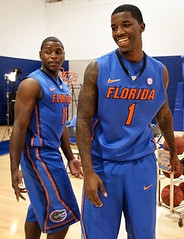
• New sweatbacks for Florida. Woof! I really dislike all that black trim (although note that the jersey swoosh is outlined in white — hmmmm). Also, makes no sense for the front typography to be black-outlined while the back is outline-free.
• New home uniforms for Colorado. First time in several years that they’ve gone with white at home, instead of that silver/gray. Big improvement.
• New look for Georgia Southern: Too bad about the loss of the gold trim. Also: Nice “shorts.”
• An Iowa player had a misspelled NOB at yesterday’s Media Day. Ouch.
• Notice anything else missing from all these jerseys? That NCAA certification patch from last year has pulled a disappearing act. (If you don’t know what I’m referring to, or if you just need a refresher course, look here.) I thought the patch was supposed to be mandatory this year, but I’ll contact the NCAA next week and ask for a clarification.
• Meanwhile, Evansville has a new arena.
And as long as we’re talking college hoops, there’s a lot of good stuff in this slideshow of past Iowa hoops Media Day photos. I especially love the “I” side panels on these shorts from 1954 — how awesome is that?! Also interesting: white jerseys paired with gold shorts (1953) and black sneakers (1941). And check out this 1944 shot — in addition to the crotch extensions, there’s also one jersey with vertically arched lettering while the others are radially arched!
(My thanks to Dan Wunderlich, Jake Wallace, Matthew Robins, Jordan Hoehn, Jesse Gavin, and Joe Wagner for their contributions to this entry.)
ESPN reminder: In case you missed it yesterday, here’s my latest ESPN column, about the fan in his 20s who designed the new Ottawa Senators jersey.
Research request: I have reason to believe that tonight’s installment of SportsBiz: Game On (Versus, 7pm Eastern) may show a view of Troy Polamalu wearing his wedding band during a game. If anyone out there has a high-def teevee and would be willing to record the show and get a screen shot of Polamalu’s ring, I’d be much obliged. (That’s right, I still have an ancient low-def teevee, which is generally fine but isn’t so great for isolating small details like wedding rings.) Thanks.
Uni Watch News Ticker: A new version of the Islanders’ third jersey has been leaked, and it’s just as miserable as the previous ones. Further info here. … Yesterday I Ticker-linked to the announcement of a sports-themed art exhibit. Mark Haarmann notes that the painting on that page is based on a famous NFL moment. … Did you know the Chicago Bulls tried to register various “4-peat” trademarks, in anticipation of a fourth straight NBA title? It’s true (big thanks to Joe Juettner). … Here’s the latest on those high-tech mouthguards that concussion researchers are using (from Ryan Perkins). … Two Lions players have received hosiery-related fines (from Christopher LaBella). … New Lebron sneakers for Kentucky (from Mike Shearer). … The Packers are wearing their throwbacks this Sunday, so their web site has an Acme Packers theme (from Rob Siergiej). … More Packers throwback stuff: Interestingly, many of the Packers appear to love the throwback pants. Since the regular pants have stripes and the throwbacks don’t, it sounds like maybe stripeless pants are comfier (from Stuart J. Ciske). … Labatt’s is coming out with Sabres-themed beer cans (from Steve Lega). … My Page 2 colleague Matt Lindner says Theo Epstein is currently generating so much buzz in Chicago that the Cubs should start marketing him on merch. Has any GM ever been leveraged in that way? … Ben Fortney notes that the official seal of the city of Green Bay features a very familiar-looking G. “I can’t think of any other occasion where a the logo of a business entity (albeit a public owned one) is used by official governments,” he says. … Before Phil Jackson and Pat Riley were geniuses, they were just a coupla basketball players (nice find by Ronnie Poore). … We all know Magic Johnson’s real name is Earvin, but it’s still really surprising to see he his NOB had two initials during the 1980 NBA All-Star Game. “At first I thought this was because Eddie Johnson was on the West team,” says Josh Hansen. “But Eddie Johnson was actually on the East team. The West did have Marques Johnson and Dennis Johnson, along with Magic. Were they worried that fans would confuse Magic with Marques?” … The Cavs have a new D-League affiliate, the Canton Charge. “Their identity package looks NOTHING like that of one of the local colleges in Canton,” notes Jason Tirotta. “In fairness, Walsh has previously worn basketball uniforms that were a blatant rip-off of the NBA Cavs. It is interesting to note, however, that Walsh was founded in 1958 and began competing in collegiate athletics (NAIA) in 1962-63, eight years before the NBA Cavaliers made their debut.” … New center-ice design for the Rangers (from Chris Hernandez). … Reprinted from yesterday’s comments: The CIAA — that’s a D-2 conference — has come up a new rule regarding shoe colors. … I like these Russian nesting dolls patterned after DC-area sports teams (from Andrew Hoenig). ”¦ Even if you’re not into video games — I’m not into them myself — you have to like the uni commentary in this NBA 2K12 segment (nice one from Brett Paci). ”¦ Odd inconsistency in this Blackhawks wallpaper image: Note the NHL logo on Duncan Keith’s pants (good spot by Keith Burza). ”¦ Goes without saying that “reality” teevee is not exactly humankind’s highest achievement. But even by the standards of the genre, what kind of warped mind has people stuff their mouths with roast pig and then makes them spit it out — over and over again? Fuck the competition, or the challenge, or whatever it’s called — I would’ve just swallowed every delicious bite. ”¦ Roger Faso designed this Boston mash-up T-shirt, which refers to the 33 championships that Beantown teams have won. ”¦ All those years I loved Shea Stadium, and I didn’t even know it had a private masturbation closet. This revelation has led our own Scott Turner to imagine how the Wilpons might offer pornography in their new ballpark: “They’d have 13 different price-point porn rooms. Shlubs in the outfield seats only get to talk about it, and the big-ticket high-rollers get glory holes in the Excelsior Club.” ”¦ The Pens and Caps both wore memorial patches for the Russian plane crash victims last night. ”¦ Here’s more about Steve DeBerg and his microphone back in 1980. Still no photo of the big hump-back thingie he was wearing, though (good find by Douglas Ford). ”¦ Someone likes to make logos — many of them sports-related — out of food (thanks, Kirsten). ”¦ Longtime contributor BSmile has started a new blog, where he’s pursuing two of his obsessions: Babe Ruth and panoramic team portraits. ”¦ My Mom’s about to move to a new apartment, so I’m heading out to Long Island today to help her pack boxes and such. See you all next week.
Are those Islanders jerseys supposed to have a number on the front, under the team name? That would make some sense. Right now that big empty space is… just bad.
Is it a rule that the Islanders must have one horrorshow of a jersey at all times?
Geez, I’d wear the fish sticks jersey before I’d wear this new snoozefest of an alternate…
-Jet
I think that is the Pac-12 shield on the Colorado jersey.
Indeed it is. All Pac 12 schools will probably be wearing them this year. This being the inaugural season and all.
Got it. I’ll remove that note from the text.
Too bad those Sabres beer cans show the French Connection in the lame modern uniforms- number on front and all.
hey florida…the knicks called…they don’t want their old unis back
Thanks for the shout-out Paul…
Cheers!
~B
I have a pic of DeBerg with the speaker on his back; it’s in the book Great Ones by Riffenburgh & Boss. I’ll scan tonight & email to Paul.
The 49ers-Jets Week 3 matchup from 1980 (with DeBerg and his amp) is on Hulu – link below:
link
At 2:30 in this clip “1980 San Francisco 49ers”, Deberg demonstrates the voice box prior to the game vs the Jets. link
Special Calder Cup champion jerseys to be worn by the Springfield Falcons a few times this season:
link
Wow, glad I’ve got a date tomorrow, was planning on going to the Falcons’ home opener. No me gusta.
Excuse the biting sarcasm, but that jersey is a great idea. If you’re an idiot.
For starters, the Falcons have never won the Calder Cup. In fact, they haven’t made the playoffs since the 2002-03 season. So for a team to honour its “past” like this is a load of crap.
Secondly, the Springfield Indians were honoured last season when the team wore these jerseys. The Indians won seven Calder Cups with the most recent being in 1991-92.
Thirdly, I guess there’s no limit on the amount of honouring one can do for a former franchise. The problem is that Springfield Indians moved to Worcester, Massachusetts to become the Worcester IceCats. The new franchise has none of the historical ties to the Indians’ achievements aside from playing in the same city.
This is the same BS that the Jets are doing. Stop messing up the freaking history of the teams and the league in which those teams play! >:o|
Make that link. Forgot the damned link!
Thumbs up to BSmile’s blog.
Thanx Mike!
“… Longtime contributor BSmile has started a new blog, where he’s pursuing two of his obsessions: Babe Ruth and panoramic team portraits. …”
Fabulous.
Thanx to you too Connie!
I’ll try to blog something new as often as I can…
~B
Amen to that!
You ever see a pic of Babe and Casey together, BSmile?
“You ever see a pic of Babe and Casey together, BSmile?”
Not exactly, although they did play against each other in the 1922-23 World Series (so that’d be a good reference to search). Sadly, Casey took over the Yankees in 1949…the year after The Babe passed away.
Can we at least get a feather in the trihorn cap for the 1914 World Series? Not to mention the 12 pennants the Braves won before the AL even existed?
tri*corn*
Is that seriously the official seal of the city of Green Bay? Seriously? SERIOUSLY?? Holy cats…
As far as I can tell… It’s even found its way into the link
Anybody besides me think the city of Green Bay should invest in having someone make their “official seal” in something other than Microsoft Paint? And seriously… lay off the gradients.
Dropping the “Titletown” crap wouldn’t hurt ’em either. They have ONE pro team. Obviously there’s other cities with more total championships.
Except Titletown is Green Bay’s nickname. A lot of cities put their nicknames on official documents, including the city seal.
If the Packers are wearing their throwbacks this weekend, does that mean they won’t have pink accents?
No, it doesn’t.
In his later years, Phil Jackson spent most of the game riding the pine; I only began following basketball in 1977 and he became my favorite player. I remember remarking his jersey looked like it still had the hanger in it.
awesome…that just may be tomorrow’s QOTD
In fact, his nickname was Head ‘n’ Shoulders.
Regarding the Florida uniforms, the rear numerals do look like they have the same black outline as the front lettering and numerals, but the image is heavily shadowed, which makes it difficult to see. The nameplate lettering IS just one color, but there are hundreds of teams that have two or three color numerals and front insignia, but just use one color nameplate lettering. Not at all uncommon.
Regarding the Packers’ pants, this same story popped up when the Browns used those stripeless brown pants. Players loved the comfort of them compared to the standard striped pants. Maybe this is the reason many of the Giants have gone to what appear to be grey pants with sublimated red and blue stripes, as opposed to the standard pants, which have a knit panel inserted into each side.
Actually taking a closer look at it, the back looks terrible, you almost hope its like a red wings preseason/regular season name plate thing.
The italic numbers just simply do not work with radially arched lettering. Look at the space between the PIT and the 3 and the D and the 5. Secondly, no reason to have everything with the black outline and then go lazy on the NOB.
Thirdly, the gators shouldn’t be adding black to their jerseys at anytime since they have an additional color in their logo. Whats so wrong with blue orange white with a green logo that you have to add black in?
The reason they use one color lettering for names while everything else is two color is probably speed and cost, but yes, it looks terrible in this instance. Still, many, many teams do this (Tampa Bay Buccaneers: three color numerals, plain white nameplate lettering, for example). I think it looks fine when the lettering is the same color as the trim on the numeral, because the width of the strokes that make up the letters is usually pretty similar to the width of the trim, but when you have orange numerals and front insignia with black trim, and then simply have orange lettering on the back, it looks unfinished, like they forgot the black outline. I’d never design it that way.
I think the other puzzling design question on these uniforms is this: white trim on the orange swoosh up top, solid orange swoosh on the shorts? That’s how it appears to me, at least, and that would be an awful decision. I don’t think the swoosh should ever be outlined anyway. Completely ruins the form. It also irks me when teams don’t coordinate the lettering with the logos that are going to adorn the uniform. The Albert logo on the shorts with the bright white keyline looks cheap when everything else has black trim, except for the upper swoosh, but they both look out of place, because there’s so little white elsewhere on the uniform.
I think the Packers’ uniforms in general suffer from having too many stripes, especially on the pants. One simple green stripe would be sufficient for me — and I really wouldn’t mind eliminating the stripes on the pants altogether.
If they need to ditch the stripes from any portion of their uniform, it’s the jersey collar, not the pants.
Happened to be looking at Iowa media day pics right before coming here. I think the swoosh-less pic of #5 Matt Gatens is from last year, note the old Big11Ten logo on the floor. Also, here are other pics showing incoming freshmen that show swooshes but no Tiger Hawk or NCAA logo (at bottom of page):
link
You’re absolutely right. Will fix text now.
That’s probably not the city seal (what they stamp on documents and such), but a logo. Lots of municipalities have supplemental logos that are more suited to mid-sized savings and loans. For example, Green Bay, Wisconsin.
For what it’s worth, according to Wikipedia that is indeed the city seal.
It is the first year of the Pac-12 but the conference had the same shield logo last season as the Pac-10. Just changed the number in the shield. I would say keep an eye on the old Pac-10 schools to see if anyone gets caught wearing last year’s patch.
Ohio State did in fact have the NCAA seal on their jerseys during their media day yesterday, as evidenced in these pictures.
link
link
Those gray uniforms are nice, with the football helmet striping as trim. The lettering and numerals should be scarlet, though, if the grey is going to be that light. The lettering and numerals are very subtle at a distance in white, even with the scarlet trim.
Man-o-man, that Georgia Southern pic is just comical to look at. I just don’t get the whole baggy look. I am 28, so it’s not like I am a couple generations removed and being all, “well in my day…” about it. I just don’t understand how that is considered a good look. It also seems like it would be counter productive and annoying to play in those. Those are boarderline cartoonish. I am not saying the short-shorts look was any better, but there is a happy median. They are essentially wearing capris. Maybe I’m wrong, but you couldn’t pay me to wear a uni like that.
I’m 28, as well, and that looks plain stupid. The uniforms make the guy in the center look like an average height, and the two shorter guys midgets.
I think the problem is all 3 player’s short are basically the same length. I went on Georgia Southern Men’s Basketball site and found out that Player # 3 is 6’7″ (his shorts look a little too long but fairly normal for today’s standards). Player #50 is 6’2″ and Player #3 is 5’10”. Both of them look foolish. You would think someone would say to themselves, “Hey maybe #3 needs shorter pants than the guy who is 8″ taller then him.”
That is a good point, it could be that they had only one size for the shoot. Still, I think what they will wear on gameday won’t be that far off from the above pic.
I don’t know how they can play with shorts that long & baggy. I started playing right at the start of the baggy shorts craze, and found them uncomfortable to play in – all that loose fabric flapping around and getting in the way.
Mind you, those shorts (which ended a couple of inches above the knee) would probably be considered short shorts these days…
I’m 27. I find anything that baggy that hits below the crease of the knee to annoying. Don’t those shorts chafe while you’re running?
I’m a few years older than you whippersnappers and remember the whole saggy trou thing originating in late ’80s rap (especially link). Of course, he wasn’t above link.
2 points:
jacob’s jerseys sure do look great in game action! way to go jacob!
link
link
and, other than sid’s headache, and geno’s knee, i don’t pay too much attention to preseason so i may be late as hell on this… but did we know the ‘ning were going to wear bolts on their pants? was this originally the plan? or is this a plesant surprise?
link
I believe the Lightning have always had bolts on their pants.
i know that… i’m talking post-rebrand
Yes, but RyCo’s alluding to the new uni as it was originally introduced. There were no bolts, nor any black trim.
Fan reaction was overwhelmingly negative, so they decided to redesign the redesigns.
on redesign , the shoulda just made the pants black with a white bolt (*maybe* a blue outline)and then they wouldn’t look like Toronto South and they would have the fans’ precious black.
like so – link
But, but… Timmy, that might actually make sense!
Re. the 1980 NBA All-Star unis – does that make Magic the only player to have the initials of both his first name and nickname on his jersey?
What do you call that anyway? Nicknitial?
“Also, makes no sense for the front typography to be black-outlined while the back is outline-free.”
You talking about the NOB? Because I definitely see link.
Two-color numbers with single-color NOBs is hardly something that’s uncommon. For example, probably at least half of the teams in the NHL do it that way.
Oops. I missed Andy’s post where he pretty much says the exact same thing I did.
Anyone else having trouble finding Sports Biz on CNBC tonight? My guide says The Kudlow Report is on at 7:00EST/6:00CST (I’m in the central time zone). I can’t find it on at all tonight.
My bad. It’s actually on Versus, even though the show’s full name is “CNBC Sports Biz: Game On.”
And people say that Versus gets no respect.
All they’ve been showing during hockey games is how Versus will become NBC Sports Network on January 2. Quite frankly, I’m sick of hearing about it already, and we’re only a week into the hockey season.
Quite frankly, I’m sick of hearing about
it already, and we’re only a week intothe hockey season.~~~
(fixed)
so says the isles fan…
Just to be annoying on a Friday, let’s once again plant this is everyone’s head for a while…
link
And may I reiterate…
First time I heard that nickname (way back in the black and white very late ’50s, I thought, “What a great combination of city and nickname; sounds good, even fun to say…one of the best.”
Still think so. Too bad it’s gone.
I don’t have headphones available. Which nickname did they use? Space City or Bayou City?
They used Houston Oilers. durp.
Oh, duh. With all the city nickname stuff today, my mind was on that. I’m dumb.
Yep.
I meant “Yep, way to go, Ricko, I certainly agree with you,” not “Yep, Dreyfuss, you sure are one dumbass.”
I meant “
Yep, way to go, Ricko, I certainly agree with you,” not “Yep,Dreyfuss, you sure are one dumbass.”~~~
ok, now it’s fixed properly ;)
Can we get some sort of collection going to get Paul an HDTV? My mind is just blown right now…
How the heck can you examine chain stitching in Regular-D?
The bolts on Tampa’s pants are new to this design. Pretty sure they weren’t there when they released the new look during last season. I remember hearing a lot of “too much like the Leafs” talk, so maybe they put them on over the summer. Keep the bolts on the pants, drop the “Tampa Bay” wordmark from their white sweaters.
It wasn’t the summer, it was in late February, less than a month after the official unveiling at the end of January.
But yeah, they should drop the “Tampa Bay” from the white jersey.
Seeing Phil Coke on the mound for the Tigers … how long will it be before somebody’s advertising contract will lead to a legal name change and take them from being, say, Chad Johnson to Chad Johnson&Johnson? Derrick RoseArt? Alex SmithAndWesson? Matt WhiteCastle Michael Vicks? Cam FigNewton?
Let’s just hope none of those people are reading this blog.
At least it wouldn’t affect Mariano RiverArridExtraDry!
It’s funny to realize that a guy named “Coke” is playing for a team whose home park features Pepsi products.
He’s probably a Royal Crown guy, anyway.
He’s probably a Crown Royal guy, anyway.**
** fixed
took me a minute … well done.
Maybe he mixes Royal Crown in with Crown Royal.
link
I think it’s illegal to legally change your name for endorsement purposes. You can change it to promote a personal brand, like Marvelous Marvin Hagler or the Ultimate Warrior did, but you can’t change it to advertise for someone else.
Like The Amazing Kreskin.
The only human I know of who has the same first name as the Veg-O-Matic.
The? We’ve got a guy with that name who posts here regularly.
My bad. His name actually is “Amazing Kreskin.” I mistakenly uses his billing.
“THE Amazing Jeff”?
Let’s don’t give the boy no ideas here now. :)
OK, based on the fact that they’ve got the old CCM logo, Duncan Keith’s clearly wearing old pants in that link.
So maybe when the photoshopper was taking the color out of everything but the players, they did the same thing with the old orange NHL logo?
The NHL used a silver version of the old logo on equipment (jerseys and pants) from 1999-2000 until the end of the lockout.
Interesting. And, unless he was in some preseason games, he didn’t play in the NHL until after the lockout.
Phil Coke needs to sign a deal with Pepsi.
No coke, pepsi.
It would be a joke that would NEVER get old!
Still waiting to see Florida go full Gator Green one of these days.
That Boston Mashup logo is the bomb! I love that it has 35 championships incorporated in it.
And the Revs get no respect. I participated in a project a number of years ago to find out how many championships Boston actually has won (Top Division National Championships).
If you include the Braves, the Shamrocks, New England Riptide (Softball), Irish Wolfhounds (rugby) and it all, it actually comes out to 63. I’m waiting for ‘that’ logo mash-up
You got a logo for those Irish Wolfhounds? Or Riptides?
I don’t know if UW had gotten to the bottom of this previously, but I know it had been asked, and as good fortune would have it the Packers’ site has a Q&A that explains why the Pack don’t wear C patches during the regular season: “The Packers don’t wear the patch during the regular season because they have different captains for every game. They wear the patch in the postseason because they keep the same captains for every game in the postseason.”
“cause it’s fuckin stupid” would have been a WAY better answer :-)
I concur with Mr. Connelly.
The motion has been forward and seconded. I move that nomination be put to an immediate vote.
The Baltimore Sun now has a paywall if you view more then 15 articles a month. But link says that the Ravens will wear a “PBM” memorial patch on their helmets for Patricia Modell who passed away on Wednesday.
Art Modell still owns 1% of the Ravens with Steve Bisciotti owning the other 99%.
I am so old I remember when she was the leading lady on a sitcom starring Jackie Cooper called “The Peoples’ Choice.”
See?
link
Is the comment section HTML compatible?
Carey Price sporting new helmet…no clue if anyone has already posted, but I don’t remember seeing.
Lots of pink…
link
Okay, I give up. I have no clue what’s going on with that thing.
Besides, doesn’t he know that the official color of the NHL’s program, Hockey Fights Cancer, is lavender, because they’re fighting ALL cancer?
Entirely right. He was supposed to wear it all October, but he was waiting for Reebok to deliver his pink pads so he could be coordinated.
I kid you not.
The “no clue” actually comes from the guys on the sides… he’s not with the Blackhawks, so what’s with the native motif?
college gameday has a maroon ASU against a green OU helmet. Do they know something we don’t, or are those the only helmets ESPN has for each school?
PHOTO?
HEY, you meant UO – Oregon – didn’t you? OU is Oklahoma, nobody else.
yeah, oregon. I couldnt get a picture, I just saw it in front of the desk at the end of the segment
Doesn’t ESPN always use a green helmet for Oregon?
everyone uses a green helmet for the u of zero
except, of course, for oregon
I hear Oregon will be blacking out for their game with ASU tomorrow night. So don’t be surprised if ASU goes storm trooper.
ESPN always uses the team color helmet, so most Hydra schools’ most school colored helmets will be used.
Still cracking up about Scott’s take on the self-gratification luxury suites at Shea Stadium. Good weekend to all!
It’s a shame David Cone didn’t know about them — could’ve saved him a lot of embarrassment out there in the bullpen.
Hey, Paul:
Isn’t it beautiful?
link
I kid, I kid….
MsPotts_ESPN #GameDay tomorrow: Fashion Police segment w/ @ErinAndrews, Joan Rivers & others who know an ugly uni when they see one.
Made a couple of my templates (one hockey, one football) public today, more info and links to downloads here – link
i think the one thing you’re missing on your 3D template is a highlight layer…it basically looks like you have your color layers set to multiply, which preserves the shadows, but doesn’t hold on to the specular-type highlights
Shut-up Phil.
You know what the sad thing is, I thought I knew what he mean by ‘specular’ but I had to look it up. this is my third “3D” template. haha
For anyone who’s still reading the comments, finish this sentence: “There are more turnovers in this Hawai’i/San Jose State game than ______.”
“…people in the stadium.”?
“…people watching this game.”.