A few weeks ago, while covering for me during one of my many recent absences, Phil Ticker-linked to an item about the Dodgers having made some very subtle alterations to their logo. A few readers expressed surprise about this news being buried in the Ticker, and reader R. Scott Rogers added, “I’m hoping there’s a lead interview by Paul about this in the near future.”
Way ahead of you, Scott. By the time that comment had been posted, I had already sent an inquiry to Dodgers art director Ross Yoshida, who I figured was the guy behind the logo adjustments. “Yep,” he replied, “my fingerprints are all over it.”
It took a little while for Ross to get permission to speak about all of this on the record. Now that he’s done so, here’s his commentary regarding the Dodgers’ logo tweaks:
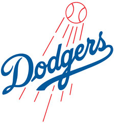
The Dodgers script with a red baseball and streaks (or “shooting ball,” as we refer to it internally) has been in use since at least 1938. Were we about to change our primary mark because of its flaws? No way. In fact, the logo and script have gone through several tweaks and redrawings over the years. We’re simply viewing these latest tweaks as part of this evolution.
The most obvious change is the thickening of the ball and streaks and making the line weights uniform. This was done mostly to solve the problem of the red lines getting lost at smaller sizes.
In addition, the Dodgers script was given an overall “refresh”””angles are sharper/cleaner and the script now has a more natural flow (the loop on the D, elimination of the stub on the o, the transition from the g to the e). The end of the underflourish also has an inverted scoop, subtly mimicking the underflourish on our jersey script.
You’ll eventually see that the new logo that’s now circulating is actually part of an entire system of marks that will officially debut in 2012, even though we’ve been doing a soft roll-out of these marks over the past year in local ads, stadium graphics, etc.
Ross’s mention of how the logo script mimicking the jersey script brought up a question I’ve always wondered about: How come the logo and jersey scripts don’t match? I asked Ross about that. Here’s his response:
We won’t be changing the jersey script on the uniforms. Why are our jersey script and logo script different? The answer is that nobody really knows. It just evolved that way. The Lakers have the same thing going on ”” their jersey wordmark is similar to but different than the wordmark in their logo. You could even argue that the Mets experience a similar anomaly. The Yankees and Tigers having cap logos that differ from their jersey logos fall into the “it just evolved that way” category as well.
All of these examples are logos that became prominent well before pro sports teams spent big bucks on branding and identity design. That kind of inconsistency just wouldn’t happen today ”” and to me, that’s part of the old-school charm. You can’t mess with this stuff now. Seriously, could you imagine the Dodgers’ logo script on our jersey? Or the Yankees’ jersey logo on their cap (and vice versa)? I couldn’t.
I can’t speak for the other teams, but internally we have very firm rules about the use of our scripts. The Dodgers jersey script can only be used on apparel or on something referencing our jersey (on a bobblehead, an illustration of a jersey, etc.). For anything else requiring the use of our script, the “shooting ball” logo or logo script by itself must be used.
Big thanks to Ross for sharing his knowledge and expertise. He also told me that the Dodgers have a few other logo tricks up their sleeves for next season, but he’s not at liberty to talk about that yet.
And speaking of team logo inconsistencies, reader Tim Lyons recently pointed out something I hadn’t noticed before: The P in the Phillies’ script overlaps the h on the jerseys but not in other applications. Interestingly, the MLB Style Guide indicates that the jersey scripts should never have the overlap. Have fun trying not to fixate on this detail the next time you watch the Phils.
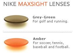
Pink eye? Back in 2007 there was briefly a lot of fuss about MLB players wearing tinted contact lenses (from left to right, that’s Mike Timlin, A.J. Pierzynski, and Brian Roberts), which were supposedly going to replace sunglasses. Haven’t heard much about the lenses lately, but I was reminded of them last night when several readers noticed Kyle Vanden Bosch’s seriously creepy-looking eyes during the Lions/Bears game.
A few readers wondered if this might be the latest “Think Pink” initiative, but it turns out that Vanden Bosch has been wearing the red lenses for several years now. Interesting that he wears them at Ford Field, which is a dome. (According to this item, the lenses are no longer being made, but Vanden Bosch bought out Nike’s supply when he heard they were being discontinued.)
So the lenses weren’t pink-related. But then there’s this stadium worker — ugh.
(My thanks to James Hoppes, Anthony Zogas, and Jim Walaitis for the screen shots.)

Collector’s Corner
By Brinke Guthrie
Leading off with the Rayduhz this week, ’cause of Al. Here he is in a black jacket, and you can buy a very similar jacket right here. We’re also gonna include this Jim Otto photo just because of the ridiculous facemask for a center. And I can certainly see Otto wearing this NFL Alumni belt buckle.
In non-Raiders finds:
• Here’s one of those funky 1960’s NFL helmet plaques, featuring the Packers.
• You see the 1970s NFL Mini-Kits once in awhile, but the NBA ones are a lot harder to find, I think. Nuts, this one has no basket.
• Ah, the elusive Cleveland Browns “CB” design on a mini-helmet. Pair it up with this Brownie beer glass!
• Here we have a 1970s New York Jets boys letterman-style jacket from Sears (look closely at the tag.)
• How cool is this late 1970s Patriots poster?
• I like this 1970s Cleveland Indians jacket.
• This must be one rare Vikings bobblehead. Look at that price!
• Mike Hersh submitted this listing for a set of NFL uniform playing cards.
Seen something on eBay that you think would make good Collector’s Corner fodder? Send your submissions here, or tweet them here.
And now a research query from Brinke: Among the things that intrigue me during my eBay searches are these NFL helmet plaques from a company called Technigraph. I only faintly recall these (I would’ve been about five at the time). Quaint, aren’t they? A generic face and helmet, often with an out-of-proportion logo, embossed on a hunk of plastic. If you look at that eBay link, you’ll see that they did large and small NFL plaques, and MLB too, which I had never seen until now. Anyone know more about these? Origins, the company that created them? If you have any info, please get in touch. Thanks.
Plus a research query from me: My thanks to the many of you who responded to yesterday’s note about players who wear their wedding bands on the field (or court, or ice, or whatever). I’m still looking for more, so if you know of athletes in any sport who keep their rings on while competing, do tell.
Speaking of which: While pursuing this topic in the Uni Watch archives yesterday, I revisited this photo of Doug Davis, which ran in the Ticker back in May. At the time I thought it was remarkable that he kept his ring on his pitching hand. But after some additional photo research, I now think Davis just has a tattoo. Too bad.
Uni Watch News Ticker: “In the battle of ideas, aesthetics matter.” That’s the rallying cry for a group that’s trying to gather second-hand suits (or funds for same) for the Occupy Wall Street protesters. Hey, that’s the power of a uniform for ya (thanks, Kirsten). … Bizzarre zebra striping in Russia’s KHL. “It’s different, but I think I actually like it,” says Jeff Barak. “I’m uncertain if the design has any connection to a sponsorship.” … Lewis English is picking the winners of NFL games based on which team has the better uniform. “I am astounded to find that I have so far predicted 51 out of 72 games correctly,” he says. … Look how Giants punter Steve Weatherford has been wearing his hose. … University of Oklahoma wide receiver Kenny Stills doesn’t like his helmet (from Daniel Caceres). … Stephen Jackson of the Rams is wearing a new helmet design with a special air-cushioning system (from Ryan Perkins). … Also from Ryan: Yesterday I mentioned that Ahmad Bradshaw ran several plays with his mouthguard stuck in his helmet, but I didn’t realize the mouthguard had an “ny” logo. … And one more from Ryan: Jake Ballard’s rear uni number got seriously shredded on Sunday. That’s longtime Uni Watch pal Joe Skiba struggling to get Ballard’s pad into his “sleeve.” … Several Penn State players had one blue sock on Saturday. “I reached out to QB Matt Mcgloin to see if this was a tribute or for functional purposes,” says Ryan Albright. “He said the socks were to cover up medically-treated burns resulting from turf surfaces (the team played at Indiana last week).” … The Purdue women’s soccer team wore one-off red, white, and blue uniforms on Sunday for the annual “special jerseys game,” benefitting the American Legion. Further details here (from Austin Chen). … Reprinted from yesterday’s comments: Chris Johnson was actually wearing a pink jockstrap on Sunday. … Not the clearest photo, but Wisconsin hockey now has the Reebok wordmark at the base of the collar and on the left pant leg. “I found this to be especially interesting, since Wisconsin is an Adidas school in pretty much every other sport and was getting a clearly branded Adidas jersey up until now,” says Jason Siewert. … New sweatbacks for Purdue (from Leo Thornton). … New cheerleading uniforms — the second new set of the young season already — for the 49ers. … Here’s more info about certain Michigan players wearing last year’s road uni, complete with the side piping, instead of the new super-stretchies. According to a note on this page, “[T]he d lineman feel that the 2011 jerseys are too easy to grab, thus they went with the older style” (from Stephen King). … Mike Hersh found a bunch of cool old stuff, including an IHOP gumball helmet placemat, ads for Kraft MLB and NHL patches, a program from a 1949 semi-pro baseball tournament. … Yesterday I Ticker-linked to all the things written inside Francisco Cordero’s cap. Now Brady Phelps has gotten the writings translated. … Here’s a look back at ASU’s 1970s helmets. … Dayton will reportedly unveil new hoops uniforms today. “The good news? No black! The Flyers will wear white, red, and dark blue jerseys this season,” says Mary Lynn Delfino. … Do the Raiders have the most influential uni design in sports history? Deadspin thinks so. … I’m sure this will end up being way too expensive for me, but I love this Cuban baseball uniform swatch catalog (big thanks to Mike Hersh). … Always fun to see pics of the Phillies’ early-1970s usherettes (thanks, Vince). … Late-breaking NHL item: The WinniJets are wearing an inaugural-season patch (big thanks to Daren Landers). … This story about Under Armour includes the heretofore untold story that UA tried to get Auburn to wear a new sock design for last January’s BCS title game, and that Auburn waited until three hours before kickoff before saying, “Thanks, but no thanks” (from Sam Mitchell). … Someone with more time than I have at the moment should comb through this book and see if there’s some good uni-related stuff in there (thanks, Brinke). … It’s one thing for Wal-Mart to destroy Main Street, fail to pay a living wage, sell a bunch of cheapo crap that nobody needs, and generally foster a cultural race to the bottom. But when they commit pork fraud, they’ve gone too far. ”¦ I’m being interviewed tomorrow for this weekend’s College GameDay, which will feature a segment on uniforms. I’m told I’ll probably be onscreen for maybe 30 whole seconds, so set your DVRs now! (To record something else, I mean.) ”¦ Is there anyone who looks less happy to be wearing a headset than Jim Leyland during those “The manager probably isn’t busy in the middle of the game so let’s chat with him” segments? ”¦ Here’s a weird one: an A+M Records varsity jacket. ”¦ Speaking of varsity jackets, check out the striped lining and the unusual lower button positioning on this one. ”¦ I like this old Rawlings chart that shows the official field dimensions for various sports. ”¦ When you’re running on a platform of returning America to the 19th century, it might help your public image if you could at least blouse your knicks correctly (tip of the cap to R. Scott Rogers). ”¦ Bill Schaefer notes that Andre Carter was missing his Myra Kraft memorial patch on Sunday. … Guess my annual NBA season-preview column’s gonna be a bit delayed this year.
Anybody else notice the Dolphins logo on that IHOP placement?
…and the Steelers logo on the wrong side too
Nice Dan Savage reference there Paul! (about the guy who can’t blouse his pants cuffs)
When you’re such a pariah that your name has literally become synonymous with fecal matter, it might help your public image if you could at least learn to blouse your pant cuffs correctly.
I don’t know if I’d say synonymous. That kinda sounds like the whole country thinks of that when they hear his name. Just because someone at one end of a political spectrum coined a phrase to define the name of someone at the other end of a political spectrum because of a stance on a social issue, I don’t know that typical middle America, when they hear “Rick Santorum” necessarily thinks of that “frothy mix of” well, you know.
Even if it does show up prominently on Google search results.
Yeah, I’d have gone with the “When you’re running on a platform of returning America to the 19th century, it might help your public image if you could at least blouse your knickers correctly” angle. The Dan Savage thing is less on point with this one than the fact that Santorum’s whole schtick is posing as a radical traditionalist, but he can’t be bothered to uphold this one particular tradition that we here care about. Either way, though, the point is this isn’t about politics – it’s a uni-related ticker item that just happens to be about a politician. If Mike Schmidt showed up at an old-timer’s game and failed blousing 101, we can be sure that Paul would ridicule him just as savagely!
I’d have gone with the “When you’re running on a platform of returning America to the 19th century, it might help your public image if you could at least blouse your knickers correctly” angle.
As usual, Scott’s logic is unassailable. In fact, I like it so much that I’m going to replace my line in the Ticker with his right now.
But hopefully Mike Schmidt would be better at blousing than just a dumb politician!
Replace whatever you like, Paul, but whenever I read or hear the name “Santorum”, I immediately think of the lube/shit combo. And I tell everyone about it at every opportunity. Because he’s a miserable dickhead.
Paul, I’m glad you made the change. There’s no reason why anyone, whether you agree with his positions or not, should have to have his name defiled in that way.
I mean, imagine if some radio host started a nationwide campaign to get people to redefine “lukas” as “a shade of purple that looks particularly classy on sports uniforms”!
No, he totally deserves it, because he’s a bigot. But Scott’s analogy was much better for the purposes of today’s Ticker link than my reference was.
Yay! More politics! Exactly what this site is missing.
Nothing political about calling Santorum a bigot. He compared homosexuality to incest and bestiality. That’s not political either — it’s pure bigotry. Simple.
Um… when you are criticizing someone’s political opinions, I would say that that is political. And this is coming from someone who strongly dislikes Santorum.
Being prejudiced against gays is not a “political opinion.” There’s literally nothing political about it. It’s just bigotry, sociopathy, etc. Dig?
If some guy at the corner bar says, “I fuckin’ hate them fags!,” that’s not politics. That’s just a bigot. And that’s Santorum.
Paul you have a good thing going here that many of us enjoy, theres no reason you need to bring this site down to that level. It really is disheartening. And I couldn’t tell you who the heck Rick Santorum is.
If you don’t even know who he is, maybe you should stay out of the discussion. He was mentioned in today’s Ticker.
Yes, I know his name is mentioned in political circles. If you’re calling him a bigot then I expect he is a republican. Again, bringing politics and namecalling into this forum degrades the entire thing. If I want to read about politicians bigotry I can find plenty of it on the web. I thought we all got it after last weeks Hank Williams Jr. fiasco.
For the umpteenth time: This notion of “If I want to read about [whatever]…” has approximately zero relevance here.
I’m sorry — genuinely and truly, not sarcastically or snarkily — if Uni Watch isn’t exactly what you want it to be. But it is exactly what I want it to be. And since it’s my site, what I want will always take precedence. Live with it. Or, if you prefer, you can read something else. Choice is always yours.
Paul, I totally agree with your right to make the site whatever you want. And yes, we keep coming back BECAUSE WE LOVE UNIFORMS AND SPORTS. But that doesn’t mean we enjoy reading the political BS. And just because you CAN do something doesn’t mean you SHOULD do it. There’s a huge difference.
Just my thoughts.
just because you CAN do something doesn’t mean you SHOULD do it.
Fair point. You get the last word. Let’s move on.
Paul’s original Santorum mention was completely uni-related. Labeling him as a bigot had not a comment on Paul nor Rick’s politcal ideologies, it is on his personal ideology. He is by definition a bigot, this is not a political interpretation. This discussion isn’t political, you guys just want it to be.
I thought we were discussing poor blousing, sounds a little less fox new, a little more uniwatch to me… just saying
This thread is turning into a real santorum…
link
Boy am I glad I didn’t pick up one of those gray, 2 striped, pillbox caps when I was playing vintage with RS in Mananas!
Minus the shield and tie, that’s my Bridgeport Orators uni Ol Ricky’s wearing.
There’s some broken code during Guthries’s Corner.
Oopsie. Now fixed.
Pic of Jim Otto isn’t linked.
Field and Court Chart Grammar
I like this old Rawlings chart that shows the official field dimensions for various sports.
Note that the chart states “BASKET BALL” (two words) rather than the modern “basketball” (one word).
Your thoughts, Paul?
My thoughts? I guess they decided to style it as two words, and/or they didn’t have a copyeditor.
You mean they didn’t include the peach basket for the basket ball dimensions? Well at least tell me they included the proper, 2-foot-by-1-foot dimensions of the ball for the foot ball specifications!
Re: The Rawlings chart.
I find it interesting that there are separate courts for boys’ and girls’ basketball. (I guess it is the six-player basketball game that died out in 1999).
Also, is it my imagination, or does that ice hockey rink almost have square corners behind the goal line?
Why will the NBA preview column be delayed? Is there some sort of news happening with the NBA? News that people care about, that is. Maybe I missed it due to the massive collective yawn that accompanied it.
…because the first 2 weeks of the season have been cancelled?
/and not a single fuck was given
Dear basketball fans,
Hockey and soccer will embrace you. Games are ongoing!
though, as a soccer fan, the standard response to soccer stories of ‘no one cares!’ being used on another sport did give me a good laugh this morning
The “Big 3” sports in the US are now Football, Baseball, and College Football.
Everything else is stuck down in “no one really cares” land.
I agree, though don’t forget college basketball… simply for the gambling aspect.
The college game is much better than the NBA, IMO. Ain’t even close.
Well, if “no one” really cares, then I guess I have a new name.
The NFL may be King of Fall
But I just want my basketball
Wake me up when the lockout ends
And wake me up for college hoops, too.
College Basketball has March Madness. The regular season is only interesting to track who will get in the tournament.
@Dan I actually threw out a “who cares” when it came up on ESPN at the bar last night and ended up striking up a conversation about it with a girl.
NBA lockout: possibly awesome for my otherwise miserable love life?
There’s only one change that I even know of at this point, and it’s Washington.
Speaking of things that make Jim Leyland uncomfortable, does anyone have any idea when (if at all) he stopped smoking in the dugout? As opposed as I am to smoking (it caused my mother’s death when I was 19), it was always a great source of amusement to see him puffing away while practically on the field.
(by the way, was there supposed to be a link with that item?)
No, no link. Just something I had noticed, thought about, etc.
I think I remember hearing a year or two ago that he still smokes during games, but he goes into the clubhouse to do it. I don’t know for sure though
As Reebok is owned by Adidas, and is the NHL’s outfitter, it makes some sense for Adidas to switch their college hockey teams to Reebok (Notre Dame is also wearing Reebok this year).
As to tinted contacts, they aren’t that new a phenomenon. In his latest book of autobiographical essays, Outside Looking In, historian Garry Wills says that Colts WR Raymond Berry had a collection of contact lenses to aid his work with Johnny Unitas, some of them tinted (to counteract those bright sunny days at Memorial Stadium).
adidas is not in the business of hockey at all. As DJ stated, Reebok is the arm of adidas that deals in hockey.
It was similar to what CCM was doing with KOHO and Jofa: Jofa was the equipment division of The Hockey Company, while KOHO and CCM were on-ice brands.
Vanden Bosch plays in a dome, so my guess is he’s either somewhat photophobic or he does it to look intimidating.
Also they said something at the end of the pregame right before kickoff (and I don’t know if it only came up because Vanden Bosch’s were previously mentioned or not) but the Bears’ CB who was covering “Megatron” had tinted contact lenses because he was much shorter than him and it might help because he’d always be looking up into the lights when he was covering him.
And NO. The Raiders’ uniform should not, shall not, and can not be improved upon.
Has a single NFL football uniform been improved upon in the past 25 years that did not involve the team going back in time to adopt an earlier template (Jets, Giants, 49ers) ?
Yes.
Tampa Bay Buccaneers (1997)
Detroit Lions (2009)
San Francisco (1998)
New England Patriots (2000)
Wish the Lions had kept those 1998 blue pants.
Yeah, those were great too.
…and for the record, I’m not saying that the Lions current uniforms are the best they’ve ever worn (that honor goes to the ’75-’81 version) but they *are* an improvement over the initial addition of black trim from 2003.
I thought the blue pants were just too bizarre a look for the Lions. At least, until the black jerseys came along… (so glad they dumped those).
Ugh. Can we get Savage to come up with an alternate definition for “The Jeff”?
Hey now, The Jeff, by often providing a counterpoint to the majority opinion, provides a necessary function on this forum. Even if he is an insufferable jerk about it. (Luv ya THE; never change)
Only the Lions is correct of those four, and it’s only because the previous uniform sucked so terribly. On the scale of 1 to 10, the current one is a solid ‘not the worst uniform ever.’
Seriously? You don’t think the Patriots current uniforms are better than the striped, drop shadowed italic numbered things they wore from ’95-’99?
Wait? The Lions uniforms before the black sucked? Interesting. I think it has all of the elements of a great uniform.
– Helmet color and striping matches the pants
– Non-black/grey facemask
– Simple logo
link
It was just a very clean (and underrated) uniform. I would love it if in the near future they used it as a throwback alt for Thanksgiving
No, mmwatkin, no one is saying that the pre-black Lions uniforms sucked. I’m saying that their current uniforms are better than the ’03-’08 uniform.
Got to disagree regarding the 1997 Bucs and 1998 49ers. I know the creamcicles are not popular with a lot of folks here, but I always thought that was a very solid uniform. Those colors really worked, especially for a team playing in Tampa, and Bruce was underrated as a logo. I don’t think the current look is terrible or anything, just a bit generic.
The 49ers update was a classic case of fixing something that wasn’t broken. Well, ok, the wide pants stripes were a bit much, but still – all they should have done is make them thinner like they eventually did with the change last year.
With due respect to The Jeff – Uh, No.
Not even close …
Tampa Bay Buccaneers (1997) – lateral move, perhaps a slight improvement. The Bucco Bruce unis simply needed a Red facemask, Red socks, and lose the Orange pants and it would have been fine. I like the Pewter, like the Black shoes, the helmet is a wash …
Detroit Lions (2009)- I lump BOTH post BFBS Lions unis into the same dumpheap. The Barry Sanders -era unis and back were 500% better than the Millen-Mooch-Moorningwhig BFBS messes that plague us now. To “improve the BFBS mess by moving 20% backwards after ruining the uni is not an “improvement” in any serious way. It is akin to totally burning a good steak and carving off the worst 20% of a 100% inedible NY Strip ….
San Francisco (1998)- Oh, come on. Do you really think the seven color numerals with nine stripes and the embedded logo on the sleeves with the BFBS all in one was an improvement over the classic “Niners’ look? OMG ….
New England Patriots (2000) – another lateral move at best. Get rid of the White facemask on the White helmet – say for Gray or Blue or Red, and the pre-2000 uni was FIXED.
Sorry if I got my dates wrong. The premise of my statemen/complaint/question was invlving the radical changes to unis that have occurred for some teams over the past 25 years.
With NE, I meant the 1990s abandonment of the Red White & Blue uni. Once the NE, Lions, TB and SF unis templates totally change to the “updated” styles, slight changes are just that, slight changes. The original complaint involves changing the template in a large way … as was done in all four instances, – none truly for the better.
By the way, the NE Pats Silver Helmet/Pants – White jersey uni was immemsely better than the White jersey/Navy pants with excessive striping that hey wear now. The current road socks are great. If they wore White jerseys over Gray pants, with those current socks – the NE road uni would improve tenfold … Ditto if the Chargers would ditch the Navy pants for White or Yellow Gold ….
The only change the raiders need is a black facemask. Other than that, they are good to go.
Lee
Speaking of the 49ers, am I the only one to notice that in at least one endzone at the ‘Stick, they had the “One Day Only” DeBartolo adopted-then-discarded “49ers” helmet logo this past Sunday?
Sorry, no screen grab, but I swear that I saw that logo in the ESPN highlights ….
I don’t think so. What they do have is the same numbers in the same colors, but with the more familiar serif font, where the 1-n-done version was more 1900s sans serif. The link below is the ESPN.com highlights that includes views of both endzones.
link
Hmmm, might it have been link? (Click on the first slideshow photo for the endzone shot — though that one looks a few years old.) Certainly looks a bit like the “one day logo” — but not it.
No it wasn’t it – those were the endzones they normally have in recent years with the current wordmark. I like the 1980s 49ers endzones better.
link
Me too. The old 49er wordmark was evocative of posters and advertisements printed during the Gold Rush.
You’re right, my bad. Just saw it for an instant ….
Thank God they never adopted that helmet !
Politics & tech blogger Tom Scocca, who’s also a part-time uni gadfly, calls the Raiders the link over at Slate.com this week. And he makes the case without mentioning either the White Sox or the Marlins.
Just read this. Well put, thoughtful and a little different perspective on BFBS.
It’s been mentioned before, but the ESPN 30 for 30 documentary about the Raiders/NWA/LA has a good feature on the Starter/Raider/branding phenomenon.
If the Dodgers’ jersey script is sacrosanct, but the team is willing to alter the logo script, why didn’t they update the logo script to match the jersey script?
Because that would make sense, and we can’t have that. It’s the same reason the Yankees continue to have 4 variations of the NY instead of just picking 1 and using it for everything.
Or… maybe the Dodgers uniform script is way too thick for a primary logo, and the primary logo script is way too thin for a uniform wordmark.
As for the Yankees, just because a logo works for a cap doesn’t mean it works for a uni, and vise versa. Thinner works better on logos & caps; thicker on unis; at least IMO.
I’d go the other way. I’m not a fan of the weights and proportions of the jersey logo, whereas the new, tweaked-for-twenty-twelve script in the shooting-ball logo looks like it would look terrific on a jersey.
But yeah, the basic point is that the jersey logo looks much better rendered in fabric than it would in print, so the Dodgers are right not to just stick their shirt script on the print logo.
I’m here, too. I don’t understand not being able to visualize the logo script on the jersey as Ross states. It would look phenomenal.
Another team that falls into this category is the Braves. Their jersey decoration is different than their wordmark, possibly due to the buttons and trim on the jersey. On the jersey, the “a” and the “v” are MUCH further apart than they are in the printed logo:
link
link
…and as Paul alluded, it’s one of those things that will drive you nuts once you see it for the first time.
BTW, via Twitter from Ross Yashida:
Me: “When wil the Dodger Stadium 50th Anniversary logo come out?”
Ross: “Early November.”
Stay tuned.
From what I remember during the Bears-Lions game, that “stadium worker” was actually a guy dressing up as a doughnut for Dunkin Donuts, whose colors are pink and orange. No big deal, but I hope no stadiums allow their employees to dress like pink astronauts.
This is correct. In the picture, you can see he is bending over something tan – that’s his donut head. Last year I went to a Chicago Bulls game where they did something like a sausage race, except with Dunkin’ Donuts products – a donut, a bagel, and something else. I would bet this was part of a promotion like that; the costumes look pretty similar.
please remind me to never attend a chicago bulls game. i would most definitely be arrested for chasing an oversized donut! and that’s just me being real…
“I hope no stadiums allow their employees to dress like pink astronauts.”
How about orange?
link
Yeah, but did he have a Dunkin’ Donuts Field Pass?
* rimshot
The Pats’ uniform from the eBay poster was the one worn when I became a fan; it’s awesome. But did anyone notice the similarity between the patriotic motif in the background and the Flying Elvis emblem?
It’s funny how people get the link…
That “Late 1960s-early 1970s” Jets jacket clearly has the helmet design adopted in 1978…
The Browns helmet is also from 1965 or ’66 and not the 1970s-’80s, since the NFL suggested it to the team in 1965 and it got rejected immediately.
Maybe they confused it with the 1984 orange-numeral experiment?
First thing I thought of when I saw the jacket was my favorite fellow Jets fan:
link
Show was set in that late 60s-early 70s range and his logo is on point
My first thought as well. A quick Google shows that they never say where the Arnold’s lived, the NY metropolitan area and Cali were the top contenders.
If the term “inaugural” means “Marking the beginning of an institution, activity, or period of office”, how is this the Jets’ inaugural season? I believe – don’t quote me if I’m wrong – they have existed before as an NHL franchise.
The inaugural season for the franchise was in Atlanta. The inaugural season for the Jets was in 1979.
WHY DOES THIS FRANCHISE KEEP MESSING UP TIMELINES?!?
Apparently, relocated teams have trouble with dates. The Cleveland Browns had a 1999 patch, and of course you’ve got the Washington Natinals who can’t seem to decide what year they were established. I’m sure there’s other examples if you go hunting for them.
Were they “inaugural” seasons? Because this is not the first season that the franchise has played nor is this the first time the Jets have played in Winnipeg.
It *is* the first time *this* team has played in Winnipeg, though, but in this case, I hope the patch doesn’t stay on for the entire season.
Well in the case of the Nats, it was a logo with “Established in 1905” on it.
Granted, there was a Washington Nationals team that was established in 1905, but there’s absolutely no relation to the current team.
I’m not sure which is more wrong, really.
In any case, I think teams are way too quick to throw on patches for any event/anniversary/whatever. We should not have seen 5-year patches, 30 years is a little unusual, and 85 is just odd (especially if you’re the only one of the 85-year-old teams to do so).
Quarter-century anniversary patches, I’m okay with. 10-year and 20-year, maybe… but I don’t need 35-year, 40-year, 85-year, and I definitely don’t need FIVE-year anniversary patches! And if you have to do some sort of “inaugural”, it should only be a “first game” (or games, if the team opens on the road, but once they’ve played their home opener, they should go patchless).
Another thing (that somewhat ties into the “inaugural” bit) is patches commemorating the closing of one venue, and the opening of another. I personally think such patches should be confined to the last/first few games, rather than a full season.
Memorials and All-Star host patches are a bit of a different animal, so I’ve got no particular issues.
US Presidents can have more than one inauguration; so too, sports franchises I guess.
This season sees the “formal beginning” of an established sports organization in its new environs, Winnipeg. That’s certainly something to commemorate.
So if it is the team’s inaugural season IN WINNIPEG, why does the patch not state that? Oh right, why quibble over details?
That’s a huge distinction from just playing their inaugural NHL season.
The patch reads “Winnipeg Jets inaugural season 2011-2012”. Entirely false in its statement and history.
Give’em hell, Teebz!
Teebz: First off, should they have a patch?
Secondly, if yes what should it say?
With Presidents, the inauguration marks the start of a new term of office. The current POTUS, while listed as the 44th President, is serving the 56th term. When a Vice President ascends to the Presidency mid-term, he’s sworn in, but there’s no new inauguration until the start of the next term.
@Tom V.:
1) No. Do you slap an “inaugural sticker” on a new-born baby? Unless you’ve been under a rock for the last three months, the entire sports world has been waiting for the Jets to show off jerseys, logos, etc. It’s not their first season as a franchise, and the Jets still exist elsewhere as another franchise. So does the Coyotes franchise have an inaugural seaon date? Or did all their history before they arrived in the desert not exist before they got there?
Furthermore, the Jets have has two inaugural seasons in Winnipeg now (and three if you want to include their inaugural WHA season). How many times can celebrate the same team name playing their first game?!?
2) This franchise existed last season. It is not their inaugural season. Does the history of the Thrashers not supercede this franchise? Officially, this franchise has had two inaugural seasons – which is simply not possibly in a logical world.
“Do you slap an “inaugural sticker” on a new-born baby?”
No, but I do wear babies while playing Hockey.
To confuse the issue further, this year’s NHL Guide has “Winnipeg Jets retired numbers” listed in the Coyotes’ pages.
It’s just an excuse to market yet another needless patch.
The Jets/Coyotes-Thrashers/Jets thing is confusing, to be sure, but this situation has occurred in sports before – specifically, baseball, which has the following progression:
Baltimore Orioles -> New York Highlanders -> New York Yankees
Milwaukee Brewers -> St. Louis Browns -> Baltimore Orioles
Seattle Pilots -> Milwaukee Brewers
Granted, there was a gap of several decades between the two Orioles teams, and an even longer interval between the two Brewers clubs, while the Jets situation is marked by a 15-year interval.
I was actually listening to the Michigan-Northwestern game on Saturday night, and the broadcasters did mention that a few players switched to last year’s jerseys due to rips suffered during the game. Interesting that they’d have last year’s jerseys on hand, though, as opposed to spares of the current model, so maybe the “feel and fit” thing has some merit to it as well.
I find it interesting that, going back to when Michigan was still with Nike, they’ve been experimenting with “maize” piping on the white jersey, but they’re not messing with the blue home jersey.
Michigan’s treatment of their football jersey is somewhat like the Detroit Tigers’ — a very simple, unadorned home jersey, and road jerseys that vary in trim (block “M” on the sleeves, Northwestern stripes in maize and blue; maize and blue trim on the cuffs; maize-trimmed numbers, the maize flank striping from last year’ model, etc.).
Can’t get through an entire week without pushing your liberal agenda, huh Paul?
You certainly come off as petty and small every time you do it. But hey, I guess we can’t come to expect anything less of you lately.
Yes, you have me all figured out. A genius you are…. And yet somehow you keep coming back here….
link
Never mind, apparently this piece missed the greater thread above (which I missed due to looking for other topics).
Hate to continue this “discussion”… but I seriously would like to know why it bothers anyone when a blogger posts a small side point that’s political.
I’m sure Paul is a bit more liberal than me. I don’t know and I don’t care.
Heck, like most avid readers of Uni-Watch I probably care 0% for a small percentage of the ticker items. I just skip them.
Seriously- why does it bother you? Just move your eyes to the next item. That’s the point of the ticker- some of it is irrelevant to some people, some of it is really interesting to some people.
And yet political content, by its nature, is sure to generate a ton of comments on this site, which appears to bring in a wide array of political persuasions.
What do you mean “by its nature”? Why is a political point more likely to generate discussion than a point about uniforms, or food, or whatever? Hell, a significant portion of the populace doesn’t even vote…
Did anyone notice the top of the d in the Dodgers tweaked logo is indented in the opposite way as the end of the underflorish. Nice balance.
I bought the Nike Maxsight lenses when the came out a few years back – grey-green for running and cycling. For contacts you only wear a few hours a week, four boxes is a lifetime supply.
They’re a great piece of equipment on sunny days, and not a swoosh anywhere on them.
But I do agree with the post, they make me look creepy as hell when I’m wearing them.
Pretty sure ‘lifetime supply’ should never describe anything you put in your eyes. Everything has an expiration. Except Happy Meals, apparently.
Of course, that’s most likely why Vanden Bosch wears them – to look creepy and all evil and such.
Probably more effective a tactic than link back in the day (which, to me, kinda made him look a little like link).
Four quick thoughts:
1) That note about the Phillies’ P-h overlap is a prime example of why I continue to be so happy that a) this site exists and b) I found out about it.
2) You clearly need neither my “permission” nor my endorsement, Paul — but I still wanted to take a moment to let you know that I truly appreciate the perspective & personality that you bring to this site every day (on matters uni & non). It was your passion that brought this community into existence, & it’s your passion (along with the great work of Messrs. Hecken & Ekdahl) that continues to make Uni Watch a must-stop on these here Internets.
3) The unfortunate fact that, for many folks, “I hate [insert ethnic/religious/demographic group here]” actually *is* a political statement tells you a lot about the sorry state of both politics & public discourse in our society.
4) Lordy lordy are the Terrapins’ new uniform combos ugly.
Not to open an old wound (though we seem to be doing pretty well so far), but the discussion of Ryan Roberts finishing the game without a jersey on (link) back on 9/27, there was discussion about whether or not it was OK because the game was over.
On Sportscenter this morning, they discussed Robin Ventura’s would-have-been grand slam in the 1999 NLCS. Because he didn’t touch 2nd, 3rd, or home (being mobbed by his teammates instead), he was credited with a single.
My point? That Roberts WAS jerseyless while on the field AND while the game was still ongoing, and Robin Ventura proved it for me. So there.
I heard a number of people already call Cruz’s slam last night the only walk-off grand slam in MLB history. Mets fans know better (unofficially).
Correction: they were sating it was the, “only walk-off grand slam in MLB PLAYOFF history.”
No idea if that’s correct, but the ESPNs kept saying it was…
Thanks Tim… “Post-season” was what I was missing (and after rereading my post some grammar too)
Are you sure that jockstrap is pink and not red, which is actually in the Titans’ color scheme and has appeared on gloves, etc. before. I’m just trying my hardest to believe that the NFL wouldn’t actually put pink on everything.
Disclaimer: I’m slightly red/green colorblind, so I might be full of shit.
Jim Otto playing center with a double-bar mask – through 1974, no less – is one of the inexplicably delightful things in sports.
Then he added the little “U” loop above his nose. But I don’t think he ever wore more than that for a mask did he??
The Dodgers will be wearing a 50th anniversary of Dodger Stadium patch in 2012, it is at least the 16th non-memorial patch they will have worn since 1980 (about one every other season) and the All Star game patch that season. I am only counting the 1999 “Heroes Patches” as one.
Other known 2012 patches, Astros & Mets 50th anniversaries, Fenway Park 100th anniversary, K.C. Royals All Star Game, and not yet confirmed, Miami Marlins new stadium.
Pretty sure the Marlins will have a new stadium.
(I kid)
Will the Dodgers commemorate their 20th patch since 1980 with a 20th patch patch?
I’m pretty sure Chris Johnson’s undergarment is red compression shorts, likely this model: link
I was thinking they were compression shorts, but they can’t be that model, since it has a contrast waistband. CJ’s definitely had a waistband the same color as the rest, whether it was pink or red.
The better question is why he would wear pink underpants, whether shorts or a jock, since I can’t imagine anyone would bid on those at auction. At least I really hope no one would bid on them.
It’s most likely this model since you can see the hip padding under his uniform pants and the black waistband is pretty apparent just below his jersey. link
He’s wearing a girdle on top of his underwear. Those aren’t integrated pads. I’m pretty sure what you’re seeing as a waistband is just skin.
Always enjoy Collector’s Corner. NY Jets letterman jacket immediately reminded me of Kevin Arnold.
Two things:
Kyle Vanden Bosch doesn’t wear the red contacts as sunglasses, he just uses them as an intimidation-type thing.
The stadium worker in pink had just finished the “dunkin donuts race” not any “think pink”
I actually think its kinda cool.
Anybody know how to fix a vintage replica NBA jersey? The numbers are cracking and peeling. Any home remedies? Any help would be appreciated. Thanks! link
Paul: “Have fun trying not to fixate on this detail the next time you watch the Phils.”
And that sums up the beauty of this site perfectly.
Hey Paul, to appease all these poor downtrodden white, male, christians you seem to piss off so easily, you could make fun of Obama for inviting the 85 Bears to the white house (The Challenger Explosion cancelled their 1986 planed visit).
I mean, it’s got uni news, obama got a jersey that was numbered “85” link (I guess he’d be a wideout…), Though thats a modern jersey and looks slightly different than the 85 version link .
He also got this very stylish headband link ala Sweetness and McMahon.
And speaking of McMahon: Dude, what are you doing? link That tie, that headband… [/ShakingHead]
Precisely the reason why McMahon wore a Bears jersey to the White House when he happened to be honored among the SB XXXI Packers. (He was the back-up.) Anybody have a picture of that?
link
Jim link of late …
Wait, what? I remember that Reagan had to postpone the State of the Union address to link, but the White House couldn’t, like, reschedule the Bears’ visit for March or something? “Ah, no, sorry, we’re completely booked through January 20, 1989. Try calling back then.”
Since I asked the question last week, has anyone been able to determine if the Cubs are tweaking their uniforms for 2012? Majestic Athletic had a fire-sale last week of all team jerseys from franchises who are changing/slightly-altering their unis next season and the Cubs were one of them.
Anyone know? Complete change? A sleeve patch? Bueller?
Please tell me they’re taking those hideous names off the backs, at least at home. The Cubs were always meant to be a link team. Let’s go back to that!
I agree, but from the merch end – people would rather by a jersey with both the player’s # & name.
And yet link is a link. A team can sell all the NOB replica jerseys it wants without putting the names on the backs of their actual players’ uniforms.
Fascinating story on the Dodgers logo today. I’ve always felt those red streak lines were too thin, too weak. I love the fact that several teams are “old school” and that their jersey logo and official print logo don’t match. For the same reason you still want parks like Wrigley Field around
-Jet
Love the Dodgers logo story, love the Rawlings chart with the various field dimensions. In Chicago, sending — what else? — love to all.
What’s up with the NHL’s new front helmet numbers? Have you covered this and I just missed it? At first I thought they were just an overzealous equipment manager on one team but now that the season is in full swing it’s obvious every team (I think anyway) is doing it.
I, personally, hate them. Especially on teams with small numbers on the upper part of the jersey like the Sabres. Cripes, add in the sleeve numbers and you’re gonna be able to see the player’s number 3 times in less than a square foot. Ridiculous.
It was mentioned last week.
link
link
The guy wearing this captioned it: The worst jersey in the history of sports. Top this…
I recognize that jersey!
Don’t know if its one and the same but I was in a youth roller hockey league in Wharton, NJ at a place called “wheels in motion”
Been closed a while, but I played back in the mid-90s (?). Every team wore that same design but in different colors… if I remember correctly, there’s a hot pink, neon green and neon blue iteration as well
That jersey is from Roller Hockey International. The New Jersey Rockin Rollers played from 1994-1997. 1997 saw the Rockin Rollers lose in the RHI Final to the Anaheim Bullfrogs – the closest they came to roller hockey supremacy.
Lots of NHL players played in RHI. Goaltender Manny Legace was a member of the Toronto Planets in 1993. Bryan Trottier played for the Pittsburgh Phantoms in 1994. Dave “Tiger” Williams played with the Vancouver Voodoo in 1993.
Former Devil and Rangers Walt Poddunbny, who passed away from a heart attack at age 49 in 2009, tore up RHI in 1994 with the Las Vegas Flash. He scored 47 points in 19 games that year before playing/coaching ten games with the Orlando Rollergators in 1995 where he scored 17 points.
“Pinkwashing for breast cancer awareness questioned”
link
“The pink drives me nuts,” said Cynthia Ryan, an 18-year survivor of breast cancer who also volunteers to help other women with the disease. “It’s the cheeriness I can’t stand.”
“What’s next, pink cigarettes for the cure?” King asked. “I think this really speaks to the fact that they’ve lost sight of their mission. Their primary purpose appears to be to sell products.”
Maybe the tide will go out someday.
Got my new Flyers Bryzgalov Sweater today in the mail today. Just noticed it has the Vector logo, not the wordmark on it.
I got to yesterday’s Hungry Hungry Hipster comments late yesterday. A couple of things:
1. Our tastes are very different. Neither of us is wrong.
2. I think we all imprint the uniforms teams wear when we start watching sports and associate them with those teams. When I first saw the New England game Sunday, I had a pleasant reaction that “Those are the Patriots” that I don’t get from the current unis. (People who started watching after Flying Elvis came along will react differently.)
3.I would rather see a team adopt a new modern uniform that I hate than stay with the same “traditional” uniform they’ve had for almost half a century.
NO. The idea that you can immediately recognize a Raiders-Chiefs game, whether it was played in 1971 or 2011, is a good thing. There are teams with (what I think of as) ugly uniforms who’ve worn them for so long that it takes me a while to say “Oh yeah. That’s ugly.”
I’d hate to be the guy in 40 years who’s looking at a photo of two teams in their one-off Pro Combat unis and trying to figure out what game it might be.
4.Have you ever heard of merchandising??? Jersey sales skyrocket when a team adopts new uniforms!
This is the worst reason to change unis. Merchandising should follow what’s on the field, not vice versa.
The 1965 Reds had their NOB arched below the uni number. (Picture of Tommy Harper 8/19/65 @ Cubs)
link
My assumption is they lowered it to fit on the vest, but surely they could have used standard size letters and fit most names above those numbers. Did they wear that style of NOB through all of the vest years? I don’t recall ever seeing this before. Maybe it was discussed previously and I just don’t remember reading. Thanks
Been discussed plenty. We even have a few membership cards based on this style:
link
Reds wore this style for a few years. Important thing to remember here is that NOBs were still a new phenomenon at the time, so there were no rules, no right or wrong ways to format them. Total freestyle.
“In the battle of ideas, aesthetics matter.”
And how.
The Cal Berkeley kids of the early 60’s fared better than the hippies of the late 60’s.
and 10 billion times better than the OWS crowd
“Have fun trying not to fixate on this detail the next time you watch the Phils.”
~~~
so, like…spring training then
Watching USA v. Ecuador… No pictures, but Ecuador’s goalie is wearing a backwards adjustable cap on field
Kenny Stills gets it.
But can we officially say that Kenny Stills Gets It®?
“But can we officially say that Kenny Stills Gets It
®™?(fixed) ;)
Not registered yet? ;)
Lewis English,
You do know that Dwayne from What’s Happening did it first?
Wow…I owned that Jets jacket. It was given to me by my godmother on Christmas when I was 8. One problem, I was a Cowboys fan at the time. (Since having converted to a Seahawks fan about the same time Tom Landry got fired.)