First things first: Big thanks to Phil for handling yesterday’s whilst I recovered from a very hectic weekend.
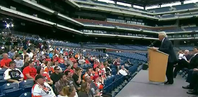
Now then: Yesterday the NHL finally announced what everyone already knew, namely that the Flyers would host the Rangers in this season’s Winter Classic. From a uniform standpoint, the announcement was a bit of a bust, because players from both teams just wore their regular jerseys (throwbacks will presumably be announced later on). Still, we did learn a few things:
• The Winter Classic logo that leaked last week is accurate.
• The Rangers have already unveiled a retro team logo for the game. To my knowledge, the Rangers have never used this logo design before, although it’s based on logos they used in the 1920s and ’30s.
• Some clown showed up to the press conference in a very classy jersey. Rumors that the gentleman in question was actually Michael Vick are almost certainly untrue. (My thanks to Terence Kearns for the screen shot.)
And as long as we’re talking hockey, here are two other tidbits that came over the transom yesterday:
• The Wild are adding a memorial helmet decal for Derek Boogaard and Pavol Demitra.
• The Devils have a new 30th-anniversary logo. It’s not clear whether they plan to wear it as a patch, but I’ve asked the team. Will advise.

Collector’s Corner
By Brinke Guthrie
Sure, the (baseball) Giants had a down year — what can you expect? It took 50+ years to win the first Series here, so of course they’re gonna go down the tubes. But Giants fans can drown their sorrows in this classic 1980s-style Starter satin jacket.
In other eBay finds:
• (Baltimore) Colts fans, you’ll want this Colts Statue. Should look great next to your Robert Irsay voodoo doll!
• Collector’s Corner Rule: If it’s a 1970s NFL item from IHOP or Sears, it goes up. Case in point: this Miami Dolphins parka from Sears. Guess there was a demand for lined parkas for kids to wear in Miami.
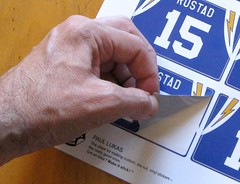
• Cliff Engle Sweater Alert: a New York Football Giants pullover.
• Here’s some rare photographic evidence that Cowboys then-backup QB Danny White wanted to knock starter Roger Staubach’s block off.
• Ever play Roto Darts baseball? Now’s your chance!
Seen something on eBay that you think would make good Collector’s Corner fodder? Send your submissions here.
Extracurricular stuff: Lots of reminders and things to catch up on:
• Remember, if you’re a Uni Watch Membership Program enrollee, you can now order a sheet of stickers based on your membership card design. Big shout-out to everyone who’s been ordering them. If you missed the announcement last week, you can get the full scoop here.
• I’ll be discussing Permanent Record this morning on WNYC-Radio’s “Brian Lehrer Show.” My segment is supposed to run from roughly 11:40am-noon Eastern. You can access the live audio here, and I’ll post the archived audio tomorrow.
• Speaking of Permanent Record, the Slate series has now run its course (if you missed it, it’s here), but the project is not finished. I’m not sure what the next phase will be — maybe a book, maybe more articles on Slate, maybe both, maybe something else entirely. Meanwhile, I’m still posting new material on the Permanent Record blog.
• Also: There’s new content up at the Butcher’s Case. The Brooklyn Fleisher’s opens tomorrow, woot-woot!
Uni Watch News Ticker: It’s official: When the Nets relocate to Brooklyn, they’ll be the Brooklyn Nets. Those jerseys are just placeholders — the team plans to unveil a new color scheme soon-ish. Further info here. … Xavier will wear Cincinnati Royals-esque uniforms for a preseason promotion. Pretty odd to see a college team using an NBA-based design, even if it’s only for an intersquad scrimmage or whatever. … Color-vs.-color alert. That’s Hamilton vs. Calgary in a CFL game from this past Sunday (from Kevin Tiessen). … Bruce Menard found an old Moe Drabowski jersey with first name on back. … Check this out: A Nats fan got himself a Mike Morse jersey with the NOB spelled out in Morse code (from Jason Mott). … Coupla nice finds by Ben Traxel: a shot of the Chiefs — then the Super Bowl champions — playing the college all-stars in July of 1970, and a Kansas football jersey with a massive chest wordmark. … Barcelona soccer players are unhappy with their new Nike jerseys, which apparently soak up too much sweat (from Patrick Runge). … Brad Marchand of the Bruins got himself a Stanley Cup tattoo — complete with a typo. But he says it’s been fixed (from Ken Singer). … And while we’re at it, ASU QB Brock Osweiler has a typo on his tattoo as well. These idiots should stick to “Mother” tats — hard to misspell that. ”¦ The Tri-City Americans of the WHL wore stars and stripes uniforms for their home opener the other day. Additional photos here (from Larry Brunt). … What would you do if your mom distributed 700 T-shirts with your nickname and photo on them? I mean besides saying, “That’s not nearly as good as a certain hypothetical shirt that might theoretically be available”? If you’re Reds rookie Devin Mesoraco, you blush and deal with it (thanks, Brinke). … Wisconsin in a black helmet? Impossible! Except it already happened — back in the 1960s. … Indiana football will wear pink gear this weekend against Penn State. ”¦ Here’s an NFL rarity: Plaxico Burress was breathing Ethier on Sunday (great spot by Lou DeGeorge). ”¦ Kudos to Redskins lineman Jammal Brown, who cut the striped section off of a pair of ’Skins socks and used them to create a killer set of armbands last night (from Casey Gross and Terry Duroncelet). ”¦ Meanwhile, Bob DeLano notes that some of the burgundy dye from Rex Grossman’s jersey appeared to be bleeding into his NOB last night. ”¦ A Michigan high school is planning to install a red football field (from J. Cristiano).
The Kansas wordmark jerseys were similar to University of Texas wordmark jerseys in the 1960s. They were used once a year — for photo day — and promptly returned to the shelf.
Back in the sixties (and maybe seventies) Tulane used to do the same thing. They had a set of green jerseys with “TULANE” on the front in big letters which they apparently only used on picture day at the beginning of the season. Anybody who played for Tulane during that time period has a picture of himself in a “TULANE” jersey.
So did North Carolina in the early 1980s. The blue jerseys said CAROLINA on them, just like the jerseys for South Carolina always have.
About the Ole Miss helmets in 1962. I have a picture with them wearing blue. And a while back there was some good info here on guessing red and blue in b&w pics. it is pretty tricky to guess what is red and what is blue from b&w.
Tulane DID were the “Tulane” wordmark jerseys for at least some games in the 1970s. My recollection is that “Tulane” wore game jerseys WITH sleeve striping (no TV numerals) in games in 1974 – the year before moving into the Superdome. Also believe that while they were NOT worn in the 1973 season, they may have been worn in the Astro-Bluenbonnet Bowl that followed that season.
You are right about Picture Day and souvenier program photos – for most or all of the early 1970s they always seemed to wear solid Green jerseys with the “Tulane” wordmark, with no stripes or trim. The JV _Baby Billow” team wore those jerseys for games, I believe …
I may be going back a little further than you…
In the late fifties and early sixties Tulane wore an assortment of uniforms and then, by the late sixties to around ’71, wore very, very plain uniforms with practically no trim whatsoever. However, in their publicity and team photos players always wore the green jerseys, with blue and white Northwestern sleeve stripes, with “TULANE” across the front. In later years they wore a similar game jersey without the wordmark. But it is possible they may have briefly worn a similar jersey, with “TULANE” across the front, in games…I’m thinking maybe around the time Mark Oliveri played.
If you know any old former Tulane players ask them to see their Tulane football portrait and I’ll bet that in it they are wearing that green jersey with “TULANE” across the front.
link
Tulane 1975 pic
Here are some color pictures of Tulane
link
1970 above
link
1969 above
link
1964 above
1967 Tulane in color
link
link
Tulane, 1968…very plain.
Nick, after looking at some old photos I may be wrong about whether Tulane’s “picture” jerseys had sleeve stripes…they may have been solid green. However, I am absolutely certain that for a number of years Tulane had a “picture” jersey, with “TULANE” across the front, that was different from their actual game jerseys. And, as I said, they may have briefly used a game jersey with a TULANE wordmark.
The only other time I have ever seen Tulane with a wordmark was way back in the early to mid-sixties (I’ll look it up.) when they had “BEAT LSU” printed on their jerseys for the LSU game…they got creamed.
Check out Tulane helmets in 1962. b&w pics but seems like a pretty cool wave
link
link
That is cool. Like a cross between the link and link
Tulane ought to do a Breakers-like uni some year.
Jim, I liked it. I also like your cross between the 2 helmets shown.
Larry, I remember Tulane’s “wave” helmets…really ahead of their time. But let me point out something else to you in that first photo…Ole Miss appears to be wearing red helmets…not blue. I recall seeing Ole Miss one year in red helmets around that time.
When I was a kid I was a big LSU fan…but Baton Rouge was 80 miles away. So on Saturday nights my dad would drop me off at Tulane stadium. I got to see a lot of college football as a child. Don’t know if you are aware that Tulane used to be in the SEC.
Pierre. Very true about those being ahead of their time. As you know the mid 50’s to early 60’s was the era of plain helmets with a single stripe and numbers on the side.
Yep I knew long ago Tulane was SEC
Wow! What photos! I had my teams switched on the Astro-Bluebonnet Bowl – it was Houston that wore the School name on front. The game photo with “Tulane” and stripes on the jerseys appears to be taken inside the Superdome – given the lighting – which would put t at 1975 or 1976. I know that in 1977 they actually wore Sky Blue numerals trimmed in White on their Green home jerseys.
I was absolutely unaware of the early 1960s “Wave” helmey , as well as the darker Blue helmet later. I do know – from Black and White photos – that at some point in the mid-1960s they appear to have worn Silver or Light Blue pants and helmets, and wore White at home for at east one season in that era – I have the 1965 yearbook indicating this. Alas, all of the photos are lacking in color.
In that era they changed coaches quite a bit, and unis along with it ….
I grew up going to Tulane games from 1970 through the present. By that time they had settled into the White helmet, White Pants, Green home jersey template. I had no idea they wore some of those unis Larry posted. Thanks !!!
One last item. On the plain Green jerseys that the football team wore in quite a few photos and media guides in the mid-1970s – with “Tulane” on the front and with plain White numerals, with no trim or striping, the numerals were in the font currently worn by the Boston Red Sox. Very unique font not often seen for football – maybe used by the AFL Chargers at some point, but to my knowledge not many teanms ….
Concur – have seen many SWC jerseys like that but never in play. However, I thought they were practice jerseys… They ONLY took pics in them?
FYI – that KU QB is Steve Renko. No, not Renko off Hill Street Blues. The mediocre pitcher from the 1970’s.
link
Houston wore them.
link
That’s from the ’73 Bluebonnet Bowl.
And the Cougars wore that style into the 1980s as well.
This is by far the most anyone has talked about Tulane football on the internet. Ever.
Kinda fun, actually…brings back a lot of memories. As a child I went to a lot of Tulane football games…simply because I couldn’t get to Baton Rouge to watch LSU. Until 1966 Tulane was a member of the SEC so I used to get to see teams like Alabama and Ole Miss play. The original visitors locker room at Tulane Stdium was underneath the West Side stands in the Northwest corner (A new one was later built outside the Northeast corner of the stadium.)and I would hang out outside the visitor’s locker room to get a good look at the teams. Sometimes the quarterbacks would come out and toss a ball around right outside the locker room. There was no security to speak of in those days so you could actually go right up to the players and talk to them. It was neat…got to see a lot of football and cool uniforms, too.
I was thinking that. From the pictures I found Tulane had a few different looks in the lat 50’s and 60’s. Some were rather nice.
I still miss the Bluebonnet Bowl…
the Chiefs – then the Super Bowl champions – playing the college all-stars in July of 1970
~~~
they continue to lobby the NFL for that SOTP home and home to this day
Phil, I have an interesting story about the old College All Star game.
In 1962 I became friends with a new kid who had just moved into the neighborhood. His father, John Rauch, was a coach at Tulane. As it turns out John Rauch was a famous quarterback from Georgia who later went on to be the head coach of the Oakland Raiders and Buffalo Bills.
link
Well, one day the kid and I were in his garage and decided to go throw a football around…but we had to find a football. So he pulls out a beat up old cardboard box (which had all kinds of football crap in it) from the back of his garage and starts rummaging through it looking for a ball. In the process he throws out this satiny white, red, and blue uniform with stars sewn on it…plus helmet. I asked him what it was and he said it was his father’s uniform from the College All Star game, which would have been from the late forties, I guess. Never forgot that uniform to this day…
“Kudos to Redskins lineman Jerome Brown, who cut the striped section off of a pair of ’Skins socks and used them to create a killer set of armbands last night”
Yeah, that was the high point for the Redskins unfortunately (grumblegrumble).
That Redskins lineman is Jammal Brown. Jerome Brown was the defensive lineman for the Eagles in the early 90s who was killed in a car accident.
Right. Will fix. Thanks.
Those Brooklyn Nets jerseys might be only place holders, but I bet they will look better than anything else they come up with. (See OKC Thunder, NO Hornets, etc.)
Great headline, Paul.
I wonder if the colors and unis of the Nets are already decided (as Jay-Z seems to say) or if there’s still some possibility of influencing the outcome. Since UW is so Brooklyn, and since its President-for-LIfe is so Brooklyn, maybe we could propose something…
I thought so, at least until last night, when the UW President’s Special Commission on Chromatic and Graphic Representations of the Brooklyn Nets held it first session at the City Reliquary. Paul flew in many of the best of UW’s experts in the hope that consensus design recommendations could emerge. Instead, things turned ugly. Someone made a disrespectful comment about Jeff’s definite article. Someone posted a security-camera shot of Jim V elbowing aside a little old lady at the supermarket line (caption: “Vilk of Human Kindness.”) Someone else called O’Brien “Timmy” and Rogers “Scotty Boy.” I believe it was Rick-o who was the first one to break a chair over someone else’s head (Ry Co’s, I think, something about copyright), but he certainly wasn’t the last. Only Teebz behaved himself, trying all night to get the HD Finder to pick up a breaking story in North Ontario. I voted for plain ol’ Dodger Blue-and-White, but by that time we had lost the quorum.
In all seriousness, I’d love to be a fly on the wall at a meeting between Messrs Lukas and Carter.
I didn’t jersey anyone? I’m hopeless as a member of the hockey wing. :o(
Laughed out loud your comment, Connie. Awesome!
Don’t you need more than one person for it to be a wing?
*ducks*
The hockey wing, while mostly quiet during the summer months, does rise up every once in while. We don’t ask for much, but we throw everything we have behind out cause when we decide to revolt. ;o)
Not out… OUR
Great spelling, Teebz. Damn Canadians….
ahem…
we spell it “or” in the states, teebowski
She may have been little and old, but she was no lady…she mispronounced “Mothervilker” when she chastised me for taking the last Kit Kat from the checkout counter…
oh gimme a break…
Given the history of the Dodgers moving and the emotions still (justifiably) involved, as well as the street cred/NBA/hip hop cache of the team being involved with an authentic “Brooklyn” connection, as well as the fact that the team will actually play it’s home games in Brooklyn, I believe that they will DEFINITELY be named the “Brooklyn Nets”, and that their uniform and wordmarks and logos will absolutely include “Brooklyn” as the focus of their identity ….
“Those Brooklyn Nets jerseys might be only place holders, but I bet they will look better than anything else they come up with. (See OKC Thunder, NO Hornets, etc.)”
I thought the exact same thing.
Those placeholder uniforms are actually pretty nice. It’s a shame the real ones will likely be on par with the Atlanta Bullshit.
Who’s going to make me an Atlanta Bullshit jersey?
Re: Tri-City Americans
I’ve never seen the Reebok wordmark on a hockey sock like in this picture.
Most CHL teams wore the vector in recent years just below the kneecap.
link.
link with the vector.
Like the NHL, Reebok switched to the wordmark in the CHL this season as well.
I don’t know how the authentic jerseys are, but I took a walk though a muggy Boston this past weekend wearing the new Nike Manchester United replica jersey, and yeah, they get sweat heavy.
That new Nike fabric is ridiculous. The teams who wear those jerseys look like they are wearing plastic after the jerseys get moist – especially in the darker colors.
I believe it is the same fabric they are using in their tennis wear. Nadal has the same problem.
Re: Cliff Engle Sweater Alert in Collector’s Corner. If you type in ‘Cliff Engle Sweater’ in the ebay search field, there are usually about a hundred of them up for auction at any given time, in many different styles, sizes and teams. Definitely not a rare thing to find on ebay.
This is great:
link
“Let this be a reminder to Anderson and Edsall that for all the headlines and publicity a school can create for itself, winning football games comes down to X’s and O’s, execution and desire. And there’s no self-praise or crazy uniform that can be substituted for that.”
That whole article was great. Nice find Geeman.
Maryland alum, fan, and season ticket holder here, and that was spot on. Thanks for the link.
…although I am a fan of some of the uniform combos, including the Maryland Pride getup. But let’s not go down that road again.
“the unveiling of Maryland’s new Under Armour uniforms in August … had the Terps looking like the ‘Oregon of the East’ with a turtle-themed white helmet, a matte black helmet without a logo and a dizzying array of uniform combinations — none of which look good to anyone over the age of 30.”
~~~
and genius to everyone under 30
i didn’t quite live through the “never trust anyone over 30″ dictum that permeated the late sixties, although the phrase was actually coined in 1964 by jack weinberger (shockingly, at berkeley)…but it seems a good number of the disagreements we have had on this board since that maryland costume roughly breakdown along similar sentiments…”if you’re over 30, you don’t know shit about uniforms”
for all those who think those flag uniforms were the shit, and are under 30…do me one small favor — when you’re over 30, married with kids and a mortgage, take a look back at how you felt in september 2011 and see if you still feel that way
i’m not saying you won’t wistfully pine for those the way some of the UW guys thought the powder blue polyester pullover was the bees knees, but at least acknowledge that with age comes (some) wisdom
That Tri-Cities uni would be beautiful… if it were actually white.
Uh, some regular old red on there would also be a good idea.
While you might think it difficult for a tattooist to misspell “Mother”, I bet several usually add six more letters to the end of the word . . .
like “vilker”?
Sure, just like that ;-)
yeah…the six letter word we’d add would definitely end in “er”
phil, let me save you the time it takes to dig through old comments for a good jab, and fes up that it was me that typed “morris code” instead of “morse code” a good while back LMAO!!!
and, in the “flattery will get you everywhere” department:
link
I think the discoloration on Grossman’s jersey might have been from the crimson/burgundy paint on the field last night. One of the Dallas tackles had the same discoloring on the back of his pants-might have happen to both of them on a tackle.
There was crimson and/or burgundy paint on the field in Dallas last night?
It was coming off the “NFL Futbol” logo painted around the 25-30 yard lines.
link
Ah, didn’t notice that last night.
I guess what threw me was the “crimson/burgundy” description. I wouldn’t have thought twice about it if it had just said “red.”
You weren’t the only one to get those colors confused. The referee referred to Washington as the “red” team last night, and my first thought was, don’t they wear burgundy? I guess I’ve been spending too much time at Uni Watch.
don’t the skins wear maroon, anyway?
“don’t the skins wear maroon, anyway?”
What a clusterfuck of red-shade-confusion. Guess now’s as good of a time to show off my new design that I did not even 12 hours ago (as of this comment):
(link)
From my understanding:
-Scarlet is the shade of red we most commonly refer to as “red”.
-Cardinal (which looks to be the actual shade of red that the ‘Skins use to MY eye, at least) is slightly “brighter” or “harsher” in tone than Crimson.
-Crimson is a little “darker” or more “muted” than Cardinal.
-Burgundy (as depicted in the link) is a very dark shade of red that has a purplish hue to it.
-Maroon is perhaps the darkest shade of red there is (assuming that blood isn’t darker) and has a brownish hue to it.
And THEN there’s every shade of red in between those shades of red, and I don’t even know what the hell’s up with “velvet”… Damn, link.
Right on, Moono, good job.
/s/ Cromson Pedant
As in “Cromson Tide” and “Cromson Pirate”…
Regarding that Michigan high school’s playing surface: I recall in the early days of Arrowhead (the stadium opened with artificial turf even though it had George Toma on staff), a game day program included a story speculating the “exciting” possibility of turf reflecting team colors. When it suggested orange for the Cleveland Browns I think I started showing some minute favor for the Jets, Eagles and Packers.
Because you wanted to see two white fields and a yellow one, right? ;)
that was obviously supposed to be a reply to Flip…
A white field with green lines would be awesome!
What about a yellow field with green lines? Wait, I mean Gold. heh.
A yellow field with gold lines? Meh. (Heh heh,)
Ha! No, I meant a yellow(gold) field with green lines. This is getting out of hand…
A yellow field with gold lines? Meh. (Heh heh,)
I thought we were talking about the Packers, not the Saints…
Anyways, I don’t know if I’d want to see a yellow (or gold, grrr) field, but it would be nice to get a little bit of creativity in field layouts. Remember how the Raiders used have the field numbers in shields? Why not bring back stuff like that?
I was talking about the Packers, just making a yellow/gold joke.
I agree with your creativity comment, special field numbers and markings could make a field unique, but not too stupid looking like all these colleges are doing nowadays.
Why stop there? Make the field different sizes, put trees on there, add some water obstructions.
Or wait, maybe a green grass field works pretty well, or has for 100 plus years.
Why don’t you try to improve on vanilla ice cream while you’re at it? It’s just so bland.
“Why stop there? Make the field different sizes, put trees on there, add some water obstructions.”
That third down field goal attempt in OT would be a lot more exciting if you had to kick it through a windmill, wouldn’t it.
Way to go about 3 steps too far there Geeman.
Different sized fields? That’s just stupid, we aren’t talking about baseball.
Do you also hate the varied designs on basketball courts?
/and who the hell eats plain vanilla ice cream? There’s a reason that chocolate syrup, whipped cream and sprinkles exist.
Holy Hell, what have I done?
Yes, I hate the varied designs on basketball courts. And a plain bowl of vanilla ice cream, a la Ricky Henderson, beats any of that artificial garbage stuffed on top of it any day. But most kids love it that way, I will concede.
Re: Football field creativity
ASU had sparky impaling a turkey leg a few years ago on thanksgiving, and this year the arrows on the yard numbers are the current pitchfork design.
link
Wait, what about about a blue tuxedo? With ruffles. Break of the black and white mold. That’ll stand the test of time.
nothin’ better than bacon and ice cream
Do we feel the same way about baseball fields, I wonder?
Colored baseball fields? You must be mad, Ricko.
I’m all for more cool designs mowed/rolled into the fields, though. The Red Sox messed around with having the 2 Sox logo in the infield grass a few years back, I thought it was awesome.
Hey self, here’s a picture, apparently they did it this year too (my mind’s a little fried from this wild card collapse + listening to most games on the radio):
link
I’m not sure that baseball fields lend themselves to being colored as well as football fields do… but I can’t say that I’d mind seeing someone try it. Take the Mets… orange infield… blue outfield… big ol’ NY logo out in center field… black bases…
(Please don’t ban me, Phil)
I could see it happening somewhere with an artificial surface (please don’t have a black infield, Toronto).
You’re out of your ever-lovin’ mind. Black “grass”, blue “dirt” and orange bases/lines is the only sensible option.
What you mean “we,” white man? The very idea of colored fields is aesthetically offensive, no matter the sport. Most especially, coloring the field a shade that matches either the home team’s uniform or the ball, thus making the game harder for spectators and officials to see and harder for the visiting team to play, is an idea of such obviously unredeemable stupidity that it was only a matter of time before it swept the NCAA.
But back to baseball, teams already do color their fields. Not the grass, not yet, but the various dirt and sand bits? Absolutely. I heard a talk a few years back at a SABR event from Nicole Sherry, head groundskeeper at Camden Yards. She described the effort that goes into making sure that the warning track is the same color as the warehouse. (A lot of effort: The O’s keep a stock of matching bricks and literally grind the bricks into dust by hand to make new warning-track dirt). Sure, it’s still within the realm of brown such that nobody other than Peter Angelos, who apparently spends a lot of time every day fussing over his team’s and his stadium’s appearance, will ever notice the difference from every other ballpark in the nation, but the bottom line is that here’s a baseball field element that’s artificially colored for purely aesthetic purposes. No different in principle than purple turf at a football arena. This happens at some other MLB parks as well, I’m told, with the dirt field elements.
Was sarcastic question. TFPIC. Meant why is it okay to imagine bizarrenes for football that almost no one would suggest for baseball?
If I recall, the president of Boise State got the idea for blue turf while watching a baseball game. The color was off, making the field look blue. If I have time, I’ll look that up to make sure I remembered correctly.
Ricko, that was also a sarcastic response. Really just an excuse to trot out my favorite Pater-Angelos-is-a-nut story. Another tidbit from Sherry’s presentation: Angelos regularly takes a ruler from his desk and measures the length of the grass on the field to check the groundscrew’s work.
I’m actually sympathetic to the notion that it’s arbitrary, and indeed artificial, to expect artificial turf to be colored grass green. In the abstract, I would prefer non-green fields when they’re artificial. However, in the real world, most field sports have evolved rules and practices over more than a century with the assumption that the field of play would be the color of grass. If all you do is change the color of the field, without addressing the larger issues of context, then you’re committing a crime against the sport. Visibility is the key thing for me. If you want to make your field a team color, fine, but then the implication probably has to be that your uniforms can no longer be team colors and must be neutral. Probably the ball has to be recolored for better contrast too. Both of which have significant second-order implications for the governance of the sport.
Point being, the field ain’t like the underside of the brim. You can’t just change it from green to black one day and leave everything else the same. You’ve got to think it through, or don’t do it at all.
And in terms of the need for holistic thinking about the turf color’s impact on the conduct of play, baseball is probably the most friendly of all sports to changing field colors. Since the assumed uniforms for each team are already neutral, and contain a minimum of team colors, and since the ball and bases are white, a blue/black Mets field would probably work just fine. It’d be disorienting at first, and it’d give lots of TV viewers seizures (another advantage for the Mets: Nobody watches them on TV anyway), but it’d work. You’d see the players and the ball just fine, and so would the players and the umps.
Just noticed that both CFL teams are wearing Reebok jerseys. Apparently all CFL teams wear Reebok. Does anybody know if they’re switching to Nike next season as well, or is that a completely separate contract?
The CFL had a total Reebok changeover a few years ago – all 8 teams came out with new jerseys with mostly not great results.
The league signed a 5 year deal with Reebok in 2008 so maybe Nike is not far off.
Thanks, Jim. Good info.
I had that dolphins coat! Mom bought it for me at sears in nj where we lived. I loved that coat and may buy it again!
That number font makes it look like the Devils are sponsoring a NASCAR team.
Conceptually speaking, I would snap up one of those Franks t-shirts rather quickly, if there was a 3XL or 4XL size available.
Also, the font used for the 30 in the Devils anniversary logo does look very NASCAR-ish. They should have used the jersey font instead, as Martin Brodeur wore 30 and that could have been a neat tie in.
Has mankind ever created anything that surpasses — in utility, in aesthetic satisfaction, in the understated elegance of its design — the frankfurter? I say to you, “No.”
Has there ever been a better t-shirt homage to the frankfurter? Well, maybe the ones they sell at Ted’s Red Hots in Buffalo, but this one is very, very close. I’d buy one in a heartbeat.
Conceptually speaking, you should get in touch. Now.
“Has there ever been a better t-shirt homage to the frankfurter?”
i like the franks shirt… but my vote goes to this beaut:
link
That’s a great one, too. Reminds me of a shirt I saw in the Poconos – it showed a hot dog and a piece of apple pie holding hands.
Only have 2X. Theoretically speaking. Sorry.
I’m a Phillies fan and as much as I love my Phils I love hot dogs even more. Get that shirt available on the sly and I’d buy 2 of them. Great design.
You could always submit it to teefury.com and let them take the heat.
Send me an e-mail.
Philadelphia and New York should throw back to a couple of defunct teams.
link
link
I was thinking the same thing. That orange sweater with a “Flyers” script in place of “Quakers” on it would look great.
I’m not so sure about that stars & stripes sweater, though. But I’m all for something based on one of their historical link.
That Quakers-based Flyers jersey needs to happen. If it doesn’t, I’ll regard the very notion of giving Philly the Winter Classic as a failure.
Seriously, at this point, what can they do, throwback-wise, with the Flyers that will be visually distinctive?
They’d better not trot out some lame-ass black jerseys with orange nameplates or something.
Of course, there is link I’d support. …
That would be SO fucking genius.
Holy Shit! If they came out in Cooperalls, I would lose it! Brilliant!
Awesome jersey for the “Quakers”. Ebbets Field Flannels offered them about ten years ago. I missed out on it and regretted it ever since.
Why not do it in a “Flyers” script …. Nice …..
Good call.
With the logo at the ankle, perfect
link
sweet
From the article about the red turf:
“St. Mary’s is one of the few schools in the county that still plays on a natural grass surface”
“One of the few schools”? C’mon, I know a lot of schools have switched to turf, but really? I’d like to see an actual stat to back up that sentence.
Jim, just to confirm, they said “county” and not “country”, unless you are from the area and know of this county. I had to read it a few times as well to get it across.
Hey, whaddaya know…it does say “county.” OK, I’ll let the writer off the hook now…
hey movi,
don’t you like, have a job as a copy editor in your spare time
or something
I’m off the clock…
I grew up in Oakland County, MI (not far from where Orchard Lake St. Mary’s is located). I wouldn’t doubt that there are few schools left in the county with natural turf.
The county is very affluent and the schools systems are nice. If a school can afford the one time costs of installing turf, it is pretty much a no brainer.
And OLSM will undoubtedly have very little trouble getting the money for the new turf. They recently built a hockey arena on campus from a donation. A hockey arena on a High School campus. Insane.
Umm, that’s normal in many places.
ESPN’s homepage had this graphic today:
link
So the superhero look is out, only to be replaced by the medieval look?
I think this is the link you meant to post:
link
Yes. I don’t always multitask well…
Paul… have you seen this Super Bowl logo for 2014 with the snowflake? Your take?
It’s not the Super Bowl logo; it’s just the Super Bowl HOST COMMITTEE logo. In other words, the tourism bureau. Who cares?
Kinda wish it was the actual logo…since we’re probably gonna be stuck with something like link.
We are:
link
Seriously, after the Seahawks thing wraps up, that should be the next Official Uni Watch Contest™ — to design a proper Super Bowl XLVI logo.
It’s not the official logo, it’s just the host city logo.
Peter Angelos … That dude has some SERIOUSLY obsessive athletic aesthetic issues. What a freak.
More on Tulsa area high school football uniforms. Apparently they went with the “traditional” look that a lot of uni-watch readers seem to enjoy.
link
Speaking of funny tattoo mistakes, my roommate freshman year of college was from Atlanta, so he had the state of Georgia with a rebel flag on his shoulder, except the state was on there backwards.
And I bet the flag was backwards, upside down, or at the very least turned 180 degrees, too.
It just wouldn’t be Philly if somebody wasn’t booed.
I know this is kind of random, but I was thinking about this year and all of the championships. I was specifically taking the five major sports(NFL, MLB, NBA, NHL, MLS) and their college counterparts into consideration. I was thinking of all the unis involved and this is definitely the year of yellow/athletic gold. Football had the Packers and Steelers in the Super Bowl and Oregon with their neon yellow in the BCS championship. The Miami Heat have a hint of yellow in their unis. Hockey had the Bruins and both Minnesota-Duluth and Michigan have yellow. So far the only two non-yellow championships have been the College World Series and the NCAA Basketball championship. MLB may ruin the every sport streak unless the Rays get in and then make the World Series with their sunburst. I don’t know if I’d consider the Brewers unless they wore throwbacks in the Series if they made it. Soccer has yet to determine their champions this year, but with the Galaxy playing well there is a decent chance of a 5 sport sweep. Has there ever been a year in sports where a color was represented in all 10 championships?
Whoa. That’s deep. I mean, MLS, a major American sport?
“I was specifically taking the
fivethree major sports(NFL, MLB, NBA,NHL, MLS) and their college counterparts into consideration.”(fixed)
Am I the only idiot who doesn’t get the “breathing Ethier” comment on the Burress picture? I don’t get the reference and/or I’m missing whatever it is about that picture that makes it unique.
You could link for starters…
It is a forced nickname in these parts. Never really caught. Same with “Pedro Porthole”
Have read about the Badgers black helmets in 1969. Have never seen a color picture of them. I have seen b&w, but not clear or close up to distinguish the black from red.
And the funny thing is that link may as well be a black & white.
I think those Badger helmets with Bucky were neat. When they had the red ones.
Here are 2 color pics of the Badgers in red helmets vs Ohio State in 1969
link
link
Told this story before. That black helmet was given to a defensive player to wear. An award for toughness, whatever.
Was as the Gopher game when Mel Somebody (Walker?, maybe) got drilled in the end zone. He was the Black Helmet Guy that day. Ended up having his leg amputated because of that injury.
Story was seriously downplayed (both then and now) and, as best I can recall, Wisconsin ceased the black helmet bit thereafter, figuring it made the particular player wearing it WAY too much of a target.
Ah, look what I found. Haven’t had time to read the whole thing, though (at work)…
link
Wow I was not aware of that.
So, if that helmet was from ’69 they I guess they didn’t discontinue the practice after the 1967 injury. But I remember him lying on the ground in his black helmet. Happened right in front of our seats (was still in school at the time), and my friends and I talked about if maybe the black helmet had singled him out. None of us saw what happened, and other than the coaches’ game films there’s probably no visual record of the play. I don’t recall any penalty on the play, either.
It’s my understanding Walker leaped high to defend a pass in the end zone, and came down awkwardly, only to be hit on that leg from the side by another player.
Walker sustained ligament, cartilage, and nerve damage to the knee. Sounds similar to the injury Falcons Pro Bowl RB William Andrews suffered in practice years ago. Anyway, Walker somehow contracted gangrene while in the hospital,forcing the amputation.
Weird. Why in the world would a paper in Sarasota, FL care about that story?
Would you believe I’m going to tonight’s Mets game? One last hurrah!
Good for you, one last trip to the ballpark this season. I can only hope you’ll jump on the Brewers bandwagon from here on out. Come on, Paul. You already love Milwaukee. Take the next step and pledge your support to the Brew Crew for the 2011 postseason.
Nice! Enjoy it. Just remember that after tomorrow it is 4 and a half months until pitchers and catchers report.
I wore a Mets cap to the gym this morning…and then caught sh*t about it afterwards from a guy at the coffee shop.
you’re lucky you didn’t get beat up
I noticed last night that the Cowboys are now wearing captaincy patches. Does that make the Ravens and Steelers as the only teams left who do not? Or am I missing others?
Patriots
Packers in the regular season.
eagles dont wear them
Watching the bartman documentary and I swear they used a painting from the artist profiled a while ago who uses lots of text.
It was him.
It was his Buckner painting.
All I know is, one more merciful game and the G-Men can take off that ridiculous World Series Champions patch.
I get doing it for opening day with the gold numerals and all..but wearing it all year was too much.
That and the cable TV show.
Next year, focus on winning, fellas. And hitting.
and resigning beltran
i’ll think of him everytime zach wheeler brings it in high and tight at 96 mph