 Click photo for larger version
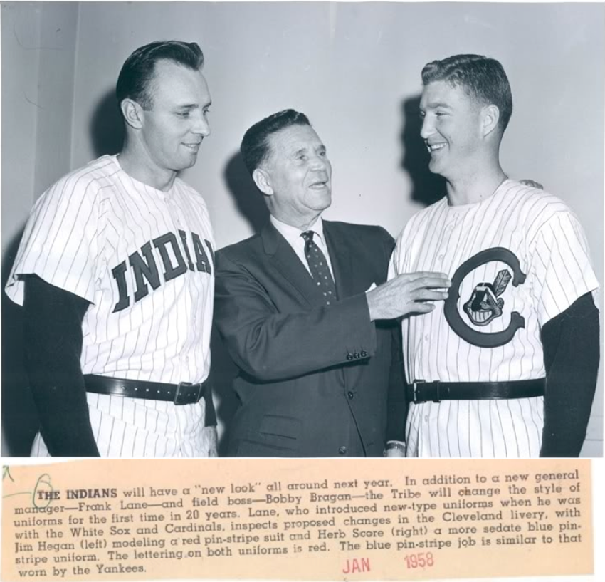
Sometimes a single wire photo deserves an entry of its own. Such is the case with the image shown above, which was submitted by reader Al Bernardo. So much going on in this shot — let’s break it down, one element at a time:
• As you can see from the caption, these were two prototypes that were being considered for the 1958 season. At first glance, it looks like the one on the left is what the chose to wear in ’58. But the caption says that that design had red pinstripes, while the pins the ended up wearing were blue. So maybe they kept the basic design on the left but changed the pinstripe color — or maybe the caption is wrong.
• The prototype on the right never made it onto the field. I’ve never seen it before. Neither had any of my go-to baseball historians (Tom Shieber, Todd Radom, etc.).
• The style of the “C” on the unused proto is vaguely similar to the insignia that the club used in the 1920s. From our contemporary perspective, though, it feels very un-Tribe-like.
• Very odd that both players are wearing their belts over their untucked jerseys. Couldn’t they just have tucked the jerseys in?
• The note in the caption about this being the team’s first uniform change in 20 years is incorrect, since the Indians had made uniform changes — albeit much smaller ones — in 1950 and ’51.
• Interesting that the caption would refer to the blue pinstripe design as being “similar to that worn by the Yankees.” In 1958 there were 15 big league teams other than the Indians. Of those, six wore pinstripes; four of those six had blue pinstripes with simple left-chest logos. The iconic nature of the Yanks’ pins had apparently taken hold already.
• But wait, it gets better: Mako Mameli has come up with this shot. Just like the one at the top of the page, it’s dated January 1958, and it’s captioned as “New Indians uniforms.” No sign of the Chief Wahoo jersey — unless it’s the one with its back facing the camera. But look at the desk in the foreground — three different caps! The one on the left is the one the Indians actually wore in 1958; the one on the right looks like what the team had worn the previous season; and the one in the middle has a notch in the center of the “C,” so I’m assuming it was meant to be worn with the Chief Wahoo proto. Looks like things were still very much in flux with spring training just a month away.
Major thanks to Al and Mako for these fascinating shots.
And while we’re at it, let’s look at another wire photo:
 Click photo for larger version
That one comes our way via Jon Helfenstein. Between the sideways type and the watermark, the caption is a bit tough to read, so here’s a transcript:
ST. LOUIS, OCT 10 [1968] — TRYING IT ON FOR SIZE — St. Louis Cardinals coach Joe Schultz tries on a Seattle Pilots shirt and cap for size prior to final game of the 1968 World Series with the Detroit Tigers at Busch Stadium in St. Louis today. In background is his Cardinals shirt. Announcement will be made at end of World Series of his selection as new manager of the Seattle Pilots.
Man, the World Series was going down to the final game, and Schultz was already playing dress-up for his next gig! Seems like bad form, no? Pretty fascinating.
Interesting that they gave him a road jersey to try on. And as Helfenstein points out, that jersey design isn’t quite the same as the one the Pilots eventually wore the following season. He’s written about that on his wonderful Fleer Sticker Project site.
ESPN reminder: In case you missed it yesterday, my latest ESPN column, about the jersey Bobby Thomson was wearing when he hit the Shot Heard ‘Round the World, is available here.
That thing I won’t shut up about: Even if you haven’t cared about the Permanent Record project, you might be interested in today’s fifth and final segment, because a former MLB player figures prominently in the story. Check it out here.
For those who want more, I talked about Permanent Record for about 15 minutes yesterday on Minnesota Public Radio. You can listen to the segment here.
Oh, and although it has nothing to do with Permanent Record, this seems like a good place to say that there’s new content today at the Butcher’s Case.

Lots of news today regarding Kirsten Hively’s Project Neon enterprise:
• Kirsten and Project Neon were featured yesterday in the New York Times.
• The Project Neon iPhone app, which lets you locate neon signage all over New York City, is now available for free download.
• And the Project Neon show at the City Reliquary in Brooklyn, featuring scores of neon sign photos and some very cool neon tubing, will have its opening reception tonight at 7pm.
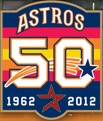
Uni Watch News Ticker: I’m usually in the “less is more” camp. But sometimes more is more, as in the case of the Astros’ new 50th-anniversary logo, shown at right. I like it a lot. Further details on the team’s anniversary program here. … Here are the throwback uniforms that the Saints will be wearing on Sunday. … Marlon Byrd of the Cubs was hit in the face by a pitch in May. When he returned to action on July 2, he was wearing one of those faceguard attachments on his batting helmet, and he’s still wearing it now. So when the season ends, he’ll have been wearing it for nearly three months solid — a record, perhaps? … Howard Berger has done a public service by posting tons of old Hockey News covers. … Valencia doesn’t have a shirt sponsor, so they’ve put their Twitter handle on their jerseys. Wow, a soccer team actually wearing its team name, shocker (from Kenny Loo). … Do high school football players really make their college choices based on uniforms? Here’s an article that explores that question (from Gordie Taylor). … New uniforms for the St. John’s Icecaps (from Stan Capp). … Reprinted from yesterday’s comments: Here’s the Marshall plane crash memorial decal that Virginia Tech will be wearing this weekend. … Hmmm, is this the new Winter Classic logo? Scott Lederer thinks so. … I’ve been saying all along that sports design is being overly infected by comic book imagery, and now it’s official (from Evan Schreiber). … Who’s that in the Little League uniform? None other than Bill Belichick (from Tom Mulgrew). … One of you Cleveland-area readers need to snap this up: a Browns-themed grill! (Awesome find by our own Vince Grzegorek.) … Cross-dressing alert from Nick Houser, who writes: “Ohio State quarterback Braxton Miller was wearing a padded arm sleeve in last week’s game against Miami. It’s the same type of sleeve that members of the Buckeyes’ basketball team wore last season.” ”¦ I didn’t think it was possible for me to find Michele Bachmann attractive. But I was wrong. ”¦ Here’s another story on the 50th anniversary of the Longhorns logo (from Mike McLaughlin).
Looking ahead: I’m about to embark on a fairly busy and complicated weekend (Permanent Record party, Brooklyn Beefsteak, etc.), so Phil’s gonna pinch-hit for me on Monday. See you on Tuesday.
Regarding the Seattle Pilot’s uni: what’s the deal with the hat?
if you followed the link to the fleer page, he has another photo — in the wire service photo, the top of the cap was either partially cut off or the crown is at a bad angle to show the full “S” — but it looked kinda like an upside down “z”, (sorta zig-zagged), rather than the classic “curved” S
Very interesting, thanks!
The line below the S has always interested me, the way it is truncated and sits above the cap/bill joint. I assume it is supposed to represent a gold chord but it always just looked awkward. The scrambled eggs were a great detail though.
link
The gold band below the S is supposed to be based on the band on a real airlines/police officer’s cap.
link
…and you know Joe was thinking…”let’s pound some Budweiser.”
BTW it’s really sexist to view women as just a piece of meat. . .. ;-)[jk-mostly]. If you slap a pair of them big glasses on Michele O’Bachmann, she looks exactly like S Palin. They ARE making them in a lab in Antarctica.
I love that “S” – it’s based on link, in the style of their “Pilots” wordmark.
I’m not usually a huge fan of using only one typeface on all uniforms, but it’s a shame that they didn’t use that on their roads.
Far as I know, that cap was only used for his 1968 post-season tour of Seattle, drumming up support for the upcoming club (hence the champagne goblet).
The Pilots should have kept those uni’s…much better than what they ended up with. Here’s a good pic of Tommy Harper with what is now regarded as the “spring training cap”.
link
Maybe Seattle would still have a team if they went with that uniform.
Oh, the Mariners are still a big league team? My apologies, Great Northwest!
Absolutely love that prototype Pilots wordmark. Nobody else in baseball had anything like it link. It could definitely fly on a uni today.
Still have the Seattle Pilots hat I bought probably in 1983 or so after reading Ball Four. It’s awesome.
I once pitched in an over-35 men’s league for a team called the Mariners and wore the Pilots’ hat in one of my starts as a one-man throwback day.
Regarding the Saints’ throwbacks and some of the comments yesterday:
1. Until yesterday evening I had no idea my wife knows a person who does alterations for the Saints…and who not only had tipped her off about the throwbacks but also explained to her how several players like to have their black sock sleeves sewn into their pants legs, such as is shown in the photo of Jonathon Vilma’s uniform.
2. Yesterday someone [posted this photo of Jim Taylor and Gary Cuozzo of the original Saints’ team:
link
A few things to point out: First, the original Saints’s gold was sort of a copper color, darker than the gold(s) they Saints presently wear.
Secondly, you’ll notice the single white helmet stripe. Many Riddell helmets used to come from the factory with the center stripe painted on. You can tell because the rivet above the nose bumper is not painted, having been attached after the helmet was painted. As I have pointed out before, many of LSU’s gold helmets came with the white center stripe painted on. When teams such as LSU or the Saints used a triple helmet stripe the two additional stripes were often added with a colored vinyl helmet tape that came on a roll, much like elctrical tape. I believe the Saints did the same thing, although by that time strips of peel and stick helmet strips were starting to be used rather than tape on a roll. The only team I can recall that was known to have all three stripes painted on were the (pre-Ravens) Cleveland Browns.
Next, the original fleur de lis on the Saints helmet shown is different from the modern Saints helmet fleur de lis, which is smaller and has a black and gold outline. I wonder of the Saints throwbacks will be authentic and bear the old fleur de lis helmet decal.
BTW, I met Jim Taylor (one of my childhood football idols) at an LSU game last year…and the dude’s still in pretty good shape.
I have reservations trusting an old magazine cover to confirm the copper color of the saints old uniforms. A lot of old photographs had a dramatic warm or cool tint to them, and I think we’re seeing a little of that there. Look how warm the skin tones are as well, or how ‘olive’ the grass looks. Maybe they were a little coppery, but I think they were probably a lot closer to traditional old gold than what we see on the cover there.
Second, yes, the old fleur was black with a single white outline. Obviously they will use the throwback helmet with these uniforms. The new helmet would be the wrong color, and the modern logo would look very out of place. Why would they wear the current helmet with a throwback uniform?
Why would they wear the current helmet with a throwback uniform?
Because a lot of fans wouldn’t notice? Because they’re cheap? Because the current helmet is “close enough”? The gold of the current helmet wouldn’t be any more off than those pants appear to be anyway. I wouldn’t be surprised at all if what they actually do is just strip and replace the decals on their regular helmets rather than having a whole new set of throwback ones. Why break in a second helmet when 99% of the people watching can’t tell the difference anyway?
Andy, just to be clear, I don’t think the original Saints’ gold was as reddish (copper) as depicted in the SI cover. And I, too, distrust any color rendition in photographs or on TV.
But I have seen instances where when you see a color such as gold (either yellow gold or old gold) it sometimes appears different in person.
For example, I mentioned LSU’s gold pants elsewhere (actully in the nineties, not the eighties as I incoorectly said) when LSU switched to shiny spandex. The gold, to my eye had an ugly greenish tint. Some of the players, particularly offensive linemen, still wore the old, duller, mustard gold pants (which werte supposed to be the same color as the new ones) and that really highlighted the greenish tint in the new shiny pants. But you really couldn’t see much of a difference in photographs.
All I am saying is that my recollection of having seen the original Saints’ uniforms in person is that the gold was richer and darker than what is worn today…it wasn’t copper; it was gold. However, as I recall, the gold sometimes had a subtle copperish tint to it…and I suspect that may have had something to do with the lighting.
Another rendition of the original Saints’ gold. Is it accurate? Who knows?
link
Copper color needs to make a permanent comeback ASAP.
Having been schooled once by Ricko on this, I will point out that the “copper” color is only how it appears in this particular photo – the actual color was lighter than it appears.
I do agree that copper would be cool for the Saints though.
If you ever see a Sacramento Mountain Lions (UFL) game on TV, check out the color of their helmets. It’s not quite copper, but not quite yellow gold, either, and it’s very metallic. It’s pretty unique (at least it looks that way on my TV). I think they look really good.
Didn’t we (and by ‘we’ I mean Ricko) determine that the ‘copper’ in that SI cover was’t really copper? That the color printing process distorted the gold? I seem to remember this being a topic of conversation a while back.
I could be wrong. In fact, I am wrong a lot.
Craig D.
No, you’re right. It’s a bad reproduction, but so much better looking that the color they actually wore on the field.
After reading the explanation I admit it’s possible my recollection could be off, too. But I did actually see the originals in person back then and have followed the Saints closely since their inception. What I am absolutely positive of is that the original Saints gold was richer and darker than what they presently use. And often, depending on the lighting (and even the fabric) sometimes these colors subtly take on a different tint. (For example, in the eighties LSU’s gold pants had an ugly greenish tint, to my eye.)
We did.
Not copper.
Just really rich Old Gold.
For some reason the scans of that cover showing up on the Internet are too red (maybe all from the same original bad scan at the SI Vault?), and have created a misconception right up there with the logoless Seahawks helmets.
I’ve scanned my tearsheet of that actual cover from that issue and posted it here. And other color photos from 1967, too.
Old Gold.
Not copper.
Off the top of my head, the only TV era pro football teams that have worn something close to copper were the original Arizona Wranglers (helmets) in the USFL and their descendants, the Arizona Outlaws (pants). Well, and the Arizona Rattlers in Arena ball (helmets and uni trim).
I see Phil dealt with that further down.
Okay, I suppose I should do some work now.
(grumble, grumble)
Ricko, agree 110% that the original gold was a richer and darker old gold, but I still suspect that there was a subtle tint could have been a lighting issue. Regardless, the original Saints’ gold was sharp and I wish the Saints would go back to it.
BTW, there are still some original Saints’ helmets floating around town here in New Orleans but the ones I’ve seen have become muddy-looking with age.
Oops, sorry. UFL’s Sacramento team is close, I think, but I’m old and my eyes may be deceiving me.
Copper, obviously, has a connection to Arizona, so it’s no surprise it has popped up on a couple of teams’ identity sets here.
In reference to your question as to if Marlon Byrd is setting the record for having the face protection attached to his helmet, I believe that Terry Steinbach wore one over multiple seasons.
I’m not able to provide absolute definitive proof of this, but I did find his baseball cards from 1989 (link), 1990 (link) and 1991 (link).
I think that it’s unlikely that Donruss would have used stock photos from the 1988 season (for the 1989 card at least) for three straight years, so I think it’s logical to assume he wore the attachment for multiple seasons.
forgot about steinbach. i was going to say terrance long, i know he wore one for a while with oakland in the early 2000s
Just a guess on the odd-looking belt-over-untucked shirt look, but perhaps there were no uniform pants for the players to try on. Therefore, they simulated the overall look with the untucked shirts rather than having the players tuck the jerseys into their trousers?
Agreed. I think they looked much better done that way, then with their jerseys tucked in to dress slacks.
What a great pic. I would love to get a better look at that hat on Joe’s head. The S appears, for lack of a better term, zig-zagged. Furthemore, the lettering on his jersey slants up from left to right. I recall the lettering was arched in the Pilots’ away unis.
Man, the watermark on those Historic Images pics makes everything look very Tron-like.
Those Saints throwback pants seem to look way too close to Packer/Steeler yellow, not the “old gold” they should be.
We think their current slightly mismatched golds look kinda bad… these are going to look flat out horrible.
I don’t know if these throwbacks are going to look horrible, but the color of the pants is certainly not an authentic representation of what the Saints used to wear. If this throwback is based on the Saints orinial uni (circa 1967) the original gold (as I pointed out above) was, by my recollection of having seen them in person, much darker…even sort of a copper color.
BTW, I also recall that the original Saints’ helmets and pants used to match up pretty closely in color (not like today)…and both had a metallic sheen.
Here’s an example of the Saints’ gold evolving (and not matched), circa early seventies:
link
I would wait until you can see them in person or HD. Those are crappy photos, and I can already tell that the color doesn’t look how they’re actually going to look.
I think in the past week we have learned more about Bill Belichek than we have known about him for his entire career as a coach.
re: original saints helmets and pants…
back when the saints reached the super bowl, i did a column with ricko and timmy b, and ricko provided me with a scan from that sports illustrated issue that gets linked to a lot — only those are the REAL colors, since that’s ricko’s personal copy of SI, not some interwebs scan that’s been circulating
if you’re interested in checking out the saints uni history check it out — quite a few shots not seen anywhere else on the net
Great, Phil…thanks!
However, I still remember the original Saints gold as not only being darker than presently but sometimes it seemed to have a tinge of red in it which made it look sort of copperish.
Let me also point out, too, that lighting sometimes plays a part in how these colors appear. And on TV some colors look much different than they do in person. For example, inside the Dome the differences in the Saints’ golds are not as noticeable as they are in photographs. Green Bay/LSU gold also often looks much different in person than on TV.
Anyway, great history of Saints’ uniforms. Thanks, again.
That 1967 Sports Illustrated issue is easy to locate – there is almost always one available on Ebay. I have purchased 3-4 over the years – I forwarded one to former Saints GM Randy Meuller some years back after meeting him and discussing the qualities of Old Gold vs. the current “Vegas Gold”, which is too light a shade to properly contrast with White jerseys – as the Saints have recently worn often at home.
Why teams wearing Gold would chose “Vegas Gold” over Old Gold is a mystery to me. The Saints could use the contrast with their White jerseys, and it is simply a better looking color. UCF wears their “Vegas Gold” as a “dark” color – with jerseys and numerals on White road jerseys in that shade. It is simply too light to utilize as a “dark” color. Switch to Old Gold – you’ll have a dark enough color and it will look 50x better. Same issue with Georgia Tech. These teams are amongst tghe many, many that would do very well to replace their current shade of Gold with Old Gold.
The 1967 SI Saints cover speaks for itself – that is one boss color for a team to wear ….
God knows I wish the Pittsburgh Penguins would ditch the “Vegas gold” they currently wear for a better shade, especially since those gold panels on the Edge jerseys look dull and flat.
Nick, I agree with your comments. Regardless of the tint of the original Saints’ gold (and my recollection of it looking faintly copperish could possibly be off) the one thing I am absolutely sure of is that the original Saints’ gold was much richer (and darker) than the shade they went to when they revamped their unis in the seventies and what they use today. It’s a shame they don’t that color today.
Back then there was a kid in my neighborhood whse father had some connections with the Saints and he had gotten him a real Saints’ game jersey. Man it was beautiful…heavy Durene. Everything was sewn on…even the sleeve stripes, as I recall. Of course, the Saints would soon switch to rubber numbers and sleeve stripes.
Interesting about the sleeve stripes being sewn on.
How about Purdue. Did they call their old color old gold? I agree that that shade of gold is better. Like Army’s old helmets. For a plain helmet the old Army helmet with black stripe looked good.
And of course, you can view the complete Saints uniform history link as well.
First play in Saints history…
link
More early Saints film….
link
1969…
link
And check out how great those Rams road unis look–perfect!
Pretty interesting PR article today. What’s funny is that Carmen Fanzone is familiar to me because he’s the naming inspiration for a character, Captain Carmine Fanzone, from Transformers Animated (which is set in a futuristic Detroit).
Did you see the little sidebar about his birthday? I still chuckle about that.
Paul, can’t tell you how fascinating I’ve found the Permanent Record project to be. Thanks for sharing.
Thanks, Flip. It’s been an extremely satisfying and utterly exhausting project. Feels good to know that people have enjoyed it.
Echo the sentiment. I had a passing interest just out of curiosity, but reading the Slate pieces got me hooked. Great glimpse into the life of everyday citizens in the 1930s.
What I found amusing were the comments of some folks pontificating that Paul was somehow violating Federal privacy laws by publishing or even researching this find.
Actually, I had some concerns about that myself. So I sought some legal advice before starting the project.
I have read in local columns in New Orleans over the years a number of tidbits about the Saints early uniform choices.
In 1967 until 1974, the team played outdoors at the old Tulane/Sugar Bowl Stadium, and early season games regularly were played in 90-plus degree heat. The team had some type of “scientific study” done that revealed that the players wearing Black dureen jerseys would have body temeratures 7 degrees higher than those wearing White jerseys in the same conditions. That, plus the desire to allow raod teams colors to be featured week-to-week, led to the decision to wear White-at-home for the early years. Eventually, the Saints began wearing Black jerseys at home for late-season colder games, and after some years in the Superdome began Black-at-home ….
A second tidbit was that when the franchise first chose uniforms, the management wanted Old Gold numerals on both White and Black jerseys, but that over the early years, they were having difficulty having consistent numeral fonts and trim when re-ordering jerseys.
For a time, the Saints wore a unique numeral style that featured a very thick trim/contrast color surrounding a very thin Old Gold numeral. This began I believe in 1968, and when they would re-order jerseys the same font would not always arrive. At some point management became disgusted with the ongoing problem and surrendered to a more common, traditional numeral font, and eventually did away with Gold numerals altogether.
RE: Black Saints helmets. In college I did an informal but extensive search of New Orleans’ newspaper archives to see about any reporting on the 1969 Preseason switch to Black helmets, and then abandoning them for the regular season. I found ZERO reporting in the two New Orleans daily newspapers at that time on the subject of how or why they were abandoned, with two small blurbs announcing the switch to Black helmets when originally done.
Over the years, their has been pretty authoritative reporting on how the league had ordered the Saints to return to their Gold helmets for the regular season because the Saints’ ownership had neglected to inform the NFL of their desire to change helmet colors, and that the marketing-intensive NFL rules required a certain notice to the league prior to making such a change. Imaging a nine-year-old having the wrong Saints helmet color on his NFL pillowcases or notebook covers!
To be honest, it turned out for the better. The Saints erstatz Black helmet looks pretty cool on a mantel, but does not look nearly as good on the field. It would look horrible indoors in the Superdome lighting – and likely would have encouraged an earlier wearing of Black (horrible) pants. Let’s leave that style for Southern Miss. or Jackass State Junior College to wear.
I actually saw the Saints play a 1969 exhibition game in Tulane Stadium wearing the black helmets. Although I like them now I didn’t like them then. At the time the classic Green Bay style uniform with matching helmet and pants stripes, and multiple sleeve and socks stripes, were very much in vogue…and the Saints’ gold helmets looked so cool.
I second the thought on those Cleveland belts, probably didn’t have pants to go with them.
On the winter classic logo for Philadelphia, I think it’s kinda bad. At first glance I’m like what is that weird old wood building in the background, then I started putting it together it could be the top of the liberty bell, so I’m like, well where is the liberty bell and finally I found it hidden behind the advertising and text, etc. It’s just a big jumbled mess with no depth.
And for the Cleveland browns helmet grill, I have a Jaguars one, although its not 30 years old. Google “helmet grill” and all kinds of them come up. I must say, it is an awesome conversation piece, I always get compliments at the tailgate.
Hmm, what’s the deal with that Rangers logo in the Citizens Bank Park videoboard? Don’t remember ever seeing that as a throwback logo.
Resounding standing ovation on the “Permanent Record” series. Especially the little Carmen Fanzone anecdote at the end. Job very well done.
Thank you, Mike.
Boise State in Black?
link
Ugh.
I don’t know. I’ve been in the anti-BFBS since Day 1, but that’s a bad-looking helmet. The white version seemed washed out. This would look stunning in a matte royal.
Matte royal would be sweet. Matte black is what everyone & their mother seems to be doing lately. I can’t say I’d mind seeing a few normally black helmeted teams use the matte finish, but blue teams and red teams shouldn’t be freakin wearing them.
That’s just awful. The whites were a sufficient badass look for me. The blue helmets from that series are definitely the best of the three.
Boise is a uniform disaster on everything except the blue and orange colors. I thought they had bottomed out with the all white but the black lowers them even more. Their standard helmet logo is pure garbage and the over sized one sided horse is putrid. The wordmark on the side of the pants, awful. The different sleeve treatments for the combats is plain old dumb. They desperately need a complete makeover, including logo. Just stick with the blue and orange and start over.
BNEa T hsomeon eath someone at the Phillies this morning, and they said that the NHL Winter Classic logo is indee legit. He’re what it will look like on the big board at Citizens Bank Park come Monday (9/26, 1 PM, NHL Network and CSN Philly):
link
What I ment to say was “I checked with someone at the Phillies this morning (9/33), and they said that the NHL Winter Classic logo is indeed legit.”
Typing in tongues?
It’s a jumbled mess, too much of the bell is obscured.
I think you’re the only one who didn’t instantly see the bell.
Not sure if it was posted, but in last week’s title bout Victor Ortiz had the Kansas Jayhawk logo on his trunks.
link
That one 1958 Indians prototype in Mako’s photo shows the Tribe considering using the chain-embroidered numeral font employed by the Phillies from 1950-1969. Philly has always used unique number styles. BTW-Does anyone have pictures of the full set of Phillies numbers from the ’50s? They’re so different they’d be right at home with some of today’s unis.
The Red Wings wore last year (i.e., Rbk vector neck patch) jerseys (with pre-season nameplate font) in game against Flyers last night in London, Ontario.
The Astros did a great job of reflecting three of their looks – but I wonder if they could have worked in the early-90s look and the Colts 45’s as well? You don’t get too many corporate logos with a gun on them anymore.
link
link
The Colts are included. The “50” is in their uni number font.
Oh man, I missed that little beautiful detail! Thanks, Paul!
Very clever – thanks
And the outer border of the patch appears to be metallic gold. There’s your shout-out to the final days of the Astrodome threads, aka the Biggio/Bagwell/Bell Killer Bees look!
Do we have a file for ‘things we just noticed about logos and now they’re obvious’?
The “C” in Colt .45 is smoke coming out of the gun.
Or am I the last person to notice that?
Second to Last.
Props to Paul for ESPN column, Kristen for Project Neon, the Usuals for all that smart Saints stuff, and to the Chrysler Corporation of the late 1950s for providing the “Forward Look” automobile (’58 Plymouth?) that serves as background for that snapshot of Little Billy Belichick (a charmer even at that age).
Are you serious…??? Well, I was one of the last to notice the arrow in the FedEx logo, so I better be careful here!
Did you know the Brewers’ old logo was a ball in a mitt?!
Technically a ball in a glove…
No worries. It was only like two years ago I realized there was a whale tail in the Hartford Whalers’ old logo.
And it was only last year that I learned what the G on the Packers’ helmet stood for. Thanks, Tiki Barber!
The whale tail in the Whalers’ logo would seem to me to be an obvious element… it’s the hidden “H” that usually takes people by surprise!
I like the sleeve stripes on the Saints’ jersey, but the Reebok logo mark looks like crap. It feels like they just had to stuff it in there between the tv numbers and the stripes.
Well, yes, that’s the only place the NFL allows the licensee logo on the jersey.
link > link
Looks like I was slow on the trigger…
Was just gonna post the same thing… I expect the video to get negative/snarky remarks on here but I gotta be honest, I may not like the uni but I really got a kick out of how excited these kids were. Different perspective on things… pretty neat
I hate BFBS, but these kids from Ohio U are really excited to get them. link
completely agree. I think we spend too much time looking in from the outside, but really HOW EXCITED were these guys to get the unis! That alone makes me happy, seeing someone so happy over something as simple as a uniform
Great video! Awful jerseys, though. The ones being wheeled in at 0:26 are a billion times better.
Yeah, I don’t know. Why are they so happy? Is there some context thing I just don’t get, or are they just losing their shit about being XTREME?
Well, they are 3-0 for the first time in I don’t know how long. Big test at Rutgers coming up, though.
“Big test at Rutgers coming up, though.”
~~~
isn’t that kinda like saying there’s a big interplague game between the astros and the twins coming up?
This is a great reminder of just how out of touch this place is sometimes. The kids are going nuts. Let them have some fun!
(Just for the sake of argument, and maybe to get us to ponder who might, or might not, be out of touch with the way the world of college athletics works)…
Right, because only the players and current students matter.
Not long-time fans. Not the school’s alumni.
Not any branding platform the school may claim to have.
Only 19-year-olds wore bore easily.
Playing the game isn’t enough to get your athletes/students pumped up?
Kudos to the Astros on their 50th logo and anniversary plans. And, by the way, thanks again for Lidge, Oswalt and Pence.
ouch…
/smolder/
Regarding the proposed Indians’ uniforms, the one with the blue pinstripes is referred to as similar to the Yankees’ style.
This is because at that time all other teams with pinstripes wore raglan sleeves. The Yankees didn’t then, although they do now, and some other teams no longer do so now, e.g. Phillies, White Sox.
Valencia isn’t the first team to “advertise” its Twitter handle. Andretti Autosport of the IndyCar series has had Mike Conway’s 27 car plastered in theirs for a number of the races.
Who said they were the first team?
Love the Astros’ 50th anniversary logo. Are they going to do anything to memorialize Jim Umbricht, who was a fan favorite before he died the day before the 1964 season opened?
They already retired his number – what else would they need to do?
More to the point, are they going to do something for the retired numbers then?
Like others the past few days I have to say great job on the Permanent Record series. Great history lesson. New report cards have no where near that kind of information on them.
Heck, the report cards I got for grades 6-12 were just printed form-feed sheets with basic info, classes, teachers’ last names, and grades.
Of course, talk of report cards makes me think of link.
And the saints uniforms are exactly why Old Gold is no longer used. The dye process only works well on cotton. I’ve got a 2008 Replica Georgia Tech home jersey that can be anywhere from old gold to diarrhea green, meanwhile the Cotton Old Gold shirts my dad purchased the season before always have the Old Gold look. It never turns yellow in the sun and it doesn’t turn green under the lights. The problem is Cotton is a heavy material which is the opposite of what players want (and we aren’t talking the difference between the Nike Pro Combats from 2009 and the ones the teams are wearing today, we’re talking the difference between uniforms worn in 1970 and that are worn today).
The biggest problem with the saints wearing throwback is the fact that they will be played in a dome, where there is no natural light which will result in something similar to what you saw in the 2008 Chick-Fil-a Peach Bowl between LSU and Georgia Tech.
I love the saints old uniforms and they are perfectly rendered in Madden (I remember putting the saints in them whenever I played them in Madden 2004). I hope they look good this weekend, and they likely will to an extent, though I’m fairly certain any pictures of them will look awful.
It’s no harder to dye a performance fabric old gold than it is to dye it red. Missouri’s had a good mustard gold going for a few years now. Very reminiscent of the Saints’ original color.
Navy blue is the new RoyalCblue.
Interesting article in the ticker (about high school recruits and college uniforms). It still didn’t really tell us anything we didn’t already know.
Thanks for keeping up on though Paul.
I live in Boise. I don’t like Boise State. I’m not especially fond of the Swoosh, and I’m especially not a big fan of Pro Combat (or Amateur Pacifism). I was at a local sporting goods chain and saw these incredibly douchey t-shirts:
link
Awful.
What’s that, the “Don’t touch my man boobs” t-shirt?
My first thought when I saw the main picture on the top of the entry: “is that Jim Thome’s dad?” Never knew how much Thome resembled another former Indians’ great!
Just wondering if Saints/Ain’ts fans will also go the throwback route and use old Delchamps grocery bags as headwear.
Every time I read something about Joe Schultz I can’t help but think about Jim Bouton’s Ball Four and all the Schultz-isms, especially “Let’s go pound some Budweiser!”
Bah humbug, only Schwegmann’s, Canal Villere, or my family’s old local standbys, Lakeview Fine Foods or Meme’s Market.
(Sorry, I had to. I’m a New Orleanian originally.)
I can’t help but think of J.R. Richard with the #50 and the rainbow in the background on the Astros’ 50th Anniversary logo.
My thought exactly!!! This woud be a perfect time to finally retire his number.
Now here is something we haven’t seen before.
To penalize a number of recent incidents of unruly fan behavior, the Turkish Football Federation sentenced Fenerbahce, one of the 3 big teams in Istanbul and defending league champions, to play 2 home matches before empty stands. Authorities then lessened the sanction and agreed to allow only women and children under 12 to attend Tuesday’s match. All tickets for the match were free!
The club was expecting about 10-12 thousand female fans and kids to take advantage of this unique opportunity. Officials were amazed when the queues formed on match day. Over 40 thousand free tickets were distributed, and additional fans were allowed to enter without tickets after the club ran out of ticket stock.
Now that is one aesthetically pleasing crowd. link.
link
link
I didn’t recognize Belichick without his hoodie.
Not uni related but Oklahoma is going with red endzones, white letters outlined in black against Missouri this weekend. OU changes their endzones during conference games to this style but non-conference games are green endzones, red letters outlined in white with red sidelines.
I was wondering what they’d do because they have a non-conference game vs. Ball State next Saturday.
Never knew that.
I’m at the Rays game tonight. Cheryl Tiegs threw out the first pitch for some reason, but wore an untucked Rays jersey, uniform pants, a belt around her waist over the jersey, and Rays stirrups. Quite the sight.
didn’t ricko date her?
Hey, Cheryl Tiegs would be quite the sight even if she wasn’t wearing anything!
er, let me rephrase that…
link
Maybe I missed it. If not here is Ohio U Bobcats reaction to the black unis.
link
I found it very funny to see. like their best Christmas ever.
HOLY SHIT…
I can equate the Ohio Bobcats football team’s reaction to them getting their black uniforms to a gang of Justin Bieber fangirls getting hand-autographed pairs of skinny jeans off of his ass. Scary… it’s
almostlike chum to them.It was pretty funny or strange to see reactions like that.
I like your analogy.
Didn’t Kevin Seitzer wear a face guard on his helmet for a good portion of his career?
Brewers: link
Indians: link
anybody else watching the high school game on ESPN2 between De La Salle and St. Thomas Aquinas? De La Salle Spartans look pretty good. St. Thomas Aquinas has the A’s logo I think or it might be Alabama, and they are called the Raiders. They got the Oregon type of shoulder things on their jerseys.
The ‘A’ at midfield is closer to the A’s insignia than Bama. Also, they do have the Flywire shoulder feathers, but nothing like Oregon’s shoulder wings.
I didn’t notice what you said until I got a better look at the midfield logo. And I meant the Oregon type thing on the shoulder as in the idea. But does anybody think that De La Salle had some pretty great unis?
Oh, Reilly…there’s already a uniform columnist on ESPN.
link
Not that I’d expect Paul to write this instead. If you behave you can pretty much wear whatever you want, in my opinion.
I’m more of a shirsey guy than a jersey guy, but I bet he’s implying me in this column. The only rule I agree with is #2. As a cheapskate, #6 is most detestable to me.
That’s alright, I’m covered under all four jersey waivers. Speaking of those, I never heard of this, covered in Waiver B:
“‘It’s like going to a concert in the T-shirt of the band that’s playing that night,’ says Ari Pillar, 29, who was wearing a simple, cool retro Giants T-shirt Monday night. ‘It’s cooler to wear another band’s T-shirt. But wearing a jersey of somebody you’re watching? That’s way high up the Dork Scale.'”
Well, color me a dork, then.
Although it’s been more than 25 years since I went to a concert and bought a t-shirt…maybe things were different then?
““‘It’s like going to a concert in the T-shirt of the band that’s playing that night,’ says Ari Pillar”
~~~
movi,
i didn’t even click on that article yet…but i did read your comment…
you do know that jeremy piven’s character used almost that exact line in PCU, right?
and you do know that jeremy piven’s character in entourage is named “ari gold”, right?
so…do you think it’s possible that’s a made up quote? perhaps the entire article is tongue-in-cheek, designed to get your hackles in an uproar? you know he was trying to get you, right? don’t let him, jim, don’t let him
don’t be that guy
I knew there was a Jeremy Piven. Didn’t know any of that other stuff about him, though.
Tongue-in-cheek? Gee, and there I was thinking the Rickster was doing some real journalism there…
you know where the state of journalism is…
link
I know some folks who could stand to read this. I have a couple rules myself. I’m not a jersey guy, but if I’m wearing a Reds t-shirt, I make sure not to wear a Reds hat. My wife questioned this one day and I told her it would make me feel like a little kid going trick-or-treating.
oh…and my niece’s husband shows up to every family get together in a Replica Tarheel jersey and replica Tarheel uniform shorts. Hilarious.
So let me get this straight…link is acceptable, but link isn’t?
Meh. I find them equally OK.
Brewers just clinched their NL Central Division Championship (yay!) and their locker room plastic did have Miller Lite logos. Not Budweiser like most of the teams who have clinched something so far have had.
Regarding the Valencia CF bit of news, soccer teams never used to “wear their names”, even before shirt sponsorship, they only had crests on the left breast, if that. See for yourself at the excellent link
Was at the Bruins-Isles game tonight.
Isles have a player wearing “de HAAN” as an NOB. Haven’t seen the deNOB since the days of Greg De Vries in Colorado.