The college football season kicked off last night. A few quick observations from the first set of games:
• Color-matched do-rags can lead to some interesting NOBs.
• The latest ramification of shrinking sleeves: really small TV numbers. That’s U.C. Davis.
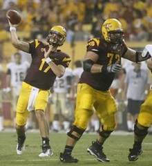
• If you look again at that last photo, you’ll see that the Arizona State player is wearing the swoosh on his hip, instead of on the thigh. We first noted a few schools doing this last year, but it now appears to be catching on with more and more Nike schools. Reader William Hering, who noticed the phenomenon last night, says, “It appears that the logos are just a little offset to the back of the pants, and this allows the camera to pick up on either the team logo [which is usually on the other hip] or the swoosh even if the player is running away from the camera. It creates hundreds of instances in which you will see the Nike logo in a game where you wouldn’t have earlier.” Lovely.
• The ref in the Murray State/Louisville game had an “R” on his jersey. That’s a new one on me.
• Rutgers has apparently changed its shoe color from mostly black to mostly white.
• Memphis has gone completely around the bend.
My thanks to all contributors, including Tim Burke, Terry Duroncelet, Braden Wolf, Jim Vilk,
Cuffery convo: MLB Network broadcasters Bob Costas and Jim Kaat discussed the relative merits of high- and low-cuffery during the bottom of the 8th of last night’s Yanks/Bosox game. Reader Matty Eggen was kind enough to transcribe the dialogue for us, as follows:
Bob Costas: Now, you have been advancing a lot of old-school notions, many of which I agree with or at least respect. This is a fashion one, here we have [David] Robertson, going throwback, as more and more players seem to be doing, with the pants up high just below knee level, like your old teammate the late Bob Allison. Right? The guy at the plate, [Carl] Crawford, [Dustin] Pedroia at second base, pants down at the shoetops… I’m just thinking I like Robertson’s style better.
Jim Kaat: Yeah, It looks like a baseball uniform, not a jogging suit.
Costas: I dont know if you have to have them up that high. Some guys do, split the difference — mid-calf. Working with Mr. Blackwell…
Kaat: [Chuckles.]
Costas: Let’s get back to the issue at hand…
Kaat: Well you mention the late Bob Allison, and the reason he did it, he felt like rolling those pant legs up and…kind of like Robertson does, he got the benefit of the knee-high strike.
Costas: Reasonable, yeah good thought.
Kaat: Yeah, there were years, you see [Curtis] Granderson, he’s got ’em up that way. When Frank Robinson wore the high stirrups, and the league wanted to institute a mandatory “wear your pants a certain way.” It might not be a bad idea. You know, there is nothing wrong with telling your teams, “Hey wear your uniforms consistently the same way.”
Costas: Guys like CC Sabathia”¦
Kaat: Yeah.
Costas: ”¦or Manny [Ramirez], when he was around, never got that memo.
Kaat: Oh, I want to see CC rolling them up around the knees. That’d be a cool look.
Pretty basic stuff. We really need to find a broadcasting team that’s willing to go beyond this elementary level analysis and discuss blousing.
Whaddaya know, there’s a new post over at the Butcher’s Case.
Uni Watch News Ticker: Pretty amusing piece about Mike Pelfrey’s habit of compulsively licking his fingers. Interestingly, it doesn’t mention his (related?) habit of sticking out his tongue. ”¦ Good spot by Kyle Ostendorf, who noticed that Justin Upton’s helmet decal wasn’t flush to the crown of his helmet. ”¦ Yesterday I Ticker-linked to photos of the Blackhawks’ center-ice logo being painted onto the ice; today we have video (from Bob Gassel). ”¦ A reader who prefers to remain anonymous spotted this anti-gang ad on a Boston bus the other day. “It’s a local church coalition’s campaign to stop gang violence,” he says. “They do it each summer when violence tends to rise. The ad features a bunch of team logos which I believe coincide with the gear worn by local gangs. Seems strange, right? An anti-violence message that gives a shout-out to gangs? And the teams can’t be happy about this.” ”¦ The Redskins offensive line all wore headbands in a recent walk-through, as a gesture of solidarity (from Atom Shock). ”¦ Michigan State is adding a Bubba Smith memorial decal, but only for three games, which seems kind of odd (from Eric Greenwald). ”¦ In a development that can only be characterized as a huge, huge surprise, the NFL has announced that all players and sideline personnel will be wearing 9/11 ribbons and pins on Sept. 11, part of a day-long extravaganza that will include on-field logos, synchronized tributes, etc. Fortunately, I’ll be stuck in a car for about seven hours that day. ”¦ What’s about the least likely place you’d expect to see a Lakers throwback jersey? If you said, “In the middle of the Libyan revolution,” come on down (from Pete Beatty). ”¦ The Mets did the Los Mets thing again last night, and Brian Erni noticed an unusual wrinkle: This year and last years, Mets batboys have been wearing uni No. 00, but last night they went BB. ”¦ Here’s a good video clip about the St. John’s football team’s equipment manager (from Quinn Martin). ”¦ Here’s the story on that photo of Pete Rose in a Padres cap, which I showed yesterday: It’s from an SI story in which they took shots of Rose in a variety of different caps (big thanks to Robert Walker). ”¦ The Brewers will wear lager-colored jerseys on Sept. 10. ”¦ The WinniJets will finally unveil their uniforms next Tuesday, at which point the counterfeiters will finally know which design to start reproducing. ”¦ Here’s something I hadn’t noticed during the NFL preseason: The Pats’ MHK memorial patch for Bob Kraft’s wife is also being worn by the coaching staff (good spot by Eric Stangel). ”¦ Kyle Allebach put together a nice little riff on NFL uni numbers. ”¦ Latest trend in lacrosse: chrome gear (from Jeff Brunelle).
Pete Rose co-ordinated his caps based on whichever team he placed his bets on for that day.
If he ever gets into the HOF (hopefully never) he will wear a NYC OTB visor
While it would be nice to have a deeper discussion of the hosiery by Mr. Costas and Kaat, it is nice that they did, at minimum, bring it up.
The stirrup will rise again, in due time. In due time.
Dirk Hayhurt’s “Bullpen Gospels” touches on this topic when he arrived in San Antonio in 2007 to find out that all players were required to show sock/ stirrup:
“There was an organizational rule forbidding pant legs the right to extend to the shoe or cover it, anyway – a rule that has irritated the hell out of players since its creation.” He went on to say players looked like clowns and Little League players: “I felt like Huckleberry Finn in a pair of high-water overalls.”
Well at least he’s literate.
But the clown look is the St. Louis Cards in red socks and shoes.
Sorry for the non uni related comment.
The word I’m hearing (call it a rumour) – but I live in the Toronto area
Wade Belak is not a suicide, although he was found hanged. However it was a case of Erotic asphyxiation. Based on all the characterizations of Belak as a happy go lucky guy, this explanation unfortunately appears to make more sense.
By the way – in terms of unique colours – does any other team wear the shade of very dark red, as Arizona St.
ASU’s color is maroon. USC’s “Cardinal” is kind of similar, but not so dark.
Without any substantiation, it’s not only off-topic but irresponsible. And you probably won’t be able to substantiate it because, for better or worse, the medical examiner’s report will not be a matter of public record.
Fair comment,
But at the same time, if there’s deep inter-reflection why there enforcers are killing themselves, and in Belak’s case, have left people absolutely stunned, as it appears so out of character,there’s a chance there’s a more unfortunate explanation. Which means the reality is one player deliberately took his life, a player that’s been fighting mental illness for a long time
I think if I’m right it will come out. Whether directly or indirectly, the tone of comments will reflect he did not deliberately take his life.
In addition, am I any less responsible than all the press that have said it’s a suicide, when in fact nothing official has come out? Accord kinky sex, tends to be a more taboo subject than deliberately ending your life, which I tend to question.
Oh well – I prefer talking about Arizona State’s maroon – so I hear you.
I don’t see the comment as irresponsible, unless you are a journalist and are disseminating this information in a “journalistic” manner. Otherwise, you’re just a guy posting on a message board (which is the virtual equivalent of the water-cooler conversations).
His mother has told the Canadian Broadcasting Corp. that Belak was suffering from depression. Dave Feschuk in the Toronto Star had previously cited two anonymous sources as saying the same thing, but I think when the source is named and close to the subject, it carries the weight of being irrefutable.
Now, under ordinary circumstances, would it be unusual for information to be divulged as an alibi, to mitigate the damage to the subject’s reputation. Sure. How about something like, “Bobby might have been driving drunk, but he was only behind the wheel because Jimmy was even worse off.” Or even better, “Harold went to jail for income-tax evasion, but he gave generously to the Easter Seals and the Children’s Hospital.”
But for a mother to confirm her son was suffering from a mental illness? That’s some heavy shit, and you don’t drop that on the press to divert attention from something sordid.
So, I’m inclined to put a lot of stock in the proposition that Belak suffered from depression, which he masked very effectively in public with a self-effacing, happy-go-lucky persona, never giving anyone a glimpse of the underlying pain. Been there, experienced that — being assured by someone that the treatment is working, everything’s looking up, only to have that person lose the war, and be left to wonder about the battles they must have been fighting — and succumbed to — in secret.
A story by Jeff Klein appared in the New York Times a couple of weeks ago, about the differences in policy between Canada and the U.S. Derek Boogaard’s death was quickly confirmed by the M.E. in Minnesota as a suicide. Rick Rypien’s cause of death would never be published, unless the next of kin so decide, because it happened in Alberta. My view is that, while the intent of Canadian law is to protect the deceased and their family, there is a case to be made that, as is evidenced here, the policy, by encouraging speculation, may cause more harm than good.
Whatever the reason, I can say with certainty that Belak’s death will leave a void in the lives of his family and friends, and for that my heart goes out to them.
Anyway, yeah, that’s taken me a long way off the trail, so I’ll just close by saying that, whenever Belak played wing for the Maple Leafs, it was neat to see an NHL forward with a single-digit number on his sweater, especially one as low as 3.
After Rypien, Boogaard and before that, Probert, Kordic, hockey writers who have inches to fill need to ASSUME it was suicide so that they can write a handwringing column about tough guys and the mental toll and push their own agenda before anything was know.
Case in point – Simmons in the Sun a couple of days ago.
Yep, had similar thoughts (sorry again more non-uni related jibber)
All the police source said was he was found hanging. If you believe the source, which the press has, there are atleast three possibilities:
a) Murder – but this is ruled out – as police has said the death is non suspicious
b) Suicide
c) Accident of autoerotic asphyxiation – unlikely – but it is the way David Carradine is believed to have passed
There’s a huge difference in the mental state of the human involved between “b” and “c”
The position on the front pocket of the official’s shirts is new to college football this year. The NFL used to have them:
link
Another official related thing I noticed last night. In the Wisconsin/UNLV game their hats had a white strip on the front of the bill (kind of seen here: link). However, that was the only game I noticed it in. It’s not seen here: link
So *all* the officials have their positions designated on their pockets — not just the refs?
Sure looks like it. I noticed it last night in the Wisc-UNLV game as well.
BTW, I think the new NCAA ref outfits, especially the long pants, look like absolute crap. Officials should look like they belong on the field, not like some mall-walker or recreational jogger who got lost on his way through the park.
I know I’ll get used to it (just like I got used to the NFL refs long pants), but that doesn’t mean I have to like it in the meantime.
from an aspiring college official (currently doing High School and JuCo ball). The NCAA officials went to 2″ stripes this year (like the old NFL officials jerseys) and yes all officials across the nation should look pretty much the same: Position placard on back as usual with additional position designation on the front pocket. CFA patch on the left sleeve, American Flag above chest pocket. Black pants with white stripe.
As for the hat with the subtle white stripe on the brim,(link) that HAS to be a manufacturer’s addition. I have NEVER seen that before. There is a little circle near the back of that officials hat that I don’t recognize either. Any other officials on here that recognize that hat?
I can’t find anything to back it up, but I think the circle is a memorial patch for David Perry (National Coordinator of Officials who died this year).
Yea the uniforms are designed to concistant through out CFOA. The shirts use the older NFL striping and the logos are sublimated (stripes and logos, including the plackets all infused directly on the shirt.) Several HS associations are adopting similar uniforms (Including the Arizona Interschoolastic Assn or AIA) with the NFHS striping (old NCAA) and Black pants with a 1 1/2 inch stripe).
A better look at one of the manufactures of the new shirts is at link look in the “Football” section. I do believe some of the conferences are using sewn patches and Plackets as well.
“Pretty amusing piece about Mike Pelfrey’s habit of compulsively licking his fingers.”
~~~
cue al dukes…
Love that “lager” hued Brewers alt. (Though pairing it with a yellow “Ahhhh, Gotta Go” shirt undermines the claim as to which yellow, beer-related liquid it resembles.) I’m not in favor of softball shirts generally, but if the Brewers are going to have a softball top, the gold works so much better for them than the navy.
Absolutely.
Gold pants would really make it great.
Didn’t the Padres just ditch that look this season by going back to traditional gray uniforms on the road?
They did, unfortunately. The Brewers definitely should bring back that look.
“Though pairing it with a yellow “Ahhhh, Gotta Go” shirt undermines the claim as to which yellow, beer-related liquid it resembles.”
Does one actually buy an “Ahhhh, Gotta Go” shirt…or does one just rent it?
I’m a Milwaukeean and I HATE that jersey! They wore them for Cerveceros Day and they’re urine colored. They’re gross. The PR line that “since fans and players love them” seems created to me – no one I know liked those things.
Agreed. I thought they looked like piss back in July and I still think they look bad. The t-shirt they showed on the game last night wasn’t bad, but only if you pair it with jeans or something. As a jersey over white pants? Disgusting.
Question to DIYers, or anyone who knows their way around fabric. I’ve got a little rip in a ballcap. Is there anything I could iron on to the inside of the cap to make the rip stay closed? It’s not frayed yet, so it would be invisible if it could be sealed somehow from behind.
The Brewers gold jersey is great (though I wonder if they were planning it before I concepted them in a gold uni back in April)… but the Gotta Go t-shirts are stupid as hell.
Agreed. I think it’s a nice shade of gold.
I’m curious about Pelfrey myself, but I’m more interested in knowing why R.A. Dickey looks like he’s screaming when he’s photographed throwing.
Yeah, he always looks like he’s in mid-shriek:
link
By the way — in terms of unique colours — does any other team wear the shade of very dark red, as Arizona St.
Maroon? Several schools have maroon as one of their colors (Texas A&M, Virginia Tech, Boston College, for example). I think Tech goes with a darker shade similar to Arizona State’s.
ASU’s combo from last night was not too bad, actually (I thought the shoulder fork tangs were stupid). I dread their next home game, when they will wear all black.
With the possible exception of Virginia Tech, I see the shade that Arizona uses is a whole lot darker than say Boston College, and Texas A&M, could be wrong, but that’s my impression.
Just to add one other perception, when I look at Arizona St, it is such a shade, I almost see “Brown”, none of the other teams you mention in my opinion give me that impression. It might come across as splitting hairs, but there has been a discussion in the past, how teams (admittedly the NFL), basically all use the same shade of colours (they’re allowed one unique colour)
Night game lighting alone can change the way colors look.
Add perspiration-soaked jerseys and they’ll change even more.
I see a brown hue too…I think it has to do with the yellow tricking our brains.
According to the respective university style guides, both ASU and Texas A&M use “maroon”, albeit different shades:
link
link
Minnesota, when they wear the color that actually is their color. Past football teams (and certainly the baseball team) have wandered well toward burgundy in the past.
Mississippi State, too.
Fair enough, and according to Wikipedia (always reliable) – all the university mentioned are just maroon…
But…
Keeping with the notion
maroon has a litle more brown burgundy is more purple
Have you ever seen BC, Mississippi St or Texas A&M, looking this brown, whether it’s sweat, rain (don’t think so) or it’s a night game – the hues appear more geared towards supporting the above notion, in fact it’s not a little brown, it’s a lot brown. Saying that I recognize what you say is correct.
link
Those two schools don’t wear the same color.
Boston College wears burgundy.
Texas A&M wears maroon.
link
According to this Boston College is maroon. Saying that – I think there is huge difference between BC and Arizona St.
Like the Gophers have done, BC tends to wear a color closer to burgundy and still call it maroon.
Certainly did during the Flutie years, I know.
I realize I sometimes lump colors together, which might seem wrong in an era of specific, computer-generated dyes.
But what I kinda do is see it as, “If I wanted my kid’s pee wee football team’s jerseys to look like _________, what sporting goods catalog generic color would be the closest?”
Seems to be the simplest because, as we know, there are varying shades of just about every color these days. So, yeah, I “round off” because otherwise these discussions would even more nit-picky than they already are.
Not saying you’re nit-picking, Oak, not at all. Just trying to find some kind of workable benchmark…even it it’s just a “catalog shorthand.”
And, yeah, Nike may have darkened the Sun Devils a bit. That is entirely possible. Almost likely. For one thing, it means people have to buy licensed products to get the precise color. Can’t be buying a maroon tee at Wal-Mart and wear it for the “maroon out”. Won’t be the right color.
Ricko, I really enjoy what you bring to this site, so don’t take this the wrong way, but calling me knit-picking , is the pot calling the kettle black. I admittedly jumped at the opportunity to prove you were technically wrong (take it as a complement) and I also admit – especially in the Doug Flutie days, BC was barely darker than scarlet, but sometimes you remind me of an old Happy Days episode, where the Fonz has to admit he’s wrong, and can’t.
I made a point of saying I WASN’T saying you were nit-picking. Then said your point was valid, that maybe ASU’s maroon was even darker than typical.
You asked who wore that color, which is closest to maroon (not necessarily what the school’s colors were), and I mentioned a couple.
Wasn’t meaning to be contentious.
Sorry if it came off that way.
And I was thinking the new BC “stained glass” set was lighter than Minnesota, ASU, A&M or Mississippi State, but I didn’t go back to find it to be certain.
So I may have booted that one, yes.
Could be the lighting, but certainly looks lighter than the teams I mentioned…
link
Shit my applogies, misread the knit picking comment – I wasn’t offended by it as is, it wasn’t that type of discussion.
My interest is on unique colours. I’m intrigued by the paradox of this hugely profitable merchandise business, has some loose chains put on them, because of the mass merchandising realities, so I’m intrigued by teams that have unique colours. One being Texas Longhorns – burnt orange, which always seems to me increadibly appropriate. (although someone will probably point out its not that unique). I was wondering if Arizona State – is going that path of truely unique hue, albeit , fully realizing lighting , sweat etc.
See your point.
The unique colors kinda bug me, though. Not because they’re not interesting but because they can take something away, too, I think.
In this sense: A Little League/softball team, for example, can’t decide they want to wear Astros colors without having to special order the precise color brick jerseys and/or hats. By comparison, if you love the Red Wings and want to call your softball team the “Red Dingers” and have them wear the NHL team’s colors, it doesn’t take much to get your gang decked out in red and white.
Granted, that may be the all-time minor point of minor points, but it does seem that, while special colors may lead to oodles of merchandise sales, don’t they in some sense also retard your team’s becoming really, truly ingrained in your community’s consciousness?
I dunno. Just thinking out loud.
lol.
Was just imagining the Astros in the W-S (okay, that’s absurd enough at the moment) and trying to institute a “Wear Brick to Work Day” to support them.
“‘Brick?’ I got nuthin’ ‘brick’. Where do I get something ‘brick’? What color exactly IS ‘brick’?”
A&M is contrasted against white, while ASU is contrasted against a dark shade of yellow. That might alter relative perception of the colors. I’d like to see them overlaid across each other to see for sure.
I was at the ASU game last night and the maroon jersey is much darker than in previous seasons. The pants seem to have vents running along the lateral side of the leg from hip to almost the knee as a cooling system.
More flair than a TGIF convention, but none of it shows up from 30 yards away except on TV. the pitchfork on the helmet is basically invisible.
“The pants seem to have vents running along the lateral side of the leg from hip to almost the knee as a cooling system.”
That is correct. The Nike Pro Combat pant has a link on the side of the pants which wraps around the back of the knees, making the pant lighter, more flexible, and more breathable.
When stripes aren’t utilized (like ASU last night), it’s actually a pretty sweet pant. Some pant stripeless teams (like Penn State and Texas) are already using this pant. Adidas and Under Armour caught wind of things and decided to make their own versions of the pant.
Boston College wears cardinal/crimson, not maroon.
“on Sept. 11… I’ll be stuck in a car for about seven hours that day.”
I kinda envy you. Looking for my own escape from the city for the day, myself.
Unplug the radios and TVs now…
Color me shocked; a 9/11 ribbon. What a creative gesture! I’ve never seen that before in professional sports!
[/sarcasm]
It’s worse than that. Not just a 9/11 ribbon, but a ribbon with writing on it. The whole point of a ribbon is to serve as a symbol. If you have to put writing on it to make people understand what it means, then the ribbon itself serves no purpose. It is, therefore, bad design.
I think it’s just bad taste. To me, the ribbons have been used so much they hold no meaning anymore.
I was gonna say “why couldn’t they design a logo” but then I realized we would be marketing a national tragedy even more than we already are. Ugh.
Hey Paul, when I run my mouse over this text “…which seems kind of odd (from Eric Greenwald). … In a development that can only be characterized as a huge, huge surprise, the NFL has announced that all players and sideline personnel…” it turns itself green and underlines itself, but it isn’t a link. I think this has happened before.
Happens to me, too. I’m using Chrome, if that is relevant.
Yeah, I am too. Maybe it’s a Chrome thing?
no…just a missing *forward slash* in the coding — should be fixed now
Yup. Thank’s Phil.
Always nice to see a small mention of my Alma Mater, Murray State.
To all of Uni Watch, I was wanting to know the opinion of being a sports fan and funerals. My grandmother was buried in University of Kentucky garb (being a massive fan since the Rupp days). What is the etiquette of showing your fan “pride” and funerals?
She can demonstrate her Wildcat pride.
You demonstrate your respect to her, to others, and to the occasion.
Wear black.
There is, quite literally, no situation where it’s wrong to have a little class.
It was tasteful and not over the top in my opinion. I only had a grey suit though.
It just got me thinking about those “novelty” coffins and the like. To each their own though.
How cruel would it be to have logo creep for eternity?
Yeah, that would be great. Wear something reserved, and maybe a blue and white ribbon on your lapel.
Give an understated “Smile” for her sense of humor and her devotion, but don’t dress like you’ll be sitting courtside.
I think you can do pretty much whatever you want at your funeral. I want my funeral to be a party ,and if there were any way possible, I would have the Oklahoma marching band there playing Boomer Sooner.
I say “hooray” for your grandmother. Sounds like she was a big fan, and if that’s how she wanted to go out, then good for her (and you, as family).
I guess I misunderstood. I thought he was talking about what to wear to a funeral. That wasn’t your own, that is.
Respect her wishes. A relative of my wife requested everyone attending wear Scarlet and Grey for Ohio State. They did, in the absence of any specific requests just go with something classy and respectful.
When my Grandfather (on my Dad’s side) died on February 12th of this year, he was wearing a simple black suit with a white dress shirt and a New Orleans Saints tie at the funeral. I thought it was a nice gesture that wasn’t over the top. Everyone else had standard formal attire on that day.
re Lakers throwback in Libya – I get a kick out of the sheer number of soccer unis worn by the rebels. My unscientific analysis has noticed more Argentina national jerseys than anything else (or maybe that’s because they tend to stand out. A lot of Real and Barca jerseys spotted as well.
On another note, props to that guy for being a modern day Hemingway.
Barca and Real shirts are everywhere and shows you exactly how massivly global they and soccer/football is.
A “modern-day Hemingway”? That kid reminds me more of Goldie Hawn in the first reel of “Private Benjamin”.
Okay, beer geek rant coming…
Now that you’ve been duly warned, THERE IS NO SUCH THING AS LAGER COLOR! Lagers are made from the same malts as ales, and as such can run the gamut in colors from pale straw to pitch black. Yes, in England “lager” has become the term for European light lagers, and in the U.S. lager is most associated with the likes of Budweiser, Coors and the namesake of the Brewers’ ballpark. But that jersey sure isn’t the color of an Oktoberfest Märzen, of a Bavarian Dunkel, or of a Schwarzbier. It’s time to reclaim the lager, people! Especially in Wisconsin, where you can find excellent lagers of all colors being brewed by the likes of Capital, New Glarus and Sprecher (just to name a few). This aggression will not stand, man!
Okay, end rant.
I used the term yesterday with the usage of England in mind, as opposed to the general catch-all term “beer”. Yes, I understand there are many types – Sam Adams Black Lager is currently my beer of choice – but when you ask someone what color is lager, 9/10 times you’re going to hear
yellow“golden.”not the beer THE drinks
that’s yellow, gaddamit
Phil I hate to break this to you, but the yellow liquid you’ve been drinking is not beer.
And a pale, pale yellow at that.
And in too many quarters, it ain’t beer if you can’t see through it.
No worries; I didn’t mean to knock anybody (except Bud, Miller and Coors, I suppose). I just figured it was a good opportunity to spread the gospel of quality lagers. :-)
Pontificate unceasingly, my friend! I proudly carry my AHA membership card (autographed by ALrry Bell, no less)as “proof” of my beer nerd/geek-iness and preach the Gospel of Good Beer at every opportunity. To make it uni-related, my brewing buddy and I have Brewers jerseys with NOB of “BREWER #” and then number “1” (for me, of course) and number “2” for him.
On the other hand, the local NBA team might consider a reddish-amber uni with “BOCKS” across the front.
link
Apparently, the ‘McCourt fiasco’ is affecting the availability of link at the ballpark.
I think that the checkerboard pattern on the Kentucky sleeves is fitting given its use on horse racing silks. If any school was going to use it, Kentucky seems to be the best choice.
the sparky sticker on the back of the ASU helmets is considerably smaller than the one they had on the back when the school first introduced the new unis. I don’t have the time to find the link to the old photo, but I most recently saw it in Paul’s College Football article on ESPN
Noticed that myself. Here is the prototype – link
Pelfrey licks his fingers nearly as much as Phil Simms used to.
link NOBs used unusually small lettering.
Love those tiny NOBs! (Given that they’re going to put them on, that is. NNOB is better.)
We’re in an age of HDTV and can see small lettering from home, whereas regular-sized names aren’t readable from the cheap seats at any size; no reason to have big clunky letters on everybody’s back.
Did anyone notice in the Blackhawks video that it appears they are painting the “New” United Airlines logo (Continental Airlines) on the ice, however, there is a piece of paper which outlines what it should look like using the old United Airlines logo.
I’m not seeing the Nike logo on the hip of the ASU player in the picture Paul posted. That’s the pitchfork logo. Maybe I’m missing something…. (?)
Look again:
link
That’s a swoosh, not a ’fork.
Oh, I see, I didn’t look at the linked picture, only the one on the front page. But the picture on the front page is a pitchfork logo on their right hip. Looks like they have a pitchfork on the right hip, and a swoosh on their left hip.
link
I think I need some link help: In my link above, go to picture 3 of 41… that’s what I was trying to link to.
oh dude, I just noticed from the pic in the link that ASU’s yellow shoulder stripes form a nike swoosh. or i might just be making another bronco-esque conspiracy
Those U.C. Davis numbers are small – they’re about the same size as tribute numbers on baseball jerseys, in this case (#18) the New Yorks Yankees paying homage to Johnny Damon.
link
Nice shoes for Devin Hester.
Well, he won’t get them on the wrong feet, anyway.
There’s no guarantee, from everything I’ve ever heard, Mr. Hester is a sweet sweet man but about as bright as a 4 watt bulb…
In the Pete Rose SI spread: great photo of him in the Padres hat, miming taking a bite out of a hamburger. No doubt a nod to then-Padres owner Ray Kroc. Surprisingly clever if he came up with that pose on his own.
RE: Chrome in lacrosse
Am I dreaming? Didn’t Oregon initially introduce a chrome helmet when they first showed the crazy uniform change? Seems like it wasn’t as chrome-ish as the ones shown in today’s ticker though.
Nonetheless, would it surprise anyone to see that kind of chrome helmet show up in Eugene?
Wasn’t that an April Fool’s joke?
Honestly, I’m asking. I seem to remember something like that.
(Calling Mr. Hemogoblin…)
I’m a long-time reader; second-time poster. In today’s post you said “Fortunately, I’ll be stuck in a car for about seven hours that day.” when referring to the upcoming NFL 9-11 tributes. This was either scarcasm and you’d really like to see the tributes or it was sincere and you’ll be happy to miss them. I’ve read your opinions on the military-themed jerseys, patches, etc worn on the field and I believe that the line quoted was sincere, not scarcasm. I thoroughly enjoy your column (and have even sent in a uni-tweak), but it’s comments like that which keep me from becoming a card-carrying “official uni-watcher”. Any tribute, from a pin to the Padres full uniform, that draws positive attention to the armed forces and gives someone a reason to think about them can only be considered a good thing. Even if the tribute is corporate sponsored by the “swoosh guys”; the “3-stripe guys”; or even if it’s considered to be poorly done should ONLY be complemented and respected if it points attention towards our services or the causes they defend.
Keep up the otherwise great work on this site and please know that I do agree with most of your other opinions (logo creep, high cuffs, anti-BFBS, etc). On this topic, however, I believe you are wrong. And that, sir, is what the guys who are being honored defend every day: our ability to disagree about uniforms.
Have a nice long weekend everybody!
Eli (USN:8 yrs; USNR: 4yrs)
Some of us — esp. those of us here in New York — are all 9/11’d out.
In any case, it’s interesting that you think “the guys who are being honored” on 9/11 are the military. You’re certainly entitled to your own interpretation of 9/11, but I believe you are mistaken.
Exactly. Just like us in New Orleans are all Katrina’ed out. I’ll have the TV off- for sure- the week of August 29, 2015.
paul beat me to it, but i agree with him 100%
a wiser man than i said to me in an e-mail:
thanks for your service to the USA eli, and it is greatly appreciated…but 9/11 is NOT, repeat NOT, about the military
First of all, my comment was only in part about the specific 9-11 tributes post, and was mainly directed at your opinion of the military tributes as a whole. “Any tribute, from a pin to the Padres full uniform, that draws positive attention to the armed forces and gives someone a reason to think about them can only be considered a good thing.” (Next time read the full comment and try not to take it out of context, will ya?)
Second of all, you guys say that the “10th anniversary should be about remembering the innocents who died, and the first responders, both those who died and those who survived.” and yet you don’t want to see too many tributes for those people you refer to?? What better way to rememeber them than to wear a special patch or paint something extra on the field?
Finally, the phrase “9/11′d out” makes me want to throw up and will cause me to never again visit your site. We all lost friends, family, and fellow humans (though I’m starting to wonder if you guys actually fall into that last category) that day. Do me a favor guys, go tell those families that you’re “9/11′d out” and that you don’t want to see too many tributes to them on uniforms or fields of play. Just make sure that you post it on YouTube when you do, because I’d sure like to see their reactions.
Dallas Stars color man Razor Reaugh is soliciting rebranding ideas
link
link
Jets center ice logo. Should have painted the whole design and not worry too much about the barber shop pole graphics… can use a thinner line as they do for NBA courts.
I LOVE how Memphis has gone back to a darker grey color scheme.
The pants kind of piss me off though. “Memphis” script on the pants leg is kind of tacky. What is so bad about traditional 3 stripes?
On a uni designed by Nike?
Or Under Armor, for that matter?
Surely you jest.
Did anyone notice in the Blackhawks video that it appears they are painting the “New” United Airlines logo (Continental Airlines) on the ice, however, there is a piece of paper which outlines what it should look like using the old United Airlines logo.
It’s the United Center and all the naming rights deals go back to the original contract unless otherwise negotiated.
link
I’m sure since they paint the ice new every year, neither the UC nor Blackhawks mind throwing down the new logo, even if it is a rotting piece or rancid festering shit compaired to the old “flying U” – link .
I would doubt (read: sincerely hope) that the marquee or the roof – link – change anytime soon. Not at the UC’s cost, at least.
Here’s hoping to keeping that logo/typeface alive.
*”rotting piece OF rancid festering shit”
My bad…
The Brewers will wear lager-colored jerseys on Sept. 10.
link
Looks vaguely familiar?
link
Not vaguely. Man, I wish the Nats had gone with that shape of N for their new “Nationals” script. Such a better match with the curly W, as a letterform.
I don’t know if it was already mentioned in the comments, but in the new trailer for NBA 2K12 they show a quick glimpse of the new Dallas Mavericks alternate. It’s really the Diddy-designed green alternate that became royal blue and is now becoming navy.
link
The time it shows up is 1:24
link
at 1:33 the Knicks still wear black.
Ricko, you got any eligibility left?
link
And look, he’s a straight-on kicker!
link
That’s rad. Simple as that.
This strikes me as kind of a big f’n deal in the world of branding in North American pro sports–the Detroit Red Wings sullying the iconic winged wheel with a VERY tight, it seems, partnership with Amway:
link
And here’s a more in-depth takedown of the deal than I could ever hope to present myself:
link
After reading Paul’s college football preview, I noticed Bowling Green now has brown facemasks link
Seems like a first to me, any other teams (college or pro) ever have brown facemasks?
Note that the orange jersey guy has the full MAC logo patch on his jersey, while the white jersey guy (and his teammates) have the NCAA conference pennant patch with the MAC wordmark. Weird o_O
And Wyoming has had a brown facemask for a while now — even with their new link.
link?
Hated it.
I don’t know whether to love it or not be a fan of it (although I can’t hate it). I’m leaning more towards the former.
If you’re going to wear black & blue, that’s the shade of blue to use.
(link)
Jimmy Tressel is being honored by the NFL with a ‘gameday consultant’ position on the Colts.
I’m surprised he isn’t in Philly…
Oops. I broke the link; here it is link
AND THEN Ohio State memorializes him. WTF.
link
Brendan Ryan, who in past times hazs worn some very nice stirrups regularly for the cardinals and has more recently gone high-cuffed on a regular basis with the Mariners has gone pajama-clad since June 25.
link
June 25: link
July 31: link
He’s occasionally gone long-john with the Cardinals as well.