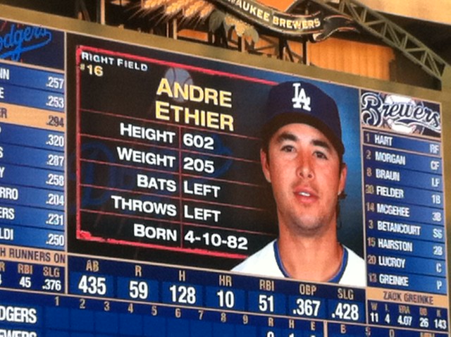
Andre Ethier is big. How big? Six hundred and two big, that’s how big. Geoff Poole snapped that shot at last night’s Dodgers/Brewers game in Milwaukee, where they’ve apparently come up with a new unit of measurement. (The ballgame excursion was Geoff’s bachelor party, incidentally. Now that’s devotion: The guy’s probably eating a hot dog and drinking a beer while getting a lap dance in the upper deck, and he still manages to send me a photo. You can all learn from this, people.)
And hey, speaking of Milwaukee, my friend Liz was there yesterday and she reports that there is now Ping-Pong in the Milwaukee airport (!), which just makes me like my favorite city even more than I already did.
New ESPN column today. It has nothing to do with the Confederate flag, which I know will be a huge disappointment, but I think you’ll enjoy it anyway — look here.
Moooo! The next Brooklyn Beefsteak will be taking place on Sept. 25. Two seatings — 1pm and 5pm. And look, there’s Terence Kearns buying his tickets now!
Just in time for back to school, there’s a new post over on the Permanent Record blog. If you or your family come from Michigan, I’d appreciate it if you could check this one out (and even if you don’t hail from the Wolverine State, I think you’ll find this one interesting). Thanks.
Uni Watch News Ticker: Most football teams have their QBs wear red “no contact” jerseys in practice. If red is already a team color, then the QB jersey is often yellow. But Wisconsin uses green (from the Rev. Nørb). ”¦ Remember Todd Hewitt, the Rams equipment manager who was sacked after decades on the job? Ken Clampett reports that Todd has now hooked on as the equipment manager at Cal. ”¦ Tris Wykes has written a very entertaining piece about his days as a Tampa Bay Bucs equipment assistant back in the early ’90s. ”¦ Here’s a decent piece on the evolution of NBA logos. Check out the first one shown for the Hornets — Matt Mallonee says he doesn’t remember that one, and frankly neither do I. ”¦ Silly me. All this time I’ve been railing about corporate douchebaggery and it turns out it’s actually been personal douchebaggery all along. See how simple it is once someone explains it to you? Just the same, though, I’m calling it Mile High (new logo courtesy of Ryan Hess). ”¦ Maybe this was already covered while I was on blogcation, but just in case: The 2011 Manchester City jersey design is based on sound waves created by the team’s anthem (from Daniel Caceres). ”¦ Lots of inspirational messages on Pitt helmets, plus they appear to be another team that’s using green QB practice jerseys (as noted by Daniel Weimann). ”¦ New football uniforms for Stephen F. Austin (from Chris Mycoskie). ”¦ No photo, but Tyler Kepner says Justin Upton has a bat knob decal “with his signature superimposed over the #10.” David Sulecki of Pro Helmet Decals, who makes most of the bat knob stickers, says he didn’t make this one, so Upton must have his own supplier. Sulecki says he’s dabbled with a few personalized designs for specific players, like these for David Wright, but none have been used. ”¦ I’m briefly quoted in this article about CFL merchandising. ”¦ Is this yet another new ASU helmet design? (As spotted by Mark Surra.) ”¦ Brian Ray found the Oklahoma State style guide. Interestingly, every single icon and wordmark has either a circle-R or a TM. ”¦ The AFL International Cup — essentially the World Cup of Aussie rules football — is currently taking place in Sydney and Melbourne, and Joel Berry sent along these quick guides to the men’s and women’s jumpers. ”¦ Matt Bellner entered a contest by making a putting green lined with a few gazillion 5-Hour Energy Bottles — and he won!
Might want to drop a note to the Toronto Star, as they say you’re webmaster of Uni-Watch.NET.
Hey Uni-Watcher’s,
Some of you may already know this, but I run a charity, cf4cf.com, that is hosting a golf tournament at Hunt Valley Golf Club in Maryland to raise money for the Cystic Fibrosis Foundation of Maryland in memory of my cousin Catherine, who lost her battle with CF just over 5 years ago.
I’m posting this because I’m looking for players! Hunt Valley Golf Club is a members only country club, so if you are a golfer and have always wanted to play there….now is your chance!! If you are not a golfer and know of friends, family members and co-workers who are, please forward this along!! The tournament is Monday, September 12th and the cost is $125 per golfer.
If you are interested, please visit the events page on cf4cf.com to download the flyer. Registration is due by Sept. 3rd.
Thank you for your support!! And if you have any questions please ask.
Joe Hilseberg
Your ping-pong link isn’t working.
Try it now.
I may need to try and get a layover in Milwaukee next time I visit CA.
My sister lives in Milwaukee, I live in Chicago – I’m flying next time I visit.
I was just in Milwaukee at the end of July and noticed the table at the airport. And my friend told me, too late in the trip I’m afraid, about link. It was a lot to think about, as I dogged out half of a pepperoni and sausage pizza at Zaffiro’s.
You know what’s smart? Have a contest where people construct stuff using tons of bottles of your product. Then in order to enter the contest they’ll have to buy tons of your product. That’s smart. Savvy. (Well, except for the chick in second place, she only used a few.)
Tennessee also uses green for the QB “no-contact” practice jerseys.
link
BYU also uses green QB jerseys. There’s no way that any of our players will wear red.
^childish. We talkin’ ’bout practice. Not a game – Not a game. Practice.
Here’s a picture: link
Of course City would have to come up with some stupid design that ruins soccer AND music at the same time.
One person’s opinion. I like ’em. They have clever use of graphics that manages to be subtle. I wish more teams would try something different, in this way.
I’m a Man United fan. It’s my unpaid job to find City horrifying and terrible for the sport.
ruin soccer and music?
A bit hyperbolic, aren’t we? I mean come on, how can you ruin something (soccer) that was never good in the first place?
I like the “picture” of the team’s song being placed on the jersey, it’s a cool idea.
Nice comment Tim, figures you’re a B1G fan.
“Nice comment Tim, figures you’re a B1G fan.”
I assume this is slanderous but I don’t understand why, do all B1G Alums hate soccer?
If so, why did I attend so many IU soccer games?
(I like international soccer but hate the MLS but I LOVE giving die hard soccer fans shit.)
Growing up watching the EPL, Serie A and the Bundesliga, MLS is nigh impossible to follow.
I wish it weren’t. I’ve tried getting into the Revolution this season, but the front office is such a mess and it’s ruining the team entirely.
“but the front office is such a mess and it’s ruining the team entirely.”
…That and all the players suck.
Kinda chicken and egg with the Revs, Tim.
FO can’t make good decisions, instead of bringing in big name players using that Patriots money, they bring in washed up players like Didier Domi and Ousmane Dabo, team continues to suck.
Revs uniform doesn’t help either. Patriot much? Geeeez.
That geometric-looking Hornet was used, but not widely, during the first year or two of the Hornets’ play. The version with the “C” was used in newspapers when the Charlotte and Miami(?) franchises were awarded to the NBA. The “C” was subtracted when the emblem was embroidered to the buckle location of the Hornets’ shorts. Around the same time, the cartoon version of the mascot was commissioned to give the team a friendlier vibe. Obviously, the cartoony one resonated better with fans and the spiky one, probably designed by Alexander Julian, slipped into obscurity. I had a version I drew of the geometric one on my bulletin board for the better part of two decades!
It was indeed designed by Alexander Julian, and was the primary logo from the team’s inception until around the 1988 draft. The Hugo logo was originally a secondary mark, but was apparently so popular it was promoted to primary by the time the Hornets’ first season started. The Julian logo remained on the warm-ups and waistbands until 1991, when it was replaced with Hugo and finally retired…
The Hornets first logo from ’88 is the best of the lot. Too bad they ditched it for the cartoon.
Hey Paul, no word yet on when the Steelers will wear their throwbacks this year. (While we’re on the subject of QB jerseys, the Steelers just give QB’s white practice jerseys–like the rest of the offense. They make no difference.) But anyways, I remember you mentioning a couple of years ago that the Giants were going to be wearing “a doozy of a throwback slated for 2011”. It’s 2011 now. Any word on the throwback?
link
Do they wear yellow helmets instead? What’s the deal with this picture?
Also, why doesn’t the Pitt D wear black? Do they wear yellow because it doesn’t get as hot as a black practice jersey might? Because most teams wear white practice on one side of the ball and their home jersey color on the other.
Yellow QB helmets + no QB jerseys + alternate colored practice jersey = Most unique training camp uniform policy?
the steelers practice in the yellow throwback helmets the week leading up to their throwback games. any other time, they’re sportin’ black helmets…
also, the steelers wear white offence jerseys, yellow defence jerseys. maybe pitt is just borrowing that style? they do practice in the same facility. who knows…
i think a lot of NFL teams don’t have a different colored QB practice jersey. unless the QB is coming off an injury, or is just otherwise a hassleback… i mean… frail and whiney
one last steelers practice thought: i noticed that don’t have a sponsor patch on their practice jerseys. is this just for training camp, and they’ll stitch them on during the season? anybody know?
The Steelers used Comcast Xfinity as a sponsor last year. I have noticed that they aren’t using anyone this year. Maybe Comcast comes aboard in the regular season? IDK, I’m surprised that companies like Pilot Flying J and Legendary Pictures haven’t become sponsors yet, given that key people in those companies became partners in the Rooney’s.
That Giants throwback plan was scrapped. Honestly, I’m not sure if a different throwback is planned for this year.
Ah, okay. The lockout probably had a hand in that one.
The offense used to wear black jerseys years ago. (The defense has always wore gold practice jerseys.) They did switch to white practice jerseys for the offense about ten years ago or so because of the heat.
As for the gold helmets, those are the throwback helmets. They do wear them occasionally in practice. That is one thing that has had me curious for quite some time, because they wear them quite frequently in practice, at least once a week.
but they’re the throwback helmets appear to be worn AT training camp.
Probably to break them in since they are going to worn during regualr season games.
regular ugh….
prove my opinion wrong: the only 2 NBA logos that actually evolved into a better, end result (used now):
the spurs and cavs…
I’ll add Nuggets, Pistons (just look at that bucket-man trying to dribble), Warriors, Clippers, Grizzlies (most improved), Nets, Sixers, Suns.
Portland should’ve never changed it’s original and Seattle should’ve stayed with its ’75-’95 logo.
That’s not a “bucket-man”, that’s a piston-man.
That’s debatable.
I’d add the Bucks too.
And the Warriors took a step backwards with the bridge thing.
/and seriously why do so many NBA teams need to have a basketball in their logo?
My brain slightly imploded upon reading that. I think it’s the best logo of any NBA team in history. Simple, classy and the colors work great together.
I’m ok with using the basketball. We sit here on the computer with the advantage of looking at all the logos in one page. We read ESPN, Yahoo Sports, and being Uni-Watchers, we pay more attention to the logos. But if you’re actually in the city, a resident of, say, Dallas. It makes sense to see the basketball in the logo because hey, the Mavericks are a basketball team! It’s not like the logo is offensive, it just fits the city.
I guess my problem with the Warriors is that… well… it’s a bridge. It’d basically work with *any* team in that geographic area. I can see how that works for some people, but I’m just not really a fan. There’s nothing about it that says “Warriors” to me.
As for the basketballs… if the team is well known, they shouldn’t need it. We know that the Chicago Bulls are a basketball team and they don’t need a ball in the logo to scream it to everyone. I’ll admit I’m not sure how you’d make a Lakers logo without a ball… But the Clippers really ought to have a nautical theme, don’t you think?
I guess you’re right, some logos don’t need a basketball because it’s such a big brand name in its own right. The Celtics don’t need one but then what would the leprechaun be doing? You’re right though, the Bulls never needed it and their court looks dumb with it now.
For the Warriors, I think the round shape does it for me. To me, it stands for a ball and it’s got the bridge. Good enough for me. The Clippers, well I have mixed feelings about them. I know they’re from San Diego and it’s a major navy base, so it makes sense to honor it’s past. I’d go with an old Navy ship but the team is in LA. It’s not a sailing town by any means. The only way I can link it to the waters is that the city serves as a major Cruise port. In this case, I think you just have to suck it up and say “LA Clippers” without thinking about the boat.
I feel the same way towards the Utah Jazz. Utah has no connection to jazz music whatsoever so it’s like, don’t even try to make it musical. Just call yourselves the Jazz and be on your way. Because if we’re going to do a major upheaval with team names, then I’d do:
Utah – send the Jazz back to New Orleans, New Orleans sends the Hornets to Charlotte. Get a name that fits its Beehive State background. I know they don’t have the bees and that it’s named over their Mormon’s work ethic but something else. Figure it out Utah and make it good.
Utah _______
New Orleans Jazz
Charlotte Hornets
Memphis ________ (Not many grizzlies in Tennessee. Let’s go with a Mississippi River theme. Raftsmen? Steamers?)
Washington Bullets
LA Clippers to become LA Stars (it only makes sense)
LA Lakers, you don’t deserve the name. At all. Get a new one.
Minnesota Lakers (run to your caves Timberwolves)
I’d be at peace with the NBA with these changes.
Utah Lakers.
LA Jazz.
New Orleans will probably be contracted someday.
Solution: Remove Warriors from brand. Keep it (in international style) Golden State B.C. or SFBC.
nope:
nuggets went a way too corporate route for me
can’t tell me that the current pistons logo is better than that classic 79-96
the warriors current logo isn’t better than the 71-75
i’ll definitely give you the clippers
grizzlies just stayed bad, but at least the old bear had character
you REALLY like the nets current logo better than anything they had in the past?!?! better than 77/78???
76ers… those old nationals logos were sweet!
the suns are boring either way
that cool little buck spinning the ball on his foot? foot… foot? hoof! Is better than their current venison jerky label
Ohhh I didn’t realize that you were talking about the current logo being better than any logo in history. I thought you meant from start to finish. But you’re right about the Pistons and Nuggets. As for the Nets, I don’t like any one of their logos but if I had to choose, it’d be the 72-77. 77/78 is a bit too cluttered for me. The New Jersey wordmark doesn’t quite fit into the red portion of the ball either. 78-90 looks like a road sign. The current logo is boring, I agree but it’s better than the first one.
I still stand by the Warriors. It’s the best logo. I’m surprised you went with 71-75. Again, too cluttered for me. I’m a Celtics fan but sometimes I secretly wish I was born and raised in the Bay Area just so I can wear the current logo.
you know, actually, the celtics might have a better logo now then ever before.
and yeah, “current logo being better than any logo in history” is exactly what i meant (sorry if i wasn’t being clear)
but i love the state of cali, the basketball, and the number in the warriors logo. it’s cluttered goodness… your favorite junk drawer… know what i mean?
Just to see where the argument can go, here are the years each team “peaked” for me:
Atlanta: 1972-1995
Boston: 1995-present
Charlotte: 2007-present
Chicago: NA
Cleveland (tie): 1983-1994, 2010-present
Dallas: 1980-2001
Denver: 2003-2008
Detroit: 1941-1948
Golden State: 2010-present
Houston: 1967-1971
Indiana: 1967-1976
Clippers: 1971-1978
Lakers: 2001-present
Memphis: 2004-present
Miami: NA (consistent suckage = no peak)
Milwaukee: 1968-1993
Minnesota: 1989-1996
Nets: 1968-1972 (possibly the worst best on my list, but get rid of that stupid clip-art player and it becomes one of my favorite in NBA history)
N’awlins: 1988
Knicks: 2011-present
OKC: 1975-1995
Orlando: NA
Philly (tie): 1946-1949, 1963-1977
Phoenix: 2000-present
Portland: 1970-1990
Sacramento: 1985-1994
San Antonio: 2001-present
Utah: 1979-1996
Washington: 2007-2011
So while I think more teams are currently using their best logos than RyCo, I completely agree that there’s no general trend toward better design, and overall the league seems to have peaked for me in the mid to late 1980s. By contrast, I think we see generally improving logo design over time in the NFL, NHL, and MLB. Not all changes are improvements in those leagues either, but the general trend is more solidly positive. I assume there must be something cultural at work in the NBA that’s behind the consistent decline in logo design for at least the last 25 years.
I’m not sure what you’re seeing… The NBA’s logos seem to follow the same *general* trend from cute and/or cartoony to bold and more aggressive that the NFL does…complete with a couple teams then going retro. The NFL’s just had fewer changes.
I think TJ has it right about the general trend, but Scott’s command of the particulars is, well. awesome.
I hope he won’t mind if I use his presentation as the frame for my own idiosyncrasies. Mine begin with “**”.
****
“… Just to see where the argument can go, here are the years each team ‘peaked’ for me:…”
Atlanta: 1972-1995 / ** 1969-1970
Boston: 1995-present / ** ditto
Charlotte: 2007-present / ** ditto (though it sucks)
Chicago: NA
Cleveland (tie): 1983-1994, 2010-present / ** 1983-1984
Dallas: 1980-2001 / ** ditto
Denver: 2003-2008 / ** 1976-1981
Detroit: 1941-1948 / ** ditto
Golden State: 2010-present / ** ditto
Houston: 1967-1971 / ** 1972-1995
Indiana: 1967-1976 / ** 1976-1990
Clippers: 1971-1978 / ** 1978-1992
Lakers: 2001-present / ** ditto
Memphis: 2004-present / ** ditto
Miami: NA (consistent suckage = no peak) / ** 1988-1999
Milwaukee: 1968-1993 / ** ditto
Minnesota: 1989-1996 / ** ditto
Nets: 1968-1972 (possibly the worst best on my list, but get rid of that stupid clip-art player and it becomes one of my favorite in NBA history) / ** ditto
N’awlins: 1988
Knicks: 2011-present / ** 1946-1964 (My fave!)
OKC: 1975-1995 / ** 1967-1970
Orlando: NA / ** 1989-2000 (but all three are just awful)
Philly (tie): 1946-1949, 1963-1977 / ** 1963-1977
Phoenix: 2000-present / **1968-1992
Portland: 1970-1990 / ** ditto
Sacramento: 1985-1994 / ** 1957-1971
San Antonio: 2001-present / ** ditto
Utah: 1979-1996 / ** 1974-1979
Washington: 2007-2011 / ** 1974-1987
I’ll give Scott’s presentation a whirl…
Atlanta: the pac man
Boston: they’re all equally good
Charlotte: there is no winner
Chicago: see how they leave well enough alone
Cleveland: the first is the best
Dallas: the hat wearin’ M, the current is impossibly bad
Denver: “Ringsby System” from ABA days, just ’cause it said Ringsby System
Detroit: the happy piston man
Golden State: The City!
Houston: the jet pack flying happy man
Indiana: put that innocent looking hand back on that ball!
Clippers: the Braves feather B
Lakers: like the Bulls, hands off
Memphis: like Charlotte, no winner
Miami: makes no difference
Milwaukee: are you kidding? Bucky!!
Minnesota: the first one
Nets: Helvetica AND the state silhouette!
New Orleans: the current one
Knicks: the dribblin’ knickabocker
OKC: I won’t dignify this
Orlando: there is no winner
Philadelphia: ’63-’77
Phoenix: the first
Portland: the first (is just brilliant)
Sacramento: the crowned ball with Kansas City*Omaha, ’cause Omaha is on a logo
San Antonio: the first
Utah: New Orleans
Washington: Capital Bullets!
The, I think you’re right that the NFL is following a similar aesthetic trend, and also making fewer changes. But I think the NFL is making what changes it makes better than the NBA. Going from cartoonishness to aggressiveness isn’t inherently a bad thing. There are plenty of crap cartoony logos, and plenty of good modern aggressive logos. Take the Atlanta Hawks: Their 1960s cartoon mascot is just bad. Amateurish even by the standards of the day. Their current logo is kind of corporate/generic, but it’s a much, much better logo than the old cartoon bird. (It’s just that the 1972-1995 logo was better than either the cartoon or the aggressive bird-mascot logos.)
For whatever reason, neither MLB nor NHL seem to go in for the whole cartoon-to-aggressive progression, at least not as consistently as NBA or NFL, and I think both leagues benefit for it. But I think the NFL shows that it’s not the trend of funky-to-serious that causes the NBA to have declining design. If you put sufficient thought and quality into it, you can move from cartoony to aggressive and still have good, even improving, logos. So it’s not what the NBA is doing, it’s how it’s doing it, in terms of design evolution.
Connie, that’s spooky. Almost all of your non-dittos are my second-favorites for that team! Example with Utah, where I gave the nod to the first Utah version, simply because I think the word “Utah” is better integrated into the logo than the words “New Orleans” were, but aside from that super-minor nitpick, I’d have gone with the original New Orleans version.
I dunno Scotty, I REALLY Like the 60s Atlanta Hawk mascot. Looks like something that would be designed today.
Seeing the 2011 Knicks logo still makes me cringe – sure they ditched the 90s black but they kept that 90s triangle! So much better without link
Sorry, RyCo…gotta disagree with you. The Cavs and Spurs could easily have stayed with their first logos and they’d be among the league’s best. Granted, their current logos are among the league’s best, but they’re a slight downgrade (although a major improvement from their late-90s logos).
Full disclosure – My favorite era was the 70s and 80s. Recently I saw a Fleer Sticker Project photo of the 81-82 logos,
link
and I realized I liked every logo…even the teams I can’t stand. How rare is it that you can come across a league where you like Every. Single. Logo?
So to make my list shorter, I will only list the teams where I think they had/have a better logo than the ones in the above photo.
link – 1948-57.
link – current.
link – current…although I’m glad the original is back on the jerseys.
link – very first logo.
As for the newer teams:
Charlotte – does it matter?
Memphis – current
Miami – original
Minnesota – original
New Orleans – current, but I remember the original and I kinda like it
Orlando – original
Toronto – current
ESPN is running an All Access on OU Football. Episode two focus on the equipment room for 5 – 7 min. It’s a cool look inside.
LSU quarterbacks also wear green practice jerseys:
link
Probably as a shoutout to Mardi Gras colors (purple, gold, and green).
Highly doubtful. I’ve actually never seen QBs wear yellow jerseys. I’ve only seen red or green practice jerseys. The comment in the ticker about the yellow practice jerseys caught me way off guard.
Yellow jerseys are often worn by QBs if the colors include red, I don’t know if that color is more frequent than green jerseys but they are definitely used.
Purdue also wears green QB jerseys.
link
The Winnipeg Goldeyes of the American Association held their annual link yesterday, where they wore their uniforms dating back to the late 50’s & 60’s. Back then, they were a farm team of the St. Louis Cardinals, thus the similar link.
teebz sent me some great pixtures today of their second baseman, and kudos to the cards for going period appropriate stirrups instead of being lazy and just ordering standard cardinal patterns. the ones they used were double-wide when it came to the white elements, and i have to say it is a grrrreat look, really got me to thinking.
I went to the game, but I forgot to take my camera! The best I could do was take some screen grabs when they re-televised the game later that night.
It makes me quite happy that the Bulls are the only team to have never changed their logo in the NBA. Really speaks to the Timelessness of it.
The NBA is filled with mismatched nicknames resulting from team moves. Yes, I am looking at you New Orleans (coming and going).
I had forgotten that the Rockets started in San Diego. This is the case where the nickname works better after the move. While no rockets are actually launched from Houston it is associated with rockets in a way that SD just isn’t.
The weird thing about the San Diego Rockets is while the logo was blue & orange, the uniforms were green, gold and white. The colours from the logo appeared nowhere in the uniform sets, and vice versa.
Actually, the Atlas rockets which powered the early manned space flights were manufactured at General Dynamics in San Diego, hence the San Diego Rockets name.
Tim N for the win!
Thanks for educating me on the manufacturing location of the Atlas rockets. I was too young then to know that. I work in aerospace and know that LA has tons of aerospace industry jobs but San Diego is a Navy town to me.
But my point may still stand. Very few if any rockets have ever been made in or launched from Houston, but ask anyone to name a NASA facility location and you will likely hear “Houston” or “Florida”. It is associated with the space program in a way that San Diego isn’t today.
If the general public had any awareness of the connection between San Diego and Atlas rockets in the 60’s I will concede that this move was “no worse” a match. I just don’t know
ask anyone to name a NASA facility location and you will likely hear “Houston” or “Florida”.
Sway just a few dozen votes across a few hundred precincts in a couple of states in November 1960, and Houston would never have become home to any NASA facilities. No Astros, no Rockets, at least in Houston. Henry Cabot Lodge Jr probably wouldn’t have been a powerful enough vice president to get mission control built in Boston (and Lodge didn’t deliver any states in the Northeast to Nixon anyway), so a premature Nixon administration would probably have put mission control in California or Arizona. Or possibly in the Southeast, probably Georgia or the Carolinas, given the nature of the coalition Nixon was trying to put together. In the alternate universe where Nixon beats Kennedy, Astros and Rockets probably become perfectly intuitive team names for franchises in San Diego, Phoenix, or Atlanta.
Are hornets more prevalent in North Carolina?
The name came from the American Civil War, when Charlotte was described as being “a nest of hornets”. There was also a minor league baseball team and a WFL team with the same name…
I remember the original Hornets logo being in a Gameboy basketball game. I don’t know if it was “NBA All Star Challenge”, since I don’t have the the game nor the Gameboy anymore. I thought it was bizarre because I had only known of the cartoon version. Is there anyone that has the game still to back this up?!?
Bill Simmons just released a pretty neat photo essay centered on sports memorabilia. Sounds right up your alley, Paul.
link
Yeah, Simmons often attends the National. I attended myself (and wrote an ESPN column about it) a few years ago. Once was enough for me.
Was that when we hooked up in Cleveland for a UW party?
Thanks for mentioning that — that’s 17 awesome pages worth of stuff that could all be featured at Uni Watch.
The wonderful city of Milwaukee actually hosted the U.S. Table Tennis Championships this summer. To promote this, the cities tourism promoter teamed up with Killerspin, and put table tennis table all around the city of Milwaukee. (The Harley-Davidson Museum, the Milwaukee Art Museum, the InterContinental Milwaukee Hotel, Mitchell Park Conservatory, Chase Bank Plaza, Horny Goat Hideaway and Lakefront Brewery, and in the main concession mall at the General Mitchell International Airport.)
link
Is it just me, or did something happen in the mid ’90s for the nba logos? Between ’94 and ’97, most teams abandoned their more “historic” look and went with something more graphically complicated – for example, the Bucks, Pistons, Jazz, Warriors, Rockets, etc. What was the tipping point for it: was there a league mandate, new uni supplier, new uni manufacturing process, or something else? It would be interesting to find out why so many similar changes were made at the same time.
Michael Jordan retiring in 1994 and the hypothetical “Beginning of a New Era” now that His Royal Airness was gone?
Ok, probably not.
Because it was the ninety’s, and everyone wanted to sell merchandise and get more fans, so they figured being more “modern” would attract a younger fan base–who would get their parents to go to games and by merch.
Yeah, but plenty of teams in all leagues made big changes in the 1990s, but no other league saw such a concentration of consistent decline in design quality as the NBA. I think you’re right in explaining why the change, but that doesn’t answer the question of why the change was so ubiquitously bad.
Off the top of my head, all the leagues sans NFL, made major changes in the 90s (NCAA included).
Merchandise became a cash cow, everybody sent their design sensibilities to pasture.
Actually I did; it was the 1990’s.
It was the 90s.
Many bad things happened fashion/style/design-wise then.
Best not to think too much about it.
UGA does something a little different.
Our QBs wear black jerseys (offense wears white and defense red) and injured players wear green “no-contact” jerseys.
It’s interesting that so many schools are going with green for “no contact.” For years the default color was red.
Is this because “red shirt” has a completely different meaning in the college ranks? Or is it part of the same trend in which we see red “Exit” signs changing to green?
I was thinking it was because red shirts mean you don’t play that year.
…or that you die in away missions
i guess we can rule out dichromacy
I know that BYU used to wear red jerseys before Bronco Mendenhall became the coach. He switched them, because he didn’t want his players to have the mindset that you don’t hit the guy in the red jersey. There’s been a dramatic increase in big hits on Utah Ute players ever since.
Here’s a story about when BYU changed: link
I terms of broader cultural norms, the green thing doesn’t make sense to me. link. So if I see a lone red jersey, I’m going to understand that I need to not hit that. If I see a lone green jersey, my subconscious instinct is going to be all like, “permission granted, baby, hit that one.” Why fight that instinct? Just go with it and give the no-hit guys red jerseys. Or amber, or construction orange, or that link they use on vests for people who have to link. Any color that carries the automatic instinctive “no!” or “danger! stop!” response.
Do major college and NFL players actually drive cars enough to have that instinct?
They do that U Miami.
I’m reminded of a classic Michael Scott moment from The Office. When he’s explaining the color coding in his rolodex. Green is for “go ahead and don’t mention his gay son”. LMAO!
doesn’t 2/3 of the ncaa wear red, crimson, burgundy, maroon, etc? so it seems to me that you automatically have a few teams that can’t use red, and when you consider that many teams are going to be hyper sensitive about rival colours, and that virtually no ncaa teams wear green, it seems an easy choice. i think ideas about colours meaning go or stop, are less likely then foolish rivalry concerns or just plain picking a colour that clearly clashes with the rest of the colours they wear. just a thought, not saying i know one way or another.
It would seem that ASU has gone mono color in practice: O is Maroon, D is white.
The blackout game is against Mizzou, gold helmet for the other games.
so they picked a team that wears black to wear black against? if this is true, it’s pathetic beyond wearing black in the first place.
I like the maroon hats that ASU was throwing down!!!!
Man- That entire list in the ‘Evolution of NBA logos’ on the MAGIC website is ripped straight from Chris Creamer’s SportsLogos website with no credit or citation given. So this guy passes off this as a bunch of work he has done to compile when all he really did is go to that one website and copy/paste the pictures over. Lovely
link
And I believe much of the Creamer content was taken from Logoserver, also without attribution. Goes around, comes around, etc.
Yeah, I don’t know about that, just whats posted on the Creamer website. If thats true, then its pretty bogus on all parties involved.
I hate it when people do stuff like this and pass it off as their own work. Just cite the other work, not that hard to do.
Dude, they’re sports team logos. Creamer didn’t create them. Neither did Logoserver. They’re owned by the teams themselves. You want to see 30 copyright notices at the bottom of the page?
“Creamer didn’t create them”
~~~
no shit
but try linking to a direct image from his site and it’s like you ripped HIM off…
+1 for THE
FORBIDDEN!
You have attempted to access my site in a bad way… either that or you are lost (or I screwed up on my code!)
Please back up, and try browsing the site through the paths set out on the homepage
Thank you!
Chris Creamer
sportslogos.net
Well, the Association for Pro Basketball Research was the first online resource for historical NBA logos, way back in the mid-90s, and a lot of the stuff on both Logoserver and Creamer’s site came from there, and often from the same contributors.
That info on the NBA site’s ripped directly off Creamer’s site, though – even has the same incorrect dates on some of the logos…
In general, I agree that simply cut/pasting and passing it off as “research” (or as “a story” or “an article”) is in bad form.
On a semi-related note, how does this work? I was home in J-town for the annual AAABA tournament (as those of you that follow on twitter no doubt know, sorry for blasting your timelines!) and I was researching the entry I wrote last year. I came across this link: link
So, yardbarker doesn’t have the full article, the link takes you to UW, is that a network you’re part of it or that just how the blog/internet game works sometimes?
Look at the Seattle Supersonics’ dynamic, totally bitchin’ 67-70 logo, and the quarter-assed church bulletin clip-art that replaced it in 70-71. I’m sorry, but that’s got to be explained.
One of the world’s great logo mysteries, indeed.
I thought the Jazz went back to the old logo.
I think they’re using both. The re-colored old one is on the jerseys, but the other one is still in use other places.
That recolored 90’s logo is still the official team logo for now. I imagine it will be phased out for the next couple of years. I think the Wizards will do something similar. But the modified note logo is the de facto primary logo now.
The NBA charges teams to change the primary logo, but not to simply recolour it – hence the recent trend of keeping the same old logo with new colours, and new secondary marks that are essentially used as a primary.
How come the logo evolution has ABA, NBL, and BAA logos for some of the teams that existed before they were in the NBA, but not all of them? He had logos that changed with team names, so why not include the Dallas Chaparrals with the Spurs or the Nuggets’ 1967 logo?
That isn’t a new ASU helmet design, the players have been putting the pitchfork decals on their helmets at their leisure. I’ve seen that twice now. Who knows, maybe it’ll inspire an official design, but for now it’s nothing.
Today’s ESPN column is up:
link
Interesting topic, and well written too. Urban legends are always fun, whether they’re true or not.
My Yankee/#s suggestion made the cut, sweet.
I’ll overlook the lack of attribution.
How do we get the new mothership column up on Snopes.com?
yikes, where’d me sarcasm tag go?
Interesting article about the Nats tribute hats that never made it to the field the other day. link
It constantly amazes me how often Bud Selig actually gets stuff right. (As in, most of the time, which frustrates me to no end, since I usually disagree with him and want deeply to simply hate him for everything all the time.) I wouldn’t have minded the Nats wearing tribute caps; the team backs its flag-wrapping rhetoric with a lot of meaningful, often unpublicized, outreach to servicemembers, veterans, and their families. Sort of like how I despise basically everything the Yankees do, and I especially loathe the team’s whole 9/11 schtick, as if the terrorists attacks were nothing more than a giant test of Derek Jeter’s character, but the NYPD/FDNY caps? Fine by me.
But the ratchet effect is a real thing, and since you’re going to have to draw a line somewhere, better to draw it on the side of tradition. Besides, isn’t baseball itself inherently patriotic? Once you get into all kinds of special “patriotic” uni tributes, you necessarily imply that you’re not patriotic the rest of the time.
So, the Nats can wear whatever they want during hitting rehearsal, but when they take the field of play, they wear their uniforms. Which, being the Washington Nationals, are already plenty patriotic, even without the navy alt jersey.
Instead of listing the best NBA logos for each team, I did some copy and paste…
link
Ah that’s sweet. I disagree with a few of em but I’ll take it. hmmm….now I’m coming up with an idea for a project…
Nice, pflava.
You pretty much nailed it!
Watching Dodgers-Brewers on MLB Network…I know the Brewers have been putting logos on the back of the pitcher’s mound for quite a while, but a colored logo (script “M” in a deep blue, barley sprig in gold)? When did this start?
Paul,
Apologies if this has been mentioned already, but when does Permanent Record run on Slate.com?
If its not decided, is there a general timeframe?
The five articles will run, one article per day, during the week of Sept. 19-23.
And of course I assume you’ll link from here so we don’t have to remember.
I’m VERY excited about the project.
Oklahoma University uses blue quarterback practice jerseys:
link
Oklahoma State University uses green:
link
(Scroll down to the 3rd story)
because red is too close to crimson and orange. where is the mystery here? i am not picking on you too tall, i am just saying in general, where is the mystery on green? other then what msu, oregon, colorado state, and i can’t even think of a forth team, green is not in the ncaa, it is a perfect contrasting colour that will not get confused. oh! marshall? texas state? i mean i really have to stretch to think of teams that use green. and i wouldn’t have even known about texas state if kathy ireland didn’t make a very bad movie.
“oh! marshall?”
~~~
yeah…like you’d forget that
Eastern Michigan, Delta State, Baylor, South Florida, Ohio, Hawaii, North Texas, UAB, to name some.
What bad movie?
No worries…didn’t interpret that as you picking on me. Guessing that you misinterpreted my emphasis – any contrasting jersey will do as a no contact jersey but, to that point, practically every jersey mentioned was red or green and it seemed as if everyone was pointing out the long list of teams using green…I offered up a team that uses blue.
Oklahoma University uses blue quarterback practice jerseys:
link…
Oklahoma State University uses green:
link…
(Scroll down to the 3rd story)
(Trying this again to see if I can get the HTML tag correct.)
lemme see if i can help ya oot a bit:
OU uses blue QB practice jerseys
OSU uses green (scroll down to 3rd story)
HTML tags use , but I’m going to use brackets so it doesn’t disappear. The tags are:
Open link: [a href=”ADDRESS”]linking text[/a]
They disappeared. Okay, HTML tags use the left and right angle brackets instead of straight brackets.
I’ve seen the 49ers use black “no contact” jerseys for their QBs.
not like Alex Smith deserves to be run over or anything………
How banged up are the Twins?
Luke Hughes missed his flight to come up from Rochester, so Joe Mauer will start in RF tonight against the Yankees.
Will Justin Morneau fill in as the inspiration for the MLB logo?
.
.
.
O.K., that was out of line.
is it possible that cc sabbathia is even fatter now than he was earlier this season?
That “soccer jersey with soundwaves of the song stitched in” is just stupid. Such a lame marketing gimmick. Why not just say “This fabric was stitched by people who just love this team”?
Wow, after viewing the evolution of NBA logos, I can further strengthen my case of the mid-90’s being the era of the dark borders and gradients (..and just dark times in general). And it’s not just in the NBA but in all of US sports. I noticed that as a kid. Back when I thought I was the only one that cared about logos and uniforms. Today, I look at logos like the San Jose Earthquakes and New Jersey Nets with palm in face and think, ….. still? Thick Black Borders on EVERYTHING!!! GRadients?? What happened to Royal Blue?? A
Anyway, I found that link very interesting, and even though I find myself being hard on today’s sports logos and uniforms, I can say that at least it’s not the mid-90s.
Love the mid-’90s look. And so apparently do the young “hoopsters” of today. Problem with this site, everyone things retro is great design. It’s not.
This is the best design era in professional basketball and in fact so popular today’s kids have turned it into a fashion revolution.
link