
Ah, my first batch of old wire photos since returning from blogcation. This bunch was contributed by Mike Hersh, Mako Mameli, and Bruce Menard.
• If I’m understanding this photo’s caption properly, it sounds like Roosevelt Brown was planning to protect his injured cheek by wearing a worse helmet.
• I had no idea that Purdue had worn sleeved basketball jerseys as recently as 1965. And man, look at how narrow those OSU shoulder straps are — almost spaghetti straps!
• Judging by this photo, you might think the Pittsburgh Pipes had a minimalist jersey design with just a basketball patch. But the ball was actually part of a Bullets-like treatment.
• Kinda cool to see that the Tigers used to name their spring training fields after their former greats. Additional examples here and here.
• Here’s a rarity: Connie Mack in a baseball cap. The cap logo stands for Little League Baseball, natch.
• Interesting logo for the 1971 Flint Generals. I like how they threw the car wheel in there, just because they could.
• Check out the sequined shamrock cap logo on this great All American Girls Baseball League uni.
• Here’s Jackie Robinson and some of his Montreal Royals teammates in the spring of 1946. Non-matching caps, non-matching stirrups, plus it almost looks like those uniforms might be satin hand-me-downs from Brooklyn.
• Always interesting to see a double-decker chest insignia. Love the sleeve patch, natch. And dig those crazy belts and belt loops!
• Not positive what was going on here, but I think they were presenting that boat to Branch Rickey.
• Speaking of the Dodgers, check out Roy Campanella using what appears to be a leather winter glove as a batting glove.
• And speaking of Campy, he had one beauty of a liquor store up in Harlem.
• Here’s the very definition of “does not compute”: Teddy Ballgame and Joe D. in very different uniforms than the ones we usually associate with them.
• Last fall we discussed the kerfuffle that ensued when Tigers ownership saw a photo of Hank Greenberg in a Yankees uniform. It was from a wartime benefit event (no other uni could be found to fit him), but the Tigers were upset nonetheless, and it ended up being a prime reason the team sold Greenberg to the Pirates at the end of his career. Here’s another photo of Hank as a Yank, and here’s an additional shot whose caption references the controversy that ensued.
• In 1932, the White Sox experimented with an alternate home uniform that featured an “S” made out of two horseshoe shapes. I’d never seen a photo of it — until now. That shot is actually from March of 1933, so they recycled those uniforms for spring training that year, even though they didn’t use them for regular games.
• Very unusual striping for both teams in this 1940s hockey shot.

ESPN reminder: In case you missed it yesterday, my latest ESPN column — the surprisingly nuanced story behind the use of a Confederate flag patch by a Yankees farm team during the height of the 1960s civil rights movement — is available here. I’ve gotten a lot of response to it, much of it very thoughtful and interesting. My thanks to everyone for their feedback.
A few follow-up items have come my way since the column was first posted yesterday:
• The Columbus Yankees only existed for three seasons, beginning in 1964. I knew they had worn the rebel flag patch in ’64 and ’65, but I wasn’t sure about ’66 — until now (Truelock only played for Columbus in 1966). Big thanks to Pat Blandford for providing that scan.
• I got a remarkable note from Michael Curley, as follows:
What a weird coincidence that ESPN posted this today. You see, my girlfriend’s father played for the Columbus Yankees in 1964. His name is Robert Cerone, and he was a promising pitching prospect for them. He got hurt in 1965, ironically while in the Army Reserve. ”¦
He doesn’t often talk about his time in Columbus. But he and my girlfriend had lunch today, and they talked about some of the very things that you wrote about in your article. About how Roy White had to stay in different hotels and eat in different restaurants. Odd stuff for a kid from Mineola, New York.
It’s so weird that he brought the topic up on the same day ESPN posted your article. I forwarded it to him, along with the photos. He loved seeing them, but he didn’t remember the flag on the uniform either. But he certainly remembered the segregation.
• Did you know there was a 1970s minor league hockey team in Virginia that also wore the Confederate flag? Neither did I, until Mike Raymer filled me in. Guess they didn’t have to worry too much about any black players being offended. And wait, it gets better: Rob Pait wrote in to say that he actually did radio play-by-play for that team back in the 1970s — as a college intern! “I remember doing the radio call for a game full of bench-clearers, heading for the locker room for an interview or two, following the guys to a local tavern, and having the fights start all over again. Good times.”
• And one important note: This photo, which was essential to my research, was provided by reader Bruce Menard. My apologies for not having credited him in the ESPN column.
Also, there’s a new post up on the Permanent Record blog.
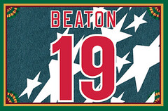
Membership update: A few new designs have been added to the membership card gallery, including Scott Beaton’s card, shown at right, which is based on USA soccer’s “denim” jersey from 1994. Just the latest example of how the ugliest jerseys often make the best membership cards.
As always, you can sign up for the membership program here.
Uni Watch News Ticker: One preseason game in, and we have our first jersey typo of the NFL season. That’s Darrell Stuckey — it should have an e — of the Chargers (great work by Eric Stangel). ”¦ A disgruntled Astros fan has a clever idea (from Gordon Blau). ”¦ Here’s the oldest baseball uni catalog I’ve ever seen. Note the mix of high and low cuffery, and dig the amazing captains’ belts (awesome find by Mike Hersh). ”¦ Also from Mike: a site devoted to vintage baseball gloves. ” Takes some digging around, but worth it,” he says. ”¦ What do Stan the Man and the Babe have in common in these pics? They’re both wax models (great stuff from Bruce Menard). ”¦ It’s a little hard to see in this photo, but Jeff Brand notes that the Blues are now wearing a PNC ad patch on their practice jerseys. ”¦ Funny scene at the annual PGA champions’ dinner, as John Daly didn’t quite get the memo regarding the dress code. Interesting to see that Tiger Woods was the only other one without a tie. Maybe he had trouble with his Onassis knot? (With thanks to Nick Orban.) ”¦ If you absolutely have to have a jersey sponsor, it’s nice to make it a charitable organization (from George Chilvers). ”¦ Remember the photo of Deion Sanders holding an NFL football with NCAA striping? Colin Feeney says he has the explanation: “Many NCAA teams used the exact NFL game ball for a time, in order for their quarterbacks to get used to the ball, since those teams used a pro-style offensive scheme. It used the two stripes, as mandated by NCAA rules, but kept the NFL markings (for the record, the NFL game ball is a bit rounder than a high school or regular college game ball). In the mid=’90s, the NCAA banned pro makings on all game balls, so Wilson — the maker of the NFL game ball — simply changed the name of it to the 1001 to bring it in line with the rules. In a nutshell, it was the NFL game ball under a different name. I don’t know how much it’s still in use, due to Nike supplying game balls for its schools, etc.” ”¦ Looks like Duke placekicker Will Snyderwine removed the front spikes from his shoes (good spot by Kyle Ostendorf). ”¦ Alex Smith has a new facemask. “Hopefully this is reason he has been terrible,” says Matt Paver. ”¦ Attention New Englanders: If you spot anyone wearing or selling this jersey, then John Kimmerlein wants to hear from you. “It belonged to my Dad and was inadvertantly donated to a local church back in Rhode Island (along with the rest of his clothes) after he died in March,” says John. “I know it’s a huge long shot, but it has great sentimental value.” If anyone has any info, contact me and I’ll pass the word along to John. ”¦ Michigan and Ohio State will play an outdoor hockey game at the Jake in January (from G. R. Brackle). ”¦ Do NASA’s space suits just pop out of a mold or something like that? Nope — they’re sewn, just like any other uniform (thanks, Kirsten). ”¦ Hey, all you Nike employees who are reading this: You might wanna send your legal team after this Fresno window-washing firm (from Chris Chaussee). ”¦ Also from Chris: The Sacramento River Cats will be wearing zerba-striped jerseys tonight. No, not like football referees — real zebra stripes. ”¦ The South Carolina football Twitter feed had an interesting series of posts yesterday. First came this: “[Under Armour’s] idea is to have a cleat that is a shoe and an ankle brace in one. They don’t want players to spat their shoes like they’ve been doing.” Sounds good so far, right? Then, a few minutes later this: “Spatting is when players tape over their cleats for ankle support, which in turn covers up the Under Armour logo.” So form follows function, as long as the function is corporate douchebaggery. Anyway, here’s the result (all courtesy of Joel Mathwig). ”¦ David Wright has been wearing some bright orange shoelaces lately. Keith Hernandez referred to them as “very ugly” on the air yesterday (big thanks to Matty Eggen). ”¦ Tommy Stafford recently designed the graphics and uniforms for a California high school. ”¦ There’s a new web site devoted to the renovation of the U. of Washington stadium (from Rob Weber). ”¦ Nike has some funny ideas about my city (Kirsten again). ”¦ “I was watching a Manchester United/Blackpool game in the spring, and Man U’s right back, Patrice Evra, had to wear a jersey with no name or number because his shirt had ripped,” writes Pierce Byron). ”¦ We all know about mini-helmets. But what the hell are mini-caps? (As noted by Ryan Mandel.) … No photo, but Garrett Schabb says Justin Boren of the Ravens wasn’t wearing full-length socks last night — just white crew socks, like college players wear. “It’s not like his stockings fell down — they just aren’t there,” he says.
Roster moves: I’ll be spending most of today out on Long Island with my Mom, so everyone play nice while I’m gone. And Phil’s gonna be busy this weekend, so Johnny Ek will be filling in for him. See you on Monday, yes? Yes!
Chris Carpenter went high cuffed last night in order to change his and the team’s luck against Milwaukee. 8IP/2ER says it worked. Bet he keeps the look.
link
Wow — he actually got a new set of short-inseam pants, instead of just scrunching up his old pants at the knee. No blousing, alas, but still, good for him!
I still say that looks clownlike. Let the next trendy streak-buster thing be black spikes.
As a side note to the Alex Smith facemask, that’s the same facemask style that the two greatest QBs in 49er history wore… so even if he doesn’t play like Joe or Steve, at least he’ll look the part.
“Spatting is when players tape over their cleats for ankle support, which in turn covers up the Under Armour logo.”
I actually think most poeple spat their cleats because it looks cool… something those cleats definitely do not.
Yeah. Seems like you could just move the logos to the toe area like Nike’s already done on its football cleats. Oh, wait. Under Armour already puts their logo on the toe on many of their models (including this prototype uber hi-top), thereby making the whole issue of the spat covering up the logo A NON-ISSUE, because the logo is already in a spot that won’t be taped over! Some people are really dense. This stuff isn’t that hard to figure out.
For real. Or they could just get USC some UnderArmour tape to spat their cleats with if they really throwing two more logos on top of the two or three that are otherwise on the uniforms (not counting sweatbands and other things like that) will really make that big of a marketing difference.
That is actually a genius idea. How has nobody thought of that yet?
I’m having the patent drawn up as we speak.
See link and link
Paul,
Glad to have been able to contribute to what turned out to be such an excellent and thought provoking article.
Cheers!
~Bruce
So wait…Does Under Armour think they’ve invented the high-top?
No, but they are taking credit for the first football/wrestling boot hybrid.
Looks like they’re taking a page out of link
Regarding that Miami Beach double-decker script: Two-level titles have mixed success in sports. Perhaps the best was the New Jersey Nets road blues in the ’80s, but I don’t have anything nice to say about the Oklahoma City Thunder’s uniforms. Sticking with the basketball theme, Illinois State’s uniforms in the 1970s had “Illinois” in tiny letters going *through* huge letters spelling “STATE”.
So much for innovation. I look at combining a cleat and an ankle brace rather clever. But around here, just bring on the bashing.
It’d be one thing if they did it for the sole purpose of eliminating spatting, but they say the real reason is so their logo isn’t covered. That’s why it is getting bashed.
It looks like a wrestling shoe with cleats. I wouldn’t call that innovative.
Uhh, has anyone done it before? I don’t think so, so I WOULD call that innovative.
If UA just kept their logo down by the toes, like on their prototype, then spatting becomes a non-issue, since the toes don’t get taped over, right?
Toes aren’t primo real estate as far as the shoe is concerned. Otherewise, everyone would do it.
Everyone is doing it, at least on football cleats.
I’ll go out on a limb and say that the Wu-Tang Clan won’t be endorsing link.
Love the white-crown, blue brim Montreal cap link. Hope EFF is watching; they need to make that cap pronto. Ditto for those link caps.
And does link have anything to do with the Nats/A’s kerfuffle that led to the Senators wearing link?
Teddy Ballgame didn’t become the Senator’s manager until 1969, the “white cap” incident was in 1967.
So THAT’s where Joe DiMaggio had gone away to.
“Teddy Ballgame turns his lonely eyes to you, woo-woo-woo / What’s that you say, Mrs. Robinson / Joltin’ Joe is coaching for the A’s, hey hey hey”
Hate to say it, because there’s obviously a lot of hard work that has gone into this, but my favorite part of Tommy Stafford’s La Salle redesign is the original LS monogram in the first slide. The rest of it is just another case of an overly aggressive, comic book sports logo. The front view of the horse’s head is really not working, either.
I bet part of what ADs are looking for is a sports “look”, a common thread linking athletic programs with other schools. Freethinkers and out-of-the-box types need not apply. Italic typefaces with windswept serifs mark your program as “21st Century” and “Varsity Hip”. Of course, an angry mascot is required.
“Hate to say it, because there’s obviously a lot of hard work that has gone into this, but my favorite part of Tommy Stafford’s La Salle redesign is the original LS monogram in the first slide.”
I thought the same thing. They had a nice logo – no need to change it.
I love what Stafford did for the wordmark and especially the LS initials. But I much prefer the older mascot, though maybe that’s just because it looked like link.
I don’t mind the new ‘LS’ lockup, but the full ‘La Salle’ wordmark puzzles me. I’ve seen wordmarks where the first letter was larger than the rest, but I’ve enver seen a wordmark where the top line of the ‘small’ letters was above the top line of the ‘capitals.’
Goes to show how tastes can vary – that’s exactly what I liked about the La Salle wordmark. It accomplishes something of a tired old effect, and one that would normally kind of bother me, since it amounts to gratuitously capitalizing an article, but in an unusual, non-cliche way. By dropping the baseline on the L and S, it gives emphasis while creating the illusion that the L and S aren’t all that bigger than the rest of the letters. I thought that was a very nice touch.
The controversy about Hank Greenberg is as ridiculous as it is interesting. Not only was the Yankee uni used only because no other uni could be found, but the game was a charity event.
The first comparison which comes to mind involves Reggie Jackson at the 1979 All-Star Game. His Yankee uniform was not available, so he wore a Seattle Mariner uniform for the team picture (though a Yankee uniform was located in time for the game itself).
link
Greenberg actually played in the game in the Yankee uniform. So, this reminds us of Babe Ruth’s suiting up for the Giants in 1923 (during his Yankee career, of course) in an exhibition game against the International League’s Baltimore Orioles, Ruth’s hometown team for which he formerly starred.
link
Because it was a charity game that Greenberg played in, other comparable situations would be the testimonial matches played for retiring English footballers, in which many players appear in uniforms other than the ones they currently wear. Recently, in Gary Neville’s game, ex-ManU stars David Beckham (LA Galaxy) and Phil Neville (Everton) played in ManU’s current uniform (well, last season’s, anyway).
Here they are with ex-teammate Nicky Butt:
link
In Paul Scholes’s testimonial match a few weeks ago, Brad Friedel and Robbie Keane (both Tottenham) appeared for the New York Cosmos, which fielded an team of international all-stars.
Friedel:
link
(P.S. – I hate to side with Nike on anything; but I agree with them about that unmentioned borough. We should trade it to New Jersey for Hudson County.)
Has there ever been a classier-looking ballplayer than Hank Greenberg? I mean, look at that photo — it’s gorgeous. He’s gorgeous.
Technically, the Indians’ field is now Progressive Field.
Yeah, its still the Jake to everyone.
“Here’s the oldest baseball uni catalog I’ve ever seen.”
What’s with all those “bib” baseball jerseys? We need to bring some of these back.
The bib jerseys allowed players/teams to easily switch bibs. Like most early baseball uni elements, they come straight out of earlier militia/firefighting uniforms. Basically, early baseball clubs were an evolution of the fraternal organizations of the time, and back in the day, if you were a young urban man who wanted to hang with other young urban men, you didn’t join the Rotary, you joined either your neighborhood fire company or your local militia regiment. Both of which were fully private, not government, organizations, and both of which spent a lot more time hosting steak dinners than fighting fires or drilling with rifles. For reasons I don’t fully understand, fire brigades developed a very poor reputation, so athletic clubs were often a very direct alternative to volunteer fire companies for membership.
Anyway, that style of shirt was known at the time as an “engineer’s shirt,” and the bib seems to have been developed to shield the wearer from letting sparks or dirt get into one’s shirt at the placket. You see train engineers, factory machine operators, and cowboys wearing that shirt in contemporary illustrations & photos. Adding a letter to it, though, seems to have been a baseball innovation. If you see someone in a bib shirt today, he’s probably either a link or a link.
– The most interesting scan from that vintage catalog has got to be the 1871 sketch of link. I’m not a lax fan (or historian) but I’d love to hear more about the original game/clubs.
– For reasons I don’t fully understand, fire brigades developed a very poor reputation – I was skimming what I’m pretty sure was link in a bookstore a few years back and there was a passage about the early firefighters clubs in NYC, and how they would literally battle in the streets for the right to fight a fire, and of course charge a fee for services rendered. Apparently things would quickly turn from competitive to brutal. Perhaps this contributed to their poor reputations.
(btw: the Amazon link for the book gives you quite a few complimentary pages of reading)
I dunno…the toy horse reins might be even more interesting.
link
Could either be part of a good fitness program…or a reason to call Children’s Services…
Nah, they still have those link
‘I was skimming what I’m pretty sure was “The Gangs of New York” in a bookstore a few years back and there was a passage about the early firefighters clubs in NYC and how they would literally battle in the streets for the right to fight a fire…’
Sounds right. I remember that from the book. And sometimes, due to these brawls, the intended customer’s property would burn to the ground.
A year or so ago I did the index for a book on a part of Montreal called Griffintown. It describes a similar situation. In the Victorian era, the city of Montreal used to pay a bonus to the fire brigade that got “first water” on a blaze. The idea being to make sure one of the companies (and there were a dozen in Montreal) showed up promptly. But dirty tricks were often employed — severing another company’s hoses, for instance — to prevent them from collecting the bonus. And in a city where there was Catholic and Protestant, French and English (plus the Irish, who weren’t completely accepted by either), there were all kinds of rivalries.
During the Patriote rebellions of 1837-38, the Parliament building in Montreal was burned down. Several companies showed up, and extinguished the fire when it spread to neighbouring buildings, but no one fought the original fire within the Parliament building, either because they were sympathetic to the uprising or because they feared being attacked by the rioters.
Wow, I’m really surprised by the Purdue sleeved basketball jersey find. While I was at Purdue, I did a project where I researched the history of the basketball team uniform, even got to dig around in the athletic departments photo archives (something every sports fan would love to do) and never found a single image of a sleeved jersey. I found pictures all the way back to near the beginning on the program (1896) and never found a shot like this. Really interesting stuff.
Even stranger, it seems to be a mixture of this uniform’s shorts:
link
with the script from this uniform:
link
Love the sleeved look. OSU’s spaghetti straps, on the other hand…bleah. Those are worse than Larry Bird’s jersey:
link
I think he was one of the last to wear them that thin.
The players in that pic don’t look a day younger than 40 years old.
Interesting find by Mets Police. “Expect the Mets to have American Flag patches on 9/11 caps” link
Anyone else heard that Star & Stripe caps won’t be worn on Sep. 11th? Instead it will be regular caps with american flags. link
A huge step forward. As much as wearing a flag on an athletic uniform is a form of flag desecration, and therefore unpatriotic, ugly offends me more than unpatriotic. And man, those S&S caps are uuugly.
Okay yeah, the 94 Stars jersey looks AWESOME as a membership card.
Those mini NFL caps are sold in gumball machines for like 50 cents. They are made out of rubber and incredibly stupid. My son is a huge NFL fan so we got one out of a machine and even my son said they were dumb.
Re: the Nike’s with the Brooklyn, Queens, etc…They put the outline of each of the 4 boros—I mean areas they represent on the shoe, but how many people would be able to identify an outline of The Bronx without knowing what it was? And on top of that an outline of Harlem?
I think those NFL mini caps are not the best, but what about the MLB versions:
link
I think they are actually kind of neat, especially if the started to make more versions for the alt hats.
So where is my 1996 Vin Baker Bucks replica purple jersey again? Forget about the London riots and the cluster fuck called Congress…
Champion NBA replica jersey are BACK!!!!
link
Really? (Man, I hate my job sometimes.)
Request Blocked by Real-Time Classifier
Your request to URL “http://deadspin.com/5612432/look-at-these-fucking-hoopsters-grab-bag/gallery/1” has been blocked by the Webwasher Real-Time Classifier. The page was classified as sexual, erotic or adult content (90% probability in meta information) which is not allowed by your administrator at this time.
The f-bomb in the url was your undoing.
They sure are. All over the place at the Indy 500 and Chicago music fests. When I went home a few weeks ago, I happened to find both my purple AND green alternate Glenn Robinson Bucks jerseys.
In regards to “presenting that boat to Branch Rickey”, while I like how the Dodgers script was used on the boat (a nice old Chris-Craft, I noticed), someone put the apostrophe in the wrong place. It reads, “Dodger’s Skipper”, as if Rickey were the skipper of ONE Dodger. Should have been “Dodgers’ Skipper”.
Dodgers (no apostrophe) is the name of the team. Hence I’m wondering if an apostrophe is required AT ALL!? Not really sure, but at the very least, B-Rich is correct, it’s in the wrong place.
Thanks for using the Roy White image I sent you for your piece on the minor leagues in the South. I’m glad you interviewed him directly..I was wondering what he went through. Amazing how everybody managed to overlook the fact they were walking around with the symbol of segregation on their sleeves. That photo just fucking blew my mind from the moment I saw it..even more amazing is the fact Roy was the only black player on that squad. When you are young you can deal with a lot of shit..todays players have no idea how easy things are for them, they take it for granted.
VINTAGE BASE BALL (TWIN CITIES) REMINDER…
Saturday (tomorrow), 2 p.m., 70th & Lyndale, Bloomington.
Clouds are supposed to have moved off by noon.
Minnesota Quicksteps vs. “Picked Nine”
link
I’ll be there spectating…the old guy accompanied by a beautiful young blonde (my daughter).
Damn. I was hoping the Quicksteps’ logo would be a green apple.
I’d wear that.
Can’t really blame them.
Tough to pass it up the chance to wear a “Q”.
Of course, if you’re from Quebec or Quincy I suppose it’s no big deal…
So what’s to stop them from putting the Q on a green apple?
Or Queen’s (the University, not the borough)
From a strictly design standpoint, I’ve always loved the Confederate flag.
Welcome to the club. Unfortunately, the ‘stars and bars’ have been forever ruined as a symbol, much like the swastika.
Seconded. What we incorrectly call the “Confederate flag” evolved very early in the War of the Rebellion as a military emblem, and once it appeared on the scene, it was recognized pretty much instantly by everyone as the superior symbol to the first actual link. The Confederacy played around with putting the Confederate Battle Flag onto the national flag, but for some reason was never willing to just go all in and turn the square Battle Flag into the rectangle that we call the “Confederate flag” today. The Confederate States wound up with link of a national flag.
I’d put the rebel flag (or Dixie flag, or whatever, since it’s not actually a Confederate flag) maybe 4th or 5th on my list of favorite national flags, from a design point of view. United Kingdom, United States, Canada, South Africa, United Nations – the rebel flag would fit in right behind Canada for me.
That steaming mess the blood-stained banner. The red stripe was added to prevent the flag from appearing as a white flag of surrender.
…which they could have avoided if they just used the rebel flag as their countries flag, and not just a battle flag.
“Steaming mess” from a design standpoint. It’s all kinds of disaster in that respect.
Design brief: Our current flag is indistinguishable on the flagpole from our existential enemy’s flag. You know, the one we’re fighting an all-out war against along every inch of our borders and seacoast for our very survival as a nation. On the plus side, we have this distinctive banner that everyone recognizes and loves and that cannot possibly be confused with our enemy’s flag.
Designer’s Solution: Take that alternate design, and stick in in the corner of an otherwise plain white sheet, even though a plain white sheet is recognized by both sides in the current war as the symbol of unconditional surrender. Once this drawback is realized, add one of the red stripes that caused the original flag to be too easily confused for the enemy’s flag back to the new flag.
That’s just such an idiotic instance of applied design – solve a functional problem by creating a worse functional problem, then solve that by taking a step backwards in form – that you kind of suspect Nike was involved somehow. It’s especially mind-blowing since the whole “take the square Battle Flag and just make it a rectangle” idea was already in use by the link!
Also, this is not the “Stars & Bars.” link. Confusing the two while speaking with a Northern accent can get you in trouble down here.
We went to see Ohio State play at Washington a couple years ago. Husky Stadium is a great venue. The stadium was not that special but the setting was nice. Hard to believe it got that loud but it had to do with the double decker sides I guess.
Interesting to see their renovations.
Pretty spectacular there by the water, yes.
Sort of a football version of PacBell (or whatever the hell the Giants’ ballpark is called this year).
Always loved the very distinct cantilevered roof. Nice to see the renovation project highlight this form in their marketing, graphics etc……W
The wheel in the Flint Generals logo:
There’s a reason for it. Flint is the birthplace of General Motors — remember the movie “Roger & Me” — so the general in the name is not the military leader, but the company, which employed much of the city.
Hockey teams in the city were later named the Spirits and the Bulldogs, but returned to the Generals in the late 1990s.
Similarly, the Oshawa Generals junior team used to have the GM Canada logo as part of their team emblem.
Metsblog has a post on the blue jerseys they wore last week, saying both David Wright and Justin Turner are fans.
Wright: “orange on blue (no black) color scheme was awesome — especially if they all wear blue spikes”
90% of Metsblog readers agree. Hopefully 2012 is finally the year they ditch the black.
Odd, “Metsblog” should be linked…
link
I was watching the Eagles-Ravens game last night and the sideline reporter actually had some decent information on the uni-number change by Vince Young. Since 10 was taken by Desean Jackson, VY opted for #9 as a tribute his mentor/surrogate father Steve McNair. That seems like a pretty good reason to pick a new number…
Yeah – what a great role model! VY should fit right in.
John Daly looks awesome in that picture. Love the pink on pink on pink with jeans next to all those fuddy duddy’s.
John’s life story should make for an AMAZING motion picture one day.
Paul- I just got a chance to check out the post on the mothership. Great article keep up the good work.
New Fresno State jerseys official revealed today. More pictures to come…
link
As promised…
link
The new helmet has a blue stripe:
link
Better helmet picture
link
Can you use a different format for the pics? jpeg?
Sorry about that. Here’s the info on the new uniforms:
Home Uniforms
The home uniforms maintained their traditionally predominately red look, but with some significant additions.
For the first time in Fresno State football history, the front of the jersey reads “Bulldogs” and as you move up the arms, the capped sleeves have a shattered navy blue and white stripes racing across both shoulders.
The new jerseys are designed to be tighter fitting through the shoulders sand sides. They are also lighter than the ones worn in the past, with an inverted body-hugging fit along the sides and waist.
In an effort to make gameday viewing more fan and media friendly, last names have returned to the backs of the jerseys above the numbers. A thin gray outline has been incorporated around the white numbers that are designed with the more traditional solid print tackle twill.
The new tightly fitted pants were uniquely designed in order to stretch and expand more. The strips down the sides of the match stripes on the jerseys and the word “Bulldogs” is embroidered into the belt line. High-tech knee pads and secured padding around the hips were built into the pants for added protection.
Away Uniforms
The away uniforms are all white and will be worn for the first time on Sept. 3 in the `Dogs opener with Cal.
The words “Fresno State” have returned to the front of the jersey for the first time since 1998. The arms feature shattered red and navy blue stripes also racing across both shoulders. The middle of the jersey is lined with mesh to help lighten the overall weight and increase breathability.
Last names are also included on the backs of the jerseys above the red solid print tackle twill numbers with the same thin gray outline. The equivalent changes were made to the away white pants as the home pants.
Helmets
The Bulldogs’ helmets have been painted a new deep red color for a consistency with the rest of the uniform. One of the biggest differences with the new helmet is the navy blue strip outlined in white to match the stripes on the jerseys.
The green “V” – which recognizes Fresno State’s pride for the agricultural community of the San Joaquin Valley – remains on the back of the helmet.
Pictures: link
In the Jackie Robinson picture, is the other black guy Dan Bankhead?
Anyone notice Roy Campanella’s personalized license plate in the link ROY-39. It took alot of clout back then to get a vanity plate, not just extra cash. Also, it’s a 1962 issue, a good five years after the Dodgers left town.
No handicap symbols back then, though I doubt Roy had any trouble parking wherever he wished. At least in certain boroughs.
Apparently the new jets logo created a skirmish. link
Posting from my phone so I don’t know if its already been mentioned but ESPN is still using Andy Daltons TCU headshot.
Sad news down here in GA tonight.
Ernie Johnson Sr, voice of the Braves along with Skip Caray and Pete Van Wieren, passed away tonight at 87. He was among the last remaining links for the Braves to Atlanta, Milwaukee, and Boston.
The Braves will wear a tribute patch for him starting tomorrow.
You guys probly saw this already but if not,
link
Actually, it looks like Snyderwine, the Duke kicker, didn’t remove his front cleats. He’s just wearing a Nike soccer cleat with the improbable name of Mercurial Vapor VII FG Men’s Soccer Cleat. The front two cleats are still there, they’re just made out of clear plastic (and thus are really hard to see in that photo).
See link. Or you can go down to your local soccer store to check it out.